matrixwave: visual comparison of event sequence … visual comparison of event sequence data jian...
TRANSCRIPT

MatrixWave: Visual Comparison of Event Sequence DataJian Zhao1 Zhicheng Liu2 Mira Dontcheva2 Aaron Hertzmann2 Alan Wilson2
1University of Toronto 2Adobe Research
a b cevent sequences Sankey MatrixWaveaatoolprotrial.tool.comtoolprotrial.tool.comtoolprotrial.tool.comcreatedoc.tool.comcreatedoc.tool.comcreatedoc.tool.comacreatedoc.tool.comadesign.myweb.com
toolprotrial.tool.comcreatedoc.tool.comdesign.myweb.com
event sequencesccps.ihvweb8.com; 12:45:53, toolprotrial.tool.comevent sequencestoolprotrial.tool.comevent sequences; 12:46:20, event sequences; 12:46:20, event sequencescreatedoc.tool.com;
09/15/2014 tracesVisit 1: 12:43:14, labs.myweb.comcreatedoc.tool.comblogs.myweb.comforums.myweb.comVisit 2:design.myweb.comforums.myweb.comdesign.myweb.com
12:43:14, labs.myweb.comcreatedoc.tool.comblogs.myweb.comforums.myweb.com
isit 2:design.myweb.comforums.myweb.comdesign.myweb.com
09/16/2014 tracesVisit 1: 11:58:23, myweb.com; 11:59:33, design.myweb.com; 12:00:27, portfolio.net; 12:01:39, shop.myweb.com;Visit 2: 12:41:14, design.myweb.com; 12:42:23, forums.myweb.com; 12:43:28,
Figure 1. We explore visualization designs for comparison analysis of two web clickstream datasets (a). Node-link diagrams, like the Sankey diagram(b), use a familiar node-link paradigm, but lead to many overlapping edges. In contrast, MatrixWave displays links as with matrices (c) and arrangesstep-to-step transitions in a zig-zag pattern. Traffic volume is encoded with size, and differences between the two datasets are encoded with color.
ABSTRACTEvent sequence data analysis is common in many domains,including web and software development, transportation, andmedical care. Few have investigated visualization techniquesfor comparative analysis of multiple event sequence datasets.Grounded in the real-world characteristics of web clickstreamdata, we explore visualization techniques for comparison oftwo clickstream datasets collected on different days or fromusers with different demographics. Through iterative designwith web analysts, we designed MatrixWave, a matrix-basedrepresentation that allows analysts to get an overview ofdifferences in traffic patterns and interactively explore pathsthrough the website. We use color to encode differencesand size to offer context over traffic volume. User feedbackon MatrixWave is positive. Our study participants madefewer errors with MatrixWave and preferred it over the morefamiliar Sankey diagram.
Author KeywordsEvent sequences; visual comparison; Sankey diagram;matrix representation; information visualization.
ACM Classification KeywordsH.5.2. Information Interfaces and Presentation (e.g. HCI):User Interfaces
INTRODUCTIONAnalysts often seek to understand event sequence data, thatis, multiple series of timestamped events. Event sequencedata arises in many applications. For example, websites loghow users navigate their pages, airlines track events during
Permission to make digital or hard copies of all or part of this work for personal orclassroom use is granted without fee provided that copies are not made or distributedfor profit or commercial advantage and that copies bear this notice and the full citationon the first page. Copyrights for components of this work owned by others thanACM must be honored. Abstracting with credit is permitted. To copy otherwise, orrepublish, to post on servers or to redistribute to lists, requires prior specific permissionand/or a fee. Request permissions from [email protected] 2015, April 18–23 2015, Seoul, Republic of Korea.Copyright c© 2015 ACM 978-1-4503-3145-6/15/04...$15.00.http://dx.doi.org/10.1145/2702123.2702419
airplane flights, and hospitals record when patients transferfrom one part of the hospital to another. A key analysis taskis comparison between different time periods and differentpopulations. For example, a website analyst asks numer-ous questions about how users navigate their site. Is trafficincreasing or decreasing? Are this week’s visitors leavingthe site faster than last week’s visitors? Are visitors fromNorth America visiting the same parts of the website asvisitors from Europe? While several visualization techniqueshave been designed for event sequence data, such as theSankey diagram [25] and the LifeFlow [31] and Outflow [30]systems, little attention has been paid to supporting visualcomparisons for this type of data.
In this work, we explore visualization designs for compar-ative analysis of two related event sequence datasets. Weperform this exploration in the context of web clickstreamdata, but we believe our findings generalize to other domains.As we began our exploration, we found that visualizing evena single clickstream dataset is not well supported by ex-isting techniques, as clickstream data includes many eventsand many transitions resulting in complex and unreadablevisualizations (Figure 1-b). To handle visualizing real-worldclickstream data, we propose the MatrixWave representa-tion. MatrixWave displays a transition matrix [3] for eachsuccessive step in the sequence, rotated and concatenatedside-by-side in a zig-zag manner (Figure 1-c). This designdirectly exposes traffic statistics for individual nodes andfor step-to-step transitions; moreover, individual navigationpaths through the site can be isolated as zig-zag paths throughthe sequence of matrices. To support comparative analysisof event sequences, we design additional visual encodingsusing color and size. Using our design, an analyst can get anoverall picture of website traffic from the basic visualization,can identify popular nodes and transitions from histogramstatistics, and can see how these quantities have changed overtime or between user segments. MatrixWave also incorpo-rates flexible interactions, such as filtering, searching, andnode reordering, to aid users with the exploration of data.
Author manuscript, published in Proceedings of the SIGCHI Conference on Human Factors in Computing Systems, pp. 259-268, 2015.DOI: 10.1145/2702123.2702419

We grounded our design in interviews with expert web ana-lysts and iteratively collected feedback throughout the designprocess. Additionally, we evaluated how well users performwith MatrixWave and the Sankey diagram from comparisontasks. Although the Sankey diagram is more familiar andMatrixWave requires learning a new technique, the studyparticipants made fewer errors and preferred the MatrixWaverepresentation over the Sankey diagram. Qualitative feedbackpoints to the need for better ways to filter the data and furtherexploration into layout.
RELATED WORK
Visualizations of clickstream dataClickstream visualization has received considerable attention.ClickViz [5] and WebQuilt [13] introduced directed graphsfor clickstream visualization, but these approaches can onlyhandle dozens of paths. In order to handle larger datasets,some authors have proposed clustering paths [7, 14, 29] andshowing summary statistics [17]. These approaches provide ahigh-level overview of clickstream patterns, but do not allowfine-scale analysis of individual paths. Moreover, the actualset of behaviors may not be represented well by clusters.Commercial systems, such as Google Analytics, use Sankeydiagrams to show pages and links with the most traffic, butoffer little assistance with comparison.
Visualization of event sequencesPerhaps the most basic approach to event sequence visualiza-tion is to display the raw sequences, as done by Lifelines [24,28], CloudLines [15], and TimeSlice [33]. These methodscan provide considerable detail to individual traces, but do notscale to clickstream data, which typically involves thousandsof sequences. In order to reduce dataset size, LifeFlow[31] and EventFlow [19] consolidate common subsequences,resulting in a tree-like representation. These representationsscale exponentially in the number of event types, and thus areimpractical for clickstream data, where each event is typicallyone of hundreds of webpages.
Several authors have proposed consolidating events into agraph. A state transition diagram [27] is a general graphof state nodes that directly shows all routes between pages.But, this approach does not show step information and doesnot scale well to highly-connected graphs. In some cases,the scaling issue can be addressed by discovering motifs[18, 23], or conducting interactive queries over event types,event intervals, etc. [10, 20]. The Sankey diagram [25] is aform of graph arranged to show step-by-step transitions; wediscuss the Sankey more extensively later in the paper. Anumber of variants and extensions to the Sankey have alsobeen developed [30].
Two previous methods use sequences of matrices, similarto MatrixWave. MatrixFlow [22] visualizes histories as asequence of matrices. Though superficially similar to Ma-trixWave, MatrixFlow does not describe paths through states,as each matrix is a separate, independent visualization, andeach matrix is a symmetric correlation matrix rather than atransition matrix. Closest to our own work is GeneaQuilts [4],which visualizes genealogy by alternating individuals with
pairs of matrices. This work is specialized to genealogy, inwhich each child has exactly two parents. The GeneaQuiltsgraph requires twice as many matrices for the same number ofsteps as MatrixWave, in order to completely specify ancestry.Although MatrixWave would not be able to precisely showancestry, it is designed for much denser transition relationswhere each event may follow many other events, and wherethere are many more possible events.
Visual data comparisonGleicher et al. [9] classify visual comparison techniques intothree categories: juxtaposition, superposition (e.g., [26]), andexplicit encoding (e.g., [11]). Another common approachto reveal differences between data is to use animation (e.g.,[2]). Juxtaposed views enable a side-by-side comparisonof data, often complemented with interactions highlightingthe matches or explicit drawings showing the connections[21, 12, 6, 32]. Superposed views allow an in-place com-parison by overlaying multiple objects in one visualization[26, 16]. Explicit encoding techniques compute the differ-ences between related elements and visualize these derivedvalues [11]. Finally, animated views interpolate two vi-sual representations to preserve a viewer’s mental map [2].These prior works on visual comparison primarily focus ontrees and graphs, and have not addressed the visualizationand comparison of changes between two event sequences.Nevertheless, they provide valuable results to ground ourdesign choices. We employ superposition to combine tworelated event sequence datasets and use explicit encoding forcomparison tasks.
UNDERSTANDING CLICKSTREAM ANALYSISWe use web clickstream data to ground our investigationin real-world problems. Modern commercial websites trackthousands of distinct clickstream sequences each single day.A sequence consists of ordered events, each assigned a stepnumber. Each event is an interaction with the website, in-cluding a click on a link, a click on a menu, or filling outa form and pressing return. These sequences are highlyvariable. Some include only one or two events, while otherscan include tens or hundreds of unique events.
To better understand the web analysis domain, we inter-viewed expert analysts who work with clickstream data atlarge IT companies. We conducted multiple interviews andcollected feedback throughout the design process. Duringthe interviews, we presented the prototypes, discussed alter-natives for visual encodings and interactions, and collectedfeedback from the experts to guide our next steps. Althoughwe developed MatrixWave in the context of comparing webclickstream data, the visualization and its interactive featurescan be generalized to other types of event sequence data.
To ground our design in real work, we distilled the followinganalysis tasks from our interviews:
Traffic volume: One of the most common analysis tasks isassessing the number of visitors to a site and tracking whichpages get the most visitors. Analysts usually compare trafficvolume from a given day to volume from the previous day andvolume from the same day on the previous week. Volume

a b
c
C
DB
B
AB
B
A
CB
AA
B
BB
A
DA
B
C
B
A
D
B
A
D
C
B
d
step 1 step 2step 3 step 4
AB
CB
A
D BA
DC
Bstep 1
step 2
step 3
step 4
AB
C
BA De
step 1
step
2
BA
D
BA
DCB
B
C
D
AB
C
BA D BA
step 1 step 2 step 3 step 4
step
2
step
3 step
4
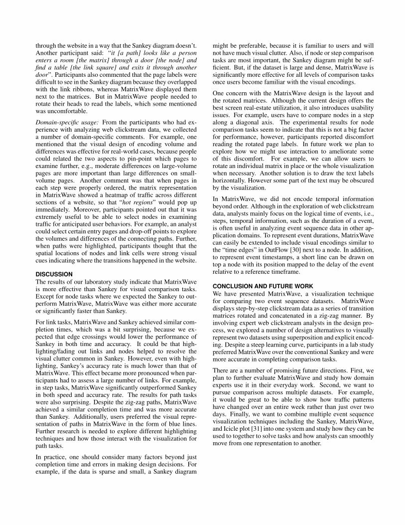
Figure 2. (a) Clickstream data comprises sequences of web pages, each one describing a unique visit by a visitor to a website. (b) The conventionalvisualization for clickstreams is the Sankey diagram, in which each column of bars represents a step number. But Sankey diagrams can becomeunreadable due to edge crossings between links. (c) We propose to replace the links with a transition matrix, in which each element in the gridrepresents the link from one node to the next; here, the size of the gray square indicates the traffic volume in that link. (d) Matrices can be sequencedtogether. However the notion of a path through the website is lost. (e) To enable path visualization and eliminate duplicating nodes, we chose a zig-zaglayout. Drop-off (exit) nodes are filled in with a line pattern.
comparison is also common across steps in the sequence.Volume comparison across steps tells analysts how quicklyvisitors leave the site.
Entry into the website: Analysts often seek to understand theeffect of marketing campaigns: are they bringing more peopleto the website, and what are these people doing? For this task,analysts break down traffic by entry point (email click, searchengine, banner ad, etc.) and study where new visitors go nextas compared to other types of visitors. Close inspection of thefirst one or two steps tells analysts how many people continuedeeper into the site.
Exits from the website: Analysts also seek to understandhow and when users leave a website. Much of websiteoptimization entails trying to reduce drop-off rates.
Paths through the website: Finally, analysts are often in-terested in studying specific paths through a website. Forexample, an analyst might want to see all the paths that takevisitors from the home page to the checkout page and howthose are different for different types of users. They areinterested not only in which pages were visited but also thesequence of those pages. For example, a path that containsmany visits to the same webpage can be a sign of a designflaw or bug in the implementation.
There are a number of other important tasks that we donot address in this work, such as optimizing search engineperformance or detecting looping behavior where visitors goback and forth between the same set of webpages.
DESIGN OF MATRIXWAVEWe now describe our visualization techniques for studyingand comparing event sequence datasets. We discuss thedesign of the MatrixWave representation, and present tech-niques for embedding comparisons into the representation.
Visualizing a single datasetThe inputs are sets of event sequences, where each eventsequence is a list of nodes. For example, we might have fourpossible nodes A, B, C, and D, and an individual sequencemight be B → A → C. This path contains three steps.A transition between nodes at a given step is called a link.Nodes and links have traffic volumes associated with them.In clickstream visualization, each node represents a webpageview, and a sequence represents a single user’s navigationhistory, e.g., start at page B, go to page A, go to page C,exit. A simple example dataset is shown in Figure 2-a.
Modern visualizations of clickstream data typically employthe Sankey diagram, which offers an aggregate view of pathsand offers more details through interaction. A Sankey di-agram aggregates clickstream data according to steps (Fig-ure 2-b). At each step, identical pages are aggregated intonodes, and nodes are sized according to their volume. Linksconnect nodes between steps and are also sized according tovolume. For clickstream data, drop-off links show the volumeof traffic leaving the site at various steps.
While Sankey diagrams are popular, their major weakness isin handling dense transitions. Even with less than ten nodesand dozens of paths, a Sankey diagram is hard to read due tothe multitude of edge crossings.
The approach we propose, MatrixWave, replaces the edgeconnections between a pair of steps with a transition matrix(Figure 2-c). Each cell in the matrix represents the volumeof traffic between the corresponding two nodes. This is in-spired by the observation that matrices can effectively displaydense graphs [8]. We hypothesize that the advantages of thematrix representation still apply in the context of visualizingclickstream data. Applying the matrix representation to eachstep in the Sankey representation, we obtain a sequence ofmatrices placed next to each other in a sequence (Figure 2-d).

Figure 3. Examples of visual encodings developed in MatrixWave to facilitate data comparison of two event sequence datasets.traffic volume is greaterin dataset onetraffic volume is greater in dataset twotraffic volume is equal in both datasetssmaller average volumelarger average volume
aa bb bc bd be
b
f
b
g hFigure 4. Potential designs for showing differences.
To represent drop-offs, we add an additional drop-off node toeach step of the matrices.
One problem with this design is that the notion of a continu-ous path is lost because the nodes at each step are duplicated.To avoid duplication of nodes, we rotate the matrices 45degrees and concatenate them. The rotation allows us to usenodes in each step to show both incoming and outgoing links(Figure 2-e). A user can then trace a path in a zig-zag manner.
Visual encodings for comparisonTo do comparative analysis of two datasets, we must firstplace them into correspondence. We assume that most nodesare in common; e.g., the only changes to a website structuremight be the addition or removal of a few pages. We matchnodes that have the same page name and step number, andlinks that have the same source and target nodes. If a nodeor a link only appears in one dataset, the correspondingvolume in the other dataset is set to zero. In real-worlddatasets, a step can include hundreds of distinct page events.We aggregate page events into groups using the website’sorganizing hierarchy.
We consider four approaches for visual comparison: juxtapo-sition, superposition, explicit encoding, and animation [9]. Inthe design of MatrixWave, we apply superposition to repre-sent two datasets within one visualization. Showing two sepa-rate visualizations side-by-side (juxtaposition) is not effectivein comparing complicated structures, because correspondingelements are far apart and difficult to identify [1]. Whileanimations can provide smooth transitions between multipledatasets, they require switching between views repeatedly.Within a visualization, we apply explicit encoding to showvolume differences in nodes and links. We explain the designof explicit visual encodings below.
Node encoding choicesWe apply explicit encoding in MatrixWave, where the dif-ference in traffic at each node is computed and directly dis-played. It is common practice to map differences to a diverg-ing color scheme, e.g., purple to orange (Figure 3-c), so thatit is easy to identify the direction of change. Both relativedifference and percentage difference can be mapped to the
color-scale. In addition, we use size to show the averagevolume, as the importance of a difference is often determinedby the volume of traffic. Changes on popular pages are moreimportant than changes on pages with less traffic.
A design alternative is to use juxtaposition: for every pagegroup, we have two nodes, each representing the page groupin one of datasets. Size is an effective visual variable toencode volume and hue is appropriate for representing datasetmembership. We can either align the two nodes along a centerline (Figure 3-a) or put them side by side (Figure 3-b) foreasier comparison. Figure 4-a to -c show how the potentialdesigns represent differences. Juxtaposition requires analyststo make perceptual judgments about the differences in vol-ume, while explicit encoding is more efficient and providesdirect access to this information [9].
Link encoding choicesDifferences in link traffic can also be displayed by juxtapo-sition or explicit encodings. Our final design uses explicitencodings with two concentric squares: the inner square sizerepresents the average link volume of the two datasets, andthe background hue of the cell encodes the difference in trafficvolume (Figure 3-h).
We started by designing two types of glyphs for juxtaposition:one using two fixed-sized concentric squares (Figure 3-d),and the other dividing a cell along the diagonal into twotriangles (Figure 3-e). Color intensity of the two regionsrepresents link volume in the two datasets. Previous workhas explored other glyphs for encoding differences and foundthat the square division method outperformed the rest [1].
We also tried to use color to explicitly encode differenceand size to represent link volume (Figure 3-f), similar tothe node encoding. Due to the limited number of pixelsallocated to each cell, this approach results in tiny squareswhen the link volume is small, making it difficult to read thedifferences represented as color. We considered swapping themapping (so that color represents volume and size encodesdifference), but size is not effective at indicating the directionof difference, positive vs. negative.
To overcome this problem, we tried representing link volumewith two concentric squares with two different colors (Figure3-g), but found it harder to interpret two different colorsrepresenting different types of quantities. In the end, wedecided to size a black square inside of each cell according tolink volume, and use the hue of the background of each cellto represents the magnitude of difference (Figure 3-h). Thisdesign is also consistent with our choice of node encoding.

aa
bb
bc
bd
Figure 5. The MatrixWave interface includes a control panel for selecting datasets, sorting, and filtering (a), a main canvas presenting the interactivevisualization (b), a legend (c), and a list of page groups (d). Here the user has highlighted a webpage from the first step. The bright orange and purplesquares representing links show that there are lots of differences between the two datasets. The user can use the groups in the panel on the right (d) tofilter the dataset according to the website structure.
Figure 4-d to -h show those design alternatives for comparingvalues in two datasets.
In our final implementation, MatrixWave visualizes the eventsequence data with the designs shown in Figure 3-c and -hby default, using percentage difference as the measurement.Other alternatives can be accessed in the prototype throughthe control panel (Figure 5-a). In addition, we display thepage group names associated with each group of nodes onthe opposite side of each matrix (Figure 5-b).
Interactive FeaturesMatrixWave incorporates a number of interactions to furtherfacilitate the exploration and comparison of event sequences.
Brushing & linking and selecting: When a user hovers overa node, he sees more information about that page group,including the traffic volume in both datasets and the differ-ence as a percentage. Additionally all the incoming sourcenodes, outgoing target nodes, and the links across all stepsare highlighted (Figure 5-b). Similarly, hovering over a linkoffers more details about the transition and highlights itssource and target nodes. A user can click on a node or a link toselect it. When a node or a link is selected, traffic through thatnode or link is highlighted. To allow users to move around thevisualization, MatrixWave supports zooming and panning.
Showing paths: Since analysts are often interested in under-standing user paths through a website, we provide a way tooverlay path information on top of the matrix representation.When one or more nodes/links are selected, as shown inFigure 6-a, blue lines indicate the underlying event sequencesthat pass through the selected nodes/links.
The traffic volume of the selected paths is typically only asubset of the overall volume. For example, in Figure 2, if
we select the path A → A → B , the third-step volumefor B is only a fraction of the overall volume for B at thatstep. To represent these path-specific volumes, we overlayvisuals with the same encodings. In particular, for a node, aninner bar representing the path-specific volume is displayedon top of the overall aggregate volume bar (Figure 6-b); andfor a link, the matrix cell is split into two triangles wherethe right half denotes the path-specific volume and difference(Figure 6-c). This path-specific representation can be turnedon or off through the control panel.
Filtering: We developed several filtering mechanisms in Ma-trixWave. First, users can search for page group names ina search box and select all the matching elements at once(Figure 6-a). This is useful when a user decides to focus onexploring the flow of a specific page group or a subset of pagegroups in the same name domain. Second, users can filterboth nodes and links by volume. Additionally, entire stepscan be filtered out to support more advanced exploration,for example, removing unnecessary intermediate steps whenonly the starting and ending nodes are of interest. Finally,pages can be filtered according to their organization in thewebsite using the tree-structured page listing (Figure 6-d).
Ordering: In order to facilitate comparison, a user can sortpage groups alphabetically, by volume, or difference. Sortingcan be performed within a specific step or across all steps.Additionally, MatrixWave allows the user to insert proxynodes for all page groups in the website at each step. Thisfacilitates using spatial positions as anchors into the identityof a page (i.e. the third node in a step will always be thesame page or page group). Using proxy nodes can result invery large and sparse matrices, but it makes it easier to getan overview of the entire site and to trace a particular pagegroup across steps. Finally, a user can also fix the ordering

aa
bb
bc
Figure 6. When one or more objects are selected, paths passing throughthe selected nodes/links are indicated with a blue-line (a). Path-specificdifferences are overlaid to show how the path volume is different fromthe aggregate volume (b)(c). In this example, the differences in the pathspecific volume of the highlighted nodes are the same as the differencesin the aggregate nodes (b). The path-specific link information (c), showsthat there is an increase in the number of path-specific links from onedataset to the other.
of the nodes in one step and propagate this ordering acrosssteps. This facilitates comparison across steps.
ANALYST EXPERIENCEWe designed MatrixWave iteratively by working with webdata analysts. To explain how analysts use MatrixWave let’swalk through a typical workflow. For a complete view of theexploration process, please refer to the supplemental video.
John is examining a website following a major redesign. Heloads two datasets into MatrixWave for comparison—onefrom the week before the redesign and one from the weekafter. At a glance, he sees a lot of differences: there are a lotof pages with bright orange and bright purple colors. He sortsthe pages according to changes in traffic.
The homepage immediately pops out. It has many links(Figure 5), but many of them are purple, which means thattraffic is down. He hovers over those links and sees that manyof those links are no longer visited from the homepage. Theyare probably no longer on the homepage, John thinks. Thereis a 35% drop in traffic to the forums pages and a huge jumpin traffic to the help pages (390%). He clicks on the linkconnecting the homepage and the help pages to highlight alltraffic that passes through the homepage and the help pages.
From the help pages, he sees people go on to four differenttypes of pages next. There is a huge jump in visits to the videosite, where some of the help videos are hosted. He selects thevideos site in step 3 to see what happens next (Figure 6). He issurprised to see that everyone leaves after step 4. So, visitorswho go to the help site after the homepage, are leaving withina couple of pages. He looks at all the drop off nodes and seesthat the drop-off nodes for step 4, 5, and 6 have seen a bigincrease. Looks like people are leaving the site faster nowafter the redesign. John needs to investigate further.
ADAPTING SANKEY FOR VISUAL COMPARISONSince our work is one of the first to investigate comparativeanalysis of event sequences, there are no existing baselinesto compare with our approach. To help us understand thestrengths and weaknesses of MatrixWave, we chose to adaptthe conventional Sankey diagram. The Sankey diagram iswidely used for visualizing large numbers of event sequencesin many applications, such as Google Analytics and [30].
We adapted the Sankey for comparison using superpositionand explicit encodings (Figure 1-b). Nodes are representedin the same way as in MatrixWave. Unlike the traditionalSankey visualization, we placed the node bars horizontally ineach step to allow for easier comparison of page volume. Forencoding differences in links, we use smooth-curved ribbonscolored according to difference magnitude. The thicknessof the ribbon is mapped to the average of the two volumesassociated with that link. We used the same divergent colorscheme as in the MatrixWave design. Additionally, we repli-cated all interactions available in the MatrixWave prototype.To highlight paths, we used blue outlines for all the relatednodes and links. To encode path-specific volume on topof nodes, we used the same representation as we did inMatrixWave. To encode path-specific volume in links, weextended the overlay paradigm and overlaid smaller ribbonson top of the aggregate ribbons.
EVALUATIONWe conducted a laboratory study to investigate the effective-ness of MatrixWave in supporting visual comparison tasks. Inthe study, we compared MatrixWave with the adapted Sankeyvisualization we described above. The main goal of the studywas to understand the advantages and disadvantages of thesetwo distinct approaches and get feedback from both noviceand expert users on their preferences. Since previous workhas indicated that a matrix representation is more effectivethan the node-link diagram for larger and denser data [1, 8],we focused on comparative analysis tasks with two datasets,instead of comparing MatrixWave and the node-link basedSankey for visualizing a single dataset.
Participants and apparatusWe recruited 12 volunteers, 8 males and 4 females, aged22–53 (mean 42), from a large IT company. Participants werefrom various technical backgrounds, such as software engi-neering, product management, data analysis, and graphicsdesign. Six of them had familiarity with website clickstreamdata, and four considered data analysis part of their job.All participants had normal vision (or corrected-to-normalvision) without color deficiency. The experiments were con-ducted on a laptop (a MacBook Pro with 2.3 GHz IntelCore i7 CPU and 16 GB memory) connected to a 30-inchDell desktop monitor. The visualization on the screen wasrestricted to an area of 1600×1000 pixels. All participantscompleted the study with a mouse and keyboard.
DataWe created our study datasets from real clickstream datacaptured on a large organization’s website. We visualizedthe first 6 steps of the 1000 most common event sequences

on two different days, where the input data covered 90% ofpage groups in the entire traces. We used the first 6 steps, inorder to allow the visualization to fit on the screen; the firstfew steps are usually the most important in web clickstreamanalysis. The final input to the visualization contained 167nodes and 902 links in total.
MethodologyWe performed a within-subject, full factorial design with twoexperimental conditions and eight tasks. Two different sets ofeight task questions were developed to address any memorylearning effects. The orders of the techniques and the tasksets were counter-balanced using a Latin square. The orderof the tasks within each set was fixed.
We created eight study tasks that cover a variety of inter-actions we saw analysts do with the visualizations duringour interviews including: node comparison, link comparison,comparison across steps, and path comparison. Each taskincluded a multiple-choice question and a visualization cus-tomized to the question. Customizations included sorting thenodes and highlighting specific nodes and links. As othershave shown previously [1], eliminating the task of selectingrelated visual elements allows us to better isolate the effectvisual encodings have on performance. Each task includeda “do not know” option to prevent users from randomlyguessing. The template we used for task questions is shownin Table 1. We carefully chose the data parameters in taskquestions to avoid ambiguous answers and to maintain thesame level of difficulty across task sets. Each question hadonly one correct answer.
Node comparison tasks: We found node comparison within astep and across steps to be part of almost every analyst task.For example when looking at overall traffic volume, analystsfocus mostly on nodes and look for big changes in color,especially for the popular pages that receive more traffic.
Link comparison tasks: Link comparison invokes comparingthe number of outgoing and incoming links and how they aredifferent across datasets. Link comparison is an integral partof understanding entry and exit of the website. To understandwhere people go when they get to the website, analysts lookat the number of links and their connections.
Comparison across steps: Comparison across steps involvescomparing nodes across steps and comparing links acrosssteps. This type of comparison is part of understandingwhether users are leaving the site faster in one dataset thanthe other and whether visitors in one dataset are visiting moreof the website as compared to visitors from the other dataset.
Path comparison tasks: Path comparison involves selectingtwo or more nodes and looking at the specific paths betweenthose nodes. In particular, analysts want to know if there aremultiple paths and which nodes they include. Path compar-ison is rarely done today, because analysts do not have theright tools to do it.
ProcedureThe study began with a brief tutorial to the participants aboutthe problem domain and the visualizations. Participants then
Type Question
T1 Node Pages A and B have been highlighted in steps x, y, and z.Which page has a larger overall volume?
T2 Node Pages A and B have been highlighted in steps x, y, and z.Which page has a greater overall change?
T3 Link Pages A and B are highlighted in step x. Which of these twopages has more incoming links with increasing volume?
T4 Link Pages A and B are highlighted in step x. Among all the outgoinglinks from these two pages, which has the largest volume?
T5 Step Is the overall traffic between the highlighted pages in steps x andx+ 1 increasing or decreasing?
T6 Step Compare the traffic between highlighted pages at step x to x+1and at step y to y + 1. Which has a larger overall volume?
T7 Path Observe the paths of traffic going through the highlighted pages.Which page has the largest path-specific volume at step x?
T8 Path Observe the paths of traffic going through the highlighted pages.Is the overall path-specific volume increasing or decreasing?
Table 1. Experimental tasks.
performed four training tasks with each of the techniques(Sankey and MatrixWave) with a separate dataset. Duringthe training session, participants were instructed to thinkaloud, and the experimenter helped them resolve any ques-tions. Next, the participants went through 8 tasks with eachtechnique for a total of 16 tasks. Each tasks was limited to2 minutes, after which the system automatically advancedto the next trial. We reminded participants that they couldalways select the “do not know” option when their confidencewas low. We recorded task completion times and users’answers. We also observed how participants performed thetasks and captured the entire session using screen record-ing software. After the study, participants were asked tospecify their preference for a visualization technique, andwe conducted a semi-structured interview to collect theirfeedback. The whole study lasted approximately 1 hour foreach participant.
HypothesesWe had the following hypotheses about the performance ofthese two visualization techniques:
H1 For node comparison tasks, we expect Sankey to performfaster, because MatrixWave introduces a rotation makingit more difficult to compare nodes; we expect the twotechniques to achieve a similar accuracy, because theyuse the same visual encodings.
H2 For link comparison and step comparison tasks, we ex-pect MatrixWave to perform faster and more accurately,because links are occluded by edge crossings in Sankey.
H3 For path tasks, we expect Sankey to perform faster thanMatrixWave, because Sankey is more familiar to usersand users do not have to follow a zig-zag to understandthe path; for the same reason in H1, we expect the twotechniques to achieve a similar accuracy.
ResultsAccuracyOn average, MatrixWave achieved an accuracy of 95%(SD=6%) for all tasks, which was much higher than Sankey,which had an accuracy of 79% (SD=17%). Both incorrectanswers and “do not know” choices were counted as

Figure 7. Accuracy of each task
incorrect. There was a significant effect of visualizationtechniques on task accuracy (F1,14=5.918, p<0.01). Figure 7shows a more detailed picture with accuracy for each task.Despite our expectations that Sankey would outperformMatrixWave for node and path tasks (H1 and H3), bothtechniques performed equally well for node tasks (T1, T2)and MatrixWave outperformed Sankey in path tasks (T7, T8).The greatest difference in accuracy was for link comparisontasks (T3, T4), where MatrixWave was about 30% moreaccurate, supporting H2. For the step comparison tasks(T5, T6), we found a different story. While MatrixWaveoutperformed Sankey for T5, it did about the same for T6.This result might be due to the nature of the task, which doesnot ask for precise comparison. The participants only had todetermine whether one set of links is larger in volume thananother set of links. In contrast, T4, which was also aboutlink volume comparison, required users to specify which linkwas bigger. Thus, tasks that require more precision in linkand step comparison are better supported by MatrixWave.
Completion timeWe analyzed task completion time for all tasks that werecompleted correctly. On average, the participants spent 34.0seconds (SD=16.2) on a task using MatrixWave and 38.2seconds (SD=19.6) using Sankey. Figure 8 shows the com-pletion time for each task. We found a significant effect(F1,22=6.097, p<0.01) of visualization technique for the stepcomparison tasks (T5 and T6), which asked participants to as-sess the overall traffic difference between steps. MatrixWavewas about 36% faster than Sankey for step comparison tasks,supporting H2. There was no significant effect for other tasktypes. Sankey had an overall higher standard deviation on alltasks, especially in link and step tasks where we expectedMatrixWave to be faster, indicating that participants mayresort to random guessing more when using Sankey.
Preference and feedbackThe preference ratings from all participants were: 2 stronglypreferred MatrixWave, 6 preferred MatrixWave, 2 were neu-tral, and 2 preferred Sankey, indicating that 8 out of 12participants liked MatrixWave. From the study interviews,we gathered many qualitative comments from participantsabout the advantages and disadvantages of both techniques.
First impressions: When we presented the two techniquesto participants, people felt that the Sankey representationwas easy to understand, because the nodes and the linksof each step followed a linear left-to-right layout, whichis commonly seen in representing data flows. However,participants also felt that it was overwhelming and noisy,
Figure 8. Completion time of each task (errors bars indicate thestandard deviation).
because many links with different thicknesses, colors, andcurvatures were overlapping with each other. As for Ma-trixWave, three participants found it difficult to comprehendthe zig-zag layout of matrices at first, mentioning “I need tothink about it a bit and try to get used to it”. Some said thatthey had never seen the matrix representation of graphs andthought that using squares to encode links was less intuitive.However, all participants said that MatrixWave was moreconcise and clean, making information visible in a compactmanner. They also liked the fact that MatrixWave provideda clearer overview of the data, saying that “the matrices arelike a heatmap, clearly telling me what is happening in whichpart of the website”.
Learning: Although many participants were not familiar withthe matrix representation of a graph and the layout of matricesin MatrixWave, they could interpret the visual representationsafter some explanation. For both visualizations, we alsoobserved that the visual encoding of volume and differenceswere easy for participants to understand. They did not haveany questions about the volume and difference visual encod-ing following the training tasks. The path-specific visualencoding was more difficult for users, because it requireddifferentiating between aggregate flow and path-specific flow.One user suggested that “showing only the paths and remov-ing the overall ones could be better”. Four participants had adramatic change in preferences over the course of the study.During the training sessions, they said to themselves (thethink aloud protocol) that Sankey was a lot better than Ma-trixWave, but after the study, they all agreed that MatrixWavewas more useful and preferable.
Ease of use: As expected (H2), participants mentioned thatit was extremely difficult to perform link-related tasks withSankey, because 1) there were too many edge crossings, mak-ing the identification of specific links tedious and sometimesimpossible, and 2) it was hard to compare the thickness oflinks with different curvatures. Participants thought the visualdesign in MatrixWave addressed these problems, comment-ing that “it is clearer to see the incoming and outgoing linksin the matrix because they are all aligned to the same row[or column]”. Moreover, for path-related tasks, participantsgenerally thought that tracing multiple paths in MatrixWavewas much easier with the blue line as a visual cue, eventhough the Sankey diagram applied similar highlighting. Twoparticipants mentioned that MatrixWave design was evocativeof architectural design with the matrices as rooms. Oneparticipant, who is an experience designer, said that shefelt this design would help her explain the visitor’s journey
through the website in a way that the Sankey diagram doesn’t.Another participant said: “it [a path] looks like a personenters a room [the matrix] through a door [the node] andfind a table [the link square] and exits it through anotherdoor”. Participants also commented that the page labels weredifficult to see in the Sankey diagram because they overlappedwith the link ribbons, whereas MatrixWave displayed themnext to the matrices. But in MatrixWave people needed torotate their heads to read the labels, which some mentionedwas uncomfortable.
Domain-specific usage: From the participants who had ex-perience with analyzing web clickstream data, we collecteda number of domain-specific comments. For example, onementioned that the visual design of encoding volume anddifferences was effective for real-world cases, because peoplecould related the two aspects to pin-point which pages toexamine further, e.g., moderate differences on large-volumepages are more important than large differences on small-volume pages. Another comment was that when pages ineach step were properly ordered, the matrix representationin MatrixWave showed a heatmap of traffic across differentsections of a website, so that “hot regions” would pop upimmediately. Moreover, participants pointed out that it wasextremely useful to be able to select nodes in examiningtraffic for anticipated user behaviors. For example, an analystcould select certain entry pages and drop-off points to explorethe volumes and differences of the connecting paths. Further,when paths were highlighted, participants thought that thespatial locations of nodes and link cells were strong visualcues indicating where the transitions happened in the website.
DISCUSSIONThe results of our laboratory study indicate that MatrixWaveis more effective than Sankey for visual comparison tasks.Except for node tasks where we expected the Sankey to out-perform MatrixWave, MatrixWave was either more accurateor significantly faster than Sankey.
For link tasks, MatrixWave and Sankey achieved similar com-pletion times, which was a bit surprising, because we ex-pected that edge crossings would lower the performance ofSankey in both time and accuracy. It could be that high-lighting/fading out links and nodes helped to resolve thevisual clutter common in Sankey. However, even with high-lighting, Sankey’s accuracy rate is much lower than that ofMatrixWave. This effect became more pronounced when par-ticipants had to assess a large number of links. For example,in step tasks, MatrixWave significantly outperformed Sankeyin both speed and accuracy rate. The results for path taskswere also surprising. Despite the zig-zag paths, MatrixWaveachieved a similar completion time and was more accuratethan Sankey. Additionally, users preferred the visual repre-sentation of paths in MatrixWave in the form of blue lines.Further research is needed to explore different highlightingtechniques and how those interact with the visualization forpath tasks.
In practice, one should consider many factors beyond justcompletion time and errors in making design decisions. Forexample, if the data is sparse and small, a Sankey diagram
might be preferable, because it is familiar to users and willnot have much visual clutter. Also, if node or step comparisontasks are most important, the Sankey diagram might be suf-ficient. But, if the dataset is large and dense, MatrixWave issignificantly more effective for all levels of comparison tasksonce users become familiar with the visual encodings.
One concern with the MatrixWave design is the layout andthe rotated matrices. Although the current design offers thebest screen real-estate utilization, it also introduces usabilityissues. For example, users have to compare nodes in a stepalong a diagonal axis. The experimental results for nodecomparison tasks seem to indicate that this is not a big factorfor performance, however, participants reported discomfortreading the rotated page labels. In future work we plan toexplore how we might use interaction to ameliorate someof this discomfort. For example, we can allow users torotate an individual matrix in place or the whole visualizationwhen necessary. Another solution is to draw the text labelshorizontally. However some part of the text may be obscuredby the visualization.
In MatrixWave, we did not encode temporal informationbeyond order. Although in the exploration of web clickstreamdata, analysts mainly focus on the logical time of events, i.e.,steps, temporal information, such as the duration of a event,is often useful in analyzing event sequence data in other ap-plication domains. To represent event durations, MatrixWavecan easily be extended to include visual encodings similar tothe “time edges” in OutFlow [30] next to a node. In addition,to represent event timestamps, a short line can be drawn ontop a node with its position mapped to the delay of the eventrelative to a reference timeframe.
CONCLUSION AND FUTURE WORKWe have presented MatrixWave, a visualization techniquefor comparing two event sequence datasets. MatrixWavedisplays step-by-step clickstream data as a series of transitionmatrices rotated and concatenated in a zig-zag manner. Byinvolving expert web clickstream analysts in the design pro-cess, we explored a number of design alternatives to visuallyrepresent two datasets using superposition and explicit encod-ing. Despite a steep learning curve, participants in a lab studypreferred MatrixWave over the conventional Sankey and weremore accurate in completing comparison tasks.
There are a number of promising future directions. First, weplan to further evaluate MatrixWave and study how domainexperts use it in their everyday work. Second, we want topursue comparison across multiple datasets. For example,it would be great to be able to show how traffic patternshave changed over an entire week rather than just over twodays. Finally, we want to combine multiple event sequencevisualization techniques including the Sankey, MatrixWave,and Icicle plot [31] into one system and study how they can beused to together to solve tasks and how analysts can smoothlymove from one representation to another.

REFERENCES1. B. Alper, B. Bach, N. Henry Riche, T. Isenberg, and
J.-D. Fekete. Weighted graph comparison techniques forbrain connectivity analysis. In Proc. CHI, 483–492,2013.
2. B. Bach, E. Pietriga, and J.-D. Fekete. Graphdiaries:Animated transitions and temporal navigation fordynamic networks. IEEE TVCG, 20(5):740–754, 2014.
3. J. Bertin. Semiology of Graphics: Diagrams, Networks,Maps. University of Wisconsin Press, 1983.
4. A. Bezerianos, P. Dragicevic, J.-D. Fekete, J. Bae, andB. Watson. GeneaQuilts: A System for Exploring LargeGenealogies. IEEE TVCG, 16(6):1073–1081, 2010.
5. J. Brainerd and B. Becker. Case study: e-commerceclickstream visualization. In Proc. InfoVis, 153, 2001.
6. S. Bremm, T. von Landesberger, M. Hess, T. Schreck,P. Weil, and K. Hamacherk. Interactive visualcomparison of multiple trees. In Proc. VAST, 31–40,2011.
7. I. Cadez, D. Heckerman, C. Meek, P. Smyth, andS. White. Visualization of navigation patterns on a website using model-based clustering. In Proc. KDD,280–284, 2000.
8. M. Ghoniem, J.-D. Fekete, and P. Castagliola. On thereadability of graphs using node-link and matrix-basedrepresentations: A controlled experiment and statisticalanalysis. Info. Vis., 4(2):114–135, 2005.
9. M. Gleicher, D. Albers, R. Walker, I. Jusufi, C. D.Hansen, and J. C. Roberts. Visual comparison forinformation visualization. Info. Vis., 10(4):289–309,2011.
10. D. Gotz and H. Stavropoulos. Decisionflow: Visualanalytics for high-dimensional temporal event sequencedata. IEEE TVCG, 20(12):1783–1792, 2014.
11. J. Guerra-Gomez, M. Pack, C. Plaisant, andB. Shneiderman. Visualizing change over time usingdynamic hierarchies: Treeversity2 and the stemview.IEEE TVCG, 19(12):2566–2575, 2013.
12. D. Holten and J. J. van Wijk. Visual comparison ofhierarchically organized data. Comp. Graph. Forum,27(3):759–766, 2008.
13. J. I. Hong, J. Heer, S. Waterson, and J. Landay.Webquilt: A proxy-based approach to remote webusability testing. IEEE Trans. Info. Sys, 19(3):263–285,2001.
14. S. Kannappady, S. P. Mudur, and N. Shiri. Visualizationof web usage patterns. In Proc. IDEAS, 220–227, 2006.
15. M. Krstajic, E. Bertini, and D. Keim. Cloudlines:Compact display of event episodes in multipletime-series. IEEE TVCG, 17(12):2432–2439, 2011.
16. B. Lee, G. G. Robertson, M. Czerwinski, and C. S. Parr.Candidtree: visualizing structural uncertainty in similarhierarchies. Info. Vis., 6(3):233–246, 2007.
17. J. Lee, M. Podlaseck, E. Schonberg, and R. Hoch.Visualization and analysis of clickstream data of onlinestores for understanding web merchandising. DataMining and Knowledge Discovery, 5:59–84, 2001.
18. E. Maguire, P. Rocca-Serra, S.-A. Sansone, J. Davies,and M. Chen. Visual compression of workflowvisualizations with automated detection of macro motifs.IEEE TVCG, 19(12):2576–2585, 2013.
19. M. Monroe, R. Lan, H. Lee, C. Plaisant, andB. Shneiderman. Temporal event sequencesimplification. IEEE TVCG, 19(12):2227–2236, 2013.
20. M. Monroe, R. Lan, J. Morales del Olmo,B. Shneiderman, C. Plaisant, and J. Millstein. Thechallenges of specifying intervals and absences intemporal queries: A graphical language approach. InProc. CHI, 2349–2358, 2013.
21. T. Munzner, F. Guimbretiere, S. Tasiran, L. Zhang, andY. Zhou. Treejuxtaposer: scalable tree comparison usingfocus+context with guaranteed visibility. ACMTrans. Graphics, 22(3):453–462, 2003.
22. A. Perer and J. Sun. Matrixflow: Temporal networkvisual analytics to track symptom evolution duringdisease progression. In Proc. AMIA, 716–725, 2012.
23. A. Perer and F. Wang. Frequence: Interactive miningand visualization of temporal frequent event sequences.In Proc. AVI, 153–162, 2014.
24. C. Plaisant, B. Milash, A. Rose, S. Widoff, andB. Shneiderman. Lifelines: visualizing personalhistories. In Proc. CHI, 221–227, 1996.
25. P. Riehmann, M. Hanfler, and B. Froehlich. Interactivesankey diagrams. In Proc. InfoVis, 233–240, 2005.
26. Y. Tu and H.-W. Shen. Visualizing changes ofhierarchical data using treemaps. IEEE TVCG,13(6):1286–1293, 2007.
27. F. van Ham, H. Van De Wetering, and J. van Wijk.Interactive visualization of state transition systems.IEEE TVCG, 8(4):319–329, 2002.
28. T. D. Wang, C. Plaisant, A. J. Quinn, R. Stanchak,S. Murphy, and B. Shneiderman. Aligning temporal databy sentinel events: Discovering patterns in electronichealth records. In Proc. CHI, 457–466, 2008.
29. J. Wei, Z. Shen, N. Sundaresan, and K.-L. Ma. Visualcluster exploration of web clickstream data. InProc. VAST, 3–12, 2012.
30. K. Wongsuphasawat and D. Gotz. Exploring flow,factors, and outcomes of temporal event sequences withthe outflow visualization. IEEE TVCG,18(12):2659–2668, 2012.
31. K. Wongsuphasawat, J. A. Guerra Gomez, C. Plaisant,T. D. Wang, M. Taieb-Maimon, and B. Shneiderman.Lifeflow: visualizing an overview of event sequences. InProc. CHI, 1747–1756, 2011.
32. J. Zhao, F. Chevalier, C. Collins, and R. Balakrishnan.Facilitating discourse analysis with interactivevisualization. IEEE TVCG, 18(12):2639–2648, 2012.
33. J. Zhao, S. M. Drucker, D. Fisher, and D. Brinkman.Timeslice: Interactive faceted browsing of timeline data.In Proc. AVI, 433–436, 2012.