matlack_tpsb
DESCRIPTION
Process book for typeface, Matlack, by Emily HeinzTRANSCRIPT

A Revolutionary Typeface by Emily Heinz
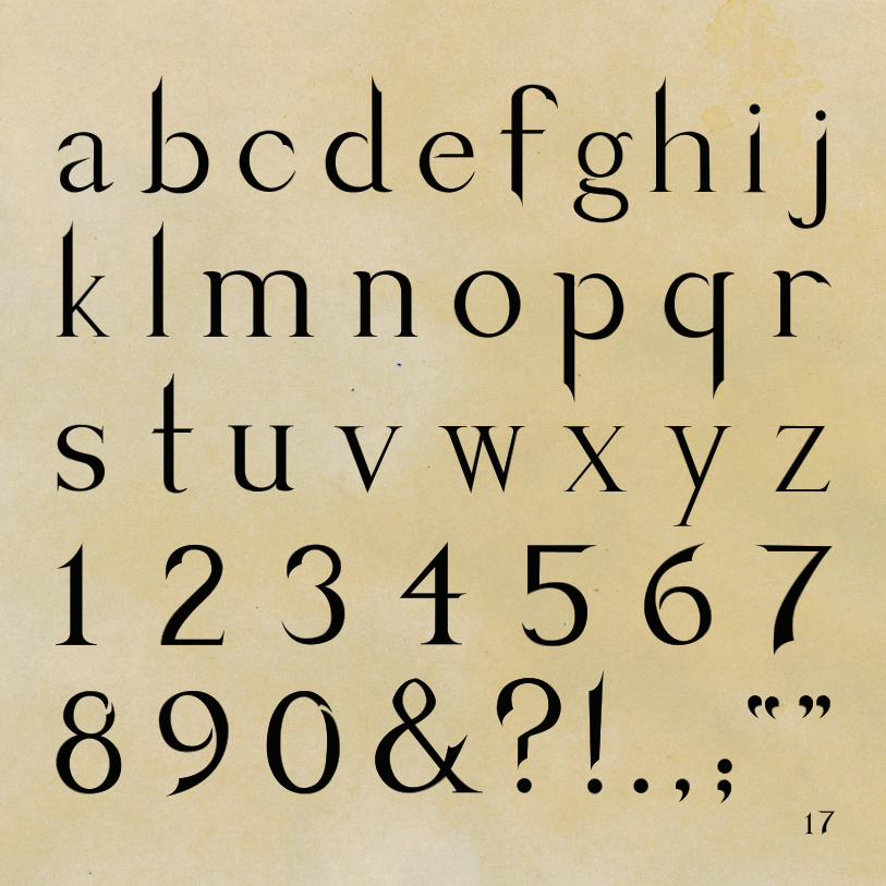
Matlack is a tribute to the men and women who sacrifeced all to ensure freedom for the United States of America. Inspired by the dauntless spirit that gave rise to the birth of a nation, Matlack is the newest historical typeface to be introduced to the design world. “Powerful,” and “savage yet genteel,” are only some of the descriptions being given to this one-of-a-kind design, which provides an unusual marriage of ferocity and eloquence. Whether for an elegant heading for a DAR luncheon invitation or for a battle re-enactment poster, Matlack is sure to grace your design with the history and prestige that makes America great.

By Emily Heinz
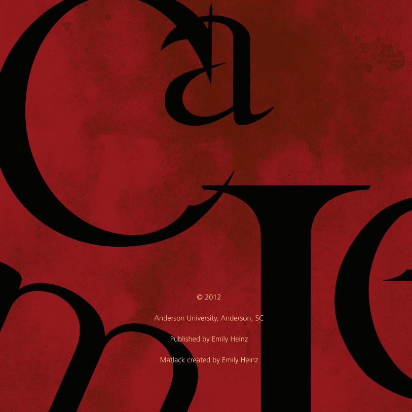
© 2012
Anderson University, Anderson, SC
Published by Emily Heinz
Matlack created by Emily Heinz

Making Headlines 2
Strategizing 4
To Arms 11
The Breakaway 13
The Process 14
Specimens 16

Aa Bb Cc Dd Ee Ff Gg
Adobe Caslon Pro
The quick, brown fox jumped over the lazy dog.

love of U.S. history drove my research to the era surrounding the American Revolution. After looking at several popular newspapers of the time
including the Pennsylvania Gazette, the New-York Mercury, and the Massachusettes Centinel, it came to my attention that nearly all of the newspapers of the time printed their body text and most of their headers exclusively
Matlack’s purpose would be to serve as headers in brochures and on signage at historical sites pertaining to the American Revolution such as Colonial Williamsburg.
®
in the typeface “Caslon” (as shown at the center left in the Boston News-Letter heading). Keeping this in mind, I wanted to design a distinct typeface that reflects the cause of the American Revolution while giving a nod to the type trend of the time. As with the current movement within the United States to retrurn to its roots and founding principles, I wanted to base my design on a traditional face.
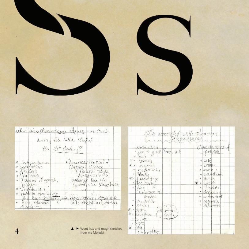
Word lists and rough sketches from my Moleskin

began my brainstorming process by writing down anything that could be considered “distinctly American in spirit.” To aid in this process, I made
lists of all the people, ideas, goals, and objects I could think of that are associated with the Revolution, which in turn lead to descriptive words. A few of these would included:
“military — rigid, strict, straight, disciplined, genteel;quills, swords, bayonets — long, slender, pointed, sharp.” I also practiced copying Caslon’s characters so as to better understand their forms and their respective parts. This practice also allowed me to experiment with stroke and serif weights.


Aa Bb CcAdobe Caslon Pro
Matlack

ust as we must look to the past in order that we might learn what course of action to take in the future, I thought it fitting to
take a typeface that has played a significant role in American history and give it a slightly modern flare without deviating drastically in favor of the modern. Adobe Caslon Pro is a version of the classic typeface, developed in 1990 by Carol Twombly. It is based on the original specimens by William Caslon from 1734 to 1770. This became the the basis for Matlack’s cap- and x-heights, and also served as the framework for my letterforms.
Adobe Caslon Pro
Matlack

— Patrick Henry, 1775
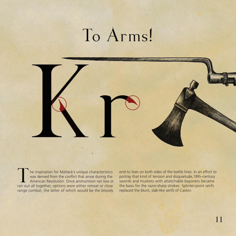
he inspiration for Matlack’s unique characteristics was derived from the conflict that arose during the American Revolution. Once ammunition ran low or
ran out all together, options were either retreat or close range combat, the latter of which would be the bloody
end to lives on both sides of the battle lines. In an effort to portray that kind of tension and disquietude,18th–century swords and muskets with attatchable bayonets became the basis for the razor-sharp strokes. Splinter-point serifs replaced the blunt, slab-like serifs of Caslon.
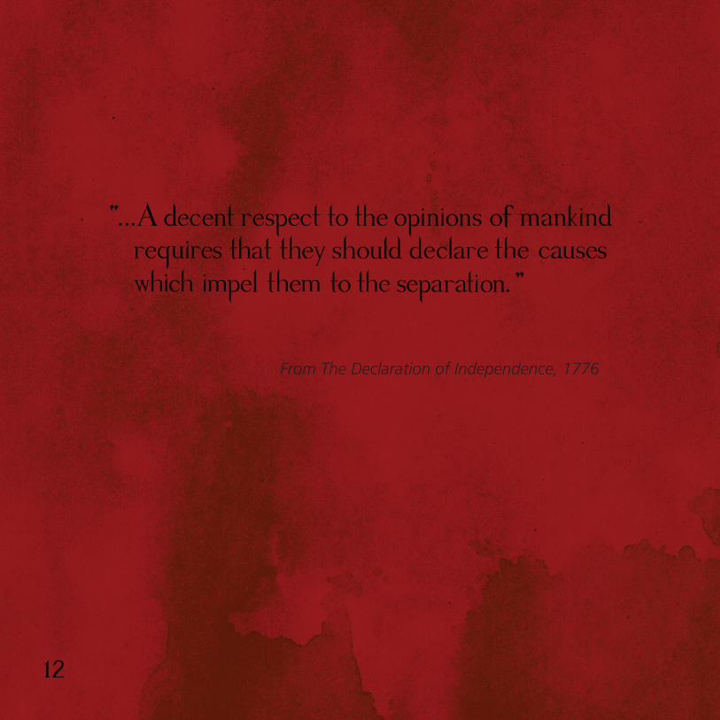
From The Declaration of Independence, 1776

“When in the course of human events it becomes necessary for one people to dissolve the political bands that have connected them with another and to assume among the powers of the earth, the separate and equal station to which the Laws of Nature and of Nature’s God entitle them, a decent respect to the opinions of mankind requires that they should declare the causes which impel them to the separation.”
Just as the American colonies broke away from their mother country, I chose to incorporate the idea of division into Matlack’s characters. By breaking a single stroke off of the main body of the letterform or creating a gap in a continuous stroke, I implied the severed ties between England and the states. Again, the sharp, pointed edges of the broken strokes create tension and suggest a violent separation.


Keeping all the aforementioned studies and details in mind, I set to work in order to create a highly emblematic set of characters. Each letterform went through a specific process from Moleskin sketch to vector character so as to establish a cohesive and “united” set.


original 1754 political cartoonby Benjamin Franklin