mapping scientific institutions
TRANSCRIPT

Mapping scientific institutions
Sebastian Grauwin • Pablo Jensen
Received: 4 May 2011� Akademiai Kiado, Budapest, Hungary 2011
Abstract We have developed a set of routines that allows to draw easily different maps
of the research carried out in a scientific institution. Our toolkit uses OpenSource elements
to analyze bibliometric data gathered from the Web Of Science. We take the example of
our institution, ENS de Lyon, to show how different maps, using co-occurrence (of authors,
keywords, institutions…) and bibliographic coupling can be built. These maps may
become a valuable tool for discussing institutions’ policies, as they offer different views on
the institution at a global scale.
Keywords Institutions � Maps � Heterogeneous � Governance
Introduction
Quantitative studies of science has developed methods and tools to better understand the
organization of scientific fields (Small 1999) and their evolution (Glanzel 2003; Chav-
alarias and Cointet 2009; Cambrosio et al. 2006). Global science maps (Small 1999;
Klavans and Boyack 2009; Small 1973; Borner and Scharnhorst 2009; Borner 2010;
Noyons 2004; Leydesdorff and Rafols 2009; Rafols and Leydesdorff 2010; Agarwal and
Skupin 2008; Cobo et al. 2011; Leydesdorff and Persson 2010) have become feasible
S. Grauwin � P. Jensen (&)Universite de Lyon, Lyon, Francee-mail: [email protected]
S. Grauwin � P. JensenInstitut des Systemes Complexes Rhone-Alpes (IXXI), Lyon, France
S. Grauwin � P. JensenLaboratoire de Physique, Ecole Normale Superieure de Lyon and UMR CNRS 5672,69007 Lyon, France
P. JensenLaboratoire d’Economie des Transports, Universite Lyon 2 and UMR CNRS 5593,69007 Lyon, France
123
ScientometricsDOI 10.1007/s11192-011-0482-y
recently, offering a tentative overall view of scientific fields and fostering dreams of a
‘‘science of science’’ (Borner and Scharnhorst 2009). In this article, we propose a more
modest but less explored mapping, that of single scientific institutions. The scope is to
achieve a global point of view on the institutions that no individual can have, in order to
understand their organization, their strong and weak points, the papers or authors that link
different Departments or disciplines... Such maps may become important as policy tools as
it is difficult to have such a global view of scientific institutions.
Recently, Rafols and Leydesdorff have suggested a simple way to picture the disci-
plinary weight of an institution (Rafols and Leydesdorff 2010). This method is rapid and
can be carried out online. As it uses Web of Science (http://apps.isiknowledge.com/)
‘‘subject categories’’ as relevant subdisciplines to project the data, it has the advantage of
enabling a comparison across different institutions or years. The drawback of this rigid
projection skeleton is that it preselects, without local information, the relevant commu-
nities. As acknowledged by Rafols and Leydesdorf (2010): ‘‘The two characteristics that
make overlay maps so useful for comparison, their fixed positional and cognitive cate-
gories, are also inevitably, their major limitations and a possible source of misreadings.
Since the position in the map is only given by the attribution in the disciplinary classifi-
cation, it does not say anything about the direct linkages between the nodes.’’
Here we propose different ways of mapping scientific institutions based on the articles
published with that address (and not the journals as in Rafols and Leydesdorff 2010). We
do not propose a real methodological innovation, but rather an approach (and a toolbox)
that allows to draw several maps of the chosen scientific institution. More specifically, we
show four different ways of mapping our institution, ENS de Lyon, and show how each of
these gives different information. Our scope is to display—in an accessible (but not too
simplistic) way—the institution’s complexity thus helping to generate discussions on its
policy among its scientists.
Methodology
Data extraction
The ‘‘Ecole normale superieure de Lyon’’ (ENS de Lyon), focused on Natural sciences,
was created in Lyon in 1987 after a move from Saint-Cloud in the suburbs of Paris. In
2010, it merged with the ‘‘Social sciences and Humanities’’ Ecole Normale Superieure.
Today, it gathers 350 researchers, 270 professors, 390 administrative and technical per-
sonnel and a budget of more than 110 million Euros. A simple query (performed in January
2011) in the ISI Web of Knowledge database (http://apps.isiknowledge.com/) yields 7,584
papers containing an ENS de Lyon address (mostly under the form ‘‘Ecole Normal Super
Lyon’’, but also ‘‘ENS-LYON’’ and ‘‘ENS de Lyon’’). We had access to the period
1899–2011. We have used all the available databases, namely (figures in [] refer to the
number of papers retrieved from that specific database) : Science Citation Index Expanded
[7,100], Social Sciences Citation Index (SSCI) [69], Arts and Humanities Citation Index
[74], Conference Proceedings Citation Index-Science (CPCI-S) [984], Conference Pro-
ceedings Citation Index-Social Science and Humanities (CPCI-SSH) [10], Index Chemicus
(IC) [93]. We save the ‘‘Full records’’ of all these articles, the records containing authors,
journal, year of publication, title, keywords (given by the authors and/or ISI Web of
Science), subjects, addresses (institutions, cities and countries), and the list of references of
the articles. It is well-known that Social sciences and Humanities (especially French ones)
S. Grauwin, P. Jensen
123
and, to a lesser degree, computer science, are not well represented in Web of Science.
Therefore, our maps mainly deal with the natural sciences at ENS de Lyon. We have also
noted that several publications from Computer Science are not retrieved from Web of
Science. Therefore, the interpretation of the results for this area should be taken with
caution.
Records are parsed and gathered in MySQL tables, which renders the handling of the
data more straightforward. Simple frequency analysis of the records allows to a get a first
global representation of the institution. Our method uses the relations present in the data
(Borner et al. 2003) to display different perspectives on the inner structure of an institution.
Bibliographic coupling
Links between articles are calculated through their common references. The bibliographic
coupling (BC) similarity between two articles i and j is defined as Kessler (1963):
xij ¼jRi \Rjjffiffiffiffiffiffiffiffiffiffiffiffiffiffiffi
jRijjRj
p
jð1Þ
where Ri is the set of references of article i.In comparison to co-citation link (which is the more usually used measure of articles
similarity), BC offers two advantages: it allows to map recent papers (which have not
yet been cited) and it deals with all published papers (whether cited or not). The reason
why weighted links are used is that they reinforce the dense (in terms of links per
article) regions of the BC networks. This reinforcement facilitates the partition of the
network into meaningful groups of cohesive articles, or communities. A widely used
criterion to measure the quality of a partition is the modularity function (Girvan and
Newman 2004; Fortunato and Barthelemy 2007), which is roughly is the number of
edges inside communities (as opposed to crossing between communities), minus the
expected number of such edges if the network were randomly produced. We compute
the graph partition using the efficient heuristic algorithm presented in Blondel et al.
(2008).
Applying the Louvain algorithm yields a partition of the network into communities (see
Fig. 2). Simple frequency analysis then allows to characterise each community through its
more frequent items (keywords, authors, etc…). The significativity r of the presence of a
given item into a community is computed by comparing its frequency f in the community
to its frequence f0 within the whole database. More precisely, we use the normalized
deviation
r ¼ffiffiffiffi
Np f � f0
ffiffiffiffiffiffiffiffiffiffiffiffiffiffiffiffiffiffiffi
f0ð1� f0Þp ð2Þ
where N is the total number of article in the database. The links between two com-
munities I and J can also be characterized qualitatively by analyzing their shared refer-
ences and quantitatively by computing the mean weight xIJ ¼\xij [ i2I;j2J .
The final step in order to create a representation of the BC communities network is to
choose a visualization algorithm. We use the Gephi software (Bastian et al. 2009). Gephi is
a intuitive and interactive software allowing, in which force-directed layout algorithms are
implemented. These algorithms produce a graph by simulating the dynamics of the net-
work as if it were a physical system (the nodes being charged particles and the edges
springs). The simulation is run until the system comes to an equilibrium state.
Mapping scientific institutions
123

Copublication coupling
The data can also be analyzed through more common approaches, such as coauthoring or
co-keyword analysis (Borner et al. 2003). For this, a list of all items (authors, keywords,
addresses) are taken from the records to obtain the nodes of our maps, whose size are
proportional to the number of articles in which they appear. Two nodes (items) i and j are
linked whenever the number nij of articles in which they both appear is non-zero. More
specifically, we use weighted links, where the co-occurrence normalized weight is chosen
as
wij ¼nijffiffiffiffiffiffiffiffi
ninjp ð3Þ
The visualization step of the produced maps is once again achieved through to Gephi
and its force-based layout algorithms.
Software available
We have developed a ‘‘Biblio Toolbox’’ which allows to draw the different maps presented
here. The toolbox needs access to Web of Science database but otherwise relies on
OpenSource software. It is available at our website (http://www.sebastian-grauwin.com/).
Gaining perspective on the ENS de Lyon
Statistical analysis
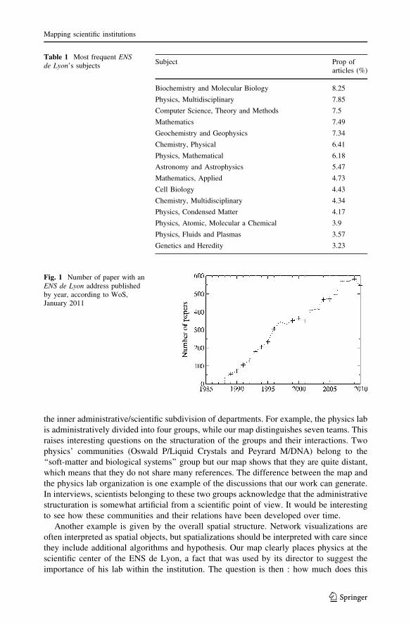
ENS de Lyon gathers a broad spectrum of scientific subjects (Table 1), mostly in the
natural sciences as discussed above. The institution has significantly grown over the last
20 years, as shown by its increasing production of papers (Fig. 1). The linear growth of the
number of published papers until 2000 is the effect of a combination of growing staff
numbers after the move from Paris and the progressive use of the new address. Our data
gathers 12,398 distinct authors, among which 952 have authored more than 5 papers. By
construction of the database, at least one author of each article is a member of ENS de
Lyon but this number also takes into account all the authors of the papers among whom
some may not be members of the ENS. ENS de Lyon collaborates with a broad range of
institutions of different countries as shown below.
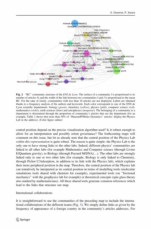
BC communities map
Figure 2 shows the map obtained with BC of articles and their grouping into ‘‘natural’’
subfields through modularity maximization. Each community is characterized by its most
frequent author and keyword. Table 2 displays an ‘‘ID card’’ for the community labelled
Hansen JP/MOLEC-DYNAMICS. This community gathers physicists interested in the
understanding of condensed matter using molecular dynamics simulations. The ‘‘ID Cards’’
of the other communities are available online on http://www.sebastian-grauwin.com.
What do we learn from this first map? First, note that the spatial organization of the
communities fits well with the scientific organization of ENS de Lyon in different
departments (different colors in Fig. 2). This confirms that BC can recover the scientific
organization of institutions. Interestingly, the precise community structure does not match
S. Grauwin, P. Jensen
123
the inner administrative/scientific subdivision of departments. For example, the physics lab
is administratively divided into four groups, while our map distinguishes seven teams. This
raises interesting questions on the structuration of the groups and their interactions. Two
physics’ communities (Oswald P/Liquid Crystals and Peyrard M/DNA) belong to the
‘‘soft-matter and biological systems’’ group but our map shows that they are quite distant,
which means that they do not share many references. The difference between the map and
the physics lab organization is one example of the discussions that our work can generate.
In interviews, scientists belonging to these two groups acknowledge that the administrative
structuration is somewhat artificial from a scientific point of view. It would be interesting
to see how these communities and their relations have been developed over time.
Another example is given by the overall spatial structure. Network visualizations are
often interpreted as spatial objects, but spatializations should be interpreted with care since
they include additional algorithms and hypothesis. Our map clearly places physics at the
scientific center of the ENS de Lyon, a fact that was used by its director to suggest the
importance of his lab within the institution. The question is then : how much does this
Table 1 Most frequent ENSde Lyon’s subjects
Subject Prop ofarticles (%)
Biochemistry and Molecular Biology 8.25
Physics, Multidisciplinary 7.85
Computer Science, Theory and Methods 7.5
Mathematics 7.49
Geochemistry and Geophysics 7.34
Chemistry, Physical 6.41
Physics, Mathematical 6.18
Astronomy and Astrophysics 5.47
Mathematics, Applied 4.73
Cell Biology 4.43
Chemistry, Multidisciplinary 4.34
Physics, Condensed Matter 4.17
Physics, Atomic, Molecular a Chemical 3.9
Physics, Fluids and Plasmas 3.57
Genetics and Heredity 3.23
Fig. 1 Number of paper with anENS de Lyon address publishedby year, according to WoS,January 2011
Mapping scientific institutions
123
central position depend on the precise visualization algorithm used? Is it robust enough to
allow for an interpretation and possibly orient governance? The forthcoming maps will
comment on this issue, but let us already note that the central position of the Physics Lab
within this representation is quite robust. The reason is quite simple: the Physics Lab is the
only one to have strong links to the other labs. Indeed, different physics’ communities are
linked to all other labs (for example Mathematics and Computer science (through Livine
E/Quantum gravity), to Biology (through Peyrard M/DNA)…). The other labs are strongly
linked only to one or two other labs (for example, Biology is only linked to Chemistry,
through Pichot C/Adsorption, in addition to its link with the Physics lab), which explains
their more peripheral position in the map. Therefore, the central position of the Physics lab
can tentatively be interpreted as its central position in terms of modelling tools (molecular
simulations tools shared with chemists for example), experimental tools (on ‘‘frictional
mechanics’’ with the geophysics lab for example) or theoretical concepts (spin glass theory
also studied by mathematicians). All these shared tools generate common references which
lead to the links that structure our map.
International collaborations
It is straightforward to use the communities of the preceding map to include the interna-
tional collaborations of the different teams (Fig. 3). We simply define links as given by the
frequency of appearance of a foreign country in the community’s articles addresses. For
Fig. 2 ‘‘BC’’ community structure of the ENS de Lyon. The surface of a community I is proportional to itsnumber of articles NI and the width of the link between two communities I and J is proportional to the meanBC. For the sake of clarity, communities with less than 10 articles are not displayed. Labels are obtainedthanks to a frequency analysis of the authors and keywords. Each color corresponds to one of the ENS deLyon scientific departments: biology (green), chemistry (yellow), physics (pink), computer science (red),mathematics (violet), earth sciences (blue) and astrophysics (turquoise). The belonging of a community to adepartment is determined through the proportion of community’s articles that use the department (for anexample, Table 2 shows that more than 50% of ‘‘HansenJP/Molec-Dynamics’’ articles’ display the PhysicsLab in the address). (Color figure online)
S. Grauwin, P. Jensen
123

Table 2 Community ‘‘ID Card’’
Institution Prop r Authors Nb authored paper
Ecole Normale Super Lyon 0.766 0.19 Hansen JP 55
Phys Lab 0.543 26.29 Barrat JL 40
CNRS 0.508 1.95 Bocquet L 38
UMR 5672 0.133 10.52 Ciliberto S 38
Univ Lyon 0.111 1.33 Geminard JC 24
Dept Phys 0.076 6.73 Holdsworth PCW 22
Univ Lyon 1 0.075 -3.41 Alastuey A 21
ENS Lyon 0.073 -1.47 Charlaix E 20
Phys Theor Lab 0.073 12.21 Dong W 20
CECAM 0.065 15.67 Cornu F 19
Subject Prop r Countries Nb coll paper
Physics, Multidisciplinary 0.27 16.7 France 704
Physics, Mathematical 0.254 18.67 USA 89
Physics, Fluids & Plasmas 0.16 15.77 Italy 47
Physics, Condensed Matter 0.128 10.09 England 37
Physics, Atomic, Molecular & Chemical 0.117 9.42 Germany 35
Chemistry, Physical 0.098 3.3 Netherlands 25
Materials Science, Multidisciplinary 0.069 6.25 Poland 25
Mechanics 0.065 6.7 Switzerland 23
Physics, Applied 0.064 9.03 Japan 20
Polymer Science 0.042 3.15 Chile 15
Keyword Prop r Refs Times used
Dynamics 0.135 14.03 Hansen JP, 1986, Theory Simple Liquid 60
Systems 0.117 13.65 Cugliandolo LF, 1997, Phys Rev E 37
Model 0.104 9.9 Cugliandolo LF, 1993, Phys Rev Lett 34
Molecular-Dynamics 0.053 10.41 Kosterlitz JM, 1973, J Phys C Solid State 25
Behavior 0.043 6.65 Gotze W, 1992, Rep Prog Phys 22
Transition 0.042 6.12 Bouchaud JP, 1998, Spin Glasses Random 22
Fluids 0.04 12.14 Jaeger HM, 1996, Rev Mod Phys 22
Relaxation 0.038 7.27 Alastuey A, 1989, Phys Rev A 21
Flow 0.038 6.96 Frenkel D, 2002, Understanding Mol SI 18
Monte-Carlo 0.036 12.65 Grigera TS, 1999, Phys Rev Lett 18
Journal Prop r Refs (journals) Times used
Physical Review E 0.155 19.32 Phys Rev Lett 1709
Physical Review Letters 0.095 11.28 J Chem Phys 1406
Journal of Chemical Physics 0.067 13.92 Phys Rev B 480
Europhysics Letters 0.058 11.24 Phys Rev E 408
Journal of Physics—Condensed Matter 0.043 11.22 Phys Rev A 399
Journal of Statistical Physics 0.038 9.18 Europhys Lett 353
European Physical Journal B 0.029 6.78 Phys Rev E 1 343
Mapping scientific institutions
123

example, the strongest link is obtained for the Astrophysics papers, for which 41% of
the papers are written in collaboration with a USA institution. The map shows that
some groups rely heavily on many international collaborations (Emsley L/RMN has strong
links with England, Italy and USA), while others are strongly linked to a single country
(Dauxois T/Long range inter, to Italy) and others have mainly French collaborations
(Oswald P/Liquid crystals).
Co-keywords, co-authors and heterogeneous maps
We now turn to more traditional maps, obtained by co-occurrence of keywords or authors
in articles. Figure 4 shows the co-keywords map obtained by using Web of Science and
authors’ keywords. One should be cautious since some terms are cleary polysemic
(‘‘evolution’’, ‘‘particles’’…) and create links between subdisciplines which are not very
relevant. However, it is clear that physics is no longer at the center of the map. Instead,
Fig. 3 International collaborations of the communities. The size of the nodes correspond to the number ofarticles in each community which imply a collaboration with a foreign country. We only keep countriesappearing in more than 10 articles and links corresponding to more than 3% of the articles implying acollaboration with the linked country. The width of the links is proportional to the proportion of linkedarticles
Table 2 continued
Journal Prop r Refs (journals) Times used
Journal of Statistical Mechanics—Theory and Experiment
0.027 8.39 J Stat Phys 310
Physical Review B 0.023 2.1 Nature 286
Journal of Physical Chemistry B 0.021 4.36 Physica A 276
The community Hansen JP/MOLEC-DYNAMICS contains N = 547 articles. Its average internal link weightis \xin[^ 1/223 (roughly, two random articles within the community share 1 reference over 223)
S. Grauwin, P. Jensen
123

‘‘crystal-structure’’ links chemistry (top left) with biology (right), ‘‘growth’’ links biology
to physics and ‘‘transition’’ and ‘‘dynamics’’ link chemistry to physics (left). Another
significant difference : what appeared to be a coherent whole when investigated through
BC (the ‘‘Albarede F/Geodynamics’’ community) turns out to split into geochemistry
(bottom of Fig. 4) and geophysics (just up of the latter, close to physics, with keywords as
‘‘high-temperatures’’ or ‘‘high-pressures’’).
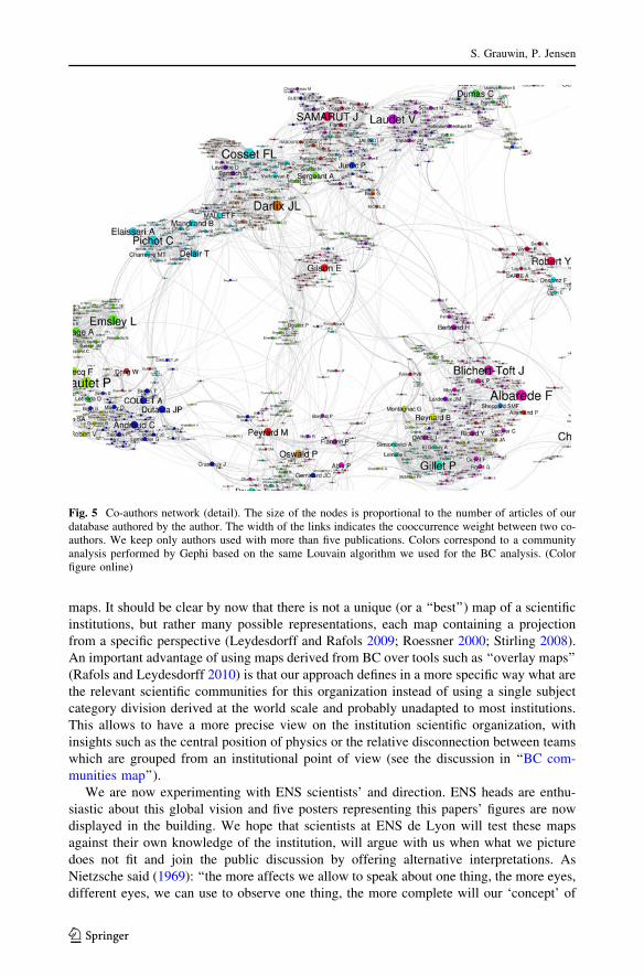
Figure 5 displays a co-author map. This represents an accessible way of showing data to
the institutions’ scientists, since names are usually well-known by the community. It also
represents a good way to tap into directors’ previous knowledge of the institution. How-
ever, coauthorship indicates quite a different (and stronger) link from the link established
by sharing references (as in BC). This is visible in Fig. 5 which does not show many links
across disciplines (and some of the links are actually homonyms, such as Bertin E). The
main co-publication link arises from collaborations between a biophysics lab and computer
simulations of biological molecules (Peyrard/Bouvet/Gilson).
To improve over the limitations of both co-keyword and co-author analysis and gather
most of the available information in a single map, it is possible to include all the co-
occurrences between keywords, authors and institutions. Figure 6 shows the map obtained
for the ENS de Lyon. It displays the connecting role of a physics-biology interdisciplinary
lab (Lab Joliot Curie, center right). One can also see that, while the CNRS plays an
important an central role, other institutions collaborate on more specialized subfields (for
example Univ California, Berkeley, lower left).
Discussion, conclusions
Our aim in this paper was to present a toolbox to map institutions and to show on the
example of our institution, ENS de Lyon, what kind of insights can be derived from these
Fig. 4 Co-keywords Network. The size of the nodes is proportional to the number of times a keyword is used inour database. The width of the links indicates the cooccurrence weight between two keywords in the samearticle. We keep only keywords used in more than 10 publications. Colors correspond to a community analysisperformed by Gephi based on the same Louvain algorithm used for the BC analysis. (Color figure online)
Mapping scientific institutions
123
maps. It should be clear by now that there is not a unique (or a ‘‘best’’) map of a scientific
institutions, but rather many possible representations, each map containing a projection
from a specific perspective (Leydesdorff and Rafols 2009; Roessner 2000; Stirling 2008).
An important advantage of using maps derived from BC over tools such as ‘‘overlay maps’’
(Rafols and Leydesdorff 2010) is that our approach defines in a more specific way what are
the relevant scientific communities for this organization instead of using a single subject
category division derived at the world scale and probably unadapted to most institutions.
This allows to have a more precise view on the institution scientific organization, with
insights such as the central position of physics or the relative disconnection between teams
which are grouped from an institutional point of view (see the discussion in ‘‘BC com-
munities map’’).
We are now experimenting with ENS scientists’ and direction. ENS heads are enthu-
siastic about this global vision and five posters representing this papers’ figures are now
displayed in the building. We hope that scientists at ENS de Lyon will test these maps
against their own knowledge of the institution, will argue with us when what we picture
does not fit and join the public discussion by offering alternative interpretations. As
Nietzsche said (1969): ‘‘the more affects we allow to speak about one thing, the more eyes,
different eyes, we can use to observe one thing, the more complete will our ‘concept’ of
Fig. 5 Co-authors network (detail). The size of the nodes is proportional to the number of articles of ourdatabase authored by the author. The width of the links indicates the cooccurrence weight between two co-authors. We keep only authors used with more than five publications. Colors correspond to a communityanalysis performed by Gephi based on the same Louvain algorithm we used for the BC analysis. (Colorfigure online)
S. Grauwin, P. Jensen
123

this thing, our ‘objectivity’ be’’. The point is that although everybody acknowledges that
maps are only representations and not the real thing, maps affect how we think about the
institution (Wood and Fels 2008).
We hope that our toolbox will lead other scientists to build maps of their own insti-
tutions, thus fostering ongoing dialogue and praxis in the institution. Future work includes
preparing different maps for successive time periods, in order to grasp the evolution of the
institution, and collaboration with other institutions (such as CNRS and CEMAGREF)
which are interested in such global maps.
References
Agarwal, P., & Skupin, A. (Eds.) (2008). Self-organising maps: Applications in geographic informationscience. Chichester: Wiley.
Bastian, M., Heymann, S., & Jacomy, M. (2009). Gephi: An open source software for exploring andmanipulating networks. Proc 3rd Intl ICWSM Conf.
Fig. 6 Heterogeneous network, mixing authors, keywords and institutions. The size of the labels isproportional to the number of articles of our database in which an item appear (we keep only items used inmore than 20 publications). The width of the links indicates the cooccurrence weight between two items (wekept only links with a co-occurrence weight x[ 0.1). Colors correspond to the type of the items (authors inblack, keywords in blue and institutions in red). (Color figure online)
Mapping scientific institutions
123

Blondel, V. D., Guillaume, J.-L., Lambiotte, R., & Lefebvre, E. (2008). Fast unfolding of communities inlarge networks. Journal of Statistical Mechanics, P10008.
Borner, K. (2010). Atlas of science: visualizing what we know. Cambridge, MA: MIT PressBorner, K., & Scharnhorst, A. (2009). Visual conceptualizations and models of science. Journal of Infor-
metrics, 3, 161–172.Borner, K., Chen, Ch., & Boyack, K. (2003). Visualizing knowledge domains. Annual Review of Infor-
mation Science and Technology, 37, 179–255.Cambrosio, A., Keating, P., Mercier, S., Lewison, G., & Mogoutov, A. (2006). Mapping the emergence and
development of translational cancer research. European Journal of Cancer, 42, 3140–3148.Chavalarias, D., & Cointet, J.-P. (2009). The reconstruction of science phylogeny, arXiv:0904.3154v3.Cobo, M. J., Lopez-Herrera, A. G., Herrera-Viedma, E., & Herrera, F. (2011). Science mapping software
tools: Review, analysis, and cooperative study among tools. Journal of the American Society forInformation Science Technology, 62, 1382–1402.
Fortunato, S., & Barthelemy, M. (2007). Resolution limit in community detection. Proceedings of theNational Academy of Science of United States of America, 104, 36–41.
Girvan, M., & Newman, M. E. J. (2004). Finding and evaluating community structure in networks. Phys RevE, 69, 026113.
Glanzel, W. (2003). Bibliometrics as a research field: A course on theory and application of bibliometricindicators. http://nsdl.niscair.res.in/bitstream/123456789/968/1/Bib_Module_KUL.pd.
Kessler, M. M. (1963). Bibliographic coupling between scientific papers. American Documentation, 24,123–131.
Klavans, R., & Boyack, K. W. (2009). Toward a consensus map of science. Journal of American Society ofInformation Science and Technology, 60(3), 455–476.
Leydesdorff, L., & Persson, O. (2010). Mapping the geography of science: Distribution patterns and net-works of relations among cities and institutes. Journal of the American Society for Information Science& Technology, 61(8), 1622–1634.
Leydesdorff, L., & Rafols, I. (2009). A global map of science based on the ISI subject categories. Journal ofthe American Society for Information Science Technology, 60(2), 348–362.
Nietzsche, F. (1969). On the genealogy of morals. New York: Vintage Books (cited by Flyvbjerg B, Makingsocial science matter. Cambridge University Press).
Noyons, E. C. M. (2004). Science maps within a science policy context. In: H. F. Moed, W. Glanzel, & U.Schmoch (Eds.), Handbook of quantitative science and technology research, the use of publication andpatent statistics in studies of ST systems (pp. 237–256). Dordrecht: Kluwer Academic publishers.
Rafols, I., & Leydesdorff, L. (2010). Science overlay maps: A new tool for research policy and librarymanagement. Journal of the American Society for Information Science Technology, 61(9), 1871–1887.
Roessner, D (2000). Quantitative and qualitative methods and measures in the evaluation of research.Research Evaluation, 9(2), 125–132.
Small, H. (1973). Co-citation in the scientific literature: A new measure of the relationship between twodocuments. Journal of the American Society for Information Science, 24, 265–269.
Small, H. (1999). Visualizing science by citation mapping. Journal of American Society of InformationScience, 50(9), 799–813.
Stirling, A. (2008). ‘‘Opening up’’ and ‘‘Closing down’’: Power, participation, and pluralism in the socialappraisal of technology. Science, Technology and Human Values, 33(2), 262–294.
Wood, D., & Fels, J. (2008). The natures of maps: Cartographic constructions of the natural world.Chicago, IL: University of Chicago Press.
S. Grauwin, P. Jensen
123