magento responsive theme design - packt · magento responsive theme design . richard carter ....
TRANSCRIPT
Magento Responsive Theme Design
Richard Carter
Chapter No. 2 "Making Your Store Responsive"

In this package, you will find: A Biography of the author of the book
A preview chapter from the book, Chapter NO.2 "Making Your Store Responsive"
A synopsis of the book’s content
Information on where to buy this book
About the Author Richard Carter is a web designer and frontend web developer based in Newcastle upon Tyne in the North East of England.
His experience includes many open source e-commerce and content management systems, including Magento, MediaWiki, WordPress, and Drupal. He has worked with clients including the University of Edinburgh, University College Dublin, Directgov, NHS Choices, and BusinessLink.gov.uk.
He is a creative director at Peacock Carter Ltd (peacockcarter.co.uk), a web design and development agency based in the North East of England. He graduated from the University of Durham in Software Engineering, and currently lives in Newcastle upon Tyne. He blogs at earlgreyandbattenburg.co.uk and tweets as @RichardCarter and @PeacockCarter.
For More Information: www.packtpub.com/magento-responsive-theme-design/book

This is his sixth book. He has previously written MediaWiki Skins Design, Magento 1.3 Theme Design, Magento 1.4 Theme Design, Joomla! 1.5 Templates Cookbook, and The Beginner's Guide to Drupal Commerce, and acted as a technical reviewer on MediaWiki 1.1 Beginners Guide, Inkscape 0.48 Illustrator's Cookbook, and Apress' The Definitive Guide To Drupal 7.
In particular, my thanks are due to Matthew, who has kept Peacock Carter on track while I've focused on the book! Thanks also to my family and friends, whose constant support is much appreciated.
For More Information: www.packtpub.com/magento-responsive-theme-design/book
Magento Responsive Theme Design E-commerce has changed drastically in the last few years, with the need for stores to provide a realistic interface for both mobile and desktop users becoming increasingly important.
Responsive design is one approach to this requirement, and this book begins to help you uncover how you can apply responsive web design techniques within Magento.
What This Book Covers Chapter 1, Beginning a Responsive Magento Theme, begins building your new responsive Magento theme and installing it on your Magento store.
Chapter 2, Making Your Store Responsive, adds to what you started in the previous chapter, dealing with Magento-specific pages from product pages to category listings.
Chapter 3, Responsive Checkout and Cart in Magento, looks at the Magento cart and checkout in more detail to address key issues customers are likely to have during the order process.
Chapter 4, Enhancing Your Responsive Magento Theme, adds some improvements to your new theme to improve your customers' experiences.
For More Information: www.packtpub.com/magento-responsive-theme-design/book

Making Your Store Responsive
So, you've now got the basics of your responsive Magento theme up and running, but there's still plenty to do! This chapter covers:
• Laying out your website's header and footer• Responsive product page layout• Dealing with product images for multiple devices• Responsive category page layout• Creating a responsive search results page
Laying out your website's header and footerThe previous chapter covered some minimal layout, and now you can start altering the appearance of your Magento theme's header and footer to provide a more intuitive format for the content in them.
For More Information: www.packtpub.com/magento-responsive-theme-design/book
Making Your Store Responsive
[ 38 ]
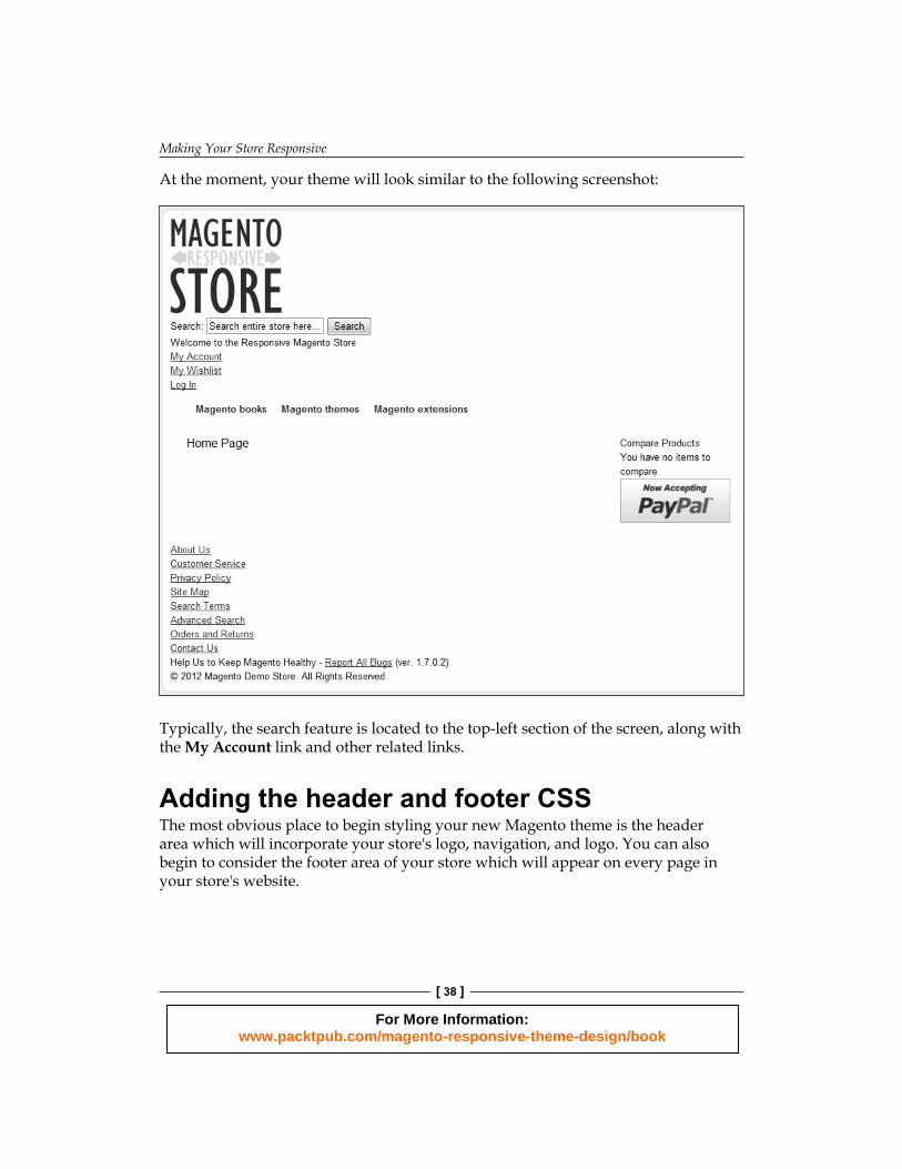
At the moment, your theme will look similar to the following screenshot:
Typically, the search feature is located to the top-left section of the screen, along with the My Account link and other related links.
Adding the header and footer CSSThe most obvious place to begin styling your new Magento theme is the header area which will incorporate your store's logo, navigation, and logo. You can also begin to consider the footer area of your store which will appear on every page in your store's website.
For More Information: www.packtpub.com/magento-responsive-theme-design/book

Chapter 2
[ 39 ]
Open your theme's styles.css fi le in the skin/frontend/default/responsive/css directory and add the following CSS outside any media queries (so that it will be used by all devices):
.breadcrumbs li { color: #777;display: inline;}.breadcrumbs a { color:#777;}
.quick-access { color: #777; text-align: right;}.quick-access a { color: #777;}.nav-container { clear: both;}
This provides styling to the breadcrumbs and search feature, which are key components of your ecommerce store in helping customers fi nd what they're looking for.
Adding CSS for larger screensNext, you will need to add some further CSS to ensure it behaves as you'd expect on larger screens, so in the desktop media query in the styles.css fi le, add the following CSS code:
@media only screen and (min-width: 50em) { .logo { float: left; }/* Your other CSS */}
For More Information: www.packtpub.com/magento-responsive-theme-design/book

Making Your Store Responsive
[ 40 ]
If you now review the frontend of your Magento store, you will see things look neater, similar to the following screenshot:
Adding CSS to change header and footer linksYou can add the following CSS to your theme's styles.css fi le (outside any media queries again) to change the links in the top-right corner of the screen to display alongside each other:
.quick-access .links { list-style-type: none;}.quick-access .links li { display: inline;}
You can treat the links in the footer of your Magento theme similarly, by adding the following relevant classes to the preceding CSS code:
.quick-access .links,
.footer ul { list-style-type: none;}.quick-access .links li,.footer ul li { display: inline;}
For More Information: www.packtpub.com/magento-responsive-theme-design/book
Chapter 2
[ 41 ]
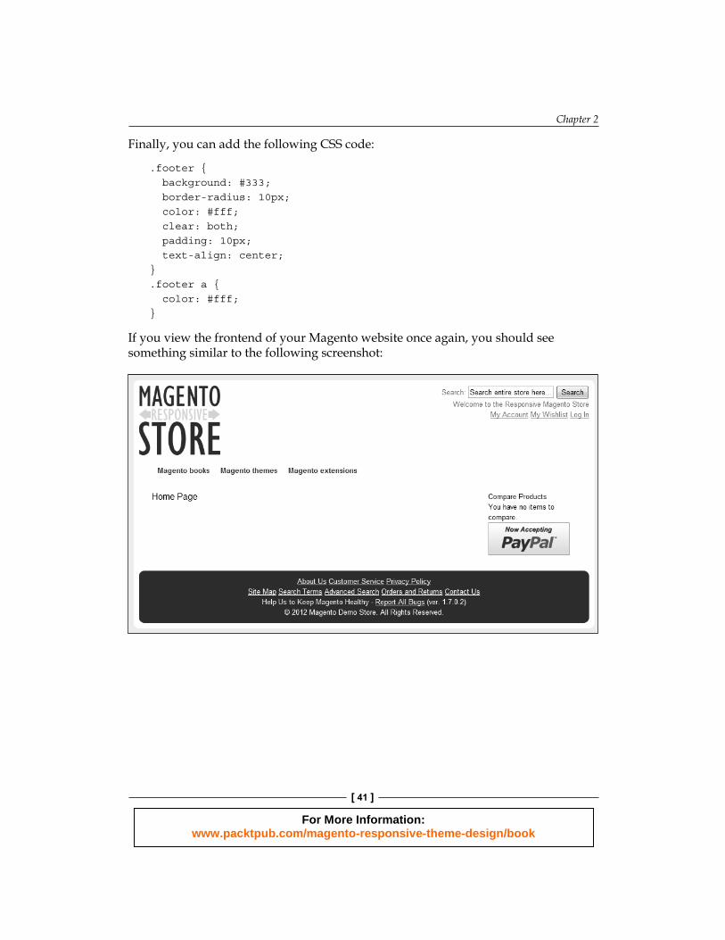
Finally, you can add the following CSS code:
.footer { background: #333; border-radius: 10px; color: #fff; clear: both; padding: 10px; text-align: center;}.footer a { color: #fff;}
If you view the frontend of your Magento website once again, you should see something similar to the following screenshot:
For More Information: www.packtpub.com/magento-responsive-theme-design/book

Making Your Store Responsive
[ 42 ]
Responsive product page layout in MagentoOne of the key features of any ecommerce website is the product pages, and effort invested here can pay dividends on responsive websites. Ensure you have products added to your Magento store, and navigate to view one of your product pages. At the moment, it will look similar to the product page in the following screenshot on tablets and desktop computers:
For More Information: www.packtpub.com/magento-responsive-theme-design/book

Chapter 2
[ 43 ]
Laying out the product image and product informationThe desired layout for a product page is typically with the primary product image to be displayed next to the product name, price, and description. To achieve this, you will need to copy the app/design/frontend/base/default/template/catalog/product/view.phtml fi le to the app/design/frontend/default/responsive/template/catalog/product/view.phtml fi le, and edit this fi le to add a class named col-half here:
<div class="product-shop col-half"><div class="product-name"> <h1><?php echo $_helper->productAttribute($_product, $_product->getName(), 'name') ?></h1></div>
In the same fi le, add the following class to the <div> tag that contains the product image:
<div class="product-img-box col-half"> <?php echo $this->getChildHtml('media') ?></div>
The fi nal step here is to defi ne some CSS for this class, so open your theme's styles.css fi le once more, and insert the following CSS highlighted in the following code within the media query:
.col-main,
.col-left,
.col-right,
.col-wrapper,
.col-half { display: inline; margin: 1%; padding: 2%;}.col-left, .col-right, .col-wrapper, .col2-right-layout .col-main,.col-half { float: left;}.col-half { width: 44%;
For More Information: www.packtpub.com/magento-responsive-theme-design/book

Making Your Store Responsive
[ 44 ]
}.col1-layout .col-main { float: none; width: 94%;}
If you now preview your Magento store's frontend again, you should see the product page now looks more useful than before, as shown in the following screenshot:
Making a defi nitive styleWith a little more CSS, you can provide a more defi nitive style for the important elements of the product page outside of the media queries you have created in your styles.css fi le:
.add-to-box { background: #fff9de; border-radius: 10px;
For More Information: www.packtpub.com/magento-responsive-theme-design/book

Chapter 2
[ 45 ]
margin: 20px 0; padding: 10px;}.btn-cart { background: #fc0; border: none; border-bottom: 3px #edbe00 solid; border-radius: 10px; color: #333; font-weight: bold; padding: 2px 5px;}.regular-price { font-size: 150%;}.add-to-links li { display: inline;}
Your product page should now look similar to the following screenshot:
For More Information: www.packtpub.com/magento-responsive-theme-design/book
Making Your Store Responsive
[ 46 ]
Responsive category page layoutThe category page, which lists related products, is a core component of many ecommerce websites. A well-designed category page allows your customers to fi nd the product they're looking for more easily, and this is especially important when considering both mobile and desktop users viewing the same responsive page.
Magento provides two methods for your customers to view products:
• List view: In this view, products are displayed one under the other• Grid view: In this view, products are displayed in rows across the page, and
then down the page
Before you begin with the category page, ensure that you have a number of products and categories added to your Magento store.
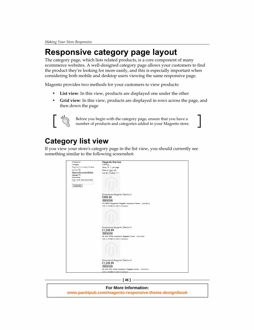
Category list viewIf you view your store's category page in the list view, you should currently see something similar to the following screenshot:
For More Information: www.packtpub.com/magento-responsive-theme-design/book
Chapter 2
[ 47 ]
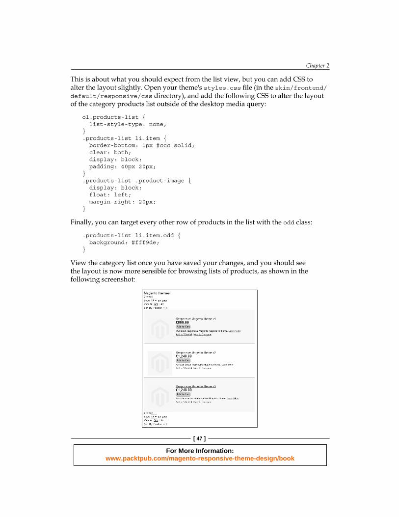
This is about what you should expect from the list view, but you can add CSS to alter the layout slightly. Open your theme's styles.css fi le (in the skin/frontend/default/responsive/css directory), and add the following CSS to alter the layout of the category products list outside of the desktop media query:
ol.products-list { list-style-type: none;}.products-list li.item { border-bottom: 1px #ccc solid; clear: both; display: block; padding: 40px 20px;}.products-list .product-image { display: block; float: left; margin-right: 20px;}
Finally, you can target every other row of products in the list with the odd class:
.products-list li.item.odd { background: #fff9de;}
View the category list once you have saved your changes, and you should see the layout is now more sensible for browsing lists of products, as shown in the following screenshot:
For More Information: www.packtpub.com/magento-responsive-theme-design/book

Making Your Store Responsive
[ 48 ]
Product pager, pagination, and sort by dropdownAs you can see, the tools that control how many products are displayed, and how they are ordered, aren't yet styled, as shown in the following screenshot:
You can control how many products are displayed in the Magento's administration panel by navigating to System | Confi guration | Catalog | Frontend.
In the styles.css fi le, you can defi ne the following generic style outside the desktop media query:
.toolbar { clear: both;}.pager, .sorter { background: #fff9de; border-radius: 10px; margin: 10px; padding: 10px;}.pager li { display: inline; padding: 10px;}
Next, copy the base/default/template/catalog/product/list/toolbar.phtml fi le to the default/responsive/template/catalog/product/list directory, and open it for editing, adding the col-half class to the pager fi rst:
<div class="pager col-half">
Next, add the col-half class to the sorter's <div> tag:
<div class="sorter col-half">
For More Information: www.packtpub.com/magento-responsive-theme-design/book
Chapter 2
[ 49 ]
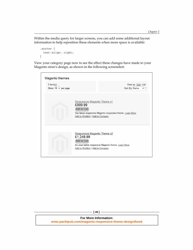
Within the media query for larger screens, you can add some additional layout information to help reposition these elements when more space is available:
.sorter { text-align: right;}
View your category page now to see the effect these changes have made to your Magento store's design, as shown in the following screenshot:
For More Information: www.packtpub.com/magento-responsive-theme-design/book

Making Your Store Responsive
[ 50 ]
On smaller screens, the sorter and pager blocks will be displayed above and below, rather than alongside each other, as shown in the following screenshot:
Category grid viewBoth Magento's list and grid view HTML are defi ned within the same fi le, so begin by copying the fi le at app/design/frontend/base/default/template/catalog/product/list.phtml to the app/design/frontend/default/responsive/template/catalog/product directory. Edit the fi le, and add the col-half class to each of the list items (<li>):
<?php if ($i++%$_columnCount==0): ?><ul class="products-grid"><?php endif ?><li class="col-half item<?php if(($i-1)%$_columnCount==0): ?> first<?php elseif($i%$_columnCount==0): ?> last<?php endif; ?>">
For More Information: www.packtpub.com/magento-responsive-theme-design/book

Chapter 2
[ 51 ]
View the category page on the frontend of your Magento store now, ensuring you are seeing the products in the Grid mode, as shown in the following screenshot:
That's it: you now have a very simple responsive layout for your Magento store's category grid view!
For More Information: www.packtpub.com/magento-responsive-theme-design/book

Making Your Store Responsive
[ 52 ]
Dealing with Magento search results responsivelySearch is another important component of your ecommerce website. By styling the category grid and category list for products in the preceding section, you have made a good start on styling the search results in Magento, which make use of the same template(s) by default. Try searching for some of your products to bring up some search results to demonstrate this, as shown in the following screenshot:
Can't see any results despite having added products to your Magento store? Try these tips: clear the search indexes by navigating to System | Index Management, and ensure your products are in stock and have a positive quantity assigned to them, if you have turned Magento's stock management feature on.
You can give more space to your Magento store's search results by assigning the one column layout to this page. Open your theme's local.xml fi le in the /app/design/frontend/default/responsive/layout directory.
For More Information: www.packtpub.com/magento-responsive-theme-design/book
Chapter 2
[ 53 ]
Resizing product imagesThis may be okay for your store, but you may want to ensure that the product images—an important element in these pages to encourage customers to view (and hopefully purchase) products from your store—are large enough to fi ll the width of screen available to them. To do this, revisit your theme's list.phtml fi le in the /app/design/frontend/default/responsive/template/catalog/product/ directory and fi nd an instance of the product image in it (which should look similar to the following code):
<a href="<?php echo $_product->getProductUrl() ?>" title=" <?php echo $this->stripTags($this->getImageLabel ($_product, 'small_image'), null, true) ?>" class="product-image"><img src="<?php echo $this->helper('catalog/image')->init ($_product, 'small_image')->resize(135); ?>" width="135" height="135" alt="<?php echo $this->stripTags($this-> getImageLabel($_product, 'small_image'), null, true) ?>" /></a>
This appears twice: once in the code for the list view, and once for the grid view. Make sure you fi nd both instances of the product image in this fi le!
The size of the image is defi ned three times in the preceding code snippet, and this is what you will need to change to alter the dimensions of product images in your category pages. The value you change this to will depend on the maximum size that the product image is likely to appear in your responsive Magento theme: the maximum size of the store is set in the following code snippet using the CSS's max-width property. As such, the following example changes the image's dimensions to a height and width of 200 pixels:
<a href="<?php echo $_product->getProductUrl() ?> " title="<?php echo $this->stripTags($this->getImageLabel ($_product, 'small_image'), null, true) ?>" class="product-image"><img src="<?php echo $this->helper('catalog/image')->init ($_product, 'small_image')->resize(200); ?>" alt="<?php echo $this->stripTags($this->getImageLabel ($_product, 'small_image'), null, true) ?>" /></a>
For More Information: www.packtpub.com/magento-responsive-theme-design/book
Making Your Store Responsive
[ 54 ]
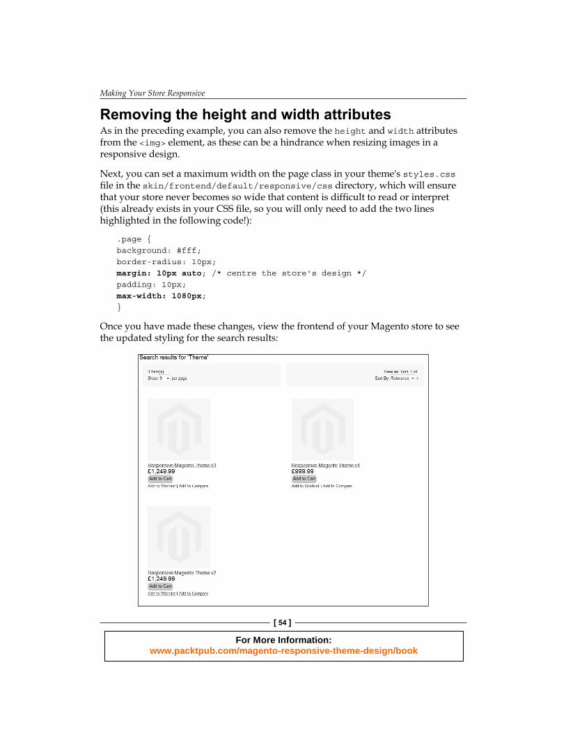
Removing the height and width attributesAs in the preceding example, you can also remove the height and width attributes from the <img> element, as these can be a hindrance when resizing images in a responsive design.
Next, you can set a maximum width on the page class in your theme's styles.css fi le in the skin/frontend/default/responsive/css directory, which will ensure that your store never becomes so wide that content is diffi cult to read or interpret (this already exists in your CSS fi le, so you will only need to add the two lines highlighted in the following code!):
.page {background: #fff;border-radius: 10px;margin: 10px auto; /* centre the store's design */padding: 10px;max-width: 1080px;}
Once you have made these changes, view the frontend of your Magento store to see the updated styling for the search results:
For More Information: www.packtpub.com/magento-responsive-theme-design/book

Chapter 2
[ 55 ]
As you resize your browser's window, the CSS in your theme's styles.css fi le which you defi ned earlier, applies max-width: 100% to the <img> element and ensures that the image is always resized to, at most, the width of the container (highlighted in red the following screenshot):
Some desktop browsers don't support media queries, though modern browsers such as Firefox, Chrome, Opera, and Safari do. See for http://caniuse.com/css-mediaqueries for native browser support of media queries.
For More Information: www.packtpub.com/magento-responsive-theme-design/book
Making Your Store Responsive
[ 56 ]
SummaryIn this chapter, you have begun to develop your responsive Magento theme more deeply, concentrating on the Magento's category and product page templates. Specifi cally, by now you will have:
• Customized the general look and feel of your store's header and footer areas• Added support for a responsive product page layout• Dealt with product images in a basic manner to accommodate your
responsive design• Updated your Magento store's responsive category page layout template
The next chapter looks at customizing your Magento store's cart and checkout areas responsively.
For More Information: www.packtpub.com/magento-responsive-theme-design/book

Where to buy this book You can buy Magento Responsive Theme Design from the Packt Publishing website: http://www.packtpub.com/magento-responsive-theme-design/book. Free shipping to the US, UK, Europe and selected Asian countries. For more information, please read our shipping policy.
Alternatively, you can buy the book from Amazon, BN.com, Computer Manuals and most internet book retailers.
www.PacktPub.com
For More Information: www.packtpub.com/magento-responsive-theme-design/book