mag1coveranalyse
DESCRIPTION
ÂTRANSCRIPT
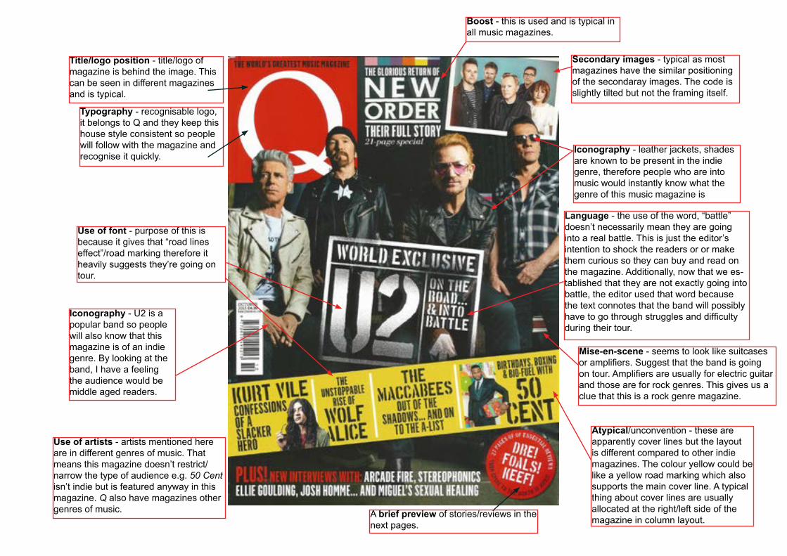
Mise-en-scene - seems to look like suitcases or amplifiers. Suggest that the band is going on tour. Amplifiers are usually for electric guitar and those are for rock genres. This gives us a clue that this is a rock genre magazine.
Use of font - purpose of this is because it gives that “road lines effect”/road marking therefore it heavily suggests they’re going on tour.
Iconography - leather jackets, shades are known to be present in the indie genre, therefore people who are into music would instantly know what the genre of this music magazine is
Iconography - U2 is a popular band so people will also know that this magazine is of an indie genre. By looking at the band, I have a feeling the audience would be middle aged readers.
Atypical/unconvention - these are apparently cover lines but the layout is different compared to other indie magazines. The colour yellow could be like a yellow road marking which also supports the main cover line. A typical thing about cover lines are usually allocated at the right/left side of the magazine in column layout.
Language - the use of the word, “battle” doesn’t necessarily mean they are going into a real battle. This is just the editor’s intention to shock the readers or or make them curious so they can buy and read on the magazine. Additionally, now that we es-tablished that they are not exactly going into battle, the editor used that word because the text connotes that the band will possibly have to go through struggles and difficulty during their tour.
Boost - this is used and is typical in all music magazines.
A brief preview of stories/reviews in the next pages.
Title/logo position - title/logo of magazine is behind the image. This can be seen in different magazines and is typical.
Typography - recognisable logo, it belongs to Q and they keep this house style consistent so people will follow with the magazine and recognise it quickly.
Use of artists - artists mentioned here are in different genres of music. That means this magazine doesn’t restrict/narrow the type of audience e.g. 50 Cent isn’t indie but is featured anyway in this magazine. Q also have magazines other genres of music.
Secondary images - typical as most magazines have the similar positioning of the secondaray images. The code is slightly tilted but not the framing itself.