macro strategy review jan 2014 - may 2015
TRANSCRIPT
Forward Markets: Macro Strategy ReviewMacro Factors and Their Impact on Monetary Policy,
the Economy and Financial Markets
The following is a recap of the analysis I provided in the monthly Macro Strategy Review (MSR) starting in January 2014 through May 2015. I think you’ll see why it can be a valuable resource as you navigate the current challenging investment environment.
My approach combines fundamental and technical analysis, which is unusual since most economists and financial advisors rely almost exclusively on fundamental analysis, which focuses on economic growth, monetary policy, equity valuations and the outlook for corporate earnings. While fundamental analysis is important, combining it with technical analysis can provide a more complete view since it incorporates market prices. Changes in the technical trend of a market have often led changes in the underlying fundamentals. A perfect example of the interplay between fundamental and technical analysis was provided in 2014.
In March 2014, European Central Bank (ECB) president Mario Draghi expressed concern about the low level of inflation and noted that the 15% increase in the value of the euro since July 2012 had shaved 0.4% off the European Union’s rate of inflation. Since the ECB had already lowered interest rates to 0% and wasn’t close to being able to launch a quantitative easing (QE) program, I concluded that the only stimulus left was for Draghi to lower the value of the euro. A decline in the euro would reverse its deflationary effects, boost growth by making exports cheaper and help make countries like Spain, Italy and France more competitive due to their higher cost of production. During the week of May 9, 2014, the euro experienced a weekly key reversal, which often
signals an important change in a price trend. Since the euro represents 57% of the dollar index, I concluded that the dollar was likely to rally 20%–25% and ultimately reach 100.00–102.00.
I believed a dollar rally of this magnitude would have a negative effect on emerging market (EM) currencies and equity markets and prove a headwind to future growth in those countries that have a current account deficit, a budget deficit and an elevated inflation rate. For advisors with exposure to emerging markets, this proved a valuable insight. I also believed that the rally in the dollar would pressure commodity prices in general, which proved prescient as oil, copper and numerous other commodities subsequently suffered large price declines. In March 2015, the dollar reversed lower after reaching 100.39. This suggested that the dollar was likely to pullback to 92.60–94.70, likely leading to a rally in the euro to 111.00–115.00, oil to $55.00–$59.00 a barrel and EM currencies and equity markets overall.
When prices fall below or rise above critical levels, technical analysis helps me quantify when I’m wrong so I can help advisors and investors do a better job of managing risk. Keeping losses small supports my philosophy that the best way to make money is to limit losses, and technical analysis can do that in real time. In my experience, fundamental analysis too often follows market reversals and by the time the “news” comes out, keeping losses small is more difficult.
Over the years I’ve received great feedback from advisors and investors who have found my analysis to be timely and insightful. Thanks in advance for taking the time to review this summary.
Jim Welsh
Macro Strategy—Portfolio Manager
2014 – 2015
Macro Strategy Review www.forwardinvesting.com2
Table of Contents
Macro Perspective—U.S. Economy _____________________________ 3
Eurozone ____________________________________________________ 9
Emerging Markets ___________________________________________ 16
Japan ________________________________________________________ 19
China ________________________________________________________ 21
U.S. Economy _________________________________________________ 27
Treasury Bonds ______________________________________________ 32
U.S. Stocks ___________________________________________________ 34

Macro Strategy Review www.forwardinvesting.com3
Macro Perspective—U.S. EconomyOctober 2014: Reaching the Limits of Monetary Policy
Economics has often been called “the dismal science” for good reason. President Harry Truman became so frustrated with the equivocations of his economists that he said, “Give me a one-handed economist! All my economists say, ‘…on the one hand…on the other.’”1 As the world was mired in the Great Depression in 1936, John Maynard Keynes wrote The General Theory of Employment, Interest and Money, which offered a theory for dealing with recessions. When private demand slackened due to a recession, Keynes advocated for intervention by the government and central bank to rejuvenate demand in the economy. This entailed the central bank lowering interest rates and the government launching infrastructure projects to inject government spending into the economy, which would then increase demand and create jobs. The deficit created by government spending during a recession would be funded by the issuance of government bonds. Once the economy returned to a path of steady growth, government surpluses would be used to pay off the bonds issued during the recession. The logic and common sense of Keynes’ theory made it easy to embrace. Any time a recession developed after World War II, Keynes’ game plan of lower rates and deficit spending was always implemented.
For the most part this economic prescription worked well. In seven of the 15 years after World War II the government actually ran a surplus, and in the 27 years between 1946 and 1972 economic growth averaged 4.15%. There was one problem, however: in the 300 months from 1957 to 1982 there were 64 months of recession. During these recessions, the unemployment rate spiked before the therapeutic effect of lower interest rates and fiscal stimulus turned the economy around. A recession caused the unemployment rate to zoom from 2.6% to 5.8% in 1954 and from 4.0% to 7.4% in 1958. Between 1968 and 1976 it soared from 3.4% to 8.9%. This pattern was unacceptable to the political system since elections could be lost if they occurred during a recession. To address this problem, Congress passed the Full Employment and Balanced Growth Act, which was signed into law by President Jimmy Carter on October
27, 1978. In addition to the Fed’s primary mandate of stable prices, the act would order that the Fed also conduct policy to ensure a low unemployment rate was maintained.
Labor costs make up approximately 65% of the cost of goods sold. Historically, full employment meant there was very little slack in the labor market, which often led to higher wages as companies bid up wages to keep or attract workers. Rising labor costs result in higher prices as companies are forced to raise the prices of their goods and services to cover higher labor costs. Wage inflation is far more intractable than inflation caused by higher food prices due to a drought or a temporary shortage. For the Fed to pursue a policy that would achieve full employment, it risked undermining its mandate for price stability. The contradictory nature of the two mandates wasn’t as important as passing legislation at a time of high unemployment with the words “full employment” in the title. For Congress, the notion of policies that are contradictory is almost perfection, since half the voters will be satisfied and the other half ripe for campaign contributions to fix the new problem.
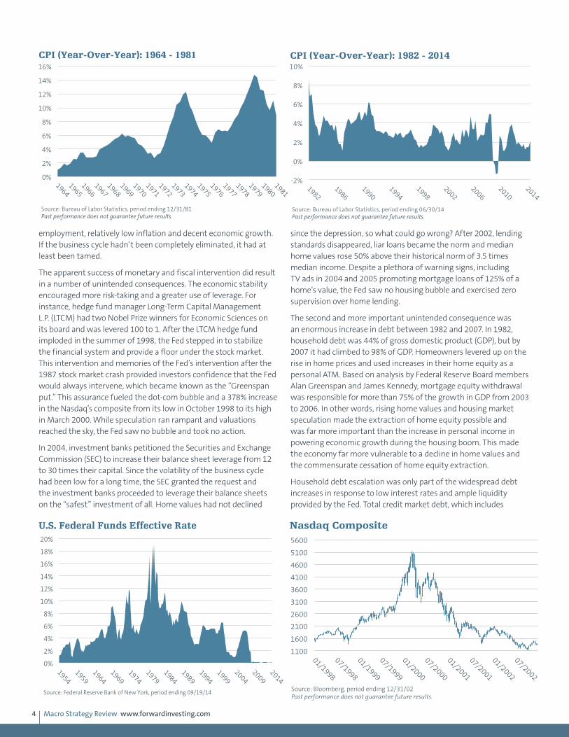
Normally, people or organizations wouldn’t be given any additional responsibilities unless they had handled their original tasks well. Prior to 1979, the Federal Reserve had one policy mandate, which was to conduct monetary policy so prices remained stable. In 1965, the Consumer Price Index (CPI) rose a scant 1%. By 1975 it exceeded 12%, on its way to 14% in 1980. There were mitigating circumstances: the Organization of Petroleum Export Countries (OPEC) cut back on oil production and oil prices soared from $3.00 to $12.00 a barrel in 1974. Even with this concession, no one considered Fed chairmen Arthur Burns or G. William Miller as maestros of monetary policy. By any standard, the Federal Reserve did not do a good job of accomplishing their stable price mandate. This poor performance, however, did not dissuade Congress from giving the Fed the potentially contradictory second mandate of full employment.
Ironically, the tide of history was about to change after Paul Volker became Fed chairman in August 1979. Volker increased the federal funds rate to 18% in 1981 to break the back of inflation, which resulted in a secular bull market in bonds and stocks. In the 300 months between 1983 and 2007 there were only 16 months that the economy was in recession. By comparison, there were 64 months of recession in the 300 months from 1957 to 1982, as stated previously. The recessions during this 25-year period were more frequent and deeper than the shallow recessions in 1991 and 2001, which each lasted eight months. Between 1983 and 2007, the CPI spent most of its time range bound between 2% and 4%, much more under control than it had been in the 1970s. After peaking at 10.8% in November 1982, the unemployment rate consistently trended lower until it was back under 4% in 2000—returning to levels of the 1950s (see the U.S. Unemployment Rate chart on page 1). On the surface it appeared that manipulating monetary and fiscal policy had achieved the economic holy grail of full
2%
3%
4%
5%
6%
7%
8%
9%
10%
11%
1949
1954
1959
1964
1969
1974
1979
1984
1989
1994
1999
2004
2009
2014
U.S. Unemployment Rate
Source: Bureau of Labor Statistics, period ending 08/31/14
Macro Strategy Review www.forwardinvesting.com4
employment, relatively low inflation and decent economic growth. If the business cycle hadn’t been completely eliminated, it had at least been tamed.
The apparent success of monetary and fiscal intervention did result in a number of unintended consequences. The economic stability encouraged more risk-taking and a greater use of leverage. For instance, hedge fund manager Long-Term Capital Management L.P. (LTCM) had two Nobel Prize winners for Economic Sciences on its board and was levered 100 to 1. After the LTCM hedge fund imploded in the summer of 1998, the Fed stepped in to stabilize the financial system and provide a floor under the stock market. This intervention and memories of the Fed’s intervention after the 1987 stock market crash provided investors confidence that the Fed would always intervene, which became known as the “Greenspan put.” This assurance fueled the dot-com bubble and a 378% increase in the Nasdaq’s composite from its low in October 1998 to its high in March 2000. While speculation ran rampant and valuations reached the sky, the Fed saw no bubble and took no action.
In 2004, investment banks petitioned the Securities and Exchange Commission (SEC) to increase their balance sheet leverage from 12 to 30 times their capital. Since the volatility of the business cycle had been low for a long time, the SEC granted the request and the investment banks proceeded to leverage their balance sheets on the “safest” investment of all. Home values had not declined
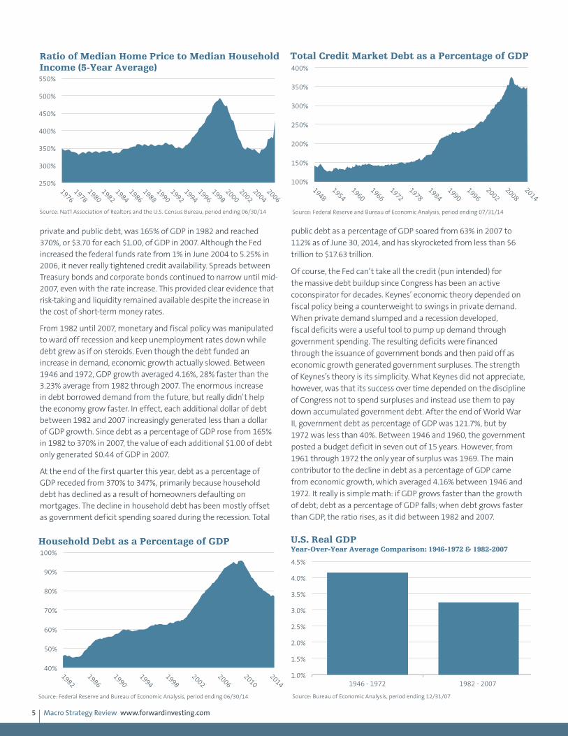
since the depression, so what could go wrong? After 2002, lending standards disappeared, liar loans became the norm and median home values rose 50% above their historical norm of 3.5 times median income. Despite a plethora of warning signs, including TV ads in 2004 and 2005 promoting mortgage loans of 125% of a home’s value, the Fed saw no housing bubble and exercised zero supervision over home lending.
The second and more important unintended consequence was an enormous increase in debt between 1982 and 2007. In 1982, household debt was 44% of gross domestic product (GDP), but by 2007 it had climbed to 98% of GDP. Homeowners levered up on the rise in home prices and used increases in their home equity as a personal ATM. Based on analysis by Federal Reserve Board members Alan Greenspan and James Kennedy, mortgage equity withdrawal was responsible for more than 75% of the growth in GDP from 2003 to 2006. In other words, rising home values and housing market speculation made the extraction of home equity possible and was far more important than the increase in personal income in powering economic growth during the housing boom. This made the economy far more vulnerable to a decline in home values and the commensurate cessation of home equity extraction.
Household debt escalation was only part of the widespread debt increases in response to low interest rates and ample liquidity provided by the Fed. Total credit market debt, which includes
-2%
0%
2%
4%
6%
8%
10%
1982
1986
1990
1994
1998
2002
2006
2010
2014
CPI (Year-Over-Year): 1982 - 2014
Source: Bureau of Labor Statistics, period ending 06/30/14 Past performance does not guarantee future results.
0%
2%
4%
6%
8%
10%
12%
14%
16%
1964
1965
1966
1967
1968
1969
1970
1971
1972
1973
1974
1975
1976
1977
1978
1979
1980
1981
CPI (Year-Over-Year): 1964 - 1981
Source: Bureau of Labor Statistics, period ending 12/31/81 Past performance does not guarantee future results.
0%
2%
4%
6%
8%
10%
12%
14%
16%
18%
20%
1954
1959
1964
1969
1974
1979
1984
1989
1994
1999
2004
2009
2014
U.S. Federal Funds Effective Rate
Source: Federal Reserve Bank of New York, period ending 09/19/14
1100
1600
2100
2600
3100
3600
4100
4600
5100
5600
01/1998
07/1998
01/1999
07/1999
01/2000
07/2000
01/2001
07/2001
01/2002
07/2002
Nasdaq Composite
Source: Bloomberg, period ending 12/31/02 Past performance does not guarantee future results.
Macro Strategy Review www.forwardinvesting.com5
private and public debt, was 165% of GDP in 1982 and reached 370%, or $3.70 for each $1.00, of GDP in 2007. Although the Fed increased the federal funds rate from 1% in June 2004 to 5.25% in 2006, it never really tightened credit availability. Spreads between Treasury bonds and corporate bonds continued to narrow until mid-2007, even with the rate increase. This provided clear evidence that risk-taking and liquidity remained available despite the increase in the cost of short-term money rates.
From 1982 until 2007, monetary and fiscal policy was manipulated to ward off recession and keep unemployment rates down while debt grew as if on steroids. Even though the debt funded an increase in demand, economic growth actually slowed. Between 1946 and 1972, GDP growth averaged 4.16%, 28% faster than the 3.23% average from 1982 through 2007. The enormous increase in debt borrowed demand from the future, but really didn’t help the economy grow faster. In effect, each additional dollar of debt between 1982 and 2007 increasingly generated less than a dollar of GDP growth. Since debt as a percentage of GDP rose from 165% in 1982 to 370% in 2007, the value of each additional $1.00 of debt only generated $0.44 of GDP in 2007.
At the end of the first quarter this year, debt as a percentage of GDP receded from 370% to 347%, primarily because household debt has declined as a result of homeowners defaulting on mortgages. The decline in household debt has been mostly offset as government deficit spending soared during the recession. Total
public debt as a percentage of GDP soared from 63% in 2007 to
112% as of June 30, 2014, and has skyrocketed from less than $6
trillion to $17.63 trillion.
Of course, the Fed can’t take all the credit (pun intended) for
the massive debt buildup since Congress has been an active
coconspirator for decades. Keynes’ economic theory depended on
fiscal policy being a counterweight to swings in private demand.
When private demand slumped and a recession developed,
fiscal deficits were a useful tool to pump up demand through
government spending. The resulting deficits were financed
through the issuance of government bonds and then paid off as
economic growth generated government surpluses. The strength
of Keynes’s theory is its simplicity. What Keynes did not appreciate,
however, was that its success over time depended on the discipline
of Congress not to spend surpluses and instead use them to pay
down accumulated government debt. After the end of World War
II, government debt as percentage of GDP was 121.7%, but by
1972 was less than 40%. Between 1946 and 1960, the government
posted a budget deficit in seven out of 15 years. However, from
1961 through 1972 the only year of surplus was 1969. The main
contributor to the decline in debt as a percentage of GDP came
from economic growth, which averaged 4.16% between 1946 and
1972. It really is simple math: if GDP grows faster than the growth
of debt, debt as a percentage of GDP falls; when debt grows faster
than GDP, the ratio rises, as it did between 1982 and 2007.
250%
300%
350%
400%
450%
500%
550%
1976
1978
1980
1982
1984
1986
1988
1990
1992
1994
1996
1998
2000
2002
2004
2006
Ratio of Median Home Price to Median Household Income (5-Year Average)
Source: Nat'l Association of Realtors and the U.S. Census Bureau, period ending 06/30/14
100%
150%
200%
250%
300%
350%
400%
1948
1954
1960
1966
1972
1978
1984
1990
1996
2002
2008
2014
Total Credit Market Debt as a Percentage of GDP
Source: Federal Reserve and Bureau of Economic Analysis, period ending 07/31/14
40%
50%
60%
70%
80%
90%
100%
1982
1986
1990
1994
1998
2002
2006
2010
2014
Household Debt as a Percentage of GDP
Source: Federal Reserve and Bureau of Economic Analysis, period ending 06/30/14
1.0%
1.5%
2.0%
2.5%
3.0%
3.5%
4.0%
4.5%
1946 - 1972 1982 - 2007
Source: Bureau of Economic Analysis, period ending 12/31/07
U.S. Real GDP Year-Over-Year Average Comparison: 1946-1972 & 1982-2007

Macro Strategy Review www.forwardinvesting.com6
In 2007, federal debt as a percentage of GDP was 64.5%—almost double 1982’s ratio of 32.5%. This increase occurred because the federal government ran a budget deficit in every year except four: 1998, 1999, 2000 and 2001. Capital gains tax revenues from the dot-com bubble were one of the primary reasons for the surplus years. Thus when the stock market declined in 2001 and 2002, those surpluses vanished. When it comes to government deficits, we are agnostic. A deficit is a deficit: whether it is the result of government spending or tax cuts, either way, future generations are on the hook to pay for them. This is one case where the means (liberal or conservative ideology) does not justify the net result. Both parties would, of course, argue this point. Ironically, each party is the opposite side of the same coin, which is currently valued at more than $17 trillion of debt.
A prominent Nobel Prize winning economist has argued that the reason the current recovery is so lackluster is because the government stimulus plan was too small. In other words, if the government had increased outstanding debt since 2009 by $8 trillion or $10 trillion instead of $6 trillion, the country would be better off. This argument totally ignores the fact that since 1982 each additional one dollar of debt has increasingly produced less than one dollar of GDP growth. Hopefully this economist has lots of children, grandchildren and great grandchildren so they can pay for his ideological largesse. A 3% annual budget deficit is commonly accepted as good by the majority of mainstream economists. This is like saying going broke is not a good thing, but if we’re going to go broke, it is better to do it slowly. But, according to the U.S. Office of Management and Budget, the average annual deficit from 1946 through 2013 was 2.09%, which has led to $17.6 trillion in federal debt.
A May 2012 ABC 20/20 news report entitled “Losing it: The Big Fat Trap” reported that Americans spend $20 billion a year on weight loss programs and diets with disappointing results. Losing weight is fairly straightforward—eat smaller portions, eat less fattening food and be more active. Getting our fiscal house in order is also straightforward—no more deficits and use surpluses to pay off prior debt. With each political party pitching their formula of spending or tax cuts to voters who, on balance, spend more time focused on sports, reality TV and social media, the odds of fiscal discipline breaking out anytime soon are slim. As we discussed in
the June MSR section “Economic Enervation,” Congress could also reduce the number of its regulations, which have likely contributed to slower economic growth since 1982. Since both political parties use regulations as a primary fundraising tool, we don’t expect a “let’s roll back regulation” movement to sweep the nation. Nor do we anticipate that Congress and the Federal Reserve will abandon their multidecade unsuccessful attempt to tame the business cycle.
There is a natural ebb and flow for everything on this planet, from ocean tides to seasons of the year. Recessions are a natural part of the business cycle, just as night follows day. In a practical sense, periodic recessions cleanse the economy and financial system of excesses, such as unneeded inventories or overleveraged companies. In this way, a balance is maintained between the supply and demand for raw materials, labor and credit, which ensures the underpinnings of the economy remain sound. The business cycle has been in existence as long as there has been something to sell and willing buyers. The notion the business cycle could be suppressed or eliminated with the ministrations of monetary and fiscal policy should have been deemed preposterous. Instead, hubris trumped common sense. In the pursuit of minimizing increases in unemployment and reelection, politicians embraced fiscal stimulus to ward off recessions but scorned the discipline to pay for the stimulus. The Fed has aided and allowed debt to grow faster than GDP, and in the process printed their way into a blind alley. With $3.47 of debt for every $1.00 of GDP, how much can the Fed raise rates without interest expense becoming a significant headwind for the economy and federal budget? At the September 2014 Federal Open Market Committee (FOMC) meeting, the median forecast for the 2017 federal funds rate was 3.75%. We suspect the Fed will be as correct on the federal funds rate forecast as their projections for 3%+ GDP growth in each of the past four years. The Fed has trained investors to be so dependent on an accommodative monetary policy that markets are fixated on when the Fed will remove the phrase “considerable period” from the FOMC statement. There will come an “uh-oh” moment when the global financial markets realize that central bank monetary policy is tapped out and perception can no longer trump economic reality. In the meantime, global markets can find comfort in the fact that the ECB will probably launch their version of quantitative easing by early 2015, the Bank of Japan will continue to debase its currency and the Fed won’t increase rates for a considerable period.
0
10
20
30
40
50
60
70
80
90
100
1948
1952
1956
1960
1964
1968
1972
1976
1980
1984
1988
1992
1996
2000
2004
2008
2012
In T
hou
san
ds
Federal Register Pages Published Annually
Source: Federal Register, period ending 12/31/12
0
2
4
6
8
10
12
14
16
18
1980
1982
1984
1986
1988
1990
1992
1994
1996
1998
2000
2002
2004
2006
2008
2010
2012
2014
In T
rilli
ons
($)
U.S. Total Public Debt Outstanding
Source: U.S. Treasury, period ending 08/31/14

Macro Strategy Review www.forwardinvesting.com7
Macro Perspective—U.S. Economy
January 2015: Monetary Policy and Business Investment
The Federal Reserve has kept short-term interest rates barely above 0% for six years and has expanded its balance sheet from $900 billion in 2007 to $4.4 trillion in 2014 through quantitative easing. The suppression of interest rates and bond purchases by the Fed has made it possible for corporations to borrow cheaply. Issuance of investment-grade and junk bonds has soared from $953 billion in 2009 to $1.31 trillion in 2012, $1.41 trillion in 2013 and $1.39 trillion through November 2014. Borrowing at lower interest rates has saved corporate America several hundred billion dollars in interest expense in recent years, which is a good thing. However, an increasing number of companies have used debt to buy back their stock. In the 12 months through the end of November, 374 companies in the S&P 500 Index spent $567.2 billion on share buybacks, up 27% since November 2013. Over the last four years, corporations have spent more than $2.2 trillion on stock buybacks. Between 2003 and 2012, of the 449 companies publicly listed in the S&P 500, 54% of earnings were used to buy back stock and 37% were used to pay dividends. According to Barclays, the proportion of cash flow used for stock buybacks has almost doubled over the last decade. With such a large percentage of earnings being used to buy back stock, the proportion of cash flow used for capital investments has declined. One driver behind the shift toward more stock buybacks has come from the increase in executive compensation derived from stock options and stock awards. In 2012, the 500 highest-paid executives named in proxy statements of U.S. public companies received an average of $30.3 million. Of this total, 42% came from stock options and 41% from stock awards. What’s more astonishing than the level of compensation is the obvious conflict of interest. Some executives recommend to their firm’s board of directors that a better use of the company’s earnings is buying back more stock, or worse, that they should borrow money for the buybacks. The fact that stock buybacks somewhat directly
enrich executives is overlooked by the board, whose focus is supposedly on the long-term interests of the company. A mutual fund portfolio manager who buys a stock for his personal account before purchasing it for the fund runs afoul of security laws. A company, however, can buy its stock all day, every day based on a recommendation from the firm’s executives to the board of directors and the Securities and Exchange Commission sees no conflict of interest.
Cheap money has incentivized companies to increase earnings by using more of their cash flow and borrowed money to reduce their share count through stock buybacks rather than investing in their business and future. In addition to skimming capital investments for buybacks, corporations have kept their hiring and wage increases to a bare minimum. On the surface this looks like a winning business plan since after-tax profits as a percentage of GDP are at an all-time high. But upon further review, there is a less promising message: employee compensation as a percentage of GDP has been trending lower for decades and is at the lowest level since recordkeeping began in 1947.
Earnings juiced by stock buybacks and financial engineering along with the suppression of wages and quality jobs may make the S&P 500’s price-earnings (P/E) ratio appear reasonable. But these earnings are not the same quality of earnings derived from intelligent research and development (R&D) investment, new products and solid revenue growth. Henry Ford became famous for implementing the assembly line, which lowered the amount of time to build one car from 12 hours to just 93 minutes. The increase in the production of cars lowered the cost of each car produced, making them affordable. His real genius though may have been deciding to pay his workers enough so they could buy the cars his assembly lines produced.
2%
3%
4%
5%
6%
7%
8%
9%
10%
11%
12%
1947
1953
1959
1965
1971
1977
1983
1989
1995
2001
2007
2013
Profits as a Percentage of GDP
Source: Federal Reserve Bank of St. Louis, period ending 07/01/14
40%
42%
44%
46%
48%
50%
52%
1948
1953
1958
1963
1968
1973
1978
1983
1988
1993
1998
2003
2008
2013
Wages as a Percentage of GDP
Source: Bureau of Economic Analysis, period ending 01/01/13

Macro Strategy Review www.forwardinvesting.com8
Macro Perspective—U.S. Economy
May 2015: Global Debt, Growth and Future Central Bank Policies
The global economic pie is shrinking relative to the growth rates of the past and that’s a problem. According to the International Monetary Fund’s (IMF) World Economic Outlook database, worldwide GDP growth during 2013–2014 averaged 3.10%, compared to 2006–2007, which averaged 5.15%. While GDP growth has declined, the chasm between growth in advanced economies and developing countries has not changed much. GDP growth in advanced economies has slowed -47.37% from 2.85% in 2006–2007 to just 1.50% in 2013–2014 while growth in developing countries has downshifted -45.06% from 8.10% to 4.45%, respectively. As this data indicates, the worldwide slowdown in growth has been evenly distributed and not merely concentrated in either advanced or developing countries.
The widespread impression that the global economy has deleveraged in the wake of the financial crisis is a fallacy—it is more leveraged now than it was prior to the financial crisis, based on the ratio of total global debt to GDP. In February, the McKinsey Global Institute published an extensive review of debt levels in 22 developed and 25 developing countries. The McKinsey analysis found that global debt had increased from $142 trillion in 2007 to $199 trillion in 2014. The $57 trillion increase in global debt represents a surge of 40%, far exceeding the 23% gain in global GDP during the same period. The global debt-to-GDP ratio rose from 269% at the end of 2007 to 286% as of June 30, 2014. The title of the McKinsey study was apt: “Debt and (not much) deleveraging.”
Although total global debt has increased 40% since 2007, the McKinsey Global Institute did find a couple of silver linings. The growth rate in global household debt slowed from 8.5% during the period of 2000–2007 to 2.8% in 2007–2014. Lax mortgage lending standards contributed to the excessive addition of mortgage debt prior to 2007 while tighter standards after the financial crisis curbed growth. The net result is that household debt is now growing in line with global GDP growth as compared to the debt binge prior
to 2007. When household debt grows in line with GDP growth, household incomes are more likely to grow fast enough to prevent a rise in defaults on mortgage, credit card and auto debt. The increase in debt and leverage by banks prior to 2008 was a major contributor to the financial crisis. A number of U.S. investment banks increased their leverage ratio from 12-to-1 in 2004 to almost 30-to-1 in 2007. A number of large European banks had leverage ratios of almost 40-to-1 just prior to the financial crisis. When home values fell in many countries, the excessive leverage decimated bank balance sheets and threatened the global financial system. Financial institutions have significantly lowered the growth rate of debt since 2007 from 9.4% to 2.9%. The deleveraging of bank balance sheets in the wake of the financial crisis is a strong indication that the global financial system is in far better shape than it had been and is capable of handling the next business cycle downturn and any unanticipated economic shock.
The same cannot be said about government debt and leverage. In response to the financial crisis, governments around the world increased spending to offset the decline in private demand as unemployment soared, consumers stopped shopping and businesses slashed spending. Much of the increase in government spending was financed with debt, which grew 60% faster in the seven years following the crisis than the precrisis level (9.3% versus 5.8%). The growth rate in government debt poses a perilous challenge for the global economy in coming years since the current level of government debt is already high enough to impair its capacity to deal with the next economic slowdown. Faced with another recession, we have no doubt that politicians around the world will respond with another round of deficit spending to minimize its impact—as that’s how they have repeatedly responded every time a recession threatened their reelections. Mae West famously said too much of a good thing could be wonderful, but we don’t think debt is one of those things. We don’t know how much debt is too much, but the economic engine of the global economy is certainly more at risk now than it was 30 years ago, even though global interest rates were far higher back then.
Most governments consider a deficit of 3% of GDP to be healthy, but the flaw in this perspective is it ignores the impact of “healthy” deficits over time. Total debt as a percentage of GDP doubles in just 24 years if a country maintains a “healthy” 3% annual deficit, meaning the long-term threat from continually running
Global Stock of Debt Outstanding Compound Annual Growth Rate
2000 – 2007 2007 – 2014
Total 7.3% 5.3%
Household 8.5% 2.8%
Corporate 5.7% 5.9%
Government 5.8% 9.3%
Financial 9.4% 2.9%
*47 nations, including 22 developed and 25 developing countries Source: McKinsey Global Institute, as of 06/30/14
Global Slowdown Compounds the Debt Challenge
Growth Rate 2006 – 2007
Growth Rate 2013 – 2014
Change in Growth Rate
World Average 5.15% 3.10% -39.81%
Advanced Economies 2.85% 1.50% -47.37%
Developing Countries 8.10% 4.45% -45.06%
USA 2.40% 2.05% -14.58%
Eurozone 2.80% 0.20% -92.86%
Source: International Monetary Fund, as of 12/31/14
Economic Growth Hasn’t Kept Pace With Debt
2007 2014
Global Debt* $142 T $199 T
Global Debt/GDP 269% 286%
*47 nations, including 22 developed and 25 developing countries Source: McKinsey Global Institute, as of 06/30/14

Macro Strategy Review www.forwardinvesting.com9
“healthy” annual deficits is that cumulative debt reaches a level that can hardly be described as healthy. However, any slowdown in government deficit spending will dampen growth in the short term unless household and corporate spending picks up the slack. That’s not likely in the short run since the global economy is suffering from a lack of demand due to a combination of high unemployment and underemployment, weak wage growth and excess capacity that has depressed business investment.
The Congressional Budget Office has estimated that a 1.0% increase in Treasury yields across the maturity spectrum would add $150 billion in interest expense to the annual U.S. government budget. Debt-to-GDP ratios in Europe and Japan are far higher than in the U.S., so their budgets and economies are even more vulnerable to higher interest rates. Any meaningful rise in global interest rates in coming years could accelerate budget deficits to well above 3% of GDP as interest expense on the mountain of accumulated sovereign debt soars—one reason central banks, especially in advanced economies, will find it extraordinarily difficult to normalize interest rates in coming years. This situation exposes an inherent conflict of interest between fiscal and monetary policy that has never been so pronounced and has the potential to further compromise central banks’ independence.
The level of GDP growth impacts the amount of cash flow generated in the form of personal income, corporate profits and government tax revenue. As economic growth accelerates, the ability to service debt becomes easier and the risk of defaults on mortgages, auto loans, corporate bonds and bank loans declines. Debt levels are higher now than in 2007 while global economic growth has slowed significantly and is only expected to reach 3.50% in 2015, according to the IMF. Even with that improvement in growth compared to the last two years, it will still be more than
30% slower than in 2007. In this respect the leverage in the global economy is more precarious than in 2007.
In the next few years, the global economy will be vulnerable to either a slowing from current growth levels or an increase in interest rates. Navigating these issues amounts to the economic equivalent of threading the needle since even a modest increase in interest rates is likely to disproportionately weigh on future growth as a larger share of cash flow will be needed to service debt. Any slowdown in the global economy would push central bankers even deeper into the uncharted territory of negative interest rates, unlimited quantitative easing (QE) and currency depreciation. The risk of deflation will continue to lurk in the shadows until the ratio of global debt to GDP actually declines.
Even though interest rates, especially in advanced economies, have spent years at their lowest levels in history, economic growth has fallen far short of historical norms. Big deficits and cheap money have failed to engender sustainable growth. This economic reality provides an insight into just how difficult it will be for the Fed, ECB and Bank of Japan (BoJ) to ever “normalize” short-term interest rates. Any increases are likely to be modest and stretched out over an extended period of time. Beginning in June 2004, the Fed increased the federal funds rate at 17 consecutive meetings. Nothing close to that will happen in this cycle. The pace of central bank rate increases in the next few years is likely to make a tortoise look like the Road Runner. The BoJ may never increase rates in our lifetime and the first increase the ECB effects will be to raise rates from below zero percent to zero percent. Welcome to the brave new world of modern monetary policy that is more effective in distorting market outcomes than generating actual economic growth.
EurozoneFebruary 2014: Eurozone
One of the ongoing challenges of the European Union (EU) is the disparity in productivity among its members. In the wake of the financial crisis, the least productive countries experienced a deeper and more prolonged contraction, resulting in far higher rates of unemployment that persists into 2014. Although the overall unemployment is 12.1% for the EU, it is 11% in France, 12.7% in Italy, 26.7% in Spain and 27.4% in Greece. In contrast, Germany’s unemployment rate is just 5.2%, hence the friction within the EU.
Prior to the formation of the EU in 1999, the productivity gap between countries could be closed through the depreciation of an individual country versus the currency of trading partners. For instance, if Italy wanted to improve its export competitiveness, it would lower the value of the Italian lira by 5%–10% or more. A decline in the lira would lower the cost of Italian exports and make Italian exporters more competitive with exporters around the world. Lowering the cost of exports through the depreciation of its currency, rather than cutting wages, kept Italian domestic demand stable, as a weaker currency lifted exports. However, with the establishment of a common currency for the members of the EU, the only way to improve export competitiveness is
through productivity improvements or lower labor costs, which is far more painful since lower incomes weaken domestic demand and GDP. For those countries whose productivity has lagged Germany over the last decade, the path to increased productivity will primarily be through labor market reforms. In the short run, labor market reforms will be politically unpopular in countries like France and Italy, and if enacted, will likely result in higher unemployment and slower GDP growth.
France’s core problem is that wages have been growing faster than productivity for years. In 2000, the socialists in France instituted the 35-hour workweek, so French workers have been producing less in less time too. Unemployment is 11% and youth unemployment is 26%. The minimum wage is now 62% of median income, versus 38% in the U.S. Anyone who has worked more than 28 months can receive up to 75% of their old salary for 24 months. The employer payroll tax can reach 48%, which means an employee paid $1,000 a month actually costs the employer $1,480 per month. Needless to say, private sector job growth has been almost nonexistent.
Welfare spending, including programs for youth, the unemployed and the elderly is set to reach 31% of GDP, the highest of the 34
Macro Strategy Review www.forwardinvesting.com10
OECD nations. Instead of reducing government spending, France increased spending so that government spending is now 57% of GDP, and debt as a percent of GDP jumped from 60% in 2007 to 92% in 2013.
Whether it was the result of its credit downgrade, Draghi’s comment, or recent polls which show that 74% of the French think France is on the decline and 83% view President Francois Hollande’s reform policies as ineffectual, Hollande appears to have experienced an epiphany. In a speech on January 14 he said, “How can we run a country if entrepreneurs don’t hire? And how can we redistribute if there’s no wealth?”2 Acknowledging that socialist redistribution does not create wealth and relies instead on entrepreneurs must have been an out-of-body experience for Hollande. Proof came when Hollande proposed cutting government spending to fund a $48 billion annual tax cut so companies won’t have to pay for France’s generous family welfare programs by 2017. It’s unlikely that one small program will pull the French economy out of a malaise that took decades to grow.
According to the OEDC, of its 34 participating countries, Italy’s output has grown the least over the last decade. This poor performance is partially due to the lack of currency flexibility, but is also due to government spending, high taxes and inflexible labor market regulations. Government spending is 50.7% of GDP and relies on high payroll taxes to fund its spending. According to the OECD, 33% of Italian salaries support Italy’s pension fund, compared to 13% in the U.S.’s Social Security system. Labor costs are higher than in Spain, but Italian workers have less disposable income after taxes are deducted. This is a bad combination since high labor costs suppress hiring, and low take-home pay mutes economic growth since workers have less money to spend. The lack of growth has resulted in chronic budget deficits, which has increased Italy’s debt to GDP ratio to 130%. Within the EU, only Greece has a higher debt to GDP ratio.
According to PricewaterhouseCoopers (PwC), European banks are sitting on $1.7 trillion in nonperforming loans, which are loans on
which no payments have been made in 90 days. In order to comply with Basel III regulations, European banks will need to increase capital by at least $240 billion to as much as $380 billion, depending on how much each bank restructures its balance sheet assets, according to PwC. A weak economy, bad loans and looming Basel III regulations have led many banks to shrink their balance sheets and lending. The annual change in eurozone loans to nonfinancial corporations has not improved and was still negative in November at -2.3%. In early November, the ECB announced stress tests for 128 systemically important banks that should be completed by the fourth quarter of 2014. The ECB will assume direct supervision over the largest eurozone banks in 2014. With the ECB conducting its stress tests and assuming a more active supervisory role over the largest banks, lending throughout Europe is likely to remain constrained in 2014 and well into 2015. Many banks may choose to write off bad loans before the stress test is completed so they look better, as Deutsche Bank did when it announced a fourth quarter loss of $1.35 billion. As long as credit growth is weak, economic growth is unlikely to exceed 1% in 2014.
There are few instruments left for the ECB to use to spur growth and offset low inflation. The ECB’s refinancing rate was lowered from 0.50% to 0.25% in November. The ECB can lower it further, but another 15 basis points probably won’t make a big difference in spurring bank lending in the EU, or help speed up the structural reforms needed in France or Italy. The ECB can launch another long-term refinancing operation (LTRO) program, but pushing more money into the European banking system is not likely to encourage more lending while banks are undergoing a stress test, economic growth is almost nonexistent and bad loans weigh on bank balance sheets. One step the ECB could take is lowering the value of the euro, which would improve the export competitiveness for every EU member. A cheaper euro would especially help those countries whose productivity has lagged behind Germany. Since a lower value of the euro could increase the cost of imports, like oil, which are priced in dollars, inflation may also rise.
Eurozone
April 2014: Eurozone
In the face of an ongoing contraction in bank lending, weak economic growth and potentially dangerously low inflation, what can the ECB do to boost growth and inflation in coming months when their refinancing rate is already at an all-time low of 0.25%?
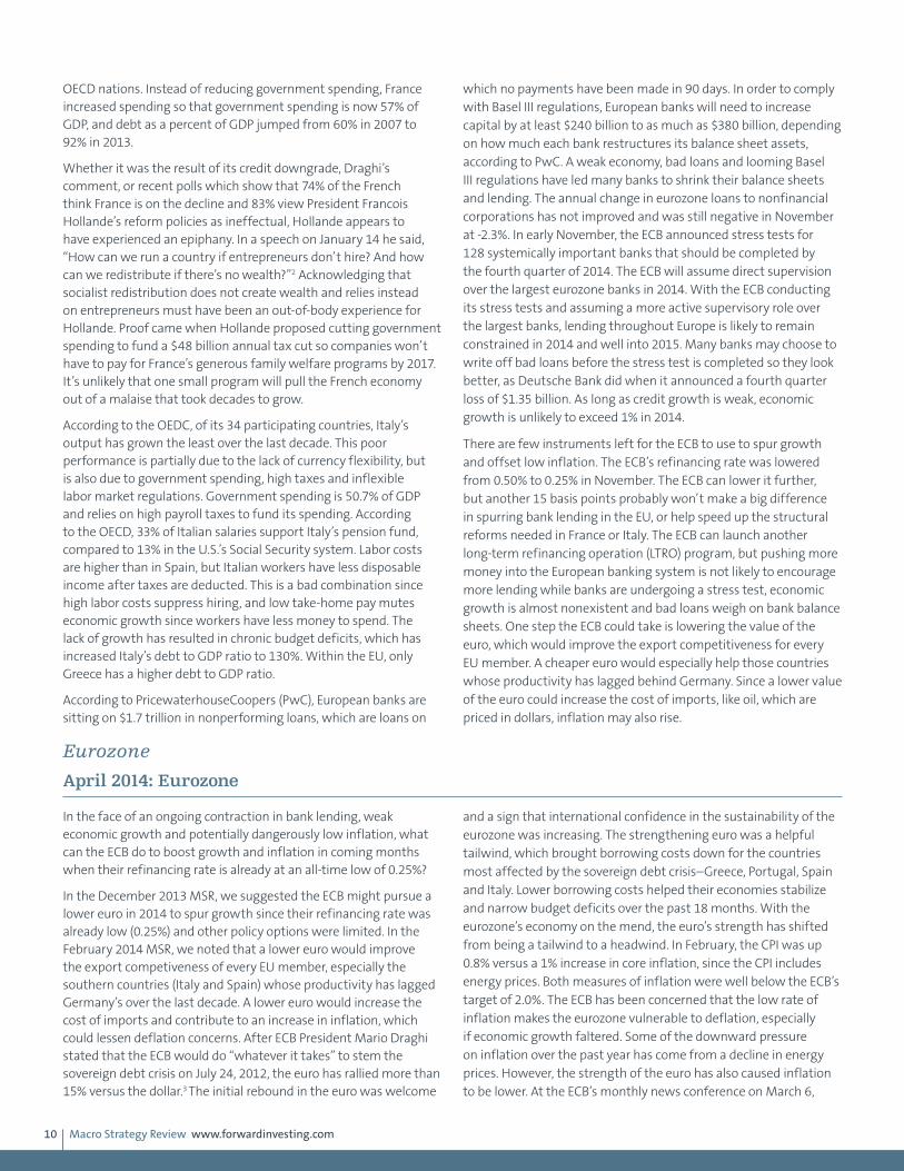
In the December 2013 MSR, we suggested the ECB might pursue a lower euro in 2014 to spur growth since their refinancing rate was already low (0.25%) and other policy options were limited. In the February 2014 MSR, we noted that a lower euro would improve the export competiveness of every EU member, especially the southern countries (Italy and Spain) whose productivity has lagged Germany’s over the last decade. A lower euro would increase the cost of imports and contribute to an increase in inflation, which could lessen deflation concerns. After ECB President Mario Draghi stated that the ECB would do “whatever it takes” to stem the sovereign debt crisis on July 24, 2012, the euro has rallied more than 15% versus the dollar.3 The initial rebound in the euro was welcome
and a sign that international confidence in the sustainability of the eurozone was increasing. The strengthening euro was a helpful tailwind, which brought borrowing costs down for the countries most affected by the sovereign debt crisis–Greece, Portugal, Spain and Italy. Lower borrowing costs helped their economies stabilize and narrow budget deficits over the past 18 months. With the eurozone’s economy on the mend, the euro’s strength has shifted from being a tailwind to a headwind. In February, the CPI was up 0.8% versus a 1% increase in core inflation, since the CPI includes energy prices. Both measures of inflation were well below the ECB’s target of 2.0%. The ECB has been concerned that the low rate of inflation makes the eurozone vulnerable to deflation, especially if economic growth faltered. Some of the downward pressure on inflation over the past year has come from a decline in energy prices. However, the strength of the euro has also caused inflation to be lower. At the ECB’s monthly news conference on March 6,
Macro Strategy Review www.forwardinvesting.com11
Mario Draghi said that the strength in the euro since July 2012 had shaved 0.4% off annual inflation. Draghi went on to state, “The strengthening of the euro exchange rate over the past one and a half years has certainly had a significant impact on our low rate of inflation, and, given current levels of inflation, is therefore becoming increasingly relevant in our assessment of price stability.”4 Draghi has consistently argued that the risk of a Japan-style deflation was low. However, on March 6, Draghi acknowledged that the longer inflation in the European monetary block remained low, the higher the risk that deflation would increase. Although the ECB has forecast that inflation will rise to 1.7% in 2016, Draghi’s March 6 comments imply the ECB may not be comfortable with that timetable, since it means that inflation will remain under the ECB’s target of 2% for at least another two years.
Our expectation that the ECB would take steps to lower the euro in 2014 appears on track and seems increasingly likely. We have no idea what actions the ECB might take to reverse the euro’s uptrend or when, but the ECB’s success in bringing down sovereign yields in 2012 may provide a clue. In conjunction with Draghi’s “whatever it takes” statement in July 2012, the ECB announced plans for its Outright Monetary Transactions (OMT) program. Under the OMT program, the ECB would be able to buy sovereign bonds of EU members in the secondary market. There were no limits established on the amount of a country’s outstanding bonds the ECB could buy, as long as that country stuck to the agreed plan for deficit reduction. The ECB didn’t want its OMT program to lessen a country’s commitment to fiscal austerity. Knowing the ECB would step in to backstop any rise in bond yields for EU countries, hedge
funds and international money managers bought sovereign bonds aggressively. Within six months, bond yields had come down dramatically and the ECB didn’t have to spend a dime in achieving their goal. Given this prior success, all the ECB may need is for Draghi to state the desire for a lower euro as well as a willingness from the ECB to sell euros if necessary. Currency traders likely would be happy to accommodate the ECB’s wishes, since they could sell the euro short knowing they were doing so with the blessing of the ECB and with almost zero chance the ECB would intervene. The ECB wouldn’t have to sell a single euro to achieve their goal.
The 50% retracement of the decline from 160.50 in July 2008 to the low in June 2010 at 118.79 is 139.64, and not much above the March 13 high of 137.87.
Eurozone
June 2014: Eurozone
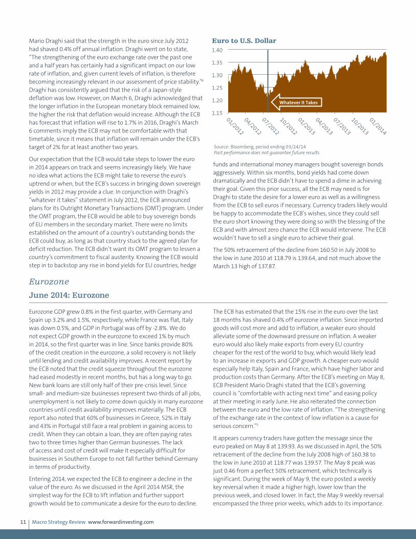
Eurozone GDP grew 0.8% in the first quarter, with Germany and Spain up 3.2% and 1.5%, respectively, while France was flat, Italy was down 0.5%, and GDP in Portugal was off by -2.8%. We do not expect GDP growth in the eurozone to exceed 1% by much in 2014, so the first quarter was in line. Since banks provide 80% of the credit creation in the eurozone, a solid recovery is not likely until lending and credit availability improves. A recent report by the ECB noted that the credit squeeze throughout the eurozone had eased modestly in recent months, but has a long way to go. New bank loans are still only half of their pre-crisis level. Since small- and medium-size businesses represent two-thirds of all jobs, unemployment is not likely to come down quickly in many eurozone countries until credit availability improves materially. The ECB report also noted that 60% of businesses in Greece, 52% in Italy and 43% in Portugal still face a real problem in gaining access to credit. When they can obtain a loan, they are often paying rates two to three times higher than German businesses. The lack of access and cost of credit will make it especially difficult for businesses in Southern Europe to not fall further behind Germany in terms of productivity.
Entering 2014, we expected the ECB to engineer a decline in the value of the euro. As we discussed in the April 2014 MSR, the simplest way for the ECB to lift inflation and further support growth would be to communicate a desire for the euro to decline.
The ECB has estimated that the 15% rise in the euro over the last 18 months has shaved 0.4% off eurozone inflation. Since imported goods will cost more and add to inflation, a weaker euro should alleviate some of the downward pressure on inflation. A weaker euro would also likely make exports from every EU country cheaper for the rest of the world to buy, which would likely lead to an increase in exports and GDP growth. A cheaper euro would especially help Italy, Spain and France, which have higher labor and production costs than Germany. After the ECB’s meeting on May 8, ECB President Mario Draghi stated that the ECB’s governing council is “comfortable with acting next time” and easing policy at their meeting in early June. He also reiterated the connection between the euro and the low rate of inflation. “The strengthening of the exchange rate in the context of low inflation is a cause for serious concern.”5
It appears currency traders have gotten the message since the euro peaked on May 8 at 139.93. As we discussed in April, the 50% retracement of the decline from the July 2008 high of 160.38 to the low in June 2010 at 118.77 was 139.57. The May 8 peak was just 0.46 from a perfect 50% retracement, which technically is significant. During the week of May 9, the euro posted a weekly key reversal when it made a higher high, lower low than the previous week, and closed lower. In fact, the May 9 weekly reversal encompassed the three prior weeks, which adds to its importance.
1.15
1.20
1.25
1.30
1.35
1.40
01/2012
04/2012
07/2012
10/2012
01/2013
04/2013
07/2013
10/2013
01/2014
Euro to U.S. Dollar
Whatever It Takes
Source: Bloomberg, period ending 03/24/14 Past performance does not guarantee future results.

Macro Strategy Review www.forwardinvesting.com12
This is another technical indication that the trend in the euro versus the dollar has turned down. This is one of those times when the fundamentals and the technicals are aligned, which should increase the probabilities that our forecast of a decline in the euro is on
target. As we wrote in the May 2014 MSR, “Shorting the euro has the potential to result in a profitable trade over the next year.” From a risk management point of view, a stop on a short trade should be either just above the May 8 high or pennies below it.
Eurozone
September 2014: Eurozone
After its GDP fell -0.1% in the second quarter, France avoided fulfilling the classic definition of recession (two consecutive quarters of negative GDP) only because GDP was unchanged in the first quarter. The unemployment rate rose to an all-time high of 10.2% in July, and, absent labor market reforms, it is unlikely to improve much in coming quarters. France holds the dubious distinction of having twice as many companies with exactly 49 employees as companies with 50 or more employees. You probably won’t be surprised to learn that the less-than-invisible hand of government regulation is responsible. When a company takes on a 50th employee, it becomes subject to almost three dozen labor laws prescribed by France’s 3,200 page labor code. A 2012 study by the London School of Economics and Political Science showed that the cost of additional rules for companies with 50-plus employees in France added 5% to 10% to labor costs. The study concluded, “There is a strong disincentive to grow.”6
Italy’s GDP fell in the first quarter and the second quarter (by -0.8%), so it is in a recession for the third time in five years. Italy’s debt-to-GDP ratio reached 135.2% in the first quarter and will continue to rise unless GDP growth returns. Like France, Italy has labor market rules that have protected one group of workers over another. In Italy’s case older workers are protected at the expense of younger workers. In an attempt to help young people get jobs in the 1980s and 1990s, Italy encouraged short-term
labor contracts, which made it easier for companies to hire and fire employees. In 1998, 20% of workers younger than 25 were temporary workers, compared to more than 50% now, according to Eurostat. A 2013 Bank of Italy study found that entry level wages for young workers under temporary contracts fell almost 30% between 1990 and 2010. This created a large income gap between older workers, whose jobs and incomes are protected by labor laws, and young workers. The temporary contracts allowed young workers to be let go when the financial crisis struck, so young workers were disproportionately affected. According to Eurostat, since 2007 the employment rate for those under 40 has fallen 9%, while it rose 9% for workers between 55 and 64 years old. In June, the unemployment rate for workers under 25 rose to a record of 43.7%. Unless Italy changes its labor laws, a whole generation of young workers will clearly have a lower standard of living than their parents.
The conundrum facing Mario Draghi and the ECB is that proactive monetary policy can alleviate some of the pressure on countries like France and Italy to make the structural changes needed to improve economic growth over the long term. In the short term, weak economic growth and low inflation will win out over doing nothing, which is why the ECB is likely to implement quantitative easing before year-end.
Eurozone
October 2014: The Return of the Almighty Dollar and Deflation
Since 2010, a vocal chorus has proclaimed that hyperinflation and a crash in the dollar was right around the corner once the Fed became a serial advocate of quantitative easing in the wake of the financial crisis. Since 2008, the Fed has expanded its balance
sheet from $900 billion to more than $4.2 trillion in 2014. Although neither a crash in the dollar or hyperinflation has reared its ugly head, it hasn’t diminished warnings from proponents like Peter Shrill (fictitious name), who in a recent CNBC interview reassured
6.0%
7.0%
8.0%
9.0%
10.0%
11.0%
12.0%
13.0%
14.0%
2007
2008
2009
2010
2011
2012
2013
2014
Eurozone Unemployment Rate
Source: Bloomberg, period ending 03/31/14
1.15
1.20
1.25
1.30
1.35
1.40
01/2012
05/2012
09/2012
01/2013
05/2013
09/2013
01/2014
05/2014
Euro to USD
Source: Bloomberg, period ending 05/23/14
Whatever it takes
Key Weekly Reversal
Macro Strategy Review www.forwardinvesting.com13
viewers that the plagues of hyperinflation and the dollar’s demise are still on their way. He’s just been a bit early. As we have discussed previously, there are a number of reasons why hyperinflation and a collapse in the dollar has not happened and likely won’t for some time. A stronger dollar is usually bearish for commodities and increases the deflationary threat from excessive debt.
The classic definition of inflation is too much money chasing too few goods. Although the Fed has greatly expanded its balance sheet since 2008, most of the money has not made its way into the economy. Free reserves held at the Federal Reserve by U.S. banks totaled $2.71 trillion as of September 19, 2014. One of the reasons the current recovery has been mediocre is because there is too little demand, not just in the United States, but globally. Capacity utilization rates around the world are low, which has kept business investment weak and inflation rates low. The U.S. Federal Reserve, ECB and Bank of Japan have been far more concerned about deflation and have strenuously tried to revive inflation with the greatest amount of monetary accommodation ever attempted. Most of the money created by central banks though is not coursing through domestic economies but sitting dormant. Although bank lending has modestly picked up in the U.S., it is still contracting in Europe, with banks more focused on strengthening their balance sheets than lending into a weak economy.
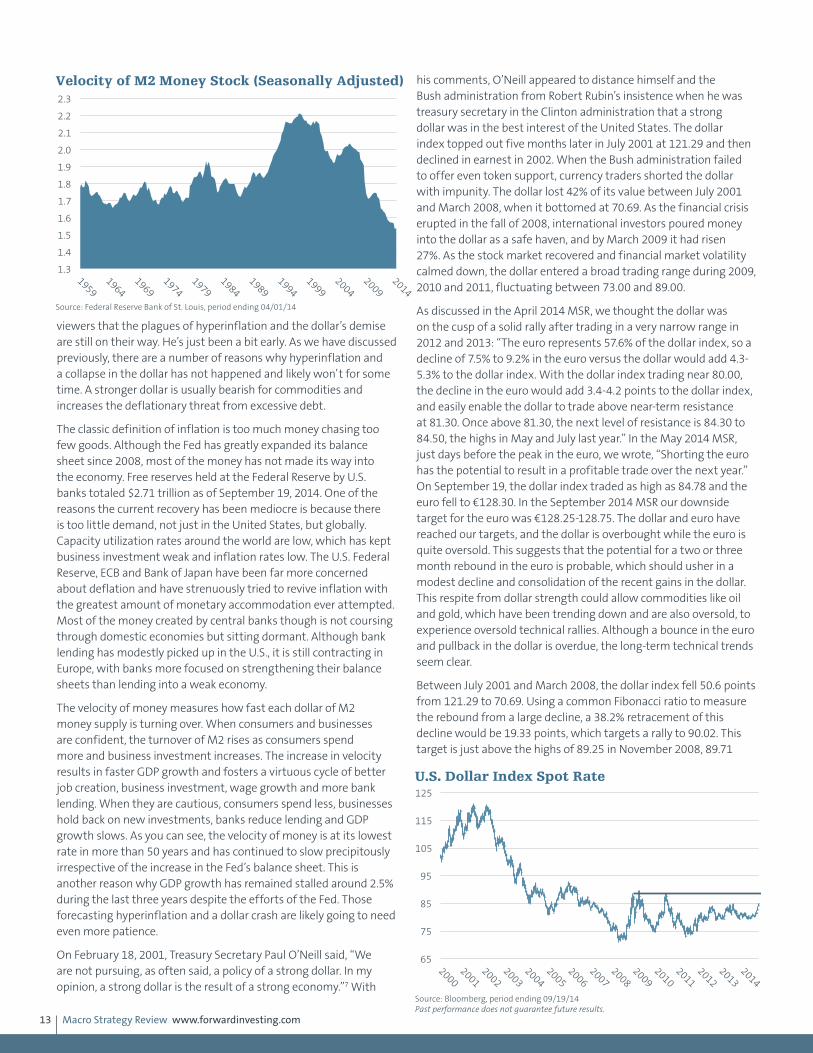
The velocity of money measures how fast each dollar of M2 money supply is turning over. When consumers and businesses are confident, the turnover of M2 rises as consumers spend more and business investment increases. The increase in velocity results in faster GDP growth and fosters a virtuous cycle of better job creation, business investment, wage growth and more bank lending. When they are cautious, consumers spend less, businesses hold back on new investments, banks reduce lending and GDP growth slows. As you can see, the velocity of money is at its lowest rate in more than 50 years and has continued to slow precipitously irrespective of the increase in the Fed’s balance sheet. This is another reason why GDP growth has remained stalled around 2.5% during the last three years despite the efforts of the Fed. Those forecasting hyperinflation and a dollar crash are likely going to need even more patience.
On February 18, 2001, Treasury Secretary Paul O’Neill said, “We are not pursuing, as often said, a policy of a strong dollar. In my opinion, a strong dollar is the result of a strong economy.”7 With
his comments, O’Neill appeared to distance himself and the Bush administration from Robert Rubin’s insistence when he was treasury secretary in the Clinton administration that a strong dollar was in the best interest of the United States. The dollar index topped out five months later in July 2001 at 121.29 and then declined in earnest in 2002. When the Bush administration failed to offer even token support, currency traders shorted the dollar with impunity. The dollar lost 42% of its value between July 2001 and March 2008, when it bottomed at 70.69. As the financial crisis erupted in the fall of 2008, international investors poured money into the dollar as a safe haven, and by March 2009 it had risen 27%. As the stock market recovered and financial market volatility calmed down, the dollar entered a broad trading range during 2009, 2010 and 2011, fluctuating between 73.00 and 89.00.
As discussed in the April 2014 MSR, we thought the dollar was on the cusp of a solid rally after trading in a very narrow range in 2012 and 2013: “The euro represents 57.6% of the dollar index, so a decline of 7.5% to 9.2% in the euro versus the dollar would add 4.3-5.3% to the dollar index. With the dollar index trading near 80.00, the decline in the euro would add 3.4-4.2 points to the dollar index, and easily enable the dollar to trade above near-term resistance at 81.30. Once above 81.30, the next level of resistance is 84.30 to 84.50, the highs in May and July last year.” In the May 2014 MSR, just days before the peak in the euro, we wrote, “Shorting the euro has the potential to result in a profitable trade over the next year.” On September 19, the dollar index traded as high as 84.78 and the euro fell to €128.30. In the September 2014 MSR our downside target for the euro was €128.25-128.75. The dollar and euro have reached our targets, and the dollar is overbought while the euro is quite oversold. This suggests that the potential for a two or three month rebound in the euro is probable, which should usher in a modest decline and consolidation of the recent gains in the dollar. This respite from dollar strength could allow commodities like oil and gold, which have been trending down and are also oversold, to experience oversold technical rallies. Although a bounce in the euro and pullback in the dollar is overdue, the long-term technical trends seem clear.
Between July 2001 and March 2008, the dollar index fell 50.6 points from 121.29 to 70.69. Using a common Fibonacci ratio to measure the rebound from a large decline, a 38.2% retracement of this decline would be 19.33 points, which targets a rally to 90.02. This target is just above the highs of 89.25 in November 2008, 89.71
1.3
1.4
1.5
1.6
1.7
1.8
1.9
2.0
2.1
2.2
2.3
1959
1964
1969
1974
1979
1984
1989
1994
1999
2004
2009
2014
Velocity of M2 Money Stock (Seasonally Adjusted)
Source: Federal Reserve Bank of St. Louis, period ending 04/01/14
65
75
85
95
105
115
125
2000
2001
2002
2003
2004
2005
2006
2007
2008
2009
2010
2011
2012
2013
2014
U.S. Dollar Index Spot Rate
Source: Bloomberg, period ending 09/19/14 Past performance does not guarantee future results.

Macro Strategy Review www.forwardinvesting.com14
in March 2009 and 88.80 in June 2010, so we expect the index to hit within the price range of 88.80 to 90.00 in coming months. Should the dollar index reach this range as we expect, the odds of it breaking out above the range are good. The dollar has already tested this zone three times, so a breakout after a fourth attempt is very probable. A 50% retracement of the dollar’s 50.6 point plunge from 2002 to 2008 would create a target of 95.99 while a 61.8% rebound (another common Fibonacci rebound from a large decline) would suggest a possible high of 101.97. We think the higher target more likely as after breaking through serious resistance at 89.00-90.00, a rally to just 95.99 seems too small, whereas a pop to 100.00-101.97 would be a more appropriate follow through. Finally, if we are correct about the eurozone’s extended economic malaise, the euro will decline significantly from current levels.
The euro almost doubled from its low of €82.30 in October 2000 to its high in July 2008 of €160.08, an increase of €77.78. A 50% retracement of this huge rally would have been achieved with a decline to €121.19. The euro bottomed at €118.70 in June 2010 and again at €120.00 in July 2012. The overshoot of the €121.19 target is understandable since Greece was imploding in June 2010 and concerns whether the European Union would hold together were rampant in July 2012, prior to ECB President Mario Draghi’s “whatever it takes” comment. Since the July 2008 top, each euro rally has made a lower high, which is a sign of longer term diminishing strength. The lows in 2010 and 2012 near €120.00 will likely be retested, and probably result in a decent short covering rally. We suspect this short covering rally will not represent “the pause that refreshes,” but rather a failing dead cat bounce, which will set up an unsettling plunge well below €120.00. A decline of 40
points from the high of €139.93 in May would be consistent with the 40 point fall from €160.00 to €120.00, so we see €100.00 as one possible target.
A decline from the September 19 close of €128.52 to €100.00 would represent a 22.2% decline. Since the euro represents 57.6% of the dollar index, the dollar would receive a boost of 12.8% from the euro’s decline, lifting the dollar to 95.58 from its September 19 close of 84.73. Since we expect additional weakness in the Japanese yen and a number of emerging market currencies, it is easy to see how the dollar index could reach 100.00-101.97 over the next nine to 18 months. Although these targets for the euro and dollar indices may seem a bit extreme, the fundamentals and chart analysis are aligned, which raises our confidence.
Eurozone
December 2014: Deflation Battle Becoming Currency War
In the 1930s as the growth of the global economic pie slowed and contracted, trade barriers and tariffs to protect domestic producers and jobs were enacted, unfortunately led by the United States. On June 17, 1930, the Smoot-Hawley Tariff Act was passed and raised tariffs on over 20,000 imported goods to the highest level in more than a century. European countries didn’t appreciate America’s “Beggar-Thy-Neighbor” trade policy and responded with retaliatory tariffs of their own. Between 1929 and 1934, U.S. exports plunged 70% and imports from Europe into the U.S. sank 66%. World trade collapsed 66% between 1929 and 1934. Although trade barriers were a consequence of the Depression and not a cause, they certainly contributed to its depth, longevity and greatness. No doubt the authors of the Smoot-Hawley Tariff Act and their European counterparts felt a degree of pride that their trade protections were so successful back then. However, history has judged their actions far more harshly, and the lesson learned is that protectionism is bad economic policy for everyone involved. Unfortunately, desperate men do desperate things and decades of bad policy has led policymakers in Japan and Europe to engage in a modern day form of protectionism.
As we discussed in the June 2013 MSR section entitled “Japan – Winning in a Zero-Sum Growth World,” there isn’t much difference
between a country that cheapens its currency by 20-25% and a country that slaps import tariffs of 20-25% on products from competing countries. In one way, currency devaluation is worse since it affects every good or service offered by a competing country rather than targeted products like the tariffs of the 1930s. The Keynesian tools of fiscal and monetary policy that policymakers have relied on since World War II to end every recession and foster economic growth have failed in Japan and Europe. This is due in part to problems beyond the scope of monetary or fiscal policy. Political leaders have had many years to address their internal structural problems but have lacked the leadership skills and courage to make necessary changes. Ironically, labor laws erected to “protect” some workers at the expense of other workers within Japan and many EU countries are a form of internal protectionism. Labor market inertia has led to slower economic growth that has persisted despite unprecedented monetary and fiscal stimulus. Given the political realities in these countries, central bankers have opted for currency devaluation in a desperate attempt to rescue their economies at the expense of global trade. While equity markets cheer central bankers, it appears to us that we’re on a slippery road to perdition.
0.8
0.9
1.0
1.1
1.2
1.3
1.4
1.5
1.6
1.7
2000
2001
2002
2003
2004
2005
2006
2007
2008
2009
2010
2011
2012
2013
2014
Euro to U.S. Dollar
Source: Bloomberg, period ending 09/19/14 Past performance does not guarantee future results.

Macro Strategy Review www.forwardinvesting.com15
Eurozone
December 2014: Currency War Beneficiary: The U.S. Dollar
When asked to explain the dollar’s strength, most strategists point to better U.S. growth compared to Europe and Japan as the primary reason. This has led strategists to conclude that the U.S. economy is strong enough to “go it alone.” This analysis, however, overlooks a couple of salient points. In a global economy there is no such thing as one economy decoupling from the rest of the world. Economic growth in the U.S. has been outpacing the recession-plagued European Union and Japan for years. The trigger for the dollar’s rally was not U.S. growth but Draghi’s strong hints that the ECB wanted the euro to decline in March and April. This led to a reversal in the euro’s uptrend in early May and its subsequent fall from 139.93 to below 124.00 on November 21. In the first estimate of third quarter GDP, the Department of Commerce reported that U.S. GDP expanded by 3.5% with trade representing more than 1% of the total. The 12% rally in the dollar is likely to exert downward pressure on exports in coming quarters, which will lower its contribution to GDP growth. This drag will be mostly offset by the decline in energy prices that are causing consumers’ disposable income to increase. As some of this newfound wealth is spent, it will help support the economy, especially in the short run. The dark side
of lower energy prices won’t materialize for some time, unless oil drops to $60 a barrel.
Eurozone
April 2015: Euro – Technical
In the May 2014 MSR we suggested the following: “Shorting the euro has potential to result in a profitable trade over the next year.” At that time, the euro was trading near 1.380 and almost no one was talking about the coming decline in the euro that we expected. As the decline in the euro accelerated after the ECB commenced with its QE program on March 9, 2015, a number of forecasts surfaced projecting a decline in the euro to 0.820 or 0.850. It has been our experience that when extreme forecasts are made after something has either rallied or declined by a large percentage, it is time to expect a counter-trend move. The Fed’s dovish outlook for the U.S. economy initiated a surge of short covering in the euro, which had become a very overcrowded trade. In coming months, the euro has the potential to rally to 1.12–1.14 before the longer-term downtrend resumes. Additional short covering may be spurred by economic reports reflecting improvement in the eurozone. From a money management perspective, we think it reasonable to cover a portion of the short position we suggested last May if the euro drops under 1.065. As we noted in the March 2015 MSR, Germany is likely to benefit disproportionately from any improvement since it is the most productive economy in the eurozone; it generates 50% of its GDP from exports, so the decline
in the euro would prove a boon. Longer term, we expect the euro to decline after any bounce since wealthy Europeans will want to protect their purchasing power by moving assets out of the euro and into other currencies like the dollar.
Eurozone
May 2015: Eurozone
Charles Plosser, president of the Federal Reserve Bank of Philadelphia, said in an interview with the New York Times in early February, “If monetary policy…is distorting what might be normal market outcomes…” In the March 2015 MSR we wrote that
we found this statement to be exceedingly disingenuous as the purpose of the Fed’s monetary policy since the financial crisis has been the intentional manipulation of Treasury yields and inflating the wealth effect of the stock market. It would be fair to say that
65.0
75.0
85.0
95.0
105.0
115.0
125.0
2000
2001
2002
2003
2004
2005
2006
2007
2008
2009
2010
2011
2012
2013
2014
The U.S. Dollar Index Spot Rate
Source: Bloomberg, period ending 11/21/14 Past performance does not guarantee future results.
Euro Reversal
65.0
75.0
85.0
95.0
105.0
115.0
125.0
2000
2001
2002
2003
2004
2005
2006
2007
2008
2009
2010
2011
2012
2013
2014
2015
U.S. Dollar Index Spot Rate
Source: Bloomberg, period ending 03/20/15 Past performance does not guarantee future results.
Euro Reversal

Macro Strategy Review www.forwardinvesting.com16
the ECB has taken the distortion of market outcomes to a new level through its QE program launched on March 9. As of April 22, more than half of eurozone government bonds have negative yields, according to Bank of America Merrill Lynch. In other words, investors that purchase a seven-year German bund will pay the German government 0.07% a year for the privilege, or they will pay the government of Spain 0.116% for owning a one-year Spanish bond.
Negative interest rates are forcing banks throughout Europe to rebuild computer programs, update legal documents and reconstruct spreadsheets to account for negative rates. The Euro Interbank Offered Rate, or Euribor, is the base interest rate used for many banks loans in Spain, Italy and Portugal. More than 90% of the 2.3 million mortgages outstanding in Portugal have variable rates linked to Euribor. Portugal’s central bank recently ruled that banks would have to pay interest on existing loans if Euribor or any additional spread falls below zero percent. Spanish-based Bankinter has been forced to pay some customers interest on mortgages by deducting that amount from the principal the borrower owes.
While the unusual effects of the ECB’s QE program are making headlines for distorting normal market outcomes, the improving health of the banking system in Europe may provide the bigger economic punch. The ECB’s second quarter survey of bank lending showed that the net percentage of banks expecting a rise in loan demand reached 39%, up from 17% in the first quarter. Banks
expect a small net easing of their credit standards to businesses during the second quarter but a further tightening of their credit standards for mortgages. Since banks provide more than 70% of credit creation in the eurozone (compared to 35% in the U.S.), the improvement in lending in coming months will put more money to work in the real economy, which should lift GDP growth to 1.5% or so in 2015. Not great, but certainly better than the 0.9% increase in 2014 and contraction in 2012 and 2013. In our opinion, the coming improvement in bank lending is more important than the ECB’s QE program.
Eurozone
May 2015: Euro – Technical
In the May 2014 MSR, when the euro was trading above 1.380, we suggested shorting the euro. In the April 2015 MSR, we said that from a money management perspective, it seemed reasonable to cover a portion of that short position if the euro dropped under 1.065, and on April 13 and 14 the euro did trade under 1.065. As this is being written on April 24, the euro is trading at 1.086. We expect the euro to rally to 1.110–1.150 in coming months as the timing of the first Fed rate increase is pushed back and better economic news from the eurozone spurs some short covering by the legion of traders expecting the euro and the dollar to reach parity. In recent weeks the euro has been under pressure by another episode in the ongoing Greece drama/comedy. The fact that the euro has not made a new low despite the headlines suggests any “resolution” could ignite a new wave of short covering.
Emerging MarketsFebruary 2014: Emerging Economies
We discussed the economic fundamentals of China, Brazil, India and
Indonesia in detail in the November 2013 MSR, and concluded that
these emerging economies were unlikely to return to prior growth
rates in 2014 and beyond. We noted that China, Brazil, India and
Indonesia had provided a significant share of the increase in global
growth following the financial crisis. Much of the growth, however,
was fueled by an unsustainable increase in credit. We expected
credit growth to slow and with it economic growth. Although
the Fed’s decision to postpone tapering at their mid-September meeting provided a respite, we expected countries with current account deficits (for instance, Brazil, India, Indonesia, Turkey and Mexico) would experience another test once the Fed decided to scale back its quantitative easing (QE3) purchases. The lead financial story in 2014 has been the upheaval in emerging market currencies, especially those with current account deficits.
Based on Shiller’s cyclically adjusted price-earnings (CAPE)
-4.0%
-2.0%
0.0%
2.0%
4.0%
6.0%
8.0%
10.0%
12.0%
2008
2009
2010
2011
2012
2013
2014
2015
Eurozone Lending to Private Sector
Source: European Central Bank, period ending 02/28/15
0.80
0.90
1.00
1.10
1.20
1.30
1.40
1.50
1.60
1.70
2000
2001
2002
2003
2004
2005
2006
2007
2008
2009
2010
2011
2012
2013
2014
2015
Euro to U.S. Dollar
Source: Bloomberg, period ending 04/20/15 Past performance does not guarantee future results.
Support
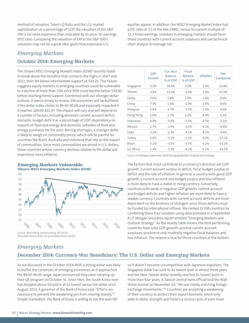
Macro Strategy Review www.forwardinvesting.com17
method of valuation, Tobin’s Q Ratio and the U.S. market capitalization as a percentage of GDP, the valuation of the S&P 500 is far more expensive than indicated by its price -to-earnings (P/E) ratio. Comparing the valuation of EM to the S&P 500’s valuation may not be a great idea, given how expensive U.S.
equities appear. In addition, the MSCI Emerging Market Index had a P/E ratio of 3.5 in the late 1990s, versus its current multiple of 11.3 times earnings. Investors in emerging markets should favor those countries with current account surpluses and use technical chart analysis to manage risk.
Emerging Markets
October 2014: Emerging Markets
The iShares MSCI Emerging Markets Index (EEM)8 recently failed to break above the trendline that connects the highs in 2007 and 2011, then fell below intermediate support at $43.25. This failure suggests equity markets in emerging countries could be vulnerable to a decline of more than 10% since EEM could decline below $39.00 before reaching trend support. Combined with our stronger dollar outlook, it seems timely to review. EM economies will be buffeted if the dollar index climbs to 89.00-90.00 and especially impacted if it reaches 100.00-101.97. The impact will vary and will depend on a number of factors, including domestic current account deficit, domestic budget deficit as a percentage of GDP, dependency on imports of food and energy and domestic subsidies of food and energy purchases for the poor. Barring shortages, a stronger dollar is likely to weigh on commodity prices, which will be painful for countries like Brazil, Australia and Indonesia that rely on the export of commodities. Since most commodities are priced in U.S. dollars, those countries whose currency declines relative to the dollar will experience more inflation.
The factors that most contribute to a currency’s direction are GDP growth, current account surplus or deficit, fiscal budget surplus or deficit and the rate of inflation. In general, a country with good GDP growth, a current account and budget surplus and low inflation is more likely to have a stable or rising currency. Conversely, countries with weak or negative GDP growth, current account and budget deficits and higher inflation are more likely to have a weaker currency. Countries with current account deficits are more dependent on the kindness of strangers since those deficits must be funded by international inflows. We ranked 12 EM countries by combining these four variables using data provided in a September 8 J.P. Morgan Securities report entitled “Emerging Markets and Outlook Strategy.” As the nearby table shows, the best-performing countries have solid GDP growth, positive current account surpluses, positive or only modestly negative fiscal balances and low inflation. The reverse is true for those countries at the bottom.
Emerging Markets
December 2014: Currency War Beneficiary: The U.S. Dollar and Emerging Markets
As we discussed in the October 2014 MSR, a strong dollar was likely to buffet the currencies of emerging economies as it approached the 89.00-90.00 range. Japan announced they were ramping up their QE program on October 31. Since then, the South Korea won has dropped about 5% and is at its lowest versus the dollar since August 2013. A governor of the Bank of Korea said, “Efforts are necessary to prevent the weakening yen from moving sharply.”9 Simple translation: the Bank of Korea is willing to see the won fall
so it doesn’t become uncompetitive with Japanese exporters. The Singapore dollar has sunk to its lowest level in almost three years and the New Taiwan dollar recently reached its lowest point in more than four years. A Taiwan central bank official told the Wall Street Journal on November 19, “We are closely watching foreign exchange movements.”10 Countries are accepting a weakening of their currency to protect their export business, which only adds to dollar strength and fosters a vicious cycle of even more
GDP Growth
Cur. Acct Balance
% of GDP
Fiscal Balance
% of GDPInflation
Net Composite
Singapore 3.3% 18.9% 5.0% 1.4% 25.8%
Taiwan 3.8% 11.0% -2.0% 1.9% 10.9%
Korea 3.6% 5.8% 1.0% 1.8% 8.6%
China 7.3% 1.8% -1.9% 2.6% 4.6%
Malaysia 5.8% 4.7% -3.5% 2.5% 4.5%
Hong Kong 2.0% 1.7% 1.0% 4.4% 0.3%
Indonesia 4.9% -3.0% -2.5% 4.5% -5.1%
Mexico 2.7% -1.9% -3.5% 4.1% -6.8%
India 5.3% -2.3% -4.1% 8.5% -9.6%
Turkey 3.0% -5.1% -2.1% 9.0% -13.2%
Brazil 0.2% -3.5% -3.7% 6.2% -13.2%
So. Africa 1.4% -5.5% -4.2% 6.2% -14.5%
Source: J.P. Morgan September 2014 Emerging Markets Outlook and Strategy
15
20
25
30
35
40
45
50
55
60
2006
2007
2008
2009
2010
2011
2012
2013
2014
Emerging Markets Vulnerable iShares MSCI Emerging Markets Index (EEM)
Source: Bloomberg, period ending 09/19/14 Past performance does not guarantee future results.

Macro Strategy Review www.forwardinvesting.com18
dollar strength. According to the International Monetary Fund, $650 billion has flowed into emerging markets as a result of quantitative easing by the Federal Reserve. There is a significant risk that some of this money will flow out of emerging economies as their currencies depreciate. A rush for the exit has the potential of igniting a currency crisis as affected central banks are forced to defend their currency through direct intervention or interest rate increases.
According to the Bank for International Settlements, more than two-thirds of the $11 trillion in cross-border bank loans are denominated in dollars and an unknown amount is not hedged. This has the potential to be a big problem since nonhedged dollar debt becomes more expensive as the dollar rises. For instance, if the dollar rises by 12%, which it has since May, a $100 million loan that is nonhedged may now be effectively $112 million if the currency of the loan holder has fallen 12%. This is another aspect of why the depreciation of the yen and euro amounts to those countries exporting the very deflation they are attempting to ward off in their own economies. The volatility in the currency market that the
BOJ and ECB have initiated is likely to intensify in coming months. If it does, it is easy to see how it could spill over into global equity markets, which have greeted every central bank intervention by lifting stock valuations.
Emerging Markets
February 2015: U.S. Dollar and Foreign Currency
In the April 2014 MSR we wrote, “The collateral damage that might flow from a weaker euro and stronger dollar could include renewed weakness in emerging market [EM] currencies with current account deficits and another decline in gold and a range of commodities, since a stronger dollar is likely to increase deflationary pressures in the global economy. There is a lot of debt denominated in dollars and most commodities are priced in dollars.” The euro experienced a three week key reversal the week of May 9, 2014, which we discussed in the June 2014 MSR. The technical key reversal in the euro coincided with the beginning of the rally in the dollar. Based on
the J.P. Morgan basket of emerging market currencies (EMCI), dollar strength has translated into a decline of 13.3% as this is written on January 26. Since May 2014, the S&P Goldman Sachs Commodity Index (GSCI) has declined by 41.5%. Certainly, a large portion of the loss was due to the drop in oil, but many other commodities have fallen, just less dramatically. Copper has declined -17.3% after falling from $3.05 a pound last May to $2.52. As noted in previous MSRs, we expected gold to break below its support at $1,180 as the dollar strengthened. Gold bottomed on November 7, 2014, at $1,132
-10%
-8%
-6%
-4%
-2%
0%
2%
4%
6%
8%
11/02/12
01/02/13
03/02/13
05/02/13
07/02/13
09/02/13
11/02/13
01/02/14
03/02/14
05/02/14
07/02/14
09/02/14
11/02/14
South Korea Taiwan Singapore China
U.S. Dollar vs. South Korea Won, Taiwan Dollar, Singapore Dollar and China Yuan
Source: Bloomberg, period ending 11/21/14 Past performance does not guarantee future results.
75
80
85
90
95
100
105
110
01/2011
07/2011
01/2012
07/2012
01/2013
07/2013
01/2014
07/2014
01/2015
J.P. Morgan EM Currency Index
Source: J.P. Morgan, period ending 01/22/15 Past performance does not guarantee future results.
Taper Talk
Dollar Rally
350
400
450
500
550
600
650
700
750
01/2012
07/2012
01/2013
07/2013
01/2014
07/2014
01/2015
S&P GSCI
Source: Standard & Poor's, period ending 01/23/15 Past performance does not guarantee future results.
Dollar Rally
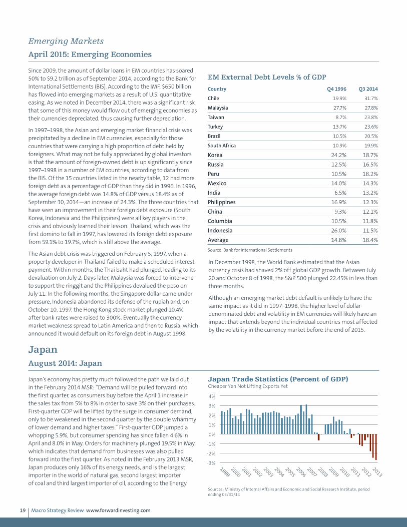
Macro Strategy Review www.forwardinvesting.com19
Emerging Markets
April 2015: Emerging Economies
Since 2009, the amount of dollar loans in EM countries has soared 50% to $9.2 trillion as of September 2014, according to the Bank for International Settlements (BIS). According to the IMF, $650 billion has flowed into emerging markets as a result of U.S. quantitative easing. As we noted in December 2014, there was a significant risk that some of this money would flow out of emerging economies as their currencies depreciated, thus causing further depreciation.
In 1997–1998, the Asian and emerging market financial crisis was precipitated by a decline in EM currencies, especially for those countries that were carrying a high proportion of debt held by foreigners. What may not be fully appreciated by global investors is that the amount of foreign-owned debt is up significantly since 1997–1998 in a number of EM countries, according to data from the BIS. Of the 15 countries listed in the nearby table, 12 had more foreign debt as a percentage of GDP than they did in 1996. In 1996, the average foreign debt was 14.8% of GDP versus 18.4% as of September 30, 2014—an increase of 24.3%. The three countries that have seen an improvement in their foreign debt exposure (South Korea, Indonesia and the Philippines) were all key players in the crisis and obviously learned their lesson. Thailand, which was the first domino to fall in 1997, has lowered its foreign debt exposure from 59.1% to 19.7%, which is still above the average.
The Asian debt crisis was triggered on February 5, 1997, when a property developer in Thailand failed to make a scheduled interest payment. Within months, the Thai baht had plunged, leading to its devaluation on July 2. Days later, Malaysia was forced to intervene to support the ringgit and the Philippines devalued the peso on July 11. In the following months, the Singapore dollar came under pressure, Indonesia abandoned its defense of the rupiah and, on October 10, 1997, the Hong Kong stock market plunged 10.4% after bank rates were raised to 300%. Eventually the currency market weakness spread to Latin America and then to Russia, which announced it would default on its foreign debt in August 1998.
In December 1998, the World Bank estimated that the Asian currency crisis had shaved 2% off global GDP growth. Between July 20 and October 8 of 1998, the S&P 500 plunged 22.45% in less than three months.
Although an emerging market debt default is unlikely to have the same impact as it did in 1997–1998, the higher level of dollar-denominated debt and volatility in EM currencies will likely have an impact that extends beyond the individual countries most affected by the volatility in the currency market before the end of 2015.
JapanAugust 2014: Japan
Japan’s economy has pretty much followed the path we laid out in the February 2014 MSR: “Demand will be pulled forward into the first quarter, as consumers buy before the April 1 increase in the sales tax from 5% to 8% in order to save 3% on their purchases. First-quarter GDP will be lifted by the surge in consumer demand, only to be weakened in the second quarter by the double whammy of lower demand and higher taxes.” First-quarter GDP jumped a whopping 5.9%, but consumer spending has since fallen 4.6% in April and 8.0% in May. Orders for machinery plunged 19.5% in May, which indicates that demand from businesses was also pulled forward into the first quarter. As noted in the February 2013 MSR, Japan produces only 16% of its energy needs, and is the largest importer in the world of natural gas, second largest importer of coal and third largest importer of oil, according to the Energy
EM External Debt Levels % of GDP
Country Q4 1996 Q3 2014
Chile 19.9% 31.7%
Malaysia 27.7% 27.8%
Taiwan 8.7% 23.8%
Turkey 13.7% 23.6%
Brazil 10.5% 20.5%
South Africa 10.9% 19.9%
Korea 24.2% 18.7%
Russia 12.5% 16.5%
Peru 10.5% 18.2%
Mexico 14.0% 14.3%
India 6.5% 13.2%
Philippines 16.9% 12.3%
China 9.3% 12.1%
Columbia 10.5% 11.8%
Indonesia 26.0% 11.5%
Average 14.8% 18.4%
Source: Bank for International Settlements
-3%
-2%
-1%
0%
1%
2%
3%
4%
1999
2000
2001
2002
2003
2004
2005
2006
2007
2008
2009
2010
2011
2012
2013
Japan Trade Statistics (Percent of GDP) Cheaper Yen Not Lifting Exports Yet
Sources: Ministry of Internal Affairs and Economic and Social Research Institute, period ending 03/31/14

Macro Strategy Review www.forwardinvesting.com20
Information Administration. Since these commodities are priced in dollars, we expected the decline in the yen to increase the cost of these imports, resulting in more inflation and a larger trade deficit. In May, Japan’s Consumer Price Index (CPI) was 3.7% higher than in May 2013. As of March 31, 2014 (latest data available), Japan’s trade deficit as a percentage of GDP was the largest in decades. Prime Minister Shinzo- Abe has succeeded in reversing deflation, but he may have succeeded too well since the cost of living is rising faster than the increase in wages. This may hurt future consumption, resulting in slower GDP growth in coming quarters. If Japan’s economy does not shows signs of recovering from the tax increase before year-end, the Bank of Japan may instigate another round of QE to cheapen the yen further and boost Japan’s stock market.
Japan
December 2014: Japan
Japan’s newest round of quantitative easing, tax cuts and currency devaluation was triggered by a -1.6% decline in third quarter GDP after its economy contracted -7.3% in the second quarter. The weakness in the second quarter was prompted by an increase in Japan’s sales tax from 5% to 8% on April 1. As we noted in the November 2013 MSR, “As consumers rush to buy before April in order to save 3% on their purchases…first quarter [2014] GDP will be lifted by the surge in consumer demand, only to weaken significantly in the second quarter. This will be the first real test of
the durability of Abenomics.” While the first quarter strength of 6.7% and second quarter weakness was predictable, the contraction in the third quarter illustrates how fragile the Japanese economy remains. In the August 2014 MSR we wrote, “If Japan’s economy does not show signs of recovering from the tax increase before year-end, the Bank of Japan may instigate another round of QE to cheapen the yen further and boost Japan’s stock market.”
With the contraction in the second and third quarters, Japan has entered its fourth recession since 2007. The BOJ vote to increase its QE program was a close 5 to 4, however, since some members are concerned about the precariousness of Japan’s long-term fiscal health. As Japan’s total debt-to-GDP ratio is a mind-blowing 640%, their concern is more than justified.
Real household income, which adjusts for inflation, has declined for 15 consecutive months and has dropped from an increase of almost 3% in the first half of 2013 to -6.0% as of September 30, 2014. Although wages rose for the seventh straight month in September and were up 0.5% from September 2013, the improvement in wages still lagged the 3.2% increase in Japan’s consumer price index (CPI) in September. The purchasing power of the average Japanese worker continues to worsen. In fact, a BOJ survey released in October found that only 4.4% of households said they were better off than a year ago. As consumers account for about 65% of Japan’s GDP, their finances and outlook are important.
-3 -2 -1 0 1 2 3 4
1999
2000
2001
2002
2003
2004
2005
2006
2007
2008
2009
2010
2011
2012
2013
Japan CPI (Year-Over-Year Change) Rising Faster Than Incomes
Source: Ministry of Internal Affairs, period ending 05/31/14 Past performance does not guarantee future results.
-10%
-8%
-6%
-4%
-2%
0%
2%
4%
6%
03/31/07
09/30/07
03/31/08
09/30/08
03/31/09
09/30/09
03/31/10
09/30/10
03/31/11
09/30/11
03/31/12
09/30/12
03/31/13
09/30/13
03/31/14
09/30/14
Japan GDP Growth (Year-Over-Year)
Source: Economic and Social Research Institute, period ending 09/30/14
500%
520%
540%
560%
580%
600%
620%
640%
660%
1999
2000
2001
2002
2003
2004
2005
2006
2007
2008
2009
2010
2011
2012
2013
2014
Japan Debt Oustanding as a Percentage of GDP
Source: Morgan Stanley Research, period ending 06/30/14
-8.0%
-6.0%
-4.0%
-2.0%
0.0%
2.0%
4.0%
6.0%
8.0%
10.0%
01/01/07
07/01/07
01/01/08
07/01/08
01/01/09
07/01/09
01/01/10
07/01/10
01/01/11
07/01/11
01/01/12
07/01/12
01/01/13
07/01/13
01/01/14
07/01/14
Japan Household Income (Year-Over-Year)
Source: Ministry of Internal Affairs, period ending 09/30/14
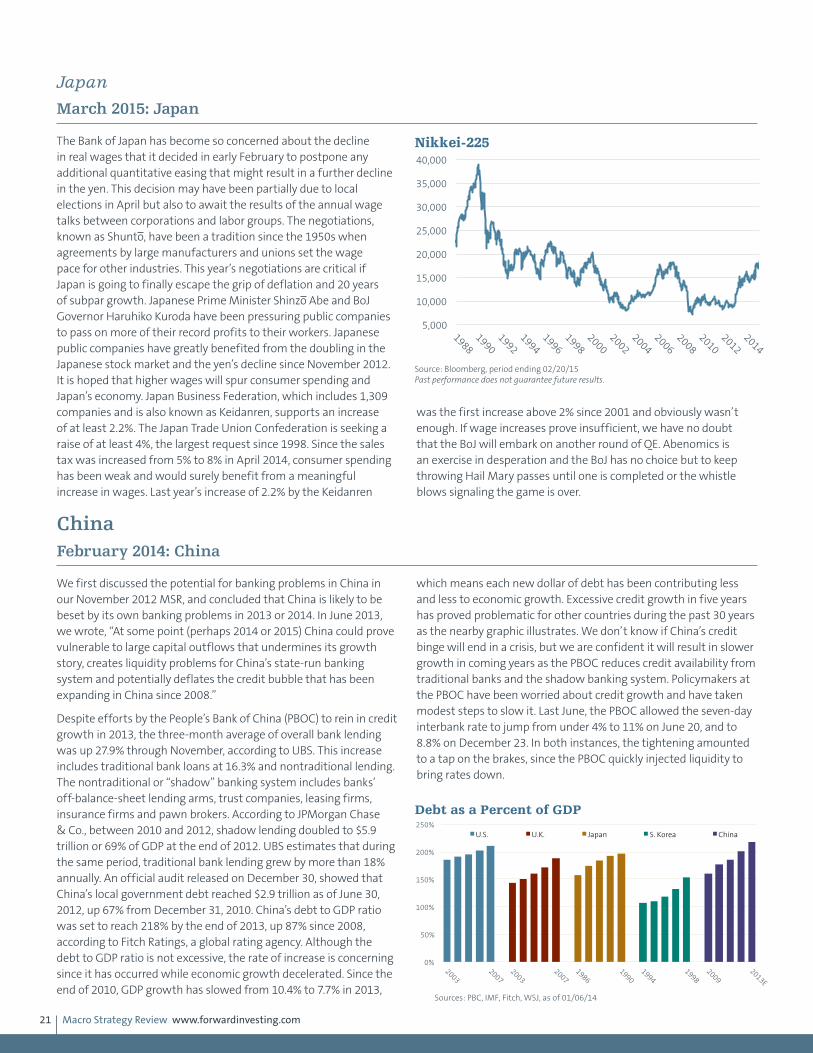
Macro Strategy Review www.forwardinvesting.com21
Japan
March 2015: Japan
The Bank of Japan has become so concerned about the decline in real wages that it decided in early February to postpone any additional quantitative easing that might result in a further decline in the yen. This decision may have been partially due to local elections in April but also to await the results of the annual wage talks between corporations and labor groups. The negotiations, known as Shunto, have been a tradition since the 1950s when agreements by large manufacturers and unions set the wage pace for other industries. This year’s negotiations are critical if Japan is going to finally escape the grip of deflation and 20 years of subpar growth. Japanese Prime Minister Shinzo Abe and BoJ Governor Haruhiko Kuroda have been pressuring public companies to pass on more of their record profits to their workers. Japanese public companies have greatly benefited from the doubling in the Japanese stock market and the yen’s decline since November 2012. It is hoped that higher wages will spur consumer spending and Japan’s economy. Japan Business Federation, which includes 1,309 companies and is also known as Keidanren, supports an increase of at least 2.2%. The Japan Trade Union Confederation is seeking a raise of at least 4%, the largest request since 1998. Since the sales tax was increased from 5% to 8% in April 2014, consumer spending has been weak and would surely benefit from a meaningful increase in wages. Last year’s increase of 2.2% by the Keidanren
was the first increase above 2% since 2001 and obviously wasn’t enough. If wage increases prove insufficient, we have no doubt that the BoJ will embark on another round of QE. Abenomics is an exercise in desperation and the BoJ has no choice but to keep throwing Hail Mary passes until one is completed or the whistle blows signaling the game is over.
ChinaFebruary 2014: China
We first discussed the potential for banking problems in China in our November 2012 MSR, and concluded that China is likely to be beset by its own banking problems in 2013 or 2014. In June 2013, we wrote, “At some point (perhaps 2014 or 2015) China could prove vulnerable to large capital outflows that undermines its growth story, creates liquidity problems for China’s state-run banking system and potentially deflates the credit bubble that has been expanding in China since 2008.”
Despite efforts by the People’s Bank of China (PBOC) to rein in credit growth in 2013, the three-month average of overall bank lending was up 27.9% through November, according to UBS. This increase includes traditional bank loans at 16.3% and nontraditional lending. The nontraditional or “shadow” banking system includes banks’ off-balance-sheet lending arms, trust companies, leasing firms, insurance firms and pawn brokers. According to JPMorgan Chase & Co., between 2010 and 2012, shadow lending doubled to $5.9 trillion or 69% of GDP at the end of 2012. UBS estimates that during the same period, traditional bank lending grew by more than 18% annually. An official audit released on December 30, showed that China’s local government debt reached $2.9 trillion as of June 30, 2012, up 67% from December 31, 2010. China’s debt to GDP ratio was set to reach 218% by the end of 2013, up 87% since 2008, according to Fitch Ratings, a global rating agency. Although the debt to GDP ratio is not excessive, the rate of increase is concerning since it has occurred while economic growth decelerated. Since the end of 2010, GDP growth has slowed from 10.4% to 7.7% in 2013,
which means each new dollar of debt has been contributing less and less to economic growth. Excessive credit growth in five years has proved problematic for other countries during the past 30 years as the nearby graphic illustrates. We don’t know if China’s credit binge will end in a crisis, but we are confident it will result in slower growth in coming years as the PBOC reduces credit availability from traditional banks and the shadow banking system. Policymakers at the PBOC have been worried about credit growth and have taken modest steps to slow it. Last June, the PBOC allowed the seven-day interbank rate to jump from under 4% to 11% on June 20, and to 8.8% on December 23. In both instances, the tightening amounted to a tap on the brakes, since the PBOC quickly injected liquidity to bring rates down.
5,000
10,000
15,000
20,000
25,000
30,000
35,000
40,000
1988
1990
1992
1994
1996
1998
2000
2002
2004
2006
2008
2010
2012
2014
Nikkei-225
Source: Bloomberg, period ending 02/20/15 Past performance does not guarantee future results.
0%
50%
100%
150%
200%
250%
2003
2007
2003
2007
1986
1990
1994
1998
2009
2013E
U.S. U.K. Japan S. Korea China
Debt as a Percent of GDP
Sources: PBC, IMF, Fitch, WSJ, as of 01/06/14
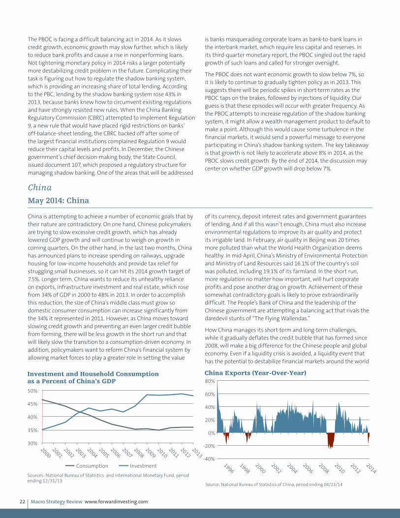
Macro Strategy Review www.forwardinvesting.com22
The PBOC is facing a difficult balancing act in 2014. As it slows credit growth, economic growth may slow further, which is likely to reduce bank profits and cause a rise in nonperforming loans. Not tightening monetary policy in 2014 risks a larger potentially more destabilizing credit problem in the future. Complicating their task is figuring out how to regulate the shadow banking system, which is providing an increasing share of total lending. According to the PBC, lending by the shadow banking system rose 43% in 2013, because banks knew how to circumvent existing regulations and have strongly resisted new rules. When the China Banking Regulatory Commission (CBRC) attempted to implement Regulation 9, a new rule that would have placed rigid restrictions on banks’ off-balance-sheet lending, the CBRC backed off after some of the largest financial institutions complained Regulation 9 would reduce their capital levels and profits. In December, the Chinese government’s chief decision-making body, the State Council, issued document 107, which proposed a regulatory structure for managing shadow banking. One of the areas that will be addressed
is banks masquerading corporate loans as bank-to-bank loans in the interbank market, which require less capital and reserves. In its third-quarter monetary report, the PBOC singled out the rapid growth of such loans and called for stronger oversight.
The PBOC does not want economic growth to slow below 7%, so it is likely to continue to gradually tighten policy as in 2013. This suggests there will be periodic spikes in short-term rates as the PBOC taps on the brakes, followed by injections of liquidity. Our guess is that these episodes will occur with greater frequency. As the PBOC attempts to increase regulation of the shadow banking system, it might allow a wealth management product to default to make a point. Although this would cause some turbulence in the financial markets, it would send a powerful message to everyone participating in China’s shadow banking system. The key takeaway is that growth is not likely to accelerate above 8% in 2014, as the PBOC slows credit growth. By the end of 2014, the discussion may center on whether GDP growth will drop below 7%.
China
May 2014: China
China is attempting to achieve a number of economic goals that by their nature are contradictory. On one hand, Chinese policymakers are trying to slow excessive credit growth, which has already lowered GDP growth and will continue to weigh on growth in coming quarters. On the other hand, in the last two months, China has announced plans to increase spending on railways, upgrade housing for low-income households and provide tax relief for struggling small businesses, so it can hit its 2014 growth target of 7.5%. Longer term, China wants to reduce its unhealthy reliance on exports, infrastructure investment and real estate, which rose from 34% of GDP in 2000 to 48% in 2013. In order to accomplish this reduction, the size of China’s middle class must grow so domestic consumer consumption can increase significantly from the 34% it represented in 2011. However, as China moves toward slowing credit growth and preventing an even larger credit bubble from forming, there will be less growth in the short run and that will likely slow the transition to a consumption-driven economy. In addition, policymakers want to reform China’s financial system by allowing market forces to play a greater role in setting the value
of its currency, deposit interest rates and government guarantees of lending. And if all this wasn’t enough, China must also increase environmental regulations to improve its air quality and protect its irrigable land. In February, air quality in Beijing was 20 times more polluted than what the World Health Organization deems healthy. In mid-April, China’s Ministry of Environmental Protection and Ministry of Land Resources said 16.1% of the country’s soil was polluted, including 19.1% of its farmland. In the short run, more regulation no matter how important, will hurt corporate profits and pose another drag on growth. Achievement of these somewhat contradictory goals is likely to prove extraordinarily difficult. The People’s Bank of China and the leadership of the Chinese government are attempting a balancing act that rivals the daredevil stunts of “The Flying Wallendas.”
How China manages its short-term and long-term challenges, while it gradually deflates the credit bubble that has formed since 2008, will make a big difference for the Chinese people and global economy. Even if a liquidity crisis is avoided, a liquidity event that has the potential to destabilize financial markets around the world
30%
35%
40%
45%
50%
2000
2001
2002
2003
2004
2005
2006
2007
2008
2009
2010
2011
2012
2013
Consumption Investment
Investment and Household Consumption as a Percent of China's GDP
Sources: National Bureau of Statistics and International Monetary Fund, period ending 12/31/13
-40%
-20%
0%
20%
40%
60%
80%
1996
1998
2000
2002
2004
2006
2008
2010
2012
2014
China Exports (Year-Over-Year)
Source: National Bureau of Statistics of China, period ending 04/23/14
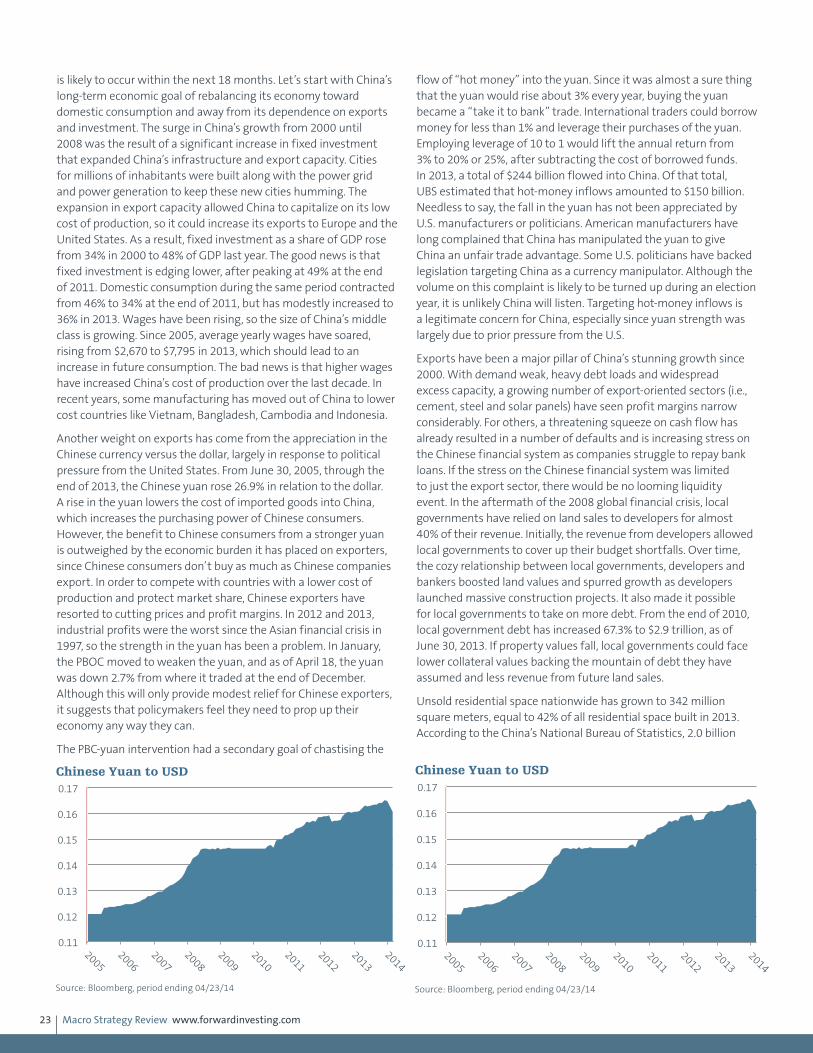
Macro Strategy Review www.forwardinvesting.com23
is likely to occur within the next 18 months. Let’s start with China’s long-term economic goal of rebalancing its economy toward domestic consumption and away from its dependence on exports and investment. The surge in China’s growth from 2000 until 2008 was the result of a significant increase in fixed investment that expanded China’s infrastructure and export capacity. Cities for millions of inhabitants were built along with the power grid and power generation to keep these new cities humming. The expansion in export capacity allowed China to capitalize on its low cost of production, so it could increase its exports to Europe and the United States. As a result, fixed investment as a share of GDP rose from 34% in 2000 to 48% of GDP last year. The good news is that fixed investment is edging lower, after peaking at 49% at the end of 2011. Domestic consumption during the same period contracted from 46% to 34% at the end of 2011, but has modestly increased to 36% in 2013. Wages have been rising, so the size of China’s middle class is growing. Since 2005, average yearly wages have soared, rising from $2,670 to $7,795 in 2013, which should lead to an increase in future consumption. The bad news is that higher wages have increased China’s cost of production over the last decade. In recent years, some manufacturing has moved out of China to lower cost countries like Vietnam, Bangladesh, Cambodia and Indonesia.
Another weight on exports has come from the appreciation in the Chinese currency versus the dollar, largely in response to political pressure from the United States. From June 30, 2005, through the end of 2013, the Chinese yuan rose 26.9% in relation to the dollar. A rise in the yuan lowers the cost of imported goods into China, which increases the purchasing power of Chinese consumers. However, the benefit to Chinese consumers from a stronger yuan is outweighed by the economic burden it has placed on exporters, since Chinese consumers don’t buy as much as Chinese companies export. In order to compete with countries with a lower cost of production and protect market share, Chinese exporters have resorted to cutting prices and profit margins. In 2012 and 2013, industrial profits were the worst since the Asian financial crisis in 1997, so the strength in the yuan has been a problem. In January, the PBOC moved to weaken the yuan, and as of April 18, the yuan was down 2.7% from where it traded at the end of December. Although this will only provide modest relief for Chinese exporters, it suggests that policymakers feel they need to prop up their economy any way they can.
The PBC-yuan intervention had a secondary goal of chastising the
flow of “hot money” into the yuan. Since it was almost a sure thing that the yuan would rise about 3% every year, buying the yuan became a “take it to bank” trade. International traders could borrow money for less than 1% and leverage their purchases of the yuan. Employing leverage of 10 to 1 would lift the annual return from 3% to 20% or 25%, after subtracting the cost of borrowed funds. In 2013, a total of $244 billion flowed into China. Of that total, UBS estimated that hot-money inflows amounted to $150 billion. Needless to say, the fall in the yuan has not been appreciated by U.S. manufacturers or politicians. American manufacturers have long complained that China has manipulated the yuan to give China an unfair trade advantage. Some U.S. politicians have backed legislation targeting China as a currency manipulator. Although the volume on this complaint is likely to be turned up during an election year, it is unlikely China will listen. Targeting hot-money inflows is a legitimate concern for China, especially since yuan strength was largely due to prior pressure from the U.S.
Exports have been a major pillar of China’s stunning growth since 2000. With demand weak, heavy debt loads and widespread excess capacity, a growing number of export-oriented sectors (i.e., cement, steel and solar panels) have seen profit margins narrow considerably. For others, a threatening squeeze on cash flow has already resulted in a number of defaults and is increasing stress on the Chinese financial system as companies struggle to repay bank loans. If the stress on the Chinese financial system was limited to just the export sector, there would be no looming liquidity event. In the aftermath of the 2008 global financial crisis, local governments have relied on land sales to developers for almost 40% of their revenue. Initially, the revenue from developers allowed local governments to cover up their budget shortfalls. Over time, the cozy relationship between local governments, developers and bankers boosted land values and spurred growth as developers launched massive construction projects. It also made it possible for local governments to take on more debt. From the end of 2010, local government debt has increased 67.3% to $2.9 trillion, as of June 30, 2013. If property values fall, local governments could face lower collateral values backing the mountain of debt they have assumed and less revenue from future land sales.
Unsold residential space nationwide has grown to 342 million square meters, equal to 42% of all residential space built in 2013. According to the China’s National Bureau of Statistics, 2.0 billion
0.11
0.12
0.13
0.14
0.15
0.16
0.17
2005
2006
2007
2008
2009
2010
2011
2012
2013
2014
Chinese Yuan to USD
Source: Bloomberg, period ending 04/23/14
0.11
0.12
0.13
0.14
0.15
0.16
0.17
2005
2006
2007
2008
2009
2010
2011
2012
2013
2014
Chinese Yuan to USD
Source: Bloomberg, period ending 04/23/14
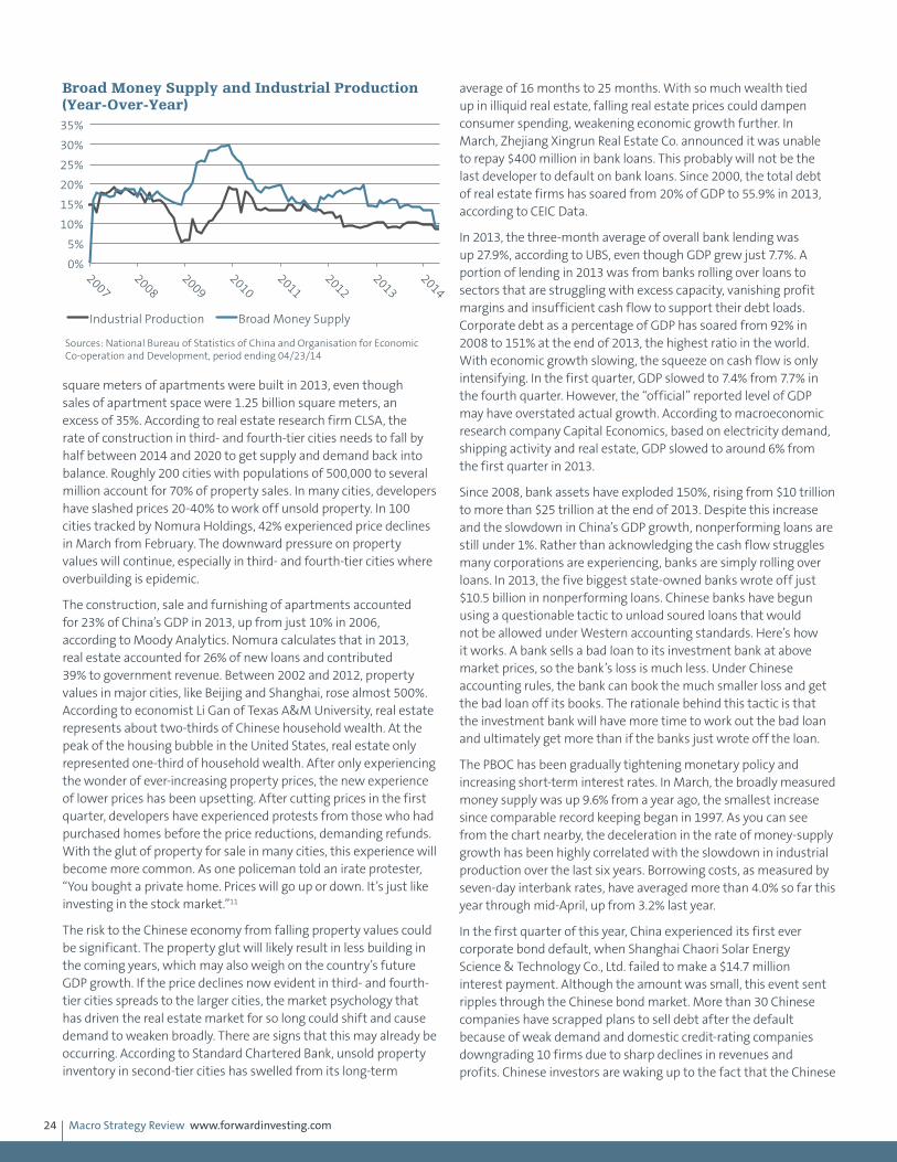
Macro Strategy Review www.forwardinvesting.com24
square meters of apartments were built in 2013, even though sales of apartment space were 1.25 billion square meters, an excess of 35%. According to real estate research firm CLSA, the rate of construction in third- and fourth-tier cities needs to fall by half between 2014 and 2020 to get supply and demand back into balance. Roughly 200 cities with populations of 500,000 to several million account for 70% of property sales. In many cities, developers have slashed prices 20-40% to work off unsold property. In 100 cities tracked by Nomura Holdings, 42% experienced price declines in March from February. The downward pressure on property values will continue, especially in third- and fourth-tier cities where overbuilding is epidemic.
The construction, sale and furnishing of apartments accounted for 23% of China’s GDP in 2013, up from just 10% in 2006, according to Moody Analytics. Nomura calculates that in 2013, real estate accounted for 26% of new loans and contributed 39% to government revenue. Between 2002 and 2012, property values in major cities, like Beijing and Shanghai, rose almost 500%. According to economist Li Gan of Texas A&M University, real estate represents about two-thirds of Chinese household wealth. At the peak of the housing bubble in the United States, real estate only represented one-third of household wealth. After only experiencing the wonder of ever-increasing property prices, the new experience of lower prices has been upsetting. After cutting prices in the first quarter, developers have experienced protests from those who had purchased homes before the price reductions, demanding refunds. With the glut of property for sale in many cities, this experience will become more common. As one policeman told an irate protester, “You bought a private home. Prices will go up or down. It’s just like investing in the stock market.”11
The risk to the Chinese economy from falling property values could be significant. The property glut will likely result in less building in the coming years, which may also weigh on the country’s future GDP growth. If the price declines now evident in third- and fourth-tier cities spreads to the larger cities, the market psychology that has driven the real estate market for so long could shift and cause demand to weaken broadly. There are signs that this may already be occurring. According to Standard Chartered Bank, unsold property inventory in second-tier cities has swelled from its long-term
average of 16 months to 25 months. With so much wealth tied up in illiquid real estate, falling real estate prices could dampen consumer spending, weakening economic growth further. In March, Zhejiang Xingrun Real Estate Co. announced it was unable to repay $400 million in bank loans. This probably will not be the last developer to default on bank loans. Since 2000, the total debt of real estate firms has soared from 20% of GDP to 55.9% in 2013, according to CEIC Data.
In 2013, the three-month average of overall bank lending was up 27.9%, according to UBS, even though GDP grew just 7.7%. A portion of lending in 2013 was from banks rolling over loans to sectors that are struggling with excess capacity, vanishing profit margins and insufficient cash flow to support their debt loads. Corporate debt as a percentage of GDP has soared from 92% in 2008 to 151% at the end of 2013, the highest ratio in the world. With economic growth slowing, the squeeze on cash flow is only intensifying. In the first quarter, GDP slowed to 7.4% from 7.7% in the fourth quarter. However, the “official” reported level of GDP may have overstated actual growth. According to macroeconomic research company Capital Economics, based on electricity demand, shipping activity and real estate, GDP slowed to around 6% from the first quarter in 2013.
Since 2008, bank assets have exploded 150%, rising from $10 trillion to more than $25 trillion at the end of 2013. Despite this increase and the slowdown in China’s GDP growth, nonperforming loans are still under 1%. Rather than acknowledging the cash flow struggles many corporations are experiencing, banks are simply rolling over loans. In 2013, the five biggest state-owned banks wrote off just $10.5 billion in nonperforming loans. Chinese banks have begun using a questionable tactic to unload soured loans that would not be allowed under Western accounting standards. Here’s how it works. A bank sells a bad loan to its investment bank at above market prices, so the bank’s loss is much less. Under Chinese accounting rules, the bank can book the much smaller loss and get the bad loan off its books. The rationale behind this tactic is that the investment bank will have more time to work out the bad loan and ultimately get more than if the banks just wrote off the loan.
The PBOC has been gradually tightening monetary policy and increasing short-term interest rates. In March, the broadly measured money supply was up 9.6% from a year ago, the smallest increase since comparable record keeping began in 1997. As you can see from the chart nearby, the deceleration in the rate of money-supply growth has been highly correlated with the slowdown in industrial production over the last six years. Borrowing costs, as measured by seven-day interbank rates, have averaged more than 4.0% so far this year through mid-April, up from 3.2% last year.
In the first quarter of this year, China experienced its first ever corporate bond default, when Shanghai Chaori Solar Energy Science & Technology Co., Ltd. failed to make a $14.7 million interest payment. Although the amount was small, this event sent ripples through the Chinese bond market. More than 30 Chinese companies have scrapped plans to sell debt after the default because of weak demand and domestic credit-rating companies downgrading 10 firms due to sharp declines in revenues and profits. Chinese investors are waking up to the fact that the Chinese
0%
5%
10%
15%
20%
25%
30%
35%
2007
2008
2009
2010
2011
2012
2013
2014
Industrial Production Broad Money Supply
Broad Money Supply and Industrial Production (Year-Over-Year)
Sources: National Bureau of Statistics of China and Organisation for Economic Co-operation and Development, period ending 04/23/14

Macro Strategy Review www.forwardinvesting.com25
government will allow risky borrowers to fail. To compensate for the increased perception of risk, investors are demanding higher returns. In the long run, allowing the credit market to price risk is a good thing, since cheap capital will flow to companies that have earned it through performance rather than companies with government connections. In the short run, it means companies that have routinely had access to cheap credit, irrespective of their financial health, must now improve their business model, pay more for credit or face failure. Companies that previously had access to credit through trust companies’ wealth management products are also scrambling after two wealth management products were allowed to renege on promises. This has slowed the indiscriminate flow of credit into wealth management products from private investors looking for better returns.
The liquidity squeeze we have discussed periodically over the past year is intensifying, as cash-strapped companies lose access to additional credit from banks, the credit market and the shadow banking system. A whole host of companies and investors are learning what it means to operate without the safety net of implied government guarantees. A good number of companies are not going to be able to maintain their balance on the high wire of debt
they have accumulated, which could negatively impact China’s highly levered banks and economic growth. The question is how many companies will policymakers allow to fail before they revert to backstopping bad loans and announcing new infrastructure spending programs. The risk is that by the time they act it will be too late. History shows that once a liquidity crisis takes hold, events often take on a life of their own.
In our January Macro Market Update webcast, we suggested that the Shanghai Stock Exchange Composite Index would make a trading low if it traded under 2,000. This view was based on the technical pattern in the Shanghai Composite and not the fundamentals of the Chinese economy. In early March, the composite did trade under 2,000, and has since rallied. If it can trade above 2,140, a rally to 2,240 will likely follow. Although we still believe any liquidity event may not become a factor until later this year or in 2015, a decline below 1,975 would reflect a serious deterioration of liquidity in the Chinese financial system. Conversely, a rally above 2,450 would likely indicate that Chinese policymakers had accomplished a feat similar to Karl Wallenda’s seven-person chair pyramid.
China
April 2015: China
Since 2007, China’s total debt has nearly quadrupled, rising from $7.4 trillion to $28.2 trillion. According to the McKinsey Global Institute, China’s debt-to-GDP ratio jumped from 158% to 282% by the second quarter of 2014. If the pace of debt accumulation during the past seven years is maintained, China’s debt-to-GDP ratio could approach 400% by 2018. According to Lombard Street Research, most new lending is used to roll over existing debt. The surge in debt since 2007 has lowered the impact of each new dollar of debt on GDP growth from $0.80 to $0.20, so additional monetary stimulus from the People’s Bank of China may only impede the slowdown in growth rather than kick-start it.
Almost half the debt of Chinese households, corporations and local governments is directly or indirectly related to real estate. A study by the U.S. Federal Reserve found that property investment has grown from 4% of GDP in 1998 to 15% in 2014—a higher proportion than Japan experienced when its real estate bubble popped in 1989. When including home furnishings like appliances, carpet and furniture, the contribution to GDP approaches 23%. Property prices in 40 major Chinese cities rose 60% in the wake of the financial crisis but are now softening. Home prices fell 3.8% in February from a year earlier, according to private sector data provider China Real Estate Index System. Ominously, sales volume, which normally precedes changes in home prices, has declined sharply: down -7% in tier-one cities, -22% in tier-two cities and -15% in tier-three cities. The inventory of homes on the market has soared to 18 months of supply at current selling rates. This data suggests that property investment is likely to slow in coming quarters until the overhang of inventory is worked off and will weigh on GDP growth.
Local governments derive 35% of their revenue from land sales, which, as a revenue source, are far less stable than taxes, especially
in the current environment. According to Deutsche Bank, land sale revenues fell 21% in the fourth quarter, which will certainly put a squeeze on local governments. These local governments have also been big borrowers in the shadow banking system, which, at $6.5 trillion, represents almost 30% of China’s $28.2 trillion in debt. To curb this off-the-books borrowing, China implemented new regulations in January 2015 to prohibit local governments from raising money off the books. These new regulations and the decline in land sales will most likely inhibit local government spending and hurt GDP growth.
The explosion in debt after the financial crisis funded a large expansion in industrial capacity to provide the materials needed during the property boom. With property sales and demand slowing, a severe overhang of excess capacity in property-related industries such as steel, cement and glass has developed. China
4%
5%
6%
7%
8%
9%
10%
11%
12%
13%
1999
2001
2003
2005
2007
2009
2011
2013
China GDP (Year-Over-Year Change)
Source: National Bureau of Statistics, period ending 12/31/14

Macro Strategy Review www.forwardinvesting.com26
produces as much steel as the rest of the world combined, but demand within China grew just 1% in 2014. Excess capacity in steel and other industries has led producers to cut prices so that the Producer Price Index (PPI) has been below 0% for almost three years. In January 2015, the PPI was 4.8% below January 2014. The only time it has been weaker since 2000 was during the nadir of the financial crisis. If Japan and Europe are concerned about deflation, you can bet China is too.
Since the Chinese yuan is closely linked to the value of the dollar, the depreciation of the yen and euro is squeezing Chinese exporters unmercifully. The yuan has soared 37% versus the yen since mid-2012 and 27% versus the euro just since May 2014. The currencies of China’s Asian trade competitors have also slumped. The Taiwan dollar has lost -5.1% against the yuan while the Singapore dollar is down -11.0% and the South Korean won has tumbled -11.7%.
In our December 2014 MSR we said the deflation battle was becoming a currency war and weighing on growth in China’s economy. So far China has responded by easing monetary policy while still maintaining the yuan’s peg to the dollar. Prior to March 16, the yuan had only dipped about 0.9% in 2015 versus the dollar after losing 2.5% in 2014. In the December MSR we said, “China will ease monetary policy further”—and it has. On February 4, the People’s Bank of China lowered the reserve ratio for banks from 20.0% to 19.5%, which will free up about $95 billion for lending. It was the first reduction in the reserve ratio since 2012. On March 1, 2015, the PBOC lowered the one-year lending rate by 0.25% to 5.35% and the deposit rate to 2.50%. Despite the easing moves by the PBOC, the growth rate in M1 money supply continues to languish. There is a high correlation between money supply growth and industrial production. The gradual slowing in money supply since its spike higher in 2010 pretty much mirrors the lessening growth rate in industrial production, which was up 6.8% year to date through February versus 8.3% in 2014. The excess capacity in property-related industries and weak money supply growth suggests a pickup in industrial production is not likely anytime soon.
The relative strength of the yuan versus a host of trade competitors and weak Chinese export growth (the European Union is China’s largest export market) will force the PBOC to cut rates again and
consider lowering the value of the yuan to defend it exporters. The Bank of Japan and ECB are effectively exporting deflation to the rest of the world through the depreciation of their currencies. Their actions have resulted in 46 rate reductions by other central banks this year in an effort to weaken their currencies or stimulate their economies. Like water swirling around a bathtub drain, more central banks are being pulled into the vortex of protectionism devaluation. The currency protectionism playing out now is worse than the protectionism of the 1930s since trade comprises a larger share of global GDP and it affects all goods and services rather than just targeted products. If China moves to protect itself by lowering the value of the yuan, another wave of deflation will be unleashed in the global economy.
Although China is likely to make additional rate cuts and lower reserve requirements, there are a number of headwinds that may limit the effectiveness of additional monetary stimulus. Overall indebtedness is already high and each new dollar of debt is generating less GDP. Nonperforming loan losses are increasing at Chinese banks so an increase in new lending could be counterproductive. Further investment in property and basic industries will only increase excess capacity, which risks further declines in producer prices and more deflation. According to Citibank estimates, financial outflows from China averaged $50 billion a month in the last three quarters of 2014. When the PBOC
-10%
-5%
0%
5%
10%
15%
2000
2002
2004
2006
2008
2010
2012
2014
China PPI (Year-Over-Year Change)
Source: National Bureau of Statistics, period ending 02/28/15
0%
5%
10%
15%
20%
25%
2000
2002
2004
2006
2008
2010
2012
2014
China Industrial Production
Source: National Bureau of Statistics, period ending 12/31/14
0%
5%
10%
15%
20%
25%
30%
35%
40%
2000
2002
2004
2006
2008
2010
2012
2014
China M1 (Year-Over-Year Change)
Source: The People's Bank of China, period ending 02/28/15
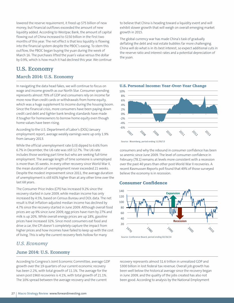
Macro Strategy Review www.forwardinvesting.com27
lowered the reserve requirement, it freed up $75 billion of new money, but financial outflows exceeded the amount of new liquidity added. According to Westpac Bank, the amount of capital flowing out of China increased to $150 billion in the first two months of this year. The net effect is that less liquidity is flowing into the financial system despite the PBOC’s easing. To stem this outflow, the PBOC began buying the yuan during the week of March 16. The purchases lifted the yuan’s value versus the dollar by 0.9%, which is how much it had declined this year. We continue
to believe that China is heading toward a liquidity event and will exhibit slower growth that will weigh on overall emerging market growth in 2015.
The global currency war has made China’s task of gradually deflating the debt and real estate bubbles far more challenging. China will do what is in its best interest, so expect additional cuts in the reserve ratio and interest rates and a potential depreciation of the yuan.
U.S. EconomyMarch 2014: U.S. Economy
In navigating the data head fakes, we will continue to focus on wage and income growth as our North Star. Consumer spending represents almost 70% of GDP and consumers rely on income far more now than credit cards or withdrawals from home equity, which was a huge supplement to income during the housing boom. Since the financial crisis, more consumers have been paying down credit card debt and tighter bank lending standards have made it tougher for homeowners to borrow home equity even though home values have been rising.
According to the U.S. Department of Labor’s (DOL) January employment report, average weekly earnings were up only 1.9% from January 2013.
While the official unemployment rate (U3) dipped to 6.6% from 6.7% in December, the U6 rate was still 12.7%. The U6 rate includes those working part time but who are seeking full-time employment. The average length of time someone is unemployed is more than 35 weeks. In every other recovery since World War II, the mean duration of unemployment never exceeded 21 weeks. Despite the modest improvement since 2011, the average duration of unemployment is still 60% higher than at any other time over the last 68 years.
The Consumer Price Index (CPI) has increased 9.2% since the recovery started in June 2009, while median income has only increased by 4.5%, based on Census Bureau and DOL data. The net result is that inflation-adjusted median income has declined by 4.7% since the recovery started in June 2009. Although overall food prices are up 9% since June 2009, egg prices have risen by 27% and milk is up 20%. While overall energy prices are up 18%, gasoline prices have increased 32%. Since most consumers eat food and drive a car, the CPI doesn’t completely capture the impact from higher prices and how incomes have failed to keep up with the cost of living. This is why the current recovery feels hollow for many
consumers and why the rebound in consumer confidence has been so anemic since June 2009. The level of consumer confidence in February (78.1) remains at levels more consistent with a recession over the past 40 years than other post-World War II recoveries. A recent Rasmussen Reports poll found that 49% of those surveyed believe the economy is in recession.
U.S. Economy
June 2014: U.S. Economy
According to Congress’s Joint Economic Committee, average GDP growth over the 19 quarters of our current economic recovery has been 2.2%, with total growth of 11.1%. The average for the seven post-1960 recoveries is 4.1%, with total growth of 21.1%. The 10% spread between the average recovery and the current
recovery represents almost $1.6 trillion in unrealized GDP and $300 billion in lost federal tax revenue. Overall job growth has been well below the historical average since the recovery began in June 2009, and the quality of the jobs created has also not been good. According to analysis by the National Employment
-‐6% -‐4% -‐2% 0% 2% 4% 6% 8%
10%
2007 2008
2009 2010
2011 2012
2013
U.S. Personal Income: Year-Over-Year Change
Source: Bloomberg, period ending 11/30/13
20
40
60
80
100
120
140
1970 1980
1990 2000
2010
Consumer Confidence
Source: Conference Board, period ending 02/26/14
Expansion
Recession
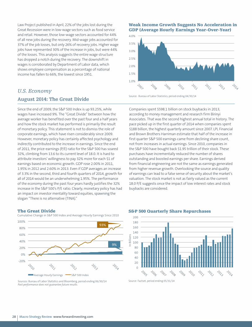
Macro Strategy Review www.forwardinvesting.com28
Law Project published in April, 22% of the jobs lost during the Great Recession were in low-wage sectors such as food service and retail. However, those low-wage sectors accounted for 44% of all new jobs during the recovery. Mid-wage jobs accounted for 37% of the job losses, but only 26% of recovery jobs. Higher wage jobs have represented 30% of the increase in jobs, but were 44% of the losses. This analysis suggests the entire wage structure has dropped a notch during the recovery. The downshift in wages is corroborated by Department of Labor data, which shows employee compensation as a percentage of national income has fallen to 66%, the lowest since 1951.
U.S. Economy
August 2014: The Great Divide
Since the end of 2009, the S&P 500 Index is up 93.25%, while wages have increased 9%. The “Great Divide” between how the average worker has benefited over the past four and a half years and how the stock market has performed is primarily the result of monetary policy. This statement is not to dismiss the role of corporate earnings, which have risen considerably since 2009. However, monetary policy has certainly affected psychology and indirectly contributed to the increase in earnings. Since the end of 2011, the price-earnings (P/E) ratio for the S&P 500 has soared 32%, climbing from 13.6 to its current level of 18.0. It is hard to attribute investors’ willingness to pay 32% more for each $1 of earnings based on economic growth. GDP rose 2.00% in 2011, 1.95% in 2012 and 2.60% in 2013. Even if GDP averages an increase of 3.3% in the second, third and fourth quarters of 2014, growth for all of 2014 would be an underwhelming 1.95%. The performance of the economy during the past four years hardly justifies the 32% increase in the S&P 500’s P/E ratio. Clearly, monetary policy has had an impact on investor mentality toward equities, spawning the slogan “There is no alternative (TINA).”
Companies spent $598.1 billion on stock buybacks in 2013, according to money management and research firm Birinyi Associates. That was the second highest annual total in history. The pace picked up in the first quarter of 2014 when companies spent $188 billion, the highest quarterly amount since 2007. LPL Financial and Brown Brothers Harriman estimate that half of the increase in first quarter S&P 500 earnings came from declining share count, not from increases in actual earnings. Since 2010, companies in the S&P 500 have bought back $1.95 trillion of their stock. These purchases have incrementally reduced the number of shares outstanding and boosted earnings per share. Earnings derived from financial engineering are not the same as earnings generated from higher revenue growth. Overlooking the source and quality of earnings can lead to a false sense of security about the market’s valuation. The stock market is not as fairly valued as the current 18.0 P/E suggests once the impact of low interest rates and stock buybacks are considered.
1.0%
1.5%
2.0%
2.5%
3.0%
3.5%
4.0%
2007
2008
2009
2010
2011
2012
2013
2014
Weak Income Growth Suggests No Acceleration in GDP (Average Hourly Earnings Year-Over-Year)
Source: Bureau of Labor Statistics, period ending 04/30/14
-20%
0%
20%
40%
60%
80%
100%
2010
2011
2012
2013
2014
Average Hourly Earnings S&P 500 Index
The Great Divide Cumulative Change in S&P 500 Index and Average Hourly Earnings Since 2010
Sources: Bureau of Labor Statistics and Bloomberg, period ending 06/30/14 Past performance does not guarantee future results.
93%
9%
0
20
40
60
80
100
120
140
160
180
200
2005
2006
2007
2008
2009
2010
2011
2012
2013
2014
In B
illio
ns
S&P 500 Quarterly Share Repurchases
Source: Factset, period ending 05/31/14
Macro Strategy Review www.forwardinvesting.com29
U.S. Economy
September 2014: U.S. Economy
According to Sentier Research and data produced in the U.S. Census Bureau’s Current Population Survey, real median annual household income has fallen 3.1% since the economic recovery began in June 2009. Since January 2000, real median annual household income has fallen by 5.9% and is about the same level as in 1995. The stock market may be hitting new all-time highs, but many hardworking Americans have not experienced a real recovery in their personal finances. This extended period of challenging times is affecting people’s perspective of the future. A recent poll taken by NBC News and the Wall Street Journal between July 26 and August 3 found that despite the better news on job creation in recent months, 76% of adults said they lacked confidence that their children’s generation will have a better life than they do and 60% believe the U.S. is in a state of decline. Nearly 70% blamed the current economic malaise more on Washington leaders than on deeper economic trends. As Robin Williams’s characters in Man of the Year quoted, “Politicians are a lot like diapers. They should be changed frequently, and for the same reason.”
U.S. Economy
March 2015: U.S. Economy
As noted in the January 2015 MSR, we expected U.S. GDP to slow in the first half of 2015 from the 5.0% rate in the third quarter of 2014, as dollar strength began to slow exports and wages failed to accelerate. It appears we were too optimistic. In its first estimate of fourth quarter GDP, the U.S. Department of Commerce pegged growth at 2.6%, bringing total 2014 growth to 2.4%. This marks the ninth consecutive year in which the economy failed to grow at 3% or better. According to the U.S. Bureau of Economic Analysis, this is the longest stretch of sub-3% growth since data began being recorded in 1930. The employment cost index, a broad gauge of wage and benefit spending, rose a seasonally-adjusted 0.6% in the fourth quarter and 2.2% for the year 2014. Wages and salaries, which account for 70% of compensation costs, rose 2.1% while benefits rose 2.6%. During the 2001-2007 expansion, the increase in annual compensation averaged 3.5% while during the current expansion, which began in June 2009, compensation has averaged
just 1.9%. If this is the best middle-class economics has to offer after almost six years of recovery, then a change in course seems overdue.
The employment report for January was solid and has led more economists to expect the Federal Reserve (Fed) to raise interest rates in June rather than later in 2015. (This projection is as of February 24 since we don’t yet know the details of the March employment report.) We think there is too much slack in the labor market for the Fed to act in June—that is, if their decision is based solely on labor market conditions. Despite a series of solid job gains in recent months, average hourly earnings rose just 2.2% in January. The dormant pace of wage growth since 2010 is a reflection of excess slack in the labor market, even though the official unemployment rate (U3) has improved significantly over the past two years.
-6%
-4%
-2%
0%
2%
4%
6%
2000
2001
2002
2003
2004
2005
2006
2007
2008
2009
2010
2011
2012
2013
2014
U.S. GDP: Year-Over-Year Change
Source: Bureau of Economic Analysis, period ending 12/31/14
1.0%
1.5%
2.0%
2.5%
3.0%
3.5%
4.0%
12/01/07
07/01/08
02/01/09
09/01/09
04/01/10
11/01/10
06/01/11
01/01/12
08/01/12
03/01/13
10/01/13
05/01/14
12/01/14
U.S. Average Hourly Earnings Private Nonfarm Payroll (Year-Over-Year)
Source: Bureau of Labor Statistics, period ending 01/31/15
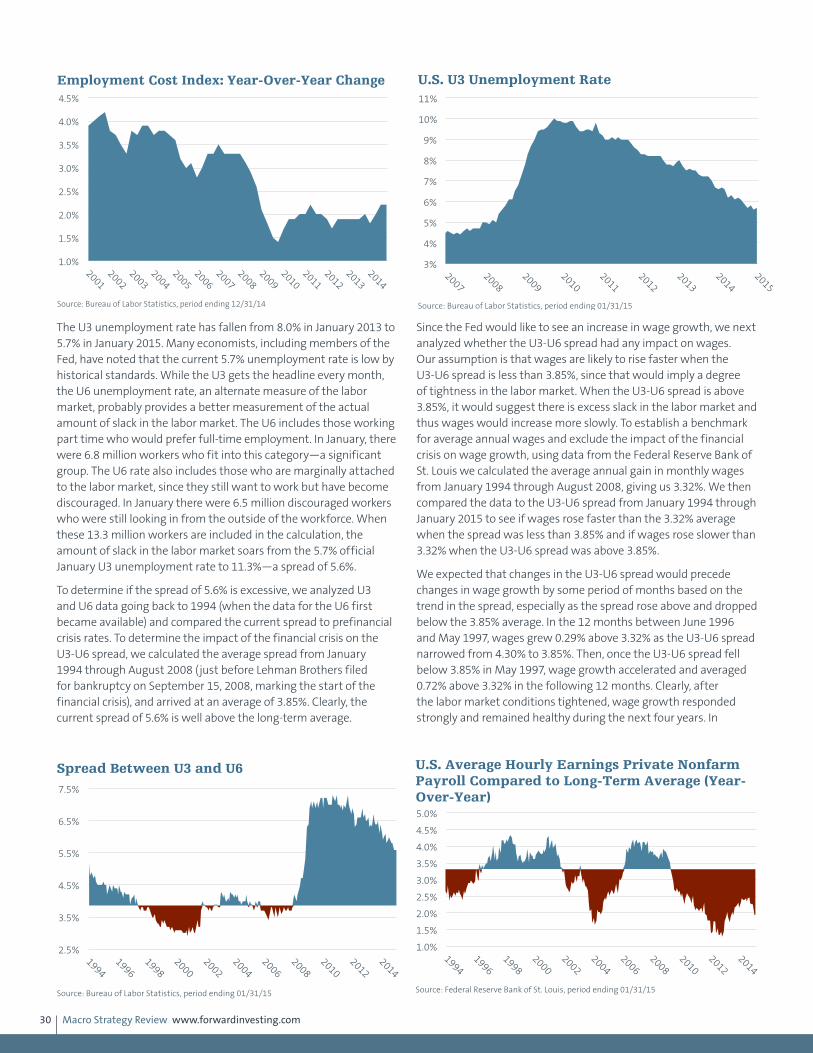
Macro Strategy Review www.forwardinvesting.com30
The U3 unemployment rate has fallen from 8.0% in January 2013 to 5.7% in January 2015. Many economists, including members of the Fed, have noted that the current 5.7% unemployment rate is low by historical standards. While the U3 gets the headline every month, the U6 unemployment rate, an alternate measure of the labor market, probably provides a better measurement of the actual amount of slack in the labor market. The U6 includes those working part time who would prefer full-time employment. In January, there were 6.8 million workers who fit into this category—a significant group. The U6 rate also includes those who are marginally attached to the labor market, since they still want to work but have become discouraged. In January there were 6.5 million discouraged workers who were still looking in from the outside of the workforce. When these 13.3 million workers are included in the calculation, the amount of slack in the labor market soars from the 5.7% official January U3 unemployment rate to 11.3%—a spread of 5.6%.
To determine if the spread of 5.6% is excessive, we analyzed U3 and U6 data going back to 1994 (when the data for the U6 first became available) and compared the current spread to prefinancial crisis rates. To determine the impact of the financial crisis on the U3-U6 spread, we calculated the average spread from January 1994 through August 2008 (just before Lehman Brothers filed for bankruptcy on September 15, 2008, marking the start of the financial crisis), and arrived at an average of 3.85%. Clearly, the current spread of 5.6% is well above the long-term average.
Since the Fed would like to see an increase in wage growth, we next analyzed whether the U3-U6 spread had any impact on wages. Our assumption is that wages are likely to rise faster when the U3-U6 spread is less than 3.85%, since that would imply a degree of tightness in the labor market. When the U3-U6 spread is above 3.85%, it would suggest there is excess slack in the labor market and thus wages would increase more slowly. To establish a benchmark for average annual wages and exclude the impact of the financial crisis on wage growth, using data from the Federal Reserve Bank of St. Louis we calculated the average annual gain in monthly wages from January 1994 through August 2008, giving us 3.32%. We then compared the data to the U3-U6 spread from January 1994 through January 2015 to see if wages rose faster than the 3.32% average when the spread was less than 3.85% and if wages rose slower than 3.32% when the U3-U6 spread was above 3.85%.
We expected that changes in the U3-U6 spread would precede changes in wage growth by some period of months based on the trend in the spread, especially as the spread rose above and dropped below the 3.85% average. In the 12 months between June 1996 and May 1997, wages grew 0.29% above 3.32% as the U3-U6 spread narrowed from 4.30% to 3.85%. Then, once the U3-U6 spread fell below 3.85% in May 1997, wage growth accelerated and averaged 0.72% above 3.32% in the following 12 months. Clearly, after the labor market conditions tightened, wage growth responded strongly and remained healthy during the next four years. In
1.0%
1.5%
2.0%
2.5%
3.0%
3.5%
4.0%
4.5%
2001
2002
2003
2004
2005
2006
2007
2008
2009
2010
2011
2012
2013
2014
Employment Cost Index: Year-Over-Year Change
Source: Bureau of Labor Statistics, period ending 12/31/14
3%
4%
5%
6%
7%
8%
9%
10%
11%
2007
2008
2009
2010
2011
2012
2013
2014
2015
U.S. U3 Unemployment Rate
Source: Bureau of Labor Statistics, period ending 01/31/15
2.5%
3.5%
4.5%
5.5%
6.5%
7.5%
1994
1996
1998
2000
2002
2004
2006
2008
2010
2012
2014
Spread Between U3 and U6
Source: Bureau of Labor Statistics, period ending 01/31/15
1.0%
1.5%
2.0%
2.5%
3.0%
3.5%
4.0%
4.5%
5.0%
1994
1996
1998
2000
2002
2004
2006
2008
2010
2012
2014
U.S. Average Hourly Earnings Private Nonfarm Payroll Compared to Long-Term Average (Year-Over-Year)
Source: Federal Reserve Bank of St. Louis, period ending 01/31/15

Macro Strategy Review www.forwardinvesting.com31
October 2001, the U3-U6 spread widened above 3.85%, signifying that labor market slack had increased. Just two months later in December 2001, wages began to weaken and remained soft during the “jobless” recovery of 2003-2005. In April 2005 the U3-U6 spread tightened back below 3.85% and nine months later in February 2006 wages started growing faster than the 3.32% average. Wage growth held up until just before the onset of the financial crisis.
In January 2008, the U3-U6 spread rose above 3.85% and stayed modestly close to average through August 2008. After the financial crisis exploded in September 2008, the U3-U6 spread soared and it didn’t take long to impact wages. Annual wage growth peaked in October 2008 at 3.92% and fell below the 3.32% average in April 2009. The U3-U6 spread remained quite wide, expanding until September 2011 when it peaked at 7.30%, a full 3.45% above the 3.85% average. Between September 2011 and October 2012, the U3-U6 spread only narrowed to 6.90% and wage growth didn’t stop falling until October 2012. Since October 2012, the U3-U6 spread has gradually improved but it is still fairly wide, which likely explains
why annual wage growth has not risen faster than the 2.2% rate of the past few years.
The Federal Reserve began to increase the federal funds rate in June 2004 when the U6 rate was at 9.50%, far less than the current rate of 11.30%, and when the U3-U6 spread was almost at the 3.85% tipping point. Between June 2004 and April 2005, the U3-U6 spread fluctuated between 3.70% and 4.00%, hovering right around the 3.85% average, and wage growth improved from 2.02% to 2.69%. In January 2015, the U3-U6 spread was 5.60%, well above the 3.85% tipping point between too much labor slack and too little. This data suggests that wage growth in coming months is likely to remain muted until the spread narrows considerably. While a further decline in the U3 unemployment rate is sure to make some Fed governors uncomfortable that the pressure is on to raise rates, we think a majority of the Federal Open Market Committee (FOMC) members will take a more holistic view of the labor market that includes the U6 unemployment rate and the absence of solid wage growth.
U.S. Economy
May 2015: U.S. Economy
Quarterly GDP growth has bounced above and below its 2.46% average since 2010, providing a number of head fakes along the way. After third quarter 2014 GDP was reported to have boomed 5.0%, many economists raised their GDP estimates for 2015 to 3.0%–3.5%. We expected growth to slow to less than 3.0% in the first half of 2015 as dollar strength curbed export growth, low oil prices and excess capacity kept a lid on business investment and weak wage growth kept consumer spending in check. After gasoline prices plummeted by more than $1.00 a gallon in the fourth quarter 2014, many economists expected consumers to go on a spending spree. After years of weak income growth we thought consumers were more likely to save some of their energy windfall, pay off some debt and spend only the remaining third. Visa has tracked consumer spending trends and concluded that consumers have been spending about 25% of their gasoline savings. According to the Federal Reserve, Americans lowered their credit card balances in February by the largest percentage in nearly four years. The personal savings rate was 5.8% in February according to the Commerce Department, the highest since the end of 2012.
After declining for three consecutive months, retail sales rebounded in March but were still below their peak in November. Compared with March 2014, retail sales were up only 1.3%, well below the 4.5% annual gain from the previous 12-month period. Industrial production has also been weak since November due to a significant decline in oil and gas drilling and manufacturing exports. The level of industrial production was up 2.0% in March 2015 from March 2014. With all of this information in mind, estimates for first quarter GDP have been slashed, dropping to 1.4% from their 3.0% estimate made in January, according to a survey of 62 economists by the Wall Street Journal in the first week of April.
This past winter was the tenth most severe since 1960, which certainly played a role in suppressing economic activity in the first quarter. Consumer confidence levels jumped in response to the decline in gasoline prices in the fourth quarter 2014 and have fallen back as gas prices have ticked up. Consumer confidence levels still remain well above 82—the level that has historically been supportive and coincident with economic growth. We expect the
-15%
-10%
-5%
0%
5%
10%
2007
2008
2009
2010
2011
2012
2013
2014
2015
Retail Sales (Year-Over-Year)
Source: U.S. Census Bureau, period ending 03/31/15
1.0%
1.5%
2.0%
2.5%
3.0%
3.5%
2009
2010
2011
2012
2013
2014
U.S. GDP (Year-Over-Year Change)
Source: Bureau of Economic Analysis, period ending 12/31/14
2010 - 2014 Average Annual Change: 2.46%
Macro Strategy Review www.forwardinvesting.com32
economy to pick up in the second quarter but not so much as to convince the Fed to raise the federal funds rate in June.
We have previously discussed how the Fed’s low interest rate policy has really hurt retirees who are dependent on certificates of deposit (CDs) to provide a safe, steady income stream. In 2007, a 5-year CD yielded more than 5.0%. Today, a 5-year CD provides a return of 1.5% or so—70% less income than in 2007. According to an estimate by reinsurance company Swiss Re, U.S. savers have received $470 billion less in interest income since 2008. We suspect the Fed’s
low rate policy is also affecting people who are within 10 years of retirement, which includes tens of millions of baby boomers. The nest egg that seemed large enough to provide a comfortable retirement a few years ago doesn’t look as sufficient based on the level of interest rates today, which may be leading some baby boomers to cut back on spending and increase their savings to make up for the reduced income. The Fed’s low interest rate policy is having the perverse effect of curbing spending by older Americans, which will remain a growth headwind as more of the 76 million baby boomers prepare for retirement.
Treasury BondsMarch 2014: Bonds
In January, we thought the 10-year Treasury yield might rise to near 3.15-3.20%, before falling to 2.5-2.7%. The yield on the 10-year Treasury bond peaked at 3.04% and then fell to 2.72% on January 27. In the February letter (written on January 21) we wrote, “If the S&P 500 falls below 1,765, the 10-year yield could dip to 2.46% to 2.63%.” On February 3, the S&P 500 broke below 1,765 and the
10-year Treasury yield bottomed at 2.58%. On February 25, as this is being written, the 10-year Treasury yield is 2.70%. Although the 10-year Treasury yield might rise to 2.86% in coming days, it is likely to fall below 2.58% and approach 2.46%, before any sustained rise in yield occurs.
Treasury Bonds
May 2014: Treasury Bonds
The pattern of the 10-year Treasury yield suggests that it is likely to fall below 2.58% and approach 2.46%. Although we expect the Federal Reserve to continue paring its purchases of Treasury bonds and mortgage-backed securities, we don’t expect economic growth to accelerate much. If our ECB assessment is correct, a weaker euro and stronger dollar could bring nondollar investment flows back into Treasury bonds.
-20%
-15%
-10%
-5%
0%
5%
10%
2006
2007
2008
2009
2010
2011
2012
2013
2014
Industrial Production (Year-Over-Year)
Source: Federal Reserve, period ending 03/31/15
0.0%
1.0%
2.0%
3.0%
4.0%
5.0%
2007
2008
2009
2010
2011
2012
2013
2014
2015
Average Five-Year CD Rate
Source: Bankrate.com, period ending 04/22/15
1.5
2.0
2.5
3.0
3.5
01/2013
03/2013
05/2013
07/2013
09/2013
11/2013
01/2014
03/2014
U.S. Government 10-Year Yield
Source: Bloomberg, period ending 04/24/14
Yiel
d (%
)
Macro Strategy Review www.forwardinvesting.com33
Treasury Bonds
October 2014: Treasury Bonds
As discussed in the September 2014 MSR, we thought the 10-year Treasury yield was making a low near 2.30%, and expected it to subsequently rise to 2.65%. The yield reached 2.642% on September 18. As this is being written on September 22, we think the 10-year Treasury yield will retest the 2.64% level, after closing a gap at 2.54%. If our analysis is correct, the stronger dollar should have positive implications for longer-term Treasury yields. The Treasury market is likely to benefit from international money moving out of the euro, yen and emerging market currencies and into the dollar, especially since U.S. yields are comfortably higher than those in Europe. This suggests it is unlikely that the 10-year Treasury yield will exceed the highs reached on March 7 at 2.821% for the rest of 2014.
Treasury Bonds
December 2014: Bonds
We have been expecting the 10-year Treasury yield to trade between 2.20% and 2.66% for the balance of 2014. As this is being written on November 21, the yield on the 10-year Treasury has traded between 2.30% and 2.38% for 17 consecutive days. The interest rate differential between the yields offered on comparable bonds in Europe make U.S. Treasury bonds a compelling value. Inflation expectations have been falling and growth in the U.S. is not likely to accelerate in the face of slowing global growth. The threat from the Fed is both distant and outweighed by these other factors. Although the Fed has stopped buying new bonds through its QE program, it is not going to be selling current holdings anytime soon and will reinvest the proceeds as bonds mature. This suggests that the yield on the 10-year Treasury is not likely to increase much in the first half of 2015.
Treasury Bonds
February 2015: Treasury Bonds
As we discussed last month, the 10-year U.S. Treasury yield has held within a downward sloping channel since September of 2013. The only excursions outside of this channel occurred in December 2013 and September 2014, which proved to be highs, and in October and December 2014, which were lows. Each break above and below the channel proved temporary, which indicates that this channel is important and any breakout that is not quickly followed by a move back into the channel is probably significant. The 10-year yield has dropped below the lower channel line and has remained below it since the beginning of this year. Undoubtedly, lower yields in Europe make the 10-year Treasury yield look like a bargain. The strength of the dollar only adds to the total return international investors have received by moving out of the euro or any currency that has weakened against the dollar and into Treasury bonds. The global decline in yields must also be considered a reflection of the increase in deflation as global growth slows and commodity prices
1.30 1.50 1.70 1.90 2.10 2.30 2.50 2.70 2.90 3.10
01/2012
05/2012
09/2012
01/2013
05/2013
09/2013
01/2014
05/2014
09/2014
U.S. Government 10-Year Treasury Yield
Source: Bloomberg, period ending 09/23/14 Past performance does not guarantee future results.
1.30
1.50
1.70
1.90
2.10
2.30
2.50
2.70
2.90
3.10
01/2012
04/2012
07/2012
10/2012
01/2013
04/2013
07/2013
10/2013
01/2014
04/2014
07/2014
10/2014
U.S. Government 10-Year Treasury Yield
Source: Bloomberg, period ending 10/23/14 Past performance does not guarantee future results.
1.30%
1.50%
1.70%
1.90%
2.10%
2.30%
2.50%
2.70%
2.90%
3.10%
01/2012
04/2012
07/2012
10/2012
01/2013
04/2013
07/2013
10/2013
01/2014
04/2014
07/2014
10/2014
01/2015
U.S. Government 10-Year Treasury Yield
Source: Bloomberg, period ending 01/23/15 Past performance does not guarantee future results.
Macro Strategy Review www.forwardinvesting.com34
slump despite central bank maneuvers. These dynamics are likely to continue to support low Treasury yields and could be buttressed if the U.S. economy slows as we expect, creating doubts that the Fed will raise rates in June as widely expected. The 10-year Treasury
yield is likely to encounter resistance at 1.60%, which was the low just before the taper tantrum in May 2013. This suggests that the yield could be range-bound between 1.60% and 2.10% until more clarity develops about the timing of the Fed’s first rate hike.
Treasury Bonds
May 2015: Bonds
Our view has been that the yield on the 10-year U.S. Treasury was likely to remain range-bound between 1.650% and 2.200% since we expected the economy to slow and the level of labor market slack to postpone a June rate hike by the Fed. Other than on March 6 when the yield popped to 2.240% after a strong employment report, the yield on the 10-year Treasury bond has traded within the expected range. With the odds of a rate increase in June likely off the table, we thought volatility would subside. On March 20, the yield was 1.930% and as of April 24 is at 1.924%. The highest yield since March
20 was 2.009% on March 26 and the lowest was 1.845% on April 17, so volatility subsided and the trading range compressed to 16 basis points compared to the range of 60 basis points between January 30 and March 6. Even though growth should pick up in the second quarter, we don’t think it will be enough for the Fed to raise rates in June. These readings suggest the trading range is likely to continue, though a close above 2.170% would be a warning sign that the trading range may be ending.
U.S. StocksJune 2014: Stock Market
As I have stressed for quite a while, the technical deterioration that has taken place in recent months only sets the stage for the market to potentially experience a decline. A meaningful decline (greater than 7%) is not likely until investors have a reason to sell all stocks. Currently, most investors are constructive on the economy, especially for the second half of this year. With that as the dominant outlook, most institutional investors are only
interested in identifying which groups to be invested in, rather than questioning whether they should be fully invested in the market. As small cap stocks were sold, the proceeds were used to buy large cap stocks institutions viewed as having greater value. That’s why the correction has been rotational in nature, rather than a true correction in which the majority of stocks are sold.
U.S. Stocks
July 2014: Stock Market
Most institutional investors remain constructive on the economy, and still expect GDP growth in the second half to hold above 3%. Whether or not that proves to be true doesn’t matter in the short run. The lack of selling pressure has been one of the main supports under the market for some time, and that’s not likely to change. Stock buybacks by corporations have also been a factor, especially since volume has been low since the end of 2012. In 2013, corporations purchased almost $550 billion of their own stock, and purchases are running at a similar pace so far in 2014. The ECB’s decision on June 5 to adopt a more accommodative posture and assurances from the Fed that any rate increase is well off into the future have simply coalesced bullish sentiment. The percent of bulls in the Investors Intelligence weekly survey of sentiment has exceeded 62%, which is the highest since 1987. However, the
stock market doesn’t decline just because there are too many bulls. The recent correction from early March into May was a rotational correction in which small cap stocks were sold in order to rotate into larger cap stocks. As the rotational correction progressed, technical indicators based on momentum, market average divergences and the shrinkage in the number of stocks making new 52-week highs, only set the stage for the market to potentially experience a decline. By late May, small cap stocks were oversold and ready to at least bounce. With no overall reason to sell, the market has rallied to new highs and some of the technical weakness has been repaired. A meaningful decline (greater than 7%) is not likely until investors have a reason to sell all stocks. The S&P 500 Index continues to make higher highs and higher lows, which is the technical definition of an uptrend.
U.S. Stocks
August 2014: Stocks
As discussed earlier, based on a broader set of valuation measurements than the P/E ratio, the stock market is fairly expensive. Investment returns over the next five years are likely to be less than historical returns and many investors’ expectations.
Another cautionary signal comes from the Investors Intelligence weekly survey of bullish and bearish investment letters. Those with a bullish bias have outnumbered the bears by more than 40% twice in 2014, which is very unusual. Prior to this year, bulls outnumbered

Macro Strategy Review www.forwardinvesting.com35
the bears by more than 40% during the week of April 8, 2011 and October 19, 2007.
Barring a geopolitical crisis, the underlying fundamentals are in decent shape so the odds of a correction deeper than 12% seems unlikely in the next few months. However, if investors begin to actively worry about the Fed raising rates much sooner than mid-2015, or that the pace of rate hikes will not be gradual, the stock market could experience a decline of 7% to 12%. If the economy fails to maintain growth comfortably above 3% as many are expecting, the market could easily fall by 4% to 7%. As we have stated numerous times, the stock market doesn’t go down because it is too expensive or due to excessive bullishness. The stock market declines modestly when expectations aren’t met, or significantly if a systemic threat develops.
U.S. Stocks
October 2014: Stocks
On September 18, the S&P 500 Index made a new closing high, but a number of technical indicators are warning that a 5%-7% correction is coming soon. Our proprietary Major Trend Indicator (MTI) has continued to fade after topping out on September 8 at 2.87, closing on September 22 at 2.73. It is worth noting that the MTI peaked at 4.38 on January 2 and 3.77 on July 7. The pattern from the January 2 high shows that the recent rally was the third drive to a new high in the S&P 500 that registered a lower peak in the MTI. Market tops have often occurred after the third drive with lower momentum. One-third of Russell 2000 stocks are down
by more than 10% year-to-date, according to Bespoke Research. Market breadth on the New York Stock Exchange (NYSE) made a new high on August 29 but did not on September 18 when the S&P 500 made a new closing high. This is the largest market breadth divergence since July 2011.
Large declines don’t just occur because a few technical indicators are exhibiting weakness, as they are now; there must be a reason for buy-and-hold institutional money managers to abandon the bullish outlook they currently hold. This is why a decline of about 7% is likely, rather than a more significant bear market.
U.S. Stocks
November 2014: Stocks
In the October 2014 MSR we laid out the technical reasons why we thought the market was vulnerable to a correction of 7%. At a minimum we thought the S&P 500 Index would decline to 1,905 and mentioned that the 50% retracement of the 281.34 rally from the February 5 low would bring the S&P 500 down to 1,878. We also noted that “Lower prices are certainly possible given the levels of technical weakness; it will just depend on whether reasons to sell are strong enough to measurably increase selling pressure.” As it turned out, a myriad of reasons to sell appeared, including a break of the S&P 500’s 200-day moving average, a downgrade of the European economy by the IMF and cases of Ebola in Dallas after the nation had been assured everything was under control. On Wednesday, October 15, when Ebola fears reached their peak, the S&P 500 dropped to an intraday low of 1,820 before rallying and closing at 1,862. The 7% correction we expected was achieved almost exactly on a closing basis.
The question is whether the recent decline is more evidence of a further weakening in the technical underpinnings of the bull market or a springboard for the next leg up in the bull market.
As this is being written on October 23, we can’t answer that question with the same degree of conviction we had last month that the market was poised for a correction. Prior to the correction, we thought there was a decent chance that the S&P 500 would advance again and potentially make a new high. The strength of the rebound would seem to increase the probability of that outcome. Should the S&P 500 make a new high, we will focus on whether the NYSE advance/decline line is also making a new high and if there are a healthy number of stocks making a new 52-week high (i.e., close to 300 stocks). Our proprietary Major Trend Indicator did a nice job of warning that the market was on the cusp of the largest correction in three years. We would want to see it recover and ideally surpass its early September high, although it is currently well below that level. Our bias leans toward a new high that is followed by a more severe correction in the first half of 2015 since Europe remains a mess and global growth is likely to slow more in coming months. The outcome will probably hinge on whether the market pays more attention to economic reality or the prospect of more monetary largesse.
600
800
1,000
1,200
1,400
1,600
1,800
2,000
-40
-30
-20
-10
0
10
20
30
40
50
2007
2008
2009
2010
2011
2012
2013
2014
S&P 500
Bu
lls M
inu
s B
ears
(%)
Investors Intelligence S&P 500
Optimism Is Near Historic Highs
Sources: Investors Intelligence and Bloomberg, period ending 07/18/14 Past performance does not guarantee future results.
Extreme Optimism
Extreme Pessimism

Macro Strategy Review www.forwardinvesting.com36
U.S. Stocks
January 2015: Stocks
As we noted in the December 2014 MSR, the overall technical health of the market has improved since the October 2014 low, but is in the category of better, not great. We said the upside momentum from the October low had bought the market some time and that the calendar was potentially the biggest plus since the pressure on underperforming money managers to be fully invested would increase with each passing day. We also said that as long as the S&P 500 did not close below 1,960, the market would probably press on until year-end. As it turned out, the low on December 16 was 1,972.74.
The consensus rationale for the quick and dramatic turnaround from the December 16 low was attributed to the Fed saying in the December 17 Federal Open Market Committee (FOMC) statement that it would be patient in raising interest rates. Anyone who may have thought the Fed was not going to be patient must have fallen asleep when Paul Volcker was the Fed chairman and then woke up on December 17. As long as the S&P 500 holds above 1,972, the uptrend is still intact.
U.S. Stocks
May 2015: Stocks
The standard price-earnings ratio understates how expensive the stock market is since it overlooks the significant impact of stock buybacks on earnings. As we discussed last month, corporations executed $550 billion in stock buybacks in 2014, almost 6.5 times the $85 billion invested in equity mutual funds and exchange-traded funds, according to the Investment Company Institute. While no single valuation metric is without flaws, a composite of a number of metrics can provide a better insight of the market’s long-term relative valuation. Doug Short (dshort.com) provides some great charts on his Advisor Perspectives website, including a chart with the combination of four valuation metrics. The current chart shows that the stock market is at its second or third most expensive level in the past 100+ years. With central banks doing everything they can to boost asset prices, this should come as no surprise. Given the likelihood that rates will stay low for a long time and that central banks will respond with more accommodation should global stock markets experience a 10% or greater correction, the odds are high that valuations will ultimately become even more expensive. As we have repeatedly cautioned, the stock market does not decline because it is too expensive until a good reason to sell
appears and convinces investors that it is in their best interest to lower their allocation to equities.
-1
0
1
2
3
4
5
6
01/02/13
03/02/13
05/02/13
07/02/13
09/02/13
11/02/13
01/02/14
03/02/14
05/02/14
07/02/14
09/02/14
11/02/14
Source: Forward Proprietary Indicator, period ending 12/22/14 Past performance does not guarantee future results.
Major Trend Indicator
Lower Upside Momentum
1,400
1,500
1,600
1,700
1,800
1,900
2,000
2,100
01/02/13
03/02/13
05/02/13
07/02/13
09/02/13
11/02/13
01/02/14
03/02/14
05/02/14
07/02/14
09/02/14
11/02/14
S&P 500 Index
Source: Standard & Poor's, period ending 12/22/14 Past performance does not guarantee future results.
19001920
19401960
19802000
2020
200%
150%
100%
50%
Mean
-50%
-100%
146%
79%
-15%
-56%
43%
78%
-56% -52%-59%
3SD117%
2SD78%
SD39%
Recessions highlighted in gray
Crestmont P/E from its Arithmetic Mean 90%
Valuation as of March 2015 Month End
Cyclical P/E 10 from its Arithmetic Mean 62%Q Ratio from its Arithmetic Mean 63%S&P Composite from its Regression 93%Average of the four 79%
Average of the Four Valuation Indicators
Source: dshort.com, period ending 03/31/15
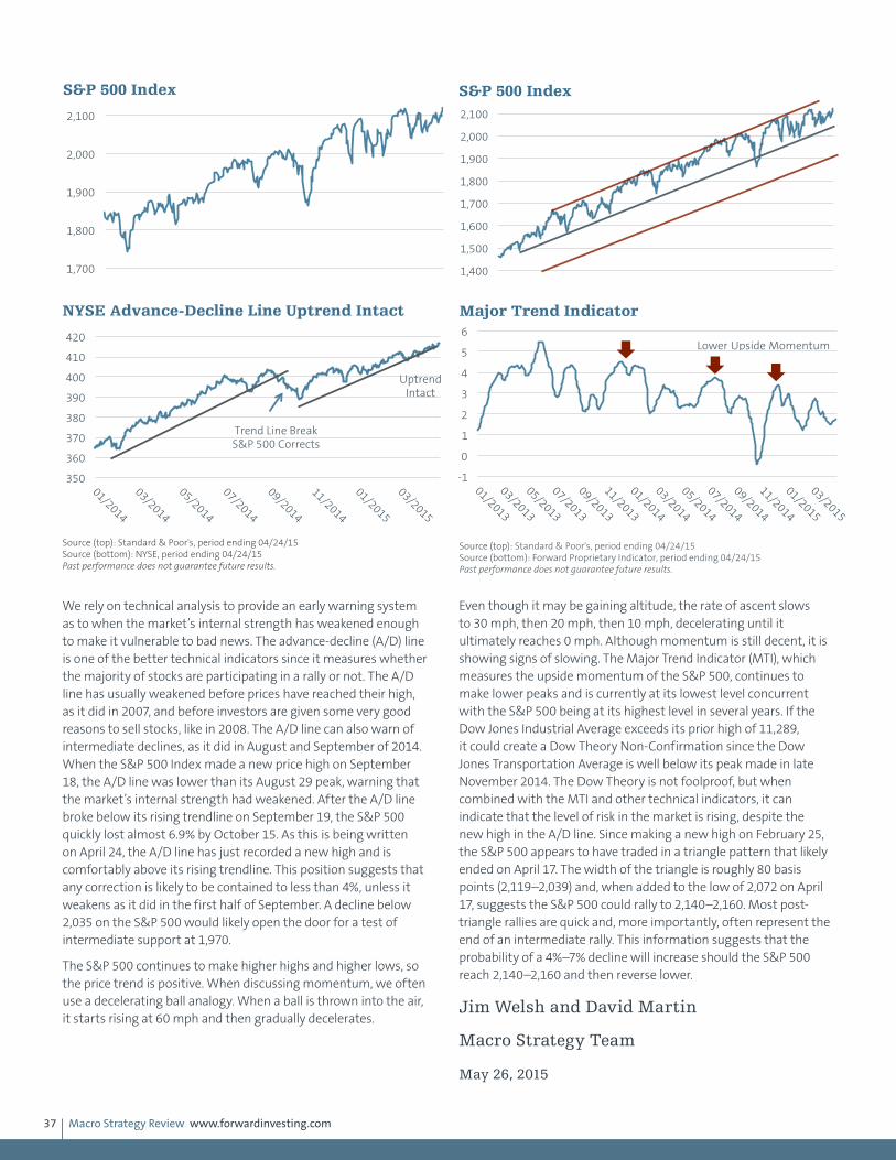
Macro Strategy Review www.forwardinvesting.com37
We rely on technical analysis to provide an early warning system as to when the market’s internal strength has weakened enough to make it vulnerable to bad news. The advance-decline (A/D) line is one of the better technical indicators since it measures whether the majority of stocks are participating in a rally or not. The A/D line has usually weakened before prices have reached their high, as it did in 2007, and before investors are given some very good reasons to sell stocks, like in 2008. The A/D line can also warn of intermediate declines, as it did in August and September of 2014. When the S&P 500 Index made a new price high on September 18, the A/D line was lower than its August 29 peak, warning that the market’s internal strength had weakened. After the A/D line broke below its rising trendline on September 19, the S&P 500 quickly lost almost 6.9% by October 15. As this is being written on April 24, the A/D line has just recorded a new high and is comfortably above its rising trendline. This position suggests that any correction is likely to be contained to less than 4%, unless it weakens as it did in the first half of September. A decline below 2,035 on the S&P 500 would likely open the door for a test of intermediate support at 1,970.
The S&P 500 continues to make higher highs and higher lows, so the price trend is positive. When discussing momentum, we often use a decelerating ball analogy. When a ball is thrown into the air, it starts rising at 60 mph and then gradually decelerates.
Even though it may be gaining altitude, the rate of ascent slows to 30 mph, then 20 mph, then 10 mph, decelerating until it ultimately reaches 0 mph. Although momentum is still decent, it is showing signs of slowing. The Major Trend Indicator (MTI), which measures the upside momentum of the S&P 500, continues to make lower peaks and is currently at its lowest level concurrent with the S&P 500 being at its highest level in several years. If the Dow Jones Industrial Average exceeds its prior high of 11,289, it could create a Dow Theory Non-Confirmation since the Dow Jones Transportation Average is well below its peak made in late November 2014. The Dow Theory is not foolproof, but when combined with the MTI and other technical indicators, it can indicate that the level of risk in the market is rising, despite the new high in the A/D line. Since making a new high on February 25, the S&P 500 appears to have traded in a triangle pattern that likely ended on April 17. The width of the triangle is roughly 80 basis points (2,119–2,039) and, when added to the low of 2,072 on April 17, suggests the S&P 500 could rally to 2,140–2,160. Most post-triangle rallies are quick and, more importantly, often represent the end of an intermediate rally. This information suggests that the probability of a 4%–7% decline will increase should the S&P 500 reach 2,140–2,160 and then reverse lower.
Jim Welsh and David Martin
Macro Strategy Team
May 26, 2015
1,400
1,500
1,600
1,700
1,800
1,900
2,000
2,100
S&P 500 Index
Source: Standard & Poor's, period ending 04/24/15 Past performance does not guarantee future results.
350
360
370
380
390
400
410
420
01/2014
03/2014
05/2014
07/2014
09/2014
11/2014
01/2015
03/2015
NYSE Advance-Decline Line Uptrend Intact
Source (top): Standard & Poor's, period ending 04/24/15 Source (bottom): NYSE, period ending 04/24/15 Past performance does not guarantee future results.
Trend Line Break S&P 500 Corrects
Uptrend Intact
-1
0
1
2
3
4
5
6
01/2013
03/2013
05/2013
07/2013
09/2013
11/2013
01/2014
03/2014
05/2014
07/2014
09/2014
11/2014
01/2015
03/2015
Source (top): Standard & Poor's, period ending 04/24/15 Source (bottom): Forward Proprietary Indicator, period ending 04/24/15 Past performance does not guarantee future results.
Major Trend Indicator
Lower Upside Momentum
1,700
1,800
1,900
2,000
2,100
01/2014
04/2014
07/2014
10/2014
01/2015
04/2015
S&P 500 Index
Source: Standard & Poor's, period ending 04/24/15 Past performance does not guarantee future results.

Macro Strategy Review www.forwardinvesting.com38
1. As quoted in: To provide for amendment of the Bretton Woods agreements act, U.S. Govt. Print. Off., 19762. The Wall Street Journal, “Hollande Courts Business With Economic Revival Plan,” January 14, 2014.3. The New York Times, “European Central Bank Set to Do Whatever It Takes to Bolster Recovery,” 01/09/14.4. European Central Bank, “Bank restructuring and the economic recovery,” 03/13/14.5. The Wall Street Journal, “Draghi: ECB ‘Comfortable With Acting Next Time’ -- 3rd Update,” May 8, 2014.6. Luis Garicano, Claire Lelarge and John Van Reenen, “Firm Size Distortions and the Productivity Distribution: Evidence from France,” March 1, 2012.7. Source: William Drozdiak, Washington Post, Page A31, February 18, 20018. Carefully consider the Fund’s investment objectives, risk factors, and charges and expenses before investing. This and other information can be found
in the Fund’s prospectus, and if available, summary prospectus, which may be obtained by calling 1-800-iShares (1-800-474-2737) or by visiting www.ishares.com. Read the prospectus carefully before investing.
9. Trivedi, Anjani, “As Yen Slides, Investors Shun Other Asian Currencies,” Wall Street Journal, November 19, 2014.10. Ibid.11. The Wall Street Journal, “China Holds Its Breath As Property Balloon Deflates,” April 21, 2014.
Follow Jim Welsh on Twitter @JimWelshMacro to receive real-time updates. If you’re interested in learning more about Forward, contact us for information at (888) 312-4100. Or to stay informed with other FWD Thinking resources, visit www.forwardinvesting.com/fwd-thinking.

Macro Strategy Review www.forwardinvesting.com39
Definition of Terms
10-year U.S. Treasury is a debt obligation issued by the U.S. Treasury that has a term of more than one year but not more than 10 years.
Advance-decline (A/D) line is a technical indicator that plots changes in the value of the advance-decline index over a certain time period.
Basis point (bps) is a unit of measure that is equal to 1/100th of 1% and used to denote a change in the value or rate of a financial instrument.
A bund is a German federal government bond issued with maturities of up to 30 years.
Cash flow is a revenue or expense stream that changes a cash account over a given period.
Consumer Price Index (CPI) is an index number measuring the average price of consumer goods and services purchased by households. The percent change in the CPI is a measure of inflation.
Correlation is a statistical measure of how two securities move in relation to each other.
Debt-to-GDP ratio is a measure of a country’s federal debt in relation to its gross domestic product (GDP). By comparing what a country owes to what it produces, the debt-to-GDP ratio indicates the country’s ability to pay back its debt.
Devaluation is a monetary policy tool whereby a country reduces the value of its currency with respect to other foreign currencies.
Dow Jones Industrial Average (DIJA) is a price-weighted average of 30 blue-chip stocks that are generally the leaders in their industry and are listed on the New York Stock Exchange.
Dow Jones Transportation Average (DJTA) is a price-weighted average of 20 transportation stocks traded in the United States.
Dow Theory is a theory developed by Charles Dow, Robert Rhea and others that uses the Dow Jones Industrial Average and the Dow Jones Transportation Average to determine the health of a particular market trend.
Federal funds rate is the interest rate at which a depository institution lends immediately available funds to another depository institution overnight.
Federal Open Market Committee (FOMC) is a branch of the Federal Reserve Board that determines the direction of monetary policy.
Gross domestic product (GDP) is the total market value of all final goods and services produced in a country in a given year, equal to total consumer, investment and government spending, plus the value of exports, minus the value of imports. The GDP of a country is one of the ways of measuring the size of its economy.
JPMorgan Emerging Market Currency Index (EMCI) is a tradable benchmark for EM currency markets. The index is comprised of 10 liquid currencies across three equally weighted regions: Latin America, Asia and CEEMEA (Central & Eastern Europe, Middle East and Africa) vs. USD.
A liar loan is a category of mortgages, also known as low-documentation or no-documentation mortgages, that have been abused to the point where the loans are sometimes referred to as liar loans.
M1 is a measure of the money supply that includes all physical money, such as coins and currency, as well as demand deposits, checking accounts and negotiable order of withdrawal accounts.
M2 is a measure of money supply that includes cash and checking deposits, savings deposits, money market mutual funds and other time deposits. It is a key economic indicator used to forecast inflation.
Major Trend Indicator is a proprietary technical tool that measures the strength or weakness of the market and helps identify bull and bear phases. During bull markets it helps indicate when the market may be vulnerable to a correction, and during bear markets it helps identify a potential rally.
Price-earnings (P/E) ratio of a stock is a measure of the price paid for a share relative to the annual income or profit earned by the company per share. A higher P/E ratio means that investors are paying more for each unit of income.
Producer Price Index (PPI) is a family of indices that measure the average change in selling prices received by domestic producers of goods and services over time.
Q ratio is a ratio devised by Nobel Laureate James Tobin that suggests that the combined market value of all the companies in the stock market should be about equal to their replacement costs.
Quantitative easing refers to a form of monetary policy used to stimulate an economy where interest rates are either at, or close to, zero.
Range-bound is when a market, or the value of a particular stock, bond, commodity or currency, moves within a relatively tight range for a certain period of time.
S&P 500 Index is an unmanaged index of 500 common stocks chosen to reflect the industries in the U.S. economy.
Shanghai Stock Exchange (SSE) Composite Index is a market composite of all A and B shares traded on the Shanghai Stock Exchange and provides a broad overview of the performance of companies listed on the Shanghai exchange.
Smoot-Hawley Tariff Act is the U.S. law enacted in June 1930 that caused an increase in import duties by as much as 50%.
Sovereign debt is the total amount owed to the holders of the sovereign bonds (bonds issued by a national government).
U-3 unemployment rate (U3) measures the total number of unemployed people as a percentage of the civilian labor force. It is considered the official unemployment rate.
U-6 unemployment rate (U6) measures the total number of people unemployed and those marginally attached to the labor force, plus the total number of people employed part time for economic reasons.
U.S. Dollar Index is a measure of the value of the U.S. dollar relative to six major world currencies: the euro, Japanese yen, Canadian dollar, British pound, Swedish krona and Swiss franc.
Valuation is the process of determining the value of an asset or company based on earnings and the market value of assets.
Volatility is a statistical measure of the dispersion of returns for a given security or market index.
One cannot invest directly in an index.
101 California Street16th FloorSan Francisco, CA 94111
(888) 312-4100www.forwardinvesting.com
About Salient + Forward
Salient + Forward is an asset management firm and leading provider of alternative and real asset investment strategies. The firm offers multi-asset and single-asset alternative investment solutions to investors, advisors and institutions. Salient + Forward’s comprehensive suite of strategies helps investors create diversified portfolios, using the firm’s core allocation solutions, or enhance existing portfolios, with alpha or income-generating options. These strategies aim to mitigate risk, reduce investing costs and drive returns in any market cycle. Experience unconventional views through the nationally recognized Epsilon Theory newsletter and FWD Thinking blog. To follow our evolution or get actionable intelligence, visit www.salientforward.com. We invite you to follow us: Salient on LinkedIn or Twitter and Forward on LinkedIn, Twitter or YouTube.
Jim Welsh is a registered representative of ALPS Distributors, Inc.
Forward Funds® are distributed by Forward Securities, LLC.
Not FDIC Insured | No Bank Guarantee | May Lose Value
©2015 Forward Management, LLC. All rights reserved.
All other registered trademarks or copyrights are the property of their respective organizations.
FSD001703 073116
RISKS
Investing involves risk, including possible loss of principal. The value of any financial instruments or markets mentioned herein can fall as well as rise. Past performance does not guarantee future results.
This material is distributed for informational purposes only and should not be considered as investment advice, a recommendation of any particular security, strategy or investment product, or as an offer or solicitation with respect to the purchase or sale of any investment. Statistics, prices, estimates, forward-looking statements, and other information contained herein have been obtained from sources believed to be reliable, but no guarantee is given as to their accuracy or completeness. All expressions of opinion are subject to change without notice.