macfadyen - mobile mapping and hgis in the field dec13cmp
TRANSCRIPT

MacFadyen, 1
Mobile Mapping and Historical GIS in the Field Joshua MacFadyen, University of Western Ontario
We’ve all heard the pedagogical principle that students retain more information if they encounter it in multisensory experiences. We remember 10 percent of what we read, 20 percent of what we see, 30 percent of what we read, see, and hear, and so on. These figures now represent more myth than
meaning for history instructors, but it is probably safe to say that falling into a salt marsh in the Grand Pre after studying historical documents and touring the local interpretative centre with a group of your peers is about as multisensory a learning experience as you can get in environmental history.
This article describes a recent series of field trips for environmental history students in the Maritime
provinces, and it makes a case for integrating historical maps and historical GIS (HGIS) into pedagogy and groundtruthing exercises. New technologies such as mobile mapping allow teachers and students to bring digitized maps to the field, find their current location in the historical map, observe changes in
the natural and built environment, and input those observations on handheld devices for later analysis, writing, and sharing. The process requires a digital copy of a map, a way to georeference it so that it fits real world coordinates, a way to serve it so that it appears as a web map overlay, and a mobile device
with an application that can read a geo-‐locate it in real time. It sounds complicated and resource intensive, but free and open source applications are available for every one of these stages and the documents and devices themselves are becoming increasingly common. Not that long ago, GIS was only
for experts and digitized historical maps were not available and certainly not mobile. Now, students can benefit from multisensory learning that integrates digitized documents and spatial data with real world
observations and experiences.
In order to experience a place it helps to first know where it is. How does it relate to places around it? What kinds of habitat does it provide to people and other species, and how has that changed over time? What topographical features existed there in the past, and which ones remain in the present? How have
these features been represented on maps over time? Visiting a place and studying modern atlases are valuable experiences, but sometimes the best way to
acquire spatial information about the place over time is through a trip to the historical map library. This raises a problem when historical maps are concentrated in a
handful of urban centres, when handling and copying them can destroy the larger and more fragile documents, and taking them to the place itself is often
impossible.
Geographical Information Systems (GIS) are making it increasingly easy to manipulate and explore spatial data, and viewers such as Google Earth and Open Layers are making much of these data available to the general public. Not only can we search for familiar or foreign addresses and map the best way to
1 Map Cabinet

MacFadyen, 2
reach them, but we can also explore the geographic features of those locations. This offers instant access to the cartographer’s opus, the atlas, but also allows us to leverage the power of dynamic
databases when we search the internet for information about the place such as user-‐contributed photographs, Wikipedia entries, YouTube videos, concert listings, and so on. These specialized databases are growing rapidly, and they are beginning to include historical maps and other digital
documents from archives around the world. If a document contains historical information about any place on earth, it is a candidate for these spatial search engines.
Smartphone technologies have unchained these data from the desktop, and most devices allow locational searches to find data with features
appearing closest to the user. So, not only is it easier to find spatial documents through search engines, but it is becoming easier for teachers to incorporate them in the classroom and on field trips. Students who
have access to phones and computers can interact with the data by creating overlays on maps, uploading images, tagging places in documents and faces in photos, and by commenting on material contributed by
archives or other users. Software developers and digital humanists have recently produced apps that display historical maps on mobile devices. The
Edinburgh College of Art and the University of Edinburgh’s “Walking Through Time” app draws from material in the National Library
of Scotland, and the “Historic Earth” app accesses georeferenced maps sold by Historic Map Works in Portland,
Maine. Some of these products will be very useful for researchers, specifically those located in areas covered by the apps, but most environmental historians will be interested in teaching from a larger
variety of maps and in more locations.
Earlier posts on the NiCHE website have shown how to use Google Earth to organize data and create maps for visualizing and exploring research findings <http://niche-‐canada.org/node/10020>. Others have pointed to
the importance of newly digitized spatial documents such as air photos for studying environmental history <http://niche-‐canada.org/node/10017>, and in 2011, Claire Campbell and I organized a series of regional workshops for teaching historical GIS to students and members of the public in Atlantic
Canadian universities (GeoWATCH: Geospatial Workshops in Atlantic Canadian History <http://niche-‐canada.org/geowatch>). GeoWATCH offered three workshops to students, faculty, and interested public: at the CHESS summer school at St. Andrews by the Sea, UPEI in Charlottetown, and Dalhousie at
Halifax and Grand Pré. Each included an introductory discussion of mapping literacy, the place of GIS and the content in historical records like maps and aerial photographs. Then there was a longer session focused on georeferencing: aligning historical maps with real world coordinates and contemporary base
maps. Each workshop ended with a “groundtruthing” exercise which involved comparing the
3 "Historic Earth" iPhone App
2 "Walking Through Time" iPhone App

MacFadyen, 3
georeferenced maps with features in the built and natural environment. Students in the UPEI workshop went on two additional fieldtrips in October and November: a salt marsh on Malpeque Bay and an
Acadian forest woodlot in Newtown Cross. The material and methods covered in these workshops offers a practical guide for getting historical maps and other documents out of the archives or map libraries and into computers, classrooms, and field trips.
Organizing a historical GIS project The first step in acquiring geospatial data for research or teaching is to plan the project and determine if
the right resources are available. Defining the research question, the spatial and temporal parameters, and the literature available is critical for any sort of historical work, but it is especially important before starting a GIS project to determine if using this technology is necessary. Will GIS be used to create maps
for description or analysis, or both? Could a copy of a historical map or a stock map from an atlas or website be sufficiently descriptive without creating a customized map? Could basic geospatial analysis, such as the measurement between points or the identification of historical features with certain spatial
characteristics, be done on a paper map instead of a GIS? If the answer to these questions is yes, and if the researchers do not have the knowledge or software to use GIS easily, then the most efficient route is likely to rely primarily on Google Maps or paper maps in the library. However, once the project requires
the handling of multiple historical maps and spatial data, and as soon as a researcher requires customized reference maps and practically any analysis of mapped features, then it’s time to bring these documents together in a GIS.
The second step is finding the documents and determining if they will be accessible for teaching or research projects. Do maps exist for the research area, and are they contemporary to the period of interest? Where are the maps stored, and have they been digitized? If the maps have not been
digitized, is it possible to scan them on location? In the case of this wall map library, the answer is probably no, but in a library with public use overhead scanners the possibilities are good. If digital copies exist, are they “GIS-‐ready?” This means the maps are either stored as files that have real world
coordinates built in (e.g. GeoTiff) or they exist in a raster format (e.g. jpg, gif, tif) that will allow GIS to import and read manually assigned
coordinates? Several guides to this process known as “georeferencing” are available online <http://prod.library.utoronto.ca/maplib/georefer
encing%20images%20in%20arcmap.pdf> <http://geo.nls.uk/urbhist/guides_georeferencingqgis.html>. If they are rasters have they been
scanned in a resolution that maintains the legibility of small details? Usually a visit to the nearest map librarian will be the most productive
way to find materials, but a quick search on Google will uncover many useful map repositories. Larger map libraries have digital collections (for example University of Toronto Map Library < http://maps.library.utoronto.ca/cgi-‐bin/search_digital.pl>)
4 Berkeley Wall Map Library
MacFadyen, 4
and new ones appear online regularly. Often the digitized historical maps appear in specialized regional collections, for example “Island Imagined” (Prince Edward Island < http://www.islandimagined.ca/ >) ,
the Don Valley Historical Mapping project <http://maps.library.utoronto.ca/dvhmp/>, Vancouver Island History <http://vihistory.ca>, or the “Canadian County Atlas Digital Project” (Ontario < http://digital.library.mcgill.ca/countyatlas>), and some may be the map of a particular collector (David
Rumsey < http://www.davidrumsey.com/ >) or agency (Natural Resources Canada < http://maps.nrcan.gc.ca/ >). Finally, the historical maps will appear in GIS as a “layer,” overlaid on a “basemap.” The basemap could be another raster showing roads and other features from providers
such as Bing, Google, and Open Layers, or it could be a customized basemap of GIS files such as the counties, rivers, population centres, and other features within the research project boundaries. Most researchers create basemaps customized to the needs of their research projects, so it’s important to
have access to these (often free) files through university or government data centres.
The next step in a historical GIS project is getting access to GIS software and the support staff or tutorials necessary to operate them. GIS software can be divided roughly into three categories, proprietary, open-‐source, and web-‐based programs. Large municipalities, universities and government
agencies usually own site-‐wide licenses for proprietary GIS software. The most common provider at Canadian universities is ESRI, whose latest mapping software is “ArcGIS 10,” but other providers include MapInfo and CARIS. However, free open source GIS software is becoming more user-‐friendly and widely
adopted in academic and private sector research. One of the older and more robust platforms is called GRASS, but newer variations have focussed on the user interface and Quantum GIS (QGIS) is an example of a powerful and user-‐friendly program that will operate on Windows, Mac and Linux machines. One of
the downsides of using open source software is the lack of support services, but on-‐line forums, tutorials, and user communities are becoming a useful solution to those who have the patience for
browsing through discussion threads and “Frequently Asked Questions” pages.
The other type of GIS software falls under a broad umbrella called “web maps,” and they are becoming increasingly import to teachers and researchers. Web-‐based map programs have limited capacity for academics creating analytical maps and they may contain copyright issues for those creating descriptive
maps. However, if you are not certain you need a full GIS for your project, and if your project does not require much customization, then web maps should be a first stop in the search for mapping software. The most common web-‐mapping program at this point is Google Maps, but others include Mapquest
and Open Layers. Some companies offer increased functionality in freely downloadable programs such as Google Earth or ArcExplorer. Websites like ArcGIS.com, GeoCommons and IndieMapper allow users to create and share customized views and thematic maps, and historians can take advantage of the web-‐
map’s capacity for uploading spatial information such as historical datasets. Many municipalities and provinces have developed their own web maps which offer more features than Google (GeoNova <http://www.gov.ns.ca/geonova> , GeoNB <http://geonb.snb.ca>, various Newfoundland municipalities
<http://www.geonl.net/>). Other web-‐maps are particularly useful for environmental historians, because they already contain historical maps and other spatial information. Theoretically, it should be possible to find a historical map and print, email, or embed a certain web map view for readers or
students to explore online. However, these historical web maps have only scratched the surface of the
MacFadyen, 5
world’s historical map collections, and they are often very general (e.g. David Rumsey’s historical web map currently has limited material for Canadianists) or limited to brief time periods or small areas
(Waterloo offers historical air photos <http://www.lib.uwaterloo.ca/locations/umd/project/>; North Vancouver presents historical land use and significant places <http://www.geoweb.dnv.org/applications/historyapp/>; Charlottetown provides a spatial database of
heritage properties <http://www.city.charlottetown.pe.ca/searchaproperty.php>). Often only a sample, of a repository’s digital collections has been mapped, and just like the digital map collections, web maps usually focus on the regions of greatest interest to the map owners. Some repositories such as the NLS
<http://geo.nls.uk/> have mapped a large proportion of local and national maps and aerial photos, and they are currently developing capacity to allow users to add digitzed maps to the web map. However, at this stage most historical GIS projects will require custom work inside proprietary or open source
software. Next I explain how to create and host a custom historical web map and how to use mobile mapping (web mapping on mobile devices) for exploring and teaching these historical maps in the real world.
Creating a web map mashup The strength of GIS is its ability to organize, overlay, and display multiple maps and large databases in a
dynamic information system. Once environmental historians have assembled a GIS project, they can use it to find a location, identify current place names and land use in that location, query historical population data in a census table, quickly identify all locations with similar attributes, measure distances
and areas, observe changes in the natural and built environment, and so on. Overlaying historical maps in the form of rasters enables quick comparisons between multiple time periods, or multiple
perspectives of the landscape in a single time period. A web map allows the same sort of interaction with the primary documents to take place in a classroom setting or as an embedded map in a course website. We created two types of web maps for GeoWatch events in 2011. The first was an elaborate
overlay of multiple historical maps using proprietary software and the assistance of Service New Brunswick’s mapping teams, and the second was a lightweight web map that used open source tools to overlay historical maps onto Google’s modern map.
In order to make a historical map mashup you will need the documents themselves and the mapping
software as discussed above. Once the maps have been digitized, imported as rasters, and made “GIS-‐ready,” you will also need a program to “tile” the rasters for display online. This allows large map images to open quickly at multiple scales. Depending on the zoom level, it is not necessary for a
browser or mobile device to download the entire map, and tiling frees up processor power by only calling up the sections of the map which actually appear in the browser window. Finally, you will need some way to serve up the maps with onto pre-‐existing web maps such as ArcGIS.com or Google Maps.
In the first example, I will show how historical maps of St. Andrews, NB, were uploaded to GeoNB’s web server, and in the second example I show how to host files on a personal website so that they appear as overlays on a Google mashup.
In the first GeoWATCH event we had a number of digitized maps of the town of St. Andrews and we
wanted to let the participants of the Canadian History and Environment Summer School explore the maps as overlays before setting out on foot to “groundtruth” our observations from the workshop. The

MacFadyen, 6
problem was we did not have access to a computer lab, GIS software, or even internet until about 30 seconds before the workshop began. These barriers made it impossible to load historical maps and GIS
files onto computers with the standardized equipment and technical support that come with teaching in a university lab environment. We needed a web-‐based solution. Even on-‐campus history classes which are usually too large to fit into a computer lab could benefit from this kind of solution. With an internet
connection established and a good number of workshop participants with personal laptops most people were able to navigate to the GeoNB web map and explore the historical documents online.
The following map of St. Andrews, part of the 1878 Atlas of the Maritime Provinces of the Dominion of Canada, was full of clues to the town’s environmental history, and became the centrepiece of the
groundtruthing component. We layered this map, and a selection of 1949 Fire Insurance Plans, with the current outline of the province’s coastline and salt marshes, in order to compare changes in the waterfront and urban landscape. Then volunteers led walking tours to different parts of the town, from
the Eastern Commons to the hotel golf course, from the salt marshes to the commercial waterfront. For example, the group that explored the eastern commons area compared the historical outline of the rail yards, on the left half of the image, with the modern orthoimagery, roads, and land use layers for that
part of the town on the right.
5 Eastern Commons, St. Andrews, NB showing historical overlays on left and GeoNB data on right
After the digitized historical maps had been given coordinates in a GIS, the georeferenced rasters were sent to Service NB and the UNB Geomatics Department who posted them directly to their copy of ESRI
ArcServer. Then Service NB sent us a URL for the workshop participants, and we were able to focus the

MacFadyen, 7
workshop on observing the differences between late nineteenth century features (Roe Brothers), mid twentieth century streetscapes (Fire Insurance Plans), and the current topography visible in GeoNB’s
features and aerial photos.
Once the rasters were hosted on ArcServer, Service NB was able to tile the maps and post each one as a new public layer on ArcGIS.com. Then, anyone who knew the name of the layer could find it and add it to any combination of layers in the St. Andrews area. This allowed for flexible, custom web mapping.
We added Service NB’s layers for parcel boundaries and civic addresses, and we were able to identify specific properties in the landscape and trace how they had been merged and subdivided over the last 133 years. Uploading the tiled maps from ArcScene to ArcGIS.com also meant that participants with
smartphones supporting the “ESRI ArcGIS” app could bring the historical map along with them, zooming in and out, exploring the nearby features, and, maybe most important, “locating” themselves on the historical map using GPS (Global Positioning System). This was our first taste of mobile mapping, and I
will explain more about the next stages below.
6 1878 historical map overlay and GeoNB data for St. Andrews NB, ArcGIS.com
One of the groundtruthing groups was led by Dr. Matthew Hatvany, a marshland historian from
Université Laval. Matthew was able to show workshop participants the marsh as it appeared on his handheld GPS device, and those carrying paper maps and smartphones with the ESRI ArcGIS app could compare their surroundings to features on the historical maps.

MacFadyen, 8
7 St. Andrews Salt Marsh Tour (Photo: C. Chen)
The St. Andrews mapping exercise worked well for a large group with no access to GIS software, but developing a web map like GeoNB is a massive project and likely out of the question for individual researchers and teachers. Having a provincial agency tailor its web map to suit your needs is not always
an option for researchers, and although we were fortunate to have received this help, the overlays were only hosted on the GeoNB and ArcGIS.com websites temporarily.
Another solution for teachers who want to display a historical web map for a longer period is to tile the maps and host them on a course or personal website. One of the best ways to do this is through an
open source program called MapTiler <http://www.maptiler.org/>, an application that converts georeferenced rasters to a directory of tiled images for online publishing. The program is designed to overlay each map over Google Maps, Google Earth, or Open Layers, and these can be explored locally on
a single computer or published on a public website. You simply input the raster, the spatial reference system, and a title for the new map and MapTiler generates the html file and supporting data for your website. You will need to include a free and unique API for each web map, which MapTiler explains and
then integrates into the html automatically.
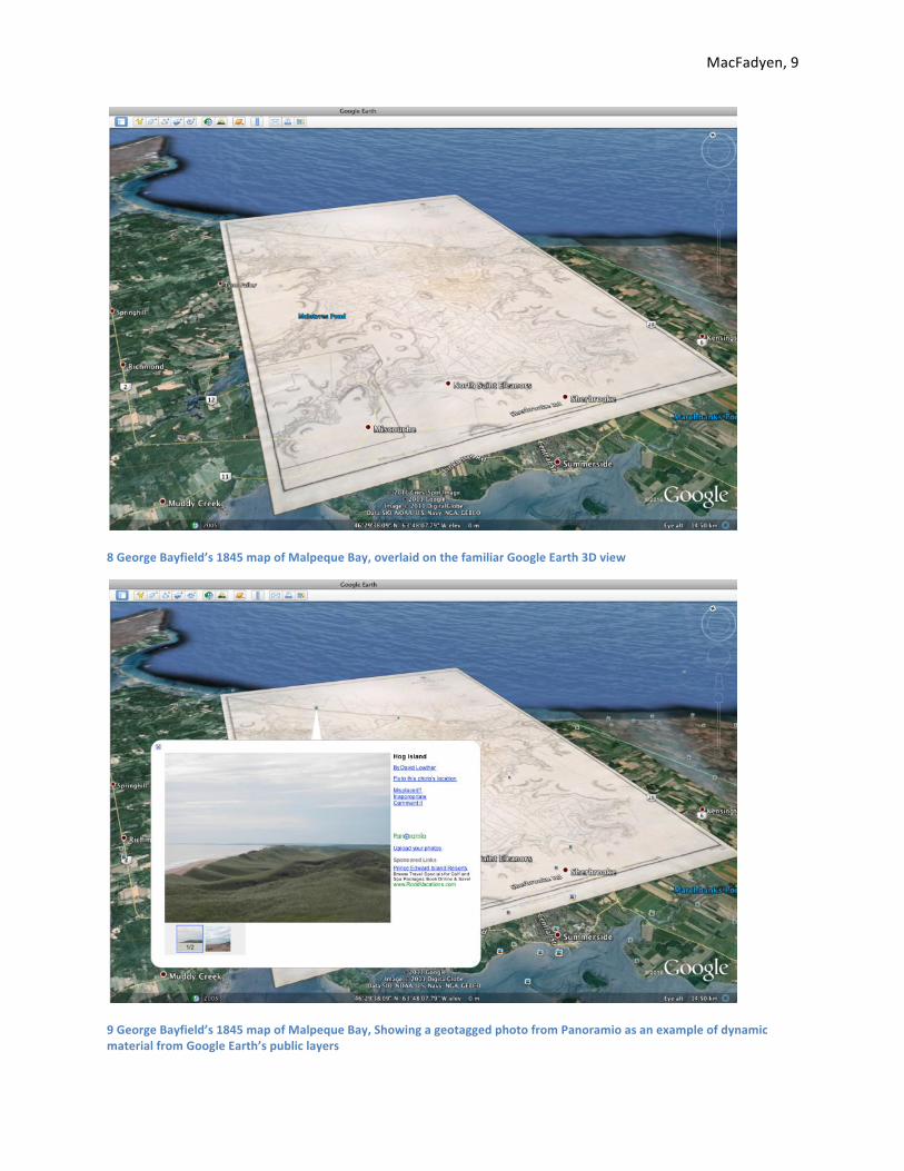
In another environmental history field trip to Malpeque Bay, a Prince Edward Island wetland of international significance according to a Ramsar-‐designation, I wanted to show students the first detailed map of the bay’s complex hydrology and coastal features. Captain George Bayfield surveyed
the bay in 1845, and students can see the large map on the wall of the UPEI library and in digital form on the Island Imagined website. Both of these media are static and do not show the map in relation to the real world. Since both the built and natural environments have changed dramatically since 1845, we
wanted to show students an overlay that let them compare coastal features and land use change over time. We could explore the map from the comfort of the classroom using Google Earth by generating a KML file with MapTiler. This allowed the usual pan-‐and-‐zoom navigation within Google Earth and set
the map in the 3D display that students are now quite familiar with.
MacFadyen, 9
8 George Bayfield’s 1845 map of Malpeque Bay, overlaid on the familiar Google Earth 3D view
9 George Bayfield’s 1845 map of Malpeque Bay, Showing a geotagged photo from Panoramio as an example of dynamic material from Google Earth’s public layers

MacFadyen, 10
By setting the transparency of the Bayfield overlay we could see that the ecologically sensitive barrier islands along the north shore had changed considerably since 1845. In one dramatic change, the wind
and tides reclaimed a 24-‐foot deep channel and replaced it with the surrounding sand dune ecosystem of
Hog Island. The overlay made these landscape changes visible and dynamic, and students could quickly
put it in the context of the Mi’Kmaq presence on the barrier islands, the fishing, farming, and tourism
industries that developed along these shores, and the modern-‐day debates over dredging a deeper passage into
the bay around Hog Island.
11 Transparent overlay showing the former channel and sand dunes on what is now Hog Island
MapTiler’s other strength is the ability to generate basic web maps for publishing on the web, In the
early twentieth century, Canadian cartographers combined aerial photo interpretation with surveys and field observations to plot what became known in 1927 as the National Topographic System (NTS). The NTS maps are an important source for environmental historians as they identified features in the built
environment such as roads, dams, residential, community, and industrial buildings, and they also offer a view of the natural environment including features such as surface hydrology, wetlands, coastlines, and a basic breakdown of forest cover types. The most detailed NTS maps were called “one mile maps”
because of their scale of one inch to one mile. The maps are large and fragile, and at this scale the paper maps of Prince Edward Island would cover a desk almost 3 meters long and 2 meters wide.
10 A channel between Hog Island and Bill Hook Island, 1845

MacFadyen, 11
Viewing these documents in a Google mashup allows historians to identify patterns in land cover and land use change, and often they reveal the origins of disturbances ranging from deforestation and
stream siltation to brown fields or other residual forms of pollution.
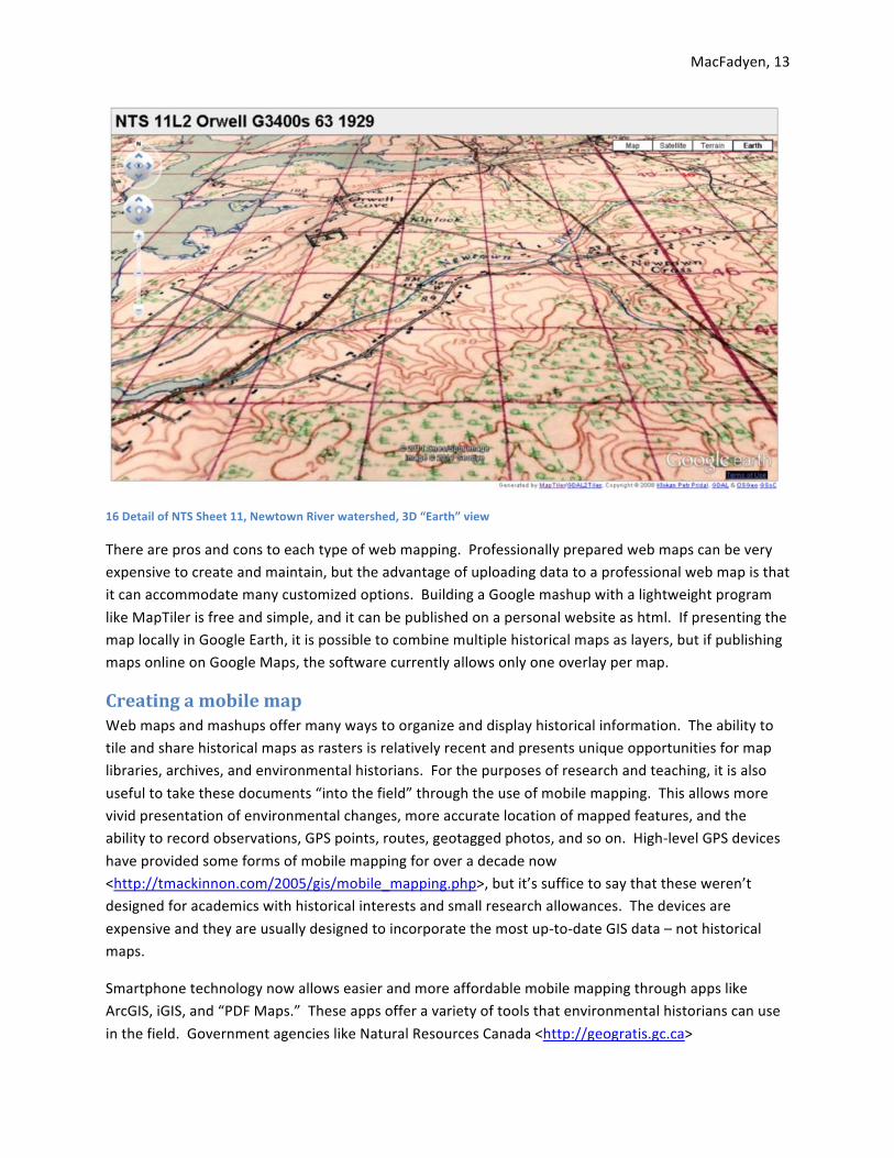
The “one mile” maps were particularly useful for a field trip I led to the Acadian forest along the Newtown River in Eastern Prince Edward Island. After selecting an area which would show good examples of different land use and woodlot management practices (including both healthy and highly
disturbed forests), the class examined the NTS maps for clues to the region’s early twentieth century environmental history. These maps are not yet available on government websites or local libraries, but the University of Toronto Map Library scanned some for the GeoWATCH project and then hosted the
web maps that I georeferenced and tiled using MapTiler. Once the files are tiled and ready to be uploaded to a web site, they include two html files (one for Google Maps, the other for
Open Layers) and a series of folders containing the image files for each viewing scale in the Google mashup. The html link to the map itself will open a Google or Open Layers map window
with navigation tools, a transparency slider, and a variety of basemap options (Map, Satellite, and Terrain) <http://maps.library.utoronto.ca/datapub/digital/3400s_63_19
29/maptile/11L2_w_Orwell/google.html>. If MapTiler is instructed to create KML files for Google Earth, then it will also
show a button called “Earth” which switches the window into the 3D Google Earth viewing mode.
12 The web map’s file structure
13 A Single NTS sheet overlaid on Google Maps

MacFadyen, 12
14 Detail of NTS sheet 11, showing the Newtown River watershed, PEI, in 1944
15 Detail of NTS Sheet 11, Newtown River Watershed. Setting the transparency shows changes in the environment, including deforestation near Cook’s Pond, regrowth near the river’s mouth where there was once a bridge.
MacFadyen, 13
16 Detail of NTS Sheet 11, Newtown River watershed, 3D “Earth” view
There are pros and cons to each type of web mapping. Professionally prepared web maps can be very expensive to create and maintain, but the advantage of uploading data to a professional web map is that it can accommodate many customized options. Building a Google mashup with a lightweight program
like MapTiler is free and simple, and it can be published on a personal website as html. If presenting the map locally in Google Earth, it is possible to combine multiple historical maps as layers, but if publishing maps online on Google Maps, the software currently allows only one overlay per map.
Creating a mobile map Web maps and mashups offer many ways to organize and display historical information. The ability to tile and share historical maps as rasters is relatively recent and presents unique opportunities for map libraries, archives, and environmental historians. For the purposes of research and teaching, it is also
useful to take these documents “into the field” through the use of mobile mapping. This allows more vivid presentation of environmental changes, more accurate location of mapped features, and the ability to record observations, GPS points, routes, geotagged photos, and so on. High-‐level GPS devices
have provided some forms of mobile mapping for over a decade now <http://tmackinnon.com/2005/gis/mobile_mapping.php>, but it’s suffice to say that these weren’t designed for academics with historical interests and small research allowances. The devices are
expensive and they are usually designed to incorporate the most up-‐to-‐date GIS data – not historical maps.
Smartphone technology now allows easier and more affordable mobile mapping through apps like ArcGIS, iGIS, and “PDF Maps.” These apps offer a variety of tools that environmental historians can use
in the field. Government agencies like Natural Resources Canada <http://geogratis.gc.ca>
MacFadyen, 14
<http://gdr.nrcan.gc.ca/mirage> and the United States Geological Survey <http://nationalmap.gov/historical/> have released some of their historical topographical maps as
GeoPDF files, or Adobe files with real world coordinates. Apps like “PDF Maps” can navigate around these files much like Google Maps does, and the phone’s GPS will show where the user is located in the map. GeoPDFs are easy to use, and they are easily shared through email, websites, GIS software, and to
virtually anyone with access to a computer. The downside to using these files is that the mobile map is limited to the margins of the PDF and the app will not overlay the documents on top of other GIS features. ESRI’s ArcGIS app allows the device to interact with other layers and add GIS data provided by
other ArcGIS.com users. However, as I mentioned earlier, ArcGIS.com does not do well with multiple rasters, and since historical maps are almost always rasters, it is difficult to overlay one historical map over another.
We used some form of mobile technology at each of
the GeoWATCH events, although the best mobile mapping applications we found for historians (iGIS) only became available toward the end of the project.
Participants at each event took plenty of photographs and geotagged them either automatically with GPS, by enabling their phone’s
location services, or afterward on Picasa Web Albums and Flikr. In the St. Andrews workshop we had an iPad 2 tablet for displaying the historical web
maps from Service NB and ArcGIS.com, and several participants with iOS or Windows phones also
installed the ESRI app for this purpose. At the Charlottetown and Grand Pre workshops in October, 2011, we used smartphones, and at this point the
“iGIS” app enabled us to customize the maps and show a variety of historical and current GIS layers.
Using mobile mapping, historians can display and
explore historical maps, query and measure GIS data just as they would on a desktop, and input place-‐specific information using GPS. We used the “iGIS”
app at the Grand Pre salt marsh and interpretive centre to compare what we were seeing in the natural environment with a Google basemap and historical forest inventory overlays. Nova Scotia produced one of the country’s first forest inventories in 1912, and it has since been digitized and made available for
download as GIS-‐ready files on the GeoNOVA website <http://www.gov.ns.ca/natr/forestry/maps-‐and-‐forest-‐info.asp>. Another, much more detailed, inventory offers a recent “historical” perspective on land use change, because it was based on the province’s first aerial photo interpretation, beginning in
1985. By adding these two layers to the Google basemap on iGIS, we were able to locate ourselves in the historical landscape and compare mapped and real world observations with what we knew from
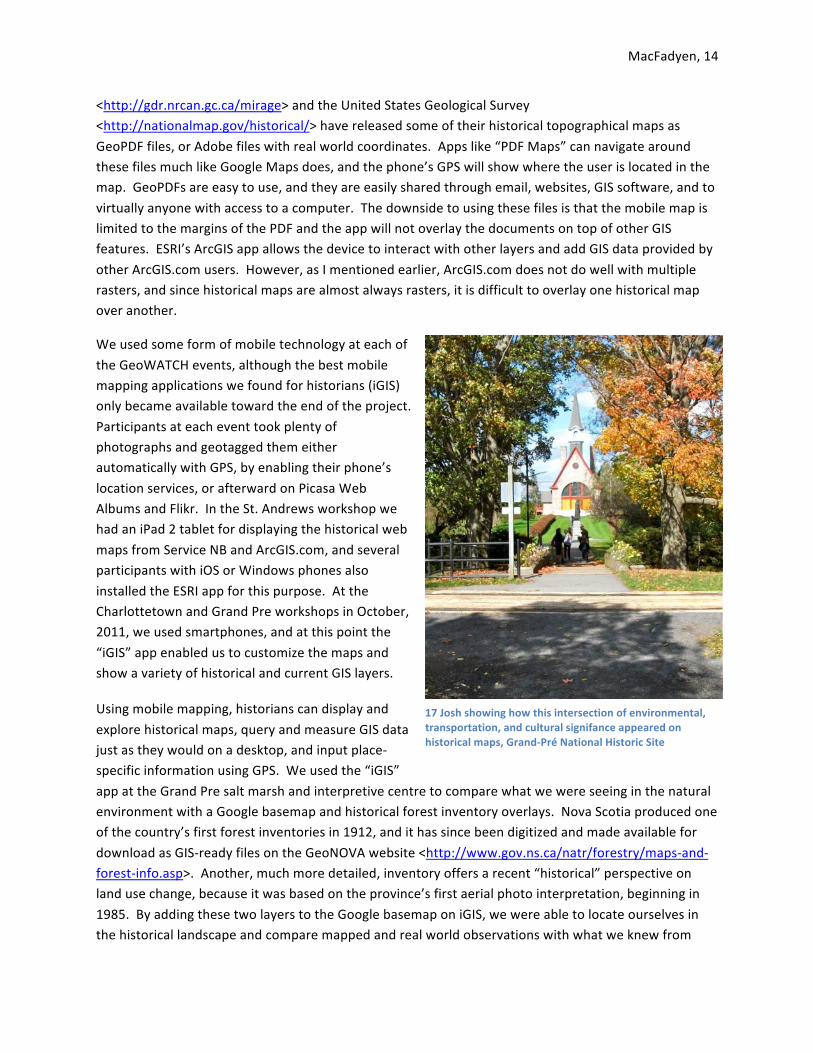
17 Josh showing how this intersection of environmental, transportation, and cultural signifance appeared on historical maps, Grand-‐Pré National Historic Site

MacFadyen, 15
other histories and historical maps of the region. The Pre was a highly manipulated landscape. From the dyked harbours of Wolfville and the
eroding Boot Island to the rural “town plat” of Horton Landing and the site of the Acadian deportation we were able to walk through these historical landscapes and trace the changes on paper and mobile maps.
Back on Prince Edward Island, we used smartphones to display the tiled
maps of Malpeque Bay and Newton Cross as overlays on the Google basemap. The iGIS app can read tiled rasters and overlay them on Google maps directly on an iPhone or other iOS device. It requires the
same processes as the other web maps, scanning the image, georeferencing it in GIS, and then tiling it with MapTiler. To bring the map into iGIS, you simply zip the group of files (see Figure 12) and copy
the archived file to iGIS using iTunes. The app unzips the files, asks you what coordinate reference system you used to make it (in the georeferencing stage) and allows you to add the map as a new layer.
Using the project properties and “layers” buttons you can make the map visible and adjust the transparency. In the Malpeque salt marsh my class was able to compare the 1845 Bayfield map with the 1944 NTS map in the exact
location we were standing. As we learned about the different zones of a salt marsh, and the
type of grasses used as marsh hay, we were able to identify
where those important agricultural resources would have been located in the
nineteenth century. Using the detailed topographical markings on the Bayfield map we were
also able to identify where the coastline was situated in 1845 and where the height of land
marked the edge of the marsh and the beginning of the agricultural uplands.
19 iGIS showing the Grand Pre, GPS points of interest in yellow, and Boot Island cover types in green
18 Exploring a Malpqeue Bay salt marsh

MacFadyen, 16
20 Malpeque 1845 overlay; close-‐up of salt mash; close-‐up showing 1845 and 1944 overlays
We also used mobile mapping in a field trip to the Acadian forest to help illustrate and explore the widespread phenomenon of farm abandonment and forest regrowth in Prince Edward Island and other parts of the Atlantic region in the early twentieth century. It was not immediately obvious from
standing on privately owned woodlot in Newtown Cross, that this scrubby woodlot had once been a farm. The iGIS app helped us identify several historically significant features in the landscape. For one, the 1944 NTS map overlay showed the historical forest outline and the location of a barn and house that
had long since disappeared from the property. We studied the map while standing in a clearing with a large mound that looked suspiciously like the ruins of a house foundation. The GPS beacon identified that we were actually in
an old field that had long since grown up in forest and had been
harvested. The mound was the remnants of a brush pile, and the
house and barn were actually located to the north of this location in
what is now a stand of spruce. The land which had been cleared in the
1930s was likely already abandoned for agricultural purposes,
the house and barns
21 iGIS app displaying location at the edge of an Acadian forest, Newtown Cross, PEI

MacFadyen, 17
beginning the process of decay.
The iGIS app also helped identify features in the natural environment that
stem from human activity on private land. In recent decades the Newtown Cross property has belonged to absentee
owners who participate in a woodlot management plan, and Brian Brown of the Provincial Department of Forestry,
took us further into the woodlot to show the results of various management practices. Property boundaries may
seem like arbitrary lines on a cadastral map showing land ownership, but
exploring nature on the ground shows the dramatic effect a property line can have. As we walked away from the first property toward a steam in the woods we crossed into other properties and saw how the
forest had responed differently to managed thinning and planting, selective harvesting, and clear cuts for firewood and lumber. We noticed how the health of the stream bed increased with distance from cleared land and steep slopes, and we saw evidence of changing hydrology and siltation between the
1944 map and today. The historical maps were useful for identifying the early alignment of farms, the location of homestead buildings, the amount of cleared land, and the way the forest was divided between multiple properties. The “back woodlot” was valued and managed differently by the owners
whose properties converged in the part of the Newtown River watershed.
23 -‐ 1944 NTS map of Newtown Cross overlaid on 2010 aerial photos; add property lines; add hydrology
22 -‐ Brian Brown showing the effect of property lines on woodlots

MacFadyen, 18
Mobile mapping brings historical documents to the field, but it also allows students to make and share observations on the documents.
This can be valuable for historians who want to create a map of environmental features and phenomena by taking GPS readings in the field. Most GPS devices and some smartphone apps will allow the
creation of points, lines, or polygons, either mapped on site or afterward by memory. The iGIS app, for instance, let me identify points of interest on the Grand Pre, Malpqeue, and Newtown Cross
field trips, which I could later use as material for writing summaries or displaying the route we took on a descriptive map. Some environmental historians may also want to enter the new features into
a GIS for recreating and analyzing aspects of the built environment which have disappeared, for example the outline of a dock based on the location of posts.
Another important way of recording observations on these field trips
was through photography, and GPS enabled smartphones are particularly useful (if not the best quality cameras). The use of GPS for geotagging fieldtrip photos was already mentioned; by sharing a geotagged photo or web album, historians are essentially sharing a map of documents with real world
coordinates. Each coordinate indicates where the researcher was located when making that particular observation of nature. However, it is also possible to “pin” historical photos to a map and share them in the same way. Google Earth, ArcGIS Explorer, Panoramio, Flikr, and Picasa Web Albums all have this
capacity, but another useful mashup, HistoryPin <www.historypin.com> , exists specifically for organizing and sharing historical photos from the global community.
In summary, locative media are changing the way we research and understand history and the
environment. Historical GIS opens up a new range of possibilities for teachers and students using maps for environmental history, and mobile mapping is making it easier to take those maps out of the archives. Any historian can create a basic web map or use mobile mapping in a field trip. All that is
required are historical maps, a computer with GIS to georeference the maps, and a mobile phone that supports apps. Open source software for each of these stages is freely available, Quantum GIS, MapTiler, and iGIS were some of the examples discussed here, and this article attempts to explain how
these applications can be used to use web maps and mobile maps creatively in a learning environment.
24 Points of interest, Newtown Cross