ljpicturesss - total film analysis
TRANSCRIPT
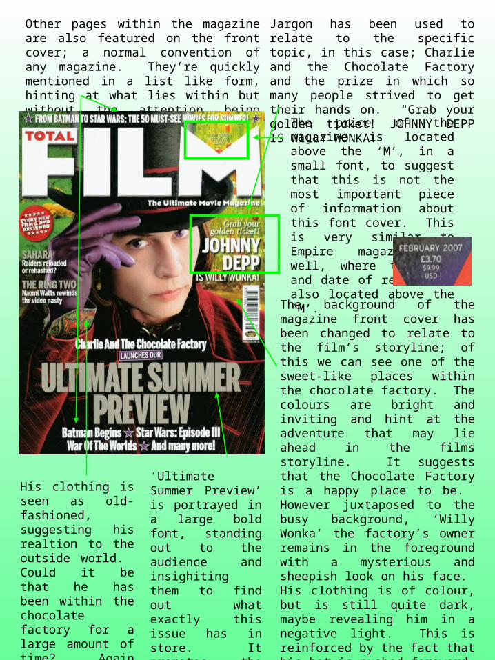
Other pages within the magazine are also featured on the front cover; a normal convention of any magazine. They’re quickly mentioned in a list like form, hinting at what lies within but without the attention being taken away from the main topic.
Jargon has been used to relate to the specific topic, in this case; Charlie and the Chocolate Factory and the prize in which so many people strived to get their hands on. “Grab your golden ticket! JOHNNY DEPP IS WILLY WONKA!
The price of the magazine is located above the ‘M’, in a small font, to suggest that this is not the most important piece of information about this font cover. This is very similar to Empire magazine as well, where to price and date of release is also located above the ‘M’.
The background of the magazine front cover has been changed to relate to the film’s storyline; of this we can see one of the sweet-like places within the chocolate factory. The colours are bright and inviting and hint at the adventure that may lie ahead in the films storyline. It suggests that the Chocolate Factory is a happy place to be. However juxtaposed to the busy background, ‘Willy Wonka’ the factory’s owner remains in the foreground with a mysterious and sheepish look on his face. His clothing is of colour, but is still quite dark, maybe revealing him in a negative light. This is reinforced by the fact that his hat is pushed foreword, creating the sense that he’s a secretive person. However this could also be perceived as him bowing to the audience, or other characters within the film, showing his welcoming side, but should this welcoming side be trusted?
‘Ultimate Summer Preview’ is portrayed in a large bold font, standing out to the audience and insighiting them to find out what exactly this issue has in store. It promotes the magazine as it attracts the reader, encouring them to want to know more.
His clothing is seen as old-fashioned, suggesting his realtion to the outside world. Could it be that he has been within the chocolate factory for a large amount of time? Again reinforcing his sercretive personality, what exactly is he hiding?

Similar to the previous analysis, the price and release date of this magazine is featured in a small print, within the dip of the ‘M’
By using the word ‘ULTIMATE’ to describe the ‘winter preview’, suggests its importance, considering it as a rare opportunity as this is the only magazine in which it is featured.
The male protagonist is stood with his arms tightly gripped around the female protagonist, guarding her. Her distressed expression and clothing being of a white colour reinforces vulnerability. Compared to her, he is stood dominant, acting as her security which is also reinforced by his dark clothing. It suggests his power and strength, making him seem like the classical hero.
Other films also featured within the ‘Ultimate winter preview’, have quickly been listed, making sure the attention isn’t taken away from the main topic. It quickly hints at what else is featured in this edition.
The fact that the two protagonist’s are stood in front of the Total Film title, compared to the ‘Willy Wonka’ edition where he is secretly tucked behind it, indicates how vulnerable they feel and how they cannot hide from what they fear, in this case King Kong!
The main topic of this front cover is displayed in a large, bold and bright font. The brightness of the yellow stands out against the dark colours that the cover consists of. It shows it’s importance and reinforces it as being the main topic.
The overall colours of the magazine are dark, not revealing much to their surroundings, this relates to their expressions, suggesting that they are lost or are in trouble.