lis650lecture 3 important css without positioning thomas krichel 2009-10-03
TRANSCRIPT

LIS650 lecture 3 important CSS without
positioning
Thomas Krichel2009-10-03

important properties
• We will now look at the properties as defined by CSS. These are the things that you can set using CSS.
• Here we study four groups– display and visibilty
– lists
– text
– fonts
– borders
• More next time.

{display: } property
• {display: } sets the display type of an element, it take the following values– 'block' displays the contents as a block
– 'inline' displays the contents as inline contents
– 'list-item' makes contents an item of a list. You can
then attach list properties to it.
– 'none' does not display the contents.
– 'run-in' (not much implemented)
– ‘inline-block’

{display: } property
• {display: } also takes the following values– table – table-footer-group
– table-row – table-row-group
– table-cell – table-column
– table-caption – table-column-group
– inline-table – table-header-group
• These means that they behave like the table elements that we already discussed.

{visibility: }
• The {visibility: } property sets the visibility of an element. It takes values– 'visible' The generated box is visible.
– 'hidden' The generated box is invisible (fully transparent), but still affects layout.
– 'collapse' The element collapses in the table. Only useful if applied to table elements. Otherwise, 'collapse' has the same meaning as 'hidden'.
• With this you can do sophisticated alignments.

list properties I• {list-style-position: } can take the value ‘inside’ or
‘outside’. The property refers to the position of the list item start marker. ‘outside’ is the initial value.
• {list-style-image: } define the list item start marker as a graphic, use url(URL) to give the location of the graphic. Note that this has to be a graphic. The initial value is ‘none’.

list properties II
• {list-style-type: } can take values ‘none’, ‘disk’, ‘circle’, ‘square’, ‘decimal’, ‘decimal-leading-zero’, ‘lower-roman’‘upper-roman’, ‘lower-alpha’, ‘upper-latin’, ‘upper-alpha’, ‘lower-latin’, ‘lower-greek’, ‘armenian’, ‘georgian’. The initial value is ‘disk’.
• latin and alpha mean the same.

{display: list-item}
• If you set the {display: } of an element to ‘list-item’, you can set list properties to them.
• At least this is what the theory says.
• All list properties inherit.

letter and word spacing
• {letter-spacing: } sets spacing between letters, takes a length value, ‘normal’ (the initial value), or ‘inherit’.
• {word-spacing: } sets the spacing between words.
• Length values set additional or subtractional spacing.
• Both properties inherit.

{line-height:}
• {line-height: } sets the distance between several lines of an element's contents, – in pt or pixel numbers
– as a percentage or a number, referring to a percentage of current font size
– ‘normal’
– ‘inherit’
• This property inherits.

{text-decoration:}
• {text-decoration: } can take the values ‘underline’, ‘overline’, ‘line-through’, ‘blink’ (very bad!), ‘inherit’, and ‘none’ (initial value).
• This inherits to some children but not to children that float, are absolutely positioned or have the inline-block or inline-table display. (for the quiz: inherits to some but not to others).

{text-transform:}
• {text-transform: } can take the value ‘uppercase’, ‘lowercase’, ‘capitalize’, ‘inherit’ and ‘none’ (the initial value)
• This only affects the characters in bicameral scripts.
• It does inherit.
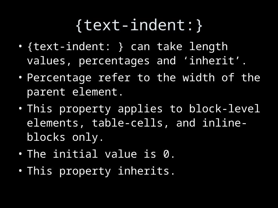
{text-indent:}• {text-indent: } can take length values,
percentages and ‘inherit’.
• Percentage refer to the width of the parent element.
• This property applies to block-level elements, table-cells, and inline-blocks only.
• The initial value is 0.
• This property inherits.

{text-align:}• {text-align: } can take the values ‘left’ ‘right’
‘center’ and ‘justify’ and ‘inherit’.
• This property applies to block-level elements, table-cells, and inline-blocks only.
• The initial value depends on the text direction.
• This property applies to block-level elements, table-cells, and inline-blocks only.
• This property inherits.

classic mistake
• you want to align an image, and you do
• img {text-align: center}
• This will align the contents (in terms of XML) of an image.
• Instead in CSS .center {text-align: center}
• and in HTML <div class="center"><img src="me.png" alt="me"/></div>

{vertical-align:}
• {vertical-align: } can take the values, ‘middle’, ‘sub’, ‘super’, ‘text-top’, ‘text-bottom’, ‘top’, ‘bottom’, length values as well as percentages, and ‘baseline’ the initial value.
• Percentages refer to the {line-height:} of the same element.
• This property only applies to text-level elements and table cells.
• This property does not inherit.

{font-family:}• {font-family:} accepts a comma-separated list of
font names
• There are five generic names, one should be quoted last as a fall-back – ‘serif’ – ‘sans-serif’ – ‘cursive’
– ‘fantasy’ – ‘monospace’
• The initial value depends on the browser. It inherits
• Example body { font-family: Baskerville, "Heisei Mincho W3",
Symbol, serif }
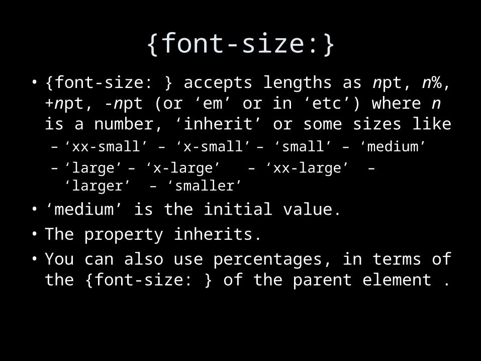
{font-size:}• {font-size: } accepts lengths as npt, n%, +npt, -npt (or ‘em’ or in ‘etc’) where n is a number, ‘inherit’ or some sizes like– ‘xx-small’ – ‘x-small’ – ‘small’ – ‘medium’
– ‘large’ – ‘x-large’ – ‘xx-large’ – ‘larger’ – ‘smaller’
• ‘medium’ is the initial value.
• The property inherits.
• You can also use percentages, in terms of the {font-size: } of the parent element .

{font-style: }
• {font-style: } can be either ‘italic’, ‘oblique’ or ‘normal’ or ‘inherit’.
• The property inherits.
• Oblique fonts use slanted glyphs. Italic fonts have their own glyphs.

{font-variant: }
• {font-variant: } can be either ‘small-caps’ or ‘inherit’ or ‘normal’.
• ‘normal’ is the initial value.
• This property inherits.
• Small caps font may be calculated from smaller capital letters of the same family.

{font-weight: }
• {font-weight: } takes the values ‘normal’, ‘bold’, ‘bolder’, ‘lighter’, ‘100’, ‘200’, ‘300’, ‘400’, ‘500’, ‘600’, ‘700’, ‘800’, ‘900’ and ‘inherit’
• ‘700’ is ‘bold’, ‘400’ is ‘normal’.
• Matching to actual fonts is a fiddly approximation.
• This property inherits.

other font properties• There is a whole bunch of other properties
– {unicode-range: } – {stemv: } – {stroke: }
– {units-per-em: } – {stemh: } – {bbox: }
– {definitions-src:} – {ascent: } – {dscent: }
– {baseline: } – {widths: } – {mathline: }
– {centerline: } – {topine: } – {panose1: }
• There also is a {font: } property that allows you to put several of the previous properties together.
• But all that is not worth learning. Keep fonts simple.

borders
• Borders are rectangular edges around the space occupied by an element.
• They are mainly used for decoration.
• Normally, the borders are not shown.
• To show borders, you have to set a positive border width and a border style.
• No border property is inherited.

box border properties
• {border-top-style} {border-right-style:} {border-bottom-style:} {border-left-style:} take the following values– ‘none’ No border. The width of the border becomes
zero. This is the initial value.
– ‘hidden’ Same as 'none', except in terms of border conflict resolution
– ‘dotted’ The border is a series of dots.
– ‘dashed’ The border is a series of short line segments.
– ‘solid ‘ The border is a single line segment.

more border style
• Other border styles are– ‘double’ The border is two solid lines.
– ‘groove’ The border looks as though it were carved into the canvas.
– ‘ridge’ The border looks as though it were coming out of the canvas.
– ‘inset’ The border makes the box look like embedded in the canvas.
– ‘outset’ The border makes the box look like coming out of the canvas.

{border-color: } • {border-top-color: }, {border-right-color: },
{border-bottom-color: }, {border-bottom-color: }, {border-left-color:} take color values, ‘transparent’ or ‘inherit’
• If a border color is not specified, the browser uses the value of the {color: } of the element. As you recall, the initial value of this property is browser dependent.

{border-width: }
• {border-top-width: }, {border-bottom-width: }, {border-left-width: } and {border-right-width: } take length values, as well as the three keywords 'thin', 'thick' and 'medium'. That is the initial value.
• Note that the default value of {boder-style:} is ‘none’, implying that no border should be shown.
• Firefox appears to be violation for the <img/> in <a><img/></a>.

the default style sheet (extract)• blockquote, body, dd, div, dl, dt, h1, h2, h3, h4,
h5, h6, ol, p, ul, hr, pre { display: block }• li { display: list-item } • head { display: none } • body { margin: 8px; line-height: 1.12 } • h1 { font-size: 2em; margin: .67em 0 } • h2 { font-size: 1.5em; margin: .75em 0 } • h3 { font-size: 1.17em; margin: .83em 0 }• h4, p, blockquote, ul, ol, dl, { margin: 1.12em 0 }• h5 { font-size: .83em; margin: 1.5em 0 }• h6 { font-size: .75em; margin: 1.67em 0 }

the default style sheet (extract)• h1, h2, h3, h4, h5, h6, b, strong { font-weight: bolder } • blockquote { margin-left: 40px; margin-right: 40px }• i, cite, em, var, address { font-style: italic } • pre, tt, code, kbd, samp { font-family: monospace } • pre { white-space: pre } • big { font-size: 1.17em } • small, sub, sup { font-size: .83em } • sub { vertical-align: sub } • sup { vertical-align: super }• del { text-decoration: line-through } • hr { border: 1px inset } • ol, ul, dd { margin-left: 40px } • ol { list-style-type: decimal }

Page design
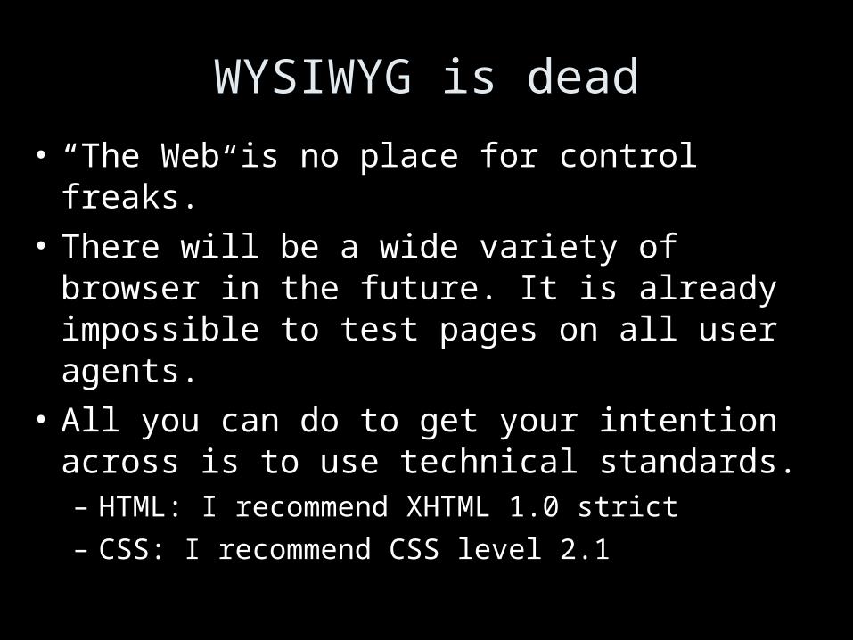
WYSIWYG is dead
• “The Web is no place for control freaks.”
• There will be a wide variety of browser in the future. It is already impossible to test pages on all user agents.
• All you can do to get your intention across is to use technical standards.– HTML: I recommend XHTML 1.0 strict
– CSS: I recommend CSS level 2.1

semantic markup
• The original HTML elements were all based on semantics.
• Example: <h2> is a second level heading. Nothing is said about how a browser should display a second level heading.
• HTML was standardized by the Word Wide Web consortium, the W3C.

the history of browser extensions
• Semantic encoding was lost with the “extensions” invented by the browser vendors.
• These extension operated in addition to the HTML as defined by the W3C, in the major browsers such as Netscape Navigator.
• Some of these have made it into the official HTML standard by the force of habit. Example: <font>

separate content from presentation
• The loose version of HTML has a lot of presentational elements.
• The strict version of HTML avoids the formatting elements introduced by the browser extensions.
• Instead there is CSS, a special language to add style to the pages.
• This language is standardized by the W3C.

CSS and browser vendors
• The W3C used to be “behind” the browser vendors.
• With CSS the W3C has turned the table because CSS is more powerful than HTML extensions but more onerous to implement.
• There are many bugs in the implementation of CSS in browsers. This is yet another reason to avoid snazzy design.

validation of pages
• Make sure that you validate all your pages.
• There are two good validators– http://validator.w3.org/
– http://www.htmlhelp.com/tools/validator/
• Despite it not being official, I recommend the latter.

testing CSS• There is a CSS validation software that will point
out simple mistakes such as – misspelled property names
– invalid property values the worst mistakes.
See http://jigsaw.w3.org.
• But this does not really test your CSS since only you can judge if it looks right.
• You can test your CSS with Opera. It generally has the best CSS support.

use a style sheet• Always use external style sheets.
– organizational benefits maximized
– faster loading
• Use a single style sheet for your site.
• Note that style sheets make it possible to style the page according to the CSS media type used by the browser.

don't go crazy with CSS
• More than two font families (plus perhaps one for computer code) and your page starts looking like a ransom note.
• Gimmicky looking sites will hurt the credibility of you site.
• Make sure your site still looks reasonable in your browser when you turn CSS off and reload the page.

screen real estate
• On a screen that displays a web page, as much as possible should be the contents of the page.
• Some white space is almost inevitable.
• But on many pages there is an overload of navigation.
• Users typically ignore navigation, they look straight at the contents, if that is no good, they hit the back button after 2 seconds.

consequences for class site
• Some students like to have a menu on each page that leads to all other pages.
• If you have a such a menu, make sure not to link a page to itself.
• I think that it is enough to have a prominent link to the home page, and let the home page link to the other pages.

avoid resolution-dependent design
• Never use fixed width in pixels except perhaps for thin stripes and lines
• Make sure that design looks good with small and large fonts in the browser.
• Provide a print version for long documents.• Watch out for horizontal scrolling on low
resolution screen. Users loath it.

never have text in graphics
• Not readable by non-visual browsers.
• Hidden from search engines.
• Takes a long time to load.
• Scales badly for people with a bad vision.

legibility
• Use high color contrast.
• Use plain or very subtle background images.
• Make the text stand still– no zooming
– no blinking
– no moving
• Left-align almost always
• No all uppercase, it reads 10% slower.

animation• Animal instinct draws human attention to moving
things.
• A moving image is a killer for reading, if you must have it, have it spin only a few times.
• Scrolling marquees are an exemplary disaster.
• Most users identify moving contents with useless contents.

watch response times
• Users loath waiting for downloads.
• Classic research by Mille in 1968 found:– delay below 0.1 second means instantaneous reaction to
the user
– 1 second is the limit for the user's train of thought not to be disrupted
– 10 seconds is the limit to keep the user interested, otherwise they will start a parallel task
• Low variability of responses is also important but the Web is notoriously poor for this.

factors affecting speed
• The user’s perceived speed depends on the weakest of the following– the throughput of the server
– the server’s connection to the Internet
– the speed of the Internet
– the user’s connection to the Internet
– the rendering speed of the computer

making speedy pages• Keep page sizes small.
• Reduce use of graphics.
• Use multimedia only when it adds to the user's understanding.
• Use the same image several times on the site.
• Make sure that the / appears at the end of the URL for directories.

get some meaning out fast
• What matters most is the time until the user sees something that makes sense.– Top of the page should be meaningful without images
having been downloaded.
– Use meaningful alt= attribute for images.
– Set width= and height= attributes of <img/> to real size of the image so that the user agent can build the page quickly.

a speed killer: tables
• Large tables, unless specially constructed, take time to build because the browser has to read the whole table first.
• Some data is tabular of course.
• But tables should not be used to coerce the display of elements of the page.
• Cut down on table complexity.
• The top table should be particularly easy.

page <title>
• Needs to be cleverly chosen to summarize the page in a contents of a web search engine. The search engine will use it as anchor text.
• Between 40 to 60 chars long• Different pages in a site should each have their
own title.• No
– welcome– "a" "the" etc..

other metadata
• The only known metadata that I know of is used by Google is <meta name="description" value="foo"/>
where foo is a description of the length of a Google snippet.
• Example: search Google for “Krichel” and look at the snippet of the first result. It is not your normal snippet.

new browser windows
• They can be done with javascript.
• They are mostly thought of to be a pain by users. Therefore they should be avoided.
• Users know that there is a "back" button.
• One potential exception is when dealing with dealing with PDF files, or other media that requires a special application.

forget Flash
• Flash is a proprietary software that allows for conventional graphical user interface application on the Web.
• Mainly used for splash screens, something that users hate.
• Flash should not be used to animate the contents either, most users equate animated contents with useless contents.

and finally: no frames • They add navigation/decoration to the page.• Pages in frames can not be bookmarked. • There are well-known issues with indexing framed
pages. Users would typically see the current frame without the surrounding frame. This is called a black hole page.
• Useful as an el cheapo aid for incompetent web architects unfamiliar with SSI, CGI, or PHP.

Contents design

reduce the number of words
• The general principle is to write as short and simply as possible.
• This hold particularly for top-level and navigational page.
• The length of lower-level “destination” pages is less of a problem.

write cross-culturally• Use simple short words. • Use short sentences.• Use common terms rather than made-up words.
This also improves search-engine visibility.• Avoid at all cost
– humour– metaphors– puns
unless your audience is very local.

write little but well
• Write scannable– Use bullet points and/or enumerations.
– Highlight key terms without risking them to appear as links.
• Write to the point as opposed to marketese.
• Answer users’ questions– You have to anticipate them.
– Image you will be the user.

no happy talk
• Everyone hates stuff like
Welcome to our award-winning web site. We hope that
you have a enjoyable time while you are with us. You
can click on any underlined word to navigate from one
page to another…
• But how many times do we have to read such
nonsense!

keep to the subject level• Write about your subject; even if the text contains
links.
Thomas Krichel is known as the creator of RePEc, a large
digital library for academic economics.
• Do not write about the reader’s movements,
– neither in terms of changing servers or visiting
resources
Go to the home page of Thomas Krichel.
– Nor in terms of interactions with their user interface
Click here to visit Thomas Krichel’s home page.

document rather than subject talk
• Here is…
• This is…
• Point your browser at…
• Press this button…
• Select this link…

bad words
• stuff and moresomething the author does not know or care about
• under constructionIf this is the only thing on the page and the page has no
meaningful information, it should not be linked to. Otherwise, leave it out.
• viewyou mean: read

meaningless buzzwords
• award-winning
• check it out
• cool
• cutting-edge
• hot
• hotlist of cool site/links
• neat
• one-stop-shop

overused and often redundant
• available• offered• current• currently• feel free• online• welcome to• note that note how• your as in “your guide to ...”

the word “provides”
• Most of the time it is redundant– provides a list -> lists
– provides a description -> describes
– provides an overview -> surveys, introduces

visual hierarchy
• Create clear visual hierarchy.– the more important something is, the more prominent it
should be
– things that relate logically should relate visually
– things that are part of something else should be nested visually within it.
• Break pages into separate parts
• Reduce visual noise.

ensure scannability
• Structure pages with 2 or 3 levels of headings
• You may want to highlight keywords in some way, but not in any way that they could be confused with hyperlinks.
• Use meaningful, rather than cute headings.
• Use one idea per paragraph.

dating
• It is useful for you to date contents, especially for pages that describe events or a state of the art.
• It looks VERY bad on you for your readers to read about dates in the past referred to in the future tense. Try to avoid this, for example by making dated event tabular.
• Or better, do LIS651.

linking
• NEVER link to a page that just says “under construction”, or worse that adds “come and check again soon”.
• NEVER link a page to itself.
• Make obvious what is a link in your document. It is best not to be smart with styling links.

avoid non-standard link appearance
• It needs to be obvious what is a link.
• Visited links and non-visited links need to contrast visually.
• A page must not link to itself.
• Some experts advise against links within pages. They say that users expect a link to go to a different page.

anchor text
• When writing anchors it is particularly tempting to deviate from the subject.
• Anchor text should make sense out contents.
• It should not be a verb phrase.
• If possible, the anchor should be the natural title of the next page.

mailto: links
• Rarely something is more annoying than following
a link just to see you email client fired up because
the link was a mailto link.
• Make it clear that the link is a mail
Thomas Krichel's email is <a
href="mailto:[email protected]" >
• Such links invite spammers.

link checking
• You need to check your links. There are tools for that. One example is the link evaluator, a Firefox extension, at http://evaluator.openly.com/
• Don’t include too many outside links. If they disappear it looks bad on you, rather than the outside site.
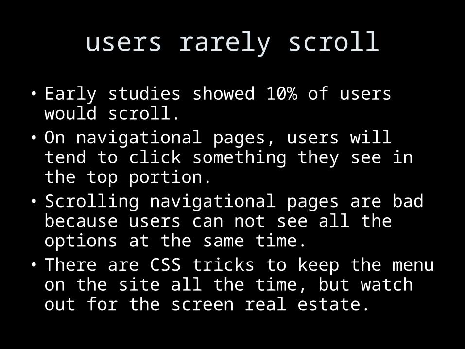
users rarely scroll
• Early studies showed 10% of users would scroll.• On navigational pages, users will tend to click
something they see in the top portion.• Scrolling navigational pages are bad because
users can not see all the options at the same time.
• There are CSS tricks to keep the menu on the site all the time, but watch out for the screen real estate.

page chunking
• Just simply splitting a long article by into
different parts for linear reading is not good.
Mainly newspapers do it for simplicity.
• Devise a strategy of front pages with the
important information and back pages linked
from the front pages with the detail.
• Base the distinction of important and not
important stuff on audience analysis.

page name
• Every page needs some sort of a name.
• It should be in the frame of contents that is unique to the page.
• The name needs to be prominent.
• The name needs to match what users click to get there. Watch out for consistency with links to the page.
• The page name should be close to the <title> of the page.

headline design• Use <h1> as top heading, CSS for style
adjustment.
• Headings must make sense out of context.
• Put important words at the beginning of the headline.
• Do not start all pages with the same word.

contact or organization information
• There needs to be information about an
organization other than its Web URL. People still
want to know
– what is the phone number?
– what is the email address?
– where an organization physically located?
– when it is open?
– how to get there?
• This data should be prominently linked to.

provide a bio• For others it is difficult to evaluate the information
in the site without knowing the author.
• Therefore, if you do provide information in a personal capacity, provide a bio of yourself as the web author.
• There is no shame admitting your site was done for LIS650.
• Dating a site adds to its credibility.

pictures
• Have a picture on a bio page.
• Avoid gratuitous images.
• You can put more pictures on background pages, that are reached by users with in-depth interest.
• Never have a picture look like an advertising banner.

alt text on images
• If the image is simply decorated text, put no text in the alt= attribute.
• If the image is used to create bullets in a list, a horizontal line, or other similar decoration, it is fine to have an empty alt= , but it is better to use things like {list-style-image: } in CSS.

longdesc=
• If the image presents a lot of important information, try to summarize it in a short line for the alt attribute and add a longdesc= link to a more detailed description.
• This is recommended accessibility recommendation.

rules for online documentation (if you must have some)
• It is essential to make it searchable.
• Have an abundance of examples.
• Instructions should be task-oriented.
• You may have to provide a conceptual introduction to the system.
• Hyperlink to a glossary.

multimedia• Since such files are long, they should have an
indication of their size.
• Write a summary of what happens in the multimedia document.
• For a video, provide a couple of still images. This will give people– quick visual scan of the contents of the multimedia
– an impression of the quality of the image

avoid cumbersome forms
• Forms tend to have too many questions.
• You can support the auto-fill that browsers now support by using common field names.
• Flexible input formats are better. Say I may want to type in my phone number with or without the 1, with or without spaces etc. Watch out for international users.

avoid advertising
• And if you don’t have advertising, do avoid having anything look like advertising. This could for example, be a graphic that looks like a banner ad.
• This is another reason to avoid moving contents. Most users think that moving contents is useless contents. Most often, indeed, it is advertising.

http://openlib.org/home/krichel
Please switch off computers when done.
Thank you for your attention!