leveraged bank loan versus high yield bond mutual funds ... · than firms issuing loans. bank loans...
TRANSCRIPT

Finance and Economics Discussion SeriesDivisions of Research & Statistics and Monetary Affairs
Federal Reserve Board, Washington, D.C.
Leveraged Bank Loan versus High Yield Bond Mutual Funds
Ayelen Banegas and Jessica Goldenring
2019-047
Please cite this paper as:Banegas, Ayelen, and Jessica Goldenring (2019). “Leveraged Bank Loan ver-sus High Yield Bond Mutual Funds,” Finance and Economics Discussion Series2019-047. Washington: Board of Governors of the Federal Reserve System,https://doi.org/10.17016/FEDS.2019.047.
NOTE: Staff working papers in the Finance and Economics Discussion Series (FEDS) are preliminarymaterials circulated to stimulate discussion and critical comment. The analysis and conclusions set forthare those of the authors and do not indicate concurrence by other members of the research staff or theBoard of Governors. References in publications to the Finance and Economics Discussion Series (other thanacknowledgement) should be cleared with the author(s) to protect the tentative character of these papers.

1
Leveraged Bank Loan versus High Yield Bond Mutual Funds
Ayelen Banegas and Jessica Goldenring1
May 3rd, 2019
Abstract
Since the financial crisis, the markets for Bank Loan (BL) and High Yield Bond (HYB) mutual funds
(MFs) have grown significantly, with assets under management increasing from $19 billion and $75
billion to close to $117 billion and $225 billion, respectively, as of December 2018. This short paper
characterizes the universe of BL MFs and compare it against that of HYB MFs on several dimensions.
We document that BL and HYB MFs’ respective market share of leverage loans (LL) and high yield
(HY) corporate bonds outstanding increased since the mid-2000s. We also show that in terms of portfolio
allocations, HYB and BL MFs hold around 60 percent of B, BB and BBB-rated assets and that exposure
to foreign fixed-income markets is relatively small for both types of MFs. Finally, we document that net
flows as a share of assets were larger and more volatile for BL MFs than for their HYB counterparts and
that HYB MFs significantly outperformed BL MFs since early 2000.
1 We are very grateful to Min Wei, Dan Li, Chuck Press and Zack Saravay for their insightful comments.

2
1. Introduction
The underlying assets of corporate debt mutual funds are often grouped into two broad
categories that lie at different ends of the credit spectrum: investment grade and high yield.
While mutual funds investing primarily in investment grade corporate bonds are considered less
risky, higher returns are generally associated with high yield mutual funds. Two increasingly
popular investment categories within the high yield MF universe are BL and HYB MFs.
BL MFs invest a large share of their portfolios in leveraged loans, defined as commercial loans
lent to high yield companies. The issuing companies are usually below investment grade or
unrated with a risk profile similar to speculative grade firms. Similarly, HYB MFs primarily
invest in high yield bonds or “junk bonds”. Reportedly driven in part by investors reaching for
yield in the sustained low interest rate environment, the demand for bank loans and high yield
bonds increased substantially since the financial crisis: from 2008 to year-end 2018, institutional
leveraged loan outstanding increased from around $550 billion to $1,150 billion and HY bonds
outstanding increased from $750 billion to $1000 billion.2 Moreover, since 2008, HYB MFs’
assets under management increased from around $75 billion to $225 billion and bank loan funds
grew from $19 billion to $117 billion. These trends highlight changes in the HYB and BL market
and are motivation for further insight into the high yield mutual fund universe. Before detailing
the BL and HYB MFs universe, there are differences between BL and HYB that are important to
note:
1. Coupons: BLs are floating rate investments, typically defined as Libor plus a fixed
spread. As a result, as interest rates (i.e. Libor) rise, coupon rates also increase. On the
other hand, HY bonds typically have fixed coupons. Interest rate increases tend to benefit
floating rate investments such as BLs.
2. Recovery rate: BLs are collateralized, senior secured debt, at the top of a company’s
corporate capital structure. In the case of a company’s default, BL investors are more
likely to receive more principal back than HY bond investors. HY bonds are subordinate
in the capital structure and are paid after BLs.
2 See Appendix B, figure B5 for a time series of both outstanding series.

3
3. Callability: BLs are callable at par at any time after the first few months of the issuance,
and therefore can have limited upside potential during bull markets. In contrast, HY
bonds tend to have better call protections, allowing investors to benefit further from price
appreciation.
4. Liquidity: HYBs are generally more liquid than bank loans as loans tend to be less
standardized, which can lead to more uncertainty and longer settlement time. As a result,
during periods of market stress, in which investors are reducing their exposures to these
assets, BLs can be expected to experience larger price declines than HY bonds.
5. Investor Protection: BLs contain covenants, or restrictions, that put limitations on
borrowers and protect investors by requiring the borrower to do or refrain from doing
certain activities. These clauses in the loan agreement can be particularly useful for
lenders in the event of a default or loan restructuring. However, these covenants have
been loosening over the past years, leading to more similarities between BL and HY
bonds.
6. Transparency: Firms issuing bonds are subject to more stringent disclosure requirement
than firms issuing loans. Bank Loans are not a security and are less regulated. Moreover,
because of the limited public disclosure of their financial information, BLs are generally
more difficult to monitor by a third-party.3
This analysis uses monthly share class data from Morningstar Direct (MD).4 The sample
contains U.S. domiciled mutual funds over the 2000-2018 period and includes both active
and inactive funds in order to avoid survivorship bias.5 Specifically, the sample considers the
“Bank Loan” and “High Yield Bond” subsets of MD “Taxable Bond” (TB) U.S. Category
Group. In order to create a robust and comprehensive universe, the data was checked against
several data vendors including Investment Company Institute and Lipper.6 The following
subsections characterize and compare the universe of these two mutual fund investment
categories.
3 In the case of BLs, financial information related to the loan arrangement is generally only fully disclosed to the lenders and or potential investors. 4 Morningstar, Inc. Morningstar Direct, http://corporate.morningstar.com/US/asp/subject.aspx?xmlfile=40.xml. 5 The sample also excludes fund of funds. 6 See Appendix A for more detail on the definition of the mutual fund universe and the breakdown of MD categories.

4
2. Assets Under Management and Investor Base
2.1. BL and HYB assets under management have grown significantly since the financial
crisis.
Total net assets of BL and HYB MFs, depicted in figure 1, rose at a strong pace during the post-
crisis period, supported by large inflows and positive performance. BL MF assets under
management (AUM) increased from roughly 19 to 117 billion dollars over the sample period,
and similarly HYB MF assets grew from close to 75 to 225 billion dollars. The AUM of BL and
HYB funds increased through the sample until September 2017 when fund assets for both
investment categories edged down.
Notably, the growth in AUM accompanies the rise in the number of mutual funds investing in
these asset classes. Figures 2 and 3 show the number of funds and the market share of the top 10
funds investing in BL and HYB MFs through the sample. The sample consists of 56 BL funds
and 191 HYB funds as of December 2018, a significant increase relative to the 16 BL and 153
HYB MFs at the beginning of the sample in early 2000. While the number of mutual funds
investing in BL MFs rose over time, the market concentration, measured as the market share of
the top 10 largest MFs in terms of AUM, declined to 60 percent at the end of last year.
Meanwhile, concentration of HYB MFs fluctuated around a narrow range, with the top 10 of
HYB MFs managing close to 40 percent of total HYB MF assets.

5
2.2. Institutional investors are increasingly seeking out BL and HYB MFs.
Figures 4 and 5 present BL and HYB MFs total AUM partitioned by investor type over time. As
shown below, the share of institutional investors remained negligible for BL MFs until 2005, but
increased substantially since the financial crisis.7 Consistent with investors reaching for higher
yields in the post-crisis sustained low interest rate environment, the share of total assets held by
institutional investors jumped to 16 percent in 2009 and continued to grow at a solid pace
through the end of 2018. By the end of the sample, institutional investors accounted for 50
percent of BL MF assets. Comparable to BL MFs, HYB MF institutional investors’ participation
increased through the sample period, starting around 10 percent in 2000 and reaching 40 percent
at the end of 2018. Moreover, like BL MFs, the increase of institutional investors’ participation
in HYB MFs was particularly notable since the financial crisis.
7 MD defines institutional investors as any fund that meets one of the following qualifications: has the word "institutional" in its name; has a minimum initial purchase of $100,000 or more; or states in its prospectus that it is designed for institutional investors or those purchasing on a fiduciary basis. In the sample, a fund is classified as institutional if all share classes meet one of the classifications; otherwise the fund shows as non-institutional or retail. This means this classification does not account for cases in which one of the share classes of a fund is for institutional investors while others are for retail investors.

6
3. Portfolio Allocations
This section focuses on quarterly portfolio allocations that highlight the composition of BL and
HYB MFs including exposure by asset class, fixed-income sector allocations, foreign versus
domestic exposure and credit rating.
Figures 6 and 7 show BL and HYB MFs allocations to cash, fixed-income, equity and other
securities.8 Both BL and HYB funds held about 85% of their assets in fixed-income securities
and about three percent in cash, at the end of 2018. Aside from fixed-income and cash, portfolio
exposure to equities and to other remained minimal over time for both BL and HYB funds.9
8 This portfolio allocation breakdown is performed using Morningstar’s asset allocation variables. The variables are defined as the percentage of a fund’s assets for each category. The categories are calculated separately for short, long and net positions. In this analysis only the net positions are considered. Missing represent the share of AUM that were not classified by MD. See Appendix for more details on these variables. 9 Morningstar describes “other” to include futures or options on commodities, weather and volatility. Cash includes futures, forwards, or options on short-term interest rates and currencies. It also includes the cash offsets for most derivative contracts.

7
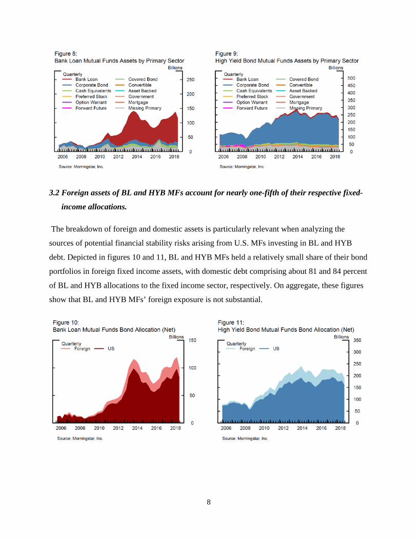
3.1 BL funds held about 74% of their assets in leveraged loans, while HYB funds held near
5% of total assets in such loans.
Figures 8 and 9 confirm that BL and HYB funds primarily hold the securities defined by their
categories.10 Specifically, BL funds held about 74 percent of their assets in bank loans, which
accounted for $84 billion as of fourth quarter 2018, while HYB funds held only 5 percent of total
assets in such loans, equivalent to around $12 billion in AUM. Meanwhile, HYB funds held
about 76 percent of total assets in corporate bond securities while BL funds held around 11
percent. In addition, figures 8 and 9 highlight net cash allocations, which in both MF categories
are positive and less than 5 percent through the sample. These cash allocations can be
particularly relevant for these fund categories since both BL and HYB MFs engage in liquidity
transformation and therefore need cash buffers to meet large redemptions.11
10 Morningstar fixed income sector allocation can be aggregated at different levels. Each category is assigned based on holdings. The broadest category, “Super Sectors” (shown in Appendix C) illustrate the predominate amount of corporate bonds assets in both BL and HY MFs. Disaggregating these allocations into their “Primary Sectors” shed light to the actual amount of bank loan holdings in both MF categories. The percentage of each asset class is the market value divided by the total market value of the portfolio at each point in time. For more details on the available categories see Appendix A. 11 Funds may also manage liquidity through internal portfolio construction by holding a larger share of their portfolios on highly liquid assets, managing liquidity at the firm level, or expanding their credit lines, among other tools.
8
3.2 Foreign assets of BL and HYB MFs account for nearly one-fifth of their respective fixed-
income allocations.
The breakdown of foreign and domestic assets is particularly relevant when analyzing the
sources of potential financial stability risks arising from U.S. MFs investing in BL and HYB
debt. Depicted in figures 10 and 11, BL and HYB MFs held a relatively small share of their bond
portfolios in foreign fixed income assets, with domestic debt comprising about 81 and 84 percent
of BL and HYB allocations to the fixed income sector, respectively. On aggregate, these figures
show that BL and HYB MFs’ foreign exposure is not substantial.

9
3.3 BL and HYB MFs held about 74% and 71% of their fixed-income allocation in B and
below-B rated debt.
Although by definition BL and HYB MFs invest primarily in below investment grade debt, in
this section we use MD credit rating variables to further decompose BL and HYB MF fixed
income and cash allocations in terms of their credit quality.12 Figures 12 and 13 display the
breakdown of assets by specific credit ratings.13 In both BL and HYB MFs the largest credit
category correspond to B rated securities, representing about 42 and 32 percent, respectively. For
BL MFs, these percentages account to about $27 billion in assets at end-of-year 2018, while for
HYB MFs B rated allocations are close to $25 billion. Overall, at the end of 2018, BL and HY
funds held 74% and 71%, respectively, of their rated assets in securities with a credit rating of B
and below.
Moreover, the specific credit ratings highlight the Investment Grade (IG) and High Yield (HY)
composition as the shade of blue in figures 12 and 13 show the allocation to IG assets while the
shades of red summarize the HY assets. This configuration highlights that both BL and HYB
MFs hold the large majority of their portfolios in HY assets, although a small share close to 6%
12 It is not possible to subset only fixed-income and cash instruments in the Morningstar feed; however the allocation variables shown in Appendix C confirm that there is not a significant amount of cash offsetting BL and HYB funds fixed-income allocations. These charts are based on available data, without any interpolation of missing observations. In appendix B, we present alternative scenarios which follow different backfilling schemas to reduce the share of missing rating assets. 13 This rating breakdown is performed using Morningstar’s credit quality variables. Missing represent the share of AUM that were not classified by MD.

10
and 5% of their bond holdings are rated as IG at the end of 2018, respectively. The concatenation
of ratings is used to construct market share estimates described in the next section.
3.4 BL MFs held about 7% of LL outstanding while HYB MFs held roughly 16% of HY bond
outstanding at the end of 2018.
Key to the assessment of risks arising from BL and HYB MFs is understanding their market
share in the underlying asset markets. Figures 14 and 15 show estimates of the share over time of
BL and HYB outstanding held by the corresponding MF categories.14 On balance, the percentage
of BL and HYB MFs trends up through the sample. BL MFs, reached its peak in 2013 and since
has fluctuated around 7 and 10 percent. Of note, in 2018 the BL percent was near 10 percent but
dropped to 7 percent in the fourth quarter due to large redemptions in December.15 Meanwhile,
the share for HYB funds increased in the post-crisis period and is somewhat higher than the level
observed for BL MFs, at 16 percent.16
14 For BL, these estimates are computed as the share of leveraged loans in BL MFs relative to the total assets of institutional leverage loans outstanding reported by S&P/LSTA by way of Thomson Reuters. A similar approach is applied to estimate the share of HY securities held by HYB MFs, where total HY corporate bond outstanding is from Mergent’s FISD. Mergent, Inc. Fixed Investment Securities Database (FISD). Thomson Reuters LPC. Dealscan and LoanConnector, http://www.loanconnector.com/loanconnector/LPC_LC2_SecurID.html. 15 CLOs have historically been the largest player in the institutional leveraged loan market. 16 For more information see Appendix B, figures B.3 and B.4, where we create a range for these estimates.

11
4. Flow and Performance
The growth of BL and HYB MFs’ AUM was driven by positive performance, strong inflows and
new funds entering the sector in the post-crisis period. In particular, BL MFs experienced large
net inflows, reaching a $61.8 billion peak in 2013. Since then, net flows decreased substantially,
with annual net outflows reaching almost 20 billion dollars in 2014 and in 2015. More recently,
BL net flows have remained almost flat. Specifically, in 2018 annual net flows reached 0.2
billion dollars (figure 16). HY MFs show a similar pattern to BL MFs post-crisis and
experienced large net inflows, with annual net flows reaching a 26.6 billion dollar peak in 2012,
followed by strong outflows in the order of 18 and 13 billion dollars in 2014 and 2015,
respectively. However, unlike BL MFs, in 2018 HY MFs experienced large net outflows close to
31 billion dollars.17
4.1. Flows as a share of assets have been larger and more volatile for BL than for HYB MFs.
The monthly frequency data highlights that BL net flows as a share of total net assets (TNA) at
times were substantial and volatile, with net outflows reaching between 5 to 11 percent of total
AUM (figure 17). Though smaller in magnitude than BL flows, HYB fund net flows as a share
of TNA were also volatile, with redemptions reaching their record high level of 4.4 percent of
TNA around the Taper Tantrum in 2013.18 Of note, BL and HYB MF flows tend to show
different sensitivity to interest rate changes, as BLs generally benefit from interest rate hikes
while HY bond performance is negatively affected by rising interest rates. The Taper Tantrum in
May 2013 provides an illustration of the different effects of a monetary policy shock on the
flows of these two investment categories. This event triggered notable outflows from HYB MFs,
with monthly redemptions reaching 4.4 percent of TNA in June of 2013, equivalent to around
$11 billion in AUM. At the same time, as shown by figure 17, BL MFs experienced large net
inflows in the order of 6% of TNA, totaling about 6 billion dollars. This event highlights the
different effects of a change in the expected future benchmark interest rate on BL and HYB
flows. Nevertheless, it is important to note that other types of shocks, such as credit shocks,
17 Early 2019 data shows that these outflows rebound but remain negative on net. 18 See appendix D, table 1, for the summary statistics of the underlying flow ratios depicted in figure 17.

12
could trigger different flow patterns and investor redemption behavior than the ones observed
during the Taper Tantrum.
In addition, figure 17 shows some asymmetries between positive and negative net flows at times,
with both BL and HYB positive net flows experiencing somewhat higher dispersion than net
outflows over the sample period. Also, monthly data points to somewhat weak co-movements
between BL and HYB MF flow ratios, with correlation close to 0.2 during the 2000-18 period.19
Figures 18 and 19 expand on figure 17 and provide further insights into the distribution of BL
and HYB MF net flows. As shown by these figures, and based on fund level data, BL MFs
generally experienced larger and more volatile flows than HYB MFs at the 25th, 50th, and 75th
percentiles.
19 Breaking the sample into the pre- and post-crisis period also suggests a low correlation between BL and HYB flows, at negative 0.04 and positive at 0.24 during the first and second half of the sample.20 Appendix C presents BL and HYB MFs annual performance based on average returns.

13
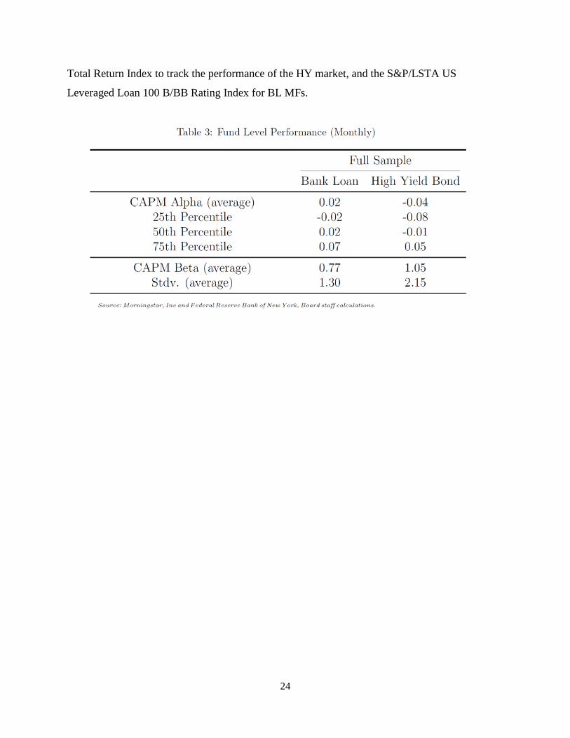
4.2. HY MFs significantly outperformed bank loan MFs.
Figures 20 and 21 present BL and HY annual returns for widely used market benchmarks as well
as returns for the MD universe of MFs. MF returns are net of fees and expenses and are weighted
averages of the underlying fund level returns.20 The benchmark returns considered are the Bank
of America Merrill Lynch High−Yield Master II Total Return Index to track the performance of
the HY market, and the S&P/LSTA US Leveraged Loan 100 B/BB Rating Index for BLs. In
contrast with the MF returns, these benchmarks are in gross terms, without accounting for fees
and expenses. As shown in figures 21, BL MFs have lagged HY MF performance for most of the
calendar years covered in the analysis. Both investment strategies experienced their worst year in
2008, with BL MFs producing a negative 29 percent annual return, and with HY MFs delivering
negative returns in the order of 27 percent. Following the burst of the crisis, performance
rebounded strongly in 2009 with BL and HY MF returns reaching their highest levels at about 38
percent and 48 percent, respectively. In looking at the return correlation between BL and HYB
MFs, monthly correlation increased notably in the post-crisis period (June 2009 to the end of
year 2018) to 0.9, from 0.6 in the pre-crisis period (2000 to December 2007).
20 Appendix C presents BL and HYB MFs annual performance based on average returns.

14
Moreover figures 22 and 23 illustrate the distribution of BL and HYB MF returns using fund
level data, allowing us to also quantify tail risks. The figures suggest that the returns of HYB
MFs are somewhat more negatively skewed than those of BL MFs.
Summary statistics for monthly returns (shown in appendix D, table 2) also point to higher
average returns from the HYB MF universe. This finding also holds when breaking the sample
into the pre- and post-crisis periods. Also, results for the 5th, 25th, 50th and 75th percentiles
indicate that BL MF’s monthly returns are smaller in magnitude than those experienced by HY
funds across their distribution.
To further illustrate how BLs performed relative to HY bonds, figures 24 and 25 show the
evolution of $100 dollars invested in the BL and HY market portfolios, and on value-weighted

15
BL and HY MF portfolios that include all the funds in our MF universes. As depicted in figure
24, while $100 invested in the BL benchmark at the end of 2001 delivered about $200 at the end
of 2018, $100 invested in the HY benchmark returned close to $350 over the same period. A
similar pattern is observed when looking at the MF portfolios in figure 25, although in this case
HYB MFs outperformance is somewhat dampened. This relative underperformance of BL funds
is consistent with the lower volatility of BL MF returns.21 Specifically, HYB MFs experienced
higher return volatility on average than BL funds. Over the 2000-18 period, HYB fund monthly
volatility stands at 2.2 percent on average, while that of BL is close to 1.3 percent.22 In looking at
the ability of both MF categories to beat their respective benchmarks, CAPM alphas are about
flat for the universe of BL funds and slightly negative for HYB MFs, on average. CAPM betas
also suggest that HYB MF performance is slightly more volatile than that of their respective
market benchmark, on average. Conversely, BL CAPM betas indicate that, on average, BL MFs
are somewhat less volatile than their market benchmark.
Finally, a comparison of figures 24 and 25 also suggests that, especially in the case of HY MFs
and after adjusting for fees, a passive approach to investment over our sample period, meaning
21 Market commentary had also related BL MFs’ lower returns relative to those of HYB funds to the negative convexity of bank loans, which can be callable at par at any time, and therefore their upside potential for price appreciation tends to be capped during bull markets. 22 See appendix D, table 3, for details on these performance statistics.

16
investing in the market portfolio, generated more economic value than investing in a portfolio of
funds that included our universe of BL and HY funds.
5. Concluding Remarks
This note documents the characteristics and trends of mutual funds investing primarily in BL and
HY bonds MFs over the 2000-18 period. We show that AUM of both BL and HY MFs grew at a
strong pace during the post-crisis years, driven by positive performance, net inflows and new
funds entering the high yield space. We also document that BL MFs have underperformed HY
MFs over the period and that BL net flows as a share of assets have been larger and more volatile
than those experienced by HY MFs.
Going forward, although HY MFs tend to be associated with lower liquidity risk and greater
potential for price appreciation, BL MFs may continue to be an attractive alternative to investors
seeking to minimize interest rate risk in the high yield space. This can be particularly relevant in
the current context of monetary policy normalization by major central banks.
Future analysis could build on recent work on MF liquidity transformation and explore in detail
the case of bank loan MFs, analyzing the potential price impact of large redemptions on
investors’ portfolios, as well as the financial stability implications at the aggregate level.

17
Appendix A –Robustness of the Bank Loan and High Yield Mutual Fund Universe
Several checks validated the BL and HYB MF universe. First, in addition to the MD share class
level data, MD provides aggregate numbers that summarize values for a specific investment
category. In the first stage of testing the universe, the share class data was compared to MD’s
monthly net asset aggregates. Next, the monthly total net BL and HYB fund assets were
compared to Lipper and ICI assets to further ensure that share class data aggregated to a robust
universe. Figures A.1 and A.2 present the total net asset comparison over time between MD,
Lipper and ICI.23 Note that Lipper asset aggregates are not available for the Bank Loan category.
Overall, the universe of BL and HYB mutual funds tracks both ICI and Lipper data closely,
validating and supporting our definition of BL and HY mutual fund universe.
Morningstar Direct reports MF data at several levels. The highest category used in this analysis
is the “U.S. Category Group” that divides mutual funds into nine category groups. This analysis
uses the “Taxable Bond” (TB) U.S. Category Group and specifically the “Bank Loan” (BL) and
“High Yield Bond” (HYB) subsets of the TB category. These two categories are used to create
the Bank Loan and High Yield Fund mutual fund universe. Figure A.3 shows the breakdown of
the categories used in this sample.
23 Thomson Reuters. Lipper U.S. Fund Flows Data, http://www.lipperusfundflows.com.

18
The Morningstar Category, highlighted in Figure A.3, classifies funds based on their holdings.
There are 123 Morningstar Categories that are mapped to nine U.S. Category Groups. To further
understand how BL and HYB MFs fit in the universe, exhibits A.4-6 break down the
Morningstar categories by assets. First, Figure A.4 shows the assets for each U.S. Category
Group. On average, the taxable bond category comprises about 20 percent of the U.S. Category
Group.

19
Within the TB category are 18 sub-categories including BL and HYB. Figures A.5 and A.6 show
the breakdown of each of these categories. More specifically, figure A.6 shows the
decomposition of the IG categories that are grouped as one category in figure A.5. On average,
around 57 percent of the sample is IG bonds while BL and HYB make up 10 and 3 percent of the
taxable bond category respectively.
Appendix B – Data Limitations
Addressing Missing Data
For many of the holding and categorical variables, reported as percentages, MD only assigns
these variables to fixed-income and cash instruments in a fund. It is not possible to subset only

20
fixed-income and cash instruments in the feed; however, the asset allocation breakdown (figures
6 and 7) show that there is not a significant amount of net cash offsetting the credit quality
distributions.
In the main portion of the text only quarter values on March, June, September and December are
considered. However, to the data was backfilled to test for missing data. Figures B.1-4 illustrate
the credit quality breakdown using a lagged sample. In the lagged sample, the values for a
quarter are backfilled by first carrying back from one month later and if this value is still
incomplete, pulling the value of the month earlier. The goal of the lagging was to account for
share classes that report their values on different quarter cycles than the traditional March, June,
September and December.
A similar methodology was then applied using a two-month lag but displayed minimal additions
to the sample. Using the backfilled data, Figures B.3-4 shows an upper and lower bound of the
share of LL and HY securities held by BL and HYB funds. The figures show the sample
including a one-month and two-month backfill. Finally, Figure B.5 shows the corporate bond and
leveraged loan outstanding series used in the calculation.

21
Appendix C – Other Morningstar Variables and Analysis
Returns
In addition to the weighted average returns present in the main text, the return series were
constructed using a simple average at the investment category level that does not take into
account the market share of each fund. Figures C.1 and C.2 depict annual average returns and
performance indices for both BL and HYB MFs.

22
Fixed-Income Categories
The main text of the analysis highlights the primary sector decomposition of BL and HYB MFs.
However, there are several other fixed-income categories that further describe the BL and HYB
mutual fund universe. Of note, each of these categories reports a net, long and short position.
This analysis uses the net position in all position variables. In addition to the primary sectors,
described in the main text of this analysis, the super-sector category consolidates the primary
sectors into six categories. In these categories, the BL primary sector is mapped to the corporate
super sector. The decomposition of these six fixed-income super sectors is displayed in figures
C.3-4.

23
Appendix D – Summary Statistics
Table 1 presents asset class level summary statistics for BL and HYB MFs monthly net flows as
a percentage of assets covering the period from 2000 to 2018. Columns 1 and 4 shows statistics
for the entire time series. Columns 2 and 5 (inflows) are based on observations with positive net
flows, while statistics in columns 3 and 6 are based on observations with negative net flows.
Table 2 shows monthly return summary statistics based on fund level data for the BL and HYB
MF universes. The full sample period is from 2000 to 2018, pre-crisis from 2000 to December
2007, and post-crisis from June 2009 to the end of 2018.
Table 3 depicts fund level CAPM alphas and betas, as well as the average standard deviation for
BL and HYB MFs. Averaged statistics are first calculated at the fund level and then averaged
across funds. Market benchmarks are the Bank of America Merrill Lynch High−Yield Master II
24
Total Return Index to track the performance of the HY market, and the S&P/LSTA US
Leveraged Loan 100 B/BB Rating Index for BL MFs.