lecture 9 metrics and ease of use fun, function and freedom cs 540 – quantitative software...
Post on 22-Dec-2015
213 views
TRANSCRIPT

Lecture 9 Metrics and Ease of UseFun, Function and Freedom
CS 540 – Quantitative Software Engineering

Historical Background from Hardware to Software
Man machine interface Cognitive Psychology Human Factors engineering Human-Computer interaction Usabililty User Centered Designs Human Performance engineering

ISO Definitions
The document ISO 9126 (1991) Software Engineering Product Quality, issued by the International Organization for Standardization, defines usability as:
• A set of attributes that bear on the effort needed for use, and on the individual assessment of such use, by a stated or implied set of users.
The document ISO 9241-11 (1998) Guidance on Usability, also issued by the International Organization for Standardization, defines usability as:
• The extent to which a product can be used by specified users to achieve specified goals with effectiveness, efficiency and satisfaction in a specified context of use.

Operational Definitions
Learnability (e.g. intuitive navigation) Efficiency of use Memorability Few and noncatastrophic errors Subjective satisfaction
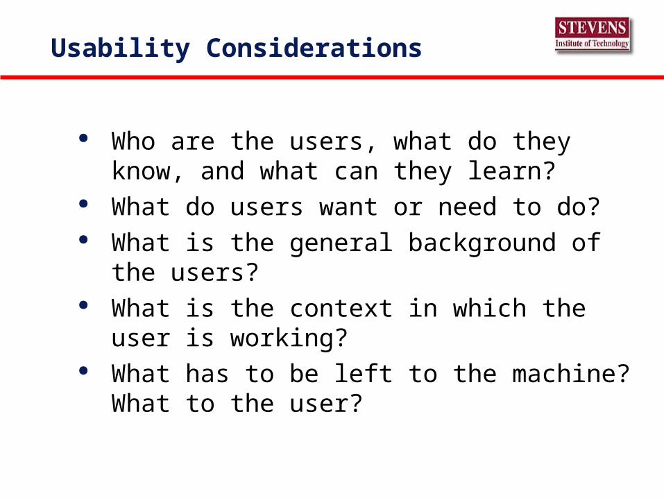
Usability Considerations
Who are the users, what do they know, and what can they learn?
What do users want or need to do? What is the general background of the users? What is the context in which the user is working? What has to be left to the machine? What to the
user?
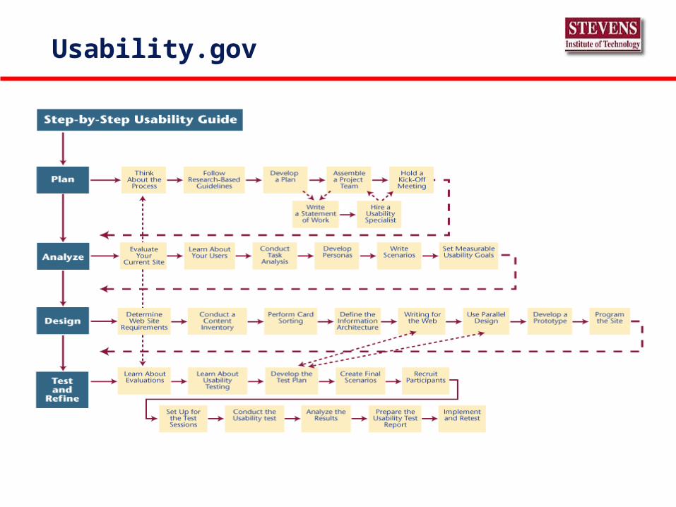
Usability.gov

Human Factors Usability Techniques
Cognitive Walkthrough Using a prototype, a conceptual design document, or the final product, a group of evaluator steps through tasks, evaluating at each step how difficult it is for the user to identify and operate the system .
Diagnostic Evaluation A diagnostic evaluation is a usability assessment to diagnose problems with a system so that they can be remedied. It involves the use of a representative sample of subject matter experts.
Feature Inspection Feature inspections involve the assessment of a product’s feature set within the context of the task to be performed. Emphasis is placed on sequence of tasks, accessibility, potential for confusion.
Focus Groups A focus group brings together stakeholders and / or experts to help refine the requirements of a system or to evaluate a particular system. Views are elicited by a facilitator on relevant topics.
Formal Usability Inspection A formal usability inspection is usually conducted by a team of stakeholders and experts each of which is assigned a particular aspect of the system to evaluate.
Heuristic Evaluation Heuristic evaluation, also known as expert evaluation, is a quick technique used to identify general usability problems that operators can be expected to encounter when using a computer system.

Human Factors Usability Techniques
Journaled Sessions A journaled session is a way to evaluate the usability of software remotely. Users are provided with the prototype interface and asked to perform a variety of tasks.
Mockup A mockup is a large-scale, proportioned model of the final equipment, subsystem, or system used for validation of layout.
Questionnaire for Interaction Satisfaction (QUIS) QUIS is a tool developed by the University of Maryland designed to assess users' subjective satisfaction with specific aspects of the human-computer interface.
Scenario Building A scenario-based usability test involves presenting representative end-users with scenarios, or specific tasks, designed to cover the major functionality of the software system.
Self-reporting logs are paper-and-pencil journals in which users are requested to log their actions and observations while interacting with a product. .
Software Usability Measurement Inventory (SUMI) SUMI was developed on the project by the Human Factors Research Group (HFRG), University College, Cork. This generic usability tool comprises a validated 50-item paper-based questionnaire.
System Usability Scale( SUS) SUS is a 10-item questionnaire that employs a Likert scale to obtain an overview of user satisfaction with software.
Usability Content Analysis Usability Context Analysis is a structured method for eliciting detailed information about a product and how it will be used, and for deriving a plan for a user based evaluation of a product.

Good user interfaces:
Improve end user productivity Require data entry only once/item Reduce training time Reduce errors Enhance end user acceptance “Don’t try to correct poor software design with
good documentation.” Yuhas

Ease of use checklist
Simple and natural dialog Speak the end user’s language Minimize human memory load Consistent Provide feedback Provide clearly-marked exits Provide shortcuts Provide helpful error messages

Northern Telecom NEC AT&T ROLMOverall Satisfaction 1 2 3 4
Most Frequently Recommended System 1 3 4 2
Training 1 4 3 2
Documentation 1 4 2 3
Attendant Operation 1 4 3 2
Installation / Cutover 1 2 3 4
System Management 1 2 4 3
User Operation 1 3 3 2
Hardware Reliability 1 3 3 4
Maintenance / Service 2 3 1 4
Troubleshooting 1 2 3 3
Systems Performed as Expected 1 4 3 4
DATAPRO PBX USER SATISFACTION Case STUDY

Human factors in interface design
Limited short-term memory• People can instantaneously remember about 7 items of information. If
you present more than this, they are more liable to make mistakes. People make mistakes
• When people make mistakes and systems go wrong, inappropriate alarms and messages can increase stress and hence the likelihood of more mistakes.
People are different• People have a wide range of physical capabilities. Designers should not
just design for their own capabilities. People have different interaction preferences
• Some like pictures, some like text.
Thanks to Ian Sommerville 2004 Software Engineering, 7th edition for this slide.
User interface importance
End users often judge a system by its interface rather than its functionality
A poorly designed interface can cause a user to abuse the system
Match the skills, experience and expectations of end users.
Unusable interfaces is the shortest path to shelf-ware.

Design concepts
Bend to familiarityThe interface should be based on user-oriented terms and concepts rather
than computer concepts. For example, an office system should use concepts such as letters, documents, folders etc. rather than directories, file identifiers, etc.
Be ConsistentThe interfaces must be consistent from screen to screen.. Commands and
menus should be at the same place and have the same format,, etc. No surprises
A user should be able to infer the use of a command from similar ones.

More design concepts
RecoverabilityThe system should contain the effects of user errors and allow recovery
with minimal effort. This might include an undo facility, confirmation of destructive actions, 'soft' deletes, etc.
User guidanceSome user guidance such as help systems, on-line manuals, etc. should be
supplied. The design should strive for a ‘zero-training’ ideal. User diversity
Interaction facilities for different types of user should be supported. For example, both command lines and menus should be supported.

User Interface metaphor
How will user data be entered? How will computer generated information be
presented to the user? How can user interaction and information presentation be
integrated through a coherent framework?

Interaction styles
Interactionstyle
Main advantages Main disadvantages Applicationexamples
Directmanipulation
Fast and intuitiveinteractionEasy to learn
May be hard to implement.Only suitable where there is avisual metaphor for tasks andobjects.
Video gamesCAD systems
Menuselection
Avoids user errorLittle typing required
Slow for experienced users.Can become complex if manymenu options.
Most general-purpose systems
Form fill-in Simple data entryEasy to learnCheckable
Takes up a lot of screen space.Causes problems where useroptions do not match the formfields.
Stock control,Personal loanprocessing
Commandlanguage
Powerful and flexible Hard to learn.Poor error management.
Operating systems,Command andcontrol systems
Naturallanguage
Accessible to casualusersEasily extended
Requires more typing.Natural language understandingsystems are unreliable.
Informationretrieval systems
© Thanks to Ian Sommerville 2004 Software Engineering, 7th edition for this slide.

Information presentation
© Thanks to Ian Sommerville 2004 Software Engineering, 7th edition for this slide.
Information tobe displayed
Presentationsoftware
Display

Information presentation
Static information• Initialised at the beginning of a session. It does not change
during the session.
Dynamic information• Changes during a session and the changes must be
communicated to the end user.
Web sessions are one transaction with persistence remembered in a cookie.

Presentation methods
1
3
4 20 10 20
Dial with needle Pie chart Thermometer Horizontal bar
© Thanks to Ian Sommerville 2004 Software Engineering, 7th edition for this slide.

Error messages reflect your design
Messages must be polite, concise, consistent, complete, constructive. and helpful,
Error codes are ok iff they are coupled with a text message telling the user how to correct the error.
Avoid cryptic error messages.
Analysis techniques
Task analysis• Models the steps involved in completing a task.• Model frequency and sequences of tasks
Interviewing and questionnaires• Asks the users and their bosses about the work they do.
Ethnography• Observes the user at work
Model the system.• Extend the life of the prototype to system delivery• Calibrate the prototype with data from the actual system• Measure system performance under projected loads and
enhancements
User interface prototyping
The aim of prototyping is to allow users to gain direct experience with the interface.
Without such direct experience, it is impossible to judge the usability of an interface.
Prototyping may be a two-stage process:• Early in the process, paper prototypes may be used;• The design is then refined and increasingly sophisticated
automated prototypes are then developed.

Human computer interface design
HCI design is an iterative process involving close liaisons between users and designers.
The 3 core activities in this process are:• User analysis. Understand what the users will do with the
system;• System prototyping. Develop a series of prototypes for
experiment;• Interface evaluation. Experiment with these prototypes with
users.
© Ian Summerville 2004

The human computer interface
User interfaces should be designed to match the skills, experience and expectations of its anticipated users.
System users often judge a system by its interface rather than its functionality.
A poorly designed interface can cause a user to make catastrophic errors.
Poor user interface design is the reason why so many software systems are never used.
© Ian Summerville 2004
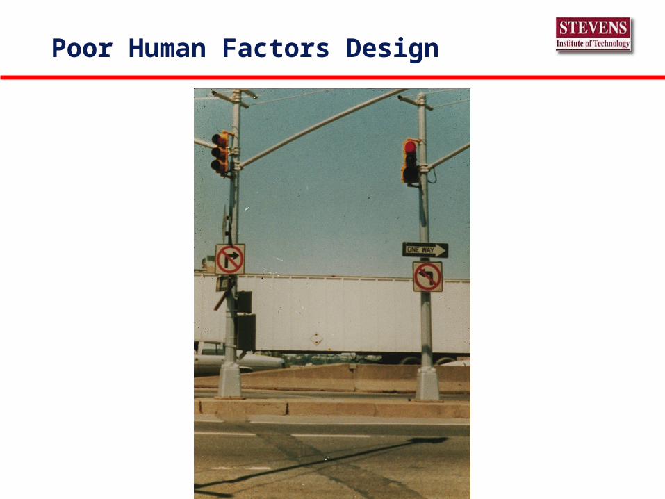
Poor Human Factors Design

Human factors in interface design
Limited short-term memoryPeople make mistakes and when mistakes are made, inappropriate
alarms and messages increases stress the likelihood of more mistakes or the warnings are ignored.
People are differentPeople have a wide range of physical and mental abilities. Designers
must not just design for themselves. Test with naïve users.
People have different interaction preferencesSome like pictures, some like text and their preferences change as
they learn to use the software

The HCI design process
User analysis: Create the use cases Prototyping: Develop a series of HCI prototypes Interface evaluation: Experiment with these
prototypes with naïve users. Measure learning time, error rates, satisfaction…
Create encapsulation software object classes to separate screen layout details from data structure details.
Feedback the analysis of the experiments to the use cases that then influence the design
© Thanks to Ian Sommerville 2004 Software Engineering, 7th edition for this slide.

Human computer interface design principles
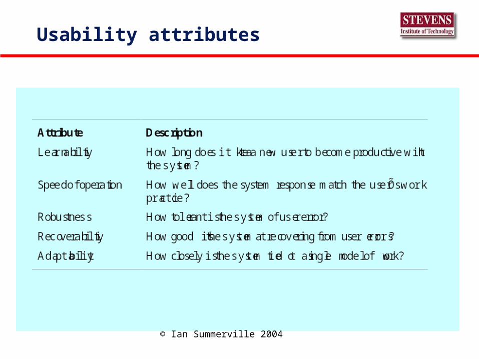
Principle Description
User familiarity The interface should use terms and concepts which are drawnfrom the experience of the people who will make most use of thesystem.
Consistency The interface should be consistent in that, wherever possible,comparable operations should be activated in the same way.
Minimal surprise Users should never be surprised by the behaviour of a system.
Recoverability The interface should include mechanisms to allow users torecover from errors.
User guidance The interface should provide meaningful feedback when errorsoccur and provide context-sensitive user help facilities.
User diversity The interface should provide appropriate interaction facilities fordifferent types of system user.
© Ian Summerville 2004

Ease of Use design objectives for HCI, ManualsForms, Printouts, Error Messages
Design Objective Technique
1. Be consistent Identical terminology, similar screen layout uniform escape routes, low response time variance
2. Provide shortcuts Direct menu access & function keys
3. Provide feedback Dashboards & warnings
4. Design tasks for completion.
Modularity
5. Fix errors efficiently Polite and comprehensive message, suggest changes
6. Easy action reversal ERASE commands, escape menus, update options
7. Local control Avoid frequent warnings & patronizing messages
8. Reduce short-term memory load
Simple displays, minimal use of windows, mnemonic coding, blank space, no clutter
9. Use surprise effectively Minimal highlighting, minimal input verification, avoid flashing and auditory messages
10. Keep user located Menu labels, graphic directories in help function, restrict menus to three levels

Why spend effort on the HCI?
Increased efficiency Improved productivity Reduced errors Reduced training - strive for game-like training Improved acceptance

Error messages reflect your design
Messages must be polite, concise, consistent, complete, constructive. and helpful,
Error codes are ok iff they are coupled with a text message telling the user how to correct the error.
Avoid cryptic error messages.

Definition –DoD US Military Standard for Human Engineering Design Criteria (1999)
• Achieve required performance by operator, control and maintenance personnel
• Minimize skill and personnel requirements and training time
• Achieve require reliability of personnel-equipment and software combinations
• Foster design standardization within and among systems

Definition -Humanistic
An interface is humane if it is responsive to human needs and considerate of human frailties• Boot up - that the user should not be kept waiting unnecessarily
is an obvious and humane design principle• Users should set the pace of interaction• Feedback status a la dashboards
:“A computer shall not harm your work or, through inaction, allow your work to come to harm” Vesonder (Asimov paraphrase)
A computer should not waste your time or require you to do more work than is strictly necessary• Data items must never be required to be keyed twice

Design target: novice (N) or expert (E)
metricobjective
Time-to-learn
Response time
Error Rate Efficiency Reliability User Satisfaction
Effectiveness
1. Be consistent N N&E N&E N&E N&E N
2. Provide shortcuts E E E E E
3. Provide feedback N N&E N&E N&E
4. Design tasks for completion.
N N&E N&E
5. Fix errors efficiently
N&E N
6. Easy action reversal N N&E N&E N&E N&E N&E
7. Local control E E E E
8. Reduce short-term memory load
N N&E N&E N&E
9. Use surprise effectively
E N&E
10. Keep user located N N&E N&E N&E N&E N&E

Information display factors
Is the user interested in precise information or data relationships?
How quickly do information values change? Must the change be indicated immediately?
Must the user take some action in response to a change?
Is there a direct manipulation interface? Is the information textual or numeric? Are relative values
important?

Analog or digital presentations?
Digital • Compact - takes up little screen space;
• Precise values can be communicated.
Analog • Easier to get an 'at a glance' impression of a value;
• Possible to show relative values;
• Easier to see exceptional data values.

Displaying relative values
0 100 200 300 400 0 25 50 75 100
Pressure Temperature

Color Graphics
Color adds an extra dimension to an interface and can help the user understand complex information structures or confuse him.
Color can be used to highlight exceptional events. Common mistakes in the use of color in
interface design include:• The use of color to communicate meaning;
• Too much color
• Red/Green
As of 14 Nov
Color use guidelines
Limit the number of colors used and limit their use.
Use color change to show a change in system status.
Use color coding to support the task that users are trying to perform.
Be careful about color pairings.

Design factors in message wording
Factor Description
Context Wherever possible, the messages generated by the system should reflect the currentuser context. As far as is possible, the system should be aware of what the user is doingand should generate messages that are relevant to their current activity.
Experience As u sers become familiar with a s ystem they become irritated by long, ŌmeaningfulÕmessages. However, beginners find it difficult to understand short terse statements of aproblem. You should provide both types of message and allow the user to controlmessage conciseness.
Skill level Messages should be tailored to the userÕs skills as well as their experience. Messagesfor the different classes of user may be expressed in different ways depending on theterminology that is familiar to the reader.
Style Messages should be positive rather than negative. They should use the active ratherthan the passive mode of address. They should never be insulting or try to be funny.
Culture Wherever possible, the designer of messages should be familiar with the culture of thecountry where the system is sold. There are distinct cultural differences betweenEurope, Asia and America. A su itable message for one culture might be unacceptablein another.
© Ian Summerville 2004

Good and bad message design
Error #27
Invalid patient id
OK Cancel
System-oriented error messageUser-oriented error message
R. MacDonald is not a reg istered patient
Click on Patients for a list of patientsClick on Retry to re-input the patient’s nameClick on Help for more information
Patients Help Retry Cancel
© Ian Summerville 2004
Analysis techniques
Task analysis• Model each step involved in completing a task.• Model the sequences and repetition of tasks
Interviewing and questionnaires• Asks the users and their bosses, ‘what do you do?” and ‘who do
you work with?”
Ethnography• Observe the user at work
Model the system.• Extend the life of the prototype to system delivery• Calibrate the prototype with data from the actual system• Measure system performance under projected loads and
enhancements

User analysis
If you don’t understand what the users want to do with a system, you have no realistic prospect of designing an effective interface.
User analyses have to be described in terms that users and other designers can understand.
Scenarios where you describe typical episodes of use, are one way of describing these analyses.

Interviewing
Design semi-structured interviews using open-ended questions.
Passive Listening technique Users will say what they think essential; not just
what you thought of collecting. Group interviews or focus groups allow users to
clarify their thinking and move form the subconscious to the conscious..

Ethnography
Involves an external observer watching users at work and asking them in an unscripted way about their work.
Valuable because many user tasks are intuitive and they find these very difficult to describe and explain.
Also helps understand the role of social and organisational influences on work.
Check the ‘postems’ on their terminals
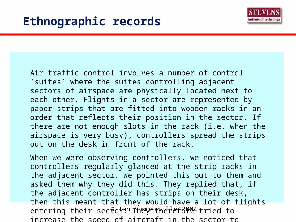
Ethnographic records
Air traffic control involves a number of control ‘suites’ where the suites controlling adjacent sectors of airspace are physically located next to each other. Flights in a sector are represented by paper strips that are fitted into wooden racks in an order that reflects their position in the sector. If there are not enough slots in the rack (i.e. when the airspace is very busy), controllers spread the strips out on the desk in front of the rack.
When we were observing controllers, we noticed that controllers regularly glanced at the strip racks in the adjacent sector. We pointed this out to them and asked them why they did this. They replied that, if the adjacent controller has strips on their desk, then this meant that they would have a lot of flights entering their sector. They therefore tried to increase the speed of aircraft in the sector to ‘clear space’ for the incoming aircraft.
© Ian Summerville 2004

Insights from ethnography
Air Traffic Controllers had to see all flights in a sector, so scrolling displays where flights disappeared off the top or bottom of the display were unacceptable.
The HCI must indicate how many flights were in adjacent sectors so that controllers can plan their work.
© Thanks to Ian Sommerville 2004 Software Engineering, 7th edition for this slide.

Perception of elapsed time
Jones, For Principles of Main Computer Dialog Computer Aided Design, Vol. 10, No. 3, pg 197, May 1978
Instantaneous Less than 1/3 sec workstation
Fast 1/3 to 1 second transaction
Pause 1 to 10 seconds www
Wait More than 10 seconds
HCI importance
End users often judge a system by its interface rather than its functionality
A poorly designed interface can cause a user to abuse the system
Match the skills, experience and expectations of end users.
Unusable interfaces is the shortest path to shelf-ware.

HCI Review
Govern software by HCI design. Prototype the HCI Choose an interaction styles that matches the problem:
• direct manipulation, • menu systems form fill-in, • command languages and • natural language.
Use graphics to show trends and approximate values. Use digital displays for precision.
Use color sparingly and consistently. Encapsulate
Usability attributes
© Ian Summerville 2004

Summary
Operational Definitions• Learnability (e.g. intuitive navigation) • Efficiency of use • Memorability • Few and noncatastrophic errors • Subjective satisfaction
Techniques• Observation, task analysis, prototyping, etc.
Measures of Success $• Easy to learn, reduce training, reduce errors, increase efficiency
and productivity, etc.

Summary: Assignment
Assignments• Read chapter 9 in Bernstein and Yuhas
• Read chapter 16/17 in Brooks
• Go to web site www.usability.gov and summarize in 4 short paragraphs the Plan, Analyze, Design, and Test/Design
Short Test next week• Lectures on Design, Estimation, Risk, and Usability
• Mostly Short Answer