lecture 10.1 10.2 bt
TRANSCRIPT
Today’s Agenda
Attendance / Announcements Collect Projects
Return Exams
MyMathLab HW Due Sunday
Remaining Schedule
Sections 10.1, 10.2
Exam Schedule
Exam 6 (Ch 10)
Monday 4/27
Final Exam (Cumulative)
Monday 5/4
Intro to Statistics
Statistics is the science that deals with the collection and summarization of data. Methods of stat analysis allow us to make conclusions about a population based on sampling.
Statistics is more a field of Communications,
than one of Mathematics!
Intro to Statistics
1. Organize Data
2. Display Data
3. Identify the “averages” of the data
4. Identify the “spread” of the data
5. Make conclusions
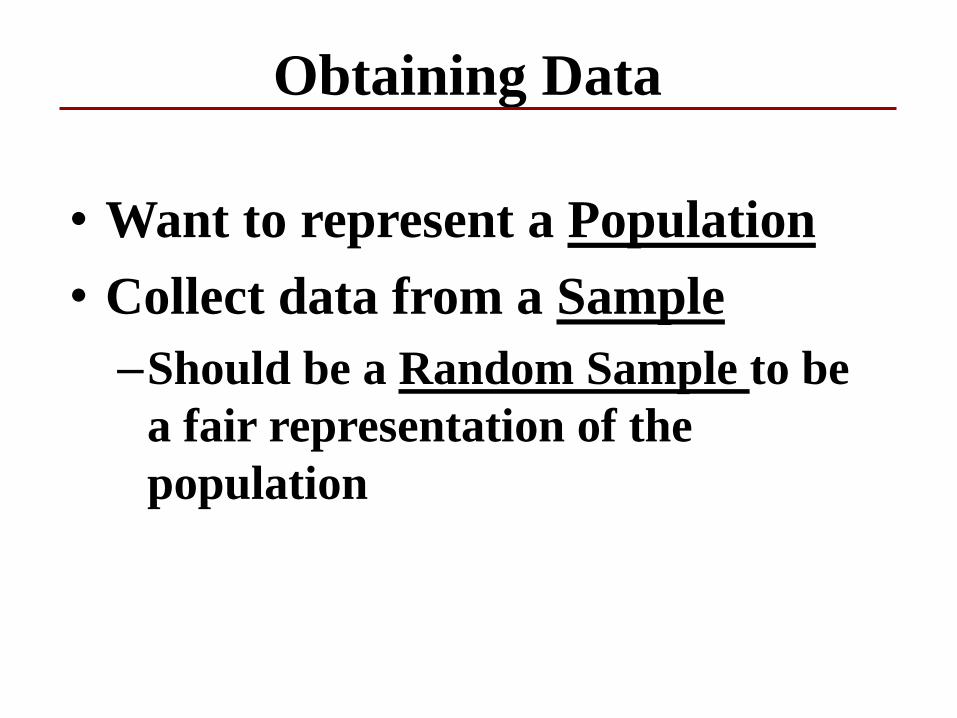
Obtaining Data
• Want to represent a Population
• Collect data from a Sample
–Should be a Random Sample to be
a fair representation of the
population
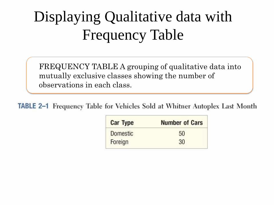
Displaying Qualitative data with
Frequency Table
FREQUENCY TABLE A grouping of qualitative data into
mutually exclusive classes showing the number of
observations in each class.
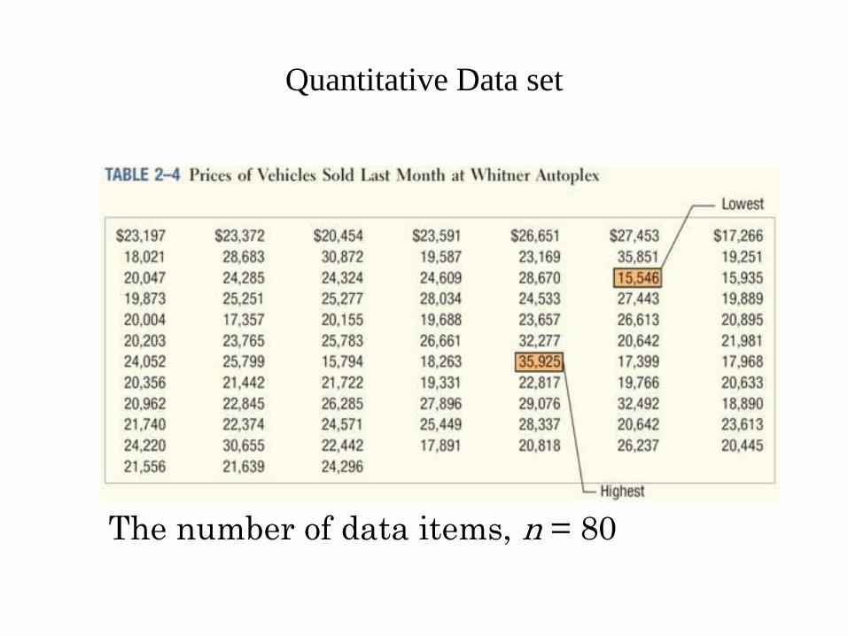
Quantitative Data set
The number of data items, n = 80
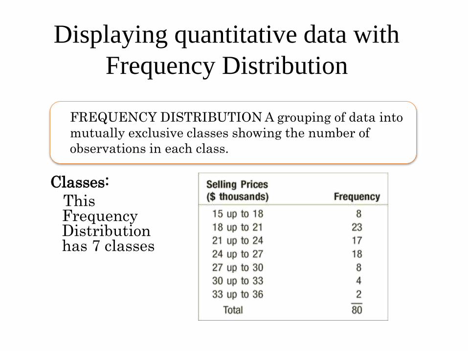
Displaying quantitative data with
Frequency Distribution
A FrequencyFREQUENCY DISTRIBUTION A grouping of data into
mutually exclusive classes showing the number of
observations in each class.
Classes:
This Frequency Distribution has 7 classes
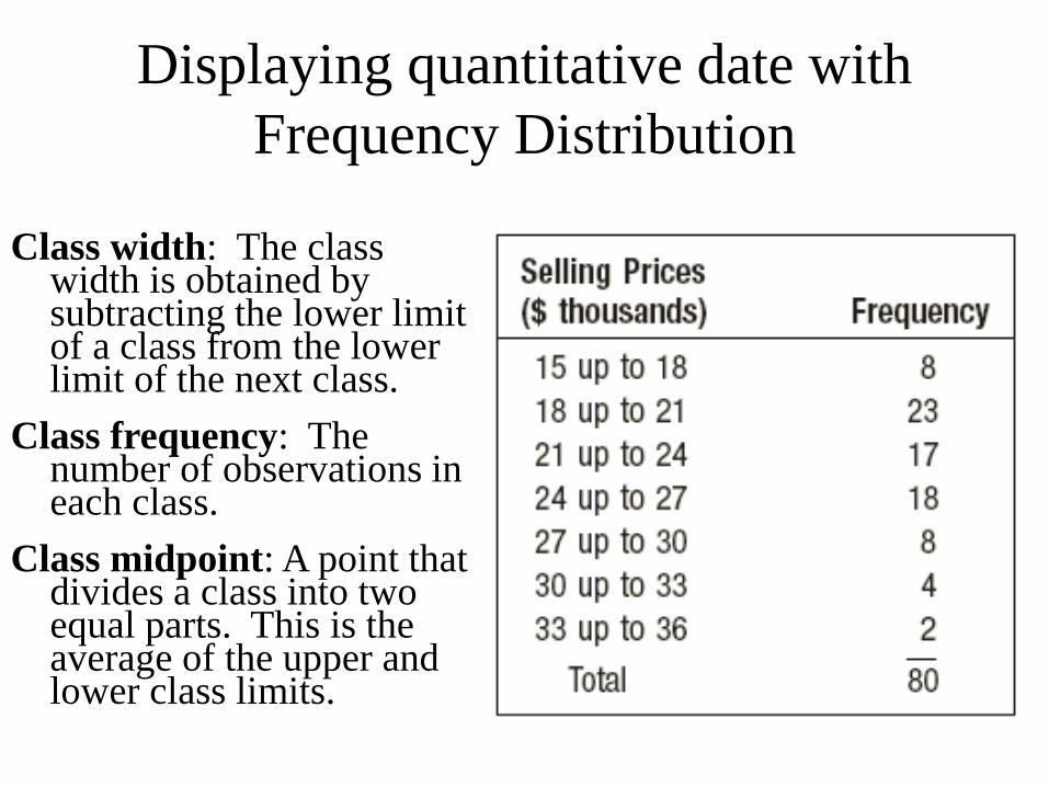
Displaying quantitative date with
Frequency Distribution
Class width: The class width is obtained by subtracting the lower limit of a class from the lower limit of the next class.
Class frequency: The number of observations in each class.
Class midpoint: A point that divides a class into two equal parts. This is the average of the upper and lower class limits.
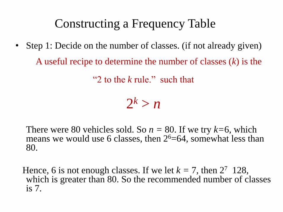
Constructing a Frequency Table
• Step 1: Decide on the number of classes. (if not already given)
A useful recipe to determine the number of classes (k) is the
“2 to the k rule.” such that
2k > n
There were 80 vehicles sold. So n = 80. If we try k=6, which means we would use 6 classes, then 26=64, somewhat less than 80.
Hence, 6 is not enough classes. If we let k = 7, then 27 128, which is greater than 80. So the recommended number of classes is 7.
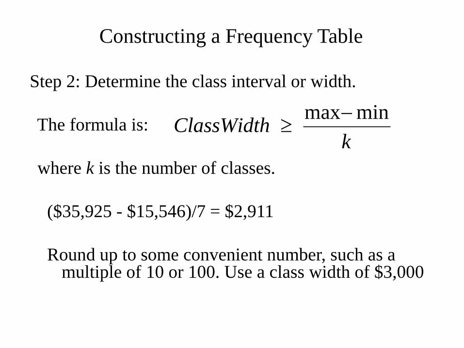
Constructing a Frequency Table
Step 2: Determine the class interval or width.
The formula is:
where k is the number of classes.
($35,925 - $15,546)/7 = $2,911
Round up to some convenient number, such as a multiple of 10 or 100. Use a class width of $3,000
kClassWidth
minmax
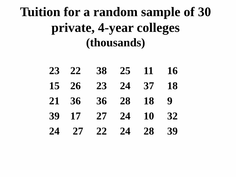
Tuition for a random sample of 30
private, 4-year colleges(thousands)
23 22 38 25 11 16
15 26 23 24 37 18
21 36 36 28 18 9
39 17 27 24 10 32
24 27 22 24 28 39
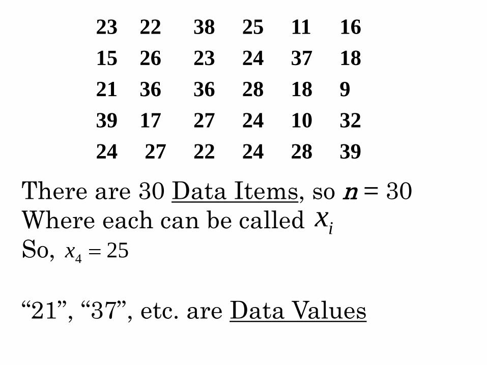
23 22 38 25 11 16
15 26 23 24 37 18
21 36 36 28 18 9
39 17 27 24 10 32
24 27 22 24 28 39
There are 30 Data Items, so n = 30
Where each can be called
So,
“21”, “37”, etc. are Data Values
ix254 x
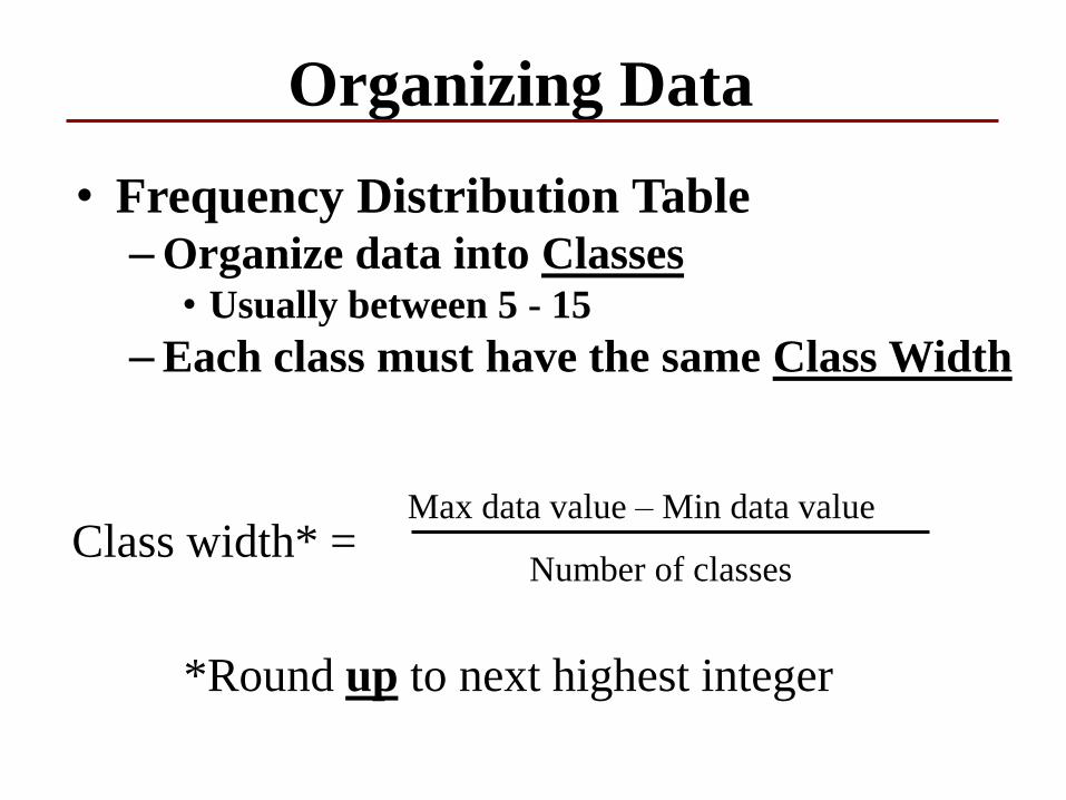
Organizing Data
• Frequency Distribution Table–Organize data into Classes
• Usually between 5 - 15
–Each class must have the same Class Width
Class width* = Max data value – Min data value
Number of classes
*Round up to next highest integer
Organizing Data
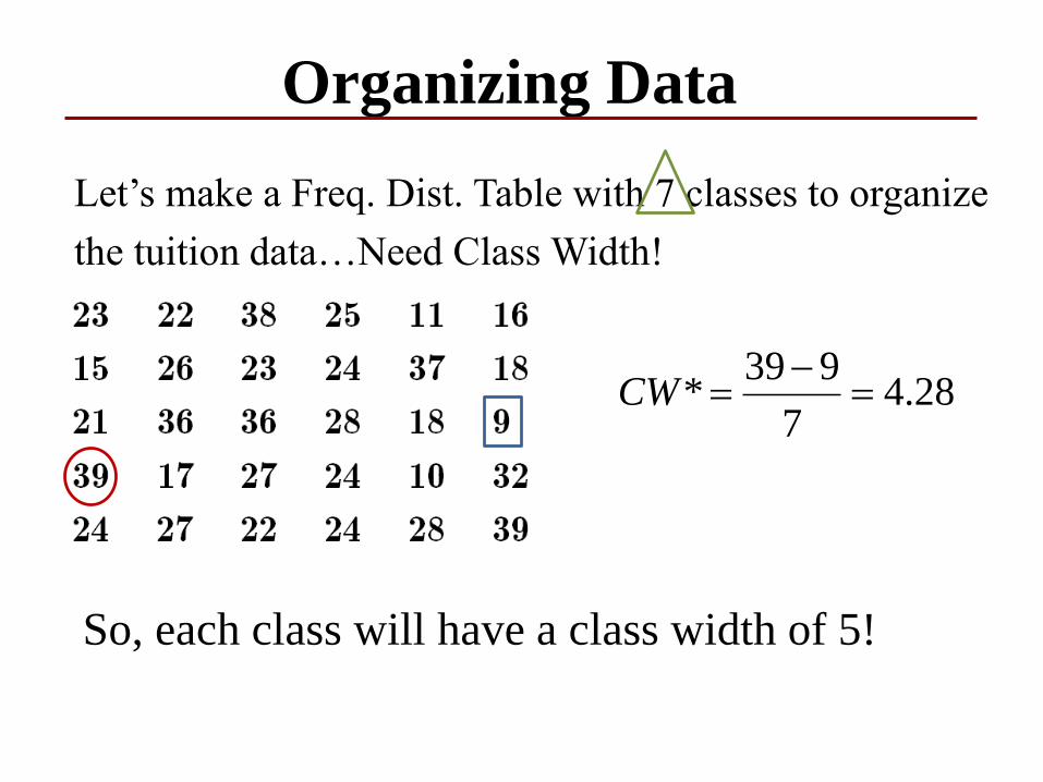
Let’s make a Freq. Dist. Table with 7 classes to organize
the tuition data…Need Class Width!
28.47
939*
CW
So, each class will have a class width of 5!
Organizing Data
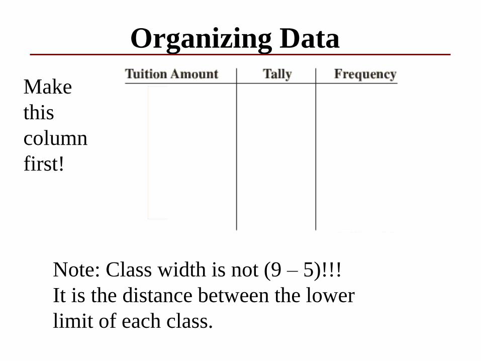
Note: Class width is not (9 – 5)!!!
It is the distance between the lower
limit of each class.
Make
this
column
first!
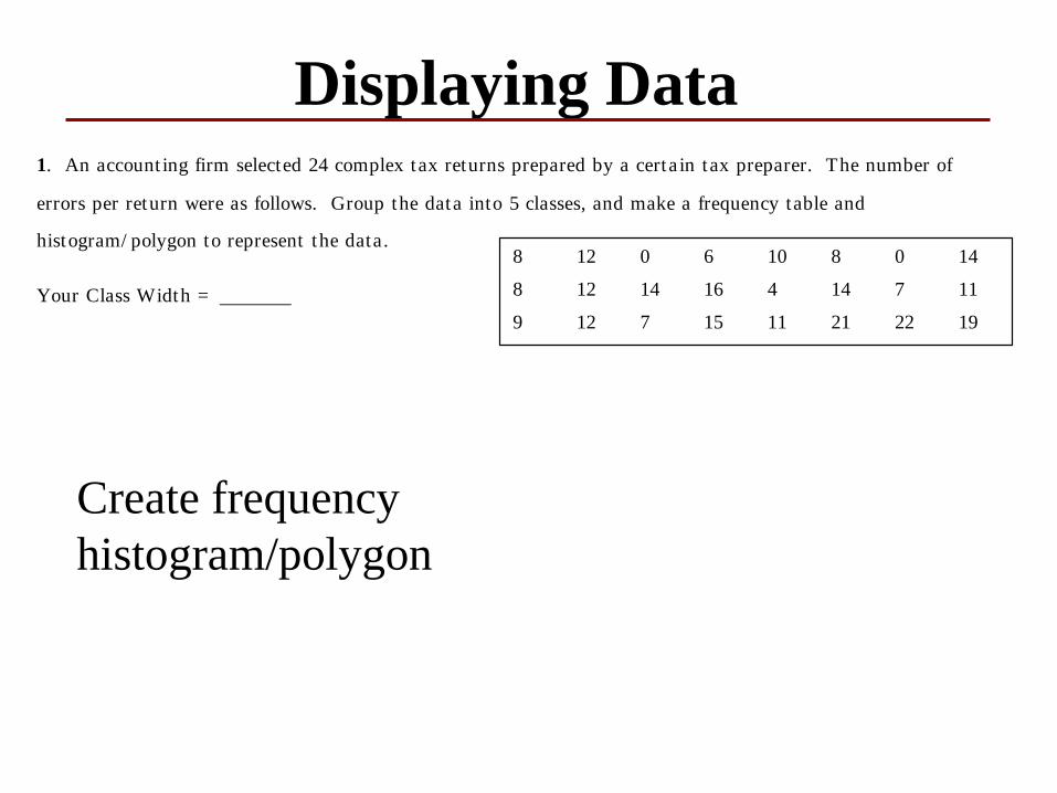
Displaying Data
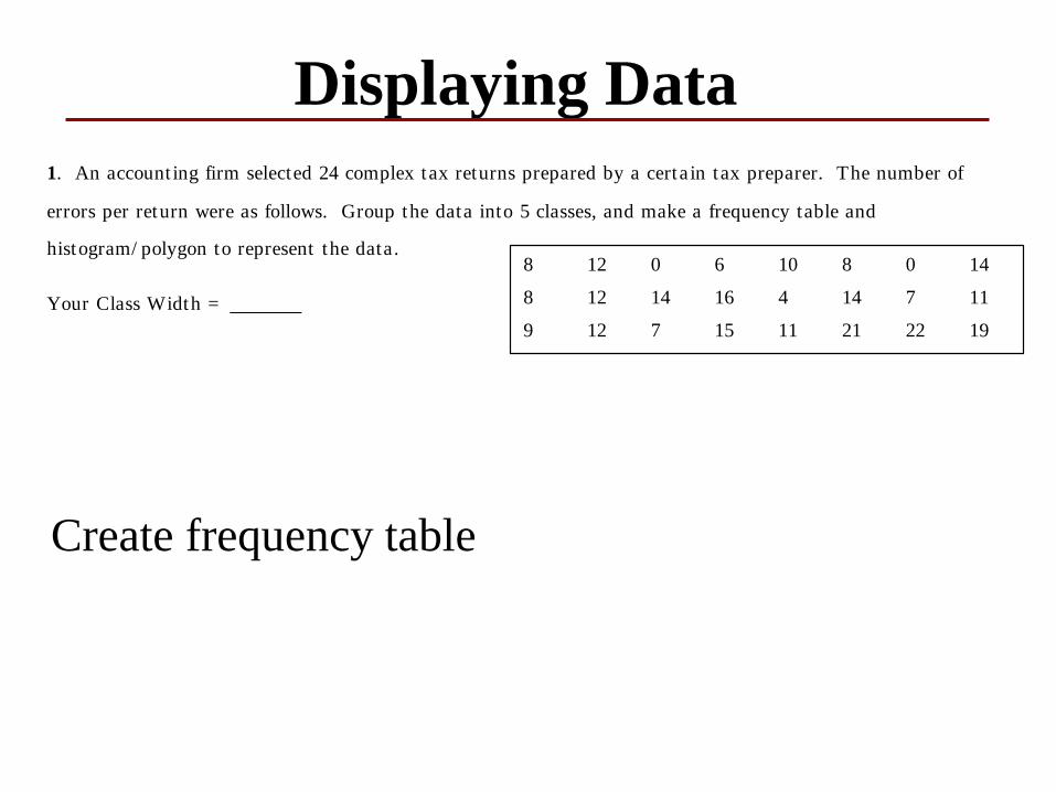
1. An account ing firm selected 24 complex tax returns prepared by a certa in tax preparer. The number of
errors per return were as follows. Group the data into 5 classes, and make a frequency table and
histogram/ polygon to represent the data.
Your Class Width =
8 12 0 6 10 8 0 14
8 12 14 16 4 14 7 11
9 12 7 15 11 21 22 19
Create frequency table
Displaying Data
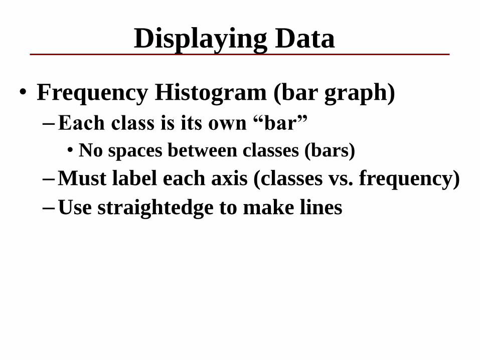
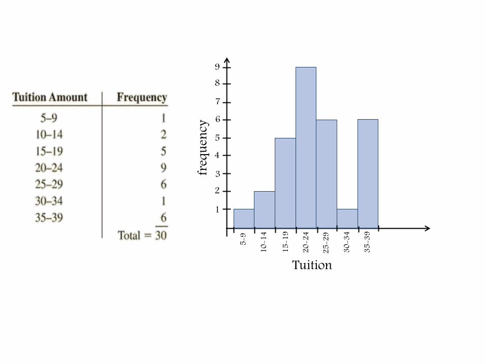
• Frequency Histogram (bar graph)
–Each class is its own “bar”
• No spaces between classes (bars)
–Must label each axis (classes vs. frequency)
–Use straightedge to make lines
1
3
45
67
89
2fre
quen
cy
Tuition5-
9
10-1
4
15-1
9
20-2
4
25-2
9
30-3
4
35-3
9
Displaying Data
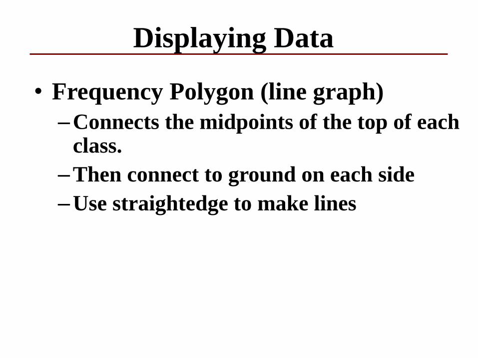
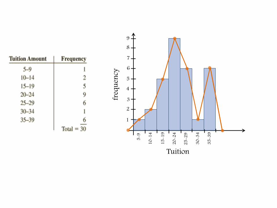
• Frequency Polygon (line graph)
–Connects the midpoints of the top of each class.
–Then connect to ground on each side
–Use straightedge to make lines
1
3
45
67
89
2fre
quen
cy
Tuition5-
9
10-1
4
15-1
9
20-2
4
25-2
9
30-3
4
35-3
9
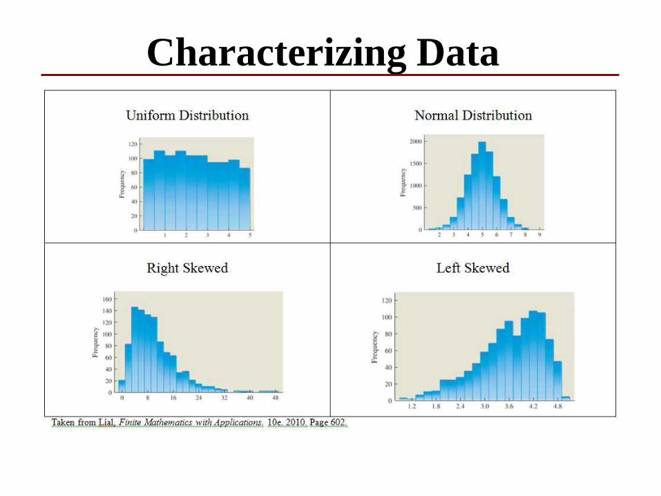
Characterizing Data
Displaying Data1. An account ing firm selected 24 complex tax returns prepared by a certa in tax preparer. The number of
errors per return were as follows. Group the data into 5 classes, and make a frequency table and
histogram/ polygon to represent the data.
Your Class Width =
8 12 0 6 10 8 0 14
8 12 14 16 4 14 7 11
9 12 7 15 11 21 22 19
Create frequency
histogram/polygon
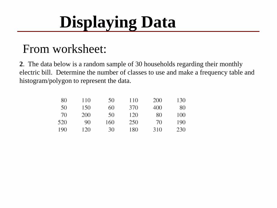
Displaying Data
From worksheet:2. The data below is a random sample of 30 households regarding their monthly
electric bill. Determine the number of classes to use and make a frequency table and
histogram/polygon to represent the data.
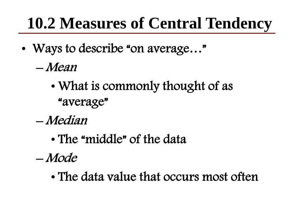
10.2 Measures of Central Tendency
• Ways to describe “on average…”–Mean
• What is commonly thought of as “average”
–Median• The “middle” of the data
–Mode• The data value that occurs most often
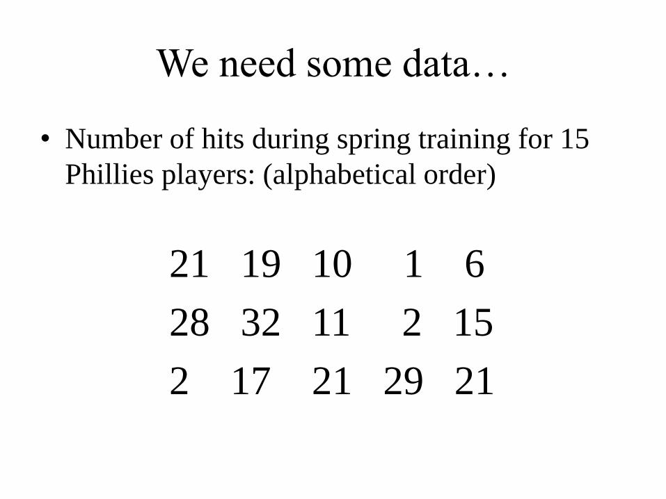
We need some data…
• Number of hits during spring training for 15
Phillies players: (alphabetical order)
21 19 10 1 6
28 32 11 2 15
2 17 21 29 21
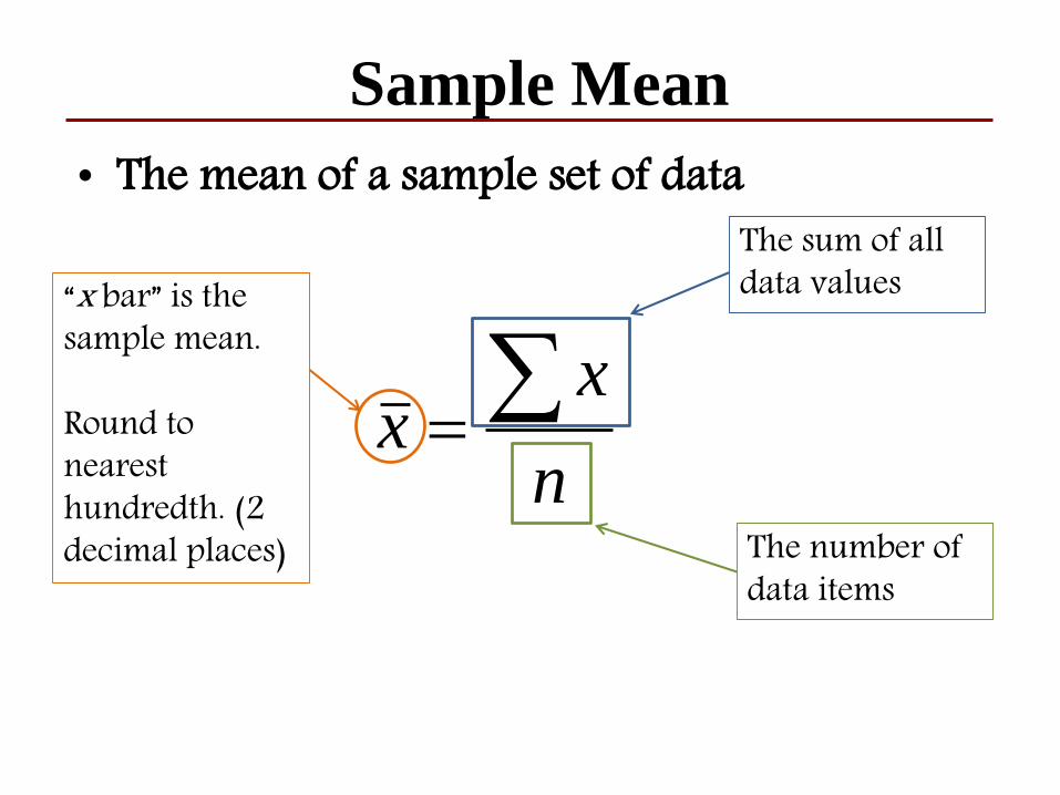
Sample Mean
n
xx
• The mean of a sample set of data
“x bar” is the sample mean.
Round to nearest hundredth. (2 decimal places)
The sum of all data values
The number of data items
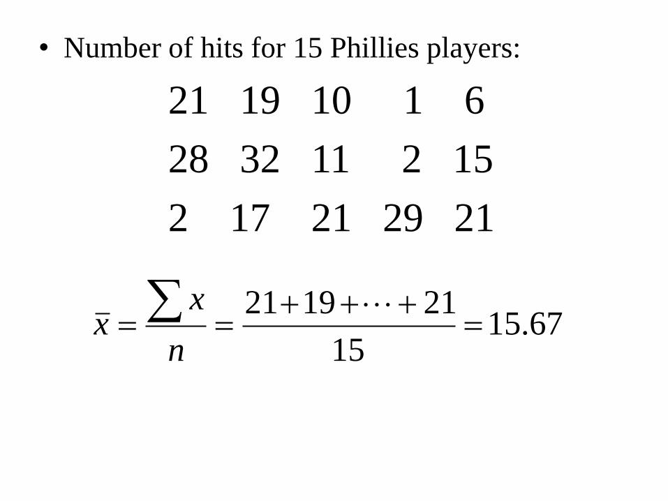
• Number of hits for 15 Phillies players:
21 19 10 1 6
28 32 11 2 15
2 17 21 29 21
67.1515
211921
n
xx
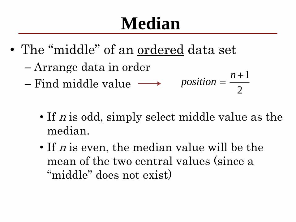
Median
• The “middle” of an ordered data set
– Arrange data in order
– Find middle value
• If n is odd, simply select middle value as the
median.
• If n is even, the median value will be the
mean of the two central values (since a
“middle” does not exist)
2
1
nposition
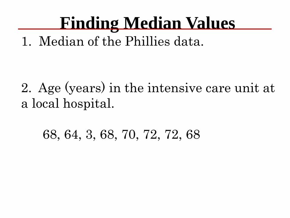
Finding Median Values1. Median of the Phillies data.
2. Age (years) in the intensive care unit at
a local hospital.
68, 64, 3, 68, 70, 72, 72, 68
Median
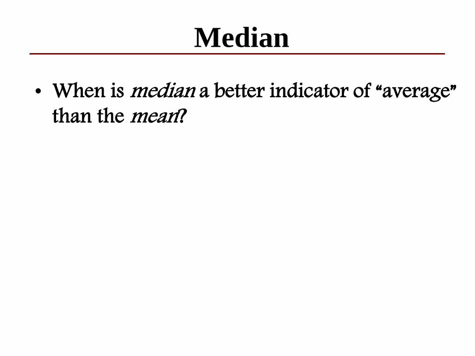
• When is median a better indicator of “average” than the mean?
Mode
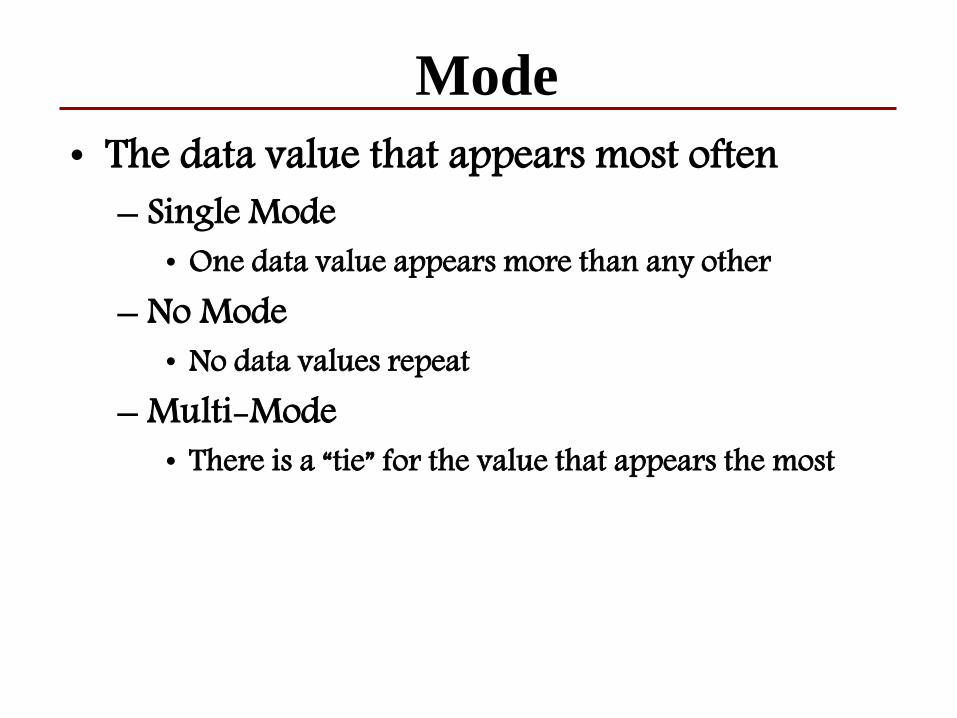
• The data value that appears most often– Single Mode
• One data value appears more than any other– No Mode
• No data values repeat– Multi-Mode
• There is a “tie” for the value that appears the most
Mode
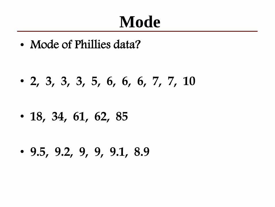
• Mode of Phillies data?
• 2, 3, 3, 3, 5, 6, 6, 6, 7, 7, 10
• 18, 34, 61, 62, 85
• 9.5, 9.2, 9, 9, 9.1, 8.9
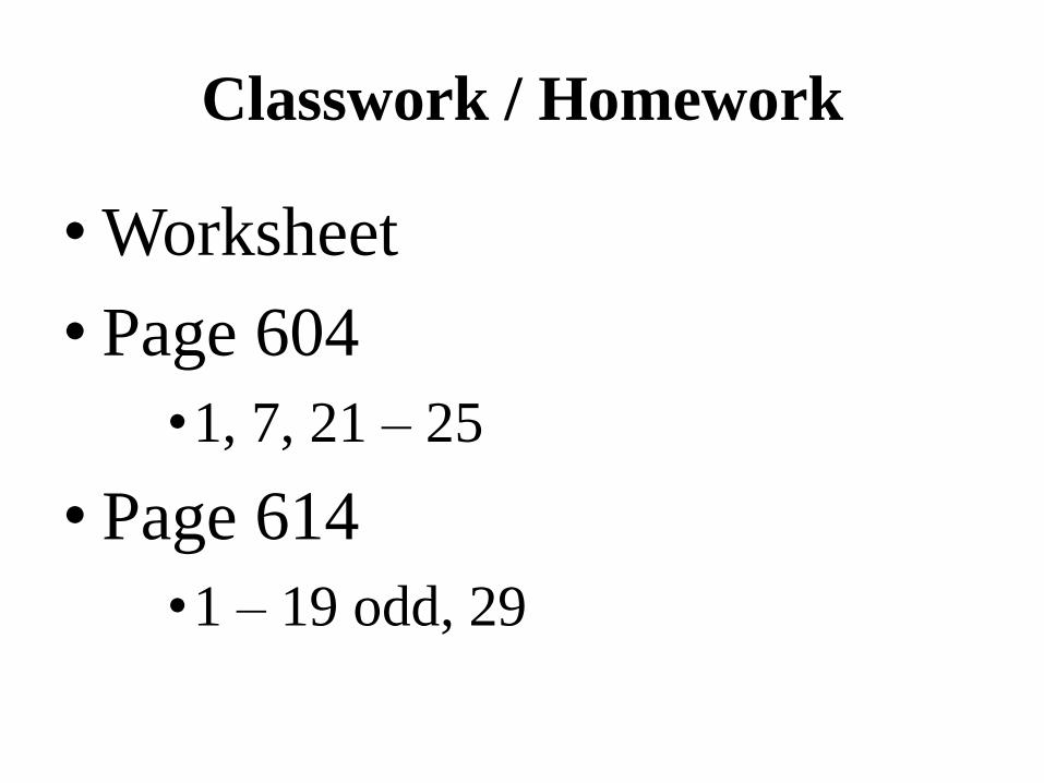
Classwork / Homework
• Worksheet
• Page 604
•1, 7, 21 – 25
• Page 614
•1 – 19 odd, 29