lab 1: model builder exercise -...
TRANSCRIPT
1
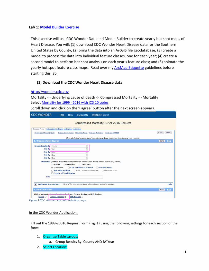
Lab 1: Model Builder Exercise This exercise will use CDC Wonder Data and Model Builder to create yearly hot spot maps of Heart Disease. You will: (1) download CDC Wonder Heart Disease data for the Southern United States by County; (2) bring the data into an ArcGIS file geodatabase; (3) create a model to process the data into individual feature classes, one for each year; (4) create a second model to perform hot spot analysis on each year’s feature class; and (5) animate the yearly hot spot feature class maps. Read over my ArcMap Etiquette guidelines before starting this lab.
(1) Download the CDC Wonder Heart Disease data http://wonder.cdc.gov Mortality -> Underlying cause of death -> Compressed Mortality -> Mortality Select Mortality for 1999 - 2016 with ICD 10 codes. Scroll down and click on the ‘I agree’ button after the next screen appears.
Figure 1 CDC Wonder Site data selection page.
In the CDC Wonder Application:
Fill out the 1999-20016 Request Form (Fig. 1) using the following settings for each section of the form:
1. Organize Table Layout:
a. Group Results By: County AND BY Year 2. Select Location:

2
a. Choose to group by Census Regions b. Choose Census Region 3: South (accept default urbanization)
3. Select Years and Demographics: Accept defaults 4. Select cause of Death:
a. Accepting ICD_10 Codes as the default, Switch to the Search Tab b. Search for Heart Disease (matches will be highlighted in BLUE) c. Select all of the causes of death highlighted with blue. Use Ctrl+Click to select each
one, but ONLY select entries that are fully expanded (do not select any that have the “+” sign or “-“ sign in front of them (Fig. 2).
Figure 2 Proper selection of causes of death criteria.
5. Other options: a. Check on the Export Results option b. Uncheck the Show Totals options
6. Press Send. Creating the file may take a few minutes. 7. When the pop-up window appears, open the file in Notepad. 8. Go back to the browser, Cancel the request (since it is finished), and close the browser
In Notepad
1. For each of the column headings (on the first line of the text file), delete all spaces within field names (County Code = CountyCode, Year Code = YearCode, Crude Rate = CrudeRate). Also not the quotes around the CountyCodes.
2. Go to the bottom of the text file, and delete ALL of the text that is not part of a column 3. Save the text file as HDSouth.txt (in C:\temp\Lab1, for example).
Important Note
In going through the lab I noticed that if I followed the directions in the original tutorial the results weren’t correct. I discovered the problem—the CountyCode downloaded from the CDC Wonder site and subsequently imported into ArcMap does not exactly match the FIPS code in the ArcMap CountyData file. That is, when the HDSouth.txt file is imported to the geodatabase as a table, the (CountyData or FIPS) code is changed from “01001” (e.g.) to 1001; in the CountyData file the code is ‘01001’ (although in the HDSouth.txt file the codes are enclosed by quotes, for some reason ArcGIS

3
(and Excel) is interpreting them as integers when it does the import). When ArcGIS tries to join the two tables records with the preceding zero will not match (even though numerically they are the same, as text they are different). So, in order to ensure that the join works properly, we need to add a prefix -- 0 -- to those CountyCodes.
1. Start Excel. 2. Open the HDSouth.txt file. Delete three columns: Notes, YearCode, CrudeRate.
3. Rename CountyCode to OldCountyCode, and add a new column CountyCodes. 4. Insert the following code to the first cell of the new column: =TEXT(B2,”0####”)
5. You should see 01001 appear in the cell. Copy/paste the formula into all of the relevant cells in the CountyCodes column. Check to ensure that the calculated values are correct.
6. Copy/Paste as values (form/to the original column) the CountyCodes in order to change them from a formula to text.
7. Right-mouse click on (the new) CountyCodes column and change the format of the cells to text.
8. Save As the file as HDSouth.xlsx. (It helps when working with Excel files to name each spreadsheet with a meaningful name. Then, when you import the table into ArcGIS you can be confident that you are accessing the right spreadsheet.)
Start ArcMap
1. In order to ensure that you are working with Projected Data (VERY important when using the Spatial Statistics tools), you will first set your Output Coordinate System
a. Go to the Geoprocessing Menu > Environments b. Press the Output Coordinates dropdown, Choose the “As Specified Below” option
for the Output Coordinate System, choose to browse for a coordinate system , then choose to Select your coordinate system. (Searching for Albers will speed things up.)
c. Choose > ProjectedCoordinateSystems > Continental > NorthAmerica > USAContiguous Albers Equal Area Conic, press “Add”, then “OK” (not the UGSS version) (Fig. 3).
Figure 3 Setting the default projection.

4
2. In this step you will create a Geodatabase and two Feature Datasets. These will help you keep your input data, results, and other data organized throughout the analysis process.
a. In the Catalog Window, right click on the folder where your text file is located, go to the New option, and choose to create a new File Geodatabase. Name your Geodatabase CDCWonderAnalysis. Right click your new geodatabase and choose to make it your Default Geodatabase.
b. Right click on your new geodatabase, go to the New option, and choose to create a new Feature Dataset. Name your new Feature Dataset “YearlyData”. For the coordinate system, use the USA Contiguous Albers Equal Area Conic (just like the output coordinate system you set earlier). Accept all other defaults, click Finish.
c. Create a second Feature Dataset and name this one “HotSpots”.
3. Next bring the CDC Wonder data into ArcMap and get it ready for analysis a. Import the data from HDSouth.xlsx. Right-mouse click on your gdb, select
Import > Table (single)… Select the spreadsheet, and name the Output Table HeartDisease_South. Accept the other parameters.
Figure 4 Importing the CDC Wonder data.

5
b. Right click on the HeartDisease_South table that has been added to ArcMap and Open c. From the options menu in the table window, choose Add Field, name your new field
HD_Rate, make it a float, and click OK (Fig 5). (Ensure that the CountyCodes have the preceeding 0 you added in the Excel file still in from of the numbers.)
Figure 5 Adding the Heart disease rate field.
d. Right-click on HD_Rate field, choose Field Calculator. Double-click on the Deaths field
from the list of fields, then choose the division operator (/), then double-click on the Population field (Fig. 6); click OK. You now have heart disease rates for each county. Close the table.
Figure 6 Calculating the County death by heart disease rates

6
4. Next you need the county features. a. In the catalog window, navigate to the location where ArcGIS is installed (by default this
is C:\Program Files (x86)\ArcGIS). In this folder, find Desktop10.5\TemplateData\TemplateData.gdb\USA\Counties.
b. Right click on Counties, and select Export it To Geodatabase (single) (Also, select and export States, to be used as an outline on the maps.) (Fig. 7)
c. Choose to save the file to your CDCWonderAnalysis geodatabase as “CountyData”, and click “OK” to run the tool (Fig. 8).
Figure 8 Exporting the data to the CDCWonderAnalysis gdb
Figure 7 Select for export the ArcGIS US Counties data
7
5. Add a Unique ID field to the County feature class. a. Right-click on CountyData in the table of contents, Open the Attribute Table, then go to
the table menu and choose to add a field – call it UniqueID, and set the type to Long Integer; press OK1.
b. Right click on the new UniqueID field, choose Field Calculator, and then set the values to the OBJECTID field (double-click on the OBJECTID field, then press OK). Close the attribute table.
6. Save your MXD in the folder with your CDCWonderAnalysis geodatabase. 7. Use the Zoom tool to focus in on your Southern United States study area.
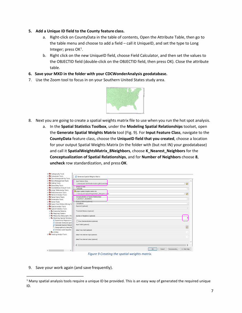
8. Next you are going to create a spatial weights matrix file to use when you run the hot spot analysis. a. In the Spatial Statistics Toolbox, under the Modeling Spatial Relationships toolset, open
the Generate Spatial Weights Matrix tool (Fig. 9). For Input Feature Class, navigate to the CountyData feature class, choose the UniqueID field that you created, choose a location for your output Spatial Weights Matrix (in the folder with (but not IN) your geodatabase) and call it SpatialWeightsMatrix_8Neighbors, choose K_Nearest_Neighbors for the Conceptualization of Spatial Relationships, and for Number of Neighbors choose 8, uncheck row standardization, and press OK.
Figure 9 Creating the spatial weights matrix.
9. Save your work again (and save frequently).
1 Many spatial analysis tools require a unique ID be provided. This is an easy way of generated the required unique ID.

8
Create a Model to Split your Data into Yearly Feature Classes
1. Open ModelBuilder
2. Set up an iterator to process records year by year:
a. From the Insert menu, go to Iterators, and choose the Row Selection Iterator. b. Double click on the iterator, and choose your HeartDisease_South table as your
input, and choose the Year field as the Group By Fields (see figure below).
3. Create an individual feature class for each year: a. From the Search dialog, search for the Copy Features tool (Data Management
toolbox), and drag it into the ModelBuilder window
Figure 10 The CreateYearlyFCs tool.

9
b. Double click on the Copy Features tool to open the dialog. Actually navigate to CountyData in your file geodatabase and select this as your Input features. You’ll use an INLINE Variable to name your output feature class. Within the YearlyData feature dataset you created, set the output feature class name to HD_Rate_%Value%. The “%Value%” part of the name is derived from the Iterator tool. For each iteration, VALUE is set to a year and used to create a selection set of heart disease records. For example, on the first iteration, VALUE is 1999 and the selection set includes all records associated with 1999. On the next iteration, VALUE is set to 2000. The entry for Output Feature Class should look something like this (Fig 11): …\Lab1\CDCWonderAnalysis.gdb\YearlyData\HD_Rate_%Value%
Figure 11 The Copy Features dialog box.
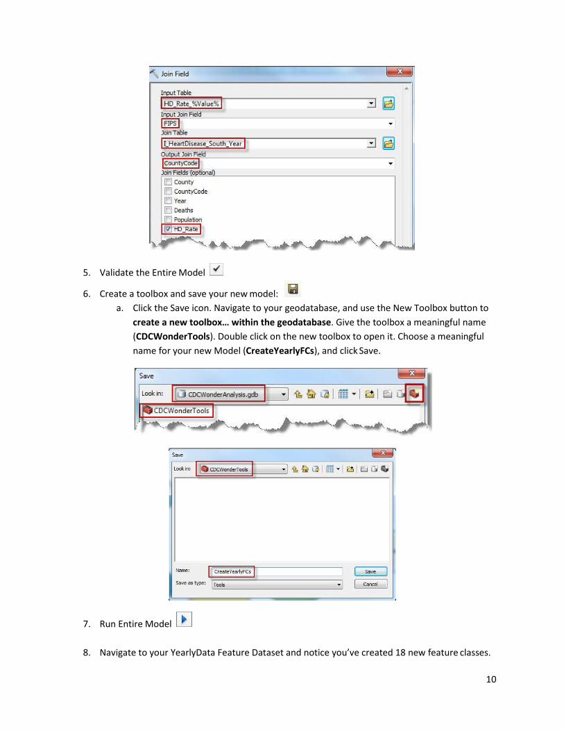
4. Join your CDC Wonder data with the County feature class: a. From the Search dialog, locate the Join Field tool (Data Management), and drag it into
the ModelBuilder window b. Use the connector tool to connect the output from the Iterate Rows tool (the
output dataset, not the VALUE) to the Join Tool as the Join Table.
c. Use the connector tool again to connect the output from Copy Features to the Join
Field tool, as the Input Table. d. Double click on the Join Field tool to expand the dialog. e. For the Input Join Field, choose the FIPS field from the county dataset, and for
the Output Join Field, choose the CountyCode field from the CDC Wonder dataset.
f. Choose to Join the HD_Rate field. g. Click OK.
10
5. Validate the Entire Model
6. Create a toolbox and save your new model: a. Click the Save icon. Navigate to your geodatabase, and use the New Toolbox button to
create a new toolbox… within the geodatabase. Give the toolbox a meaningful name (CDCWonderTools). Double click on the new toolbox to open it. Choose a meaningful name for your new Model (CreateYearlyFCs), and click Save.
7. Run Entire Model
8. Navigate to your YearlyData Feature Dataset and notice you’ve created 18 new feature classes.

11
Create a Model to Run Hot Spot Analysis for each Yearly Feature Class
1. Open a new ModelBuilder canvass
2. Create an iterator to process each yearly feature class: a. From the Insert menu, go to Iterators, and choose the Feature Classes Iterator b. Double click on the Iterate Feature Classes iterator to expand the dialog. For the
Workspace or Feature Dataset parameter, navigate to your YearlyData feature dataset in your geodatabase, and click OK.
3. Add the Hot Spot Analysis tool.
a. In ArcToolbox, in the Spatial Statistics toolbox, navigate to the Hot Spot Analysis (Getis- Ord Gi*) tool in the Mapping Clusters Toolset (see figure below), and drag the Hot Spot Analysis tool into ModelBuilder
b. Use the connector tool to connect the Feature Class output from the iterator, to the Hot
Spot Analysis tool, as the Input Feature Class
Figure 12 The YearlyHotSpot tool.
12
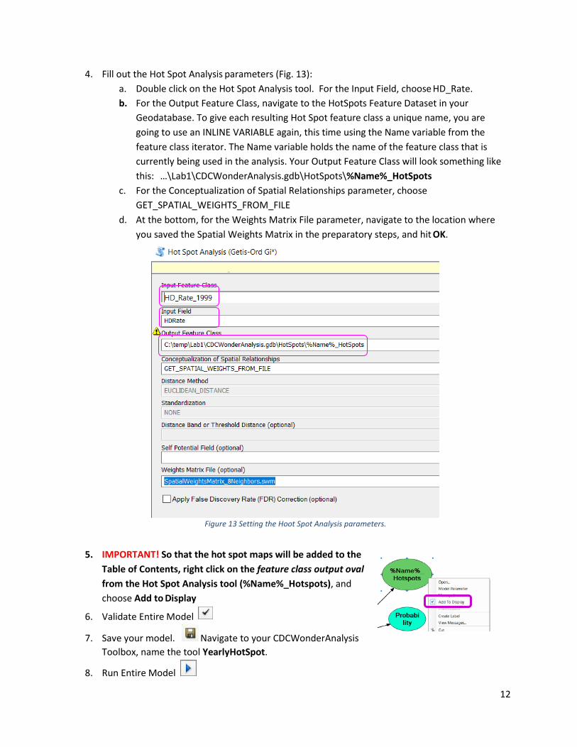
4. Fill out the Hot Spot Analysis parameters (Fig. 13): a. Double click on the Hot Spot Analysis tool. For the Input Field, choose HD_Rate. b. For the Output Feature Class, navigate to the HotSpots Feature Dataset in your
Geodatabase. To give each resulting Hot Spot feature class a unique name, you are going to use an INLINE VARIABLE again, this time using the Name variable from the feature class iterator. The Name variable holds the name of the feature class that is currently being used in the analysis. Your Output Feature Class will look something like this: …\Lab1\CDCWonderAnalysis.gdb\HotSpots\%Name%_HotSpots
c. For the Conceptualization of Spatial Relationships parameter, choose GET_SPATIAL_WEIGHTS_FROM_FILE
d. At the bottom, for the Weights Matrix File parameter, navigate to the location where you saved the Spatial Weights Matrix in the preparatory steps, and hit OK.
Figure 13 Setting the Hoot Spot Analysis parameters.
5. IMPORTANT! So that the hot spot maps will be added to the
Table of Contents, right click on the feature class output oval from the Hot Spot Analysis tool (%Name%_Hotspots), and choose Add to Display
6. Validate Entire Model
7. Save your model. Navigate to your CDCWonderAnalysis Toolbox, name the tool YearlyHotSpot.
8. Run Entire Model

13
Note: Ignore messages about problems reading records. Since we have counties from the entire United States, but only health records for the Southern states, many of the records (counties) have null values. Counties with null values for HD_Rate will not be included in the analysis. Also: if the hot spot maps are not automatically added to the Table of Contents, make sure the Add to Display and Model Parameter options for the %Name%_HotSpots element are checked ON, then re-run the model.
Animate your Hot Spot Results
1. You should now have 18 feature classes that were added to your display…a hot spot analysis for each year in the dataset. Switch your view in the Table of Contents (TOC) to the “List by
Drawing Order” option. 2. Uncheck each layer to turn off drawing. 3. Select all of the hot spot layers in the TOC by holding down the Ctrl key and clicking each one 4. With them selected, right click on any of the selected feature classes (anywhere in the blue
selection), and choose the “Group” option. A new Group Layer will be created, with all of your hot spot analysis results inside. Name your new group: Hot Spot Analysis Results.
5. In the grey space in the top of the application, where all of the toolbars are, right click and choose the “Animation” toolbar from the list of toolbars.
6. From the Animation toolbar drop-down, choose to “Create Group Animation” (Fig. 14). a. For the “Select a group layer” parameter, choose your Hot Spot Analysis Results
group layer that you just created. b. For the “Layer Visibility” set of options, leave the One Layer at a time option checked,
but also check the Invert Order option (this will turn them on from the bottom to the top, and since your hot spot analysis results go from 1999 at the bottom to 2006 at the top, you will want to invert the order).
c. Accept all other defaults, and hit OK.

14
Figure 14 Setting the create group animation parameters.
7. From the Animation toolbar, open the Animation Controls
a. From the options, choose to make the animation 20 secs. b. Press play to watch the animation of your hot spot analysis results over time. c. You can also play around with the options to slow down or speed up the animation, as
well as some other parameters.
To be handed in:
Produce a layout showing a single hot spot map (add the states as an outline using a line weight of 2.0). Add an appropriate title, your name, scale, attribution, etc. Write a page (double-spaced) describing what that particular map is showing (i.e., describe the pattern). To be handed in at the beginning of your next lab.