l o4 magazine pitch final
TRANSCRIPT

Pitch

Welcome


My 1st Idea- “Sound”
Dark and bold colours make the magazine look professional and stand out to the audience. Target audience-16-25 year olds both male and females. “Sound” connotes that its for people that enjoy the latest music and artist that have recently produced music.

First proposal
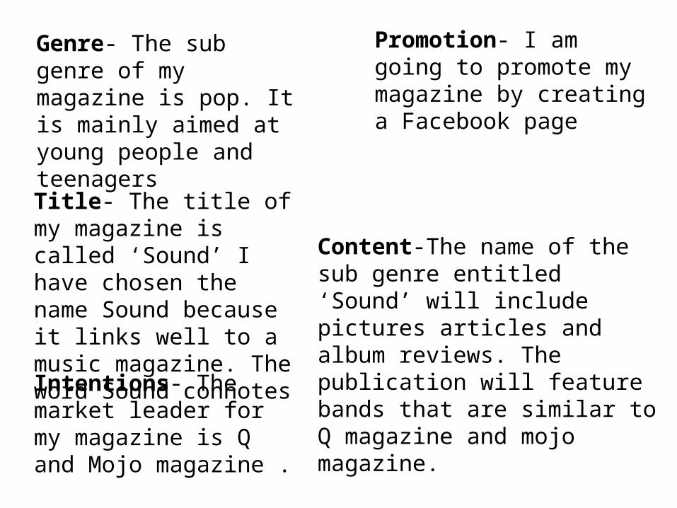
Genre- The sub genre of my magazine is pop. It is mainly aimed at young people and teenagers
Title- The title of my magazine is called ‘Sound’ I have chosen the name Sound because it links well to a music magazine. The word Sound connotes
Intentions- The market leader for my magazine is Q and Mojo magazine .
Promotion- I am going to promote my magazine by creating a Facebook page
Content-The name of the sub genre entitled ‘Sound’ will include pictures articles and album reviews. The publication will feature bands that are similar to Q magazine and mojo magazine.


Magazine cover and double page spread

First front cover Hand Drawn DraftsMagazine Logo- I have chosen to place my magazine logo on the left top corner of the front cover, I chose this part in particular because it is easy for the readers and it would be the first thing they would see. I have been inspired to put the magazine logo in this particular place because of Q magazine, this is because It is my magazine of inspiration. I have chosen these particular colours on the magazine logo because Q magazine has a red logo, I have then got the idea of using the same colour. This will show that my magazine is similar to Q magazine.
Main story- I have decided to place my main story on the right hand side of the front cover because I thought that readers will notice it straight away and as it is close to the main image, it will encourage readers to pick it up and read it. When creating my front cover, I will then include a pull quote so readers will attracted by what it says and it will encourage more people to read the magazine. I thought by placing the main story there, it will have a clear view of the magazine logo and the main image. I was inspired by Q magazine to place it in this particular area, other Q magazines have this in the same place, this will show I am following my magazine of inspiration.
Puff promotion- when placing the puff promotion on the top left hand corner, I chose to place it in this particular place because it is similar to my magazine of inspiration which is Q magazine. I thought placing it here will attract readers to the magazine by paying attract to the logo and what the logo looks like. This will also encourage the reader to buy the magazine because the logo is eye catching to the reader and will be the main thing that they will see.
Magazine layout- when creating the hand drawn drafts for my magazine, I wanted to make sure that they look professional and eye catching for the reader to see, this will more likely attract the reader to read the magazine. I wanted to carefully think about where I wanted to place certain things such as the masthead and the puff promotion. In order to do this I have looked at my magazine of inspiration which is Q magazine and followed a similar layout so readers will know it is my magazine of inspiration.
Article feature- on this hand drawn draft, I was aiming to include the content and what readers will see when they open the magazine. Then I will make the title of the pages smaller in order for the readers more about the content of the magazine and the artist it is talking about.

Second front cover hand drawn draftCover lines- as the main story is
just below the main image, I have decided to put the cover lines to the right of the page so it is more eye catching for the reader. When creating the layout of this magazine front cover, I had to make sure that the cover lines didn’t overlap with anything else on the font cover. I will then make sure of this by carefully placing my cover lines onto my second front cover idea.
Bar code- on the bar code it will include the issue number of when the magazine will be published, the month and the price of the magazine. This is always at the bottom of the page on a magazine front cover because it is less important compared to the main image or the logo.
House style- features from my second front cover, the font and the size are chosen specifically for my magazine, I will then repeat this throughout my magazine to show consistency. This will then show readers that I am using this throughout my magazine so it doesn’t look different to the readers. I plan to use the drop capital for my main articles, this will then imply that the article is important and readers will be attracted to reading it because it stands out then anything else of the page.
Strapline- for my strapline, I have decided to place it just above my magazine logo, I have done this because it will interest the reader because it will be appealing and will stand out. This is similar to my magazine of inspiration which is Q magazine because they used a similar layout. The purpose of doing this is to show readers that I have made a similar magazine to Q, also when they see the strapline they will associate it with the brand and it will become popular to readers the age group that will be interested in it.
Technological convergence- I plan to include technological convergence on the front cover of the magazine that I will create. I will put social media’s and other links to show readers that they can also find the magazine on types of social medias so they can learn more about it and so that they will never miss an issue. I will place it at the bottom left of the page in the barcode for the readers to see on the magazine.

First double page spread hand drawn draftMain image- I created this double page spread by looking at my magazine of inspiration which is Q magazine, I thought it was a good idea for the image to be a big part of the double page spread. This will be eye catching to the reader and will be the first thing the reader sees, I then positioned the masthead just above the main image to again attract the readers attention.
Information about the artist- this includes specific information that readers would like to know about the artist, which includes information about who they are and how they got famous and why they are popular to the public.
Article images- on this double page spread, I will be including smaller images to represent the main image and to tell the reader abit about what they will be reading. Also the smaller images can refer back to the article which readers could find interesting, this will also encourage the reader to read the article and find out what it is about.
Interview- I have placed the interview in columns, as you can see in this double page spread, I have done this make it more interesting for the reader. An interview in a magazine is personal information about the artist and their life, this will encourage readers to find out more about the artist that they like and admire. I have also placed it in columns because it will seem like a build up for the reader, I have used questions and answers in the interview to show that it is professionally laid out and tells readers information about the artist.

Second double page spread hand drawn draftPull Quote-from
interview: I added in a pull quote to my interview so readers would find it more interesting. I put the pull quote above the anchorage text so readers will see it straight away and will be interested in reading the interview as a whole. This is simular to my magazine of inspiration which is Q because they use a simular layout in order to attract readers.
Main image- the layout I used on this double page spread is slightly different to my other double page spread because the main image is not as revealing as in my other double page spread. I have separated the image from the other things such as the pull quote because I thought that the pull quote would tell the reader what the double page spread is mainly about. The main image will be the first thing that the reader will see and they will be already interested by looking at the main image and the title.
Stand First-the stand first is very important on a double page spread because it explains about the topic and this will get readers interested because it will give them a brief idea about what they are about to read.

House Style of the magazine When creating house style for Q I thought it was important to include the details of the house styles and colours in which I will use on my created magazine. In each of my proposals there was an outline on what is going to be included in the magazine and the features such as colour schemes and logos.
Colour schemeFor Sound magazine, the house style is the colour scheme. They have chosen the colours to be bright dark red, black and blue. The red will connote to the readers that I am taking ideas from my magazine of inspiration and also the how professional they have laid out the magazine. the colour scheme will be continued on every page of the magazine.
MastheadWhen deciding on the masthead for my magazine sound, I thought I would have it similar to the colour scheme and similar to my magazine of inspiration which is Q magazine and I will also use similar colours to Q such as the colour red. I will use other colours like black and blue to create my masthead. I will use effects such as make the masthead stand out and look professional in my magazine.

Volume House StyleThe house style for volume consists of the masthead which is located on the top left to show that I have followed my magazine of inspiration which is Q. Q magazine’s masthead is located at the same position as Volume magazine, this is so the reader can clearly see what the magazine is called and what it’s logo is throughout the magazine. Volume magazine will use the same masthead, colour scheme and fonts all throughout the magazine’s they produce to show that it is consistent. Volume magazine will use a variety of images in different types of shots such as a close up, this is to show the readers to look at the image and they will automatically think it is important to look at on the page. All of the images used on the front cover of the magazine are model suggested which means that readers would recgonise the person on the front cover straight away which means they will be more likely to be interested in reading the magazine. The layout of Volume magazine is very similar to Q magazine which consists of titles which create a frame around the artist, which would mean that the artist is the most important part on the page, this would also encourage readers to buy the magazine.

Promoting my magazine on Facebook

Target Audience
For my magazine “sound” the target audience will be mainly aimed at young people and teenagers from the ages 16-25 year olds. I have chosen Q magazine to be my magazine of inspiration which produces similar content that I will use on my new magazine

Graphic Layout Front Covers
Magazine logo
Stra
plin
e Puff Promotion
Image of Artist Headline Quote Cover lines
Magazine Logo
Stra
plin
e
Headline Quote
Puff Promotion
Image of Artist
Main Headline
Coverlines
Barcode, Price and Date Barcode, Price and Date
Main Headline

Double Page Spread
MAIN HEADLINE
STAND FIRST
ARTICLE CREDITS IMAGE OF ARTIST
INFORMATION ABOUT ARTIST
PAGE NUMBER
INTERVIEW
INTERVIEW
QUOTE FROM INTERVIEW
INTERVIEW
TECHNICAL CONVERGENCE
IMAGE OF ARTIST

Second Double Page Spread
MAIN HEADLINE
STAND FIRST
IMAGE OF ARTIST
PAGE NUMBER QUOTE FROM INTERVIEW
ARTICLE CREDITS
INFORMATION ABOUT ARIST
Image of artist

My 2nd idea-Volume
On my second magazine I used faint colours to stand out the background of the magazine and also so it would stand out to the age group that are interested in it.The target audience for my second magazine is also 16-25 year olds both male and female.“Volume” connotes

This is my second proposal for “Volume” magazine, it includes format, working title, genre, content, style and approach of the magazine, the audience for example if it is aimed at teenagers or adults, the length of the magazine for example how many pages it will have and the frequency such as the price of the magazine.

Genre- The sub genre of my magazine is pop. It is mainly aimed at young people and teenagers
Title- The title of my magazine is called “volume” I have chosen the name volume because
Intentions- The market leader for my magazine is Q and Mojo magazine
Promotion- I am going to promote my magazine by creating a twitter page
Content-The name of the sub genre entitled “volume” will include pictures articles and album reviews. The publication will feature bands that are similar to Q magazine and mojo magazine.

Second magazine cover and double page spread

Promoting my magazine on twitter

Target Audience
For my magazine “Volume” the target audience will be mainly aimed at young people and teenagers from the ages 16-25 year olds. I have chosen Q magazine to be my magazine of inspiration which produces similar content that I will use on my new magazine

Second front cover
This is my second front cover for my second magazine “Volume” as you can see I have used different colours compared to my other front cover, these colours are chosen by my own choice and I have also included colours from Q magazine such as blue.

Spending Power For both magazines the target audience will be mainly aimed at young people and teenagers and the power It will have compared to Q magazine. I have chosen Q magazine to be my magazine of inspiration which produces similar content which I will use on my new magazine.
From looking at the table from Bauer media pack, I have analysed that the Q magazine readers are aged 15-24 years of age.

below the line marketingMy magazine will be below the line marketing to advertise my product I have create a Facebook page for Sound and a twitter page for Volume because By advertising my magazine on social networking sites I will be able to interest my target audience, this is because most people that use this type of technology are mostly young people and teenagers.

Production plans
Publication date- the publication date for my magazine will be on the 28th of July 2016 In this I will be producing a schedule so the public don’t miss out anything from sound and Volume magazine

Budget summary Jobs and salaries per year
Commissioning editor-£26,500Publishing editor- £15,000-£23,000Magazine features editor- £25,000 to £40,000Publishing rights manager- £22,000 to £35,000Editorial assistant- £15,000 Press sub editor- £20,000-£23,000Art director- £25,000-£50,000Photo editor-£25,000- £40,000
Recruitment costs: £173,500
Marketing costs: Marketing on Facebook is free

Office space
8 Office chairs- 8x64= £512.00
Computers
4x£300= £1,200
8x375=£3,000
Added up all together = £4,712
http://www.flexioffices.co.uk/surrey/leatherhead http://www.pcofficechairs.co.uk/index.php?Page=category&CategoryID=2
http://www.dinopc.com/shop/pc/Home-Office-PCs-Evolve-c195.htm?gclid=CJCHjJjXoNACFXAz0wodLdYOrw
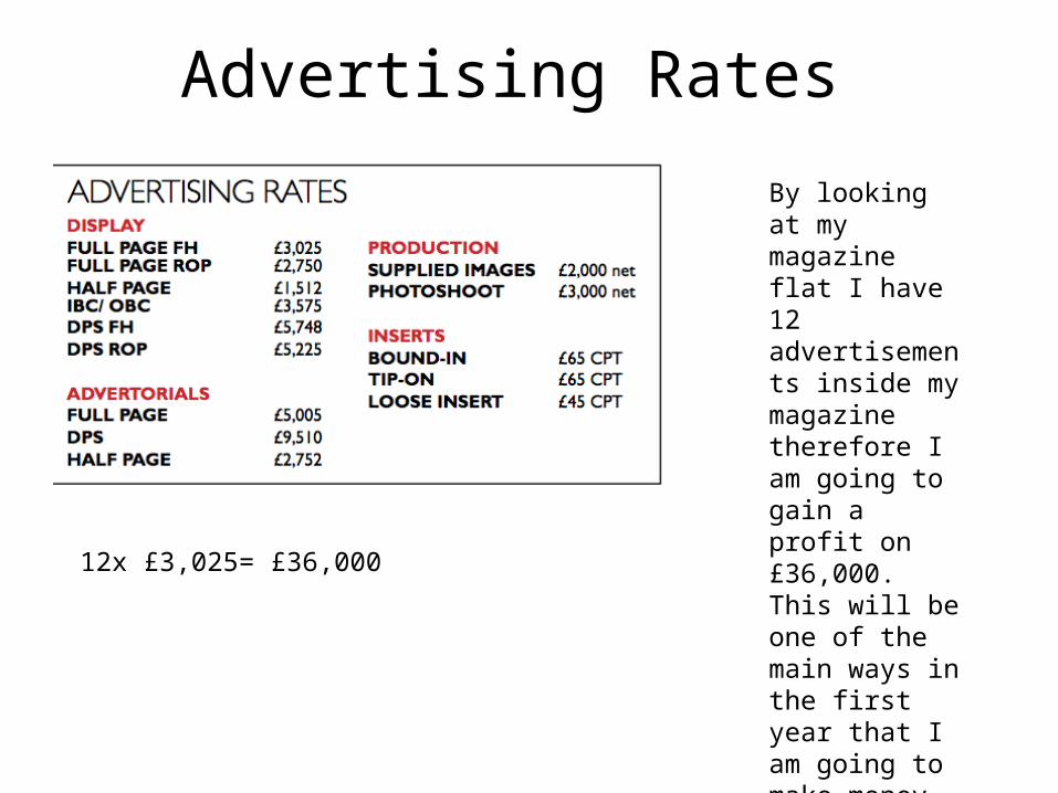
Advertising Rates
12x £3,025= £36,000
By looking at my magazine flat I have 12 advertisements inside my magazine therefore I am going to gain a profit on £36,000. This will be one of the main ways in the first year that I am going to make money.

Printing Costs
60
£600,000
£600,000

Sum upOutgoings = Start up costs – Equipment, Office furniture, Marketing costs – Advertising Below the line (Social Media), Publishing costs/Distribution Costs, Office Rent –
My outgoings are going to be:
£4,712£173,500 £600,000=£778,211
Income = Magazine circulation (£Sales), Advertising in the magazine (FP = Full Page; HP = Half Page), Subscription sales –
My income is going to be: £36,000£2.00x10,000= £20,000=£56,000Which means I am going to make a loss instead of a profit

Theory-Target Audience According to Sound, it would fit into the category of personal identification for Katz because the audience of Sound magazine would relate to the artist and the information being produced of that particular artistfor Hartley category, the age group of Sound magazine would fit into 16-25 year olds that are interested, it will be for both genders but mainly females and finally for class, it would fit into the category of young working class students, which means that Sound is targeted at young people that have working jobs. Finally for Maslow, Sound would fit into the category of Explorers which means that the readers of Sound magazine will experience reading something different every week when it is published.

Psychographics According to the psychographics table, the target audience for Sound would fit into the category of ‘Reformers’ because Sound’s target audience would like to be aware of the new information which would be published each month for viewers to read, also the audience would select products of Sound magazine that were at top quality. Also the target audience would be also aimed at ‘strugglers’ as they seek escape and the people in the D and E demographic which is targeted from Q magazine that Sound magazine was inspired from. Lastly the target audience would be ‘Aspirers’ because Sound magazine is related to younger people who seek status which therefore they would be interested in Sound magazine because it would seek a lower status which means young viewers would more likely be interested.

Colour schemeFor Q magazine a part of the house style is the colour scheme. This has been chosen as a bright dark red with simple colours such as black and blue, The red will connote to the readers that I am taking ideas from my magazine of inspiration and also the professionalism of the magazine. I have also used this with Sound Throughout the magazine. the colour scheme will be continued on every page, this will demonstrate consistency.

Magazine Fonts Font Name Font Preview Font Usage
Abadi MT Condensed light Coverlines
Coverlines
Dimbo Headline Headline
Myraid pro Strapline Strapline, Article Titles
Abadi MT condensed light Puff Promotion
Puff Promotion
This highlights the different font names I am going to use for each magazine convention

Text Photography
In my test photography I have taken 6 images of the person that is featured on my created front covers and double page spreads. I will use these images in my magazine to show that I have used different images to attract the audience.
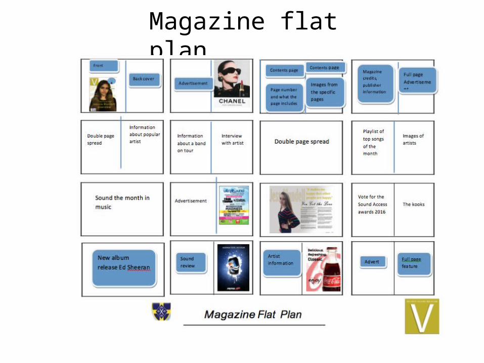
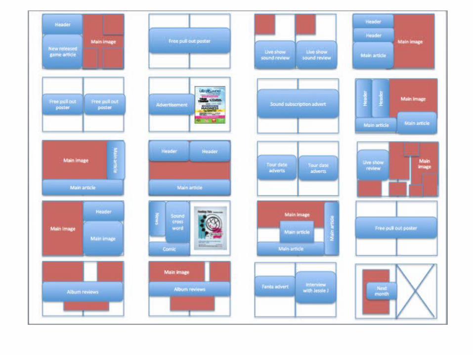
Magazine flat plan


Draft Article-Interview Interviewer: hello Florence, its good to finally have a chat with you- how has your past week been? Florence-Its been great thanks for asking, it was very busy but exciting at the same time Interviewer: Did you gain your inspiration for your song when “what kind of man” when you went traveling? Florence- yeah actually, I found that my song really inspired my fans and just people in general, sometimes when I have a bad day I think about how supportive my fans are and then I start to think about the song and how it made people feel.Interviewer-so how is your song writing process work?Florence- well I start off thinking about the song beat then I get some ideas from my people “Florence and the machine” I do admit they give me inspiration to write songs, they give me a few ideas that I could use, I think of lyrics for them and then we think of a name for the song.Interviewer- so your new album is being realised soon, what can we expect from it?Florence- you can expect a lot of sad emotion as the album goes on but overall I find that it will bring pleasure to my fans and other people than my fans Interviewer-have you learnt any important or tough lessons from your early experiences of the music industry?Florence- yes I have learnt that it is very competitive to be the best singer, I think about how my music makes people feel, I'm not very competitive person but if my music is reaching the top charts then I'm happy to say that I'm number one Interviewer-I heard that you sold out your tour, how does that feeling of thousands of people want to see you and only you? Florence- its shocking to be honest, it makes me feel happy that I'm making other people happy when they listen to my music and its also shocking how thousands of people look up to me as a person and not just a singerInterviewer- finally, thank you Florence for your time its been great talking with you. Do you have any words of inspiration for your fans who are looking to pursue a music career?Florence-thank you, never stop believing in yourself and you will get there, if your talented at singing then I suggest you keep at it and never stop until you’ve been noticed by someone

My final idea I have chosen is Sound

Conclusion
I will provide feedback via Survey Monkey which I have sent via email.

Thanks for watching