keeping greek typography alive
TRANSCRIPT
HAL Id: hal-02111989https://hal.archives-ouvertes.fr/hal-02111989
Submitted on 26 Apr 2019
HAL is a multi-disciplinary open accessarchive for the deposit and dissemination of sci-entific research documents, whether they are pub-lished or not. The documents may come fromteaching and research institutions in France orabroad, or from public or private research centers.
L’archive ouverte pluridisciplinaire HAL, estdestinée au dépôt et à la diffusion de documentsscientifiques de niveau recherche, publiés ou non,émanant des établissements d’enseignement et derecherche français ou étrangers, des laboratoirespublics ou privés.
Keeping Greek Typography ALiveYannis Haralambous
To cite this version:Yannis Haralambous. Keeping Greek Typography ALive. First International Conference on Typog-raphy & Visual Communication, Jun 2002, Thessalonique, Greece. pp.63-91. �hal-02111989�
Keeping Greek Typography ALive
Yannis Haralambous
In the past few centuries, Greek typographers have producedworks of art and won many prizes at international book exhi-bitions. But, due to various economic and social factors, theGreek printing industry has evolved in a slightly different waythan in other European countries. The most important diffe-rence was the fact that in Greece the three main printing me-thods of the twentieth century—hot lead typography, phototy-pesetting, computer typesetting—still co-exist, while in othercountries hot lead typography has completely vanished (ex-cept for some rare bibliophile collector’s items) and phototy-pesetting is in the process of being completely replaced by thecomputer.
Unfortunately, although the co-existence of the three me-thods—often in the same company—would be the ideal condi-tion for preserving tradition, this does not seem to be the case.The majority of computer typeset books—and here we are re-ferring only to books in regular Greek 1—are clearly typogra- 1. Throughout this paper
we call regular Greek theGreek language written withaccents and breathings,which is the natural wayof writing it. We do notcall it «polytonic»»—as isdone in standards like Uni-code—because we considerthis name redundant, just asit would be redundant to aFrenchman to call his lan-guage «accented French»,since accents are an integralpart of the French language.Needless to say, the authorconsiders the «monotonic»spelling reform as a crimeagainst the Greek language, acrime committed by populisticpoliticians and negationistpseudo-linguists.
phically inferior to those produced by traditional methods (seeFigs. 1 and 2 for some examples, taken from books by wellk-nown publishers, printed in the last decade).
The reasons for this loss of quality are manifold. First ofall, purely technical ones: the «monotonic» spelling reform of1982, besides all other evil consequences, has also obstruc-ted the development of computer tools for processing regularGreek. The situation is a bit better nowadays, since more andmore people are returning to the real way of writing the lan-guage, but in the early days of computer typesetting in Greeceit was quite hard to find decent resources for typesetting regu-lar Greek. Creating or modifying existing software to adapt itto regular Greek had never been an easy task, and demandsspecific skills in computing.
In addition, there seems to have been a resistance to theuse of the computer for regular Greek, since in the seventiesand eighties hot lead printers (and phototypesetters) still re-tained the monopoly of regular Greek books. When hot leadprinting started to diminish, because of the usury of equipmentand the fact of craftsmen growing older and retiring, it was of-
1
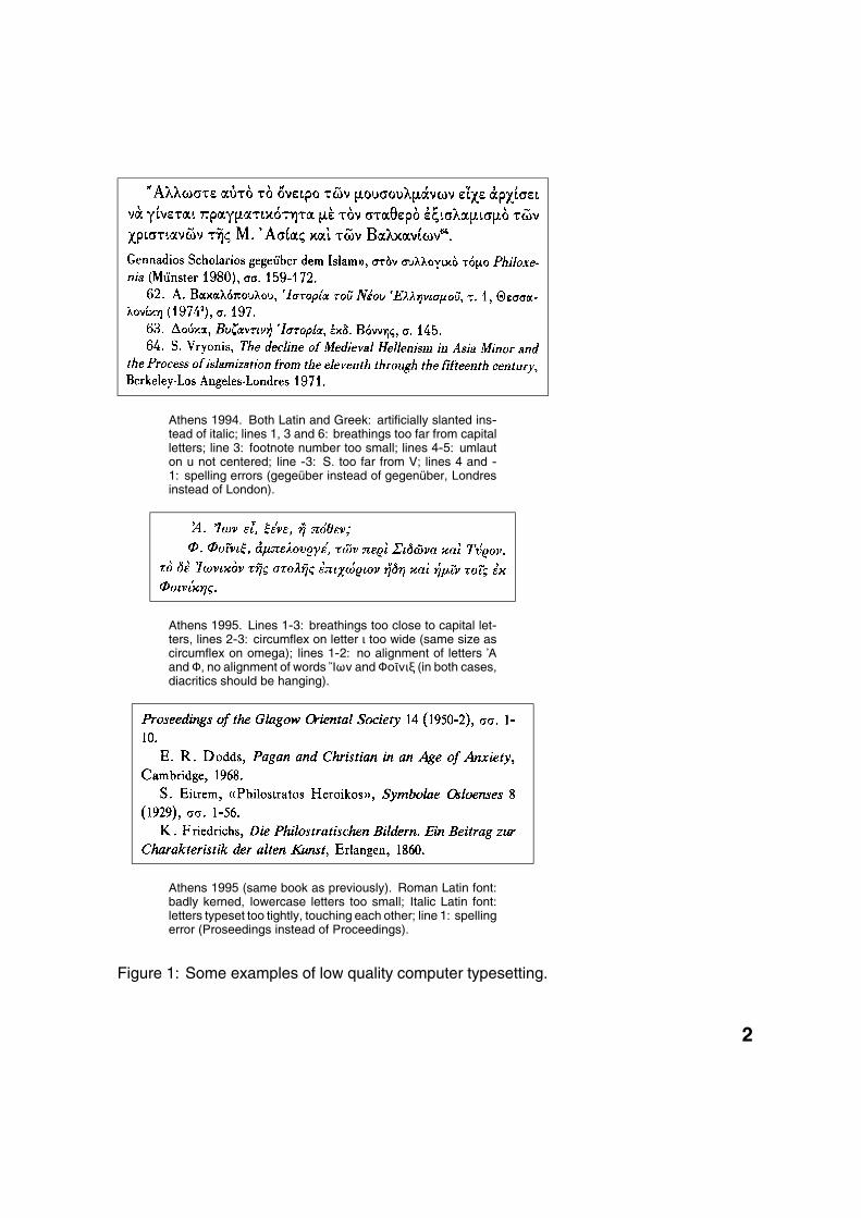
Athens 1994. Both Latin and Greek: artificially slanted ins-tead of italic; lines 1, 3 and 6: breathings too far from capitalletters; line 3: footnote number too small; lines 4-5: umlauton u not centered; line -3: S. too far from V; lines 4 and -1: spelling errors (gegeüber instead of gegenüber, Londresinstead of London).
Athens 1995. Lines 1-3: breathings too close to capital let-ters, lines 2-3: circumflex on letter ι too wide (same size ascircumflex on omega); lines 1-2: no alignment of letters \Αand Φ, no alignment of words �Ιων and Φï�νιê (in both cases,diacritics should be hanging).
Athens 1995 (same book as previously). Roman Latin font:badly kerned, lowercase letters too small; Italic Latin font:letters typeset too tightly, touching each other; line 1: spellingerror (Proseedings instead of Proceedings).
Figure 1: Some examples of low quality computer typesetting.
2
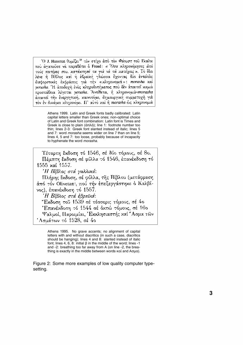
Athens 1999. Latin and Greek fonts badly calibrated: Latincapital letters smaller than Greek ones; non-optimal choiceof Latin and Greek font combination: Latin font is Times andGreek is close to plain (�πλÀ); line 1: footnote number toothin; lines 2-3: Greek font slanted instead of italic; lines 5and 7: word morasha seems wider on line 7 than on line 5;lines 4, 5 and 7: too loose, probably because of incapacityto hyphenate the word morasha.
Athens 1995. No grave accents; no alignment of capitalletters with and without diacritics (in such a case, diacriticsshould be hanging); lines 4 and 8: slanted instead of italicfont; lines 4, 6, 8: initial â in the middle of the word; lines -1and -2: breathing too far away from A (on line -2, the brea-thing is exactly in the middle between words καÝ and Ασµα).
Figure 2: Some more examples of low quality computer type-setting.
3

ten too late to transfer their knowledge and experience to thegeneration of computer users.
Thirdly, and this is a general problem not only confinedto Greece only, computer operating systems and commer-cial DTP programs never offered a decent operating model ofthe book. Software products like Quark XPress or PageMa-ker, which are considered to be—or to have been—the bestDTP systems, were not designed to handle books, but rathermagazines and newspapers. They suffer both on the micro-typographical level, since they are not sufficiently precise orcustomizable, and on the macro-typographical level, since theydo not offer an automatic treatment of the most basic visualconstructions of a book, like footnotes, headers, etc.
digital monotypeIt is generally admitted that the typographically finest Greekbooks have been typeset on Monotype machines; furthermorethere are still monotypists in Greece perpetuating that tradi-tion 2. This is the reason why, to keep high quality Greek ty- 2. Like Christos Manousari-
dis (Manoutios) and ChristosDarras (Ideogramma).
pography alive, the author has started a research and deve-lopment project called «digital monotype» (in Greek: ψηæιακcµïνïτυπÝα). In this context, the word «monotype» is lowerca-sed, since we are referring to the technique of using Monotypemachines, rather than to the machines themselves; in French,the author translates this term «monotypie numérique».
Digital monotype is the method of computer emulation ofthe printed output of Monotype machines (see Figs. 3 and 4to compare an original hot lead typeset page with a digitallymonotyped one). Often the question is asked whether emu-lation alone is sufficient, or whether one must seek improve-ment of the technique that is emulated. The answer is notclear, since it involves the evaluation and classification of pro-perties of the emulated technique into positive ones and nega-tive ones—«bugs» and « features» are the terms commonlyused in the computing world. For example, we will see later onin this paper that Greek Monotype typeset books use a fixedgrid of lines on the page. Is this due to a conscious creativechoice, or to material incapacity to do otherwise? And evenif the latter is the case, has it become an integral part of thattradition, or is it still just a technical constraint which one wouldlike to abandon whenever possible? We have only very rarely« improved» our digital monotype output, in comparison withthe original Monotype output, and this only in cases where this
4
has been requested by people knowledgeable anout the origi-nal techniques and their limitations.
To achieve the goal of computer emulation of the printedoutput of Monotype machines, the latest technologies in elec-tronic document engineering are used. In fact, the process ofproduction of a digitally monotyped book is completely differentfrom the one involving DTP software like Quark XPress or Pa-geMaker.
Instead, we are processing data in a multi-step processwith feedback:
1. the original data—textual contents and structural markup—are stored in XML, encoded in Unicode;
2. using stylesheets describing specific configurations (ac-cording to the publishers preferences and conventions),the XML data are typeset and produce a static binary file(in a device-independent file format called DVI) contai-ning an extremely precise description of the printed pageplus additional textual information;
3. this DVI file is parsed to extract textual information (whichis now linked to the geography of the page) and to gaugethe printed result; the results of this parsing process arestored in auxiliary files;
4. using information stored in these auxiliary files, step 2is repeated, to produce a slightly different—and, in prin-ciple, better—printed result;
5. once again the typeset pages are parsed and the resultsare stored in auxiliary files;
6. steps 4 and 5 are repeated until either the result meetsqualitative criteria (which means that modified versionshave converged to an « ideal» version), or we enter into avicious circle and the same versions re-occur periodically(which means that there has been no convergence). Inthe latter case, manual intervention is necessary;
7. once the « ideal» result has been achieved, it is stored ina commonly used rigid presentation file format. Nowa-days the best such format is PDF, since it is sufficientlydevice-independent and autonomous to produce goodresults on a variety of output devices, and at the sametime can be used for online use of documents.
5
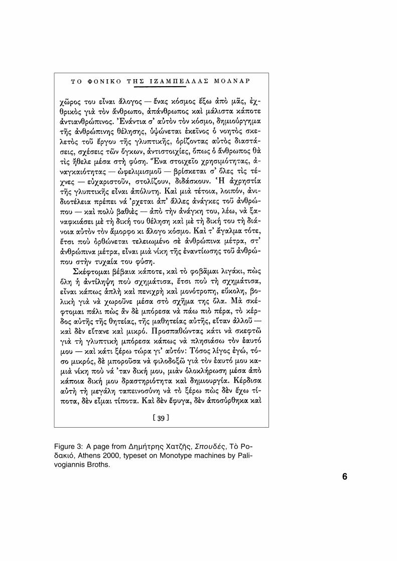
Figure 3: A page from ∆ηµÜτρης Ìατú�ς, ΣπïυδÛς, Τe Ρï-δακιÞ, Athens 2000, typeset on Monotype machines by Pali-vogiannis Broths.
6
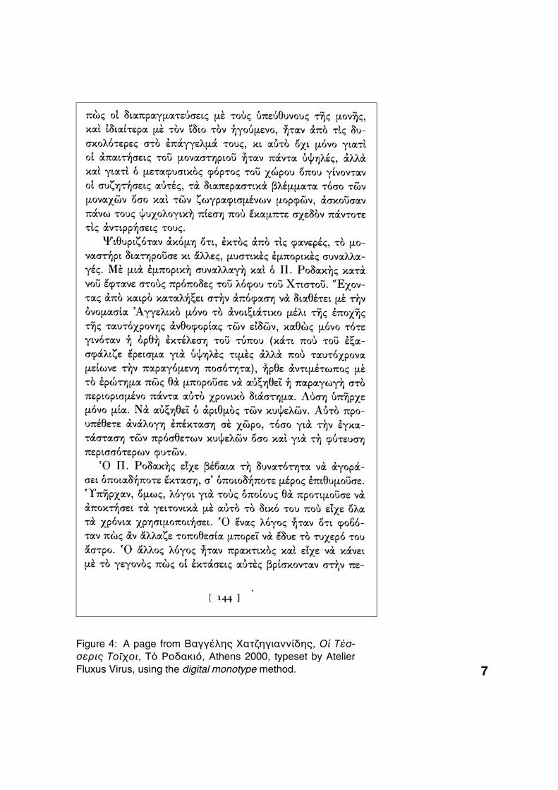
Figure 4: A page from ΒαγγÛλης ÌατúηγιαννÝδης, Ã� ΤÛσ-σερις Τï�øïι, Τe ΡïδακιÞ, Athens 2000, typeset by AtelierFluxus Virus, using the digital monotype method. 7
Clearly, the feedback used in this iterative process to en-hance the subsequent versions of typeset material contradictsthe WYSIWYG («what you see is what you get») principle ofDTP software. Also the precision obtained by digital monotypeis far better than the precision obtained by even the best com-puter operator when moving text blocks around with a mouse.In fact, in digital monotype every step is a part of data proces-sing, accomplished by various software modules.
As this paper is intended for a Typography Conference,we will omit the technical computer engineering details andpresent the methods from a typographical point of view. In fact,we will cover the most important problems we encountered,going from the local to the global level. Some of the methodspresented here are not new: for example, the TEX typesettingsystem was developed in the seventies, and the Omega sys-tem started in the early nineties—and a major part of our modelis based on the latter. Nevertheless we will present them forthe sake of completeness and to give the reader a global viewof digital monotype methods.
building paragraphsTheoretically speaking, a paragraph is a structural unit of text,and this has no relation whatsoever with presentation. Ourfirst visual approach to the concept of paragraph is a long linecontaining all the words, separated by equal blank spaces. Tofit this into our page, we have to break this line several times,either between words or inside them. To obtain justification onboth sides, one must choose the best breakpoints and slightlymodify the widths of blank spaces.
How do we calculate the optimal breakpoints? There is astandard value for the blank space, which is the blank spacewe would have if there were no justification constraints. Thisstandard blank space depends on the font used, and shouldbe a decision of the font designer and of the book designer.Let us call the standard blank space w. Suppose now that webreak a paragraph into lines, so that the following conditionsare satisfied: (a) on a given line all blank spaces are equal(with some exceptions which we will consider later on), (b) linesare justified, (c) all blank spaces have values between a givenminimum and a given maximum. For that given paragraph pre-sentation, which we call P , let wi, 1 ≤ i ≤ N be the widths ofblank spaces. Then, following Don Knuth’s paradigm, we call
8
«badness» of the paragraph the sum:
bP =N∑
i=1
|wi − w|2.
Suppose now that, as an optimal paragraph presentation Popt,we take the one which is the « least bad 3 »: 3. In fact, this is a sim-
plified version of Knuth’smethod implemented in TEX,since Knuth also introduces«hyphenation penalties» and« line penalties», and goesone step further, in calculating«demerits» out of these twoquantities and badness. Theparagraph chosen is the onewith the least demerits. See[2, p. 98] for more details.
bPopt = minPbP
and, of course, this means that one has to make a large numberof calculations, in order to compare the different combinationsof breakpoints. The bigger a paragraph is, the more potentialbreakpoints it contains.
This is a mathematical model of an optimal paragraph pre-sentation introduced by Knuth ([1], [2]) in the seventies. It hasbeen extensively used in the last decades and has shown bothits efficiency and its limits. It has the advantage that all the linesof the paragraph contribute to the regulation of blank spaces,so that the result is fairly homogeneous, and also that—thanksto the quadratic factor—deviations from the standard blankspace very quickly increase badness and hence reduce thechances of a given paragraph presentation of being the opti-mal one 4. 4. On the other hand, this
model may become inef-ficient in some rare caseswhere a single line may be«sacrificed» to save theparagraph; also it has thedisadvantage of treatingspaces wider than standard,and spaces narrower thanstandard, in the same way:this means that the differencebetween the narrowest andthe widest space can be quitelarge, even for the optimalsolution, since it will be twicethe difference between one ofthose two and the standardspace. This may result ina mixture of lines which aretighter and others whichare looser than normal. Onour experimental platform(which is part of the Omegaproject) we are testing othermodels of optimal paragraphpresentation, which may leadto a new generic algorithm ofline breaking.
The situation we just described is fairly abstract and sim-plified; a real-life situation, and especially if we are typesettingGreek text, is even more complex, since additional constraintsare applied. Here are some of them:
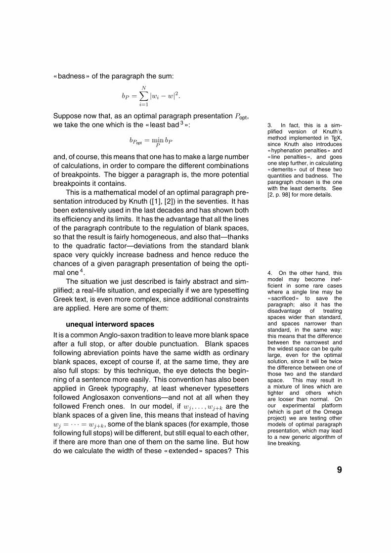
unequal interword spaces
It is a common Anglo-saxon tradition to leave more blank spaceafter a full stop, or after double punctuation. Blank spacesfollowing abreviation points have the same width as ordinaryblank spaces, except of course if, at the same time, they arealso full stops: by this technique, the eye detects the begin-ning of a sentence more easily. This convention has also beenapplied in Greek typography, at least whenever typesettersfollowed Anglosaxon conventions—and not at all when theyfollowed French ones. In our model, if wj , . . . , wj+k are theblank spaces of a given line, this means that instead of havingwj = · · · = wj+k, some of the blank spaces (for example, thosefollowing full stops) will be different, but still equal to each other,if there are more than one of them on the same line. But howdo we calculate the width of these «extended» spaces? This
9

min ideal max
Width of standard blank space
(a)
Wid
th o
f ex
tended
blan
k s
pa
ce
min ideal max
Width of standard blank space
(b)
Wid
th o
f d
ou
ble
pun
ctua
tion
spa
ce
Figure 5: The width of expanded/double punctuation spacesand standard blank spaces, for a given line
width has to depend on the tightness or looseness of each line,but it still has to be unique on a given line. This means that ifw′L is the width of an extended blank space on line L, then it isa function:
w′L = f(wL)
of the width of the standard blank space of that line wL. Knuthhas chosen this function to be simply a multiplication by a fixedfactor (for example, if we choose 1.3 as factor, then all spacesafter full stops will be 30% wider than standard blank spaceson the same line). This factor being the same for all lines, it isusually chosen so that it gives good results for optimal lines.But what happens for less optimal lines? For tight lines, thefixed factor is still the only natural solution: after all, if stan-dard spaces become smaller and smaller, there is no reasonwhy extended spaces should behave differently. On the otherhand, the fixed factor function is not well suited to loosely spa-ced lines: if standard blank spaces have a tendency of be-coming too large, then multiplying them by a fixed factor onlymakes things even worse. This is why we prefer to use a func-tion f , as represented in diagram 5 (a). By this function, ex-tended spaces get closer and closer to standard spaces whenthese become wide, but behave more-or-less like in Knuth’sparadigm when in optimal or tight lines.
10
double punctuation and spacingAs in French, Greek punctuation needs spacing. But the rulesare slightly different: while in French there is the notion of es-pace fine (French thin space), a standard width used for alldouble punctuation except the colon, in Greek, thin spaces aredifferent for each double punctuation mark. We have estima-ted that the space before an exclamation mark is larger thanthe space before a semicolon (Greek question mark) which islarger than the space before a colon. Unlike French, Greekguillemets are not spaced 5. In most current typesetting soft- 5. With a single exception:
books published by Agra in-deed space guillemets, butalso all other delimiters: pa-rentheses, brackets, braces,etc.
ware, thin spaces, whether for French or for Greek, are of fixedwidth. This looks nice when standard spaces are of naturalwidth or tend to become wide, but causes a serious problemwhen standard spaces become narrow: in fact, it may happenthat a regular space becomes narrower than the thin space ofdouble punctuation. This is an absurd situation and we resolveit once again in our model by defining these spaces as a func-tion f of regular spaces, represented in diagram 5 (b).
letterspacingA similar micro-typographical problem is the one of letterspa-cing. Using letterspacing in Greek typography—as in Germanand in Russian—is an integral part of the tradition and has norelation whatsoever with the typesetter’s potential tendency tosteal sheep. Letterspacing is a method for emphasizing, likeusing italics. In the Greek tradition, italics are rather usedfor quoted titles, guillemets are used for words or sentencesspoken or narrated and letterspacing is used for emphasizing.Here is an example: ^à ΓιÀννης εrπε: «� ΚαúαµπλÀνκα εrναιæ ï β ε ρ c ταινÝα» [John said: «Casablanca is a f a b u l o u smovie»].
Using letterspacing to improve line justification is certainlyas bad as stealing sheep, and this is the case also in Greektypography. But, on the other hand, spaces used between let-ters cannot be completely indifferent to what happens betweenwords. On the contrary, if interword spaces become too nar-row, then interletter spaces can hardly be distinguished from 6. In fact, if this happened,
that is if one could havetwo copies of the sameword, with one of them moreletterspaced than the other,one would—consciously orunconsciously—imagine thatthe former carried moreemphasis than the latter. . .
them and the individual letters look like words. On the otherhand, unlike «extended spaces» after full stops, and to doublepunctuation spaces, one would not like a letterspaced word tolook different on two different lines of the same text 6. Thismeans that we don’t have the possibility of defining letterspa-cing as a function of standard interword spaces on the same
11
line. The only solution is to change the line breaking algorithmso that it chooses a different set of breakpoints whenever a linecontaining a letterspaced word is getting too tight 7. 7. This means significantly in-
creasing the badness of tightlines containing letterspacedmaterial.
Finally, an issue that has to be taken into consideration isthat of blank spaces between letterspaced words and at theboundary between letterspaced and non-letterspaced ones. Itis clear that these blank spaces should be wider than the stan-dard blank spaces on the line, since otherwise the distinctionbetween them and spaces between letters would be more dif-ficult.
optical kerning
In current mathematical models of typesetting, kerning is atechnique that is applied inside words. But in some cases, ker-ning is needed even between words: this depends both on theshapes of the (visually) last letter of the first word and the (vi-sually) first letter of the second one, and on the width of theregular blank space of that line. If the line is very loosely spa-ced, then the shapes of these letters are less influential thanwhen the line is tightly spaced. Technically it is impossible topredict all possible combinations of letters and blank space inbetween, especially since these letters can be in different fontsor in different sizes. Imagine, for example, in the Latin alpha-bet, a Roman capital A followed by a blank space and an italicf : ‘A f,’ or, two Roman W letters with a blank space inbetween:‘W W.’ These blank spaces, although being theoretically of thesame width, at least according to our basic mathematical mo-del, appear to be quite unequal visually.
Optical kerning needs to be applied to obtain better visualresults. For this, different methods are tested (calculation ofthe blank area between the letters or between simplified ver-sions of the letters, comparison of horizontal extrema on bothsides, comparison of the letters with basic forms for which wehave kerning rules) and combined. Practically, the most diffi-cult problem is not calculate optical kerning, but to detect whenthis is really necessary, since it is a calculation too heavy to beapplied to all the pairs of words in the paragraph.
alignment of capital letters
Greek diacritics (breathings and possible accents) in front ofcapital letters have a very special behaviour: whenever theyare encountered inside a paragraph, they are spacing diacri-tics; but whenever the capital letters have to aligned, then dia-
12
critics become hanging diacritics. This is the case for the firstwords of: items in lists, verses in poetry, paragraphs, etc. It isinteresting to note that this alignment also occurs for the firstword of a paragraph when it is preceded by an em-dash (as indialogs). Examples:
^à κανÞνας λÛει ÂτιΣτïιøειïθετï�µε λÛêεις πïf\ΑρøÝúïυν �πe æων�ενΜb περασιa στe γρÀµµα καd
�Ãøι στe πνε�µα.
—Ãπως ε�παµε— �Νa µc êεøÀσεις— \Αæï� σï� λÛω— �ΠÀψε πιÀ !—�Ετσι µ\ �ρÛσει
overlapping a/descenders, rivers, typographical gray
Until now, the micro-typographical problems we have discus-sed have always been «horizontal» ones, that is problems ofplacing words on a line so that the sum of badnesses of in-dividual lines is minimal. The problem with this mathematicalmodel is that it does not take the vertical properties of linesinto consideration. Two main problems may occur: if leadingis too small, descenders of one line may overlap with ascen-ders from the line beneath. This can be avoided by choosing aslightly different presentation of the paragraph, but, again, theproblem is to detect this situation.
Even more difficult to detect is the phenomenon of«rivers», which are groups of more-or-less horizontally alignedblank spaces on subsequent lines of text, giving the impressionthat a river is flowing in the middle of the text (which gives theimpression that the paragraph is broken into two columns). Wehave defined a mathematical model of rivers and are workingon modifying the general line breaking algorithm so that theseare taken into account in the calculation of badness, so thatthey may be avoided.
The problem of rivers can be generalized into a problemof typographical gray density variations. Typographical grayis the visual image perceived when a page of printed text isviewed from a distance such that individual letters are not dis-tinguished anymore. Well typeset pages have a very uniformlydense typographical gray. We are collaborating with medicalimagery specialists to develop efficient methods of measuringtypographical gray and its variations. Once this is accuratelymeasured, we will search for ways of including its calculation
13
in the general line breaking algorithm so as to be able to predictthe typographical gray of a page even before typesetting it.
hyphenation and re-occurring words
Last but not least, there are also linguistic problems involved,like hyphenation: there are several sets of rules for hyphena-ting Greek, differing mainly in the amount of etymological vs.phonetic hyphenation (one publisher will hyphenate �νÛντιµïςetymologically as �ν-Ûν-τι-µïς 8 while some other will hyphe- 8. Where we indicate by a hy-
phen the potential breakpointsof the word.
nate phonetically �-νÛν-τι-µïς and, nowadays, one may evenencounter the terrifying �-νÛ-ντι-µïς). This problem has beensolved, by using sets of hyphenation rules and exceptions. Upto now, in our model, all potential breakpoints in a word areconsidered as being of equal priority and only the badness ofthe paragraph as a whole decides which breakpoint in a word(or between words) is to be used.
Greek words sometimes happen to be very long and ty-pesetters seem to have no scruples about breaking them intoparts of quite unequal width (the author often encounters ex-treme cases of hyphenations like �-ερïπλανïæÞρï). There-fore it would be useful to give different levels of priority to break-points, allowing hyphenation more easily towards the middleof the word than close to its extremities. One could even go astep further, and apply methods similar to German typography,where compound words are more easily hyphenated betweencomponents, and then between syllables towards the center ofthe words, and finally at the extremities. This would give, forexample, a scheme such as �4ε3ρï1πλα2νï1æÞ3ρï, where1 is first priority, 2 second priority, and so on.
A problem similar to hyphenation (and to rivers, examinedin the previous section) is the one of the same words occurringat the beginning of two or more subsequent lines. Once againhere the paragraph presentation should be slightly modified toavoid this phenomenon (which is irritating to the eye since thereis uncertainty about which line has been read and which is thenext line to read).
We have discussed seven factors involved in building optimallypresented paragraphs by breaking lines. Each of these factorsshould ideally influence the choice of paragraph presentation.The question is: what are their mutual priorities and how dothey compare? Our study of the mathematical model of type-setting is by no means sufficient to answer that question, as it
14
is not yet a global model but rather a collection of models forthe various facets of typeset text. We hope that in the futurewe will have a clearer idea of the interaction of these facets andmaybe an attempt to integrate them into a single abstract mo-del, which will result in a globally more efficient line-breakingalgorithm.
building pagesSo far we have discussed the micro-typographical aspects,that is those whose scope is limited to the level of the para-graph. In this section we will discuss macro-typographical as-pects of the book, and mainly the process of building pages outof paragraphs, possibly broken between lines.
This process can theoretically be considered as a genera-lization of the line-breaking process, if we exchange the tripletof concepts (word, line, paragraph) for the triplet (paragraph,page, book). Indeed, the sentence «a book is broken intopages by distributing (possibly breaking) paragraphs» is thecounterpart of «a paragraph is broken into lines by distributing(possibly breaking) words». This implies that it would be quitenatural to apply the same algorithm as in the previous sectionfor breaking a book into pages. For example, one could de-fine and calculate a badness measure of each page, take thesum of all such page badnesses as the badness of the givenpresentation of the book, and choose as optimal book the onewith the least badness.
Unfortunately it is hard to implement such a method 9. All 9. And a student of Knuth’shas even proved in his Ph.D.thesis [3] that the general pro-blem is NP-complete, that is:impossible to solve by compu-ter.
we are able to do, up to now, is to apply a best-fit method cor-rected by an iterative process as described in the Introduction.We fill pages in a linear way so that each one of them is filledin the best possible way, independently of all preceding andfollowing pages. Once this process has terminated, we exa-mine the result, make measures and extract information thatis injected into the data and stylesheets so that the next timepages are built, some problems in the results are corrected.This process is iterated until either the results have convergedto a stable version, which, by definition, is the optimal one, orwe have entered a vicious circle of corrections producing twoor more alternating versions: in the latter case, human inter-vention is necessary to escape from the vicious circle.
Here are some cases where this iterative process of buil-ding pages is of crucial importance.
15
widow linesWidow lines (κïυτσbς �ρÀδες = limping lines) occur whene-ver the last line of a paragraph is not a full line and happensto be the first line of the page. This problem is solved in mo-dern typesetting and DTP software by adding additional whitespace between paragraphs, so that an additional line is sent tothe page, so that the partial line is no longer the first line of thepage.
This approach, which seems so very natural nowadays, isout of the question in digital monotype. As a matter of fact, di-gital monotype books have to be typeset on a fixed grid so thatthere is absolutely no variation in leading. Even explicit verticalblank spaces between paragraphs (to show textual unities of ahigher order than paragraphs), have to be exact multiples of theleading of printed lines; the same constraint applied when de-corative elements or figures are placed between paragraphs.These rules are very strict and the slightest deviation is imme-diately visible.
This means that there is no trivial solution for widow lines.The non-trivial solution we apply is based on methods used byhot lead typographers. In fact there are three possibilities:
1. if the conditions allow it, one can typeset the paragraph towhich the widow line belongs a bit more loosely, so thatthe widow line fills the whole line width (see Fig. 6). A« filled widow» line is not only admissible, but even so-metimes quite nice for connoisseurs, since it shows theefforts of the typesetter to avoid widows;
2. otherwise, one has to typeset the paragraph containingthe line, or some previous paragraph, one line tighter sothat the widow line is absorbed by the previous page (seeFig. 7). Of course one must not climb up too many para-graphs in the book, because otherwise new widow linesmay occur in between.
3. if step 2 is not possible, instead one can typeset someprevious paragraph one line looser, so that the widow linebecomes the second line of the page. Once again it isunsafe to climb up too many paragraphs in the book, be-cause otherwise new widow lines may occur inbetween.
All three solutions depend on the flexibility of paragraphslocated before the widow line. They are based on the assump-tion that we know how a paragraph will react if we increase or
16
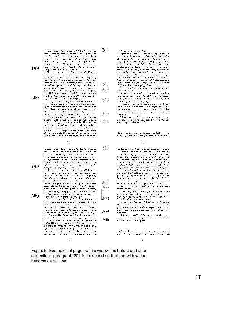
Figure 6: Examples of pages with a widow line before and aftercorrection: paragraph 201 is loosened so that the widow linebecomes a full line.
17
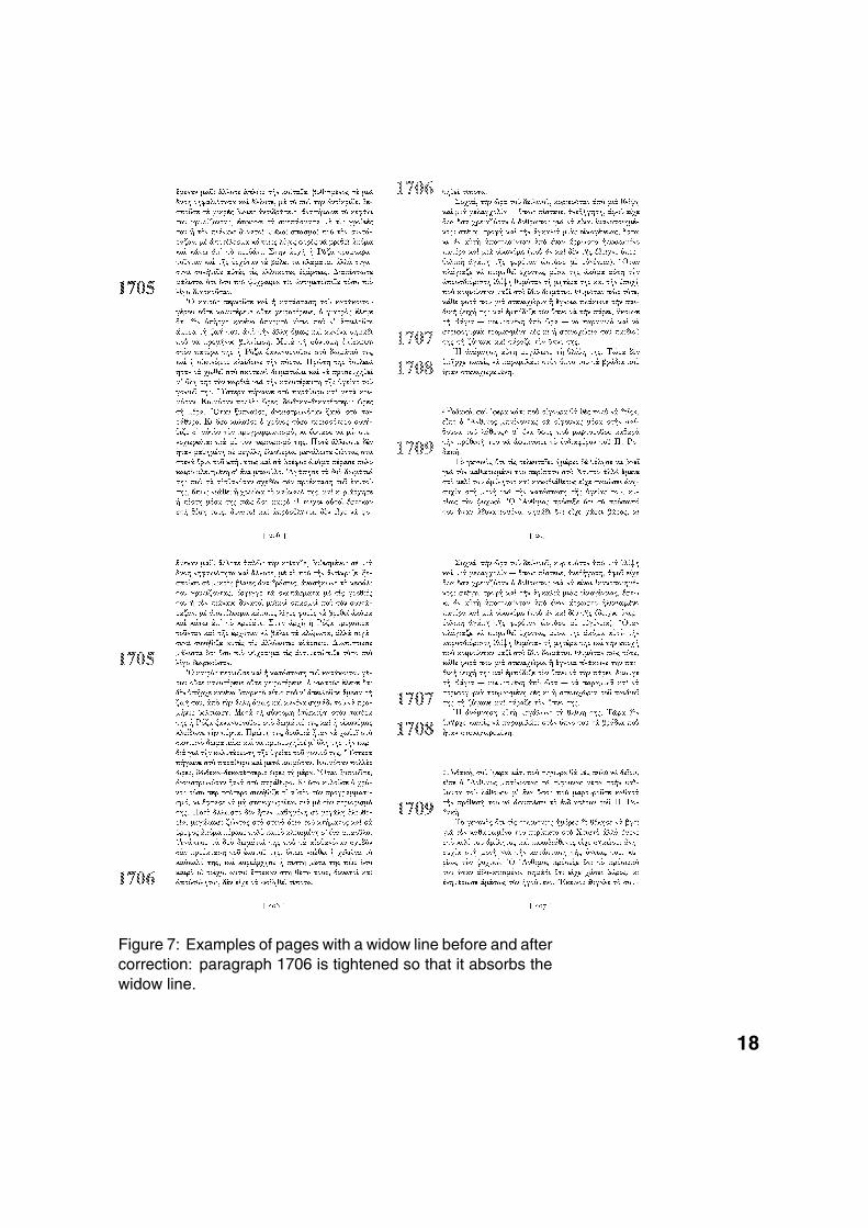
Figure 7: Examples of pages with a widow line before and aftercorrection: paragraph 1706 is tightened so that it absorbs thewidow line.
18
decrease the standard interword space (which in turn will mo-dify non-standard interword spaces, as we have seen in theprevious sections). Obviously a 50-line paragraph will moreeasily «swallow» a partially filled widow line than a 3-line one,but if we take two arbitrary regular size paragraphs there is notrivial way to predict how they will react when the standard inter-word space is slightly modified, and which one will more easilyabsorb a line.
The only way to find out is to actually try it and so our sys-tem makes various tests on paragraphs preceding the widowline before deciding if the widow line should be filled, or absor-bed, and in the latter case which paragraph must be tighted sothat a line is gained.
The results are not only unpredictable but also quite sur-prising, since by its nature our line breaking algorithm mixestightly and loosely typeset lines so that one can hardly say ifa given paragraph is fairly loosely or tightly typeset. Often thefact of making the standard interword space a bit narrower will,however contradictory it may seem, make some lines moreloosely spaced: this may happen because of the way wordsare hyphenated, or because of other factors we have discus-sed previously. We are experimenting with other line breakingmethods which may produce more homogeneous results andmay make paragraph behaviour more predictable and easierto control.
Nevertheless it should be noted that widow lines are themost difficult problem we have had to solve in order to producedigital monotype.
parallel texts
To produce parallel texts, as in Fig. 8, we first introduce iden-tifiers into the XML elements which correspond to paragraphs.These identifiers are the same in paragraphs of both files (ori-ginal text and translation). When these texts are typeset, theidentifiers are included as invisible spots in the DVI files. TheDVI parsing process counts lines between these spots and de-cides how many blank lines have to be included in either theoriginal text or the translation so that parallelism is optimal.
critical editions
A critical edition, as in Fig. 9, is a real typesetter’s challenge.There are two parallel texts, which generate further text flows(the critical apparatus, and several footnote apparati). These
19
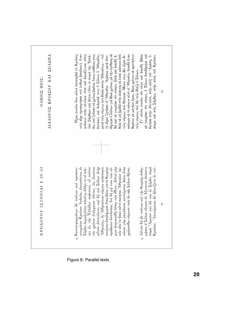
Figure 8: Parallel texts
20
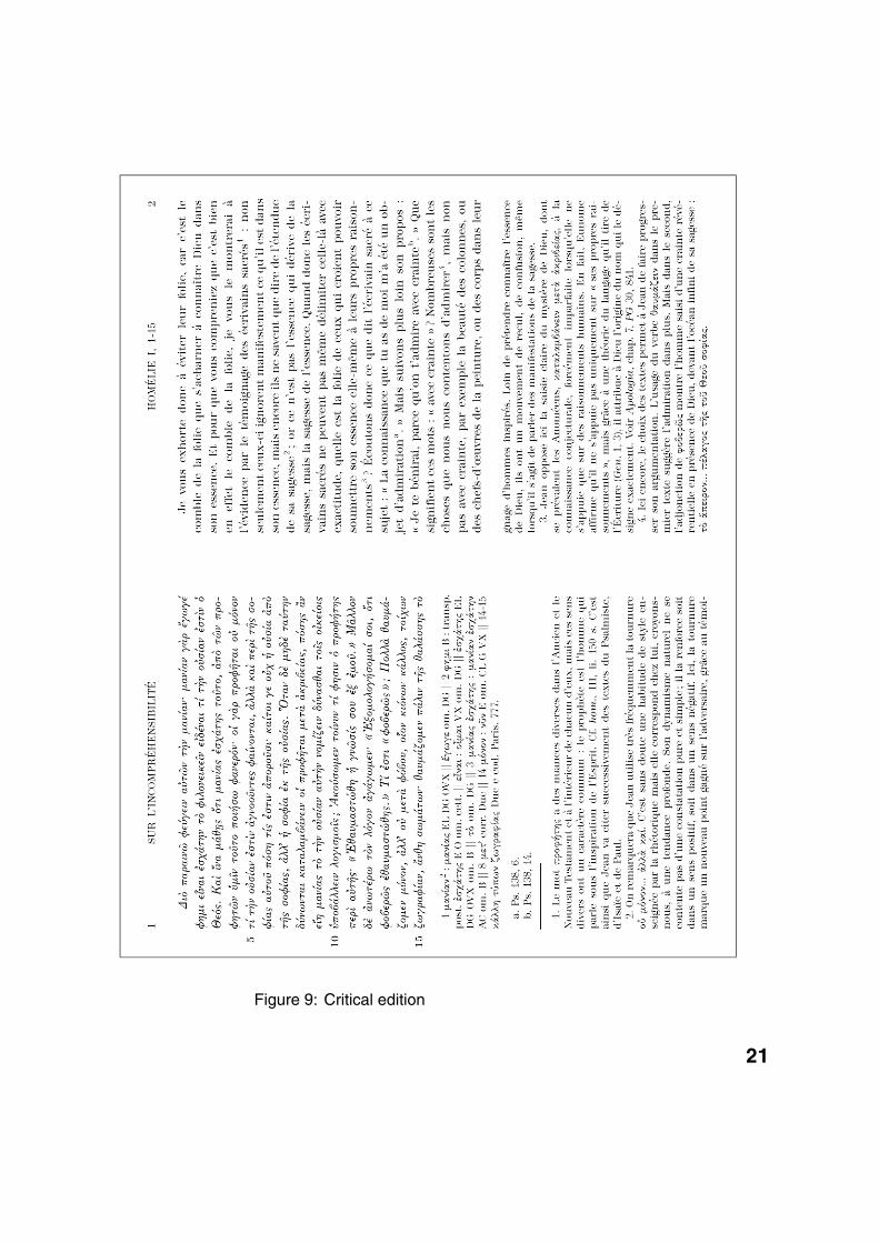
Figure 9: Critical edition
21
additional text flows can be placed on separate sides, or can befloating, in the sense that they will—all together—fill the emptyspace underneath the original text and translation. This is theideal page setup for critical editions, since the two main textscan be of unequal length: the additional text flows will adapt tofill the space underneath.
The critical apparatus is especially difficult to typeset, be-cause its entries are preceded by the line number where the en-try is encountered in the original text above. This line number,of course, depends on the typesetting, and may change com-pletely if either the context or the original text changes evenslightly. Furthermore the following rules apply: if two entriesare on the same line, then the line number is not written twice;if the entry spans over several lines (or even several pages)then the whole span is indicated in the apparatus; if the sameentry occurs twice or more times on the same line, then a su-perset number indicates which occurrence one is referring to.
Information included in the critical apparatus depends somuch on the original text, that a small change in the latter cangrossly change the former, which, in turn, may change the cri-tical apparatus again. In other words, the original text and thecritical apparatus significantly influence each other.
The method we have chosen for producing critical editionsis to fill the pair of even and odd page by the original text andits translation, typeset line by line. Every line of the originaltext will call for a certain number of lines (or simply, words) ofthe translation. At the same time, both the original text and thetranslation will produce parts of the critical apparatus and foot-notes, which will fill the lower parts of the pages. At some timethe insertion of a line in the original text will cause an overflowof our pages. If this overflow is caused by the translation or bythe last footnote, then we can keep that line of original text andtry to place the overflowed text in the next pair of pages. If theoverflow is caused by the critical apparatus, then we stop justbefore the line that caused the overflow and attempt to balancevertical spaces on both pages.
This method of typesetting critical editions is very time- andCPU-consuming, since for every line of original text, a new ty-pesetting process is started. But it is the only method that en-sures the same high quality of the result, as in ordinary digitalmonotype books. At the same time, this method is relativelyfailproof, since at every step of the process the (partial) criticaledition is optimally typeset, and the role of the iterative pro-
22
cess is not to enhance typesetting but to provide data in smallchunks.
typefacesMany people in Greece, even among so-called book professio-nals, believe that all that is necessary to produce high qualitybooks, is to have the right typefaces. We hope to have shown,in the previous two sections of this paper, that this is untrue andthat there is a lot of development and research involved andstill to be done in the areas of micro- and macro-typography,whether the problem is building words, paragraphs or pages.
Nevertheless it is obvious that when the goal is to repro-duce as faithfully as possible a technique that has existed—andstill exists—like Monotype typesetting, the typefaces used arecrucial for producing a convincing result.
This is why a tremendous effort has been spent on de-signing or adapting fonts identical to the ones used in Greekhot lead typography, whether for regular text or for special pur-poses.
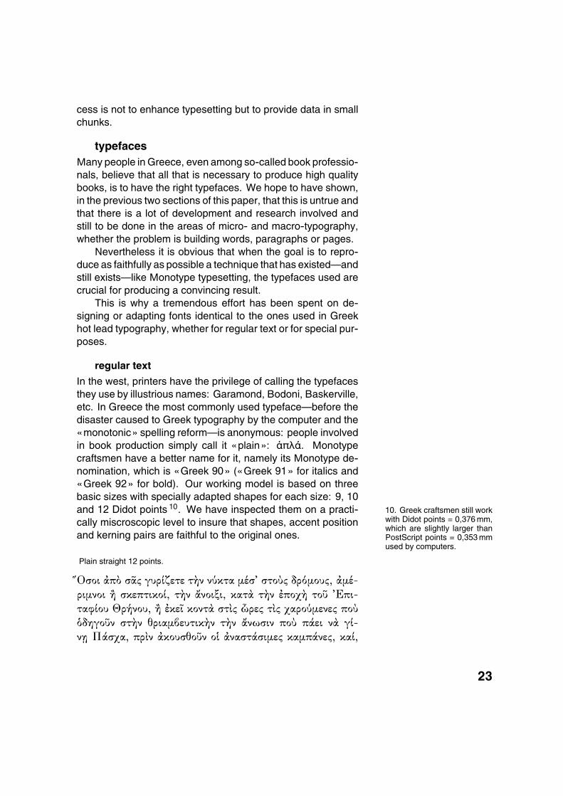
regular text
In the west, printers have the privilege of calling the typefacesthey use by illustrious names: Garamond, Bodoni, Baskerville,etc. In Greece the most commonly used typeface—before thedisaster caused to Greek typography by the computer and the«monotonic» spelling reform—is anonymous: people involvedin book production simply call it «plain»: �πλÀ. Monotypecraftsmen have a better name for it, namely its Monotype de-nomination, which is «Greek 90» («Greek 91» for italics and«Greek 92» for bold). Our working model is based on threebasic sizes with specially adapted shapes for each size: 9, 10and 12 Didot points 10. We have inspected them on a practi- 10. Greek craftsmen still work
with Didot points = 0,376 mm,which are slightly larger thanPostScript points = 0,353 mmused by computers.
cally miscroscopic level to insure that shapes, accent positionand kerning pairs are faithful to the original ones.
Plain straight 12 points.
�IΟσοι �π¿ σAv γυρ¬ζετε τ�ν νËκτα µ�σL στοÌv δρ¾µουv, �µ�-
ριµνοι � σκεπτικο¬, τ�ν �νοιξι, κατ� τ�ν �ποχ� τοÖ LΕπι-
ταφ¬ου Θρ�νου, � �κεE κοντ� στv ëρεv τv χαρο˵ενεv ποÌ
ÁδηγοÖν στ�ν θριαµàευτικ�ν τ�ν �νωσιν ποÌ π�ει ν� γ¬-
ν| Π�σχα, πρν �κουσθοÖν ο¯ �ναστ�σιµεv καµπ�νεv, κα¬,
23
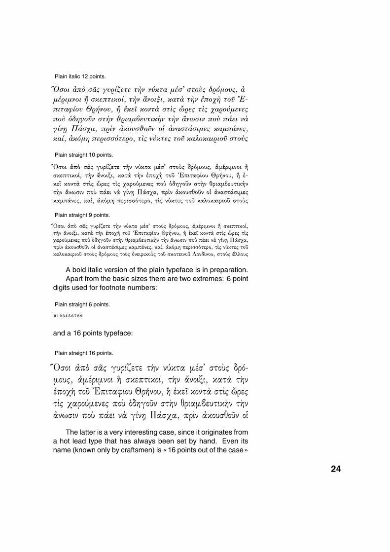
Plain italic 12 points.
�IΟσοι �π¿ σ�v γυρ¬ζετε τ�ν νËκτα µ�σL στοÌv δρ¾µουv, �-
µ�ριµνοι � σκεπτικο¬, τ�ν �νοιξι, κατ� τ�ν �ποχ� τοÖ LΕ-
πιταφ¬ου Θρ�νου, � �κε´ κοντ� στv ëρεv τv χαρο˵ενεv
ποÌ ÁδηγοÖν στ�ν �ριαµàευτικ�ν τ�ν �νωσιν ποÌ π�ει ν�
γ¬ν| Π�σχα, πρν �κουσ�οÖν ο¯ �ναστ�σιµεv καµπ�νεv,
κα¬, �κ¾µη περισσ¾τερο, τv νËκτεv τοÖ καλοκαιριοÖ στοÌv
Plain straight 10 points.
�IΟσοι �π¿ σAv γυρ¬ζετε τ�ν νËκτα µ�σL στοÌv δρ¾µουv, �µ�ριµνοι �
σκεπτικο¬, τ�ν �νοιξι, κατ� τ�ν �ποχ� τοÖ LΕπιταφ¬ου Θρ�νου, � �-
κεE κοντ� στv ëρεv τv χαρο˵ενεv ποÌ ÁδηγοÖν στ�ν θριαµàευτικ�ν
τ�ν �νωσιν ποÌ π�ει ν� γ¬ν| Π�σχα, πρν �κουσθοÖν ο¯ �ναστ�σιµεv
καµπ�νεv, κα¬, �κ¾µη περισσ¾τερο, τv νËκτεv τοÖ καλοκαιριοÖ στοÌv
Plain straight 9 points.
�IΟσοι �π¿ σAv γυρ¬ζετε τ�ν νËκτα µ�σL στοÌv δρ¾µουv, �µ�ριµνοι � σκεπτικο¬,τ�ν �νοιξι, κατ� τ�ν �ποχ� τοÖ LΕπιταφ¬ου Θρ�νου, � �κεE κοντ� στv ëρεv τvχαρο˵ενεv ποÌ ÁδηγοÖν στ�ν θριαµàευτικ�ν τ�ν �νωσιν ποÌ π�ει ν� γ¬ν| Π�σχα,πρν �κουσθοÖν ο¯ �ναστ�σιµεv καµπ�νεv, κα¬, �κ¾µη περισσ¾τερο, τv νËκτεv τοÖκαλοκαιριοÖ στοÌv δρ¾µουv τοÌv ÀνειρικοÌv τοÖ σκοτεινοÖ Λονδ¬νου, στοÌv �λλουv
A bold italic version of the plain typeface is in preparation.Apart from the basic sizes there are two extremes: 6 point
digits used for footnote numbers:
Plain straight 6 points.
� 0 1 2 3456789
and a 16 points typeface:
Plain straight 16 points.
�%Οσοι �π¿ σ�v γυρ¬ζετε τ�ν νËκτα µ�σ$ στοÌv δρ¾-µουv, �µ�ριµνοι � σκεπτικο¬, τ�ν �νοιξι, κατ� τ�ν�ποχ� τοÖ $Επιταφ¬ου Θρ�νου, � �κε´ κοντ� στv ëρεvτv χαρο˵ενεv ποÌ ÁδηγοÖν στ�ν θριαµàευτικ�ν τ�ν�νωσιν ποÌ π�ει ν� γ¬ν| Π�σχα, πρν �κουσθοÖν ο¯
The latter is a very interesting case, since it originates froma hot lead type that has always been set by hand. Even itsname (known only by craftsmen) is «16 points out of the case»
24
δεκαεêÀρια τ�ς κÀσας. It is amazing how often this typefaceis encountered in Greek books of the middle of the 20th cen-tury: sometimes it is just a title, or just a word on the cover, butit is always invariably the same plain 16 points typeface.
This typeface is an excellent example of the positive impactof random or apparently random variation of its components.The same accent on different vowels has quite different shapesand sometimes is placed in surprising positions. A given glyphfrom this font, taken separately, may seem badly designed orwith an unfortunate position of the accent. But seen as a whole,glyphs from this font produce a very vivid and lively impression,and make reading very enjoyable.
A few books have been printed entirely in the 16 points ty-peface 11 and reading them is a very special experience. 11. For example, Agra publi-
sher has a longstanding seriesof short booklets called «Theturbulent rabbit» ^Ã �τακτïςλαγÞς. Other books, inclu-ding a text by the great iconpainter Kontoglou, are in pre-paration.
The problem with plain 16 points is that there is no ade-quate italics version. In the last few decades, craftsmen haveused, as a substitute, the italics version of the 16 points El-selvier typeface (see section below). This typeface, besidesbeing quite different in style than plain 16 points, also has thedisadvantage of being significantly bigger. We have designedthis typeface and reduced it slightly so that, at least in size, itfits with plain 16 points. This is one of the few cases wherewe have consciously transgressed the principle of visual iden-tity with Monotype output, and this has only been done afterconcertation with experts in Monotype typesetting 12. 12. We would like to grab
the opportunity to thank MssGeorgia Papageorgiou forhelp in this matter.
a variant style: elsevierCurrent computer fonts «Times Greek» (Monotype) and«Times Ten Greek» (Linotype) belong to a different style,which Greek craftsmen call «Elsevier». Elsevier typefaceshave been used less frequently than the «plain» typefacesdescribed in the previous section. They are mostly used toge-ther with «plain» typefaces whenever a block of text has to bedistinguished as playing a different role. Books typeset entirelyin Elsevier are either technical or general purpose books, andare not considered to be typographically state-of-the-art books.In particular, Elsevier bold or bold italic is sometimes used inconjunction with plain because it is less heavy than plain bold,and because plain bold italic is most of the time unavailable.
Elsevier straight 10 points.
��IΟσοι �π¿ σ�v γυρ¬ζετε τ�ν νËκτα µ�σL στοÌv δρ¾µουv, �µ�ρι-
µνοι � σκεπτικο¬, τ�ν �νοιξι, κατ� τ�ν �ποχ� τοÖ LΕπιταφ¬ου
25
Θρ�νου, � �κε´ κοντ� στv ëρεv τv χαρο˵ενεv ποÌ ÁδηγοÖν
στ�ν θριαµàευτικ�ν τ�ν �νωσιν ποÌ π�ει ν� γ¬ν0Π�σχα, πρν
�κουσθοÖν ο¯ �ναστ�σιµεv καµπ�νεv, κα¬, �κ¾µη περισσ¾τε-
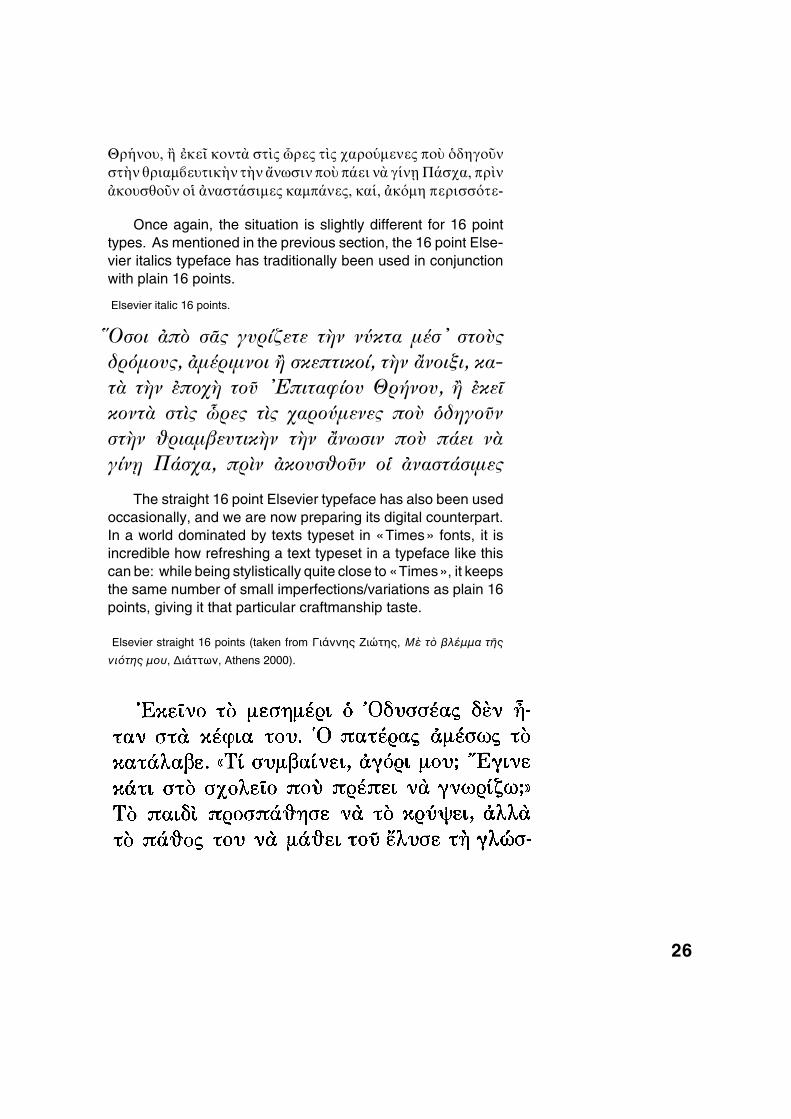
Once again, the situation is slightly different for 16 pointtypes. As mentioned in the previous section, the 16 point Else-vier italics typeface has traditionally been used in conjunctionwith plain 16 points.
Elsevier italic 16 points.
�%Οσοι �π¿ σ�v γυρ¬ζετε τ�ν νËκτα µ�σ$ στοÌvδρ¾µουv, �µ�ριµνοι � σκεπτικο¬, τ�ν �νοιξι, κα-τ� τ�ν �ποχ� τοÖ $Επιταφ¬ου Θρ�νου, � �κε´κοντ� στv ëρεv τv χαρο˵ενεv ποÌ ÁδηγοÖνστ�ν θριαµàευτικ�ν τ�ν �νωσιν ποÌ π�ει ν�γ¬ν| Π�σχα, πρν �κουσθοÖν ο¯ �ναστ�σιµεv
The straight 16 point Elsevier typeface has also been usedoccasionally, and we are now preparing its digital counterpart.In a world dominated by texts typeset in «Times» fonts, it isincredible how refreshing a text typeset in a typeface like thiscan be: while being stylistically quite close to «Times», it keepsthe same number of small imperfections/variations as plain 16points, giving it that particular craftmanship taste.
Elsevier straight 16 points (taken from ΓιÀννης ·ιñτης, Μb τe âλÛµµα τ�ς
νιÞτης µïυ, ∆ιÀττων, Athens 2000).
26
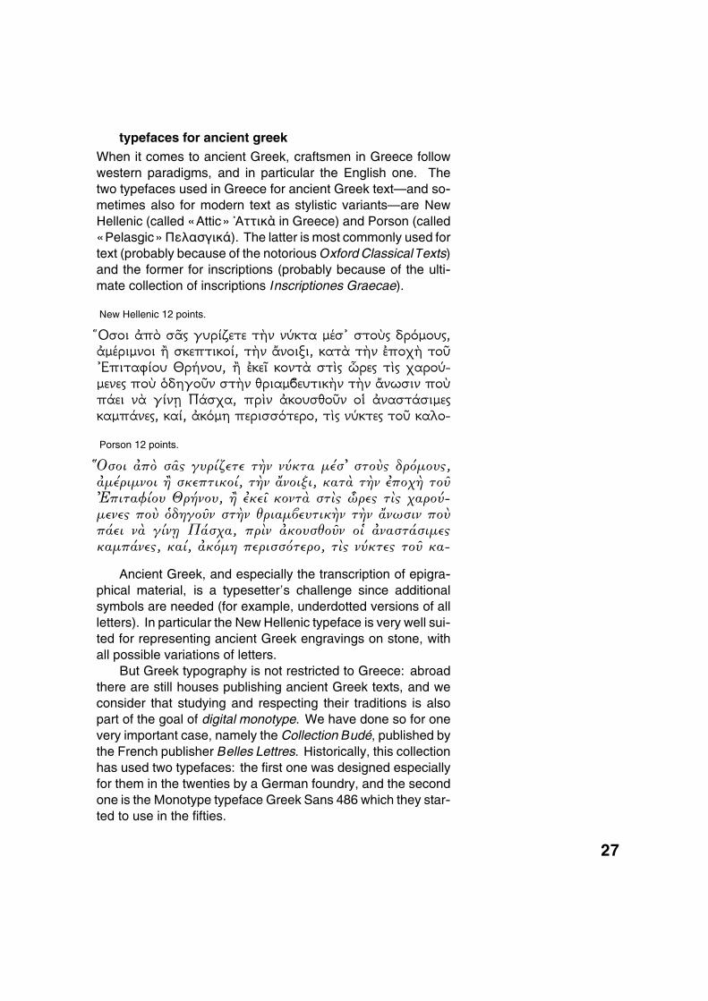
typefaces for ancient greekWhen it comes to ancient Greek, craftsmen in Greece followwestern paradigms, and in particular the English one. Thetwo typefaces used in Greece for ancient Greek text—and so-metimes also for modern text as stylistic variants—are NewHellenic (called «Attic» \Αττικa in Greece) and Porson (called«Pelasgic» ΠελασγικÀ). The latter is most commonly used fortext (probably because of the notorious Oxford Classical Texts)and the former for inscriptions (probably because of the ulti-mate collection of inscriptions Inscriptiones Graecae).
New Hellenic 12 points.
IΟσοι �π¿ σ�v γυρ¬ζετε τ�ν νËκτα µ�σL στοÌv δρ¾µουv,�µ�ριµνοι � σκεπτικο¬, τ�ν �νοιξι, κατ� τ�ν �ποχ� τοÖLΕπιταφ¬ου Θρ�νου, � �κε´ κοντ� στv ëρεv τv χαροË-µενεv ποÌ ÁδηγοÖν στ�ν θριαµàευτικ�ν τ�ν �νωσιν ποÌπ�ει ν� γ¬ν0 Π�σχα, πρν �κουσθοÖν ο¯ �ναστ�σιµεvκαµπ�νεv, κα¬, �κ¾µη περισσ¾τερο, τv νËκτεv τοÖ καλο-
Porson 12 points.
��IΟσοι �π¿ σ�| γυρ¬ζετε τ�ν νÊκτα µ�σL στοË| δρ¾µου|,�µ�ριµνοι � σκεπτικο¬, τ�ν �νοιξι, κατ� τ�ν �ποχ� τοÕLΕπιταφ¬ου Θρ�νου, � �κε´ κοντ� στ| êρε| τ| χαροÊ-µενε| ποË ÁδηγοÕν στ�ν θριαµßευτικ�ν τ�ν �νωσιν ποËπ�ει ν� γ¬νz Π�σχα, πρν �κουσθοÕν ο¯ �ναστ�σιµε|καµπ�νε|, κα¬, �κ¾µη περισσ¾τερο, τ| νÊκτε| τοÕ κα-
Ancient Greek, and especially the transcription of epigra-phical material, is a typesetter’s challenge since additionalsymbols are needed (for example, underdotted versions of allletters). In particular the New Hellenic typeface is very well sui-ted for representing ancient Greek engravings on stone, withall possible variations of letters.
But Greek typography is not restricted to Greece: abroadthere are still houses publishing ancient Greek texts, and weconsider that studying and respecting their traditions is alsopart of the goal of digital monotype. We have done so for onevery important case, namely the Collection Budé, published bythe French publisher Belles Lettres. Historically, this collectionhas used two typefaces: the first one was designed especiallyfor them in the twenties by a German foundry, and the secondone is the Monotype typeface Greek Sans 486 which they star-ted to use in the fifties.
27
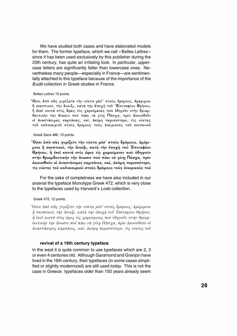
We have studied both cases and have elaborated modelsfor them. The former typeface, which we call «Belles Lettres»since it has been used exclusively by this publisher during the20th century, has quite an irritating look. In particular, upper-case letters are significantly fatter than lowercase ones. Ne-vertheless many people—especially in France—are sentimen-tally attached to this typeface because of the importance of theBudé collection in Greek studies in France.
Belles Lettres 10 points.
�%Οσοι �π¿ σ�v γυρ¬ζετε τ�ν νËκτα µ�σ$ στοÌv δρ¾µουv, �µ�ριµνοι� σκεπτικο¬, τ�ν �νοιξι, κατ� τ�ν �ποχ� τοÖ $Επιταφ¬ου Θρ�νου,� �κε´ κοντ� στv ëρεv τv χαρο˵ενεv ποÌ ÁδηγοÖν στ�ν θριαµ-àευτικ�ν τ�ν �νωσιν ποÌ π�ει ν� γ¬ν| Π�σχα, πρν �κουσθοÖνο¯ �ναστ�σιµεv καµπ�νεv, κα¬, �κ¾µη περισσ¾τερο, τv νËκτεvτοÖ καλοκαιριοÖ στοÌv δρ¾µουv τοÌv ÀνειρικοÌv τοÖ σκοτεινοÖ
Greek Sans 486, 10 points.
IΟσοι �π¿ σ�v γυρ¬ζετε τ�ν νËκτα µ�σL στοÌv δρ¾µουv, �µ�ρι-µνοι � σκεπτικο¬, τ�ν �νοιξι, κατ� τ�ν �ποχ� τοÖ LΕπιταφ¬ουΘρ�νου, � �κε´ κοντ� στv ëρεv τv χαρο˵ενεv ποÌ ÁδηγοÖνστ�ν θριαµàευτικ�ν τ�ν �νωσιν ποÌ π�ει ν� γ¬ν| Π�σχα, πρν�κουσθοÖν ο¯ �ναστ�σιµεv καµπ�νεv, κα¬, �κ¾µη περισσ¾τερο,τv νËκτεv τοÖ καλοκαιριοÖ στοÌv δρ¾µουv τοÌv ÀνειρικοÌv τοÖ
For the sake of completness we have also included in ourarsenal the typeface Monotype Greek 472, which is very closeto the typefaces used by Harvard’s Loeb collection.
Greek 472, 12 points.
%Οσοι �π¿ σ�v γυρ¬ζετε τ�ν νËκτα µ�σ$ στοÌv δρ¾µουv, �µ�ριµνοι
� σκεπτικο¬, τ�ν �νοιξι, κατ� τ�ν �ποχ� τοÖ $Επιταφ¬ου Θρ�νου,
� �κε´ κοντ� στv ëρεv τv χαρο˵ενεv ποÌ ÁδηγοÖν στ�ν �ριαµ-
àευτικ�ν τ�ν �νωσιν ποÌ π�ει ν� γ¬ν| Π�σχα, πρν �κουσ�οÖν ο¯
�ναστ�σιµεv καµπ�νεv, κα¬, �κ¾µη περισσ¾τερο, τv νËκτεv τοÖ
revival of a 19th century typeface
In the west it is quite common to use typefaces which are 2, 3or even 4 centuries old. Although Garamond and Granjon havelived in the 16th century, their typefaces (in some cases simpli-fied or slightly modernized) are still used today. This is not thecase in Greece: typefaces older than 150 years already seem
28
oldish or even « fac-similish», and their use severely hindersaccess to the text contents.
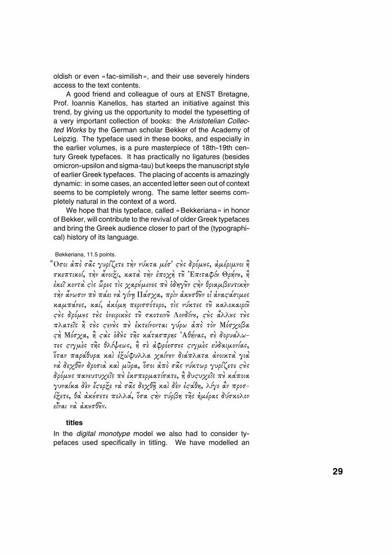
A good friend and colleague of ours at ENST Bretagne,Prof. Ioannis Kanellos, has started an initiative against thistrend, by giving us the opportunity to model the typesetting ofa very important collection of books: the Aristotelian Collec-ted Works by the German scholar Bekker of the Academy ofLeipzig. The typeface used in these books, and especially inthe earlier volumes, is a pure masterpiece of 18th-19th cen-tury Greek typefaces. It has practically no ligatures (besidesomicron-upsilon and sigma-tau) but keeps the manuscript styleof earlier Greek typefaces. The placing of accents is amazinglydynamic: in some cases, an accented letter seen out of contextseems to be completely wrong. The same letter seems com-pletely natural in the context of a word.
We hope that this typeface, called «Bekkeriana» in honorof Bekker, will contribute to the revival of older Greek typefacesand bring the Greek audience closer to part of the (typographi-cal) history of its language.
Bekkeriana, 11.5 points.
�%Οσοι �π¿ σ�v γυρPζετε τ�ν νËκτα µ�σ$ ��v δρ¾µjv, �µ�ριµνοι �σκεπτικο¬, τ�ν �νοιξι, κατ� τ�ν �ποχ� τÛ $Επιταφ¬j Θρ�νj, ��κε´ κοντ� �v ëρεv τv χαρ�µενεv π� ÁδηγÛν ��ν θριαµàευτικ�ντ�ν �νωσιν π� π�ει ν� γ¬ν| Π�σχα, πρν �κjσθÛν ο¯ �να��σιµεvκαµπ�νεv, κα¬, �κ¾µη περισσ¾τερο, τv νËκτεv τÛ καλοκαιριÛ��v δρ¾µjv τ�v Àνειρικ�v τÛ σκοτεινÛ Λονδ¬νj, ��v �λλjv τ�vπλατε´v � τ�v �εν�v π� �κτε¬νονται γËρω �π¿ τ¿ν Μ¾σχοàα�� Μ¾σχα, � ��v Áδ�v τ�v κ�τασπρηv $Αθ�ναv, σ� δορυ�λω-τεv �ιγµ�v τ�v θλ¬ψεωv, � σ� �φρ¾εσσεv �ιγµ�v εÍδαιµον¬αv,Åταν παρ�θυρα κα �ξÞφυλλα χα¬νjν δι�πλατα �νοικτ� γι�ν� δεχθÛν δροσι� κα µÖρα, Åσοι �π¿ σ�v νËκτωρ γυρPζετε ��vδρ¾µjv πανευτυχε´v π� �κσπερµατ¬σατε, � δυ�υχε´v π� κ�ποιαγυνα¬κα δ�ν ��ερξε ν� σ�v δεχθ© κα δ�ν ���θη, λ¬γο �ν προσ-0ξετε, θ� �κ�σετε πολλ�, Åσα ��ν τËρàη τ�v �µ�ραv δËσκολονεµναι ν� �κjσθÛν.
titles
In the digital monotype model we also had to consider ty-pefaces used specifically in titling. We have modelled an
29
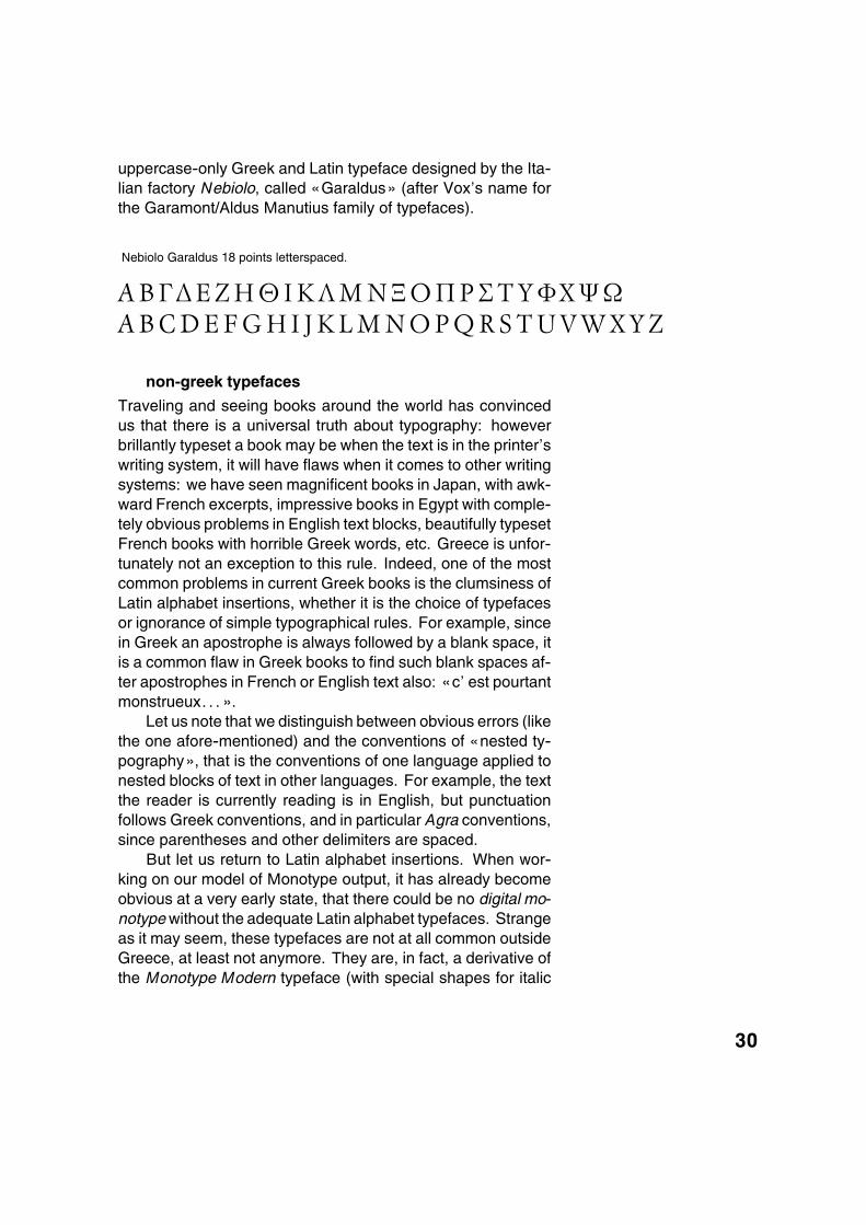
uppercase-only Greek and Latin typeface designed by the Ita-lian factory Nebiolo, called «Garaldus» (after Vox’s name forthe Garamont/Aldus Manutius family of typefaces).
Nebiolo Garaldus 18 points letterspaced.
a b gd e z h j i k l m n x o p r s t u fq y wA B C D E F G H I J K L M N O P Q R S T U V W X Y Z
non-greek typefaces
Traveling and seeing books around the world has convincedus that there is a universal truth about typography: howeverbrillantly typeset a book may be when the text is in the printer’swriting system, it will have flaws when it comes to other writingsystems: we have seen magnificent books in Japan, with awk-ward French excerpts, impressive books in Egypt with comple-tely obvious problems in English text blocks, beautifully typesetFrench books with horrible Greek words, etc. Greece is unfor-tunately not an exception to this rule. Indeed, one of the mostcommon problems in current Greek books is the clumsiness ofLatin alphabet insertions, whether it is the choice of typefacesor ignorance of simple typographical rules. For example, sincein Greek an apostrophe is always followed by a blank space, itis a common flaw in Greek books to find such blank spaces af-ter apostrophes in French or English text also: «c’ est pourtantmonstrueux. . . ».
Let us note that we distinguish between obvious errors (likethe one afore-mentioned) and the conventions of «nested ty-pography», that is the conventions of one language applied tonested blocks of text in other languages. For example, the textthe reader is currently reading is in English, but punctuationfollows Greek conventions, and in particular Agra conventions,since parentheses and other delimiters are spaced.
But let us return to Latin alphabet insertions. When wor-king on our model of Monotype output, it has already becomeobvious at a very early state, that there could be no digital mo-notype without the adequate Latin alphabet typefaces. Strangeas it may seem, these typefaces are not at all common outsideGreece, at least not anymore. They are, in fact, a derivative ofthe Monotype Modern typeface (with special shapes for italic
30
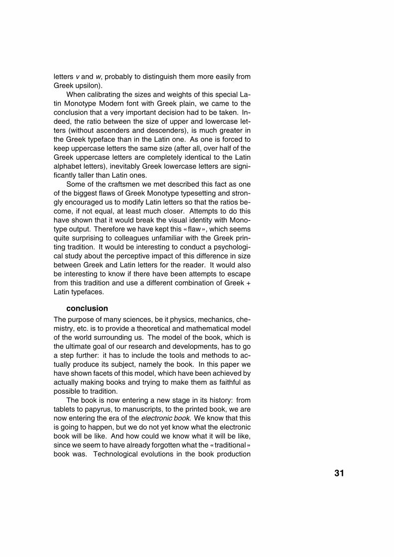
letters v and w, probably to distinguish them more easily fromGreek upsilon).
When calibrating the sizes and weights of this special La-tin Monotype Modern font with Greek plain, we came to theconclusion that a very important decision had to be taken. In-deed, the ratio between the size of upper and lowercase let-ters (without ascenders and descenders), is much greater inthe Greek typeface than in the Latin one. As one is forced tokeep uppercase letters the same size (after all, over half of theGreek uppercase letters are completely identical to the Latinalphabet letters), inevitably Greek lowercase letters are signi-ficantly taller than Latin ones.
Some of the craftsmen we met described this fact as oneof the biggest flaws of Greek Monotype typesetting and stron-gly encouraged us to modify Latin letters so that the ratios be-come, if not equal, at least much closer. Attempts to do thishave shown that it would break the visual identity with Mono-type output. Therefore we have kept this «flaw», which seemsquite surprising to colleagues unfamiliar with the Greek prin-ting tradition. It would be interesting to conduct a psychologi-cal study about the perceptive impact of this difference in sizebetween Greek and Latin letters for the reader. It would alsobe interesting to know if there have been attempts to escapefrom this tradition and use a different combination of Greek +Latin typefaces.
conclusionThe purpose of many sciences, be it physics, mechanics, che-mistry, etc. is to provide a theoretical and mathematical modelof the world surrounding us. The model of the book, which isthe ultimate goal of our research and developments, has to goa step further: it has to include the tools and methods to ac-tually produce its subject, namely the book. In this paper wehave shown facets of this model, which have been achieved byactually making books and trying to make them as faithful aspossible to tradition.
The book is now entering a new stage in its history: fromtablets to papyrus, to manuscripts, to the printed book, we arenow entering the era of the electronic book. We know that thisis going to happen, but we do not yet know what the electronicbook will be like. And how could we know what it will be like,since we seem to have already forgotten what the « traditional»book was. Technological evolutions in the book production
31
process and the ability for anyone to make books using perso-nal computers, have created an abyss between our generationand the multicentennial tradition of bookmaking.
Before we move to the «electronic» book we must firststudy what the real book was like.
In the case of Greek typography, this issue is of crucial im-portance since Greece is one of the few places in the worldwhere high quality typography is still alive and accessible tothe large public.
The goal of the digital monotype project is to keep it alive.
References
[1] D.E. Knuth, Digital Typography, CSLI Publications, Stanford,1999.
[2] D.E. Knuth, The TEXbook, Addison-Wesley, 1989.
[3] M.F. Plass, Optimal Pagination Techniques for Automatic Ty-pesetting Systems, Report No STAN-CS-81-870, Dept. ofComputer Science, Stanford University, June 1981.
Yannis HaralambousDepartement Informatique
ENST Bretagne, CS 8381829238 Brest Cedex, France
http://omega.enstb.org/yannis
32