jennifer’s - wartburg collegefaculty.wartburg.edu/payne/310_advdesprojs/04-5wjennifer...
TRANSCRIPT
Jennifer’s
An Advanced Communication Design Projectby Jennifer SimmerWinter Term 2005
Introduction to Typography

Chapter 1:
An introduction to basic fonts, their characteristics, and basic typography terms.
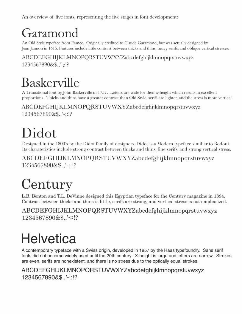
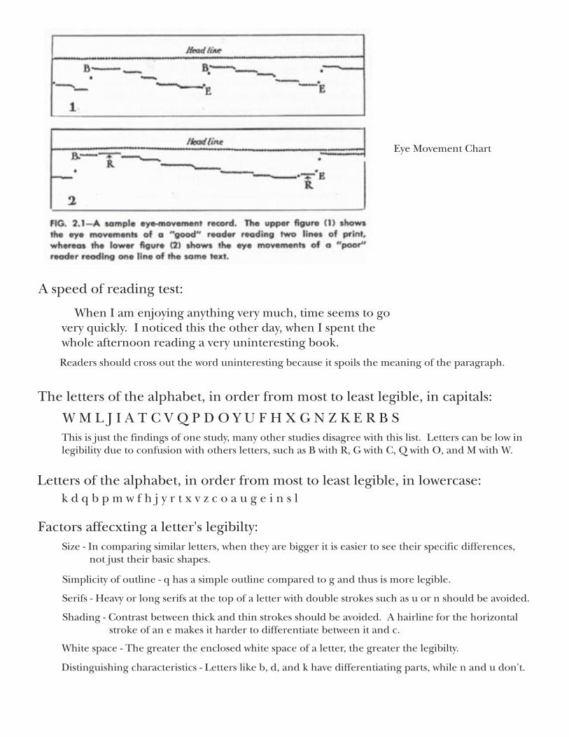
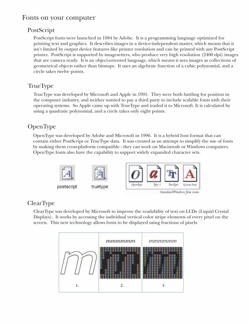
An overview of five fonts, representing the five stages in font development:
An Old Style typeface from France. Originally credited to Claude Garamond, but was actually designed by Jean Jannon in 1615. Features include little contrast between thicks and thins, heavy serifs, and oblique vertical stresses.
Garamond
ABCDEFGHIJKLMNOPQRSTUVWXYZabcdefghijklmnopqrstuvwxyz1234567890&$.,’-;:!?
BaskervilleA Transitional font by John Baskerville in 1757. Letters are wide for their x-height which results in excellent proportions. Thicks and thins have a greater contrast than Old Style, serifs are lighter, and the stress is more vertical.
ABCDEFGHIJKLMNOPQRSTUVWXYZabcdefghijklmnopqrstuvwxyz1234567890&$.,’-;:!?
DidotDesigned in the 1800’s by the Didot family of designers, Didot is a Modern typeface similiar to Bodoni.Its charateristics include strong contrast between thicks and thins, fine serifs, and strong vertical stress.
ABCDEFGHIJKLMNOPQRSTUVWXYZabcdefghijklmnopqrstuvwxyz1234567890&$.,’-;:!?
CenturyL.B. Benton and T.L. DeVinne designed this Egyptian typeface for the Century magazine in 1894.Contrast between thicks and thins is little, serifs are strong, and vertical stress is not emphasized.
ABCDEFGHIJKLMNOPQRSTUVWXYZabcdefghijklmnopqrstuvwxyz1234567890&$.,’-;:!?
HelveticaA contemporary typeface with a Swiss origin, developed in 1957 by the Haas typefoundry. Sans serif fonts did not become widely used until the 20th century. X-height is large and letters are narrow. Strokes are even, serifs are nonexistent, and there is no stress due to the optically equal strokes.
ABCDEFGHIJKLMNOPQRSTUVWXYZabcdefghijklmnopqrstuvwxyz1234567890&$.,ʼ-;:!?
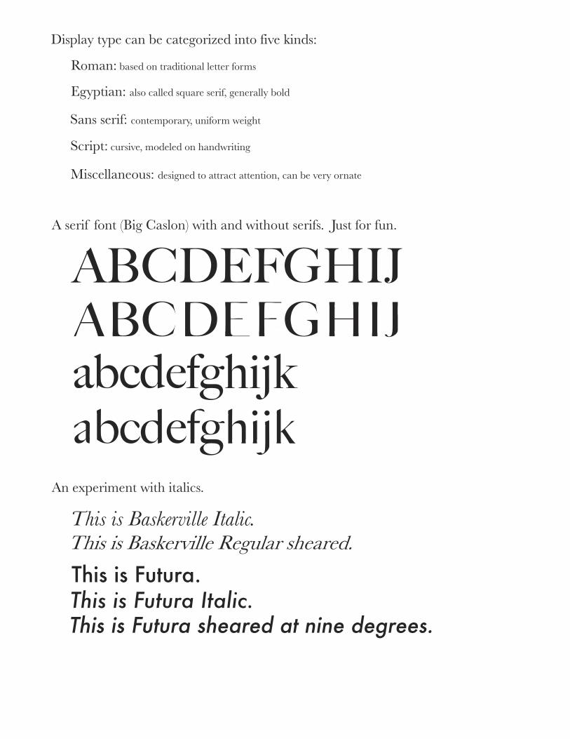
Display type can be categorized into five kinds:
Roman: based on traditional letter forms
Egyptian: also called square serif, generally bold
Sans serif: contemporary, uniform weight
Miscellaneous: designed to attract attention, can be very ornate
A serif font (Big Caslon) with and without serifs. Just for fun.
Script: cursive, modeled on handwriting
This is Baskerville Italic.This is Baskerville Regular sheared.
This is Futura.This is Futura Italic.This is Futura sheared at nine degrees.
An experiment with italics.
ABCDEFGHIJ
abcdefghijkabcdefghijk
ABCDEFGHIJ
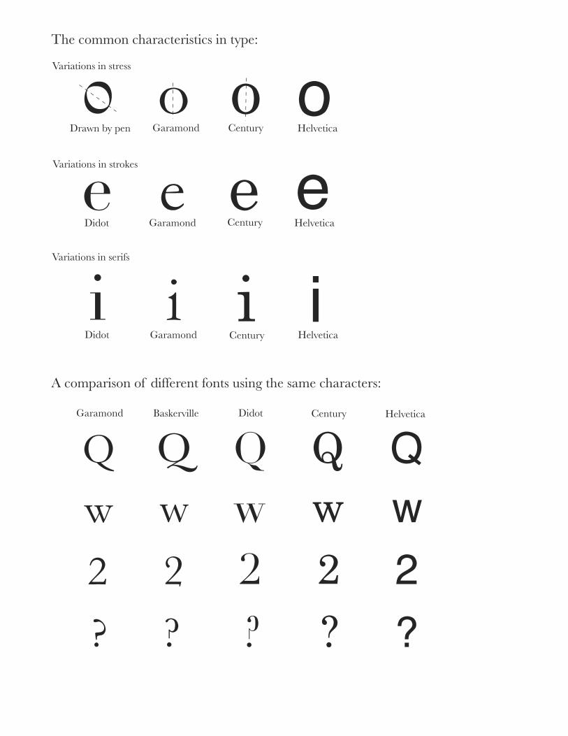
The common characteristics in type:
Variations in stress
o o oDrawn by pen Garamond Century Helvetica
Variations in strokes ee e eGaramond HelveticaDidot Century
Variations in serifs
i i iiGaramond HelveticaDidot Century
A comparison of different fonts using the same characters:
QQ Q Q QGaramond HelveticaDidot CenturyBaskerville
wwwww
2 2 2 2 2? ? ? ? ?
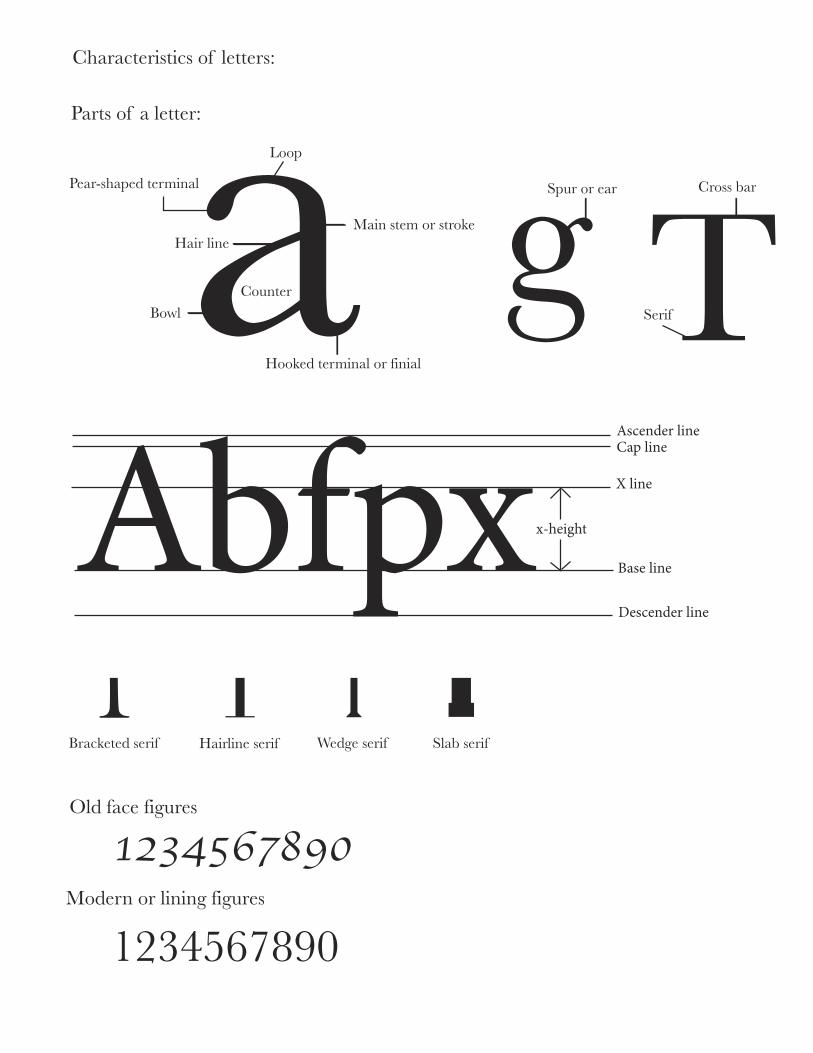
Characteristics of letters:
Parts of a letter:aLoop
Main stem or strokeHair line
CounterBowl
Pear-shaped terminal
Hooked terminal or finial
Spur or ear Cross barg TSerif
��������������������������
������
���������
��������������
��������
T � �TBracketed serif Hairline serif Wedge serif Slab serif
Old face figures
1234567890Modern or lining figures
1234567890
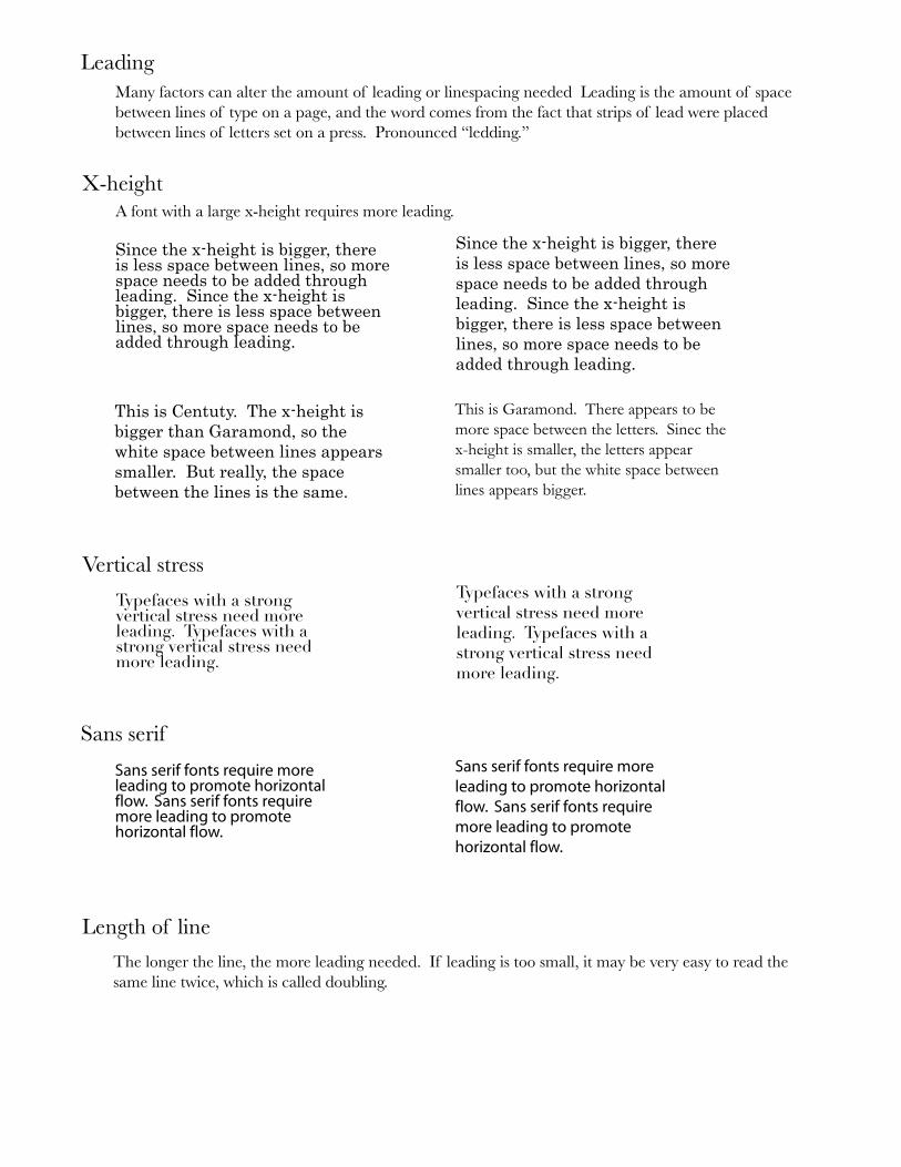
LeadingMany factors can alter the amount of leading or linespacing needed Leading is the amount of spacebetween lines of type on a page, and the word comes from the fact that strips of lead were placed between lines of letters set on a press. Pronounced “ledding.”
X-heightA font with a large x-height requires more leading.
Since the x-height is bigger, there is less space between lines, so more space needs to be added through leading. Since the x-height is bigger, there is less space between lines, so more space needs to be added through leading.
Since the x-height is bigger, there is less space between lines, so more space needs to be added through leading. Since the x-height is bigger, there is less space between lines, so more space needs to be added through leading.
This is Centuty. The x-height is bigger than Garamond, so the white space between lines appears smaller. But really, the space between the lines is the same.
This is Garamond. There appears to be more space between the letters. Sinec the x-height is smaller, the letters appear smaller too, but the white space between lines appears bigger.
Vertical stressTypefaces with a strong vertical stress need more leading. Typefaces with a strong vertical stress need more leading.
Typefaces with a strong vertical stress need more leading. Typefaces with a strong vertical stress need more leading.
Sans serif
������������������������������������������������������������������������������������������������������������������������������������
������������������������������������������������������������������������������������������������������������������������������������
Length of line
The longer the line, the more leading needed. If leading is too small, it may be very easy to read the same line twice, which is called doubling.
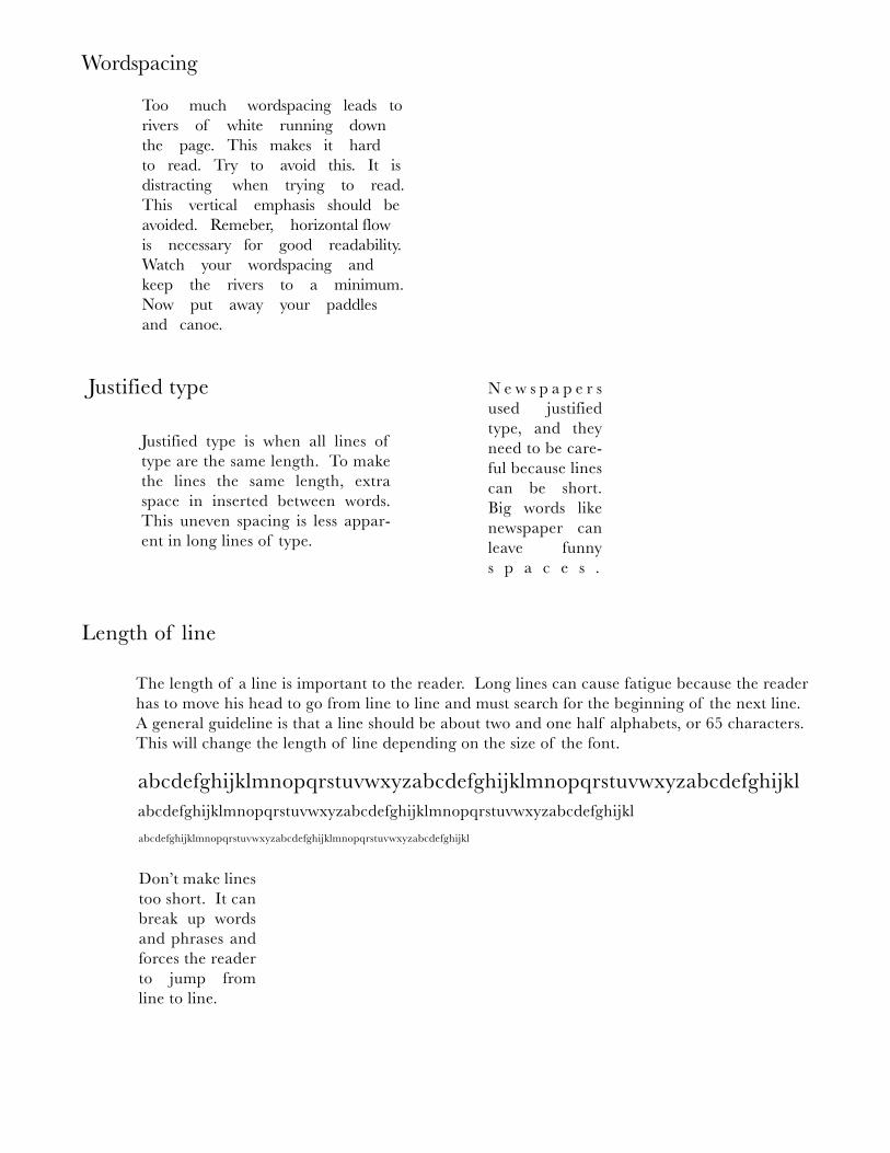
Wordspacing
Too much wordspacing leads torivers of white running down the page. This makes it hard to read. Try to avoid this. It isdistracting when trying to read. This vertical emphasis should beavoided. Remeber, horizontal flow is necessary for good readability.Watch your wordspacing and keep the rivers to a minimum.Now put away your paddles and canoe.
Justified type
Justified type is when all lines of type are the same length. To make the lines the same length, extra space in inserted between words. This uneven spacing is less appar-ent in long lines of type.
N e w s p a p e r s used justified type, and they need to be care-ful because lines can be short. Big words like newspaper can leave funny s p a c e s .
Length of line
The length of a line is important to the reader. Long lines can cause fatigue because the reader has to move his head to go from line to line and must search for the beginning of the next line. A general guideline is that a line should be about two and one half alphabets, or 65 characters. This will change the length of line depending on the size of the font.
abcdefghijklmnopqrstuvwxyzabcdefghijklmnopqrstuvwxyzabcdefghijklabcdefghijklmnopqrstuvwxyzabcdefghijklmnopqrstuvwxyzabcdefghijkl
abcdefghijklmnopqrstuvwxyzabcdefghijklmnopqrstuvwxyzabcdefghijkl
Don’t make lines too short. It can break up words and phrases and forces the reader to jump from line to line.
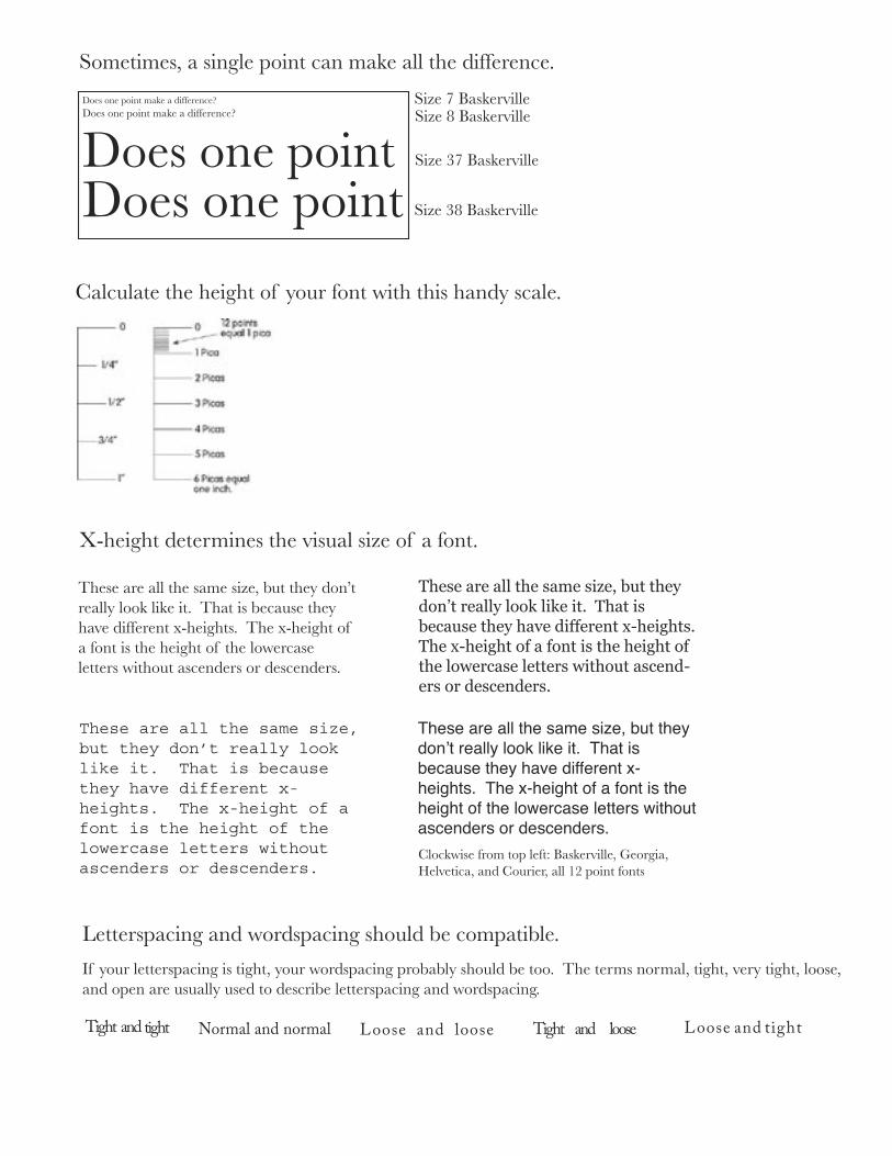
Does one point make a difference?Does one point make a difference?
Does one point Does one point
Size 7 BaskervilleSize 8 Baskerville
Size 38 Baskerville
Size 37 Baskerville
Sometimes, a single point can make all the difference.
Calculate the height of your font with this handy scale.
X-height determines the visual size of a font.
These are all the same size, but they don’t really look like it. That is because they have different x-heights. The x-height of a font is the height of the lowercase letters without ascenders or descenders.
These are all the same size, but they donʼt really look like it. That is because they have different x-heights. The x-height of a font is the height of the lowercase letters without ascenders or descenders.
These are all the same size, but they don’t really look like it. That is because they have different x-heights. The x-height of a font is the height of the lowercase letters without ascend-ers or descenders.
����������������������������������������������������������������������������������������������������������������������������������������������������������������������������������������������������������������
Clockwise from top left: Baskerville, Georgia, Helvetica, and Courier, all 12 point fonts
Letterspacing and wordspacing should be compatible.
If your letterspacing is tight, your wordspacing probably should be too. The terms normal, tight, very tight, loose, and open are usually used to describe letterspacing and wordspacing.
����� ��������� ����������������� ����� ��� ����� ����� ���� ����� ����� ��� �����
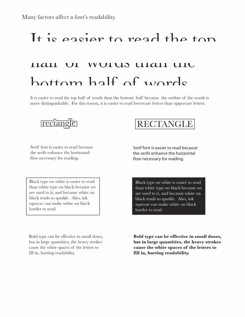
It is easier to read the top half of words than the bottom half of wordsIt is easier to read the top half of words than the bottom half because the outline of the words is more distinguishable. For this reason, it is easier to read lowercase letters than uppercase letters.
RECTANGLErectangle
Serif font is easier to read becausethe serifs enhance the horizontal flow necessary for reading.
�������������������������������������������������������������������������������������������������
Black type on white is easier to read than white type on black because we are used to it, and because white on black tends to sparkle. Also, ink squeeze can make white on black harder to read.
Black type on white is easier to read than white type on black because we are used to it, and because white on black tends to sparkle. Also, ink squeeze can make white on black harder to read.
Bold type can be effective in small doses, but in large quantities, the heavy strokes cause the white spaces of the letters to fill in, hurting readability.
Bold type can be effective in small doses, but in large quantities, the heavy strokes cause the white spaces of the letters to fill in, hurting readability.
Many factors affect a font’s readability.
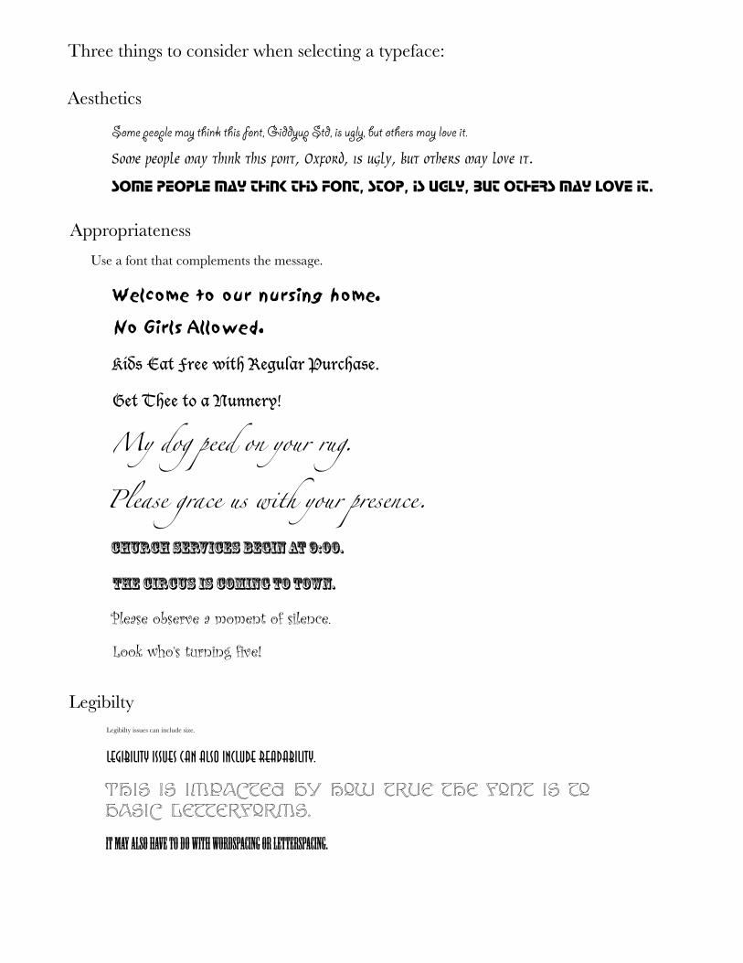
Three things to consider when selecting a typeface:
Aesthetics
������������������������������������������������������������������������������
Some people may think this font, Oxford, is ugly, but others may love it.
some people may think this font, stop, is ugly, but others may love it.
Appropriateness
Use a font that complements the message.
Welcome to our nursing home.
Kids Eat Free with Regular Purchase.
My dog peed on your rug.
������������������������������
LegibiltyLegibilty issues can include size.
������������������������������������������������
This is impacted by how true the font is to basic letterforms.
���������������������������������������������������������
Please observe a moment of silence.
No Girls Allowed.
Get Thee to a Nunnery!
Please grace us with your presence.
�����������������������������
Look who’s turning five!
Modern Monotype casting machines use lead plus 6-12% tin and 15-24% antimony. Tin is added for toughness and to make the lead melt more easily, and antimony is to add strentgh and hardness.
According to this book, the quality of Gutenberg’s ink has never been improved on, in terms of depth of black and permanence.
Interesting facts about typography
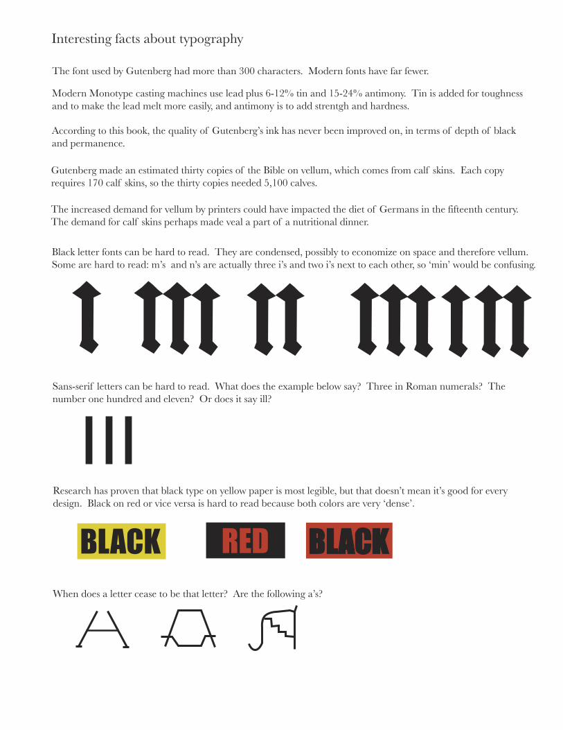
The font used by Gutenberg had more than 300 characters. Modern fonts have far fewer.
Gutenberg made an estimated thirty copies of the Bible on vellum, which comes from calf skins. Each copy requires 170 calf skins, so the thirty copies needed 5,100 calves.
The increased demand for vellum by printers could have impacted the diet of Germans in the fifteenth century. The demand for calf skins perhaps made veal a part of a nutritional dinner.
Black letter fonts can be hard to read. They are condensed, possibly to economize on space and therefore vellum.Some are hard to read: m’s and n’s are actually three i’s and two i’s next to each other, so ‘min’ would be confusing.
Sans-serif letters can be hard to read. What does the example below say? Three in Roman numerals? The number one hundred and eleven? Or does it say ill?
Research has proven that black type on yellow paper is most legible, but that doesn’t mean it’s good for every design. Black on red or vice versa is hard to read because both colors are very ‘dense’.
When does a letter cease to be that letter? Are the following a’s?
RED BLACKBLACK
Chapter 2:
Information about typography related to books, page layout, font usage, and legibility.
Paper
Cellulose: a chemical compound of the elements carbon, hydrogen, and oxygen in the form of minute threads
Main qualities
1. Cellulose is a chemical substance rather than inert; it is not easily attacked by chemical reagents. Due to this, paper can be made that has a high degree of resistance to the effects of light and air.
2. The fibers are tubular and swell when immersed in water. When swollen, a suspension of the fibers can be deposited as pulp, and when the water is squeezed out, a mass remains. So these fibers act as their own cementwhen they dry in close contact with one another. The easy absorption makes paper naturally porous.
3. The fibers are colorless and translucent, so they naturally make a paper that is white and opaque.
4. The fibers are light, strong, and flexible. Paper can be made virtually untearable, and when paper is torn, it isseldom the fibers that tear, but rather the bond between them. This bond is reduced when paper is wet, and that is why wet paper is weaker than dry paper.
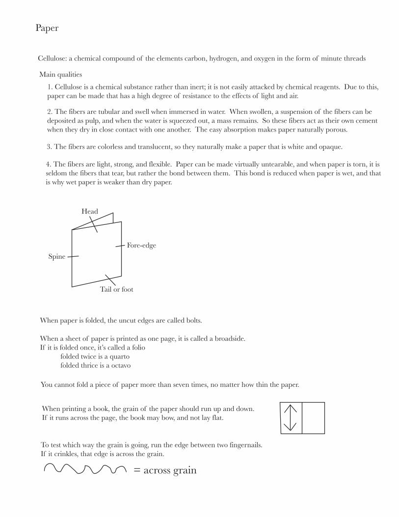
Head
Spine
Fore-edge
Tail or foot
When paper is folded, the uncut edges are called bolts.
When a sheet of paper is printed as one page, it is called a broadside.If it is folded once, it’s called a folio folded twice is a quarto folded thrice is a octavo
You cannot fold a piece of paper more than seven times, no matter how thin the paper.
When printing a book, the grain of the paper should run up and down.If it runs across the page, the book may bow, and not lay flat.
To test which way the grain is going, run the edge between two fingernails. If it crinkles, that edge is across the grain.
= across grain
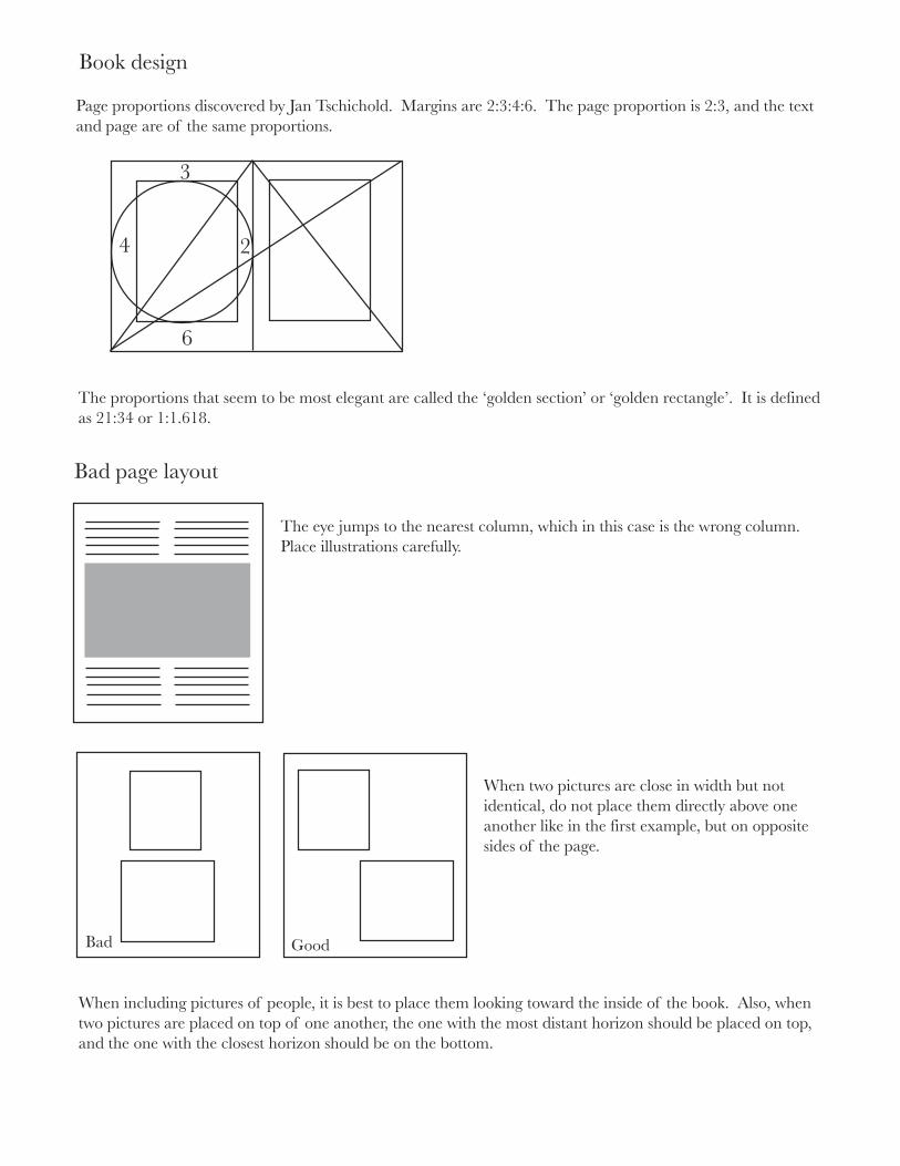
Book design
2
3
4
6
Page proportions discovered by Jan Tschichold. Margins are 2:3:4:6. The page proportion is 2:3, and the text and page are of the same proportions.
The proportions that seem to be most elegant are called the ‘golden section’ or ‘golden rectangle’. It is definedas 21:34 or 1:1.618.
Bad page layout
The eye jumps to the nearest column, which in this case is the wrong column.Place illustrations carefully.
When two pictures are close in width but not identical, do not place them directly above one another like in the first example, but on opposite sides of the page.
Bad Good
When including pictures of people, it is best to place them looking toward the inside of the book. Also, whentwo pictures are placed on top of one another, the one with the most distant horizon should be placed on top,and the one with the closest horizon should be on the bottom.
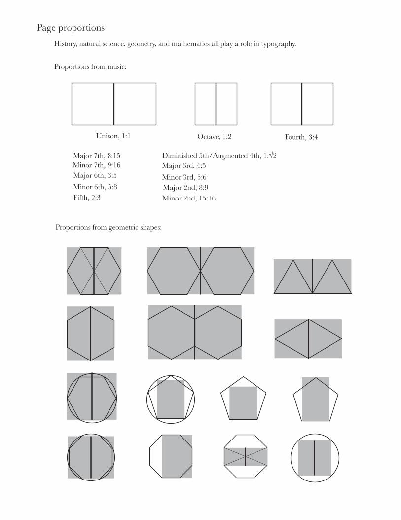
Page proportions
History, natural science, geometry, and mathematics all play a role in typography.
Proportions from music:
Unison, 1:1 Octave, 1:2 Fourth, 3:4
Major 7th, 8:15Minor 7th, 9:16Major 6th, 3:5
Minor 6th, 5:8Fifth, 2:3
Diminished 5th/Augmented 4th, 1:√2Major 3rd, 4:5
Minor 3rd, 5:6Major 2nd, 8:9Minor 2nd, 15:16
Proportions from geometric shapes:
26
Typography
27
Book Design
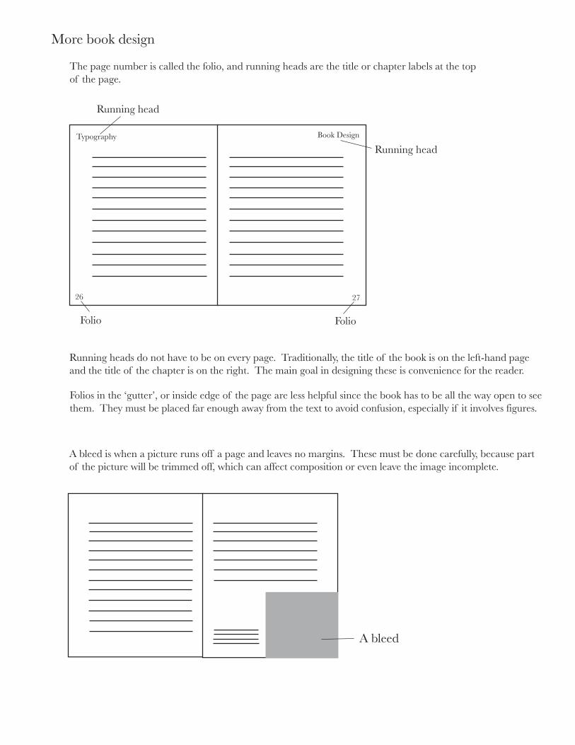
Running head
Running head
Folio Folio
The page number is called the folio, and running heads are the title or chapter labels at the topof the page.
More book design
Running heads do not have to be on every page. Traditionally, the title of the book is on the left-hand page and the title of the chapter is on the right. The main goal in designing these is convenience for the reader.
Folios in the ‘gutter’, or inside edge of the page are less helpful since the book has to be all the way open to see them. They must be placed far enough away from the text to avoid confusion, especially if it involves figures.
A bleed is when a picture runs off a page and leaves no margins. These must be done carefully, because part of the picture will be trimmed off, which can affect composition or even leave the image incomplete.
A bleed
Parts of a book:
1. PrelimsTraditionally including the following, but d through i are often condensed.a. Half-title or bastard titleb. Blank or frontispiece, or other books by authorc. Title paged. Verso of titlee. Dedicationf. Acknowledgmentsg. Preface or forwardh. Contentsi. List of illustrations
2. Main textThings to consider when designing main text:
The length of the text - long books may need to be designed in a condensed format.Backing up - The lines of type may need to fall in the same position as the lines on the back side of the page. If you can see through the paper, the type or heavy illustrations may affect legibilty.Running heads, folios, quotations, footnotes, and chapter openings also are part of the main text.
3. CaptionsOften a different size or weight or type is used for captions to set them apart from the text.
4. Appendices
5. Bibliography
6. Index
7. End-papers
8. Case
9. Jacket
A case is the hard cover that is fixed to a book by adhesive. It is often hidden by the jacket, however itstill must be well designed. The spine of the book must have the title of the book on it, and possibly thenames of the author and publisher. The lettering may read across, up, or down. Across is the mostnatural way, but often the words do not fit this way. If the title must run vertically, it makes the most senseto start at the top and go down. A person expects to start reading at the top, and if the book is laid on theback, the title will be right side up.
The primary purpose of the jacket is to sell, but it also protects the book. The main elements of the design,including title and author, should be legible from fifteen feet.
Twenty one night stands
# octothorp
† dagger
^ caret
° degree
• bullet
¶ pilcrow§ section
ß eszett
¨ umlaut/diaeresis
µ mu«» guillemets
‡ double dagger
· midpoint
ˆ circumflex
˘ breve
˙ overdot
˚ ring
¸ cedilla˛ ogonek
ˇ caron
¦ pipe
Þ thorn
Analaphabetic characters
An analphabetic character is a typographic symbol used with the alphabet but lacking a place in the alphabetical order. The following are some of the ones you might not not know.
These symbols can be very important to the legibility of writing. Take the following example:
Twenty one-night stands
Twenty-one nightstands
Dingbats are typographic glyphs or symbols. They have no apparent relation to the alphabet, and many of themare pictograms. Others are abstract symbols.
The fist is an example of a dingbat . It is a silent, pointing hand from the Baroque period.
The gutter is the blank column between two columns of type or the margins at the spine between two facing textblocks.
There are eight basic arithmetical signs in the standard ISO character set, but often the subtraction sign and theen dash are identical. If signs other than the basic eight are desired but not included in your font, it would bebest to take all symbols from the same font so they match.
+ - = > < ± ÷ ×
A bicameral alphabet is two alphabets joined together. The modern Latin alphabet is an example; it has anupper and lower case. Unicameral alphabets, such as Arabic and Hebrew, only have one case.
The ISO is the International Organization for Standardization. It is headquartered in Geneva, and is an agencyfor interntaional cooperation on industrial and scientific standards. Its membership contains organizations frommore than one hundred countries.
�����������������
������������������������������������������������������������������������������������������������������������������������������������������������������������������������������������������������������������������������
������������������������������������������������������������������������������������������������������������������������������������������������������������������������������������������������������������������������������������������������������������������������������������������������������������������������������������������������������������������������������������������������������������������������������
�������������������������������������������������������������������������������������������������������������������������������������
��������������������������������������������������������������������������������������������������������������������������������������������������������������������������������������������������������������������������������������������������������������������������������������������������������������
������������������������������������������������������������������������������������������������������������������������ � ��������������������������������������������������������������������������������������������������������������������� � ������������������������������������������������������������������������������������������������������������������������������������������������������������
����������������������������������������������������������������������������������������������������������������������������������������������������������������������������������������������������������������
��������������������������������������� ��� ������� ����� ���� �������������������������������������������������� ��� ����� ����� �� ��������� �����������������������������������������������������������
��������������������������������������� ��� ������� ����� ���� ������������������������������������������������� ��� ����� ����� �� ��������� ����������� ����� ����� ���� ����������������������������������
����������������
��������� �����������������
���������������
��������� ����������������������
����������������
��������������������������
����������
����������������
�������������������������������������������������������������
��������������������������
�������������������������������������������������������������������������������������������������������������������������������������������������������������������������������������������������������������������������������������������������������������������������������������
�������������������������������
��������������������������������������
��������������
�����������������������������
���������������
����������������
���������������������
���������������������������������������������������������������������������������������������������������������������������������������������������������������������������������������������������������������������������
���������������������������������������������������������������������������������������������������
����������������������������������������������������������������������������������������������������������������������������������������������������������������������������������������������������������������������������������������������������������������������������������������������������������������������������������������������������������������������������������������������������������������������������
��������������������������������������������������������������������������������������������������������������������������������������������������������������������������������������������������������������������������������������������������������������������������������������������������������������
�������������������������������������������������������������������������������������������������������������������������������������������������������������������������������������������������������������������������������������������������������������������������������������������������������������������������������������������������������������������
�������������������������������������������������������������������������������������������������������������������������������������������������������������������������������������������������������������������������������������������������������������������������������������������������������������������������������������������������������������������������������������������������������������������������������������������������������������������������������������������������������������������������������������������������������������������������������������������������������������������������������������������������������������������������������������������������������������������������������������������������������������������������������������������������������������������������������������������������������������������������������������������������������������������������������������
�������������������������������������������������������������������������������������������������������������������������������������������������������������������������������������������������������������������������������������������������������������������������������������������
������������������
������������������������
���������������������������������������������������������������������������������������������������������������������������������������������������������������������������
�����������������������������������������������������������������������������������������������
������������������������������������������������������������������������������
������������������������������������������������������������������������������������������������������������������������������������������������������������������������������������������������������������������������������������������������������������������
������������������������������������������������������������������������������������������������������������������������������
����������������������������������������������������������������������������������������������������������������������������������������������������������������������������������������
��������������������������������������������������������������������������������������
����������������������������������������������������������������������������������������������������������
��������������������������������������������������������������������������������������������������������������������������������������������������������������������������������������
������������������������������������������������������������������������������������������
����������������������������������������������������������������������������������������������������������
������������������
������������������������������������������������������������������������������������������������������������������������������������������������������������������������������������������������������������������������������������������������������������������������������������������������������������������������������������������������������������������������������������������������������������������������������������������������������������������������������������
������� �������� ��������� ������������������� ������� � ������ � �������������
���������������������������������������������������������������������������������������������������������������������������������������������������������������������������������������������������������������������������������������������������������������������������������������������������������
������������� �������� �������������� ����������� ������������� ������������ ������� ���������� ����������
���������������� �������� � ��������������� � ������������ � �������������� � ������������� ������� � ������������ � ������������
�����������
������������������������������������������������������������ �������������� � ��� ������������ � � ��� ���������� � � ��� ����������������������� ��� ��������������� � ��� ���������������� � �� ��������������� � �� �������������������������� �� �������������� � ��
�����������������������������������������������������������������������������������������������������������������������������������������������������������������������������������������������������
�����������������������������������������������������������������������������������������������������������������������������������������������������������������������������������������������������������������������������������������������������������������������������������������������������������������������������������������������
�����������������������������
Chapter 3:
Typography and fonts from a technological stand-point.
����������
��������
��������
���������
�������������������������������������������������������������������������������������������������������������������������������������������������������������������������������������������������������������������������������������������������������������������������������������������������������������������������������������������������������������������������������������������������������������������������������������������������������������������������������������������������������������������������������������������������������������������������������������������������������������������������������������������������������
��������������������������������������������������������������������������������������������������������������������������������������������������������������������������������������������������������������������������������������������������������������������������������������������������������������������������������������������������������������������������
�����������������������������������������������������������������������������������������������������������������������������������������������������������������������������������������������������������������������������������������������������������������������������������������������������������������������������������������������������������������������������������
������������������������������������������������������������������������������������������������������������������������������������������������������������������������������������������������������������������������������������������������������������������������������������������
����������������������
�����������������
�������������
�����������������������������������������������������������������������������������������������������������������������������
��������������������������������������������������������������������������������������������������������������
�������������������������������������������������������������������������
����������������������������������������������������������������������������������������������������
��������������������������
��������������� �������������������������������
����������������������������
���������������� ������������
����������������������������������������������������������������������������������������������������������������������������������������������������������������������������������������������������������������
��������
�����������������������������������������������������������������������������������������������������������������
�������
�������
�����������������������������������������������������������������������������������������������������������������������������������������������������������������������������������������������������������������������������������������������������������������������������������������������������������������������������������������������������������������������������������������������������
������������������������������������������������������������
�������������������������������������������������������������������������������������������
��������������� ���������������
��������������������������� �������������������������������

Chapter 4:
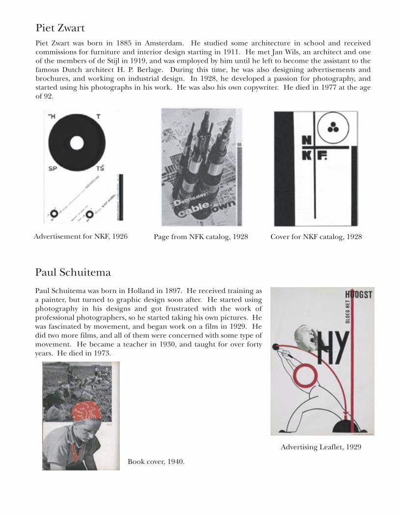
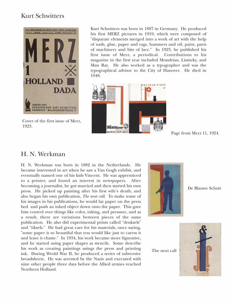
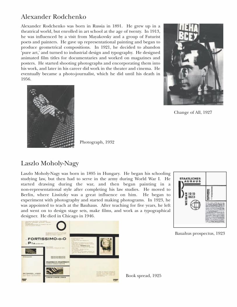
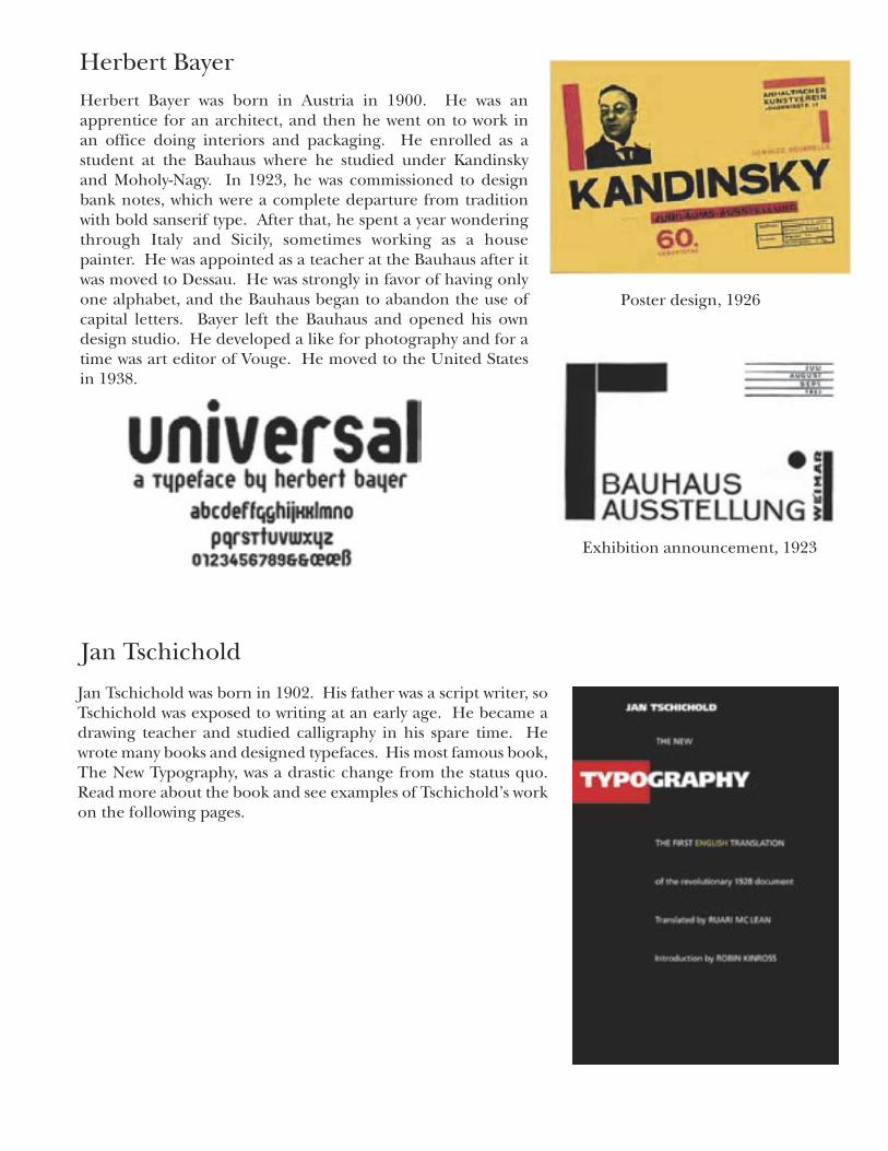
An introduction to typographers.
������������
��������������������������������������������
����������������������������������������
����������������������������������
������������������������������������������������������������������������������������������ ������������ ���� ������������� ��� ��������� � ������ ����������� ��� �������������� ���������� ��� ������������� ��� �������� ���� �������� � ���� ����������� ���������������������������������������������������������������������������������������� ���������� ������ ����� �������������� ������� � ��� ���������� ����� ��� ����������������� �������� �������� ��������� ���� ��������������� � ��� ������ ��� ������������������ ��������� ����� ���� ����������� ���� ����� �������� ��� ������� ��������������������������������������������������������������������������������������������������������������������������������������������������������������������������������� ���� ���������� ����� �������������� � ���� ���������� ��� ���� ������� ���� ������������������������������������������������������������������������������������
������������������������������������������������������������������������������������������������������������������������������������������������������������������������������������������������������������������������������������������������������������������������������ ���� �������� �������� ������ ��� ������ ���������� ������ ���������������������������������������������������������������������������������������������������������������������������������������������
���������������������������� �������������
��������������� ������ ���� ����� ��� ����� ��� ����������� � ��� �������� ����� ������������� ��� ������� ���� �������������������������������������������������������������������������������������������������������������������������������������������������������������������������������������������������������������������������������� ������ ���������� ��� ��� ��������� � ������� ����� ������ ��� ���� ����� ���������� ��������������� ��������������� ��������������� ������������������� � �������������������������������� �����������������������������������������������������������������������������������������������������������������������������������
��������������������������� ������������������������������������������������������
��������������
������������������������������������������������������������������������������������������������������������������������� ������������������������������ ��� ���� �������� ���� ���� ����������� ����� ���� ����� ��������������������������������������������������������������������������������������������������������������������������������������������������������������������������������������������������������������������������� ��������������������������������������������������������������������������������
�������������������������
�����������������
���������������
�������������������������������������������������������������� ������ ����� ��������� ��� ������ ������ ����� ��������� �������������������������������������������������������������������������������������������������������������������������������� ���������� ���� ����� ��� ������� � ��� ������ ��� ���������� ���������� ������ ��� ������ �� ������������ � �������������� ��� ��������������������������������������������������������������������� ����� � ��� ����� ������� ��� �� ������������ ���� ���� ������������������ �������� ��� ���� ����� ��� ��������� � ��� ����� ��������
�������������
��� ��� �������� ���� ����� ��� ����� ��� ���� ������������� � ��������������������������������������������������������������������������������������������������������������������������������� �� ��������� ���� ������ ��� ��������� ��� ������������ � ���������������������������������������������������������������������������� � ��� ������� ��� ��������� ������ ���� ������ ������� ������� ��������������������������������������������������������������������������������������������������������������������������������������������������������������������������������������������������������������������������������������������������������������������� �������� ������ ���� ����������� �������� ������� ��� ���� ��������������������������������������������������������������������������������������������������������������������������������������������������������������������������������������������������������������������������������������������������������������������������������� �������������������� ���������� ���������� ������������������� ����� ��� ��������� ���������� ������� ���� ������ ���� �������������� ���������������������������������������������������������������������� �������������������� �����������������������������������������������������������������������������������������������������������
���������������������������������������
������������������������
����������������
�������������
������������������������������ ���������� ���� ����� ��� ������� ��� ������ � ��� ����� ��� ��� ���������������������������������������������������������������������������������� ���� ����������� ��� �� ������ ����� ����������� ���� �� ������ ��� ���������������������������������������������������������������������������������������� ������������ �������������� � ��� ������ ��� �������� ��� ������������������������������������������������������������������������������������������ ����� ������� ���� �������������� ���� ������� ��� ���������� ��������������������������������������������������������������������������������������������������������������������������������������������������������������� ������� �� ������������������ ������ ��� ���� ������ ���� ������ ����������
����������������
�������������������
���������������������������������������������� �������� ������������ �������������� ������������������� ����� ���� ����� ���� ��� ������ ��� ���� ����� ������� ������ ���� ��� � ����������� �������� ������� ���� ����� ���� ����� ������ ��������� ��� ����������������������� ������ ������ ����������� ���� ���� ��������� � ��� ������ ����������� ������ ���������� ���� �� ������ ���������� ��� ����� � ��� ������ �������������������������������������������������������������� ������������������������������������������������������������������������������������������������ ����� ��� ��� ������� ������ ������ ����� ������� ���� ����� ��� �� ����������������������������������������������������
�����������������
������������������������
��������������������� ������ ���� ����� ��� �������� ��� ������ � ��� ���� �������������� ���������������������������������������������� ������ ������� ������ ���������� ���� ����������� � ��� ��������� ��� ���������� ��� ���� �������� ������ ��� �������� ������ �������������� ������������� � ��� ������ ��� ���� ������������� ��� ������������������������������������������������������������������������������������������������������������������������������������������ ������ ���� �������� ���������� �������� ��� �� ������������������������������������������������������������������������������������������������������������������������������������������������������������������������������������������������������ ��������� � ������ ����� ���� �������� ���� ������� ���� ���������������������������������������������������������������������������������������������������������������������������������������
�������������������
�����������������������������
��������������
��������������������������������������������������������������������������������������������������������������������������������������������� �������� ���� �������� ������������ ��� ���� ������ ������ � ���������������������������������������������������������������������������������������������������������������������������������������������������������������������������������������������������������������������������
The New Typographyby Jan Tschichold, from Germany in 1928
“Anyone who has recognized the deep underlying similarity between typography and architecture and has understood the true nature of the new architecture can no longer doubt that the future will belong to the new typography and not the old,” (13).
Typography is related to architecture
The Old Typography
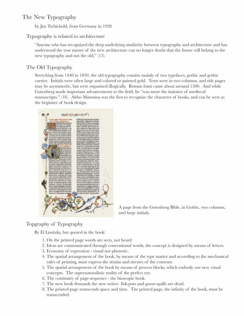
Stretching from 1440 to 1850, the old typography consists mainly of two typefaces, gothic and gothic cursive. Initials were often large and colored or painted gold. Texts were in two columns, and title pages may be asymmetric, but were organized illogically. Roman fonts came about around 1500. And while Gutenberg made important advancements to the field, he “was more the imitator of medieval manuscripts.” (18). Aldus Manutius was the first to recognize the character of books, and can be seen as the beginner of book design.
A page from the Gutenberg Bible, in Gothic, two columns, and large initials.
Topgraphy of Typography
By El Lissitzky, but quoted in the book:
1. On the printed page words are seen, not heard2. Ideas are communicated through conventional words, the concept is designed by means of letters.3. Economy of expression - visual not phonetic.4. The spatial arrangement of the book, by means of the type matter and according to the mechanical rules of printing, must express the strains and stresses of the contents.5. The spatial arrangement of the book by means of process blocks, which embody our new visual concepts. The supernaturalistic reality of the perfect eye.6. The continuity of page-sequence - the bioscopic book.7. The new book demands the new writer. Ink-pots and goose-quills are dead.8. The printed page transcends space and time. The printed page, the infinity of the book, must be transcended.
Principles of the New Typography
Function
The old typography was less concerned with function and more concerned with art. Readers in the past read line by line, but now people don’t have time. If the goal of the material is to gain attention, the typography must serve this purpose. Designers can’t continue to repeat what has been done before: “the succession of historic styles...are nothing but proof of creative incompetence,” (65).
Clarity
Asymmetry
No ornaments for the sake of being ornamental
White Space
Color
Type
The aim of typography is not beauty. Clarity is essential due to the increased demands for a viewer’s attention.It is worth it to study how things are read, and important to anticipate how your work will be read.
In the old typography, the vast majority of printed materials were done using a central axis. “We believe it is wrong to arrange a text as if there were some focal point in the centre of a line which would justify such an arrangement...Axial arrangements are illogical because the distance of the stressed, central parts from the begininng and end of the word sequences is not usually equal but constantly varies from line to line,” (66).
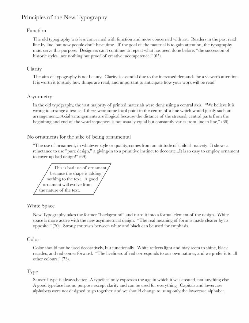
“The use of ornament, in whatever style or quality, comes from an attitude of childish naivety. It shows a reluctance to use ”pure design,” a giving-in to a primitive instinct to decorate...It is so easy to employ ornament to cover up bad design!” (69).
This is bad use of ornament because the shape is adding
nothing to the text. A good ornament will evolve from
the nature of the text.
New Typography takes the former “background” and turns it into a formal element of the design. White space is more active with the new asymmetrical design. “The real meaning of form is made clearer by its opposite,” (70). Strong contrasts between white and black can be used for emphasis.
Color should not be used decoratively, but functionally. White reflects light and may seem to shine, blackrecedes, and red comes forward. “The liveliness of red corresponds to our own natures, and we prefer it to allother colours,” (73).
Sanserif type is always better. A typeface only expresses the age in which it was created, not anything else. A good typeface has no purpose except clarity and can be used for everything. Capitals and lowercasealphabets were not designed to go together, and we should change to using only the lowercase alphabet.
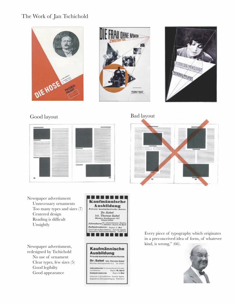
The Work of Jan Tschichold
Every piece of typography which originates in a preconceived idea of form, of whatever kind, is wrong,” (66).
Good layout Bad layout
Newspaper advertisment Unnecessary ornaments Too many types and sizes (7) Centered design Reading is difficult Unsightly
Newspaper advertisment, redesigned by Tschichold No use of ornament Clear types, few sizes (5) Good legibilty Good appearance
���������
��� ������������ ������� ������������ �������� �������� � ������������ ���� ����������� ��� ������������� ������ ���������������� ���� ���� ����� ����������������� ��� ������������ ��������� �� ��������� ��������� ����������� ��������� � ��� ���� ������������������������������������������������ ��� ���� ��������� ������������ ���� ����� ������ ����������� � ��� ���� �������� ������������������������������������������������ ���� �������������� � ���������������������������������������������������
������������
��������������������������������������������������������������������������������������������� ��� ����� ���� ��������� � ��� ���� ���������� ����� ����������� ������ ������������������������������������������������������������� ������������������������������������������������������������������������
����� ������������ ����� �������� ��� ��� ��� ���� ������ ��������� ����� ���� ���� ����� ������������� ������ ��� �������������� ��� �� ������ ���� ������������� �� ��������� ��������������� ����������� ��� ���������� ��� �����������������������
����� ��� ���������� ���������� ��� ���������� ������������� ����� ��� ���� ��������������� ������ ���� ������ ������� � ������������ ���� ��������� ������ ����������������� ���� ���� ��������� ��� �������������� � ��� ����� ������� ��� ����������������� ��������� ���� ���� ������������������� ��������� ������������������������� ������������ �� �� ���� � ��������� ������ ������������� �������������������������������������
�������������
������������������������������������������������������������������������������������������������������������������� ��� ���� �������� ���� ����� �������� ������� �������� ����� �������������� �������� ������� ��������������� � ���� ��������� ��� ����������� ��� ���� ����� ��������� ����� ��� ���������� ������ ��� ����� ���� ������������������������������������������������������������������
�� ���������������������� ���� ����� ��� ���������������� ���� ���������� � ��� ���� ���� ��� ������������� ��� ���� �������� ��������� ����������� ���� ���� ������� ������ ��� ������ � ��������� ������� ����� ����� �������� ��� �������������� ��� ��������� �������������� ��� ��������������� ���� �������� � ��� ����� ��������������������������������������
�����������
������ ����������� ��� ���� ������� ������ ���������� � ���� ����������� ��������������������������������������������������� ��� ��������� ����������������� �������� ���� ������������������ �������� �������� ������������ ���� �����������������������������������������
�� ��������� ���������� ��� ����� ������� ��� ����������� ����������������������� ���� ������� � ��� ���� ����� ���������� ���� �������� ������������ ������ ���� �������� ������ ���� ��� �������� ������������� ���������� ������ ���� �� ������� ����������� ��� �������������
�������������
������������������������������������������������������������������������������������������������������������������������������������������������������������������� ����� ������� ��� ���� ������ ����������� ��� ����� ��� ������ ����� ������� ������� ���� ������� ��� ����� ��� ���������������������������������
����������������������������������������������������������������� �������� ����������� ����� ���������� ��������� ����� ������������������������������������������������������������������������������������������������������������������������
�����������������������������������
��������������������������
������������������������
����������������������
�������������������
The information contained in this book came from the following sources, as well as various webpages (mostly the information about the computer stuff and biographical info about the designers).
The New Typorgraphyby Jan TschicholdUniversity of California Press, Berkeley, 1995.
Legibility of Printby Miles A. TinkerIowa State University Press, Ames, 1963.
Designing with Typeby James CraigWaston-Guptill Publications, New York, 1992.
The Elements of Typographic Styleby Robert BringhurstHartley&Marks, Point Roberts, WA, 2001.
Pioneers of Modern Typographyby Herbert SpencerThe MIT Press, Cambridge, 2004.
Typography 21; The Annual of the Type Directors ClubEdited by Susan Cotler-BlockHarperCollins Publishes, New York, 2000.
Graphis Typography 1Edited by Martin PedersenGraphis Press Corp., Zurich, 1994.
References