issue fall artist newsletter 13 4 2015 real · make something real also in this issue artist...
TRANSCRIPT

makesomething
real
ALSO IN THIS ISSUE
ARTIST NEWSLETTER 13VOLUME
4ISSUE
2015FALL
After hanging out in life drawing studios drawing and teaching, a few common themes have emerged. Here is a list of the top 10 mistakes beginners make when life drawing, with suggestions on how to improve. 1. Sitting in the wrong spot: If you are not directly facing the model (like exactly), and are sitting too close or far - you are setting up to fail before the drawing begins. Proper orientation to the model is the easiest thing you can do to improve your life drawing. Rotate your work to directly face the model. Exactly straight on, not off to one side, not even a little. If you sit on a bench the model should be seen directly over your work. If you are standing at an easel, the model should appear directly to the side.
The proper distance from the artist to the model is achieved when the model appears to be the same size, or slightly smaller, than the drawing surface. Back up or move closer to make that happen. The artist is at the correct distance from their artwork when at arms length (not hunched over). Hold your arm out fully so you can draw with your arm and see the work entirely. Make small adjustments for each new pose, don’t move the work or your head position during the pose. 2. Drawing too small (aka tiny drawings): A figure drawing the size of your hand is the primary symptom of the life drawing beginner. Drawing tiny figures hide mistakes, (and isn’t fooling the instructor). Drawing figures at a larger size reveals the issues hidden in a small drawing, like
continued
MAIN FEATURE
Top Ten Life Drawing Mistakesby Graham Smith
Make Something STAND OUT!
Black is the new black-more-
Catalog CoverContest Winners
See the winner and runners up of
our 2016 Catalog cover art contest. -more-
“Learning to ‘see’ is the goal of life drawing...”
Questions from our WebsiteWhat is Bristol and what is the
difference between a Smooth
and Vellum finish? -more-
Did you Know?We have dozens of art instruction
videos on our YouTube Channel?
makesomething
realARTIST NEWSLETTER
A division of Pacon Corporation® and ™ used under license from Mohawk Fine Papers Inc.www.strathmoreartist.com
13VOLUME
4ISSUE
2015FALL
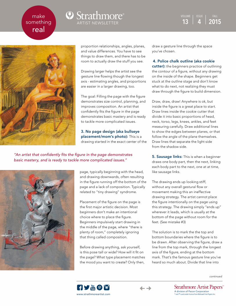
proportion relationships, angles, planes, and value differences. You have to see things to draw them, and there has to be room to actually draw the stuff you see. Drawing larger helps the artist see the gesture line flowing though the longest axis - estimating angles, and proportions are easier in a larger drawing, too. The goal: Filling the page with the figure demonstrates size control, planning, and improves composition. An artist that confidently fits the figure in the page demonstrates basic mastery and is ready to tackle more complicated issues. 3. No page design (aka bullseye placement/mom’s photo): This is a drawing started in the exact center of the
page, typically beginning with the head, and drawing downwards, often resulting in the figure running off the bottom of the page and a lack of composition. Typically related to “tiny drawing” syndrome. Placement of the figure on the page is the first major artistic decision. Most beginners don’t make an intentional choice where to place the figure. Beginners impulsively start drawing in the middle of the page, where “there is plenty of room,” completely ignoring that thing called composition. Before drawing anything, ask yourself, is this pose tall or wide? How will it fit on the page? What type placement matches the mood you want to create? Only then,
draw a gesture line through the space you’ve chosen.
4. Police chalk outline (aka cookie cutter): the beginners practice of outlining the contour of a figure, without any drawing on the inside of the shape. Beginners get stuck at the outline stage and don’t know what to do next, not realizing they must draw through the figure to build dimension. Draw, draw, draw! Anywhere is ok, but inside the figure is a great place to start. Draw lines inside the cookie cutter that divide it into basic proportions of head, neck, torso, legs, knees, ankles, and feet measuring carefully. Draw additional lines to show the edges between planes, or that follow the angle of the plane themselves. Draw lines that separate the light side from the shadow side. 5. Sausage links: This is when a beginner draws one body part, then the next, linking each body part to the next, one at at time, like sausage links. The drawing ends up looking stiff, without any overall gestural flow or movement making this an ineffective drawing strategy. The artist cannot place the figure intentionally on the page using this strategy. The drawing simply “ends up” wherever it leads, which is usually at the bottom of the page without room for the feet. (See mistake #3) The solution is to mark the the top and bottom boundaries where the figure is to be drawn. After observing the figure, draw a line from the top mark, through the longest axis of the figure, ending at the bottom mark. That’s the famous gesture line you’ve heard so much about. Divide that line into
“An artist that confidently fits the figure in the page demonstrates basic mastery, and is ready to tackle more complicated issues.”
continued
makesomething
realARTIST NEWSLETTER
A division of Pacon Corporation® and ™ used under license from Mohawk Fine Papers Inc.www.strathmoreartist.com
13VOLUME
4ISSUE
2015FALL
proportions of legs, torso head, thus ensuring the figure will fit in the space selected.
6. Drawing symbols (aka drawing whatyou think instead of what you see):The beginner often draws a predetermined ideal, “a symbol” they’ve learned to represent a body part, instead of observing nature, noting shape, angle, value, and proportions, then recreating those observed metrics.
Beginners believe a symbol for each body part exists, and once they are all memorized, the student “knows how to draw”. Not true. Beginners also confuse symbols with anatomy saying
to themselves, “I gotta learn more anatomy” thinking memorizing muscle and bone names will provide the ability
to draw realistically. Observation is the key. Without proper observation, you may know names of the muscles, yet struggle with drawing them. Seeing the model reveals all the answers. And learning to “see” is the point of life drawing.
Measure proportions using a stick, estimate angles using the clock, determine values, and simplify geometries. These skills can be learned by anyone. That is why they are important.
Learning to “see” is the goal of life drawing, learning to more completely understand what you are looking at. Life drawing practice trains your mind to see underlying geometry, how to measure angles accurately, determine which areas are lighter, or darker than the areas next to it, which things are bigger, or more important. These observation skills enable
the beginner to progress from symbolic, to observational drawing.
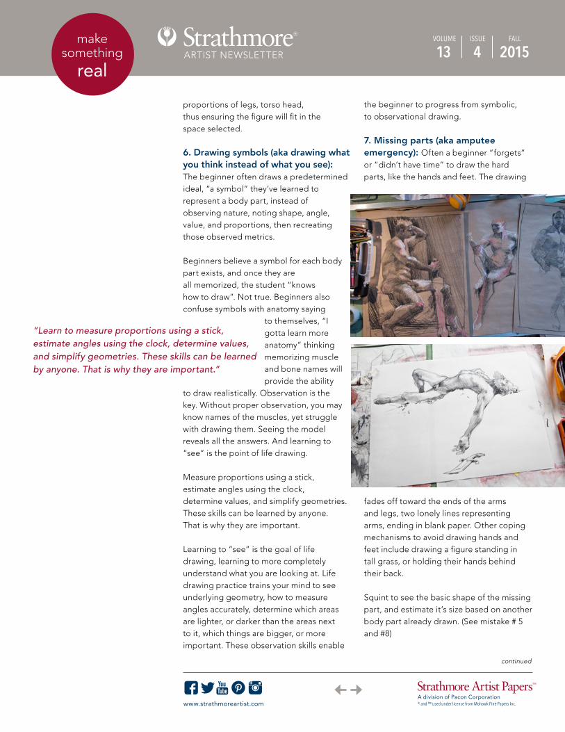
7. Missing parts (aka amputeeemergency): Often a beginner “forgets”or “didn’t have time” to draw the hard parts, like the hands and feet. The drawing
fades off toward the ends of the arms and legs, two lonely lines representing arms, ending in blank paper. Other coping mechanisms to avoid drawing hands and feet include drawing a figure standing in tall grass, or holding their hands behind their back.
Squint to see the basic shape of the missing part, and estimate it’s size based on another body part already drawn. (See mistake # 5 and #8)
“Learn to measure proportions using a stick, estimate angles using the clock, determine values, and simplify geometries. These skills can be learned by anyone. That is why they are important.”
continued

makesomething
realARTIST NEWSLETTER
A division of Pacon Corporation® and ™ used under license from Mohawk Fine Papers Inc.www.strathmoreartist.com
13VOLUME
4ISSUE
2015FALL
8. Tennis racket head (aka fryingpan face): This is what instructors call theblank oval a beginner draws instead of the head and face.
Treat the head, or any missing body part, like everything else, and block in the shapes and values from the largest things to the smallest. Estimate the size of the missing part based on another body part that has already been drawn.
One simple way to estimate the size of the head, once the body is sketched, is to measure the distance from the bottom of the pectorals up to the bottom of where the chin should be. That distance will be similar to the head size. Add that distance upwards from the chin to estimate where the top of the head is supposed to be. Draw an oval or egg shape between those 2 measurements.
When an instructor sees tennis racket face, we know the artist is fearful and struggling to reconcile symbolic
drawing with what they see. Use basic measurement tools such as measuring stick, or measuring angles using hands of a clock metaphor.
9. Detail crazy (aka only fools rush in):The strategy of drawing details, before roughing in large masses is a common mistake often related to the “sausage links” drawing style. This misconception equates more detail with greater realism, when in fact, more detail makes a drawing appear busy and unfocused.
Squint your eyes to see only the major value blocks and to eliminate details. Finesse the proportions of the major elements first. Proportion and value are the first steps toward adding realism. Details are saved for last and are the sparkling jewels of your composition.
10. The feathered edge (aka furry line):This is when a beginner “shades in” one side of a shape with a small, wispy, feathered edge on one side of a figure. This is a beginners first step in attempting shading.
“Proportion and value are the first steps toward adding realism. Details are saved for last and are the sparkling jewels of your composition.”
continued

makesomething
realARTIST NEWSLETTER
A division of Pacon Corporation® and ™ used under license from Mohawk Fine Papers Inc.www.strathmoreartist.com
13VOLUME
4ISSUE
2015FALL
To improve, fill each area with one of 4 basic values: white, light grey, dark grey, or black. The goal is to block in values over the entire page, indicate the lighting direction, define the geometry, and set the mood. Each shape will contain 1 of the 4 values. Each shape will be lighter, darker, or the same value as the shape next to it - including the background. Keep adjusting the values and shapes until they are organized logically and give the effect desired.
ABOUT THE ARTIST Graham Smith is an illustrator with well over 20 years experience creating images for national clients in publishing, fashion, advertising, packaging, and film. Clients include: Blue Moon Brewing Company, Boston Globe, Worth Magazine, Sony, General Mills, Levi Strauss and Co, Saatchi and Saatchi, Integer, and Trinity.
WANT MORE?See Graham's new video “Confessions of a Paper Junkie.” You can also see more of Graham’s work on his website and blog. See additional videos from Graham on his Vimeo channel.
All images of Graham Smith's artwork appearing in this article are the property of Graham Smith. They are not to be reproduced in any way without the written permission of Graham Smith. Copyright 2015 Graham Smith. All Rights Reserved.

ARTIST NEWSLETTER VOLUME 13 | ISSUE 4 | FALL 2015
A division of Pacon Corporation® and ™ used under license from Mohawk Fine Papers Inc.A division of Pacon Corporation® and ™ used under license from Mohawk Fine Papers Inc.
artwork by Bonnie Martelli
www.strathmoreartist.com
BLACKis the newBLACKmake something stand out
Creating art on black paper is a fresh and inspiring way to create artwork that stands out. A wide range of mediums including gel pens, white charcoal, pastel, colored pencils, metallic inks, paint markers, and other types of light media can be used on black paper to achieve a unique, bold effect. We’ve got you covered with our broad range of products containing our rich, coal black paper.
NEW LOOK!
NEWSIZE!
WIREBOUND JOURNALS with black drawing paper
7" x 10"
COAL BLACK CARDS with coordinating envelopes
5" x 6.875"
ARTIST TILES with Strathmore Artagain® paper
4" x 4" • 6" x 6"
STRATHMORE ARTAGAIN®
black pads6" x 9" • 9" x 12" • 12" x 18"
NEW!

ARTIST NEWSLETTER VOLUME 13 | ISSUE 4 | FALL 2015
A division of Pacon Corporation® and ™ used under license from Mohawk Fine Papers Inc.www.strathmoreartist.com
We want to thank everyone who submitted artwork for our 2016 Product Catalog Cover. There was an INCREDIBLE amount of beautiful artwork that came in and we loved and appreciated seeing everybody’s submissions!
Congratulations to artist Olga Levitskiy whose artwork was selected for the cover of our 2016 Product Catalog! Olga’s piece is titled “Make Something Authentic” and was created using charcoal pencils on our 500 Series Storm Gray Charcoal Paper. Olga is a freelance Illustrator based in New Jersey. See more of her artwork on her website.
A big congratulation also goes to our 4 runner-ups:
Dorrie Rifkin: “Make Something Streetwise – Ducks”Watercolor on our 500 Series Illustration Board for Wet Media.
Jesse Lane: “Make Something Emotional – Resolve” Colored pencils on our 400 Series Bristol Vellum paper.
Jessica Padilla: “Make Something Messy” Pastel on our 400 Series Artagain Black paper.
Erik Davis: “Make Something Daily” Watercolor and drawing pens on our 400 Series Watercolor paper.
2016 Catalog Cover Contest Winners
Make Something Authentic - Olga Levitskiy
Make Something Emotional – Resolve- Jesse Lane
Make Something Messy-Jessica Padilla
Make Something Daily- Erik Davis
Make Something Streetwise – Ducks-Dorrie Rifkin

makesomething
realARTIST NEWSLETTER
A division of Pacon Corporation® and ™ used under license from Mohawk Fine Papers Inc.www.strathmoreartist.com
13VOLUME
4ISSUE
2015FALL
QUESTIONS FROM OUR WEBSITE:
What is Bristol and what are the differences between Smooth and Vellum finishes?
Bristol generally describes a drawing paper that is pasted to form multi-ply sheets. Bristol sheets provide a stiff, strong surface to work on without the need for mounting. The term Bristol derives from the early days of European papermaking when mills would send their finest papers to Bristol, England to be pasted together. Bristol papers generally have two types of surfaces: smooth and vellum.
Smooth and Vellum are each best suited for a specific set of media: Smooth surfaces are great for pen & ink, mechanical pencil, airbrush, and markers. There is little to no tooth, making these surfaces great for creating fine lines, detail drawings, or marker drawings.
Vellum surfaces are great for graphite, colored pencil, charcoal, pastel, and crayon. The surface has peaks and valleys which grab dry media such as graphite. More even shading and deeper tones can be achieved on a vellum surface.
We’ve created a short video to help demonstrate the difference between smooth and vellum surfaces:v
Our Bristol Smooth and Vellum papers are available in sheets, rolls, and various
pad sizes. Visit our website and learn more about all the types of Bristol papers we offer.