invisible narratives: how to easily and effectively turn data into stories
DESCRIPTION
Justin Malecki gave this presentation on using data to tell your story at Toronto Net Tuesday in April 2012. You can find a full recap of the event here: http://www.techsoupcanada.ca/community/events/toronto_net_tuesday/data_visualizationTRANSCRIPT

Invisible Narratives:How to easily and effectively
turn data into stories
Justin Malecki, PhDAnalyst/Physicist
April 17, 2012
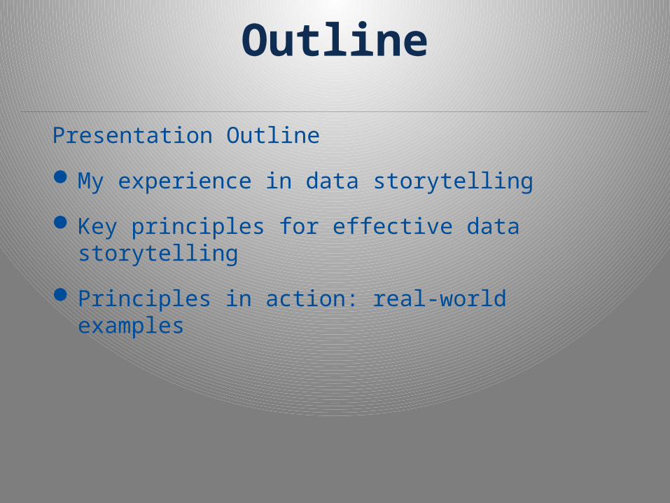
Outline
Presentation Outline
My experience in data storytelling
Key principles for effective data storytelling
Principles in action: real-world examples

Outcomes
By the end of this presentation, you will…
Have seen several varied examples of effective data presentation using simple Microsoft Excel/Word tools
Have been introduced to several general principles to help guide you through your own data presentation needs
Be more prepared and confident to effectively tell the stories that are hidden in your data

Provisos
I’m not a designer
My graphs aren’t very sexy
My approach is old school
My graphs are not interactive
I’ve never been formally trained for this
My approach is very utilitarian: what do I need to do to effectively tell my stories, nothing more.
Background & ExperienceCosmology

Background & Experience
Computational Physics

Background & Experience
ClearSky Advisors
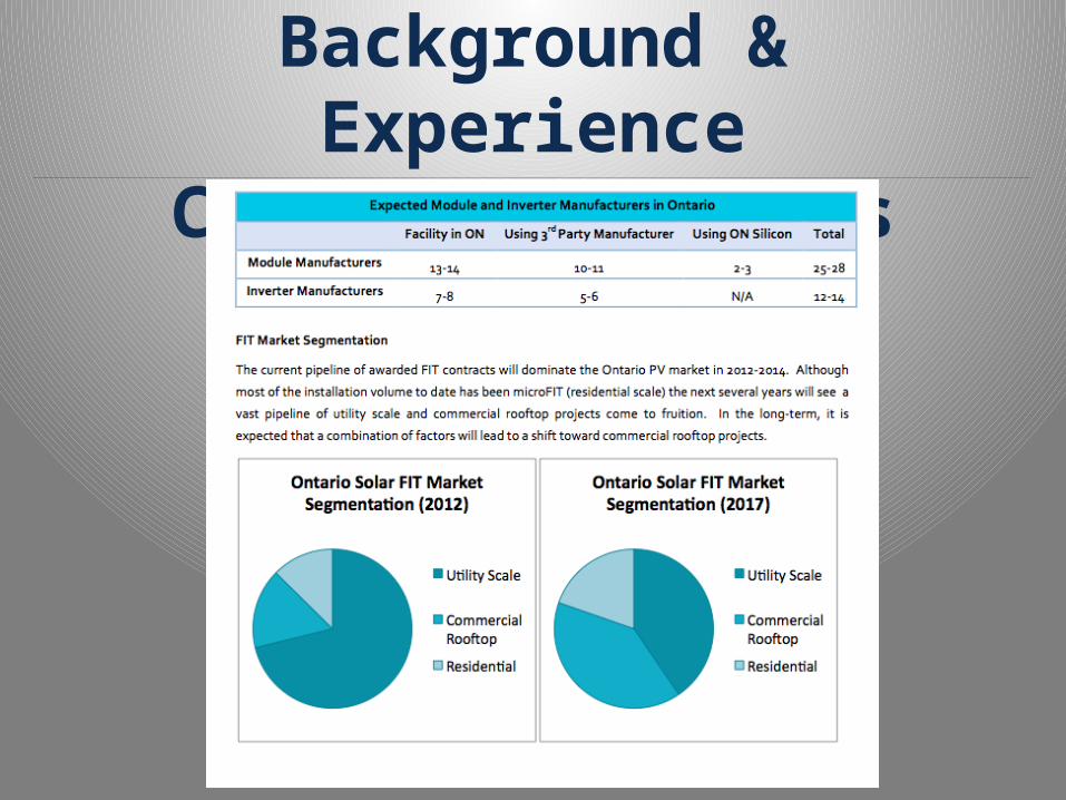
Background & Experience
ClearSky Advisors

Key Principles in Effective Data StorytellingKnow your audience
o Who is your audience?o How will they read/interact with your story?o How much data do they really need?
Know the story/stories you want to tello What are the key points you want to convey?o What data will you need to tell that story?o Know this before preparing data for presentation

Key Principles in Effective Data StorytellingHave your graphics independently tell your
storyo Is your message conveyed through the graph
alone?o Will your audience need to read the text in order
to understand the graphs?
Only include that which adds to your storyo Have you included non sequitur data in your
graphs?o Are there any elements of your graphs that
distract the reader from the story?o Of each element (e.g. graph type, shapes, colors,
textures), ask “Does this help tell my story?”

Example 1: Blog ArticleKnow your audience
Who is your audience?o Wide range of people working/interested in solar industry
How will they read/interact with your story?o Casual, quick reading
How much data do they really need?o Not much at all
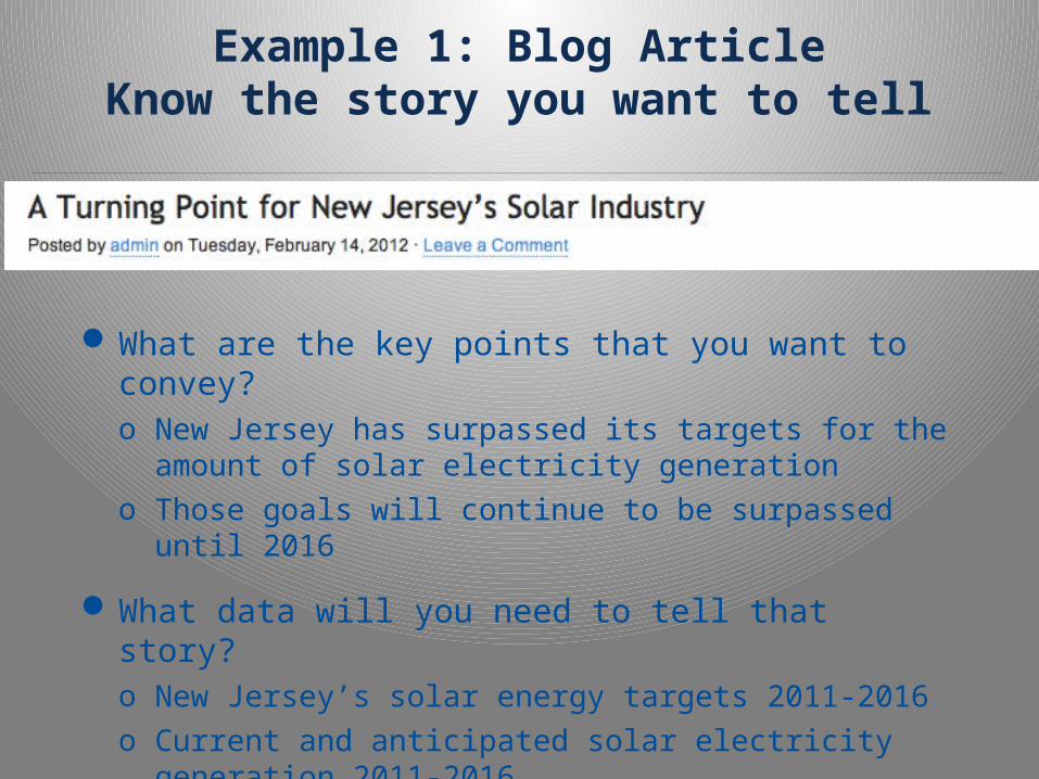
Example 1: Blog ArticleKnow the story you want to tell
What are the key points that you want to convey?o New Jersey has surpassed its targets for the
amount of solar electricity generationo Those goals will continue to be surpassed until
2016
What data will you need to tell that story?o New Jersey’s solar energy targets 2011-2016o Current and anticipated solar electricity
generation 2011-2016

Example 1: Blog ArticleHave your graphics independently tell
your story

Example 1: Blog ArticleHave your graphics independently tell
your story
Is your message conveyed through the graph alone?o I think so, at least for the intended audience of solar workers
Does the reader have to read the text to understand the graph?o Only a little (What’s an “energy year”?)

Example 1: Blog ArticleOnly include that which adds to your
story
Have you included non sequitur data in your graphs?
Are there any distracting elements?
Of each element, ask “Does this help tell my story”?

16
Example 2: Solar Module Distribution
Know your audienceWho is your intended audience?
o One client wanting to know details of how solar modules (panels) are being distributed through the Ontario supply chain
How will they read/interact with your story?o Directly and with great detailo For use in presentation to head office
How much data do they really need?o As much as possible

17
Example 2: Solar Module Distribution
Know the story you want to tellWhat are the key points that you want to
convey?o How many modules are being manufactured and
soldo Through what channels are they reaching the end
customer
What data will you need to tell that story?o The numbers, all of them

Example 2: Solar Module DistributionHave your graphics independently tell
your story
18
Net Supply Serving Ontario
XXX MW
Distributors, Brokers, Dealers
Installers/EPCs
Developers/EPCs
MicroFIT
40% DC: XX MW 60% DC: XX MW
CAE FIT
50% DC: X MW60% DC: XX MW
Utility-Scale (RESOP)
YYY MW
Manufacturers Distribution Channel End Market
YY*
YY*
YYY
YY*
YY*
YYY
YY*

Example 2: Solar Module DistributionOnly include that which adds to your
story
Is your message conveyed through the graph alone?o Yes
Does the reader have to read the text to understand the graph?o No. The only text provided described methodology.

Example 2: Solar Module DistributionHave your graphics independently tell
your story
Have you included non sequitur data in your graphs?
Are there any distracting elements?
Of each element, ask “Does this help tell my story”?

Summary
4 Key Principles
Know your audience
Know the story/stories you want to tell
Have your graphics independently tell your story
Only include that which adds to your story