introduction to excel 2007 bar graphs & histograms psych 209 february 1st, 2011
TRANSCRIPT

Introduction to Excel 2007Bar Graphs & Histograms
Psych 209February 1st, 2011
Bar Graphs and Histograms
Although they may look similar, bar graphs and histograms differ in several important ways:
1. The types of information they convey
2. The x-axis
3. The y-axis
Bar Graphs and Histograms
Let’s say Instructors 1 and 2 both teach the same Psych class. You are trying to decide which instructor to take the class from (based on the grades they gave last quarter).
First, you take a look at a bar graph…
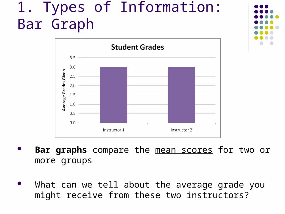
1. Types of Information: Bar Graph
Bar graphs compare the mean scores for two or more groups
What can we tell about the average grade you might receive from these two instructors?
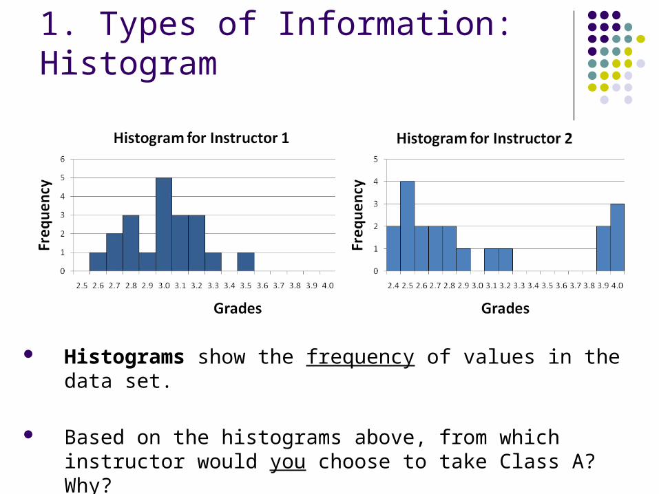
1. Types of Information: Histogram
Histograms show the frequency of values in the data set.
Based on the histograms above, from which instructor would you choose to take Class A? Why?
2. The x-axis
The x-axis of a histogram includes the range of possible scores in the data set. In our example, students received grades ranging from 2.4 to 4.0, so the x-axis includes this range of values.
- NOTE: Even though Instructor 2 gave no grades of 3.0, 3.3, etc., ALL consecutive values between 2.4 and 4.0 are included
The x-axis of a bar graph simply identifies the levels of the independent variable (i.e., the groups you wish to compare: Instructor 1 and Instructor 2).
3. The y-axis
In this course, we always label the y-axis of a histogram as “Frequency,” since it represents a count of how frequently each value appears in the data set.
- NOTE: The values on the y-axis of a histogram must always be consecutive whole numbers
The y-axis of a bar graph always represents values of the dependent variable and must be labeled as such. Since these values are means, the y-axis on a bar graph can include decimal values.
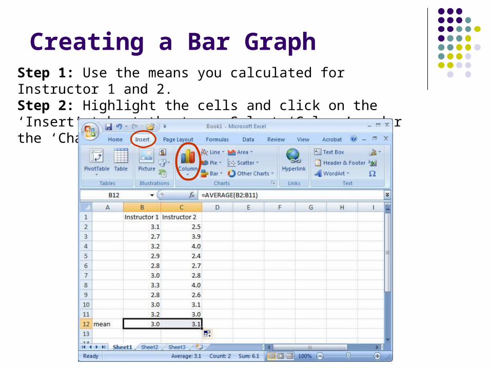
Creating a Bar GraphStep 1: Use the means you calculated for Instructor 1 and 2.Step 2: Highlight the cells and click on the ‘Insert’ tab at the top. Select ‘Column’ under the ‘Charts’ menu.
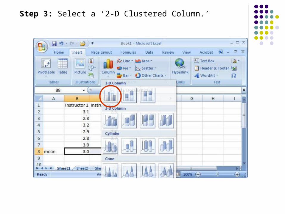
Step 3: Select a ‘2-D Clustered Column.’
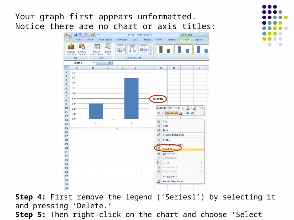
Your graph first appears unformatted. Notice there are no chart or axis titles:
Step 4: First remove the legend (‘Series1’) by selecting it and pressing ‘Delete.’Step 5: Then right-click on the chart and choose ‘Select Data’ from the menu.
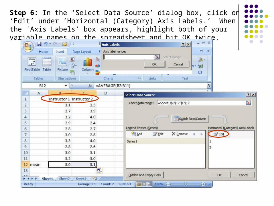
Step 6: In the ‘Select Data Source’ dialog box, click on ‘Edit’ under ‘Horizontal (Category) Axis Labels.’ When the ‘Axis Labels’ box appears, highlight both of your variable names on the spreadsheet and hit OK twice.
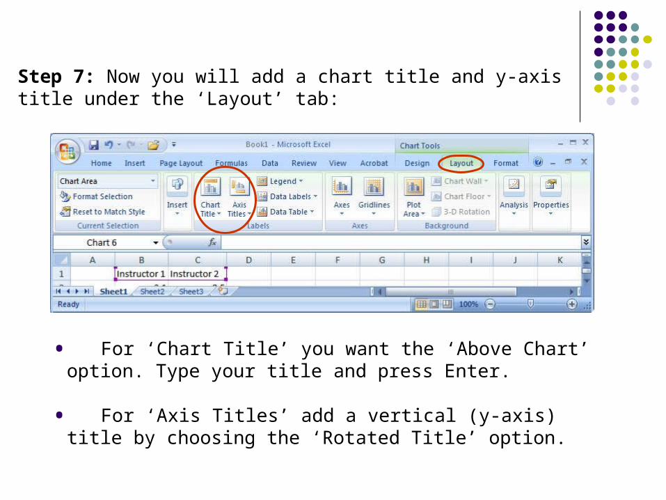
Step 7: Now you will add a chart title and y-axis title under the ‘Layout’ tab:
• For ‘Chart Title’ you want the ‘Above Chart’ option. Type your title and press Enter.
• For ‘Axis Titles’ add a vertical (y-axis) title by choosing the ‘Rotated Title’ option.
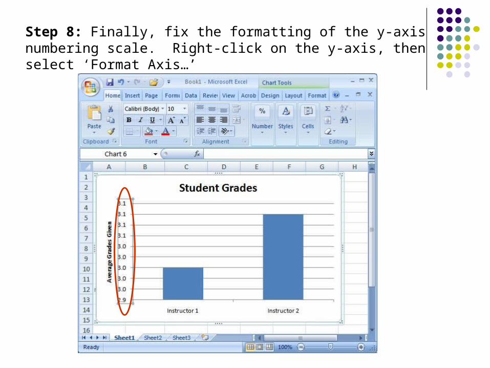
Step 8: Finally, fix the formatting of the y-axis numbering scale. Right-click on the y-axis, then select ‘Format Axis…’
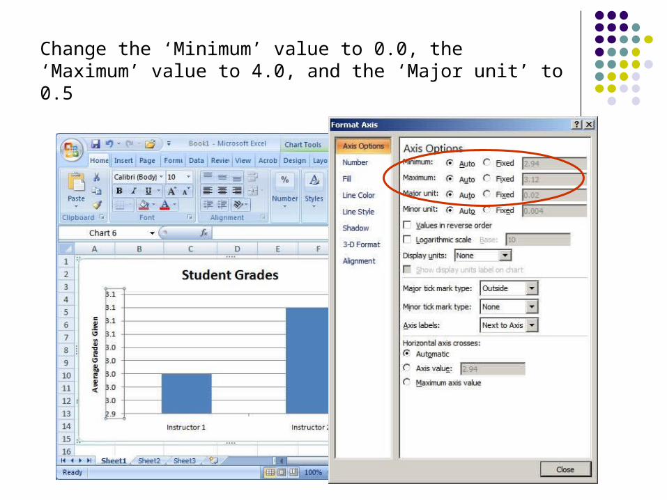
Change the ‘Minimum’ value to 0.0, the ‘Maximum’ value to 4.0, and the ‘Major unit’ to 0.5
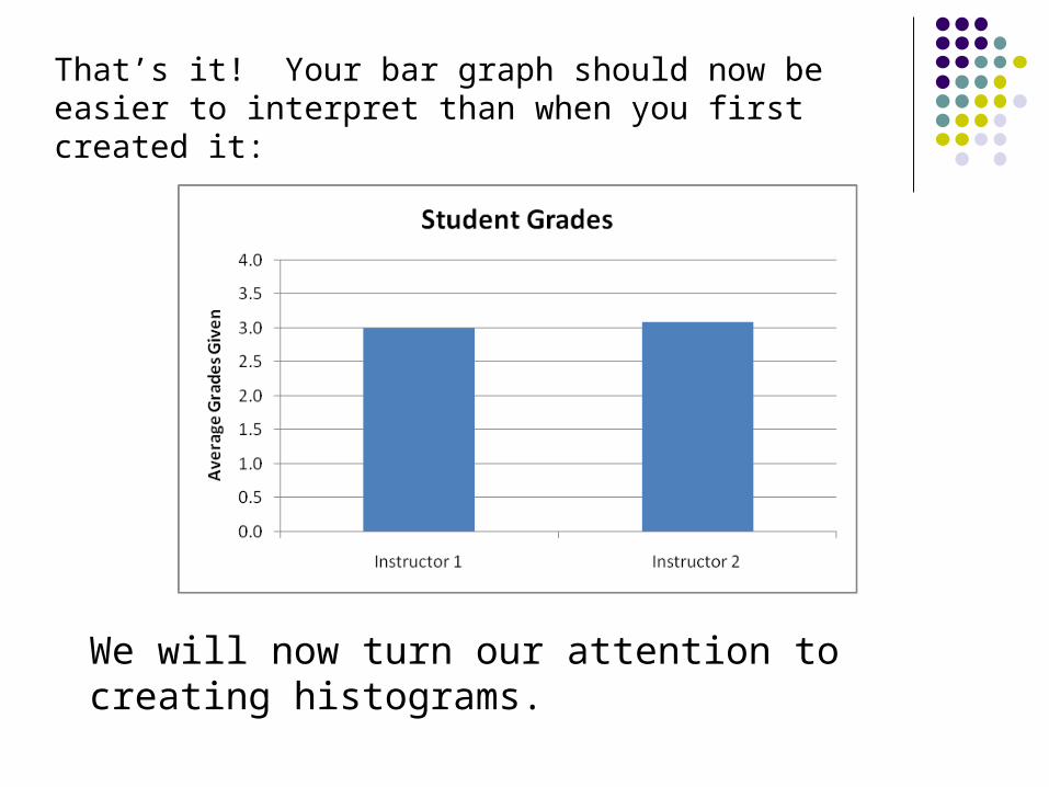
That’s it! Your bar graph should now be easier to interpret than when you first created it:
We will now turn our attention to creating histograms.
Creating a Histogram
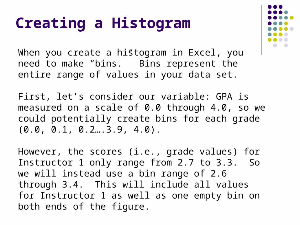
When you create a histogram in Excel, you need to make “bins.” Bins represent the entire range of values in your data set.
First, let’s consider our variable: GPA is measured on a scale of 0.0 through 4.0, so we could potentially create bins for each grade (0.0, 0.1, 0.2….3.9, 4.0).
However, the scores (i.e., grade values) for Instructor 1 only range from 2.7 to 3.3. So we will instead use a bin range of 2.6 through 3.4. This will include all values for Instructor 1 as well as one empty bin on both ends of the figure.
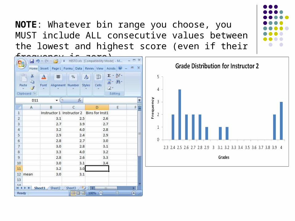
NOTE: Whatever bin range you choose, you MUST include ALL consecutive values between the lowest and highest score (even if their frequency is zero).
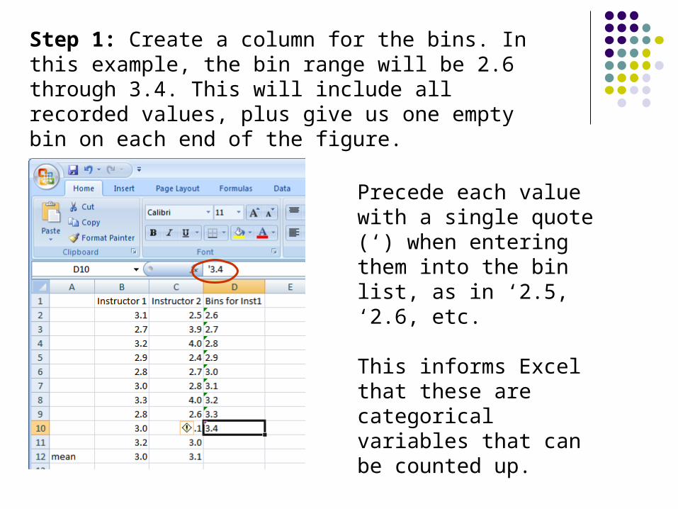
Step 1: Create a column for the bins. In this example, the bin range will be 2.6 through 3.4. This will include all recorded values, plus give us one empty bin on each end of the figure.
Precede each value with a single quote (‘) when entering them into the bin list, as in ‘2.5, ‘2.6, etc.
This informs Excel that these are categorical variables that can be counted up.
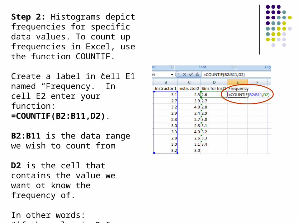
Step 2: Histograms depict frequencies for specific data values. To count up frequencies in Excel, use the function COUNTIF.
Create a label in cell E1 named “Frequency.” In cell E2 enter your function: =COUNTIF(B2:B11,D2).
B2:B11 is the data range we wish to count from
D2 is the cell that contains the value we want ot know the frequency of.
In other words: “if the value is 2.6, then count all occurrences of 2.6 in the list of grades for Instructor 1”
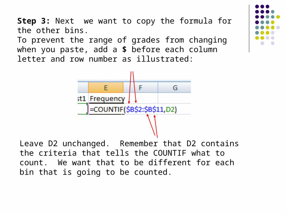
Step 3: Next we want to copy the formula for the other bins. To prevent the range of grades from changing when you paste, add a $ before each column letter and row number as illustrated:
Leave D2 unchanged. Remember that D2 contains the criteria that tells the COUNTIF what to count. We want that to be different for each bin that is going to be counted.
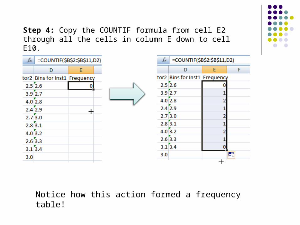
Step 4: Copy the COUNTIF formula from cell E2 through all the cells in column E down to cell E10.
Notice how this action formed a frequency table!
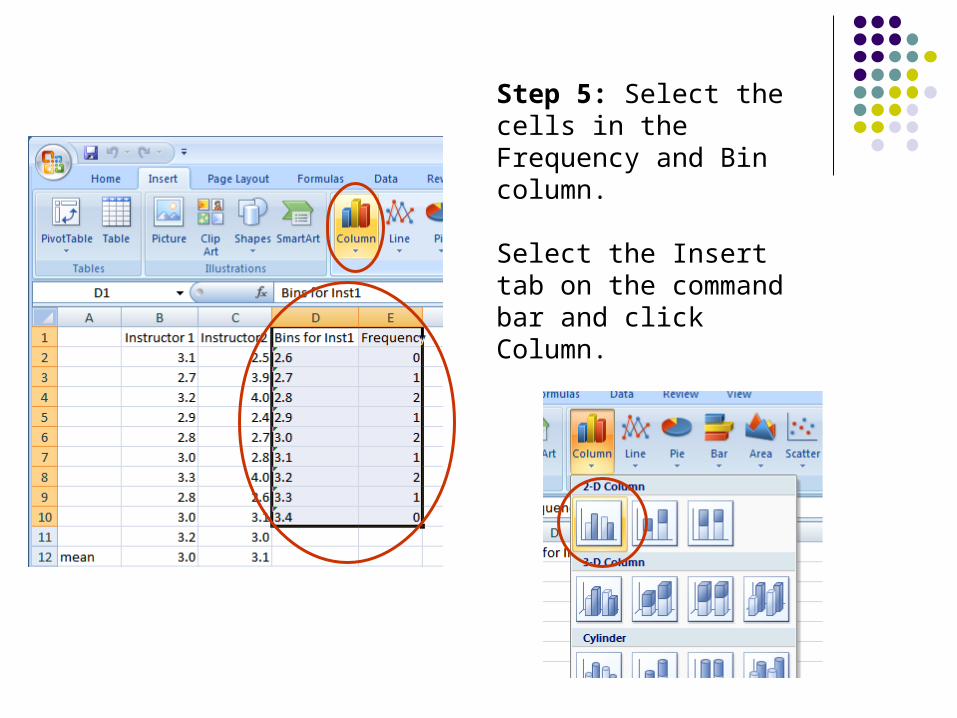
Step 5: Select the cells in the Frequency and Bin column.
Select the Insert tab on the command bar and click Column.
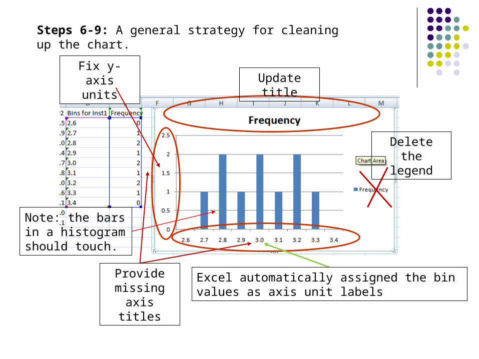
Steps 6-9: A general strategy for cleaning up the chart.
Update title
Delete the legend
Provide missing axis
titles
Fix y-axis units
Excel automatically assigned the bin values as axis unit labels
Note: the bars in a histogram should touch.
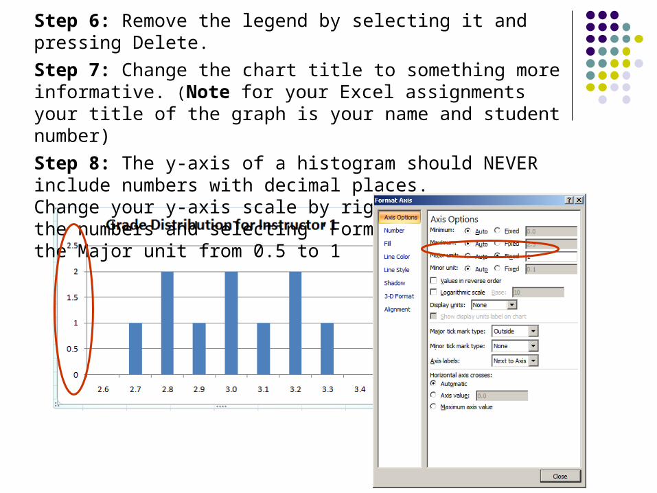
Step 6: Remove the legend by selecting it and pressing Delete.
Step 7: Change the chart title to something more informative. (Note for your Excel assignments your title of the graph is your name and student number)
Step 8: The y-axis of a histogram should NEVER include numbers with decimal places. Change your y-axis scale by right-clicking on the numbers and selecting ‘Format Axis…’ Change the Major unit from 0.5 to 1
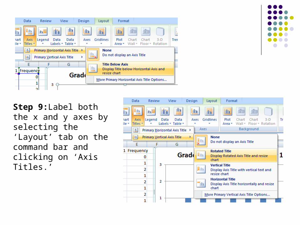
Step 9:Label both the x and y axes by selecting the ‘Layout’ tab on the command bar and clicking on ‘Axis Titles.’
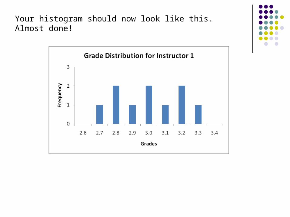
Your histogram should now look like this. Almost done!
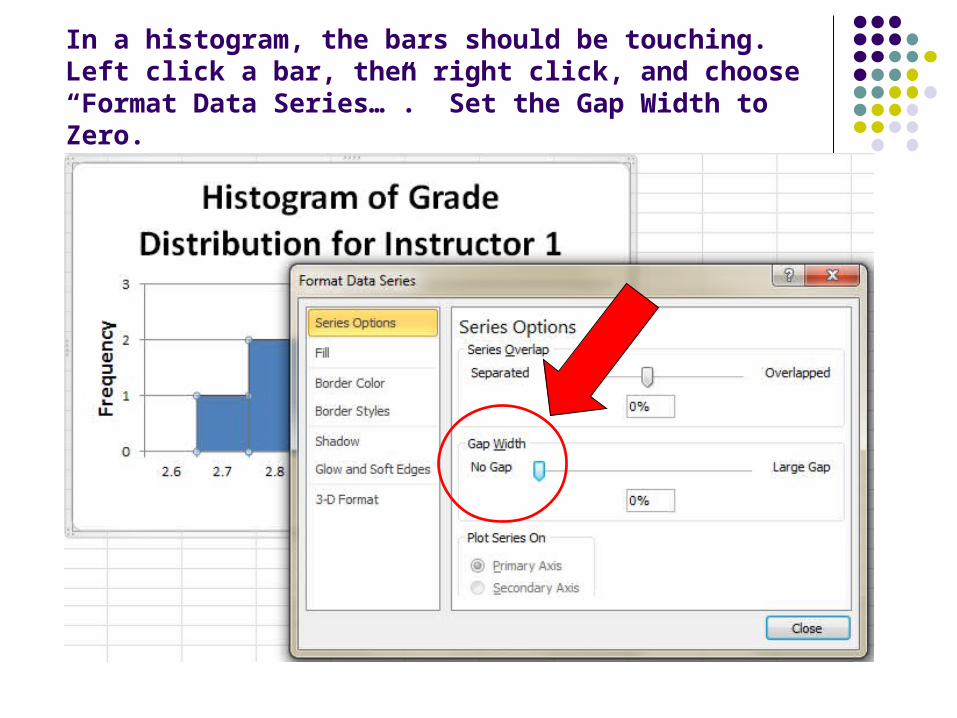
In a histogram, the bars should be touching.Left click a bar, then right click, and choose “Format Data Series…”. Set the Gap Width to Zero.
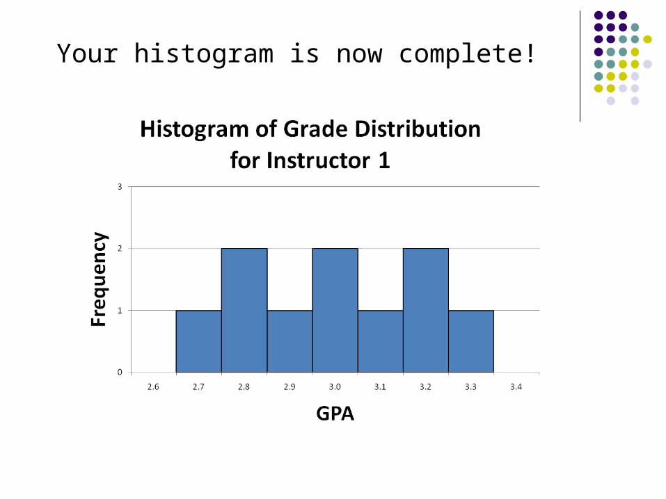
Your histogram is now complete!