introduction to data visualization with python · introduction to data visualization with python...
TRANSCRIPT
INTRODUCTION TO DATA VISUALIZATION WITH PYTHON
Visualizing Regressions
Introduction to Data Visualization with Python
Seaborn
https://stanford.edu/~mwaskom/software/seaborn/
Introduction to Data Visualization with Python
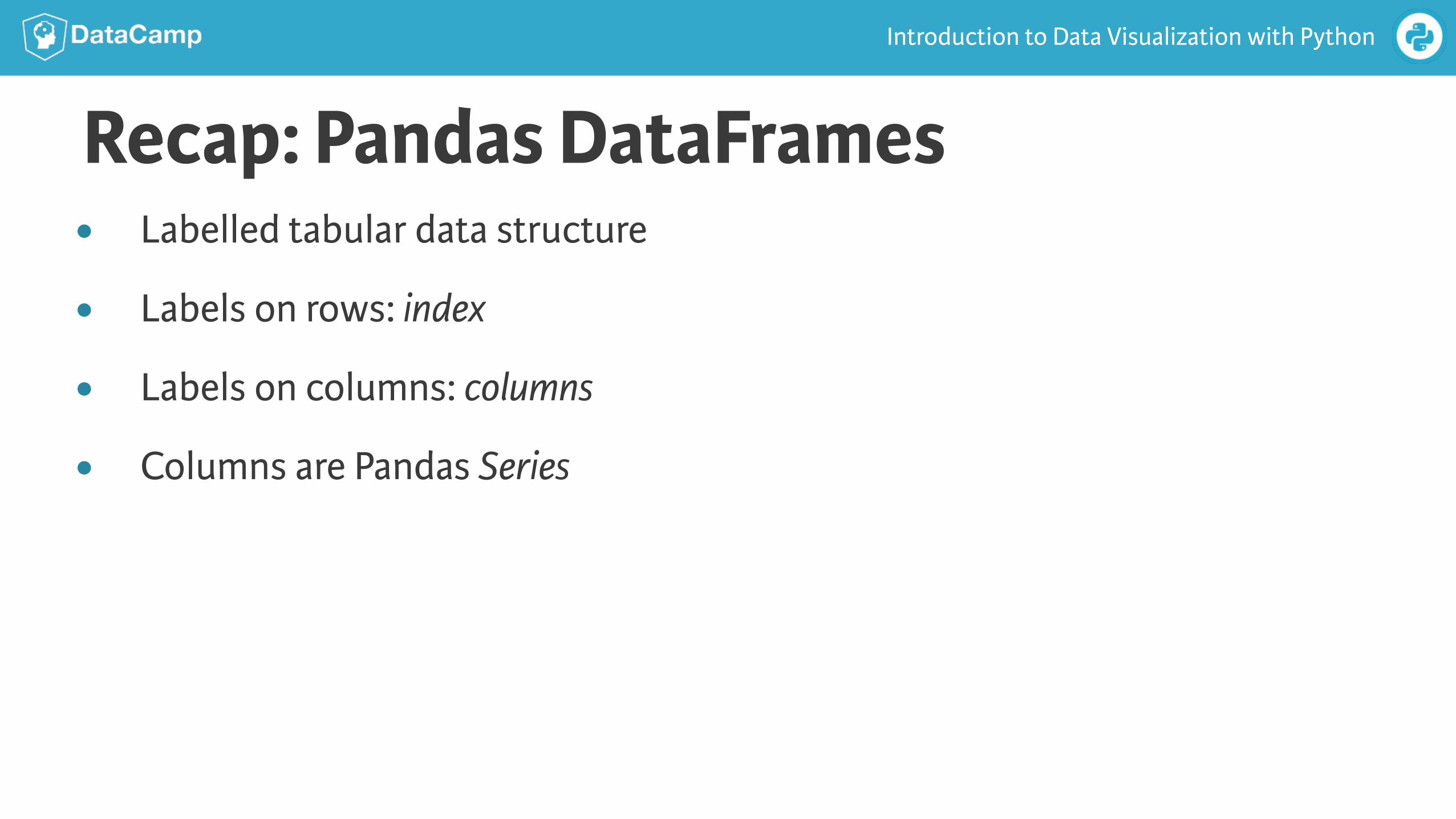
Recap: Pandas DataFrames● Labelled tabular data structure
● Labels on rows: index
● Labels on columns: columns
● Columns are Pandas Series
Introduction to Data Visualization with Python
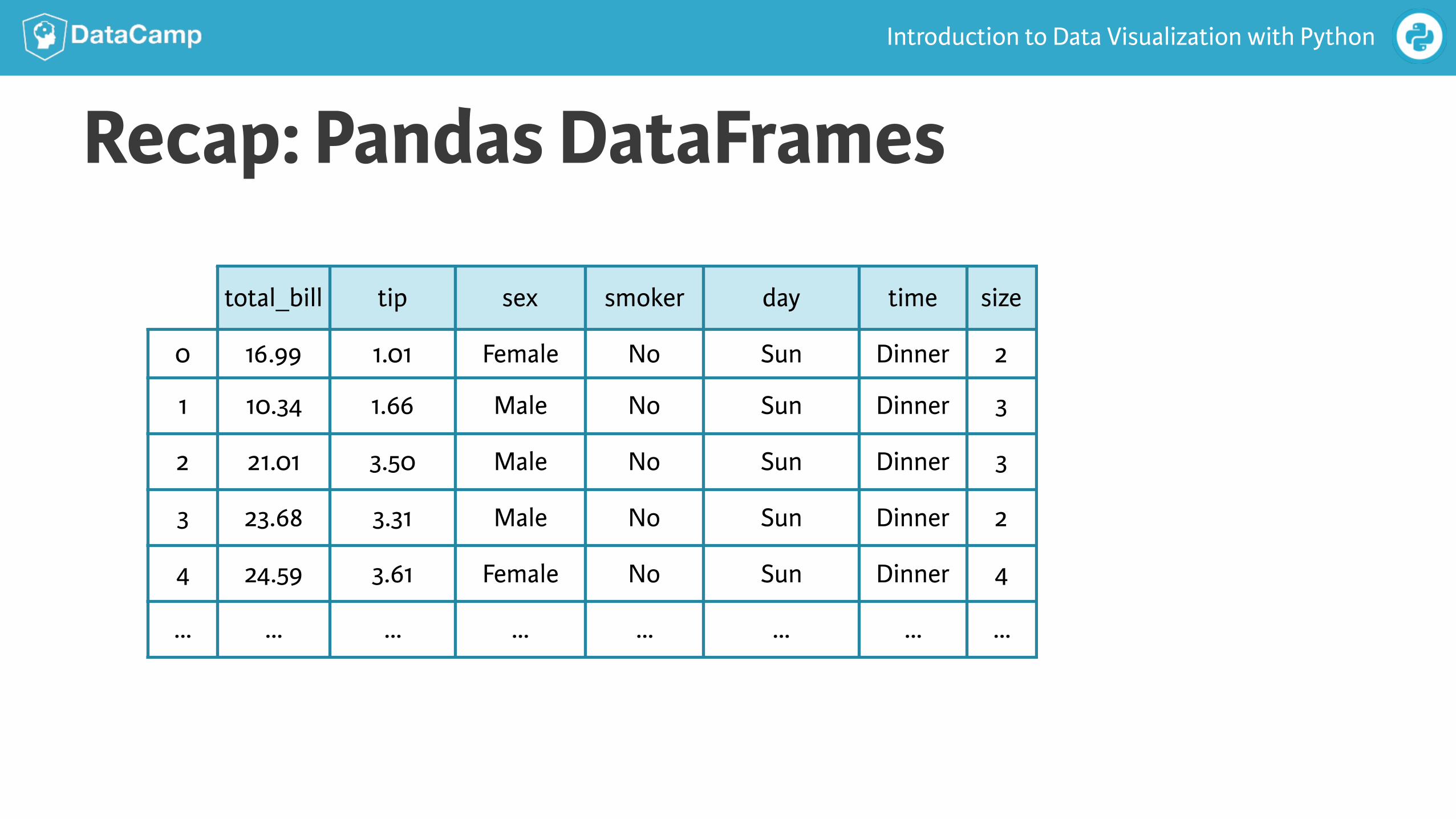
Recap: Pandas DataFrames
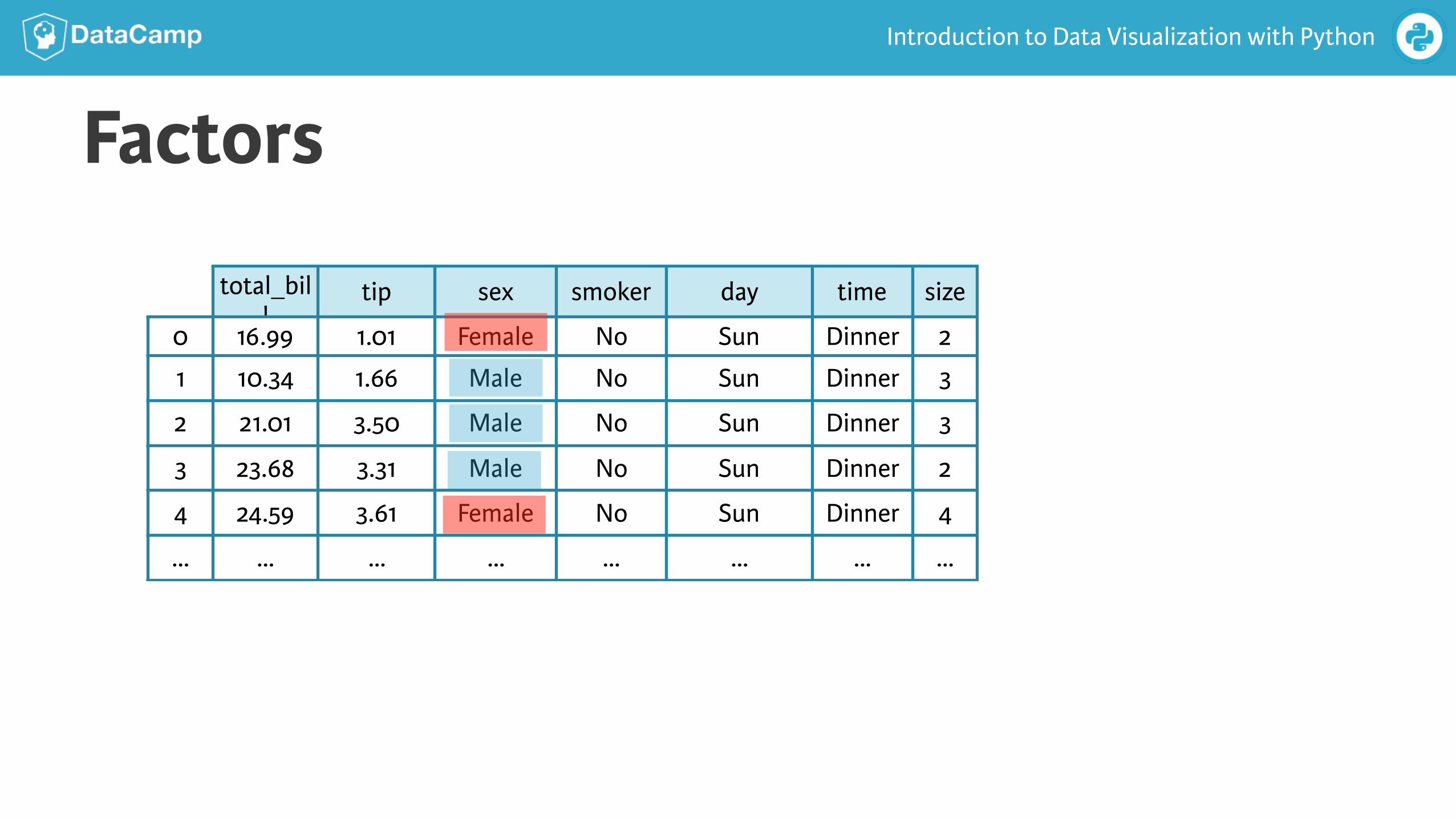
total_bill tip sex smoker day time size
0 16.99 1.01 Female No Sun Dinner 2
1 10.34 1.66 Male No Sun Dinner 3
2 21.01 3.50 Male No Sun Dinner 3
3 23.68 3.31 Male No Sun Dinner 2
4 24.59 3.61 Female No Sun Dinner 4
… … … … … … … …
Introduction to Data Visualization with Python
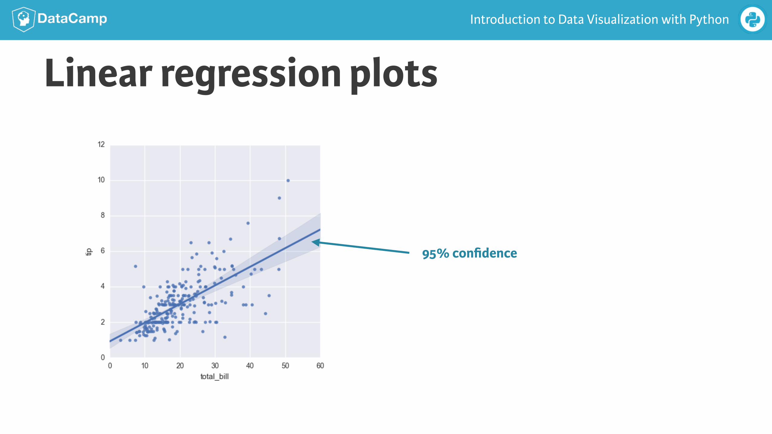
Linear regression plots
95% confidence
Introduction to Data Visualization with Python
In [1]: import pandas as pd
In [2]: import matplotlib.pyplot as plt
In [3]: import seaborn as sns
In [4]: tips =sns.load_dataset('tips')
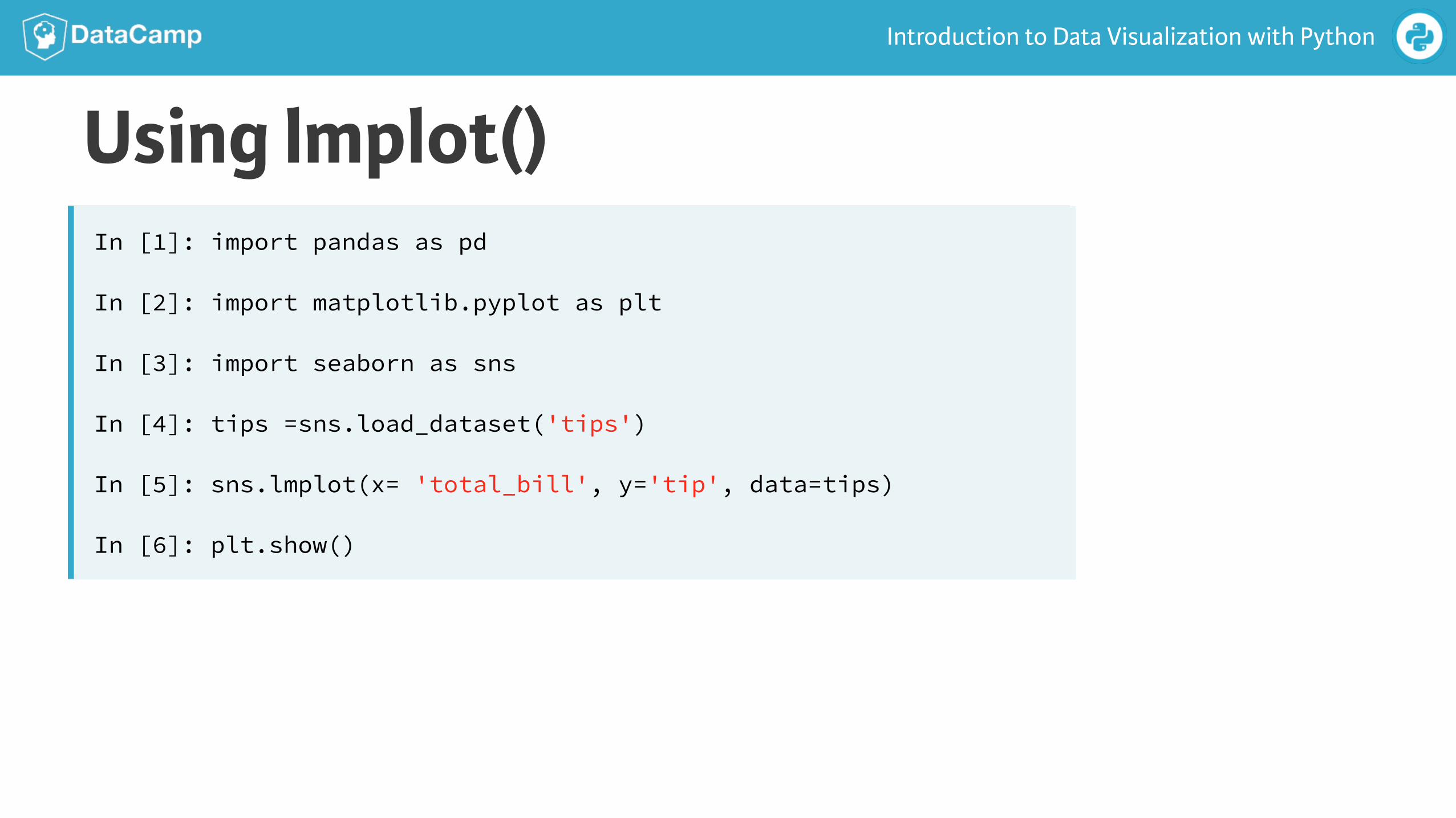
In [5]: sns.lmplot(x= 'total_bill', y='tip', data=tips)
In [6]: plt.show()
Using lmplot()
Introduction to Data Visualization with Python
Factors
total_bill
tip sex smoker day time size
0 16.99 1.01 Female No Sun Dinner 2
1 10.34 1.66 Male No Sun Dinner 3
2 21.01 3.50 Male No Sun Dinner 3
3 23.68 3.31 Male No Sun Dinner 2
4 24.59 3.61 Female No Sun Dinner 4
… … … … … … … …
Introduction to Data Visualization with Python
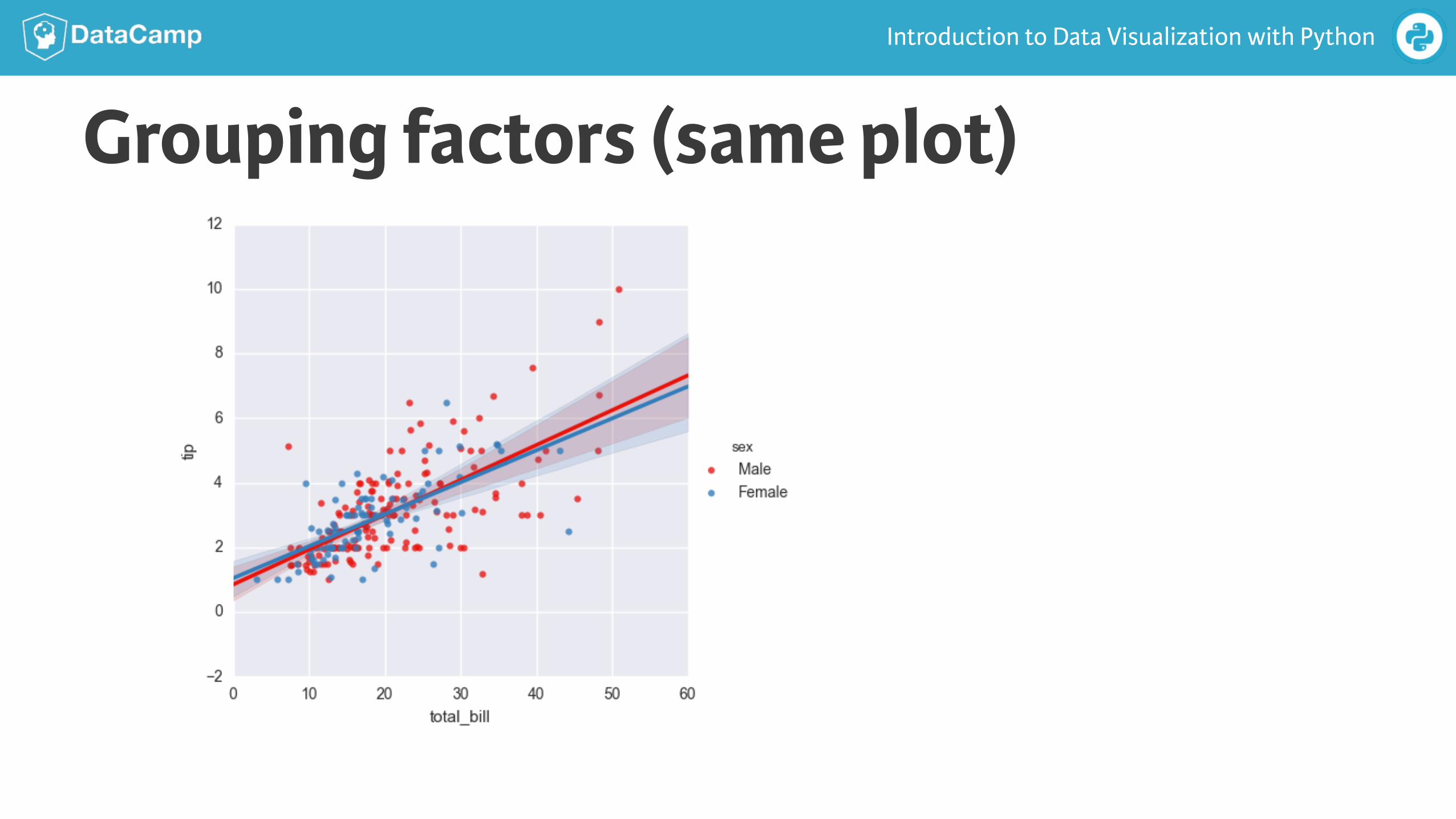
Grouping factors (same plot)
Introduction to Data Visualization with Python
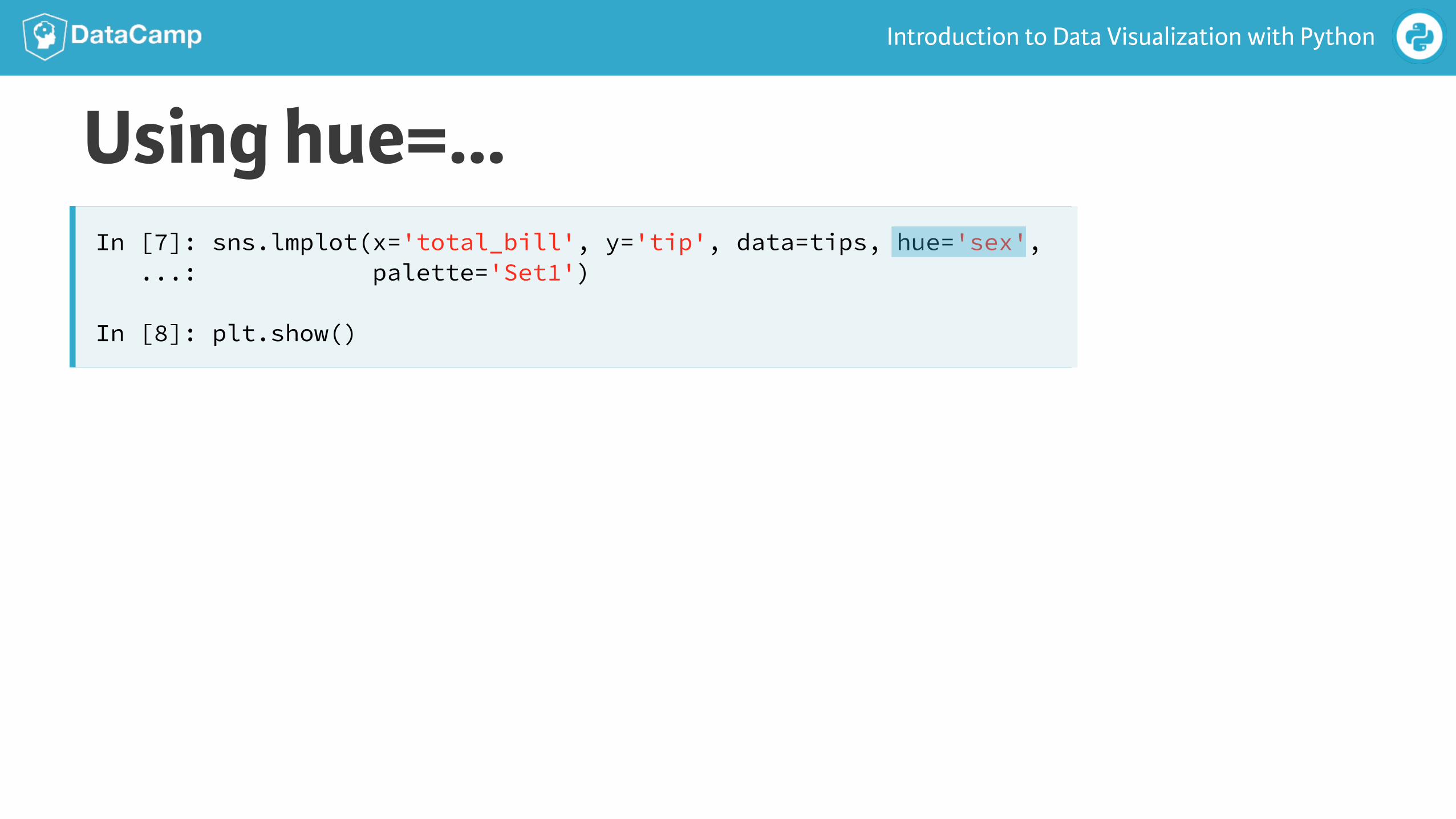
Using hue=…In [7]: sns.lmplot(x='total_bill', y='tip', data=tips, hue='sex', ...: palette='Set1')
In [8]: plt.show()
Introduction to Data Visualization with Python
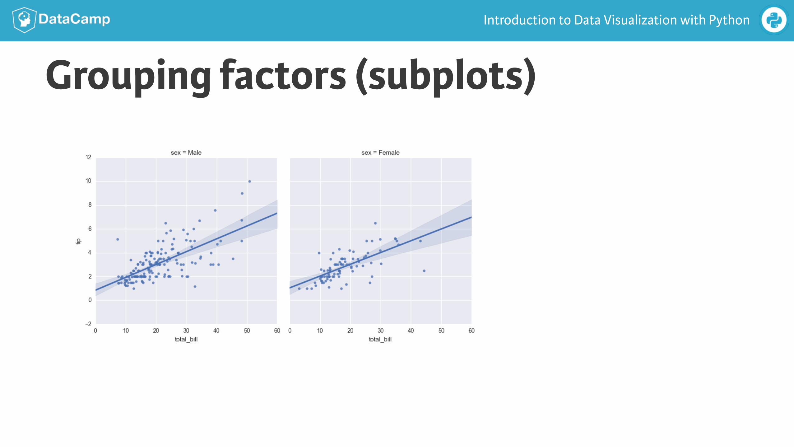
Grouping factors (subplots)
Introduction to Data Visualization with Python
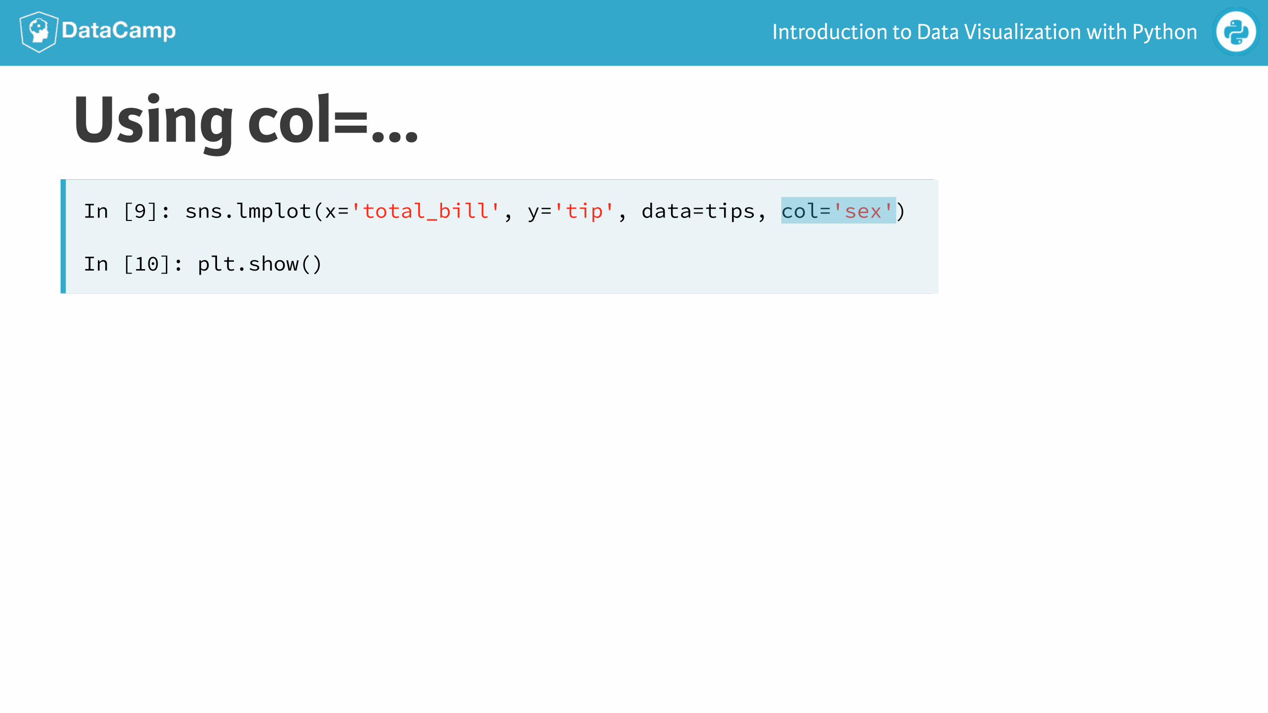
Using col=…In [9]: sns.lmplot(x='total_bill', y='tip', data=tips, col='sex')
In [10]: plt.show()
Introduction to Data Visualization with Python
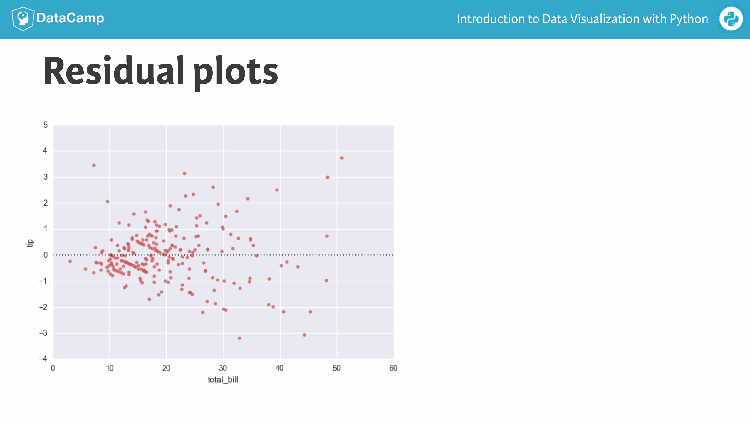
Residual plots
Introduction to Data Visualization with Python
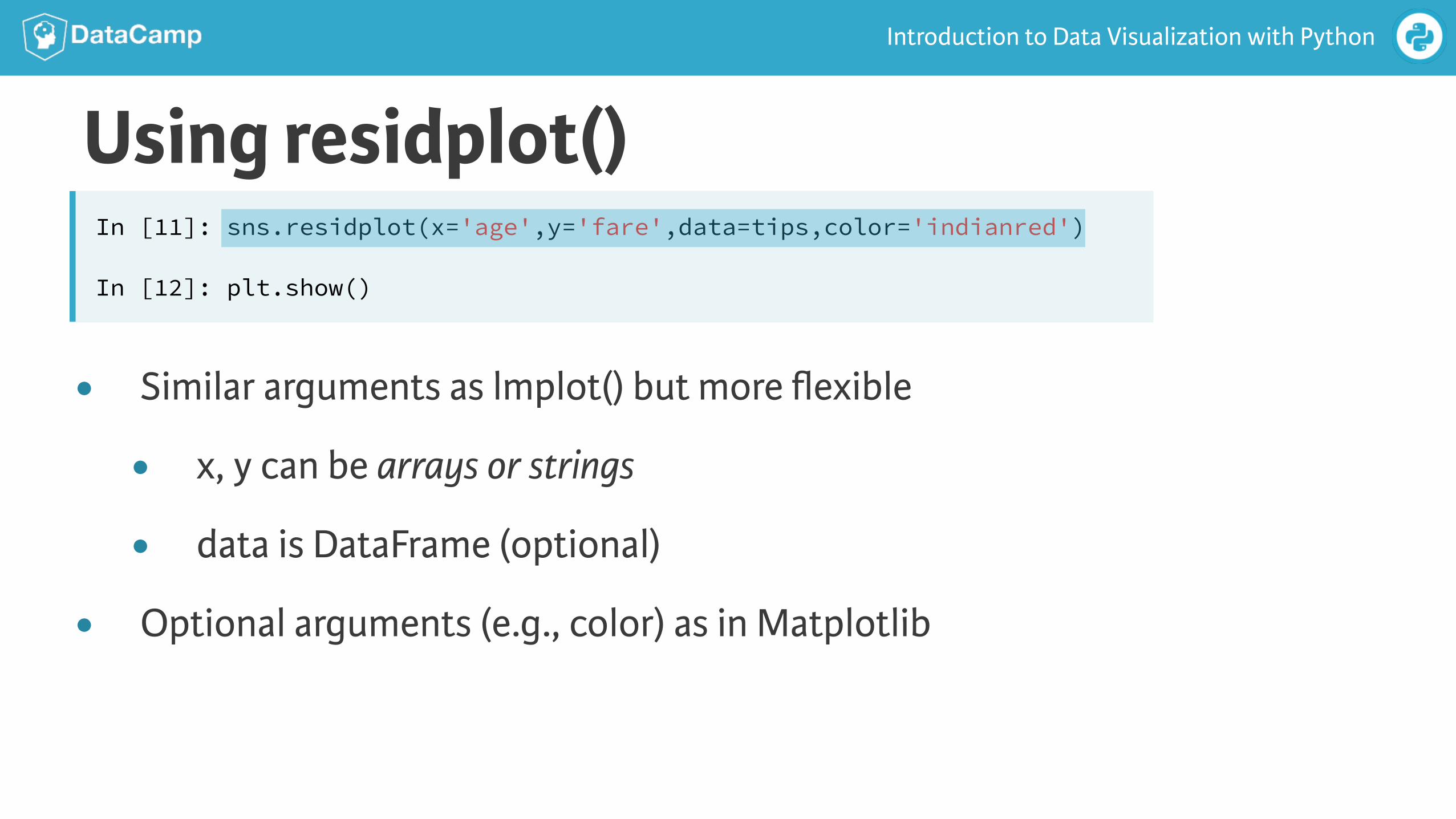
● Similar arguments as lmplot() but more flexible
● x, y can be arrays or strings
● data is DataFrame (optional)
● Optional arguments (e.g., color) as in Matplotlib
Using residplot()In [11]: sns.residplot(x='age',y='fare',data=tips,color='indianred')
In [12]: plt.show()

INTRODUCTION TO DATA VISUALIZATION WITH PYTHON
Let’s practice!
INTRODUCTION TO DATA VISUALIZATION WITH PYTHON
Visualizing univariate
distributions
Introduction to Data Visualization with Python
Visualizing data● Univariate → “one variable”
● Visualization techniques for sampled univariate data
● Strip plots
● Swarm plots
● Violin plots
Introduction to Data Visualization with Python
Strip plot
Introduction to Data Visualization with Python
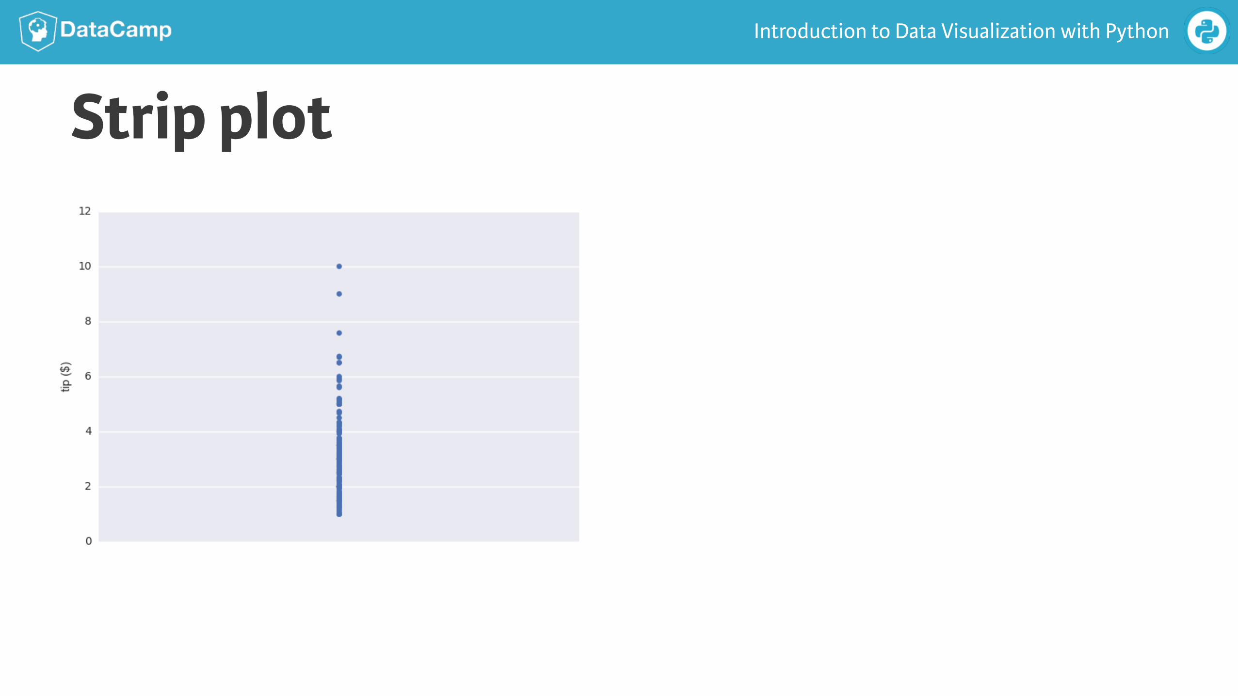
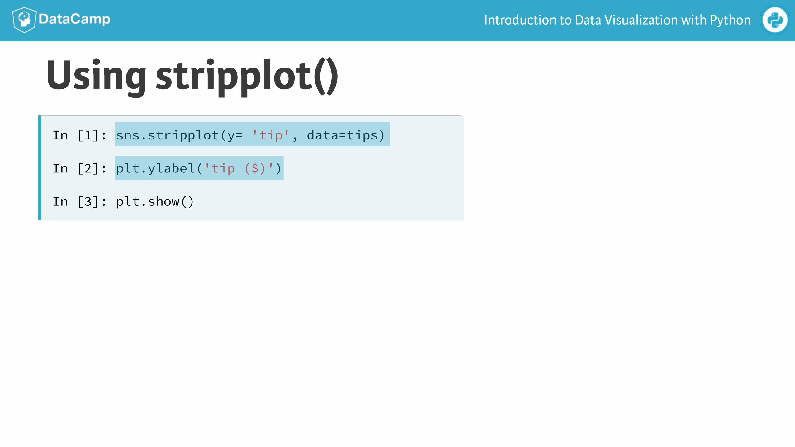
Using stripplot()In [1]: sns.stripplot(y= 'tip', data=tips)
In [2]: plt.ylabel('tip ($)')
In [3]: plt.show()
Introduction to Data Visualization with Python
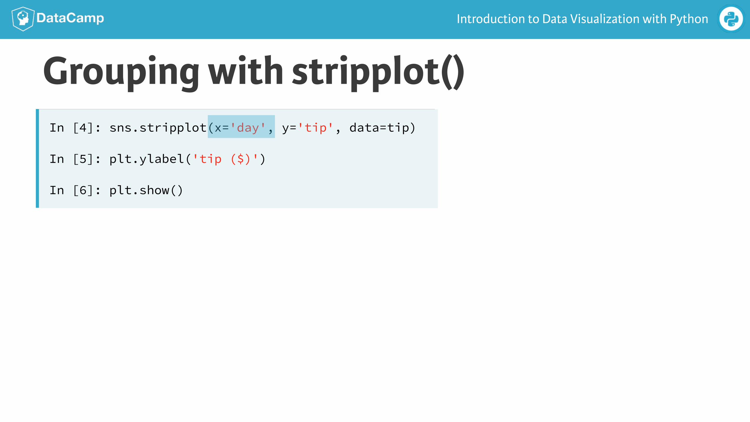
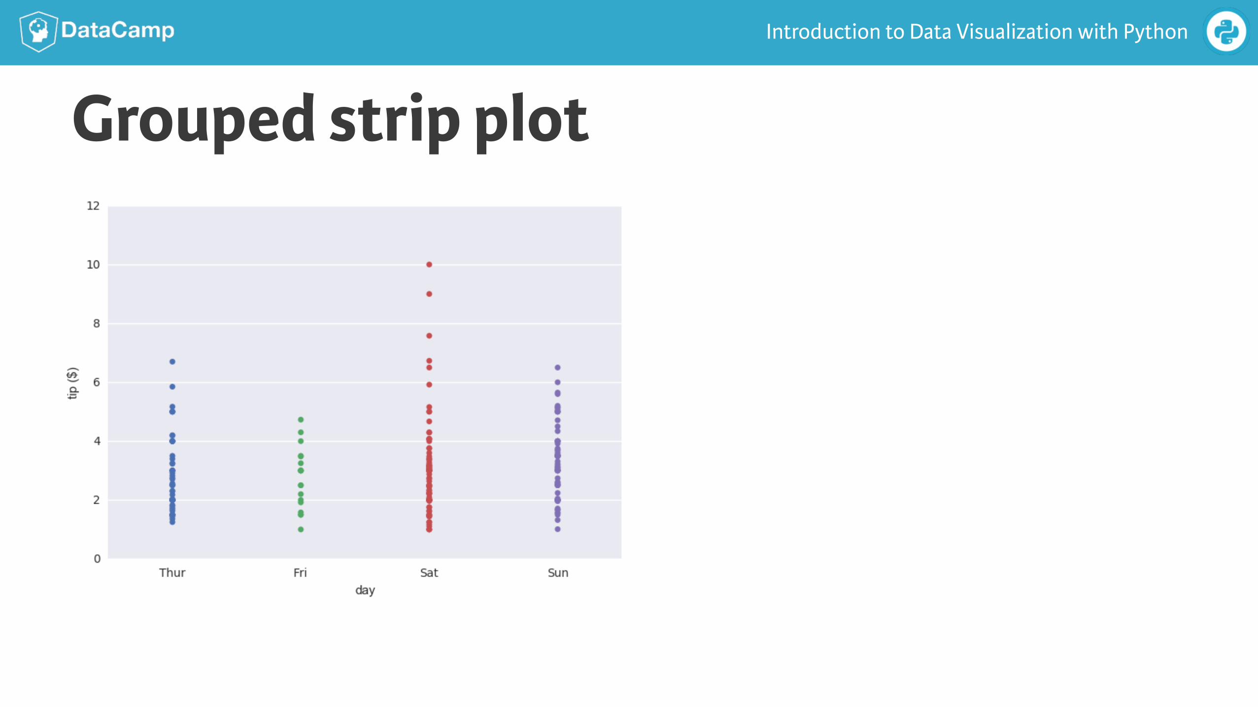
Grouping with stripplot()In [4]: sns.stripplot(x='day', y='tip', data=tip)
In [5]: plt.ylabel('tip ($)')
In [6]: plt.show()
Introduction to Data Visualization with Python
Grouped strip plot
Introduction to Data Visualization with Python
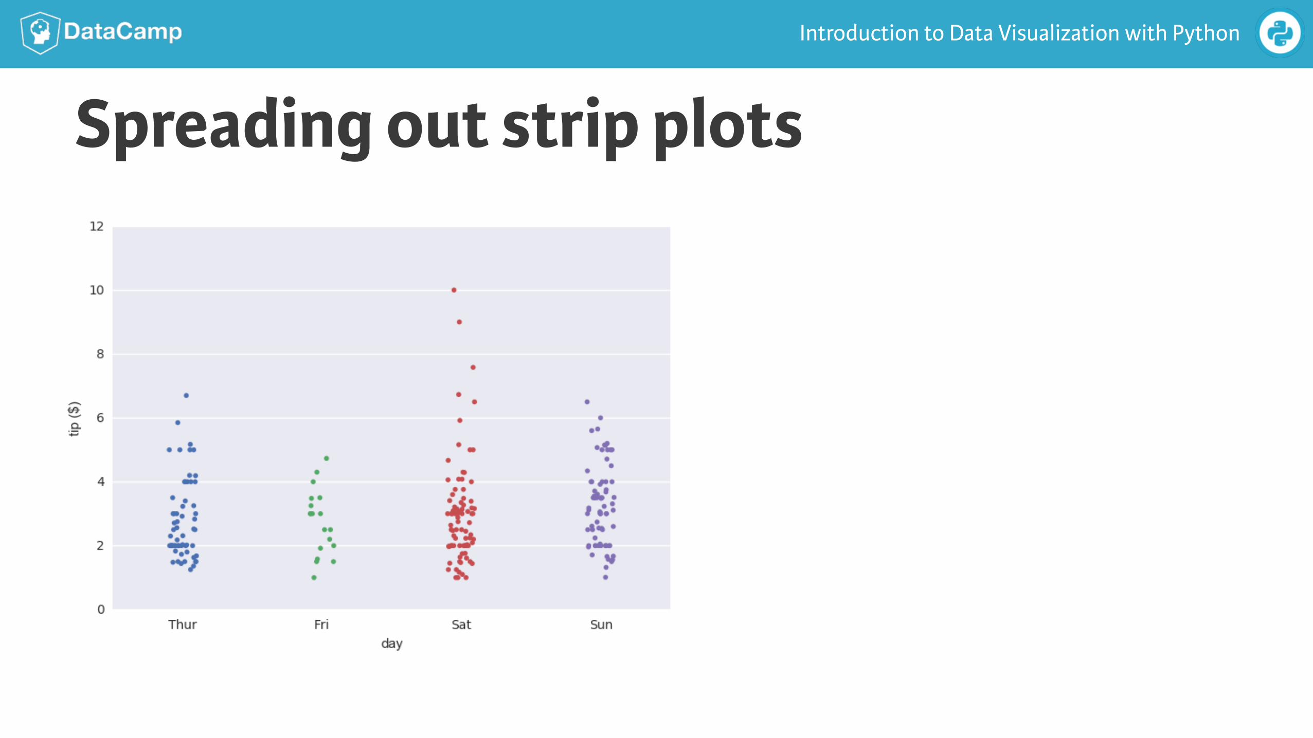
Spreading out strip plots
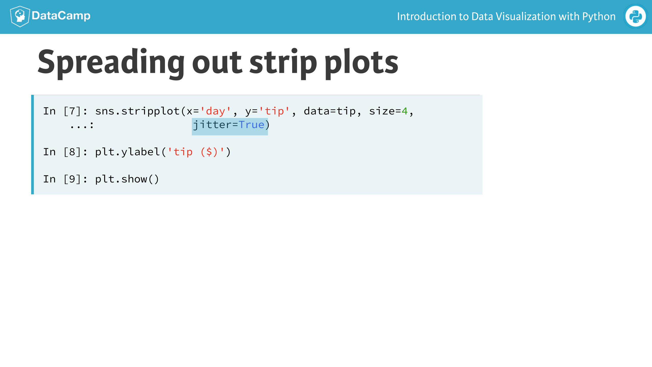
Introduction to Data Visualization with Python
Spreading out strip plotsIn [7]: sns.stripplot(x='day', y='tip', data=tip, size=4, ...: jitter=True)
In [8]: plt.ylabel('tip ($)')
In [9]: plt.show()
Introduction to Data Visualization with Python
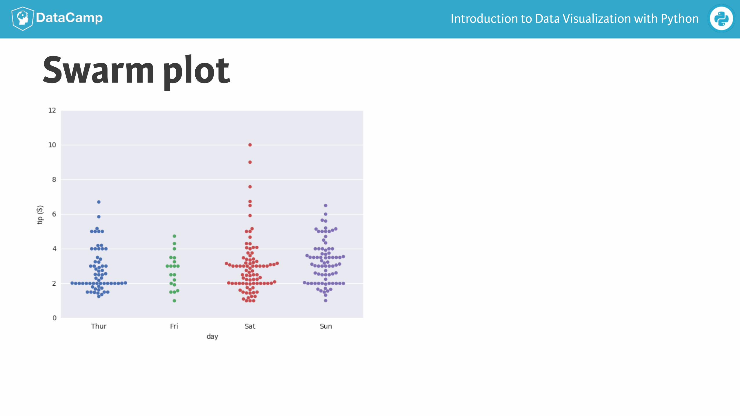
Swarm plot
Introduction to Data Visualization with Python
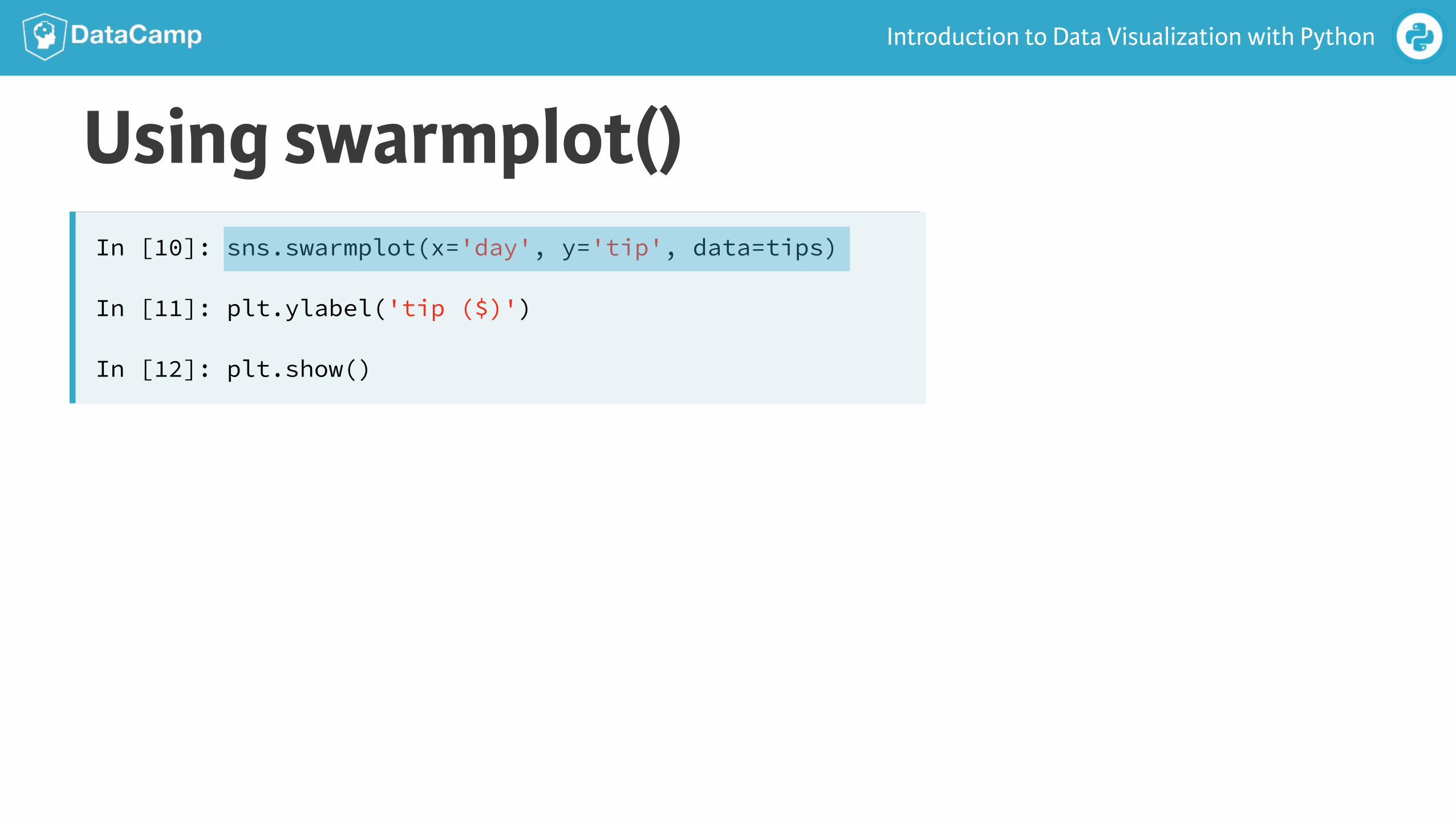
Using swarmplot()In [10]: sns.swarmplot(x='day', y='tip', data=tips)
In [11]: plt.ylabel('tip ($)')
In [12]: plt.show()
Introduction to Data Visualization with Python
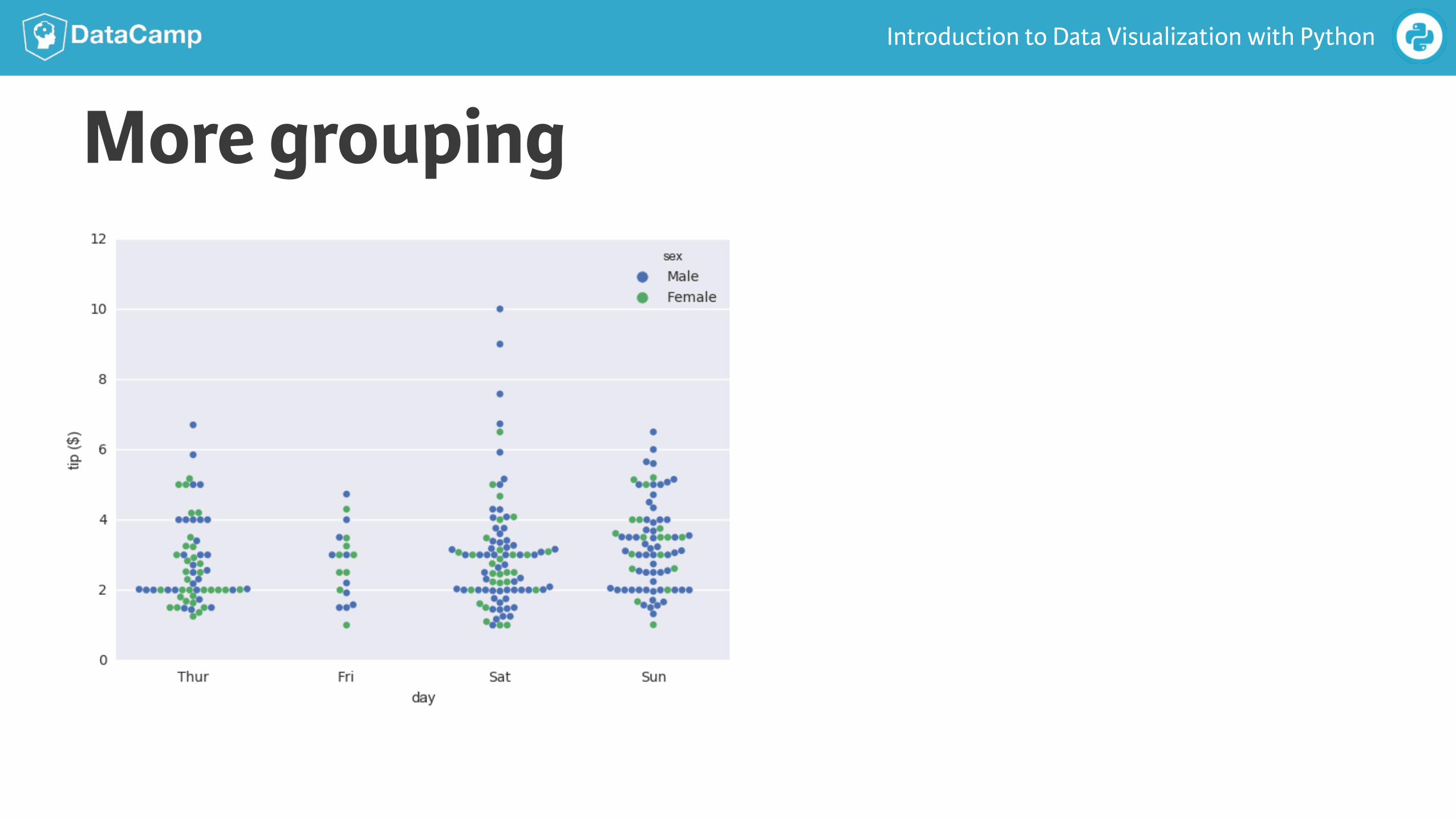
More grouping
Introduction to Data Visualization with Python
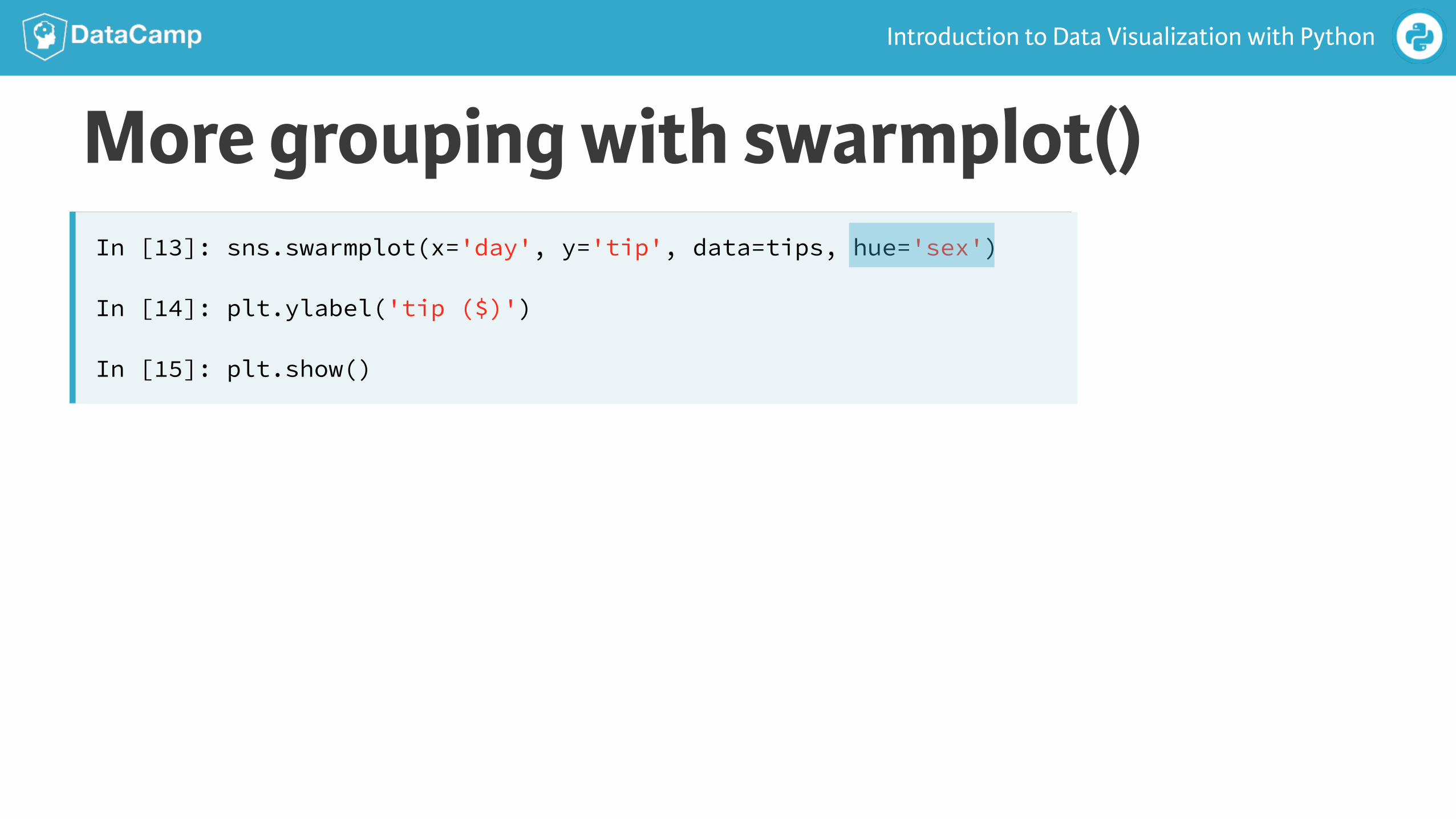
More grouping with swarmplot()In [13]: sns.swarmplot(x='day', y='tip', data=tips, hue='sex')
In [14]: plt.ylabel('tip ($)')
In [15]: plt.show()
Introduction to Data Visualization with Python
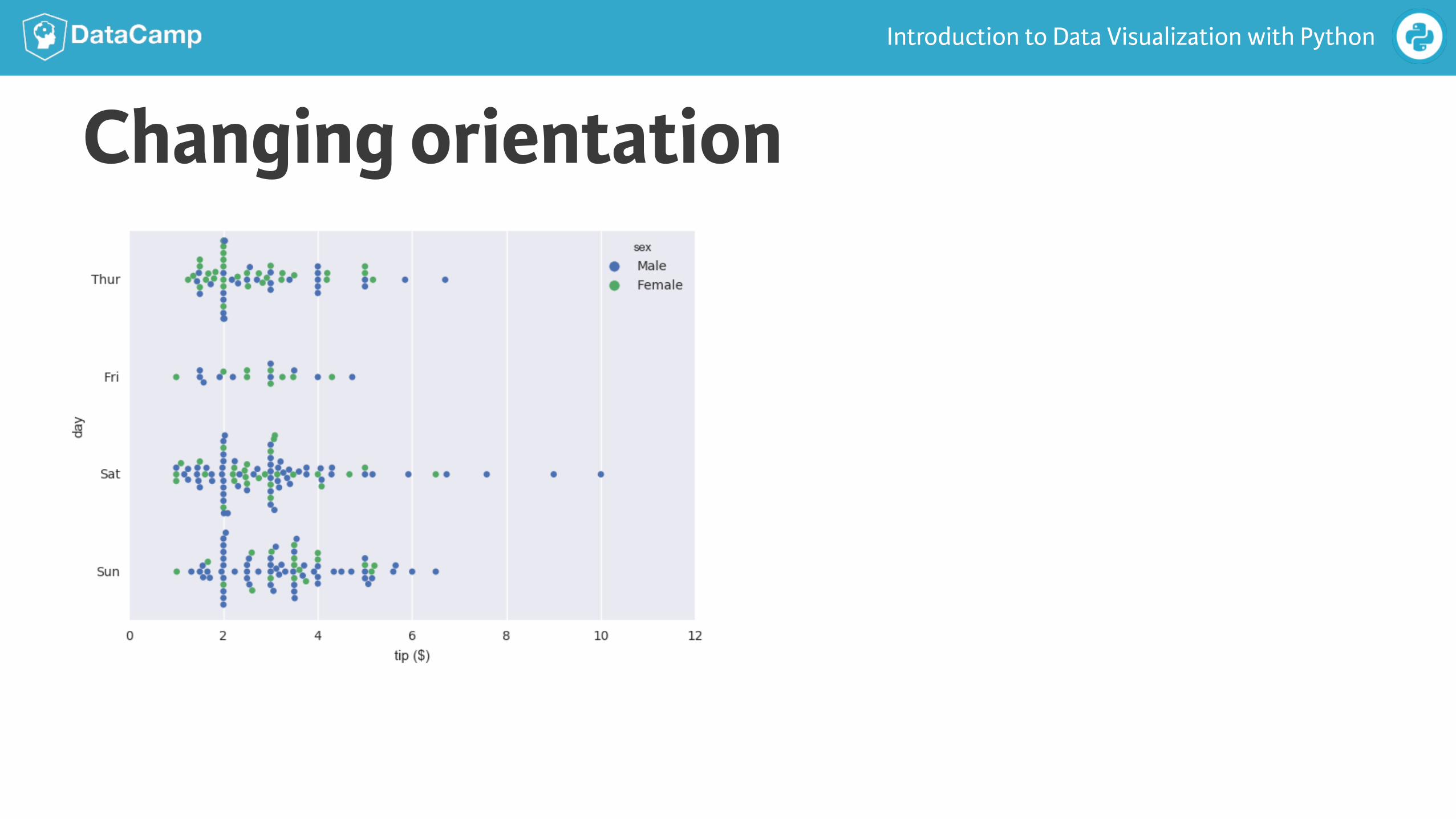
Changing orientation
Introduction to Data Visualization with Python
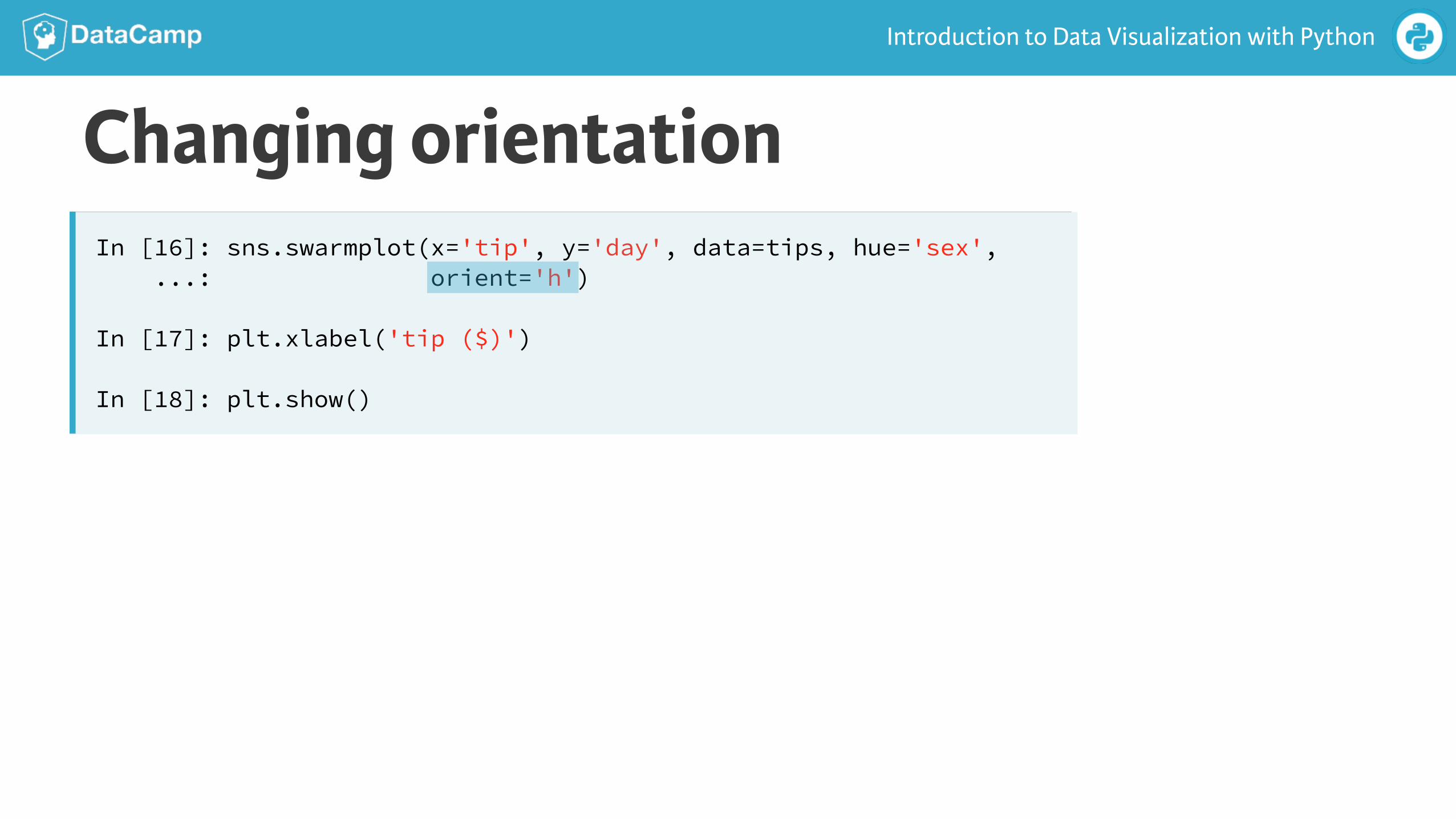
Changing orientationIn [16]: sns.swarmplot(x='tip', y='day', data=tips, hue='sex', ...: orient='h')
In [17]: plt.xlabel('tip ($)')
In [18]: plt.show()
Introduction to Data Visualization with Python
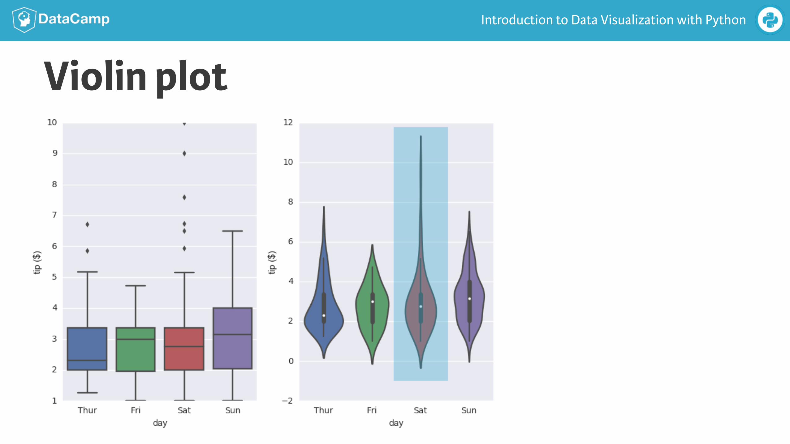
Violin plot
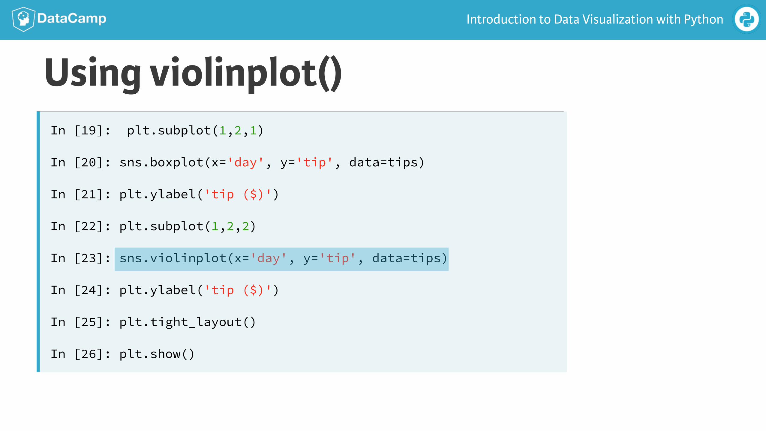
Introduction to Data Visualization with Python
Using violinplot()In [19]: plt.subplot(1,2,1)
In [20]: sns.boxplot(x='day', y='tip', data=tips)
In [21]: plt.ylabel('tip ($)')
In [22]: plt.subplot(1,2,2)
In [23]: sns.violinplot(x='day', y='tip', data=tips)
In [24]: plt.ylabel('tip ($)')
In [25]: plt.tight_layout()
In [26]: plt.show()
Introduction to Data Visualization with Python
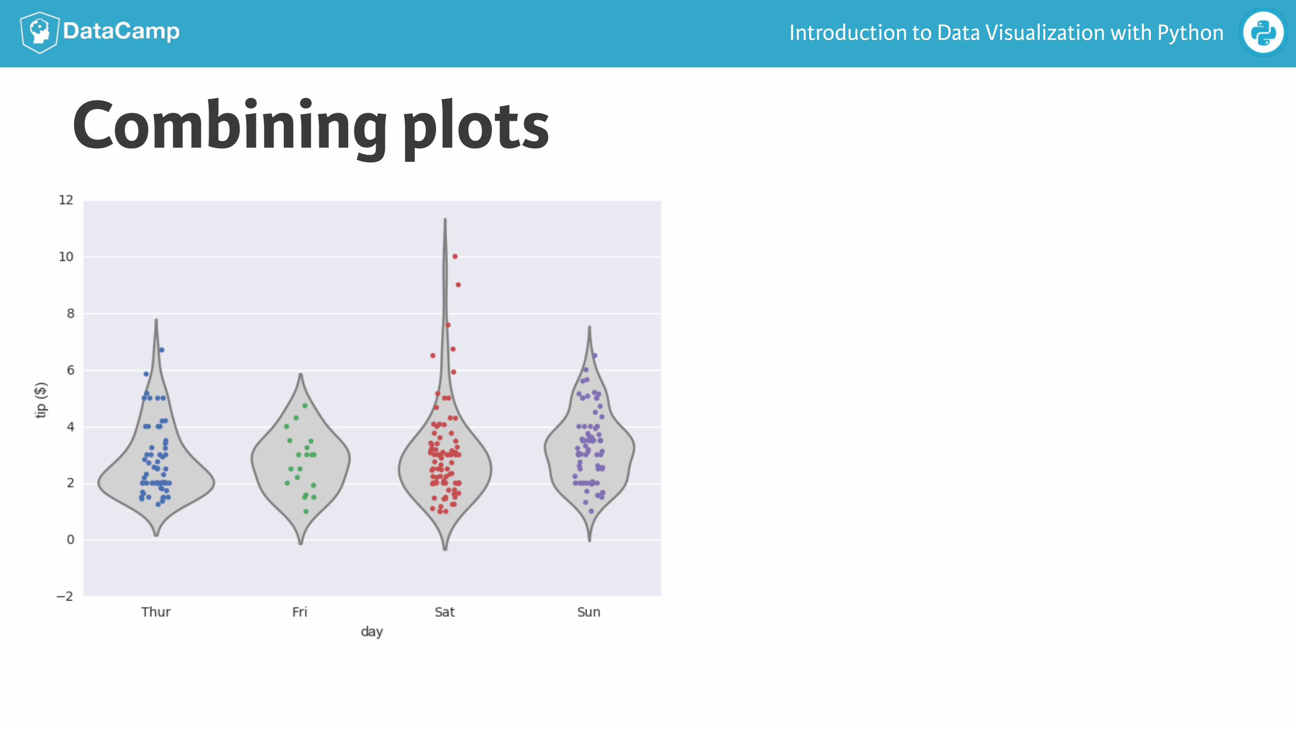
Combining plots
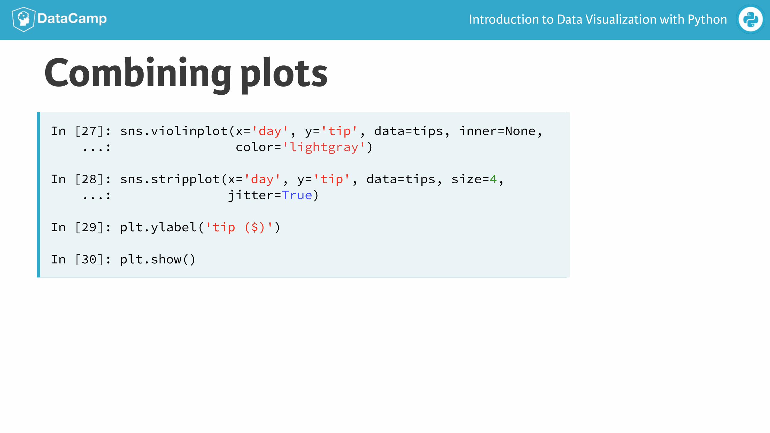
Introduction to Data Visualization with Python
Combining plotsIn [27]: sns.violinplot(x='day', y='tip', data=tips, inner=None, ...: color='lightgray')
In [28]: sns.stripplot(x='day', y='tip', data=tips, size=4, ...: jitter=True)
In [29]: plt.ylabel('tip ($)')
In [30]: plt.show()

INTRODUCTION TO DATA VISUALIZATION WITH PYTHON
Let’s practice!
INTRODUCTION TO DATA VISUALIZATION WITH PYTHON
Visualizing Multivariate
Distributions
Introduction to Data Visualization with Python
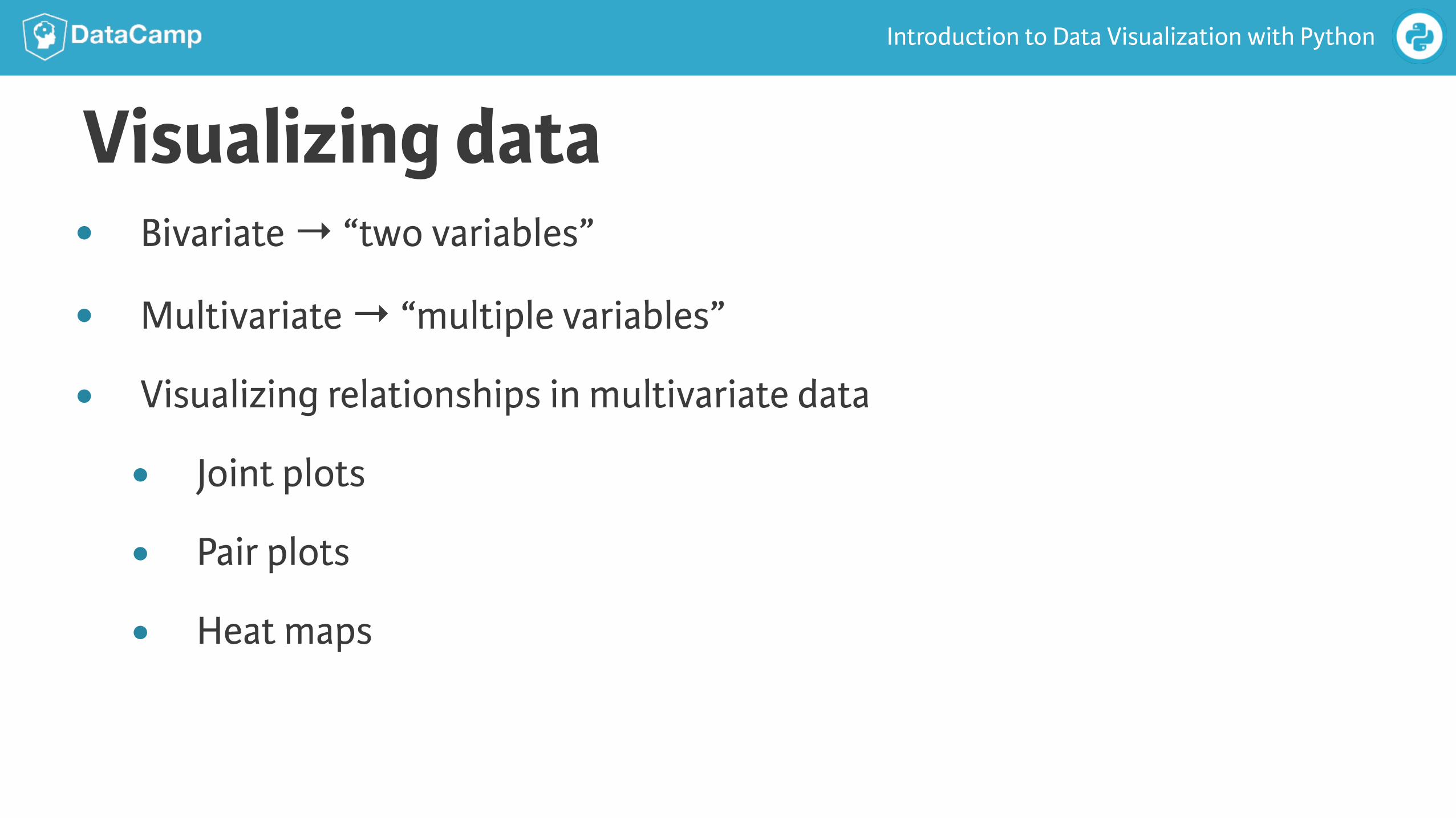
Visualizing data● Bivariate → “two variables”
● Multivariate → “multiple variables”
● Visualizing relationships in multivariate data
● Joint plots
● Pair plots
● Heat maps
Introduction to Data Visualization with Python
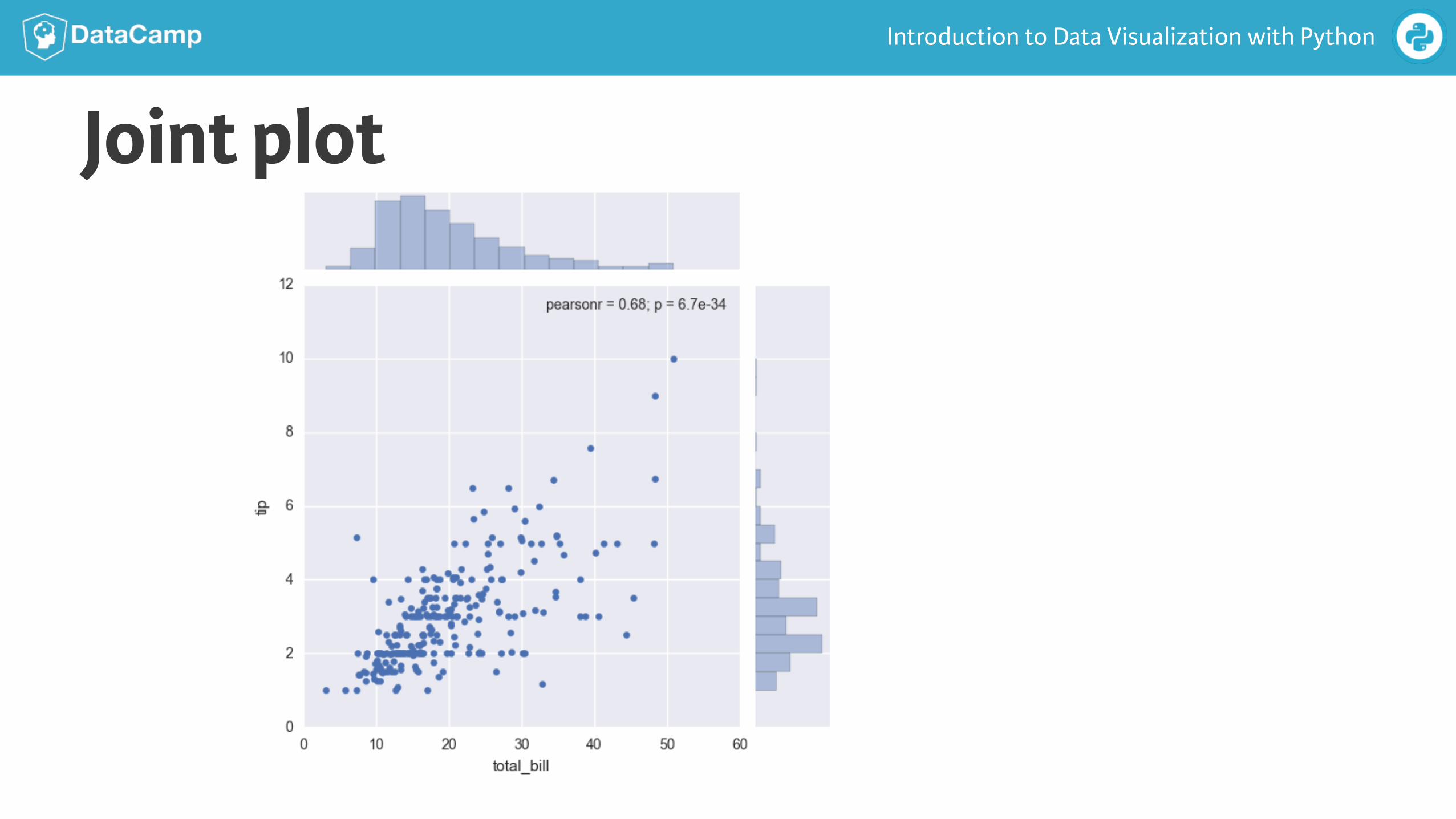
Joint plot
Introduction to Data Visualization with Python
Using jointplot()In [1]: sns.jointplot(x= 'total_bill', y= 'tip', data=tips)
In [2]: plt.show()
Introduction to Data Visualization with Python
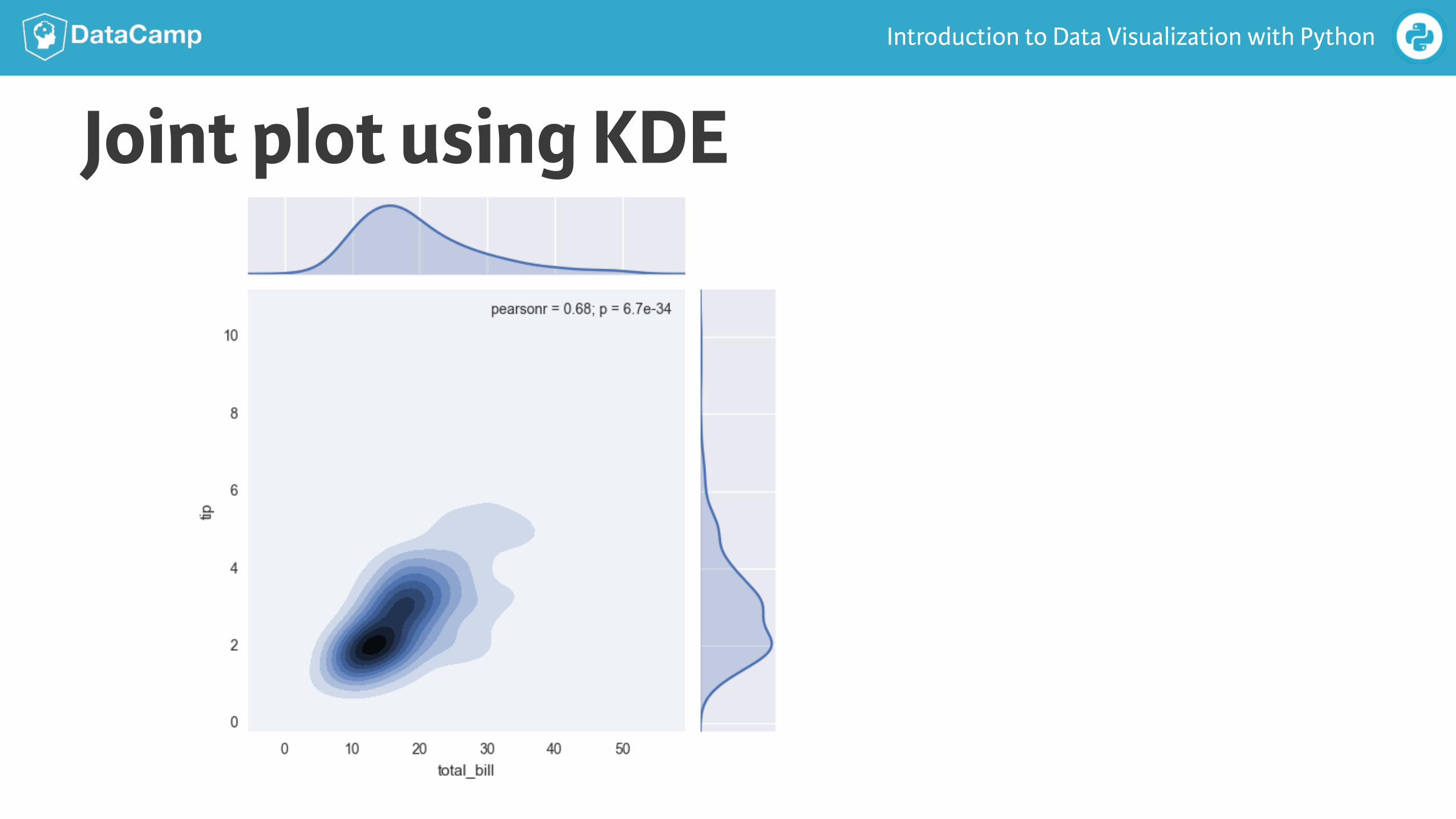
Joint plot using KDE
Introduction to Data Visualization with Python
Using kde=TrueIn [3]: sns.jointplot(x='total_bill', y= 'tip', data=tips, ...: kind='kde')
In [4]: plt.show()
Introduction to Data Visualization with Python
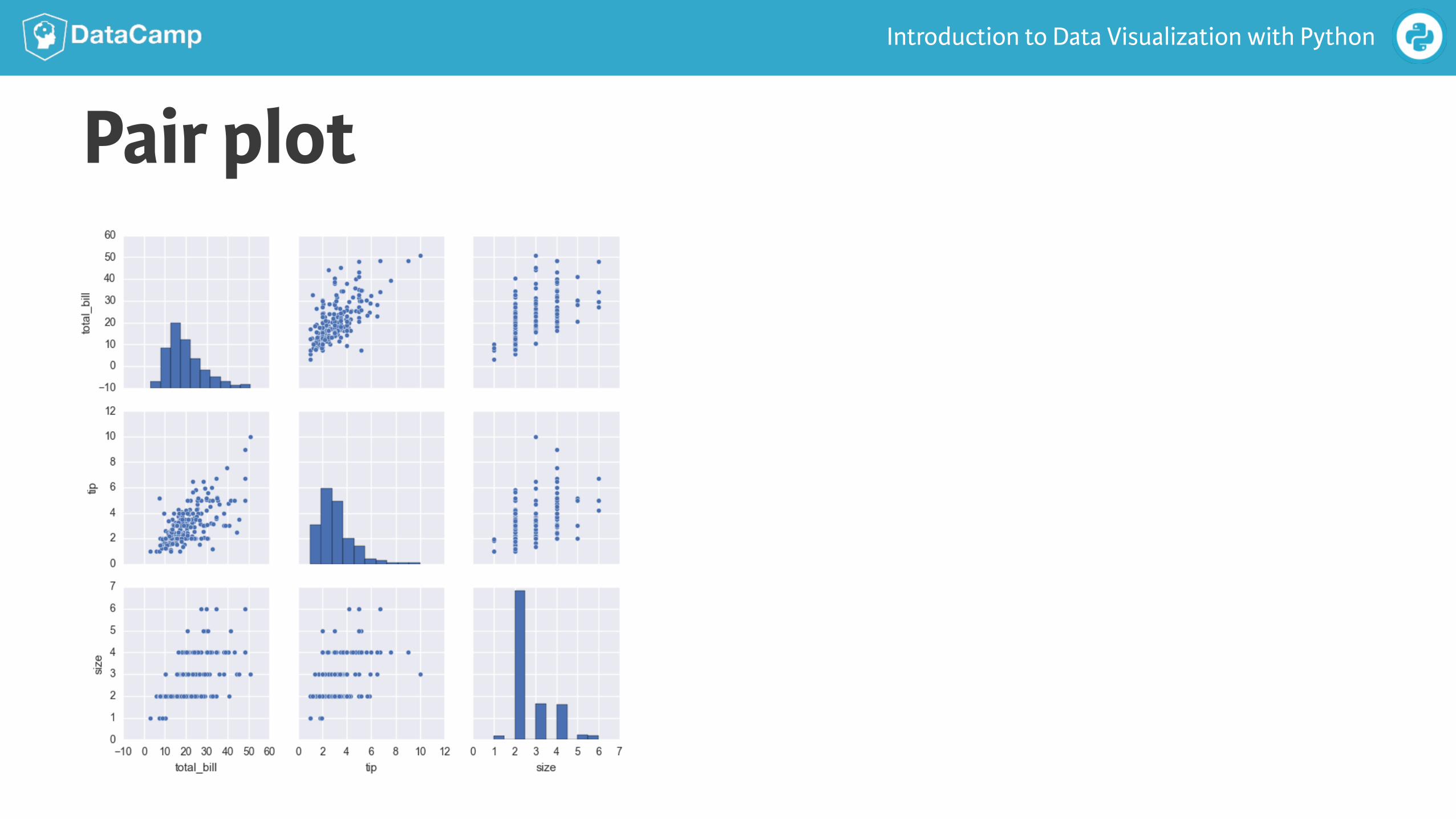
Pair plot
Introduction to Data Visualization with Python
Using pairplot()In [5]: sns.pairplot(tips)
In [6]: plt.show()
Introduction to Data Visualization with Python
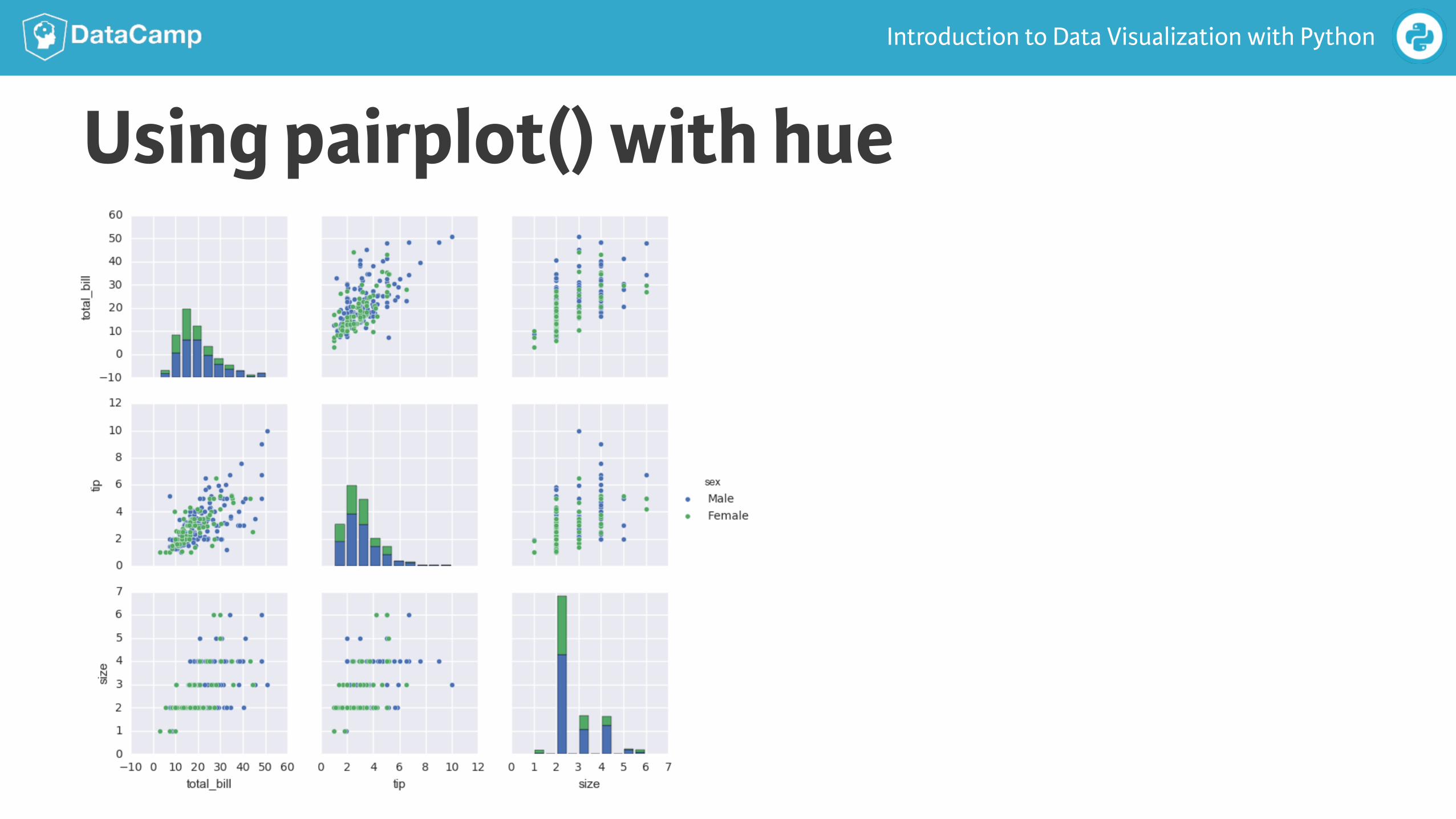
Using pairplot() with hueIn [7]: sns.pairplot(tips, hue='sex')
In [8]: plt.show()
Introduction to Data Visualization with Python
Using pairplot() with hue
Introduction to Data Visualization with Python
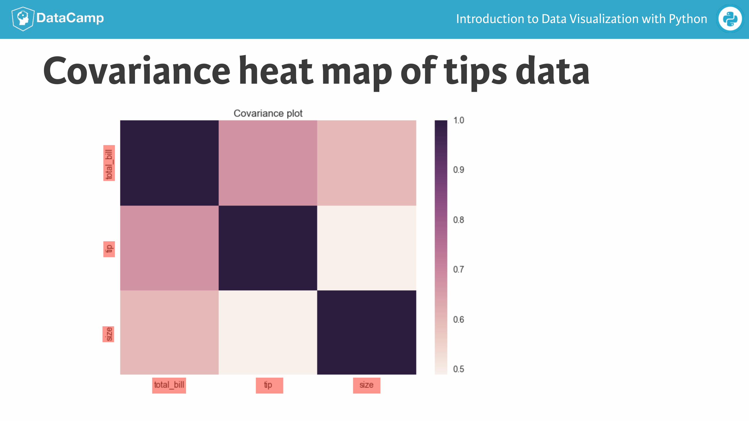
Covariance heat map of tips data
Introduction to Data Visualization with Python
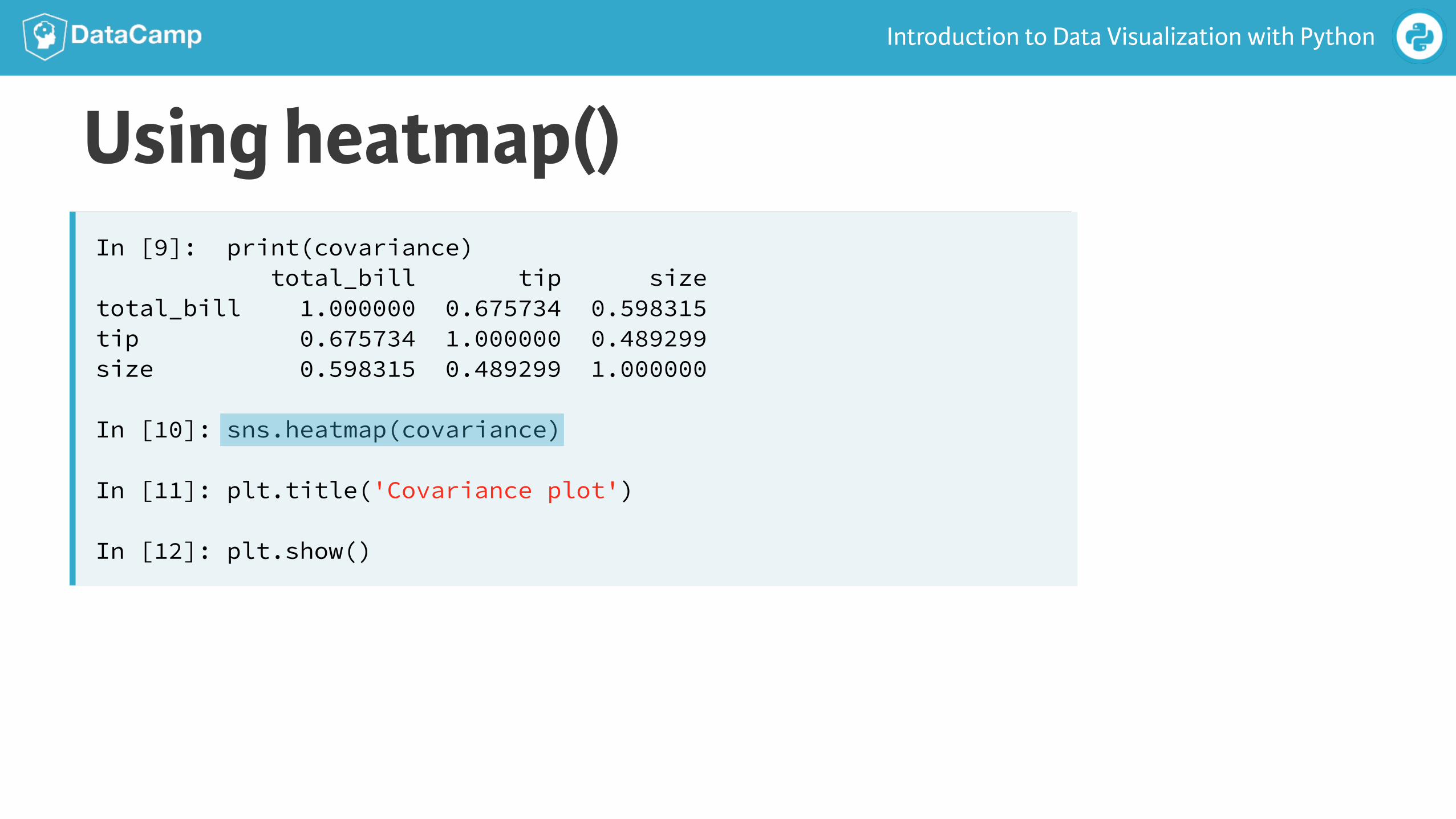
Using heatmap()In [9]: print(covariance) total_bill tip size total_bill 1.000000 0.675734 0.598315 tip 0.675734 1.000000 0.489299 size 0.598315 0.489299 1.000000
In [10]: sns.heatmap(covariance)
In [11]: plt.title('Covariance plot')
In [12]: plt.show()

INTRODUCTION TO DATA VISUALIZATION WITH PYTHON
Let’s practice!