introduction to bootstrap 3 - june 24th 2015
TRANSCRIPT
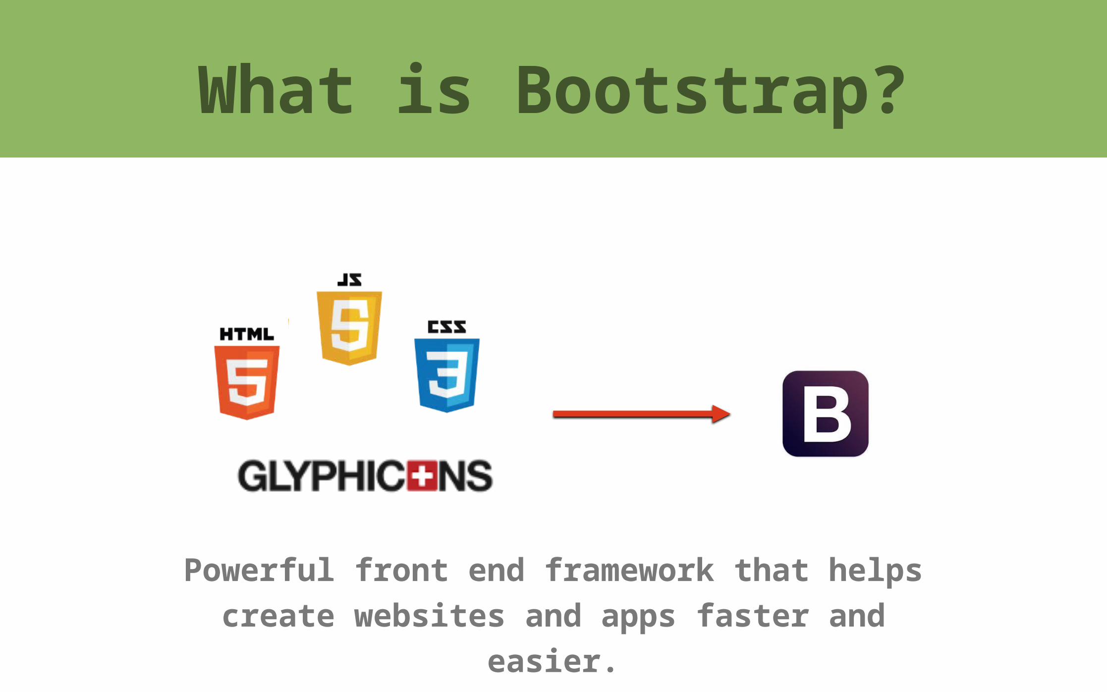
Powerful front end framework that helps create websites and apps faster and easier.
What is Bootstrap?

Who Should Use Bootstrap?
Developer Designer

❖ Ease of use and quick to learn
❖ Speed of development
❖ Consistent design and common components
❖ Wide browser compatibility
❖ Responsive framework
Why Bootstrap?

Without additional custom design work your site will look like any other site
Why NOT Bootstrap?

Mobile-First Strategy
Sites built with Bootstrap3 (and beyond) target mobile devices and scale for larger screens
depending on screen size.
1.7B mobile web users worldwide

❖ Download CSS and JS files, along with the fonts
➡ http://getbootstrap.com/getting-started
❖ Checkout Examples
➡ http://getbootstrap.com/getting-started/#examples
❖ Cheat Sheet - classes name, screen sizes, grid
behavior
➡ https://www.dropbox.com/s/gqhwxkx80gf8hwm/bootstrap3-cheatsheet.pdf?dl=0
❖ Online Development
➡ http://www.codeply.com/go
How to Get Started?

TEMPLATE START<!DOCTYPE html><html> <head>
<title>Bootstrap 101 Template</title> <!—- enable responsive design —-> <meta name="viewport" content="width=device-width,initial-scale=1.0">
<!—- include reference to the bootstrap css —-> <link rel="stylesheet" type="text/css" href="css/bootstrap.min.css" />
</head> <body> <h1>Hello, world!</h1>
<!—- JQuery (necessary for Bootstrap’s JavaScript plugins) —-> <script type="text/javascript" src=“http://code.jquery.com/jquery.js”></script>
<!—- include reference to the bootstrap js —-> <script type="text/javascript" src="js/bootstrap.min.js"></script>
</body></html>
STARTING TEMPLATE
index.html
Responsive with Bootstrap 3
❖ Grid System
❖ Responsive Utilities
❖ Responsive Embed and Flexible Images
❖ Consistent design and common components
❖ CSS3 Media Queries

The grid system layout dynamically adjusts to the proper screen resolution
Grid System

TEMPLATE START
<div class="row" > <div class="col-md-8">.col-md-8</div> <div class="col-md-4">.col-md-4</div></div>
<div class="row" > <div class="col-md-4">.col-md-4</div> <div class="col-md-4">.col-md-4</div> <div class="col-md-4">.col-md-4</div></div>
<div class="row" > <div class="col-md-6">.col-md-6</div> <div class="col-md-6">.col-md-6</div></div>
Basic Columns
index.html
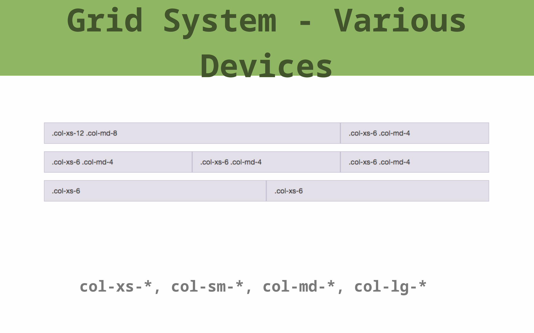
col-xs-*, col-sm-*, col-md-*, col-lg-*
Grid System - Various Devices

TEMPLATE START
<div class="row" > <div class="col-xs-12 col-sm-6 col-md-8">.col-xs-12 .col-sm-6 .col-md-8</div> <div class="col-xs-6 col-md-4”>.col-xs-6 .col-md-4</div></div>
<div class="row" > <div class="col-xs-6 col-sm-4”>.col-xs-6 .col-sm-4</div> <div class="col-xs-6 col-sm-4">.col-xs-6 .col-sm-4</div> <div class="col-xs-6 col-sm-4”>.col-xs-6 .col-sm-4</div></div>
Various Layouts
index.html

Responsive Utilities
