into the weeds of css layout
TRANSCRIPT

@rachelandrew at Smashing Conf London
Into the Weeds of CSS Layout
https://www.flickr.com/photos/protake/17383852206/


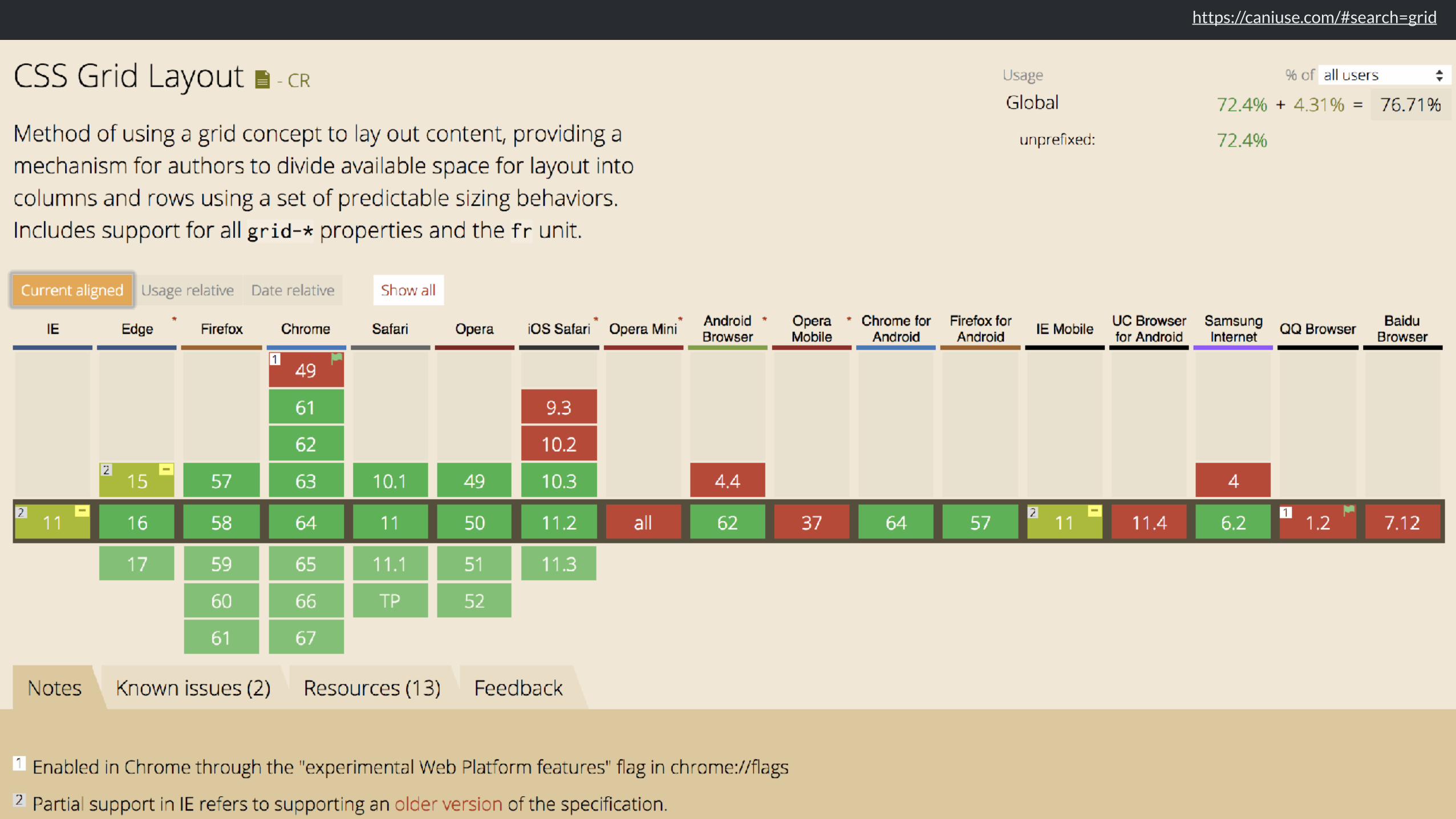
How big is that box?

https://twitter.com/devine_howest/status/959036561839960070


https://www.smashingmagazine.com/2018/01/understanding-sizing-css-layout/

How big is a grid?
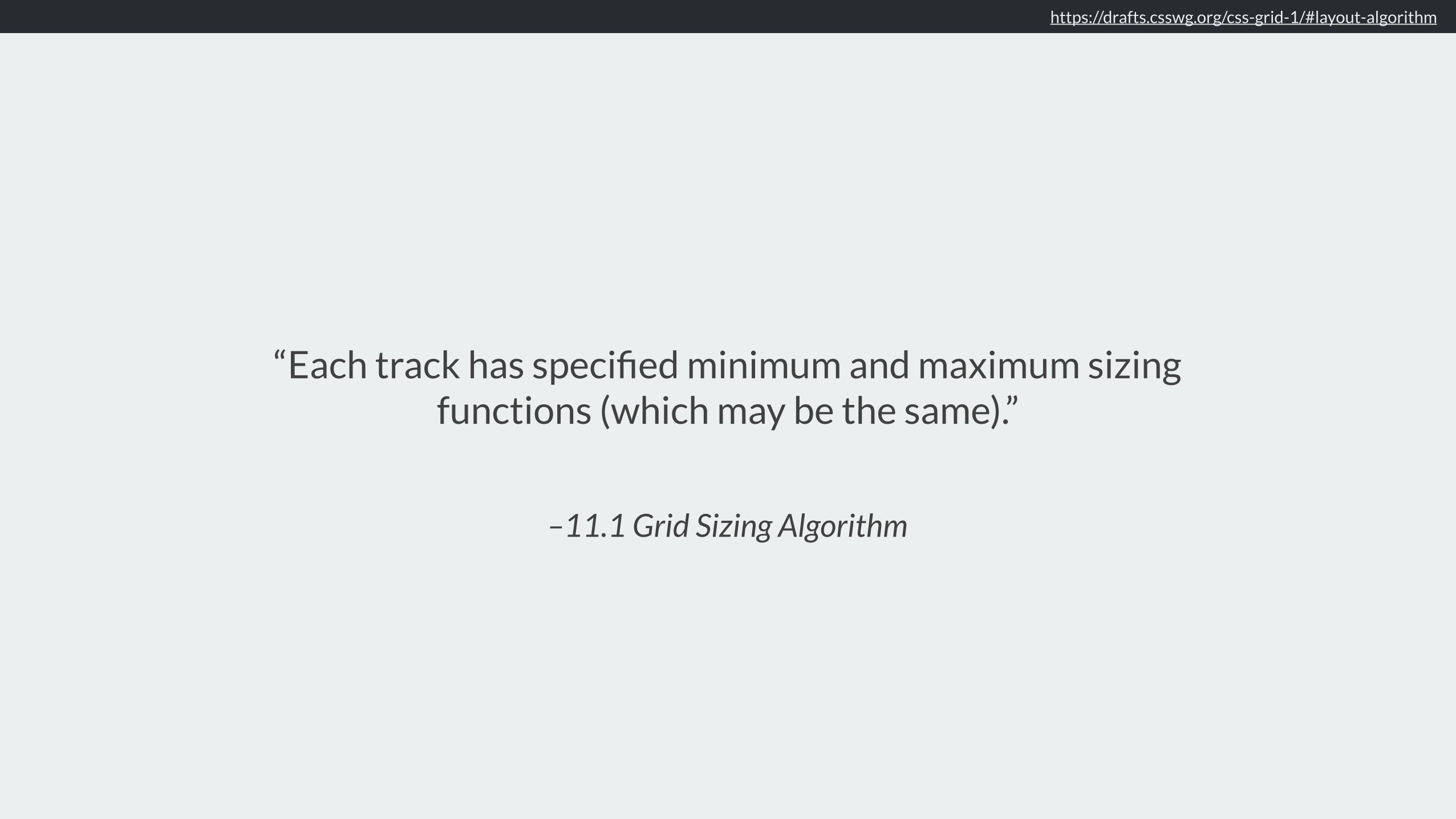
–11.1 Grid Sizing Algorithm
“Each track has specified minimum and maximum sizing functions (which may be the same).”
https://drafts.csswg.org/css-grid-1/#layout-algorithm

❖ Fixed sizing: lengths such as px or em, or a resolvable percentage
❖ An intrinsic sizing function auto, min-content, max-content, fit-content
❖ A flexible sizing function The fr unit
https://drafts.csswg.org/css-grid-1/#layout-algorithm

Intrinsic Sizing
autoDefault size of grid tracks. Tracks sized auto will stretch to take up space in the grid container.

https://codepen.io/rachelandrew/pen/ppYPZR
justify-content: start
justify-content: stretch
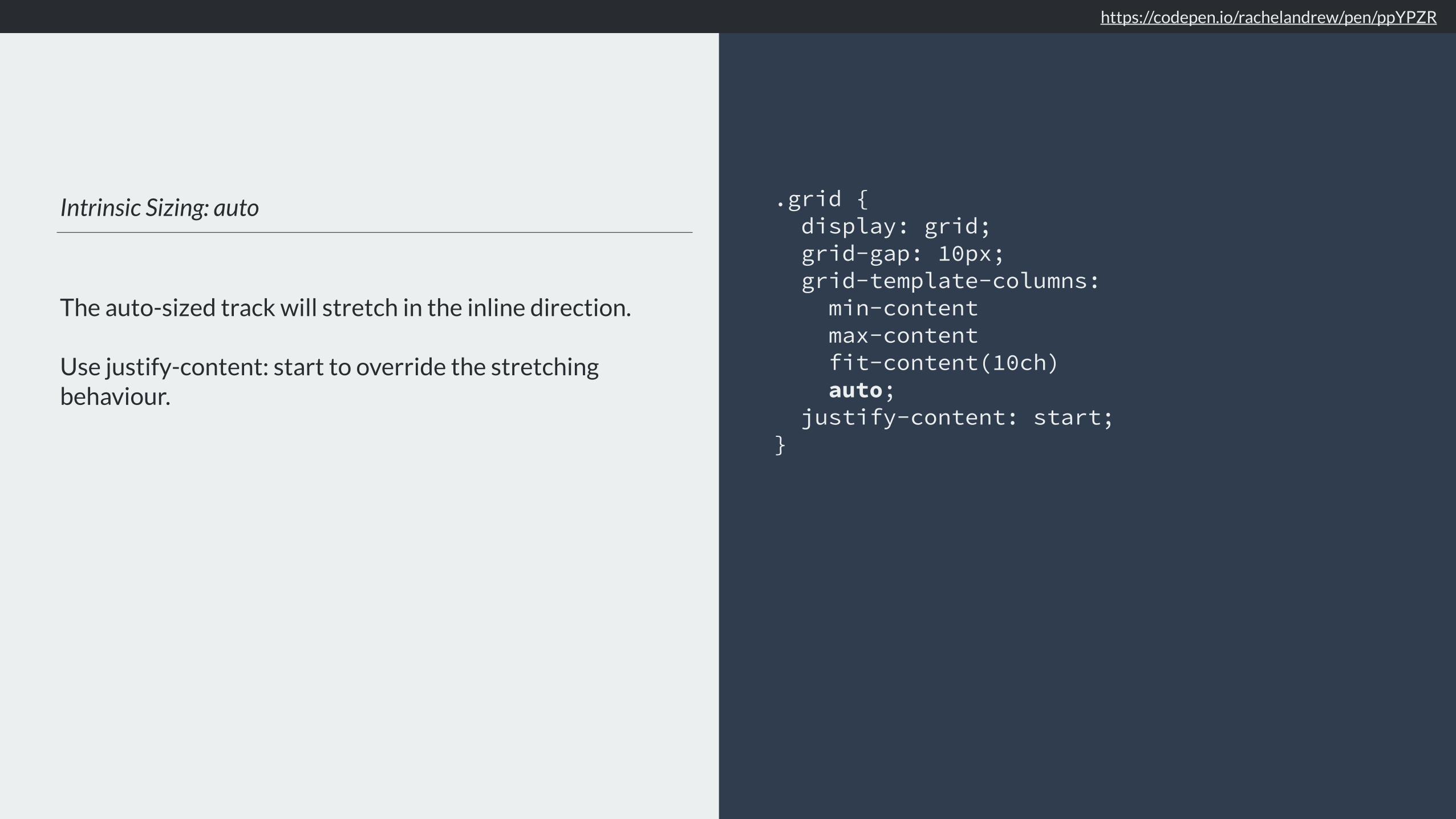
Intrinsic Sizing: auto
The auto-sized track will stretch in the inline direction.
Use justify-content: start to override the stretching behaviour.
.grid { display: grid; grid-gap: 10px; grid-template-columns: min-content max-content fit-content(10ch) auto; justify-content: start; }
https://codepen.io/rachelandrew/pen/ppYPZR

Intrinsic Sizing
min-contentThe smallest size the item can be, taking advantage of all soft-wrapping opportunities.

Intrinsic Sizing: min-content
Grid tracks sized with min-content will become as small as they can without causing overflows.
.grid { display: grid; grid-gap: 10px; grid-template-columns: min-content min-content min-content; }
https://codepen.io/rachelandrew/pen/VyOpXj

https://codepen.io/rachelandrew/pen/VyOpXj
The word ‘columns’ is defining the size
of track 1.
This item has a width which defines the size
of track 2
A 100px image defines the size
of track 3
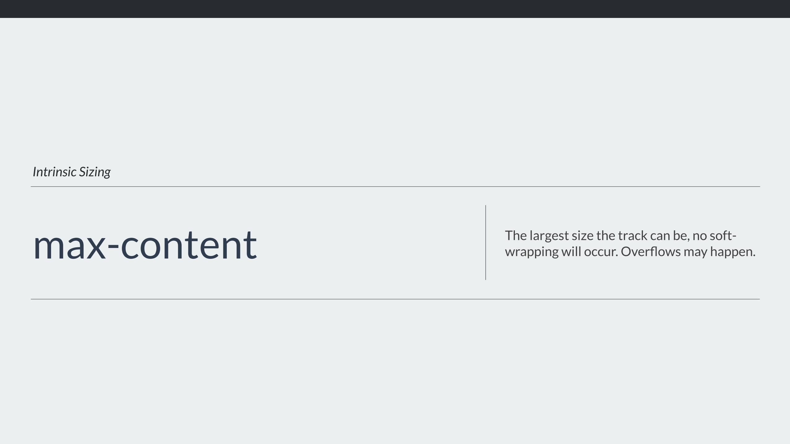
Intrinsic Sizing
max-content The largest size the track can be, no soft-wrapping will occur. Overflows may happen.

Intrinsic Sizing: max-content
Grid tracks sized with max-content will become as large as needed, and may overflow the grid container.
.grid { display: grid; grid-gap: 10px; grid-template-columns: max-content max-content max-content; }
https://codepen.io/rachelandrew/pen/xpNdxV

https://codepen.io/rachelandrew/pen/xpNdxV
Tracks 1 and 2 need to be wide enough to fit the unwrapped text.
A 100px image defines the size
of track 3

Intrinsic Sizing
fit-content Act like max-content until it reaches the passed in value.

Intrinsic Sizing: fit-content
Grid tracks sized with fit-content will act like max-content until they hit the limit given.
.grid { display: grid; grid-gap: 10px; grid-template-columns: fit-content(10em) fit-content(10em) fit-content(15ch); }
https://codepen.io/rachelandrew/pen/Mrdobm

https://codepen.io/rachelandrew/pen/Mrdobm
Track 3 is fit-content(15ch)
Columns 1 and 2 are both fit-content(10em). Track 1 wraps at 10em. Track 2 is max-content.

Flexible lengths
Sizing with fr units The fr unit describes a flexible length

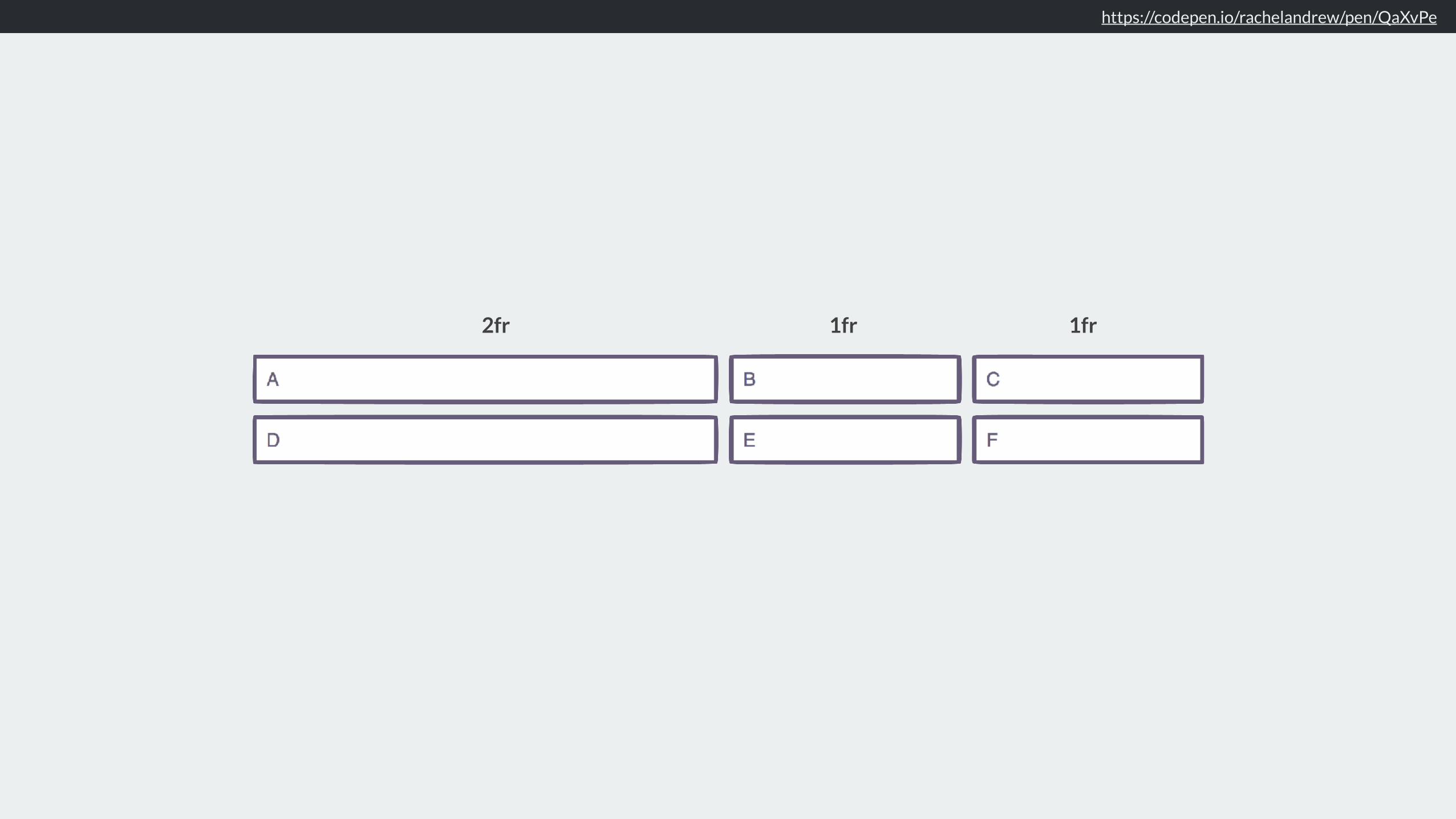
Flexible lengths
The fr unit is a <flex> unit and represents a portion of the available space in the Grid Container.
.grid { display: grid; grid-gap: 10px; grid-template-columns: 2fr 1fr 1fr; }
https://codepen.io/rachelandrew/pen/QaXvPe
Minimum & Maximum sizing functions

minmax()

Minimum Sizing Function
The minimum size for these two tracks is 100px, and 10em.
.grid { display: grid; grid-template-columns: minmax(100px, auto) minmax(10em, 20em); }

Minimum Sizing Function
The minimum size of these two tracks is auto.
.grid { display: grid; grid-template-columns: 10fr fit-content(10em); }

Minimum Sizing Function
The minimum size of the first track is 100px, the second track is 50px (10% of 500).
.grid { width: 500px; display: grid; grid-template-columns: 100px 10%; }

Maximum Sizing Function
The maximum size for these two tracks is 400px, and 20em.
.grid { display: grid; grid-template-columns: minmax(100px, 400px) minmax(10em, 20em); }
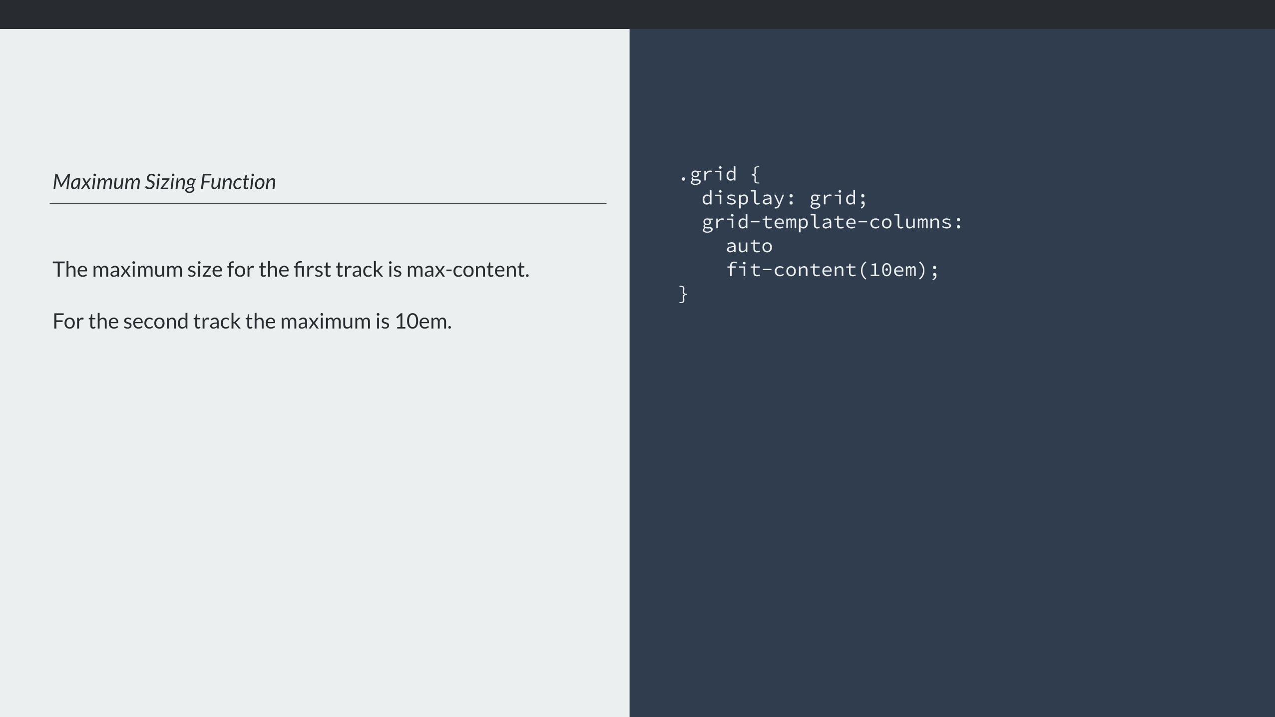
Maximum Sizing Function
The maximum size for the first track is max-content.
For the second track the maximum is 10em.
.grid { display: grid; grid-template-columns: auto fit-content(10em); }

https://codepen.io/rachelandrew/pen/aEgwKY
200px 200px 200px
200px
200px
620px
410px

https://codepen.io/rachelandrew/pen/goNRVp
200px 200px 200px
620px
Auto sized row expands to make room for content

https://codepen.io/rachelandrew/pen/BJgdKL
Auto sized row expands to make room for content
1fr 1fr 1fr

What is a fr unit anyway?
A track sized with 1fr, is actually sized minmax(auto, 1fr).
The minimum size is auto.
.grid { display: grid; grid-template-columns: 1fr 1fr 1fr; }

https://codepen.io/rachelandrew/pen/BJgdKL
1fr 1fr 1fr
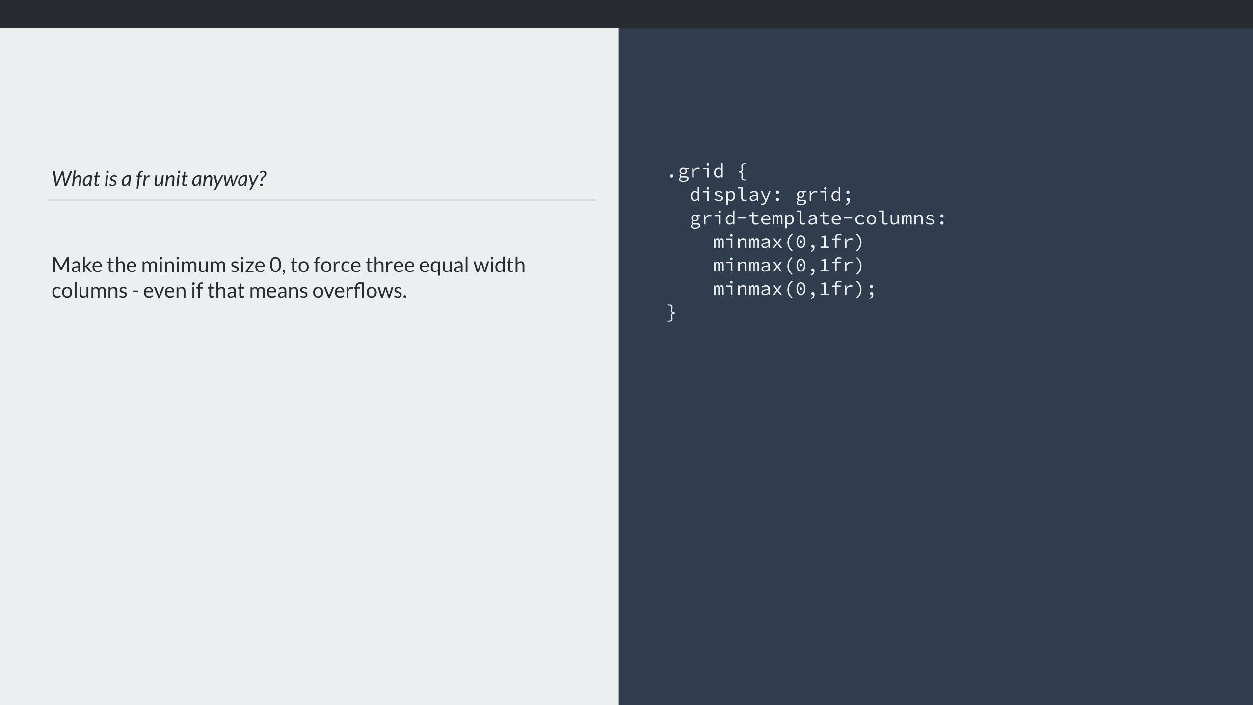
What is a fr unit anyway?
Make the minimum size 0, to force three equal width columns - even if that means overflows.
.grid { display: grid; grid-template-columns: minmax(0,1fr)
minmax(0,1fr) minmax(0,1fr);
}

minmax(0,1fr) minmax(0,1fr) minmax(0,1fr)

1fr 1fr 1fr
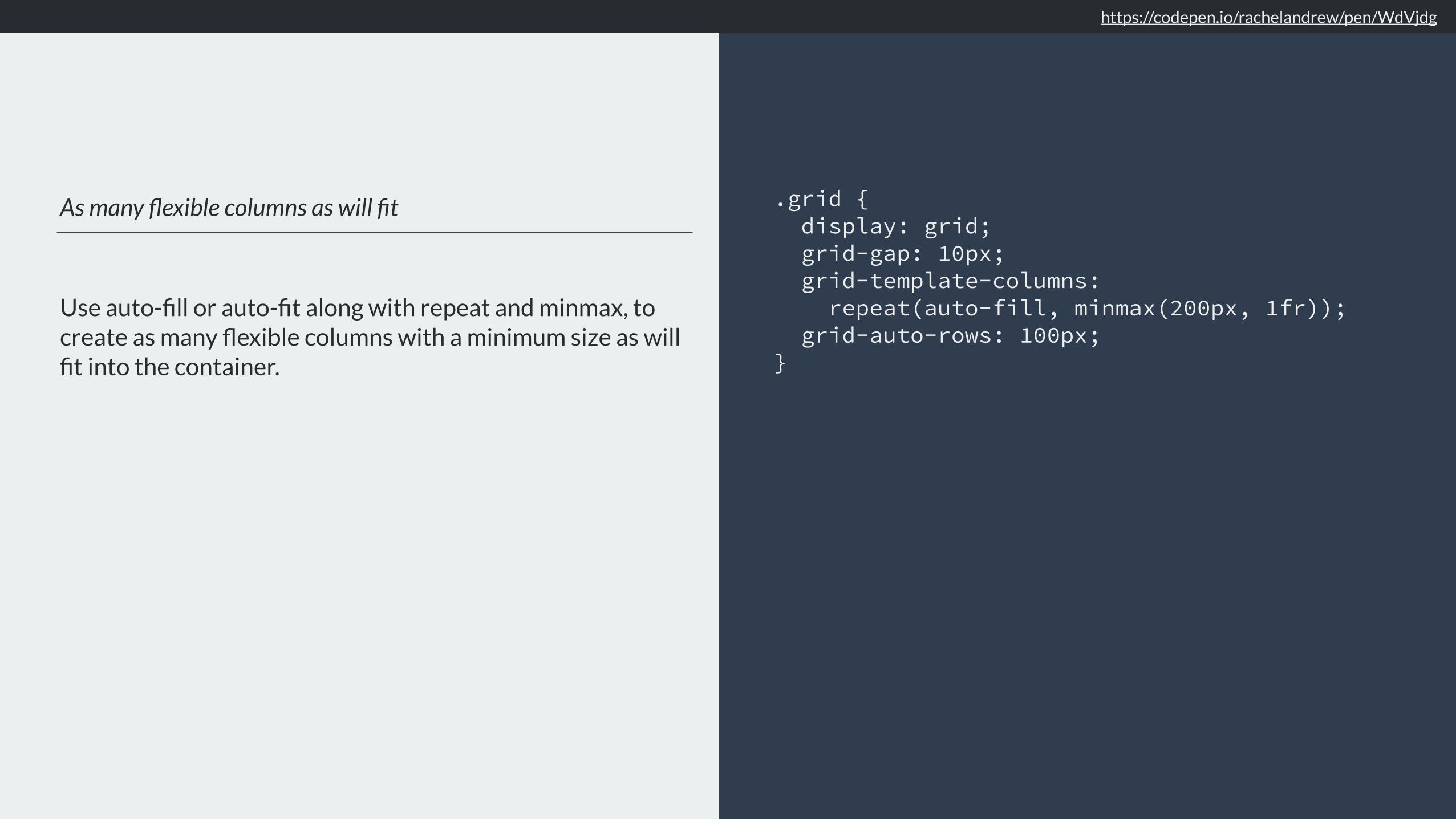
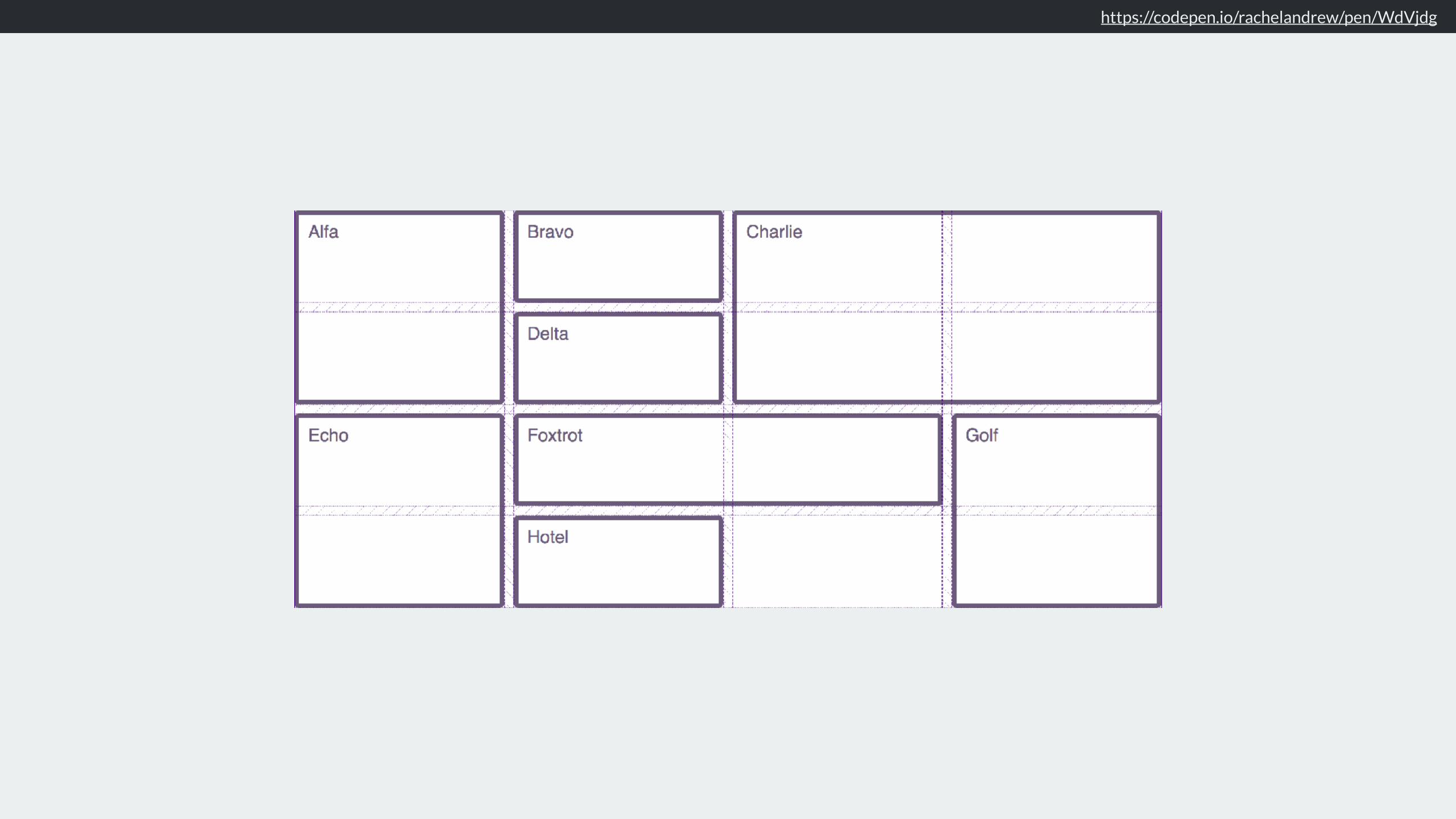
As many flexible columns as will fit
Use auto-fill or auto-fit along with repeat and minmax, to create as many flexible columns with a minimum size as will fit into the container.
.grid { display: grid; grid-gap: 10px; grid-template-columns: repeat(auto-fill, minmax(200px, 1fr)); grid-auto-rows: 100px; }
https://codepen.io/rachelandrew/pen/WdVjdg

https://codepen.io/rachelandrew/pen/WdVjdg
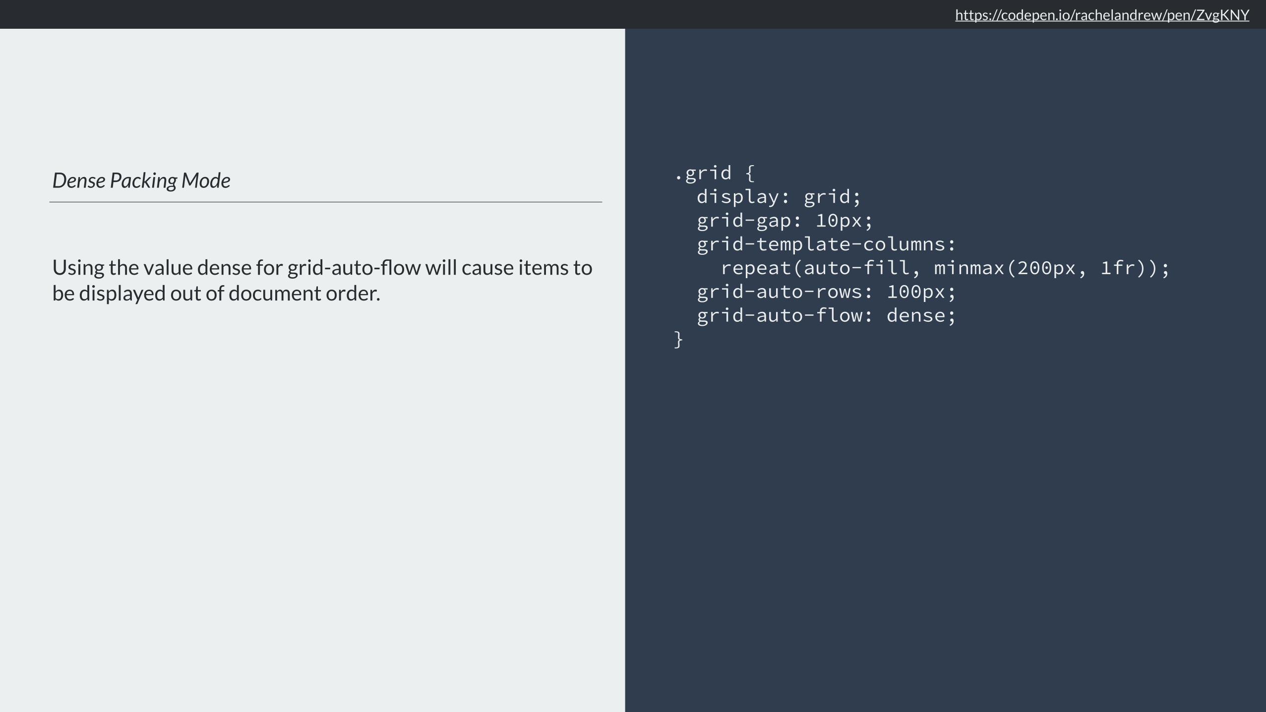
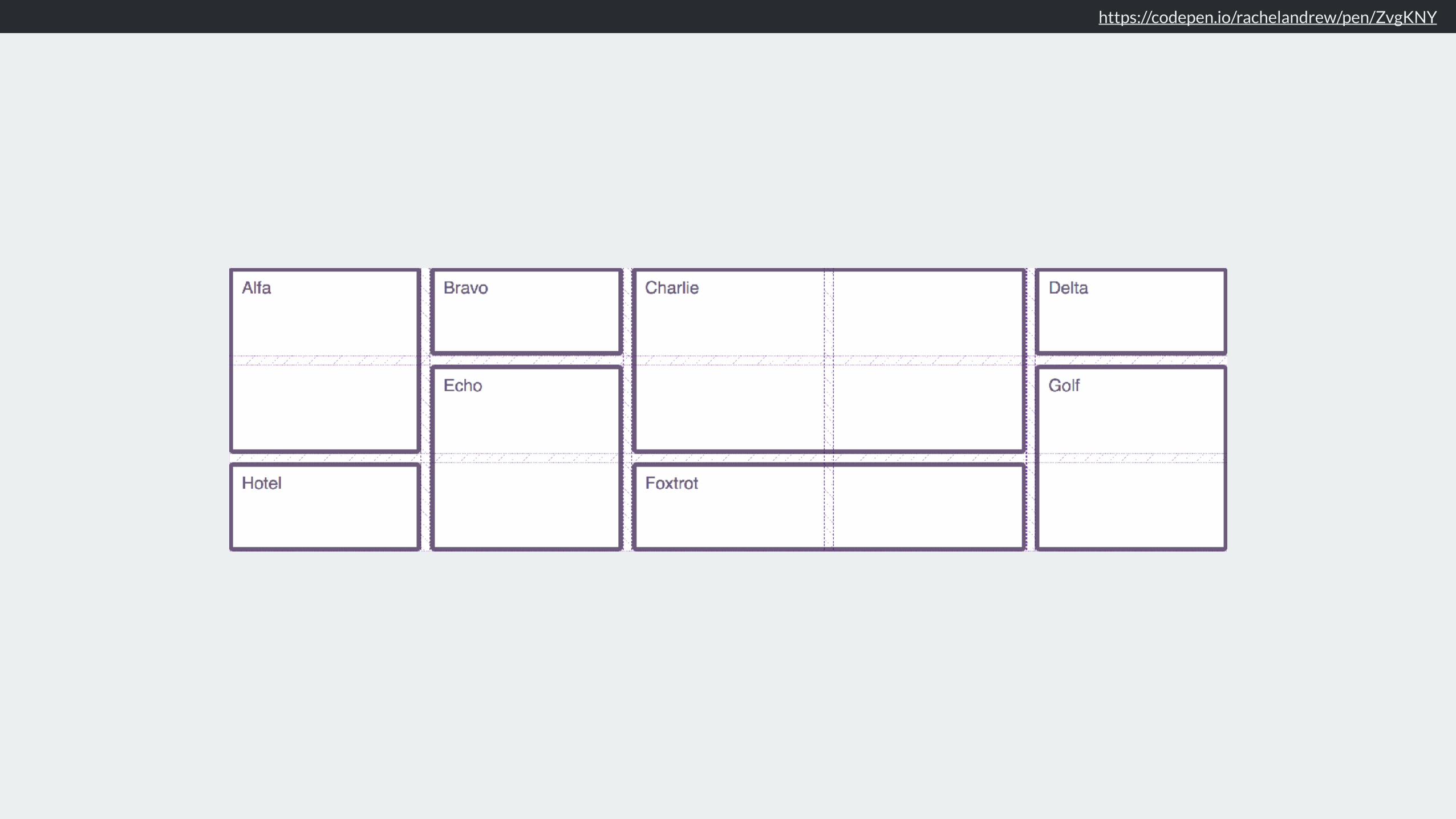
Dense Packing Mode
Using the value dense for grid-auto-flow will cause items to be displayed out of document order.
.grid { display: grid; grid-gap: 10px; grid-template-columns: repeat(auto-fill, minmax(200px, 1fr)); grid-auto-rows: 100px; grid-auto-flow: dense; }
https://codepen.io/rachelandrew/pen/ZvgKNY

This must be pretty slow, right?

https://benfrain.com/css-performance-test-flexbox-v-css-table-fight/

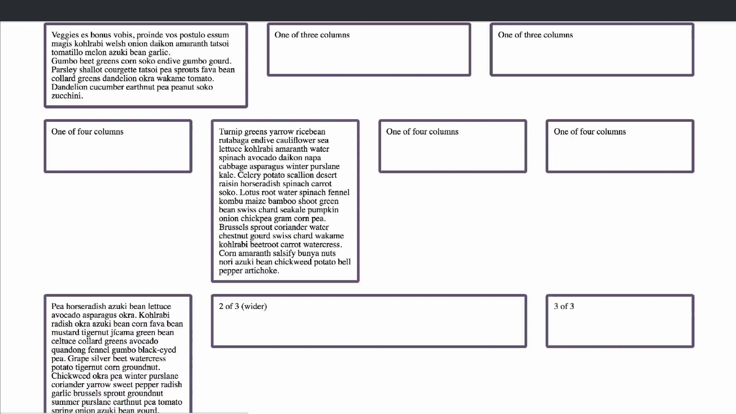
A Flexbox Grid with Bootstrap 4
Uses flexbox for the grid, I used the default Bootstrap grid classes.
<div class="container-fluid"> <div class="row"> <div class="col-sm">One of three columns</div> <div class="col-sm">One of three columns</div> <div class="col-sm">One of three columns</div> </div> <div class="row"> <div class="col-sm">One of four columns</div> <div class="col-sm">One of four columns</div> <div class="col-sm">One of four columns</div> <div class="col-sm">One of four columns</div> </div> <div class="row"> <div class="col">1 of 3</div> <div class="col-6">2 of 3 (wider)</div> <div class="col">3 of 3</div> </div>
<!— repeat 999 times —> </div>
https://rachelandrew.github.io/into-the-weeds/bootstrap/
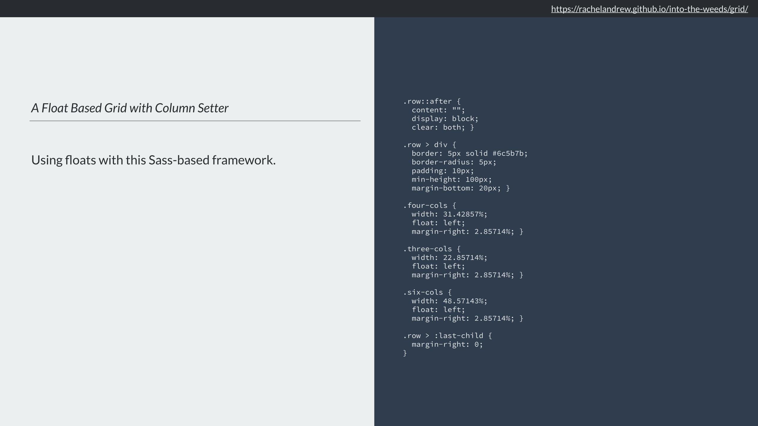
A Float Based Grid with Column Setter
Using floats with this Sass-based framework.
.row::after { content: ""; display: block; clear: both; }
.row > div { border: 5px solid #6c5b7b; border-radius: 5px; padding: 10px; min-height: 100px; margin-bottom: 20px; }
.four-cols { width: 31.42857%; float: left; margin-right: 2.85714%; }
.three-cols { width: 22.85714%; float: left; margin-right: 2.85714%; }
.six-cols { width: 48.57143%; float: left; margin-right: 2.85714%; }
.row > :last-child { margin-right: 0; }
https://rachelandrew.github.io/into-the-weeds/grid/

CSS Grid
We lost the row wrappers in the HTML for the Grid version.
.grid { display: grid; grid-template-columns: repeat(12, 1fr); grid-auto-rows: 100px; grid-gap: 20px; }
.four-cols { grid-column: auto / span 4; }
.three-cols { grid-column: auto / span 3; }
.six-cols { grid-column: auto / span 6; }


–everyone on the web
“Where is my magic Grid Polyfill?”

https://www.reddit.com/r/web_design/comments/700tfh/is_there_a_working_polyfill_for_css_grid_for_ie_11/
http://brm.io/jquery-match-height-demo/


Sorry.

We develop in an environment far more powerful than that of our users.

Testing often does not reflect realistic day to day use, or realistic data.

please stop asking this question
“Where is my magic Grid Polyfill?”


New CSS can help you create better experiences in browsers that don’t support new CSS.

A 12 column layout .grid { display: grid; grid-template-columns: repeat(12, 1fr); grid-auto-rows: 100px; grid-gap: 20px; }
.four-cols { grid-column: auto / span 4; }
.three-cols { grid-column: auto / span 3; }
.six-cols { grid-column: auto / span 6; }

New CSS knows about old CSS

❖ Media Queries: tailor your design according to features of the device
❖ Feature Queries: tailor your design to the support in the browser
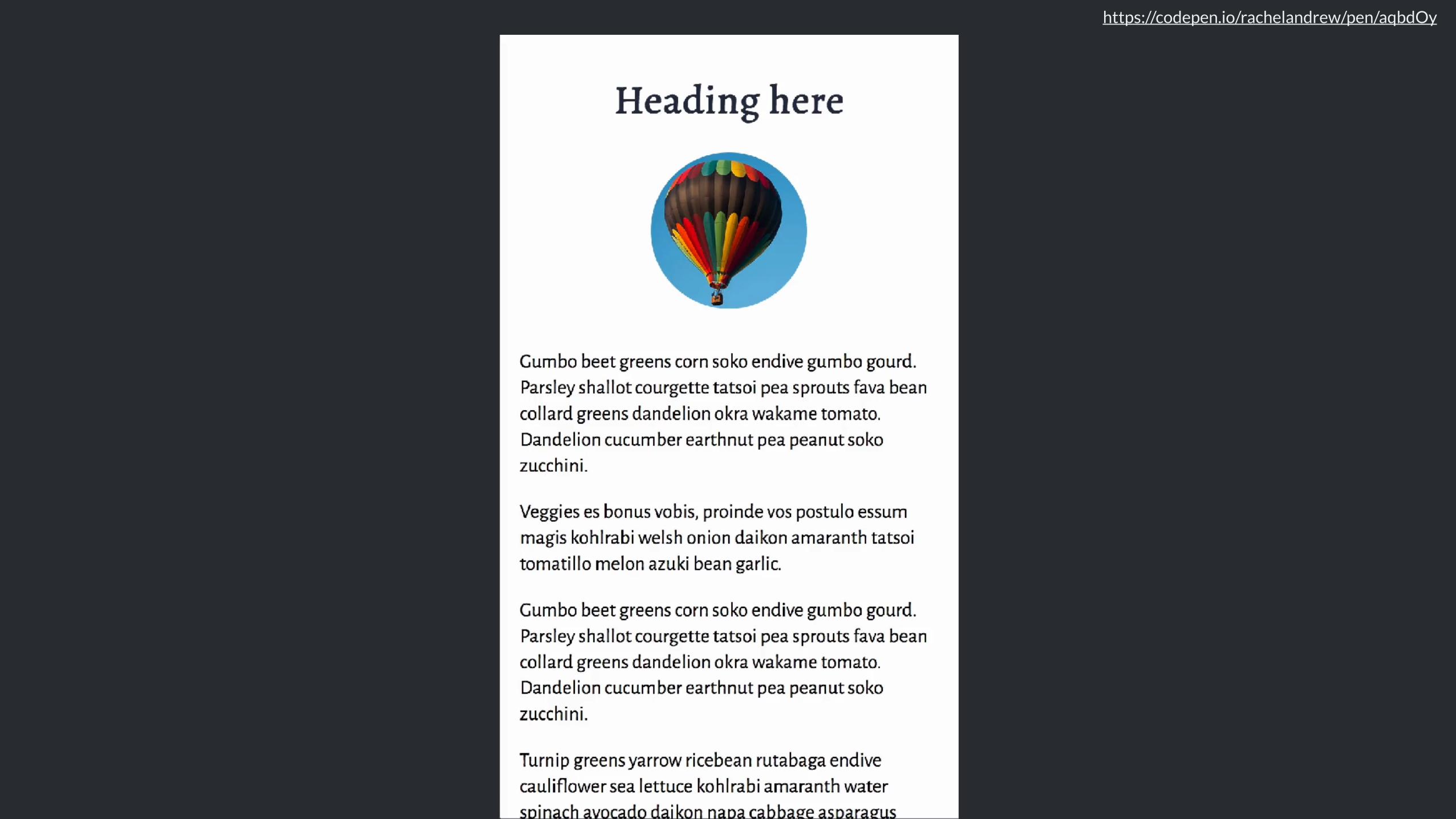

Adding a vertical centre line either side of the text
Using generated content to add a border.
header h1 { text-align: center; display: grid; grid-template-columns: 1fr auto 1fr; grid-gap: 20px; }
header h1:before, header h1:after { content: ""; align-self: center; border-top: 1px solid rgba(37,46,63,.5); }
https://codepen.io/rachelandrew/pen/aqbdOy

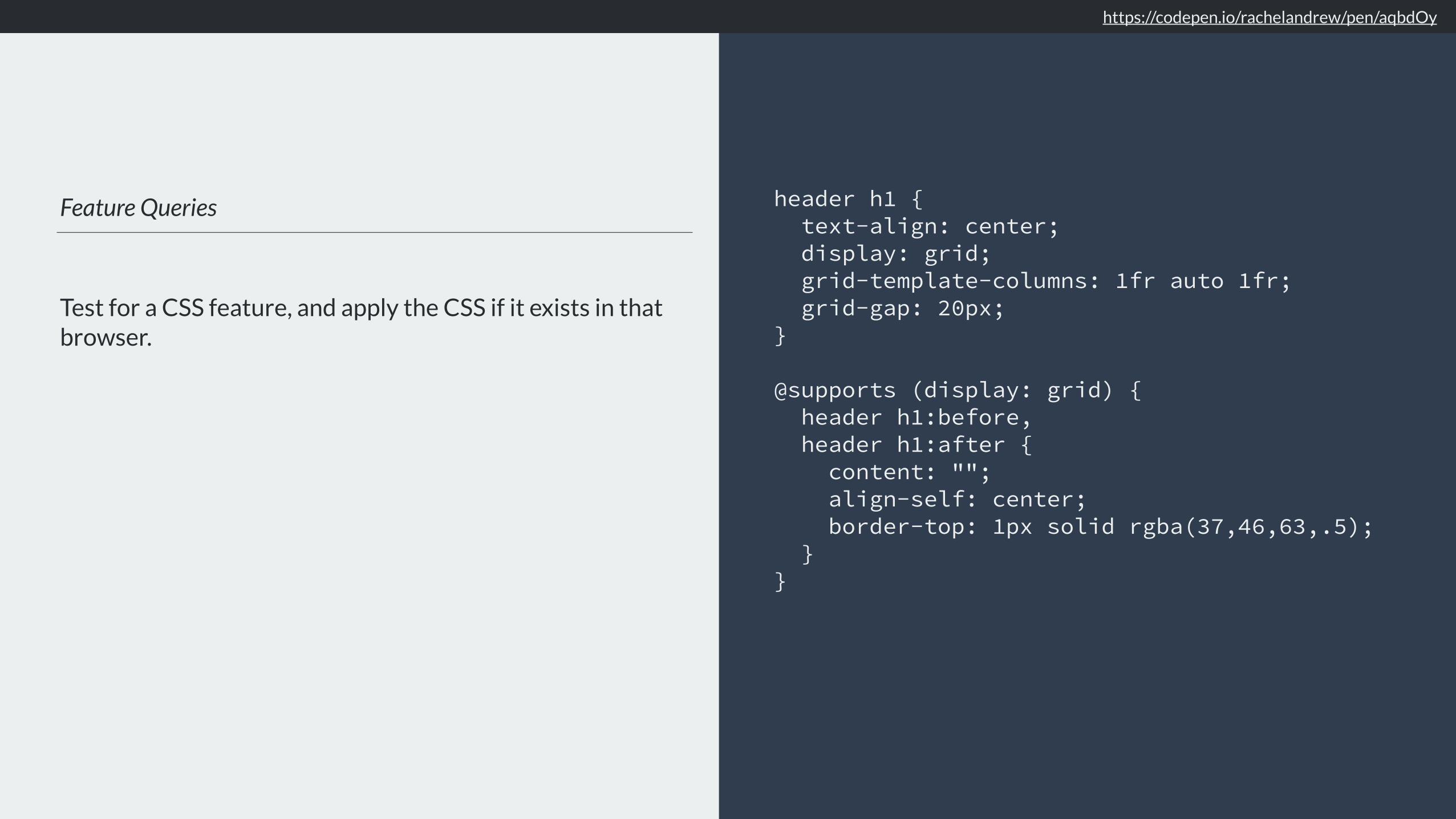
Feature Queries
Test for a CSS feature, and apply the CSS if it exists in that browser.
header h1 { text-align: center; display: grid; grid-template-columns: 1fr auto 1fr; grid-gap: 20px; }
@supports (display: grid) { header h1:before, header h1:after { content: ""; align-self: center; border-top: 1px solid rgba(37,46,63,.5); } }
https://codepen.io/rachelandrew/pen/aqbdOy
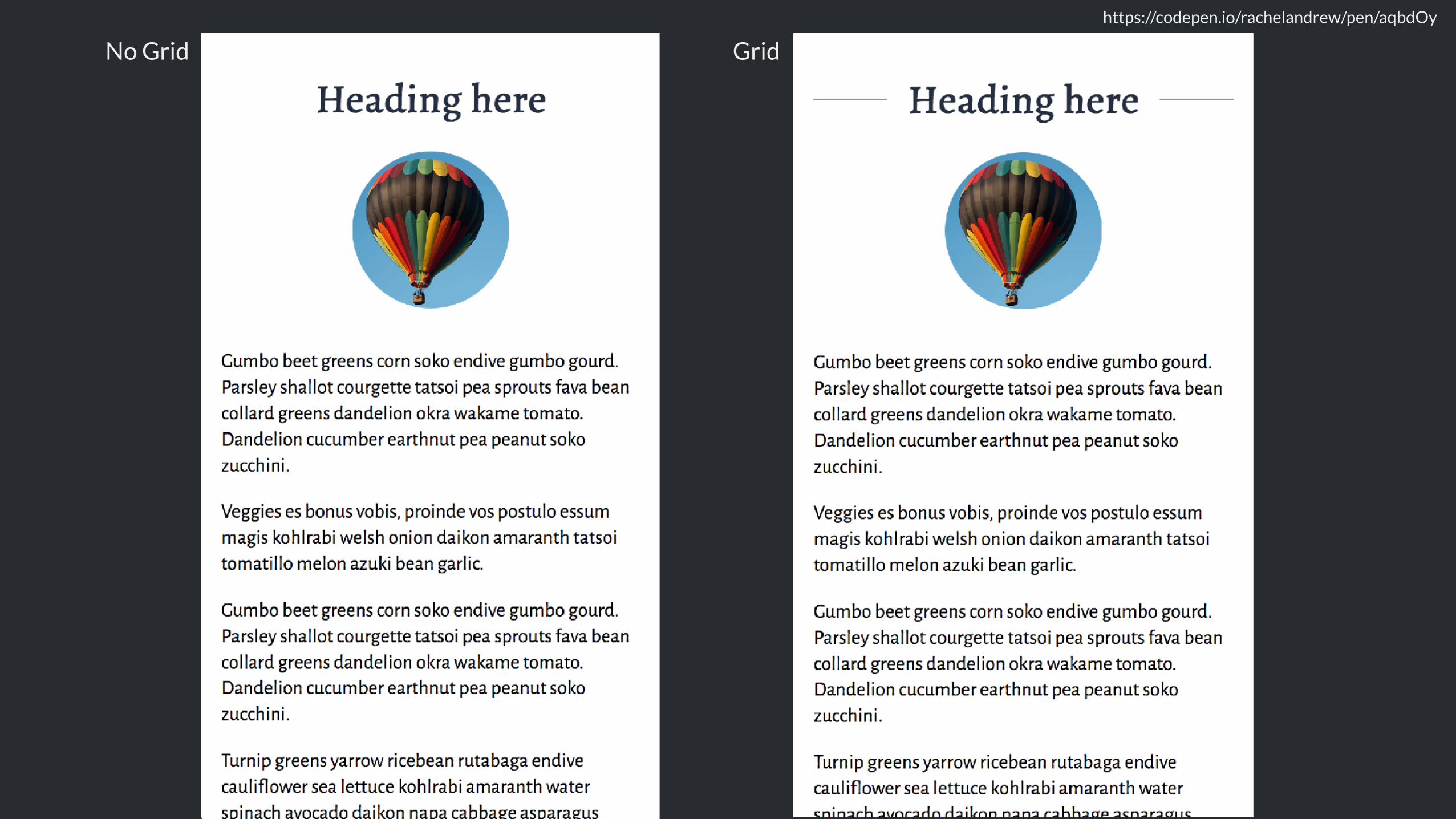
https://codepen.io/rachelandrew/pen/aqbdOy
No Grid Grid
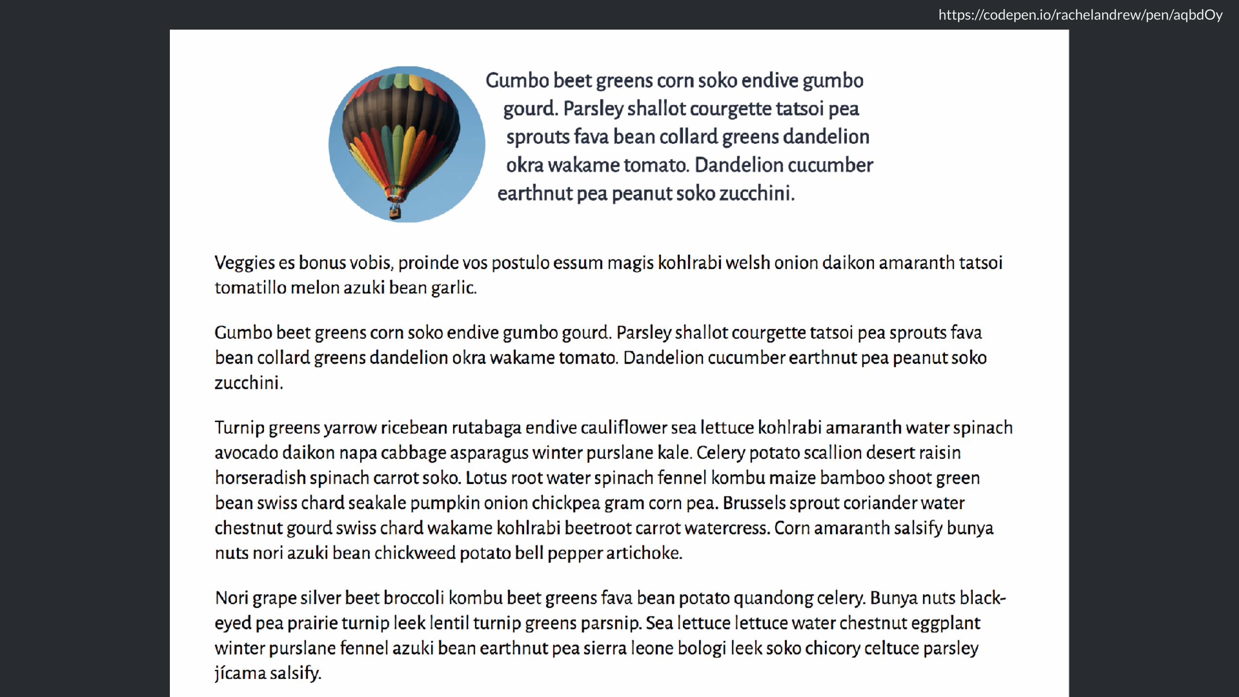
Creating circles from squares
Use border-radius
Don’t forget that old CSS still exists!
header img { border-radius: 50%; margin: 0 auto 2em auto; }
https://codepen.io/rachelandrew/pen/aqbdOy
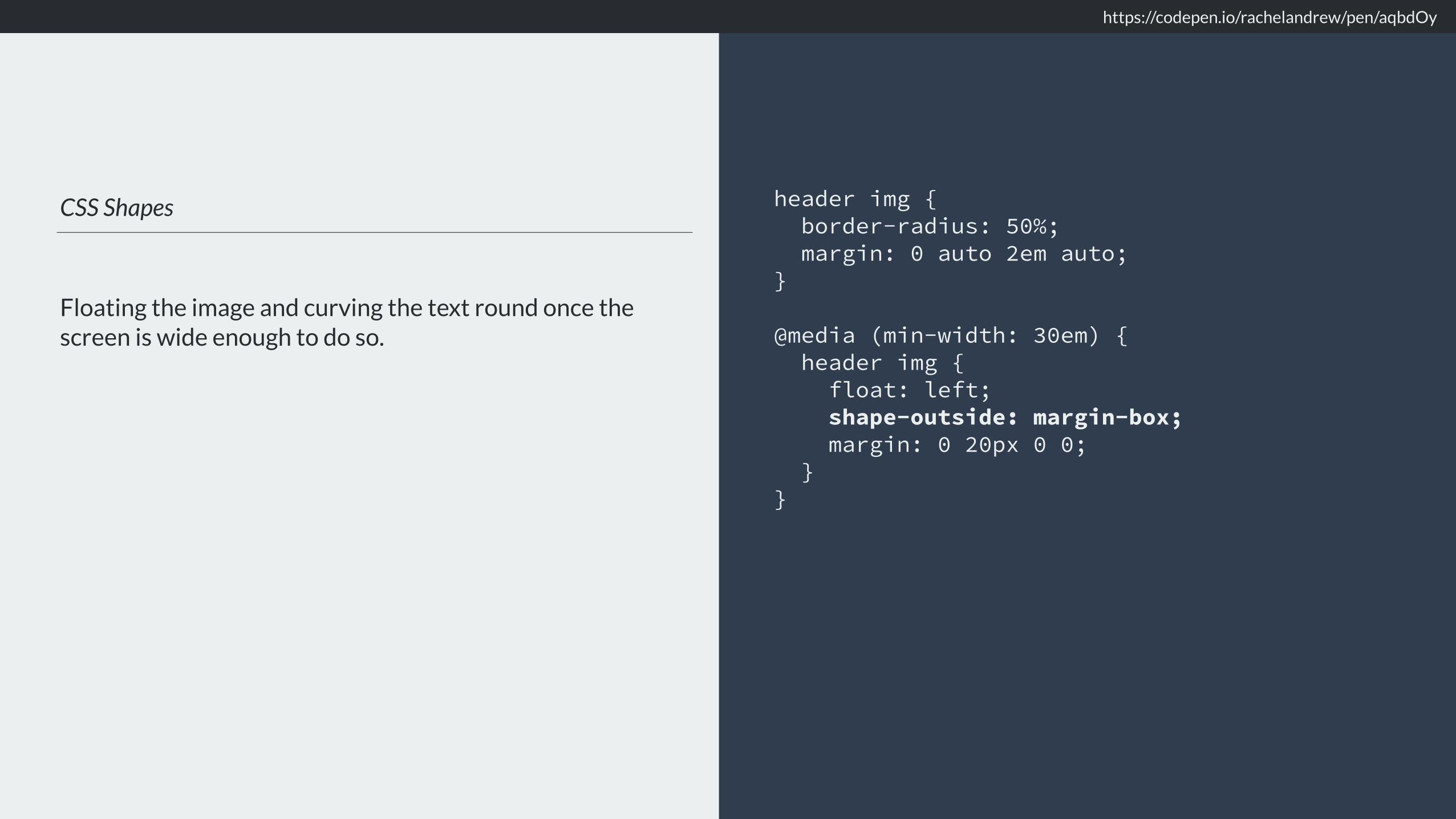
CSS Shapes
Floating the image and curving the text round once the screen is wide enough to do so.
header img { border-radius: 50%; margin: 0 auto 2em auto; }
@media (min-width: 30em) { header img { float: left; shape-outside: margin-box; margin: 0 20px 0 0; } }
https://codepen.io/rachelandrew/pen/aqbdOy

https://codepen.io/rachelandrew/pen/aqbdOy

https://codepen.io/rachelandrew/pen/aqbdOy
https://codepen.io/rachelandrew/pen/aqbdOy
Multi-column layout
Well supported, responsive by default.
section { column-width: 15em; }
https://codepen.io/rachelandrew/pen/aqbdOy

Vertical Media Queries
Do we have enough height to show the columns without vertical scrolling?
@media (min-height: 500px) { section { column-width: 15em; } }
https://codepen.io/rachelandrew/pen/aqbdOy

https://codepen.io/rachelandrew/pen/aqbdOy

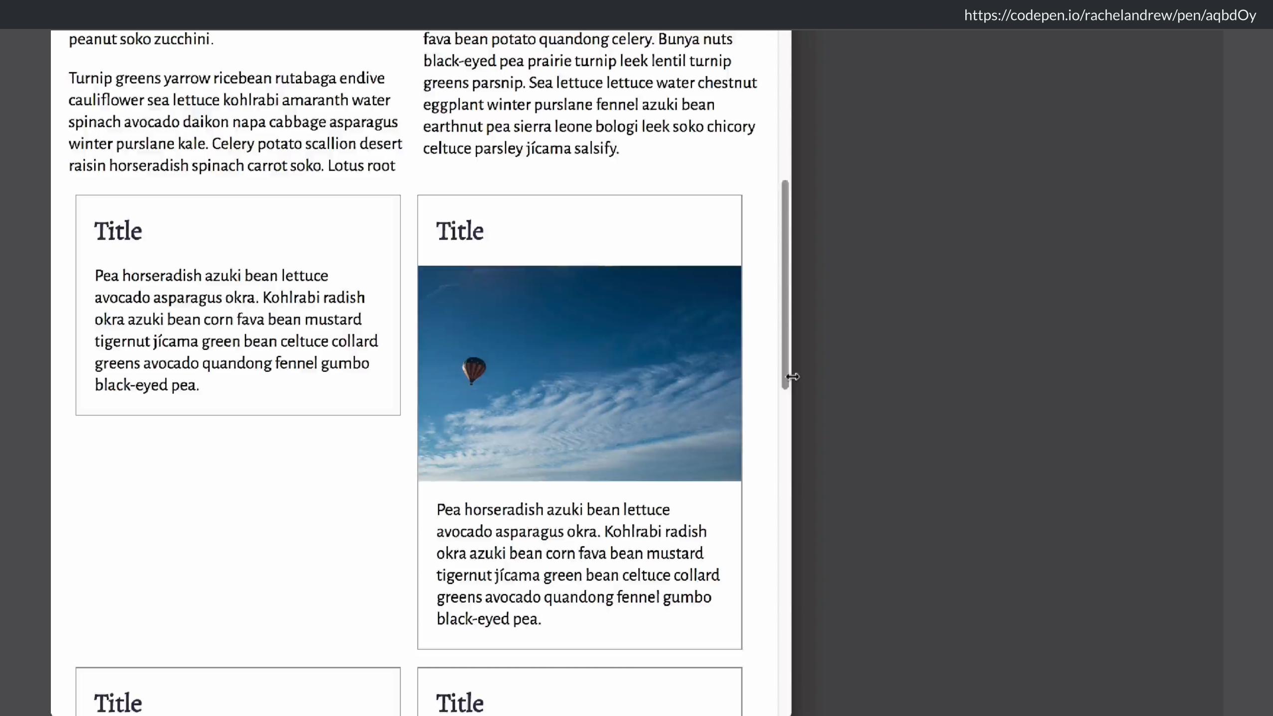
Creating columns of cards
Matching the minimum grid width, and the gap to the multi-column width and column-gap.
.resources { max-width: 60em; }
.resources { margin: 1em auto; padding: 0; list-style: none; display: grid; grid-template-columns: repeat(auto-fill, minmax(15em,1fr)); grid-gap: 1em; }
.resources li.image { grid-row: auto / span 2; }
https://codepen.io/rachelandrew/pen/aqbdOy

https://codepen.io/rachelandrew/pen/aqbdOy

Using in-line: block as a fallback
We only need to over-ride the width and margin in a Feature Query.
@media (min-width: 40em) { .resources li { display: inline-block; width: 47%; margin: 0 1% 1em 1%; vertical-align: top; } }
@supports (display: grid) { .resources li { width: auto; margin: 0; } }
https://codepen.io/rachelandrew/pen/aqbdOy
https://codepen.io/rachelandrew/pen/aqbdOy
Using multi-column layout as a fallback
We don’t need to override the column-* properties. They are ignored once we are in grid layout.
@media (min-width: 40em) { .resources { column-width: 15em; }
.resources li { break-inside: avoid; } }


We can achieve a lot with a little CSS.

Before worrying if a technique performs well, ask yourself if you need it at all.

Reframe the browser support conversation.

We have the tools to provide great experiences for everyone.

https://rachelandrew.co.uk/speaking/event/smashing-london-2018
Thank you! @rachelandrew https://rachelandrew.co.uk