integrated visual exploration tool for fusion of mass...
TRANSCRIPT

Integrated Visual Exploration Tool for Fusion of Mass Movement Data and Static Data
UEYAMA Satoshi, AKIYAMA Yuki and SHIBASAKI Ryosuke
Abstract
The spread of positioning technologies such as GPS-equipped mobile
phones is making it easy to collect movement data and an enormous
amount of movement data can be accumulated every day. However, to
analyze movement data, we currently need to develop statistical tools,
programming, spreadsheets, etc. and know how to combine them.
Therefore, in this research, we develop "Mobmap", a specialized tool for
movement data analysis, to remove non-essential problems that prevent
researchers from using movement data. Mobmap can load grid data and
conventional statistical data to help users perform various analysis tasks.
Thus, Mobmap improves the value of movement data. We present an
example analysis combining actual movement data and grid data to
demonstrate how Mobmap fuses the different types of data.
_______________________________________________________ UEYAMA Satoshi (Corresponding author)
EDITORIA, University of Tokyo, Komaba, Meguro-ku, Tokyo, Japan
Email: [email protected]
AKIYAMA Yuki
EDITORIA, University of Tokyo, Komaba, Meguro-ku, Tokyo, Japan
Email: [email protected]
SHIBASAKI Ryosuke
Center for Spatial Information Science, University of Tokyo, Kashiwa,
Chiba, Japan
Email: [email protected]
CUPUM 2015 271-Paper

1 Introduction
The spread of positioning technologies such as GPS-equipped mobile
phones is making the collection of movement data very easy, allowing an
enormous amount of movement data to be accumulated every day.
Although it is difficult to equip all people and vehicles with independent
GPS receivers, the widespread use of GPS-equipped mobile phones allows
urban monitoring of movement data. For example, Intelligent
Transportation Systems (ITS) mitigate congestion and provide route
guidance for travelers (Calabrese 2011). However, a huge volume of
terabytes or petabytes of data, and real-time or near-real-time velocity are
characteristics of the big data acquired by modern sensor devices (Kitchin
2014).
However, limited tools are available for handling "big" movement
data, despite the sufficient technology for data collection. If users of
movement data cannot find a suitable tool for their purpose, they must then
combine existing general-purpose tools. Spreadsheet software such as
Microsoft Excel can be used for movement data analysis, and while R,
Matlab, Stata, and ArcGIS are more professional types of software, they
are not specialized for movement data. Therefore, users must adapt the
tools for whichever software they choose (Ferreira 2013), and some
advanced tasks such as data conversion and interactive visualization
require programming skills.
In this study, we develop Mobmap, a tool for analyzing and
visualizing movement data. Mobmap integrates analysis and visualization
tasks that have been fragmented into various tools and provides a
specialized user interface for movement data analysis. In addition,
Mobmap has the capability to fuse static data that have been accumulated
in the past with movement data, thus providing a new paradigm for
movement data analysis.
2 Related Works 2.1 Visual Exploration of Movement Data
Andrienko et al. (2000) discussed the typical purposes of tool users and
developed a visual exploration tool for movement data: telemetric
observation of storks between Europe and Africa. The following list shows
the five typical questions an analyst may pose:
CUPUM 2015 Ueyama, Akirama, Shibasaki 271-2
Overall view: What trajectories did the objects make during the entire
time span considered?
Moment view: Where was each object at a selected time t?
Comparison: How did the positions of the objects change from moment
t1 to moment t2?
Interval view: What were the routes of the objects in the interval [t1, t2]?
Dynamics view: How did the movement progress with time?
Mobmap has been designed with functions that incorporate these purposes.
2.2 Handling mass moving objects
When Andrienko et al. (2000) developed their system, computer
performance was less advanced than today and could render only a few
moving objects simultaneously. Mobmap utilizes the graphics accelerators
of modern computers to render mass moving objects. Therefore, Mobmap
can render fluid animation with tens of thousands of mass moving objects.
If some delay in animation is accepted, then Mobmap can handle more
moving objects as long as the CPU and memory capacity permit than
non-delayed case.
An example of a study utilizing the graphics performance of modern
computers is the visualization system for vessel trajectories developed by
Scheepens et al. (2011). If many trajectories are simply drawn as lines, a
user cannot distinguish how many trajectories are overlapped. Thus,
Scheepens et al. added post processing with a GPU to render bumps
indicating the points of overlapping trajectories, which help the user to
understand the congested overlaps.
2.3 Visual Querying
Ferreira et al. (2013) developed TaxiVis, a system that can visualize spatial
queries, e.g., "extract taxis picked here and dropped off there", for 540
million taxi trips in New York City. This study is similar to Mobmap in its
implementation and functions. However, we put more emphasis on
complete trajectory data than on origin–destination (OD) data because the
spread of positioning devices will produce enormous trajectory data in the
future. If users want to handle OD data, we assume that an external system
will generate trajectory data from the OD data.
Bouvier and Oates (2008) developed a user interface called "Staining"
to extract (1) people who passed a specified place and (2) people who
moved during a specified period from movement data of an evacuation
CUPUM 2015 Integrated Visual Exploration Tool for Fusion of Mass Movement ... 271-3

from a building. Mobmap has a similar function called "Gate" selection,
which provides more complex conditions, e.g., filtering by attribute value
and constraints caused by the direction of movement.
3 Overview of Mobmap 3.1 Data Source
Mobmap loads CSV-formatted movement data. CSV is a simple file
format that can be understood by non-expert users. Simplicity is important
because we assume users of Mobmap have various backgrounds.
However, there is no standard for CSV representation of movement
data, as the order of the columns storing latitude, longitude, and time
varies by file. Therefore, Mobmap asks users to specify which column
stores what type of data. Input CSV file must include at least the required
attributes of object ID, latitude, longitude, and time. Each person or object
is identified by their object ID, and records that have the same object ID
form a trajectory polyline.
3.2 Example of Visualization
Figure 1 shows a screenshot of Mobmap showing trajectory data generated
from a person trip survey in 2008. As a person trip survey is typically a
text-based questionnaire, it is not accompanied by detailed trajectories
recorded by positioning devices. Thus, interpolated person trip data is
developed using inferred trajectories matching road and railway network
data (Sekimoto 2011).
Figure 1 shows 19,193 people who can be animated fluently.
Animation is an intuitive expression for movement data. However, as it is
difficult to observe phenomena from pure animation, interactivity is
important to make the animation useful (Dorling 1992). Mobmap’s user
interface enables users to control time at will to improve interactivity. The
next chapter describes this user interface in detail.
Figure 2 shows the same data as Figure 1 from another view. In Figure
2, markers of the moving objects are hidden and the trajectory layer is
enabled to render the entire trajectory. In both Figures 1 and 2, the color of
each marker or line represents the transportation mode.
CUPUM 2015 Ueyama, Akirama, Shibasaki 271-4

Fig. 1 Mobmap showing interpolated person trip data (1/30 sampling,
2008).
Fig. 2 Mobmap showing the trajectory layer.
3.3 Movie Exporter
The movie exporter is the most characteristic function of Mobmap. The
inclusion of an x264 video compression library enables Mobmap to export
animations as compressed movie files. The generated movie is compressed
with H.264, a high-efficiency and widely used video compression format
suitable for publishing on the Internet. However, if the general public can
CUPUM 2015 Integrated Visual Exploration Tool for Fusion of Mass Movement ... 271-5
watch the movie, then its publisher must consider copyrighting the base
map. The movie exporter is also able to visualize mass movement data that
cannot be rendered in real time.
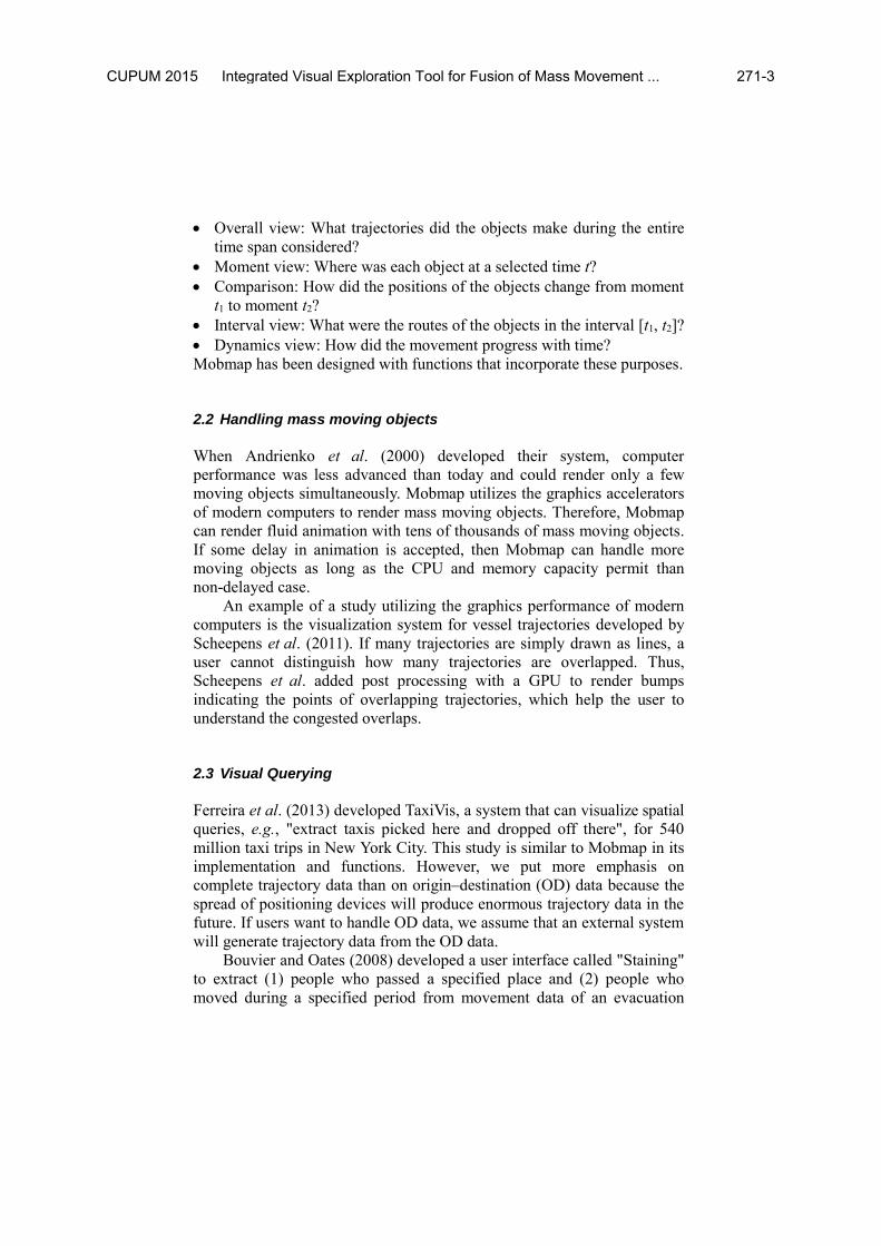
Figure 3 shows a movie generated by Mobmap. Notably, Mobmap can
composite the title text without a video editing tool.
Fig. 3 A generated movie from Mobmap.
3.4 Case Study
We heard from a consulting company that uses mobmap in their work
relating to moving data to investigate their use case.
In their work, gate selection is the most significant feature to reduce
operating time. Before introducing mobmap, they picked object IDs
passing certain location on GIS software at first and then queried database
to collect records of that IDs. They took 3 hours to pick about 200 objects
from the database. Gate selection of mobmap takes less than a minute
including user operation.
Mobmap also improved quality of output by removing trajectories
containing errors at the start of the work.
4 User Interface
CUPUM 2015 Ueyama, Akirama, Shibasaki 271-6
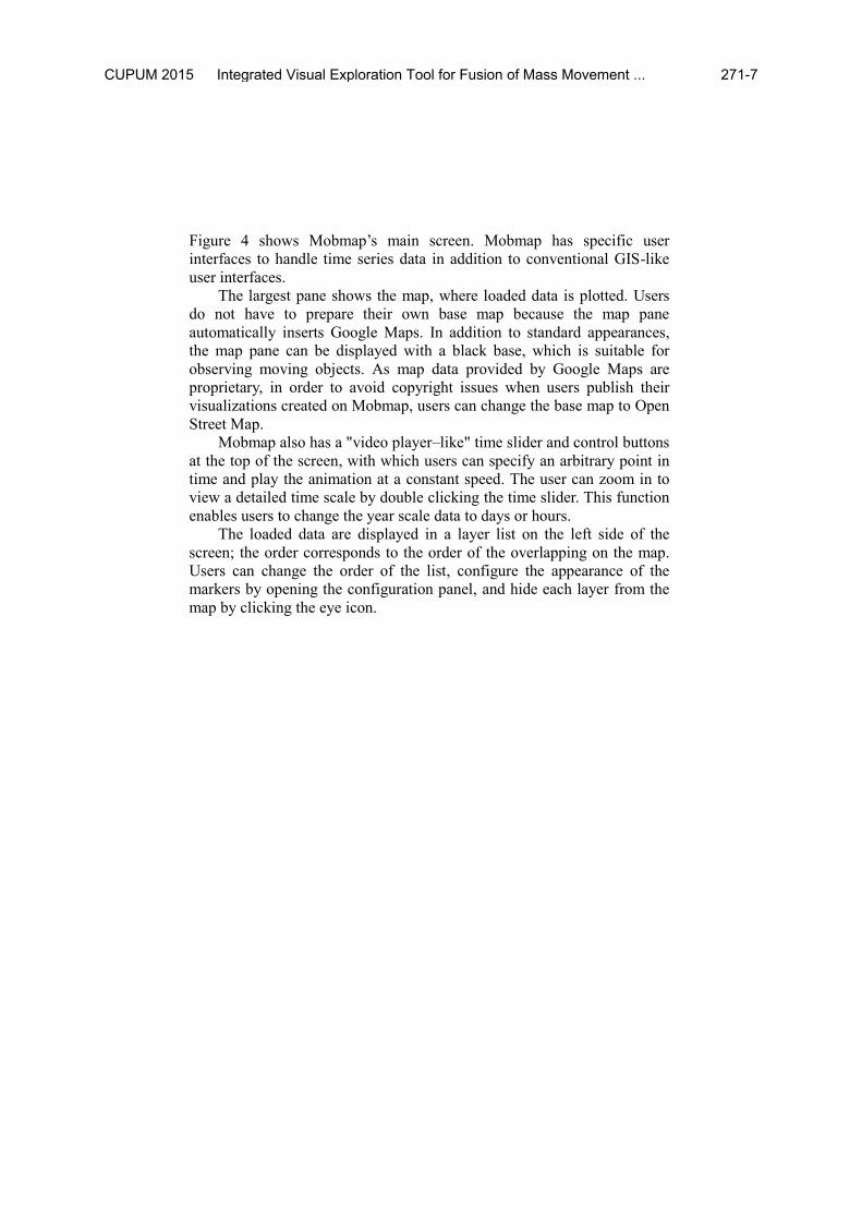
Figure 4 shows Mobmap’s main screen. Mobmap has specific user
interfaces to handle time series data in addition to conventional GIS-like
user interfaces.
The largest pane shows the map, where loaded data is plotted. Users
do not have to prepare their own base map because the map pane
automatically inserts Google Maps. In addition to standard appearances,
the map pane can be displayed with a black base, which is suitable for
observing moving objects. As map data provided by Google Maps are
proprietary, in order to avoid copyright issues when users publish their
visualizations created on Mobmap, users can change the base map to Open
Street Map.
Mobmap also has a "video player–like" time slider and control buttons
at the top of the screen, with which users can specify an arbitrary point in
time and play the animation at a constant speed. The user can zoom in to
view a detailed time scale by double clicking the time slider. This function
enables users to change the year scale data to days or hours.
The loaded data are displayed in a layer list on the left side of the
screen; the order corresponds to the order of the overlapping on the map.
Users can change the order of the list, configure the appearance of the
markers by opening the configuration panel, and hide each layer from the
map by clicking the eye icon.
CUPUM 2015 Integrated Visual Exploration Tool for Fusion of Mass Movement ... 271-7
Fig. 4 Main screen and UI of Mobmap.
5 Implementation
Mobmap is capable of handling mass movement data. Browsing mass
movement data on one map enables users to observe phenomena occurring
in a crowd. Visualization of minimal data may lose such phenomena, even
if it works well on individual trajectory data.
Mobmap is implemented as an application running on a Javascript
engine in the Google Chrome web browser, enabling the use of Google
Maps as a base map and creating a Mobmap cross platform. The modern
Javascript engine is not an interpreter but a compiler; thus, it has sufficient
capability to run heavy applications (Charland & Leroux 2011). However,
we also have to perform application-level optimization to handle the mass
movement data. The following section describes the optimization
techniques used in Mobmap.
5.1 WebGL-Based Marker Renderer
Rendering is the most time-consuming process in visualization software.
CUPUM 2015 Ueyama, Akirama, Shibasaki 271-8

Thus, Mobmap implements a custom renderer for moving object markers
using WebGL, which is embedded as a Google Maps API overlay. Here,
the standard marker object in the Google Maps API is not used; instead,
this overlay is implemented as a simple HTML canvas and never generates
child elements to render.
WebGL is a Javascript binding of OpenGL, an API for 3D computer
graphics. Generally, a 3D computer graphics system has the ability to draw
numerous polygons in a short time, enough to sustain fluent animation.
Thus, Mobmap renders each marker a polygon to utilize the full capability
of modern video cards. Part of a triangular polygon is used to render a
marker, while a fragment shader discards pixels in unused parts to improve
rendering performance.
5.2 Asynchronous Polyline Renderer
Mobmap implements another custom renderer to draw polylines on the
trajectory layer. Initially, Mobmap used a standard function of the Google
Maps API to render the polylines. However, the standard renderer blocked
the user input until the rendering was complete. Thus, we reverted to our
original renderer, which draws mass trajectory polylines bit by bit and
returns them to the user interface thread frequently. This enables users to
move the map or manipulate the time slider even while the renderer is
running.
5.3 Quick Projection
Optimizing the rendering routine is essential for improving the
performance of a graphics application. In addition, Mobmap needs to
optimize the handling of mass data outside the rendering process.
The cost of converting projections from latitude/longitude to screen
coordinates is not negligible. Thus, Mobmap puts several representative
points inside the viewport and performs high-accuracy calculations on
these points only. The projection of mass markers is performed by a quick
linear interpolation between representative points.
5.4 Benchmark
We show benchmark results here as conclusion of this chapter.
Table 1 shows benchmark results of mass marker rendering. The
slowest method is standard Google Maps API. WebGL and the quick
CUPUM 2015 Integrated Visual Exploration Tool for Fusion of Mass Movement ... 271-9

projection routine significantly improve rendering performance.
Table 1. Benchmark of WebGL renderer and Quick Projection
Condition Number of Markers Time per frame (ms)
Standard Google Maps API 1000 154.14
WebGL + Std. Projection 1000 15.39
WebGL + Quick Projection 1000 7.73
Standard Google Maps API 10000 1677.20
WebGL + Std. Projection 10000 101.04
WebGL + Quick Projection 10000 11.17
. All benchmarks are done on MacBook Air (Mid 2012) and Google
Chrome 42.0.2311.152 (64-bit).
6 Analysis in Combination with Static Data
We developed Mobmap to utilize movement data acquired in recent years.
However, we cannot ignore the enormous amount of static data already
accumulated. Mobmap is therefore designed to load both static and
movement data formats and perform a combined analysis. A typical data
format of static geographical data is grid data.
The next chapter describes an example of an analysis using grid data
in combination with movement data. We utilize the national and economic
censuses published by the Japanese government as the sample data. The
population distribution in the national census represents people’s
residences. Therefore, at midnight or early morning, as almost all people
are at home, their distribution should be similar to the national census.
Conversely, as almost all people go to their workplaces in the daytime,
their distribution should be similar to the working population in the
economic census.
6.1 Grid Layer
Mobmap loads grid data as a layer. The grid data file for Mobmap is a
simple CSV file, except for several special header lines, which can be
easily generated from a spreadsheet or scripts. Mobmap defines an
arbitrary grid by specifying the original location and cell width/height in
CUPUM 2015 Ueyama, Akirama, Shibasaki 271-10

longitude/latitude. However, the Japanese government provides
geographical statistics using a standard, widely used grid code. In the
standard grid code, a single number code represents a certain region in
Japan.
6.2 Dynamic Stat
Mobmap can generate an aggregated value by summing moving objects on
other layers in each cell. It overrides the original value of the mesh layer.
With this function, Mobmap can show trajectory data acquired from GPS
or a person trip survey as a population distribution grid. This function is
called "dynamic-stat".
Figure 5 shows a grid layer with dynamic-stat. In Figure 5, the
"magnification factor" attribute of each object in the interpolated person
trip data is summed inside each cell and applied to the color of the cell.
The raw value label, dynamic-stat value label, and their ratio are shown as
a radial bar chart.
Fig. 5 Example of dynamic-stat visualization.
Mobmap calculates the correlation between the raw value of the cell
and the result of dynamic-stat. When the correlation coefficient is high, the
resulting value of dynamic-stat in the cell having a higher raw value will
CUPUM 2015 Integrated Visual Exploration Tool for Fusion of Mass Movement ... 271-11

also be high.
The "calculate correlation" button is the simplest way to show a
correlation coefficient at a specified time on the screen. Furthermore,
Mobmap can calculate a time series sequence of the correlation over an
interval and export it to a CSV file, which can be used for statistical
operations on other software.
Figure 6 shows an example of using dynamic-stat between the
interpolated person trip data (in 2008), the national census (in 2010), and
the economic census (working population, in 2009). In Figure 6, (a) the
raw value of the national census (in 2010), (b) the raw value of the
economic census (working population, in 2009), (c) the dynamic-stat at
5:00 am, and (d) the dynamic-stat at 11:00 am are represented. Both
national and economic censuses are on a 500-m grid. Figure 6 visually
shows the transition from the nighttime population to the daytime
population. In the next section, we observe these results in a quantitative
way using CSV exporter.
Fig. 6 Comparison between grid layer raw values and dynamic-stat (grid
= 500 m).
6.3 Time Series Correlation
Figure 7 shows a plot of time series correlation coefficients between
dynamic-stat and the raw value of the grid layer described in the previous
CUPUM 2015 Ueyama, Akirama, Shibasaki 271-12

section. Mobmap can export such data as a CSV file for plotting on a
spreadsheet. In Figure 7, the solid line (a) represents a correlation with the
national census and the dashed line (b) represents a correlation with the
economic census (worker population). The time series interval is 5 minutes.
At 5:00 am, almost all people are in their homes and the distribution has a
high correlation with the national census. At 11:00 am, after people have
commuted to their workplaces, the correlation with the economic census
(worker population) becomes higher. Thus, the nighttime population
switches places with the daytime population.
We can also observe the commuting process as an animation by
showing the layer of the interpolated person trip data. We can even track a
certain commuter from his/her home to his/her workplace. Therefore,
Mobmap enables us to observe both aggregated and non-aggregated data
simultaneously.
Fig. 7 Time series of correlation coefficients between dynamic-stat and
raw grid values.
CUPUM 2015 Integrated Visual Exploration Tool for Fusion of Mass Movement ... 271-13

Fig. 8 Dynamic-stat with a 1000-m grid national census instead of 500–
m.
6.4 Evaluation of Accuracy of Movement Data
In Figure 7, the maximum correlation coefficient with the national census
is not very high, only 0.62 at 5:05 am, suggesting limited accuracy of the
interpolated person trip data. The person trip survey does not acquire
accurate locations of the respondents' homes. Thus, the interpolation
program infers the home location to generate pseudo OD points. If these
inferred locations lie outside the grid cell, then the result of dynamic-stat
grows worse. Figure 8 shows correlation coefficients for a 1000-m national
census grid instead of 500–m grid. The maximum correlation coefficient
ascends to 0.83 and the effect of inference error is mitigated. Such an
evaluation of the accuracy of movement data is a valuable demonstration
of the use of Mobmap.
7 Conclusion
This paper presented Mobmap, an integrated analytics and visualization
tool for movement data. We showed how Mobmap can fuse movement
data and conventional static data to analyze them in combination. Mobmap
provides fluent animation and interactivity with a good response for mass
movement data. Thus, Mobmap enables users to utilize movement data
more easily and quickly than the conventional way of combining generic
tools. Furthermore, Mobmap turns static geographical data, collected
CUPUM 2015 Ueyama, Akirama, Shibasaki 271-14

before the spread of positioning devices, into valuable assets for
movement data analysis.
As positioning technology continues to spread, the amount of
movement data will increase explosively. Therefore, Mobmap must have
the capability to handle larger movement data in the future. The data
selection routine is still naïve in implementation and should therefore be
made more sophisticated as a primary topic for future work. Parallelism is
one possible method because the selection routine is independent between
moving objects (Di Blas 2009). At present, only a few parallel
technologies are available to Javascript applications, such as shader
programming on a GPU. However, we expect the development of more
technologies that will work seamlessly with the main program.
References
Andrienko, N., Andrienko, G., Gatalsky, P. (2000). Supporting visual
exploration of object movement. Proceedings of the Working Conference
on Advanced Visual Interfaces, ACM, 217–220.
Bouvier, D.J., Oates, B. (2008). Evacuation Traces Mini Challenge award:
Innovative trace visualization staining for information discovery. IEEE
Symposium on Visual Analytics Science and Technology, 2008, 219–220.
Calabrese, F. Colonna, M., Lovisolo, P., Parata, D., Ratti, C. (2011).
Real-time urban monitoring using cell phones: A case study in Rome.
IEEE Transactions on Intelligent Transportation Systems, 12(1), 141–151.
Charland, A., Leroux, B. (2011). Mobile application development: Web vs.
native. Communications of the ACM, 54(5), 49–53.
Di Blas, A., Kaldewey, T. (2009). Data monster: Why graphics processors
will transform database processing. Spectrum, IEEE, 46(9), 46–51.
Dorling, D. (1992). Stretching space and splicing time: From cartographic
animation to interactive visualization. Cartography and Geographic
Information Systems, 19(4), 215–227.
Ferreira, N., Poco, J., Vo, H.T., Freire, J. (2013). Visual exploration of big
spatio-temporal urban data: A study of New York City taxi trips. IEEE
Transactions on Visualization and Computer Graphics, 19(12), 2149–2158.
CUPUM 2015 Integrated Visual Exploration Tool for Fusion of Mass Movement ... 271-15

Kitchin, R. (2014). The real-time city? Big data and smart urbanism.
GeoJournal, 79(1), 1–14.
Scheepens, R., Willems, N., van de Wetering, H., van Wijk, J.J. (2011).
Interactive visualization of multivariate trajectory data with density maps.
Pacific Visualization Symposium (PacificVis), IEEE, 147–154.
Sekimoto, Y., Shibasaki, R., Kanasugi, H., Usui, T., Shimazaki, Y. (2011).
Pflow: Reconstructing people flow recycling large-scale social survey data.
IEEE Pervasive Computing, 10(4), 27–35.
CUPUM 2015 Ueyama, Akirama, Shibasaki 271-16