infrastructure investments and public transport use · c-89231-pak-1. infrastructure investments...
TRANSCRIPT

Working paper
Infrastructure investments and public transport use
Evidence from Lahore, Pakistan
Hadia Majid Ammar Malik Kate Vyborny
March 2018 When citing this paper, please use the title and the followingreference number:C-89231-PAK-1

Infrastructure investments and public transport use:
Evidence from Lahore, Pakistan
Hadia Majid∗ Ammar Malik† Kate Vyborny‡§
March 16, 2018
Abstract
In many cities in the developing world, public transport infrastructure has not kept up withdramatic urban growth. Car ownership is growing rapidly among wealthier households, increasingcongestion and emissions, and potentially leading to patterns of land use that make access difficultfor the poor. To address these challenges, more than a hundred cities in the developing worldhave recently built mass transit systems and many more are considering doing so. However, therehas been limited rigorous analysis of the impacts of these investments. In this paper, we provide acredible causal estimate of the effect of mass transit on commuting. We use areas which were slatedfor transit routes that have not yet been built as a comparison group for areas connected by thenew Bus Rapid Transit line. Within these comparison areas, we select areas that were similar onobservables before the transit was built, and collect data in these areas. We find that access to thenew transit line reduced both the time and cost of commuting. We find robust evidence that theline has caused workers to switch from private to public modes of transport. We estimate that theintroduction of this transit line led to a 24% increase in public transport use among commuters innearby areas, with approximately 35,000 commuters switching to public transit citywide. We alsodocument that the mass transit line attracts a significantly larger proportion of highly educatedriders than those who rode public transport before its introduction, suggesting that its high qualityand reliability make public transport options acceptable to a broader part of the population. Thecapital cost of the transit line was substantial, and its fare is subsidized. However, the majority ofriders are willing to pay a substantially higher fare, suggesting it could be made more financiallysustainable with better targeting of the subsidy. The results suggest the potential of mass transitinvestments to make urbanization in the developing world more sustainable.
∗Department of Economics, Lahore University of Management Sciences, Lahore, Pakistan.†Urban Institute, Washington, DC.‡Department of Economics, Duke University, Durham, NC.§We thank the International Growth Centre, the International Food Policy Research Institute Pakistan Strategy
Support Program, the Asian Development Bank and the International Initiative for Impact Evaluation (3IE) for fundingsupport that made this project possible and the Center for Development Policy Research for support in engaging withpolicymakers. We are grateful to Sibtay Hassan Haider, Shanze Fatima Rauf, and Zubaria Khalil for superb researchassistance and project management. We appreciate assistance with data and fieldwork from Rania Nasir, ChuhangYin, Mahrukh Khan, Fatima Khan, Fakhar Malik Ahmed, Rabail Chandio and Noor Qureshi. We thank Umer Saifand Information Technology University, Lahore, and the Punjab Metrobus Authority, for access to secondary data andbackground information about the mass transit system. We thank Anjum Altaf, Ghulam Abbas Anjum, Nate Baum-Snow, Pat Bayer, Rafael Dix-Carneiro, Marcel Fafchamps, Mazhar Iqbal, Yasir Khan, Melanie Morten, Kamil Mumtaz,Ijaz Nabi, Fizzah Sajjad, Juan Carlos Suarez Serrato, Chris Timmins, Matthew Turner, Raheem ul Haque, and otherparticipants in workshops at Duke, LUMS, the Center for Development Policy Research, World Bank- DIME, andthe UEA-Europe, German Economic Association Development Economics conference, ICED and UPPD conferences forhelpful conversations and feedback.
1
1 Introduction
In many cities in the developing world, public transport infrastructure has not kept up with dramatic
urban growth. The World Bank (2013) predicts that 96% of population growth in developing countries
in the next two decades will be urban. Many people in these urban areas have limited access to public
transport; for example in Sub-Saharan Africa, only 5% of urban trips are on public transport (Pojani
and Stead, 2015). Car ownership has increased by an order of magnitude in countries such as India
and China in the past two decades. But private vehicle ownership also creates substantial externalities
of congestion and pollution (Timilsina and Dulal, 2010). In addition, in these cities many households
will not be able to afford private vehicles; public investments that serve private vehicle users and
resulting patterns of land use may reinforce inequitable access to urban economic opportunities.
As a result, there has been a major push from governments and aid agencies to build urban mass
transit infrastructure in the developing world. Several hundred cities worldwide have built mass transit
systems either by rail or dedicated busway (Bus Rapid Transit), with well over a hundred built since
2000 (Gonzalez-navarro and Turner, 2016; EMBARQ, 2017). The high-speed, reliable transport on
these services can reduce duration and variability of commute time for those who use public transport.
However, economic estimates from developed countries have suggested that the costs of mass transit
may exceed the benefits, with limited positive externalities on congestion and pollution. This is
because they are used below full ridership capacity and primarily attract users who otherwise would
have traveled by bus, not private vehicle (Winston and Maheshri, 2007; Baum-Snow and Kahn, 2005).1
This literature focuses almost exclusively on industrialized countries, part of a more general under-
representation of the developing world in studies of urban economics (Glaeser and Henderson, 2017).
Yet there are many reasons to expect public transit to have different impacts in a city like Lahore
or Bangkok than in Charlotte, NC or Buffalo, NY. For example, developing country cities typically
have higher levels of traffic congestion (Cookson and Pishue, 2017), implying that mass transit creates
greater time savings relative to driving and buses. Higher congestion may also lead to a larger number
of people who find it optimal to take another mode to get to the mass transit line instead of taking a
private vehicle or taking a bus all the way to their destination (consistent with the theoretical model of
1This literature has primarily considered rail systems. However, in recent years, more cities have built Bus RapidTransit systems, in which buses are given dedicated right-of-way so they can move at higher speeds. These systems havesubstantially lower capital costs than rail. Wright and Hook (2007) estimate that on average BRT systems cost 4 to 10times less than a LRT system and 10 to 100 times less than an underground or elevated rail system. The first line builtin Lahore is a Bus Rapid Transit system.
2

Baum-Snow and Kahn (2005)).2 On the other hand, the opportunity cost of time is lower in developing
country cities due to lower wages, suggesting the impact of these time savings may be lower. All this
has implications for both the cost effectiveness of transit (through increasing the number of riders per
vehicle) as well as through positive externalities on congestion and the environment (through switching
from private to public transport commuting).
In this paper, we quantify the impact of a new urban mass transit line in Lahore, Pakistan on
commuting and the use of public transport. We identify areas slated for potential routes that have
not yet been built as a comparison group for areas with new access to a transit line. Of seven lines
included in an original transit plan, one was built first (as a BRT) in order to improve traffic flow
on a major artery road, a second is under construction (as a light rail), while the others are still in
the original plan but do not currently have a date planned for implementation. We use areas close to
stops on the new line as “treatment” areas, and close to stops on the other lines in the original plan
as “control” areas. The route and order of routes built were maintained unchanged from a technical
plan developed by a previous government, reducing the likelihood of selection of areas for new transit
access on unobservables such as political importance.
This approach is arguably the most plausible identification strategy used in the literature from
developed countries (Redding and Turner, 2015). However, it requires the assumption that the order
of lines to be built is uncorrelated with unobservables that affect the outcome variable. We improve
on this strategy to relax this assumption in two ways. First, we use matching methods to select and
sample data from areas which are similar on observables before the first transit line was built. To
address the possibility of pre-trends, we match on data from two points in time before transit was
built.
Second, we incorporate fixed effects for bands of distance from the planned stop. This effectively
compares areas less than 1 km from a built stop with those less than 1 km from a planned stop.
Similarly, it compares areas 1-2 km from a built stop with those 1-2 km from a planned stop, and so
on.
Thus we require a much weaker assumption for identification of the causal effect of access to transit:
areas that were both slated for a transit stop, both the same distance from the planned stop, and
were similar on observables both twelve and three years before transit was built, should not differ on
unobservables that affect our outcomes of interest. We also use recall data to construct a quasi-panel
2Consistent with this, in our setting, we observe commuters traveling much further to a transit stop than the typical3km catchment area assumed in developed countries (Billings, 2011).
3
dataset, so that the assumption is further weakened to require only that such observably similar areas
have parallel trends. This combination strategy ensures that the treatment group is comparable to
the comparison group, so we can attribute differential changes to the introduction of the new transit.
In this paper, we discuss the impact of this transit investment on commuting and public transport
ridership.3
We find that access to the new transit line reduced both the time and money cost of commuting.
We also find a robust effect of the line on workers switching from private modes to public transport.
We estimate that the introduction of this transit line led to a 1.5 percentage point increase in public
transport use among commuters in nearby areas, or a 24% increase over the base. We calculate that
this corresponds to approximately an 8% increase for the city as a whole. This pattern is consistent
with descriptive statistics from a survey of riders we conduct, approximately half of whom report using
only private modes such as motorbikes, autorickshaws and cars in the past for the same trip they now
make on transit.
Our descriptive analysis suggests that the mass transit line attracts a much larger proportion of
highly educated riders than those in the same areas who rode public transport before its introduction.
Our causal estimates also that educated commuters are just as likely to switch to public transport
in response to the new transit line. This suggests that its high quality and reliability make public
transport options acceptable to a broader part of the population.
The capital cost of the transit line was substantial, at about 280 million USD (29 billion PKR),
or 18 million USD per mile - on the high end for a Bus Rapid Transit system because elevated lanes
were built for a large portion of the route. Its fare is subsidized, with a flat fare of about 20 cents per
trip regardless of length. However, three-quarters of riders report they would be willing to pay a 50%
higher fare for the same trip, and almost half say they are willing to pay double the fare, suggesting
it could be made more financially sustainable with better targeting of the subsidy.
Our paper relates to the literature on the effects of urban transport connections (see Redding and
Turner (2015) for a review). Only a few studies in this literature include data from developing country
cities (Tsivanidis, 2017; Gonzalez-navarro and Turner, 2014; Baum-Snow et al., 2017)4.
Some of these papers (Gibbons and Machin, 2005; Glaeser et al., 2008; Billings, 2011) use natural
3We pre-registered the evaluation design with the 3IE database (RIDIE) under ID RIDIE-STUDY-ID-570e7e4ce1a59.This paper focuses on the transport related outcomes (area 1 in the database entry), and extends the analysis plannedin the registry to explicitly incorporate analysis of use of public transport. A companion paper investigates the impactson labor markets and the structure of urban economic activity, i.e. area 2 outcomes in the registry entry.
4(?) uses an alternative approach using Indian data to identify the effects of higher commuting costs due to thegeographic spread of a city on similar outcomes.
4

experiments such as the introduction of new lines or comparison lines; in general these still rely on
before and after changes to identify the effect of interest, relying on strong assumptions about time
trends, or use areas further from stations as a comparison group, which relies on strong assumptions
about the comparability of these areas. Some papers (such as (Baum-Snow et al., 2017; Tsivanidis,
2017)) also incorporate instruments based on historical or geographic factors that made some areas
more likely to receive new transport connections. Because we have an original plan with a number of
routes for comparison, in addition to rich baseline data to allow for matching on baseline observables
that determined line sequencing, we are able to improve on the identification strategies used in most
of this literature.
In addition, most work on this topic uses aggregate sources of data such as real estate prices, night
lights or repeat cross section census data (Baum-Snow and Kahn, 2000, 2005; Gonzalez-navarro and
Turner, 2014)). Such data cannot be used to distinguish between changes for an existing population
and sorting mechanisms, in which one group of households moves in and perhaps displaces existing
residents in an area with new access to transit. Thus a net increase in transit use in an area could
simply represent more transit users moving in after a station opens. A few studies (Glaeser et al.,
2008; Tsivanidis, 2017) test this directly, and have found substantial evidence of residential sorting.
Because we collect household residential histories, we are able to rule out sorting for our estimates of
interest.
Finally, these papers focus on changes in population, labor and housing markets; in many cases
they do not observe commuting behavior directly. While our broader project investigates effects of
Lahore’s mass transit system on these markets, in this paper we focus specifically on commuting
patterns, and in particular sustainable commuting on public transport. Thus this paper relates most
closely to Baum-Snow and Kahn (2000) and Baum-Snow and Kahn (2005), who study the impact of
US urban rail transit expansions on public transport ridership. Baum-Snow and Kahn (2005) find that
these effects vary dramatically from negative to positive depending on the city and the distance from
the central business district, but the modal estimate is insignificantly different from zero. In particular,
their results for many cities indicate a negative impact on areas close to the central business district.
This may be suggestive of sorting, which they are not able to address with the repeat cross section
census data used. In contrast, we find a robust positive impact, which we can attribute to changes in
behavior of existing residents, not sorting.
The remainder of the paper proceeds as follows. Section 2 describes the setting and the new transit
5
infrastructure we study. Section 3 details our empirical strategy. Section 4 describes the data. Section
5 presents results, and Section 6 concludes.
2 Setting and new transit infrastructure
Lahore, Pakistan is the country’s second largest city and the capital of its most populous province,
Punjab. It is a metropolitan area with a population of 10 million, covering an area of about 2,000
square kilometers.
Before the mass transit line was built in 2013, its transport system consisted of a large system of
public buses and wagons (Figure 1). However, less than 5% of the working population took public
transport to work (Figure 2); forty percent of working individuals walked to work, while most of
the rest traveled by motorcycle (Figure 3). Ten percent of workers traveled to work by car. Highly
educated workers were substantially more likely to commute by private transport: 80% of individuals
with a university degree and 70% of those with a high school degree commute by private transport,
while only half of those with less than a high school degree do so (Figure 4). In particular, the most
educated workers are far more likely to commute by car (Figure 5).
The idea of a mass transit system had been floated in repeated urban planning documents since
1991, but without follow-up towards construction. In 2007, the military-led government, with as-
sistance from the Japanese aid agency JICA, finalized a detailed mass transit plan with seven mass
transit lines to cover most of the city and connect it to the edges of the peri-urban areas. The plan
prepared by urban planning and transportation consultants included a sequence of lines to be built
based on pre-existing patterns of transport use on each corridor (JICA, 2012). Figure 6 shows the
entire plan. The full system as planned would cover most of the areas of population and employment
in the city, even though firms in Lahore are not concentrated in a central business district (Figure 7).
In early 2008 democratic parties regained power in Pakistan, and the plan was shelved. However, in
2012, the democratic government, under pressure to complete public works in advance of an upcoming
election, took up the plan again. It announced plans to build the first transit line recommended for
construction in the plan, but to build it as a lower-cost Bus Rapid Transit line instead of a rail line.
Building commenced rapidly and the Green Line was completed in early 2013, just before the spring
2013 election.
The Green Line crosses the entire city from north to south, covering a distance of about 26 km.
It carries approximately 200,000 riders per day, approximately equivalent to 2% of the city’s entire
6

population. Like other Bus Rapid Transit systems, the Green Line comprises a system of buses running
with a reserved lane to -allow high-speed transit. However, unlike some BRTs, this line incorporates
extensive physical infrastructure in the form of dedicated overpasses. This feature was included in
part to allow for new buses to run in addition to other vehicle traffic while minimizing land acquisition
to widen the roadway in a congested city.
Overall the Green Line BRT is known to have a better quality of service than alternative buses in
a number of ways. The buses run on a very high frequency and have less variability in arrival time
due to the dedicated lane. In addition, stops have dedicated spaces which are protected from traffic,
well lit, and have CCTV surveillance, unlike standard bus stops which are often no more than the side
of the road without a sidewalk.
The fare was set at the level of 20 PKR (approximately 20 US cents) regardless of distance, while
existing bus fares ranged from 15 to 45 PKR depending on distance. The line also reduced travel
time from one end to the other from approximately 1.5 hours to 45 minutes. Hence the Green Line
decreased travel time and costs substantially for many potential trips in the city.
The bus routes that overlapped with the mass transit line were cancelled along with its introduc-
tion. In addition, a number of bus routes were changed to act as feeder routes for the new transit line,
but this occurred after our data were collected.
The government went on to announce plans in 2014 to build the second line recommended in the
plan, the Orange Line, as a light-rail line, and began construction in 2015. Orange Line construction
is ongoing. Our follow-up data were collected in 2015-2016, almost three years after the opening of the
Green Line. As of early 2018, no time frame has been announced to build the other mass transit lines
envisioned in the original plan. To allow for the possibility that the first two lines differ systematically
from those planned for later years, which may not be built, we include estimates using only these first
two lines as a robustness check on all our main estimates. These are included in all the main results
tables (indicated as analysis on the subsample for T1 and T2 only).
3 Empirical strategy
Our causal estimates are based on comparing areas that are served by new transit with areas slated
for potential routes that have not yet been built. This approach is arguably the most plausible
identification strategy used in the literature (Redding and Turner, 2015); however, it requires the
assumption that the order of lines to be built is uncorrelated with unobservables that affect the
7
outcome variable. In this section, we outline how we improve on the basic strategy to relax the
assumptions required. With matching and fixed effects, we require a much weaker assumption for
identification of the causal effect of access to transit: areas that were both slated for a transit stop,
both the same distance from the planned stop, and were similar on observables both twelve and three
years before transit was built, should not differ on unobservables that affect our outcomes of interest.
Selection of priority areas for transit access based on unobservables such as political factors could
be a concern when comparing built and unbuilt transit lines. However, the route plan used and
sequence of lines built was the same as that developed under the technocratic military government,
even after the change to a democratic multiparty system. This suggests that adjustments of the transit
plan to target transit access on unobservables, such as neighborhoods well connected to politicians,
did not take place at a small geographic scale. Rather, the government decided to move forward with
a preexisting technical plan to serve the city as a whole. This is plausible given that the city as a
whole is a stronghold of the ruling party, and that the government was keen to move forward without
a lengthy planning process given the time pressure to complete construction before an election. Only
one adjustment to the original route were made, in a busy central area of Lahore, to accommodate
the above-ground bus design.5 These areas are not a part of our sample. Thus it is reasonable to
assume that the technical criteria for prioritizing the Green Line, in particular pre-existing transport
patterns, were the deciding factor in the line sequencing.
3.1 Matching
To address the differences in lines on such observable factors, we use matching methods on the treated
and control areas to select and sample data from areas which are similar before the first transit line
was built.
While the Green Line was a high priority route, not all areas it connects would be high priority
than those on the other planned lines. We select geographic areas among the areas served by these lines
and the comparison lines that were similar before transit. The intuition is that after this selection, we
identify areas that were not in themselves higher priority, but happened to be along a higher priority
route. This allows us to address differences on a rich set of baseline observables between the built and
unbuilt lines.
We matched on the level of a zone; Lahore has 228 zones, with populations ranging from 10 to
5The rail based plan was to be routed via Mall Road and Queen’s road, whereas the BRT was aligned with FerozpurRoad instead to allow space for its dedicated lanes.
8

50,000. We use microdata from several sources for the matching. First, we use microdata from a
2010 survey of 18,000 households that the government gathered as a part of preparation of its urban
master plan. This survey was sampled by the 228 urban zones and was designed to be representative
of the entire metropolitan area. It includes household information, information on a roster of adult
members, as well as a trip diary for each of these members.
In addition, we use block-level data from the 1998 census and microdata on industrial activity to
select zones as follows. Incorporating data from both 1998 and 2010 in the matching procedure allows
us to address the possibility of differential trends between the two groups.
Selecting zones near treatment and control lines Our objective is to select T1 areas, i.e. those
that have access to the completed mass transit, the BRT or Green Line; T2 areas, those that would
have access to the line under construction, the Orange Line, when it is completed, and control areas,
those that would have access to the planned lines that have not been implemented.
All else equal, areas closer to a station are expected to be more affected by access to that station.
However, to avoid measuring spillovers in our estimated treatment effect, control zones must be distant
from T1 and T2 stops; similarly, T2 zones must be distant from T1 stops and vice versa. To ensure
this, we selected an initial set of zones for analysis using distance from the planned and actual stations
using successive radii as follows.
If the zone centroid was within X km of a control station station and was at least Y km from any
T1 or T2 station, it was considered a control zone. Table 1 shows the full set of criteria used. So a
zone that was within 2km of a control station and at least 3km from the nearest T1 or T2 station, it
would be considered a control zone; or if it was within 3km of a control station and at least 4.5km
from the nearest T1 or T2 station, it would be considered a control zone, and so on. Similarly, a zone
would be considered a T1 zone if it was within 2km of a T1 station and at least 3km from the nearest
T2 station; and vice versa.
Figure 8 shows the 121 zones selected according to this procedure. Note that areas in the center
of the planned transit system, where all the lines interchange, are therefore excluded.
Despite this procedure, some degree of spillovers may still exist as a small number of commuters
travel longer distances on another mode before boarding the mass transit line. This would attenuate a
reduced-form treatment effect comparing treated and untreated areas. However, since we use distance
to a stop on the built line as an instrument for a measure of public transport accessibility, these will
account for such an effect on comparison zones (Angrist and Krueger, 2001).
9
Selecting a subset of comparable treatment and control zones Within each treatment group,
we use a matching procedure to select zones that were similar on pre-treatment characteristics. We
use a rich set of variables from 2012, which includes key aspects of the markets we study, including
rental values, vehicle ownership, commute times, labor force participation, and wages, as well as more
general characteristics. We also use the full set of educational and demographic variables available
from the 1998 census. This is a more limited set of variables, but it allows us to identify zones that
had similar time trends in these characteristics. The full set of variables used for matching is listed in
Table 2.
To carry out the match, we construct the Mahalanobis distance on vector of baseline characteristics
between each C zone and corresponding potential T1 zones:
DM (x) =√
(xi − xj)′S−1(xi − xj)
Where
• xi and xj are vectors of baseline characteristics of a given control and T1 zone, respectively
• S is their covariance matrix
We then select pairs of C and T1 zones with DM ≤ R, where R is a fixed radius. Since the different
sources of matching data have different units of observation, we calculate four different values of DM,g,
once for each group g of variables listed in Table 2 and set a radius Rg for each of them. To be selected
as a match, a pair of zones must meet all the matching criteria, i.e. DM,g ≤ Rg∀g.
We repeat the procedure for pairs of C and T2 zones. Finally, we select control group zones that
have at least one matching T1 and one matching T2 zone. We allow multiple matches; this will be
addressed in estimation using weights, as discussed below.
This final set of 50 zones, shown in Figure 9, is well-balanced in 2010 and 1998 (Tables 3 - 5).
We select a representative sample of households from these zones for our household and community
survey.
Weighting In some cases, a small control zone might be matched to a large T1 zone or vice versa.
In addition, we allowed for multiple matches. In all specifications, we weight observations to correct
for this, using the following procedure. Denote each control zone as i ∈ 1...I, and each T1 zone as
j ∈ 1...J . Denote Mij as an indicator equal to 1 if zones i and j were matched and zero otherwise.
10

We standardize the zone weight for control zones at 1 and calculate the zone weight for zone j as:
Wj =∑i
Mij∑j Mij
(1)
Thus the weight for each T1 zone increases in the number of control zones it is matched with, but
decreases in the number of T1 zones that its counterpart control zones are matched to. We repeat the
procedure for the T2 zones.
Then the weight applied to each household in zone g is defined asWg
Ng, where Ng is the number of
households sampled in zone g.
3.2 Distance fixed effects
To further relax the assumptions required for causal identification, we incorporate fixed effects for
distance to the closest stop; each group has a 0.25km radius. This effectively compares households
within a “doughnut ring” of this radius around a treatment stop to a similar ring around a stop on
a planned line. In other words, the fixed effects estimate compares areas less than 1 km from a built
stop with those less than 1km from a planned stop. Similarly, it compares areas 1-2km from a built
stop with those 1-2km from a planned stop, and so on. This flexible specification allows the effect
of distance from the planned stop on our outcome variables to take any functional form, rather than
assuming it is linear.
3.3 Empirical specification
We use distance from a transit stop that was built as an instrument for public transport accessibility.
Our measure of accessibility is the community respondent’s report of the fastest travel time using
only public transport to a central point in the city. The identifying assumption is that conditional on
distance from any planned stop, distance from a built stop is exogenous.
We estimate the effects of new transit on outcomes Yig for individual or household i in geographic
zone g:
ACCESSg = π1 + π2D1g + π3D12g + π4Dg + π5D
2g + αd + ηXi + υig (2)
Yig = β1 + β2ACCESSg + β3Dg + β4D
2g + αd + γXi + εig (3)
11

Where D1 is the distance of the enumeration block from the closest built station and D is the
distance from any planned station (whether built or not). αd is a fixed effect for a distance “‘doughnut
ring”, e.g. it is defined as 1 for all enumeration blocks that are between 1-2 km from either a built or
unbuilt stop. All standard errors are clustered at the level of the zone (50 zones total).
Because transit stops in fact decreased both the financial and time cost of public transport travel
to the center city, ACCESS proxies for a change in both these costs.
For selected outcome variables, we also use recall data to construct a quasi-panel dataset, so
that the assumption is further weakened to require only that such areas have parallel trends. This
combination strategy ensures that the treatment group is comparable to the comparison group, so we
can attribute differential changes to the introduction of the new transit.
We also test robustness to estimating Equation (2) including only areas served by the planned line
and the line under construction. This helps to address the concern that selection of lines for shorter-
term implementation may reflect differences between these areas (such as economic or political priority)
that could be correlated with our outcomes of interest. The results of these estimations are shown in
all main results tables (column 4, T1 T2 sample).
4 Data
4.1 Community and household survey in balanced sample
Within the balanced sample of zones we selected 550 random coordinates as sample points, using
probability proportional to the population density in each area estimated from satellite imagery such
that the data represent the population in the zone. At each point, an enumerator interviewed a real
estate agent or other community member well informed about local real estate markets and local
amenities. These respondents reported on local real estate purchase and rental prices for commercial
and residential property for the current period (end 2015 / beginning 2016), the year before the Green
Line was completed (2012), and three years before (2009). They also reported the typical travel time
on different modes from that sample point to a well-known central point in Lahore (Kalma Chowk).
Enumerators worked with these respondents to calculate the total time and cost of the best route from
the survey sample point to the central point using only public transport (BRT, bus or wagon) and
walking, at 9AM on a weekday (morning rush hour). This approach has the advantage of allowing for
12

the actual frequency of public transport services, congestion and other real-world factors.6 These are
our main measure of travel time and cost on public transport.
The household survey included a total of 12,300 households. At each sample point, the survey
team drew a random start direction and selected one every three households to interview. Response
rates were approximately 70% and were balanced across treatment arms (Table ??).
The survey included a roster of all household members age 15-65. For each such member, it covered
work and commuting information. These variables were collected for the current period (end 2015 /
beginning 2016) and the year before the Green Line was completed (2012). Respondents were also
asked when the household moved into the area and whether each member had joined the household in
the last three years, allowing us to identify in-migrants to the community. The survey also included
questions on household characteristics including the household’s vehicle ownership.
Women were often the main respondents, but in some cases did not have complete information on
male family members’ activities. Therefore we supplemented the respondents’ reports with a shorter
survey of a male household member which only covered confirmation or completion of records on male
family members’ employment. If the male was available at the time of the survey this was completed
immediately afterwards; otherwise it was done by telephone after the field interview.
This allows us to collect a two- or three-period panel of key variables for households and adults; in
the case of variables reported for 2009, this covers approximately 140,000 person-round observations.
Table 7 shows that these recall baseline observations are also balanced across treatment arms.
Table 8 shows summary statistics for selected variables from the survey. The sample covers areas
from 2-17 km from the central point of the city used as a reference point in our study (Kalma Chowk).
About a third of the individuals in the sample work outside the home. Conditional on working, over
two thirds commute by some motorized mode (i.e. they do not walk or bike to work) but only about
seven percent commute via public transport. Overall, mean transport time is 24 minutes.
Because of the questions on new household members and how long the household has stayed in
the area, we are able to identify in-migration to the residential area through a migration history.
However, unlike a traditional panel, the data do not cover households that moved out of the area.
Sixteen percent of households moved in to their current residence within the last three years, i.e. after
the Green Line was built, demonstrating the importance of sorting as a potential mechanism. These
6These factors would likely be understated in a GIS trip analysis given that the frequency of public transport servicesis often not in line with the official schedule, and some routes that appear on official maps are sometimes not operatedin practice.
13

households are excluded from our main estimates of interest. Table 25 shows analysis of differential
sorting; overall, we see a small but statistically significant reduction in overall in-migration to treated
areas, and those who move in are more likely to be young. However, we do not see any difference in
the employment or commute history of those who move in to treated versus control areas.
4.2 Descriptive data sources
In addition to the 2015-6 survey of residential areas described above, we use two additional data sources
for descriptive analysis. First, we use data from the 2010 HIS survey conducted by the government,
described above.
Second, we conducted a survey of 2,500 riders on the BRT by approaching riders as they exited the
station. We selected the start and end stations on the line and one every three stations in between,
and randomly selected morning, mid day or afternoon shifts for interviews. We weight the estimates
using administrative data on rider volumes provided by the Punjab Mass Transit Authority. Thus
the survey data is representative of riders, other than those who ride in the early morning or late
evening (before 8AM or after 6.30PM). Approximately two thirds of riders approached responded to
the survey; in the case of non-response, enumerators recorded observable characteristics about the
individual. Respondents were asked about their age and education, purpose and destination of their
trip, the time and cost of the trip, their past travel behavior, and their hypothetical willingness to pay
different prices for tickets on the BRT.
5 Results
5.1 Mass transit substantially improved public transport accessibility
Figure 16 shows the reduction in travel cost as reported by riders in our rider survey who report
they took the same trip on other modes before 2012 (this makes up 70% of the sample). They report
substantial decreases in travel cost. However, these data represent those who benefited from time
and/or cost savings sufficiently high to switch to the BRT; they do not represent the effect on the
population as a whole.
Figures 17 - 20 and Tables 11 - 12 show the effect of the new mass transit line on travel time and
cost to central Lahore in our balanced sample of residential areas. The regression estimates represent
the causal impact on the population in these sample areas. For every kilometer further from a mass
14
transit stop, public transport accessibility decreases, with an increase of fare of 3.2 rupees (about 3.2
US cents) and an increase of time of 3.6 minutes. There are no such trends between the groups in
the period preceding the introduction of the BRT (Table 22). We also estimate a similar specification
in Table 13, with a binary for “treatment zones”, showing that the average effect on the population
of the sample zones is a 25-30 minute reduction in time, i.e. a decrease of about one third from the
baseline mean of 76 minutes. The mass transit also reduced the public transport fare by 20-30 PKR,
or over half the baseline mean. These figures represent a substantial improvement in public transport
accessibility to an area including approximately 25% of the population of the city.7
The estimation shown in Table 11 is also the first stage for our IV specification (2), demonstrating
that the instrument is informative. In our IV estimates, we use the time measure of public transport
accessibility as the independent variable of interest. However, it proxies for overall public transport
accessibility, representing both time and cost savings, since the mass transit expansion which is used
as an instrument affects both time and cost savings.
Table 9 shows that in our balanced sample, distance to the closest built stop strongly predicts use
of the BRT for commuting. For every kilometer further from a mass transit stop, the probability of
commuting on the transit line decreases by 0.1 percentage points. The sample mean use is 1%, so
this is a substantial gradient. Consistent with this, we also see an impact on the reported average
commute time reported by commuters in the treated areas (Table 14).8
Since the BRT took over lanes in some areas of the city, some have voiced concern about additional
congestion faced by commuters on private modes. The effects of a BRT are ambiguous, because it may
shift some commuters into public transport, reducing congestion, but take lanes from private transport,
increasing congestion. This has been a major issue in some settings, such as Delhi. However, in the
case of Lahore, large sections of the BRT were built on overhead flyover, reducing the lane space
required. We repeat our main estimates for the subset of individuals using private modes. These
estimates should be taken with caution as they are subject to concerns of sample selection, since the
mass transit treatment causes switching out of private transport. However, we find that the BRT
reduced commute times reported by these individuals as well, suggestive of a reduction in congestion
(table available on request).
7This figure includes the population of areas outside central Lahore which are accessible to the new mass transit, i.e.those shown in green in Figure 8.
8The mass transit line is known to be more frequent and reliable in service than the pre-existing bus services. Wealso measure variability in commute time in the survey by asking respondents the average commute time and how longit takes when traffic is busy. We do not see any impact of the BRT on this variable, but since it is reported by onerespondent for multiple household members, the quality of data on the variability of commute time may be low.
15

Riders board from all parts of the line, but the heaviest traffic is at the endpoints (Figure 12).
In addition, over half the riders travel on some other mode to reach the station and then change on
to the Green Line (Figure 13). Figure 14 shows that about 80% of riders who walk to the station
walk for 15 minutes or less to the station, suggesting a distance of under a mile given typical walking
speed of 3 miles per hour. However, Figure 15 shows that about 30% of those who come by another
vehicle traveled for more than half an hour to the station, suggesting that mass transit may have
affected commute patterns for a larger catchment area than in the literature from the US. This is
consistent with the high levels of congestion in Lahore; since these give mass transit a greater speed
advantage over private vehicles, the catchment area in which it is optimal to take another mode to
the mass transit line is larger (Baum-Snow and Kahn, 2000). However, note that our IV specification
effectively addresses any use of the transit in zones selected for the control group, effectively readjusting
the estimates for incomplete compliance (Angrist and Krueger, 2001).
5.2 Mass transit caused commuters to switch to public transport
The populations in areas slated for mass transit in the original plan (both our treatment and control
areas) were higher income and more educated at baseline than the rest of the metropolitan area
(Figure 10 - Figure 11). This likely reflects the fact that both the treated and control lines were
routed on major thoroughfares, where mass transit was feasible and which are more desirable areas
because of their overall accessibility. It does not necessarily reflect a deliberate attempt to target
higher income populations. However, this pattern does differ from that found in the US: Baum-Snow
and Kahn (2000) document that mass transit expansions have been systematically targeted towards
lower income and less educated populations.
The targeting of public transport towards these higher-income and more educated populations is
important because these individuals are the most likely to use private vehicles. This suggests a greater
potential for mass transit to induce switching from private to public transit.
Figures 21 - 22 show the previous modes used by riders in our BRT rider survey who report they
took the same trip before the mass transit line was built. Strikingly, 40% of the riders switched from
using only private transport to public transport. The most common modes they report switching from
are rickshaws and motorbikes, followed by cars. The respondents from the highest education brackets
are more likely to report switching from a private mode (Figure 23).
Table 15 shows the causal estimates of public transport commuting on our comparable treated and
16

control areas. Panel A shows the effects on all adults, while Panel B shows the effects on commuters.9
Here the dependent variable is any use of public transport in the regular daily commute. This is defined
as 1 for those who use public modes or a mixture of public and private modes (for example, taking a
motorcycle to the mass transit station). The estimates imply that for every 10 minute improvement
in public transport access (reduction in time it takes to reach a central point by public transport),
the proportion of commuters who commute by public transport increases by 1.3 percentage points, an
18.5 percent increase from the baseline mean of 7%. Table 16 shows the equivalent estimates from a
binary treatment specification: overall, mass transit increased the proportion of adults in treatment
areas commuting by public transport by 1.5 percentage points; this is about 21% over the baseline
mean or 30% over the control group.
We use the 2010 baseline data to get a total estimate based on extrapolating our estimates to all
areas of the city, based on their access to the Green Line. Using this data, we generate predicted values
for the change in use of public transport based on the reduced form version of our main estimates from
the 2015 data (regressing public transport commuting directly on distance from the BRT stops and
distance squared), and assuming zero effect beyond 10km from any stop. This calculation suggests
that approximately 35,000 commuters would have switched from private to public transport across the
city, assuming similar marginal effects of distance to transit in areas we did not sample. This is in the
same order of magnitude as the descriptive statistics from the rider survey, which indicate that 40%
of the BRT’s riders who took the same trip in the past used private modes; since there are 200,000
riders and about 70% took the same trip in the past, this suggests approximately 56,000 switchers.
A switch to public transport could imply that commuters have switched from non-motorized modes
such as walking or cycling to riding transit. Given that walking is the most common commute mode,
this is a possibility in Lahore. While this would lead to time savings for commuters, such a switch
would make the environmental impact of the mass transit ambiguous. However, we do not see a
significant impact on use of motorized modes for commute (Table 17).10
Table 18 shows the impact on specific commute modes. The only mode-specific result that is robust
across specifications is that on motorcycles: the switch to public transport appears to be driven by
switching from this common, low-cost private mode. Table 19 shows the estimates for switching to
9We see no impact on whether an individual reports any commute (Table 24), addressing concerns about sampleselection in the commuter sample.
10This is consistent with the fact that the mass transit line is generally considered more convenient for longer distancetrips, because riders must climb several flights of stairs to reach the elevated platforms, so a substitution from walkingto mass transit is less likely.
17

public transport stratified by whether the household owned any motorcycle at baseline. The estimates
are similar between the two groups: while those who had no motorcycle would have switched from
modes such as rickshaws to public transport, individuals who had the option of travel on a private
motorcycle, which is convenient, fast and has a low marginal cost, also switched to public transport.11
5.3 Mass transit attracted higher status, more educated riders than previous
public transport
The impact on vehicle owners points to a larger trend in the takeup of the mass transit line: riders
come from a better-off households than the typical riders of buses before mass transit. As Figure
4 showed, more educated households were much more likely to take private modes at baseline. In
contrast, the new mass transit line attracts riders with higher education levels. Figure 24 shows a
comparison of the education levels of mass transit riders from the 2016 rider survey with that of
riders of pre-existing buses in the 2010 HIS survey. For comparability, data from the subsample
of the 2010 survey living in the zones slated for future mass transit are shown. These two data
sources are collected differently, and are thus not fully comparable. Nevertheless, there appears to
be a substantial difference in composition: only a quarter of baseline bus riders had a high school
(Intermediate) degree or more, whereas 60% of mass transit riders have this level of education. Figure
23 shows that in the rider survey, more educated mass transit riders are slightly more likely to have
switched from private transport modes. Table 21 shows that the causal effect of the mass transit
line on the switch to public transport is similar for educated and less educated respondents Taken
together, the descriptive and causal results on vehicle owners and educated respondents suggest that
the mass transit line, with its high speed, quality and reliability, effectively attracted riders from a
broader set of backgrounds, including many who could afford to take convenient, comfortable private
commute modes. This indicates a shift towards commute patterns that can be more sustainable in
the long run, even as economic growth allows more households to afford private vehicles.
5.4 Cost effectiveness and subsidy
In this section we consider both the time savings and potential environmental benefits of the imapacts
on the shift to public transport, and compare them to available information about costs.
11While we find that the mass transit line has caused commuters to switch from private motorized transport to publictransport, we find no impact on ownership of the most prevalent vehicle, motorcycles (Table 20). This may be explainedby the short term of the impact, the fact that commuters on mass transit likely use motorbikes for trips to areas thatmass transit does not reach, and that households often share vehicles.
18

To calculate a rough approximation the value of time saved for commuters, we estimate the total
time savings for commuters in zones in both sampled and non-sampled areas, by estimating the
predicted impact of the transit on the city-wide baseline data as described in 5.2. Multiplying this
by each zone’s commuting population at baseline and 528 one-way commute trips per person per year
yields a total of 285,000 person work months of work. At the minimum wage of 13,000 PKR ($130)
per month, this would add up to $37 million per year.
For a rough approximation of how the costs of the transit system translate into environmental
benefits, we calculate approximate emissions averted as a result of the system. We start with the
estimate of 35,000 individuals switching to public transit, discussed above, and the mode-wise results,
which demonstrated that this switch is driven by a shift away from motorcycle use. We use these
figures to calculate an approximate figure for emissions averted. Table 23 shows these calculations,
which suggest that this switching would translate into a reduction of approximately 6,000 tons of CO2
per year.
These estimates are approximations, and cannot account for several factors. For example, there
could be increases in the use of private transport from passengers from other parts of the city, taking
advantage of decreased congestion; thus this would cause us to over-estimate emissions averted. On
the other hand, they do not account for the effect of reduced congestion reducing the fuel burned for
a trip of a given length, which would cause us to under-estimate the effect on emissions.
The official pre-construction estimate of the capital cost of the BRT mass transit line was 280
million USD, or 11 million USD per kilometer. This expenditure has been highly controversial, despite
the fact that overall the majority of the province’s transport budget is allocated for roads, with little
spending on public transport (Malik, 2015). To date, we have been unable to obtain estimates of the
actual incurred costs and running cost. However, if the estimates are accurate, this places Lahore’s
BRT at $11 million / km, on the high end of bus mass transit, compared to 5-10 million per km for
similar systems in Turkey, China, India and Mexico City EMBARQ (2017). These systems are all
far less expensive than (higher-capacity) light rail systems, which have capital costs in the range of
$40-60 million per km.
The fare is set at 20 rupees (20 US cents) flat fare regardless of distance. On a monthly basis,
this represents about 7% of the salary of a minimum wage worker, well below It is also substantially
less for a long trip than a standard subsidized bus fare, which ranges up to 45 rupees depending on
distance. Because the mass transit line is very heavily used, its total revenues may be more per vehicle
19
than that of the buses. However, it is widely assumed that the system’s operating costs are heavily
subsidized. Given the cheap cost as well as the higher quality, it is not surprising that three-quarters
of riders report they would be willing to pay a 50% higher fare for the same trip, and almost half say
they are willing to pay double the current fare (Figure 25). Combined with the fact that mass transit
riders include many commuters from higher socioeconomic backgrounds, this suggests that reducing
or better targeting the subsidy could increase revenue with little loss of ridership, and the subsidy
(on operating and perhaps even capital costs) could be defrayed. Given the logistical constraints, this
could be achieved through peak pricing at the commute times common among office workers, which
would alleviate congestion as well as targeting the lowest fares at blue-collar workers who typically
work longer shifts and thus commute at earlier and later times. At peak times the buses run at
completely full passenger loads; this has been an issue critiqued by opponents of the system, who
argue it was built for short-term rather than long-term requirements. This suggests that increasing
the fare at these times could be welfare enhancing and potentially even increase the total ridership,
as passengers with greater schedule flexibility sort into off-peak times, reducing congestion effects.
6 Conclusion
The introduction of a new mass transit line in Lahore did not only reduce the time and money cost of
commuting for those who already relied on public transport. It also caused a substantial proportion
of commuters to switch to public transport, attracting educated workers who had private vehicles
available as an option. While the existing system is subsidized, many commuters indicate they would
still use it if the fare were increased substantially - reflecting its speed, quality and their higher average
earning power than the population riding public buses in the past. These results suggest the potential
of mass transit investments to create a substantial shift towards more sustainable urban commuting
in the developing world.
20
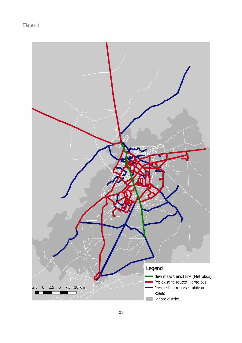
Figure 1
21

Figure 2
Figure 3
22

Figure 4
Figure 5
23
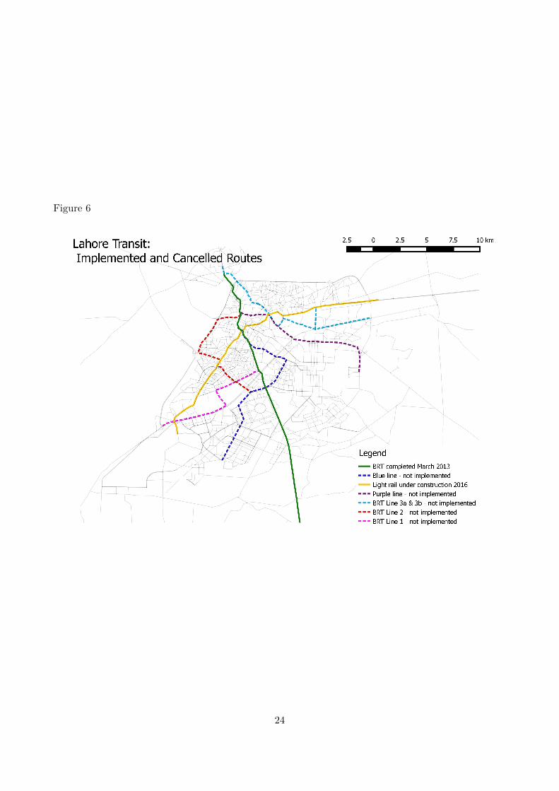
Figure 6
24

Figure 7
Notes: Red points represent the location of formal employers, identified from job advertisements innewspapers and web platforms.
25

Table 1: Radii used for selecting potential treatment and control zones and avoiding spillovers
To be assigned to treatment group i, Zone centroid must be:< X km from ≥ Y km from other
a treatment i station ≥ treatment stations:
2 33 4.54 65 7.56 97 10.5
Figure 8
26

Table 2: Matching variables
Variable Unit of observation
A. Masterplan zone-level data: Simple match on each variableDistance to center ZonePopulation density Zone
B. Punjab Directory of Industries: Mahalanobis match group 1Number of manufacturing firms, weighted by (1 / distance from zone centroid) ZoneTotal firm investment, weighted by (1 / distance from zone centroid) Zone
C. 1998 Census: Mahalanobis match group 2Proportion male completed primary education Census blockProportion female completed primary education Census blockProportion male completed matriculation Census blockProportion female completed matriculation Census blockProportion age 10 or older Census blockProportion age 18 or older Census blockProportion religious minorities Census block
D. 2010 Lahore Masterplan Household Integrated Survey: Mahalanobis match group 3Any individual income HH memberLevel individual income HH memberLog income HH memberEducation high school or less HH memberHigher education HH memberTrip cost in reference day HH memberTrip duration in reference day HH memberYears at location HouseholdOwns house HouseholdRent paid per month HouseholdHouse area HouseholdNumber of rooms HouseholdHH income HouseholdMonthly transport expenditure HouseholdBicycle ownership HouseholdMotorcycle ownership HouseholdNumber of HH members living at HH HouseholdNumber of HH members living away from HH Household
E. Neighboring zones: Mahalanobis match group 4All variables in Panel D, for all HHs in neighboring zones (centroids ≤ 3km) HH / HH member
27
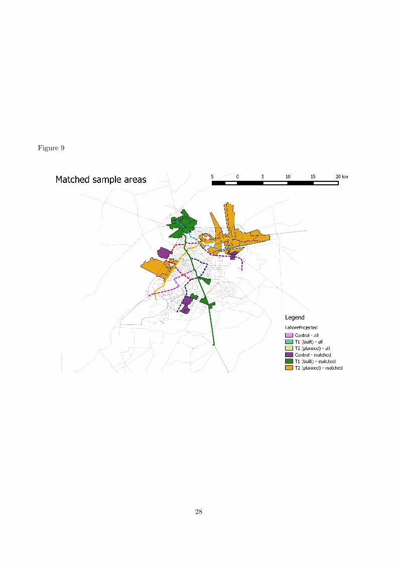
Figure 9
28

Tab
le3:
Bal
ance
afte
rm
atch
ing:
2010
HIS
dat
a
T1
(lin
eb
uil
t)T
2(l
ine
un
der
con
stru
ctio
n)
Diff
eren
ceS
ED
iffer
ence
SE
Ob
serv
ati
on
sA
ny
inco
me
0.00
(0.0
2)6104
0.00
(0.0
1)-0
.00
(0.0
1)15140
Inco
me
-282
.09
(449
.30)
6058
-282
.09
(442
.91)
340.
28(3
24.1
0)15049
Ln
inco
me
-0.0
6(0
.08)
2571
-0.0
6(0
.08)
0.03
(0.0
7)6347
Ed
uca
tion
:H
Sor
less
0.05
(0.0
3)6104
0.05
(0.0
3)0.
01(0
.03)
15140
Ed
uca
tion
:H
S-0
.01
(0.0
2)6104
-0.0
1(0
.02)
0.01
(0.0
1)15140
Ed
uca
tion
:h
igh
er-0
.04
(0.0
3)6104
-0.0
4(0
.03)
-0.0
1(0
.02)
15140
Tri
pco
st-1
.03
(3.2
2)1934
-1.0
3(3
.18)
0.73
(2.6
4)4754
Tri
pd
ura
tion
1157
58.1
2(2
0778
3.54
)1910
1157
58.1
2(2
0482
4.59
)64
206.
64(1
6115
1.79
)4701
29

Tab
le4:
Bal
ance
afte
rm
atch
ing:
2010
HIS
dat
a
T1
(lin
eb
uil
t)T
2(l
ine
un
der
con
stru
ctio
n)
Diff
eren
ceS
ED
iffer
ence
SE
Ob
serv
ati
on
sY
ears
atlo
cati
on2.
51(2
.47)
400
2.51
(2.4
4)4.
75*
(2.4
3)
1012
Ow
ns
hom
e-0
.03
(0.0
3)394
-0.0
3(0
.03)
-0.0
2(0
.03)
999
Ren
tex
pen
dit
ure
per
mon
th-2
59.8
3(4
11.9
6)400
-259
.83
(406
.01)
-318
.28
(383
.56)
1012
Hou
sear
ea-1
.93
(1.9
8)398
-1.9
3(1
.95)
-0.9
7(1
.94)
1005
Nu
mb
erof
room
s0.
13(0
.32)
400
0.13
(0.3
2)0.
40(0
.30)
1012
Tra
nsp
ort
exp
end
itu
re-1
25.1
4(3
76.6
8)399
-125
.14
(371
.24)
69.2
3(3
06.5
5)
1003
HH
inco
me
-0.2
3(0
.49)
400
-0.2
3(0
.48)
0.24
(0.3
2)
1012
Bic
ycl
e-0
.05
(0.0
9)400
-0.0
5(0
.09)
0.02
(0.0
7)
1012
Mot
orcy
cle
-0.0
4(0
.08)
400
-0.0
4(0
.08)
0.08
(0.0
6)
1012
Nu
mb
erof
mem
ber
sli
vin
gin
HH
0.08
(0.2
3)400
0.08
(0.2
3)0.
15(0
.19)
1012
Nu
mb
erof
mem
ber
sli
vin
gaw
ay0.
03(0
.05)
400
0.03
(0.0
5)0.
06(0
.04)
1012
30

Tab
le5:
Bal
ance
afte
rm
atch
ing:
1998
cen
sus
dat
a
Con
trol
grou
pT
1(G
reen
lin
e-
bu
ilt)
T2
(Ora
nge
lin
e-
un
der
con
stru
ctio
n)
Mea
nS
ED
iffer
ence
SE
Diff
eren
ceS
E
Pro
por
tion
wit
hp
rim
ary
edu
cati
on-
mal
e0.
13(0
.01)
-0.0
1(0
.01)
0.13
(0.0
1)-0
.01
(0.0
1)0.0
0(0
.01)
Pro
por
tion
wit
hp
rim
ary
edu
cati
on-
fem
ale
0.11
(0.0
1)-0
.01
(0.0
1)0.
11(0
.01)
-0.0
1(0
.01)
0.0
1(0
.01)
Pro
por
tion
wit
h10
thgr
ade
edu
cati
on-
mal
e0.
10(0
.01)
-0.0
2(0
.02)
0.10
(0.0
1)-0
.02
(0.0
2)0.0
1(0
.02)
Pro
por
tion
wit
h10
thgr
ade
edu
cati
on-
fem
ale
0.07
(0.0
1)-0
.01
(0.0
1)0.
07(0
.01)
-0.0
1(0
.01)
0.0
1(0
.01)
Pro
por
tion
age
10+
0.74
(0.0
1)-0
.02*
(0.0
1)0.
74(0
.01)
-0.0
2*(0
.01)
0.0
0(0
.01)
Pro
por
tion
age
18+
0.54
(0.0
1)-0
.02
(0.0
1)0.
54(0
.01)
-0.0
2(0
.01)
0.0
0(0
.01)
Pro
por
tion
non
-Mu
slim
0.07
(0.0
2)-0
.02
(0.0
2)0.
07(0
.02)
-0.0
2(0
.02)
-0.0
3**
(0.0
2)
31

Table 6: Balance in response - primary survey
Dependent variable: responds to survey
(1) (2)
Distance to closest built stop (T1) -0.0036(0.0042)
Distance to closest stop under construction (T2) 0.0046(0.0041)
Distance to closest planned stop (T1 / T2 / C) 0.0153 0.0148(0.0173) (0.0171)
Treatment area (T1 - near built stop) 0.0508*(0.0302)
Area near stop under construction (T2) -0.0094(0.0300)
Constant 0.7210*** 0.7058***(0.0275) (0.0210)
Observations 16851 16851
32

Table 7: Balance in recall baseline data - primary survey
Dependent variable: Recall 2012 commutes by public transport(1) (2) (3) (4)
Treatment area (T1 - near built stop) 0.0037 0.0027 -0.0003 0.0016(0.0029) (0.0019) (0.0042) (0.0022)
Distance to closest planned stop (T1 / T2 / C) 0.0019 -0.0005 0.0019 -0.0003(0.0020) (0.0013) (0.0017) (0.0013)
Area near stop under construction (T2) -0.0077* -0.0017(0.0039) (0.0023)
Observations 30569 30184 30569 30184
Dependent variable: Recall 2012 commutes by public transport - conditional on commuting(1) (2) (3) (4)
Treatment area (T1 - near built stop) 0.0175 0.0103 -0.0005 0.0062(0.0150) (0.0089) (0.0218) (0.0105)
Distance to closest planned stop (T1 / T2 / C) 0.0089 -0.0037 0.0091 -0.0031(0.0097) (0.0054) (0.0083) (0.0053)
Area near stop under construction (T2) -0.0357* -0.0062(0.0205) (0.0112)
Observations 6165 6100 6165 6100
Control variables No Yes No Yes“Donut” FE No Yes No Yes
Each observation is one adult HH member in year 2012. Control variables include female, age, age squared,years of education and years of education squared. Standard errors clustered at the zone level. * p < .1,** p < .05, *** p < .01.
33

Table 8: Summary statistics: Household Survey
Summary (1)
count mean sd min max
Commute time 47395 7.965 15.99 0 360Commute time (conditional on work) 16051 23.519 19.73 1 360Motorized commute 48698 0.241 0.43 0 1Motorized commute (conditional on work) 17251 0.678 0.47 0 1Public transpport commute 48698 0.024 0.15 0 1Public transport commute (conditional on work) 17251 0.067 0.25 0 1Work outside 48663 0.356 0.48 0 1Work outside (female) 23672 0.044 0.20 0 1Distance to work - km 11814 17.555 9.37 .4402654 37.58378Wage (PKR) - 5 pc winsorized 10159 16452.446 9630.02 4999.998 47040.01gender 48779 1.485 0.50 1 2Age 48779 34.932 14.93 17 85Education 48181 7.526 5.45 0 18dist cent 48779 8.243 3.55 2.396217 17.01249HH moved in during last 3 years 48338 0.163 0.37 0 1HH moved in 4-6 years ago 48338 0.075 0.26 0 1HH moved in more than 6 years ago 48338 0.762 0.43 0 1
Observations 48779
Zones Sample points Households Individuals Recall panel obs.
T1 (Green line - built) 15 188 6,152 24,295 72,885T2 (Orange line - under construction) 29 256 3,902 15,304 45,912C (Other planned lines) 6 86 2,447 9,180 45,912
Total 50 530 12,501 48,779 146,337
Notes: Recall panel observations are indicated for both 2009 and 2012; however, the set of recall variables collectedfor 2009 was limited, and did not include commute patterns.
34

Figure 10
Figure 11
35

Figure 12: Administrative data: riders boarding and leaving BRT
Source: Punjab Mass Transit Authority
Figure 13
36

Figure 14
Figure 15
37

Figure 16
Figure 17
38

Figure 18
Figure 19
39

Figure 20
Table 9: Takeup of green line mass transit for daily work commute
Dependent variable:rides mass transit for daily commute(1) (2) (3) (4)
Distance to closest built stop (T1) -0.0014***-0.0014***-0.0031***-0.0031***(0.0002) (0.0002) (0.0005) (0.0005)
Distance to closest planned stop (T1 / T2 / C) 0.0010 0.0000 0.0004 0.0095(0.0006) (0.0006) (0.0013) (0.0073)
Distance to closest built stop sq 0.0001*** 0.0002***(0.0000) (0.0000)
Distance to closest planned stop sq -0.0001 -0.0010(0.0002) (0.0008)
Constant 0.0104*** 0.1464*** 0.0470(0.0017) (0.0511) (0.0536)
Observations 48698 48107 48107 48107Sample mean dependent variable 0.0100Additional control variables No Yes Yes YesDonut ring FE No No No Yes
Each observation is one adult HH member in year 2015-6. Households and individuals who movedinto their current residence after the Green Line was built are excluded. All specifications includecontrols for female, age, age squared, years of education and years of education squared. Standarderrors clustered at the zone level. * p < .1, ** p < .05, *** p < .01.
40
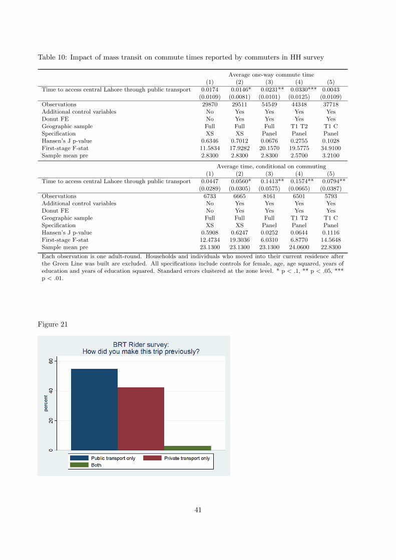
Table 10: Impact of mass transit on commute times reported by commuters in HH survey
Average one-way commute time(1) (2) (3) (4) (5)
Time to access central Lahore through public transport 0.0174 0.0146* 0.0231** 0.0330*** 0.0043(0.0109) (0.0081) (0.0101) (0.0125) (0.0109)
Observations 29870 29511 54549 44348 37718Additional control variables No Yes Yes Yes YesDonut FE No Yes Yes Yes YesGeographic sample Full Full Full T1 T2 T1 CSpecification XS XS Panel Panel PanelHansen’s J p-value 0.6346 0.7012 0.0676 0.2755 0.1028First-stage F-stat 11.5834 17.9282 20.1570 19.5775 34.9100Sample mean pre 2.8300 2.8300 2.8300 2.5700 3.2100
Average time, conditional on commuting(1) (2) (3) (4) (5)
Time to access central Lahore through public transport 0.0447 0.0560* 0.1413** 0.1574** 0.0794**(0.0289) (0.0305) (0.0575) (0.0665) (0.0387)
Observations 6733 6665 8161 6501 5793Additional control variables No Yes Yes Yes YesDonut FE No Yes Yes Yes YesGeographic sample Full Full Full T1 T2 T1 CSpecification XS XS Panel Panel PanelHansen’s J p-value 0.5908 0.6247 0.0252 0.0644 0.1116First-stage F-stat 12.4734 19.3036 6.0310 6.8770 14.5648Sample mean pre 23.1300 23.1300 23.1300 24.0600 22.8300
Each observation is one adult-round. Households and individuals who moved into their current residence afterthe Green Line was built are excluded. All specifications include controls for female, age, age squared, years ofeducation and years of education squared. Standard errors clustered at the zone level. * p < .1, ** p < .05, ***p < .01.
Figure 21
41

Table 11: Impact of transit on public transport access to center city - time (IV first stage)
(1) (2) (3) (4)
Distance to closest built stop (T1) 3.7183*** 6.4400*** -2.0390 -1.5209(0.7348) (2.1400) (3.6423) (3.7342)
Distance to closest planned stop (T1 / T2 / C) 4.1011 -0.2043 7.2752 16.3174(3.3562) (6.3366) (9.7785) (26.7605)
Distance to closest built stop sq -0.2113 0.2594 0.2132(0.1542) (0.2401) (0.2495)
Distance to closest planned stop sq 1.2400 0.5349 -0.9373(0.8871) (1.3597) (3.1685)
Post -32.5280*** 0.0000(6.9842) (.)
Distance to closest built stop (T1) x post 8.4789*** 8.5623***(2.0289) (2.1067)
Distance to closest built stop sq x post -0.4707*** -0.4795***(0.1201) (0.1270)
Distance to closest planned stop x post -7.4795 -5.0654(5.1617) (15.1740)
Distance to closest planned stop sq x post 0.7051 0.3313(0.7385) (1.7687)
Observations 515 515 1566 1566Donut FE No No No YesSpecification XS XS Panel Panel
Dependent variable is the real estate agent’s report of travel time by public transport tocentral Lahore. Each observation is one sample point. Standard errors clustered at the zonelevel. * p < .1, ** p < .05, *** p < .01.
Figure 22
42

Table 12: Impact of transit on public transport access to center city - fare
(1) (2) (3) (4)
Distance to closest built stop (T1) 3.1304*** 5.0346*** -1.8234 -1.7480(0.3663) (0.7480) (1.7282) (1.7122)
Distance to closest planned stop (T1 / T2 / C) -1.3240 -3.6768* -3.2377 -8.2996(1.4352) (1.9537) (3.8572) (12.3425)
Distance to closest built stop sq -0.1475*** 0.2022 0.1955(0.0545) (0.1317) (0.1304)
Distance to closest planned stop sq 0.6971** 0.5171 1.0657(0.2874) (0.5201) (1.5462)
Post -18.0956*** 0.0000(4.6394) (.)
Distance to closest built stop (T1) x post 6.8581*** 6.8880***(1.4690) (1.4331)
Distance to closest built stop sq x post -0.3497*** -0.3541***(0.1032) (0.0954)
Distance to closest planned stop x post -0.4391 27.9464***(3.6503) (10.4085)
Distance to closest planned stop sq x post 0.1800 -3.0791**(0.4945) (1.3096)
Observations 512 512 1550 1550Donut FE No No No YesSpecification XS XS Panel Panel
Dependent variable is the real estate agent’s report of total fare for public transport tocentral Lahore. Each observation is one sample point. Standard errors clustered at the zonelevel. * p < .1, ** p < .05, *** p < .01.
Figure 23
43

Table 13: Impact of transit on public transport access to center city - binary treatment variable
Dependent variable: time to reach central point by public transport(1) (2) (3)
Treatment area (T1 - near built stop) -23.3634*** 4.9425 2.9882(6.6968) (11.2001) (11.1374)
Distance to closest planned stop (T1 / T2 / C) 8.2340** 9.7296** 10.1303***(3.3342) (3.9788) (3.3969)
Treatment area x post -32.6565***-26.0230***(6.4849) (6.2909)
Distance to closest planned stop x post -1.5104(1.8679)
Observations 521 1579 1579Donut FE No No YesSpecification XS Panel PanelBaseline sample mean 76.3800
Dependent variable: fare to reach central point by public transport(1) (2) (3)
Treatment area (T1 - near built stop) -21.1993*** 5.4052 4.4232(3.3119) (7.2216) (7.3772)
Distance to closest planned stop (T1 / T2 / C) 1.8879 0.3558 2.6949(1.5675) (2.3948) (1.6651)
Treatment area x post -29.6241***-25.3746***(5.7229) (5.8236)
Distance to closest planned stop x post 2.1119(1.7304)
Observations 518 1563 1563Donut FE No No YesSpecification XS Panel PanelBaseline sample mean 48.5900
Dependent variable is the real estate agent’s report of total time or fare for a trip to a central pointin Lahore (Kalma Chowk) using only public transport and walking. Each observation is one samplepoint. Standard errors clustered at the zone level. * p < .1, ** p < .05, *** p < .01.
44

Table 14: Impact of transit on respondents’ commute times
Dependent variable: respondent’s typical commute time(1) (2) (3)
Time to access central Lahore by public transport 0.0416 0.0565* 0.0866*(0.0296) (0.0289) (0.0456)
Observations 6733 6665 5480Donut FE No Yes YesGeographic sample Full Full T1 T2Specification XS XS XSHansen’s J p-value 0.4161 0.6254 0.1583First-stage F-stat 11.4724 20.3201 10.8722
Each observation is one adult in 2015. Households and individuals who moved into their currentresidence after the Green Line was built are excluded. The sample includes adults who report acommute only. The probability of commuting does not change (Table 24), so interpretation of theresults conditional on commuting is not affected by sample selection concerns. Standard errorsclustered at the zone level. * p < .1, ** p < .05, *** p < .01.
Table 15: Impact of transit on commuting by public transport
Commutes by public transport(1) (2) (3) (4) (5)
Time to access central Lahore through public transport -0.0004*** -0.0003*** -0.0001*** -0.0002*** -0.0001**(0.0001) (0.0001) (0.0001) (0.0001) (0.0000)
Observations 30449 30071 59771 48786 41222Additional control variables No Yes Yes Yes YesDonut FE No Yes Yes Yes YesGeographic sample Full Full Full T1 T2 T1 CSpecification XS XS Panel Panel PanelHansen’s J p-value 0.6455 0.7173 0.5121 0.3054 0.9483First-stage F-stat 11.4762 18.0319 20.9746 20.4815 37.2840Sample mean pre 0.0200 0.0200 0.0200 0.0200 0.0300
Commutes by public transport (conditional on commute)(1) (2) (3) (4) (5)
Time to access central Lahore through public transport -0.0017*** -0.0013*** -0.0005** -0.0006* -0.0004**(0.0005) (0.0003) (0.0002) (0.0003) (0.0002)
Observations 7261 7181 13182 10776 9141Additional control variables No Yes Yes Yes YesDonut FE No Yes Yes Yes YesGeographic sample Full Full Full T1 T2 T1 CSpecification XS XS Panel Panel PanelHansen’s J p-value 0.9405 0.9949 0.2105 0.1921 0.8069First-stage F-stat 11.9319 19.9707 20.0149 18.3624 39.0177Sample mean pre 0.0700 0.0700 0.0700 0.0700 0.0800
Results shown for second stage of 2SLS estimate. Each observation is one adult-round. Households and individualswho moved into their current residence after the Green Line was built are excluded. The first panel showsestimations on the full sample, with observations taking on a zero value for adults who do not commute. Thesecond panel shows estimations on the sample of adults who report a commute only. The probability of commutingdoes not change (Table 24), so interpretation of the results conditional on commuting is not affected by sampleselection concerns. Standard errors clustered at the zone level. * p < .1, ** p < .05, *** p < .01.
45

Table 16: Impact of transit on commuting by public transport - binary specification
Commutes by public transport (conditional on commute)(1) (2)
Treatment area (T1 - near built stop) 0.0299*** 0.0133(0.0077) (0.0087)
Treatment area x post 0.0150*(0.0082)
Observations 7205 13305Control group meanDonut FE Yes YesGeographic sample Full FullSpecification XS PanelHansen’s J p-valueFirst-stage F-stat
Results shown for second stage of 2SLS estimate. Each observation is oneadult-round. Households and individuals who moved into their current resi-dence after the Green Line was built are excluded. Estimations are conductedon the sample of adults who report a commute only. The probability of com-muting does not change (Table 24), so interpretation of the results conditionalon commuting is not affected by sample selection concerns. Standard errorsclustered at the zone level. * p < .1, ** p < .05, *** p < .01.
Table 17: Impact of transit on commuting by motorized vehicle
Commutes by motorized vehicle(1) (2) (3) (4) (5)
Time to access central Lahore through public transport 0.0002 0.0001 0.0002** 0.0002** 0.0001(0.0002) (0.0002) (0.0001) (0.0001) (0.0001)
Observations 30449 30071 59771 48786 41222Additional control variables No Yes Yes Yes YesDonut FE No Yes Yes Yes YesGeographic sample Full Full Full T1 T2 T1 CSpecification XS XS Panel Panel PanelHansen’s J p-value 0.0134 0.2964 0.8792 0.2905 0.0463First-stage F-stat 11.4762 18.0319 20.9746 20.4815 37.2840Sample mean pre 0.2200 0.2200 0.2200 0.2200 0.2200
Commutes by motorized vehicle (conditional on commute)(1) (2) (3) (4) (5)
Time to access central Lahore through public transport 0.0003 0.0006 0.0002 0.0002 0.0001(0.0010) (0.0007) (0.0004) (0.0003) (0.0004)
Observations 7261 7181 13182 10776 9141Additional control variables No Yes Yes Yes YesDonut FE No Yes Yes Yes YesGeographic sample Full Full Full T1 T2 T1 CSpecification XS XS Panel Panel PanelHansen’s J p-value 0.0177 0.0081 0.6131 0.2478 0.3436First-stage F-stat 11.9319 19.9707 20.0149 18.3624 39.0177Sample mean pre 0.6800 0.6800 0.6800 0.6700 0.6700
Results shown for second stage of 2SLS estimate. Each observation is one adult-round. Households and individualswho moved into their current residence after the Green Line was built are excluded. The first panel showsestimations on the full sample, with observations taking on a zero value for adults who do not commute. Thesecond panel shows estimations on the sample of adults who report a commute only. The probability of commutingdoes not change (Table 24), so interpretation of the results conditional on commuting is not affected by sampleselection concerns. Standard errors clustered at the zone level. * p < .1, ** p < .05, *** p < .01.
46
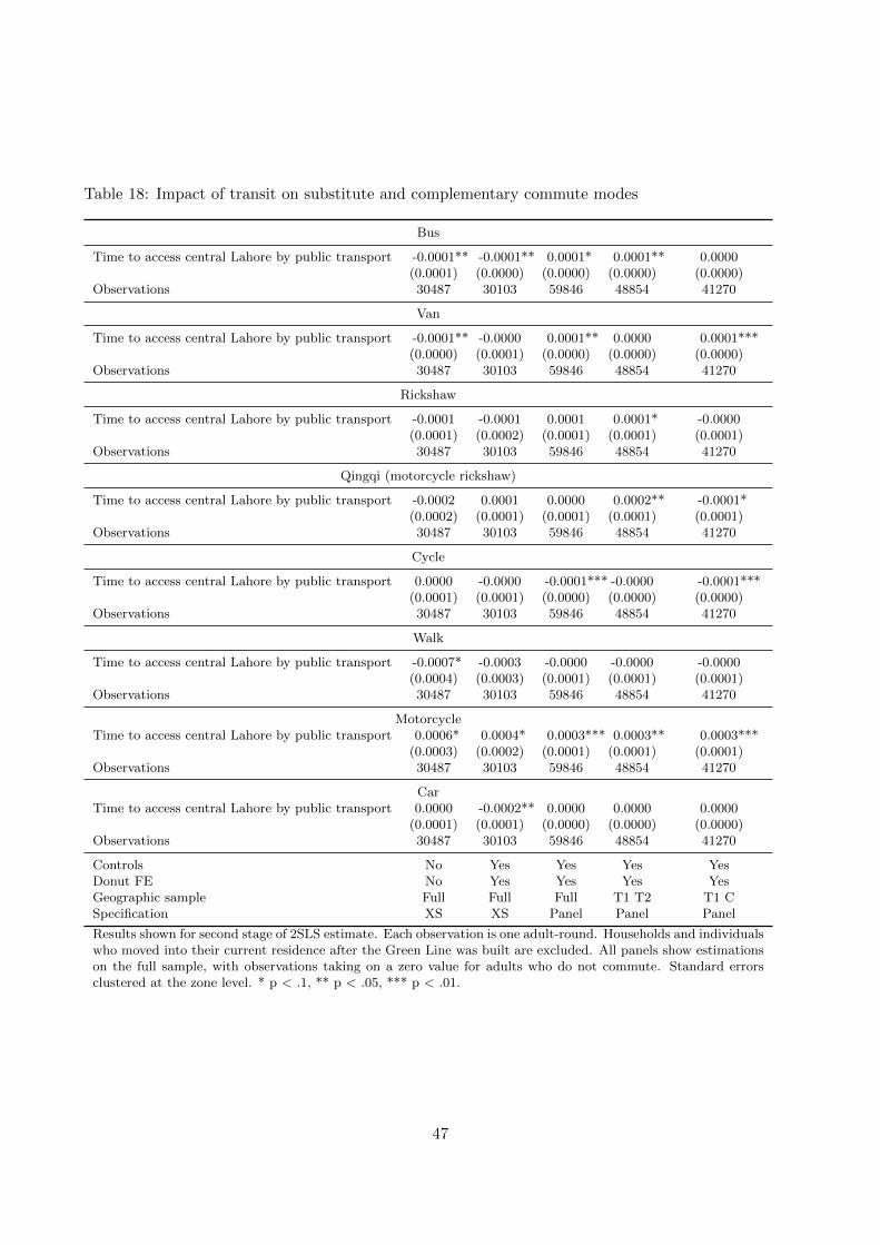
Table 18: Impact of transit on substitute and complementary commute modes
Bus
Time to access central Lahore by public transport -0.0001** -0.0001** 0.0001* 0.0001** 0.0000(0.0001) (0.0000) (0.0000) (0.0000) (0.0000)
Observations 30487 30103 59846 48854 41270
Van
Time to access central Lahore by public transport -0.0001** -0.0000 0.0001** 0.0000 0.0001***(0.0000) (0.0001) (0.0000) (0.0000) (0.0000)
Observations 30487 30103 59846 48854 41270
Rickshaw
Time to access central Lahore by public transport -0.0001 -0.0001 0.0001 0.0001* -0.0000(0.0001) (0.0002) (0.0001) (0.0001) (0.0001)
Observations 30487 30103 59846 48854 41270
Qingqi (motorcycle rickshaw)
Time to access central Lahore by public transport -0.0002 0.0001 0.0000 0.0002** -0.0001*(0.0002) (0.0001) (0.0001) (0.0001) (0.0001)
Observations 30487 30103 59846 48854 41270
Cycle
Time to access central Lahore by public transport 0.0000 -0.0000 -0.0001*** -0.0000 -0.0001***(0.0001) (0.0001) (0.0000) (0.0000) (0.0000)
Observations 30487 30103 59846 48854 41270
Walk
Time to access central Lahore by public transport -0.0007* -0.0003 -0.0000 -0.0000 -0.0000(0.0004) (0.0003) (0.0001) (0.0001) (0.0001)
Observations 30487 30103 59846 48854 41270
MotorcycleTime to access central Lahore by public transport 0.0006* 0.0004* 0.0003*** 0.0003** 0.0003***
(0.0003) (0.0002) (0.0001) (0.0001) (0.0001)Observations 30487 30103 59846 48854 41270
CarTime to access central Lahore by public transport 0.0000 -0.0002** 0.0000 0.0000 0.0000
(0.0001) (0.0001) (0.0000) (0.0000) (0.0000)Observations 30487 30103 59846 48854 41270
Controls No Yes Yes Yes YesDonut FE No Yes Yes Yes YesGeographic sample Full Full Full T1 T2 T1 CSpecification XS XS Panel Panel Panel
Results shown for second stage of 2SLS estimate. Each observation is one adult-round. Households and individualswho moved into their current residence after the Green Line was built are excluded. All panels show estimationson the full sample, with observations taking on a zero value for adults who do not commute. Standard errorsclustered at the zone level. * p < .1, ** p < .05, *** p < .01.
47

Table 19: Impact of transit on commuting by public transport: by vehicle ownership
Dependent variable: Commutes by public transport(conditional on commute)
Sample: Households without a motorcycle at baseline(1) (2) (3) (4) (5)
Time to access central Lahore by public transport -0.0019*** -0.0013* -0.0008 -0.0011* -0.0006(0.0007) (0.0008) (0.0005) (0.0006) (0.0005)
Observations 2094 2071 3733 3184 2718SubsampleDonut FE No Yes Yes Yes YesGegraphic sample Full Full Full T1 T2 T1 CSpecification XS XS Panel Panel PanelHansen’s J p-value 0.7544 0.9414 0.0544 0.0317 0.6091First-stage F-stat 12.4989 24.9647 19.7721 20.7741 27.4555Control group mean
Sample: Households with at least 1 motorcycle at baseline(1) (2) (3) (4) (5)
Time to access central Lahore by public transport -0.0016*** -0.0012*** -0.0003 -0.0004 -0.0003*(0.0004) (0.0004) (0.0002) (0.0003) (0.0002)
Observations 5167 5110 9449 7592 6423SubsampleDonut FE No Yes Yes Yes YesGeographic sample Full Full Full T1 T2 T1 CSpecification XS XS Panel Panel PanelHansen’s J p-value 0.9543 0.7117 0.6352 0.8525 0.7882First-stage F-stat 12.1931 17.4131 19.3378 17.3892 44.8293Control group mean
Results shown for second stage of 2SLS estimate. Each observation is one adult-round. Households and individualswho moved into their current residence after the Green Line was built are excluded. Both panels show estimatesfor the subsample of adults who report a commute. The probability of commuting does not change (Table 24),so interpretation of the results conditional on commuting is not affected by sample selection concerns. Standarderrors clustered at the zone level. * p < .1, ** p < .05, *** p < .01.
Table 20: Impact of transit on vehicle ownership
Dependent variable: motorcycles owned by HH(1) (2) (3) (4) (5)
Time to access central Lahore through public transport 0.0025 -0.0005 -0.0004 0.0003 -0.0014(0.0025) (0.0019) (0.0013) (0.0019) (0.0012)
Observations 2347 2326 4634 3772 3186Additional control variables No Yes Yes Yes YesDonut FE No Yes Yes Yes YesGeographic sample Full Full Full T1 T2 T1 CSpecification XS XS Panel Panel PanelHansen’s J p-value 0.3269 0.9164 0.4008 0.8401 0.3244First-stage F-stat 11.2245 15.9859 18.9385 18.3329 29.8714Sample mean pre 0.8100 0.8100 0.8100 0.8000 0.7800
Results shown for second stage of 2SLS estimate. Each observation is one household-round. Households andindividuals who moved into their current residence after the Green Line was built are excluded. Standard errorsclustered at the zone level. * p < .1, ** p < .05, *** p < .01.
48
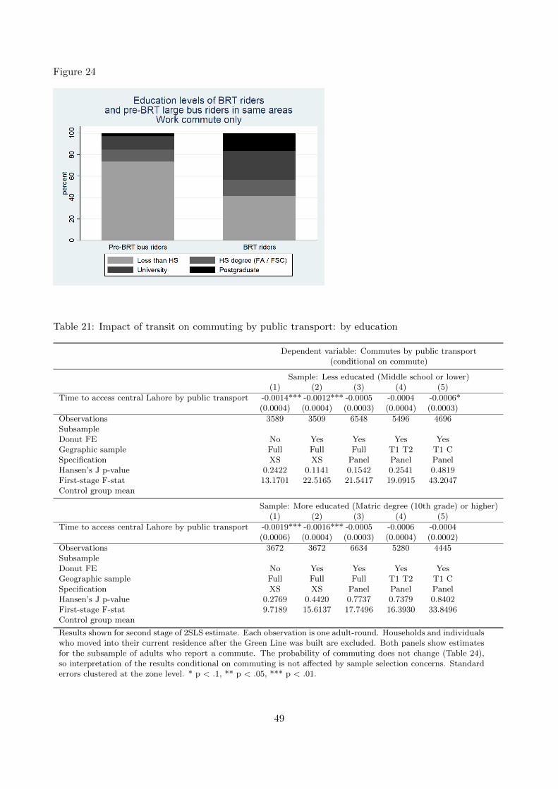
Figure 24
Table 21: Impact of transit on commuting by public transport: by education
Dependent variable: Commutes by public transport(conditional on commute)
Sample: Less educated (Middle school or lower)(1) (2) (3) (4) (5)
Time to access central Lahore by public transport -0.0014*** -0.0012*** -0.0005 -0.0004 -0.0006*(0.0004) (0.0004) (0.0003) (0.0004) (0.0003)
Observations 3589 3509 6548 5496 4696SubsampleDonut FE No Yes Yes Yes YesGegraphic sample Full Full Full T1 T2 T1 CSpecification XS XS Panel Panel PanelHansen’s J p-value 0.2422 0.1141 0.1542 0.2541 0.4819First-stage F-stat 13.1701 22.5165 21.5417 19.0915 43.2047Control group mean
Sample: More educated (Matric degree (10th grade) or higher)(1) (2) (3) (4) (5)
Time to access central Lahore by public transport -0.0019*** -0.0016*** -0.0005 -0.0006 -0.0004(0.0006) (0.0004) (0.0003) (0.0004) (0.0002)
Observations 3672 3672 6634 5280 4445SubsampleDonut FE No Yes Yes Yes YesGeographic sample Full Full Full T1 T2 T1 CSpecification XS XS Panel Panel PanelHansen’s J p-value 0.2769 0.4420 0.7737 0.7379 0.8402First-stage F-stat 9.7189 15.6137 17.7496 16.3930 33.8496Control group mean
Results shown for second stage of 2SLS estimate. Each observation is one adult-round. Households and individualswho moved into their current residence after the Green Line was built are excluded. Both panels show estimatesfor the subsample of adults who report a commute. The probability of commuting does not change (Table 24),so interpretation of the results conditional on commuting is not affected by sample selection concerns. Standarderrors clustered at the zone level. * p < .1, ** p < .05, *** p < .01.
49

Table 22: Test for differential pre-trends
Time to access central Lahore Cost to access central Lahoreby public transport by public transport
(1) (2) (3) (4)
Distance to closest built stop (T1) -1.9755 -1.5793 -3.1987 -3.1913(3.7488) (3.8358) (2.9118) (2.8498)
Distance to closest built stop sq 0.2489 0.2104 0.3407 0.3396(0.2530) (0.2607) (0.2332) (0.2279)
Distance to closest planned stop (T1 / T2 / C) 8.7390 4.8860 -8.1325 -18.0231(9.8404) (24.1312) (6.7773) (13.8922)
Distance to closest planned stop sq 0.2801 0.3442 1.4355 2.5439(1.3806) (2.8507) (0.9459) (1.8190)
Year 2012 2.5956 2.5179 -13.9314*** -14.0641***(2.6692) (2.7542) (3.2461) (3.2526)
Distance to closest built stop x 2012 -0.2354 -0.1970 1.1730 1.2353(0.7215) (0.7453) (1.0971) (1.0790)
Distance to closest built stop sq x 2012 0.0235 0.0219 -0.1010 -0.1058(0.0515) (0.0518) (0.0990) (0.0966)
Distance to closest planned stop x 2012 -2.6517 -2.8990 3.7800 3.6069(2.3418) (2.3982) (2.8450) (2.8783)
Distance to closest planned stop sq x 2012 0.3657 0.4142 -0.9452** -0.9114**(0.3597) (0.3726) (0.4452) (0.4521)
Constant 66.0093*** 66.0228***(12.5741) (9.0504)
Observations 1042 1042 1029 1029Donut FE No Yes No Yes
Standard errors clustered at the zone level. * p < .1, ** p < .05, *** p < .01.
Figure 25: Rider self-reported willingness to pay higher fares for mass transit
50

Table 23: Approximate calculations of averted emissions from switching to public transport
Parameter Estimate Source
a Bus - miles per gallon 3.4 US DOEb Bus - passengers per vehicle 50 Assumptionc Bus - passenger miles per gallon 170 a * bd Motorcycle - miles per gallon 42 US DOEe Motorcycle - passengers per vehicle 1.5 Assumptionf Motorcycle - passenger miles per gallon 63 d * eg Number of switchers 35000 HH survey regression estimates*h Mean travel distance (daily round trip) 9 Baseline HH survey (2010 HIS)i Proportion switching completely to public transport 0.55 Descriptive data from rider surveyj Proportion of trip on private modes for mixed mode trips 0.5 Assumptionk Gallons gasoline equivalent averted
per mile traveled on bus instead of motorcycle 0.01 (1/f) - (1 / c)l Passenger-miles traveled on bus instead of motorcycle 228375 (1 - i*j) * g * h
m Gallons gasoline equivalent averted - total 2,282 k*ln Grams CO2 per gallon gasoline equivalent 8,837 US EPAo Tons CO2 averted per working day 22 m*n / 900,000 grams / tonp Tons CO2 averted per year 5,914 o * 264 working days
Notes: Fuel economy data are based on data in US Department of Energy (2017).
Table 24: Impact of transit on probability of commuting to work
(1) (2) (3) (4) (5)
Time to access central Lahore through public transport 0.0001 0.0000 0.0002 0.0002 0.0001(0.0003) (0.0003) (0.0001) (0.0001) (0.0001)
Observations 30423 30052 59637 48684 41110Additional control variables No Yes Yes Yes YesDonut FE No Yes Yes Yes YesGeographic sample Full Full Full T1 T2 T1 CSpecification XS XS Panel Panel PanelHansen’s J p-value 0.8600 0.5173 0.2801 0.9404 0.0363First-stage F-stat 11.4554 18.1063 20.9745 20.5628 37.1704Sample mean pre 0.3300 0.3300 0.3300 0.3300 0.3400
Results shown for second stage of 2SLS estimate. Each observation is one adult-round. Households and individualswho moved into their current residence after the Green Line was built are excluded. Standard errors clustered atthe zone level. * p < .1, ** p < .05, *** p < .01.
51
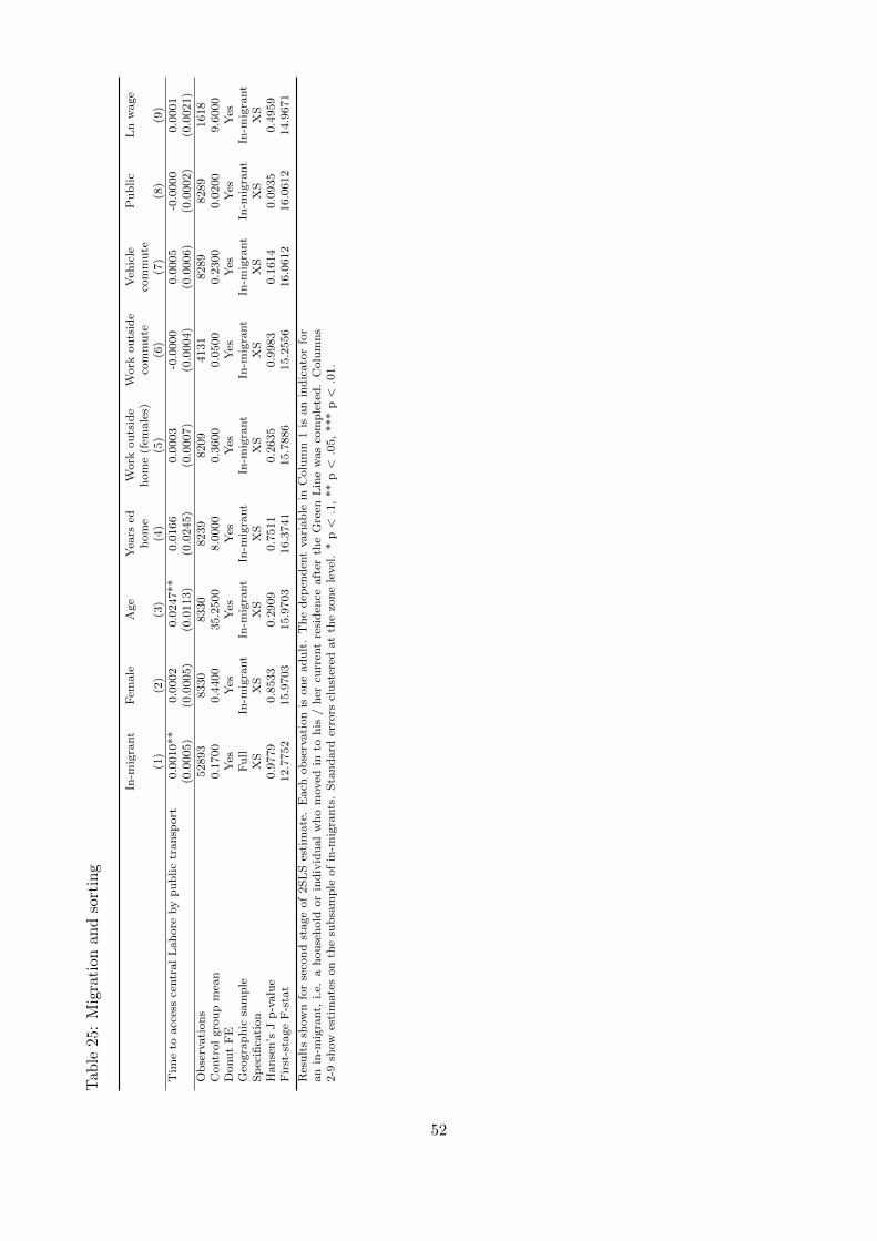
Tab
le25
:M
igra
tion
and
sort
ing
In-m
igra
nt
Fem
ale
Age
Yea
rsed
Work
ou
tsid
eW
ork
ou
tsid
eV
ehic
leP
ub
lic
Ln
wage
hom
eh
om
e(f
emale
s)co
mm
ute
com
mu
te(1
)(2
)(3
)(4
)(5
)(6
)(7
)(8
)(9
)T
ime
toacc
ess
centr
al
Lah
ore
by
pu
blic
tran
sport
0.0
010**
0.0
002
0.0
247**
0.0
166
0.0
003
-0.0
000
0.0
005
-0.0
000
0.0
001
(0.0
005)
(0.0
005)
(0.0
113)
(0.0
245)
(0.0
007)
(0.0
004)
(0.0
006)
(0.0
002)
(0.0
021)
Ob
serv
ati
on
s52893
8330
8330
8239
8209
4131
8289
8289
1618
Contr
ol
gro
up
mea
n0.1
700
0.4
400
35.2
500
8.0
000
0.3
600
0.0
500
0.2
300
0.0
200
9.6
000
Donu
tF
EY
esY
esY
esY
esY
esY
esY
esY
esY
esG
eogra
ph
icsa
mp
leF
ull
In-m
igra
nt
In-m
igra
nt
In-m
igra
nt
In-m
igra
nt
In-m
igra
nt
In-m
igra
nt
In-m
igra
nt
In-m
igra
nt
Sp
ecifi
cati
on
XS
XS
XS
XS
XS
XS
XS
XS
XS
Han
sen
’sJ
p-v
alu
e0.9
779
0.8
533
0.2
909
0.7
511
0.2
635
0.9
983
0.1
614
0.0
935
0.4
959
Fir
st-s
tage
F-s
tat
12.7
752
15.9
703
15.9
703
16.3
741
15.7
886
15.2
556
16.0
612
16.0
612
14.9
671
Res
ult
ssh
ow
nfo
rse
con
dst
age
of
2S
LS
esti
mate
.E
ach
ob
serv
ati
on
ison
ead
ult
.T
he
dep
end
ent
vari
ab
lein
Colu
mn
1is
an
ind
icato
rfo
ran
in-m
igra
nt,
i.e.
ah
ou
seh
old
or
ind
ivid
ual
who
moved
into
his
/h
ercu
rren
tre
sid
ence
aft
erth
eG
reen
Lin
ew
as
com
ple
ted
.C
olu
mn
s2-9
show
esti
mate
son
the
sub
sam
ple
of
in-m
igra
nts
.S
tan
dard
erro
rscl
ust
ered
at
the
zon
ele
vel
.*
p<
.1,
**
p<
.05,
***
p<
.01.
52

References
Angrist, J. D. and Krueger, A. B. (2001). Instrumental Variables and the Search for Identification:
From Supply and Demand to Natural Experiments. Journal of Economic Perspectives, 15 (4), 69–
85.
Baum-Snow, N., Brandt, L., Henderson, J. V., Turner, M. A. and Zhang, Q. (2017). Roads,
Railroads, and Decentralization of Chinese Cities. The Review of Economics and Statistics, 99 (3),
435–448.
— and Kahn, M. E. (2000). The effects of new public projects to expand urban rail transit. Journal
of Public Economics.
— and — (2005). Effects of Urban Rail Transit Expansions: Evidence from Sixteen Cities, 1970-2000.
Brookings-Wharton Papers on Urban Affairs, (2005), 147–206.
Billings, S. B. (2011). Estimating the value of a new transit option. Regional Science and Urban
Economics, 41 (6), 525–536.
Cookson, G. and Pishue, B. (2017). INRIX Global Traffic Scorecard. Inrix Global Traffic Scorecard,
(February), 44.
EMBARQ (2017). Global BRT Data.
Gibbons, S. and Machin, S. (2005). Valuing rail access using transport innovations. 57, 148–169.
Glaeser, E. and Henderson, J. V. (2017). Urban economics for the developing World : An intro-
duction. Journal of Urban Economics, 98, 1–5.
Glaeser, E. L., Kahn, M. E. and Rappaport, J. (2008). Why do the poor live in cities? The role
of public transportation. Journal of Urban Economics, 63 (1), 1–24.
Gonzalez-navarro, M. and Turner, M. A. (2014). Subways and Urban Growth : Evidence from
Earth. 1.
— and — (2016). Subways and Urban Growth: Evidence from Earth.
JICA (2012). Lahore Urban Transport Master Plan: Final Report.
53

Malik, A. A. (2015). Exploring the dynamics of urban development with agent-based modeling: The
case of Pakistani cities. George Mason University, pp. 1 – 237.
Pojani, D. and Stead, D. (2015). Sustainable Urban Transport in the Developing World: Beyond
Megacities. (2), 7784–7805.
Redding, J. and Turner, M. A. (2015). Transportation Costs and the Spatial Organization of
Economic Activity, vol. 5. Elsevier B.V., 1st edn.
Timilsina, G. R. and Dulal, H. B. (2010). Urban Road Transportation Externalities: Costs and
Choice of Policy Instruments. World Bank Research Observer, 26, 162–191.
Tsivanidis, N. (2017). The Aggregate and Distributional Effects of Urban Transit Infrastructure:
Evidence from Bogota’s TransMilenio.
US Department of Energy (2017). Transportation Energy Data Book. 36.
Winston, C. and Maheshri, V. (2007). On the social desirability of urban rail transit systems. 62,
362–382.
World Bank (2013). Global Monitoring Report.
Wright, L. and Hook, W. (eds.) (2007). Bus Rapid Transit Planning Guide. June.
54

Designed by soapbox.co.uk
The International Growth Centre (IGC) aims to promote sustainable growth in developing countries by providing demand-led policy advice based on frontier research.
Find out more about our work on our website www.theigc.org
For media or communications enquiries, please contact [email protected]
Subscribe to our newsletter and topic updates www.theigc.org/newsletter
Follow us on Twitter @the_igc
Contact us International Growth Centre, London School of Economic and Political Science, Houghton Street, London WC2A 2AE