information visualization - kth visualization is about choosing a representation of the data ... the...
TRANSCRIPT

1
INFORMATION VISUALIZATION
Gustav Taxén, Ph. D.Associate Professor
School of Computing Science and CommunicationRoyal Institute of Technology, Stockholm
2
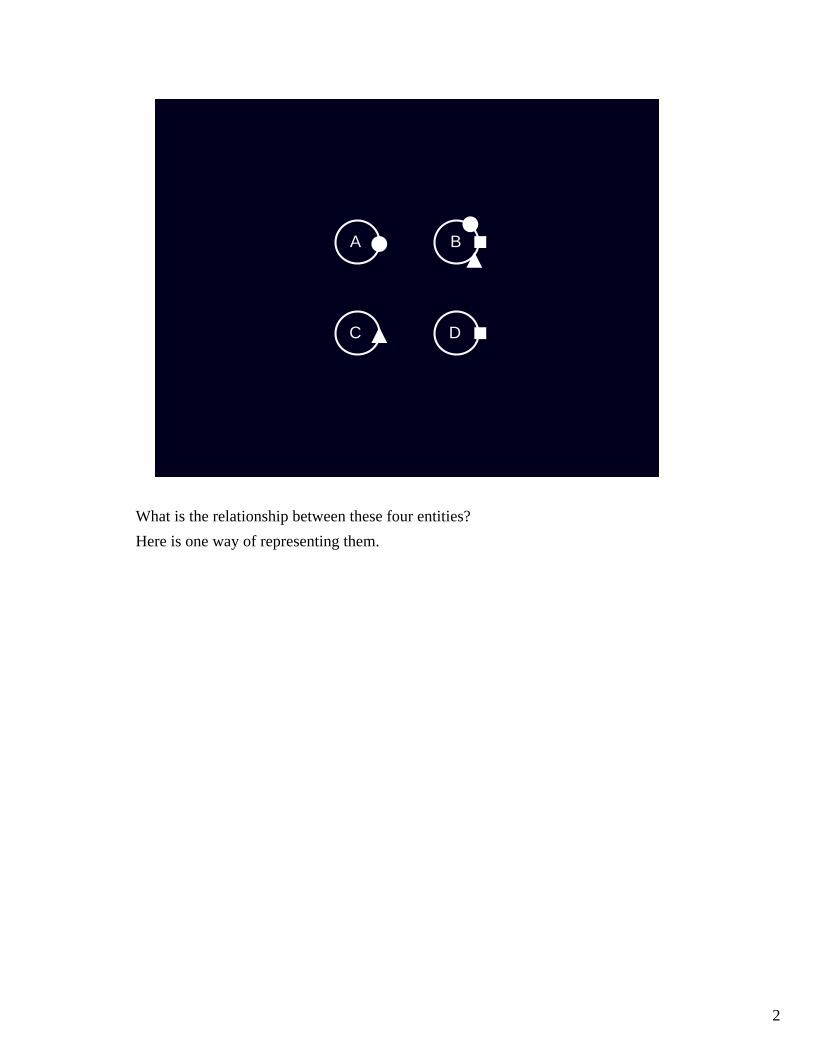
A B
C D
What is the relationship between these four entities?Here is one way of representing them.

3
A B
C D
This representation is (arguably) more efficient!
Information visualization is about choosing a representation of the data that helps us”understand” it, i.e., answers the questions we might have.If the presentation requires us to ”go through” each data entity and examine them in turn, we haven’t achieved much.Hence, an important issue to consider is ”what representation of the data will be most efficient in helping me understand the data?”In order to do that, we must try to formulate what it is about the data we want to know.It is important to formulate these questions because they may suggest how the data should be presented.Even when we ”explore” a dataset freely we often have some notion of what ourgoals are.
4
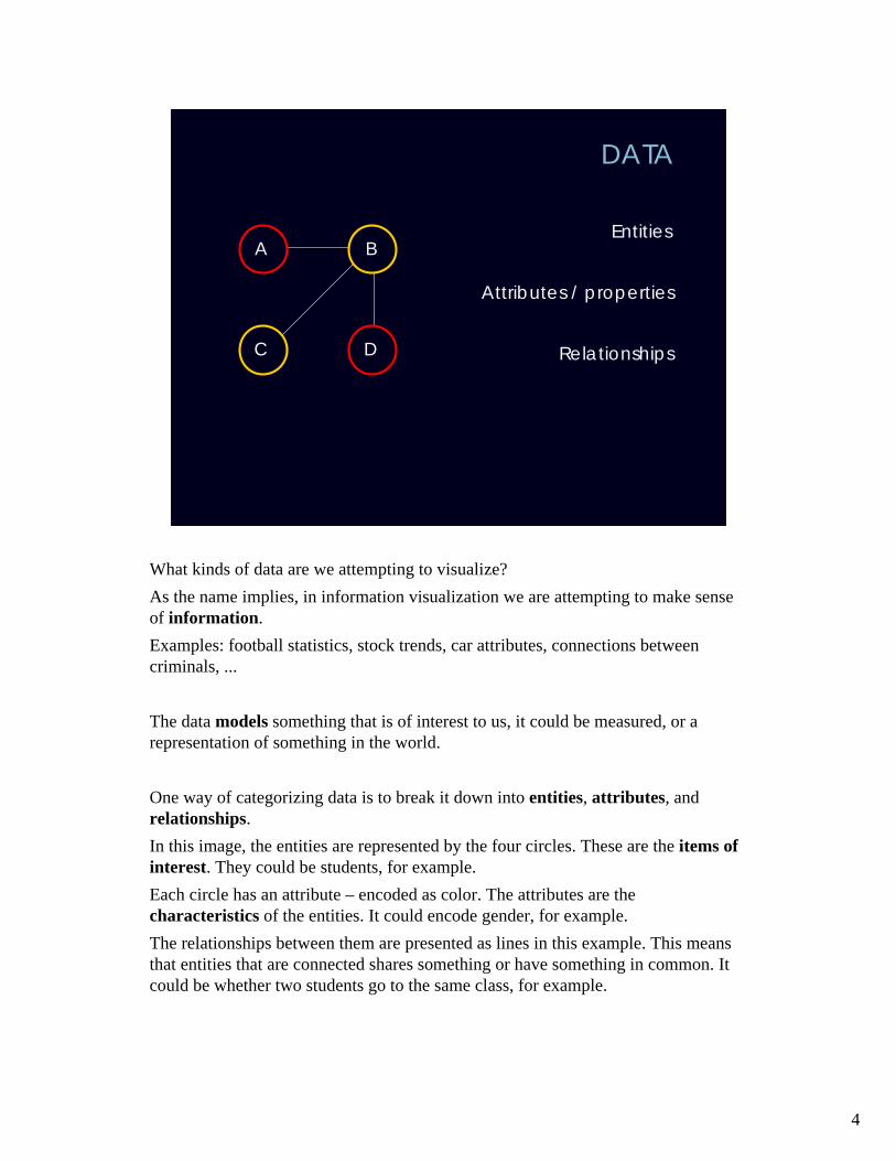
DATA
Entities
Relationships
Attributes / properties
A B
C D
What kinds of data are we attempting to visualize?As the name implies, in information visualization we are attempting to make senseof information.Examples: football statistics, stock trends, car attributes, connections betweencriminals, ...
The data models something that is of interest to us, it could be measured, or a representation of something in the world.
One way of categorizing data is to break it down into entities, attributes, and relationships.In this image, the entities are represented by the four circles. These are the items of interest. They could be students, for example.Each circle has an attribute – encoded as color. The attributes are the characteristics of the entities. It could encode gender, for example.The relationships between them are presented as lines in this example. This meansthat entities that are connected shares something or have something in common. It could be whether two students go to the same class, for example.
5
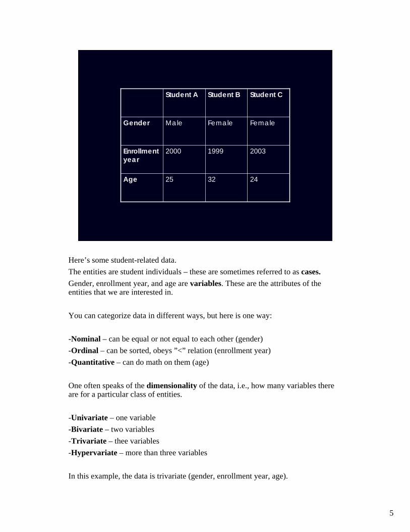
243225Age
200319992000Enrollmentyear
FemaleFemaleMaleGender
Student CStudent BStudent A
Here’s some student-related data.The entities are student individuals – these are sometimes referred to as cases.Gender, enrollment year, and age are variables. These are the attributes of the entities that we are interested in.
You can categorize data in different ways, but here is one way:
-Nominal – can be equal or not equal to each other (gender)-Ordinal – can be sorted, obeys ”<” relation (enrollment year)-Quantitative – can do math on them (age)
One often speaks of the dimensionality of the data, i.e., how many variables thereare for a particular class of entities.
-Univariate – one variable-Bivariate – two variables-Trivariate – thee variables-Hypervariate – more than three variables
In this example, the data is trivariate (gender, enrollment year, age).
6
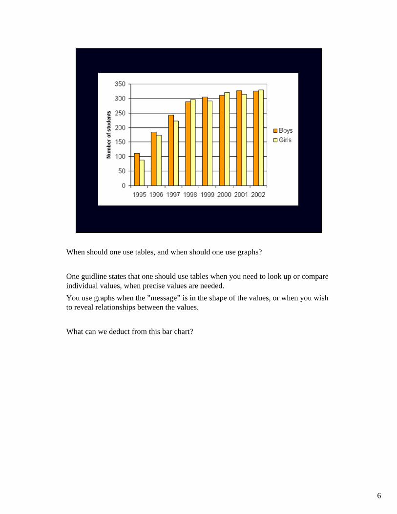
When should one use tables, and when should one use graphs?
One guidline states that one should use tables when you need to look up or compareindividual values, when precise values are needed.You use graphs when the ”message” is in the shape of the values, or when you wishto reveal relationships between the values.
What can we deduct from this bar chart?
7
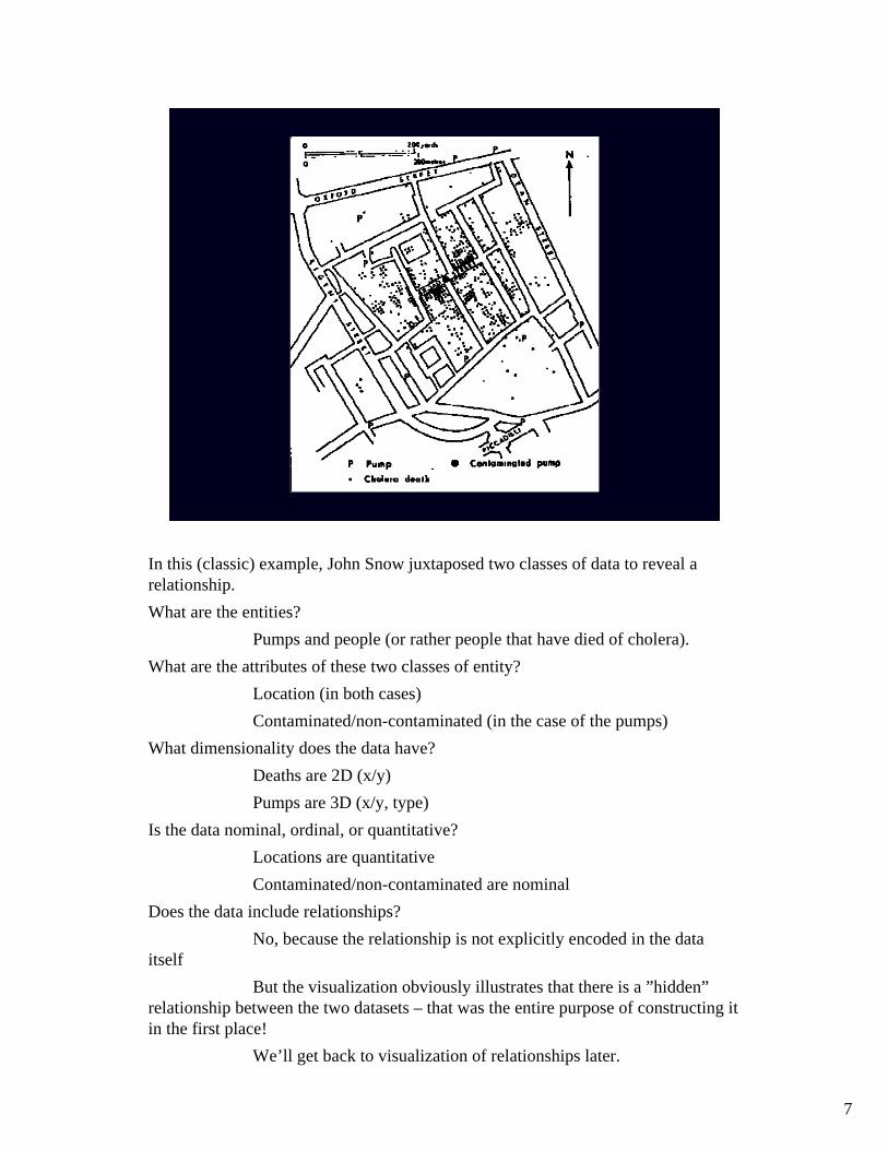
In this (classic) example, John Snow juxtaposed two classes of data to reveal a relationship.What are the entities?
Pumps and people (or rather people that have died of cholera).What are the attributes of these two classes of entity?
Location (in both cases)Contaminated/non-contaminated (in the case of the pumps)
What dimensionality does the data have?Deaths are 2D (x/y)Pumps are 3D (x/y, type)
Is the data nominal, ordinal, or quantitative?Locations are quantitativeContaminated/non-contaminated are nominal
Does the data include relationships?No, because the relationship is not explicitly encoded in the data
itselfBut the visualization obviously illustrates that there is a ”hidden”
relationship between the two datasets – that was the entire purpose of constructing it in the first place!
We’ll get back to visualization of relationships later.

8
Operations and processes are often thought of as somehow different than the data itself – not entities, not relationships, not attributes.Examples: Mathematical operations on numbers, merging lists, transforming an entity in some way, splitting a complex entity into its component parts.It often takes creativity to ”convert” operations into data that can be visualizedeffectively.Animation is sometimes used.
9
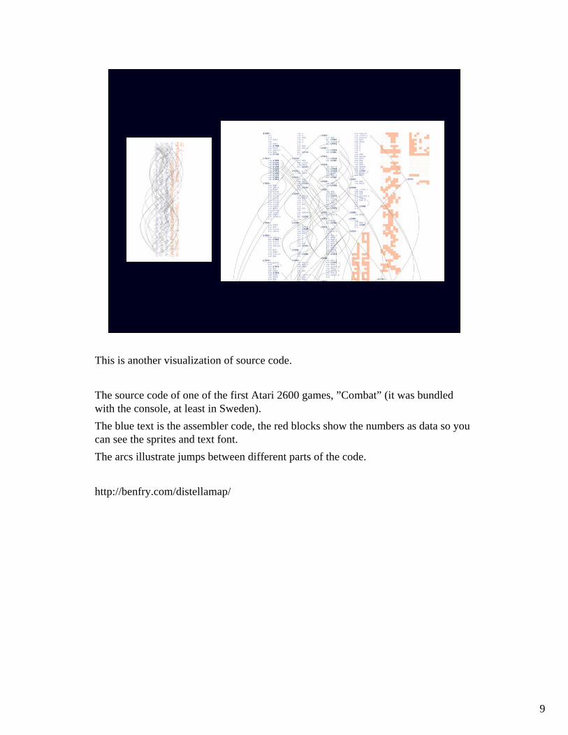
This is another visualization of source code.
The source code of one of the first Atari 2600 games, ”Combat” (it was bundledwith the console, at least in Sweden).The blue text is the assembler code, the red blocks show the numbers as data so you can see the sprites and text font.The arcs illustrate jumps between different parts of the code.
http://benfry.com/distellamap/

10
...and here’s ”Pitfall”, for the same system.Can we say something about the nature of the code when comparing these twoimages?

11
Here’s another game, ”Q-bert”.What can we say about this programmer’s approach to coding?

12
Position in list
Value
Example: sorting a list using bubblesortThe algorithm steps through the list, comparing two items at a time and swaps themif they are out of order.When no swaps are needed, the list is sorted.
One option would be to show it as an animation, as here.Is this a good visualization of the algorithm?Can we answer questions such as:- After what percentage of time is half of the array sorted? - Can you find an element that moved about half the length of the array to reach its final destination? - What percentage of the array was sorted after 80% of the sorting process?
13
Time
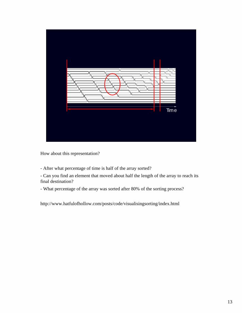
How about this representation?
- After what percentage of time is half of the array sorted? - Can you find an element that moved about half the length of the array to reach its final destination? - What percentage of the array was sorted after 80% of the sorting process?
http://www.hatfulofhollow.com/posts/code/visualisingsorting/index.html

14
18122378919374783897419782301342398741782542374190254128793632542348792637162431
Choosing a representation of the data that supports the sense-making process......hopefully in an efficient way......that reduces the risk of misinterpretation.Combination of creativity/design and knowledge about perception and cognition
How many threes are there in this presentation of numbers?If we don’t assist the visual system in some way, we have no choice but to scan eachline, counting threes as we encounter them.Hence, this is an inefficient presentation for that task.
But since the numbers are organized in a table (rather than positioned by random on the screen) we can say, for example, how many numbers there are without having to count all of them.
15
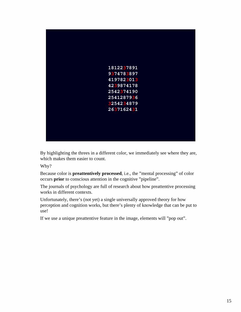
18122378919374783897419782301342398741782542374190254128793632542348792637162431
By highlighting the threes in a different color, we immediately see where they are, which makes them easier to count.Why?Because color is preattentively processed, i.e., the ”mental processing” of coloroccurs prior to conscious attention in the cognitive ”pipeline”.The journals of psychology are full of research about how preattentive processingworks in different contexts. Unfortunately, there’s (not yet) a single universally approved theory for howperception and cognition works, but there’s plenty of knowledge that can be put to use!If we use a unique preattentive feature in the image, elements will ”pop out”.

16
Some visual features that have been shown to be processed preattentively. From leftto right, top to bottom:
Line orientationLength/widthClosureSizeCurvatureDensity/contrastNumber, estimationColor / hueIntensityIntersectionTerminators3D depth cue
Note that some of these examples are more efficient than others.
http://www.csc.ncsu.edu/faculty/healey/PP

17
Note that the feature we choose to highlight objects should be unique.Here, the curvature of the target is the unique distinguishing feature, which makes it pop out in the right image

18
Here, the target circle shares features with the ”distractors”: they can be both red, or be circles. This makes the red circle more difficult to find.
The take-away here is that the way you choose your presentation influences howefficient your visualization is!
In my opinion, the choice of presentation is a fundamental part of the visualizationprocess – you ”understand” the data by presenting it in different ways. Different presentations will yield different interpretations. Experimenting with the presentation design space is a very, very important part of any visualization activity.

19
You will find that often, there is no ”perfect” single presentation – you will need to combine different visualizations, and you’ll need to filter the data in different waysOften, making use of interactivity is an important part of the sensemaking process.The QlikView lecture will be about this.
20
UNIVARIATE DATA
Keyhole problem
Overview / navigation
There are surprisingly many issues that come up, even for ”simple” univariate dataThe most simple examples are bar charts and line diagrams – there’s plenty of booksdescribing how to do these, so we won’t focus on them here.
Instead, we’ll look at text!For large data sets (such as text documents extending over more than a page), oneimportant issue is how to support both overview and provide detail at the same time.
21
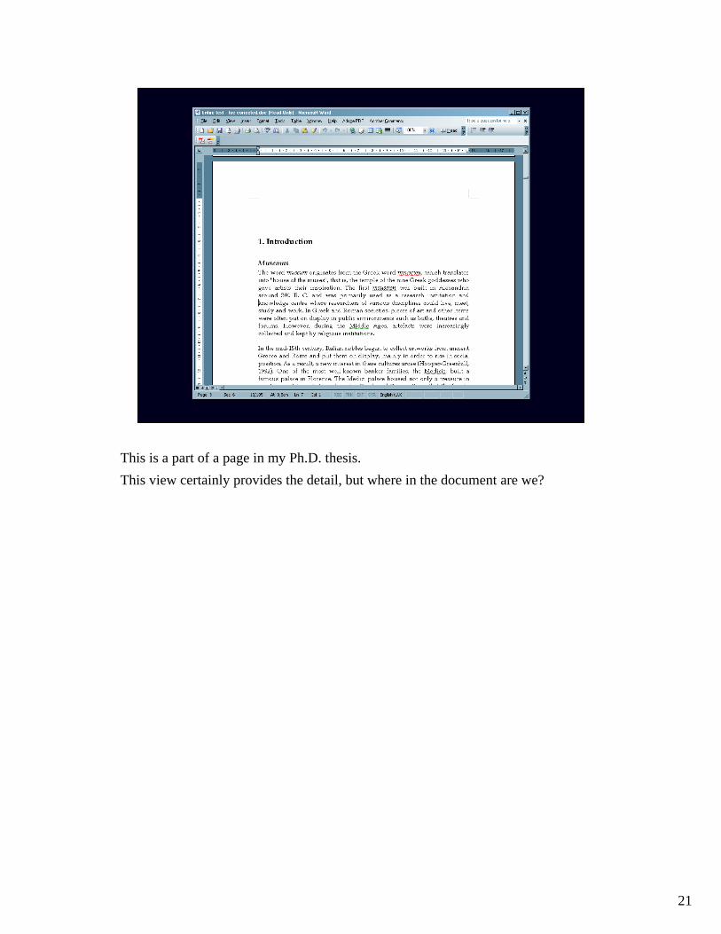
This is a part of a page in my Ph.D. thesis.This view certainly provides the detail, but where in the document are we?

22
MS Word has a ”reading layout” function where we can see the header hierarchy. It’s possible to expand or collapse the section display on the left, and the currentsection is highlighted.
23
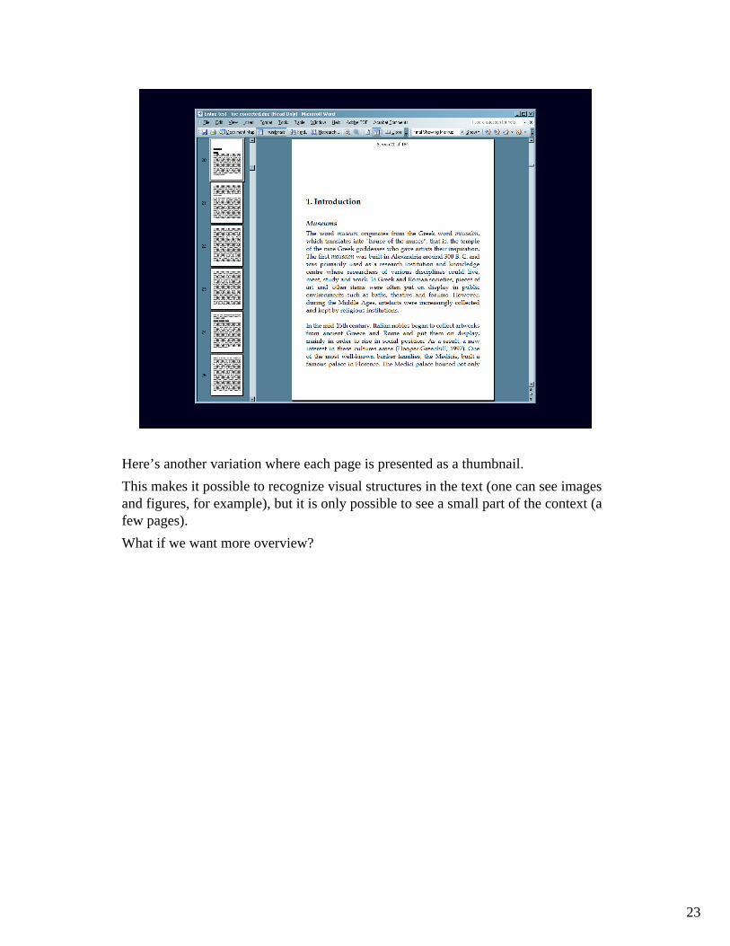
Here’s another variation where each page is presented as a thumbnail. This makes it possible to recognize visual structures in the text (one can see images and figures, for example), but it is only possible to see a small part of the context (a few pages).What if we want more overview?

24
Here’s one option. (Robertson & Mackinlay, ”The document lens”, 1993).
25
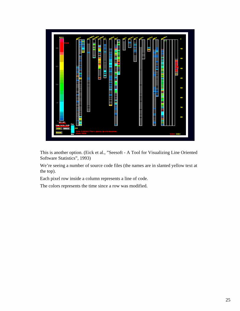
This is another option. (Eick et al., ”Seesoft - A Tool for Visualizing Line Oriented Software Statistics”, 1993)We’re seeing a number of source code files (the names are in slanted yellow text at the top).Each pixel row inside a column represents a line of code. The colors represents the time since a row was modified.

26
Another way of providing overview of texts is to attempt to distill what the text is about.
The first chapter of my Ph.D. thesis, as visualized by www.wordle.net.The font size corresponds to the number of occurrences in the text.The program uses a so-called ”stop list” to filter out undesired words (the application keeps such a list for common languages).
What is my thesis about?Is this a useful visualization?Is the filter satisfactory?Could something be done to improve it?
27
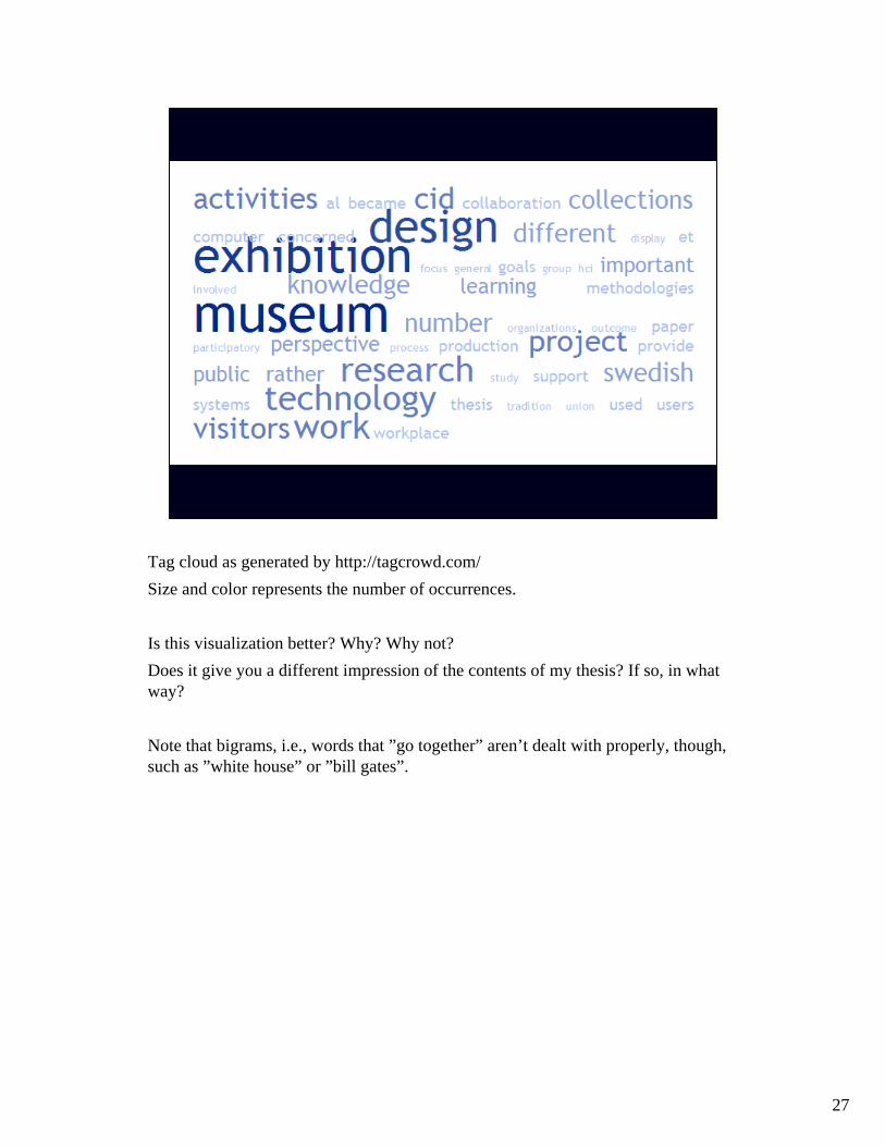
Tag cloud as generated by http://tagcrowd.com/Size and color represents the number of occurrences.
Is this visualization better? Why? Why not?Does it give you a different impression of the contents of my thesis? If so, in whatway?
Note that bigrams, i.e., words that ”go together” aren’t dealt with properly, though, such as ”white house” or ”bill gates”.
28
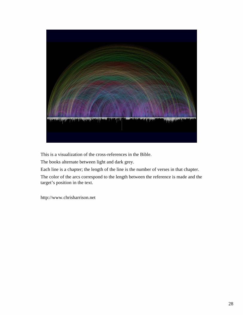
This is a visualization of the cross-references in the Bible.The books alternate between light and dark grey.Each line is a chapter; the length of the line is the number of verses in that chapter.The color of the arcs correspond to the length between the reference is made and the target’s position in the text.
http://www.chrisharrison.net
29
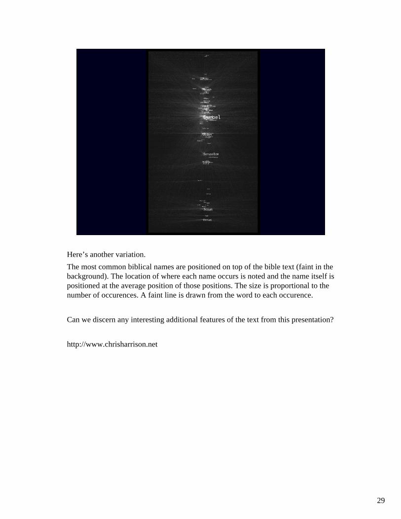
Here’s another variation.The most common biblical names are positioned on top of the bible text (faint in the background). The location of where each name occurs is noted and the name itself is positioned at the average position of those positions. The size is proportional to the number of occurences. A faint line is drawn from the word to each occurence.
Can we discern any interesting additional features of the text from this presentation?
http://www.chrisharrison.net

30
BIVARIATE DATA
With bivariate data, we have two variables.The simplest solution here is to use a scatterplot.This example illustrates diamond prices in Singapore. Each case is represented by one dot. The X axis encodes size in carats, the Y axis is the price.What can we learn?
31
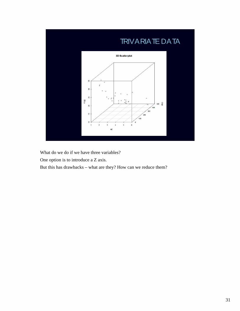
TRIVARIATE DATA
What do we do if we have three variables?One option is to introduce a Z axis.But this has drawbacks – what are they? How can we reduce them?

32
Another option is to use a 2D scatterplot, but let the shape, color or size of the dotscorrespond to the value of the third variable.(The examples are unrelated)
33
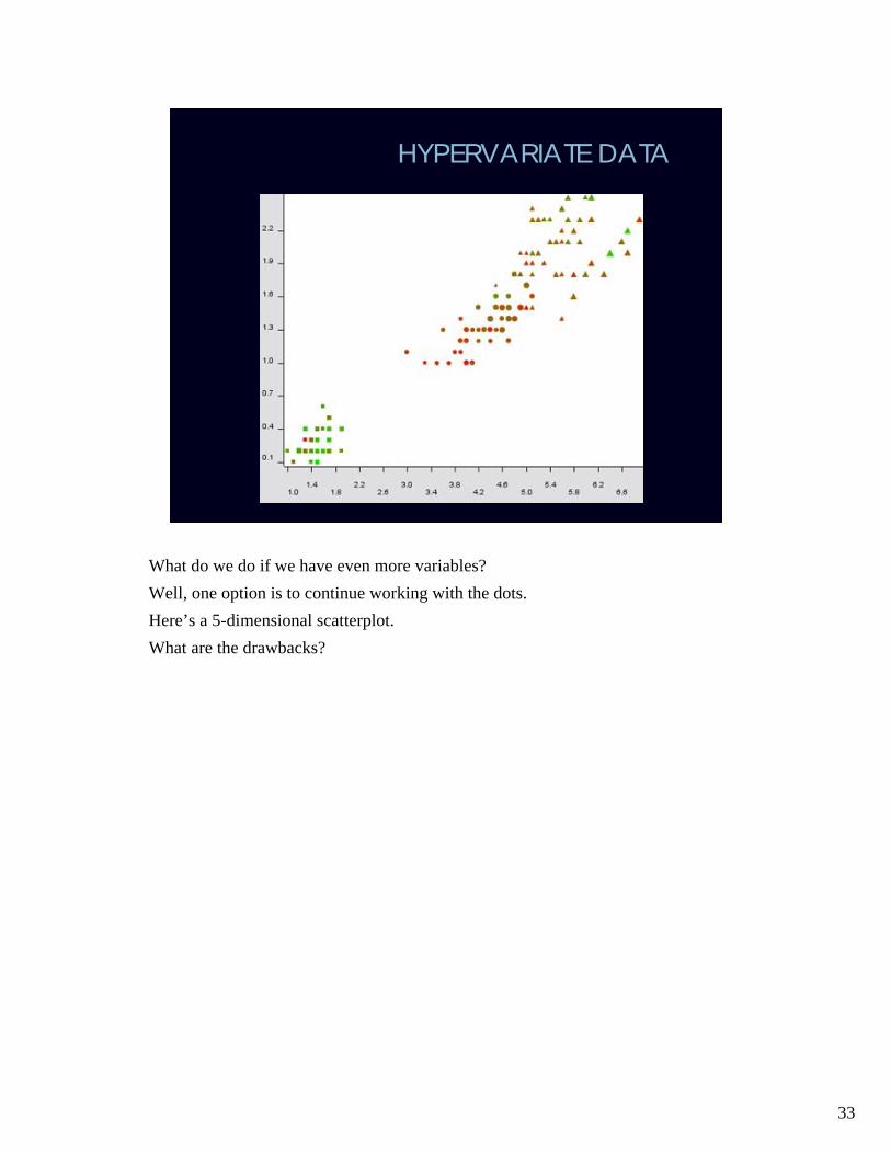
HYPERVARIATE DATA
What do we do if we have even more variables?Well, one option is to continue working with the dots.Here’s a 5-dimensional scatterplot.What are the drawbacks?

34
Another option is to use a scatterplot matrix.

35
Of primary importance when working with multiple simultaneous scatterplots is the ability to highlight.In this example, a group of cases have been highlighted in one of the scatterplots(yellow) and the same cases are automatically hightlighted in the other.You will see more examples of this in the QlikView lecture.
36
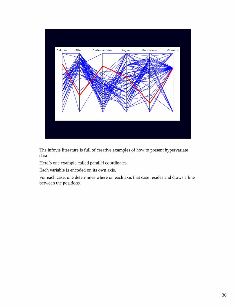
The infovis literature is full of creative examples of how to present hypervariatedata.Here’s one example called parallel coordinates.Each variable is encoded on its own axis. For each case, one determines where on each axis that case resides and draws a linebetween the positions.
37
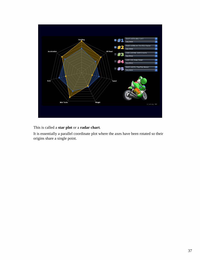
This is called a star plot or a radar chart. It is essentially a parallel coordinate plot where the axes have been rotated so theirorigins share a single point.

38
This is called a mosaic plot.The example is from a data set describing the Titanic disaster.First, we divide the passengers into two categories – the ones that survived and the ones that didn’t. The size of the boxes correspond to the amount of passengers in each category.Then, we divide along the other axis – we note whether the passenger was male or female. Again, the size of the boxes illustrates the number of people in eachcategory.In the third step, we’ve divided along the x axis again – this time we note whetherthe passenger is a child or an adult.We can continue this for as long as we like.
Can this be done with any hypervariate data?

39
REPRESENTING RELATIONS
Relations between entities may be encoded in the data as well.
The simplest option is to draw the entities as symbols on a 2D plane and connectthem with lines (that could be directed if necessary).That allows us to encode attributes of the entities as shape, size, or color if we like.
This example is from 1934 (Jacob Moreno). The data are friendship choices made by fourth grade children. Boys are shown as triangles and girls as circles. All the boys, moreover, are drawn on the left of the image and all the girls are on the right. The different shapes and the placement of points show dramatically the segregation of choices by gender. In fact, only one boy chose a girl and no girl chose any boy as a friend.
40
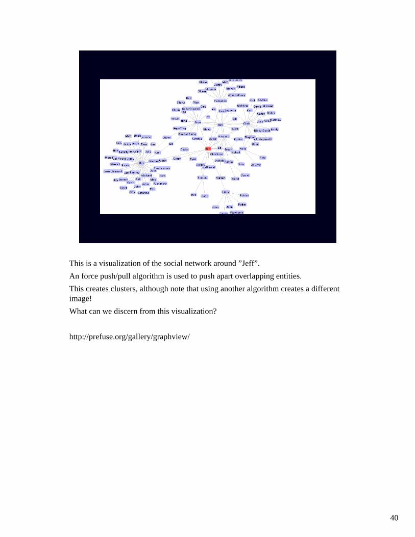
This is a visualization of the social network around ”Jeff”.An force push/pull algorithm is used to push apart overlapping entities.This creates clusters, although note that using another algorithm creates a different image!What can we discern from this visualization?
http://prefuse.org/gallery/graphview/

41
Here’s another visualization of the bible.It is based on a list of biblical names. Whenever two names occur in the same verse, a connection is made between them.The result is then clustered so that relations that occur more often are put closertogether.Entities with less than 40 connections are drawn at an angle.The size is proportional to the number of connections
http://www.chrisharrison.net
42
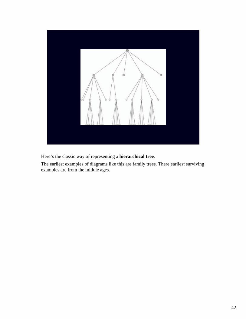
Here’s the classic way of representing a hierarchical tree.The earliest examples of diagrams like this are family trees. There earliest survivingexamples are from the middle ages.

43
Here is one example from the 11th century, showing Noah’s descendants.
Is there anything interesting about Noah’s family?
44
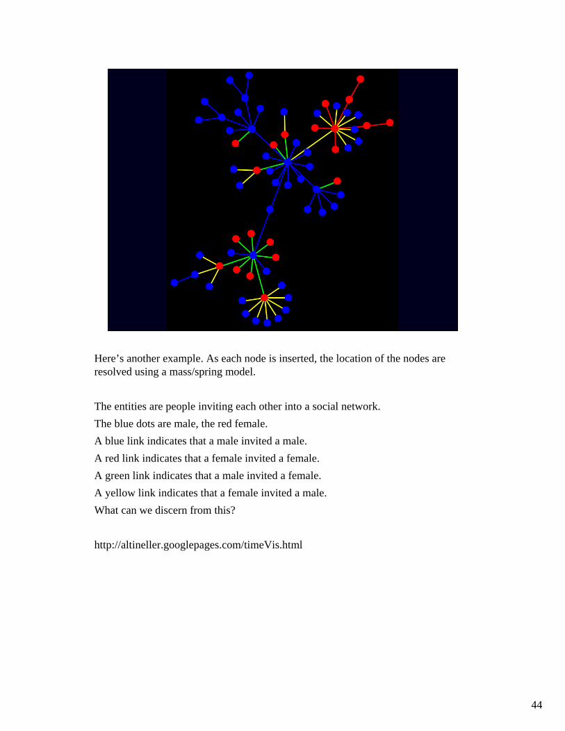
Here’s another example. As each node is inserted, the location of the nodes are resolved using a mass/spring model.
The entities are people inviting each other into a social network.The blue dots are male, the red female.A blue link indicates that a male invited a male.A red link indicates that a female invited a female.A green link indicates that a male invited a female.A yellow link indicates that a female invited a male.What can we discern from this?
http://altineller.googlepages.com/timeVis.html
45
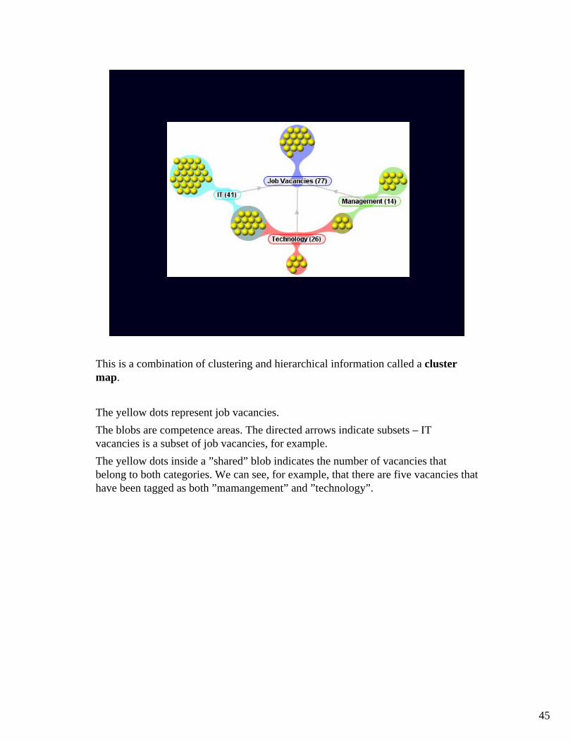
This is a combination of clustering and hierarchical information called a cluster map.
The yellow dots represent job vacancies. The blobs are competence areas. The directed arrows indicate subsets – IT vacancies is a subset of job vacancies, for example.The yellow dots inside a ”shared” blob indicates the number of vacancies that belong to both categories. We can see, for example, that there are five vacancies that have been tagged as both ”mamangement” and ”technology”.

46
This is a so-called radial layout with the root node in the center.Each successive level in the hierarchy is mapped to a circle around the root node.

47
This is another option called a balloon tree. Subtrees are encased in circles.
48
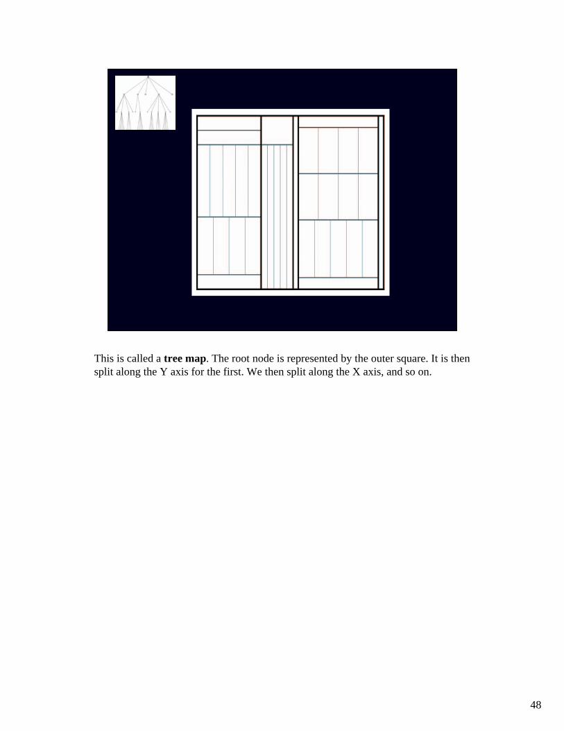
This is called a tree map. The root node is represented by the outer square. It is thensplit along the Y axis for the first. We then split along the X axis, and so on.
49
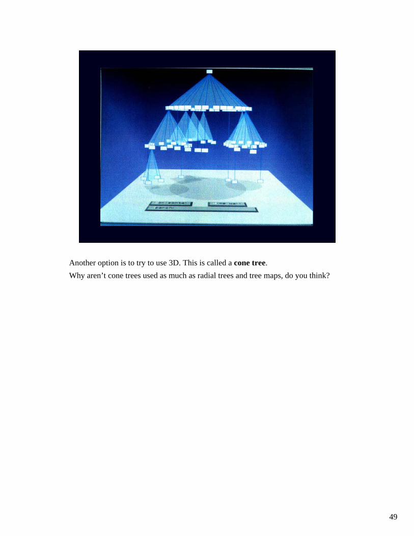
Another option is to try to use 3D. This is called a cone tree.Why aren’t cone trees used as much as radial trees and tree maps, do you think?
50
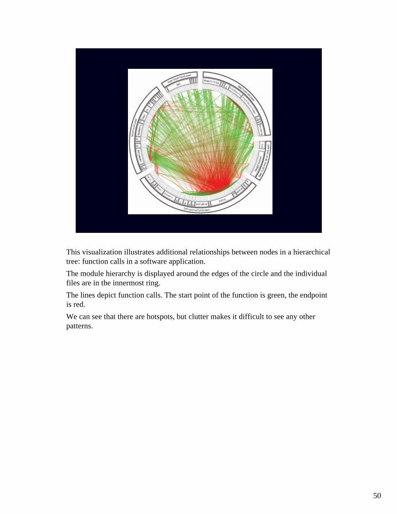
This visualization illustrates additional relationships between nodes in a hierarchicaltree: function calls in a software application.The module hierarchy is displayed around the edges of the circle and the individualfiles are in the innermost ring.The lines depict function calls. The start point of the function is green, the endpointis red.We can see that there are hotspots, but clutter makes it difficult to see any otherpatterns.
51
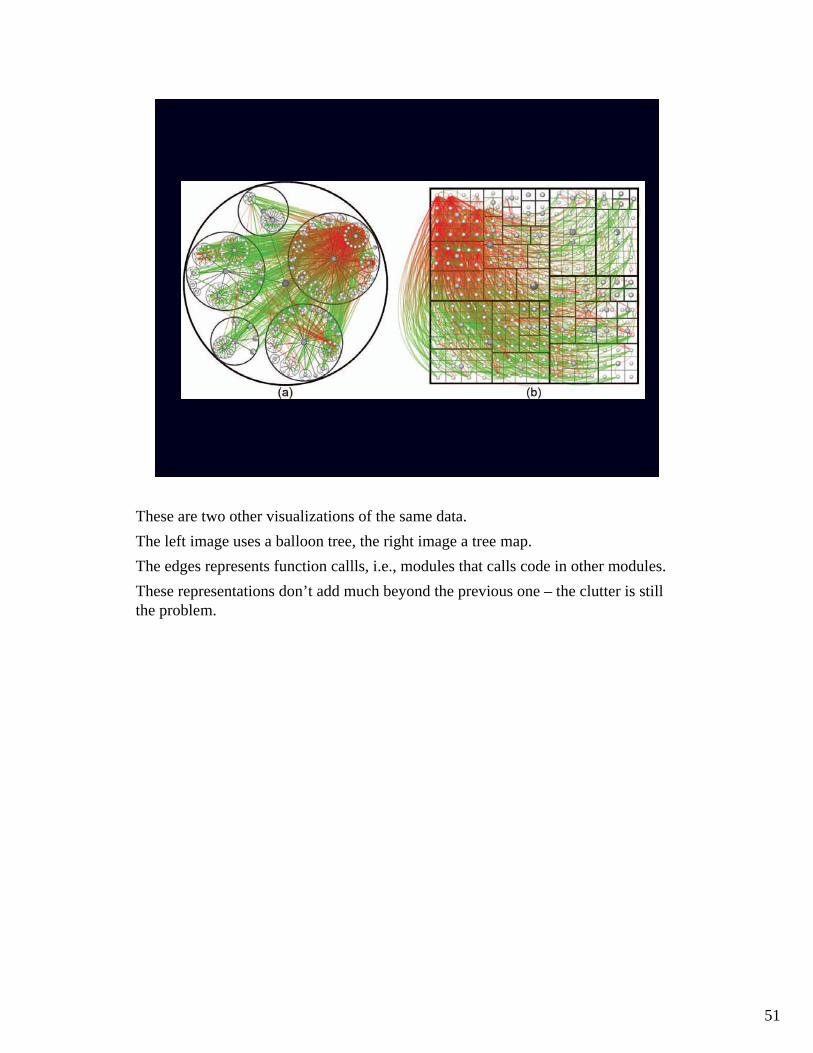
These are two other visualizations of the same data.The left image uses a balloon tree, the right image a tree map.The edges represents function callls, i.e., modules that calls code in other modules.These representations don’t add much beyond the previous one – the clutter is still the problem.
52
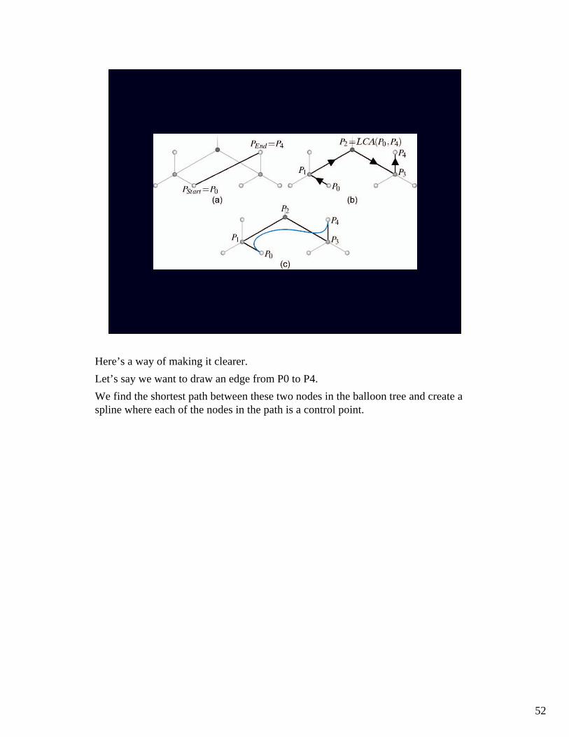
Here’s a way of making it clearer. Let’s say we want to draw an edge from P0 to P4.We find the shortest path between these two nodes in the balloon tree and create a spline where each of the nodes in the path is a control point.

53
In a radial layout we get something like this.In (b), longer paths are drawn at a lower opacity.

54
If we apply this principle to the original data, we get this.We begin by presenting the hierarchy in a radial layout that matches the modulehierarchy.We then add the function call lines, using the radial layout to create spline controlpoints. When the radial layout is removed, we get the resulting image.
Danny Holten, Hierarchical Edge Bundles: Visualization of Adjacency Relations in Hierarchical Data. IEEE TRANSACTIONS ON VISUALIZATION AND COMPUTER GRAPHICS, VOL. 12, NO. 5, SEPTEMBER/OCTOBER 2006.
55
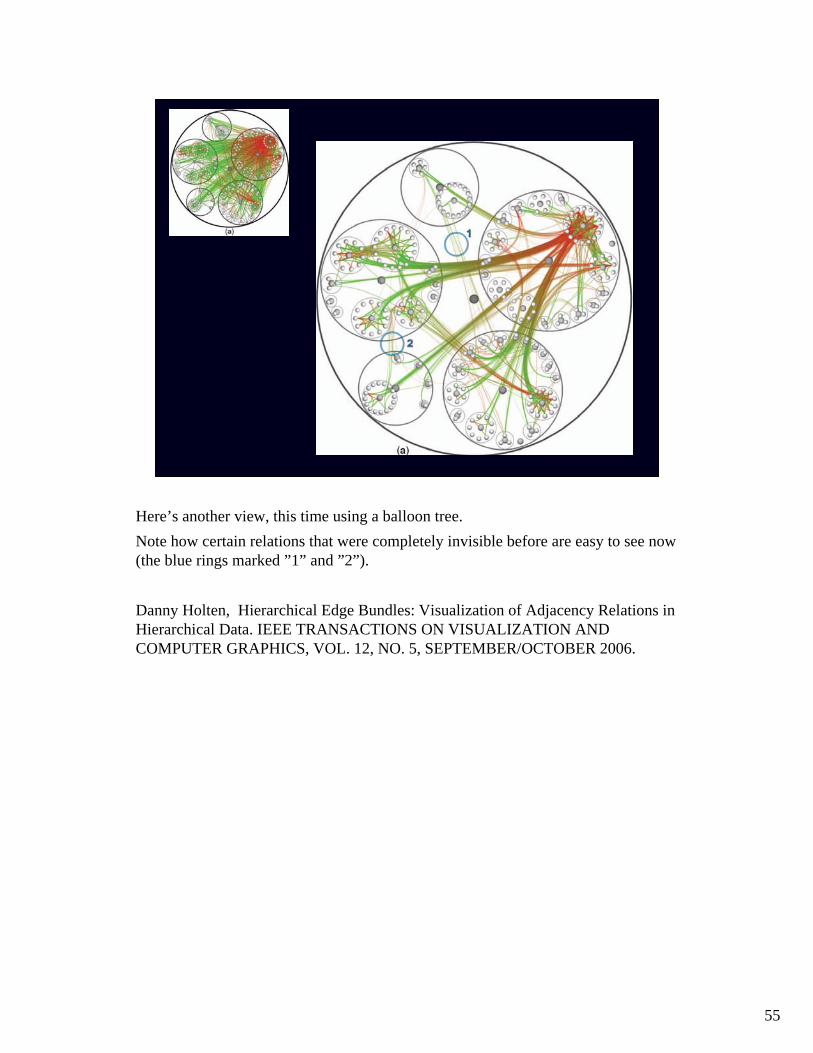
Here’s another view, this time using a balloon tree.Note how certain relations that were completely invisible before are easy to see now(the blue rings marked ”1” and ”2”).
Danny Holten, Hierarchical Edge Bundles: Visualization of Adjacency Relations in Hierarchical Data. IEEE TRANSACTIONS ON VISUALIZATION AND COMPUTER GRAPHICS, VOL. 12, NO. 5, SEPTEMBER/OCTOBER 2006.
56
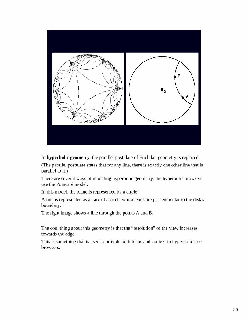
In hyperbolic geometry, the parallel postulate of Euclidan geometry is replaced.(The parallel postulate states that for any line, there is exactly one other line that is parallel to it.)There are several ways of modeling hyperbolic geometry, the hyperbolic browsersuse the Poincaré model.In this model, the plane is represented by a circle. A line is represented as an arc of a circle whose ends are perpendicular to the disk's boundary.The right image shows a line through the points A and B.
The cool thing about this geometry is that the ”resolution” of the view increasestowards the edge.This is something that is used to provide both focus and context in hyperbolic treebrowsers.
57
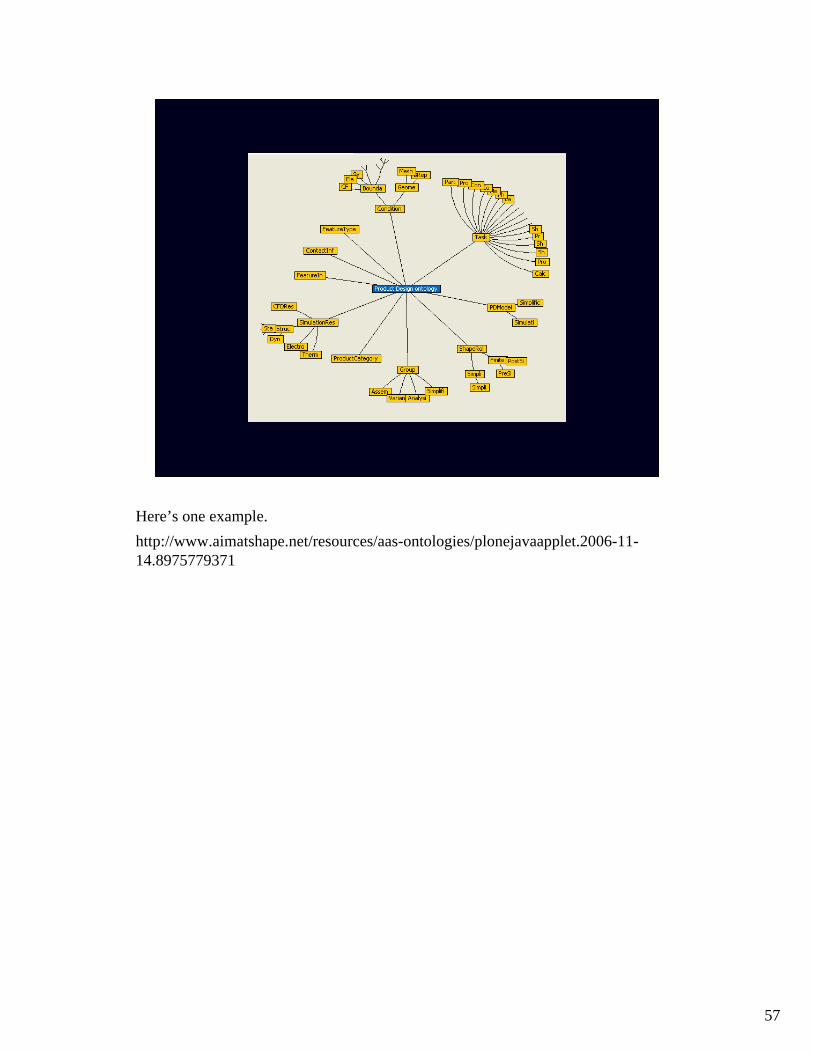
Here’s one example.http://www.aimatshape.net/resources/aas-ontologies/plonejavaapplet.2006-11-14.8975779371

58
REAL-TIME
The internet makes it possible to create fascinating real-time visualizations of global human activity.Here is one example illustrating how yellow cabs move through San Francisco.
http://cabspotting.org/
59
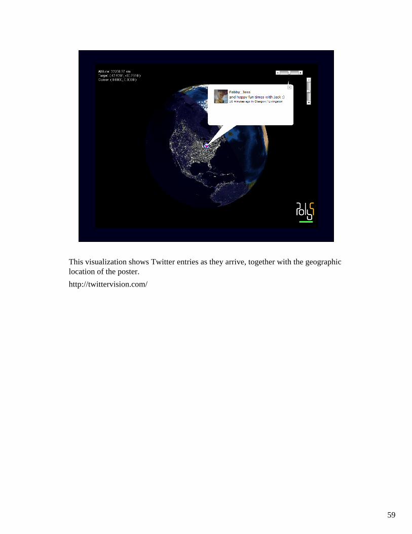
This visualization shows Twitter entries as they arrive, together with the geographiclocation of the poster.http://twittervision.com/
60
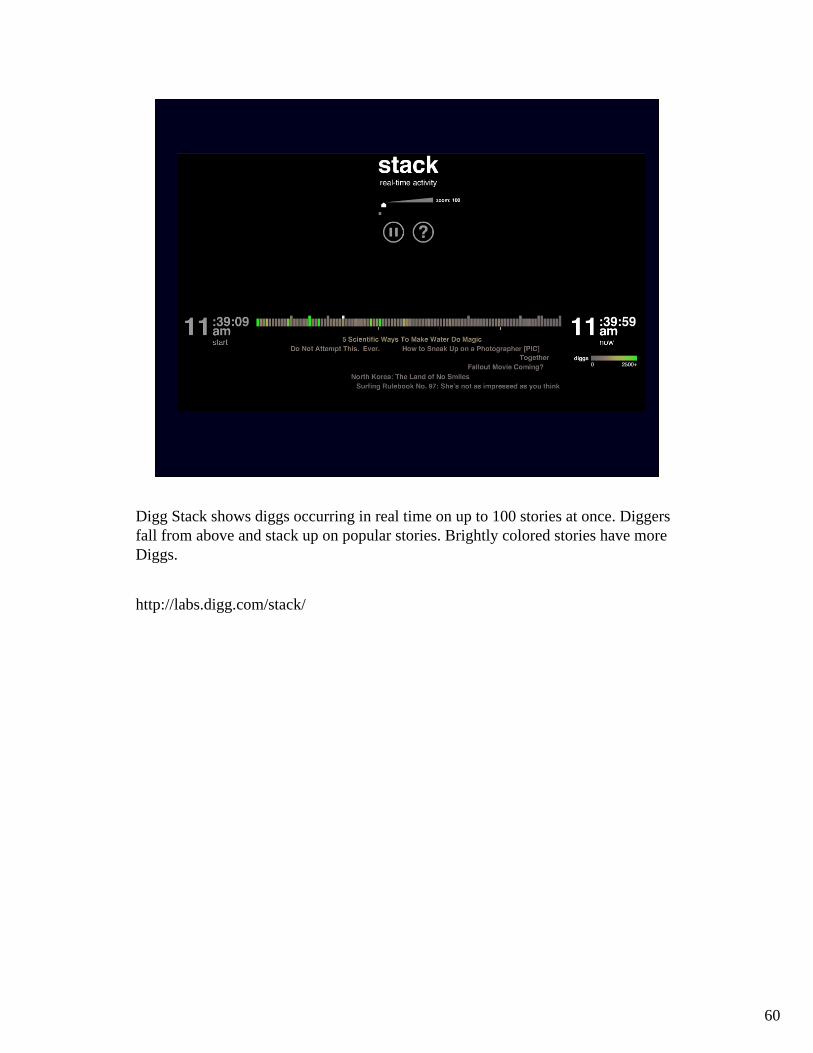
Digg Stack shows diggs occurring in real time on up to 100 stories at once. Diggers fall from above and stack up on popular stories. Brightly colored stories have more Diggs.
http://labs.digg.com/stack/
61
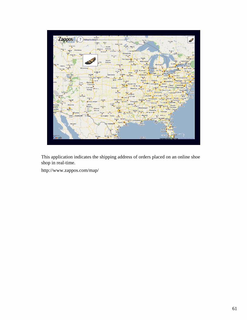
This application indicates the shipping address of orders placed on an online shoeshop in real-time.http://www.zappos.com/map/

62
This is a live visualization of the current number of hostile Internet attacks.
Akamai is a company that collects data on the number of connections that are attempted, the source IP address, the destination IP address and the source and destination ports in real time. The packets captured are generally from automated scanning trojans and worms looking to infect new computers scanning randomly generated IP addresses. The attack traffic depicts the total number of attacks over the last twenty-four hours.
Values are measured in attacks per 24 hours (attacks/24hrs). Regions are displayed as countries or states.
http://www.akamai.com/html/technology/
63
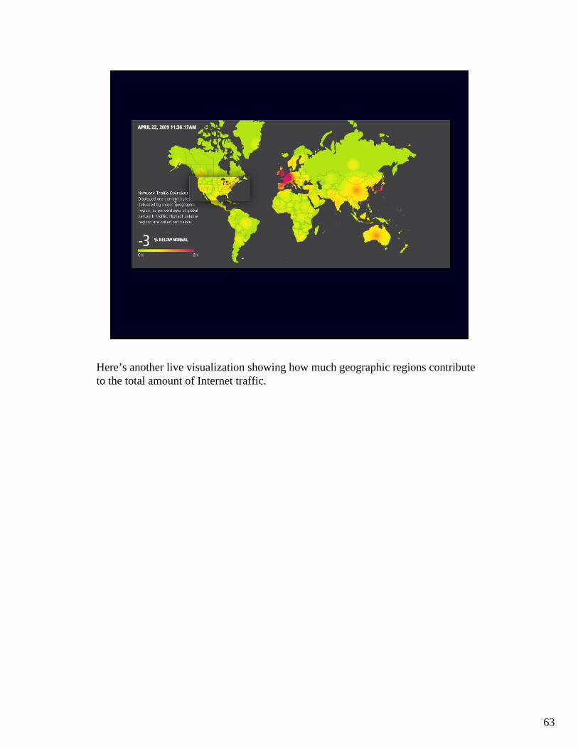
Here’s another live visualization showing how much geographic regions contributeto the total amount of Internet traffic.