information visualization crash course
TRANSCRIPT

Information Visualization
Crash Course
Chad Stolper
Google(graduated from Georgia Tech CS PhD)
1
(AKA Information Visualization 101)
http://poloclub.gatech.edu/cse6242
CSE6242: Data & Visual Analytics

What is Infovis?
Why is it Important?
Human Perception
Chart Basics(If Time, Some Color Theory)
The Shneiderman Mantra
Where to Learn More
2

What is Information Visualization?
3

Information Visualization
“The use of computer-supported, interactive,
visual representations of abstract data to
amplify cognition.”
Card, Mackinlay, and Shneiderman 1999
4

Communication
Exploratory Data Analysis (EDA)
5

Communication
6
(gone wrong)

7

8 X
Edward Tufte
An American statistician
and professor emeritus of
political science, statistics,
and computer science at
Yale University.
He is noted for his writings
on information design and
as a pioneer in the field of
data visualization.
-Wikipedia

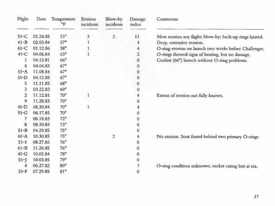
Space Shuttle ChallengerJanuary 28, 1986
9
Morning Temperature: 31°F

10

11
Tufte, E. R. (2012). Visual explanations: images and quantities,
evidence and narrative. Cheshire, CT: Graphics Press.

13
Video originally from: http://www.FeynmanPhysicsLectures.com
Most Watched Science Experiment
Richard Feynman, Physics
Nobel laureate explained how
rubber became rigid in cold
temperate
YouTube video:
https://youtu.be/6Rwcbsn19c0

How did this happen?
14

15
Tufte, E. R. (2012). Visual explanations: images and quantities, evidence and narrative. Cheshire, CT: Graphics Press.
Engineers at Morton Thiokol, the rocket
maker, presented on the day before and
recommended not to launch.

19

24

25

26
27

28

So, communication is
extremely important.
Visualization can help with that –
communicate ideas and insights.
29

30http://www.ted.com/talks/hans_rosling_shows_the_best_stats_you_ve_ever_seen.html

Visualization can also help with
Exploratory Data Analysis (EDA)
But why do you need to explore
data at all???
31

“There are three kinds of lies:
lies, damned lies, and statistics.”
33
https://en.wikipedia.org/wiki/Lies,_damned_lies,_and_statistics

Mystery Data Set
34

Mystery Data Set
Property Value
mean( x ) 9
variance ( x ) 11
mean( y ) 7.5
variance ( y ) 4.122
correlation ( x,y ) 0.816
Linear Regression Line y = 3 + 0.5x
35

36

37

38

39

Anscombe’s Quartet
40https://en.wikipedia.org/wiki/Anscombe%27s_quartet

Anscombe’s Quartet
Sanity Checking Models
Outlier Detection
41

Data visualization leverages
human perception
43

Name the five senses.
44

45
Sense Bandwidth (bits/sec)
Sight 10,000,000
Touch 1,000,000
Hearing 100,000
Smell 100,000
Taste 1,000
http://www.britannica.com/EBchecked/topic/287907/information-theory/214958/Physiology

A (Simple) Model
of Human Visual Perception
46

A (Simple) Model of Human Perception
47
Parallel detection of
basic features into
an iconic store
Serial processing of
object identification and
spatial layout
Stage 1 Stage 2

Stage 1: Pre-Attentive Processing
Rapid
Parallel
Automatic(Fleeting = lasting for a short time)
48

Stage 2: Serial Processing
Relatively Slow
(Incorporates Memory)
Manual
49

Stage 1: Pre-Attentive Processing
The eye moves every 200ms
(so this processing occurs every
200ms-250ms)
50

Example
1281768756138976546984506985604982826762
9809858458224509856458945098450980943585
9091030209905959595772564675050678904567
8845789809821677654876364908560912949686
51

Example
1281768756138976546984506985604982826762
9809858458224509856458945098450980943585
9091030209905959595772564675050678904567
8845789809821677654876364908560912949686
52

A few more examples from
Prof. Chris Healy at NC State
53

54
Left Side Right Side

Raise your hand if a RED DOT
is present…
(On the left or on the right?)
55

56

57

Color (hue) is pre-attentively
processed.
58

Raise your hand if a RED DOT
is present…
59

60

61

Shape is pre-attentively
processed.
62

Determine if a RED DOT is
present…
63

64

65

Hue and shape together are NOT
pre-attentively processed.
66

Pre-Attentive Processing
• length
• width
• size
• curvature
• number
• terminators
• intersection
• closure
• hue
• lightness
• flicker
• direction of motion
• binocular lustre
• stereoscopic depth
• 3-D depth cues
• lighting direction
67

Stephen Few
“Now You See It”
pg. 3968

Pre-Attentive → Cognitive
69

Gestalt Psychology
Berlin, Early 1900s
70

Gestalt Psychology
Goal was to understand
pattern perception
Gestalt (German) = “seeing the whole picture all at once”
instead of a collection of parts
Identified 8 “Laws of Grouping”
71
http://study.com/academy/lesson/gestalt-psychology-definition-principles-quiz.html

Gestalt Psychology
1. Proximity
2. Similarity
3. Closure
4. Symmetry
5. Common Fate
6. Continuity
7. Good Gestalt
8. Past Experience
72

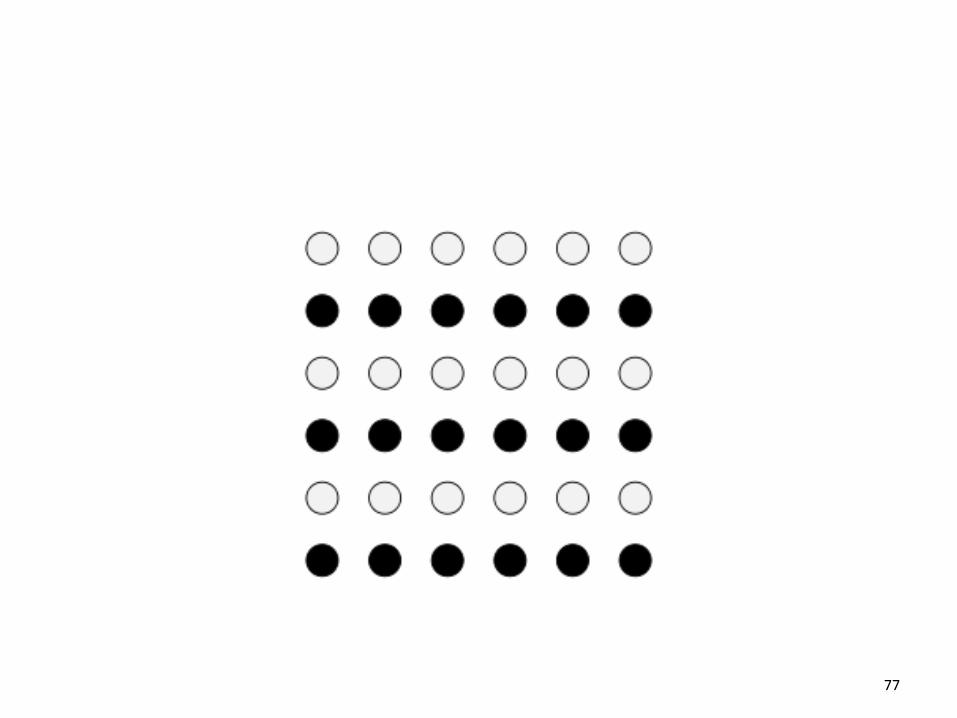
How many groups are there?
73

74

Proximity
75

How many groups are there?
76
77

Similarity
78

How many shapes are there?
79

80

Closure
81

How many items are there?
82

( ) { } [ ]
83

( ) { } [ ]
Symmetry
84

How many sets are there?
85
86

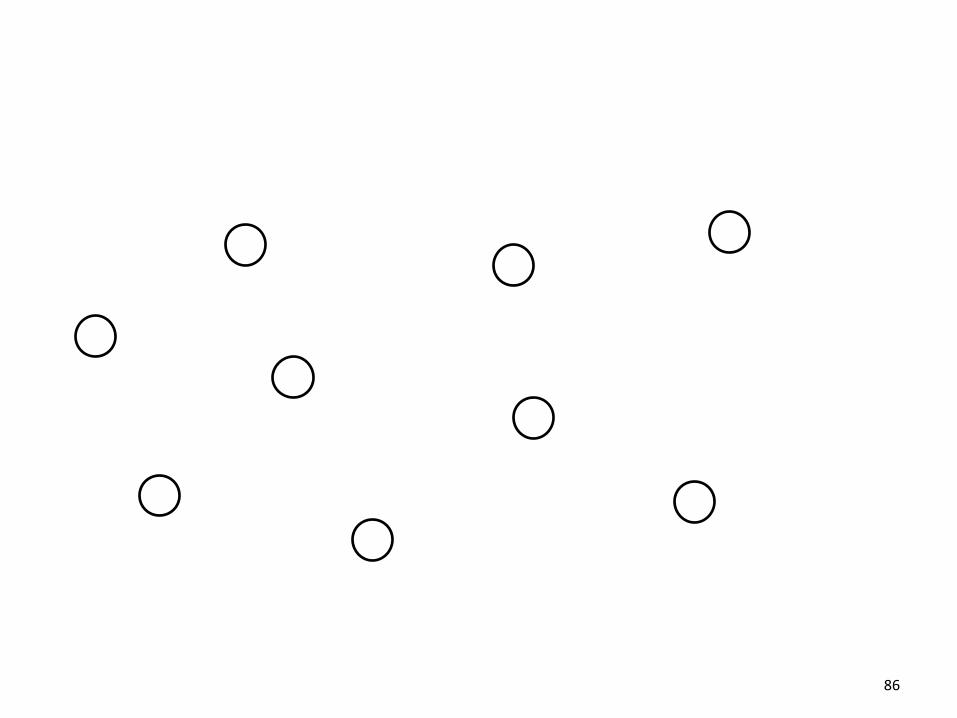
87
Common Fate
How many objects are there?
88

89

Continuity
90

How many objects are there?
91

92

Good Gestalt
93

What is this word?
94

95
CLIP

Past Experience
96
CLIP

Pre-Attentive Processing
Gestalt Laws
101

Detect Quickly
102

Detect quickly does NOT mean
detect accurately
Ideally you want both.
103

104Crowdsourcing Graphical Perception: Using Mechanical Turk to Assess Visualization Design.Heer
and Bostock. Proc ACM Conf. Human Factors in Computing Systems (CHI) 2010, p. 203–212.

105Crowdsourcing Graphical Perception: Using Mechanical Turk to Assess Visualization Design.Heer
and Bostock. Proc ACM Conf. Human Factors in Computing Systems (CHI) 2010, p. 203–212.
1.0
1.5
2.0
2.5
3.0
10 20 30 40 50 60 70 80 90
T1T2T3T4T5T6T7T8T9
True Proportional Difference (%)
Lo
g E
rro
r
Figure 3: Midmeans of log absolute errors againsttrue percentages for each proportional judgment type;superimposed are curves computed with lowess.
the results for the position-angle experiment to those for theposition-length experiment. By designing judgment types 6and 7 to adhere to the same format as the others, the resultsshould be more apt for comparison. Indeed, the new resultsmatch expectations: psychophysical theory [7, 34] predictsareato perform worsethan angle, and both to besignificantlyworse than position. Theory also suggests that angle shouldperform worsethan length, but theresultsdo not support this.Cleveland & McGill also did not find angle to perform worsethan length, but as stated their position-angle results are notdirectly comparable to their position-length results.
EXPERIMENT 1B: RECTANGULAR AREA JUDGMENTS
After successfully replicating Cleveland & McGill’s results,we further extended the experiment to more judgment types.We sought to compare our circular area judgment (T7) re-sults with rectangular area judgments arising in visualiza-tions such as cartograms [9] and treemaps [26]. We hypoth-esized that, on average, subjects would perform similarly tothecircular case, but that performance would be impacted byvarying the aspect ratios of the compared shapes. Based onprior results [19, 34], we were confident that extreme varia-tions in aspect ratio would hamper area judgments. “Squar-ified” treemap algorithms [3, 35] address this issue by at-tempting to minimize deviance from a1:1 aspect ratio, but itisunclear that this approach isperceptually optimal. Wealsowanted to assess if other differences, such as the presence ofadditional distracting elements, might bias estimation.
Method
We again used Cleveland & McGill’s proportional judgmenttask: subjects were asked to identify which of two rectangles(marked A or B) was the smaller and then estimate the per-centage the smaller was of the larger by making a “quickvisual judgment.” We used a 2 (display) ⇥ 9 (aspect ra-tios) factorial design with 6 replications for a total of 108unique trials (HITs). In the first display condition (T8) we
Cleveland & McGill's Results
1.0 1.5 2.0 2.5 3.0 3.5
T1
T2
T3
T4
T5
Log Error
Crowdsourced Results
1.0 1.5 2.0 2.5 3.0 3.5
T1
T2
T3
T4
T5
T6
T7
T8
T9
Log Error
Figure 4: Proportional judgment results (Exp. 1A & B).Top: Cleveland & McGill’s [7] lab study. Bottom: MTurkstudies. Error bars indicate 95% confidence intervals.
1.0 1.5 2.0 2.5 3.0 3.5
2/3 : 2/3
1 : 1
3/2 : 3/2
2/3 : 1
2/3 : 3/2
1 : 3/2
Log Error
Aspe
ct
Ra
tio
s
Figure 5: Rectangular area judgments by aspect ratios(1B). Error bars indicate 95% confidence intervals.
showed two rectangles with horizontally aligned centers; inthe second display condition (T9) we used 600⇥400 pixeltreemaps depicting 24 values. Aspect ratios weredeterminedby the cross-product of the set { 2
3, 1, 3
2} with itself, roughly
matching the mean and spread of aspect ratios produced byasquarified treemap layout (we generated 1,000 treemaps of24 uniformly-distributed random values using Bruls et al.’slayout [3]: theaverageaspect ratio was1.04, thestandard de-viation was0.28). Wesystematically varied area and propor-tional difference across replications. Wemodified the squar-ified treemap layout to ensure that the size and aspect ratioof marked rectangles matched exactly across display condi-tions; other rectangle areas were determined randomly.
As a qualification task, we used multiple-choice versions oftwo trial stimuli, one for each display condition. For eachtrial (HIT), we requested N=24 assignments. We also re-duced the reward per HIT to $0.02. We chose this numberin an attempt to match the U.S. national minimum wage (as-suming a response time of 10 seconds per trial).
CHI 2010: Visualization April 10–15, 2010, Atlanta, GA, USA
206

Mackinlay, 1986106

Stephen Few
“Now You See It”
pg. 41 107

What does this tell us?
108

Barcharts, scatterplots, and line
charts are really effective
for quantitative data
0 20 40
0
20
40
0 20 40
0
20
40
0 20 40109

(and for statistical distributions)
Tukey Box Plots
110

111

Median
Outliers
Largest < Q3 + 1.5 IQR
Smallest > Q1 - 1.5 IQR
Largest < Q3
Smallest > Q1
112

Tufte’s Chart Principles
113
Edward Tufte

Tufte’s Chart Principles
DO NOT LIE!Maximize Data-Ink Ratio
Minimize Chart Junk
116

Tufte’s Chart Principles
DO NOT LIE!Maximize Data-Ink Ratio
Minimize Chart Junk
117

118

119
“Cumulative”

http://www.perceptualedge.com/blog/?p=790120


Tufte’s Chart Principles
DO NOT LIE!Maximize Data-Ink Ratio
Minimize Chart Junk
123

http://skilfulminds.com/2011/04/05/exploring-the-usefulness-of-chartjunk-at-stl-ux-2011/
124

125
Chartjunk. (2017, October 05). Retrieved December 01, 2017, from https://en.wikipedia.org/wiki/Chartjunk

Please…
127

No pie charts.
No 2.5D charts.
128

129

37
36
24
2 1
130

0
5
10
15
20
25
30
35
40
131

132

PLEASE DON’T
EVER DO THIS!
133
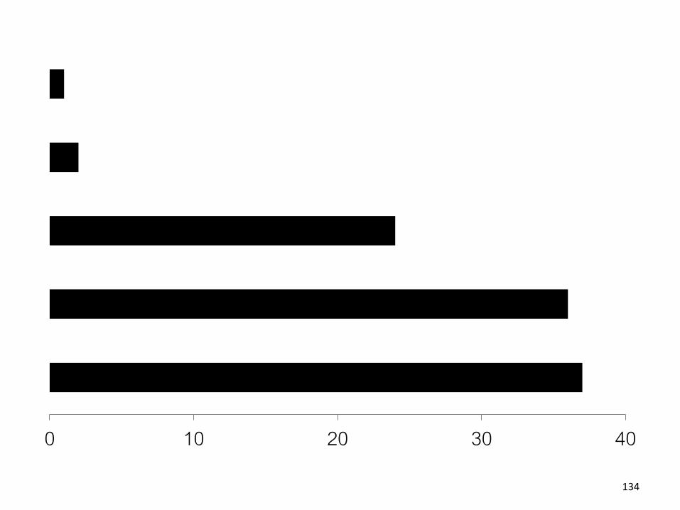
0 10 20 30 40
134

But otherwise…
138

Barcharts, scatterplots, and line
charts are really effectivefor quantitative data
0 20 40
0
20
40
0 20 40
0
20
40
0 20 40139
Anyone else bored
by my color choices?
140

In fact, grayscale can be risky…
141

In fact, grayscale can be risky…
142
Color is Powerful
143

Call attention to information
Increase appeal
Increase memorability
Another dimension to work with
Color
144

145
Have you heard of RGB?
RGB color model. (2017, November 20). Retrieved December 01, 2017, from https://en.wikipedia.org/wiki/RGB_color_model
Additive color model: colors create by mixing
red, green, blue light

We see in RGB,
but we don’t interpret in RGB…
146

147
Hue
Lightness
Saturation
Source: color picker in Affinity Designer
HSV Color Model

Hue
Post & Greene, 1986148

Hue and Colorblindness
10% of males and 1% of females
are Red-Green Colorblind
150

151

152http://viz.wtf/post/98981561686/ht-matthewbgilmore-noaas-new-weather-modelling

Color and Quantitative Data
Can you order these (low→hi)?
154

155http://www.personal.psu.edu/faculty/c/a/cab38/ColorSch/Schemes.html via Munzner

156
Color Brewer for Picking Color Scales
COLORBREWER 2.0. (n.d.). Retrieved December 01, 2017, from http://colorbrewer2.org/

Overview
Zoom+Filter
Details on Demand
Shneiderman Mantra
(Information-Seeking Mantra)
157
https://www.mat.ucsb.edu/g.legrady/academic/courses/11w259/schneiderman.pdf

158

http://visual.ly/every-single-death-game-thrones-series159


Where to learn more?
169

CS 7450
Information Visualization
Every Fall
170

Visualization @GeorgiaTech
vis.gatech.edu
171

How to Make Good Charts
• Edward Tufte’s One-Day Workshop– http://www.edwardtufte.com/tufte/courses
• Edward Tufte, Visual Display of Quantitative Information– http://www.edwardtufte.com/tufte/books_vdqi
• Stephen Few, Show Me the Numbers: Designing Tables and Graphs to Enlighten– http://www.amazon.com/Show-Me-Numbers-
Designing-Enlighten/dp/0970601972/ref=la_B001H6IQ5M_1_2?s=books&ie=UTF8&qid=1385050724&sr=1-2
172

Visualization Theory “Books”• Tamara Munzner VIS Tutorial and Book
– http://www.cs.ubc.ca/~tmm/talks.html
– http://www.cs.ubc.ca/~tmm/vadbook/
• Colin Ware, Information Visualization: Perception for Design– http://www.amazon.com/Information-Visualization-Perception-Interactive-
Technologies/dp/1558605118
• Stephen Few, Now You See It– http://www.amazon.com/Now-You-See-Visualization-
Quantitative/dp/0970601980/ref=pd_bxgy_b_img_z
• Edward Tufte, Envisioning Information– http://www.edwardtufte.com/tufte/books_ei
• Edward Tufte, Visual Explanations– http://www.edwardtufte.com/tufte/books_visex
• Edward Tufte, Beautiful Evidence– http://www.edwardtufte.com/tufte/books_be
• Tamara Munzner, Visualization Analysis & Design– http://www.amazon.com/Visualization-Analysis-Design-AK-
Peters/dp/1466508914
173

Perception and Color Websites
• Chris Healy, NC State– http://www.csc.ncsu.edu/faculty/healey/PP/index.ht
ml
• Color Brewer– http://colorbrewer2.org/
• Maureen C. Stone (Color Links, Blog, Workshops)– http://www.stonesc.com/color/index.htm
• Subtleties of Color by Robert Simmon of NASA– http://blog.visual.ly/subtleties-of-color/
174

Visualization Blogs
• Flowing Data by Nathan Yau– http://flowingdata.com/
• Information Aesthetics by Andrew Vande Moere– http://infosthetics.com/
• Information is Beautiful by David McCandless– http://www.informationisbeautiful.net/
• Visual.ly Blog– http://blog.visual.ly/
• Indexed Comic by Jessica Hagy– http://thisisindexed.com/
175
