information visualization course - percro laboratory · information visualization course...
TRANSCRIPT

Information Visualization Course
Informatica UmanisticaUniversità di Pisa
Lecture 2 – Design Principles3rd March 2011
Emanuele RuffaldiPERCRO - Scuola Superiore S.Anna
Overview
• Graphical Integrity
• Design Principle
• Design Elements

GRAPHICAL INTEGRITYData must tell the truth

Missing Scales
Tufte, VDQI
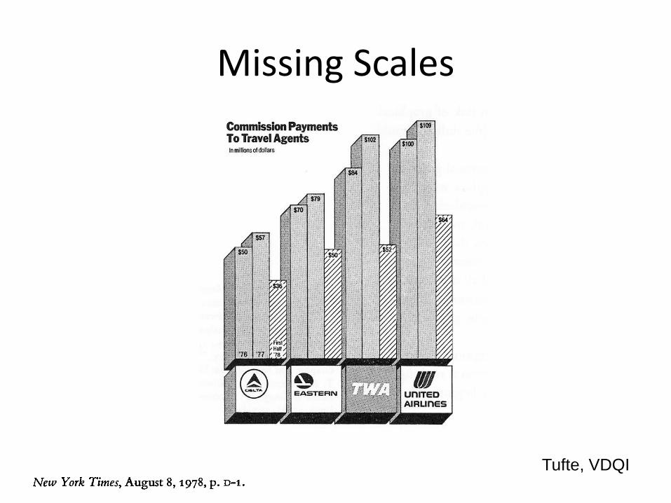
Missing Scales
Tufte, VDQI

Lie Factor
(Size of effect in graphic) / (size of effect in data)

Lie Factor

Lie Factor
"The logarithm of the Lie Factor can be
taken in order to compare overstating (log
LF > 0) with understating (log LF < 0)
errors."
Tufte, VDQI p. 57

Design Distortions
•1973-1978: one vertical inch
equals to $8.00. In 1979,
One vertical inch equals $3-4
• 1973-1978: one horzontal inch
equals 3.7 years, while 1979
equals 0.57 year
Show Data Variations and not Design
Variation

Scale Distortions

Scale Distortions

Context and Scale

Context and Scale
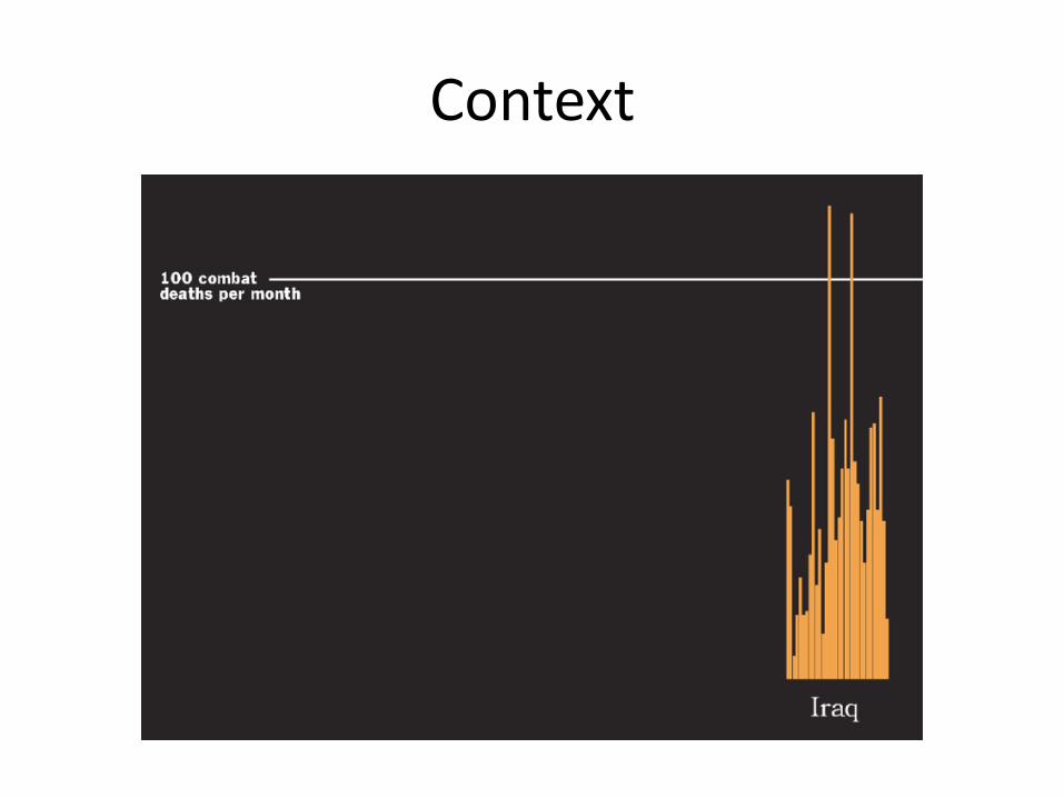
Context
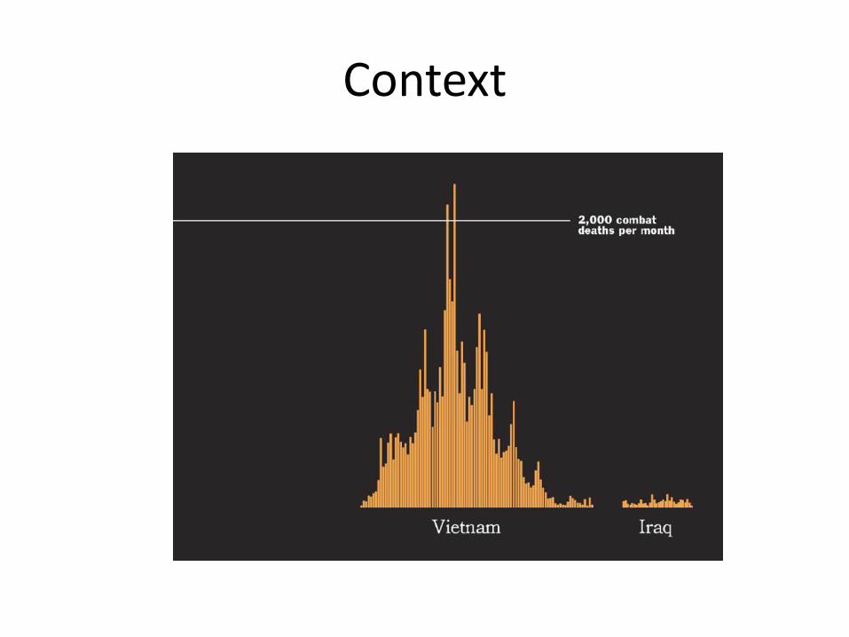
Context

Context
Context


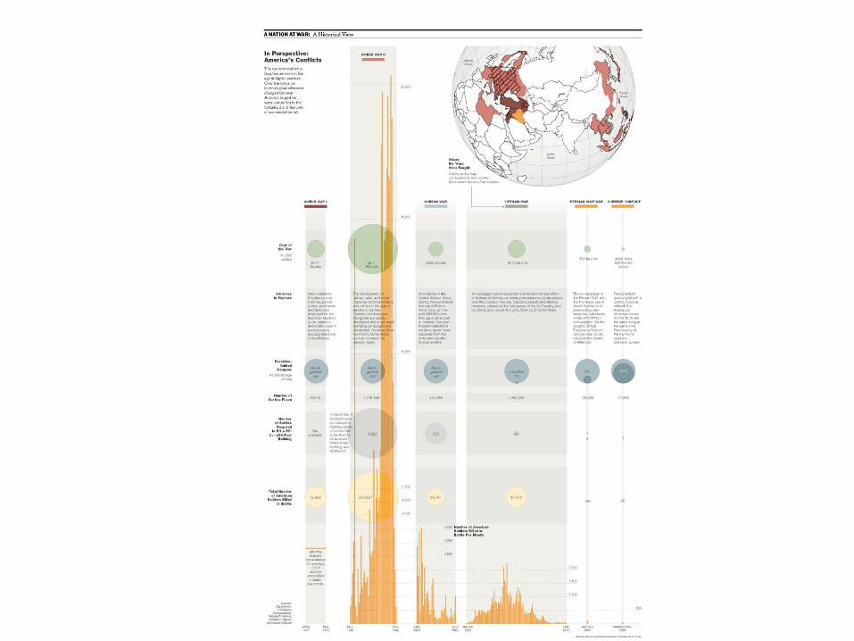
Junk Chart 1
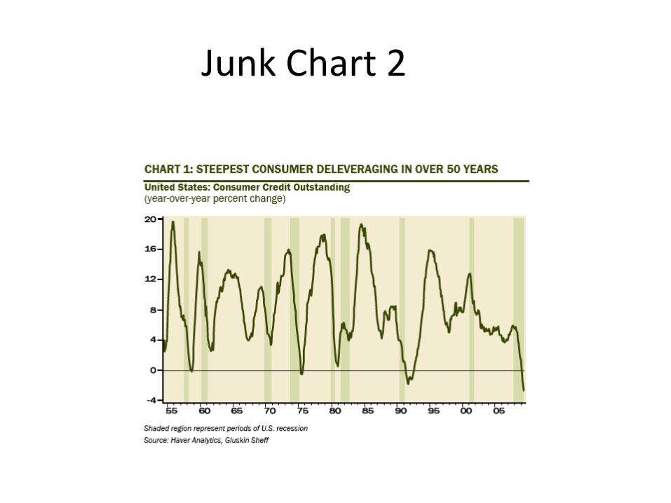
Junk Chart 2
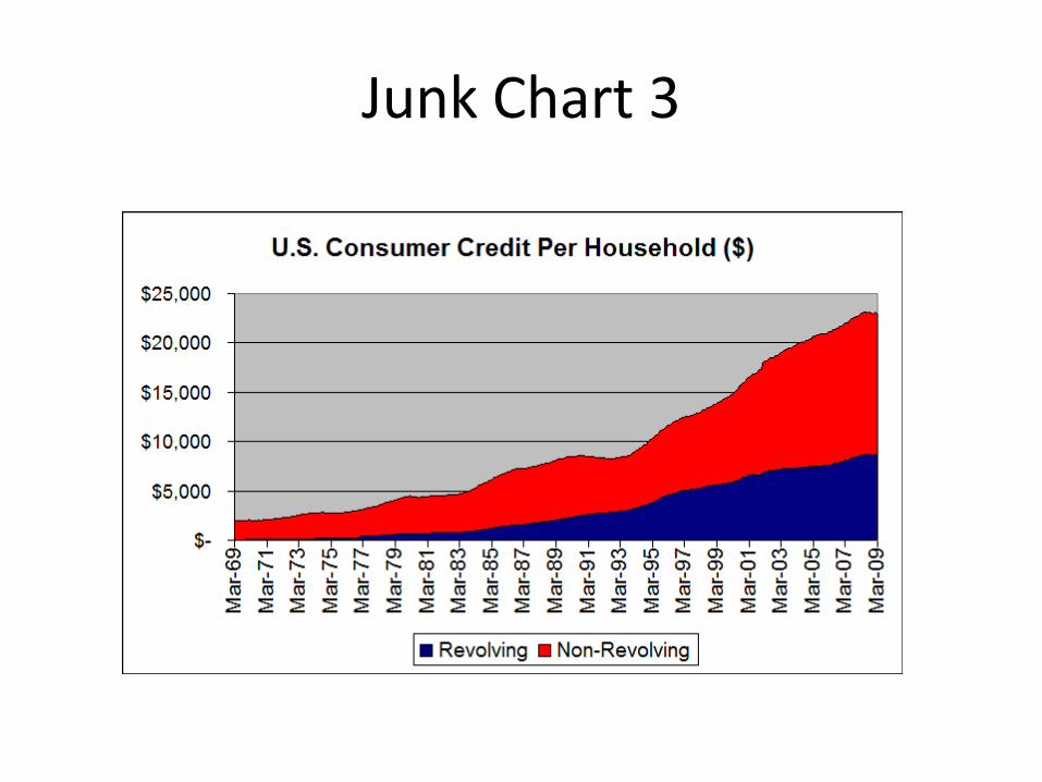
Junk Chart 3

Junk Chart 4
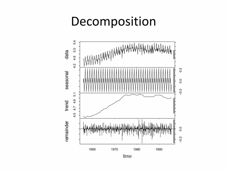
Decomposition
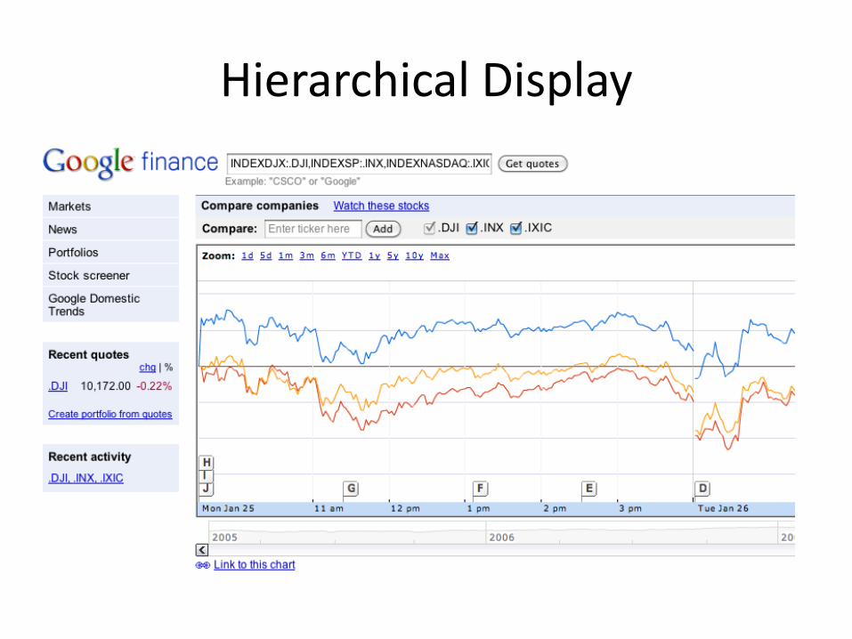
Hierarchical Display
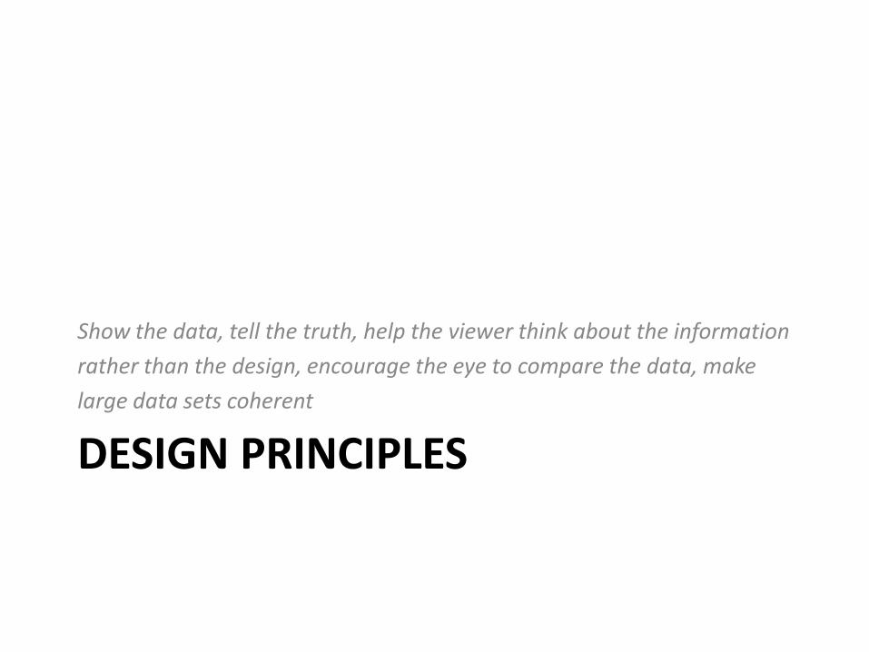
DESIGN PRINCIPLES
Show the data, tell the truth, help the viewer think about the information
rather than the design, encourage the eye to compare the data, make
large data sets coherent

Maximize Data-Ink Ratio
• Data-ink = the ink used to show data
• Data-ink ratio = data-ink / total ink used

Maximize Data-Ink Ratio
• Data-ink = the ink used to show data
• Data-ink ratio = data-ink / total ink used

Data Density

Escaping Flatland
http://www.historyshots.com/ViewInfo.cfm?Type=zoom&PID=1010

Escaping Flatland

Sparklines (Tufte)
Chapter
http://www.edwardtufte.com/bboard/q-and-a-
fetch-msg?msg_id=0001OR
BE,Tufte
Interactive Demo
http://omnipotent.net/jquery.sparkline/

ChartjunkExtraneous visual elements that distract from
the message
http://www.tbray.org/ongoing/data-ink/di1


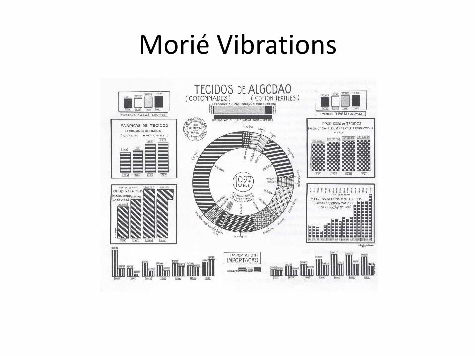
Morié Vibrations

Grids as Chart Junk
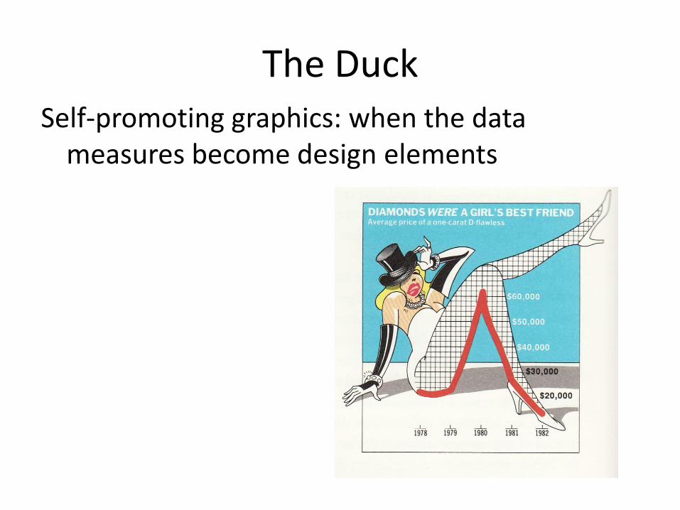
The DuckSelf-promoting graphics: when the data
measures become design elements
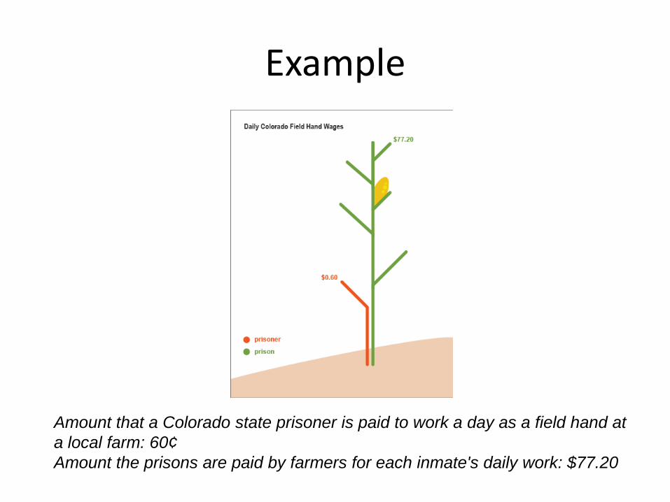
Example
Amount that a Colorado state prisoner is paid to work a day as a field hand at
a local farm: 60¢
Amount the prisons are paid by farmers for each inmate's daily work: $77.20

• World Population in 2008

World Population in 2008
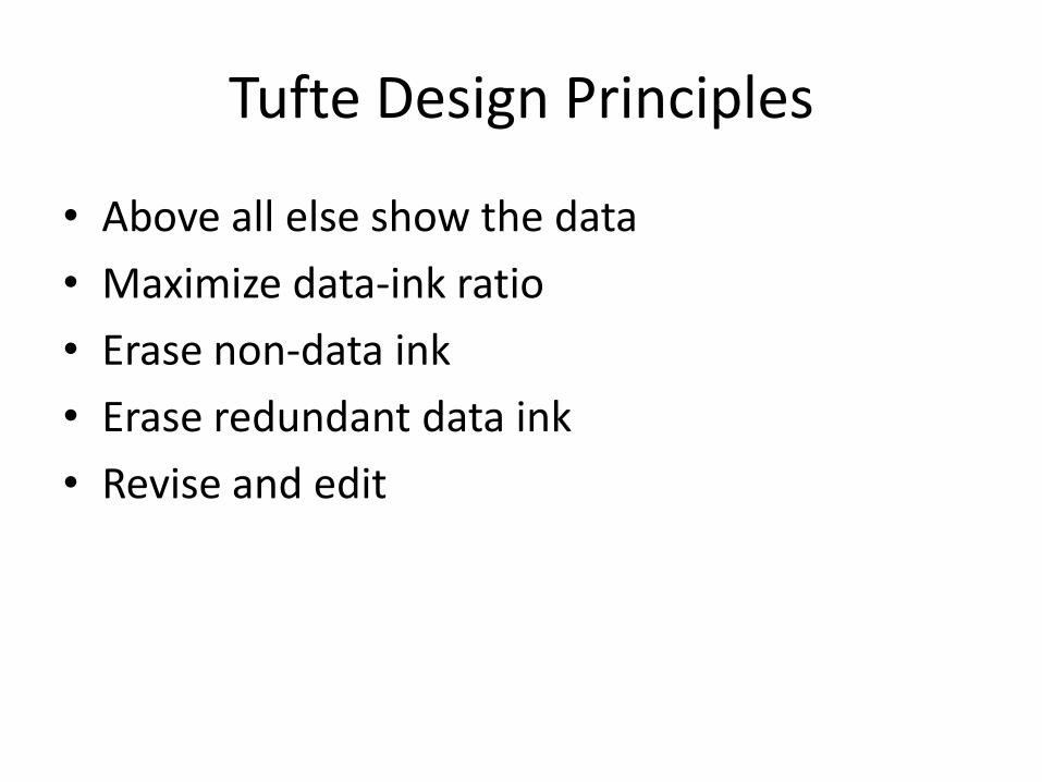
Tufte Design Principles
• Above all else show the data
• Maximize data-ink ratio
• Erase non-data ink
• Erase redundant data ink
• Revise and edit
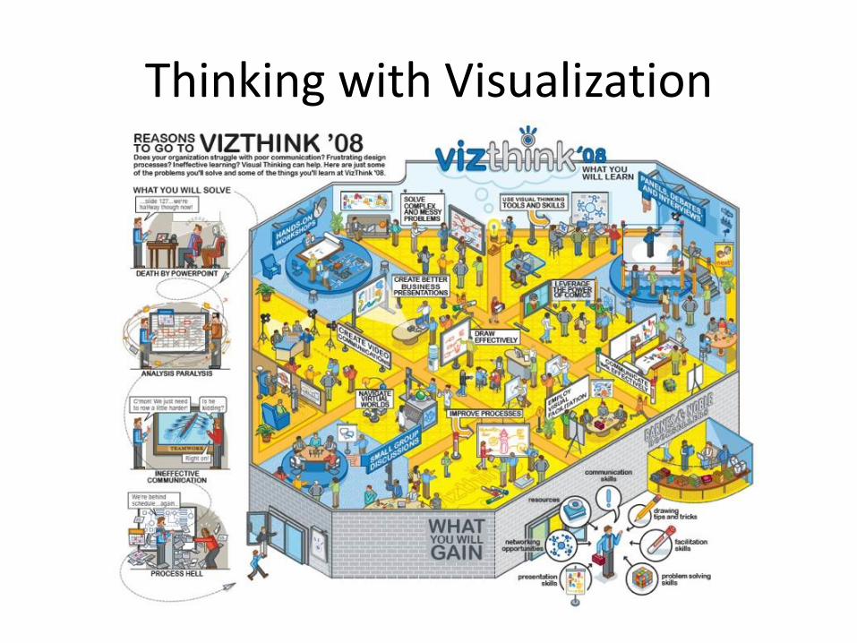
Thinking with Visualization
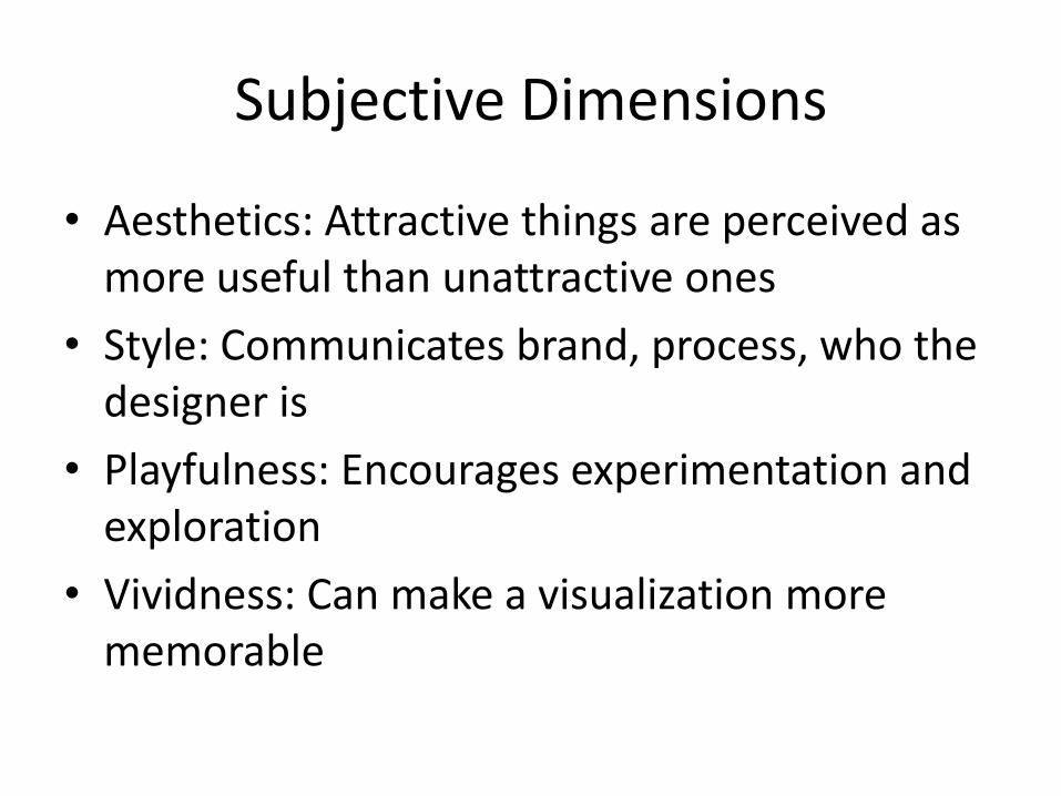
Subjective Dimensions
• Aesthetics: Attractive things are perceived as more useful than unattractive ones
• Style: Communicates brand, process, who the designer is
• Playfulness: Encourages experimentation and exploration
• Vividness: Can make a visualization more memorable

DESIGN ELEMENTS

CRAP
• Contrast
• Repetition
• Alignment
• Proximity
• + Composition

Contrast
• Contrast between Colors

Contrast
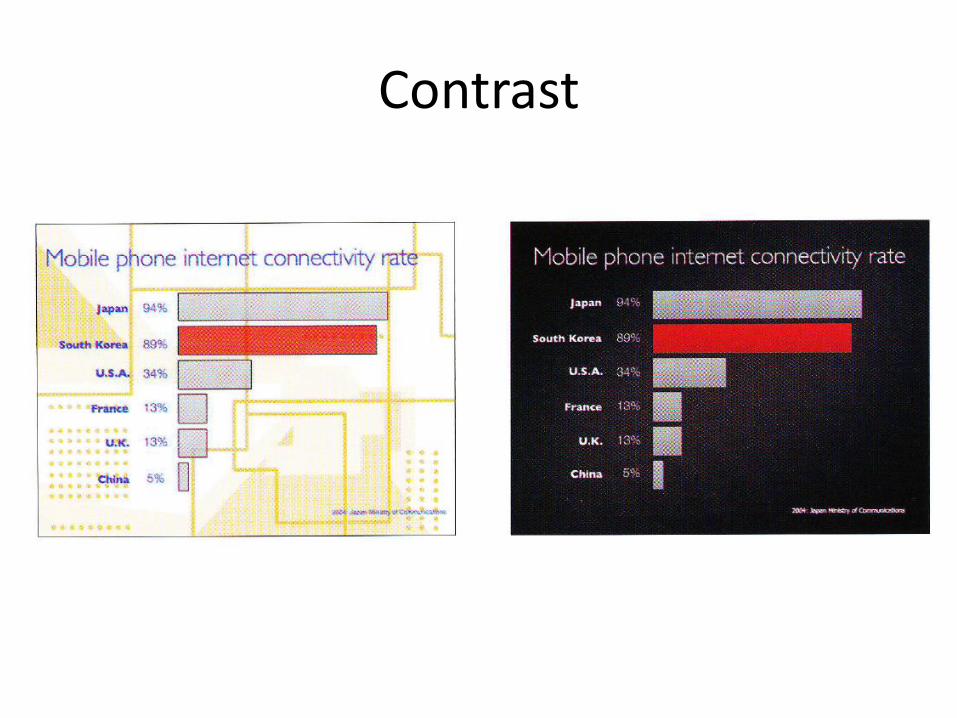
Contrast
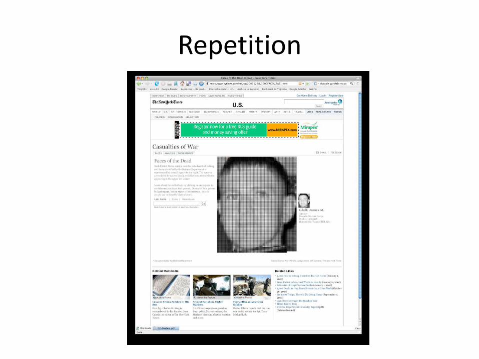
Repetition

Alignment

Proximity

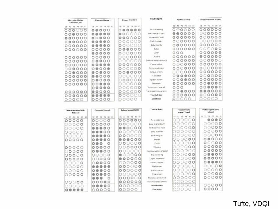
Small Multiplies
Small multiple designs, multivariate and data bountiful, answer directly by
visually enforcing comparisons of changes, of the differences among
objects, of the scope of alternatives. For a wide range of problems in data
presentation, small multiples are the best design solution (EI, p. 67)
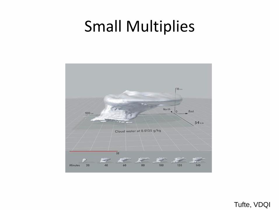
Small Multiplies
Tufte, VDQI

Trellis Chart
Tonga Trench Earthquakes
Yellow: 0 − 70 km
Orange: 71 − 300 km
Red: 300 − 800 km.

Trellis Chart

Elements of Trellis Chart
• Every Trellis display consists of a series of rectangular panels, laid out in a regular row-by-column array.
• The indexing of the array is left-to-right, bottom-to-top.
• The x axes of all the panels are identical. This is also true for the y axes.
• Each panel of the a display corresponds to conditioning, either on the levels of a factor, or on sub-intervals of the range of a numeric variable.

Trellis Chart
• The conditioning carried out in the earthquake plot is described by a shingle.
• A shingle consists of a number of overlapping intervals (like the shingles on a roof of a house).
Small Multiplies
Tufte, VDQI

Layering and Separation

Layering and Separation

Layering and Separation

Balance Positive and Negative Space

Negative Space
Other Design Elements
• Color
• Line and Form
• Typography
• Format and Scale

Format and Scale

Aesthetics
• Simplicity
• Clarity
• Uncluttered
• Restraint

Exercise
1. Take a set of data from recent news
e.g. from Harper’s Index http://www.harpers.org/subjects/HarpersIndex
2. Design Graph Interpretation of that information
3. Apply graphical principles discussed
References
• BE: Tufte, E. R. (2006). Beautiful evidence. Cheshire, CT: Graphics Press
• EI: Tufte, E.R. (1990) Envisioning Information, Cheshire, CT, Graphics Press.
• VDQI: Tufte, E. R. (1983) The Visual Display of Quantitative Information, Cheshire, CT: Graphics Press.
These slides are subject to the LicenseCreative Commons
Attribution-Noncommercial-Share Alike 2.5 Italy