in defence of the roman letter - edward …ejf.org.uk/resources/jrnarticle.pdf · in defence of the...
TRANSCRIPT
e j f journal 11
IN DEFENCE OF THE ROMAN LET TER
IN DEFENCE OF THEROMAN LETTERB Y D R J O H N R N A S H
T he Roman letter was one of the few aspects ofRoman art which was truly their own, not bor-rowed from the Greeks. Like their roads and aque-
ducts it was beautiful because it did its job supremelywell. It is one of the most enduring legacies from theRoman period; it formed the basis of our Western writ-ing and printing; we couldn’t do without it if we wantedto. One may well ask why it – or, more precisely, Roman let-tering produced by hand in the twentieth century –needs defending.
In fact, the survival of the Roman letter, at least in itsmost subtle and enduring form, has been a rather precar-ious affair. Its history has tended to be one of ebb andflow, deterioration and regeneration, eclipse and revival;in this country, no less than in others, it has periodicallybeen given a bad time – not least by those who admired itand wished it well. A good deal of this perpetual motionhas been due to a constant struggle between two tenden-cies, summed up by Eric Gill in the definition: ‘Letters arethings, not pictures of things’ – the first being the crafts-manlike point of view, which considers the letter first andforemost as a thing: a useful tool whose beauty comesfrom its usefulness; the second being the artistic or self-expressive point of view, which sees lettering in terms ofform and texture, to be looked at rather than read (pic-tures of things.) The craftsmanlike point of view, whetherin typography, calligraphy or lettering, is now somewhatout of fashion, to say the least.
Lettering (as opposed to calligraphy) was defined byFather Edward Catich as ‘A method of making letters inwhich each essential part is made by more than onestroke’ – letterforms constructed or drawn rather thanwritten directly with an edged or pointed pen. We’re con-cerned here principally with applied or ‘public’ lettering –that is, informational lettering on signs, memorials,
buildings; lettering which is intended to be a part of ourdaily lives, and which I see as still being best served by thetraditional Roman capital and its relatives, an amazingfamily capable of infinite subtle variations, which no onehas yet come to the end of.
The Roman inscriptional capital thrived particularlyduring three periods: in the Empire of the second century; in sixteenth century Italy (principally Rome); and inearly twentieth century England, during the revival of cal-ligraphy and the general restoration of high standards inprinting and lettering which was associated, in its earlydays, with the Arts and Crafts movement. The first of theseperiods is symbolised in most people’s minds by theinscription at the base of a column in Trajan’s Forum inRome, which still survives though very much worn by mer-ciless cleaning – six lines of dedicatory text V-cut on a marbleslab around by a master craftsman (fig. ). Splendid asit was (and is) it was only one of many magnificentinscriptions among many, most of which, unfortunately,only survive in fragments; it’s one of the very few exam-ples of the highest level of Roman lettering craftsmanshipof that period to survive in place and more or less intact,and as such has attracted the attentions of scholars andenthusiasts down through the ages. From to
Father Edward Catich, an American priest, teacher andlettering craftsman who had been trained as a Chicagosignwriter in his youth, made intensely detailed studies ofthe inscription and discovered many interesting things,not least of which was the fact that each letter containedsubtleties which weren’t immediately apparent. In hepublished The Origin of the Serif, in which he proved tohis own and others’ satisfactions a theory suggested byonly a few before him: that the basic forms of ‘capitalismonumentalis’ do not arise from the action of the chiselalone, but from being ‘written’ beforehand on the stone

e j f JOURNAL12
IN DEFENCE OF THE ROMAN LET TER
Fig.1. Inscription at the base of a column in Trajan’s Forum in Rome c.113 AD. Fig. 2. Painted lettering on wall at Pompeii c.79 AD.
1
2
e j f journal 13
IN DEFENCE OF THE ROMAN LET TER
with a flat brush producing thicks and thins, itself influ-enced by the edged reed pen writing of the time. The the-ory is reinforced by large brush lettering – ‘signwriting’,in effect – to be found on the walls of houses along themain thoroughfare of Pompeii, publicising political can-didates and advertising gladiatorial combats, many prob-ably done the night before the eruption of Vesuvius in which buried the town, none meant to last morethan a few days, let alone nineteen hundred years (fig. ).In one of these (unfortunately mostly destroyed byAmerican bombing in ) we see two forms of capitalletter in use at the time – one which we now think of as‘rustic’, written quite directly with a flat brush as if it werean edged pen, the other a compressed form of ‘quadrata’or square capital, written rapidly but more carefully, alsowith a flat brush but with much more manipulation, andshowing a very close relationship with the forms of theRoman inscriptional capital at what Stanley Morison wasto call ‘its highest development.’ Catich, using his ownbrush lettering skills, was able very convincingly to re-create the likely stroke sequences which, for example,
mean that the broad stroke of the A is serifed only to theright, not the left (the Trajan inscription’s A does thesame) and the tail of the R has a wonderfully natural andvigorous quality which simply cannot be duplicated withcompass and straight-edge.
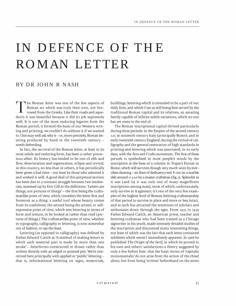
The point is reinforced by an inscription fromWroxeter, England, dated years later than the Trajaninscription (fig. ). In spite of the technically skilled carv-ing, these letters were laid out geometrically; and itshows. (Perhaps there was no ‘ordinator’, or brush-letter-ing layout artist, available in second-century provincialWroxeter?) The serifs on the As are carefully formed,without spontaneity; the Os are contained religiouslybetween head and base lines, with the result that theylook too small; straight strokes are dead straight, so thatthey tend to look fat in the middle; the curves and tails ofthe Rs are stiff and mechanical; letters tend to follow anear-identical pattern; and far too little attention is givento spacing, so that tight clusters of narrow, vertical letterscontrast uncomfortably with spaced-out wider ones. Itseems evident that the whole inscription was governedby compass and straight-edge, rather than by eye.
A marvellous contrast is offered by a tomb inscriptionsome distance outside Rome on the Appian Way – morefragmentary than the Trajan, but in some ways moreremarkable (fig. ). It follows the same logic, incorporat-ing the same optical subtleties; but the more you look atit, the more different it is. Most obviously, the tops of A,M and N are cut off, not pointed; less obviously, the let-ters have more weight and are more deeply cut than theTrajan, and have a very pronounced ‘waisting’ of straightstrokes to avoid the optical illusion of thickening. The Rsare nothing short of marvellous. The spacing is donewith great precision; as Stan Knight points out in hisHistorical Scripts, ‘Without abbreviation or word-split-ting at the end of lines, each of the sixteen long lines hasbeen accurately centred.’ Great care with form and spac-ing is also shown in an inscription on a large semi-circu-lar seat which forms part of a tomb at Pompeii – the bigeleven-inch letters are impeccably placed, and showevery sign of having been made by hand and eye (fig. ).The craftsmen who worked on the Trajan inscriptionwere certainly not unique, and they travelled and workedthroughout the Empire – witness the splendidly unfussyexamples to be seen in the Musée Gallo-Romaine inLyons, or the noble remnants of the Julius Classicianusmonument in the British Museum. But for every skilledlettering craftsman of the Roman period, there werewhole armies of incompetent ones, as a visit to theWolfson Gallery of inscriptions at the British Museum
Fig. 3. Roman inscription at Wroxeter, England. c.129 AD

IN DEFENCE OF THE ROMAN LET TER
Fig. 4. The Memorial to the Children of the Freedman Sextus Pompeius – on the Appian Way in Rome and dated the 1st or 2nd century AD.
Fig. 5. Inscription on a large semi-circular seat which forms part of a tomb at Pompeii.

e j f journal 15
IN DEFENCE OF THE ROMAN LET TER
will swiftly show. It’s as well to bear this in mind, and pre-serve some sense of proportion, since in RenaissanceItaly–the next period we have to deal with–the scholarsand craftsmen of the ancient classical world tended to berevered uncritically, en masse.
In the fourteenth century blackletter, or ‘Gothic’ heldsway. The straightforward Roman inscriptional idiomwas virtually gone by the dissolution of the Empire, dis-appearing behind forests of ornamentation, survivingonly in deteriorating fragments wherever the Romans hadbeen. Scholars became restive and began increasingly tomake efforts to regain what they saw as the superior stan-dards of the classical age. In lettering and calligraphy themood was set by Petrarch himself, who wrote in a letterto his friend Boccacio ‘That he objected to the intricateforms of Gothic, saying that it was attractive to look at buthard to read, produced by artists rather than scribes, andthat he aimed at a clear script’.
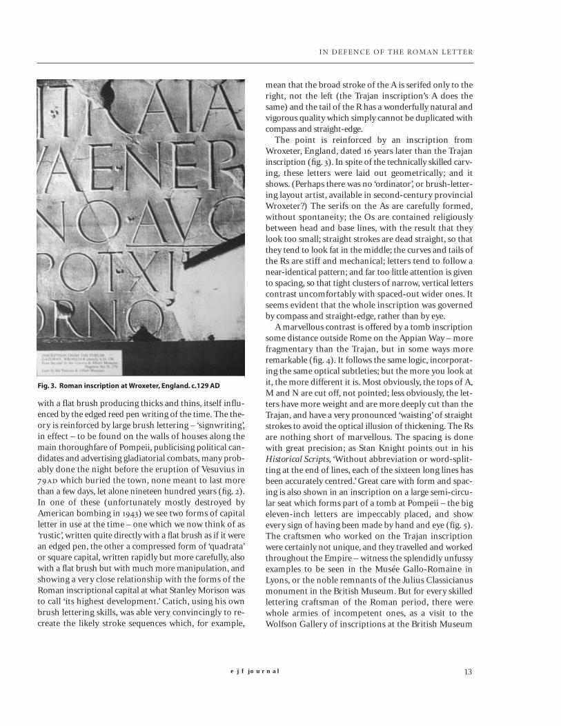
In the case of the Roman capitals as such, Renaissancescholarship took a rather unfortunate turn, based onexcess admiration. Taking it that those who producedsuch splendid forms must have been possessed of a spe-cial secret, scholars and artists took it by turns to publishalphabets of Roman capitals laboriously constructedaccording to formulae which, they were convinced, theRoman craftsmen must have used. From Felice Feliciano’sAlphabetum Romanum in to Ferdinando Ruano’sSette Alphabeti in , at least half a dozen of these alpha-bets were published (including one by the otherwiseadmirable Albrecht Dürer, fig. ), each different, somemore complicated and ingenious than others, each ofconsuming interest to historians, each dead as a doornailin comparison to the originals which the Italian authors,at least, could presumably see all around them. Itremained for Giovan Francesco Cresci, the writing mas-ter who was ‘scriptor latinus’ to the Vatican Library from to , to follow the revolutionary procedure ofactually going outdoors, studying the antique inscriptionsin situ and drawing the letterforms directly from themrather than simply formulating theories about them. Forthis he was ridiculed by his arch-rival Palatino, but thecapitals he came up with were the only ones known to mefrom that period to approach the spirit and subtlety oftheir ancient models (fig. ). The ‘Treatise on the MostExcellent Ancient Roman Majuscules’ which forms animportant part of his first writing manual, Essemplare dipiu sorti lettere, published in , still makes very sensi-ble reading (e.g.,‘the perfection of these curves isobtained more through the continual exercise of judg-ment and by the eye rather than by compass measure-
ments’). The ending of his treatise is both poignant andtimely:
But above all take pains to choose intelligent work-men who are well-grounded in these Letters,because nowadays there are few lettercutters whounderstand them and can cut them correctly,clearly and with patience; consequently there areeven fewer who realise the difficulty, effort andtime involved in cutting and drawing; and so itcomes about that, because the pay is so bad in thesemiserable times, there are few who take up theoccupation of drawing and cutting letters properly.
The Cresci tradition survived for some while. Its actualuse in public lettering was mainly confined to Rome,where it had great influence – notably on Luca Horfei,priest and scribe in the Vatican Library, whose dates arenot known but who reached the height of his careerunder the patronage of Pope Sixtus V (–) (fig. ).He designed and carried out many inscriptions on foun-tains, churches, public buildings and obelisks erectedthrough the Pope’s energetic building programme, theculmination being the great circular mosaic inscriptionaround the base of the inside of the cupola of St. Peter’s(). But his capitals, although graceful, already lacksome of the vigour of the ancient models – even those ofhis master Cresci. James Mosley, in his Trajan Revived –the authoritative account of this period in the history ofthe Roman capital – notes: ‘In subsequent writing books,
Fig. 6. inscription from the base of the Obelisk in the Piazza SGiovanni in Laterano, Rome, erected by Sixtus V in 1588,designed by Luca Horfei.
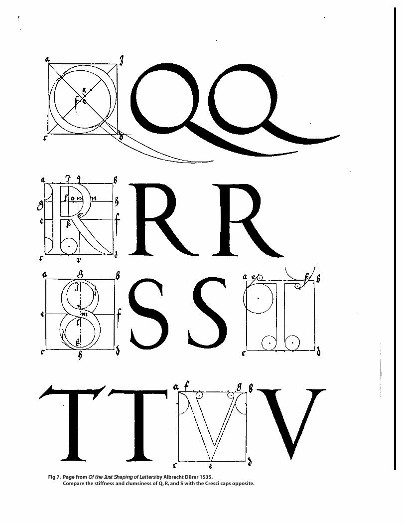
Fig 7. Page from Of the Just Shaping of Letters by Albrecht Dürer 1535.Compare the stiffness and clumsiness of Q, R, and S with the Cresci caps opposite.
Fig. 8. GF Cresci, alphabet engraved on wood from Il perfetto scrittore, 1570

e j f JOURNAL18
IN DEFENCE OF THE ROMAN LET TER
the Cresci capitals lasted well into the th century beforesuccumbing to the more modern French and Englishstyles’; but when the Roman lettering tradition did fadeaway in Italy, it went for good – even the Fascists, withtheir enthusiasm for the grander aspects of Roman cul-ture, couldn’t revive it for long. The Trajan column stillstood in Rome, and now and then attracted attention –not, however, for its lettering, but for its sculpture.Napoleon III, whose troops occupied Rome for a time,went to the length of having an electrotyped facsimilemade of the whole column; in he presented plastercasts made from this electrotype to museums in Londonand Berlin. The London cast went into the ArchitecturalRoom at the Victoria and Albert Museum, and was for-gotten about for forty years.
‘By the end of the nineteenth century all lettering inEngland had sunk to a very low level.’ (So wrote the cal-ligrapher MC Oliver in ). ‘Alphabets became mixed,poor medieval forms became grafted on Roman, fancyexcrescences abounded in the printed initial, printers’types were known as ‘crazy’, and all was chaos, as the let-tering books of the period will show.’ Oliver’s opinionsreflect those which were beginning to make themselvesfelt at the beginning of the twentieth century. In ,when Edward Johnston was given his first lettering classat the old Central School in Regent Street, lettering wasalready on its way to being considered a very importantpart of the Arts and Crafts movement, thanks not least toWilliam Morris’s involvement in calligraphy in the s,and in printing at the end of his life. However, the mangenerally credited with perceiving the true importance ofthe ancient Roman inscriptional letter as the soundestbasis for study was not a letterer at all but an architect andeducator – William R. Lethaby, who was first Director andthen Principal of the Central School, and who saw to itthat classes were taught, not by art theorists, but by prac-tising craftsmen. By all accounts he was a man of remark-able intuitive understanding, with a habit of coming toquiet and seemingly groundless conclusions (for exam-ple, about Johnston’s potential as a teacher) which werelater proved right. It was almost certainly he who discov-ered the Trajan column and its inscription languishing inthe V & A and introduced it to Johnston and to Johnston’spupil Eric Gill. According to Oliver, on or about ,when Lethaby was appointed Professor at the RoyalCollege of Art, he had separate casts made of the inscrip-tion, to be available for students at the College to exam-ine and draw. The demand for these casts grew until mostart schools in the country seem to have had at least one.
It must be stressed that neither Lethaby nor Johnstonand Gill after him made any claim that the letters of theTrajan inscription represented perfection – the sort of‘ideal’ letter for which a Renaissance scholar might havestriven. The inscription offered two main advantages:
being fairly complete, it provided clear models of nine-teen letters of the alphabet, and it was readily availablenot only in the flesh (or rather, plaster), but in the formof photographs and additional casts which the V & A wereready and able to provide, at a time when authoritativereproductions and exemplars of any kind were very diffi-cult to come by. If, however, the Appian Way inscription(for example) had been available in equally clear form, itwould have been greeted with equal enthusiasm. In thesection on ‘Inscriptions’ which closes Edward Johnston’sWriting and Illuminating, and Lettering (his immenselyinfluential manual, first published in ), no fewer thanfour additional examples of Roman capitals are illustrated.However, Johnston had to depend on rubbings and onoutline drawings from Emil Hübner’s Exempla ScripturaEpigraphicae Latinae (Berlin, ) – much better thannothing, but far less satisfactory than photographs; so hisletter-by-letter analysis of Roman capitals is based on theTrajan model.
We know that Johnston’s classes were immediately suc-cessful, that he took on another class at Camberwell in and, in , at the Royal College of Art in SouthKensington, where he was to teach for the rest of his life.From the start the classes attracted students who were tobe important in carrying out his and Lethaby’s ideas, buttwo who were particularly influential in carrying theRoman letter into the public domain were Eric Gill (whowas in the Central School class almost from the first) andPercy Smith, who joined the Camberwell class in .Each became familiar with most lettering disciplines,including type design, but for our purposes their impor-tance lies in the concentration of Gill and his workshopon letter-carving, and of Smith and his workshops onbrush-lettering and signwriting. For Smith, the effect ofJohnston’s teaching was undoubtedly of the greatestimportance; to Gill, as we know from his own words, itwas nothing less than a revelation. In he was a boredtrainee architect who was becoming increasingly inter-ested in carving and had already tried his hand at letter-cutting; by the end of he was a full-time letteringcraftsman with jobs on the books and a contract todesign fascia lettering for the booksellers W.H.Smith,which he did on the Roman model, with great effect.Smith took over the Camberwell class when Graily Hewittresigned it, produced his own portfolio of teaching alpha-
e j f journal 19
IN DEFENCE OF THE ROMAN LET TER
bets in (causing a rift with Johnston, who consideredthat he had plagiarised), and set up his own flourishingworkshop, first as the Roman Lettering Company, thenafter the first world war as the Dorian Workshop andStudios. Like their contemporaries, they were very awareof being part of a resistance movement which had veryancient and straightforward principles at its heart. Gillwrote of those days in his Autobiography: ‘And what wasfine lettering? It was in the first place rational lettering; itwas exactly the opposite of ‘fancy’ lettering. That was thenew idea, the explosive notion, and, you might say, THESECRET.’ Lethaby summed up the prevailing attitudevery succinctly: ‘Nothing done for the LOOK looks well.’
Johnston’s book was undoubtedly the first to publishthe V & A photo of the Trajan inscription, but JamesMosley states, in Trajan Revived, that in Batsford hadpublished An Alphabet of Roman Capitals by one G.Wooliscroft Rhead, which claimed to provide letterswhich had been ‘carefully enlarged from the inscriptionon the Trajan Column, Rome,’ and which would serve asthe best models for a lettering examination newlyrequired by the Board of Education. So the Trajan mes-sage was already reaching the authorities. A year beforethat, in Boston, an American architect, Frank ChouteauBrown, published Letters and Lettering, in which an analy-sis of classical Roman capitals takes pride of place. TheTrajan inscription itself is not mentioned, but this bookfurnishes the first example known to me of a curious tra-dition which has prevailed in how-to-do-it letteringbooks ever since. Brown presents carefully detailed draw-ings, from rubbings done by himself, and even two orthree photographs, of well-proportioned historical exam-ples from the great period, praises them… and then payslittle or no attention to them, presenting an alphabetdesigned by himself which is best described as pic-turesque. The same pattern prevailed through the twen-ties, thirties and forties. With the success of Johnston’sbook, lettering manuals proliferated, each with its V & Aphoto of the Trajan letters, or fulsome praise of them, orboth, each proudly showing an alphabet supposedlybased on them which sprang wholly or in part from theauthor’s imagination. As one looks through these books –and it must be noted that the tradition persists right upto the present day – he comes to the inevitable conclusionthat the author hasn’t read his own book, or at least hasn’tlooked carefully at his own illustrations. This is surely anall-too human phenomenon. But it did not do much byway of furthering the cause of genuinely accomplishedRoman lettering among the general public.
Both Smith and Gill, however, seem from the start to
have thoroughly digested the principles behind what onemight call the ‘design success’ of the Roman capital at theheight of its development, and made use of these princi-ples to develop their own highly subtle forms – similar atfirst glance, different in detail – following their teacherJohnston’s dictum: ‘One may lawfully follow a methodwithout copying a style’. Where letterers with less percep-tion were claiming to copy the style of the letters in a par-ticular inscription – generally the Trajan – and failing to agreater or lesser degree, Smith, Gill and a handful of others,once they had sufficient grasp of the method and spiritwhich lay behind the Trajan letters, were careful not to setup these or any other single alphabet as a model. Smith’sfirst published Roman capitals (in the portfolio alreadymentioned) are simply headed ‘Pen-made Roman capi-tals founded on second-century incised inscriptions’; histwo later lettering books pay homage to the Roman capi-tal but make no mention at all of the Trajan inscription.Gill’s early letter designs for W.H.Smith did not copy theTrajan letters, no matter how much they undoubtedlydepended on them; nor did his later alphabets.
I want now to trace the influence of these two men onthe fortunes of the classical Roman letter as used in pub-lic lettering in twentieth-century England – Smith in thefield of brush-lettering and signwriting, Gill in letter-carving. I start with signwriting, the most ephemeral ofthe lettering crafts. Signs have no rights. They can betaken down, painted over, burned and smashed withimpunity; unless made picturesque with Victorian giltand gingerbread they, and the work and knowledge whichmay have gone into them, tend to escape notice, andwhen their functions end they end too. At the beginningof the twentieth century, therefore, signwriting, thoughoften a highly skilled craft, was definitely lower-class andundervalued. The mood of the new movement inEngland (and in Germany, where Rudolph Koch estab-lished his Offenbach workshop) placed great emphasis onsuch principles as forthrightness, return to basics, appro-priateness of tools, materials and techniques, precision ofcraftsmanship, and good workmanship placed on a equalfooting with fine art; as such it militated against snobbery– in lettering, at least. It also turned against the English‘vernacular’ capitals which had come to prevail in theeighteenth and nineteenth centuries, with their mechani-cal sameness of proportion, exaggerated thicks and thinsand absolute disregard of good spacing; and it limitedornamentation and historical ‘quoting’ to specialisedfields where these were thought to be justified – advertis-ing, for instance. In The Studio issued, in the form ofa special autumn number, a pictorial survey entitled

e j f JOURNAL20
IN DEFENCE OF THE ROMAN LET TER
Lettering of To-Day, with sections on calligraphy, letteringin book production, advertising, and (not least) ‘Letteringin Association with Architecture’, selected by Percy Smith,who stated at the beginning of his introduction:
The greater part of this lettering is mostly used formodest service, e.g. to announce or direct. For thesake of efficiency, that is of good service in prefer-ence to mediocre or bad service, it will surely beagreed that this should be done as clearly as pos-sible. For most purposes, such clarity appears tobe best obtained by the use of forms which havewon a common focus of understanding.Architectural lettering should thus be classicalrather than romantic.
In other words, capitals were to be based on the gener-ally recognised Roman models from the great period.Minuscules were more of a ‘design problem’ being basedon Carolingian and Italian Renaissance pen-made formsas a foundation over which the ‘Roman character ofdesign’ was introduced according to the perception of theindividual craftsman; some, such as Smith, Gill and theirassociates, were continually refining and improving their
alphabets, hence were more successful than others. (Thedevelopment of an appropriate italic was the knottiestproblem of all, but doesn’t come into the present story.)
The beauty, simplicity, practicality and lack of ‘Artnonsense’ shown by most of the work in Lettering of To-Day had considerable influence and was a showcase fortalents now much better known, such as Berthold Wolpe(still working with Koch in Germany at the time), Gill,Gilbert Ledward, Milner Gray, Norman Ball, DavidKindersley, Smith’s former partner George Mansell,Arthur Ayres, and Smith himself. Its impact was rein-forced the following year () by LC Evetts’ RomanLettering (see fig. ) which (again) reproduced the V & Acast, but then broke with tradition by making a carefulexamination of the letters one by one, in a way which stillmakes the book a very useful one – by a limited use ofcompass and straight-edge to form the underlying con-struction of the letters, then superimposing the opticallycorrected forms on this geometric framework, so that thesubtleties are clearly illustrated (the elegant flattening, topand bottom, of C and G, the concavity of the serifs, theslight ‘waisting’ of the vertical strokes.) Some liberties are
Fig. 9. LC EVETTS Roman Lettering (pp46/7). Sir Isaac Pitman and Sons Ltd,. London, 1938
e j f journal 21
IN DEFENCE OF THE ROMAN LET TER
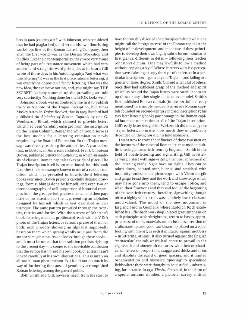
Fig.10 WILLIAM SHARPINGTON Alphabet designs.
e j f JOURNAL22
IN DEFENCE OF THE ROMAN LET TER
taken (for example, the R, whose tail droops below theline in a way the Trajan R never did); but by and large itwas rightly admired, went into a second printing in
and undoubtedly influenced the further establishing ofwhat was beginning to be called the ‘Trajan letter’ as abasic form to be taught to art schools, manufacturedcommercially, and eventually issued as a guide to sign-writers under contract to the Ministry of Works.
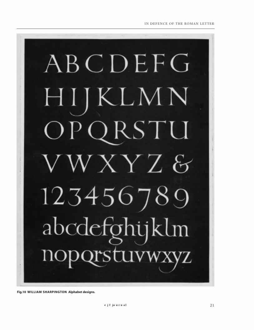
Smith’s workshop thrived – first in John Street, Adelphias the Dorian Workshop and Studio (–); then,after parting company with George Mansell, from to in Grays Inn Place, with ‘Dorian’ changed to ‘Dorno’.(He died in ). Throughout the lives of both work-shops there seem seldom to have been fewer than fourassistants staying for varying lengths of time, of whomthe best known was William Sharpington (fig. ).
Sharpington joined the Dorian Workshop around
and left in to set up on his own, first in Kennington,then (after the war) in Balham. From he carried onthe workshop at the City and Guilds of London ArtSchool, two floors above the lettering classes which he hadbegun there in – an ideal situation for training, since
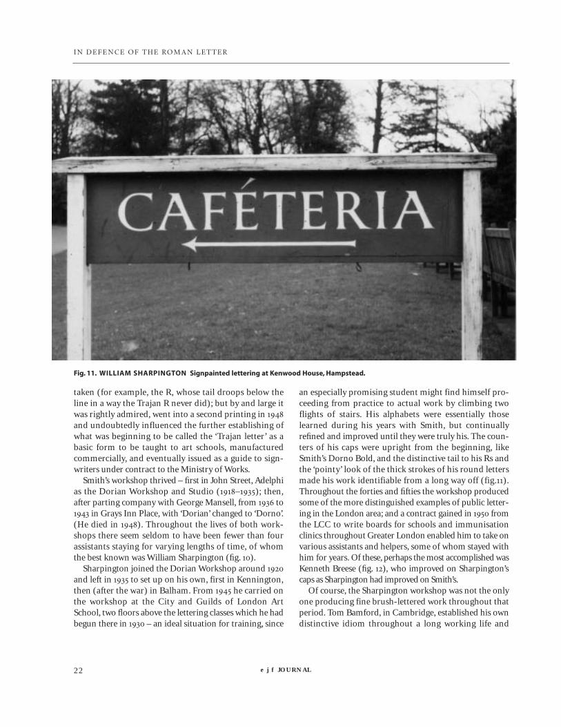
an especially promising student might find himself pro-ceeding from practice to actual work by climbing twoflights of stairs. His alphabets were essentially thoselearned during his years with Smith, but continuallyrefined and improved until they were truly his. The coun-ters of his caps were upright from the beginning, likeSmith’s Dorno Bold, and the distinctive tail to his Rs andthe ‘pointy’ look of the thick strokes of his round lettersmade his work identifiable from a long way off (fig.).Throughout the forties and fifties the workshop producedsome of the more distinguished examples of public letter-ing in the London area; and a contract gained in fromthe LCC to write boards for schools and immunisationclinics throughout Greater London enabled him to take onvarious assistants and helpers, some of whom stayed withhim for years. Of these, perhaps the most accomplished wasKenneth Breese (fig. ), who improved on Sharpington’scaps as Sharpington had improved on Smith’s.
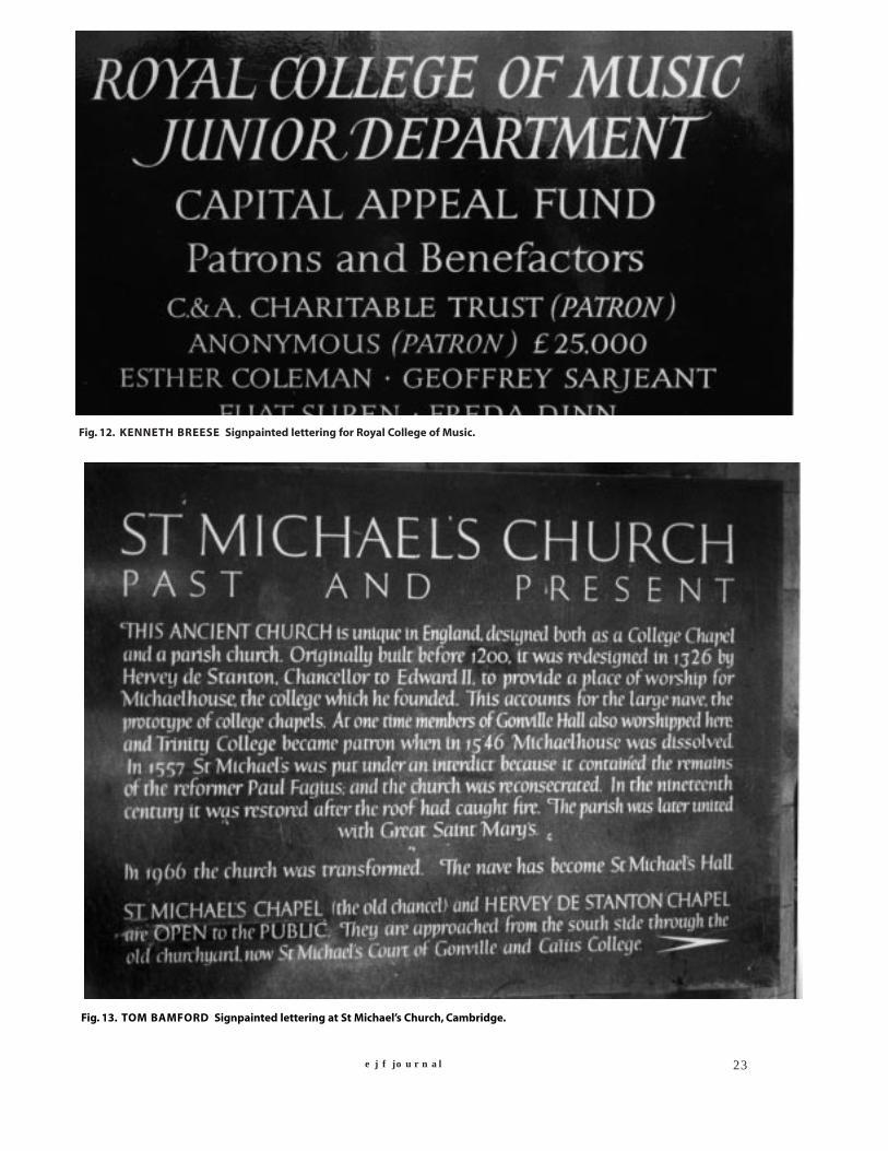
Of course, the Sharpington workshop was not the onlyone producing fine brush-lettered work throughout thatperiod. Tom Bamford, in Cambridge, established his owndistinctive idiom throughout a long working life and
Fig. 11. WILLIAM SHARPINGTON Signpainted lettering at Kenwood House, Hampstead.
e j f journal 23
Fig. 12. KENNETH BREESE Signpainted lettering for Royal College of Music.
Fig. 13. TOM BAMFORD Signpainted lettering at St Michael’s Church, Cambridge.

e j f JOURNAL24
IN DEFENCE OF THE ROMAN LETTER
many of his signs survive there (Fig. ). In London a num-ber of fine examples by anonymous craftsmen of Romanlettering on boards and fascias survived into the seventies(fig. ); but almost all were eventually overtaken by plastic.
To turn to lettercarving, and to Eric Gill (fig. ): his lifehas been so thoroughly chronicled that it’s only necessaryto note that he worked in Ditchling from to , atCapel-y-ffin in Wales from to , and at Pigotts,near High Wycombe, from until his death in ,four years before Johnston’s. Evan Gill’s inventory of theinscriptional work lists some pupils and assistants dur-ing those years, including Joseph Cribb who was his firstapprentice and worked with him until the move to Wales,and Joseph’s brother Lawrence who worked with himthereafter. After the move to Pigotts, helpers includedRalph Beyer (who soon went his own very individualway), David Kindersley, and Gill’s nephew and lastapprentice John Skelton; both of these last trained num-bers of additional carvers in their own workshops. If youinclude visitors such as Reynolds Stone, who stayed onlya fortnight at Pigotts in but was influenced by thatvisit all his life, you begin to see how a tradition of fineclassically-inspired carved lettering which virtually didn’texist at the beginning of the century could, under theinfluence of Johnston and Gill, be firmly established inEngland by the s (as well as being represented in theUS by John Howard Benson.)
Note that I say ‘classically-inspired’, not ‘Trajan-inspired’. Gill did supply a careful drawing of capitalsfrom the V & A cast as Plate of Johnston’s teachingportfolio Manuscript and Inscription Letters (), butthe ‘house style’ which he developed had a quite different
look to it – upright and slightly narrow, with a droopingD, a simplified U whose stems are of equal weight, and asmall-bowled R whose tail flourishes slightly when spaceallows and bends gracefully downward when it doesn’t.Like the work of those who came after him, his caps havetheir ancestry firmly in second-century Rome, but aredistinctively his. He even went so far as to write in hisEssay on Typography (): ‘In inscription-carving, whilewe may remember Trajan lovingly in the museum, wemust forget all about him in the workshop.’
Fig. 15. ERIC GILL Inscribed lettering on stone. Memorial toAR Orage, St John’s Churchyard, Hampstead.
Fig. 14. Near the Museum of London; awaiting demolition.

Micellaneous examples of applied lettering in London
16
17
18

e j f JOURNAL26
IN DEFENCE OF THE ROMAN LET TER
This advice, as we’ve seen, was not followed by theMinistry of Works, whose adoption of the ‘Trajan’ capitalas a modelled, admittedly, to a certain amount of weedyand indifferent lettering in parks and public buildings,but more often produced public lettering of real grace,distinction and appropriateness (see opposite and below).For a considerable time during the postwar period evenmuch of the mass produced applied lettering used onshopfronts and blocks of flats showed great attention tothe subtleties of classical Roman capitals and – perhapsjust as important – awareness of proper letterspacing (figs, and ). As the fifties progressed, the Johnston-Gilltradition still prevailed; in Studio Publicationsbrought out a ‘sequel’ to Lettering of To-Day, entitledModern Lettering and Calligraphy, in which the section onLettering in Association with Architecture (introduced byGeorge Mansell) included work by himself, GeorgeFriend, Joseph and Lawrence Cribb, Arthur Ayres,Sharpington, Breese, Kindersley and Skelton. The tide,however, was already beginning to turn. Many designers,historians, educators and typographers were increasinglyimpatient with what they considered to be the backwardoffspring of an increasingly discredited Arts and Craftsmovement. (Gill, who spent much of his life scorning thatvery movement and considered himself nothing if notforward-looking, would have been most irritated.)
To make a brief but relevant detour: in FatherCatich published his Letters Redrawn from the TrajanInscription in Rome, the result of his exhaustiveresearches. Through photographs, rubbings and exactdrawings he proved that the V & A cast which had been sohighly revered through the years was in fact highly dis-torted in various ways. The cast itself was none too sharp,having been taken not from the inscription itself but fromNapoleon III’s metal copy; furthermore it had been madein three sections and joined together, producinginevitable distortions which the workmen then patchedup according to whim. Since the original, like mostincised Roman inscriptions, had been painted in order tomake it more legible, the V & A cast was also painted, butwith considerable addition of details (such as left-point-ing serifs on the right feet of the As) which it was thoughtshould be there, though they weren’t. Finally, the castswhich were supplied to the art schools were even moreunclear, being copies of a copy of a copy, while the pho-tograph which had served as a focal point in so manybooks suffered badly from barrel distortion, most obvi-ous in the bottom corners. This discrediting of the modelwhich had the approval of authorities from Lethabyonward undoubtedly did little to help the general reputa-
tion of the Trajan letter.In Nicolete Gray, lettering historian, authority on
modern art and teacher at the Central School mountedan attack on the Johnston-Gill tradition in her bookLettering on Buildings:
The first half of this century has seen a revolutionin monumental lettering, one which for severaldecades has also dominated architectural letter-ing. lt has been a purely English movement, andone sees no traces of it on the Continent. Its sup-porters have, however,been very confident andhave proclaimed that they have returned toabsolute standards and reintroduced good tasteinto an art which had been debased; which thelamentable vagaries of nineteenth-century com-mercialism had diverted from its true nature andpurpose. The effect has been the introduction ofan almost uniform letter for every sort of use,from tombstones and painted Ministry of Worksnotices to pub fascias and public buildings. Thesame letter has become the sole type of capitaltaught in art schools, and included in everytextbook on lettering… The letterforms arebased on those of the inscription on the base ofTrajan’s column.
She admitted that this type of letter does have merits;it is ‘very legible, unobtrusive and often very welldesigned, and has much improved the appearance ofmany types of notice, particularly small-scale notices… ’However, her criticism lay in its claim to be ‘the perfectkind of letter,’ leading to sameness and standardisation,and its inappropriate use in many situations where amore colourful or picturesque letterform (such as one ofthe immense variety of nineteenth-century forms) wouldwork better. So far, so true; what is harder to justify is hertendency to associate Johnston, Gill and their associateswith the blinkered ‘Ministry of Works’ approach. She pre-sented a beguiling artistic and philosophical viewpointwhich sees letters as individual shapes, to be selected fromsource books and handled freely with little reference tostandards handed down from the past – in fact, in hernext book, Lettering as Drawing () she spoke approv-ingly of the coming emancipation of the modern studentfrom the ‘dead hand of conventional skill.’
The general reaction against the ‘Trajan trap’ was rein-forced by James Mosley’s rehabilitation, in the –
issue of Motif, of ‘English Vernacular’. His definitive arti-cle, Trajan Revived, followed the year after, and in facthailed the demise of Trajan as prescribed by the Ministryof Works. Ralph Beyer, after a spell working with David
e j f journal 27
IN DEFENCE OF THE ROMAN LET TER
Kindersley, broke away from the second-century idiom touse early Christian catacomb inscriptions as the inspira-tion for his influential lettering in Coventry Cathedral. InVolume of the Penrose Annual () John Brinkley,then tutor in Graphic Design at the Royal School of Art,presented a short but pungent essay, ‘On the Teaching ofLettering’ in which his attitude to the traditional teachingapproach was summed up as follows: ‘A painful study ofthe Trajan forms, plus hard labour with a flat pen, fol-lowed by the grateful realisation that a collection of suit-able type specimens would solve all further difficulties.’He went on to modify his stance somewhat:
Of course the training in Roman forms is essen-tial, particularly as incised forms, but the realisa-tion that the majority of their inscriptions borelittle relation to the Trajan ideal and yet weremost satisfying in their freedom and gaiety givesnew interest to the study of the classic model.
In he edited the ‘survey and reference’ book,Lettering Today, which contained a section on lettering inarchitecture compiled by Ken Garland in which letteringby hand played little or no part. ‘Incised lettering in stone,’Garland wrote with breathtaking complacency, ‘is nowused for little other than foundation stones and monu-ments. In the main it is a lifeless tradition depending onthe weedy and unsuitable model of the carved letters onTrajan’s column.’ Alan Bartram’s Lettering in Architecture() and Jock Kinnear’s Words on Buildings () wereboth basically collections of photographs from whichclassical Roman was almost entirely banned. In
Bartram published The English Tradition from 1700 to thePresent Day, but he was quick to point out in his intro-duction that for him ‘English’ meant English Vernacularonly. ‘… I exclude the lettering of the craftsmen workingbroadly within the Arts & Crafts movement. For the first
sixty years or so of this century, this group had its ownslightly rarefied tradition, preferring to look back to his-torical forms… in a mood of emulation rather than inspi-ration.’ Gill, the most English of letterers, is never men-tioned; you’d never know he had existed.
In short, a common trait of post- publicationsdealing with public lettering is their seeming refusal toadmit the existence of a continuing tradition of craftsmanletterers building on, developing and imaginatively trans-forming the Johnston-Gill tradition. (William Gardner’sAlphabet at Work, published in , is an honourableexception.) Fine signwriting is, alas, an increasingly lim-ited and specialised profession; but in the field of letter-carving a flourishing body of craftsmen exists, each com-ing directly or indirectly out of that tradition, each dis-tancing himself or herself from it to some degree, eachproducing a distinct ‘flavour’ of the traditional Romancapital without feeling the need to destroy it in theprocess. Some of those who work in one or both disci-plines are: David Baker, Sidney Bendall, Pieter Boudens,Kristoffel Boudens, Brenda Berman, Sally Bower, LidaCardozo Kindersley Beck, Charlie Creffield, David Dewey,Jon Gibbs, Richard Grasby, David Holgate, Mark Brookes,Ben Jones, Eric Marland, Sarah More, John Neilson,David Peace, Ieuan Rees, Nick Sloan, Chris Elsey, RafStaiano, Annet Stirling, Caroline Webb, Jack Trowbridge,John Shaw, Paul Wehrle, James Salisbury, Rory Young…thelist goes on. An illustrated selection of distinguished ‘caps’over the past fifty years might include the following:
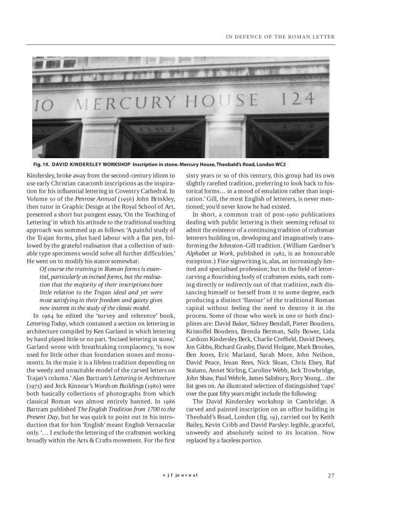
The David Kindersley workshop in Cambridge. Acarved and painted inscription on an office building inTheobald’s Road, London (fig. ), carried out by KeithBailey, Kevin Cribb and David Parsley: legible, graceful,unweedy and absolutely suited to its location. Nowreplaced by a faceless portico.
Fig. 19. DAVID KINDERSLEY WORKSHOP Inscription in stone. Mercury House, Theobald’s Road, London WC2
e j f JOURNAL28
IN DEFENCE OF THE ROMAN LET TER
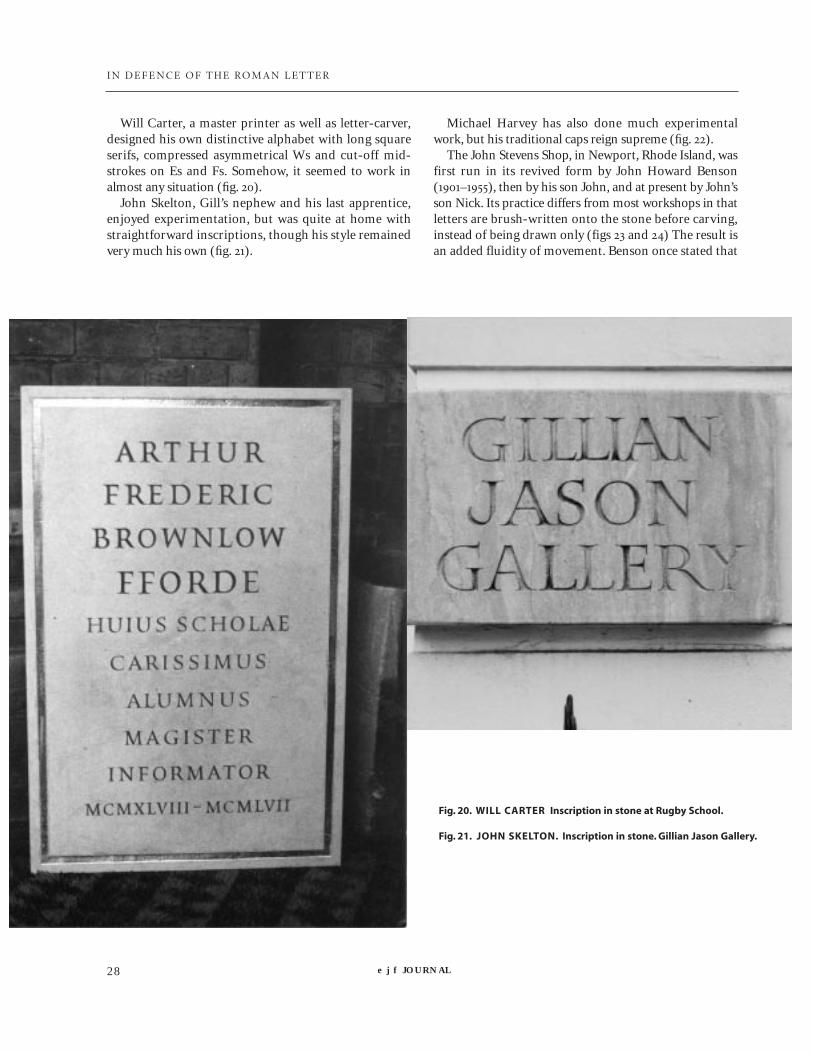
Will Carter, a master printer as well as letter-carver,designed his own distinctive alphabet with long squareserifs, compressed asymmetrical Ws and cut-off mid-strokes on Es and Fs. Somehow, it seemed to work inalmost any situation (fig. ).
John Skelton, Gill’s nephew and his last apprentice,enjoyed experimentation, but was quite at home withstraightforward inscriptions, though his style remainedvery much his own (fig. ).
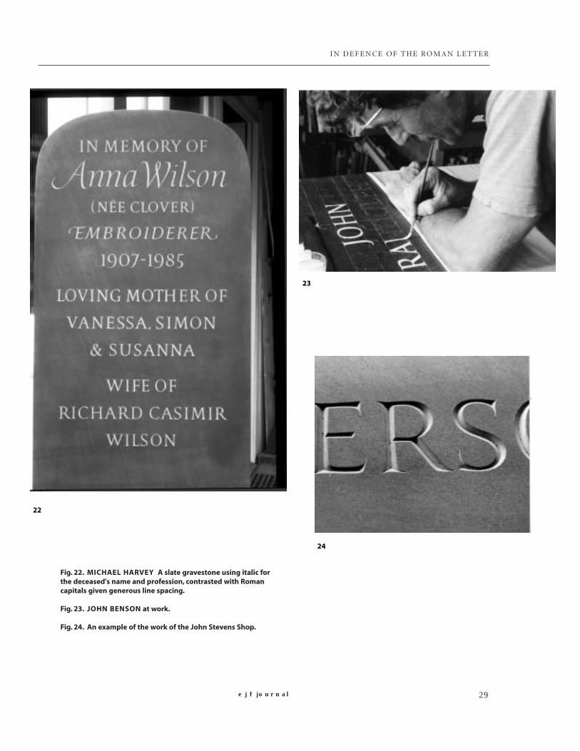
Michael Harvey has also done much experimentalwork, but his traditional caps reign supreme (fig. ).
The John Stevens Shop, in Newport, Rhode Island, wasfirst run in its revived form by John Howard Benson(–), then by his son John, and at present by John’sson Nick. Its practice differs from most workshops in thatletters are brush-written onto the stone before carving,instead of being drawn only (figs and ) The result isan added fluidity of movement. Benson once stated that
Fig. 20. WILL CARTER Inscription in stone at Rugby School.
Fig. 21. JOHN SKELTON. Inscription in stone. Gillian Jason Gallery.
e j f journal 29
IN DEFENCE OF THE ROMAN LET TER
Fig. 22. MICHAEL HARVEY A slate gravestone using italic forthe deceased's name and profession, contrasted with Romancapitals given generous line spacing.
Fig. 23. JOHN BENSON at work.
Fig. 24. An example of the work of the John Stevens Shop.
22
23
24

e j f JOURNAL30
IN DEFENCE OF THE ROMAN LET TER
his aim was ‘an absence of style’ – as shown in the beau-tifully clear, deceptively simple inscription on the ShawMemorial in Boston, Mass (fig. ).
Tom Perkins has studied and thought about Romancaps more than most. Thanks to a solid calligraphic train-ing, he has been able to develop elegant and ‘different’ cap-ital forms without tormenting them beyond endurance(fig. ).
Michael Renton was a master wood engraver as well asdesigner and lettercarver. His brush-lettering for theMartello Bookshop in Rye shows the vigorous caps heused throughout much of his life; but he also developedmore experimental, yet eminently legible, lettering forWinchester Cathedral (figs and ).
In Nicolete Gray asked this question: ‘Why did
this movement, which started with ideas which were flex-ible and practical, lead in the field of architecture andmonumental lettering only to sterile imitation?’ The sim-ple answer is: it did not. The Roman inscriptional letterwhich in its various forms reached its highest point ofsophistication in the second century remains a mostgraceful and efficient means of providing those modestservices: to announce and direct; and far from automati-cally imposing uniformity, it is capable (as shown above)of infinite subtle modifications. It seems to have analmost mystical ability to rise above the modern ten-dency to tolerate (even admire) lack of knowledge andbad workmanship in the name of personal self-expres-sion. Johnston wrote, ‘When in doubt, use Roman capi-tals,’ and this is still true.
Fig. 25. THE JOHN STEVENS SHOP. The Shaw Memorial, Boston, Massachusetts.

IN DEFENCE OF THE ROMAN LET TER
Fig. 26. TOM PERKINS Painted lettering on silk for the Crafts Council”sBagnall Gallery, London.
Fig. 27. MICHAEL RENTON Inscriptional and relief lettering in stone.Winchester Visitors’ Centre, Hampshire.
Fig. 28. MICHAEL RENTON Painted shop sign. Rye, East Sussex.