improving graduate students’ graphing skills of multiple ... · designs with microsoft® excel...
TRANSCRIPT

The Behavior Analyst Today Volume 10, Number 1
83
Improving Graduate Students’ Graphing Skills of Multiple Baseline Designs with Microsoft® Excel 2007
Ya-yu Lo1 and A. Leyf Peirce Starling
Abstract
This study examined the effects of a graphing task analysis using the Microsoft® Office Excel 2007 program on the single -subject multiple baseline graphing skills of three university graduate students. Using a multiple probe across participants design, the study demonstrated a functional relationship between the number of correct graphing components and the graphing task analysis for two participants. All participants reported positively to the usefulness and ease of the graphing task analysis for creating a multiple baseline design graph. The graphing task analysis is available at the end of the paper to provide users with detailed step-by-step instructions in creating all single -subject design graphs with Excel 2007 for the Windows.
Keywords : single subject graphs; graphic construction; task analysis; Excel 2007 graphing; single subject designs.
Graphic displays of data for ongoing visual inspections serve as the primary vehicle for interpreting and analyzing treatment effects in single -subject (SS) research (Cooper, Heron, & Heward, 2007). Precision in data analyses is possible only when data are presented in a clear and accurate graphic format, in order for SS researchers to appropriately evaluate the functional relationships between the dependent and independent variables. Due to recent technological advancements (e.g., Microsoft® Office software upgrades), researchers are provided with tools to create a graph that is professional, presentable, and that is in an electronic format for dissemination purpose (e.g., publications). However, creating precise electronic SS graphs continues to be difficult for many educators and researchers because of the complexity of graphing knowledge and skills involved in the task (Lo & Konrad, 2007).
Microsoft® (hereafter MS) Office Excel is one of the most common and standard software available to users for constructing SS graphs. To assist users in creating professionally presented, computer-generated SS graphs, several guidelines or step-by-step instructions for using MS Excel as the graphing software are available. For example, Carr and Burkholder (1998) offered step-by-step procedures for graphing reversal, multiple baseline, and multielement design graphs using Excel 97 for Windows 95/NT or MacOS operating systems. Similarly, Moran and Hirschbine (2002) provided a technical tutorial of detailed steps for creating reversal design graphs using Excel 97 and Excel 2000. Hillman and Miller (2004) expanded on this paper by further illustrating steps for creating multiple baseline graphs using Excel 97 and 2000. To supplement the contents of their most recent edition textbook, Applied Behavior Analysis for Teachers (2006, 7th ed.), Cihak, Alberto, Troutman, and Flores (2006) provided step-by-step instructions for using Excel 2003 or earlier versions to construct six types of SS design graphs including AB design, reversal, changing criterion, multiple baseline/probe, alternating
The Behavior Analyst Today Volume 10, Number 1
84
treatments, and multi-treatments designs. Finally, Lo and Konrad (2007) expanded on previous publications by refining and detailing two task analyses specific for creating various SS single data path and double data paths graphs using Excel 2003 or earlier versions. In addition to the aforementioned guidelines in using MS Excel program for graphing SS research data, tutorials or instructions for creating SS graphs are also available to users with either MS Word for Windows 2003 and Mac 2004 (Grehan & Moran, 2005) or MS PowerPoint 2003 and MS PowerPoint for Mac (Barton, Reichow, & Woolery, 2007).
Despite the availability and usefulness of various approaches or instructions for creating SS graphs using MS software programs, previous published guidelines become impractical for users who adopt the newest version of MS Office 2007 program. This new version presents drastic changes in commands and toolbars compared to its earlier versions, making it very difficult for users to follow when using MS Office 2007. Recently, Dixon et al. (in press) updated the graphing task analyses by Carr and Burkholder (1998) and provided new task analyses for creating SS graphs in Excel 2007. Using a between-subject design, Dixon et al. compared the Excel 2007 SS graphing skills of 22 graduate students using either the Carr and Burkholder or the new task analyses. The authors found that participants who received the new task analyses created SS graphs more quickly and accurately than those using the Carr and Burkholder procedure. The three sets of task analyses (i.e., reversal designs, multielement designs, and multiple baseline designs) by Dixon et al. are very timely and useful; however, some Excel 2007 users may benefit from streamlined task analyses that attend to the following aspects not addressed in Dixon et al. task analyses: (a) setting data points to fall on the tick marks of x axes, (b) raising the 0 off the x axes while maintaining appropriate scales, (c) providing appropriate and consistent scales on the x and y axes, (d) offering instructions for creating multiple data paths on one graph, (e) offering various graphics accompanying key steps throughout the task analyses, and (f) providing detailed instructions for inserting new columns for additional information (e.g., dates or conditions), organizing data and graph worksheet tabs, or editing various aspects of graphs such as textboxes, data point markers, and data path lines. Additionally, with the Dixon et al. task analyses, Excel 2007 users may find it difficult to complete a multiple baseline graph without following through and memorizing steps for creating reversal design graphs as some steps were referenced back to the first task analysis for reversal designs.
To supplement the aforementioned graphing components not addressed in the task analyses by Dixon et al. (in press) and to meet the needs of an increasing number of Excel 2007 users in creating SS graphs, the purposes of this paper are twofold. First, this paper provides a detailed task analysis for constructing various SS graphs using Excel 2007 program. The task analysis mirrors those provided by Lo and Konrad (2007) and provides steps for Excel 2007 users to address graphing “gaps” found in Dixon et al. instructions. Second, the effectiveness of a graphing task analysis depends on its validation through empirical research and a rigorous research design. We conducted a multiple probe across participants design study to evaluate the effects of the Excel 2007 graphing task analysis on the graphing performance of three university graduate students. In addition, the participants completed a consumer satisfaction questionnaire to express the acceptability and utility of the graphing task analysis.

The Behavior Analyst Today Volume 10, Number 1
85
Method
Participants and Settings
Three female graduate students majoring in special education at a university in southeastern U.S. volunteered to participate in this study during a summer semester. Due to the participants’ various schedules and obligations during the summer term, the implementation settings and technology equipment also varied across the participants.
Hannah was a part-time graduate student pursuing a Masters in Education (M.Ed.) degree in special education. At the time of the study, Hannah was three fourths into her program completion and was at her initial stage of conducting her research project required by the program. She has taken a SS research course which also introduced students to the graphing tasks of using Excel 2003. At the beginning of the study, Hannah reported her comfort levels of using Excel 2003 (or an earlier version) and Excel 2007 for graphing SS data as a “3” and “1” on a 5-point scale (1 being not comfortable at all and 5 being very comfortable), respectively. Hannah completed her first two baseline sessions in a computer lab on campus immediately following her summer class session for convenience. The computer lab had 19 desktop computers equipped with MS Excel 2007 program. On average, four to five other university students were present at the same time; however, minimal conversation took place in the computer lab. Beginning the third session, Hannah completed all graphing tasks using her own laptop computer at her house to avoid long hour driving to campus (i.e., 1 hr each way). She assured the researchers that no one else was around to distract her or assist her during her graphing sessions.
Julia was a first-year, full-time graduate level student seeking initial special education teaching license to teach students with mild disabilities. At this certificate-seeking level, Julia was not required to take research courses and had limited knowledge on SS research. However, Julia had a basic understanding of an AB design that was introduced through a course focusing on classroom management strategies using behavioral techniques. She reported her comfort level in using both Excel 2003 and 2007 versions for graphing as very limited (i.e., 1 on a scale of 1 to 5) at the beginning of the study. Julia completed all of her graphing sessions at her house using her own laptop computer equipped with MS Excel 2007. During each session, she sat alone at her dining room table and completed the graphing task. Occasionally, the second author was present at Julia’s house to collect procedural integrity data.
Desiree was a second-year, part-time doctoral student majoring in special education. As a part of her course requirements, Desiree took several research courses including SS research method. Even though Desiree had good knowledge in SS research methodology, she did not feel comfortable using either Excel 2003 or 2007 to produce computer-generated SS graphs at the beginning of the study (i.e., 1 on a scale of 1 to 5). Desiree completed the first eight sessions in the same computer lab as for Hannah’s first two sessions for convenience. Beginning with session nine, Desiree completed each graphing task using her new laptop computer equipped with MS Excel 2007 program at her own house. Similarly, Desiree assured the researchers that no distraction or assistance was present during each of the graphing sessions.
The Behavior Analyst Today Volume 10, Number 1
86
Materials
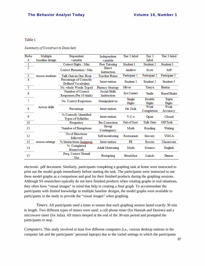
Data sets. A total of 15 data sets were used for the participants’ graphing tasks. The researchers created the data sets to present hypothetical data based on hypothetical dependent and independent variables within a multiple baseline design across three tiers (students, skills/behaviors, or settings/situations). Data sets 1 through 5 displayed data for a multiple baseline across students design. Data sets 6 though 10 showed data for a multiple baseline across skills or behaviors design, whereas data sets 11 through 15 represented data based on a multiple baseline across settings design. A multiple baseline design was selected because it involved the most complicated steps in graphing among all SS design graphs due to the involvement of multiple tiers. Each data set consisted of the following four components: (a) a direction statement, “use the data below to create graphs showing a multiple baseline across _____ (students, skills, or settings) design,” (b) identified dependent variable (e.g., correct digits per minute), (c) identified independent variable (e.g., peer tutoring), and (d) three respective tables illustrating raw data across 14 sessions with two condition labels (i.e., “Baseline” and Intervention) indicating sessions being conducted under each of the two conditions for each of the three identified tiers (e.g., Student 1, Student 2, Student 3). All data sets presented 5 baseline (sessions 1-5) and 9 intervention sessions (sessions 6-14) for tier one, 8 baseline (sessions 1-8) and 6 intervention sessions (sessions 9-14) for tier two, and 12 baseline (sessions 1-12) and 2 intervention sessions (sessions 13-14) for tier three. Four of the 15 data sets (i.e., Sets 3, 10, 11, 13) represented decreasing data paths (e.g., reductions of problem behavior) whereas the remaining sets showed increasing data paths. Additionally, all data sets indicated clear functional relationships in data (i.e., clear changes in level or data trend from baseline to intervention) for clear visual detection of specific data points to be disconnected in data path. When developing the data sets, the researchers also ensured various representations of general and specific dependent variables (e.g., frequency or percentage vs. number of correct phonemes per minute), independent variables (e.g., intervention vs. prompting), and the tier labels (e.g., Student 1 vs. Andrew) to reduce possible, undesirable stimulus control. For some data sets (e.g., Sets 4 and 6), information given on the dependent variable also prompted the participants to set up their y-axis scale (e.g., using 100 as the maximum for percentage; using 10 as the maximum for the variable of “Number of Correct Responses (Per 10 trials)”). Finally, 4 of the 15 data sets (i.e., Sets 2, 6, 8, 12) included a “missing” data point (i.e., “Absent”) that required the participants to create a disconnected data path for the missing data point. See Table 1 for a summary of the data set construction.
Each data set was presented in black color to the participants on an 11” by 8” A4 size paper in horizontal view either in hard copy (for participants who completed their graphing sessions on campus) or as an electronic .pdf document sent through an email correspondence (for participants who completed their graphing sessions remotely). Participants completing a graphing task at home were instructed to print out the designated data set before starting the task.
Model graphs. Fifteen model graphs were created using Excel 2007 program to represent the multiple baseline design data in the 15 data sets. These model graphs included all of the essential components listed in the 50-item checklist used for scoring the participants’ work (described in the Dependent Variable and Data Collection section). As for the data set, each model graph was presented in black color to the participants on an 11” by 8” A4 size paper in portrait view either in hard copy or as an
The Behavior Analyst Today Volume 10, Number 1
87
electronic .pdf document. Similarly, participants completing a graphing task at home were instructed to print out the model graph immediately before starting the task. The participants were instructed to use these model graphs as a comparison and goal for their finished products during the graphing sessions. Although SS researchers typically do not have finished products when creating graphs in real situations, they often have “visual images” in mind that help in creating a final graph. To accommodate the participants with limited knowledge in multiple baseline designs, the model graphs were available to participants in the study to provide the “visual images” when graphing.
Timers. All participants used a timer to ensure that each graphing session lasted exactly 30 min in length. Two different types of timers were used: a cell-phone timer (for Hannah and Desiree) and a microwave timer (for Julia). All timers beeped at the end of the 30-min period and prompted the participants to stop.
Computers. This study involved at least five different computers (i.e., various desktop stations in the computer lab and the participants’ personal laptops) due to the varied settings in which the participants
The Behavior Analyst Today Volume 10, Number 1
88
completed their graphing sessions. Regardless of each computer being a laptop or desktop and its brand, all computers were equipped with the MS Excel 2007 for Windows and a mouse. None of the participants in this study used a Mac or a laptop touch pad.
Dependent Variable and Data Collection
The dependent variable for this study was the number of graphing components created correctly using Excel 2007 in a 30-min period when given a multiple baseline design data set and a corresponding model graph (described in the Materials section). The selection of data set (1 through 15) for each graphing session for each participant was randomized using SPSS. This dependent variable was measured using a 50-item checklist (see Table 2) which detailed essential components of a professionally computer-generated multiple baseline design graph. The checklist was developed based on the guidelines recommended by Lo and Konrad (2007) and the figure requirements for manuscript preparation entailed by the Journal of Applied Behavior Analysis (JABA, 2000).
When scoring, the second author compared a participant’s graphing product to the model graph and scored each item on the checklist as either correct (C) or incorrect (I). All parts of an item must be completed correctly and be identical to those on the model graph in order for it to be scored with a “C.” For example , a participant would receive an “I” on item 38 (i.e., “The x-axis label is centered, in capital letters without a textbox border.”) if she created the x-axis label in capital letters with a visible textbox border. Because each participant was provided with the model graph and was instructed to create a graph to match the model graph as closely as possible, the scoring for this study was stringent and particular to each model graph even though a graphing product would have been considered appropriate by others (e.g., setting x-axis tick marks with a scale of 1 vs. a scale of 2).
Interobserver Agreements
The first author conducted an interobserver agreement (IOA) measure for 36% (4 out of 11 sessions), 33% (4 out of 12), and 40% (6 out of 15) of the graphing sessions across conditions for Hannah, Julia, and Desiree, respectively. Prior to conducting the IOA checks, the first and second authors practiced scoring by independently scoring three graphing products produced by another student who did not participate in this study using the 50-item checklist and comparing the results. Discrepancies on the scoring were discussed and clarified. Once both the scorers agreed on interpretations and scoring of each item on the checklist, the same procedures for scoring were used throughout the study. Each IOA was calculated by dividing the number of agreements by 50 (i.e., total number of items) and multiplying the figure by 100. The mean agreement was 98% (range 96%-100%) across all IOA measures.
Procedural Integrity
Using two procedural integrity (PI) checklists (one for baseline and the other for the intervention), the second author collected PI data during two baseline sessions and two intervention sessions for each participant. The checklists were designed to ensure the accurate implementation of

The Behavior Analyst Today Volume 10, Number 1
89
necessary procedures during both conditions. Both PI checklists consisted of 10 steps, including the following components: (a) the participant opened and used a new, blank worksheet in Excel 2007 for the
Table 2
Checklist Scoring Sheet for Creating Multiple Baseline Design Graphs Using Excel 2007
Tier TA steps Items Correct Incorrect 1 2, 6-10 1. Data are reflected correctly for tier 1. C I 1 8-10 2. All data for tier 1 fall on the tick mark (not between tick marks). C I
1 10 3. Data points are connected (except any absence) within each condition for tier 1.
C I
1 11-13, 22-27 4. There is no background color, gridline, plot area borderline, or chart area borderline for tier 1.
C I
1 29-31 5. X-axis scale has equal increments (with visible tick marks) and is appropriate* for tier 1.
C I
1 33-35 6. Y-axis scale has equal increments (with visible tick marks) and is appropriate* for tier 1.
C I
1 33-35 7. Y-axis “0” value is slightly raised above the x-axis for tier 1. C I
1 37-39 8. Size/type of data marks and data path lines are created in black and are appropriate* for tier 1.
C I
1-3 44-50 9. Three tiers are created and stacked on top of each other. C I
1-3 44-50 10. All tiers are created in the same size (i.e., including both plot area and chart area).
C I
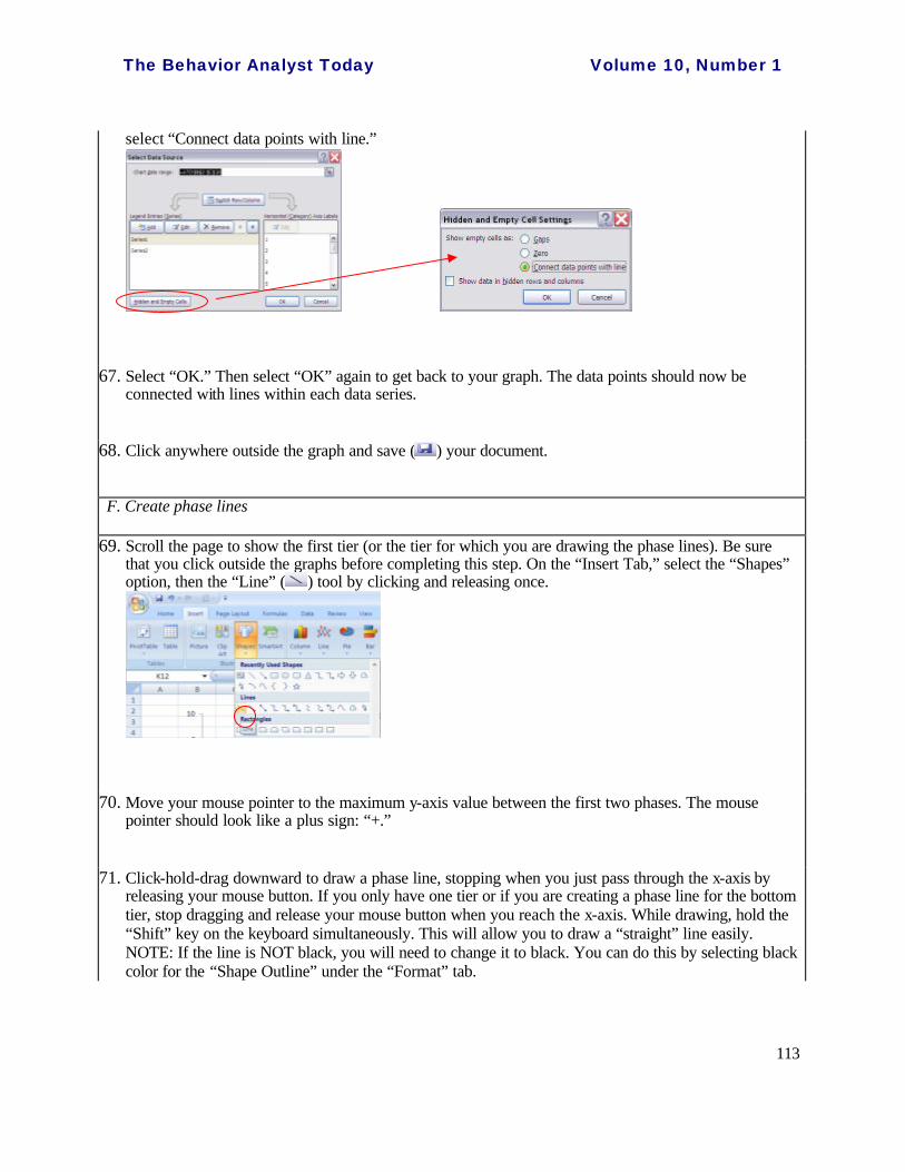
2 8-10, 44-50 11. All data for tier 2 fall on the tick mark (not between tick marks). C I 3 8-10, 44-50 12. All data for tier 3 fall on the tick mark (not between tick marks). C I
2 10, 44-50 13. Data points are connected (except any absence) within each condition for tier 2.
C I
3 10, 44-50 14. Data points are connected (except any absence) within each condition for tier 3.
C I
2 11-13, 22-27, 44-50
15. There is no background color, gridline, plot area borderline, or chart area borderline for tier 2.
C I
3 11-13, 22-27, 44-50
16. There is no background color, gridline, plot area borderline, or chart area borderline for tier 3.
C I
2 29-31, 44-50 17. X-axis scale has equal increments (with visible tick marks) and is appropriate* for tier 2.
C I
3 29-31, 44-50 18. X-axis scale has equal increments (with visible tick marks) and is appropriate* for tier 3.
C I
2 33-35, 44-50 19. Y-axis scale has equal increments (with visible tick marks) and is appropriate* for tier 2.
C I
3 33-35, 44-50 20. Y-axis scale has equal increments (with visible tick marks) and is appropriate* for tier 3.
C I
2 33-35, 44-50 21. Y-axis “0” value is slightly raised above the x-axis for tier 2. C I 3 33-35, 44-50 22. Y-axis “0” value is slightly raised above the x-axis for tier 3. C I 2 37-39, 44-50 23. Size/type of data marks and data path lines are created in black
and are appropriate* for tier 2. C I
3 37-39, 44-50 24. Size/type of data marks and data path lines are created in black and are appropriate* for tier 3.
C I
1-3 37-39, 44-50 25. Axes scales and sizes/types of data marks and data path lines are consistent across all tiers.
C I

The Behavior Analyst Today Volume 10, Number 1
90
2 52-58 26. Data are reflected correctly for tier 2. C I Note: Table 2 continues on next page
Table 2 (Continued…)
Checklist Scoring Sheet for Creating Multiple Baseline Design Graphs Using Excel 2007
Tier TA steps Items Cor-rect
Incorrect
3 52-58 27. Data are reflected correctly for tier 3. C I 1 60-63 28. Data points are disconnected between two conditions for tier 1. C I 2 60-63 29. Data points are disconnected between two conditions for tier 2. C I 3 60-63 30. Data points are disconnected between two conditions for tier 3. C I 1 69-73 31. Condition line(s) in black, dashed line formats are created for tier 1. C I 2 69-73 32. Condition line(s) in black, dashed line formats are created for tier 2. C I 3 69-73 33. Condition line(s) in black, dashed line formats are created for tier 3. C I
1-3 74-75 34. Horizontal dashed lines in black color are created to connect phase lines between tiers.
C I
N/A 77-85 35. “Baseline” label (or a precise condition label) is centered and placed slightly above its phase in tier 1.
C I
N/A 86 36. “Intervention” label (or a precise condition label) is centered and placed slightly above its phase in tier 1.
C I
NA 89 37. Only one x-axis label is created and placed slightly below the tick mark labels of the last tier.
C I
NA 89 38. The x-axis label is centered, in capital letters without a textbox border. C I NA 90 39. Only one y-axis label is created and oriented sideways along y-axes. C I NA 90 40. The y-axis label is centered, in capital letters without a textbox border. C I
1 92 41. The tier label is created with a black textbox borderline and placed at tier 1 without covering up any data point.
C I
2 92 42. The tier label is created with a black textbox borderline and placed at tier 2 without covering up any data point.
C I
3 92 43. The tier label is created with a black textbox borderline and placed at tier 3 without covering up any data point.
C I
1 96-100 44. X-axis tick mark labels in numerals are invisible for tier 1. C I 2 96-100 45. X-axis tick mark labels in numerals are invisible for tier 2. C I 3 96-100 46. X-axis tick mark labels in numerals are visible for tier 3. C I
1 102-108 47. Session “0” value for x-axis and the negative scale value for y-axis are both hidden for tier 1.
C I
2 102-108 48. Session “0” value for x-axis and the negative scale value for y-axis are both hidden for tier 2.
C I
3 102-108 49. Session “0” value for x-axis and the negative scale value for y-axis are both hidden for tier 3.
C I
1-3 102-108 50. No “extra” or “unnecessary” line, legend, or textbox present on the
graph (Note: anything that is in addition to what is presented on the model graph is considered “extra” and unnecessary.)
C I
*For the purpose of the study, the word “appropriate” is used to indicate that the component matches identically to that on the model graph.
The Behavior Analyst Today Volume 10, Number 1
91
graphing task; (b) the researcher distributed necessary materials appropriate for the condition to the participant; (c) the participant set the timer for 30 min; (d) the participant engaged exclusively in the graphing task for the entire 30-min period and stopped the task when the period ended; (e) the participant
sought no help from others during the session; and (g) the participant saved and delivered her graphing product to the researcher at the end of the graphing session. Due to the various implementation settings across the three participants and the lack of video equipment for direct observations at remote sites, the second author conducted the PI measures through either direct observations on site (i.e., was present physically during the session) or phone conference interviews with participants’ self repots. On-site PI data collection occurred during one baseline PI session for Hannah, all PI sessions for Julia, and two baseline PI sessions for Desiree, with all remaining PI sessions through phone interviews. Phone conference interviews were employed immediately following each 30-min graphing period by the second author calling the participant, who then self reported the degree to which she followed each of the 10 steps. Although the self report PI data collection method was not optimal, it was most feasible in cases when option for videotaping the graphing session was not available and it was difficult or impractical for the researchers to be present at the participants’ houses.
The percent of PI was calculated by dividing the number of steps completed correctly by the total number of steps (i.e., 10) and then multiplying by 100. A perfect percentage was obtained on all PI measures for all participants.
Experimental Design and Procedures
This study employed a multiple probe across participants design (Horner & Baer, 1978). This design allows the researchers to determine whether a change in behavior has occurred prior to the intervention through intermittent measures (Cooper et al., 2007), which is appropriate for reducing practice effects or the participants’ frustration possibly due to their unfamiliarity with graphing using Excel 2007.
In general, baseline probes were collected once a week initially and two to three times a week immediately prior to the implementation of the intervention. During the intervention, graphing sessions occurred two to three times per week until a minimum of five graphing sessions showing improvements in correct number of steps were obtained.
Pre-baseline. To ensure that each participant had a basic understanding of SS graphs and multiple baseline designs in particular, the first author met with each participant individually for 15 min to explain terminologies and basics of a multiple baseline design and its graphic display. Using a data set and a model graph, the first author explained to each participant the essential components of a multiple baseline design graph and the materials she would use for each graphing session.
Baseline. During the baseline condition, the second author distributed a pre-designated data set and its corresponding model graph to each participant immediately prior to the commencement of each graphing session. For each “remote” graphing session, the second author emailed the materials to the
The Behavior Analyst Today Volume 10, Number 1
92
participant and followed up with a phone call to verify that the participant received the email and was able to access and print out the attachments. Each participant was instructed to (a) open a new, blank Excel 2007 worksheet and exit all other programs on the computer, (b) have the graphing materials (i.e., distributed data set and model graph) ready, (c) use the given data to create a multiple baseline design graph as closely matching to the model graph as possible, (d) neither seek help from others nor reference to any previous graphing products, and (e) set the timer for 30 min and engage exclusively in the graphing task during the period. The participants were allowed to use the “Help” function within MS Excel 2007 as they desired during the 30-min graphing session. The researchers chose a 30-min time block to ensure that the participants would not be overwhelmed with the repeated measures while concurrently engaging in multiple intensive summer courses. Furthermore, the researchers have found that this time period would allow most users to complete a majority of the graphing components within a few graphing sessions. To reduce possible frustration and anxiety, the participants were told that the timing was unlikely sufficient for them (or most people) to fully complete the graphing task and they were to simply try their best to complete as many graphing components as possible. At the end of the 30-min graphing period, the participants were to discard the graphing materials, send their graphing product to the second author through an email attachment, and follow up with the second author to ensure the product was received. No graphing task analysis or step-by-step instruction was available during the baseline condition.
Graphing task analysis. The procedures for the graphing task analysis condition were exactly the same as those described in baseline with one exception. At the first intervention session, the second author distributed to the participant a 17-page long document, entitled “A Task Analysis for Creating Single-subject Graphs using Microsoft® Office Excel 2007.” This task analysis (see Appendix A) was developed and adapted by the authors based on the 2003 version graphing task analysis published by Lo and Konrad (2007). Similar to the 2003 version, the document consisted of (a) a prerequisite skill checklist; (b) a list of eight glossary words pertaining to Excel 2007 and SS graphing (i.e., worksheet, Home toolbar, Insert toolbar, highlight cells, right click, a-axis, y-axis, and tiers); (c) tips before starting the tasks analysis (i.e., checking for toolbars, recording dates/sessions); and (d) the Excel 2007 graphing task analysis with 110 steps entailing procedures with graphics throughout to create SS graphs with single and double data paths. The second author reviewed the glossary with each participant immediately prior to the graphing session via telephone (for Hannah and Desiree) or a face-to-face meeting (for Julia). Each participant was then instructed to use the “single data path” steps only for their graphing task. The participants were to follow each step in the “single data path” column of the task analysis to complete their graphing task during each intervention graphing session.
Consumer Satisfaction Questionnaire
The participants completed a 12-item consumer satisfaction questionnaire 2 weeks after the completion of their last respective intervention graphing task. The questionnaire consisted of 11 items that required the participants to rate, using a four-point scale (4 being strongly agree and 1 being strongly disagree), their comfort level in using the task analysis to complete certain components of a SS graph (7 items; e.g., “I feel comfortable creating a one-tier graph with the task analysis.”) and their perceptions
The Behavior Analyst Today Volume 10, Number 1
93
regarding the usefulness and ease of the task analysis for themselves and other potential users (4 items). One additional item on the questionnaire asked the participants to describe their overall experience with the task analysis as written comments.
Results

The Behavior Analyst Today Volume 10, Number 1
94
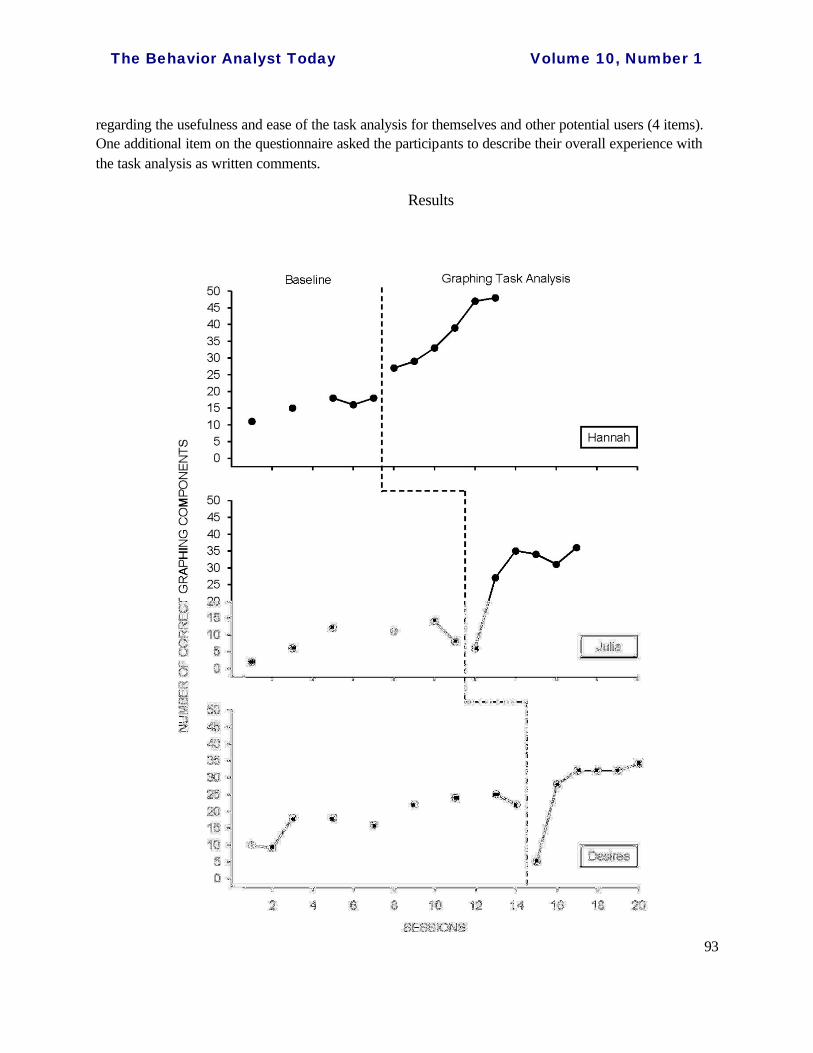
Figure 1. Number of Correct graphing components completed by the participants.
Number of Correct Graphing Steps
Hannah’s baseline data showed an overall slight increasing trend with a mean of 15.7 (out of 50) correct steps and a stable baseline for the last three data points. During the graphing task analysis condition, Hannah improved the number of correct graphing steps to an average of 37.2 with a rapid but steady increasing trend across the six intervention sessions. Julia correctly completed an average of 8.8 steps with a very slight increasing trend during the baseline condition. With the graphing task analysis , Julia produced graphs that had much higher numbers of correct steps during the last five sessions (mean = 28.2) than those during the baseline condition, showing a clear change in level. Finally, Desiree’s baseline data revealed an overall increasing trend and a mean of 18.2 correct graphing steps with the last four data points showing some level of stability. During the graphing task analysis condition, Desiree reduced the number of correct graphing steps in the first intervention session to a level lower than any of the baseline data points but increased to a level slightly higher than any of the baseline data points for the remaining intervention sessions (overall mean = 27.2). Regardless of the first intervention data point, Desiree’s data trend for the graphing task analysis condition remained similar to that during the baseline condition. See Figure 1 for the results of all participants’ graphing skills.
Consumer Satisfaction
On the consumer satisfaction questionnaire, Hannah provided a rating of “4” on all 11 items. She described her experience with the task analysis as “very good” and reported that the task analysis was easy to follow, which “made an overall frustrating task seem simple and easy.” Both Julia and Desiree provided a mean rating of 3.82 across the 4-point scale items, with all but two items being rated with a “3” on the questionnaire. Julia felt less comfortable with modifying axes and creating phase lines using the task analysis, whereas Desiree felt less comfortable with structuring an Excel worksheet and creating phase lines using the task analysis. Julia expressed, “the experience gave me an opportunity to focus on each part of the graphing process and will benefit me going forward, in both school and work.” For Desiree, her experience using the task analysis helped her feel more comfortable when creating a graph. She reported, “[w]ithout the task analysis my graph would not represent the information accurately. The task analysis is clearly written and easy to follow.”
Discussion
This study examined the effects of a single-subject graphing task analysis with Excel 2007 on the multiple baseline design graphing skills of three graduate students in special education program at a southeastern university. Two of the participants clearly improved the number of correct graphing components on graphing probes during the intervention condition and perceived the task analysis to be useful and easy to follow.
The Behavior Analyst Today Volume 10, Number 1
95
Data on the number of correct graphing components for the participants indicated clear changes in slop for Hannah and in level for Julia, with less conclusive improvement for Desiree during the graphing task analysis condition. For Hannah, the improvement in the correct number of graphing steps was rapid and immediate with the task analysis. In fact, in a short length of six graphing sessions, Hannah demonstrated her graphing skills in creating a complete three-tier multiple baseline graph using Excel 2007 with only 2-3 incomplete steps within a 30-min period when the graphing task analysis was provided. The improvement in Hannah’s graphing accuracy and fluency was considerable with the task analysis. For Julia, the number of correct graphing components also increased markedly during all but the first intervention session when compared to that in the baseline condition. Specifically, Julia showed an average improvement of 19.4 steps in creating a three-tier multiple baseline graph during the graphing task analysis condition. The results for Hannah and Julia showed a functional relationship between the number of correct graphing components and the task analysis. Unfortunately, similar intervention effects were not evident for Desiree as the data path trend remained unchanged from the baseline condition, regardless of the sharp dip in the first intervention data point.
The differential levels of improvement for Hannah and Julia may be twofold. First, the higher comfort level in Excel 2003 graphing may have assisted Hannah in completing graphing steps in Excel 2007 more accurately and quickly. Contrarily, Julia has experienced an overall feeling of anxiety in creating SS graphs and has informally reported to the researchers that she was “not good at graphing” and was “slow in following the steps.” In essence, some Excel 2007 users may simply require more time to produce a SS graph. Second, an analysis of the Excel graphing worksheets of Hannah’s graphing products showed that she precisely followed each step listed on the graphing task analysis, which may have ensured the accurate and relatively easy completion of later steps, therefore making the graphing process more efficient. It is possible that when a step in the task analysis is not followed correctly, confusion (e.g., unable to find a certain function) may occur that slows down the graphing process. Additionally, precision in certain steps in the task analysis (e.g., steps 44-50) can greatly impact the accuracy of many graphing components (e.g., items 9-25, Table 2). As a result, precision in following the graphing task analysis may, in part, have contributed to accuracy and fluency in graphing steps.
The immediate reduction in the number of correct graphing components during the first task analysis session for both Julia and Desiree is possibly due to detailed descriptions in the task analysis that required the participants to follow step-by-step instructions on graphing. First, the task analysis required the participants to read texts and follow each step, which may have taken away from their actual construction of a graph. Second, the task analysis required the participants to first carefully structure the Excel worksheet to clearly indicate tier, condition, and sheet tab labels before moving on to creating the first tier graph. Time spent in the “prearrangement” of worksheet, not evident in all participants’ baseline graphing documents, may have reduced the

The Behavior Analyst Today Volume 10, Number 1
96
available time for the participants to complete more graphing steps. For example, with the task analysis participants would need to follow steps 1-39 correctly in order to receive possible eight correct items on the graphing components (see Table 2). However, once they accurately completed 50 steps, they possibly would receive 25 correct items. The unfamiliarity in the task analysis may have prevented Julia and Desiree from reaching step 50 during the first task analysis session. As Julia and Desiree became familiar with the task analysis after a few graphing sessions, effort and time to structure an Excel worksheet was minimal and that they became more fluent with structuring worksheets and other graphing steps in the task analysis.
The inconclusive results for Desiree may be explained by practice effects resulted from the prolonged baseline and her previous knowledge in using Excel for graphing. First, based on her baseline graphing products, it is clear that Desiree learned additional steps by explo ring through different graphing functions as she advanced to the next graphing session. This is not unusual for any Excel users in that time spent in practicing graphing and exploring graphing tools often lead to improvement in fluency. In fact, all three participants showed slight improvement in their graphing skills over time without the assistance of the task analysis (i.e., baseline). Second, in-depth analyses of Desiree’s baseline graphing documents showed that she used different methods in graphing that often resulted in similar product in print. For example, Desiree created each tier graph on three separate worksheets and copied and pasted all tiers into one empty worksheet for tier stacking and alignment. In addition, tier and condition labels were often created within the Chart area, that prevented her from relocating the textbox labels outside the Chart when needed. These practices and methods were not likely to be detected through in-print products and most often could produce the same level of accuracy in graphing. During the graphing task analysis, Desiree was required to “unlearn” her previous graphing skills and follow a “new way” of graphing. As a result, her adjustment in the graphing tools might have limited her level of improvement with the task analysis.
Despite the inconclusive results from Desiree, the overall results of this study contribute to the field in several ways. First, this study supplements the empirical research effort by Dixon et al. (in press) by experimentally evaluating the effects of a detailed graphing instruction with outcome measures through a single subject research methodology. Improvement in two participants’ graphing skills was positive and noticeable. Second, the current study extends previous articles (Carr & Burkholder, 1998; Cihak et al., 2006; Hillman & Miller, 2004; Lo & Konrad, 2007; Moran & Hirschbine, 2002) on SS graphing instructions in that it addresses the technological advancement of Excel 2007 with validated results and provides detailed steps for completing several essential graphing components not outlined in the task analyses by Dixon and colleagues. Third, the scoring checklist (Table 2) used in the current study lists essential components for an accurately presented multiple baseline design graph that may be useful for users to check against their finished SS graphing products for accurate presentation. Moreover,
The Behavior Analyst Today Volume 10, Number 1
97
the checklist includes information of the corresponding steps in the task analysis (i.e., “TA steps”) for each graphing component to allow users to easily return to specific steps in the task analysis if needed. Finally, the positive results of the current study involving three participants at different graduate levels (i.e., M.Ed., teaching certificate, Ph.D.) showed that the graphing task analysis may be viable and appropriate for users with different levels of SS knowledge and graphing experiences.
Limitations and Directions for Future Research
Several limitations warrant discussion. One limitation is related to the practice effects and other uncontrolled learning opportunities on Excel graphing outside the study. Unfortunately, the total elimination of practice effects may not be possible due to the nature of the tasks required of the participants even with a multiple probe design. Future research may use a delayed multiple baseline design to further reduce practice effects. In addition to the practice effects, participants might have engaged in any spontaneous graphing tasks (e.g., asking a fellow student how to complete a certain step in graphing for a coursework requirement) that could not be controlled. Similarly, total elimination of graphing exercise outside of the study may not be possible in applied research. A second limitation concerns the lack of direct observations for the procedural integrity data for Hannah and Desiree with possible overestimation of their own integrity implementation. Specifically, data collection on the procedural integrity during the intervention condition depended on Hannah’s and Desiree’s oral reports. Although all participants were instructed to follow the “honor system” of complying with all required steps (e.g., seek no help or refer to none of previously created worksheets), it was impossible for the researchers to confirm the participants’ oral reports without physically attending to the graphing session. In future studies, researchers may run sessions in more accessible settings so that direct observations are possible or may videotape sessions at remote sites so that direct measures of procedural integrity can be carefully monitored.
Finally, this study limited each graphing session to only 30 min to reduce possible frustration and to limit the amount of time needed from each participant during their respective full- load summer schedule. The time limit may raise the question of whether the low accuracy in graphing components was a result of the participants not finishing the lengthy task analysis within the time constraint, or a result of the participants failing to produce completed graphs even with accurate adherence to the task analysis. Observations of the participants’ final products showed that the former explanation is more probable as the graphing products in intervention condition showed unfinished components, rather than graphing errors. Future studies may consider allowing participants as much time as they need to finish graphs or until the participants indicate that they have done as much as they can to ensure the full utility of the graphing task analysis.
The Behavior Analyst Today Volume 10, Number 1
98
Conclusion
Creating a professionally presented and computer generated SS graph using MS Excel 2007 is a complex and often unfamiliar task for many users. Detailed step-by-step instructions on producing SS graphs using Excel 2007 can ease users’ frustration and anxiety with graphing. Through empirical validation, this paper presents the usefulness and effectiveness of a 110-step task analysis for correctly graphing SS graphs using Excel 2007. The graphing task analysis may be of great value to SS researchers and practitioners as they continue to use graphs for data analyses and dissemination.
References
Barton, E. E., Reichow, B., & Wolery, M. (2007). Guidelines for graphing data with Microsoft PowerPoint. Journal of Early Intervention, 29, 320-336.
Carr, J. E., & Burkholder, E. O. (1998). Creating single -subject design graphs with Microsoft Excel. Journal of Applied Behavior Analysis, 31, 245-251.
Cihak, D. F., Alberto, P. A., Troutman, A. C., & Flores, M. M. (2006). Graphing in Excel for the classroom: A step-by-step approach. Upper Saddle River, NJ: Prentice Hall. Retrieved on January 3, 2009 from http://wps.prenhall.com/wps/media/objects/2028/2077456/Volume_medialib/BOOK.PDF
Cooper, J. O., Heron, T. E., & Heward, W. L. (2007). Applied behavior analysis (2nd ed.). Upper Saddle River, NJ: Merrill/Prentice Hall.
Dixon, M. R., Jackson, J. W., Small, S. L., Horner-King, M. J., Mui, N., Lik, K., et al. (in press). Creating single-subject design graphs in Microsoft Excel 2007™. Journal of Applied Behavior Analysis.
Grehan, P., & Moran, D. J. (2005). Constructing single -subject reversal design graphs using Microsoft Word™: A comprehensive tutorial. The Behavior Analyst Today, 6, 235-242.
Hillman, H. L., & Miller, L. K. (2004). Designing multiple baseline graphs using Microsoft Excel. The Behavior Analyst Today, 5, 372-387.
Horner, R. D., & Baer, D. M. (1978). Multiple -probe technique: A variation on the multiple baseline. Journal of Applied Behavior Analysis, 11, 189-196.
Journal of Applied Behavior Analysis. (2002). Manuscript preparation checklist. Journal of Applied Behavior, 32, 514.

The Behavior Analyst Today Volume 10, Number 1
99
Lo, Y., & Konrad, M. (2007). A field-tested task analysis for creating single -subject graphs using Microsoft® Office Excel. Journal of Behavioral Education, 16, 155-189.
Moran, D. J., & Hirschbine, B. (2002). Constructing single -subject reversal design graphs using Microsoft ExcelTM: A comprehensive tutorial. The Behavior Analyst Today, 3, 179-187.
Contact Information:
Ya-yu Lo, Ph.D. Assistant Professor Department of Special Education and Child Development College of Education 9201 University City Blvd. University of North Carolina at Charlotte Charlotte, NC 28223 E-mail: [email protected] Telephone number: (704) 687-8716 Fax number: (704) 687-2916
A. Leyf Peirce Starling, B.S. Master’s Student Department of Special Education and Child Development University of North Carolina at Charlotte E-mail: [email protected] Telephone number: (919) 210-3727
The Behavior Analyst Today Volume 10, Number 1
100
Appendix A
A Task Analysis for Creating Single -subject Graphs using Microsoft® Office Excel 2007
Prerequisite Skill Checklist
The SS task analysis is intended for people who have some basic prerequisite skills. An individual is prepared to use the task analysis if he or she can do the following:
c Open Microsoft® Office Excel c Use the standard and drawing toolbar features c Define basic terminology and concepts (e.g., SS designs, baseline, intervention, phase line,
data path, and terms in the following glossary section) Glossary
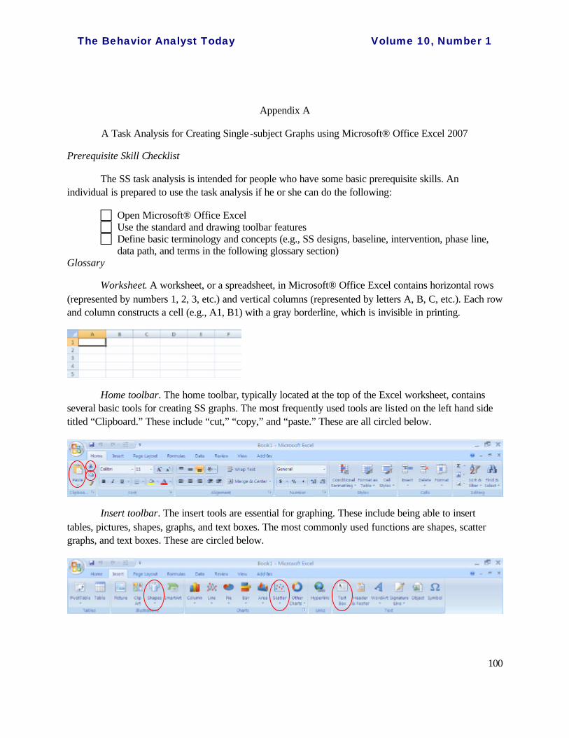
Worksheet. A worksheet, or a spreadsheet, in Microsoft® Office Excel contains horizontal rows (represented by numbers 1, 2, 3, etc.) and vertical columns (represented by letters A, B, C, etc.). Each row and column constructs a cell (e.g., A1, B1) with a gray borderline, which is invisible in printing.
Home toolbar. The home toolbar, typically located at the top of the Excel worksheet, contains several basic tools for creating SS graphs. The most frequently used tools are listed on the left hand side titled “Clipboard.” These include “cut,” “copy,” and “paste.” These are all circled below.
Insert toolbar. The insert tools are essential for graphing. These include being able to insert tables, pictures, shapes, graphs, and text boxes. The most commonly used functions are shapes, scatter graphs, and text boxes. These are circled below.
The Behavior Analyst Today Volume 10, Number 1
101
Highlight (select) cells. To highlight or select cells (e.g., A1 through D10), place the mouse pointer at the beginning of the cell range you wish to select (in this case, A1), then left click-hold-drag until all the cells you wish to highlight are selected. This creates a gray area of cells.
Right click. For PC users, “right click” refers to making a quick click on the right-hand side button on the top of your mouse. “Right click” serves the same function as “double click,” although double clicking in Excel 2007 often leads to very subtle changes in screen (e.g., no pop-up window) that at times may be difficult for users to notice. Mac users can use “double click” to perform the same action as “right click” listed in this task analysis.
X-axis. The x-axis is the horizontal axis on a graph. In SS graphs, the x-axis typically represents time (e.g., sessions, days, weeks).
Y-axis. The y-axis is the vertical axis on a graph. In SS graphs, the y-axis typically represents the dependent variable.
Tier. To create multiple baseline design graph, two or more graphs are stacked on top of each other. Each graph is referred to as a tier.
Tips before Starting with the Task Analysis
Checking for toolbars. Before you start with the task analysis, make sure that you can locate the “Home” tab and the “Insert” tab at the top of your screen. Typically, these are located at the top of the Excel worksheet by default.
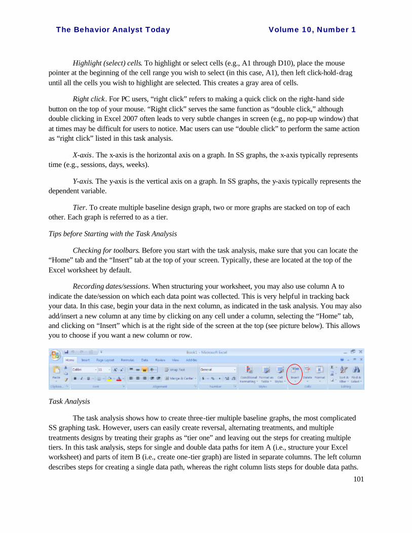
Recording dates/sessions. When structuring your worksheet, you may also use column A to indicate the date/session on which each data point was collected. This is very helpful in tracking back your data. In this case, begin your data in the next column, as indicated in the task analysis. You may also add/insert a new column at any time by clicking on any cell under a column, selecting the “Home” tab, and clicking on “Insert” which is at the right side of the screen at the top (see picture below). This allows you to choose if you want a new column or row.
Task Analysis
The task analysis shows how to create three-tier multiple baseline graphs, the most complicated SS graphing task. However, users can easily create reversal, alternating treatments, and multiple treatments designs by treating their graphs as “tier one” and leaving out the steps for creating multiple tiers. In this task analysis, steps for single and double data paths for item A (i.e., structure your Excel worksheet) and parts of item B (i.e., create one-tier graph) are listed in separate columns. The left column describes steps for creating a single data path, whereas the right column lists steps for double data paths.

The Behavior Analyst Today Volume 10, Number 1
102
Items C through J include steps that are applicable to both single and double data paths. Because each step is essential and missing one step can produce different results, we strongly recommend users check off each step as they follow through the task analysis.
Single data path Double data paths
A. Structure your Excel worksheet A. Structure your Excel worksheet
1. In cell B1, enter the label of the first tier (e.g., student’s name, skill, setting). In cell D1, enter the label of the second tier. In cell F1, enter the label of the third tier. Continue this across row 1 in every other column (B, D, F, H, etc.) until all tiers have been labeled. If the label name (e.g., work completion) is too long to fit in the cell (e.g., B1), you may widen the cell by (a) placing your mouse pointer at the shared borderline of the target cell and the cell next to it at its right
(e.g., C1) until a appears, (b) click-hold-dragging toward your right, and (c) releasing your mouse button when you complete widening.
2. Enter data below each tier’s label from top down beginning in row 2 (i.e., B2 ~ , D2~ , F2~). If data were not collected on certain days (e.g., student was absent), leave the cell blank. Entering the word “absent” will inaccurately lead to a “0” score assigned by Excel.
3. Enter the name of the condition in the cell next to the first data point of that condition in column A for the first tier. Continue this in columns C, E, etc. to indicate the beginning of a condition for each tier. See illustration below.
1. In cell A1, enter the label of the first tier (e.g., student’s name, skill, setting). In cell B1, enter the label of the first data path for the first tier (e.g., correct). In cell C1, enter the label of the second data path for the first tier (e.g., incorrect). To widen a cell, see instruction in step 1 in the left-hand column of the task analysis.
2. Enter the label of the second tier in cell D1; enter the label of its first and second data paths in cells E1 and F1, respectively. Continue this across row 1, labeling the names and all data paths for all tiers.
3. Enter data into columns B, C, E, F, H, I, etc. from top down beginning in row 2 (i.e., B2 ~ , C2~ , E2~, F2~) to reflect data for each data path of each tier. Leave the cell blank if data were not collected for a particular session.
4. Enter the name of the condition in the cell next to the first data point of that condition below each tier’s label in columns A, D, G, etc. to indicate the beginning of a condition for each tier.

The Behavior Analyst Today Volume 10, Number 1
103
[Note. If you are creating a one-tier graph (e.g., reversal design) for multiple participants, you may also follow steps 1 to 3 so that all the data can be organized into one worksheet.
4. Under the bottom of the worksheet, place the mouse pointer on “Sheet1” tab label. Double left click the tab. The word “Sheet1” becomes orange color in black background.
5. Rename the tab by typing in a new label name (e.g., “Data,” “Disruption,” “Tommy”) to help you organize the worksheets. Hit the “Enter” key on your keyboard or click on one of the cells in the worksheet after renaming the tab. [Note: If you have a simple data set (e.g., one dependent variable), this step may not be critical as you can easily locate your data.]
An example of a data entry sheet for a single -tier alternating treatments design is illustrated below.
5. Rename the worksheet tab label as needed by double left-clicking on the tab label and typing in the label name (see steps 4-5 in the left-hand column of the task analysis).
B. Create one-tier graph B. Create one-tier graph
6. Highlight data for the first tier, beginning with B2 to the last row of data. Make sure that you highlight the data (i.e., numbers) only, not the labels nor the conditions.
6. Highlight the first data path for the first tier, beginning with B2 to the last row of data. Make sure that you highlight the data (i.e., numbers) only, not the labels nor the conditions.

The Behavior Analyst Today Volume 10, Number 1
104
7. Click on the “Insert” tab so that you can see the “Charts” options.
8. Above “Charts,” locate the “Scatter” icon. This chart type will allow data to fall on the tick marks rather than between tick marks.
9. Click on the arrow under “Scatter.”
10. Select second sub-type in the second column (i.e., “Scatter with Straight Lines and Markers”).
11. A graph should appear. This graph will most likely have grid lines with a light blue border around the edge of the graph. At this point, the top of the screen will look like this:
If the graph has grid lines, continue to the next step. If it does not, skip the next step and continue to step 14.
12. Locate the Chart layout under “Chart Layouts.” Click on the “More” arrow at the right hand side to see all options.
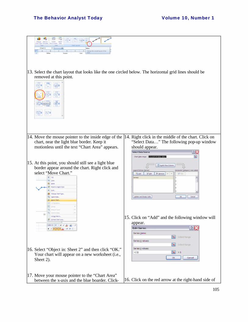
The Behavior Analyst Today Volume 10, Number 1
105
13. Select the chart layout that looks like the one circled below. The horizontal grid lines should be removed at this point.
14. Move the mouse pointer to the inside edge of the chart, near the light blue border. Keep it motionless until the text “Chart Area” appears.
15. At this point, you should still see a light blue border appear around the chart. Right click and select “Move Chart.”
16. Select “Object in: Sheet 2” and then click “OK.” Your chart will appear on a new worksheet (i.e., Sheet 2).
17. Move your mouse pointer to the “Chart Area” between the x-axis and the blue boarder. Click-
14. Right click in the middle of the chart. Click on “Select Data…” The following pop-up window should appear.
15. Click on “Add” and the following window will appear.
16. Click on the red arrow at the right-hand side of

The Behavior Analyst Today Volume 10, Number 1
106
hold-drag the entire chart so that the upper left-hand corner of the chart area rests against the upper left-hand corner of cell B2 (i.e., one column over from the left and one row down from the top). Then release your mouse button. See illustration.
18. With the presence of the light blue border, place the mouse pointer at the lower right-hand corner of the chart area until the two-way diagonal arrow appears.
19. Click-hold-drag to extend/shrink the chart area through column I and down to the appropriate row (i.e., divide 52 by number of tiers and extend to that row, e.g., through row 17 if there are three tiers). This is to make sure that your graphs will fit onto a letter size (8.5 x 11 in.) paper. If you only have one tier, extending your chart area through row 17 will also be appropriate. Release your mouse button after extending/shrinking.
20. Place your mouse pointer on the “Sheet2” tab label of the worksheet. Rename the label (e.g., “graph”) by double left clicking on the tab and typing in the new label name to help you organize the worksheets (see steps 4-5). Hit the “Enter” key on the keyboard or click on one of the cells in the worksheet after renaming the tab.
21. Click anywhere outside the graph (i.e., in one of the worksheet cells) and save ( ) your document.
“Series Y values:.” A small window pops up with a heading called, “Edit Series.” The box with “={1}” is highlighted in black.
17. Highlight the second data path of the first tier, beginning with C2 to the last row of data. The data you just highlighted will be surrounded with dashed flashing lines. The values in the box should change instantly. This is to add the second data path onto the graph.
18. Click on the red downward arrow at the right-hand side of the pop-up window.
19. Select “OK.” You will be returned to the “Select Data Source” screen.
20. Select “OK.” The second set of data should now appear on your graph.
21. Follow steps 14-21 in the left-hand column of the task analysis to move the chart, extend and drag the Chart Area, and rename the tab.

The Behavior Analyst Today Volume 10, Number 1
107
C. Modify graphs
[Modify background]
22. Click on the border of your chart. With the graph having a blue border, place your mouse pointer near the inside edge of the chart. Keep it motionless until the text “Chart Area” appears. Right click and select “Format Chart Area.”
23. On the menu at the left hand side: • For the “Fill” option, select “No fill” • For the “Border Color” option, select “No line”
24. Click on “Close” at the bottom right.
25. Move the mouse pointer to the data area and keep it motionless until the text “Plot Area” appears. Right click and select “Format Plot Area.”
26. On the menu at the left hand side: • For the “Fill” option, select “No fill” • For the “Border Color” option, select “No line”
27. Click on “Close” at the bottom right.
28. Click anywhere outside the graph and save ( ) your document.
[Modify x-axis]
29. Right click on one of the numbers on the x-axis and select “Format Axis.”
30. For “Axis Options:” • For “Minimum,” select “Fixed” and enter the number “0.” • For “Maximum,” select “Fixed” and change the number to reflect your total number of sessions
(or days, weeks, etc.). • For “Major unit,” select “Fixed” and adjust the number according to your needs [Note: The major
unit is what the numbers on the x-axis will “count by” (e.g., 2, 5, 10).] • For “Major tick mark type,” select “Outside” (or “Inside” depending on your preference). • For “Minor tick mark type,” keep it as “None.” • For “Axis labels,” keep it as “Next to Axis.”

The Behavior Analyst Today Volume 10, Number 1
108
For “Line Color:”
• Select “Solid line,” then black color on the pull down menu.
For “Line Style:”
• Change the width to 1 pt.
31. Click on “Close” at the bottom right.
32. Click anywhere outside the graph and save ( ) your document.
[Modify y-axis]
33. Right click on one of the numbers on the y-axis and select “Format Axis.”
34. For “Axis Options:” • First, for “Maximum,” select “Fixed” and change the number to reflect the maximum level of your
dependent variable (e.g., 100 for percentage). This number may need to be set in correspondence with your “Major unit.” For example, if the highest score earned by a student was 49 and you set the “Major unit” by fives (i.e., 5, 10, 15, 20), an appropriate “Maximum” number would be “50.”
• Then, for “Major unit,” select “Fixed” and adjust the number according to your needs to show what you want the y-axis to “count by” (e.g., 2 for twos, 5 for fives).
• Then, for “Minimum,” select “Fixed” and enter the same number from the “Major unit” box, except this time enter it with a negative sign (e.g., -2).
• For “Major tick mark type,” select “Outside” (or “Inside” depending on your preference). Do make sure that this is consistent with the tick mark type for your x-axis.
• For “Minor tick mark type,” keep it as “None.” • For “Axis labels,” keep it as “Next to Axis.” • For “Horizontal axis crosses:,” select “Axis value.” Divide the
negative number from the “Minimum” box by 2 and enter it in the “Axis value” box. For example, if the major unit is 2, enter “-2” for “Minimum” and “-1” for “Axis value.” This is to raise the y-axis zero value with an appropriate scale. See illustration at the right for an example.
For “Line Color:”
• Select “Solid line,” then black color on the pull down menu.
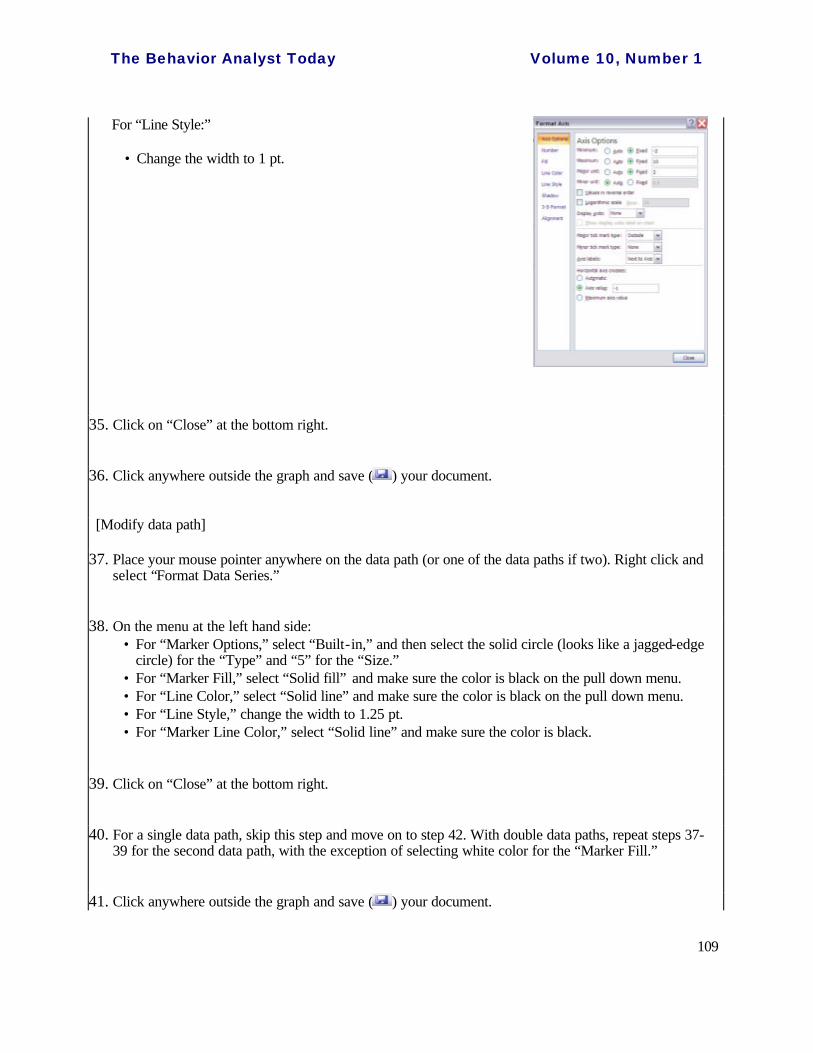
The Behavior Analyst Today Volume 10, Number 1
109
For “Line Style:”
• Change the width to 1 pt.
35. Click on “Close” at the bottom right.
36. Click anywhere outside the graph and save ( ) your document.
[Modify data path]
37. Place your mouse pointer anywhere on the data path (or one of the data paths if two). Right click and select “Format Data Series.”
38. On the menu at the left hand side: • For “Marker Options,” select “Built-in,” and then select the solid circle (looks like a jagged-edge
circle) for the “Type” and “5” for the “Size.” • For “Marker Fill,” select “Solid fill” and make sure the color is black on the pull down menu. • For “Line Color,” select “Solid line” and make sure the color is black on the pull down menu. • For “Line Style,” change the width to 1.25 pt. • For “Marker Line Color,” select “Solid line” and make sure the color is black.
39. Click on “Close” at the bottom right.
40. For a single data path, skip this step and move on to step 42. With double data paths, repeat steps 37-39 for the second data path, with the exception of selecting white color for the “Marker Fill.”
41. Click anywhere outside the graph and save ( ) your document.
The Behavior Analyst Today Volume 10, Number 1
110
[Remove series legend]
42. Click on the series legend (e.g., Series 1) underneath the x-axis and enter “Delete” on your keyboard.
43. Click anywhere outside the graph and save ( ) your document.
D. Graph other tiers (For one-tier graphs, skip to Item E or step 60.)
44. Place your mouse pointer at the outside area of the axes and left click so that a light blue border appears around the graph.
45. Click the “Home” tab and select “Copy” ( ) (or press “Ctrl” -and-“C” on the keyboard).
46. Click on the cell right below the lower left-hand corner of the first graph (e.g., B18).
47. On the “Home” tab, select “Paste” ( ) (or press “Ctrl” -and-“V” on the keyboard). This is to create the second tier. If necessary, click-hold-drag this graph so that it is directly underneath the first tier. Release the mouse button once you complete dragging the graph. You can use the gray lines on the worksheet to help with this alignment.
48. Click on the cell right below the lower left-hand corner of the second graph you just created (e.g., B34).
49. On the “Home” tab, select “Paste” ( ) (or press “Ctrl” -and-“V” on the keyboard). This is to create the third tier. If necessary, click-hold-drag this graph so that it is directly underneath the second tier. Release the mouse button once you complete dragging the graph. You can use the gray lines on the worksheet to help with this alignment.
50. Repeat steps 48-49 until all the tiers are copied.
51. Click anywhere outside the graph and save ( ) your document.
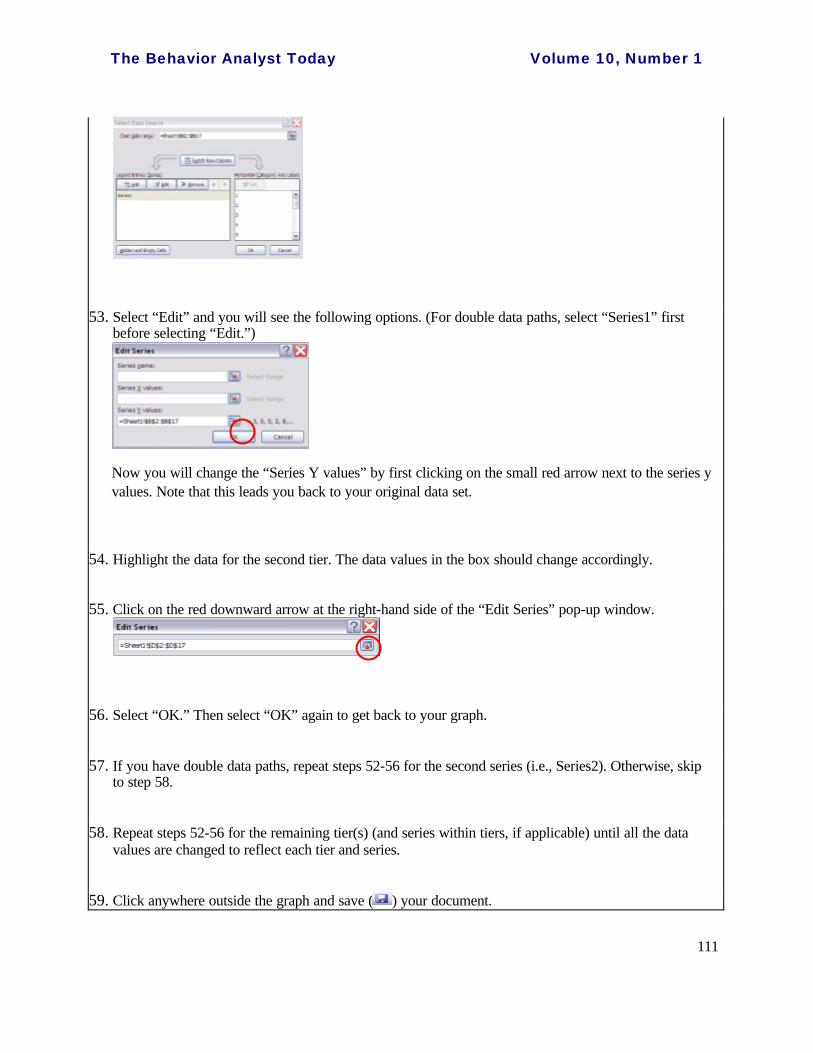
52. Go to the second tier and click the outside area of the axes so the blue border appears around the chart. Click on the “Plot Area” of the second tier (i.e., the area where the data are plotted) so that four squares and four circles appear around the plot area. Right click and select “Select Data.” A “Select Data Source” window will appear.
The Behavior Analyst Today Volume 10, Number 1
111
53. Select “Edit” and you will see the following options. (For double data paths, select “Series1” first before selecting “Edit.”)
Now you will change the “Series Y values” by first clicking on the small red arrow next to the series y values. Note that this leads you back to your original data set.
54. Highlight the data for the second tier. The data values in the box should change accordingly.
55. Click on the red downward arrow at the right-hand side of the “Edit Series” pop-up window.
56. Select “OK.” Then select “OK” again to get back to your graph.
57. If you have double data paths, repeat steps 52-56 for the second series (i.e., Series2). Otherwise, skip to step 58.
58. Repeat steps 52-56 for the remaining tier(s) (and series within tiers, if applicable) until all the data values are changed to reflect each tier and series.
59. Click anywhere outside the graph and save ( ) your document.

The Behavior Analyst Today Volume 10, Number 1
112
E. Disconnect lines between phases (For an alternating treatments design, skip to step 65 to connect discontinuous data points.)
60. In the first tier, move your mouse pointer onto the point that indicates the first data point of the second phase (e.g., tutoring). Left click on the point once. All data points will be “selected” at this point. Click on the point once more. At this time, only one data point is selected. Therefore any change you make will only affect this data point and the line segment directly before it. [Note. (a) The condition/phase labels under columns A, C, E, and etc. in your data entry worksheet will greatly help you determine where to disconnect the data points. (b) If the data points are really close together, you can temporarily “zoom out” the screen using the “Zoom” tool located at the lower right hand corner of the Excel worksheet.]
61. Right click to select “Format Data Point.” For the “Line Color” option, select “No line.”
62. Click on “Close” at the bottom right. Skip to step 64 if you only have one tier with single data path.
63. Repeat steps 60-62 to disconnect lines between other phases and within the other data path (if double data paths are used). Repeat these steps for all tiers.
64. Click anywhere outside the graph and save ( ) your document. Then skip to step 69 unless creating an alternating treatments design graph.
[For alternating treatments design] Connect discontinuous data points
65. Move your mouse pointer to the data area (“Plot Area”). Right click and select “Select Data.” The “Select Data Source” window will appear.
66. Click on “Series1” and select “Hidden and Empty Cells.” Then for the “Show empty cells as:” option,
The Behavior Analyst Today Volume 10, Number 1
113
select “Connect data points with line.”
67. Select “OK.” Then select “OK” again to get back to your graph. The data points should now be connected with lines within each data series.
68. Click anywhere outside the graph and save ( ) your document.
F. Create phase lines
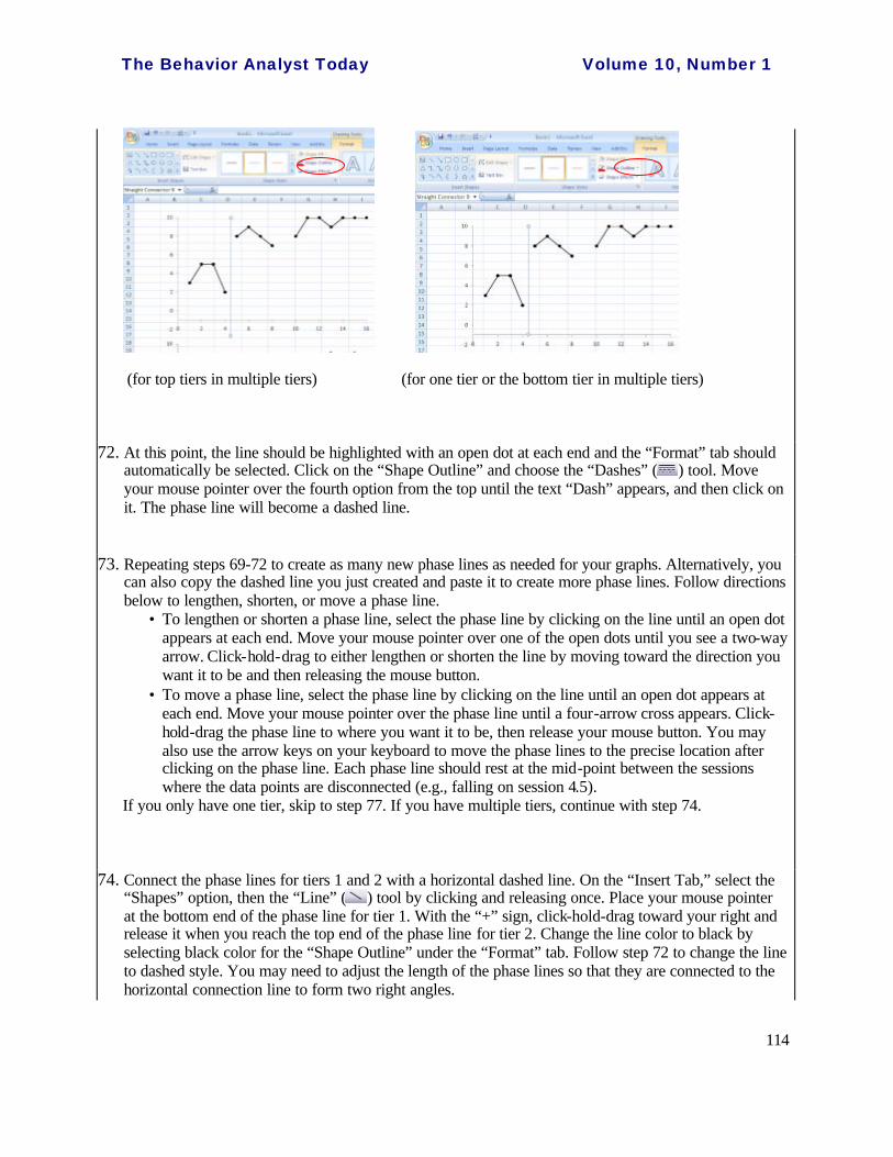
69. Scroll the page to show the first tier (or the tier for which you are drawing the phase lines). Be sure that you click outside the graphs before completing this step. On the “Insert Tab,” select the “Shapes” option, then the “Line” ( ) tool by clicking and releasing once.
70. Move your mouse pointer to the maximum y-axis value between the first two phases. The mouse pointer should look like a plus sign: “+.”
71. Click-hold-drag downward to draw a phase line, stopping when you just pass through the x-axis by releasing your mouse button. If you only have one tier or if you are creating a phase line for the bottom tier, stop dragging and release your mouse button when you reach the x-axis. While drawing, hold the “Shift” key on the keyboard simultaneously. This will allow you to draw a “straight” line easily. NOTE: If the line is NOT black, you will need to change it to black. You can do this by selecting black color for the “Shape Outline” under the “Format” tab.
The Behavior Analyst Today Volume 10, Number 1
114
(for top tiers in multiple tiers) (for one tier or the bottom tier in multiple tiers)
72. At this point, the line should be highlighted with an open dot at each end and the “Format” tab should automatically be selected. Click on the “Shape Outline” and choose the “Dashes” ( ) tool. Move your mouse pointer over the fourth option from the top until the text “Dash” appears, and then click on it. The phase line will become a dashed line.
73. Repeating steps 69-72 to create as many new phase lines as needed for your graphs. Alternatively, you can also copy the dashed line you just created and paste it to create more phase lines. Follow directions below to lengthen, shorten, or move a phase line.
• To lengthen or shorten a phase line, select the phase line by clicking on the line until an open dot appears at each end. Move your mouse pointer over one of the open dots until you see a two-way arrow. Click-hold-drag to either lengthen or shorten the line by moving toward the direction you want it to be and then releasing the mouse button.
• To move a phase line, select the phase line by clicking on the line until an open dot appears at each end. Move your mouse pointer over the phase line until a four-arrow cross appears. Click-hold-drag the phase line to where you want it to be, then release your mouse button. You may also use the arrow keys on your keyboard to move the phase lines to the precise location after clicking on the phase line. Each phase line should rest at the mid-point between the sessions where the data points are disconnected (e.g., falling on session 4.5).
If you only have one tier, skip to step 77. If you have multiple tiers, continue with step 74.
74. Connect the phase lines for tiers 1 and 2 with a horizontal dashed line. On the “Insert Tab,” select the “Shapes” option, then the “Line” ( ) tool by clicking and releasing once. Place your mouse pointer at the bottom end of the phase line for tier 1. With the “+” sign, click-hold-drag toward your right and release it when you reach the top end of the phase line for tier 2. Change the line color to black by selecting black color for the “Shape Outline” under the “Format” tab. Follow step 72 to change the line to dashed style. You may need to adjust the length of the phase lines so that they are connected to the horizontal connection line to form two right angles.
The Behavior Analyst Today Volume 10, Number 1
115
75. Repeat step 74 until all the phase lines for other tiers (e.g., tiers 2 and 3, tiers 3 and 4, etc.) are connected with a horizontal dashed line.
76. Click anywhere outside the graph and save ( ) your document.
G. Create label(s) and title(s)
[Create condition/phase label(s)]
77. Scroll the page to show the first tier. On the “Insert Tab,” select the “Text Box” tool by clicking and releasing once.
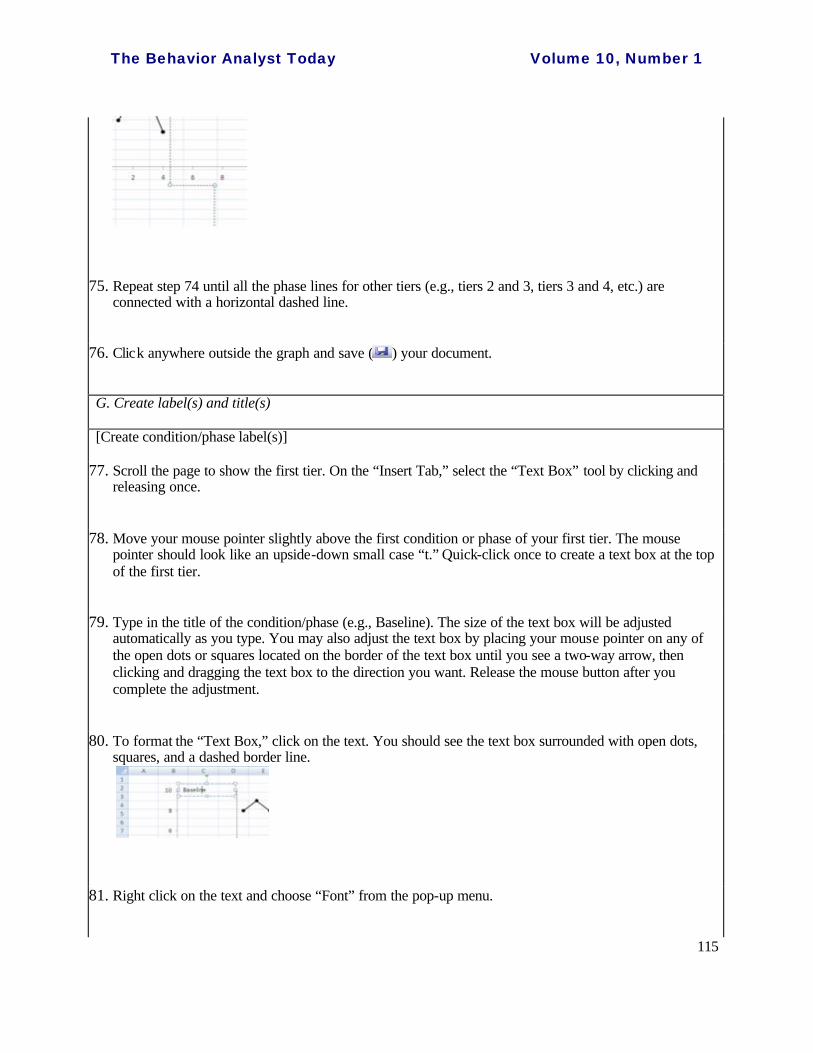
78. Move your mouse pointer slightly above the first condition or phase of your first tier. The mouse pointer should look like an upside-down small case “t.” Quick-click once to create a text box at the top of the first tier.
79. Type in the title of the condition/phase (e.g., Baseline). The size of the text box will be adjusted automatically as you type. You may also adjust the text box by placing your mouse pointer on any of the open dots or squares located on the border of the text box until you see a two-way arrow, then clicking and dragging the text box to the direction you want. Release the mouse button after you complete the adjustment.
80. To format the “Text Box,” click on the text. You should see the text box surrounded with open dots, squares, and a dashed border line.
81. Right click on the text and choose “Font” from the pop-up menu.

The Behavior Analyst Today Volume 10, Number 1
116
82. Under the “Font” tab, adjust your font, font style, and size as appropriate. By default, texts will be in regular Calibri (+Body) font in size 11. This is acceptable in most professional journals and therefore no change needs to be made. It is suggested that you keep the font, font style, and size of the text consistent within all parts of the graphs.) Click “OK.”
83. Right click on the text again and this time click on the top “center” button to center the text, then click out of the text box.
84. Right click on the text again, and choose the “Format Shape” option. Make sure “No fill” and “No line” options are selected for “Fill,” and “Line color,” respectively.
85. Click on “Close” at the bottom right.
86. Repeat steps 77-85 until all the phases are labeled above the first tier. [Note. You only need one condition/phase label above the first tier if all the tiers for the multiple baseline graphs share the same condition/phase.]
87. To move each text box to the proper place, click on the text, then the borderline, of a text box until the four-arrow cross appears. Click-hold-drag the text box and release the mouse button after you complete your adjustment. The text box should appear at the center of the condition/phase and fall slightly above the maximum y-axis value of that condition/phase.

The Behavior Analyst Today Volume 10, Number 1
117
88. Click anywhere outside the graph and save ( ) your document.
[Create x-axis and y-axis labels]
89. Click on “Inset” tab. Use the “Text Box” tool to add an x-axis label right below the last tier by following steps 77-85. The label should be in capitals. Extend the text box the length of the x-axis. This allows the label to be centered below the x-axis. If multiple tiers are developed, only one x-axis label should be created, to be located beneath the last tier.
90. Use the “Text Box” tool to add a y-axis label at the left-hand side of your y-axes by following steps 77-85. NOTE: The y-axis label should have a vertical alignment. To change the textbox layout, right click on the text, then select “Format Shape.” Select “Text Box” from the menu at the left hand side. For the “Text direction,” select “Rotate all text 270?”. Then click on “Close” at the bottom right. The label should be in capitals. If the labels for all the y-axes are the same, create only one text box and align it at the vertical center across the y-axes.
91. Click anywhere outside the graph and save ( ) your document.

The Behavior Analyst Today Volume 10, Number 1
118
[Create tier labels] (This is for multiple tiers only. Skip this part if you have a one-tier graph.)
92. Use the “Text Box” tool to add the label for each tier (e.g., Mike, on-task, math) by following steps 77-85, except that you want to put a black color border around your text box. To do this, right click on the text and select “Format Shape.” Click on the “Line Color” and select “Solid Line.” Make sure you select the black color.
Once you created a tier label, you may copy-and-paste the label you just created, revise the text labels (e.g., change from “Student 1” to “Student 2”) and then drag the copied labels to the appropriate location. This will ensure that the size of each tier label remain the same. (Note: To change the size of a text box, click on the text box until you see open dots and squares surround on the border of the text box. Move your mouse pointer over any one of the open dots or squares until you see a two-way arrow. Click-hold-drag in any direction you want to resize the text box. Release it after you finish resizing.)
Additionally, the tier label should be placed at bottom right-hand corner of the graph or nearby space where data points will not be masked. For consistency, you may want to find the same location within each tier where the space is open for the label. To move a text box, click on the border of the text box until open dots and squares appear on its border. Move your mouse pointer over the border until a four-arrow cross appears. Click-hold-drag to the desired location, then release your mouse button. You may also use the arrows on the keyboard to move the text box after you see the open dots and squares surround at the border of the text box.
93. Click anywhere outside the graph and save ( ) your document.
[Create double data path labels] (This is for double data paths only. Skip steps 94-95 if you have single data path graphs.)
94. On the “Insert Tab,” select “Shapes” and then the “Arrow” ( ) tool by clicking and releasing it once.

The Behavior Analyst Today Volume 10, Number 1
119
Then move your mouse pointer to the location where you are to draw an arrow (e.g., close to the selected data path). The mouse pointer should look like a plus sign: “+.” Click-hold-drag toward the data path to create an arrow for the data path label, then release your mouse button. The arrow should be pointing to the data path. To reverse the direction of the arrow (if needed), click on the arrow for the two open dots to appear in both ends of the arrow. Place the mouse pointer on the tip of the arrow until the two-way arrow appears. Then click-hold-drag the tip of the arrow in the direction you want it to point. NOTE: If the arrow is not black, select the black color under “Shape Outline” while the arrow has two dots at the end. Repeat until all the arrows are created. Click anywhere outside the graph before moving onto step 95.
95. Use the “Text Box” tool to create a label for each data path by following steps 77-85. Click anywhere outside the graph and save ( ) your document.
H. Make the x-axis value invisible for all but the last tier (If you only have one tier, skip to step 102.)
96. Move your mouse pointer over the x-axis of the first tier and left click on the x-axis.
97. Right click to select “Font.”
98. Under the “Font” tab, select white color for the “Font color.”
99. Click “OK.”
100. Repeat steps 96-99 for all other tiers except the last tier.
101. Click anywhere outside the graph and save ( ) your document.
I. Hide the “0” session and the negative y-axis value
102. Scroll the page to show the first tier. On the “Insert Tab,” select “Shapes” and then “Rectangle” ( ) tool by clicking and releasing once.
103. Move your mouse pointer to the negative y value of the top tier. The mouse pointer should look like a plus sign: “+.”
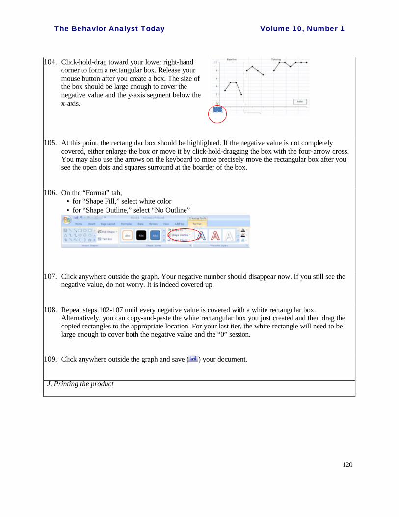
The Behavior Analyst Today Volume 10, Number 1
120
104. Click-hold-drag toward your lower right-hand corner to form a rectangular box. Release your mouse button after you create a box. The size of the box should be large enough to cover the negative value and the y-axis segment below the x-axis.
105. At this point, the rectangular box should be highlighted. If the negative value is not completely covered, either enlarge the box or move it by click-hold-dragging the box with the four-arrow cross. You may also use the arrows on the keyboard to more precisely move the rectangular box after you see the open dots and squares surround at the boarder of the box.
106. On the “Format” tab, • for “Shape Fill,” select white color • for “Shape Outline,” select “No Outline”
107. Click anywhere outside the graph. Your negative number should disappear now. If you still see the negative value, do not worry. It is indeed covered up.
108. Repeat steps 102-107 until every negative value is covered with a white rectangular box. Alternatively, you can copy-and-paste the white rectangular box you just created and then drag the copied rectangles to the appropriate location. For your last tier, the white rectangle will need to be large enough to cover both the negative value and the “0” session.
109. Click anywhere outside the graph and save ( ) your document.
J. Printing the product

The Behavior Analyst Today Volume 10, Number 1
121
110. Before printing the product, on the top menu, click on the “Office” button.” Move your mouse pointer over the “Print,” and then click on “Print Preview.” You can preview your graphs to see if they can fit into one A4 size paper. If they do, select “Print,” and print your product. If they do not fit into one single page, select “Page Setup.” Under the “Page” tab, then under “Scaling,” select “Fit to 1 page(s) wide by 1 tall.” Then select “OK,” and then “Print.”
ADVERTISEMENT
ADVERTISING IN BAO JOURNALS
The prices for advertising in one issue are as follows:
1/4 Page: $50.00 1/2 Page: $100.00 vertical or horizontal Full Page: $200.00
In addition to publishing your paid ad in the journals of your choice, we will place your ad in the advertising section of our website for free!
If you wish to run the same ad in multiple issues for the year, you are eligible for the following discount:
1/4 Pg.: $40 - per issue 1/2 Pg.: $75 - per issue -vertical or horizontal
Full Page: $150.00-per issue
An additional one time layout/composition fee of $25.00 is applicable
For more information, or place an ad, contact Halina Dziewolska by phone at (215) 462-6737 or e-mail at: [email protected]