implementation and usability testing of a rich internet ... · implementation and usability testing...
TRANSCRIPT

Implementation and Usability Testing of a Rich Internet Application
P A T R I C K T H O M S S O N
Master of Science Thesis Stockholm, Sweden 2009

Implementation and Usability Testing of a Rich Internet Application
P A T R I C K T H O M S S O N
Master’s Thesis in Media Technology (30 ECTS credits) at the School of Media Technology Royal Institute of Technology year 2009 Supervisor at CSC was Björn Hedin Examiner was Nils Enlund TRITA-CSC-E 2009:136 ISRN-KTH/CSC/E--09/136--SE ISSN-1653-5715 Royal Institute of Technology School of Computer Science and Communication KTH CSC SE-100 44 Stockholm, Sweden URL: www.csc.kth.se
Implementation and Usability Testing of a Rich Internet Application
Abstract This degree project was done at a development office at Ericsson AB in Göteborg in the autumn of 2008 and spring of 2009. At this office an application concept had been developed, this application was a graphical editor for creating and maintaining mobile portals, or mobile websites. This application had the form of a design sketch when the degree project started. The objectives of the degree project was to examine this design sketch, suggest enhancements to the usability of the graphical user interface, and choose appropriate technology for implementing the application and actually implementing it. After implementing an interactive prototype of the application, the usability should be evaluated with first-time users and possible success factors found should be presented. Usability problems found when evaluating with the first-time users should be presented and suggestions for enhancing the initial usability experience should be made.
Google Web Toolkit and Java Enterprise Edition technology was chosen for the implementation of the interactive prototype. The result was a stable web application with which a user easily could create a mobile portal page based on HTML code by adding formatted text and uploaded images etc. This page could by the click of a mouse button be uploaded to the Internet and then previewed with a mobile phone.
Usability testing was chosen as the methodology for evaluating the initial usability experience of the users. Four participants were tested and data of their attempts were collected and compared among them. It was obvious that two of the users had a much easier time using the prototype; these had a more positive attitude towards using computers in general and had also previous experience creating websites. Suggestions were made for improving the initial usability experience of the prototype; this included both specific prototype details as well as more general usability guidelines for implementing this kind of web applications.

Implementering och användartestning av en webbapplikation
Sammanfattning Detta examensarbete gjordes på ett utvecklingskontor vid Ericsson AB i Göteborg under hösten 2008 och våren 2009. Vid detta kontor hade ett applikationskoncept utvecklats, denna applikation var en grafisk redigerare för att skapa och underhålla mobilportaler, eller mobil-webbsidor. Denna applikation var i form av en designsketch då examensarbetet påbörjades. Målen med examensarbetet var att undersöka denna designsketch, föreslå förbättringar av användbarheten hos dess grafiska användargränssnitt, och att välja passande teknik för att sedermera även implementera denna applikation. Efter att ha implementerat en interaktiv prototyp av applikationen skulle dess användbarhet utvärderas med nybörjareanvändare och eventuella framgångsfaktorer hos dessa användare skulle presenteras. Problem med användbarheten funna under utvärderingen med nybörjarna skulle presenteras och förslag för att förbättra den initiala användarupplevelsen skulle föreslås.
Google Web Toolkit- och Java Enterprise Edition-teknik valdes för implementeringen av den interaktiva prototypen. Resultatet av detta blev en stabil webbapplikation med vilken användare lätt kunde skapa en mobilportalsida baserad på HTML-kod genom att lägga till formaterad text och uppladdade bilder etc. Denna sida kunde med ett enda musklick läggas upp på Internet och sedan förhandsgranskas i en mobiltelefon.
Användartester valdes som metod för utvärderingen av den initiala användbarhetsupplevelsen hos användarna. Fyra deltagare testades och data från deras försök samlades in och jämfördes dem emellan. Det var tydligt att två av användarna hade det betydligt lättare att hantera prototypen. Dessa hade båda en mer positiv attityd till användande av datorer generellt, men även tidigare erfarenheter av att skapa webbsidor. Förslag för att förbättra den initiala användarupplevelsen av prototypen gjordes. Detta inkluderade både specifika detaljer i prototypen men även mer generella riktlinjer för användbarhet i denna typ av webbapplikationer.

Acknowledgements I would like to thank everyone who helped me in the process of doing this degree project. Special thanks go to Natalia Matulewicz – my supervisor at Ericsson AB, as well as to Susanne Isaksson and Johanna Hasslöf and the rest of the Drutts.
Big thanks also to all participants in the usability tests and to Björn Hedin for reading through the early versions of the report and giving invaluable help.
Cheers!


Table of Content 1 Introduction ........................................................................................................................................... 1
1.1 Mission........................................................................................................................................... 1
1.2 Background .................................................................................................................................... 1
1.3 Project Objectives .......................................................................................................................... 3
1.4 To whom may this Report be Interesting....................................................................................... 3
1.5 Job Initiator .................................................................................................................................... 4
1.6 Thesis Report Disposition .............................................................................................................. 4
2 The prototype and the Test.................................................................................................................... 6
2.1 Prototype Goals.............................................................................................................................. 6
2.2 QuickBuilder Team and Concept................................................................................................... 7
2.3 Initial Version, the Design Sketch ................................................................................................. 8
2.4 Final Version, the Implemented Prototype .................................................................................... 8
2.5 Evaluating the Usability............................................................................................................... 11
3 Theory ................................................................................................................................................. 12
3.1 Usability ....................................................................................................................................... 12
3.2 Interaction Design ........................................................................................................................ 13
3.3 Usability Engineering................................................................................................................... 14
3.4 Heuristic Evaluation..................................................................................................................... 15
3.5 Usability Testing .......................................................................................................................... 15
4 Technology.......................................................................................................................................... 23
4.1 HTML and HTTP......................................................................................................................... 23
4.2 JavaScript and DHTML ............................................................................................................... 23
4.3 AJAX............................................................................................................................................ 24
4.4 Java, and Server Scripting............................................................................................................ 24
4.5 Rich Internet Applications ........................................................................................................... 25
4.6 Google Web Toolkit..................................................................................................................... 25
4.7 WYSIWYG Editors ..................................................................................................................... 26
5 Implementation ................................................................................................................................... 27
5.1 Requirements Analysis................................................................................................................. 27
5.2 Interface Components .................................................................................................................. 29
5.3 Drag-and-Drop ............................................................................................................................. 30
5.4 Communicating with the Server................................................................................................... 30
5.5 Open Source ................................................................................................................................. 30
5.6 Working with Usability................................................................................................................ 31
5.7 The Process .................................................................................................................................. 31
5.8 Agile and Scrum........................................................................................................................... 32
6 Method and Evaluation ....................................................................................................................... 33
6.1 Continuous Evaluation ................................................................................................................. 33
6.2 Usability Testing .......................................................................................................................... 33
6.3 Reliability and Validity ................................................................................................................ 39
7 Result................................................................................................................................................... 41
7.1 The Prototype ............................................................................................................................... 41
7.2 Usability Test Results .................................................................................................................. 41
7.3 Usability Findings ........................................................................................................................ 50
8 Analysis............................................................................................................................................... 57
8.1 Test-Data Analysis ....................................................................................................................... 57
8.2 Reaching the Interface Experience Goals .................................................................................... 59
9 Discussion ........................................................................................................................................... 62
9.1 Future Research............................................................................................................................ 64
References .............................................................................................................................................. 65
Literature References ......................................................................................................................... 65
Web References ................................................................................................................................. 65
Appendix X1: Design Sketch................................................................................................................. 67
Appendix X2: Final Layout ................................................................................................................... 68
INTRODUCTION
1
1 Introduction This first chapter will give an introduction to the thesis subject. After reading this chapter you will know the objectives of the project. This will help in understanding which parts will be covered in the report. In the end of the chapter the disposition of the master thesis report will be illustrated.
1.1 Mission The mission was to create an interactive prototype of a web application for creating and editing mobile portals in an easy way, and then to evaluate its usability. A mobile portal is a website designed to be viewed on a mobile/cell-phone; this is from here on only referred to as mobile portals. This tool would be used as a complement, or replacement, to several applications in the Ericsson AB’s existing product suite. This new tool should be easy to use, especially for non-technical personnel, such as journalists and administrators. Today’s tools have a lot of functionality and are very complex, and quite difficult to use and learn. The company believes that by introducing this complementary tool, QuickBuilder, the users will be able to work more efficiently in designing and publishing mobile web content. This application could also be sold to companies which do not need the complexity of the existing applications.
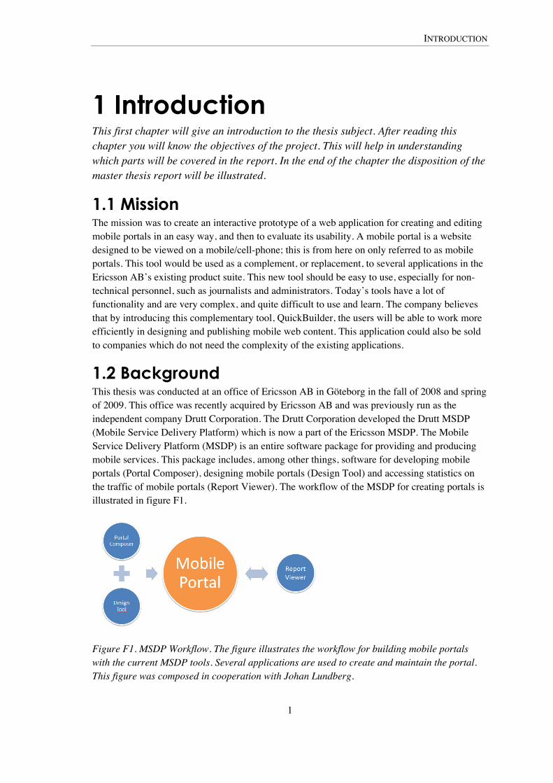
1.2 Background This thesis was conducted at an office of Ericsson AB in Göteborg in the fall of 2008 and spring of 2009. This office was recently acquired by Ericsson AB and was previously run as the independent company Drutt Corporation. The Drutt Corporation developed the Drutt MSDP (Mobile Service Delivery Platform) which is now a part of the Ericsson MSDP. The Mobile Service Delivery Platform (MSDP) is an entire software package for providing and producing mobile services. This package includes, among other things, software for developing mobile portals (Portal Composer), designing mobile portals (Design Tool) and accessing statistics on the traffic of mobile portals (Report Viewer). The workflow of the MSDP for creating portals is illustrated in figure F1.
Figure F1. MSDP Workflow. The figure illustrates the workflow for building mobile portals with the current MSDP tools. Several applications are used to create and maintain the portal. This figure was composed in cooperation with Johan Lundberg.
INTRODUCTION
2
The objective of this degree project was to build a prototype of an application that alone would do the work of the first three of the above mentioned MSDP applications, but in a simplified manner. This new application is called QuickBuilder and there existed a design sketch of the graphical user interface upon thesis start. This sketch had been designed at the current Ericsson AB office. QuickBuilder was meant to ease the creation and maintenance of mobile portals. This is something that was being asked for by many of the current users of the MSDP.
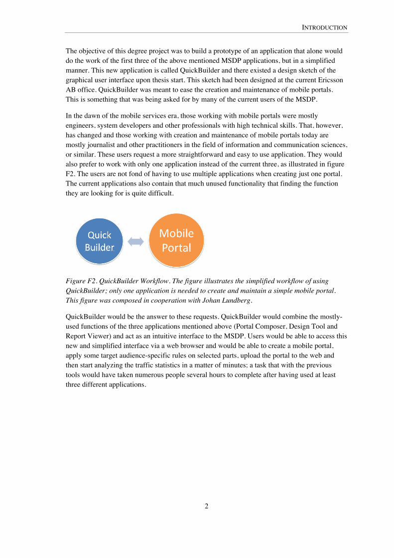
In the dawn of the mobile services era, those working with mobile portals were mostly engineers, system developers and other professionals with high technical skills. That, however, has changed and those working with creation and maintenance of mobile portals today are mostly journalist and other practitioners in the field of information and communication sciences, or similar. These users request a more straightforward and easy to use application. They would also prefer to work with only one application instead of the current three, as illustrated in figure F2. The users are not fond of having to use multiple applications when creating just one portal. The current applications also contain that much unused functionality that finding the function they are looking for is quite difficult.
Figure F2. QuickBuilder Workflow. The figure illustrates the simplified workflow of using QuickBuilder; only one application is needed to create and maintain a simple mobile portal. This figure was composed in cooperation with Johan Lundberg.
QuickBuilder would be the answer to these requests. QuickBuilder would combine the mostly-used functions of the three applications mentioned above (Portal Composer, Design Tool and Report Viewer) and act as an intuitive interface to the MSDP. Users would be able to access this new and simplified interface via a web browser and would be able to create a mobile portal, apply some target audience-specific rules on selected parts, upload the portal to the web and then start analyzing the traffic statistics in a matter of minutes; a task that with the previous tools would have taken numerous people several hours to complete after having used at least three different applications.
INTRODUCTION
3
1.3 Project Objectives The objective of the degree project was to develop QuickBuilder with strong focus on usability issues; the main focus therefore lies on implementation and evaluation. This included
• analyzing the existing QuickBuilder prototype (a low-fidelity design sketch), and suggest enhancements to the interface and its usability
• choosing appropriate technology for the implementation, preferentially Java- and/or JavaScript-based technologies
• actually implementing the prototype as a web based What You See Is What You Get (WYSIWYG, see Technology chapter) editor, incorporating the suggested usability enhancements
• evaluating the usability of the implemented prototype; how usable the prototype is for first-time users and to discover potential problem factors or areas where the initial usability experience can be improved, suggestions for such improvements should be made
• finding potential success factors for using QuickBuilder; finding out if QuickBuilder is as usable for all first-time users
The degree project will help Ericsson AB in deciding if QuickBuilder has potential as a real product and if so, the feedback gained from the evaluation will be incorporated in future versions of the QuickBuilder application to improve the usability, especially the initial usability experience of first-time users.
The implementation had a strict dead-line. QuickBuilder was to participate in an internal Ericsson AB prototype competition in the beginning of December 2008. The degree project started in the beginning of September 2008 which meant that the first three points in the list above had to be completed in three months time.
Parts of this degree project were conducted in cooperation with fellow Media Technology student Johan Lundberg. All the work that was made on site in Göteborg was a conjoined effort. The work that took place in Göteborg was the initial analysis of the design sketches, the choosing of the technology and the implementation. All the work on the evaluation found in this report is done by me, if not stated otherwise. Johan Lundberg also did usability testing, but on a paper-based prototype. He used the same test assignments as was used in my degree project, and the tests were performed in similar ways. The tests and its assignments were all planned by me, although later altered by both of us. The questionnaire was however a conjoined effort.
1.4 To whom may this Report be Interesting This report is foremost interesting to read for anyone in the process of designing a user interface for Rich Internet Applications (see Technology chapter) in general and web based WYSIWYG editors in particular. They will get input on different approaches to designing the interface and how to implement the interaction as well as usability aspects of WYSIWYG design.
INTRODUCTION
4
Secondly, it should be attractive for those interested in usability evaluation, especially those interested in usability testing.
1.5 Job Initiator Ericsson AB is major player in the Telecom industry. They do business in all parts of the world. Lately they have gone into the business of multimedia, which includes mobile services and IPTV among other things.
The office where this report was written is a development office which focuses strictly on mobile telephone (cell phone) services. Their main focus lies in developing the Ericsson Mobile Services Delivery Platform (MSDP). The MSDP includes several applications which enable telecom operators to serve their customers. The operators could be such telecom companies as Hi3G Access AB, Tele2 AB or Telenor A/S. The services are for example systems enabling ringtones or music for download, as well as tools for creation and administration of mobile portals.
1.6 Thesis Report Disposition This thesis report has nine chapters which all covers different areas of the thesis work. Each chapter begins with a short description of which areas are discussed in it.
1. Introduction: This first chapter gives an introduction to the assignment, the thesis problem and the company where this thesis was done.
2. The Prototype and the Test: This chapter introduces the initial design sketch and the implemented prototype. The usability tests are also introduced here. All this is done early in the report to support the reader’s comprehension of the text in the succeeding chapters.
3. Theory: The third chapter covers relevant theoretical matters such as usability, interaction design, usability engineering and usability testing.
4. Technology: The fourth chapter gives introduction to some of those technologies that was used during the development of the prototype. Such as AJAX (Asynchronous JavaScript and XML) and Google Web Toolkit. This chapter also explains some technical terms, such as Rich Internet Applications and WYSIWYG editors.
5. Implementation: The fifth chapter discusses the implementation of the prototype. It covers areas such as requirements analysis and how different parts of the prototype were developed.
6. Method and Evaluation: The sixth chapter explains the methods used for evaluating the prototype. It consists mostly of a description of the usability test and its assignments, and how these were designed.
7. Result: The seventh chapter presents the results of this master thesis.
8. Analysis: In the eighth chapter the results are analyzed.

INTRODUCTION
5
9. Discussion: The ninth and last chapter consists of a discussion on the results from this master thesis and it discusses if the goals were reached and what has been learned during the project. A discussion on method improvements and future research is also held.

THE PROTOTYPE AND THE TEST
6
2 The Prototype and the Test This chapter gives introduction to the QuickBuilder prototype which was developed within this degree project. The chapter shows how QuickBuilder evolved from the preexisting design sketches to the final implemented version. The chapter ends with an introduction of the how the prototype later was evaluated in the usability testing sessions.
Since QuickBuilder is an active project of Ericsson AB it is not possible to show all parts of the graphical user interface in this public master thesis report. Therefore only two of the tools are being displayed, the text tool and the graphics tool. The interface images displayed in this report are owned by Ericsson AB and permission to reproduce these in the report has been given to me. The text and graphics tools are however the most fundamental ones for building mobile portals and are also the ones which was implemented in greatest detail within this degree project. Because of these reasons, even the usability findings presented later in the Result chapter mostly covers these two tools as they can be illustrated in detail with imagery.
2.1 Prototype Goals The goal of this thesis is to implement an interactive prototype of an editor for creating mobile portals - QuickBuilder. The editor should be web based, and it should resemble the preexisting design sketches (see figure F3). After implementing the application its usability should be tested and evaluated. To be considered successful the application should be very easy to use and learn by first-time users in the field of information and communication sciences.
With this web application it should be possible to create mobile portals. The portals should be HTML-based, but no certain document type definition was specified. The requirement was that it should be possible to view at least three different pages made with QuickBuilder on a certain mobile phone when completed.
QuickBuilder should have the following features:
• text input and formatting
• image inserting
• publishing the portal
• menu and multiple pages support
• inserting third party content, such as Services, audio and video
However due to lack of time when implementing QuickBuilder not all of these features could be included in the prototype. The first three points on the list was implemented. It was actually possible to add a menu to a portal page but there were no support for multiple pages, so the menu did not link to any other pages. It was possible to insert one dummy-service. This service was based on HTML. No work was done on adding audio or video to the portals.
THE PROTOTYPE AND THE TEST
7
The prototype also had some interface experience goals. The prototype should be
• easy to learn
• efficient to use
• easy to install and open
• focused on drag-and-drop, and
• have only the most-used functions
Interface experience goals is a term coined by me, these goals are further explained in the Implementation chapter and then analyzed in the Analysis chapter.
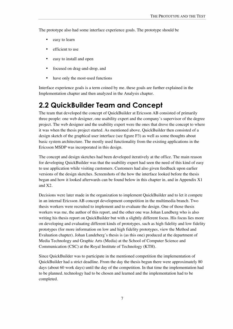
2.2 QuickBuilder Team and Concept The team that developed the concept of QuickBuilder at Ericsson AB consisted of primarily three people: one web designer, one usability expert and the company’s supervisor of the degree project. The web designer and the usability expert were the ones that drove the concept to where it was when the thesis project started. As mentioned above, QuickBuilder then consisted of a design sketch of the graphical user interface (see figure F3) as well as some thoughts about basic system architecture. The mostly used functionality from the existing applications in the Ericsson MSDP was incorporated in this design.
The concept and design sketches had been developed iteratively at the office. The main reason for developing QuickBuilder was that the usability expert had seen the need of this kind of easy to use application while visiting customers. Customers had also given feedback upon earlier versions of the design sketches. Screenshots of the how the interface looked before the thesis began and how it looked afterwards can be found below in this chapter in, and in Appendix X1 and X2.
Decisions were later made in the organization to implement QuickBuilder and to let it compete in an internal Ericsson AB concept development competition in the multimedia branch. Two thesis workers were recruited to implement and to evaluate the design. One of those thesis workers was me, the author of this report, and the other one was Johan Lundberg who is also writing his thesis report on QuickBuilder but with a slightly different focus. His focus lies more on developing and evaluating different kinds of prototypes, such as high fidelity and low fidelity prototypes (for more information on low and high fidelity prototypes, view the Method and Evaluation chapter). Johan Lundeberg’s thesis is (as this one) produced at the department of Media Technology and Graphic Arts (Media) at the School of Computer Science and Communication (CSC) at the Royal Institute of Technology (KTH).
Since QuickBuilder was to participate in the mentioned competition the implementation of QuickBuilder had a strict deadline. From the day the thesis begun there were approximately 80 days (about 60 work days) until the day of the competition. In that time the implementation had to be planned, technology had to be chosen and learned and the implementation had to be completed.

THE PROTOTYPE AND THE TEST
8
2.3 Initial Version, the Design Sketch The work on QuickBuilder started before the thesis did. When the thesis started QuickBuilder consisted of a numerous images such as Figure F3 below. The interface consists of five parts; pages, templates, workspace, tools, and the tool options.
In the next section the implemented version of the prototype is shown, followed by a discussion on the major differences between the initial and the final versions of QuickBuilder.
Figure F3. The Design Sketch. The image shows the preexisting design sketch. This is how QuickBuilder looked before the thesis started. Note that the image is a montage, it is not really a web application it is only an image of how QuickBuilder would look in a web browser.
2.4 Final Version, the Implemented Prototype In this section the final version of the QuickBuilder prototype is explained. Reading this chapter will greatly help the reader in understanding further sections on implementation and evaluation, as well as results, analysis and discussion. Since the QuickBuilder application is owned by Ericsson AB not all parts of the interface can be shown here in this report. This section will however give the reader some insight on the prototype structure and how it is used to create mobile portals.
THE PROTOTYPE AND THE TEST
9
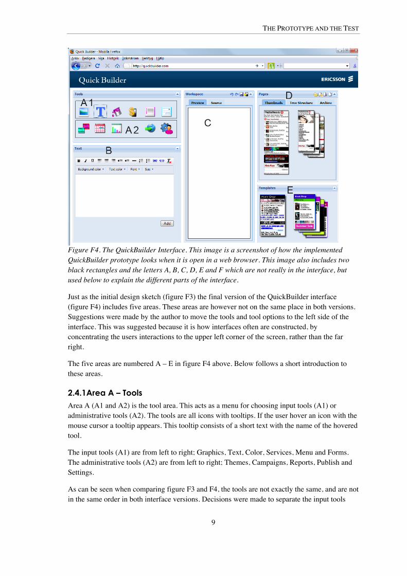
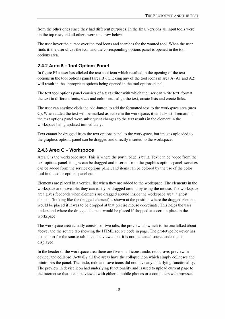
Figure F4. The QuickBuilder Interface. This image is a screenshot of how the implemented QuickBuilder prototype looks when it is open in a web browser. This image also includes two black rectangles and the letters A, B, C, D, E and F which are not really in the interface, but used below to explain the different parts of the interface.
Just as the initial design sketch (figure F3) the final version of the QuickBuilder interface (figure F4) includes five areas. These areas are however not on the same place in both versions. Suggestions were made by the author to move the tools and tool options to the left side of the interface. This was suggested because it is how interfaces often are constructed, by concentrating the users interactions to the upper left corner of the screen, rather than the far right.
The five areas are numbered A – E in figure F4 above. Below follows a short introduction to these areas.
2.4.1Area A – Tools Area A (A1 and A2) is the tool area. This acts as a menu for choosing input tools (A1) or administrative tools (A2). The tools are all icons with tooltips. If the user hover an icon with the mouse cursor a tooltip appears. This tooltip consists of a short text with the name of the hovered tool.
The input tools (A1) are from left to right; Graphics, Text, Color, Services, Menu and Forms. The administrative tools (A2) are from left to right; Themes, Campaigns, Reports, Publish and Settings.
As can be seen when comparing figure F3 and F4, the tools are not exactly the same, and are not in the same order in both interface versions. Decisions were made to separate the input tools
THE PROTOTYPE AND THE TEST
10
from the other ones since they had different purposes. In the final versions all input tools were on the top row, and all others were on a row below.
The user hover the cursor over the tool icons and searches for the wanted tool. When the user finds it, the user clicks the icon and the corresponding options panel is opened in the tool options area.
2.4.2 Area B – Tool Options Panel In figure F4 a user has clicked the text tool icon which resulted in the opening of the text options in the tool options panel (area B). Clicking any of the tool icons in area A (A1 and A2) will result in the appropriate options being opened in the tool options panel.
The text tool options panel consists of a text editor with which the user can write text, format the text in different fonts, sizes and colors etc., align the text, create lists and create links.
The user can anytime click the add-button to add the formatted text to the workspace area (area C). When added the text will be marked as active in the workspace, it will also still remain in the text options panel were subsequent changes to the text results in the element in the workspace being updated immediately.
Text cannot be dragged from the text options panel to the workspace, but images uploaded to the graphics options panel can be dragged and directly inserted to the workspace.
2.4.3 Area C – Workspace Area C is the workspace area. This is where the portal page is built. Text can be added from the text options panel, images can be dragged and inserted from the graphics options panel, services can be added from the service options panel, and items can be colored by the use of the color tool in the color options panel etc.
Elements are placed in a vertical list when they are added to the workspace. The elements in the workspace are moveable; they can easily be dragged around by using the mouse. The workspace area gives feedback when elements are dragged around inside the workspace area; a ghost element (looking like the dragged element) is shown at the position where the dragged element would be placed if it was to be dropped at that precise mouse coordinate. This helps the user understand where the dragged element would be placed if dropped at a certain place in the workspace.
The workspace area actually consists of two tabs, the preview tab which is the one talked about above, and the source tab showing the HTML source code in page. The prototype however has no support for the source tab, it can be viewed but it is not the actual source code that is displayed.
In the header of the workspace area there are five small icons; undo, redo, save, preview in device, and collapse. Actually all five areas have the collapse icon which simply collapses and minimizes the panel. The undo, redo and save icons did not have any underlying functionality. The preview in device icon had underlying functionality and is used to upload current page to the internet so that it can be viewed with either a mobile phones or a computers web browser.
THE PROTOTYPE AND THE TEST
11
These small icons lacked tooltips in the prototype which caused problems discovered in the evaluation.
2.4.4 Area D – Pages Area D is the pages panel where the user gets an overview of all the pages and files included in the mobile portal. Shown in figure F4 is the thumbnails tab, which is one of three tabs in the pages panel. The thumbnails tab shows thumbnail pictures of the pages being worked on. There is also the Tree Structure tab and the Archive tab. The Tree Structure tab shows all active portal files on the file system as a tree structure. The Archive tab shows old and inactive pages which can become active and used again.
None of these tabs had any deeper functionality in the prototype. They could be viewed but did not work. Since there was no time to implement support for multiple pages in the prototype, the pages panel had a very low priority.
2.4.5 Area E – Templates The templates area holds page templates which can be used for easy development of portal pages. This did not work at all in the prototype; the image seen in figure F4 is static and cannot be interacted with. Templates had a very low priority in the implementation period.
2.5 Evaluating the Usability In order to evaluate the usability of the implemented prototype usability testing was performed on four possible future users. The test consisted of ten assignments which all of the users were given. The assignments were done individually with me, the author, present as test moderator. The test was planned to evaluate the user’s initial contact with QuickBuilder and to find problematic areas where the usability could be enhanced.
The assignments were scenario based. In the first assignment the user was just employed by the fictional company Popstar Records. In the beginning the user got to do administrative tasks, and later, after getting more and more popular with the boss of the company, the user got to do more creative tasks. The last assignment consisted of the user being responsible of creating an entire mobile portal page, following a rough sketch.
The theory of usability testing is further discussed in the Theory chapter, and the test and its assignments are further explained in the chapter on Method and Evaluation.

THEORY
12
3 Theory This chapter covers the theories that will be used in this master thesis report. I will define what I mean with certain concepts and how it is viewed in the literature. I will also give examples of how the theory was applied in the work of the degree project.
3.1 Usability A usable product is according to Rubin and Chisnell (2008) defined as follows:
“When a product or service is truly usable, the user can do what he or she wants to do the way he or she expects to be able to do it, without hindrance, hesitation, or questions”
(Rubin and Chisnell, 2008 p. 4)
Nielsen (1993) discusses the importance of realizing that usability is not a one-dimensional property of the user interface. Usability is rather multidimensional and his opinion is that it includes at least five major areas: learnability, efficiency, memorability, errors and satisfaction. Nielsen calls these usability attributes; however other authors call them usability goals.
3.1.1 Usability Goals and User Experience Goals Usability is often divided in terms of usability goals in order to make it easier to measure as well as to talk about it. These goals vary from source to source. Rubin and Chisnell (2008) have listed the following usability goals; usefulness, efficiency, effectiveness, learnability, satisfaction and accessibility. These differ somewhat from those of Preece et al. (2002) which are; effectiveness, efficiency, safety, utility, learnability and memorability. Even Nielsen (1993) has his own collection of usability goals; he on the other hand calls them usability attributes. A compilation of all the goals and attributes can be seen in table T1.
The goals of Rubin and Chisnell and those of Preece are quite similar but differ on particularly one point; Preece discusses the use of both usability goals as well as of user experience goals. Preece means that usability goals asses certain usability criteria, such as effectiveness and efficiency and that user experience goals on the other hand rather is concerned with the quality of the user experience, such as the satisfaction usability goal of Rubin and Chisnell. All of the usability goals of Preece’s can more easily be tested by quantitative measurement, like how long it takes to perform a certain task (efficiency), while the user experience goals could not that easily be measured in quantitative variables. The user experience goals would preferably be measured with qualitative methods since they are more personal. Other examples of the user experience goals of Preece include if the product is; fun, supportive of creativity, aesthetically pleasing, entertaining etc.
Some of the usability goals will be used in the evaluation of QuickBuilder. Particularly efficiency and learnability has been seen as important in the creation of QuickBuilder. These goals are often highly prioritized and fundamental for usability experience; hence they are also supported by all authors mentioned above. The assessment of these two usability goals, and the rest of the interface experience goals, is analyzed in the Analysis chapter.

THEORY
13
Table T1. Usability Goals and Attributes. The table shows the usability attributes (UA) supported by Nielsen (1993) and those usability goals (UG) supported by Preece et al. (2002) and Rubin and Chisnell (2008). Nielsen Preece et al. Rubin and Chisnell
Accessibility - - UG
Effectiveness - UG UG
Efficiency UA UG UG
Learnability UA UG UG
Memorability UA UG -
Safety - UG -
Satisfaction UA - UG
Usefulness - - UG
Utility - UG -
Errors UA - -
3.1.2 Design Principles Design principles are another set of terms of how to explain usability issues. Preece et al. (2002) writes:
“[Design principles] are generalizable abstractions intended to orient designers towards thinking about different aspects of their designs”
The most common design principles are visibility, feedback, constraints, mapping, consistency and affordances (Preece et al., 2002). These principles are written and used in a way that differs from that of the usability and user experience goals. While the usability and user experience goals are the aims of the design, the targets to achieve, the design principles on the other hand are the roads of which to reach these goals.
By for example implementing feedback in a user interface it will be easier for the user to understand what is happening in the system. The user will instantaneously know if the action she performed was valid or not, thus improving the efficiency and ease of use of the system. By making appropriate use of mappings and constraints it will be more likely that the user knows which buttons do what and to know when a certain task is allowed or not. By using mappings and constraints together with visibility it will make the interface easier to learn and to memorize. Because if all the available options are visible (and the unavailable options visibly constrained) and have logical mapping then the user will know what can be done, and also understand what will be done by a given control.
These design principles were used while making suggestions for enhancing QuickBuilder. They are also used in later chapters to discuss certain interface issues, for example in the analysis chapter and the Results subchapter on usability findings.
3.2 Interaction Design Interaction design is a methodology which eases the production of usable products. It does not only comply to the development of graphical user interfaces, but rather with the development of any interactive product. Preece et al. (2002) writes that interaction design is about designing interactive products to support people in their everyday and working lives.
THEORY
14
3.2.1 Characteristics The characteristics of interaction design according to Preece and her colleagues (2002) is that users should be involved through the development process and that specific usability and user experience goals should be identified and thoroughly documented in the beginning of the project. Overall the process of interaction design is heavily dependent on user input.
3.2.2 The Process The process of interaction design, according to Preece et al. (2002), is iterative. One should first identify the needs of the product and establish its requirements. This is preferably done by speaking with the users or by conducting an ethnographic study to get to know the users, how they work and what they are in need of in their everyday or working lives.
When the requirements and needs have been documented alternative designs which asses these necessities should be developed. After examining and discussing these designs, the best ideas should be incorporated in interactive prototypes that can be communicated to the users. These prototypes can be of varying fidelity. In the first iterations the prototype could preferably be low-fidelity paper prototypes or mockups. With low-fidelity prototypes the users’ criticism is less likely to be withheld, since the prototype looks hastier made – and to not have all too much work put into it (Preece et al., 2002).
The last step in the iterative process is to evaluate what has been done so far, this can be done in various ways described in more detail below, under the topics of Heuristic evaluation and Usability testing.
During the whole implementation period Preece’s thoughts on interaction design was always kept in mind and many of the elements were incorporated in the degree projects work. Users could however never be involved but other elements such as usability goals and design principles are used in this report. Also evaluation is a big part of both interaction design and this thesis.
3.3 Usability Engineering Usability engineering is similar to interaction design, as it is also a methodology for working with creating usable products. They both share many components such as iterative design, user involvement and usability evaluation among other things. Usability engineering is however more targeted at establishing quantifiable data on user interfaces and to make changes to later versions of the applications based on such data collected in elaborative usability testing (Preece et al., 2002).
Nielsen quotes Voltaire saying “Le mieux est l’ennemi du bien” (Voltaire, 1764; see Nielsen 1993 p.17) meaning “the best is the enemy of the good” (Nielsen, 1993 p.17) about usability engineering methodologies. Often good results can be achieved by applying simpler usability engineering methodologies; he therefore invented discount usability engineering. Discount usability engineering is easier to handle since it does not require as much time or resources as traditional and more elaborative usability engineering methodologies often do. Having the discount usability engineering approach makes finding usability errors easier and quicker, it might not catch as many errors as elaborative usability testing would, but instead more evaluation sessions can be done since it requires less time per set.
THEORY
15
Nielsen’s (1993) discount usability engineering method consists of four elements:
• User and task observation – Observing users while working with the task of which to improve with usability engineering methods.
• Scenarios – Very simple paper prototypes or mockups of the interface tested on users.
• Simplified Thinking Aloud – Asking users to think out loud when testing a system/prototype. The feedback should be noted on paper, never video/audio recorded in this simplified approach.
• Heuristic evaluation – Evaluation done by usability experts following certain usability rules/heuristics. More on this subject below.
Even though the discount engineering approach may be well suited for smaller projects such as degree projects this method was not chosen. Instead a more elaborative usability testing was performed. Data was collected during these tests which could be used to, in a usability engineering fashion, compare the usability of the prototype with data from tests of later versions of QuickBuilder. However adapting the discount usability engineering method can be a cheap way of finding, and then be able to eliminate, usability problems before heading into the more elaborative usability testing sessions.
3.4 Heuristic Evaluation To ensure that a product really is usable, its usability should be evaluated. There are many ways of doing this. Users can be tested or one can simply ask the users opinion. Another way of doing it is by consulting usability experts. One common way of using experts is by applying the method of heuristic evaluation.
When there is not enough time or resources to perform evaluating usability tests with users; heuristic evaluation can be a good alternative. The method was originally composed by Jacob Nielsen and his co-workers (Nielsen, 1993). Heuristic evaluation is preferably done by experienced usability experts who evaluate the product guided by a list of heuristics.
These heuristics are often both the design principles (mentioned above), and also some additional usability principles which resemble, and somewhat overlap, the design principles. The usability principles are however written in a more normative way and used most for evaluation purposes.
The expert performing the heuristic evaluation should preferably feel at home with the category of product he/she is evaluating. This is because heuristic evaluation is easier, and more effective, if the expert can rely somewhat on experience. It is also preferred that the experts has some user insight, it will help him/her to find the possible problems of the future users.
3.5 Usability Testing Usability testing is broad term for evaluating the usability of a design by asking questions and performing tests on actual users. Usability tests can be performed in a laboratory environment in order to conduct an experimental study of usability, or in a more office/real-world resembling environment for a more qualitative approach. By doing an experimental study rigorous
THEORY
16
quantitative data can be collected. This differs from most other methods in this aspect since usability evaluation in general collects qualitative data (Rubin and Chisnell, 2008).
However, doing usability experiments are tough and not often done. It takes many tests in order to get reliable results that can be generalized and it requires a lot of work. It is more common to use usability tests in a more qualitative manner (Rubin and Chisnell, 2008).
Rubin and Chisnell (2008) advocate usability testing to assure usability of software, websites and documentation and so on. To them usability testing is part of a user-centered design process. The testing has the goal of supplying an understanding of the relationship between the user of the product and the product itself.
Some of the testing techniques described by Rubin and Chisnell (2008) will be used in the scope of this thesis to test the usability of the developed prototype (QuickBuilder). The test result will be analyzed and discussed in succeeding chapters. Results of the analysis will be written as guidelines which could be used for further development of this prototype, and possibly other ones as well. These guidelines will help to overcome the usability problems found while testing.
In this chapter some of the most dominant usability testing variants and prerequisites covered by Rubin and Chisnell (2008) will be presented. A short discussion of these will also be held. In a succeeding chapter the tests performed in the scope of this master thesis will be presented (see the Method and Evaluation chapter).
3.5.1 Type of Test Depending on the goal of the evaluation different approaches to usability testing can be taken. The goals are often different depending on the phase of the development. If the development is still in the design phase, or if the application is ready to be released could greatly affect the goals of the testing. View figure F5 for an overview of three different types of usability tests and appropriately when they are incorporated in the development process.
In the early stages of the development usability testing normally focuses on trying out different design ideas to assess high level usability issues. At these stages there may be several design proposals and the testing will explore the benefits of the different designs and the users’ reaction to these. Such tests are called exploratory or formative tests and they often include a lot of interaction between the test moderator and the user. They could be seen as a long interview with the user where the design of the different prototypes is discussed. These tests are mainly targeted at collecting qualitative high-level data about the designs (Rubin and Chisnell, 2008).
After having decided upon the more high-level issues of the designs, it is time to test the usability of some typical tasks performed with the product. It could then be appropriate to perform an assessment or summative test. This type of test is more focused on the user performing real-world tasks than the exploratory or formative test. The interaction between the test moderator and the user is more restricted in an assessment test than in an exploratory test. The user is often asked to “think aloud”, and both quantitative and qualitative data is collected (Rubin and Chisnell, 2008).
When late in the development process there is appropriate to do validation and/or verification testing. These are meant to assess the usability goals, such as efficiency, and to make sure that the product performs within the established benchmarks. The validation test is however more
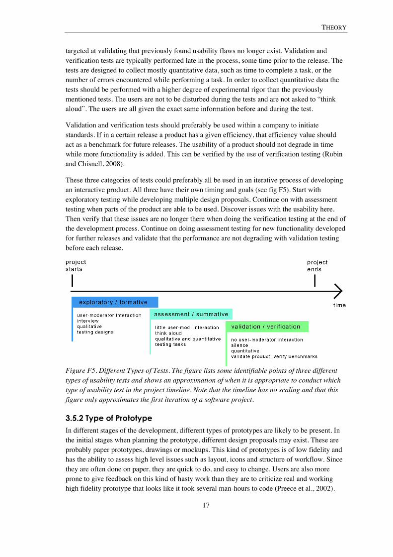
THEORY
17
targeted at validating that previously found usability flaws no longer exist. Validation and verification tests are typically performed late in the process, some time prior to the release. The tests are designed to collect mostly quantitative data, such as time to complete a task, or the number of errors encountered while performing a task. In order to collect quantitative data the tests should be performed with a higher degree of experimental rigor than the previously mentioned tests. The users are not to be disturbed during the tests and are not asked to “think aloud”. The users are all given the exact same information before and during the test.
Validation and verification tests should preferably be used within a company to initiate standards. If in a certain release a product has a given efficiency, that efficiency value should act as a benchmark for future releases. The usability of a product should not degrade in time while more functionality is added. This can be verified by the use of verification testing (Rubin and Chisnell, 2008).
These three categories of tests could preferably all be used in an iterative process of developing an interactive product. All three have their own timing and goals (see fig F5). Start with exploratory testing while developing multiple design proposals. Continue on with assessment testing when parts of the product are able to be used. Discover issues with the usability here. Then verify that these issues are no longer there when doing the verification testing at the end of the development process. Continue on doing assessment testing for new functionality developed for further releases and validate that the performance are not degrading with validation testing before each release.
Figure F5. Different Types of Tests. The figure lists some identifiable points of three different types of usability tests and shows an approximation of when it is appropriate to conduct which type of usability test in the project timeline. Note that the timeline has no scaling and that this figure only approximates the first iteration of a software project.
3.5.2 Type of Prototype In different stages of the development, different types of prototypes are likely to be present. In the initial stages when planning the prototype, different design proposals may exist. These are probably paper prototypes, drawings or mockups. This kind of prototypes is of low fidelity and has the ability to assess high level issues such as layout, icons and structure of workflow. Since they are often done on paper, they are quick to do, and easy to change. Users are also more prone to give feedback on this kind of hasty work than they are to criticize real and working high fidelity prototype that looks like it took several man-hours to code (Preece et al., 2002).
THEORY
18
However low fidelity prototypes are limited in their functionality, often a human can act as the computer and display the different stages in the prototype but this does not reflect the real usage of the product. So while paper prototypes are handy in the start of a software product like this one, there comes a time when you will start the coding process and develop the high fidelity prototypes. With the high fidelity prototypes you can assess functions and user interaction in more detail.
QuickBuilder was tested both as a high fidelity and as a low fidelity prototype. This thesis report only covers the evaluation of the high fidelity prototype; the low fidelity prototype is covered in a master thesis report by Johan Lundberg. He has also done a comparison between the two tests and discusses the different fidelities in greater detail.
3.5.3 Type of User The users used in the testing should reflect the target audience of the product. So choosing the right users is quite important. If the tested persons are nowhere near those who the product is being designed for it does not matter how well you test – you will not get information about the interaction between the intended user and the product, which is the main reason for doing usability testing. However Rubin and Chisnell (2008) stresses that doing some testing is better than not doing any testing at all, even though your test subjects are not exactly the right kind of users. You should always strive to test with users as near the intended target audience as possible.
3.5.4 Type of Data Data collection during usability testing can be done in multiple ways. Some data collection methods are better suited to some types of tests, while other methods work for other types of tests. In early exploratory testing only qualitative data is collected. Qualitative data is best collected by interacting with the user whilst testing. In exploratory testing there is much interaction between the user and the test moderator, the interaction could take form as a discussion or an interview. The qualitative data provided by a user reflects what the specific user thinks and feels about the graphical user interface (GUI) and this data is particularly useful in the beginning of the development process. By analyzing qualitative data from a group of users it will be understandable which designs work for the users and which does not.
The later in the development process, the more interesting it is to collect quantitative data. The quantitative data reflects how well the product works in the hands of the user. By measuring time to complete tasks, number of errors made while completing a task and so on in a validation test, results can be given numerical values and these values can be used as benchmarks for testing of future releases. These tests are preferably conducted in a strict environment with the assertion that each user was given exactly the same information. By testing many users (10-12 per user group) this kind of testing could be used to provide statistically significant results (Rubin and Chisnell, 2008).
3.5.5 Collecting data Rubin and Chisnell (2008) discuss several techniques of collecting data from the users. The techniques will be briefly covered below. The techniques include:
• Pre- and posttest questionnaire

THEORY
19
• Interview
• Observing and taking notes
• Think aloud
• Recording (video, audio)
• Screen capture
• Logging (keystrokes, mouse clicks)
3.5.5.1 Pre- and Posttest Questionnaires
Pre- and posttest questionnaires aim at collecting general data about the user as well as the users’ opinion about the product before and after having used it. Questionnaires are a good source of collecting quantitative data about the users’ opinion towards the product but they can also be used to collect some qualitative data by the use of open ended questions.
3.5.5.2 Interviews & Observing and Taking Notes
Interviews are preferably used in exploratory tests as explained above, but they are also used by Rubin and Chisnell (2008) as a way of debriefing the users after a test session of any test variant. While the test moderator (and possibly others as well) is observing and taking notes about the users behavior, questions may arise. These questions are often saved for later since the user should not be interrupted more than necessary during a test session. After the users has finished the tasks of the test and filled out any posttest questionnaires the user is debriefed in interview or discussion form, and the questions saved by the test moderator is asked.
3.5.5.3 Think aloud
During tests the users are often (especially in assessment and summative testing) asked to think aloud. Think aloud is a technique for making it easier for observers to follow the users’ way of thoughts in order to easier understand what is going on and what the user thinks about the GUI and the interaction. Users are seldom asked to think aloud in validation and verification testing, since thinking aloud slows down the process of using the application. Thinking aloud can greatly affect the timing and may also give the user more time to think about how to interact with the GUI in a way that does not reflect natural usage of the product.
3.5.5.4 Recording, Screen Capture & Logging
There are multiple ways of using technology for data collection. Video and web cameras and microphones can be used to record image and audio. These recordings can be used for later examination of the users’ reactions and the out loud thinking. There are also ways to capture the actions on the computer screen. Software can be used to capture images displayed on the monitor and also to log data about keystrokes and mouse clicks. This kind of data lets the analyzer follow the users’ interaction with the GUI and tasks can easily be timed and errors easily counted, although this kind of measurements can also be captured by observers during the tests (Rubin and Chisnell, 2008).
3.5.6 Planning a Test Rubin and Chisnell (2008) promote the making of a written test plan prior to conducting usability testing. A test plan will serve as blueprint of the test and will outline of how the test
THEORY
20
will be performed, which data will be collected and what the goals of the testing are. A test plan will also be a good means of communicating the test details to those involved (not including the users of course).
3.6 Agile Software Development In traditional software development methodologies, such as the Waterfall process, the development of software is divided into several phases which are then run sequentially. The waterfall process starts with the requirements analysis phase where all of the software requirements are established, it continues on with the design phase where all of the design decisions are made. The implementation phase then begins and implements the designs from the preceding phase. The testing phase starts when the implementation has finished and all software tests are run. This idealistic way of dealing with software engineering is often not realistic since it requires that all parts of the software can be planned in advance which is often not the case (Braude, 2004).
Agile software development methodology has arisen as a salvation for those who saw the problems constituted with the stiffness of traditional methodologies. Where traditional methodologies run all development phases in sequence and changes of the software requirements must be kept on minimum, agile methodologies mixes all phases and do them all at once in short iterative development cycles while changes of the requirements is not only accepted, it is expected (Waters, 2007).
The core thoughts behind the agile methodology are stated in the Agile Manifesto, the authors of the manifesto has come to value:
• “Individuals and interactions over processes and tools
• Working software over comprehensive documentation
• Customer collaboration over contract negotiation
• Responding to change over following a plan” (Beck et al., 2001)
There are many implementations of the agile methodology, some of the most known are Extreme Programming and Scrum. Since the implementation of the QuickBuilder prototype was heavily influenced by Scrum, Scrum methodology will be covered shortly in the following section.
3.6.1 The Agile Methodology Scrum Scrum is an agile process for developing software. It is heavily dependent on teams that build software incrementally in iterative development cycles, known as sprints. Communication within the Scrum teams are important, therefore many teams have daily morning meetings, known as daily stand-ups or scrums, in which the progress of the project is discussed with the whole team. By having this short meetings approach all team members have an awareness of the project status (Scrum Alliance, 2009:1).
There are certain roles for the members of the Scrum teams. There is the project manager who is responsible for prioritizing the list of features of the software, the product backlog, and to be responsible for the communication between the developers and the executives. Another
THEORY
21
important person is the Scrum Master who leads the scrum team(s); there is one Scrum Master in each team, but never more than one project manager totally. The rest of the team is constituted by developers, architects, testers and sometimes usability professionals (Scrum Alliance, 2009:2).
The goal of Scrum is to complete parts of the software in all iterations, these parts are working and tested code of acceptable quality which satisfies the requirements of the backlog items given to the team by the project manager. Scrum embraces changing requirements, unlike the Waterfall process which detests it. If changes to the requirements are made late in a Waterfall process, the cost to fix the software is often great since it relies on requirements being established before the design, implementation and testing occurs. In Scrum on the other hand changes in the requirements are simply added as items to the backlog and fixed in a succeeding sprint where design, implementation and testing occur simultaneously. Changing requirements are also more natural in Scrum since the working parts of the software can be viewed by the customers (and other stakeholders) after each sprint, the customers can then give feedback on what they have seen.
By the time this degree project took place all development in the Ericsson AB office were moving more towards using Scrum. This affected even me and Johan Lundberg and the degree project also moved towards using the Scrum development process. At the last half of the implementation period daily scrums (meetings) were held where the status of the project was discussed. In the last couple of weeks we worked with a backlog list of prioritized items to complete before the end of the implementation period. The members of the team also resembled the members of traditional Scrum teams. There was a product owner, a usability professional and a Scrum Master (referred to as the web designer, the usability expert and the supervisor above in the subchapter QuickBuilder Team and Concept in the chapter on The Prototype and the Test), and me and Johan Lundberg were the developers.
3.6.2 Usability and Agile Development The agile processes tend to stress the quick development of functioning code instead of doing adequate field work with usability focus initially (McInerney and Maurer, 2005). Usability professionals do neither have given positions in agile development teams. Singh (2008) writes that even if there are usability professionals on the teams, it tends to not be enough to create highly usable products with Scrum methodology. In her experience the initial user stories, which are the basis for the design, and the feedback from users gotten after the release of the product often get too low priorities in Scrum. She continues:
“We recognized this outcome to be a consequence of the following important facts:
• Scrum product owners in a fast customer-focused business are often overwhelmed with marketing and sales concerns that preclude adequate attention to usability.
• Traditional product owners often lack the skills and – not surprisingly given the marketing and sales concerns they continually address – the motivation to design effective user experiences.

THEORY
22
• Traditional agile methodologies leave little room for specifying what we term a user experience vision, which drives the architecture and is essential for ensuring a coherent user experience.” (Singh, 2008 pp. 555)
The word traditional is used in the preceding quote since the solution to these problems is a new and non-traditional version of Scrum, called U-Scrum, where the “U” stands for usability. The U-Scrum methodology has been tested successfully within Singh’s organization to create highly usable software. It differs from traditional Scrum in that there are two equal project managers instead of only one. One of these project managers has a traditional role whilst the other one focuses on usability issues. The usability project manager is responsible for inventing and maintaining a user experience vision. The vision is used to keep all team members on the usability track in order to develop software which immensely focuses on the users and their needs.
The user experience vision is formed by the usability project manager meeting with users, interviewing them and doing ethnographic studies at their places of work. These are quite traditional ways of getting user input promoted by both the interaction design and usability engineering methodologies. The vision is then communicated to the fellow Scrum team members with low fidelity prototypes and mockups. The user information is communicated by the use of personas, archetypical user profiles which depicts the predominant types of users’ personalities. Personas often make it easier to talk about designs since developers can refer to specific personas when making an argument (Singh, 2008).
The specific methodology U-Scrum was not implemented during this degree project but I have written about it here since I believe it is an interesting approach which bears similarities with the Scrum implementation of this degree project. Scrum and its implications on usability issues are further discussed in later chapters.
Later analyze the involvement of Scrum and discuss U-Scrum to enhance the usability focus of Scrum projects. Maybe something on enterprise projects also… Fix “the process” subchapter in implementation to support this chapter.

TECHNOLOGY
23
4 Technology This chapter will give short introductions to several technologies referenced in the implementation section. A basic understanding of these technologies is paramount for the comprehension of the following chapters.
4.1 HTML and HTTP Hypertext Markup Language (HTML) is the language in which standard web pages are defined. Hypertext Transfer Protocol (HTTP) is the protocol used on the Internet when a web browser is used to view a web page. The HTTP protocol was built for synchronized communication between clients (web browsers) and web servers. The communication process typically starts with a user writing a Unified Resource Locator (URL)1 in the web browser, the browser then requests the HTML page specified by the URLs path from the web server which is specified by the host part of the URL. Given that the host and path exists, the server responds by returning the specified HTML page to the client. This results in complete reload of the displayed page by the users’ web browser. This synchronized communication process is repeated every time the user clicks a link or enters a new URL into the browser; the client sends a request and the server responds which results in a complete reload of all content being displayed by the web browser.
In the simplest case, these HTML pages are written only in HTML. Then the page looks exactly the same for every visitor at every time – they are static. The HTTP protocol can also be used to request other files such as images, audio, video and pure text files for example. Static pages were reality in the mid 1990’s. Today it is a part of history and most pages found on the Internet these days are dynamic and can even be personalized. Several techniques are used to achieve the dynamic and personalized web. Some of these techniques are discussed below.
4.2 JavaScript and DHTML JavaScript is the major scripting language of the web. It is supported by all major web browsers and it’s a cornerstone of web applications in general and Rich Internet Applications in particular. QuickBuilder depends heavily on JavaScript.
By the use of JavaScript the web developer is able to bring a lot of functionality to a web application and extend the capabilities from that of a pure HTML page. A HTML page can be more dynamic by the use of JavaScript, hence the name Dynamic HTML (and the acronym DHTML).
A DHTML page can be seen as a small application. It can make calculations by its self and also alter the content of the page without the whole page having to reload.
1 URL (Unified Resource Locator), often referred to as web address; Points to a certain resource on the Internet. A URL is composed with the following syntax: protocol://host:port/path. Example: http://www.google.se:80/index.html. The port is often omitted from the URL however. Port 80 (the HTTP standard port) is assumed by the web browser if no other is specified. In the example even the path can be omitted, this is because the server has specified index.html as a default page and automatically guides its guests to that location.

TECHNOLOGY
24
4.3 AJAX Asynchronous JavaScript and XML2 (AJAX) is a technique used widely in web applications today. It is not a programming or scripting language in its self but rather a certain combination of other techniques. With AJAX you can speed up websites and to give them more the feeling of a traditional desktop application. This is achieved by updating only certain parts of the web page with data obtained asynchronously from a web server (Eichorn, 2007).
By the use of AJAX in a web application, new data can be collected from a server without the browser having to reload the entire page, which is the way websites traditionally work (see HTML and HTTP above). The AJAX data reload is accomplished by the use of a JavaScript object often referred to as XmlHttpRequest. An XmlHttpRequest is similar to a traditional HTTP Request but it is being sent asynchronously to the server by the use of JavaScript code, instead of synchronously by the web browser. When the server receives this request it handles it and then sends a response back to the web application/page. The way the server handles the response is up to the developer to decide by coding scripts, or servlets (see below), often the server looks up something in a database and then returns the data in XML format. When the web application/page receives the servers response it is handled by the JavaScript, and instead of reloading the entire page (as it would when receiving a traditional HTTP Response) it can use DTHML techniques to update only certain parts of the web application/page (Garrett, 2005).
In QuickBuilder AJAX calls is used for uploading and deleting images from the server as well as for publishing html pages for quick preview.
4.4 Java, and Server Scripting Java is a programming language which is widely used in both application and web development. In contrast to some other programming languages (such as C/C++) a compiled program written in Java can be run on all major operative systems. QuickBuilder was written in Java and compiled to JavaScript code by the Google Web Toolkit compiler (see below).
The Java Platform, Enterprise Edition (Java EE) adds functionality to the Java Platform, Standard Edition which enables a developer to write programs that run on web servers. It includes packages for development of Java Server Pages (JSP) and Java Servlets (referred to as servlets) among other things.
A JSP page and a servlet is basically the same thing (Qusay, 2003), and resemble other web technologies such as Active Server Pages (ASP) and PHP: Hypertext Preprocessor (PHP). Programming a JSP page, servlet, ASP page or PHP page is a handy way of receiving and handling an XmlHttpRequest. The page, whatever the technology, receives the request and processes it before responding to the web application which sent the request.
In QuickBuilder servlets were, among other things, used to receive images being uploaded by the user, and to store these images on the servers file system. If the server could handle the image upload without any error the server returned a message to QuickBuilder saying that the upload was finished successfully, otherwise it returns an error message saying that the upload could not be processed.
2 eXtensive Markup Language (XML) is a text based format for structuring data, similar to HTML.
TECHNOLOGY
25
4.5 Rich Internet Applications Rich Internet Application (RIA) is a term which has come to denote desktop-like applications that are run in web browsers. These applications bear similarities with desktop applications as they are responsive, dynamic and can be designed to handle very complex operations even though they are run in a web browser as a webpage (SearchSOA.com, 2007). RIAs can be developed with many different technologies and programming languages, for example Adobe Flash is a popular development environment. RIAs can also be constructed with AJAX and JavaScript. QuickBuilder can be, and is by the author, considered a Rich Internet Application.
4.6 Google Web Toolkit Google Web Toolkit (GWT) is a framework with an interface component library which was used for the implementation of Quick Builder. GWT is preferably used for developing Rich Internet Applications. The beauty of GWT is that all the programming code you write is traditional Java code. This Java code is then compiled to JavaScript by the GWT compiler. This means that you as a developer never will have to write a single line of JavaScript code for your web application. It also means that you can use your favorite integrated development environment (IDE) and debugging tools. GWT also handles browser differences, so unlike traditional web development you do not have to code different versions for different browser types, the GWT compiler takes care of that for you (Google Code, 2009:1).
Since the GWT Java code is compiled into JavaScript, not the whole Java language can be used. Only classes and methods that could as well be written in JavaScript are supported. This depends on several differences between the two languages. For example; JavaScript does not support multiple threads and therefore the Thread class in the Java language is not supported by GWT.
GWT supports several ways of interacting with a web server, one of these ways being Remote Procedure Call (RPC). An RPC call is made from inside the compiled JavaScript (in the client browser) to a Java object on the web server. The object takes no parameters but returns any Java object that can be interpreted by the GWT application (Google Code, 2009:2). By using RPC calls you can make use of the complete Java language with the only drawback that you cannot send parameters.
If you want to send parameters to the server you could always use AJAX calls to a servlet. A servlet can also make use of the whole Java language, but it cannot return Java, only XML or other text based data.
GWT has its own component library which makes it easy to quickly put in advanced user interface components and widgets into your web application. GWT is also released as Open Source so all component and widget source code can be obtained and changed to better fit your specific needs.
Even though you are not writing any JavaScript while coding with GWT, an understanding of the JavaScript language will help you understand the logic, the event model and which Java classes you can and cannot use. The GWT website also has a complete reference to which classes and methods of the Java language that can be used with GWT.
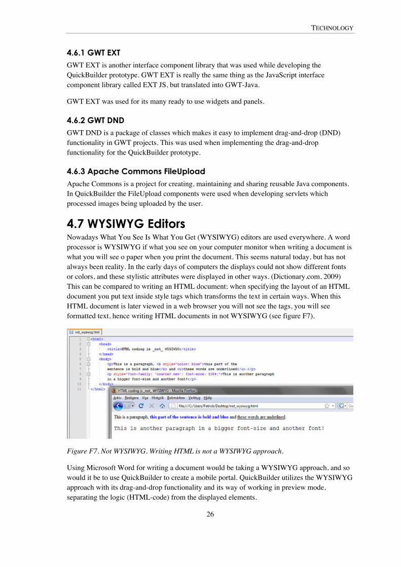
TECHNOLOGY
26
4.6.1 GWT EXT GWT EXT is another interface component library that was used while developing the QuickBuilder prototype. GWT EXT is really the same thing as the JavaScript interface component library called EXT JS, but translated into GWT-Java.
GWT EXT was used for its many ready to use widgets and panels.
4.6.2 GWT DND GWT DND is a package of classes which makes it easy to implement drag-and-drop (DND) functionality in GWT projects. This was used when implementing the drag-and-drop functionality for the QuickBuilder prototype.
4.6.3 Apache Commons FileUpload Apache Commons is a project for creating, maintaining and sharing reusable Java components. In QuickBuilder the FileUpload components were used when developing servlets which processed images being uploaded by the user.
4.7 WYSIWYG Editors Nowadays What You See Is What You Get (WYSIWYG) editors are used everywhere. A word processor is WYSIWYG if what you see on your computer monitor when writing a document is what you will see o paper when you print the document. This seems natural today, but has not always been reality. In the early days of computers the displays could not show different fonts or colors, and these stylistic attributes were displayed in other ways. (Dictionary.com, 2009) This can be compared to writing an HTML document; when specifying the layout of an HTML document you put text inside style tags which transforms the text in certain ways. When this HTML document is later viewed in a web browser you will not see the tags, you will see formatted text, hence writing HTML documents in not WYSIWYG (see figure F7).
Figure F7. Not WYSIWYG. Writing HTML is not a WYSIWYG approach.
Using Microsoft Word for writing a document would be taking a WYSIWYG approach, and so would it be to use QuickBuilder to create a mobile portal. QuickBuilder utilizes the WYSIWYG approach with its drag-and-drop functionality and its way of working in preview mode, separating the logic (HTML-code) from the displayed elements.
IMPLEMENTATION
27
5 Implementation This chapter will explain the process of implementing the QuickBuilder prototype. Knowledge of the implementation will give the reader a deeper insight to, and understanding of, the details of the evaluation and result in the succeeding chapters.
5.1 Requirements Analysis When this degree project began, there already existed a design sketch of the concept and graphical user interface (GUI) of QuickBuilder. This sketch was in the form of a layered image (a Photoshop document, see figure F3). Substantial time had been put into this sketch by a team of Ericsson employees. This team included among others a usability expert and a web designer. The objective of the team was to incorporate user feedback collected about the tools within the Ericsson MSDP which was currently used to create mobile portals, as discussed in the Introduction chapter. Also some feedback from early versions of the design sketch was incorporated in this resulting version of the design.
The initial work done by these professionals resulted in a clear view about the look and feel of the application, as well as of how the application should function. This meant that most of the graphic and layout design issues were already thought about and decided upon before the thesis work began. The implementation therefore was more about designing the underlying functionality instead of designing the looks or to decide which functions to include. However some design changes were incorporated during implementation period, before and after pictures (screenshots) can be found in the appendices X1 and X2 as well as in the chapter on The Prototype and the Test (figures F3 and F4).
The implementation period started off by prioritizing which functionality to concentrate on. This resulted in a complex list of with prioritization values. Deciding the priority of different functions was made with consideration of which functions really had to be there in order for the application to fulfill its purpose (such as inserting text and images). Other functionality that was not seen as necessary for this prototype was given lower priority (such as adding HTML forms and adding borders and margins). This list however soon lost its purpose since many of the things which was considered harder to achieve was in fact incredibly easy to incorporate due to ready-to-use widgets in the Google Web Toolkit and some issues required a lot more than was available. The priorities also changed during the implementation period and the list of priorities was not updated. However writing the prioritization list made me more understanding of which parts QuickBuilder actually consisted of.
5.1.1 The Interface Experience Goals As mentioned in the first chapter the application had some interface experience goals which should be achieved. These goals will be discussed and explained in this section. The interface experience goals are further discussed in the Analysis chapter.
5.1.1.1 Easy to Learn
The current tools in the MSDP (Mobile Services Delivery Platform) contain an extremely great amount of features, functionality which has been inserted without any effort of making it easy to

IMPLEMENTATION
28
use or learn. Hence, those tools contain that much functionality that it is hard to get a clear overview of the applications.
In order to maintain a portal with the MSDP tools at least three applications must be used. This makes it even harder to work with.
To eliminate these problems only the mostly used functions of the current tools will be incorporated in this one new application (QuickBuilder). The graphical user interface (GUI) will be clean and somewhat minimalistic to support the user in getting an easy overview of all the functions available.
By making the GUI heavily dependent on drag-and-drop the idea is to keep the interaction simple and intuitive (see below).
5.1.1.2. Efficient to Use
By eliminating the need of several tools and to instead gather the mostly used functions in one application; hope is that the efficiency will be heavily improved. Efficiency has been thought of while designing the interface. A way to increase the efficiency is by reducing the number of clicks; there should not be unnecessary prompting for permission and the functions should be accessible by as few mouse clicks as possible.
The applications should be so easy to use and so efficient that it should be possible for a user to create and publish a mobile portal in under a minute.
5.1.1.3 Easy to Install and Open
By designing QuickBuilder as a web application many problems are solved. An installation is no longer required. All that is needed to start the application is simply to open up a web browser window and select a bookmark (or to manually enter the URL). QuickBuilder can be reached from everywhere, from any computer with an Internet connection. By using the Google Web Toolkit for development the application will work in any standard web browser supporting JavaScript. The user will never have to install or update plug-ins such as Flash Player or the Java Runtime Engine.
5.1.1.4 Focused on Drag and Drop
QuickBuilder should make extensive use of drag-and-drop functionality. This is to make the interaction more intuitive and easy.
Elements should be able to be dragged to the workspace and inserted by being dropped. While in the workspace, the elements could be dragged around to interchange their relative order.
5.1.1.5 Only the Most-Used Functions
As mentioned in preceding paragraphs only the most-used functions from the prior applications exists in QuickBuilder. This was chosen since users easily got disorientated in the prior MSDP applications. By reducing the number of functions to only those necessary, the efficiency should be improved. It should also be easier to use and learn due to this simplification. It however comes with the cost that the developer cannot do as many things as he could have done using the prior applications. However this application could be seen as just a complement to these prior MSDP applications, not a replacement for those in the need of advanced functionality.
IMPLEMENTATION
29
5.1.2 Choosing Technology Choosing which technology to use for the implementation was not obvious. The prerequisite was that it should be a JavaScript and Java based technology. The original thought was to use traditional Java Enterprise Edition (Java EE) technologies such as Java Server Pages (JSP) for the server parts and to write the client in JavaScript. But since only parts of the development team had any experience of writing JavaScript this was not an option. The technology which was finally decided upon was not far from this original idea though.
Since QuickBuilder was supposed to be Rich Internet Application – web based with the look and feel of a desktop application – a static HTML based application would not do. To build a web application of this sort dynamic HTML (DHTML) together with Asynchronous JavaScript and XML (AJAX) techniques had to be involved.
It turned out that another project existed within the office that was working on a prototype with similar goals as us, such as being a web application and using Java technology. They had assembled a list of Model View Controller (MVC)3 and AJAX frameworks. Most of these frameworks could be used in the development of QuickBuilder, but two of these were particularly interesting. These were the AJAX frameworks Yahoo! User Interface Library (YUI) and Google Web Toolkit (GWT). These two frameworks have both user interface libraries with ready-to-use widgets, which enable quick development of web applications.
After testing both frameworks GWT was finally chosen. It was perceived as superior in this case since the coding is done in Java, and JavaScript knowledge was not required (which is the case with YUI). The GWT code is however compiled into JavaScript which can be interpreted by the user’s web browser (see the Technology chapter). The fact that the other project mentioned above had also chosen GWT for the development was seen as bonus. It also proved advantageous later in the process when knowledge could be exchanged.
In order to learn how to use GWT the official tutorial supplied by Google was worked through before the coding of QuickBuilder began. The tutorial included such things as interface development, event handling and client-server communication.
5.2 Interface Components Since GWT, and not least GWT EXT (see Technology chapter), consist of a large amount of ready-to-use graphical interface components, the process of creating an interface can be very quick. Most of the design of the components is already done. Tweaking of the components can be done to some extent with methods predefined in the source code.
Creation of the basic QuickBuilder interface was done in a few days. It resulted in a graphical user interface (GUI) consisting of five moveable windows (as discussed in the chapter on The Prototype and the Test). The interface components that made up these windows were chosen because of their ability to hold other subcomponents easily, and because of their flexibility. The windows could be moved around and minimized – which were attributes that felt positive when creating a desktop-like application. Although the windows were moveable, they could never conceal each other. Instead the to-be-obscured window now changed position and was
3 Model View Controller is a design pattern used often in web development. It aims at separating programming logic (the Model and the Controller) from the layout information (the View).

IMPLEMENTATION
30
automatically placed beneath the moved (obscuring) window. This was seen as a pleasant feature since a window would never disappear from the screen, thus enhancing the users feeling of easy access to all interface components at all times.
5.3 Drag-and-Drop Implementing the basics of the drag-and-drop functionality was the part which took the most time to complete. In contrast to graphical interface components implementing drag-and-drop functionality was not simply a matter of puzzling together pieces of code. Drag-and-drop functionality is based on rules and logic. Hence more complex code had to be composed.
The first drag- and droppable items in the interface were the input tool icons. Hence the initial implementation was based on the rules of dragging and dropping tool icons onto the workspace. This code was later conformed to work with all types of dragged and dropped elements, such as texts and images.
When an icon was dragged to the workspace, a ghost image of the dragged icon appeared in the area. This ghost icon was implemented for the reason of making it clear where the element would be placed on the workspace, if dropped at that current spot.
5.4 Communicating with the Server The client-server communication code is probably the most advanced pieces of code in QuickBuilder. GWT supports a few ways of communicating with a server. (Google Code, 2009:2) One specific way to do this is to use Remote Procedure Calls (RPC). With RPC the client can communicate with a Java-file a server (see Technology chapter).
RPC is used in QuickBuilder for checking available images on the server. When accessing the image section in QuickBuilder the client code sends a request to a specific Java object on the server (a service, similar to a servlet). The object then checks which files exists in a certain folder on the server and then replies with a list of all filenames. These filenames are then used to compile a list of all images within the client. This (client) list consists of the filenames, the images themselves and the image-sizes measured in pixels.
Other more conventional ways of client-server communication methods can of course be used. Traditional synchronized HTTP requests as well as asynchronous AJAX requests can be utilized.
5.5 Open Source The development was truly enhanced by the fact that GWT and GWT DND (Drag and Drop for GWT, see technology chapter) is Open Source software which enabled access to the source code of all GWT objects and interface components. When something was not functioning as hoped, the source code could easily be accessed and examined to get a better understanding of it, or manipulated to better support the needs of QuickBuilder. This approach of changing the source code however comes with the cost of updating problems. When a new version of GWT is released the source code-files are updated and will have to be altered again.
IMPLEMENTATION
31
5.6 Working with Usability The implementation period was quite hectic and usability issues might not have been given all the time that they deserved. Although much time had been put into designing the QuickBuilder concept to be as usable as possible, these issues had also been discussed by the me and Johan Lundberg together with the rest of the team (see the chapter on The Prototype and the Test for information on the QuickBuilder team), so thoughts about the usability issues were always present in mind while coding.
Some usability issues that were incorporated in the designs were for example such high level matters as; tooltips being displayed when hovering tools with the cursor, buttons being activated on mouse-button release instead on mouse-button press, and ghost elements displayed in the workspace when elements were dragged around in (or dragged to) the workspace area. Also some layout issues were changed such as; concentrating the most used panels (tools, options panel and workspace area) to upper left corner of the screen and separating the input tools (text, graphics, color etc) from the tools which was not used for input (campaign calendar, statistics reports, settings etc). For illustration of these layout matters view the two different versions (September and December 2008) of the QuickBuilder interface in Appendix X1 and X2, or review the chapter on The Prototype and the Test.
5.7 The Process The first few weeks constituted of planning the implementation. In this period effort was made to fully understand the QuickBuilder concept, plan for which functionality should be prioritized and also to research possible technologies fitted for the implementation of an application of this sort.
Through the first half of the implementation period there were weekly meetings with the whole QuickBuilder team (us thesis workers and Ericsson AB employees). In these meetings the progress, prioritization and design specifics were discussed. The meeting frequency was upped during the last half of the period. Shorter meetings were then held every morning, when the progress of QuickBuilder was discussed.
This everyday meeting approach proved to be a lot helpful particularly in the last couple of weeks when many parts of the interface were implemented. This was a time were many decisions had to be made, and by meeting the team every day, if only for a short while, many of these issues could be decided upon after being discussed by all involved. This meeting approach was inspired by the agile software methodology Scrum, in which development teams meet every morning and discusses what has been done the day before, what should be done the current day and if there are anything that stands in the way of you completing today’s task. The approach gave awareness to all involved people of how the project ran time-wise. This was most probably one of the reasons for the project to turn out the way it did. All parts which were planned to be completed during the last few weeks actually were implemented (note that this plan differed from the functionality prioritization list written in the beginning of the project).
The last weeks the priorities were to implement all parts of the graphical user interface, though all parts did not have to work, as long as they looked good for the internal Ericsson AB prototype competition. The most important parts should function, other parts should be made to work only if time allowed.

IMPLEMENTATION
32
5.7.1 The Coding The coding of QuickBuilder was done both by me – the author, and by Johan Lundberg. The coding was mostly done separately on two different workstations, but on the same code base. Some parts of the code were written as a conjoined effort while both developers were present at the same workstation. For example most of the drag-and-drop code was written in this pair-programming fashion. The code on the different machines was synchronized by the use of the revision control system Subversion. The coding was done with the development tool Eclipse.
5.8 Agile Development with Scrum By the time the implementation took place the office was about to move to a new software development methodology – Scrum. This resulted in that the development of QuickBuilder got inspired by agile thinking and Scrum methodology. As discussed above (see The Process) short meetings (also known as daily stand-ups or Scrums) were held every morning in which the implementation work was discussed. As the implementation period drew to its end the most important features that was not yet implemented was listed and then implemented one by one. Such a list is often referred to as the backlog in Scrum methodology.
The coding was also inspired by agile methods. The coding alternated between individual- and pair-programming.

EVALUATION
33
6 Method and Evaluation This chapter explains how QuickBuilder was evaluated in order to find out if the implemented prototype was usable, and to find problem areas for first-time users. The process of designing the usability tests will be covered. The results of the evaluation will be presented in the next chapter.
6.1 Continuous Evaluation During the implementation period, feedback was given continuously by supervisors at Ericsson AB. Due to the fact that we met daily and discussed the progress of the development we got immediate feedback throughout the whole development process. This meant that many details of the interface were discussed and evaluated early, and everyone in the team knew what was going on, and how things should work.
The supervisor and the team behind the concept of QuickBuilder acted here as the customer, or buyer, of the product. They knew what they wanted and they had some insight on what the users looked for in this application. However, they were in fact the ones who ordered the development, and the ones that had come up with the concept. In order to get some feedback from the outside world, usability testing was applied to evaluate the actual usability of a user’s first encounter with the prototype.
6.2 Usability Testing In order to get some feedback from the outside world usability testing was applied on QuickBuilder. Four identical tests were done with four different people. Each test consisted of ten assignments for the user to finish. In the sections below, the testing and the test assignments will be discussed in detail. The results can be found in next chapter.
6.2.1 Test plan In order to structure the work of doing a series of usability tests, the first thing that was done was to do a test plan. This test plan was greatly inspired by the Rubin and Chisnell’s (2008) approach to usability test plans. The test plan consisted of the following subjects;
• Purpose, Goals and Objectives
• Research Goals
• Participant Characteristics
• Method (Test Design)
• Task List
• Posttest Questionnaire
• Test Environment, Equipment and Logistics
EVALUATION
34
• The Moderator Role
• Data to be Collected and Evaluation Measures
The objectives of the test were to evaluate the usability of the application seen in the eyes of a first-time user. This was assessed by collecting data on the time it took for the user to complete the tasks and how many errors the user performed while trying. This data can be found in the Result chapter.
6.2.1.1 Test Participants
The four tested users were all third, and last, year students studying Multimedia; Pedagogy and Technology. They were chosen because of their knowledge of subjects which I believe would be attractive for a possible real-world user of QuickBuilder (those working at telecom operators building mobile portals today). These subjects are such as design of interactive platforms and environments, skills in communication and information technology and basics of interaction design.
The participants were also selected by reasons of convenience. They were all acquaintances of mine which induces and enhances the possibility of them being biased. Their answers and actions may have been affected of them knowing me.
6.2.2 The test The test was designed as an assessment or summative test with moderate user-moderator interaction. The user was asked to think aloud and both qualitative and quantitative data was collected. This particular test type was chosen because of the timing and status of the application prototype. Exploratory/formative (see figure F5) tests had been done earlier during the design of the QuickBuilder concept by employees of Ericsson AB. Validation/verification testing would be the next thing to do, after having incorporated the user feedback from the assessment/summative tests, in order to validate/verify the selected improvement from the tests conducted during this thesis project.
The test consisted of ten assignments of which the first nine were sort of an introduction to the last and more extensive one. The first ones handled basic things such as administrative tasks, adding text and images, moving elements around in the workspace, removing elements and previewing the page. The assignments were all part of a scenario where the user was just employed by the fictional company Popstar Records. The user then got assignments directly from the boss of the company. In time for the last assignment the boss had really taking a liking for the new employee and gave him the job to implement the company’s new mobile portal page. This page consisted of several elements, most of which the user was familiar with since the previous assignments, but there were new ones as well. These assignments are explained further below.
All users were given the same instructions before the test. The only thing they knew before the test session was that they were to use a web application for development of mobile websites/portals. In the beginning of each test session the users were read printed instructions of how they should act, for example that they should think aloud and wait for instruction before moving on to the next assignment. They were also briefed on the role of the test moderator and that they were going to be recorded.
EVALUATION
35
The role of the moderator was not to interfere more than necessary. The users could ask a question if needed but not all questions would be answered. The moderator would mostly observe the user while testing, keeping an eye on the time, and help the user if stuck.
The tests were all recorded with audio, video and screen capture4. These recordings were later analyzed and used for data gathering (timing and error count). More information on data gathering can be found below.
The tests were all done in Swedish, even the assignments and the written briefing was in Swedish. This language was chosen since all participants were Swedes and their familiarity and confidence with the English language was unknown. This resulted in that most of the test documentation is written in Swedish.
6.2.3 The Test Assignments Here follows the assignments, or tasks, the users got to do in the usability testing sessions. These assignments are translated into English, but the users got them in Swedish. Each assignment has a benchmark (time limit), which was established after a first pilot testing session where the usability test was run through with a participant with the same background as the following participants. For the users to be successful on the assignments they should be done within the benchmark time. The benchmarks are displayed in seconds inside parentheses after each assignment header. The benchmark times and their relevance are further discussed in later chapters. Each assignment description below is followed by a comment on what the user actually was supposed to do.
6.2.3.1 Assignment 1 (180s)
You have just been employed at the web department of Popstar Records. Use QuickBuilder to find the answer to the question: How many unique persons visited the “Home”-page week 48 2008?
Comment: The user was supposed to find the reports tool which has page-traffic statistics. Inside the reports tool the user should find the correct data for the given time.
6.2.3.2 Assignment 2 (180s)
Use QuickBuilder to make a notation in the calendar about the easer-campaign which lasts from 12am March 15 until 12am April 1.
Comment: The user was supposed to find the campaign tool which had a calendar in it. The campaign icon also looked like a calendar. In there a notation should be made by use of an input form.
6.2.3.3 Assignment 3 (300s)
You have just been given your first web design assignment! Make a bulleted list consisting of the names of the music styles Pop, Rock and Punk (one style per bullet and row). Each style should be in a separate font, choose the font you feel best resembles the particular music style. The list is a part of the music page you are going to create with QuickBuilder. The list should therefore be added to the workspace. 4 Screen Capture is a term of which I mean the process of capturing the events on the computer screen, software is used to record the images being displayed by the computer screen.
EVALUATION
36
Comment: The first creative assignment. The user was supposed to find the text tool, write the words and turn the words into a bulleted list. And then change the fonts with the text tool. Finally it should be added to the workspace by using the add button in the text options panel.
6.2.3.4 Assignment 4 (300s)
The creation of the music page continues. At the desktop of the computer lies an image named “image1.jpg”, it should be added to the workspace, below the list from the last assignment.
Comment: The user was to find the graphics tool and there use the upload form, select the image from the desktop, upload it to QuickBuilder and then drag it to the workspace.
6.2.3.5 Assignment 5 (300s)
You show the page for your closest boss. The boss wants the music styles to distinguish themselves more than they do right now. Change therefore the colors of the music styles. For each style; choose a color which you associate with the particular music style.
Comment: The assignment aimed at getting the users to understand that they could edit the element that they had earlier added to the workspace. It also tested the coloring tools in the text editor. Users could also have tried using the color tool (but no one did).
6.2.3.6 Assignment 6 (120s)
The boss wants the image to be placed above the list. Change the order of the elements in the workspace to make your boss happy.
Comment: The assignment tested if the users understood that the elements in the workspace were drag-able and could easily be moved around inside the workspace area and if this interaction was perceived as intuitive and natural.
6.2.3.7 Assignment 7 (180s)
The art director of the company has updated the image you used in your assignment (“image1.jpg”). Switch the current image to “image2.jpg”. The new image can be found on the computers desktop.
Comment: The user was supposed to find the right-click menu and there the delete option.
6.2.3.8 Assignment 8 (300s)
The page is now ready for an initial preview in a mobile phone. How do you do it?
Comment: A certain icon should be found in the header of the workspace area.
6.2.3.9 Assignment 9 (300s)
The boss gives you new work tasks; he begins by giving you the following explanation:
Sometimes you want to adapt the content on a mobile portal page for different types of customers (for example different ages, genders, interests etc.). Such adaptation can be done with QuickBuilder. By setting properties on a certain image you can make it appear only for certain customers.
Find these settings for the image in the workspace.
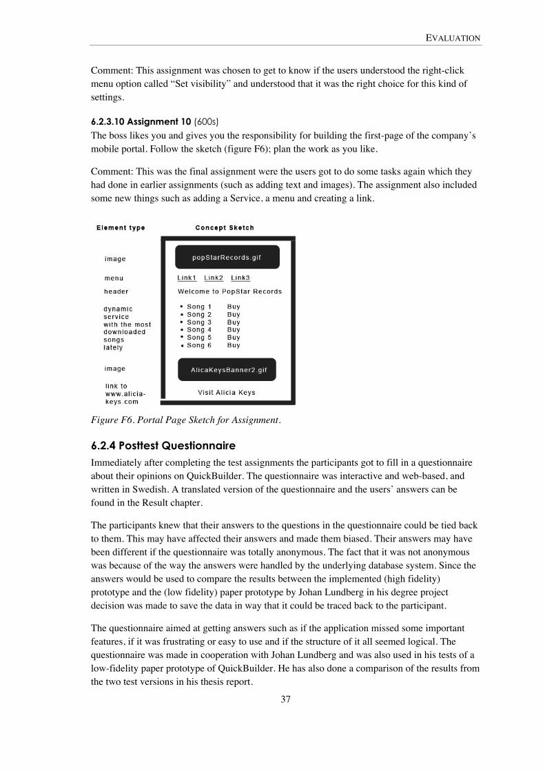
EVALUATION
37
Comment: This assignment was chosen to get to know if the users understood the right-click menu option called “Set visibility” and understood that it was the right choice for this kind of settings.
6.2.3.10 Assignment 10 (600s)
The boss likes you and gives you the responsibility for building the first-page of the company’s mobile portal. Follow the sketch (figure F6); plan the work as you like.
Comment: This was the final assignment were the users got to do some tasks again which they had done in earlier assignments (such as adding text and images). The assignment also included some new things such as adding a Service, a menu and creating a link.
Figure F6. Portal Page Sketch for Assignment.
6.2.4 Posttest Questionnaire Immediately after completing the test assignments the participants got to fill in a questionnaire about their opinions on QuickBuilder. The questionnaire was interactive and web-based, and written in Swedish. A translated version of the questionnaire and the users’ answers can be found in the Result chapter.
The participants knew that their answers to the questions in the questionnaire could be tied back to them. This may have affected their answers and made them biased. Their answers may have been different if the questionnaire was totally anonymous. The fact that it was not anonymous was because of the way the answers were handled by the underlying database system. Since the answers would be used to compare the results between the implemented (high fidelity) prototype and the (low fidelity) paper prototype by Johan Lundberg in his degree project decision was made to save the data in way that it could be traced back to the participant.
The questionnaire aimed at getting answers such as if the application missed some important features, if it was frustrating or easy to use and if the structure of it all seemed logical. The questionnaire was made in cooperation with Johan Lundberg and was also used in his tests of a low-fidelity paper prototype of QuickBuilder. He has also done a comparison of the results from the two test versions in his thesis report.
EVALUATION
38
6.2.5 Data collection Three major categories of quantitative data were collected from the recording of the tests:
• Timing (time to complete tasks)
• Errors (erroneous clicks)
• User-Moderator Interaction (verbal communication)
6.2.5.1 Timing
The time was recorded from the moment the user had read the assignment and then opened up QuickBuilder in the web browser, until the assignment was completed (with or without help). The times to complete tasks are interesting to use with comparisons between different users in this test and the tests done by Johan Lundberg. It can also be used in later comparisons with future verification/validation test results (Rubin and Chisnell, 2008).
6.2.5.2 Errors
Erroneous clicks were counted per assignment. An erroneous click was defined as a mouse click or keyboard press, when using QuickBuilder during an assignment, which did not help in achieving the goal of the current assignment. These errors were classified in two subcategories:
• Inaccurate menu choices
• Other errors
An inaccurate menu choice was defined as a click that either opened a new (for the assignment incorrect) option panel, or a first click in a section that had nothing to do with the current assignment (subsequent clicks in that section would be other errors). This error kind was counted because of its possibility to reveal information on the ease of learning, logical structure of the prototype and if it is easy to remember and to get around in the application.
Other errors were clicks in the current section that did not directly help in achieving the goals of the current assignment. This could be the selection of a tool within the option panel that was not to be used in the particular assignment. This type of error count might give a finger point on how the application handles the users’ conception of the workflow and if the user can understand what the tools do and how to work with them.
If the user was supposed to add a link to the workspace for example, a click on a tool icon different than the text tool would be counted as an incorrect menu choice. If the user selected the menu icon and then started clicking in the menu options panel, those clicks inside the panel would be counted as other errors.
This way of defining the error types was something I invented for the purpose of doing these tests.
6.2.5.3 User-Moderator Interaction
The verbal communication during the assignments was classified and counted. The classifications were; encouragements, discouragements, help, tips, questions and information. The data was collected and classified in this way to help in gaining understanding of the
EVALUATION
39
difficulty experienced by the user (e.g. if the user needed much help or got many tips). On occasion the user was asked questions such as “what do you think this thing does?” when the user did not think out loud. This often resulted in quite extensive answers which account for some assignments taking longer time to complete than necessary.
6.2.5.4 Transcription and Collecting Data
Transcriptions of the tests were made after all of the tests were conducted. The transcriptions were done by viewing and listening to the recorded material. The transcription consisted of all verbal communication between the user and test moderator, the loud thinking from the user and also data on all erroneous clicks and the major happenings during the assignments when testing the prototype.
Time and effort was spent on transcribing the tests as detailed as possible to ready for easy data collection later. Also reading through a transcription of a test can be done more quickly than by viewing a video recording. A transcription is also more practical to store and distribute.
After transcribing all tests the transcriptions were examined and the errors and user-moderator interactions were counted and classified.
6.3 Reliability and Validity Since no users are the same, they are individuals who all perform differently; it makes establishing reliability in usability testing problematic. Nielsen (1993) says that it is not uncommon to find out that the slowest participants are as much as ten times slower than the faster ones. He continues:
For usability engineering purposes, one often need to make decisions on the basis of fairly unreliable data, and one should certainly do so since some data is better than no data.
(Nielsen, 1993 p. 166)
A carefully controlled test has higher reliability and is easier for another researcher to repeat (Preece et al., 2002). The tests performed in this degree project were controlled. The test was carefully planned beforehand and pilot tested with a participant studying the same subjects as the other participants. All users got the same instructions read to them right before the sessions started in order to make sure that they had the same information on the prototype and how the test was planned.
The goal of the usability testing was to find usability problems encountered by first-time users. This was taken into account as the tests were planned, the test was scenario-based starting with the user being employed by the fictional company Popstar Records and eventually getting to use more and more of the application, ending with the users creating an entire mobile portal page by their own. This scenario approach was based on the thoughts of Rubin and Chisnell (2008) which say that the more realistic the scenarios are the more reliable are the test results. It also helps the user in acting as if it was a real case which makes their act more realistic. The choice to build the scenarios around the user’s employment at a music company, such as Popstar Records instead of a telecom operator, was made since most of the images available in QuickBuilder followed the music theme. The theme of the images was not a choice of mine, but of the earlier team members behind QuickBuilder. However the original thought was for
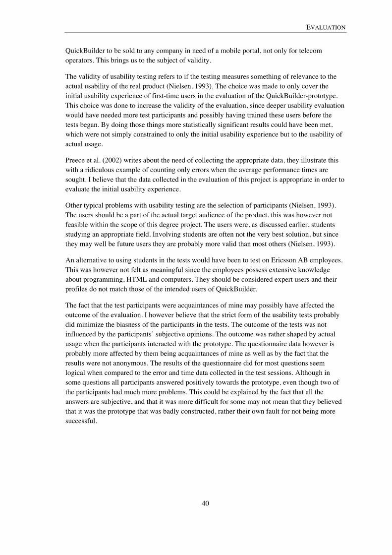
EVALUATION
40
QuickBuilder to be sold to any company in need of a mobile portal, not only for telecom operators. This brings us to the subject of validity.
The validity of usability testing refers to if the testing measures something of relevance to the actual usability of the real product (Nielsen, 1993). The choice was made to only cover the initial usability experience of first-time users in the evaluation of the QuickBuilder-prototype. This choice was done to increase the validity of the evaluation, since deeper usability evaluation would have needed more test participants and possibly having trained these users before the tests began. By doing those things more statistically significant results could have been met, which were not simply constrained to only the initial usability experience but to the usability of actual usage.
Preece et al. (2002) writes about the need of collecting the appropriate data, they illustrate this with a ridiculous example of counting only errors when the average performance times are sought. I believe that the data collected in the evaluation of this project is appropriate in order to evaluate the initial usability experience.
Other typical problems with usability testing are the selection of participants (Nielsen, 1993). The users should be a part of the actual target audience of the product, this was however not feasible within the scope of this degree project. The users were, as discussed earlier, students studying an appropriate field. Involving students are often not the very best solution, but since they may well be future users they are probably more valid than most others (Nielsen, 1993).
An alternative to using students in the tests would have been to test on Ericsson AB employees. This was however not felt as meaningful since the employees possess extensive knowledge about programming, HTML and computers. They should be considered expert users and their profiles do not match those of the intended users of QuickBuilder.
The fact that the test participants were acquaintances of mine may possibly have affected the outcome of the evaluation. I however believe that the strict form of the usability tests probably did minimize the biasness of the participants in the tests. The outcome of the tests was not influenced by the participants’ subjective opinions. The outcome was rather shaped by actual usage when the participants interacted with the prototype. The questionnaire data however is probably more affected by them being acquaintances of mine as well as by the fact that the results were not anonymous. The results of the questionnaire did for most questions seem logical when compared to the error and time data collected in the test sessions. Although in some questions all participants answered positively towards the prototype, even though two of the participants had much more problems. This could be explained by the fact that all the answers are subjective, and that it was more difficult for some may not mean that they believed that it was the prototype that was badly constructed, rather their own fault for not being more successful.

RESULTS
41
7 Result In this chapter the results of the thesis is presented. The evaluation results consist of quantitative data from the usability testing sessions as well as usability findings based on qualitative data.
7.1 The Prototype The result of the implementation was a working and stable Rich Internet Application developed in Google Web Toolkit and Java Enterprise technology, with which you could create mobile portal pages in HTML. You could add and format text, upload and add images, add other elements such as the menus and services which were HTML-based elements. There was a working interface with drag-and-drop functionality, a right click menu and you could upload your page to the web by the click of mouse button.
The implemented prototype has been explained earlier in the chapter on The Prototype and the Test.
7.2 Usability Test Results The results from the usability testing consist in both quantitative data, such as times to complete tasks, error counts and questionnaire data, and qualitative data such as quotes, observations and usability findings. The quantitative data will be discussed in this subchapter. It should however be noted that no real and statistically established conclusions can be drawn from testing with only four participants as was done in this thesis. Finding suitable users to test with was difficult and doing usability testing takes quite a lot of time. The quantitative data from the tests are therefore mostly used to make comparisons among the tested users. It is attempted to see patterns in the data, and if it points in any particular directions. The data is later used to discuss the difference between the participants in order to establish success factors, why certain participants did better than others.
7.2.1 Timing Time was measured per assignment in the usability tests. The time started when the user had read the instructions for the assignment and then opened QuickBuilder in the web browser. The times were counted in seconds and collected in order to be able to analyze the tests in a qualitative manner. Diagrams are used below to illustrate the times and their distribution among the different participants and assignments.
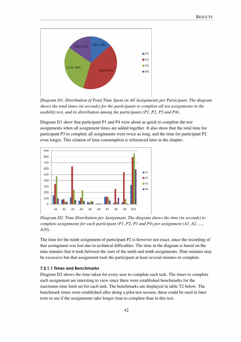
RESULTS
42
Diagram D1. Distribution of Total Time Spent on All Assignments per Participant. The diagram shows the total times (in seconds) for the participants to complete all ten assignments in the usability test, and its distribution among the participants (P1, P2, P3 and P4).
Diagram D1 show that participant P1 and P4 were about as quick to complete the test assignments when all assignment times are added together. It also show that the total time for participant P3 to complete all assignments were twice as long, and the time for participant P2 even longer. This relation of time consumption is referenced later in the chapter.
Diagram D2. Time Distribution per Assignment. The diagram shows the time (in seconds) to complete assignments for each participant (P1, P2, P3 and P4) per assignment (A1, A2, …, A10).
The time for the ninth assignment of participant P2 is however not exact, since the recording of that assingment was lost due to technical difficulties. The time in the diagram is based on the nine minutes that it took between the start of the ninth and tenth assignments. Nine minutes may be excessive but that assignment took the participant at least several minutes to complete.
7.2.1.1 Times and Benchmarks
Diagram D2 shows the time taken for every user to complete each task. The times to complete each assignment are intersting to view since there were established benchmarks for the maximum time limit set for each task. The benchmarks are displayed in table T2 below. The benchmark times were established after doing a pilot test session, these could be used in later tests to see if the assignments take longer time to complete than in this test.

RESULTS
43
Table T2. The table holds benchmark times in seconds for all assignments in the usability tests. Assignments A1 A2 A3 A4 A5 A6 A7 A8 A9 A10 Benchmarks
times 180 180 300 300 300 120 180 300 300 600
Participant P1 and P4 completed all assignments within the established benchmark times, which gives them a successrate of 100%. Participant P2 failed to complete within the benchmarks of assignments A1, A3, and A10 (and A9 as well with the approximated time of that assignment) and that gives him the successrate or 70% (60%). Participant P3 completed all assignments, except A1 and A10, within the established benchmarks which gives him a successrate of 80%.
The time difference between the time it took to complete the assignments and the benchmarks are displayed in diagram D3, where the negative numbers are times left before reaching the benchmark time. Negative numbers means that the assignment was completed within time, and positive numbers means failure to complete the assignments within time.
Diagram D3. Benchmark Times Subtracted from the Time to Complete Assignments. The diagram shows the time difference in seconds between the benchmark times and the times to complete the tasks. Positive numbers means failure to complete the tasks within time.
7.2.2 Error Count Errors made by the participants during the tests were counted and grouped to each assignment. A click that did not lead towards the goal of the assignment was interpreted as an error. There were two distinct error types; incorrect menu choices and others. For more information on the error types, view the Evaluation chapter.
In this section diagrams are used to illustrate the total error distribution among the participants, error occurrences per assignment and user as well as the distribution of error types among the participants.
It should be acknowledged that the error count of the ninth assignment (A9) with participant P2 is not in these statistics, since the recording of that assignment was lost and data collection could never be done on that assignment (other than the approximate time).
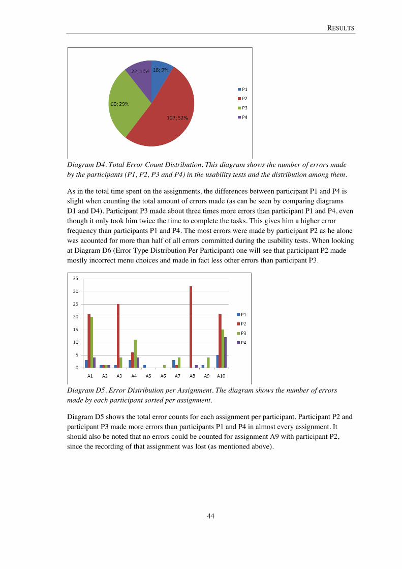
RESULTS
44
Diagram D4. Total Error Count Distribution. This diagram shows the number of errors made by the participants (P1, P2, P3 and P4) in the usability tests and the distribution among them.
As in the total time spent on the assignments, the differences between participant P1 and P4 is slight when counting the total amount of errors made (as can be seen by comparing diagrams D1 and D4). Participant P3 made about three times more errors than participant P1 and P4, even though it only took him twice the time to complete the tasks. This gives him a higher error frequency than participants P1 and P4. The most errors were made by participant P2 as he alone was acounted for more than half of all errors committed during the usability tests. When looking at Diagram D6 (Error Type Distribution Per Participant) one will see that participant P2 made mostly incorrect menu choices and made in fact less other errors than participant P3.
Diagram D5. Error Distribution per Assignment. The diagram shows the number of errors made by each participant sorted per assignment.
Diagram D5 shows the total error counts for each assignment per participant. Participant P2 and participant P3 made more errors than participants P1 and P4 in almost every assignment. It should also be noted that no errors could be counted for assignment A9 with participant P2, since the recording of that assignment was lost (as mentioned above).
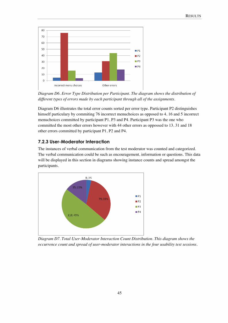
RESULTS
45
Diagram D6. Error Type Distribution per Participant. The diagram shows the distribution of different types of errors made by each participant through all of the assignments.
Diagram D6 illustrates the total error counts sorted per error type. Participant P2 distinguishes himself particulary by commiting 76 incorrect menuchoices as opposed to 4, 16 and 5 incorrect menuchoices committed by participant P1, P3 and P4. Participant P3 was the one who committed the most other errors however with 44 other errors as oppossed to 13, 31 and 18 other errors committed by participant P1, P2 and P4.
7.2.3 User-Moderator Interaction The instances of verbal communication from the test moderator was counted and categorized. The verbal communication could be such as encouragement, information or questions. This data will be displayed in this section in diagrams showing instance counts and spread amongst the participants.
Diagram D7. Total User-Moderator Interaction Count Distribution. This diagram shows the occurrence count and spread of user-moderator interactions in the four usability test sessions.

RESULTS
46
Diagram D8. User-Moderator Interaction Distribution per Assignment. This Diagram shows the number of user-moderator interactions sorted per assignment.
As can be seen in the diagrams D7 and D8, the test with participant P3 was the one with the greatest amount of user-moderator interaction. This was because of the personality of participant P3, the user was big talker and asked a lot of questions which was often answered somehow. This participant also often forgot to think aloud and was asked questions on how the interface was perceived when he did not verbally express it.
It should be acknowledged that the user-moderator interaction of the ninth assignment (A9) with participant P2 is not in these statistics, since the recording of that assignment was lost and data collection could never be done on that assignment (other than the approximate time).
Diagram D9. User-Moderator Interaction Type Distribution. This diagram shows the distribution of the different interaction types for each user.
Diagram D9 shows the different types of user-moderator interaction totally per participant. Participant P2 and P3 distinguishes themselves as the ones in need of the most moderator assistance. They are the ones accounted for the most of the user-moderator interactions totally in all of the tests (as can bee seen in diagrams D7, D8 and D9).
As in the time to complete assignments as well as error counts, participant P2 and P3 are the ones with the higher values. These are all correlated since the more time spent on each assignment gives the participant more opportunities to commit errors and to interact with the test moderator. It however also points to the difference between participant P1 and P4 as
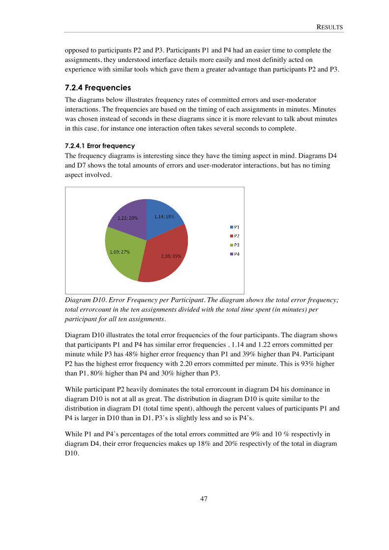
RESULTS
47
opposed to participants P2 and P3. Participants P1 and P4 had an easier time to complete the assignments, they understood interface details more easily and most definitly acted on experience with similar tools which gave them a greater advantage than participants P2 and P3.
7.2.4 Frequencies The diagrams below illustrates frequency rates of committed errors and user-moderator interactions. The frequencies are based on the timing of each assignments in minutes. Minutes was chosen instead of seconds in these diagrams since it is more relevant to talk about minutes in this case, for instance one interaction often takes several seconds to complete.
7.2.4.1 Error frequency
The frequency diagrams is interesting since they have the timing aspect in mind. Diagrams D4 and D7 shows the total amounts of errors and user-moderator interactions, but has no timing aspect involved.
Diagram D10. Error Frequency per Participant. The diagram shows the total error frequency; total errorcount in the ten assignments divided with the total time spent (in minutes) per participant for all ten assignments.
Diagram D10 illustrates the total error frequencies of the four participants. The diagram shows that participants P1 and P4 has similar error frequencies , 1.14 and 1.22 errors committed per minute while P3 has 48% higher error frequency than P1 and 39% higher than P4. Participant P2 has the highest error frequency with 2.20 errors committed per minute. This is 93% higher than P1, 80% higher than P4 and 30% higher than P3.
While participant P2 heavily dominates the total errorcount in diagram D4 his dominance in diagram D10 is not at all as great. The distribution in diagram D10 is quite similar to the distribution in diagram D1 (total time spent), although the percent values of participants P1 and P4 is larger in D10 than in D1, P3’s is slightly less and so is P4’s.
While P1 and P4’s percentages of the total errors committed are 9% and 10 % respectivly in diagram D4, their error frequencies makes up 18% and 20% respectivly of the total in diagram D10.
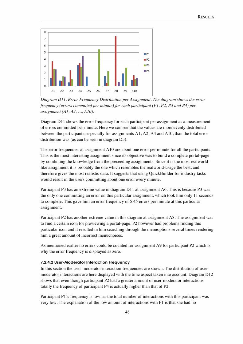
RESULTS
48
Diagram D11. Error Frequency Distribution per Assignment. The diagram shows the error frequency (errors committed per minute) for each participant (P1, P2, P3 and P4) per assignment (A1, A2, …, A10).
Diagram D11 shows the error frequency for each participant per assignment as a measurement of errors committed per minute. Here we can see that the values are more evenly distributed between the participants, especially for assignments A1, A2, A4 and A10, than the total error distribution was (as can be seen in diagram D5).
The error frequencies at assignment A10 are about one error per minute for all the participants. This is the most interesting assignment since its objective was to build a complete portal-page by combining the knowledge from the preceeding assignments. Since it is the most realworld-like assignment it is probably the one which resembles the realworld-usage the best, and therefore gives the most realistic data. It suggests that using QuickBuilder for industry tasks would result in the users committing about one error every minute.
Participant P3 has an extreme value in diagram D11 at assignment A6. This is because P3 was the only one committing an error on this particular assignment, which took him only 11 seconds to complete. This gave him an error frequency of 5.45 errors per minute at this particular assignment.
Participant P2 has another extreme value in this diagram at assignment A8. The assignment was to find a certain icon for previewing a portal-page. P2 however had problems finding this particular icon and it resulted in him searching through the menuoptions several times rendering him a great amount of incorrect menuchoices.
As mentioned earlier no errors could be counted for assignment A9 for participant P2 which is why the error frequency is displayed as zero.
7.2.4.2 User-Moderator Interaction Frequency
In this section the user-moderator interaction frequencies are shown. The distribution of user-moderator interactions are here displayed with the time aspect taken into account. Diagram D12 shows that even though participant P2 had a greater amount of user-moderator interactions totally the frequency of participant P4 is actually higher than that of P2.
Participant P1’s frequency is low, as the total number of interactions with this participant was very low. The explanation of the low amount of interactions with P1 is that she had no

RESULTS
49
particular problems finding her way around the QuickBuilder interface, and did not ask many questions. Also since she was the first person tested the moderators approach was slightly different, the approach changed into asking more questions at the later testing sessions. This is why participant P4 had a much greater amount of interactions even though he had similar success rate, error count and time spent.
P3 had the most interactions which are shown both in the diagrams D12 and D13 as well as in diagrams D7, D8 and D9.
Diagram D12. User-Moderator Interaction per Participant. The diagram shows the tests total user-moderator interaction frequencies per participant.
Diagram D13. User-Moderator Interaction Frequency per Assignment. The diagram shows the user-moderator interaction frequency (interactions per minute) for each participant (P1, P2, P3 and P4) per assignment (A1, A2, …, A10).
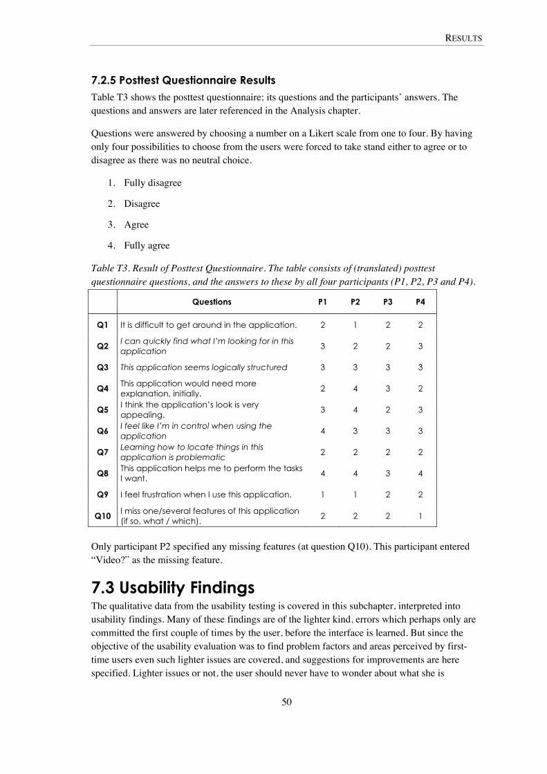
RESULTS
50
7.2.5 Posttest Questionnaire Results Table T3 shows the posttest questionnaire; its questions and the participants’ answers. The questions and answers are later referenced in the Analysis chapter.
Questions were answered by choosing a number on a Likert scale from one to four. By having only four possibilities to choose from the users were forced to take stand either to agree or to disagree as there was no neutral choice.
1. Fully disagree
2. Disagree
3. Agree
4. Fully agree
Table T3. Result of Posttest Questionnaire. The table consists of (translated) posttest questionnaire questions, and the answers to these by all four participants (P1, P2, P3 and P4).
Questions P1 P2 P3 P4
Q1 It is difficult to get around in the application. 2 1 2 2
Q2 I can quickly find what I’m looking for in this application
3 2 2 3
Q3 This application seems logically structured 3 3 3 3
Q4 This application would need more explanation, initially.
2 4 3 2
Q5 I think the application’s look is very appealing.
3 4 2 3
Q6 I feel like I’m in control when using the application
4 3 3 3
Q7 Learning how to locate things in this application is problematic
2 2 2 2
Q8 This application helps me to perform the tasks I want.
4 4 3 4
Q9 I feel frustration when I use this application. 1 1 2 2
Q10 I miss one/several features of this application (if so, what / which).
2 2 2 1
Only participant P2 specified any missing features (at question Q10). This participant entered “Video?” as the missing feature.
7.3 Usability Findings The qualitative data from the usability testing is covered in this subchapter, interpreted into usability findings. Many of these findings are of the lighter kind, errors which perhaps only are committed the first couple of times by the user, before the interface is learned. But since the objective of the usability evaluation was to find problem factors and areas perceived by first-time users even such lighter issues are covered, and suggestions for improvements are here specified. Lighter issues or not, the user should never have to wonder about what she is
RESULTS
51
supposed to do, as the quote of Rubin and Chisnell (2008) read in the Theory chapter on Usability, a truly usable product can be used without hindrance, hesitation or question.
In the sections below suggestions for improvements are first presented for the Text and the Graphics tools since they are the main tools in QuickBuilder. These tools are also the ones with the deepest functionality in the prototype; they are also the tools of which screenshots can be displayed in this public thesis report. After the suggestions to better these specific tools, more general suggestions are presented which can be applied on all parts of the QuickBuilder prototype, as well as other similar Rich Internet Applications.
7.3.1 The Text Tool All users do well with the text editor, there are however some things that could be better.
7.3.1.1 Add and New Buttons
One person thought that the add button was meant for adding images or other things to the text area. One might consider changing the name to something more descriptive, or adding a tooltip saying the button adds the text to the workspace.
It may be a good idea to add a “new”-button. This button would open up an empty text area in the text editor. This would make the process of adding two text elements subsequently more natural. This is as opposed to first adding an element, then to deselect the added element and opening the text editor again before adding the second element (or to add the first element twice before editing the latter).
7.3.1.2 Font and Text Color
It is hard to know which font and which color is active. Not even after choosing a certain font is it directly visible which font was selected. The same thing goes for selecting text color and text background color. A solution would be to use traditional HTML drop down list to display the font and color options. When an element is then selected it is displayed when the drop down list is contracted.
If the list type which is used to display the font and color options today is to remain, they should be reprogrammed to show which option is toggled, and also to close automatically when a selection is made.
Several users had problems getting rid of the toggled lists and confusion often arose concerning if a certain font was selected or not.
7.3.1.3 Creating Links
Using the link tool was proven quite problematic during the tests. In order to accomplish creating a link firstly the link-text had to be written and then selected before a click on the “create link”-button would generate a hyperlink (which links to the URL inputted by the user in a popup window triggered by the “create link”-button, the popup is seen in figure F8). Half of the users did however start by clicking the “create link”-button before selecting the link-text. Doing this accomplishes nothing, other than arising confusion, since no link is created.

RESULTS
52
Figure F8. Link Popup. The current popup for entering a link URL.
One way to get rid of this problem would be to simply alert the user that no link-text had been selected. This approach however may not be well suited with the “minimum amount of clicks” approach of QuickBuilder. A better way may be to simply create a default link-text which is linked with the URL (which the user inputs after clicking the “create link”-button). This default text may then be edited in the next step using the text editor. A third way to rid the problem is to reprogram the popup window where the user inputs the URL. If the popup consisted of two text-input fields, the URL input field and an additional link text-input field (as in figure F9); I believe most users would accomplish adding a link on the first try. If a user had marked some text in the text editor before clicking the “create link”-button this additional input field (for the link text) should contain the selected text automatically.
Figure F9. Suggested Future Popup for Entering a Link URL. With additional text input for link text, automatically filled in with selected text from the text options panel.
The popup window triggered by the “create link”-button tells the user to “Enter a link URL”. One of the users who had the most problems with the linking tool did not know what a URL was. It might be a good idea to instead call it “web address”, or to have some kind of help text explaining what a URL is to help inexperienced users (as in figure F9).
7.3.2 The Graphics Tool
7.3.2.1 Adding, Searching or Editing Graphics
When arriving to the Graphics tool one is met by an abundance of input fields (see figure F10). The idea is that by using the same input fields, more than once, in different purposes one could
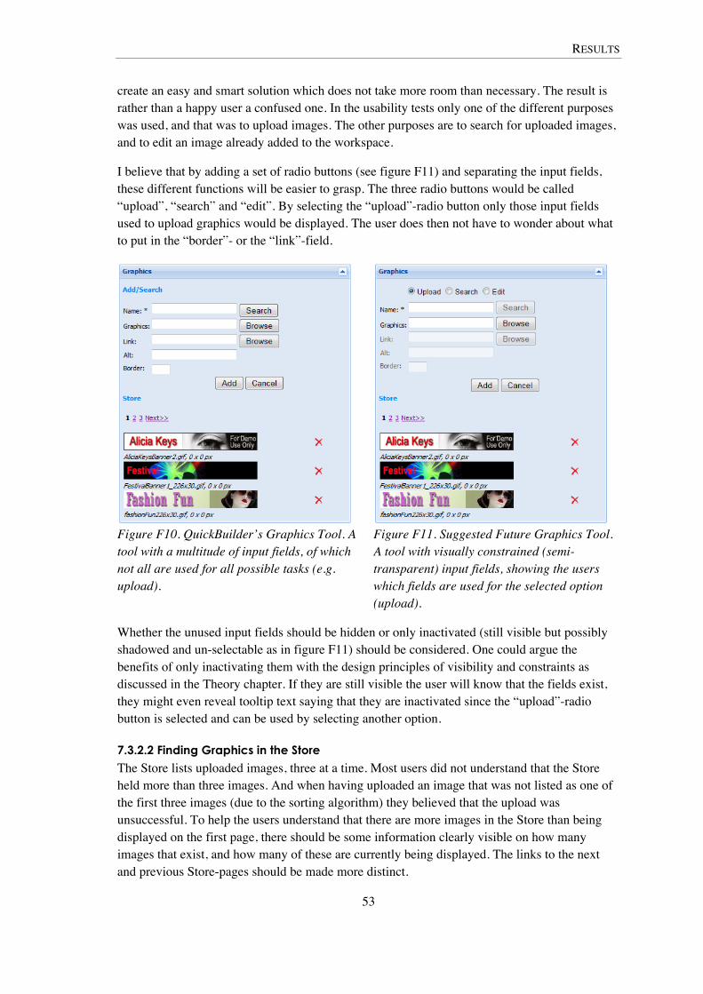
RESULTS
53
create an easy and smart solution which does not take more room than necessary. The result is rather than a happy user a confused one. In the usability tests only one of the different purposes was used, and that was to upload images. The other purposes are to search for uploaded images, and to edit an image already added to the workspace.
I believe that by adding a set of radio buttons (see figure F11) and separating the input fields, these different functions will be easier to grasp. The three radio buttons would be called “upload”, “search” and “edit”. By selecting the “upload”-radio button only those input fields used to upload graphics would be displayed. The user does then not have to wonder about what to put in the “border”- or the “link”-field.
Figure F10. QuickBuilder’s Graphics Tool. A tool with a multitude of input fields, of which not all are used for all possible tasks (e.g. upload).
Figure F11. Suggested Future Graphics Tool. A tool with visually constrained (semi-transparent) input fields, showing the users which fields are used for the selected option (upload).
Whether the unused input fields should be hidden or only inactivated (still visible but possibly shadowed and un-selectable as in figure F11) should be considered. One could argue the benefits of only inactivating them with the design principles of visibility and constraints as discussed in the Theory chapter. If they are still visible the user will know that the fields exist, they might even reveal tooltip text saying that they are inactivated since the “upload”-radio button is selected and can be used by selecting another option.
7.3.2.2 Finding Graphics in the Store
The Store lists uploaded images, three at a time. Most users did not understand that the Store held more than three images. And when having uploaded an image that was not listed as one of the first three images (due to the sorting algorithm) they believed that the upload was unsuccessful. To help the users understand that there are more images in the Store than being displayed on the first page, there should be some information clearly visible on how many images that exist, and how many of these are currently being displayed. The links to the next and previous Store-pages should be made more distinct.

RESULTS
54
One of the users wanted the Store to sort the images by order of upload time. There might be a point in having variable ways of sorting the images. They could be sorted by name, time of upload, pixel width and file type etc.
7.3.3 Always Include Feedback, and be Consistent Many of the errors above, and many others as well, could have been avoided if helpful feedback would have been given to user when operating the interface. Such errors as the failing in creating links could have been avoided by the use of feedback. If the user had gotten some kind of message when clicking the “create link”-button without first having marked some text in the text tool he would probably have understood that what he did was wrong. This feedback could be a text message, or a popup telling him that the link text had to be selected before pressing the button. My illustrated suggestion for improving the link tool above also makes use of feedback. The user does not have to select any text before clicking the “create link”-button, he then gets to see two input text fields in the create link-popup, and are therefore helped in creating the link. Even if the user selects some text before clicking the button, feedback is given in the way of the text appearing in the “link text” input box, immediate feedback is given by showing the user what is happening, and what text is being linked.
Feedback could also be a way to improve the graphics tool, in particular the Store which holds the uploaded images. As told above, some of the users thought that they had failed in uploading images because they could not see the image immediately in the Store. If feedback had been implemented to give the user a simple text message that the upload had been successful, them they would know and would not have to wonder.
Tooltips proved very useful and important in this interface. Since all buttons and icons were simply images (no text, except the text tool icon in the form of a “T”) their meaning was not obvious for all users. Many of the users simply had to place the mouse cursor above the icons and read the tooltips in order to understand what the tool did. Some of the icons lacked tooltips, and this caused quite a lot of confusion – the feedback was not consistent. Many users had problems finding the Preview in Device-button for previewing the portal page. This is not something that would have been such a great issue if there were tooltips, giving feedback with the name of the icon, consistently on all icons.
Feedback was implemented quite successfully in the workspace area. When dragging an element into or inside of the workspace area, ghost images were shown. These ghost elements were copies of the elements being dragged and placed in the position of the workspace where the dragged element would be placed if released (dropped) in that particular spot. This made moving elements around in the workspace very easy and intuitive for all users in the usability tests. Although there was a bug in this feedback system, when the user tried placing an element in the top of the workspace area, no ghost image was shown. Many of the users tried placing the bottom element in the top of workspace (assignment A6 consisted of this action, there were only two elements in the workspace at that time), but when they got no feedback in form of a ghost element they did not even try dropping the element there. Instead the users dragged the top element below the second element in order to interchange their places. This showed that when the users did not get any feedback they did not believe it would work.
The actions of the users could be explained by the fact that they always got the ghost element-feedback when dragging elements to other places, and therefore it is not strange that they
RESULTS
55
believed that dropping the element at that particular spot would mean that it would be unsuccessful. Even if this is the case I still believe it is interesting since lack of feedback caused this problem. Therefore feedback should be used consistently throughout the interface.
7.3.4 Create Abstractions and Wizards The idea of QuickBuilder is to be a very easy, intuitive and simplified tool. In the Menu, and Form tools this is shown by letting the users by simple means create menu bar-items and to add HTML-form elements to the workspace. I however believe that this extremely simplified way of letting the user create and add such elements to the portals are in fact not good for the usability experience. Menus and especially HTML-forms are very complicated elements, and giving the users total freedom with these – on menu bar-item or HTML-input element level – does not help them in creating complex functions. I believe that by constraining the users’ freedom with these elements, and instead adding abstractions and wizards, the creation of complex functions could be made easy and intuitive.
7.3.4.1 The Poll Function
If a user would want to add a poll-function (for simple voting) to the portal page, the user could utilize HTML-form elements for this task. The poll-function would consist of a few questions and radio-buttons for selecting a particular answer (such as yes or no). There should also be a button to submit the answers. However, the creation of such a poll-function does not stop there, the results have to be collected, and probably saved in a database. This requires knowledge of server-scripting which an inexperienced user does not have (probably).
To help the users in creating such functions as the poll, I suggest that abstractions should be introduced to the Forms tool. Instead of the user adding the low level form elements, the user should add the entire poll-function. The adding of the poll function elements should be done by a “wizard”, the wizard is implemented functionality inside QuickBuilder which asks the user how many questions the poll should contain, what these questions are, what the answers could be and how the poll result should be displayed. By the utilization of this wizard the users will not have to think about adding form elements or writing a server script, since all of this is abstracted and handled by the wizard.
The wizard approach will help the users in creating certain predefined functions, and it will be very easy to add such advanced functionality to a simple mobile portal, without really having to know anything about HTM- forms or server scripting.
7.3.4.2 The Menu Widget
The last usability test assignment included adding a menu to the portal page. This proved quite difficult and not very intuitive at all. These problems are explained by the fact that the menu tool was not implemented correctly. However it showed that the users wanted to add the menu items one by one, by first creating a menu item by giving it a name and then linking it to a particular page. I feel that this approach of adding one element at the time will cause confusion as these elements are not grouped together as one menu element in this approach.
I suggest introducing a wizard for creating menus. The wizard would ask the user to input how many menu items there should be and then on the level of each menu item specify the name/title/image for display and the link URL. The visual settings would be set on the entire menu widget, so that each menu item would be displayed the same.

RESULTS
56
The created menu would be stored inside the menu tool options, similar to how uploaded images are stored in the graphics tool, for later use on other portal pages.
ANALYSIS
57
8 Analysis In this chapter the data collected in the usability tests are analyzed. Factors for a successful user experience with QuickBuilder are analyzed. The reaching of the interface experience goals is also analyzed as well as the implications of adapting the Scrum methodology.
8.1 Test-Data Analysis As mentioned in the Result chapter, these quantitative data was not collected in order to find statistically significant results on the usability of the QuickBuilder prototype. The data is used to compare how the participants handled the assignments and how successful they were in their first encounter with the prototype.
8.1.1 Timing and Error Count During the usability tests two of the participants (P1 and P4) distinguished themselves by performing a lot better than the other two (P2 and P3). P1 and P4 finished the assignments considerably faster than the other two participants. P1 and P4 were done after having spent 945 and 1081 seconds respectively on the assignments which was about half of the time it took for participant P3 to complete the same tasks (P3 took 2135 seconds). P2 took the longest amount of time to complete tasks, with total time adding up to approximately 2920 seconds (see diagram D1).
As mentioned in the Result chapter, P2’s total time is an approximation and is somewhat exaggerated. The time for P2’s ninth assignment could not be measured exactly, and was approximated to 540 seconds since it took him nine minutes between the point where he began the ninth and the tenth assignment (which can be established by viewing the tests recording material). The fact is that it took P2 quite a while to complete the ninth assignment and the nine minutes approximation is not far from the truth. Also even if the time for this assignment is not counted into the total amount, it still would add up to more time totally than for P3. The absence of recording material for P2’s ninth assignment may skew the results since no error or user-moderator interaction data could be collected on this part of the usability test, neither could it be approximated. Decision was made to count these posts as zero in the absence of any reliable approximation. The timing was however inserted into the results as an approximation could be made that was seen as not far from the actual time.
Even when looking at the total error count P1 and P4 performed similarly (see diagram D4), P1’s count adding up to 18 and P3’s to 22 errors made totally during all of the assignments. This is considerably less errors than committed by the other two participants. P3 made 60 errors (three times the mean value of P1 and P4) and P2 made 107 errors (more than five times the mean value of P1 and P4).
These error values above are however the sum of all kinds of errors. By viewing diagram D6 the facts take a slightly different turn. There you can see that P3 actually made more other errors than P2. The greatest amount of P2’s errors consists of incorrect menu choices. The error differences between P1 and P4 are slight.
ANALYSIS
58
The fact that P2 made about nine (76 / ((5 + 4 + 16) / 3) = 9.12) times more incorrect menu choices than the mean value of the other three participants is remarkable. P2 had to return to each menu-option several times before he started to remember which one was which. P2 also disagreed with the statement “I can quickly find what I’m looking for in this application” in the posttest questionnaire (question Q2 in the posttest questionnaire). P2 went through all of the tools multiple times, clicking on the icons and opening their option panels. The other participants instead mostly just hovered (instead of clicking) the tool icons with the mouse cursor, and read the tooltips which was triggered by this action, when they were searching for a certain tool. The tooltips told the names of the tools and the other participant often stopped at that, but P2 often clicked to open the tool even after reading the tooltip. It seemed this participant had a much harder time learning the interface than the others. P2 however disagreed, as all participants did, in the posttest questionnaire question that asked if learning how to find things in the application was problematic (question Q7). All participants also agreed that the application seemed logically structured (question Q3). The answers to these questions are of course subjectively and what is a logical structure for one participant may not be logical for another. When answering if it is hard to learn how to get around in an application the participant answers from his or her experience of using other applications, may it be that even though participant P2 took longer to complete tasks than the others, he may take longer time using all kinds of applications and thus this application does not seem harder to learn than any other.
P1 and P4 completed the tasks more quickly than the others. They also committed substantially less errors and interacted a lot less with the test moderator. The error and interaction counts are however correlated with the time it took to complete the tasks. When looking at the frequency diagrams in the result chapter, a slightly different picture is painted. Diagram D10 show that even though participants P2 and P3 committed several times more errors than P1 and P4, their error frequencies did not differentiate as greatly. The more time it took for a user to complete a task gave the user more time to commit errors. This fact gives a bit of perspective on the total error count. One possibility is that taking longer time to do a certain task would give the user longer time to think about how to actually do the tasks correctly. This however was not the fact in these tests. Even though the frequencies were more evenly distributed among the participants than the total error count, participants P1 and P4 had the lowest error frequencies.
As mentioned in the Result chapter, the moderators approach to user-moderator interaction changed after the first test. Participant P1managed well on her own, she did not ask many questions and was not asked many either. The other participants however were more in need of help, asked more questions and were also asked more questions in order to get more input on their thoughts. Participant P4 who performed similarly to P1 in most areas had actually a higher user-moderator interaction frequency than participant P2. This had most probably an effect on his result. However which those effects are, is hard to speculate in. The interactions may have given him more help, which could explain his high success rate and low error count. They most definitely affected his timing. The more interactions, the more disturbances and the longer it takes to complete the task, as long as the interactions do not help the user to complete the assignments easier and therefore more quickly.
ANALYSIS
59
8.1.1 Success Rate and Success Factors P1 and P4 succeeded in finishing all ten assignments within the established benchmarks. P2 completed six assignments within the benchmarks and P3 completed eight within time. Even these facts indicate the superiority of participants P1 and P4 in relation to their peers.
The main reasons for P1’s and P4’s success are probably their greater experience using computers for doing similar and other advanced tasks. P1’s and P4’s attitudes against computers were a lot more positive than the attitudes of P2 and P3. P1 and P4 both had some experience with web design previously to these tests. This was shown particularly in the tests as they were both interested in the source code tab in the QuickBuilder interface. P3 said that the source code frightened him when he first saw it. P2 said that he had no previous experience making web sites and thus had no knowledge of HTML code.
This indicates that even though QuickBuilder has an easy interface, which users feel is easy to get around in and is logically structured, using it is easier if you have previous web site development experience or more positive attitudes towards computers (or at least both). P1 and P4 agreed on finding what they wanted with QuickBuilder was quickly done, P2 and P3 disagreed (question Q2). P1 and P4 disagreed that QuickBuilder needed more explanation initially (question Q4), P3 agreed, P2 fully agreed.
Even though the application may need more explanation initially and that it takes a long time to find what is searched for by some users, all users feel that QuickBuilder helps in performing the wanted tasks (question Q8). This seems contradictory but could be explained with the fact that all users eventually completed each assignment, and may feel that the application therefore is helpful, even though the help may not have come from the application itself but the test moderator.
The fact that the participants P1 and P4 were able to complete the assignments fairly quickly and without making particularly many errors should mean that a person with even more experience building mobile portals with similar tools would be at least as successful using QuickBuilder as they were. This at least points in the direction that QuickBuilder is an easy to use tool, at least for people with a basic understanding of web site development and HTML.
8.2 Reaching the Interface Experience Goals In this subchapter the reaching of the interface experience goals is analyzed.
8.2.1 Easy to Learn Ease of learning is one of the most fundamental goals of usability, since all systems have to be learned (Nielsen, 1993). In the usability tests the users started off by doing nine assignments which introduced different tools in the QuickBuilder interface. The tenth and last assignment consisted of the users applying their knowledge from the earlier assignments, and of learning some new tools. Two of the four participants succeeded in completing the last assignment within the benchmark time and was therefore considered successful in this assignment, as discussed earlier, and hence the other two was considered unsuccessful. This fact makes it difficult to say that QuickBuilder is easy to use. However all users eventually completed all tasks given to them, which indicates that even though it may take longer time for some users to learn than others, it is still quite easy to learn QuickBuilder.
ANALYSIS
60
All participants disagreed that it was difficult to get around in the application (posttest questionnaire, question Q1). They also disagreed that locating things in the application was problematic (question Q7) and they agreed to feeling in control when using the application (question Q6). The more successful participants P1 and P4 agreed that they could quickly find what they were looking for in the application (question Q2) and they also disagreed on that the application would need more explanation initially (question Q4). The answers to from participants P2 and P3 were the opposite on these questions (Q2 and Q4). Even though these answers are subjective it indicates that participants P2 and P3 found the application harder to learn than P1 and P4. Particularly participant P2 seemed to have a harder time to learn the interface than the others as he committed nine times more incorrect menu choices than the mean of the other participants.
8.2.2 Efficient to Use Preece et al (2002) writes that efficiency is about helping the user in completing tasks, and that a system that lets the user do tasks with a minimal amount of mouse clicks or key presses is an efficient system. Nielsen (1993) however writes that efficiency refers to the ability level of an expert user, when his or her learning curve has flattened. Nielsen writes the following about measuring efficiency:
A typical was to measure efficiency of use is thus to decide on some definition of expertise, to get a representative sample of users with that expertise, and measure the time it takes these
users to perform some typical test tasks. (Nielsen, 1993 p. 31)
This was attempted in assignment A10 in the usability test. The users had been trained through the first nine assignments on doing normal QuickBuilder tasks, and in A10 they applied their expertise by building a mobile portal page. Two of the participants finished assignment A10 within the benchmark times, P1 finished after just over half of the benchmark time, P2 completed just under the benchmark. However the mean of all four participants’ times were 640 seconds which is more than the benchmark time of the assignment (which was 600 seconds). This means that QuickBuilder was not as efficient as was hoped for.
8.2.3 Easy to Install and Open Unlike the two interface experience goals above, this one and the following two are not ordinary usability goals or attributes supported by the literature, hence the analysis of these are not based on theory. This interface experience goal was neither evaluated in the usability tests, QuickBuilder had been started for the users before the testing sessions started.
However since QuickBuilder was implemented as a web application, no installation is required; the application is run directly in the web browser with JavaScript. No plug-ins has to be installed since all major web browsers (such as Internet Explorer, Firefox, Safari, Opera and Google Chrome) support JavaScript from the start.
Opening QuickBuilder today is trivial; the only thing that had to be done was to enter the web address of where QuickBuilder was. In the future users most probably will have to login with a username and password but in the prototype this was not the case.

ANALYSIS
61
8.2.4 Focused on Drag-and-Drop As mentioned in the Implementation chapter, the first drag-and-drop functionality in the prototype was implemented with the input tool icons. This was not discovered by any of users, and indicates that this was not needed and dragging these icons to the workspace is unnatural. However the same logic was used for dragging and dropping uploaded images from the graphics options panel, and for moving around all kinds of elements inside of the workspace area. Images were actually the only element type which was able to be dragged to the workspace from another options panel. This was seen as some kind of a disappointment, but was due to the fact that dragging and dropping elements is difficult to implement, and it was not prioritized in the end of the implementation period.
Add buttons were utilized for adding such elements as text and menu. In future version of QuickBuilder, solving the drag-and-drop issues should be highly prioritized.
8.2.5 Have Only the Most-Used Functions QuickBuilder was to have only the most-used functions of the previous tools in the Ericsson Mobile Service Delivery Platform (MSDP) product suite. The participant in the usability tests had no previous experience using the MSDP applications and could therefore not utter themselves on this matter. The participants were however asked in the posttest questionnaire if they missed any particular features in QuickBuilder. All participants disagreed on this question (question Q10). One of the participants however wrote “Video?” as a missed function. All participants agreed on that the application helped them to perform the tasks they wanted. This indicates that QuickBuilder at least does not have too few functions, it however says nothing about having too many.
8.3 The Implications of Scrum The greatest implications of the Scrum-like development process used in the implementation period of this degree project were the daily scrum meetings and the never ending backlog with prioritized functionality. The daily meetings helped in giving all team members and developers an awareness of the project status. Decisions could be made on place directly by all involved. This meant that the most prioritized items on the backlog could be assessed in time. Although since the backlog contained many more items than could ever be implemented during the project, it seemed endless, and more time was spent on implementing new functionality than addressing usability issues. This resulted in the usability not being as focused on as was the original idea.
It is probably quite unfair to blame these problems entirely on Scrum. The problem of the never ending backlog is something that one should not have to worry about as a developer, since all development is done in iterations and only a certain amount of backlog items are handled in each sprint (iteration). The implementation phase in this degree project was not divided into regular iterations, and therefore the backlog items were not grouped together in smaller chunks as they usually are per iteration. Had there been fixed iteration cycles planning could have done in more detail, in some sprints could have been subject to assessing only usability issues.
DISCUSSION
62
9 Discussion In this chapter the results and the analysis is discussed. This chapter also discusses if the thesis objectives has been met, and a discussion on the methods are held.
The mission of this thesis project was to create an interactive web application for development of mobile portals. This tool was implemented during the fall of 2008 with the use of Google Web Toolkit. With this tool you were able to add formatted text, links, lists, graphics, and services to an HTML page and to upload this page to the web. You were able to upload any image to the application and add it to your mobile portal page. Screens from the QuickBuilder interface can be found in Appendix X1 and X2 the prototype is also discussed in the chapter on The Prototype and the Test. The prototype had some additional interface experience goals of which some were met and some were not, while others were hard to measure and the reaching of those goals could not be established with the evaluation data.
The process of working on this degree project was inspired by interaction design and usability engineering which is two similar approaches for creating usable products. Both fields advocate heavy involvement of users and to do usability evaluations, especially usability testing. Involving actual users was not an option in this degree project due to rules on customer involvement of Ericsson AB projects. This was seen as very negative by me, and I still wonder how Ericsson AB is going to succeed in creating new products that are usable. Consideration of these matters are however not a part of my thesis work.
The implementation of the prototype was inspired by Scrum development methodology. Even though this project was to focus heavily on usability it did not get all the usability focus needed to create a perfectly useable product. Scrum does not always play well with usability issues as was discussed in the Theory chapter. There is however people who have tweaked agile development methodologies to be more focused on usability issues and succeeded in creating highly usable products with it. One such methodology is U-Scrum discussed in the Theory chapter.
The mission was also to evaluate the initial usability experience of this application for first-time users. In the beginning of the project there were plans to do both heuristic evaluation in the mid of the implementation period, as well as to do usability testing on the finished QuickBuilder prototype. However, due to lack of time while implementing, heuristic evaluation was never done. Instead the evaluation focus was laid on the usability testing.
Usability testing was done in the spring of 2009. Four people were tested and these were all students studying a, according to me, relevant area (Multimedia: Pedagogy and Technology). The students got ten assignments to solve with QuickBuilder. The tests were planned so that the user slowly got to know the interface and ended with the user creating an entire mobile portal page for a fictional company. The results of these tests varied, but two of the users distinguished themselves as particularly successful. These
DISCUSSION
63
two users finished all tasks within established benchmark times and did not commit especially many errors. The two successful users both had a more positive attitude against computers and they also had previous web design experience, although slight. These two factors are seen as the reasons for their success, and it suggests that having previous knowledge of web design will help the user in learning and understanding the QuickBuilder interface. This is probably since they know what can be constructed with HTML and they know what it means to do simple tasks as inserting images and creating links. Their more positive attitudes towards computers help them in getting an overview of the interface, since they more easily understand the conceptual model of the application layout.
The thesis objectives included finding problem areas and factors making it harder for first-time users to work with QuickBuilder, and to suggest improvements to the interface in order to better their initial usability experience. Such suggestions were made in the Usability Findings subchapter in the Result chapter. These suggestions included both QuickBuilder-specific details such as making it easier to create links and to separate function areas in the graphics tool. It also included more general suggestions such as always adding feedback to the interface and to be consistent with the usage of it, as well as to introduce abstractions and creating wizards in order to help the user to do advanced tasks in very simple ways.
Success rates were calculated for the participants, these rates were percentages of the amount of test assignments completed within previously established benchmark times. The benchmarks were roughly estimated after having done a pilot testing session. The relevance of these benchmarks could be discussed as they were simply based on one certain user. The benchmarks were chosen since it would be good to have some kind of reference values before the real tests started, if a test would take all too long the test could be stopped and seen as unsuccessful. None of the participants were however interrupted even though some of them took longer time than the benchmark times to complete some assignments. They were never interrupted since they all were about to complete the assignments within reasonable time.
In order to establish statistically significant usability results more tests should be done, this was however never the goal of this degree project since finding appropriate users is hard and doing usability testing takes a lot of time. The quantitative data collected from the evaluation are used in this thesis to compare the results among the users. The data showed that two of the participants were particularly successful, while the others encountered more problems and took longer time to complete the assignments.
Some issues were found where the usability of the prototype could be improved to better support first-time users. It is possible that doing heuristic evaluation before the usability testing sessions would have lead to these issues being discovered earlier. If they would have been discovered before the usability testing started the issues could have been solved, and therefore the usability would have been improved. However as mentioned above there was no time to do heuristic evaluation, since the implementation was seen as more important in that phase.

DISCUSSION
64
More general results from this master thesis include that Google Web Toolkit can be a very practical tool for implementing Rich Internet Applications and that you should always include feedback and be consistent with it to improve the usability experience.
9.1 Future Research Research should be done on the integration of QuickBuilder with the rest of the Ericsson Mobile Services Delivery Platform (MSDP) applications.
The usability testing done within the scope of this thesis only evaluated the first encounter with the QuickBuilder interface. In order to evaluate how usable QuickBuilder will be for an experienced user, more tests will have to be done with users having prior QuickBuilder experience.
In order to establish that QuickBuilder is truly usable, usability testing should be conducted with users within the actual user group, or target audience, such as those working on building mobile portals with the MSDP today.
The development of QuickBuilder, during the degree project, was inspired by interaction design and usability engineering, two methodologies which advocate an iterative design process. During the implementation period only one such iteration was done. It would be interesting to follow up with an additional iteration, and to incorporate the usability findings from this thesis report, and then to do additional usability testing to validate the improvements of these findings.
It would also be interesting to apply the U-Scrum methodology and test it in development of an application with high usability focus, such as QuickBuilder.
REFERENCES
65
References Literature References BRAUDE, E. 2004. Software Design: From Programming to Architecture. Hoboken: John Wiley & Sons, Inc.
NIELSEN, J. 1993. Usability Engineering. San Francisco: Morgan Kaufman
PREECE, J., ROGERS, Y. AND SHARP, H. 2002. Interaction Design: Beyond Human-Computer Interaction. New York: John Wiley & Sons, Inc.
RUBIN J. AND CHISNELL D. 2008. Handbook of Usability Testing: How to Plan, Design and Conduct Effective Tests, 2nd edition. Indianapolis: John Wiley & Sons, Inc.
Articles and Papers MCINERNEY, P. AND MAURER, F. 2005. ‘UCD in Agile Projects: Dream Team or Odd Couple?’, Interactions, November + December, pp. 19-23
SINGH, M. 2008. ‘U-SCRUM: An Agile Methodology for Promoting Usability’, Agile, 2008. AGILE ’08 Conference, pp. 555-560
Web References BECK, K., BEEDLE, M., VAN BENNEKUM, A., COCKBURN, A., CUNNINGHAM, W., FOWLER, M., GRENNING, J., HIGHSMITH, J., HUNT, A., JEFFRIES, R., KERN, J., MARICK, B., MARTIN, R. C., MELLOR, S., SCHWABER, K., SUTHERLAND, J. AND THOMAS, D. 2001. Manifesto for Agile Software Development, http://www.agilemanifesto.org/ (Retrieved 2009-06-16)
EICHORN, J. 2007. Understanding Ajax: Getting Started, http://www.webreference.com/programming/javascript/understanding-ajax/index.html
(Retrieved 2009-05-02)
GARRETT, J. J. 2005. Ajax: A New Approach to Web Applications, http://www.adaptivepath.com/ideas/essays/archives/000385.php (Retrieved 2009-05-02)
QUSAY H. M. 2003. Servlets and JSP Pages Best Practices, http://java.sun.com/developer/technicalArticles/javaserverpages/servlets_jsp/ (Retrieved 2009-05-02)
WATERS, K. 2007. All about Agile: 10 Good Reasons to do Agile Development, http://www.agile-software-development.com/2007/06/10-good-reasons-to-do-agile-development.html (Retrieved 2009-06-16)
Web References with Unknown Authors DICTIONARY.COM. 2009. Search Results for: WYSIWYG, http://dictionary.reference.com/browse/wysiwyg (Retrieved 2009-05-02)
REFERENCES
66
GOOGLE CODE. 2009. Google Web Toolkit: Product Overview, http://code.google.com/intl/sv-SE/webtoolkit/overview.html (Retrieved 2009-05-02)
GOOGLE CODE. 2009. Communicating with a Server – Google Web Toolkit, http://code.google.com/intl/sv-SE/webtoolkit/doc/1.6/DevGuideServerCommunication.html (Retrieved 2009-05-24)
SCRUM ALLIANCE. 2009. Scrum Alliance – Scrum Ceremonies, http://www.scrumalliance.org/pages/scrum_ceremonies (Retrieved 2009-06-17)
SCRUM ALLIANCE. 2009. Scrum Alliance – Scrum Roles, http://www.scrumalliance.org/pages/scrum_roles (Retrieved 2009-06-17)
SEARCHSOA.COM. 2007. What is Rich Internet Application (RIA), http://searchsoa.techtarget.com/sDefinition/0,,sid26_gci1273937,00.html (Retrieved, 2009-05-24)

APPENDIX
67
Appendix X1: Design Sketch QuickBuilder in September 2008
The Design Sketch, here showing the initial design of the text tool.
The Design Sketch, here showing the initial graphics tool.
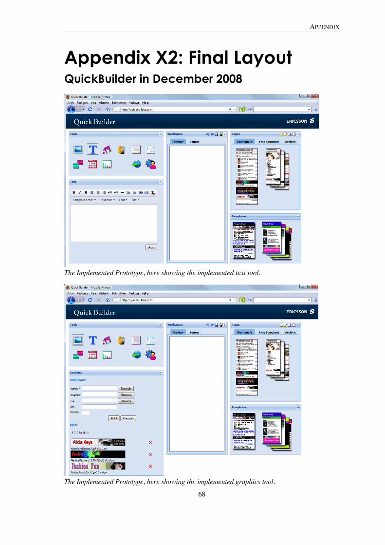
APPENDIX
68
Appendix X2: Final Layout QuickBuilder in December 2008
The Implemented Prototype, here showing the implemented text tool.
The Implemented Prototype, here showing the implemented graphics tool.

TRITA-CSC-E 2009:136 ISRN-KTH/CSC/E--09/136--SE
ISSN-1653-5715
www.kth.se