i am my ego
DESCRIPTION
PORTFOLIO ALEXP PROBATRANSCRIPT

PROJECT TURNING THE IMMATERIAL MATERIAL // EINDHOVEN 2011
PUBLICATIONS COALFACE GALLERY // GENK BELGIUM // 2012
MY
SELECTED WORKS STARTING 2006 UNTIL NOW
I AM
EGO
I AM EGOMY
PORTFOLIO
Portfolio: lat. portare carry and folium page
This portfolio illustrates some of my most important design works. It is supposed to show a wide range of my design skills. Moreover, it depicts my expansive conceptual and realistic thinking. First of all there will be a depiction of the design works during my study at the Akademie Mode & Design in Hamburg. After that there will be a description of my professional work during my internship at studioMDA in New York City and my Bachelor thesis. The final part of my portfolio are projects which I developed during my first year Master studies at the Design Academy Eindhoven.
PROLOGUE
PORTFOLIO
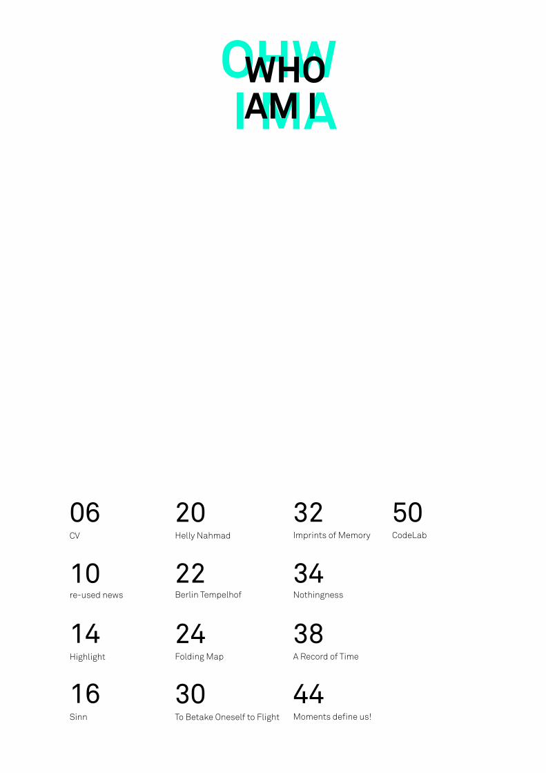
WHO AM I
WHOAM I
re-used news
CV
Highlight
Sinn
10
06
14
16
Helly Nahmad
Berlin Tempelhof
Folding Map
To Betake Oneself to Flight
20
22
24
30
Imprints of Memory CodeLab
Nothingness
A Record of Time
Moments define us!
32 50
34
38
44

PROJECT TURNING THE IMMATERIAL MATERIAL // EINDHOVEN 2011
PUBLICATIONS COALFACE GALLERY // GENK BELGIUM // 2012
CURRICULUM VITAEALEXANDRA PROBA
160 NORTH4TH STREET
APARTMENT 4BROOKLYN, 11211
NEW YORK347.567.0941
CURRICULUM VITAEALEXANDRA PROBA
160 NORTH4TH STREET
APARTMENT 4BROOKLYN, 11211
NEW YORK347.567.0941
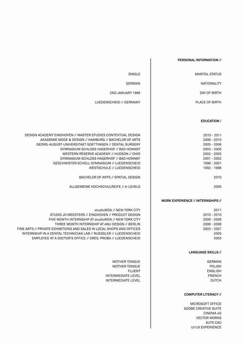
PERSONAL INFORMATION //
MARITAL STATUS
NATIONALITY
DAY OF BIRTH
PLACE OF BIRTH
EDUCATION /
2006 - 20102005 - 20062003 - 20052002 - 20032001 - 20021996 - 20011992 - 1996
2010
2005
WORK EXPERIENCE // INTERNSHIPS //
2011 2010 - 20102008 - 20092008 - 20082003 - 2007
20052003
LANGUAGE SKILLS //
GERMAN POLISH
ENGLISH FRENCH
DUTCH
COMPUTER LITERACY //
MICROSOFT OFFICEADOBE CREATIVE SUITE
CINEMA 4DVECTOR WORKS
AUTO CADUI/UX EXPERIENCE
SINGLE
GERMAN
2ND JANUARY 1986
LUEDENSCHEID // GERMANY
DESIGN ACADEMY EINDHOVEN // MASTER STUDIES CONTEXTUAL DESIGNAKADEMIE MODE & DESIGN // HAMBURG // BACHELOR OF ARTS
GEORG-AUGUST-UNIVERSITAET GOETTINGEN // DENTAL SURGERYGYMNASIUM SCHLOSS HAGERHOF // BAD HONNEF
WESTERN RESERVE ACADEMY // HUDSON // OHIOGYMNASIUM SCHLOSS HAGERHOF // BAD HONNEF
GESCHWISTER SCHOLL GYMNASIUM // LUEDENSCHEIDWESTSCHULE // LUEDENSCHEID
BACHELOR OF ARTS // SPATIAL DESIGN
ALLGEMEINE HOCHSCHULREIFE // A-LEVELS
studioMDA // NEW YORK CITYSTUDIO JO MEESTERS // EINDHOVEN // PRODUCT DESIGN
FIVE MONTH INTERNSHIP AT studioMDA // NEW YORK CITYTHREE MONTH INTERNSHIP AT AMJ DESIGN // BERLIN
FINE ARTS // PRIVATE EXHIBITIONS AND SALES IN LOCAL SHOPS AND OFFICESINTERNSHIP IN A DENTAL TECHNICIAN LAB // RUESSLER // LUEDENSCHEID
EMPLOYEE AT A DOCTOR’S OFFICE // DRES. PROBA // LUEDENSCHEID
MOTHER TONGUE MOTHER TONGUE
FLUENT INTERMEDIATE LEVEL INTERMEDIATE LEVEL
2010 - 2011
PROCESS
PROCESS
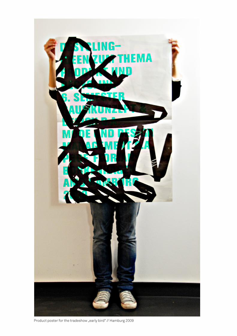
Product poster for the tradeshow „early bird“ // Hamburg 2009
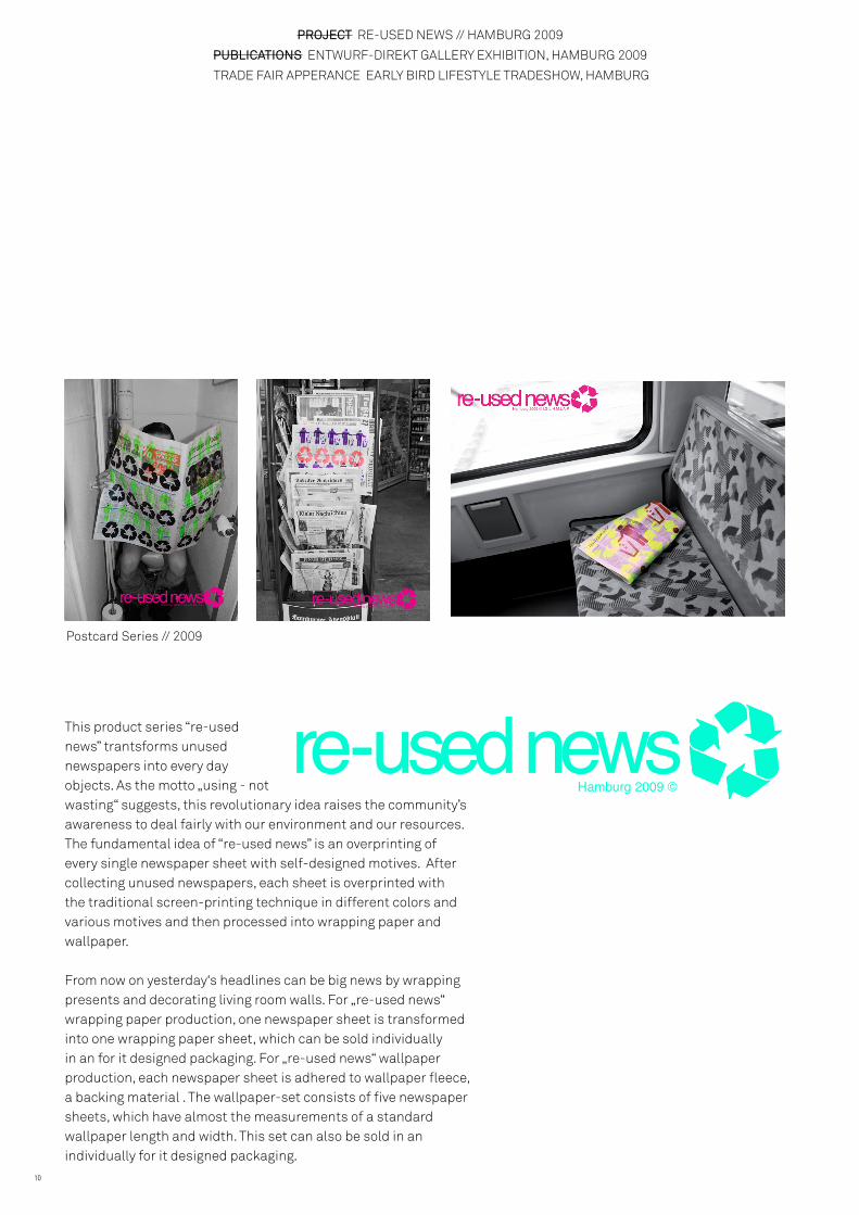
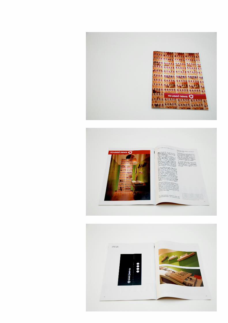
PROJECT RE-USED NEWS // HAMBURG 2009
PUBLICATIONS ENTWURF-DIREKT GALLERY EXHIBITION, HAMBURG 2009
TRADE FAIR APPERANCE EARLY BIRD LIFESTYLE TRADESHOW, HAMBURG
10
re-used newsHamburg 2009 © I.G L.H M.L A.P re-used news
Hamburg 2009 © I.G L.H M.L A.P
This product series “re-used news” trantsforms unused newspapers into every day objects. As the motto „using - not wasting“ suggests, this revolutionary idea raises the community’s awareness to deal fairly with our environment and our resources. The fundamental idea of “re-used news” is an overprinting of every single newspaper sheet with self-designed motives. After collecting unused newspapers, each sheet is overprinted with the traditional screen-printing technique in different colors and various motives and then processed into wrapping paper and wallpaper.
From now on yesterday‘s headlines can be big news by wrapping presents and decorating living room walls. For „re-used news“ wrapping paper production, one newspaper sheet is transformed into one wrapping paper sheet, which can be sold individually in an for it designed packaging. For „re-used news“ wallpaper production, each newspaper sheet is adhered to wallpaper fleece, a backing material . The wallpaper-set consists of five newspaper sheets, which have almost the measurements of a standard wallpaper length and width. This set can also be sold in an individually for it designed packaging.
Postcard Series // 2009
re-used news Hamburg 2009 ©
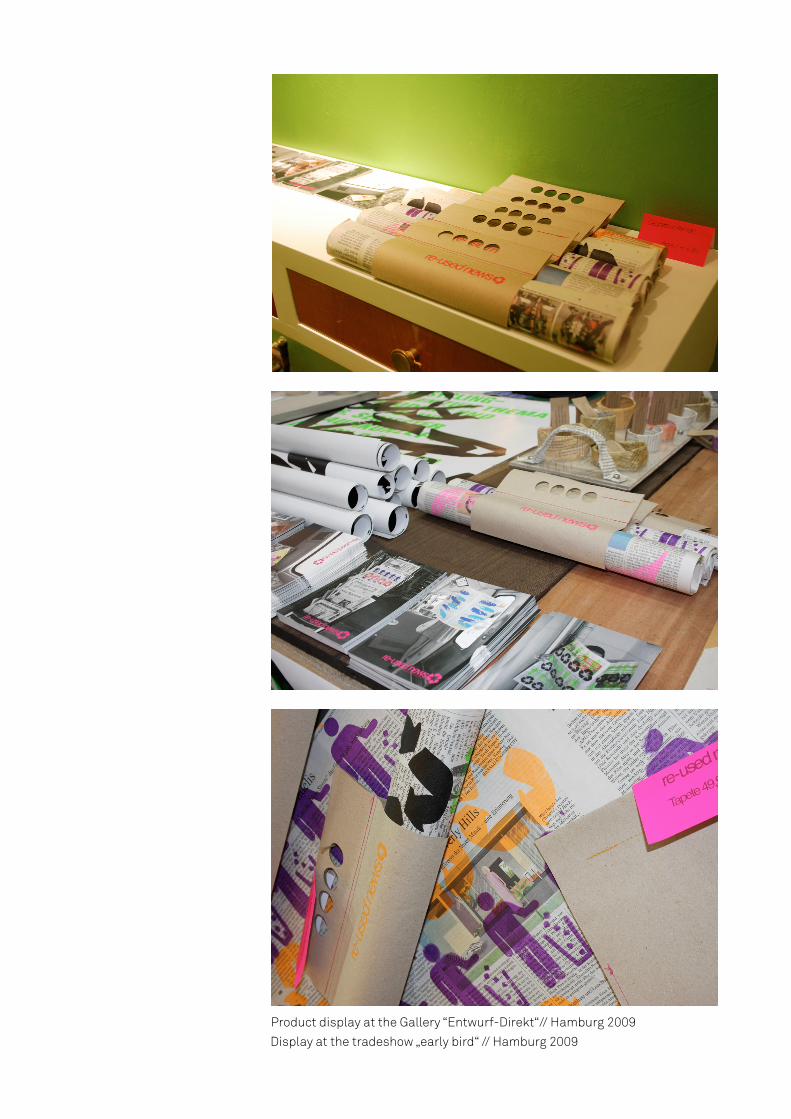
Product display at the Gallery “Entwurf-Direkt“// Hamburg 2009Display at the tradeshow „early bird“ // Hamburg 2009
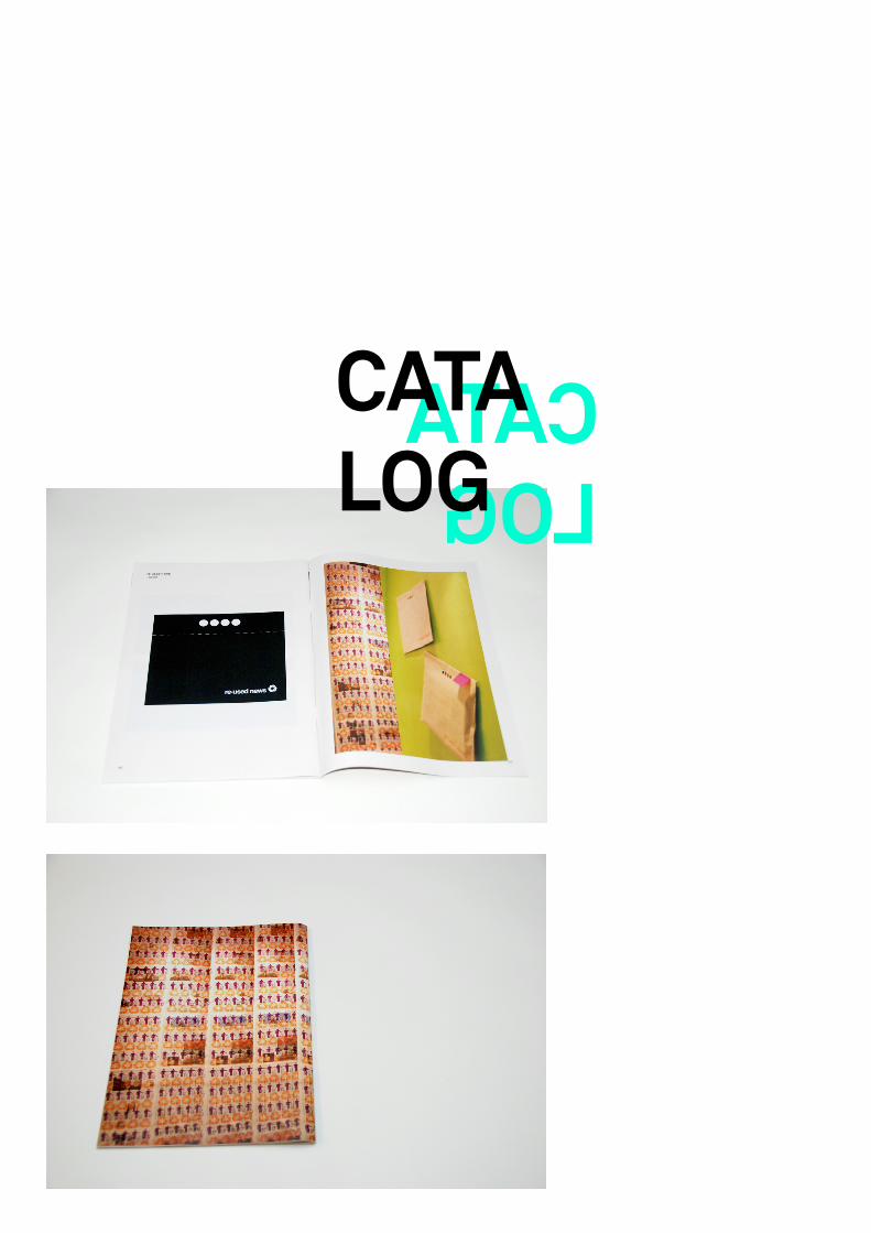
CATALOG
CATALOG
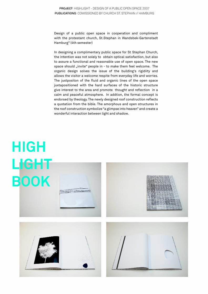
PROJECT HIGHLIGHT - DESIGN OF A PUBLIC OPEN SPACE 2007
PUBLICATIONS COMISSIONED BY CHURCH ST. STEPHAN // HAMBURG
Design of a public open space in cooperation and compliment with the protestant church, St.Stephan in Wandsbek-Gartenstadt Hamburg“ (4th semester)
In designing a complimentary public space for St Stephan Church, the intention was not solely to obtain optical satisfaction, but also to assure a functional and reasonable use of open space. The new space should „invite“ people in - to make them feel welcome. The organic design solves the issue of the building‘s rigidiity and allows the visitor a welcome respite from everyday life and worries. The justpositon of the fluid and organic lines of the open space juxtapositioned with the hard surfaces of the historic structure give interest to the area and promote thought and reflection in a calm and peaceful atmosphere. In addtion, the formal concept is endorsed by theology. The newly designed roof construction reflects a quotation from the bible. The amorphous and open structures in the roof construction symbolize “a glimpse into heaven” and create a wonderful interaction between light and shadow.
HIGHLIGHTBOOK
PROJECT TURNING THE IMMATERIAL MATERIAL // EINDHOVEN 2011
PUBLICATIONS COALFACE GALLERY // GENK BELGIUM // 2012

PROJECT SINN - INTERIOR DESIGN CONCEPT TO FACILITATE STRESS REDUCTION // HAMBURG 2008
PUBLICATIONS COMMISIONED BY THE ASKLEPIOS CLINIC HAMBURG HARBURG
The „Asklepios Clinic Hamburg Harburg“ made its business to help stress afflicted people and offer them a place of peace and encounter, a place to
altercate with themselves and their issues. In this context the question came up to design an accompanying and supporting therapy interior design concept for the premises of the psychiatric and psychological therapy ward at the “Asklepios Clinic Hamburg Harburg”. The attempt of this project was to design spaces by mixing art and therapy - to develop a concept, which is new for clinical design. The premises were designed according to the word “attentiveness”. Therapy tiles, with a massage effect, and a water basin, as a reflecting therapy, were designed for this concept.
sinn

BROCHURE

PHOTO SERIES WATER BASIN STUDY PLANTEN UND BLOMEN // HAMBURG 2009

PHOTO SERIES MASSAGE TILE STUDY // HAMBURG 2009
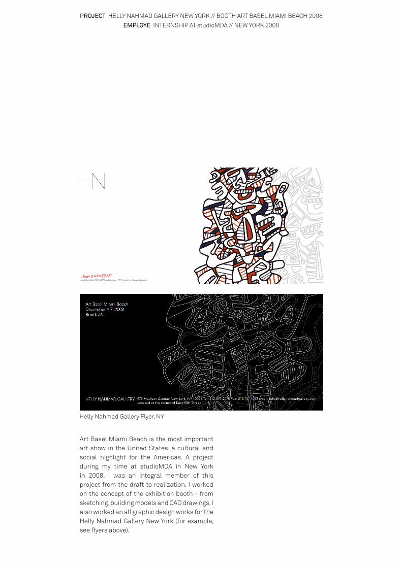
PROJECT HELLY NAHMAD GALLERY NEW YORK // BOOTH ART BASEL MIAMI BEACH 2008
EMPLOYE INTERNSHIP AT studioMDA // NEW YORK 2008
Jean Dubuffet (1901-1985) -Allégoricus, 1971, Acrylic on Klegecell panel
Art Basel Miami Beach is the most important art show in the United States, a cultural and social highlight for the Americas. A project during my time at studioMDA in New York in 2008, I was an integral member of this project from the draft to realization. I worked on the concept of the exhibition booth - from sketching, building models and CAD drawings. I also worked an all graphic design works for the Helly Nahmad Gallery New York (for example, see flyers above).
Helly Nahmad Gallery Flyer, NY

Helly Nahmad Gallery booth, Miami Art Basel 2008
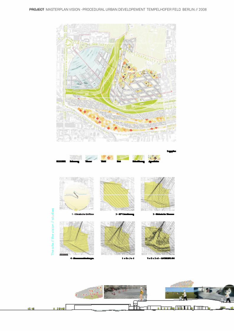
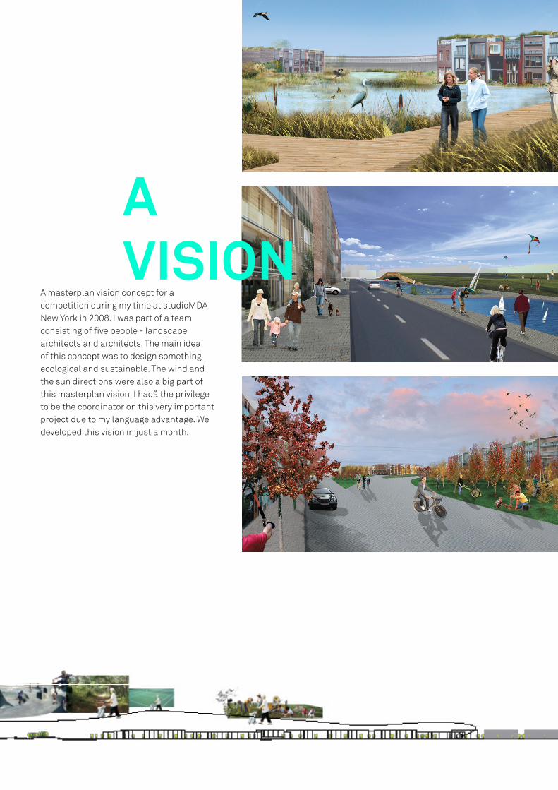
PROJECT MASTERPLAN VISION -PROCEDURAL URBAN DEVELOPEMENT TEMPELHOFER FELD BERLIN // 2008
The
site
// th
e vi
sion
// s
tudi
es
AVISION
A masterplan vision concept for a competition during my time at studioMDA New York in 2008. I was part of a team consisting of five people - landscape architects and architects. The main idea of this concept was to design something ecological and sustainable. The wind and the sun directions were also a big part of this masterplan vision. I hadå the privilege to be the coordinator on this very important project due to my language advantage. We developed this vision in just a month.

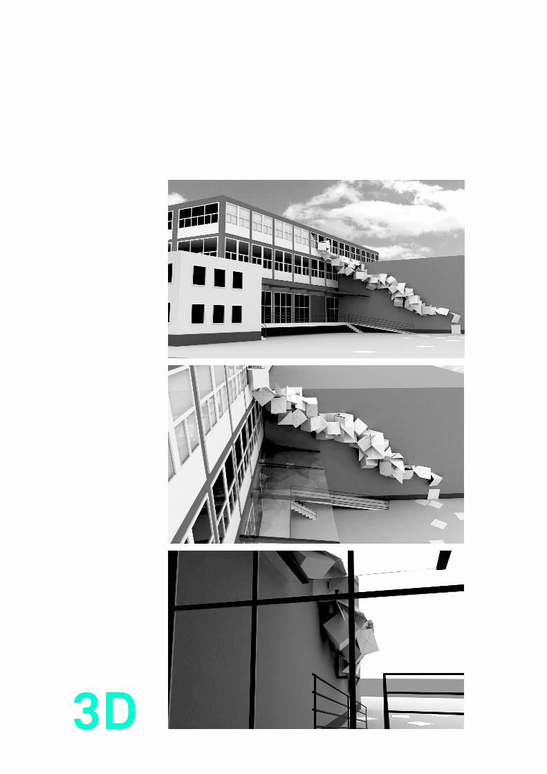
PROJECT FALTPLAN - BACHELOR THESIS 2009
CONTENT A NEW INTERPRETATION OF BUILDINGS THROUGH AN ADDING OF NEWLY DEVELOPED AND NEW DESIGNED BUILDING ACCESSORIES - IN A SENSE, A NEW LANGUAGE FOR BUILDINGS
People are called upon daily to interact with a built structure of their own urban environment. To create these accessories that assist in this interaction need and „signs“ of that need must be detected, identified,
and interpreted. Their metaphoric potential represents language, communication, and identity.
History must be taken into account when considering the overall need of modern building accessories. History, and more specifically the building‘s history, is fascinating and allows us to get a glimpse of times long gone. And putting historic events into a modern context is most intruiging - comparing between what used to be and what is. In the best of all circumstances, we are lucky to be able to find ourselves Once designed, the accessory is attached to a façade and imparts the individual history of a building on an abstract level, and passers-by are invited to read and interpret it. In the best of circumstances, we are fortunate to be able to find ourselves rooted in a particular historical event or to debunk myths by disclosing interrelations. From past events we can learn how to handle today’s world. Each history has a right to exist, and building accessories assist in the transmission and appreciation of these precious historic structures in present time.
Pho
to S
tudy
Ham
burg
200
9
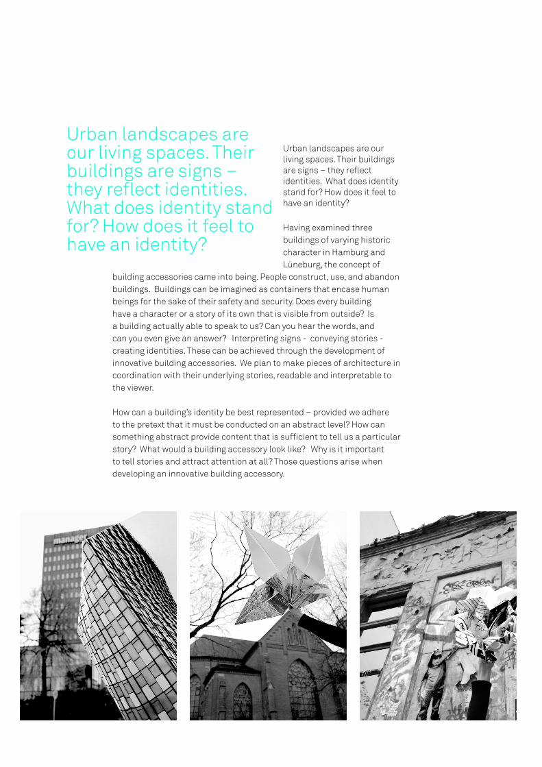
Urban landscapes are our living spaces. Their buildings are signs – they reflect identities. What does identity stand for? How does it feel to have an identity?
Having examined three buildings of varying historic character in Hamburg and Lüneburg, the concept of
building accessories came into being. People construct, use, and abandon buildings. Buildings can be imagined as containers that encase human beings for the sake of their safety and security. Does every building have a character or a story of its own that is visible from outside? Is a building actually able to speak to us? Can you hear the words, and can you even give an answer? Interpreting signs - conveying stories - creating identities. These can be achieved through the development of innovative building accessories. We plan to make pieces of architecture in coordination with their underlying stories, readable and interpretable to the viewer.
How can a building’s identity be best represented – provided we adhere to the pretext that it must be conducted on an abstract level? How can something abstract provide content that is sufficient to tell us a particular story? What would a building accessory look like? Why is it important to tell stories and attract attention at all? Those questions arise when developing an innovative building accessory.
Urban landscapes are our living spaces. Their buildings are signs – they reflect identities. What does identity stand for? How does it feel to have an identity?

1 CITY3 BUILDINGS3 IDENTITIES264 PAGES1 BOOK


LEFT PAGE FOLDING MAP I 1:1 STUDY BILLHORNER RÖHRENDAMM // HAMBURG 2009
RIGHT PAGE FOLDING MAP - CONCEPT 3D VISUALIZATION
1:1
3D
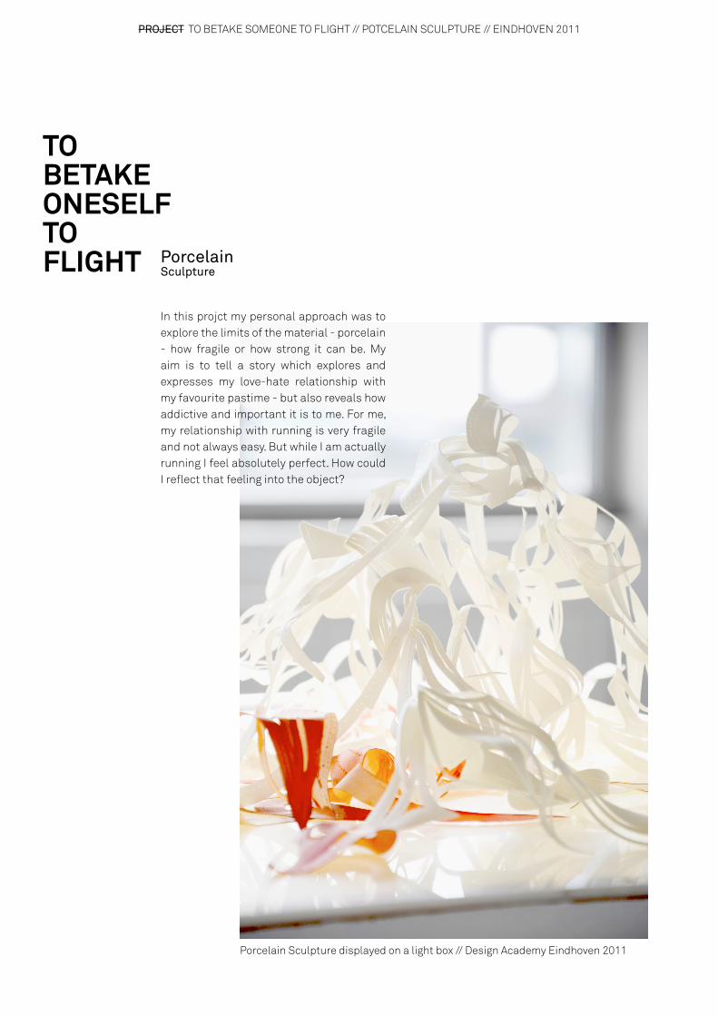
PROJECT TO BETAKE SOMEONE TO FLIGHT // POTCELAIN SCULPTURE // EINDHOVEN 2011
Porcelain Sculpture
TO BETAKE ONESELF TO FLIGHT
Porcelain Sculpture displayed on a light box // Design Academy Eindhoven 2011
In this projct my personal approach was to explore the limits of the material - porcelain - how fragile or how strong it can be. My aim is to tell a story which explores and expresses my love-hate relationship with my favourite pastime - but also reveals how addictive and important it is to me. For me, my relationship with running is very fragile and not always easy. But while I am actually running I feel absolutely perfect. How could I reflect that feeling into the object?
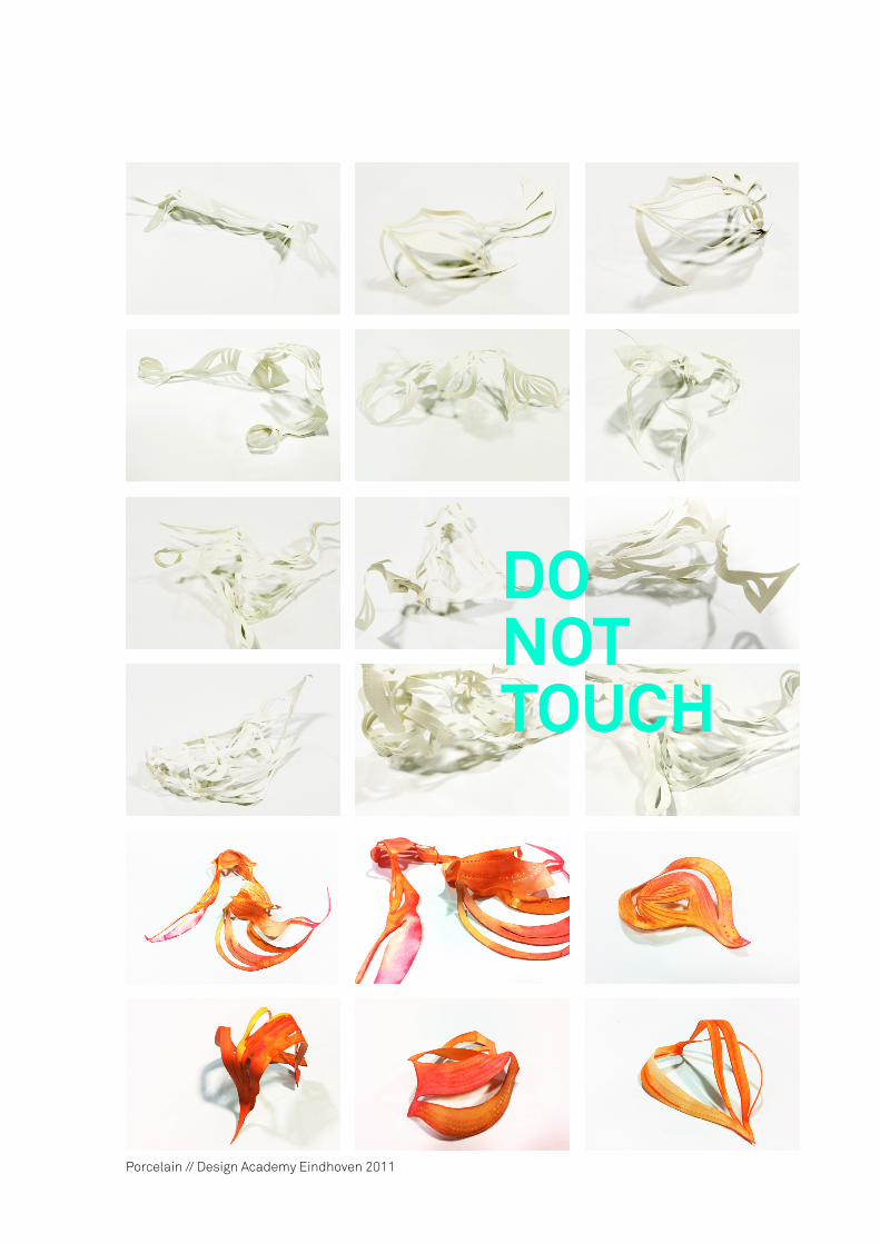
Porcelain // Design Academy Eindhoven 2011
DONOTTOUCH

PROJECT IMPRINTS OF MEMORY // TOILET SEATS // EINDHOVEN 2010
Trust in Products. This is a very difficult topic. In my opinion trust is an emotion between human beings. By researching ‘trust‘ I came to the conclusion that I - personally - trust things which involve memory - an action from the past. Why do I trust a hand knitted blanket my grandmother made for me more than just a regular blanket? What comes directly in our mind when we try to rember things from the past? When I think about the past I often see patterns which are a link to a specific person or experience.I investigated various patterns and I tried to transform those patterns into universal language. A common past. To add more value to the actual patterns I applied those patterns on an unconventional product. I chose the extreme intimate space of a bathroom. I created different toilet seats and applied patterns in various appearings. Furthermore, there will be imprints of the pattern left on the skin.
IMPRINTS OF MEMORY

Imprint toilet seats // Design Academy Eindhoven 2011
“ WHAT WE REMEMBER
FROM CHILDHOOD WE REMEMBER
FOREVER - PERMANENT
GHOSTS, STAMPED, INKED, IMPRINTED, ETERNALLY SEEN.“
Cynthia Oz
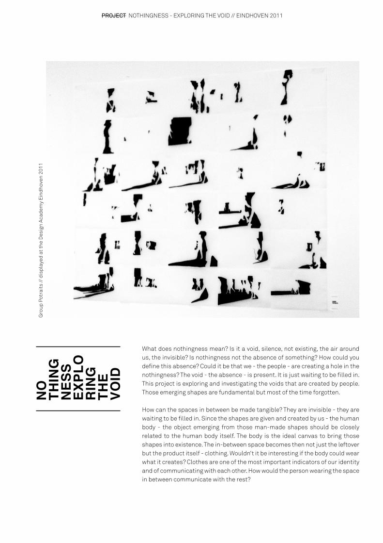
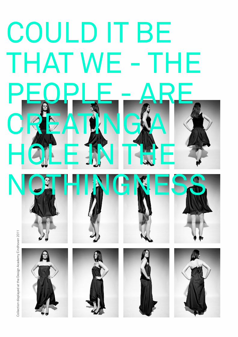
PROJECT NOTHINGNESS - EXPLORING THE VOID // EINDHOVEN 2011
NO
THIN
GN
ESS
EXPL
OR
ING
TH
E VO
ID
Gro
up P
otra
its
// d
ispl
ayed
at t
he D
esig
n Ac
adem
y E
indh
oven
201
1
What does nothingness mean? Is it a void, silence, not existing, the air around us, the invisible? Is nothingness not the absence of something? How could you define this absence? Could it be that we - the people - are creating a hole in the nothingness? The void - the absence - is present. It is just waiting to be filled in. This project is exploring and investigating the voids that are created by people. Those emerging shapes are fundamental but most of the time forgotten.
How can the spaces in between be made tangible? They are invisible - they are waiting to be filled in. Since the shapes are given and created by us - the human body - the object emerging from those man-made shapes should be closely related to the human body itself. The body is the ideal canvas to bring those shapes into existence. The in-between space becomes then not just the leftover but the product itself - clothing. Wouldn‘t it be interesting if the body could wear what it creates? Clothes are one of the most important indicators of our identity and of communicating with each other. How would the person wearing the space in between communicate with the rest?
Col
lect
ion
disp
laye
d at
the
Des
ign
Acad
emy
Ein
dhov
en 2
011
COULD IT BE THAT WE - THE PEOPLE - ARE CREATING A HOLE IN THE NOTHINGNESS

PROJECT NOTHINGNESS - CONCEPT BOOK // EINDHOVEN 2011
CONCEPT BOOKCONCEPT BOOK

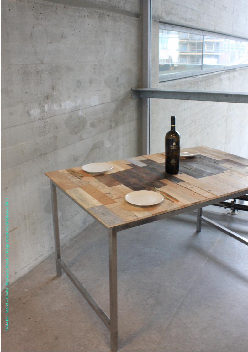
PROJECT A RECORD OF TIME // EINDHOVEN 2011
OBJECT A TABLE WHICH STORES THE TRACES OF TIME AND WHICH SAVES THEM IN A MEMOIR
Why do we trust certain objects more than others? Objects which involve memory have a higher level of trust - they are a record from the past. By observing the world around me, I revealed a new world for me - preciuos traces of memory almost everywhere - which been mostly forgotten and with no value for the most people. Actually you could say that stains, scratches, marks, traces etc. are the character and the life of an object. They reveal its identity. I chose the dinner table as a families meeting point where communication and interactions take place and which in my opinion is one of the most important objects in everyday life. I collected and explored old, used, discarted furniture - especially tables - which show traces of memory in various variations. By investigating the world around me and the marks left by time I created a table which is a collective of many different tables. Reinventing a new piece of furniture - a table - put together out of wood from old, used and discarded tables. By adding another layer through labeling the traces of time gives the table a new signature. The labels will keep a record of the traces and the events behind them. The table is supposed to grow within time and gain even more stains and labels (which can be punched in with the letter punch which comes with the table).
Engraved Tabletop // Roman numeral system // Design Academy Eindhoven 2011
ARECORDOFTIME
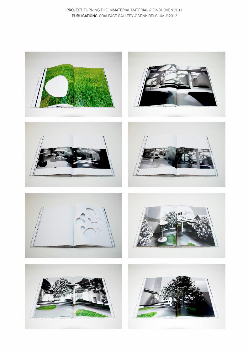
PROJECT TURNING THE IMMATERIAL MATERIAL // EINDHOVEN 2011
PUBLICATIONS COALFACE GALLERY // GENK BELGIUM // 2012
Tabl
e to
p : W
ood
// F
ram
e : S
tain
less
Ste
el //
Des
ign
Aca
dem
y E
indh
oven
201
1
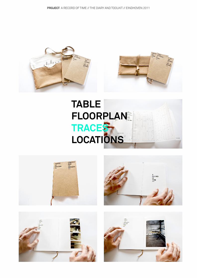
PROJECT A RECORD OF TIME // THE DIARY AND TOOLKIT // EINDHOVEN 2011
TABLEFLOORPLANTRACESLOCATIONS

DIARY PAGES STORING MEMORIES
PROJECT TURNING THE IMMATERIAL MATERIAL // EINDHOVEN 2011
PUBLICATIONS COALFACE GALLERY // GENK BELGIUM // 2012
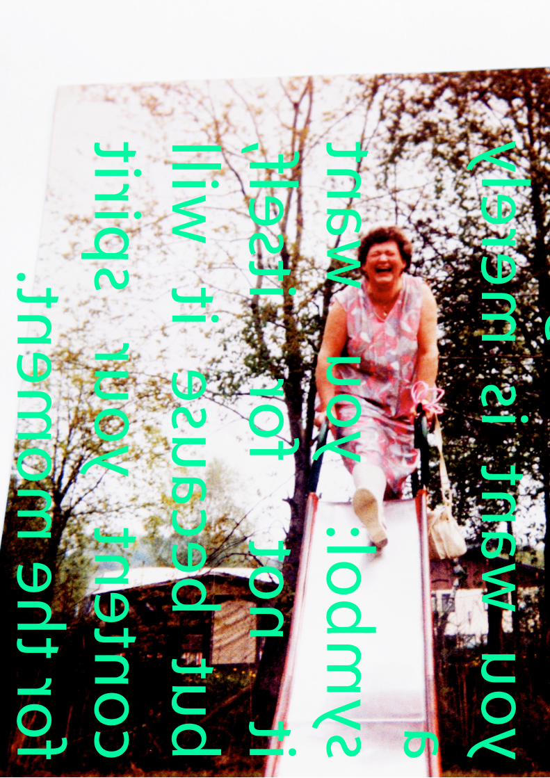
Any
so-called
material thing that
you want is merely
a
symbol: you want
it not for itself,
but because it will
content your spirit
for the moment.

PROJECT TURNING THE IMMATERIAL MATERIAL // EINDHOVEN 2011
PUBLICATIONS COALFACE GALLERY // GENK BELGIUM // 2012
Any so-called material thing that you want is merely a symbol: you want it not for itself, but because it will content your spirit for the moment.
PROJECT TURNING THE IMMATERIAL MATERIAL // EINDHOVEN 2011
PUBLICATIONS COALFACE GALLERY // GENK BELGIUM // 2012
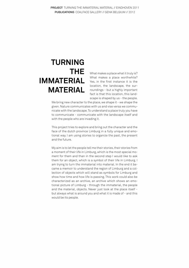
What makes a place what it truly is? What makes a place worthwhile? Yes, in the first instance it is the location, the landscape, the sur-roundings - but a highly important fact is that this location, this land-scape is shaped by us - the people.
We bring new character to the place, we shape it - we shape the given. Nature communicates with us and vise versa we commu-nicate with the landscape. To understand a place truly you have to communicate - communicate with the landscape itself and with the people who are invading it.
This project tries to explore and bring out the character and the face of the dutch province Limburg in a fully unique and emo-tional way. I am using stories to organize the past, the present and the future.
My aim is to let the people tell me their stories, their stories from a moment of their life in Limburg, which is the most special mo-ment for them and than in the second step I would like to ask them for an object, which is a symbol of their life in Limburg. I am trying to turn the immaterial into material. In the end it be-came a memoir to understand the region of Limburg and a col-lection of objects which will stand as symbols for Limburg and show how time and how life is passing. This work could also be characterized as an archive, an archive which shows an emo-tional picture of Limburg - through the immaterial, the people and the material, objects. Never just look at the place itself - but always what is around you and what it is made of - and this would be its people.
TURNING THE
IMMATERIAL MATERIAL
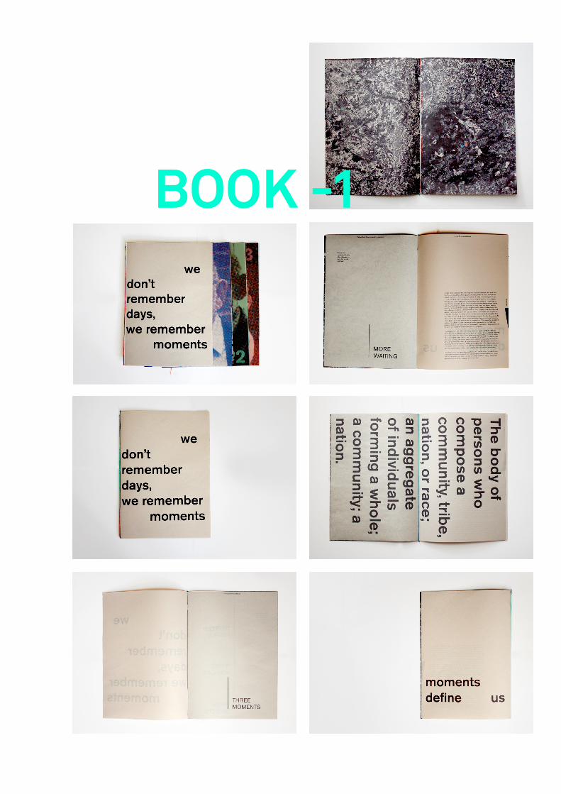
BOOK -1

BOOK 2
BOOK 1
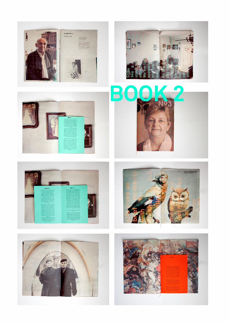
BOOK 2
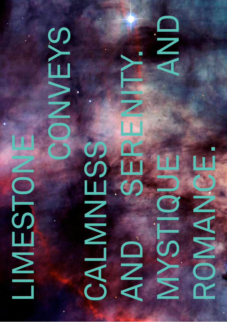
LIM
ES
TON
E
CO
NVE
YS
CA
LMN
ES
S
AN
D
S
ER
EN
ITY.
M
YSTI
QU
E
AN
D
RO
MA
NC
E.
PROJECT TURNING THE IMMATERIAL MATERIAL // EINDHOVEN 2011
PUBLICATIONS COALFACE GALLERY // GENK BELGIUM // 2012
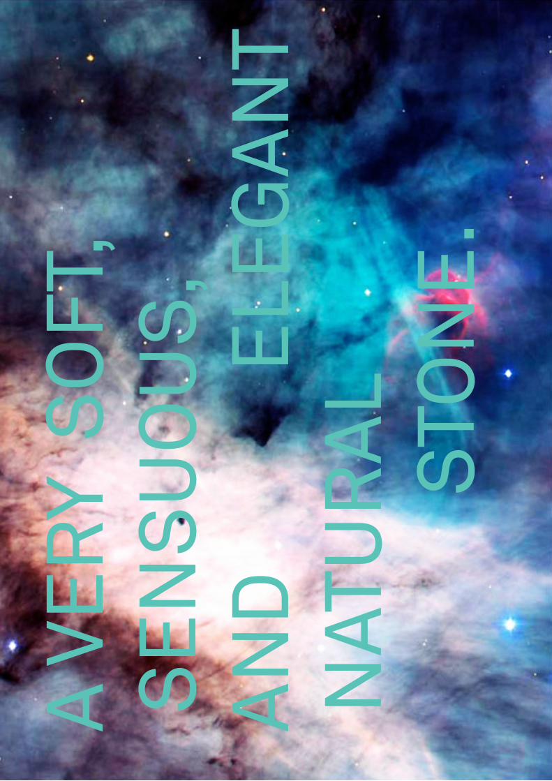
A V
ER
Y S
OFT
, S
EN
SU
OU
S,
AN
D
ELE
GA
NT
NAT
UR
AL
STO
NE
.

PROJECT CODELAB // A MATERIAL RECEIPE GENERATING TOOL //EINDHOVEN 2011
CONTENT STORING AND SHARING MATERIAL KNOWLEDGE
CODELAB is a laboratory which is directly located at the site t’Rooth in Limburg and which can be seen as a archive of devel-oping material technologies and storing them as recipes. Its a new way of storing recipes. It is an open source archive, where artists etc. can experiment with the natural resources and store their recipes. The main resource is the marl stone, which is found in a massive amounts in this quarry. Other natural re-sources are clay, loam, loes, sand, peat, birch wood, flint stone, other minerals, soil, plants etc.
The artists have a stack of punch cards which they can “punch” in with the amounts (%) they need for their mixture. They can also decide how many materials they will use for that experi-ment. By sliding the punch card in, the funnels open and the material can run out through the holes for a fixed amount of time. The materials will fall directly into a blender bowl which will mix the materials. After, the material can be used in any way and the punch card will be stored in an archive for further use. Depending on the mixture the usesof the “new” material is endless. The original properties of the resource change whith every mixture.
Mat
eria
l Mix
ing
Pro
toty
pe //
Ein
dhov
en 2
011
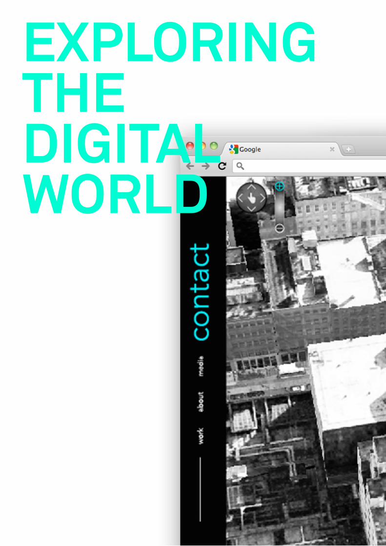
EXPLORING THEDIGITAL WORLD
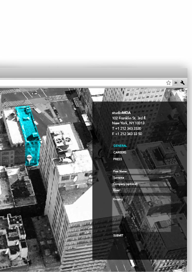

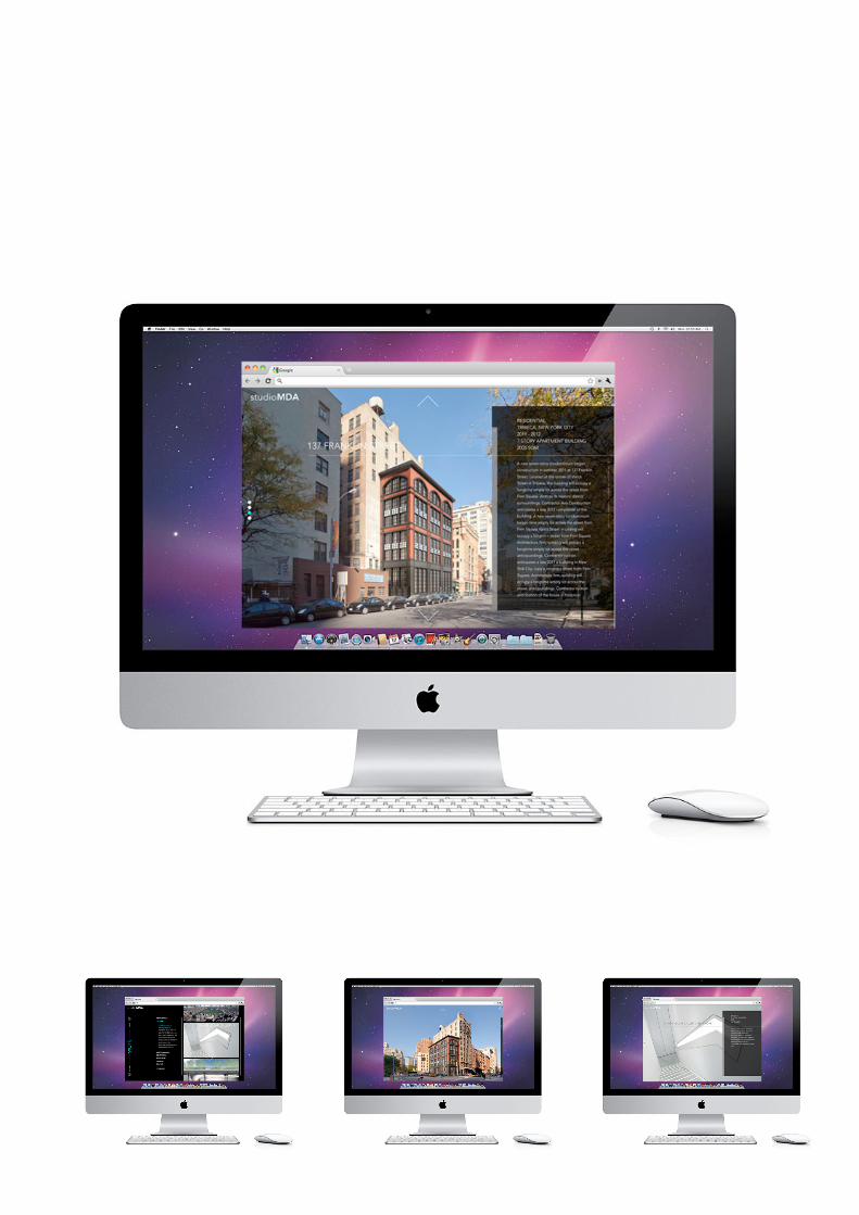
PROJECT studioMDA WEBSITE // NEW YORK 2011
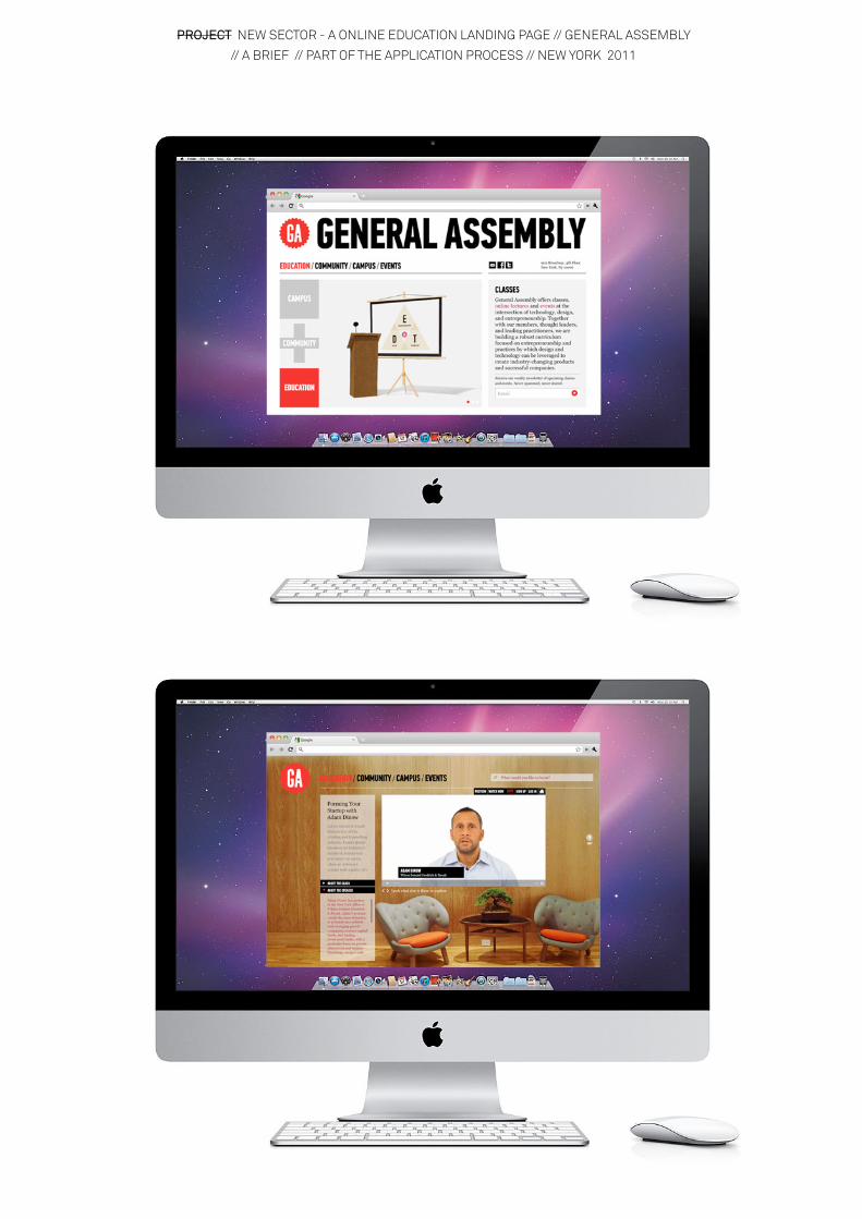
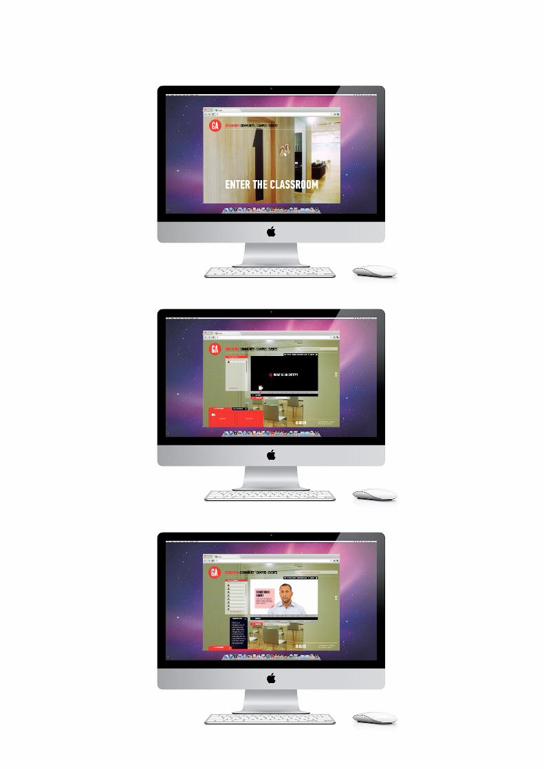
PROJECT NEW SECTOR - A ONLINE EDUCATION LANDING PAGE // GENERAL ASSEMBLY
// A BRIEF // PART OF THE APPLICATION PROCESS // NEW YORK 2011
PROJECT TURNING THE IMMATERIAL MATERIAL // EINDHOVEN 2011
PUBLICATIONS COALFACE GALLERY // GENK BELGIUM // 2012
PORTFOLIO ALEXANDRA N. PROBA
WHO AM I
I AM ME