hudgraphic artist typeface
DESCRIPTION
A typography project for uniTRANSCRIPT

HARRISON GILESU1263908
ARTIST TYPEFACE
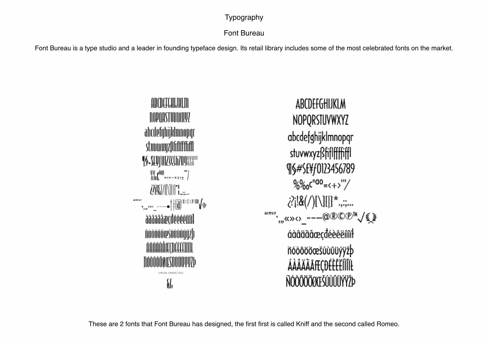
Typography
Font Bureau
Font Bureau is a type studio and a leader in founding typeface design. Its retail library includes some of the most celebrated fonts on the market.
These are 2 fonts that Font Bureau has designed, the first first is called Kniff and the second called Romeo.

These are Font Bureau Specimen books, we have been asked to design our own front cover using our typeface that we design. Looking at the recent front covers they all look very minimalistic and simple use the number of what edition the book is. Alot of thought will have to go into the cover to get an as effective
design as the front covers they have at the moment.

Artists
Lorem Ipsum Studio, Bratislav Milenkovic & Nemanja Jehlika
This typeface was used for Misker Festival which is a festival for creativity. I have been created by speak ink from a printed jamming or miss skanning. I like the distorted effect on the type face like a mistake and come off good. It would be nice to try and get the same effect after i have design my own typeface and see how it turs out. More design were done but there are just a select few i picked. each different design has a different alignement but as it had been created
in the same process it all fits in well.

Tien-Min Liao
Tien-Min has used a font that has already been created but then painted them on her fingers so that they make up the letters in uppercase and lowercase. Its a nice outcome but she hasnt create the font herself. You can take the images into illustrater and pen tool around the letters and then it would become its own font.

Jackon Pollock
As soon as i thought of Jackson Pollocks work i instantly thought that when paint splats onto a canvas there is a way the splats can look like letters. I can recreate a piece in the style of Pollock and either try and make each splat look like a letter or pick out letter after ive finished the piece.

These are some letters i pulled out from a Jackson Pollock piece, i just trased over different splatters to create the letters and they traced them in illustrator to make them a vector.
I got the idea of using Jackson Pollock whilst listening to The Stone Roses and seing their album cover with his work used in the background

Carlo Carra
I tried to find an artist that uses icon and bold shapes and then remembered i had used Carlo Carra’s work at college in my research. Its really effective how it looks like the paintings have been cut up and placed back together slightly off key, but the images are still legable. I could recreate the style with typography
by createing a san serif minimal font and then chop it up and place it all back together.
This is just an example how how my typeface in the style of Carlo Carra would look.

I didnt think i would be able to find ways of designing a typeface from Max Ernst’s work, but looking deeper into these 2 pieces i see the tonal work he has used on the shadows and slime. Looking at the piece on the left i can pick out letters withing the slime where shadows have been added and using the tone.
With the photo on the right i like how species are forming off the creature and would be nice to experiment this with a typeface already made.
Some examples of letters i have created out of the lime green slime in this artwork, even though they are from the same piece they dont look similar like they are from the same typeface. Maybe if i try to create more letters from the letters i have here and they may start to look like the same font family.
Max Ernst

Louise Nevelson
The detail in each section of the piece is really nice and reminded me of tall thin typeface and the detail in the hollow bit of the letters like the hole in the ‘O’.
These are some letters i created out of Louise Nevelson’s piece. I created them by using the sculptures in each section of the piece. Moe detail in the letters can be added then is on the sculpture and this would make the whole typeface tye in together and become more recognisible.

Wassily Kandinsky
These are some ecperimental pages i have done for the artist Kandinsky, i just looked at the different shapes and the style he worked in and tried to relate it to typography. I worked with cutting out over lapping shapes on shapes are with lines or moving some of the shapes he has created himself. I found it quite
simple as he used very easy shapes which resemble letters themselves but it wasnt hard to place the shapes together to get other letters.
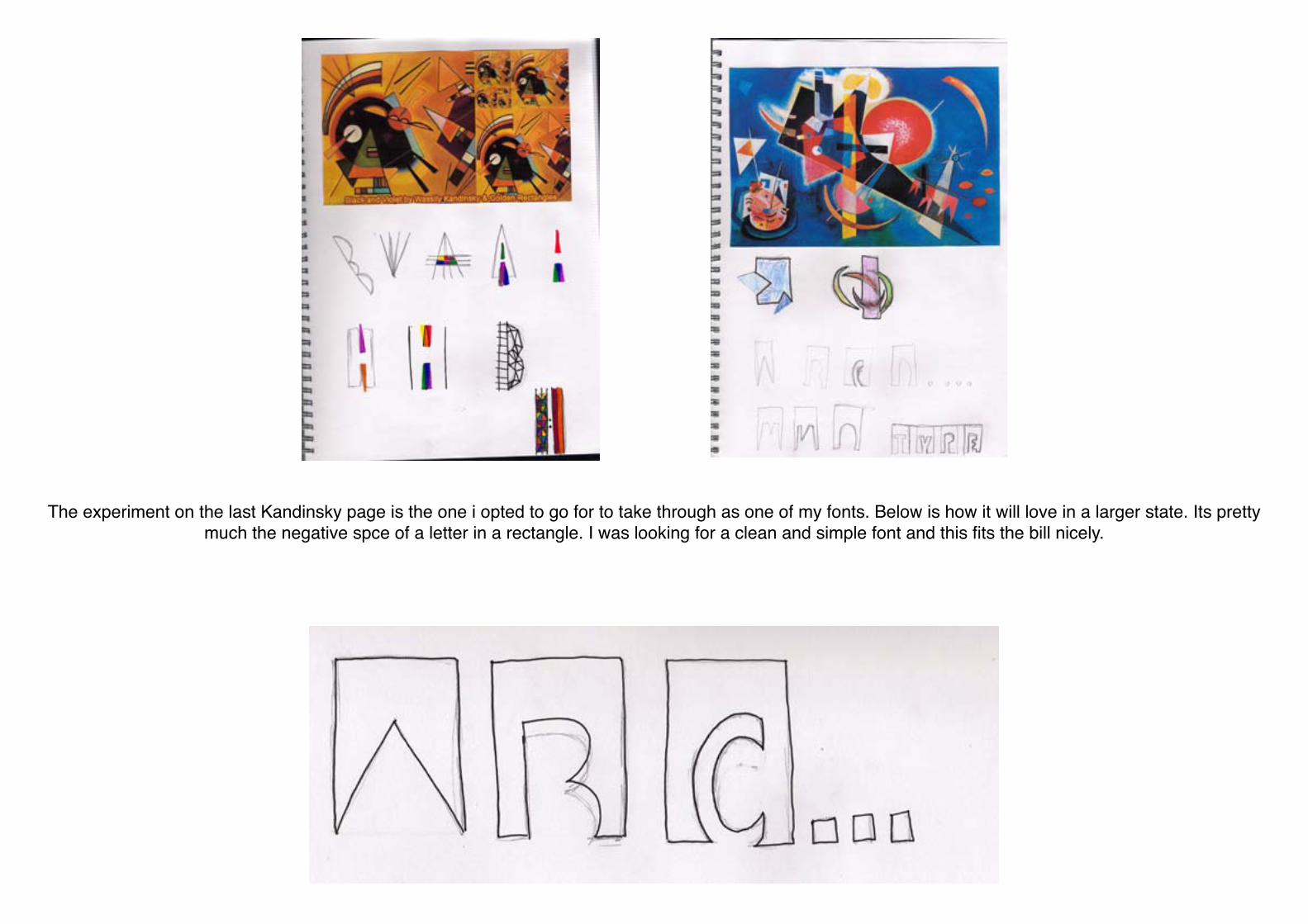
The experiment on the last Kandinsky page is the one i opted to go for to take through as one of my fonts. Below is how it will love in a larger state. Its pretty much the negative spce of a letter in a rectangle. I was looking for a clean and simple font and this fits the bill nicely.

I found these images in a typography book i got from the uni library, I like how the designers have gone about finiding different ways to display their font or use their font. It doesnt show you how to design your own typeface but its useful for once you have designed your typeface and trying to find an origional way of
displaying it.
Book Research

I like how this alphabet how been made 3D by using tone and shading in the triangles within the letters. I would quite like to experiment in this style but the only this is that i would have to use a type face alredy in use and it wouldnt really be creating my own typeface as the brief states.
This alphabet is from a different artist but in a very similar style. As i said in the last post it looks like they have used a font and just added the triangles in which isnt what the brief is asking for. It could be ncie to include this in a typeface if i design one that would work well in this style.

Just like the last two typefaces this font is just in my research with the presentation asspect. Its really interesting how this font has been created my tearing paper in diferent places and folding at some points. Its a nice design aspect as its different from most fonts you see as they are either hand drawn or
illustarted, its nice how this is handmade.

Typeface experiments
These are the three typeface designs i decided to take through as my final three. The first one is taken from Jackson Pollock in the style of his paint splatts. The second is taken from Wassily Kandinsky using rectangles with the negative space of the letter and the third is in the futurist style of Carlo Carra.

Alphabet 1

Alphabet 2
Jackson Pollock

Alphabet 3
Wassily Kandinsky

Chosen Typeface
I chose to go for this type face as i think its the most unique looking and related most to the artist. Its legible and works well in several colours and sizes. Im pleased with the first steps and final outcome of the typeface and how it all came together in the end.
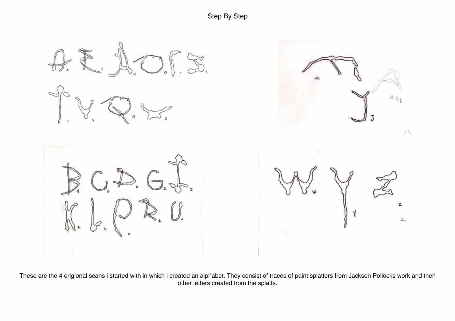
Step By Step
These are the 4 origional scans i started with in which i created an alphabet. They consist of traces of paint splatters from Jackson Pollocks work and then other letters created from the splatts.

This was the outcome of my first attempt at the full alphabet. I had the changed some of the letters from the origional scans to get them to fit in with the style and change the thickness of the letters but first outcome looks nice.

This is how my final typeface turned out, including numbers. I am pleased with how it looks and i feel you could tell its jackson pollock style but not looking like paint and not letters.

This is an example of how the font works well written and in Regular, Semi Bold and Bold and the different point sizes.

Font Bureau Specimen Book
These are just my enitial sketches for the layout of my Type Specimen Book. Im trying to imcorporate paint splats in the
background in the same style as Jacksons work.
These are the background i designed in photoshop for the cover. I used brushes to create the splatts and used a lighter grey everytime. I chose these colours as the style of the past specimen books are bold colours either black, grey, white and
red. I feel these colours work well together.

These are the letters and number i chose for the cover. I chose them as they all have relevence to do with the book, as the S stands for Specimen, the 4 for Fourth edition and the FB for Font Bureau. I feel the middle one works the best as its legible and i like the negative space used as the number it fits in well
with the splats and composition.

This was my final design for the Specimen Cover. I chose the fonts as they are the ones they have used on the past edition and the fit in well with the design, stand out and are legible. Using the white make the font easy for the eye to catch as its the important information on the cover of the book.

Type Advertisement
These are my two advertisement pieces that go with my font when it can be downloaded, it shows the typeface in use and with a bold background behind my font it still works well which is good for a font. In the background i have used the letters of my alphabet but overlayed and rotated them to make it look like a Jackson Pollock piece,
i feel it is quite effective and compliments the font.

Finally this is how my font will look on the Font Bureau website, i have tried to keep it similar to what they put in there ads. With the background being so bright and bold it will surly catch the eye of the viewer which makes them wonder further about the font and want to use the font.