hubspot + canva | how to design graphics that convert 1
TRANSCRIPT
HubSpot + Canva | How to Design Graphics That Convert 1
HubSpot + Canva | How to Design Graphics That Convert 2
Introduction ........................................................................................ 01
Section 1: Designing Graphics for Email ..................................................... 02
Section 2: Designing Graphics for Landing Pages ..................................... 11
Section 3: Designing Call-to-Action Graphics ............................................ 16
Section 4: Designing Graphics for Social Media & Paid Ads ................. 21
Conclusion .......................................................................................... 30
Table of Contents
HubSpot + Canva | How to Design Graphics That Convert 1
A s marketers we’re constantly reading blog posts, soaking in new tips and tricks, thinking of our next campaigns, testing email subject lines, meeting about promoting new products, and talking about social media strategy (to name a few common tasks). Underneath all of this hustle and bustle, there’s the underlying notion that what we do as inbound marketers is essentially think of ways to create content, share that content, promote it, and generate leads for our business.
Great content isn’t very useful if you’re not promoting it, right? But promoting it means more than just sharing a few posts on Twitter and Facebook. Your social and email strategy behind promoting content should be evolving to adapt to consumer’s visual needs. Yes, social media posts with images are proven to convert higher than posts with no images. But there’s so much more than an image when creating graphics for your marketing promotions. The copy, color, placement, size, and use of graphics can really make an impact on conversions when optimized for the desired call-to-action. And what about the rest of your promotional content? Email headers, landing page images, and calls-to-action (CTAs)?
The question we’d all like answered is: how do you design graphics that convert when it’s time to promote your content?
In this ebook, we’ll discuss how to design graphics for social media, landing pages, email marketing, CTAs, and paid ads that will increase your conversion rates and allow your content to perform better, get more leads, and reach a bigger audience.
Introduction
HubSpot + Canva | How to Design Graphics That Convert 2
A recent study conducted by MarketingSherpa indicated that 72% of U.S. adults prefer communication with companies to happen through email, 86% would like to receive promo emails at least monthly, and 61% at least weekly. Marketers: it’s time to put our conversion optimization hats on.
When it comes to email marketing and conversion rates, the traditional subject line, open rate, and click-through-rate testing come to mind. Along with CTR, what else happens when somebody opens your email? What do they see?
If you’re in charge of designing an email newsletter, promoting a product or piece of content in a one-off email, or inviting people to an event, pay attention: the graphics in your email play a big part in converting your audience into taking action.
According to Laura Busche, whether your email is for your personal brand or your job, email has the power to:
• Connect you with a large audience frequently and consistently• Keep the costs of sharing new information low by cultivating a channel of your own• Allow you to scale an engaging content program quickly• Share compelling calls to action to steer your audience in a specific direction
Your email graphics need to follow these rules:1. Be visually appealing (follow hierarchy and typography design principles)2. Be responsive (mobile, tablet, desktop) 3. Add value4. Be A/B testable (in copy vs. image)5. Have a clear CTA
Let’s get started!
Section 1: Designing Graphics for Email
HubSpot + Canva | How to Design Graphics That Convert 3
Designing with
Hierarchy &Typography in Mind
Hierarchy applies order to your designs, and makes sure the most important elements are seen first. This is crucial for email headers as it’s the first thing people see when they open your email. With an effective email header that looks visually appealing and has a clear call-to-action, you can increase your conversion rates in no time.
When you’re working with multiple graphic elements such as fonts, images, colors and shapes or icons – applying hierarchy is a vital skill to get the message of your design across clearly and succinctly.
Once you’re set up and ready to go consider these five principles of effective visual hierarchy.
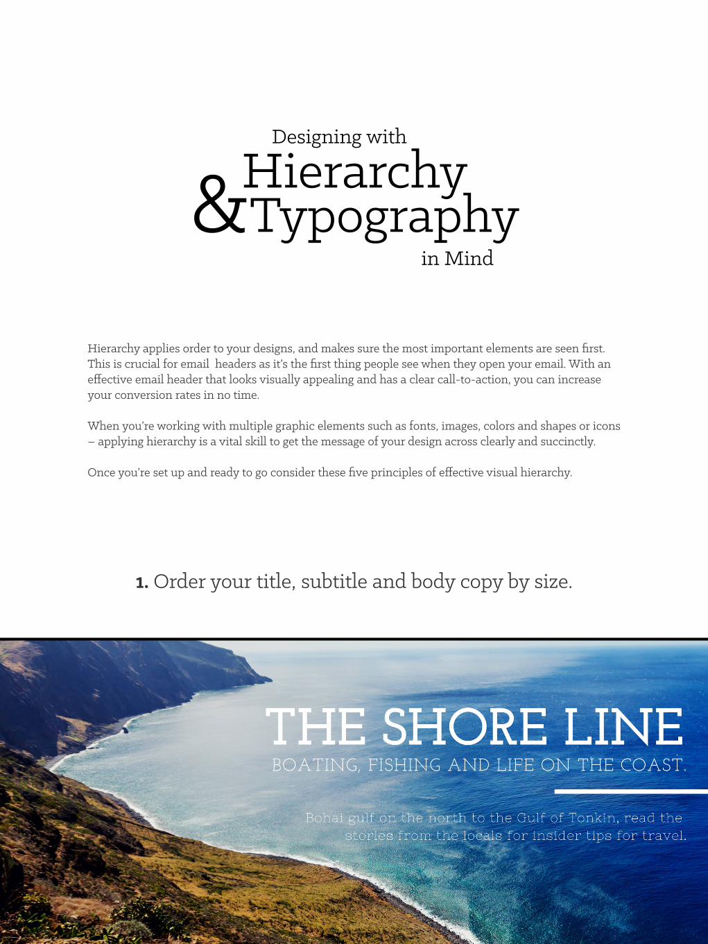
1. Order your title, subtitle and body copy by size.
HubSpot + Canva | How to Design Graphics That Convert 4
These elements are the three musketeers of the typographic party. From largest to smallest, these content types should be read in a naturally progressive order.
Your title is the first thing that your viewer will notice, so make sure it stands out. This can be done by making sure it’s dominant in size, and using a strong eye-catching font. The subtitle should support your title at a relatively smaller type size.
Body copy is the smallest and should be clear and easy to read. Avoid using elaborate script fonts or uppercase text in this setting as it forces strain on the reader’s eye and makes the overall text much harder to read.
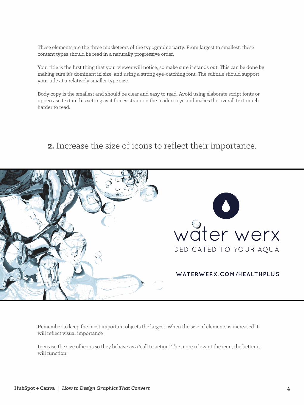
Remember to keep the most important objects the largest. When the size of elements is increased it will reflect visual importance
Increase the size of icons so they behave as a ‘call to action’. The more relevant the icon, the better it will function.
2. Increase the size of icons to reflect their importance.
HubSpot + Canva | How to Design Graphics That Convert 5
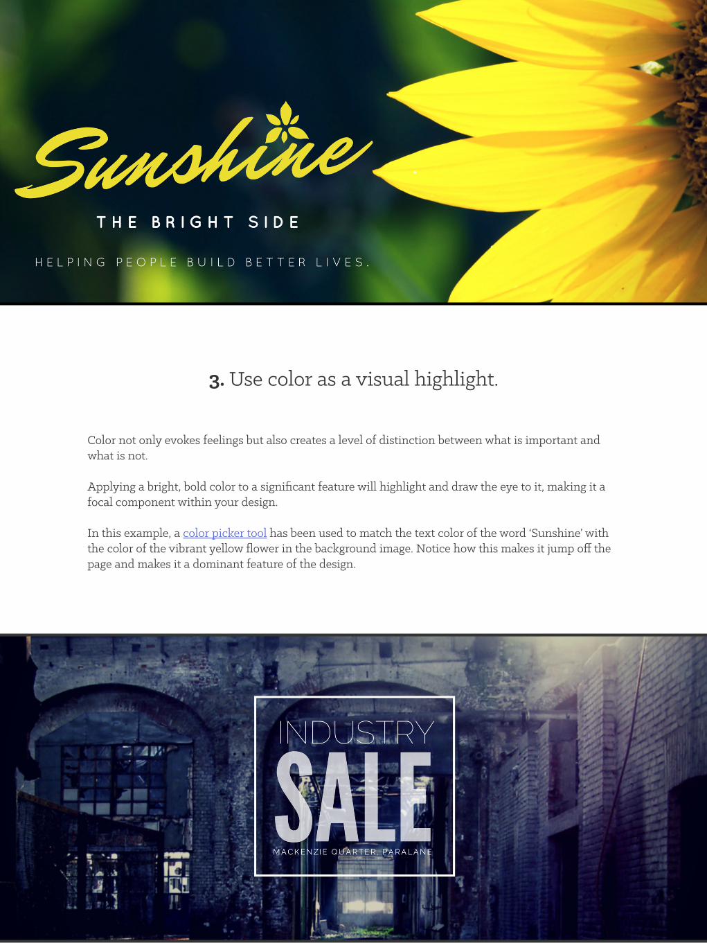
Color not only evokes feelings but also creates a level of distinction between what is important and what is not.
Applying a bright, bold color to a significant feature will highlight and draw the eye to it, making it a focal component within your design.
In this example, a color picker tool has been used to match the text color of the word ‘Sunshine’ with the color of the vibrant yellow flower in the background image. Notice how this makes it jump off the page and makes it a dominant feature of the design.
3. Use color as a visual highlight.
HubSpot + Canva | How to Design Graphics That Convert 6
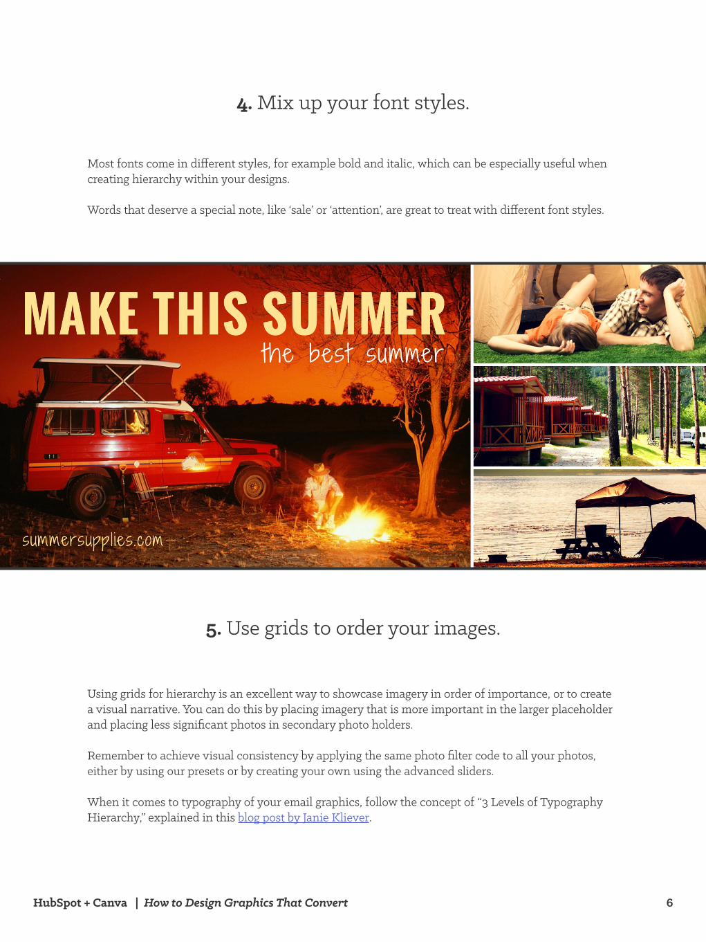
Most fonts come in different styles, for example bold and italic, which can be especially useful when creating hierarchy within your designs.
Words that deserve a special note, like ‘sale’ or ‘attention’, are great to treat with different font styles.
4. Mix up your font styles.
Using grids for hierarchy is an excellent way to showcase imagery in order of importance, or to create a visual narrative. You can do this by placing imagery that is more important in the larger placeholder and placing less significant photos in secondary photo holders.
Remember to achieve visual consistency by applying the same photo filter code to all your photos, either by using our presets or by creating your own using the advanced sliders.
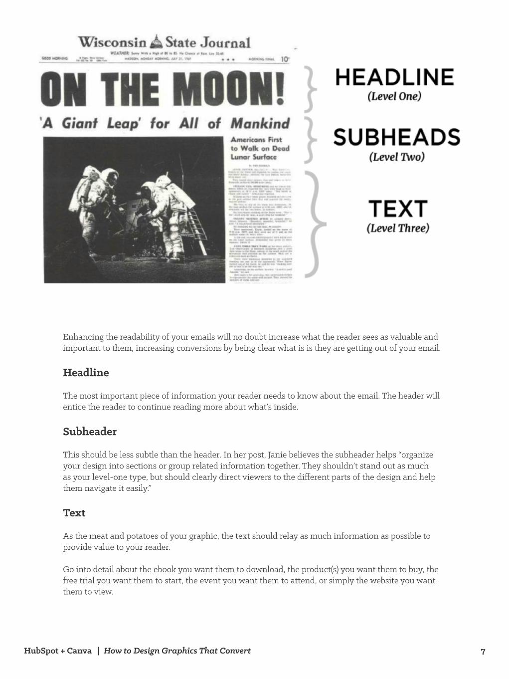
When it comes to typography of your email graphics, follow the concept of “3 Levels of Typography Hierarchy,” explained in this blog post by Janie Kliever.
5. Use grids to order your images.
HubSpot + Canva | How to Design Graphics That Convert 7
Enhancing the readability of your emails will no doubt increase what the reader sees as valuable and important to them, increasing conversions by being clear what is is they are getting out of your email.
Headline
The most important piece of information your reader needs to know about the email. The header will entice the reader to continue reading more about what’s inside.
Subheader
This should be less subtle than the header. In her post, Janie believes the subheader helps “organize your design into sections or group related information together. They shouldn’t stand out as much as your level-one type, but should clearly direct viewers to the different parts of the design and help them navigate it easily.”
Text
As the meat and potatoes of your graphic, the text should relay as much information as possible to provide value to your reader.
Go into detail about the ebook you want them to download, the product(s) you want them to buy, the free trial you want them to start, the event you want them to attend, or simply the website you want them to view.
HubSpot + Canva | How to Design Graphics That Convert 8
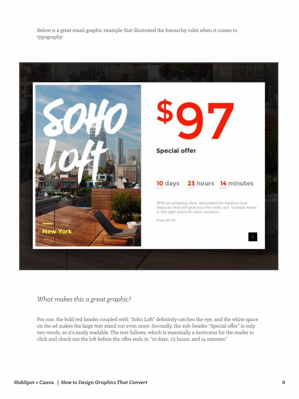
Below is a great email graphic example that illustrated the hierarchy rules when it comes to typography:
What makes this a great graphic?
For one, the bold red header coupled with “Soho Loft” definitely catches the eye, and the white space on the ad makes the large text stand out even more. Secondly, the sub-header “Special offer” is only two words, so it’s easily readable. The text follows, which is essentially a motivator for the reader to click and check out the loft before the offer ends in “10 days, 23 hours, and 14 minutes.”
HubSpot + Canva | How to Design Graphics That Convert 9
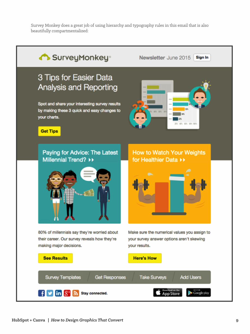
Survey Monkey does a great job of using hierarchy and typography rules in this email that is also beautifully compartmentalized:
HubSpot + Canva | How to Design Graphics That Convert 10
What makes this a great graphic?
Contrasting from the previous example, this graphic has much more information and modules on the page, however it’s still simply, readable, and has clear calls-to-action. For one, the header “3 Tips for Easier Data Analysis and Reporting” will pique the interest of people interested in making their reporting lives easier. There is a simple call-to-action, “Get Tips” even before the rest of the graphic sub-header, which there are two of. The reader can either take action first, or keep reading and decide which of the two sub-headers are of more interest to them.
This graphic represents a “decision-tree” if you will, an almost flowchart-like readability that is easy to consume and understand where the reader will get value from.
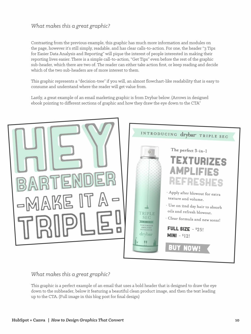
Lastly, a great example of an email marketing graphic is from Drybar below. (Arrows in designed ebook pointing to different sections of graphic and how they draw the eye down to the CTA”
What makes this a great graphic?
This graphic is a perfect example of an email that uses a bold header that is designed to draw the eye down to the subheader, below it featuring a beautiful clean product image, and then the text leading up to the CTA. (Full image in this blog post for final design)
HubSpot + Canva | How to Design Graphics That Convert 11
When it comes to designing landing page graphics, think about A/B testing elements of your graphics such as:
• Product image vs. Person image• Product image: placement, screenshots, or drawings • Person images: the direction their eyes are pointing, male or female
There’s a theory floating out there that hypothesizes when a person featured on a landing page graphic is staring at the product featured on the same page, conversion rates increase since the way our eyes move on websites flows in the direction of that product, thus wanting to buy it.
Section 2: Designing Graphics
for Landing Pages
Using People on Your
Landing Pages
HubSpot + Canva | How to Design Graphics That Convert 12
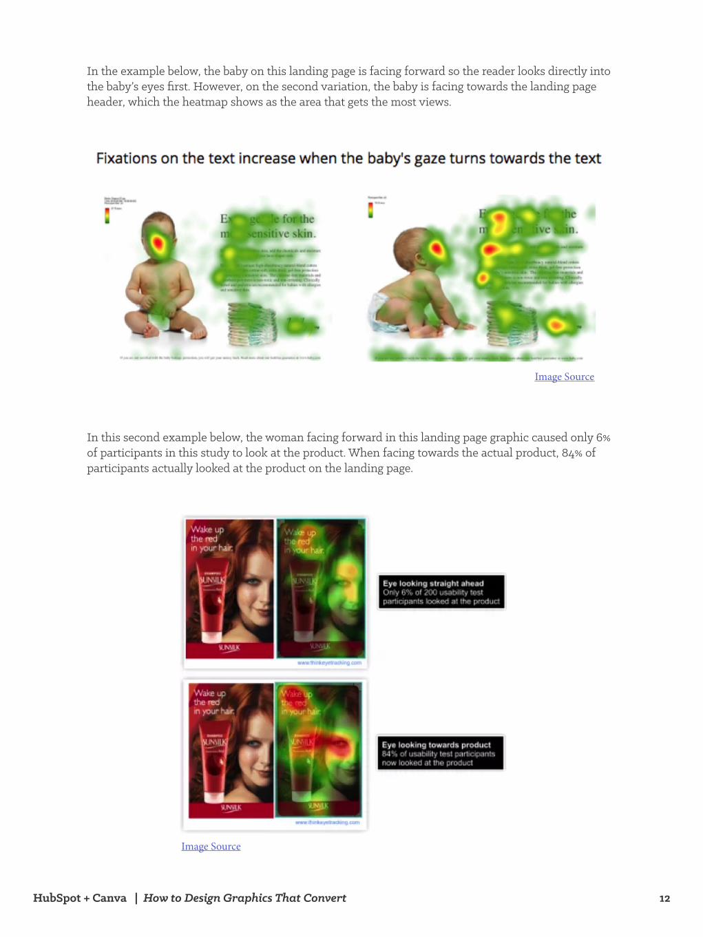
In this second example below, the woman facing forward in this landing page graphic caused only 6% of participants in this study to look at the product. When facing towards the actual product, 84% of participants actually looked at the product on the landing page.
Image Source
In the example below, the baby on this landing page is facing forward so the reader looks directly into the baby’s eyes first. However, on the second variation, the baby is facing towards the landing page header, which the heatmap shows as the area that gets the most views.
Image Source
HubSpot + Canva | How to Design Graphics That Convert 13
There are other ways that people can be featured on landing pages that don’t necessarily need to be “looking” at your product being featured.
Try testing out a simply male vs. female landing page.
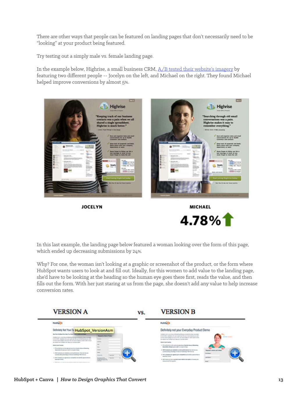
In the example below, Highrise, a small business CRM, A/B tested their website’s imagery by featuring two different people -- Jocelyn on the left, and Michael on the right. They found Michael helped improve conversions by almost 5%.
In this last example, the landing page below featured a woman looking over the form of this page, which ended up decreasing submissions by 24%.
Why? For one, the woman isn’t looking at a graphic or screenshot of the product, or the form where HubSpot wants users to look at and fill out. Ideally, for this women to add value to the landing page, she’d have to be looking at the heading so the human eye goes there first, reads the value, and then fills out the form. With her just staring at us from the page, she doesn’t add any value to help increase conversion rates.
HubSpot + Canva | How to Design Graphics That Convert 14
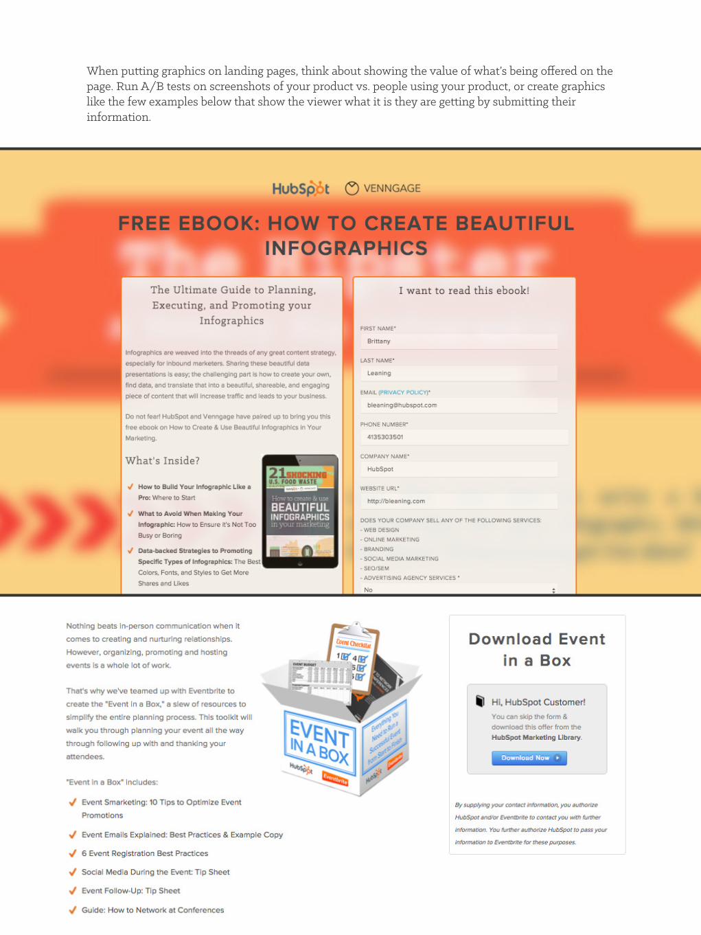
When putting graphics on landing pages, think about showing the value of what’s being offered on the page. Run A/B tests on screenshots of your product vs. people using your product, or create graphics like the few examples below that show the viewer what it is they are getting by submitting their information.
HubSpot + Canva | How to Design Graphics That Convert 15
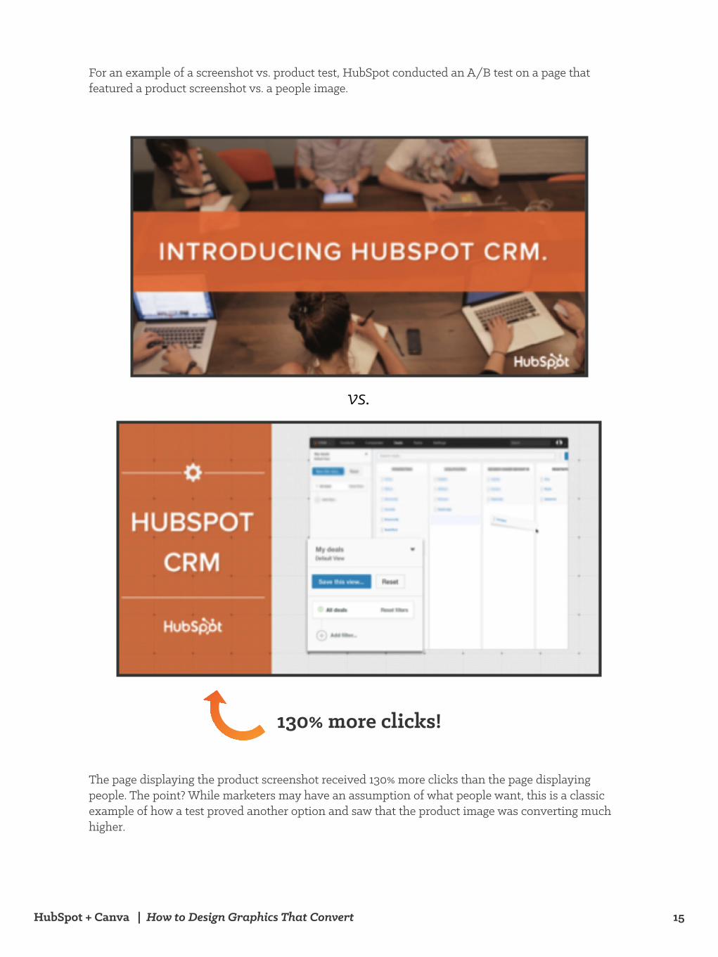
For an example of a screenshot vs. product test, HubSpot conducted an A/B test on a page that featured a product screenshot vs. a people image.
The page displaying the product screenshot received 130% more clicks than the page displaying people. The point? While marketers may have an assumption of what people want, this is a classic example of how a test proved another option and saw that the product image was converting much higher.
vs.
130% more clicks!
HubSpot + Canva | How to Design Graphics That Convert 16
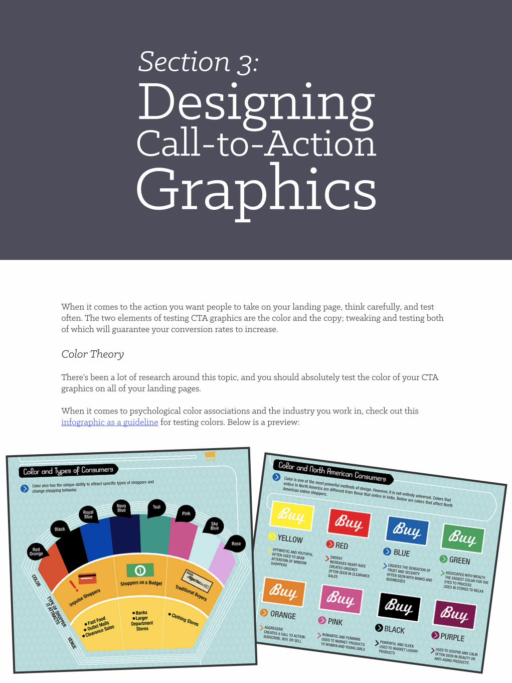
When it comes to the action you want people to take on your landing page, think carefully, and test often. The two elements of testing CTA graphics are the color and the copy; tweaking and testing both of which will guarantee your conversion rates to increase.
Color Theory
There’s been a lot of research around this topic, and you should absolutely test the color of your CTA graphics on all of your landing pages.
When it comes to psychological color associations and the industry you work in, check out this infographic as a guideline for testing colors. Below is a preview:
Section 3: Designing Call-to-ActionGraphics
HubSpot + Canva | How to Design Graphics That Convert 17
Use color theories as a general guideline for testing out CTA graphics, and don’t forget to add copy when necessary to “close” your viewers into submitting their information.
Copy within the CTA
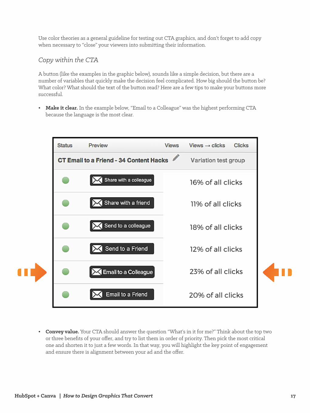
A button (like the examples in the graphic below), sounds like a simple decision, but there are a number of variables that quickly make the decision feel complicated. How big should the button be? What color? What should the text of the button read? Here are a few tips to make your buttons more successful.
• Make it clear. In the example below, “Email to a Colleague” was the highest performing CTA because the language is the most clear.
• Convey value. Your CTA should answer the question “What’s in it for me?” Think about the top two or three benefits of your offer, and try to list them in order of priority. Then pick the most critical one and shorten it to just a few words. In that way, you will highlight the key point of engagement and ensure there is alignment between your ad and the offer.
HubSpot + Canva | How to Design Graphics That Convert 18
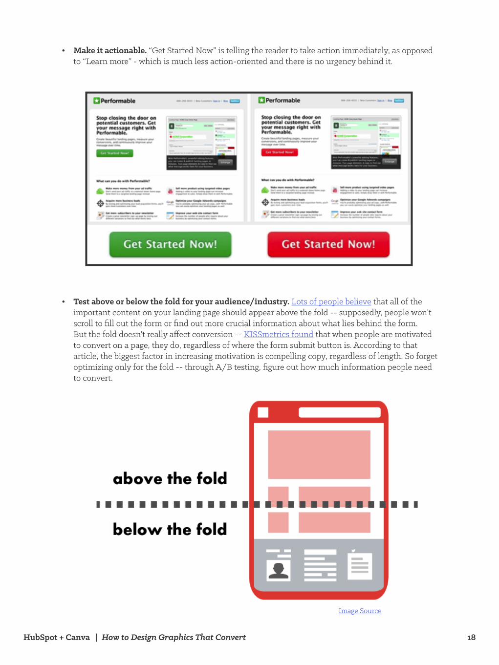
• Make it actionable. “Get Started Now” is telling the reader to take action immediately, as opposed to “Learn more” - which is much less action-oriented and there is no urgency behind it.
• Test above or below the fold for your audience/industry. Lots of people believe that all of the important content on your landing page should appear above the fold -- supposedly, people won’t scroll to fill out the form or find out more crucial information about what lies behind the form. But the fold doesn’t really affect conversion -- KISSmetrics found that when people are motivated to convert on a page, they do, regardless of where the form submit button is. According to that article, the biggest factor in increasing motivation is compelling copy, regardless of length. So forget optimizing only for the fold -- through A/B testing, figure out how much information people need to convert.
Image Source
HubSpot + Canva | How to Design Graphics That Convert 19
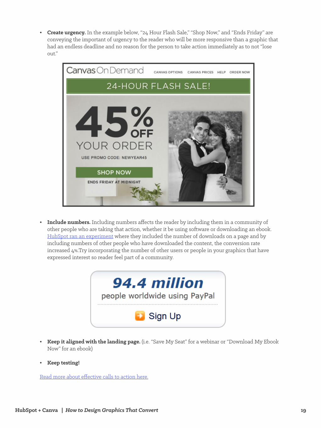
• Create urgency. In the example below, “24 Hour Flash Sale,” “Shop Now,” and “Ends Friday” are conveying the important of urgency to the reader who will be more responsive than a graphic that had an endless deadline and no reason for the person to take action immediately as to not “lose out.”
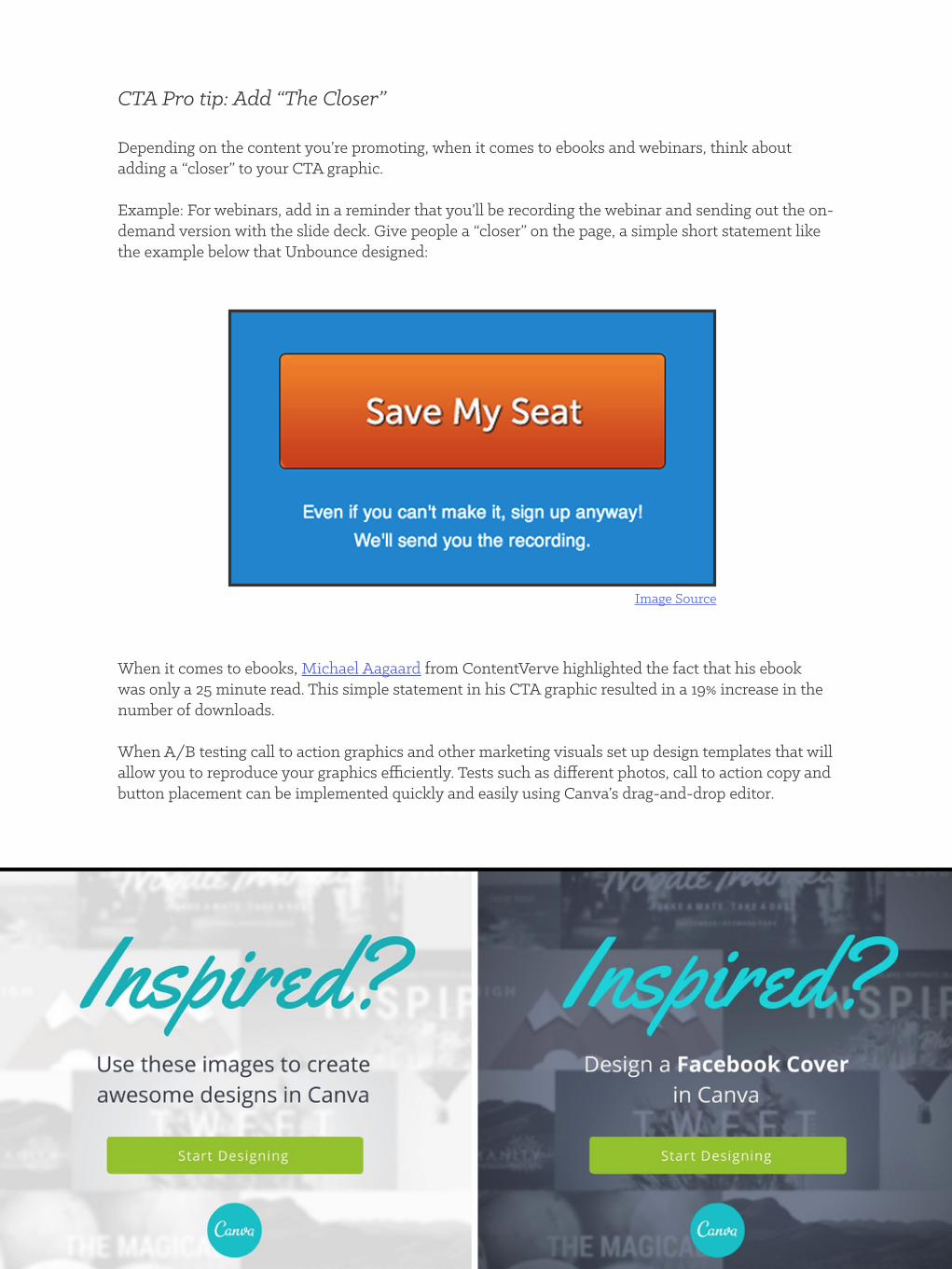
• Include numbers. Including numbers affects the reader by including them in a community of other people who are taking that action, whether it be using software or downloading an ebook. HubSpot ran an experiment where they included the number of downloads on a page and by including numbers of other people who have downloaded the content, the conversion rate increased 4%.Try incorporating the number of other users or people in your graphics that have expressed interest so reader feel part of a community.
• Keep it aligned with the landing page. (i.e. “Save My Seat” for a webinar or “Download My Ebook Now” for an ebook)
• Keep testing!
Read more about effective calls to action here.
HubSpot + Canva | How to Design Graphics That Convert 20
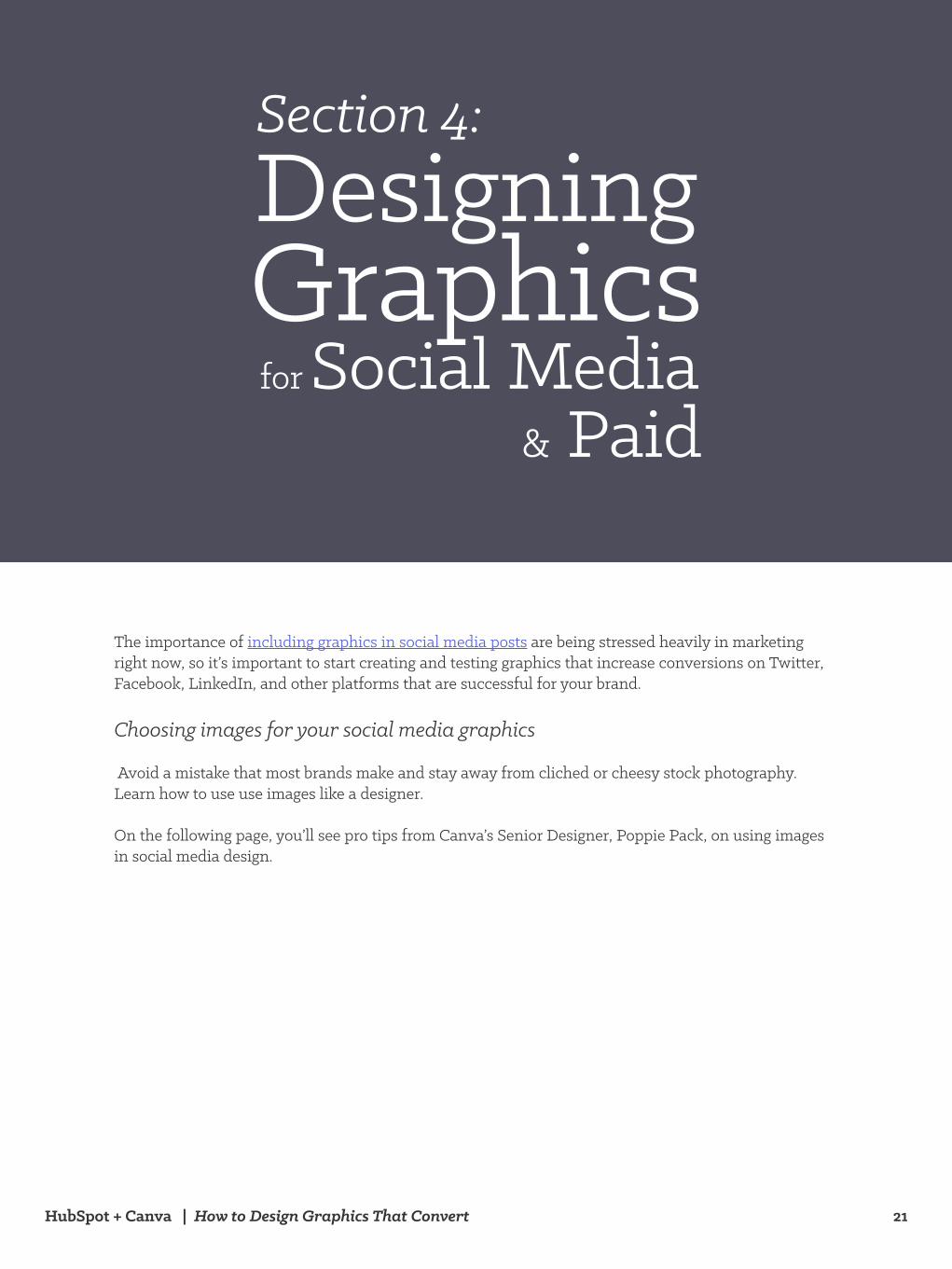
CTA Pro tip: Add “The Closer” Depending on the content you’re promoting, when it comes to ebooks and webinars, think about adding a “closer” to your CTA graphic.
Example: For webinars, add in a reminder that you’ll be recording the webinar and sending out the on-demand version with the slide deck. Give people a “closer” on the page, a simple short statement like the example below that Unbounce designed:
When it comes to ebooks, Michael Aagaard from ContentVerve highlighted the fact that his ebook was only a 25 minute read. This simple statement in his CTA graphic resulted in a 19% increase in the number of downloads.
When A/B testing call to action graphics and other marketing visuals set up design templates that will allow you to reproduce your graphics efficiently. Tests such as different photos, call to action copy and button placement can be implemented quickly and easily using Canva’s drag-and-drop editor.
Image Source
HubSpot + Canva | How to Design Graphics That Convert 21
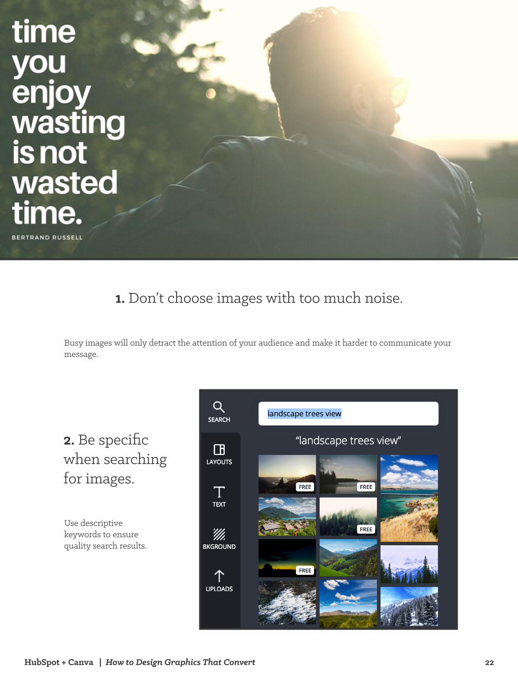
The importance of including graphics in social media posts are being stressed heavily in marketing right now, so it’s important to start creating and testing graphics that increase conversions on Twitter, Facebook, LinkedIn, and other platforms that are successful for your brand.
Choosing images for your social media graphics
Avoid a mistake that most brands make and stay away from cliched or cheesy stock photography. Learn how to use use images like a designer.
On the following page, you’ll see pro tips from Canva’s Senior Designer, Poppie Pack, on using images in social media design.
Section 4: Designing Graphics for Social Media & Paid
HubSpot + Canva | How to Design Graphics That Convert 22
Busy images will only detract the attention of your audience and make it harder to communicate your message.
1. Don’t choose images with too much noise.
2. Be specific when searching for images.
Use descriptive keywords to ensure quality search results.
HubSpot + Canva | How to Design Graphics That Convert 23
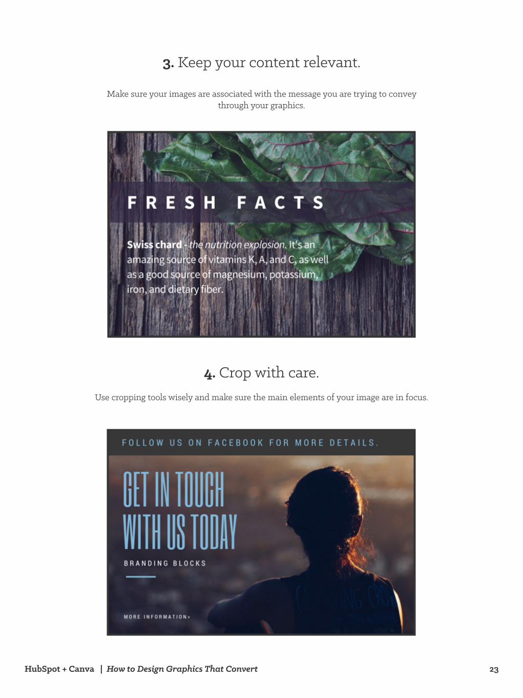
Make sure your images are associated with the message you are trying to convey through your graphics.
3. Keep your content relevant.
Use cropping tools wisely and make sure the main elements of your image are in focus.
4. Crop with care.
HubSpot + Canva | How to Design Graphics That Convert 24
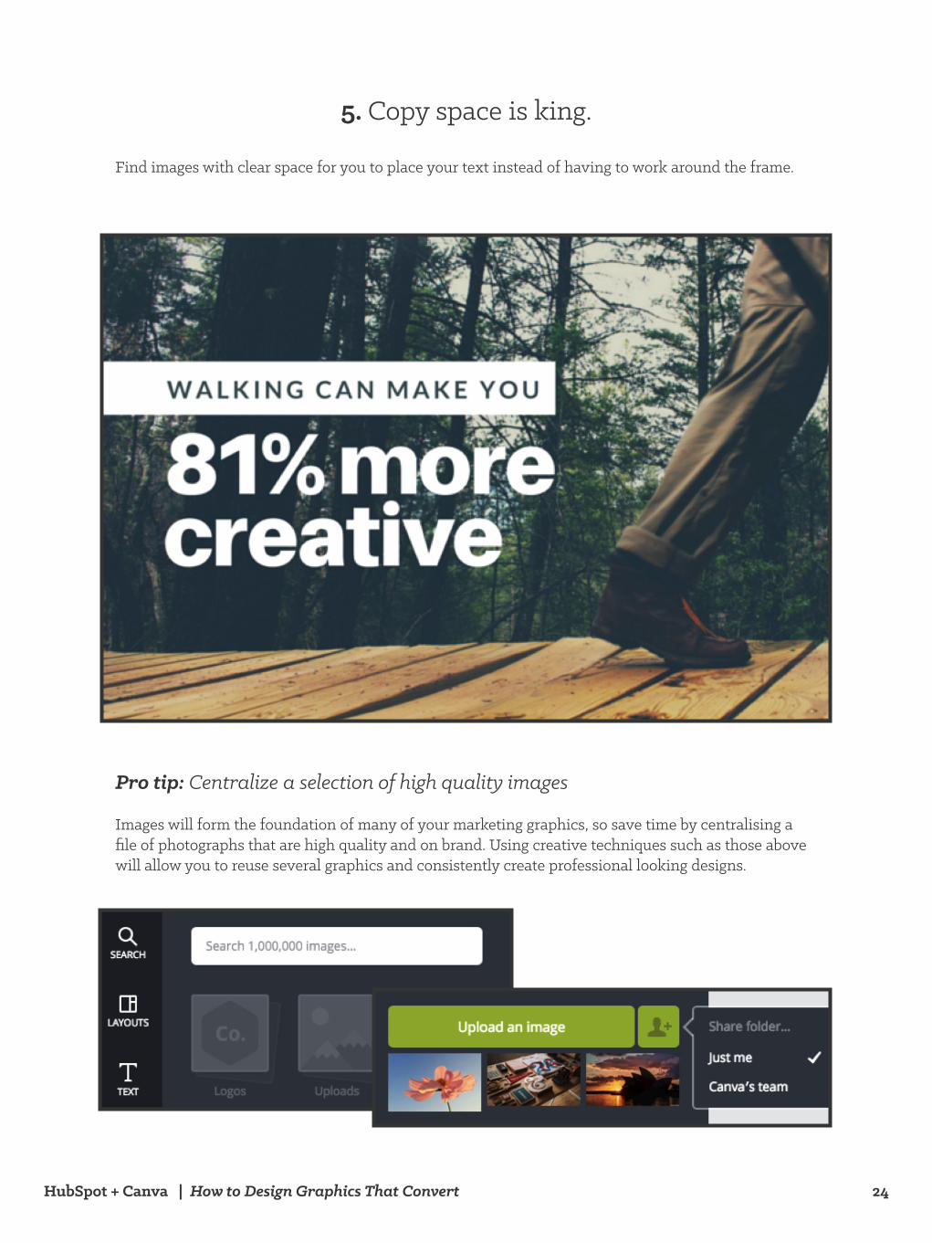
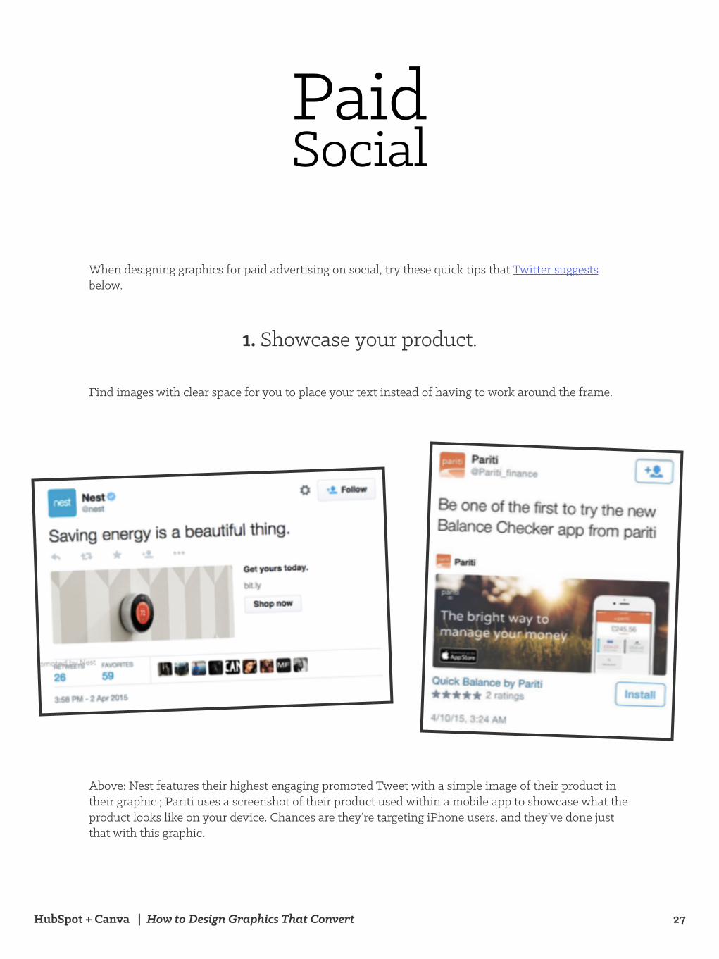
Find images with clear space for you to place your text instead of having to work around the frame.
5. Copy space is king.
Pro tip: Centralize a selection of high quality images
Images will form the foundation of many of your marketing graphics, so save time by centralising a file of photographs that are high quality and on brand. Using creative techniques such as those above will allow you to reuse several graphics and consistently create professional looking designs.
HubSpot + Canva | How to Design Graphics That Convert 25
Social Media Posts
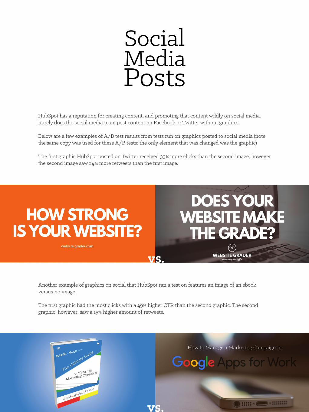
HubSpot has a reputation for creating content, and promoting that content wildly on social media. Rarely does the social media team post content on Facebook or Twitter without graphics.
Below are a few examples of A/B test results from tests run on graphics posted to social media (note: the same copy was used for these A/B tests; the only element that was changed was the graphic)
The first graphic HubSpot posted on Twitter received 33% more clicks than the second image, however the second image saw 24% more retweets than the first image.
Another example of graphics on social that HubSpot ran a test on features an image of an ebook versus no image.
The first graphic had the most clicks with a 49% higher CTR than the second graphic. The second graphic, however, saw a 15% higher amount of retweets.
vs.
vs.
HubSpot + Canva | How to Design Graphics That Convert 26
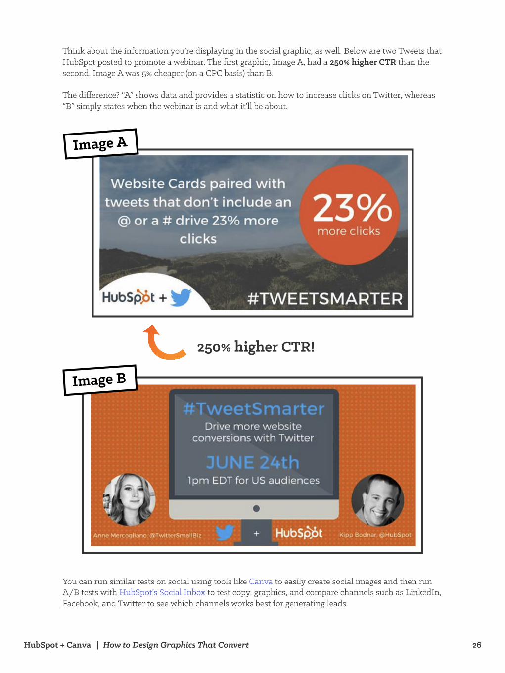
Think about the information you’re displaying in the social graphic, as well. Below are two Tweets that HubSpot posted to promote a webinar. The first graphic, Image A, had a 250% higher CTR than the second. Image A was 5% cheaper (on a CPC basis) than B.
The difference? “A” shows data and provides a statistic on how to increase clicks on Twitter, whereas “B” simply states when the webinar is and what it’ll be about.
You can run similar tests on social using tools like Canva to easily create social images and then run A/B tests with HubSpot’s Social Inbox to test copy, graphics, and compare channels such as LinkedIn, Facebook, and Twitter to see which channels works best for generating leads.
250% higher CTR!
Image A
Image B
HubSpot + Canva | How to Design Graphics That Convert 27
Paid Social
When designing graphics for paid advertising on social, try these quick tips that Twitter suggests below.
vs.
Find images with clear space for you to place your text instead of having to work around the frame.
Above: Nest features their highest engaging promoted Tweet with a simple image of their product in their graphic.; Pariti uses a screenshot of their product used within a mobile app to showcase what the product looks like on your device. Chances are they’re targeting iPhone users, and they’ve done just that with this graphic.
1. Showcase your product.
HubSpot + Canva | How to Design Graphics That Convert 28
Pro tip: You don’t have to hire a photographer to use high-quality images in your paid graphics. Use free tools like www.unsplash.com to download beautiful and professional photos for your graphics for free, or use your iPhone and edit photos with cheap and free tools.
Pro tip: Match your screenshots to the audience you are targeting.I.e. don’t have a screenshot of a desktop if you’re promoting a mobile app.
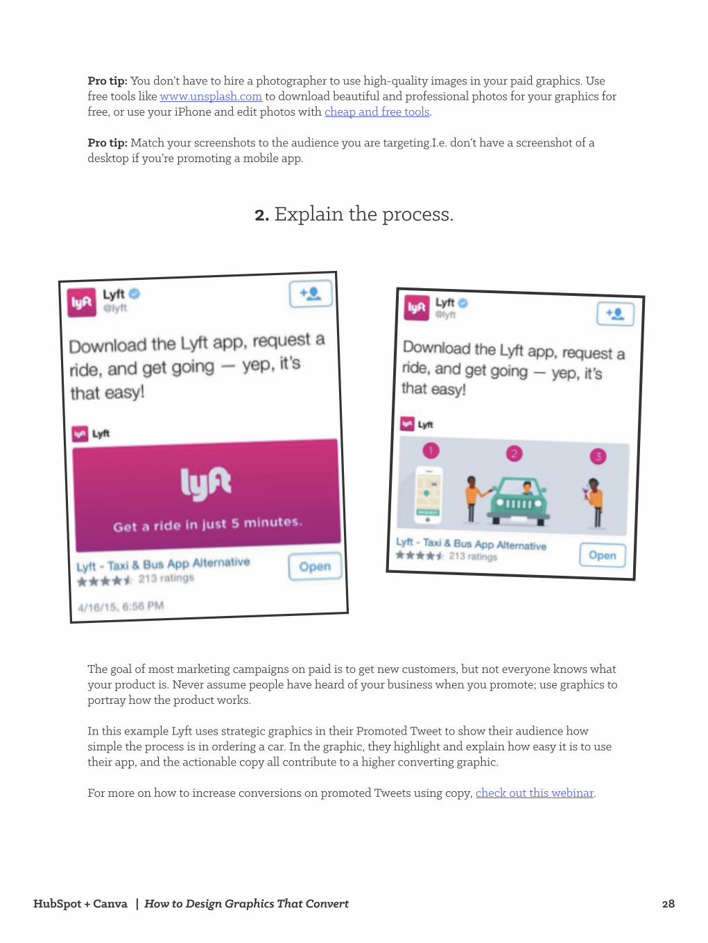
The goal of most marketing campaigns on paid is to get new customers, but not everyone knows what your product is. Never assume people have heard of your business when you promote; use graphics to portray how the product works.
In this example Lyft uses strategic graphics in their Promoted Tweet to show their audience how simple the process is in ordering a car. In the graphic, they highlight and explain how easy it is to use their app, and the actionable copy all contribute to a higher converting graphic.
For more on how to increase conversions on promoted Tweets using copy, check out this webinar.
vs.
2. Explain the process.
HubSpot + Canva | How to Design Graphics That Convert 29
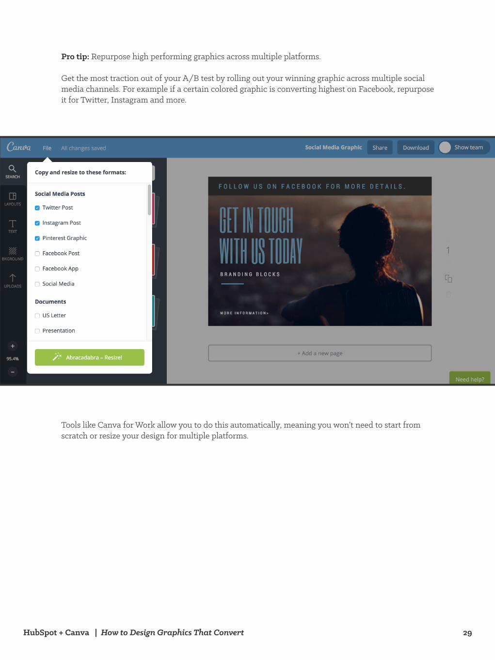
Pro tip: Repurpose high performing graphics across multiple platforms.
Get the most traction out of your A/B test by rolling out your winning graphic across multiple social media channels. For example if a certain colored graphic is converting highest on Facebook, repurpose it for Twitter, Instagram and more.
Tools like Canva for Work allow you to do this automatically, meaning you won’t need to start from scratch or resize your design for multiple platforms.
vs.
HubSpot + Canva | How to Design Graphics That Convert 30
When it comes to graphics, proving what works comes down to testing, redesigning, tweaking, and trying new things constantly. Especially for certain industries, what works for some may not work for others.
If you’ve read somewhere what red buttons work best for software sales or pink graphics convert best on Facebook ads for ecommerce, try testing that for yourself and seeing what works for your specific audience.
There’s so much variation - literally billions of different combinations of graphics in email marketing, social media, landing pages, and paid advertising - your only task is to find out which variations increase your conversion rates. Make sure to play around with your graphics, visit other blogs and subscribe to other email newsletters that inspire your designs.
Whether it be increasing shares, leads, visits, or sales, graphics have been proven to help increase conversions and hit goals we as marketers are always striving for. Here’s a quick recap of some takeaways to apply to your next graphics design and testing.
Key Takeaways:• Try and stay away from cheesy stock photos. Go with product screenshots, customer
testimonials, employee photos around the office, or use tools like www.unsplash.com to find great images for your graphics
• Follow the guidelines of hierarchy and typography in your graphics. Test one element of your graphic in different variations to ensure you know exactly what it is that’s causing a spike or decrease in conversions
• Always A/B test your CTAs - what you think might do well may not!
Finally, use graphics to your advantage: place them wherever you can. They enhance promotion of your content and products, so get out there and have fun designing and testing!
Conclusion
HubSpot + Canva | How to Design Graphics That Convert 1
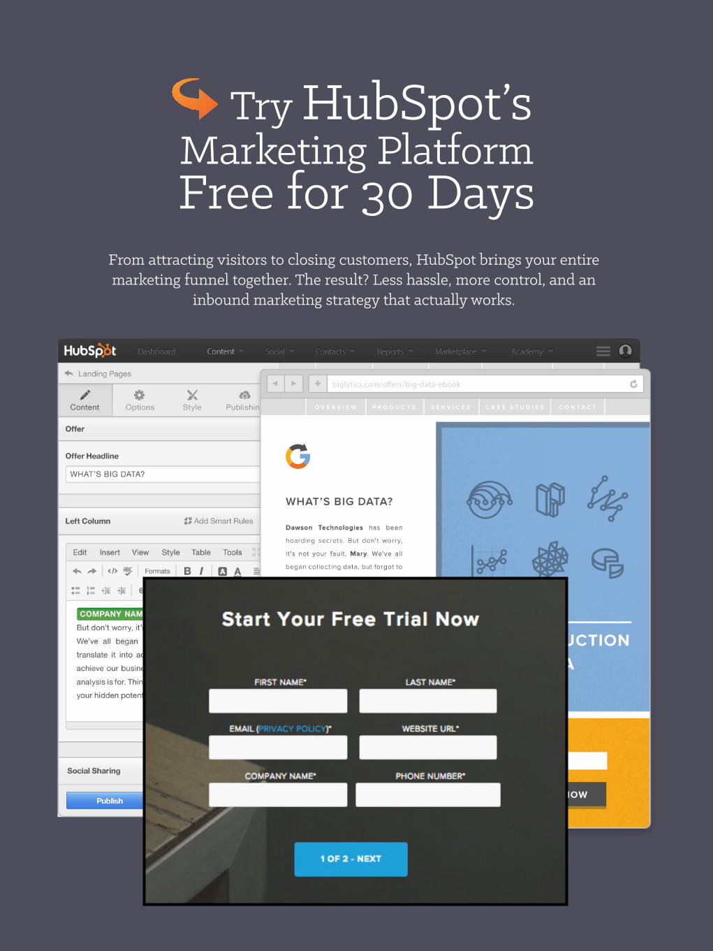
Try HubSpot’s Marketing Platform Free for 30 Days
From attracting visitors to closing customers, HubSpot brings your entire marketing funnel together. The result? Less hassle, more control, and an
inbound marketing strategy that actually works.
HubSpot + Canva | How to Design Graphics That Convert 2
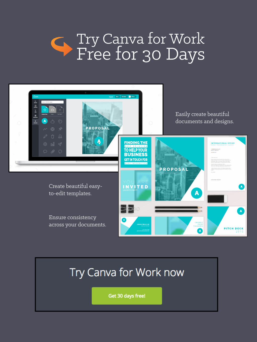
Try Canva for Work Free for 30 Days
Easily create beautiful documents and designs.
Create beautiful easy-to-edit templates.
Ensure consistency across your documents.