html utopia: designing without tables using css
TRANSCRIPT
HTML Utopia: Designing Without Tables Using CSS (Chapters 1, 3, 4, and 5)
Thank you for downloading these four chapters of Dan Shafer’s HTML Utopia: Designing Without Tables Using CSS.
This excerpt encapsulates the Summary of Contents, Information about the Author and SitePoint, Table of Contents, Preface, four chapters of the book, and a portion of Appendix C: CSS Property Reference.
We hope you find this information useful in evaluating the book.
For more information, visit sitepoint.com
Summary of Contents of this Excerpt Preface ..........................................................................................xi I. Introduction to CSS ................................................................. 1
1. Getting the Lay of the Land........................................... 3 3. Digging Below The Surface .......................................... 49
II. Page Layout with CSS........................................................... 73 4. CSS Web Site Design................................................... 75 5. Building the Skeleton ................................................... 87
C. CSS Property Reference (A-D only) ................................... 309 Index......................................................................................... 481
Summary of Additional Book Contents I. Introduction to CSS ................................................................. 1
2. Putting CSS Into Perspective ....................................... 23 II. Page Layout with CSS........................................................... 73
6. Putting Things in Their Place .................................... 123 III. Styling Text and other Content with CSS ........................ 155
7. Splashing Around a Bit of Color ................................ 157 8. Making Fonts Consistent ........................................... 173 9. Text Effects and the Cascade ..................................... 193 10. Adding Graphics to the Design ................................ 241
IV. Non-Obvious Uses of CSS................................................. 255 11. Improving the User Experience................................ 257 12. Validation and Backwards Compatibility................ 275
A. CSS Miscellany.................................................................... 293 B. CSS Color Reference ........................................................... 301 C. CSS Property Reference ...................................................... 309 Recommended Resources......................................................... 473

HTML Utopia: DesigningWithout Tables Using CSS
by Dan Shafer
HTML Utopia: Designing Without Tables Using CSSby Dan Shafer
Copyright © 2003 SitePoint Pty. Ltd.
Editor: Georgina Laidlaw
Technical Editor: Kevin Yank
Illustrations and Cover Design: Julian Carroll
Printing History:
First Edition: May 2003
Notice of Rights
All rights reserved. No part of this book may be reproduced, stored in a retrieval system or transmitted
in any form or by any means, without the prior written permission of the publisher, except in the
case of brief quotations embodied in critical articles or reviews.
Notice of Liability
The author and publisher have made every effort to ensure the accuracy of the information herein.
However, the information contained in this book is sold without warranty, either express or implied.
Neither the authors and SitePoint Pty. Ltd., nor its dealers or distributors will be held liable for any
damages to be caused either directly or indirectly by the instructions contained in this book, or by
the software or hardware products described herein.
Trademark Notice
Rather than indicating every occurrence of a trademarked name as such, this book uses the names
only in an editorial fashion and to the benefit of the trademark owner with no intention of infringe-
ment of the trademark.
Published by SitePoint Pty. Ltd.
Suite 6, 50 Regent Street Richmond
VIC Australia 3121.
Web: www.sitepoint.com
E-Mail: [email protected]
ISBN 0-9579218-2-9
Printed and bound in the United States of America
About the Author
Dan Shafer is a highly respected Web design consultant. He cut his teeth as the
first Webmaster and Director of Technology at Salon.com, then spent almost
five years as the Master Builder in CNET's Builder.com division.
Dan gained widespread recognition as a respected commentator on the Web
design scene when he hosted the annual Builder.com Live! conference in New
Orleans. He has designed and built more than 100 Websites and is regarded as
an expert in Web user experience design and implementation.
The author of more than 50 previous titles on computers and technology, Dan
lives in Monterey, California, with his wife of almost 25 years, Carolyn, and their
Shiitzu dog, Albert Einstein.
About SitePoint
SitePoint specializes in publishing fun, practical and easy-to-understand content
for Web Professionals. Visit http://www.sitepoint.com/ to access our books,
newsletters, articles and community forums.
This book is dedicated to One Mind,in the knowing that It is all there is.
ii
Table of ContentsPreface ..................................................................................................... xi
Who Should Read This Book? ............................................................ xii
The Book's Web Site ......................................................................... xiii
The Code Archive ...................................................................... xiii
Updates and Errata ................................................................... xiii
The SitePoint Forums ........................................................................ xiii
The SitePoint Newsletters ................................................................. xiii
Your Feedback ................................................................................... xiv
Acknowledgements ............................................................................ xiv
I. Introduction to CSS 1
1. Getting the Lay of the Land ........................................................... 3CSS in Context ............................................................................ 4
The Basic Purpose of CSS ............................................................ 5
Why Most—But Not All—Tables Are Bad .................................... 6
Tables Mean Long Load Times ............................................. 6
Use of Transparent Images Slows Us Down .......................... 7
Maintaining Tables is a Nightmare ....................................... 7
When it’s OK to Use a Table .............................................. 8
What is CSS, Really? ................................................................... 8
Parts of a CSS Rule .................................................................... 10
Types of CSS Rules .................................................................... 12
What Properties Can CSS Rules Affect? ............................. 13
What Elements Can CSS Affect? ........................................ 13
Where Can CSS Styles Be Defined? ................................... 14
Why Bother? ............................................................................. 17
Summary ................................................................................... 21
2. Putting CSS Into Perspective ........................................................ 23What is CSS Good For? ............................................................. 23
Color and CSS ................................................................... 24
Fonts and CSS ................................................................... 28
Pseudo-Class Animation and CSS ....................................... 30
Images and CSS ................................................................. 31
Multiple Style Sheets, Users, and CSS ................................ 33
What CSS Alone Can’t Do For You ........................................... 34
CSS and Web Accessibility ........................................................ 36
CSS and the Ever-Shifting World of Browsers ............................ 42
Accommodating Older Browsers ......................................... 44
Dealing with Broken Browsers ............................................ 46
Summary ................................................................................... 47
3. Digging Below The Surface ........................................................... 49Applying CSS to HTML Documents .......................................... 50
Using Shorthand Properties ....................................................... 51
How Inheritance Works in CSS ................................................. 51
Selectors and Structure of CSS Rules .......................................... 54
Universal Selector .............................................................. 56
Element Type Selector ....................................................... 56
Class Selector .................................................................... 57
ID Selector ........................................................................ 58
Pseudo-Element Selector .................................................... 59
Pseudo-Class Selector ......................................................... 60
Descendant Selector ........................................................... 61
Parent-Child Selector ......................................................... 62
Adjacent Selector ............................................................... 62
Attribute Selectors ............................................................. 63
Selector Grouping .............................................................. 65
Expressing Measurements ........................................................... 65
Absolute Values ................................................................. 66
Relative Values .................................................................. 68
CSS Comments .......................................................................... 70
Summary ................................................................................... 71
II. Page Layout with CSS 73
4. CSS Web Site Design .................................................................... 75Advantages of CSS Design ......................................................... 76
Increased Stylistic Control ................................................. 76
Centralized Design Information ......................................... 77
Semantic Content Markup ................................................. 78
Accessibility ....................................................................... 79
Standards Compliance ....................................................... 80
CSS Success Stories ................................................................... 82
Our Sample Site: Footbag Freaks ................................................ 83
Summary ................................................................................... 85
5. Building the Skeleton ................................................................... 87Enumerating Design Types ......................................................... 88
How Many Page Types? ..................................................... 88
How Many Design Elements? ............................................. 89
CSS Positioning and Multi-Column Page Layouts ...................... 90
HTML Utopia: Designing Without Tables Using CSS
Order this 500 page hard-copy CSS Book Now!iv
The CSS Box Model .......................................................... 90
The display Property ................................................................ 112
CSS Positioning and Multi-Column Layouts ............................ 113
Absolute, Relative, and Positioning Contexts .................... 113
Basic Three-Column Layout ............................................. 117
Adding a Top Header Area ............................................... 120
Summary ................................................................................. 121
6. Putting Things in Their Place ...................................................... 123More on Positioning Page Blocks .............................................. 123
Measurement Units and Types Influence Design .............. 123
The float Property ............................................................ 125
The clear Property ............................................................ 127
Absolute Versus Relative Heights and Widths .......................... 131
The z-Index Property and Overlapping Content ........................ 140
CSS Layout in Practice: Footbag Freaks .................................... 145
Summary ................................................................................. 153
III. Styling Text and other Content with CSS 155
7. Splashing Around a Bit of Color .................................................. 157Who’s in Charge Here? ............................................................ 157
Color in CSS ............................................................................ 159
How to Specify Colors ..................................................... 159
Color Selection and Combining Colors ............................. 162
Setting body Color ........................................................... 164
Transparency, Color, and User Overrides .......................... 165
Interesting Uses of Color .......................................................... 166
Warnings and Cautions .................................................... 166
Coloring Alternate Rows of Data Tables ........................... 169
Summary ................................................................................. 172
8. Making Fonts Consistent ............................................................ 173How CSS Deals With Fonts ..................................................... 173
The font-family Property .......................................................... 174
The font-size Property .............................................................. 176
HTML Sizes Versus CSS Sizes ......................................... 176
Variability Across Browsers and Platforms ........................ 177
Relative to What? ............................................................ 178
Other Font Properties .............................................................. 180
The font-style Property .................................................... 180
The font-variant Property ................................................. 180
The font-weight Property ................................................. 181
vOrder this 500 page hard-copy CSS Book Now!
HTML Utopia: Designing Without Tables Using CSS
The font Shorthand Property ................................................... 181
Standard and Nonstandard Font Families ................................. 184
Specifying Font Lists ........................................................ 186
Using Nonstandard and Downloadable Fonts ................... 188
Summary ................................................................................. 191
9. Text Effects and the Cascade ..................................................... 193Using the span Element ........................................................... 194
Text Alignment as a Design Technique ..................................... 196
Text Alignment in CSS Versus HTML .............................. 197
Moving from Crowded to Airy Design with Alignment ...... 197
First-Line Indentation .............................................................. 203
Horizontal and Vertical Spacing ............................................... 206
The line-height Property .................................................. 206
The letter-spacing and word-spacing Properties ................. 209
Text Decorations ..................................................................... 214
Shadowed Text Without Graphics ............................................ 219
Styling Hyperlinks ................................................................... 221
Styling Lists with CSS .............................................................. 224
The list-style-type Property .............................................. 224
The list-style-position Property ......................................... 229
The list-style-image Property ............................................ 231
Cascading and Inheritance ....................................................... 233
Basic Principles of Cascading ............................................ 233
Sort Order ....................................................................... 235
Specificity ........................................................................ 237
Origin .............................................................................. 239
Weight (!important) ........................................................ 239
Summary ................................................................................. 240
10. Adding Graphics to the Design ................................................. 241Alignment of Images and Text .................................................. 242
Placing Text On Top of Images ........................................ 245
Clipping HTML Content ......................................................... 250
Summary ................................................................................. 253
IV. Non-Obvious Uses of CSS 255
11. Improving the User Experience ................................................ 257Basic List Styling With CSS ..................................................... 259
Enhancing the Look of the Menu ............................................. 265
Creating a Submenu within the Main Menu ............................. 266
Modifying the Cursor on the Fly .............................................. 269
HTML Utopia: Designing Without Tables Using CSS
Order this 500 page hard-copy CSS Book Now!vi
Using a Background Image as a Fixed Canvas ........................... 271
Summary ................................................................................. 274
12. Validation and Backward Compatibility .................................... 275Validating Your CSS ................................................................ 275
Adjusting for Backward Compatibility ...................................... 279
Which Are the Non-Conforming Browsers? ...................... 280
Basic Approaches to Non-Conforming Browsers ............... 281
Accommodating Netscape 4.x ........................................... 285
Keep the Quirks: DOCTYPE Switching .................................... 288
Summary ................................................................................. 291
A. CSS Miscellany ................................................................................... 293At-Rules ........................................................................................... 293
Aural Style Sheets ............................................................................ 297
CSS and JavaScript .......................................................................... 299
B. CSS Color Reference ........................................................................... 301
C. CSS Property Reference ...................................................................... 309azimuth ........................................................................................... 309
background ...................................................................................... 310
background-attachment .................................................................... 311
background-color ............................................................................. 312
background-image ............................................................................ 313
background-position ......................................................................... 314
background-position-x, background-position-y .................................. 316
background-repeat ........................................................................... 317
behavior ........................................................................................... 318
border .............................................................................................. 319
border-bottom, border-left, border-right, border-top .......................... 320
border-bottom-color, border-left-color, border-right-color, border-top-
color ................................................................................................ 321
border-bottom-style, border-left-style, border-right-style, border-top-
style ................................................................................................. 322
border-bottom-width, border-left-width, border-right-width, border-
top-width ......................................................................................... 322
border-collapse ................................................................................. 323
border-color ..................................................................................... 324
border-spacing ................................................................................. 326
border-style ...................................................................................... 326
border-width .................................................................................... 328
bottom ............................................................................................ 329
viiOrder this 500 page hard-copy CSS Book Now!
HTML Utopia: Designing Without Tables Using CSS
caption-side ..................................................................................... 331
clear ................................................................................................. 332
clip .................................................................................................. 332
color ................................................................................................ 334
content ............................................................................................ 335
counter-increment ............................................................................ 338
counter-reset .................................................................................... 339
cue .................................................................................................. 340
cue-after, cue-before ......................................................................... 341
cursor .............................................................................................. 342
direction .......................................................................................... 344
display ............................................................................................. 346
elevation .......................................................................................... 351
empty-cells ....................................................................................... 351
filter ................................................................................................ 352
float ................................................................................................. 354
font ................................................................................................. 355
font-family ....................................................................................... 357
font-size ........................................................................................... 359
font-size-adjust ................................................................................ 361
font-stretch ...................................................................................... 363
font-style ......................................................................................... 364
font-variant ...................................................................................... 365
font-weight ...................................................................................... 366
height .............................................................................................. 368
ime-mode ......................................................................................... 369
layout-flow ....................................................................................... 370
layout-grid ....................................................................................... 371
layout-grid-char ................................................................................ 372
layout-grid-line ................................................................................. 373
layout-grid-mode .............................................................................. 374
layout-grid-type ............................................................................... 375
layer-background-color ..................................................................... 376
layer-background-image .................................................................... 377
left ................................................................................................... 379
letter-spacing ................................................................................... 380
line-break ......................................................................................... 381
line-height ....................................................................................... 382
list-style ........................................................................................... 383
list-style-image ................................................................................. 385
list-style-position .............................................................................. 386
list-style-type ................................................................................... 388
HTML Utopia: Designing Without Tables Using CSS
Order this 500 page hard-copy CSS Book Now!viii
margin ............................................................................................. 390
margin-bottom, margin-left, margin-right, margin-top ....................... 391
marker-offset ................................................................................... 392
marks .............................................................................................. 394
max-height, min-height .................................................................... 394
max-width, min-width ...................................................................... 396
-moz-border-radius ........................................................................... 397
-moz-border-radius-bottomleft, -moz-border-radius-bottomright, -moz-
border-radius-topleft, -moz-border-radius-topright ............................ 398
-moz-opacity .................................................................................... 400
orphans ........................................................................................... 401
outline ............................................................................................. 402
outline-color .................................................................................... 403
outline-style ..................................................................................... 404
outline-width ................................................................................... 405
overflow ........................................................................................... 406
overflow-x, overflow-y ...................................................................... 408
padding ........................................................................................... 409
padding-bottom, padding-left, padding-right, padding-top ................ 410
page ................................................................................................. 412
page-break-after ............................................................................... 413
page-break-before ............................................................................. 414
page-break-inside ............................................................................. 416
pause ............................................................................................... 417
pause-after, pause-before .................................................................. 418
pitch ................................................................................................ 418
pitch-range ....................................................................................... 420
play-during ...................................................................................... 420
position ........................................................................................... 422
quotes .............................................................................................. 423
richness ........................................................................................... 425
right ................................................................................................ 426
ruby-align ........................................................................................ 427
ruby-overhang .................................................................................. 428
ruby-position ................................................................................... 430
scrollbar-base-color ........................................................................... 431
scrollbar-element-color ..................................................................... 432
size .................................................................................................. 434
speak ............................................................................................... 435
speak-header .................................................................................... 435
speak-numeral .................................................................................. 436
speak-punctuation ............................................................................ 437
ixOrder this 500 page hard-copy CSS Book Now!
HTML Utopia: Designing Without Tables Using CSS
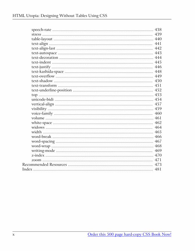
speech-rate ....................................................................................... 438
stress ............................................................................................... 439
table-layout ...................................................................................... 440
text-align ......................................................................................... 441
text-align-last ................................................................................... 442
text-autospace .................................................................................. 443
text-decoration ................................................................................. 444
text-indent ....................................................................................... 445
text-justify ....................................................................................... 446
text-kashida-space ............................................................................ 448
text-overflow .................................................................................... 449
text-shadow ..................................................................................... 450
text-transform .................................................................................. 451
text-underline-position ..................................................................... 452
top ................................................................................................... 453
unicode-bidi ..................................................................................... 454
vertical-align .................................................................................... 457
visibility ........................................................................................... 459
voice-family ..................................................................................... 460
volume ............................................................................................. 461
white-space ...................................................................................... 462
widows ............................................................................................ 464
width ............................................................................................... 465
word-break ....................................................................................... 466
word-spacing .................................................................................... 467
word-wrap ........................................................................................ 468
writing-mode ................................................................................... 469
z-index ............................................................................................. 470
zoom ............................................................................................... 471
Recommended Resources ......................................................................... 473
Index ....................................................................................................... 481
HTML Utopia: Designing Without Tables Using CSS
Order this 500 page hard-copy CSS Book Now!x
PrefaceI was already in my 50s when the World Wide Web burst upon the scene. Having
spent most of my life to that point as a writer and editor, I naturally gravitated
to the publishing side of the coin, rather than remaining content to be an amazed
consumer of all the wonderful information and connections that began to flow
from it.
As I saw the first version of the first graphical Web browser before it was officially
released, some might say I’ve been there from the beginning. And one thing that
bothered me from that beginning, as an author and publisher, was the inability
to disentangle content from presentation. The interconnectedness of it all meant
that, to produce a Website, you needed not only something to say, and some
graphical designs to make the site look good, but you also needed to be a bit of
a programmer. Initially, this “programming” was a pretty lightweight task to
someone like me who had a broad but thin programming background. HTML
markup, when all was said and done, wasn't really programming. Still, it was
more than just writing words. And it was more than using a word processor to
format words.
Designers who had clear ideas of how they wanted their Web pages to look were
frustrated and stymied by the need to create complex sets of deeply nested tables
even to approximate their visions. And, as designers came up with increasingly
complex ideas, and Web browsers diverged further and further from standards
and compatibility, the Web threatened to collapse under its own weight. Serious
designers began lobbying for a complete break from HTML to some new approach
to the Web. Chaos reigned.
I was at CNET’s Builder.com at the time, chronicling all of this, as well as parti-
cipating in it both as a designer and as a pundit. I was one of the founding
members of the Web Standards Project, or WaSP[1], and I helped found the
major conference where Web designers and creators gathered at Builder.com Live!in New Orleans. So I had a front-row seat as we gradually figured out the best
way to deal with this problem.
The Holy Grail of the Web, then, was the notion that authors should write, de-
signers should design (and code HTML) and programmers should… well… pro-
gram. Those boundaries were not clean in the first few years of the Web.
[1] http://www.webstandards.org/
Then, along came Cascading Style Sheets (CSS), the subject of this book. The
governing forces of the Web, through the World Wide Web Consortium, better
known as the W3C[2], addressed the problem and proposed that we divide
presentation instructions, and structural markup with content, into two separate
kinds of files.
Things haven’t been the same since, thank goodness! Now we really can (mostly)
separate what we say from how it gets presented to the user in a Web browser.
I wager that most Web developers today are fairly comfortable with CSS and
would no more think of embedding presentation instructions in their HTML
than they’d consider mixing 23 fonts on the same Web or print page.
Since CSS emerged, there have been dozens of books written about it. So when
SitePoint approached me about doing a CSS book, my first thought was, “Who
needs another CSS book?” But as they began to reveal their vision to me, it made
sense. It was indeed time for a book that took a different tack, based on the ex-
tensive experience of the Web design community.
So, this book is different in two primary ways.
First, it focuses on the question of how to accomplish with CSS some of the
successes Web designers have spent significant time and energy to create using
nested tables. Said another way, this book doesn’t try to start from scratch and
become a CSS tutorial. Instead, it’s a sort of introductory CSS design guide.
Second, it starts at the outside and works its way in. Most, if not all, other CSS
books, focus first on the little pieces: the attributes, values, and tags that comprise
the syntax of CSS. They then explain how to put those pieces together into a
Website.
This book begins by looking at how CSS should influence the entire design of a
site, and how to put the CSS framework in place before you begin to deal with
individual HTML elements and their styling.
Who Should Read This Book?As I wrote this book, I had in mind Web designers with at least a little experience
building sites, who are curious about how CSS can help them become more ef-
fective designers. It is, then, aimed at a beginner to intermediate designer. I shall
assume a strong grasp of HTML, but that's about it.
[2] http://www.w3.org/
Preface
Order this 500 page hard-copy CSS Book Now!xii
The Book's Web SiteLocated at http://www.sitepoint.com/books/, the Website supporting this book
will give you access to the following facilities:
The Code ArchiveAs you progress through the text, you'll note a number of references to the code
archive. This is a downloadable ZIP archive that contains complete code for all
the examples presented in the book. You'll also find a copy of the Footbag Freaks
Website[4], which we use as an example throughout the book.
Updates and ErrataNo book is perfect, and I expect that watchful readers will be able to spot at least
one or two mistakes before the end of this one. The Errata page on the book's
Website will always have the latest information about known typographical and
code errors, and necessary updates for new browser releases and versions of the
CSS standard.
The SitePoint ForumsIf you’d like to communicate with me or anyone else on the SitePoint publishing
team about this book, you should join SitePoint’s online community[5]. In fact,
you should join that community even if you don’t want to talk to us, because
there are a lot of fun and experienced Web designers and developers hanging out
there. It’s a good way to learn new stuff, get questions answered (unless you really
enjoy being on the phone with some company’s tech support line for a couple of
hours at a time), and just have fun.
The SitePoint NewslettersIn addition to books like this one, SitePoint publishes free email newsletters in-
cluding The SitePoint Tribune and The SitePoint Tech Times. In them, you'll read
about the latest news, product releases, trends, tips, and techniques for all aspects
of Web development. If nothing else, you'll get the useful CSS articles and tips,
[4] http://www.footbagfreaks.com/
[5] http://www.sitepointforums.com/
xiiiOrder this 500 page hard-copy CSS Book Now!
The Book's Web Site
but if you're interested in learning other technologies, you'll find them especially
useful. Sign up to one or more SitePoint newsletters at http://www.site-
point.com/newsletter/.
Your FeedbackIf you can't find your answer through the forums, or if you wish to contact us for
any other reason, the best place to write is <[email protected]>. We have a
well-manned email support system set up to track your inquiries, and if our
support staff is unable to answer your question, they send it straight to me.
Suggestions for improvements as well as notices of any mistakes you may find
are especially welcome.
AcknowledgementsA huge vote of thanks and appreciation goes to Kevin Yank, Technical Editor of
this book. SitePoint as a publisher has a radically different approach than any
other publisher I’ve dealt with. Kevin taught me a lot about CSS, argued with
me about details when necessary, and generally made a major and measurable
contribution to the technical quality of this book. In particular, he wrote the
impressive Appendix C. Needless to say, errors remain my responsibility, but I
can tell you that any errors that slipped through are my fault, and not due to a
lack of understanding on Kevin’s part. He must eat, sleep, and breathe W3C
specs.
Also immensely influential on this book was Editor Georgina Laidlaw. She kept
the project as on schedule as it could be, acted as a liaison between Kevin and I,
and copy-edited the text to make sure my propensity to write incredibly long
sentences was curbed. Plus, she was a joy to work with.
Julian Carroll, Designer, created the graphic design for the book, did almost all
the graphics work, and designed the Footbag Freaks sample Website[7] to boot.
He also wrote the article that was the original inspiration for this book: HTMLUtopia: Designing without Tables using CSS[8].
Mark Harbottle, SitePoint’s CEO, approached me with the concept, negotiated
the deal, and remained flexible during sometimes difficult periods as the book
[7] http://www.footbagfreaks.com/
[8] http://www.sitepoint.com/article/379
Preface
Order this 500 page hard-copy CSS Book Now!xiv
evolved and grew and shrank and missed deadlines. He was never anything less
than a professional and a gentleman.
Jeff Soulé, a bright technology guy who also happens to be married to my lovely
oldest daughter Sheila, read some of the chapters of the book as it was being
written, learned some CSS in the process, and offered several helpful suggestions
that led to clearer explanations of some points.
Two world-class Web designers, Eric Meyer and Jeffrey Zeldman, helped me
through, with their writing, their examples, and their dogged determination that
CSS be understandable to, and usable by, all Web designers.
Finally, my wife, Carolyn, continues to stand by her man despite long hours, blue
air, bouts of self-doubt and depression, periods of inexplicable and incomprehens-
ible joy, and reams of techno-speak. She is, as always, my primary inspiration
and life teacher, without whom none of this would be possible or make sense.
xvOrder this 500 page hard-copy CSS Book Now!
Acknowledgements

xvi
Introduction to CSSI

Getting the Lay of the Land1We can look at Cascading Style Sheets (CSS) from a number of contextual per-
spectives. I prefer to view them as a correction to a fundamental mistake that
was made at the beginning of Web Time, back in the old days of the early 1990s,
when Tim Berners-Lee and the first pioneering Web builders first envisioned the
beginnings of the Web.
What was that mistake?
To meet the requirements of the Web’s initially limited purpose, it was not ne-
cessary to separate content from presentation. Even though some thought it was
a good idea, there was no really compelling, practical reason to recognize this
distinction. After all, the Web’s early intent was simply to allow a small number
of nuclear physicists using disparate systems at various locations to share vital
experimental data.
Berners-Lee didn’t envision the massively popular, wildly commercialized, extens-
ively morphed Web that emerged from his core ideas in the early 1990s—I doubt
that anyone could have.
So, the mistake was a lack of foresight, rather than an oversight. But it was a
mistake nonetheless.
CSS in ContextAlmost as soon as the Web became popularized by the emergence of the first
graphical Web browser (the forerunner to Netscape Navigator), graphic designers
became aware of a problem. The method by which the Web browser displayed
information stored in HTML files was not within the designer’s control. No, it
was the users who were in primary charge of how the Web pages they visited
would appear on their systems.
While there were many, including myself, who thought this was A Good Thing,
professional designers were beside themselves with concern. From their perspective,
this constituted a fundamental flaw. "Users don't know anything about good
design", they argued. If the designers couldn't control with great accuracy things
like colors, fonts, and the precise, pixel-level positioning of every design element
on the Web page, their creations could easily end up as ugly travesties in the
user’s browser.
While a few decided to look upon this as a challenge posed by the new medium,
most designers, accustomed to print and other fixed layouts that afforded them
complete control over what the user saw, found ways to bend the Web to their
will.
Lest I incur the ire of every designer reading this book, let me hasten to add that
I don’t think this was A Bad Thing. It is certainly the case that designers know
more about how content should be displayed for users than do the users them-
selves. Things like spacing, color combinations, and other design elements affect
readability and usability. My point has much less to do with who should have
been in charge, than it does with the actions to which designers were more or
less forced to resort, in order to achieve at least some measure of control.
Soon, expert designers discovered that they could use tables to gain significant
control over the presentation of content to users. By carefully laying out tables
within tables within tables, they could position quite precisely any design element
that could be contained within a table cell. And that encompassed almost
everything.
The first desktop publishing-style Web page design tool, NetObjects Fusion, en-
abled designers to lay out pages with a high degree of precision. It generated
complex, table-based HTML, which resulted in Web pages that were as close as
possible to the designer’s original vision.
We never looked back.
Chapter 1: Getting the Lay of the Land
Order this 500 page hard-copy CSS Book Now!4
But tables weren’t intended to be used as layout tools, so while they were margin-
ally effective, they were also horribly inefficient. We’ll explore some of the
shortcomings and disadvantages of using tables for layout tasks a little later in
this chapter; for now, just know that everyone, including the designers who used
the techniques, understood pretty well how clumsy a solution they really were.
The Basic Purpose of CSSCSS emerged as a standard for Web page design, in large part, as a reaction to
the overuse of excessively complex tables to force precision layout upon a medium
that was not originally intended for such a purpose. While this is a bit of an
oversimplification of the facts, it’s hardly an unfair one.
After a brief series of skirmishes at the beginning of the Web’s development, the
question of who should control the overall appearance of a page or site ended
with the designers as victors. In fact, hardly a shot was fired. Users, after all,
eventually care most about usability, accessibility and convenience, rather than
the nitty-gritty details of design techniques.
Though flush with their victory, designers found themselves hard-pressed to
identify very good, standards-compliant ways to provide their customers—and
their customers’ users—with great designs that were also effective and efficient.
Thus, they were forced to rely largely on tables.
As the snarl of tables grew to resemble a giant thicket, even the design community
became uneasy. Maintaining a Web page that consists of a half-dozen or more
deeply intertwined tables is a nightmare. Most designers prefer not to deal with
code—even simple HTML markup—at such a level of detail.
Into the breech stepped the World Wide Web Consortium, better known as the
W3C[1], a body founded by Tim Berners-Lee to oversee the technical growth of
the Web. They saw that separating the content of a site from its form (or appear-
ance) would be the most logical solution. This would enable content ex-
perts—writers, artists, photographers, and programmers–to provide the “stuff”
that people come to a site to see, read, or experience. It would also free the design
experts—artists, graphic designers, and typographers–to determine the site’s
aesthetics independently of its content.
The result was CSS.
[1] http://www.w3.org/
5Order this 500 page hard-copy CSS Book Now!
The Basic Purpose of CSS
Why Most—But Not All—Tables Are BadWhy are tables such a bad idea as a design mechanism? There are numerous
reasons, but the ones we’re most concerned with in this context are:
� They result in load times that are longer than necessary.
� They encourage the use of inefficient “placeholder graphics” that further slow
performance.
� Their maintenance can be a nightmare in which even minor changes “break”
the entire layout.
Tables Mean Long Load TimesMost people don't know that Web browsers are deliberately designed to ensure
that each table downloads as a single entity. So, none of the material that's con-
tained in a table will be displayed until all the contents of that table are down-
loaded to the client machine, and available for display1.
When the original, intended purpose of tables is taken into account, this makes
sense. Tables were designed to display… well… tables of data. Each cell contained
a value that was being compared to, or related with, the values of other cells in
the table. Isolated bits of data appearing quasi-randomly would not do; the table
was a single, integrated entity.
When designers began to rely on tables to contain all or most of the content of
a Web page, they were also saddled with the consequences of this design decision.
In addition to the apparent delay that many users experience as a result of tables
displaying all at once, the sheer volume of HTML code that is required to create
today's Web page layouts with nested tables can also add actual load time due to
increased page size. Table-based layouts almost certainly account for more user
concern over long page load times than any other single factor.
Avoiding this significant load time would obviously be A Good Thing.
1Cascading Style Sheets Level 2 (CSS2) includes a property called table-layout that alters this be-
havior, with several important caveats. Refer to Appendix C for details.
Chapter 1: Getting the Lay of the Land
Order this 500 page hard-copy CSS Book Now!6
Use of Transparent Images Slows Us DownEven with the availability of tables as layout mechanisms, designers could not
quite attain the detailed level of control over page design that they wanted.
Sometimes, for instance, a designer might need a bit more breathing room around
one part of a table cell (something for which table design does not allow). This
kind of precision was unachievable.
Early on, some designer came up with the notion of creating a transparent.gifimage file—a tiny GIF image that had no visible content. By creating table cells
to contain these transparent images, we could force extra room both vertically
and horizontally into tables whose cells were designed to remain in close proximity
to one another.
The problem is, given a table with dozens (or even hundreds) of these images,
and depending on a variety of other factors, the performance impact of transparent
GIFs on a Web page can be significant. More importantly, however, this technique
will often restrict the page to a fixed pixel size, and it clutters the page with images
that have no actual meaning for the content of the page. As we'll see later, this
severely impacts the ability for users with disabilities to make sense of your site.
Maintaining Tables is a NightmareThe third reason why most tables are bad is that maintaining a complex array of
deeply nested tables is a nightmare. If you use tools such as Macromedia
Dreamweaver or Adobe GoLive to manage your sites and their designs, you can
generally ignore the messiness of the nested tables that make the design possible.
But even these tools are not foolproof, and when they “mess up” (to use a highly
technical term), amending the unsightly pages they create can be quite a challenge.
If you’re like most designers, and you wouldn’t be caught dead using an HTML-
generating tool because you feel you gain more control and understanding if you
hand-code everything, then you’ll be familiar with this problem.
The difficulty arises because, by necessity, tables have a fairly complex set of tags,
even if they aren’t embedded within other tables. And when we have nested
tables, well, we’ve got a clear case of the uglies alright.
The situation is further complicated by the fact that, unlike programming editors,
HTML editors generally do not force or support the clean indentation of code.
So, finding the start and end points for a given table, row, or even cell turns out
7Order this 500 page hard-copy CSS Book Now!
Use of Transparent Images Slows Us Down
to be what software folks call a “non-trivial task.” While it’s true that a competent
HTML coder or designer could make this problem more tractable, it’s never really
solvable, no matter what we do.
When it’s OK to Use a TableThere is one notable exception to the cardinal rule that Tables are A Bad Thing.
If you have tabular data, and the appearance of that data is less important than
its appropriate display in connection with other portions of the same data set,
then a table is in order.
In general (though there are undoubtedly some exceptions to this rule as well),
this means that the use of tables should be confined to the presentation of nu-
meric or textual data, not graphics, multimedia data types, forms, or any other
interactive user interface components.
What is CSS, Really?OK, now that we’ve established that an important role of CSS in our lives as
designers is to free us from the drudgery (and treachery) of using tables for page
layout, let’s take a look at what CSS really is.
The most important word in the Cascading Style Sheets label is the middle one:
style. The cascading issue becomes important only when we get into fairly complex
style usage, while the word “sheet” is even a tad misleading at times. So, even
though we mean Cascading Style Sheets in the broadest and most accurate sense,
we’ll focus not on the cascading or sheet-like nature of these beasts, but on their
role in determining the styles of our Web pages and sites. Styles are defined in
the form of rules. These rules tell any Web browser that understands them (i.e.
that supports CSS) how to display specific types of content structures when it
encounters these structures in delivering a Web page to a user.
To understand how styles affect Web page appearance, we need to be sure we
understand what happens to a Web page in the absence of any style rules.
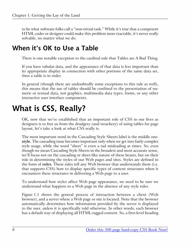
Figure 1.1 shows the general process of interaction between a client (Web
browser), and a server where a Web page or site is located. Note that the browser
automatically determines how information provided by the server is displayed
to the user, unless it is specifically told otherwise. In other words, each browser
has a default way of displaying all HTML-tagged content. So, a first-level heading
Chapter 1: Getting the Lay of the Land
Order this 500 page hard-copy CSS Book Now!8
enclosed in the <h1></h1> tag set will always be displayed using a relatively large
font in black. The “default” font that’s used may vary between browsers, and can
be affected by user-defined settings as well.
Figure 1.1. Normal Browser Page Display Behavior
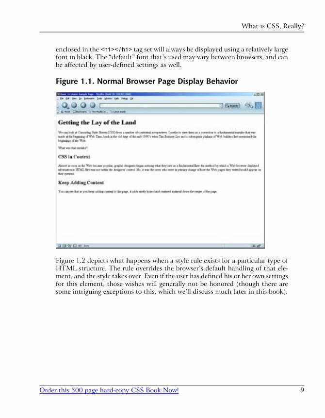
Figure 1.2 depicts what happens when a style rule exists for a particular type of
HTML structure. The rule overrides the browser’s default handling of that ele-
ment, and the style takes over. Even if the user has defined his or her own settings
for this element, those wishes will generally not be honored (though there are
some intriguing exceptions to this, which we’ll discuss much later in this book).
9Order this 500 page hard-copy CSS Book Now!
What is CSS, Really?
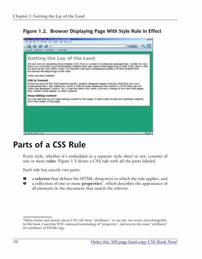
Figure 1.2. Browser Displaying Page With Style Rule in Effect
Parts of a CSS RuleEvery style, whether it’s embedded in a separate style sheet or not, consists of
one or more rules. Figure 1.3 shows a CSS rule with all the parts labeled.
Each rule has exactly two parts:
a selector that defines the HTML element(s) to which the rule applies, and
a collection of one or more properties2, which describes the appearance of
all elements in the document that match the selector.
2Many books and articles about CSS call them “attributes,” or use the two terms interchangeably.
In this book, I used the W3C endorsed terminology of “properties”, and reserve the name “attributes”
for attributes of HTML tags.
Chapter 1: Getting the Lay of the Land
Order this 500 page hard-copy CSS Book Now!10
Figure 1.3. Parts of a CSS Rule
Each property consists of a pair of values separated by a colon. The first item of
the pair defines the specific property that’s being modified. The second item de-
scribes the value that the property takes on. Each property-value pair must be
followed by a semicolon, with one exception: The semicolon following the last
property is optional and may be omitted. In this book, however, we will always
add this optional semicolon. I encourage you to adopt this habit as well, as it's
much easier to train yourself to always add that semicolon than it is to remember
when it is required and when it isn't. It also makes it easier to add properties to
an existing style rule.
Here are a few examples of increasingly complex CSS rules, with the parts iden-
tified so that you can fix this syntax clearly in your mind. Essentially, this is the
only real syntax issue you must learn in order to master CSS, so it’s important!
h1 { color: red;}
The selector, h1, indicates that this rule applies to all h1 headings in the document.
The name of the property that’s being modified is color, which applies to the
font color. The value we want the color property to take on is red. Chapter 7
and Chapter 9 explore fonts and coloring in CSS in great detail.
p { font-size: 14px; color: green;}
11Order this 500 page hard-copy CSS Book Now!
Parts of a CSS Rule
The selector, p, indicates the style rule should be applied to all paragraphs in the
document. There are two property name-value pairs in the rule. The first, font-size, sets the size of the font in all paragraphs in the document to 14 pixels. A
pixel is one dot on your screen, and is the most common measurement used in
CSS. See Chapter 3, for an explanation of this and other measurement issues in
CSS. The second property is color and is set to green. The result of this rule is
that all paragraphs in the document will appear in a green, 14-pixel-high font.
p { font-family: 'New York', Times, serif;}
Again, this rule deals with paragraphs, as is evidenced by the p selector. This
time, the selector affects the font family that is used to display text. The new
wrinkles in this example are that it includes a list of values for the font-familyproperty, and one of those values is enclosed in quotation marks.
The font-family property is one of a handful of CSS properties to which you
can assign a list of possible values, rather than a single, fixed value. When you
use a list, commas must separate its individual members. In this case, the font-family property list tells the browser to use New York as the font if the user’s
machine has it installed. If not, it directs the browser to use Times. And if neither
of these fonts is available on the user’s system, then the browser is told to default
to the font used for serif type. Again, this subject is covered in more depth in
Chapter 7 and Chapter 9.
Whenever the name of a property value in a CSS rule includes spaces (as is the
case with the font named “New York”), you must put that value into quotation
marks. Many designers use single quotation marks for a number of reasons, not
the least of which is that they’re easier to type, but you can use either single or
double quotation marks.
Types of CSS RulesThere are several possible ways to categorize and think about CSS rules.
First, there is the question of what types of style properties the rules define.
Second, there is the requirement of describing the type(s) of HTML elements
that the rules affect. Finally, there is the issue of whether the styles are “inline”,
“embedded” or “external.”
Chapter 1: Getting the Lay of the Land
Order this 500 page hard-copy CSS Book Now!12
Let's take a brief look at each of these categorizations, so that you have a good
overview of the organization of CSS rules before you embark on a detailed study
of their actual use.
What Properties Can CSS Rules Affect?CSS rules can include properties that affect virtually every aspect of the
presentation of information on a Website. A complete reference to these properties
is presented in Appendix C.
What Elements Can CSS Affect?Stated another way, this question asks “How specifically can a CSS rule target
a piece of information on a Web page for special presentation?” CSS allows the
designer to affect all paragraphs, but how can you confine that impact to certain,
specific paragraphs? Is this even possible?
The answer, unsurprisingly, is yes. Through various combinations of selector usage,
the designer can become quite specific indeed about the circumstances under
which a style rule is enforced. For example, you can assign rules so that they affect:
� all elements of a specific type
� all elements of a specific type that are assigned to a common group or class
� all elements of a specific type that are contained within other elements of a
specific type
� all elements of a specific type that are both contained within another specific
element type and assigned to a common group or class
� all elements of a specific type only when they come immediately after an ele-
ment of some other type
� only a specific element of a specific type which is assigned a unique ID
Chapter 3, includes a detailed discussion of all the CSS selectors you can use to
achieve this kind of precision targeting.
13Order this 500 page hard-copy CSS Book Now!
What Properties Can CSS Rules Affect?
Where Can CSS Styles Be Defined?Finally, you can define CSS styles in any of three places, in conjunction with a
Web page.
Inline CSS
First, you can define a style entirely within an appropriate HTML tag. This type
of style is referred to as an inline style because it is defined in line with the
document's HTML code. You can assign a style attribute to almost all HTML
elements. For example, to make a second-level heading in a document appear in
red text and all capital letters, you could code a line like this:
<h2 style="color: red; text-transform: uppercase;">An Unusual Heading</h2>
If you follow the advice in this book, you won’t use many inline styles. As you’ll
learn, separating content from presentation is one of the big advantages of CSS,
and embedding styles directly in HTML tags defeats that purpose. Inline styles
are mainly useful for rapid prototyping—quickly applying style properties to a
particular element to experiment with an effect before giving the properties a
more permanent place in an embedded or external style rule.
Embedded CSS
Specifying style properties in an embedded style is probably the method that’s
most common today, particularly among beginning Web designers or those just
learning the techniques involved in CSS design. It’s not my favorite, but it does
have the singular virtue of being easy to deal with, so you’ll see it used from time
to time in this book.
To embed a style sheet in a Web page, you place a style block in the head of
the document’s HTML, as shown here in bold:
<!DOCTYPE html PUBLIC "-//W3C//DTD XHTML 1.0 Transitional//EN" "http://www.w3.org/TR/xhtml11/DTD/xhtml1-transitional.dtd"><html xmlns="http://www.w3.org/1999/xhtml"><head><title>CSS Style Sheet Demo</title><meta http-equiv="Content-Type" content="text/html; charset=iso-8859-1" /><style type="text/css"><!--
Chapter 1: Getting the Lay of the Land
Order this 500 page hard-copy CSS Book Now!14
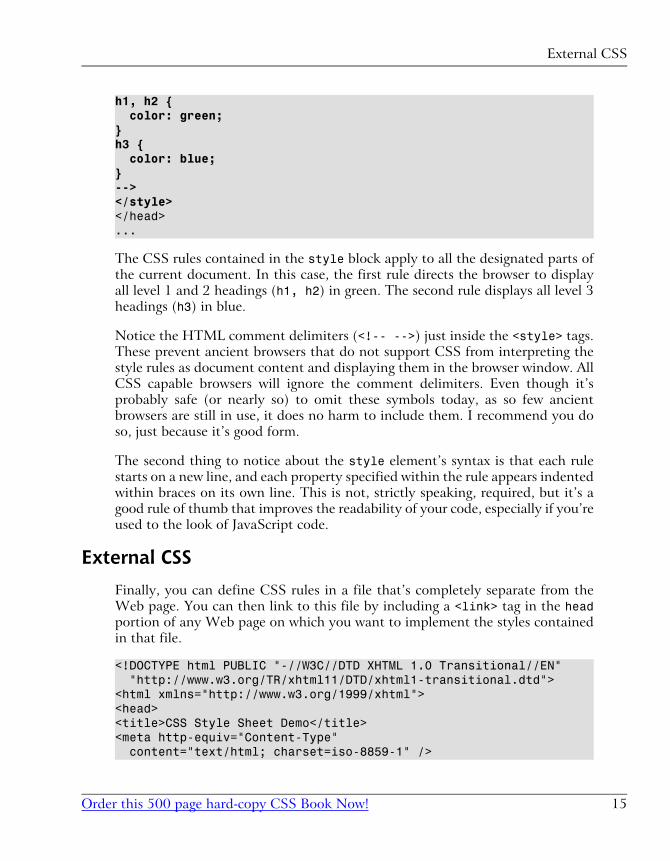
h1, h2 { color: green;}h3 { color: blue;}--></style></head>...
The CSS rules contained in the style block apply to all the designated parts of
the current document. In this case, the first rule directs the browser to display
all level 1 and 2 headings (h1, h2) in green. The second rule displays all level 3
headings (h3) in blue.
Notice the HTML comment delimiters (<!-- -->) just inside the <style> tags.
These prevent ancient browsers that do not support CSS from interpreting the
style rules as document content and displaying them in the browser window. All
CSS capable browsers will ignore the comment delimiters. Even though it’s
probably safe (or nearly so) to omit these symbols today, as so few ancient
browsers are still in use, it does no harm to include them. I recommend you do
so, just because it’s good form.
The second thing to notice about the style element’s syntax is that each rule
starts on a new line, and each property specified within the rule appears indented
within braces on its own line. This is not, strictly speaking, required, but it’s a
good rule of thumb that improves the readability of your code, especially if you’re
used to the look of JavaScript code.
External CSS
Finally, you can define CSS rules in a file that’s completely separate from the
Web page. You can then link to this file by including a <link> tag in the headportion of any Web page on which you want to implement the styles contained
in that file.
<!DOCTYPE html PUBLIC "-//W3C//DTD XHTML 1.0 Transitional//EN" "http://www.w3.org/TR/xhtml11/DTD/xhtml1-transitional.dtd"><html xmlns="http://www.w3.org/1999/xhtml"><head><title>CSS Style Sheet Demo</title><meta http-equiv="Content-Type" content="text/html; charset=iso-8859-1" />
15Order this 500 page hard-copy CSS Book Now!
External CSS
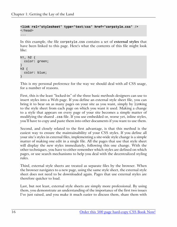
<link rel="stylesheet" type="text/css" href="corpstyle.css" /></head>...
In this example, the file corpstyle.css contains a set of external styles that
have been linked to this page. Here's what the contents of this file might look
like:
h1, h2 { color: green;}h3 { color: blue;}
This is my personal preference for the way we should deal with all CSS usage,
for a number of reasons.
First, this is the least “locked-in” of the three basic methods designers can use to
insert styles into a Web page. If you define an external style sheet file, you can
bring it to bear on as many pages on your site as you want, simply by linking
to the style sheet from each page on which you want it used. Making a change
to a style that appears on every page of your site becomes a simple matter of
modifying the shared .css file. If you use embedded or, worse yet, inline styles,
you’ll have to copy and paste them into other documents if you want to use them.
Second, and closely related to the first advantage, is that this method is the
easiest way to ensure the maintainability of your CSS styles. If you define all
your site’s styles in external files, implementing a site-wide style change is a simple
matter of making one edit in a single file. All the pages that use that style sheet
will display the new styles immediately, following this one change. With the
other techniques, you have to either remember which styles are defined on which
pages, or use search mechanisms to help you deal with the decentralized styling
rules.
Third, external style sheets are treated as separate files by the browser. When
the browser navigates to a new page, using the same style sheet, the external style
sheet does not need to be downloaded again. Pages that use external styles are
therefore quicker to load.
Last, but not least, external style sheets are simply more professional. By using
them, you demonstrate an understanding of the importance of the first two issues
I’ve just raised, and you make it much easier to discuss them, share them with
Chapter 1: Getting the Lay of the Land
Order this 500 page hard-copy CSS Book Now!16
colleagues, analyze their effects, and, in general, to work with them as if they
were a serious part of the site’s design, rather than an afterthought.
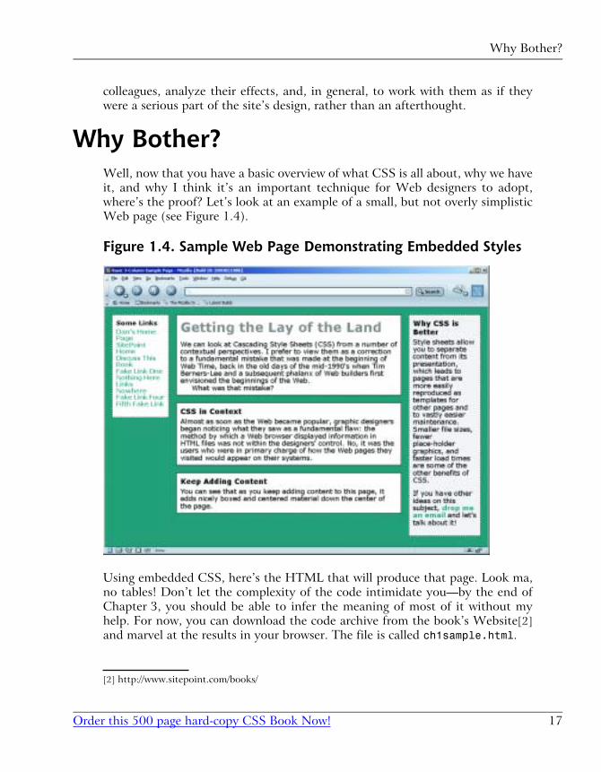
Why Bother?Well, now that you have a basic overview of what CSS is all about, why we have
it, and why I think it’s an important technique for Web designers to adopt,
where’s the proof? Let’s look at an example of a small, but not overly simplistic
Web page (see Figure 1.4).
Figure 1.4. Sample Web Page Demonstrating Embedded Styles
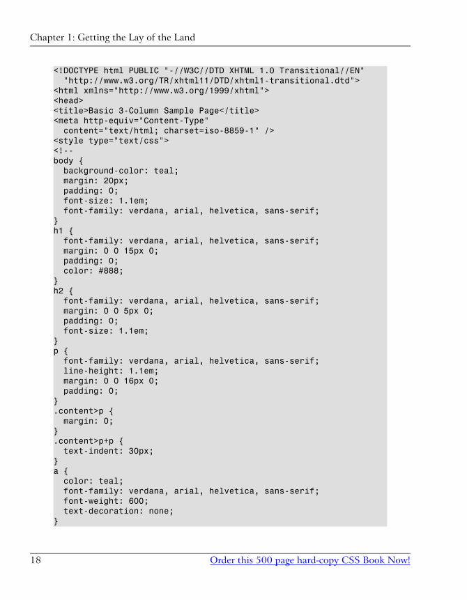
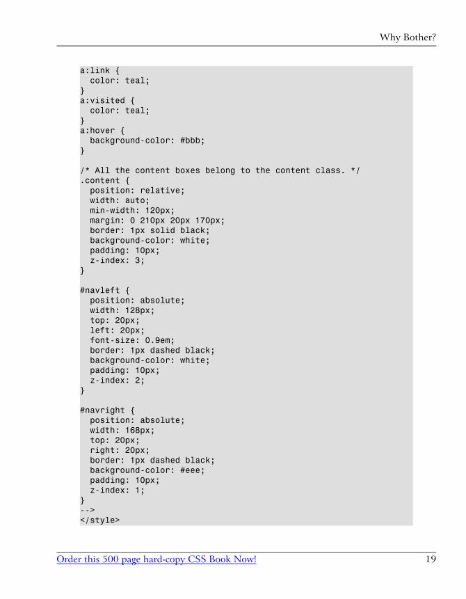
Using embedded CSS, here’s the HTML that will produce that page. Look ma,
no tables! Don’t let the complexity of the code intimidate you—by the end of
Chapter 3, you should be able to infer the meaning of most of it without my
help. For now, you can download the code archive from the book’s Website[2]
and marvel at the results in your browser. The file is called ch1sample.html.
[2] http://www.sitepoint.com/books/
17Order this 500 page hard-copy CSS Book Now!
Why Bother?
<!DOCTYPE html PUBLIC "-//W3C//DTD XHTML 1.0 Transitional//EN" "http://www.w3.org/TR/xhtml11/DTD/xhtml1-transitional.dtd"><html xmlns="http://www.w3.org/1999/xhtml"><head><title>Basic 3-Column Sample Page</title><meta http-equiv="Content-Type" content="text/html; charset=iso-8859-1" /><style type="text/css"><!--body { background-color: teal; margin: 20px; padding: 0; font-size: 1.1em; font-family: verdana, arial, helvetica, sans-serif;}h1 { font-family: verdana, arial, helvetica, sans-serif; margin: 0 0 15px 0; padding: 0; color: #888;}h2 { font-family: verdana, arial, helvetica, sans-serif; margin: 0 0 5px 0; padding: 0; font-size: 1.1em;}p { font-family: verdana, arial, helvetica, sans-serif; line-height: 1.1em; margin: 0 0 16px 0; padding: 0;}.content>p { margin: 0;}.content>p+p { text-indent: 30px;}a { color: teal; font-family: verdana, arial, helvetica, sans-serif; font-weight: 600; text-decoration: none;}
Chapter 1: Getting the Lay of the Land
Order this 500 page hard-copy CSS Book Now!18
a:link { color: teal;}a:visited { color: teal;}a:hover { background-color: #bbb;}
/* All the content boxes belong to the content class. */.content { position: relative; width: auto; min-width: 120px; margin: 0 210px 20px 170px; border: 1px solid black; background-color: white; padding: 10px; z-index: 3;}
#navleft { position: absolute; width: 128px; top: 20px; left: 20px; font-size: 0.9em; border: 1px dashed black; background-color: white; padding: 10px; z-index: 2;}
#navright { position: absolute; width: 168px; top: 20px; right: 20px; border: 1px dashed black; background-color: #eee; padding: 10px; z-index: 1;}--></style>
19Order this 500 page hard-copy CSS Book Now!
Why Bother?
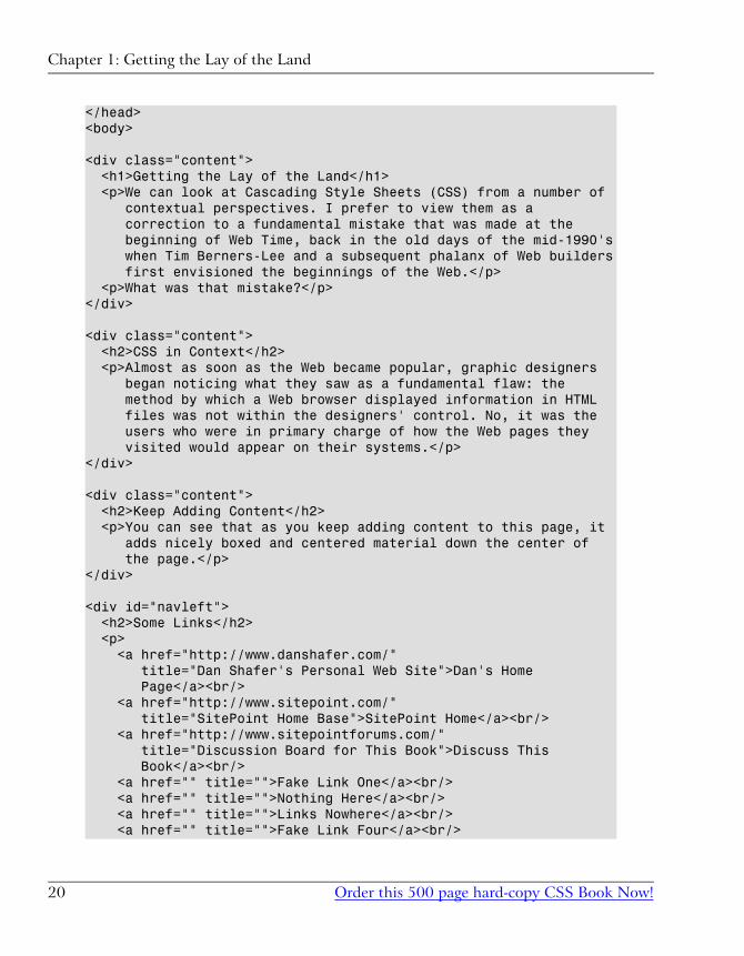
</head><body>
<div class="content"> <h1>Getting the Lay of the Land</h1> <p>We can look at Cascading Style Sheets (CSS) from a number of contextual perspectives. I prefer to view them as a correction to a fundamental mistake that was made at the beginning of Web Time, back in the old days of the mid-1990's when Tim Berners-Lee and a subsequent phalanx of Web builders first envisioned the beginnings of the Web.</p> <p>What was that mistake?</p></div>
<div class="content"> <h2>CSS in Context</h2> <p>Almost as soon as the Web became popular, graphic designers began noticing what they saw as a fundamental flaw: the method by which a Web browser displayed information in HTML files was not within the designers' control. No, it was the users who were in primary charge of how the Web pages they visited would appear on their systems.</p></div>
<div class="content"> <h2>Keep Adding Content</h2> <p>You can see that as you keep adding content to this page, it adds nicely boxed and centered material down the center of the page.</p></div>
<div id="navleft"> <h2>Some Links</h2> <p> <a href="http://www.danshafer.com/" title="Dan Shafer's Personal Web Site">Dan's Home Page</a><br/> <a href="http://www.sitepoint.com/" title="SitePoint Home Base">SitePoint Home</a><br/> <a href="http://www.sitepointforums.com/" title="Discussion Board for This Book">Discuss This Book</a><br/> <a href="" title="">Fake Link One</a><br/> <a href="" title="">Nothing Here</a><br/> <a href="" title="">Links Nowhere</a><br/> <a href="" title="">Fake Link Four</a><br/>
Chapter 1: Getting the Lay of the Land
Order this 500 page hard-copy CSS Book Now!20
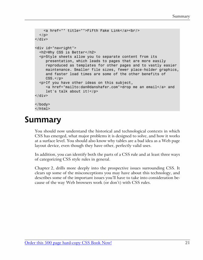
<a href="" title="">Fifth Fake Link</a><br/> </p></div>
<div id="navright"> <h2>Why CSS is Better</h2> <p>Style sheets allow you to separate content from its presentation, which leads to pages that are more easily reproduced as templates for other pages and to vastly easier maintenance. Smaller file sizes, fewer place-holder graphics, and faster load times are some of the other benefits of CSS.</p> <p>If you have other ideas on this subject, <a href="mailto:[email protected]">drop me an email</a> and let's talk about it!</p></div>
</body></html>
SummaryYou should now understand the historical and technological contexts in which
CSS has emerged, what major problems it is designed to solve, and how it works
at a surface level. You should also know why tables are a bad idea as a Web page
layout device, even though they have other, perfectly valid uses.
In addition, you can identify both the parts of a CSS rule and at least three ways
of categorizing CSS style rules in general.
Chapter 2, drills more deeply into the prospective issues surrounding CSS. It
clears up some of the misconceptions you may have about this technology, and
describes some of the important issues you’ll have to take into consideration be-
cause of the way Web browsers work (or don’t) with CSS rules.
21Order this 500 page hard-copy CSS Book Now!
Summary
22
Digging Below The Surface3This chapter completes our look at the “mechanics” of CSS: the background you
need to have to work with the technology. It covers six major topics:
� quick review of the three methods for assigning CSS properties to HTML
documents
� use of shorthand properties to group values for a related set of properties in
a single statement
� workings of the inheritance mechanism in style sheets
� structure of a style, including variations on the use of selectors for determining
with great precision exactly what is affected by a style
� units and values that can appear in styles to express sizes, locations, and
other properties, and how they are used
� CSS comments, which can be used to place human-readable notes in your
CSS code
Applying CSS to HTML DocumentsIn Chapter 1, I introduced the three methods for applying style sheet properties
to HTML documents. I will briefly review them here to jog your memory.
� Inline styles: We can use the style attribute, which is available for the vast
majority of HTML elements, to directly assign CSS properties to HTML ele-
ments.
<h1 style="font-family: 'Comic Sans'; color: blue;"> Welcome</h1>
This method is best reserved for when you want to try out quickly one or
more CSS properties to see how they affect an element. You should never use
this method in a practical Web site, as it misses almost every advantage that
CSS has to offer.
� Embedded styles: We can use the <style> tag in the head portion of any
HTML document to declare CSS rules that apply to the elements of the page.
<style type="text/css"><!--h1, h2 { color: green;}h3 { color: blue;}--></style>
This form of CSS offers many advantages over inline styles, but is still not as
flexible or powerful as external styles (see below). I recommend you only use
embedded styles when you are certain the styles you are creating will only be
useful in the current page. Even then, the separation of code offered by external
styles can make them a preferable option, but embedded styles can often be
more convenient for quick-and-dirty, single-page work.
� External styles: We can use a <link> tag in the head portion of any HTML
document to apply a set of CSS rules in an external file to the elements of
the page.
<link rel="stylesheet" type="text/css" href="mystyles.css" />
Chapter 3: Digging Below The Surface
Order this 500 page hard-copy CSS Book Now!50
The recommended method for applying CSS to HTML, external styles offer
the full range of performance and productivity advantages that CSS can
provide.
Using Shorthand PropertiesMost property names take a single item as a value. When you define a property
with a collection of related values (e.g. a list of fonts for the font-family prop-
erty), the values are separated from one another by commas and, if any of the
values include embedded white space or reserved characters such as colons, they
may need to be enclosed in quotation marks.
In addition, there is a special set of properties called shorthand properties. Such
properties let you use a single property declaration to assign values to a number
of related properties. This sounds more complicated than it is.
The best-known shorthand property is font. CSS beginners are usually accus-
tomed to defining font properties one by one:
h1 { font-weight: bold; font-size: 12pt; line-height: 14pt; font-family: Helvetica;}
But CSS provides a shorthand property, font, that allows this same rule to be
defined much more succinctly:
h1 { font: bold 12pt/14pt Helvetica;}
All shorthand properties are identified as such in Appendix C.
How Inheritance Works in CSSBefore you can grasp some of the syntax and behavior of CSS rules, you need a
basic understanding of the inheritance CSS uses.
51Order this 500 page hard-copy CSS Book Now!
Using Shorthand Properties
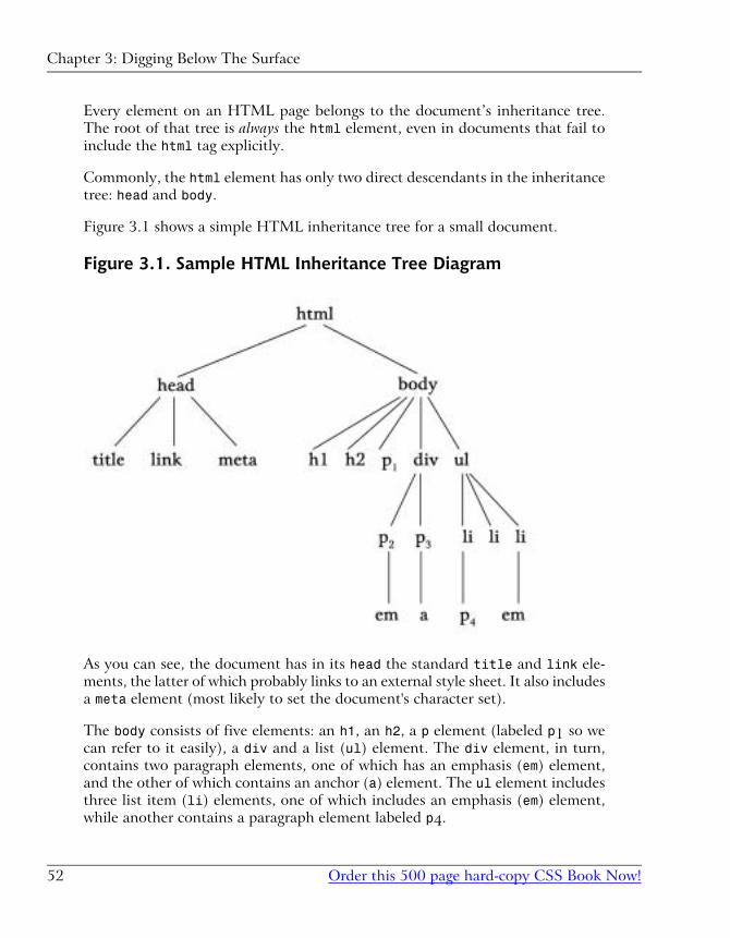
Every element on an HTML page belongs to the document’s inheritance tree.
The root of that tree is always the html element, even in documents that fail to
include the html tag explicitly.
Commonly, the html element has only two direct descendants in the inheritance
tree: head and body.
Figure 3.1 shows a simple HTML inheritance tree for a small document.
Figure 3.1. Sample HTML Inheritance Tree Diagram
As you can see, the document has in its head the standard title and link ele-
ments, the latter of which probably links to an external style sheet. It also includes
a meta element (most likely to set the document's character set).
The body consists of five elements: an h1, an h2, a p element (labeled p1 so we
can refer to it easily), a div and a list (ul) element. The div element, in turn,
contains two paragraph elements, one of which has an emphasis (em) element,
and the other of which contains an anchor (a) element. The ul element includes
three list item (li) elements, one of which includes an emphasis (em) element,
while another contains a paragraph element labeled p4.
Chapter 3: Digging Below The Surface
Order this 500 page hard-copy CSS Book Now!52
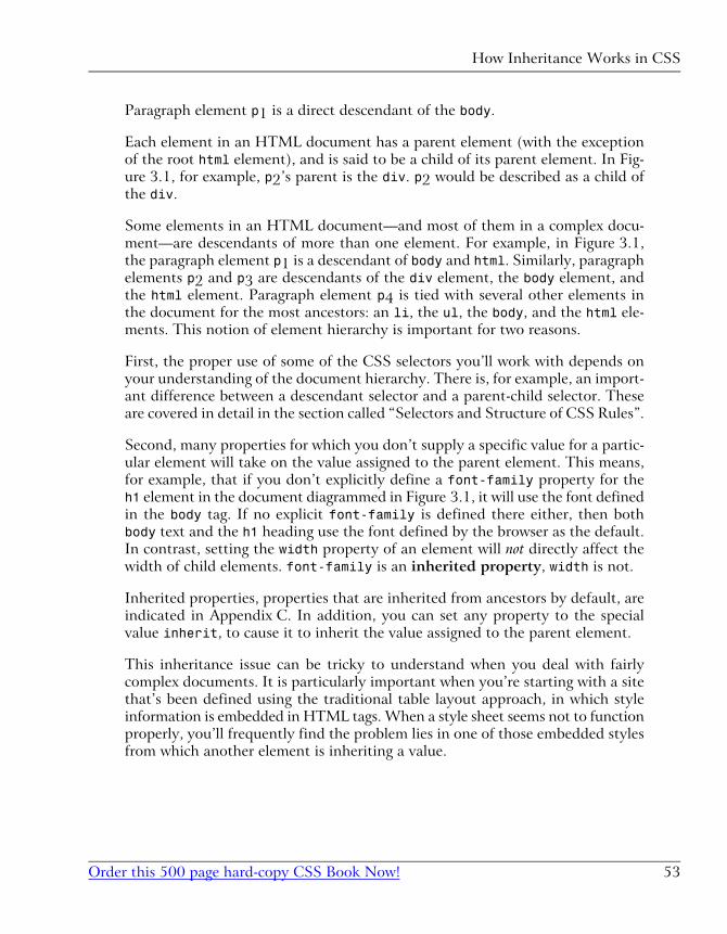
Paragraph element p1 is a direct descendant of the body.
Each element in an HTML document has a parent element (with the exception
of the root html element), and is said to be a child of its parent element. In Fig-
ure 3.1, for example, p2’s parent is the div. p2 would be described as a child of
the div.
Some elements in an HTML document—and most of them in a complex docu-
ment—are descendants of more than one element. For example, in Figure 3.1,
the paragraph element p1 is a descendant of body and html. Similarly, paragraph
elements p2 and p3 are descendants of the div element, the body element, and
the html element. Paragraph element p4 is tied with several other elements in
the document for the most ancestors: an li, the ul, the body, and the html ele-
ments. This notion of element hierarchy is important for two reasons.
First, the proper use of some of the CSS selectors you’ll work with depends on
your understanding of the document hierarchy. There is, for example, an import-
ant difference between a descendant selector and a parent-child selector. These
are covered in detail in the section called “Selectors and Structure of CSS Rules”.
Second, many properties for which you don’t supply a specific value for a partic-
ular element will take on the value assigned to the parent element. This means,
for example, that if you don’t explicitly define a font-family property for the
h1 element in the document diagrammed in Figure 3.1, it will use the font defined
in the body tag. If no explicit font-family is defined there either, then both
body text and the h1 heading use the font defined by the browser as the default.
In contrast, setting the width property of an element will not directly affect the
width of child elements. font-family is an inherited property, width is not.
Inherited properties, properties that are inherited from ancestors by default, are
indicated in Appendix C. In addition, you can set any property to the special
value inherit, to cause it to inherit the value assigned to the parent element.
This inheritance issue can be tricky to understand when you deal with fairly
complex documents. It is particularly important when you’re starting with a site
that’s been defined using the traditional table layout approach, in which style
information is embedded in HTML tags. When a style sheet seems not to function
properly, you’ll frequently find the problem lies in one of those embedded styles
from which another element is inheriting a value.
53Order this 500 page hard-copy CSS Book Now!
How Inheritance Works in CSS
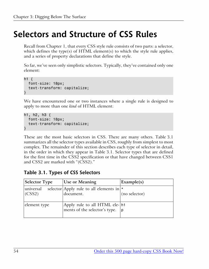
Selectors and Structure of CSS RulesRecall from Chapter 1, that every CSS style rule consists of two parts: a selector,
which defines the type(s) of HTML element(s) to which the style rule applies,
and a series of property declarations that define the style.
So far, we’ve seen only simplistic selectors. Typically, they’ve contained only one
element:
h1 { font-size: 18px; text-transform: capitalize;}
We have encountered one or two instances where a single rule is designed to
apply to more than one kind of HTML element:
h1, h2, h3 { font-size: 18px; text-transform: capitalize;}
These are the most basic selectors in CSS. There are many others. Table 3.1
summarizes all the selector types available in CSS, roughly from simplest to most
complex. The remainder of this section describes each type of selector in detail,
in the order in which they appear in Table 3.1. Selector types that are defined
for the first time in the CSS2 specification or that have changed between CSS1
and CSS2 are marked with “(CSS2).”
Table 3.1. Types of CSS Selectors
Example(s)Use or MeaningSelector Type
*(no selector)
Apply rule to all elements in
document.
universal selector
(CSS2)
h1p
Apply rule to all HTML ele-
ments of the selector’s type.
element type
Chapter 3: Digging Below The Surface
Order this 500 page hard-copy CSS Book Now!54
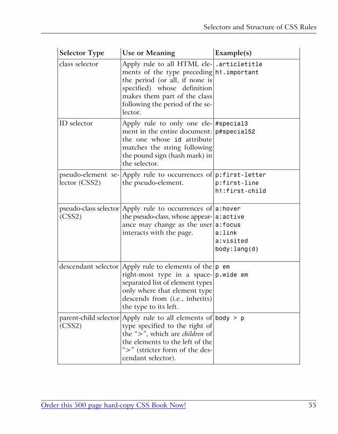
Example(s)Use or MeaningSelector Type
.articletitleh1.important
Apply rule to all HTML ele-
ments of the type preceding
the period (or all, if none is
specified) whose definition
makes them part of the class
following the period of the se-
lector.
class selector
#special3p#special52
Apply rule to only one ele-
ment in the entire document:
the one whose id attribute
matches the string following
the pound sign (hash mark) in
the selector.
ID selector
p:first-letterp:first-lineh1:first-child
Apply rule to occurrences of
the pseudo-element.
pseudo-element se-
lector (CSS2)
a:hovera:activea:focusa:linka:visitedbody:lang(d)
Apply rule to occurrences of
the pseudo-class, whose appear-
ance may change as the user
interacts with the page.
pseudo-class selector
(CSS2)
p emp.wide em
Apply rule to elements of the
right-most type in a space-
separated list of element types
only where that element type
descends from (i.e., inherits)
the type to its left.
descendant selector
body > pApply rule to all elements of
type specified to the right of
the “>”, which are children of
the elements to the left of the
“>” (stricter form of the des-
cendant selector).
parent-child selector
(CSS2)
55Order this 500 page hard-copy CSS Book Now!
Selectors and Structure of CSS Rules
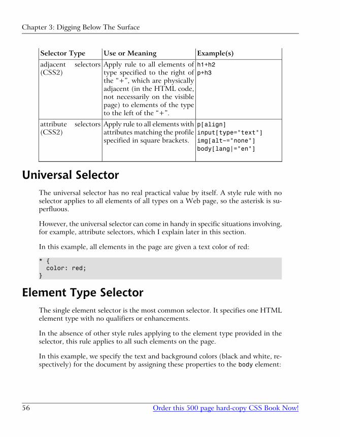
Example(s)Use or MeaningSelector Type
h1+h2p+h3
Apply rule to all elements of
type specified to the right of
the “+”, which are physically
adjacent (in the HTML code,
not necessarily on the visible
page) to elements of the type
to the left of the “+”.
adjacent selectors
(CSS2)
p[align]input[type="text"]img[alt~="none"]body[lang|="en"]
Apply rule to all elements with
attributes matching the profile
specified in square brackets.
attribute selectors
(CSS2)
Universal SelectorThe universal selector has no real practical value by itself. A style rule with no
selector applies to all elements of all types on a Web page, so the asterisk is su-
perfluous.
However, the universal selector can come in handy in specific situations involving,
for example, attribute selectors, which I explain later in this section.
In this example, all elements in the page are given a text color of red:
* { color: red;}
Element Type SelectorThe single element selector is the most common selector. It specifies one HTML
element type with no qualifiers or enhancements.
In the absence of other style rules applying to the element type provided in the
selector, this rule applies to all such elements on the page.
In this example, we specify the text and background colors (black and white, re-
spectively) for the document by assigning these properties to the body element:
Chapter 3: Digging Below The Surface
Order this 500 page hard-copy CSS Book Now!56
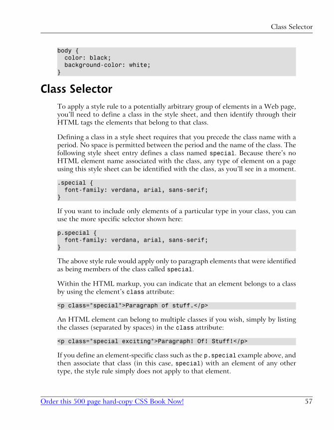
body { color: black; background-color: white;}
Class SelectorTo apply a style rule to a potentially arbitrary group of elements in a Web page,
you’ll need to define a class in the style sheet, and then identify through their
HTML tags the elements that belong to that class.
Defining a class in a style sheet requires that you precede the class name with a
period. No space is permitted between the period and the name of the class. The
following style sheet entry defines a class named special. Because there’s no
HTML element name associated with the class, any type of element on a page
using this style sheet can be identified with the class, as you’ll see in a moment.
.special { font-family: verdana, arial, sans-serif;}
If you want to include only elements of a particular type in your class, you can
use the more specific selector shown here:
p.special { font-family: verdana, arial, sans-serif;}
The above style rule would apply only to paragraph elements that were identified
as being members of the class called special.
Within the HTML markup, you can indicate that an element belongs to a class
by using the element’s class attribute:
<p class="special">Paragraph of stuff.</p>
An HTML element can belong to multiple classes if you wish, simply by listing
the classes (separated by spaces) in the class attribute:
<p class="special exciting">Paragraph! Of! Stuff!</p>
If you define an element-specific class such as the p.special example above, and
then associate that class (in this case, special) with an element of any other
type, the style rule simply does not apply to that element.
57Order this 500 page hard-copy CSS Book Now!
Class Selector
ID SelectorThe ID selector permits you to identify single instances of HTML elements where
you wish to override the style properties set in, for example, a class style rule.
Like a class selector, an ID selector requires definition in the style sheet and ex-
plicit inclusion in the HTML tag. Use the “#” symbol to identify an ID selector1.
IDs must be unique within a document; no two HTML tags in a single document
should have the same ID.
This style sheet rule defines a rule for an element with the ID unique:
#unique { font-size: 10px;}
The code below shows how to indicate the element to be affected by the above
rule using the HTML id attribute:
<h4 id="unique">This will be a very tiny headline</h4>
For example, if you had five <div class="sidebar"> items on your page, but
you wanted to style differently the one responsible for displaying your site’s
search box, you could do so like this:
div.sidebar{ ...}#searchbox{ ...}
Now, if both of these rules define a background-color property, and your search
box tag was <div id="searchbox" class="sidebar">, then the search box
would get all the sidebar properties assigned to it, but it would take its back-ground-color from the #searchbox rule. The guidelines for cascading overlapping
rules (discussed in Chapter 9), in combination with the ID selector, let you avoid
having to redefine all the sidebar properties in a special searchbox class.
1You can optionally confine the ID’s use to an element of a specific type by preceding the # with the
HTML element’s tag name (e.g. div#searchbox). But, as you can have only one element with the
specific ID in your document, it seems silly to confine it to a specific element type.
Chapter 3: Digging Below The Surface
Order this 500 page hard-copy CSS Book Now!58
However, you could just as easily define a class and apply it to the exceptional
element (the search box, in this example). This is more flexible, although perhaps
not as efficient in terms of code space. For example, after you’ve identified a class
or other rule that applies to all level three headings except one, and if you’ve used
an ID selector for the exception, what do you do when a redesign or content
change requires even one more such exception? The ID selector solution breaks
down immediately in that situation.
It appears from my testing that not all of the newer browsers enforce the rule
that the ID be unique in the document. Instead, they apply the ID rule to allelements in the document that carry the ID. That makes the ID essentially
equivalent to the class selector. This is clearly not what the CSS specification
had in mind, but it is how many of the browsers I’ve tested behave.
Pseudo-Element SelectorThis and all the remaining selectors in this section require a browser that supports
the CSS2 specification.
The pseudo-element and pseudo-class selectors are unique among the CSS select-
ors in that they have no equivalent HTML tag or attribute. That’s why they use
the prefix “pseudo”, meaning “false.”
So far, the CSS specification has defined only three pseudo-elements: first-letter, first-line, and first-child. While the first two of these phrases
mean something to us humans, it’s ultimately up to each browser to interpret
them when rendering HTML pages using these pseudo-elements. For example,
does first-line mean “first sentence” or does it mean first physical line dis-
played, a value that changes as the user resizes the browser? The first-childpseudo-element, on the other hand, is not browser-dependent. It refers to the
first descendant of the element to which it is applied, in accordance with the
HTML document hierarchy described in the section called “How Inheritance
Works in CSS”.
To define a pseudo-element selector for a style rule, precede the pseudo-element
name with a colon. Here’s an example:
p:first-letter { font-face: Gothic, serif; font-size: 250%; float: left;}
59Order this 500 page hard-copy CSS Book Now!
Pseudo-Element Selector
This creates a drop-caps effect for the first letter in every paragraph on the page.
The first letter in each paragraph will be a Gothic letter 2.5 times larger than the
usual type used in paragraphs. The float style property, which we discuss in
Chapter 6, ensures the remaining text in the paragraph wraps around the enlarged
drop-cap correctly.
Pseudo-Class SelectorThe pseudo-class selector is exactly like the pseudo-element selector, with one
exception. A pseudo-class selector applies to a whole element, but only under
certain conditions.
The current release of CSS2 defines the following pseudo-classes:
� :hover
� :active
� :focus
� :link
� :visited
� :lang()
A style sheet, then, can define style rules for these pseudo-classes like this:
a:hover { color:#ffcc00;}
All anchor tags will change their color when the user hovers over them with the
cursor. As you can see, this means the pseudo-class selector comes into play only
when the user interacts with the affected element.
The :lang() pseudo-class2 refers to the setting of the lang attribute in an HTML
element. For example, you can define a paragraph in a document as being written
in German, with a tag like this:
<p lang="de">Deutsche Grammophone</p>
2Be aware that browser support for the :lang() pseudo-class is still very scarce. It is covered here
mainly for the sake of completeness.
Chapter 3: Digging Below The Surface
Order this 500 page hard-copy CSS Book Now!60
If you wanted, for example, to change the font family associated with all elements
in the document written in German, you could write a style rule like this:
:lang(de) { font-family: spezialitat;}
Don’t confuse this lang attribute with the language attribute that applies to
tags related to the scripting language being used in a script or on a page.
Descendant SelectorRecall that all HTML elements (except the html element) are descendants of at
least one other HTML element. To apply a CSS style rule to an element that’s
a descendant of another type of element, use the descendant selector.
A descendant selector, such as the one shown in the following style rule, restricts
the applicability of the rule to elements that are descendants of other elements.
The descendant selector is read from right to left to determine its scope. Spaces
separate the element types.
li em { font-size: 16px; color: green;}
The style rule describes a 16-pixel-high font size and a color of green to be applied
to any text contained in an em element (emphasis) only where the emphasized
text is a descendant of a list item.
In the fragment below, the first em element will be displayed in green, 16-pixel
characters, while the second will not, as it doesn’t appear within a list item.
<ul><li>Item one</li><li>Item <em>two</em></li></ul><p>An <em>italicized</em> word.</p>
It’s important to note that the descendant relationship need not be an immediate
parent-child connection. In Figure 3.1, for example, the following style rule would
apply to the anchor element (a) even though it explicitly focuses on a elements
61Order this 500 page hard-copy CSS Book Now!
Descendant Selector
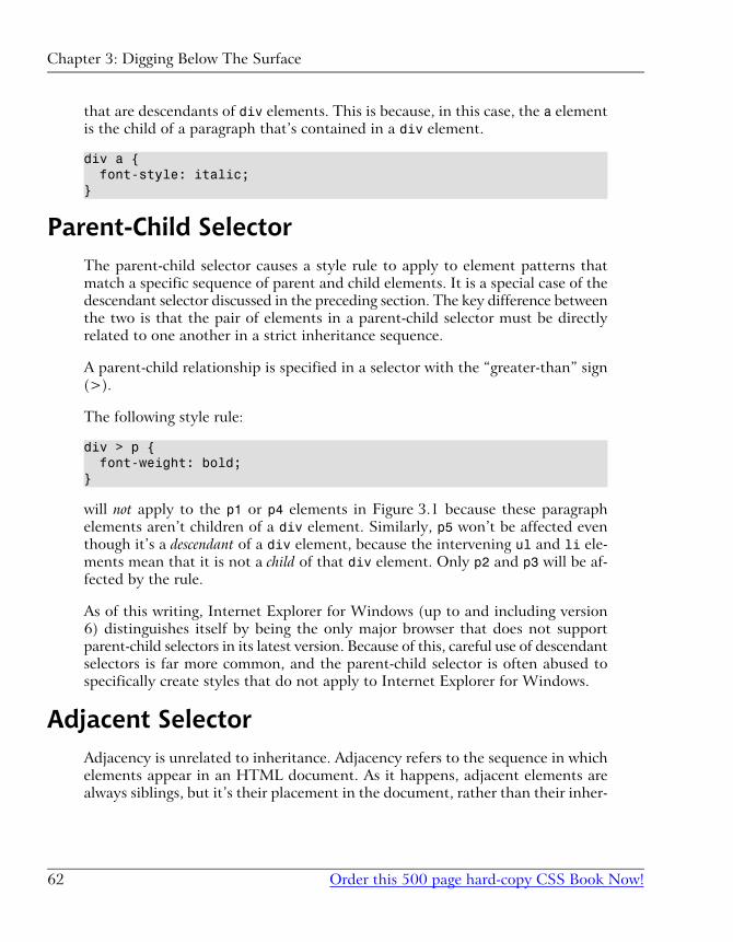
that are descendants of div elements. This is because, in this case, the a element
is the child of a paragraph that’s contained in a div element.
div a { font-style: italic;}
Parent-Child SelectorThe parent-child selector causes a style rule to apply to element patterns that
match a specific sequence of parent and child elements. It is a special case of the
descendant selector discussed in the preceding section. The key difference between
the two is that the pair of elements in a parent-child selector must be directly
related to one another in a strict inheritance sequence.
A parent-child relationship is specified in a selector with the “greater-than” sign
(>).
The following style rule:
div > p { font-weight: bold;}
will not apply to the p1 or p4 elements in Figure 3.1 because these paragraph
elements aren’t children of a div element. Similarly, p5 won’t be affected even
though it’s a descendant of a div element, because the intervening ul and li ele-
ments mean that it is not a child of that div element. Only p2 and p3 will be af-
fected by the rule.
As of this writing, Internet Explorer for Windows (up to and including version
6) distinguishes itself by being the only major browser that does not support
parent-child selectors in its latest version. Because of this, careful use of descendant
selectors is far more common, and the parent-child selector is often abused to
specifically create styles that do not apply to Internet Explorer for Windows.
Adjacent SelectorAdjacency is unrelated to inheritance. Adjacency refers to the sequence in which
elements appear in an HTML document. As it happens, adjacent elements are
always siblings, but it’s their placement in the document, rather than their inher-
Chapter 3: Digging Below The Surface
Order this 500 page hard-copy CSS Book Now!62
itance relationship, that is the focus of this selector. This is demonstrated in this
HTML fragment:
<h1>This is important stuff!</h1><h2>First important item</h2><h2>Second important item</h2>
The first h2 heading is adjacent to the h1 heading. The second h2 heading is not
adjacent to the h1 heading. Neither h2 heading inherits from the h1 heading.
The adjacent selector uses the + sign as its connector, as shown here:
h1 + h2 { margin-top: 11px;}
This style rule would put an extra 11 pixels of space between the bottom of an
h1 heading and an immediately-following h2 heading. It’s important to recognize
that an h2 heading that follows a paragraph under an h1 heading would not be
affected.
As of this writing, Internet Explorer for Windows (up to and including version
6) remains the only major browser that does not support adjacent selectors in its
latest version. Because of this, the adjacent selector has not yet found widespread
use in practical Web design.
Attribute SelectorsThe group of selectors I’m lumping together as “attribute selectors” are among
the most interesting of all the CSS selectors, because they almost feel like pro-
gramming techniques. Each attribute selector declares that the rule with which
it is associated is applied only to elements that have a specific attribute defined,
or have that attribute defined with a specific value.
There are four levels of attribute matching:
� [attribute] – matches if the attribute is defined at all for the element(s)
� [attribute="setting"] – matches only if the attribute is defined as having
the value of setting
� [attribute~="setting"] – matches only if the attribute is defined with a
space-separated list of values, one of which exactly matches “setting”
63Order this 500 page hard-copy CSS Book Now!
Attribute Selectors
� [attribute|="setting"] – matches only if the attribute is defined with a hy-
phen-separated list of “words” and the first of these words begins with setting
You might, for example, want to apply style properties to all single-line text input
boxes (<input type="text" />) in your document. Perhaps you want to set
their text and background colors to white and black, respectively. This style rule
would have that effect:
input[type="text"] { color: white; background-color: black;}
The third variation of the attribute selector described above searches the values
assigned to an attribute, to see whether it contains the word you’ve specified (i.e.
a value in a space-separated list).
For example, during the development of a Website, various graphic designers
may have inserted temporary placeholder alt text tags, with the idea of returning
to them later to finish them. You could call attention to the existence of such
tags with a style rule like this:
img[alt~="placeholder"] { border: 8px solid red;}
This selector will find all img tags whose alt attributes contain the word “place-
holder” and will put an 8-pixel red border around them. That ought to be hard
to miss!
The fourth variation is really useful only when you’re dealing with the lang at-
tribute. It enables you to isolate the first portion of the lang attribute, where the
human language being used is defined. The other portions of the hyphen-separated
value are ignored. It would be pretty rare to use this version, but it comes in
handy when the language defined is en-cockney and you’re really only interested
in whether the language is English.
As you would expect by now, attribute selectors are not supported by Internet
Explorer for Windows. As with other advanced selector types, this has prevented
widespread adoption of attribute selectors, despite their obvious usefulness.
Chapter 3: Digging Below The Surface
Order this 500 page hard-copy CSS Book Now!64
Selector GroupingTo apply a style rule to elements in an HTML document of several different
types, use selector grouping. Separate with a comma each element type to which
the rule is to be applied.
Here’s a simple example of this type of selector:
h1, h2, h3 { font-family: verdana, arial, sans-serif; color: green;}
The elements in the selector list need not be all of the same type or even of the
same level of specificity. For example, the following style rule is perfectly legal.
It applies a specific style to level 2 headings (h2) and to paragraphs whose class
is defined as special:
h2, p.special { font-size: 22px;}
You may include a space between the comma-separated items or not.
Expressing MeasurementsMany of the properties you define in a CSS rule include measurements. These
measurements tell the rule how tall or wide something is to be. Fonts, spacing,
and positioning are the primary places you’ll use such measurements.
There are two types of measurements: absolute and relative. An absolute meas-
urement (e.g. setting a font-size to 18px, or 18 pixels) tells the browser to render
the affected content as 18 pixels in height3. Technically, it actually tells the
browser to use the specified font and scale its character height, so that the font’s
overall height is 18 pixels. Chapter 8, includes an explanation of font height and
width.
3Again, if I wanted to be terribly precise, I would say that a pixel is actually a relative measurement,
because its meaning is relative to the display medium on which the page is produced. But, in this
context, “relative” means “relative to some other value in the style rule or in the HTML” and in that
sense, pixels are absolute.
65Order this 500 page hard-copy CSS Book Now!
Selector Grouping
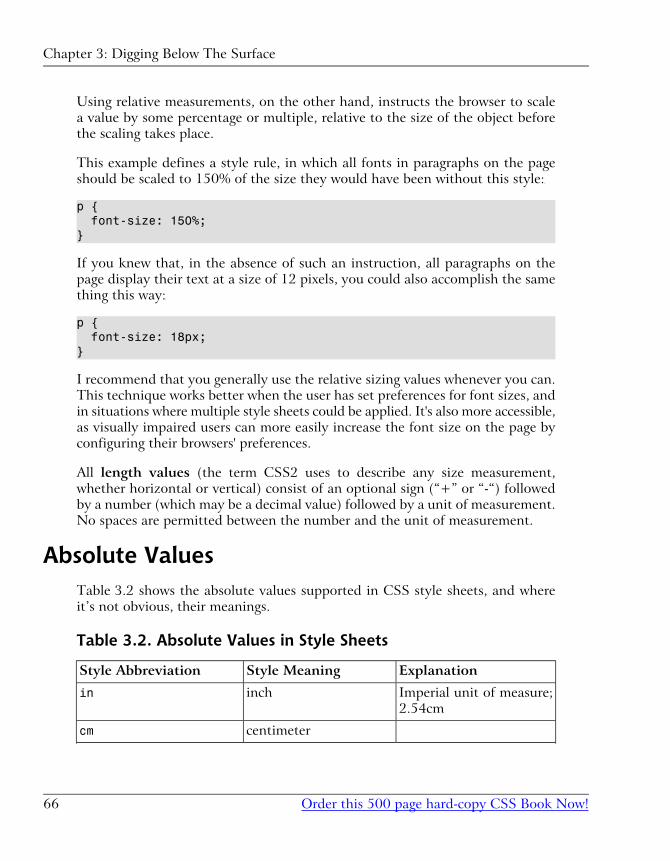
Using relative measurements, on the other hand, instructs the browser to scale
a value by some percentage or multiple, relative to the size of the object before
the scaling takes place.
This example defines a style rule, in which all fonts in paragraphs on the page
should be scaled to 150% of the size they would have been without this style:
p { font-size: 150%;}
If you knew that, in the absence of such an instruction, all paragraphs on the
page display their text at a size of 12 pixels, you could also accomplish the same
thing this way:
p { font-size: 18px;}
I recommend that you generally use the relative sizing values whenever you can.
This technique works better when the user has set preferences for font sizes, and
in situations where multiple style sheets could be applied. It's also more accessible,
as visually impaired users can more easily increase the font size on the page by
configuring their browsers' preferences.
All length values (the term CSS2 uses to describe any size measurement,
whether horizontal or vertical) consist of an optional sign (“+” or “-“) followed
by a number (which may be a decimal value) followed by a unit of measurement.
No spaces are permitted between the number and the unit of measurement.
Absolute ValuesTable 3.2 shows the absolute values supported in CSS style sheets, and where
it’s not obvious, their meanings.
Table 3.2. Absolute Values in Style Sheets
ExplanationStyle MeaningStyle Abbreviation
Imperial unit of measure;
2.54cm
inchin
centimetercm
Chapter 3: Digging Below The Surface
Order this 500 page hard-copy CSS Book Now!66
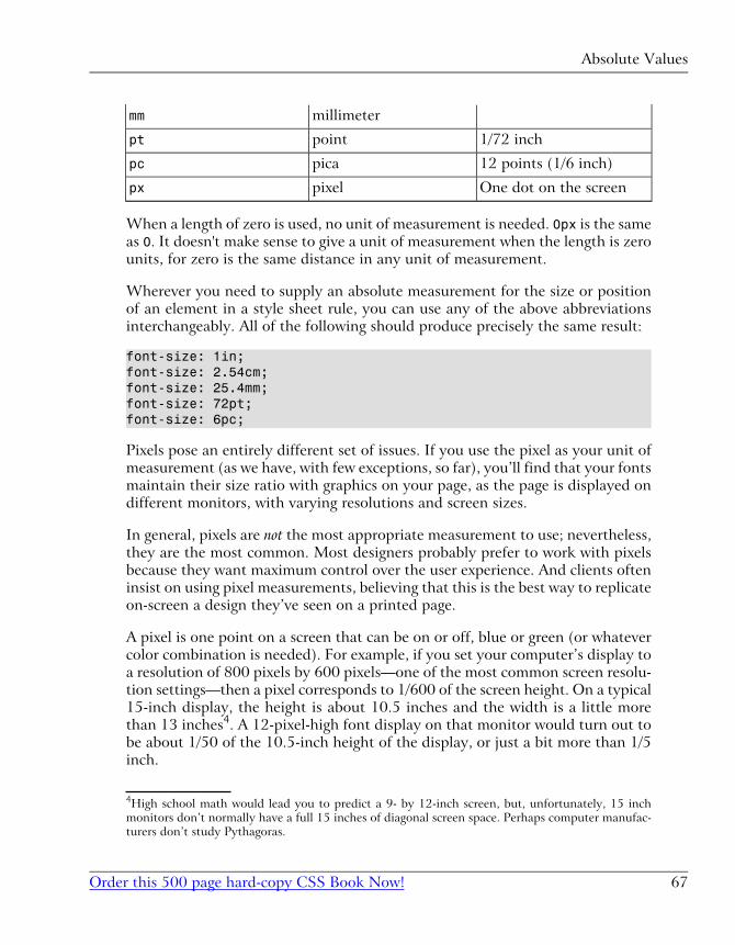
millimetermm
1/72 inchpointpt
12 points (1/6 inch)picapc
One dot on the screenpixelpx
When a length of zero is used, no unit of measurement is needed. 0px is the same
as 0. It doesn't make sense to give a unit of measurement when the length is zero
units, for zero is the same distance in any unit of measurement.
Wherever you need to supply an absolute measurement for the size or position
of an element in a style sheet rule, you can use any of the above abbreviations
interchangeably. All of the following should produce precisely the same result:
font-size: 1in;font-size: 2.54cm;font-size: 25.4mm;font-size: 72pt;font-size: 6pc;
Pixels pose an entirely different set of issues. If you use the pixel as your unit of
measurement (as we have, with few exceptions, so far), you’ll find that your fonts
maintain their size ratio with graphics on your page, as the page is displayed on
different monitors, with varying resolutions and screen sizes.
In general, pixels are not the most appropriate measurement to use; nevertheless,
they are the most common. Most designers probably prefer to work with pixels
because they want maximum control over the user experience. And clients often
insist on using pixel measurements, believing that this is the best way to replicate
on-screen a design they’ve seen on a printed page.
A pixel is one point on a screen that can be on or off, blue or green (or whatever
color combination is needed). For example, if you set your computer’s display to
a resolution of 800 pixels by 600 pixels—one of the most common screen resolu-
tion settings—then a pixel corresponds to 1/600 of the screen height. On a typical
15-inch display, the height is about 10.5 inches and the width is a little more
than 13 inches4. A 12-pixel-high font display on that monitor would turn out to
be about 1/50 of the 10.5-inch height of the display, or just a bit more than 1/5
inch.
4High school math would lead you to predict a 9- by 12-inch screen, but, unfortunately, 15 inch
monitors don’t normally have a full 15 inches of diagonal screen space. Perhaps computer manufac-
turers don’t study Pythagoras.
67Order this 500 page hard-copy CSS Book Now!
Absolute Values
If the user sets his or her resolution to 1024 pixels by 768 pixels, the same 16-
pixel high font displays at 78% the height, or 0.16 inches. What if the user’s on
a 13-inch display instead of a 15-inch display? You begin to see the problem with
using pixels.
So, if pixels are problematic, why have we used them so far? There are three
reasons.
First, they are easily the most common absolute value measurements used on
Web pages, despite the problems they seem to pose. Even though some Web
purists argue against the use of pixels, there really is no perfect, absolute measure-
ment that will work well in all circumstances. In such situations, people tend to
stay with what they know and what works for them. In this case, that’s pixels.
Second, pixels are the measurement used in virtually all computer software. This
means users expect the text on their displays to get smaller if they increase the
resolution and larger if they decrease it. Text that worked “better” and didn’t
undergo such transformation would jar the typical user.
Finally, whenever a measurement is being applied to something other than a font,
pixel measurements are generally the best way to describe distance. Only fonts
are measured in non-pixel units, primarily because they have lives of their own
in print and other media. Everything else on a computer display is measured in
pixels by default, so using pixels for positioning, and to describe the size of such
elements as graphic images is appropriate.
Relative ValuesBecause of the problems posed by the use of any absolute value, the most flexible
and least controlling way to approach measurements for style rules is to use rel-
ative units of measurement. Principally, these are em and %, although some people
prefer to use the more obscure ex measurement. The “em” measurement is so
named because it refers to the height of a capital “M” character in the given font,
but in practice it is equal to the font-size of the current font. The “ex” measure-
ment is based on the height of the lower-case “x” character in a font (more com-
monly known as the x-height of the font) and is far less common than the em.
Both the em and the percentage generate font sizes based on the inherited or
default size of the font for the object to which they’re applied. In addition, ems
and percentages are 1:100 equivalent. A size of 1em is identical to a size of 100%.
Chapter 3: Digging Below The Surface
Order this 500 page hard-copy CSS Book Now!68
This description begs the question, “What’s the default or inherited font size for
a particular HTML element?” The answer is: it depends.
Prior to the emergence of Opera 5 for Windows, browsers set the default values
for all fonts as part of their startup process. Users had no control. The browser
defined a default. The Web designer overrode defaults willy-nilly. The user took
what was presented.
Then, along came the idea of user choice. Not surprisingly, this development was
facilitated by the emergence of CSS. Essentially, what the developers of the Opera
browser did was create a local style sheet that the user could modify, and set his
or her defaults to use. They also defined a nice graphical user interface through
which the user could set preferences for these styles.
This was great for users, but Web designers found themselves in a quandary. If,
for example, you assumed that browsers were going to default body text to a 12
point font size5 (which was the de facto standard before the user-controlled pref-
erences era), you could set a style to apply a 1.25em scaling to the text and get
a 15 point font size for the text in question. It was nice and predictable.
Now, however, a 1.25em scaling applied to a font tells the browser to increase
the size of the font to 1.25 times (125% of) its default size. If the user has set
up his or her browser to show standard text at a height of 16 points, your 1.25emtransformation brings the size up to 20 points.
When you stop and think about it, though, that’s probably just fine. The user
who chooses a larger base font size probably needs to see bigger type. If you want
type that would otherwise be at 12 points to display at 14 for some good reason,
then it’s not unreasonable to expect that this new user will benefit in the same
way from seeing the font used in this particular situation increase from his or her
standard 16 points to 20.6
Most of the time, there’s not really a reason to muck with the user’s settings for
font sizes, so changing them arbitrarily isn’t a good idea. Before you apply this
kind of transformation to a text segment on your Web design, ask yourself if it’s
really necessary. My bet is that nine times out of ten, you’ll find it’s not.
5Just in case you were wondering, pixel sizes and point sizes are not equivalent, and the ratio between
the two varies between browsers and operating systems. For example, the 12 point default font size
used by most Windows browsers was rendered at 16 pixels on that platform. 12pt is equivalent to
16px on Windows browsers.6If that’s not the case, you probably want to rethink your reason for boosting the font size in the
first place.
69Order this 500 page hard-copy CSS Book Now!
Relative Values
I would be remiss if I didn’t point out that there are some inherent pitfalls in
using relative font sizes, of which you should beware. Under some circumstances,
relative font values can combine and multiply, producing bizarre results indeed.
For example, if you define style rules so that all text that is bold is displayed at
1.5 ems and all text that is italic is displayed at 1.5 ems, text that is bold and it-
alic will display at 2.25 ems (1.5 x 1.5). This problem arises with child elements,
which inherit from their parent container elements the computed values for
measured properties and not the relative values. This is relatively easy to avoid,
but if you overlook it, the results can be quite startling.
CSS CommentsMore than likely, you are familiar with the concept of comments in HTML:
<!-- this is an HTML comment -->
Comments allow you to include explanations and reminders within your code.
These are entirely ignored by the browser, and are normally included solely for
the developer's convenience. If you've ever had to make changes to code that
hasn't been touched in a few months, I'm sure you can appreciate the value of a
few well-placed comments that remind you of how it all works.
CSS has its own syntax for comments. In HTML, a comment begins with <!--and ends with -->. In CSS, a comment begins with /* and ends with */:
<style type="text/css">/* This rule makes all text red by default. We include paragraphs and table cells for older browsers that don't inherit properly. */body, p, td, th { color: red;}</style>
If you know much JavaScript, you'll recognize this syntax, which can be used to
create multiline comments in that language as well. Unlike JavaScript, however,
CSS does not support the single-line double-slash (//) comment style.
Chapter 3: Digging Below The Surface
Order this 500 page hard-copy CSS Book Now!70
SummaryThis chapter ends our overview of CSS technology. This chapter covered more
of the syntactical and structural rules of CSS styles. Along the way, it explained
the basic ideas involved in HTML document inheritance.
In Part II, which starts with Chapter 4, we’ll launch into a full-scale project. Be-
ginning with a traditional table-based layout for a Website, we’ll start to focus
on how to lay out the page using CSS rather than tables.
71Order this 500 page hard-copy CSS Book Now!
Summary
72
Page Layout with CSSII

CSS Web Site Design4The development of any Website begins with its design. Typically, you'll have a
statement from your client, or at least a rough idea in your head, of the intended
capabilities of the site. If you're a by-the-book sort of developer, this may even
take the form of a detailed specification document, which may describe the use
cases (i.e. things that visitors can do) the site needs to support, the official spe-
cifications and recommendations the site must observe, and the list of browsers
and platforms that must be able to access the site.
At this stage, it is customary for the designer to create a series of mock-ups, pro-
gressing from paper sketches, to prototype designs in a graphics application, to
actual Web pages in HTML. If you have some experience in traditional site
design, you probably produce even your very first paper sketches with a mind to
the HTML code that will eventually replicate those layouts on screen.
As you move from tables to using CSS as your primary page layout tool, you'll
have to learn a whole new set of design principles upon which to base your initial
mock-ups. In this and the next few chapters of this book, I'll guide you through
those principles so that you can come to grips with the new limitations, and let
your imagination run wild with the new possibilities.
It is human nature to resist change. When you encounter things that CSS can'tdo, you'll be tempted to cling tightly to the heavy handed control offered by
table-based design, rather than to brave the new world of CSS layout, where the
layout of a hundred pages can hinge on a single rule. In this chapter, I'll endeavour
to coax you out of your comfort zone by explaining some of the “big picture”
advantages of CSS-based design, and present some success stories of Websites
that have taken the plunge and are reaping the rewards of CSS layout.
Advantages of CSS DesignIn the past few chapters, I've touched on a number of the powerful features of,
and reasons for, using CSS for site layout. In this section, I'll formalize those ar-
guments and present them all in one place. Not only do I hope to convince youof the merits of CSS, but I hope to give you the tools to sell others on the techno-
logy.
In the cutthroat world of freelance Web development, you will often be called
upon to explain why you will do a better job than other developers bidding on
the same project. If CSS layout is one of the tools in your Web design arsenal,
the sites you build will benefit from the advantages presented here. Many of
these advantages go well beyond ease of development, and translate directly to
extra value for your clients. Let them know about this—it just might make the
difference between winning the contract and losing out to a designer who lives
and breathes table-based design.
Increased Stylistic ControlThe prima facie selling point of CSS, and the reason most Web developers first
choose to dabble in the technology, is that it lets you control many aspects of
the appearance of your site that you simply cannot control with pure HTML.
There is, for example, a waning fad of removing the underlines from hyperlinks
and indicating them with some other style distinction (such as bold or colored
text, or perhaps adding the underline when the mouse hovers over a link) that
was sparked by the introduction of CSS. For a complete reference to the style
properties that can be controlled with CSS, see Appendix C.
In addition to the sheer number of controllable style properties, CSS lets you apply
them more uniformly to the range of HTML page elements that are available.
With HTML, for instance, if you want to put a visible border around an area of
the page, you need to use a table to do it, because you can add borders only to
tables. CSS not only gives you greater control over the look of the border (solid,
embossed, dotted, or dashed, thick or thin, red or green, etc.), but also lets you
add a border to any page element—not just tables. The design rationale behind
CSS is to give the designer as many options as possible, so any style property
Chapter 4: CSS Web Site Design
Order this 500 page hard-copy CSS Book Now!76
that exists can usually be applied anywhere that it could potentially make sense
to do so.
CSS simply has more style properties, that can be applied to more page elements,
than HTML has ever offered. If you had to choose between CSS and HTML as
a means for specifying the design of your site, based only on which would afford
you the most visual control, CSS would win hands down. Despite this, common
practice is to use HTML for design wherever possible, and to resort to CSS
whenever an effect is needed that HTML cannot produce. While the visual ap-
pearance of sites designed with this rationale is just as good, you miss out on all
the other advantages of CSS.
Centralized Design InformationAs I've already explained, the best way to use CSS in the design of a Website is
to write one or more .css files to house all your style code, and then link it to
the appropriate pages with the HTML <link> tag. With this approach, everything
to do with the look of your site can be found in one place, and is not jumbled up
with the content of your site.
The idea is that you should be able to change the content of your site without
affecting its look, and vice versa. In traditional Web design, where HTML tags
and attributes are used to specify how things look in the browser, the code for
these two aspects of your site is mixed together, so anyone who wants to modify
one of these must understand both, or risk breaking one while making changes
to the other. The look and the content of the site are said to be coupled.
This principle of keeping code that serves different purposes in different places
is known in the programming world as decoupling. If a site's style and content
are decoupled, a Web designer can modify the look of the site by editing the
.css file(s), while a content editor can add content to the site by editing the
.html files.
Even more significant than facilitating organization and teamwork, this separation
of code reduces code duplication. In HTML-based design, if you want the title
at the top of every article on your site to be displayed in a large, red font, you
have to put a <font> tag inside the relevant <h1> tag on every article page of
your site. With CSS-based design, you can specify the font properties for the
<h1> tags in one place, which saves you typing. And should you decide to change
the appearance of these headings, you have only to modify the CSS file instead
of each and every HTML file, which saves your sanity! These differences are illus-
trated in Figure 4.1.
77Order this 500 page hard-copy CSS Book Now!
Centralized Design Information
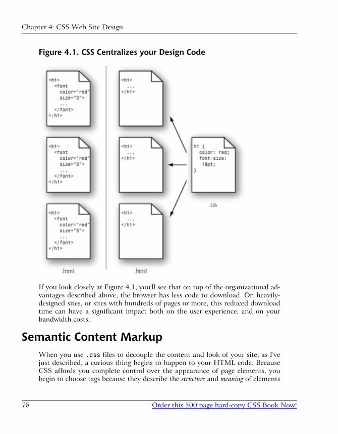
Figure 4.1. CSS Centralizes your Design Code
If you look closely at Figure 4.1, you'll see that on top of the organizational ad-
vantages described above, the browser has less code to download. On heavily-
designed sites, or sites with hundreds of pages or more, this reduced download
time can have a significant impact both on the user experience, and on your
bandwidth costs.
Semantic Content MarkupWhen you use .css files to decouple the content and look of your site, as I've
just described, a curious thing begins to happen to your HTML code. Because
CSS affords you complete control over the appearance of page elements, you
begin to choose tags because they describe the structure and meaning of elements
Chapter 4: CSS Web Site Design
Order this 500 page hard-copy CSS Book Now!78
of the page, instead of how you want them to look. Stripped of most or all of the
presentational information, your HTML code is free to capture the semantics
of your site's content.
There are a number of reasons why this is a desirable state of affairs, not the least
of which is how easily you can find things when you're making changes to the
content of your site. The easiest way to spot a CSS site is to use the “View Source”
feature in your browser—if you can make sense of the code there within 10
seconds, chances are that you're not dealing with a site that uses table-based
layout and other non-semantic HTML.
Search engine optimization (SEO) is greatly assisted by semantic HTML, because
the fewer presentational tags the search engine has to wade through in analyzing
your site, the greater your site's keyword density—an important metric in de-
termining your site's ranking. As we'll see, CSS lets you control the position of
an element in the browser window, largely independent of its position in the
HTML document. So, if you have a newsletter subscription form or some other
lengthy chunk of HTML that won't mean a whole lot to a search engine, feel free
to move its code to the end of your HTML document and use CSS to ensure
that it is displayed near the top of the browser window.
Increasingly supported by modern browsers is a feature of the HTML <link>tag1, which lets you restrict a linked style sheet so that it affects only the page
when it's displayed by a certain type of browser or display. For instance, you
could link three .css files to a page: one that defined the appearance of the page
on a desktop browser, another that dictates how the page will look when printed,
and yet another that controls the display on mobile devices such as Internet-
connected Personal Digital Assistants (PDAs). Only by using semantic markup,
and allowing the CSS to take care of the display properties, is this sort of content
repurposing possible.
Last, but certainly not least, are the vast improvements to accessibility that a site
can garner by using semantic markup. We'll discuss these in detail in the next
section.
AccessibilityShould you ever have the opportunity to observe a visually impaired individual
browsing the Web, I highly recommend the experience. Alternatively, get yourself
1Specifically, the media attribute.
79Order this 500 page hard-copy CSS Book Now!
Accessibility
some screen reader software, switch off your monitor, and see for yourself what
it's like.
Heavily-designed Websites that make use of tables, images, and other non-se-
mantic HTML for layout are extremely difficult to use when the most natural
way to experience a Website is to listen to it read aloud, from top to bottom. It's
not uncommon for a modern Website to inflict 30 seconds or more of nested
tables opening and closing, unidentified images for layout, and other nonsense,
before the actual content begins. Now, if you think that sounds mildly annoying,
imagine having to listen to it for each and every page of the sites that you visit!
Semantic HTML nearly eliminates this aural garbage, because it ensures that
every tag in the document has a structural meaning that's significant to the
viewer (or listener). An aural browser ignores the visual formatting properties
defined in the CSS, so the user need not be bothered listening to them.
On a site that used semantic markup, for example, a visually impaired user would
never have to wonder if a word was bold because it was more important, or just
because it looked better that way. Elements that were displayed in bold for design
reasons would have that property assigned using CSS, and the aural browser
would never mention it. Elements that needed additional impact or emphasis
would be marked up using the semantically meaningful <strong> and <em> tags,
which are displayed by default as bold and italics in visual browsers.
A complete set of guidelines exists for developers who are interested in making
their sites more accessible for users with disabilities. The Web Content Accessib-
ility Guidelines 1.0[1] (WCAG) is recommended reading for all Web developers,
with Guideline 3[2] treating the idea of avoiding presentational markup in favour
of semantic markup.
Standards ComplianceThe WCAG is not the only specification that advocates the use of CSS for the
presentation properties of HTML documents. In fact, the latest HTML stand-
ards[3] themselves are written with this in mind!
[1] http://www.w3.org/TR/WCAG10/
[2] http://www.w3.org/TR/WCAG10/#gl-structure-presentation
[3] http://www.w3.org/MarkUp/#recommendations
Chapter 4: CSS Web Site Design
Order this 500 page hard-copy CSS Book Now!80
The World Wide Web Consortium[4] (W3C) is the body responsible for publish-
ing Recommendations (de facto standards) relating to the Web. Here are some of
the W3C Recommendations that relate to using semantic markup and CSS:
HTML 4 (http://www.w3.org/TR/html4)
The latest (and last) major revision of the HTML Recommendation marks
all non-semantic elements and attributes as deprecated2. The <font> tag[6],
for example, is clearly marked as deprecated in this standard. Under the de-
scription of deprecated elements[7], the Recommendation has this to say:
In general, authors should use style sheets to achieve stylistic and
formatting effects rather than HTML presentational attributes.
XHTML 1.0 (http://www.w3.org/TR/xhtml1/)
A reformulation of HTML 4 as an XML document type, XHTML lets you
use HTML tags and attributes, while also benefiting from the features of
XML (mixing tag languages, custom tags, etc.).
This Recommendation includes the same tags and deprecations as HTML 4.
Web Content Accessibility Guidelines 1.0 (http://www.w3.org/TR/WCAG10/)
As described in the section called “Accessibility”, the WCAG Recommendation
strongly recommends using CSS and semantic markup in Web design to
improve accessibility. I'll let the Recommendation speak for itself:
Misusing markup for a presentation effect (e.g., using a table for
layout or a header to change the font size) makes it difficult for
users with specialized software to understand the organization
of the page or to navigate through it. Furthermore, using
presentation markup, rather than structural markup, to convey
structure (e.g., constructing what looks like a table of data with
an HTML PRE element) makes it difficult to render a page intel-
ligibly to other devices
According to many Web developers, strict standards compliance is an idealistic
goal that is rarely practical. One of the primary goals of this book is to demonstrate
that this is no longer true. Today's browsers provide strong support for CSS and
[4] http://www.w3.org/2A deprecated element or attribute is one that has been tagged for removal from the specification,
and which therefore should not be used. For a document to strictly comply with the specification, it
should not use any deprecated tags or attributes.
[6] http://www.w3.org/TR/html4/present/graphics.html#h-15.2.2
[7] http://www.w3.org/TR/html4/conform.html#deprecated
81Order this 500 page hard-copy CSS Book Now!
Standards Compliance
produce more consistent results when they are fed standards-compliant code.
While bugs and compatibility issues still exist, they are no more insurmountable
than the bugs that face designers who rely on noncompliant code.
CSS Success StoriesThe following sites serve as great examples of what can be accomplished with
CSS page layout:
SitePoint (http://www.sitepoint.com/)
I know, I know... it's unseemly to use my own publisher as an example of
why CSS works, but you've got to hand it to these guys. They've not only
taken a tired, table-laden layout and replaced it with a fresh, standards-
compliant design, but they've also made the site vastly more usable in the
process.
Though the flat colors in use on this site may look simplistic at first glance,
this “low fat” approach to the design keeps the pages loading quickly, despite
often lengthy content and a plethora of navigational options.
A List Apart (http://www.alistapart.com/)
Since its inception in 1998, this site, and the associated mailing list, has be-
come one of the leading sources of information and advocacy for CSS design
and layout. The site itself is a model of simplicity, but it demonstrates that
simple doesn't have to mean boring or ugly.
Netscape DevEdge (http://devedge.netscape.com/)
DevEdge is Netscape's resource site for Web developers. With Netscape 6 and
7 having been based on a standards-compliant Web layout engine, it seemed
only logical to redesign the site to take advantage of this technology. They've
even published an article[13] that covers their approach to this redesign.
ESPN (http://www.espn.com/)
The first mainstream, commercial Website to be built with CSS page layout
techniques, ESPN.com is the ice breaker that the Web design community
has been waiting for!
When pitching a site design idea—especially when you propose to use “new”
technologies like CSS layout—clients will often ask if you can show them
another site that has implemented a similar solution successfully. Until now,
[13] http://devedge.netscape.com/viewsource/2003/devedge-redesign/
Chapter 4: CSS Web Site Design
Order this 500 page hard-copy CSS Book Now!82
all the best examples of CSS site design were either sites written by Web
developers, for Web developers, or personal sites that could afford to take
risks because they weren't in it for the money.
For an in-depth interview with one of the designers behind this site, visit
Netscape DevEdge[15].
Fast Company Magazine (http://www.fastcompany.com/)
The online presence for a popular business magazine, this site was redesigned
to make use of CSS layout and semantic markup. The actual look and organ-
ization of the site hasn't changed drastically from its previous version, but
thanks to CSS, its pages load much more quickly.
Our Sample Site: Footbag FreaksFor the rest of this book, I will relate each of the techniques we discuss, wherever
possible, to a sample site that has been developed especially for this book. Called
Footbag Freaks, this fictitious site can be found online at http://www.footbag-
freaks.com/. The source code is also available for download from this book's
Website[18]. You can see the front page of the Footbag Freaks site in Figure 4.2.
[15] http://devedge.netscape.com/viewsource/2003/espn-interview/01/
[18] http://www.sitepoint.com/books/
83Order this 500 page hard-copy CSS Book Now!
Our Sample Site: Footbag Freaks
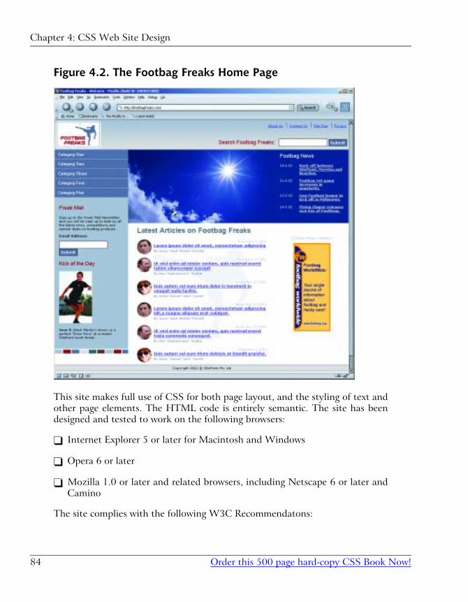
Figure 4.2. The Footbag Freaks Home Page
This site makes full use of CSS for both page layout, and the styling of text and
other page elements. The HTML code is entirely semantic. The site has been
designed and tested to work on the following browsers:
� Internet Explorer 5 or later for Macintosh and Windows
� Opera 6 or later
� Mozilla 1.0 or later and related browsers, including Netscape 6 or later and
Camino
The site complies with the following W3C Recommendatons:
Chapter 4: CSS Web Site Design
Order this 500 page hard-copy CSS Book Now!84
� XHTML 1.0 (Strict)
� WCAG 1.0 (AAA Rating for Accessibility)
� CSS 2.0
SummaryIn this chapter, I provided the justification for all that is to follow. I explained
in detail the most important advantages that CSS has to offer for your Web
design work. These advantages fell under the headings of:
� increased stylistic control
� centralized design information
� semantic content markup
� accessibility
� standards compliance
After presenting a few success stories—sites that have used CSS design techniques
to good effect—I introduced our own, admittedly fictional, success story: FootbagFreaks. Throughout the rest of this book, we'll explore the wide range of CSS
features and techniques that go into making a site like this one.
Chapter 5, begins this process by looking at how to build the skeleton of a page
layout, and flesh out major pieces of design using, pure CSS techniques.
85Order this 500 page hard-copy CSS Book Now!
Summary
86
Building the Skeleton5Most books on CSS begin by teaching you how to deal with the bits and pieces
of a Web page: fonts, colors, lists, and the like. Then, they move on to explaining
the broader issues associated with CSS Positioning (CSS-P), which affect the
layout of pages rather than the appearance of individual elements.
In this book, I take the opposite approach. I first look at the site-level and page-
level issues involved with CSS design, so that we can understand the big picture
perspective of page layout without tables (which is, after all, the primary thrust
of this book). And later, in Part III, I’ll discuss styling the content of the pages
we’ll be laying out in this and the next chapter.
This chapter focuses specifically on creating the basic structural layout of a Web
page or site using CSS. In it, I’ll discuss multi-column layouts—both in general
and very specifically—as they relate to the Footbag Freaks site. I’ll teach you
about boxes, borders, and the famous Box Model of CSS design. I’ll delve into
the intricacies of creating and using two- and three-column page layouts, and
into the mysteries of floating objects. I’ll guide you through the process of creating
dummy layouts for the pages you’ll encounter in the Footbag Freaks project, and
in other projects you may create.
I’ll conclude with the usual tips on dealing with the layout issues presented in
this chapter—the issues involved in converting pages to CSS from an existing
table-centric design.
Enumerating Design TypesOne of the first decisions you have to make when you create any Website, but
particularly one where you intend to put CSS to its most effective use, is how
many different types of pages and elements you’re going to need.
How Many Page Types?Most sites use more than one basic page layout. The front, or index page, often
has a different look and feel from the “inside” pages. In the Footbag Freaks site,
for example, the specification tells us that bread-crumb navigation will appear
on all but the front page. An inspection reveals that the large graphic that displays
near the top of the front page does not appear on other pages of the site.
On a typically complex ecommerce site, you might run into far more page types.
For example, such a site might include different layouts for its:
� front page (index)
� catalog pages
� secure ordering pages
� main content pages
� site map page
Some of these pages might display dynamic content that is stored in a database
and generated in response to specific user requests. Others might be flat HTML
pages that never change unless you redesign them.
The Footbag Freaks site appears to need only one type of page layout. The sec-
ondary page has fewer elements than the home page, but the relative positioning
and layout of the common elements doesn’t change from one page type to the
other.
Chapter 5: Building the Skeleton
Order this 500 page hard-copy CSS Book Now!88
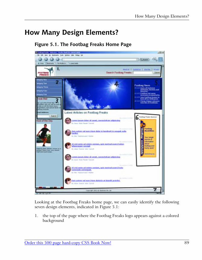
How Many Design Elements?
Figure 5.1. The Footbag Freaks Home Page
Looking at the Footbag Freaks home page, we can easily identify the following
seven design elements, indicated in Figure 5.1:
1. the top of the page where the Footbag Freaks logo appears against a colored
background
89Order this 500 page hard-copy CSS Book Now!
How Many Design Elements?
2. the left-hand column where the site’s navigation is located
3. inside the navigation area, the text field for newsletter sign-up and related
text
4. the large image area where the sun, the sky, and the hacky sack appear
5. the news area
6. the sponsor area
7. the footer where the copyright information appears
The second page of the site eliminates the fourth design element from this list
and adds a submenu navigation element inside the main navigation. So, each
page type has seven design elements, six of which are common, and one of which
is unique to each page.
CSS Positioning and Multi-Column PageLayouts
Now that you have an idea of the number of pieces of design for which you’re
going to define CSS rules, let’s take a step back and get a basic grounding in how
to use specific CSS rules to create these layouts and effects.
The CSS Box ModelFrom the perspective of a style sheet, everything you deal with in HTML pages
can be viewed as living inside a box. This fact is generally far more obvious when
you’re formatting large chunks of content, like the seven design elements in the
Footbag Freaks Website. But it’s true even when you’re dealing with individual
components of those elements, like headings, lists, list elements, and even seg-
ments of text.
The basic CSS box model is shown in Figure 5.2.
Chapter 5: Building the Skeleton
Order this 500 page hard-copy CSS Book Now!90
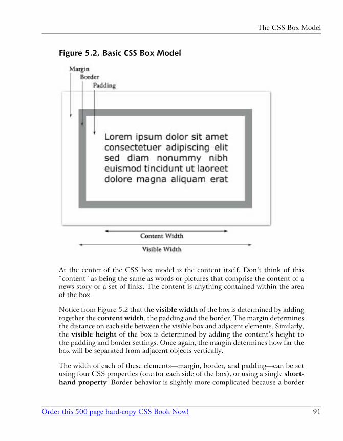
Figure 5.2. Basic CSS Box Model
At the center of the CSS box model is the content itself. Don’t think of this
“content” as being the same as words or pictures that comprise the content of a
news story or a set of links. The content is anything contained within the area
of the box.
Notice from Figure 5.2 that the visible width of the box is determined by adding
together the content width, the padding and the border. The margin determines
the distance on each side between the visible box and adjacent elements. Similarly,
the visible height of the box is determined by adding the content’s height to
the padding and border settings. Once again, the margin determines how far the
box will be separated from adjacent objects vertically.
The width of each of these elements—margin, border, and padding—can be set
using four CSS properties (one for each side of the box), or using a single short-
hand property. Border behavior is slightly more complicated because a border
91Order this 500 page hard-copy CSS Book Now!
The CSS Box Model
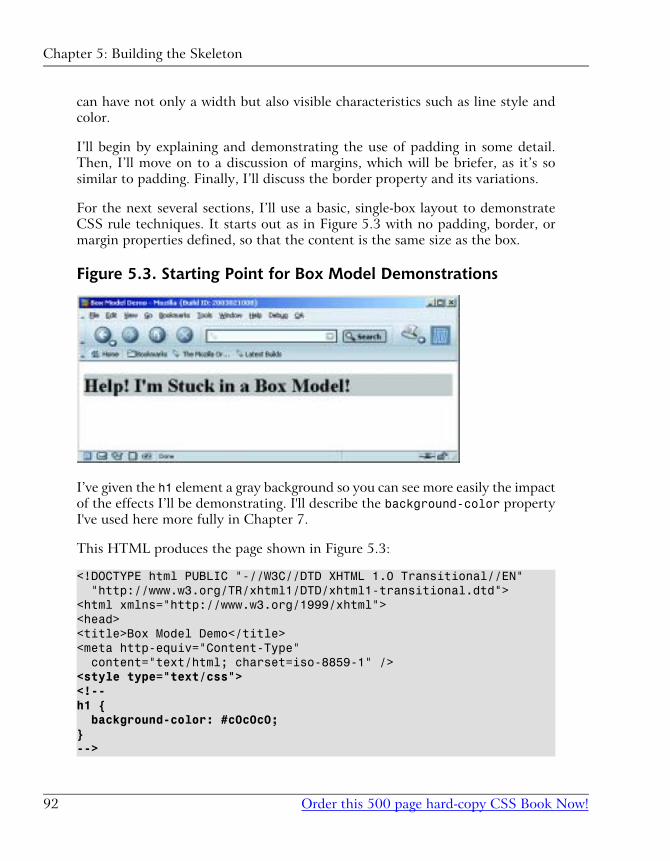
can have not only a width but also visible characteristics such as line style and
color.
I’ll begin by explaining and demonstrating the use of padding in some detail.
Then, I’ll move on to a discussion of margins, which will be briefer, as it’s so
similar to padding. Finally, I’ll discuss the border property and its variations.
For the next several sections, I’ll use a basic, single-box layout to demonstrate
CSS rule techniques. It starts out as in Figure 5.3 with no padding, border, or
margin properties defined, so that the content is the same size as the box.
Figure 5.3. Starting Point for Box Model Demonstrations
I’ve given the h1 element a gray background so you can see more easily the impact
of the effects I’ll be demonstrating. I'll describe the background-color property
I've used here more fully in Chapter 7.
This HTML produces the page shown in Figure 5.3:
<!DOCTYPE html PUBLIC "-//W3C//DTD XHTML 1.0 Transitional//EN" "http://www.w3.org/TR/xhtml1/DTD/xhtml1-transitional.dtd"><html xmlns="http://www.w3.org/1999/xhtml"><head><title>Box Model Demo</title><meta http-equiv="Content-Type" content="text/html; charset=iso-8859-1" /><style type="text/css"><!--h1 { background-color: #c0c0c0;}-->
Chapter 5: Building the Skeleton
Order this 500 page hard-copy CSS Book Now!92
</style></head><body><h1>Help! I'm Stuck in a Box Model!</h1></body></html>
Throughout the rest of this discussion, I’ll be modifying only the style sheet in-
formation, so I’ll reproduce only that section of the code, indicating any changes
in bold.
Pixels Versus Percentages
Because the box model deals with the display of content on the screen, the pixel
measurement (abbreviated px) is the most commonly used of the absolute
measurement units in CSS. However, often we desire to create a “stretchy” layout,
in which case it is necessary and appropriate to use the percentage model (with
the % symbol), rather than pixels. I’ll have more to say on this subject in
Chapter 6.
Setting the Padding Properties
There are four properties that together define the padding around an object in
a CSS rule: padding-left, padding-right, padding-top and padding-bottom.
Let’s change just one of the padding settings to get a feel for how this works.
Modify the style sheet in the sample file, so that it looks like the following frag-
ment (remember that the new material is bold):
h1 { background-color: #c0c0c0; padding-left: 25px;}
The result of this change is shown in Figure 5.4. Notice that the text now begins
25 pixels from the left side of the box, resulting in 25 pixels of blank, gray space
to the left of the text.
93Order this 500 page hard-copy CSS Book Now!
Pixels Versus Percentages
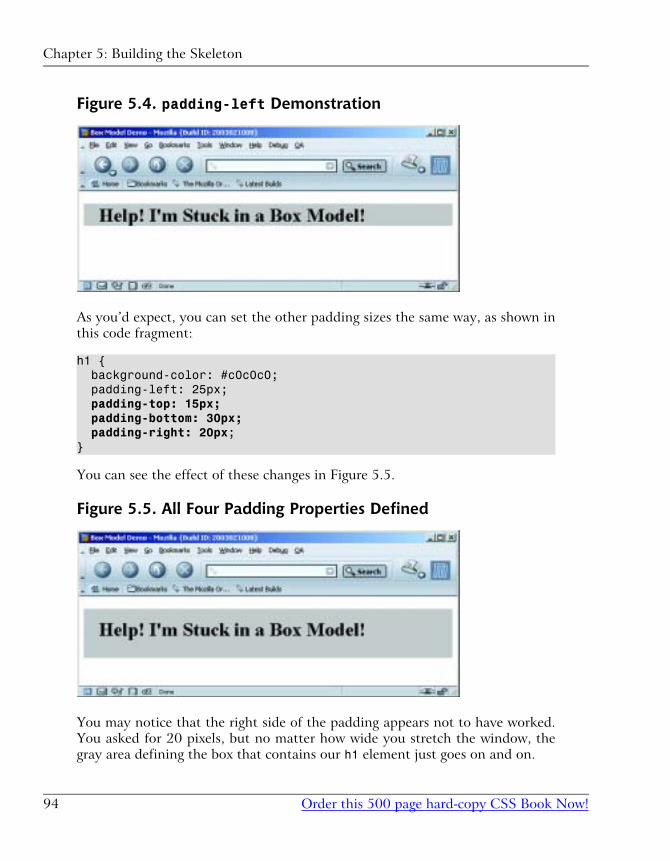
Figure 5.4. padding-left Demonstration
As you’d expect, you can set the other padding sizes the same way, as shown in
this code fragment:
h1 { background-color: #c0c0c0; padding-left: 25px; padding-top: 15px; padding-bottom: 30px; padding-right: 20px;}
You can see the effect of these changes in Figure 5.5.
Figure 5.5. All Four Padding Properties Defined
You may notice that the right side of the padding appears not to have worked.
You asked for 20 pixels, but no matter how wide you stretch the window, the
gray area defining the box that contains our h1 element just goes on and on.
Chapter 5: Building the Skeleton
Order this 500 page hard-copy CSS Book Now!94
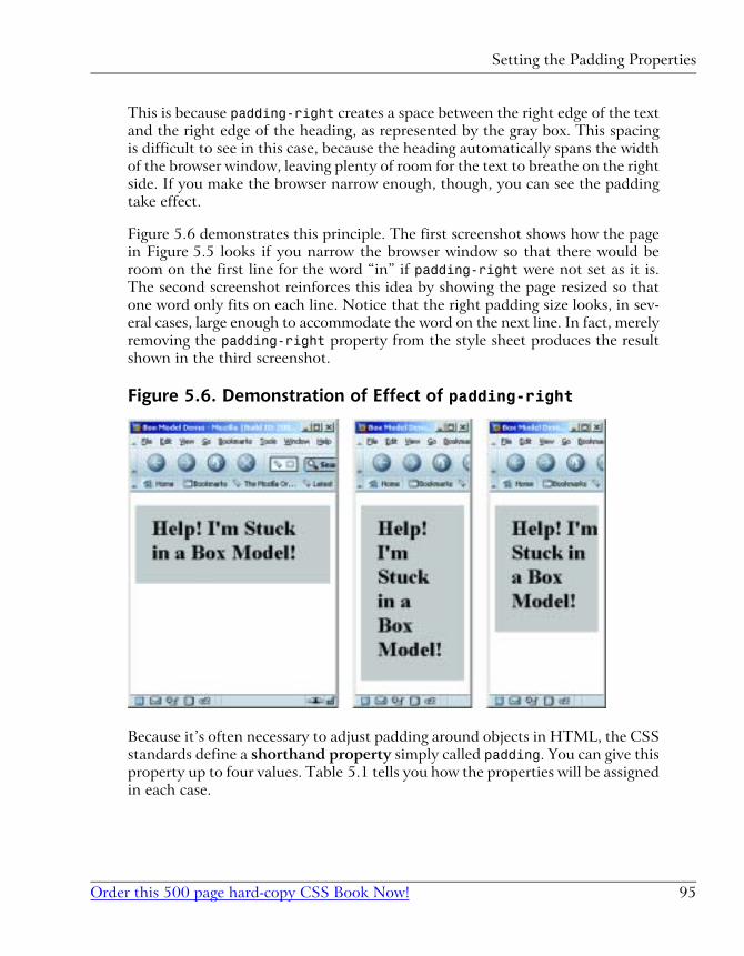
This is because padding-right creates a space between the right edge of the text
and the right edge of the heading, as represented by the gray box. This spacing
is difficult to see in this case, because the heading automatically spans the width
of the browser window, leaving plenty of room for the text to breathe on the right
side. If you make the browser narrow enough, though, you can see the padding
take effect.
Figure 5.6 demonstrates this principle. The first screenshot shows how the page
in Figure 5.5 looks if you narrow the browser window so that there would be
room on the first line for the word “in” if padding-right were not set as it is.
The second screenshot reinforces this idea by showing the page resized so that
one word only fits on each line. Notice that the right padding size looks, in sev-
eral cases, large enough to accommodate the word on the next line. In fact, merely
removing the padding-right property from the style sheet produces the result
shown in the third screenshot.
Figure 5.6. Demonstration of Effect of padding-right
Because it’s often necessary to adjust padding around objects in HTML, the CSS
standards define a shorthand property simply called padding. You can give this
property up to four values. Table 5.1 tells you how the properties will be assigned
in each case.
95Order this 500 page hard-copy CSS Book Now!
Setting the Padding Properties
Table 5.1. Effect of Multiple Values on padding ShorthandProperty
InterpretationNo. of Values
Set all four padding values to this value.1
Set the top and bottom padding to the first value, left and right
padding to the second.
2
Set the top padding to the first value, right and left to the
second value, bottom to the third value.
3
Set the top padding to the first value, right padding to the
second, bottom padding to the third, and left padding to the
fourth.1
4
1You can remember this as clockwise, starting from the top, or as TRBL (trouble), whichever you
find easier to remember.
For example, the last code fragment above could be rewritten using the paddingshorthand property as follows:
<style type="text/css"><!--h1 { background-color: #c0c0c0; padding: 15px 20px 30px 25px;}--></style>
To create equal top and bottom padding, and equal left and right padding, even
though right padding is all but meaningless in this context, you could use:
<style type="text/css"><!--h1 { background-color: #c0c0c0; padding: 15px 25px;}--></style>
The result of this code fragment is shown in Figure 5.7.
Chapter 5: Building the Skeleton
Order this 500 page hard-copy CSS Book Now!96
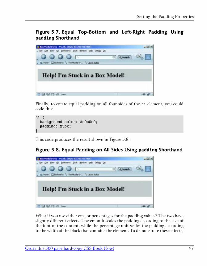
Figure 5.7. Equal Top-Bottom and Left-Right Padding Usingpadding Shorthand
Finally, to create equal padding on all four sides of the h1 element, you could
code this:
h1 { background-color: #c0c0c0; padding: 25px;}
This code produces the result shown in Figure 5.8.
Figure 5.8. Equal Padding on All Sides Using padding Shorthand
What if you use either ems or percentages for the padding values? The two have
slightly different effects. The em unit scales the padding according to the size of
the font of the content, while the percentage unit scales the padding according
to the width of the block that contains the element. To demonstrate these effects,
97Order this 500 page hard-copy CSS Book Now!
Setting the Padding Properties
we’ll work with a new HTML page that displays two headings against colored
backgrounds on a page of a contrasting color.
Here’s the HTML for that demo page.
<!DOCTYPE html PUBLIC "-//W3C//DTD XHTML 1.0 Transitional//EN" "http://www.w3.org/TR/xhtml1/DTD/xhtml1-transitional.dtd"><html xmlns="http://www.w3.org/1999/xhtml"><head><title>Box Model Demo</title><meta http-equiv="Content-Type" content="text/html; charset=iso-8859-1" /><style type="text/css"><!--body { background-color: #808080;}h1, h4 { background-color: #c0c0c0;}--></style></head><body><h1>Help! I'm Stuck in a Box Model!</h1><h4>But it's not too crowded if you're just a little old h4 heading like me! In fact, it's kind of cozy in here.</h4></body></html>
Notice that I’ve given the page a dark grey background and I’ve added an h4element, which I’ve styled in the same CSS rule as the h1 element.
This HTML page displays as shown in Figure 5.9.
Chapter 5: Building the Skeleton
Order this 500 page hard-copy CSS Book Now!98
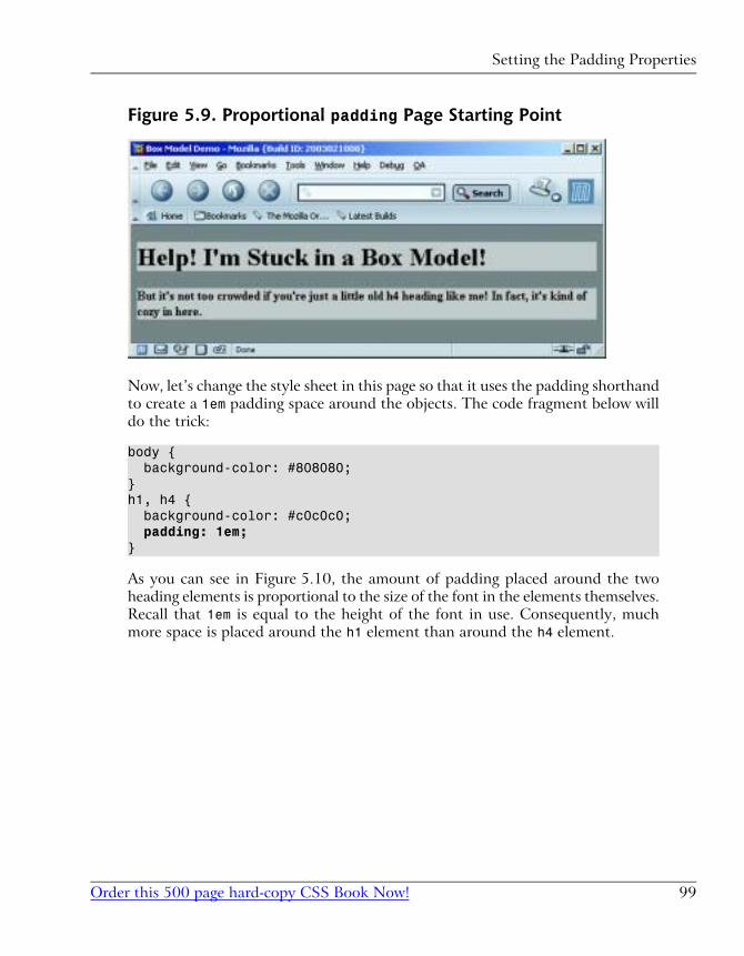
Figure 5.9. Proportional padding Page Starting Point
Now, let’s change the style sheet in this page so that it uses the padding shorthand
to create a 1em padding space around the objects. The code fragment below will
do the trick:
body { background-color: #808080;}h1, h4 { background-color: #c0c0c0; padding: 1em;}
As you can see in Figure 5.10, the amount of padding placed around the two
heading elements is proportional to the size of the font in the elements themselves.
Recall that 1em is equal to the height of the font in use. Consequently, much
more space is placed around the h1 element than around the h4 element.
99Order this 500 page hard-copy CSS Book Now!
Setting the Padding Properties
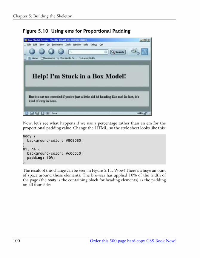
Figure 5.10. Using ems for Proportional Padding
Now, let’s see what happens if we use a percentage rather than an em for the
proportional padding value. Change the HTML, so the style sheet looks like this:
body { background-color: #808080;}h1, h4 { background-color: #c0c0c0; padding: 10%;}
The result of this change can be seen in Figure 5.11. Wow! There’s a huge amount
of space around those elements. The browser has applied 10% of the width of
the page (the body is the containing block for heading elements) as the padding
on all four sides.
Chapter 5: Building the Skeleton
Order this 500 page hard-copy CSS Book Now!100
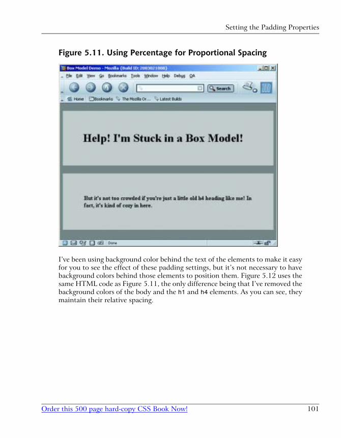
Figure 5.11. Using Percentage for Proportional Spacing
I’ve been using background color behind the text of the elements to make it easy
for you to see the effect of these padding settings, but it’s not necessary to have
background colors behind those elements to position them. Figure 5.12 uses the
same HTML code as Figure 5.11, the only difference being that I’ve removed the
background colors of the body and the h1 and h4 elements. As you can see, they
maintain their relative spacing.
101Order this 500 page hard-copy CSS Book Now!
Setting the Padding Properties
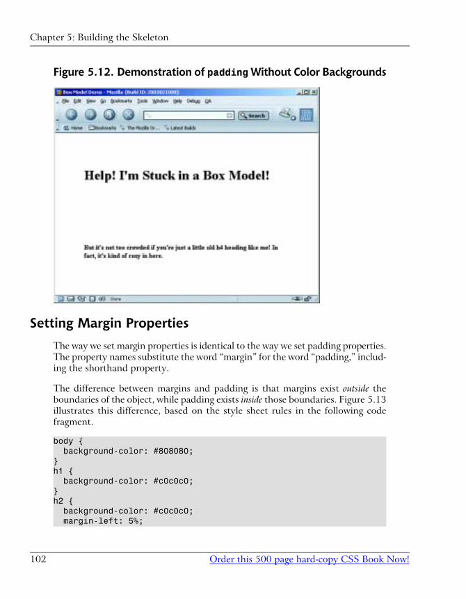
Figure 5.12. Demonstration of padding Without Color Backgrounds
Setting Margin Properties
The way we set margin properties is identical to the way we set padding properties.
The property names substitute the word “margin” for the word “padding,” includ-
ing the shorthand property.
The difference between margins and padding is that margins exist outside the
boundaries of the object, while padding exists inside those boundaries. Figure 5.13
illustrates this difference, based on the style sheet rules in the following code
fragment.
body { background-color: #808080;}h1 { background-color: #c0c0c0;}h2 { background-color: #c0c0c0; margin-left: 5%;
Chapter 5: Building the Skeleton
Order this 500 page hard-copy CSS Book Now!102
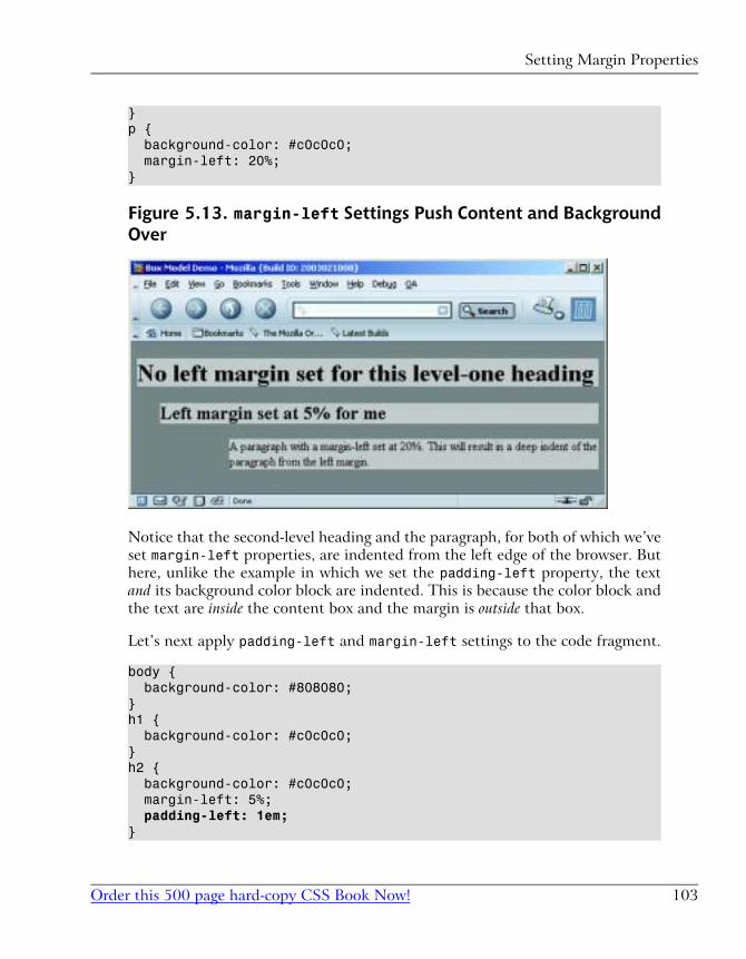
}p { background-color: #c0c0c0; margin-left: 20%;}
Figure 5.13. margin-left Settings Push Content and BackgroundOver
Notice that the second-level heading and the paragraph, for both of which we’ve
set margin-left properties, are indented from the left edge of the browser. But
here, unlike the example in which we set the padding-left property, the text
and its background color block are indented. This is because the color block and
the text are inside the content box and the margin is outside that box.
Let’s next apply padding-left and margin-left settings to the code fragment.
body { background-color: #808080;}h1 { background-color: #c0c0c0;}h2 { background-color: #c0c0c0; margin-left: 5%; padding-left: 1em;}
103Order this 500 page hard-copy CSS Book Now!
Setting Margin Properties
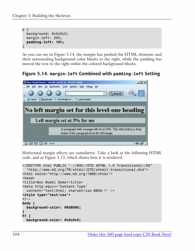
p { background: #c0c0c0; margin-left: 20%; padding-left: 10%;}
As you can see in Figure 5.14, the margin has pushed the HTML elements and
their surrounding background color blocks to the right, while the padding has
moved the text to the right within the colored background blocks.
Figure 5.14. margin-left Combined with padding-left Setting
Horizontal margin effects are cumulative. Take a look at the following HTML
code, and at Figure 5.15, which shows how it is rendered.
<!DOCTYPE html PUBLIC "-//W3C//DTD XHTML 1.0 Transitional//EN" "http://www.w3.org/TR/xhtml1/DTD/xhtml1-transitional.dtd"><html xmlns="http://www.w3.org/1999/xhtml"><head><title>Box Model Demo</title><meta http-equiv="Content-Type" content="text/html; charset=iso-8859-1" /><style type="text/css"><!--body { background-color: #808080;}h1 { background-color: #c0c0c0;
Chapter 5: Building the Skeleton
Order this 500 page hard-copy CSS Book Now!104
}h2 { background-color: #c0c0c0; margin-left: 5%; padding-left: 1em;}p { background-color: #c0c0c0; margin-left: 20%; padding-left: 10%;}li { background-color: #ffffff;}li p { margin-left: 10%;}--></style></head><body><h1>No left margin set for this level-one heading</h1><h2>Left margin set at 5% for me</h2><p>A paragraph with a margin-left set at 20%. This will result in a deep indent of the paragraph from the left margin.</p><ul><li>Item one</li><li><p>Paragraph item</p></li></ul></body></html>
105Order this 500 page hard-copy CSS Book Now!
Setting Margin Properties
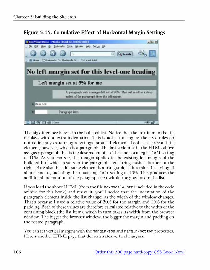
Figure 5.15. Cumulative Effect of Horizontal Margin Settings
The big difference here is in the bulleted list. Notice that the first item in the list
displays with no extra indentation. This is not surprising, as the style rules do
not define any extra margin settings for an li element. Look at the second list
element, however, which is a paragraph. The last style rule in the HTML above
assigns a paragraph that is the descendant of an li element a margin-left setting
of 10%. As you can see, this margin applies to the existing left margin of the
bulleted list, which results in the paragraph item being pushed further to the
right. Note also that this same element is a paragraph, so it retains the styling of
all p elements, including their padding-left setting of 10%. This produces the
additional indentation of the paragraph text within the gray box in the list.
If you load the above HTML (from the file boxmodel4.html included in the code
archive for this book) and resize it, you’ll notice that the indentation of the
paragraph element inside the list changes as the width of the window changes.
That’s because I used a relative value of 20% for the margin and 10% for the
padding. Both of these values are therefore calculated relative to the width of the
containing block (the list item), which in turn takes its width from the browser
window. The bigger the browser window, the bigger the margin and padding on
the nested paragraph.
You can set vertical margins with the margin-top and margin-bottom properties.
Here’s another HTML page that demonstrates vertical margins:
Chapter 5: Building the Skeleton
Order this 500 page hard-copy CSS Book Now!106
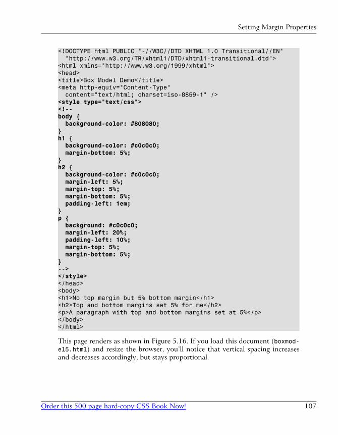
<!DOCTYPE html PUBLIC "-//W3C//DTD XHTML 1.0 Transitional//EN" "http://www.w3.org/TR/xhtml1/DTD/xhtml1-transitional.dtd"><html xmlns="http://www.w3.org/1999/xhtml"><head><title>Box Model Demo</title><meta http-equiv="Content-Type" content="text/html; charset=iso-8859-1" /><style type="text/css"><!--body { background-color: #808080;}h1 { background-color: #c0c0c0; margin-bottom: 5%;}h2 { background-color: #c0c0c0; margin-left: 5%; margin-top: 5%; margin-bottom: 5%; padding-left: 1em;}p { background: #c0c0c0; margin-left: 20%; padding-left: 10%; margin-top: 5%; margin-bottom: 5%;}--></style></head><body><h1>No top margin but 5% bottom margin</h1><h2>Top and bottom margins set 5% for me</h2><p>A paragraph with top and bottom margins set at 5%</p></body></html>
This page renders as shown in Figure 5.16. If you load this document (boxmod-el5.html) and resize the browser, you’ll notice that vertical spacing increases
and decreases accordingly, but stays proportional.
107Order this 500 page hard-copy CSS Book Now!
Setting Margin Properties
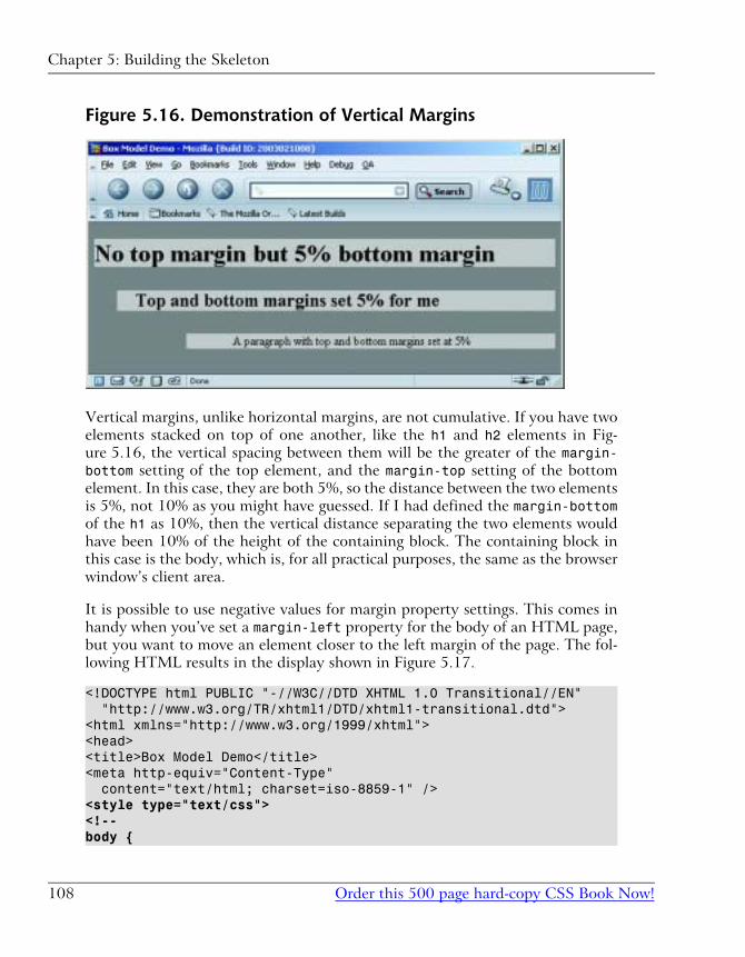
Figure 5.16. Demonstration of Vertical Margins
Vertical margins, unlike horizontal margins, are not cumulative. If you have two
elements stacked on top of one another, like the h1 and h2 elements in Fig-
ure 5.16, the vertical spacing between them will be the greater of the margin-bottom setting of the top element, and the margin-top setting of the bottom
element. In this case, they are both 5%, so the distance between the two elements
is 5%, not 10% as you might have guessed. If I had defined the margin-bottomof the h1 as 10%, then the vertical distance separating the two elements would
have been 10% of the height of the containing block. The containing block in
this case is the body, which is, for all practical purposes, the same as the browser
window’s client area.
It is possible to use negative values for margin property settings. This comes in
handy when you’ve set a margin-left property for the body of an HTML page,
but you want to move an element closer to the left margin of the page. The fol-
lowing HTML results in the display shown in Figure 5.17.
<!DOCTYPE html PUBLIC "-//W3C//DTD XHTML 1.0 Transitional//EN" "http://www.w3.org/TR/xhtml1/DTD/xhtml1-transitional.dtd"><html xmlns="http://www.w3.org/1999/xhtml"><head><title>Box Model Demo</title><meta http-equiv="Content-Type" content="text/html; charset=iso-8859-1" /><style type="text/css"><!--body {
Chapter 5: Building the Skeleton
Order this 500 page hard-copy CSS Book Now!108
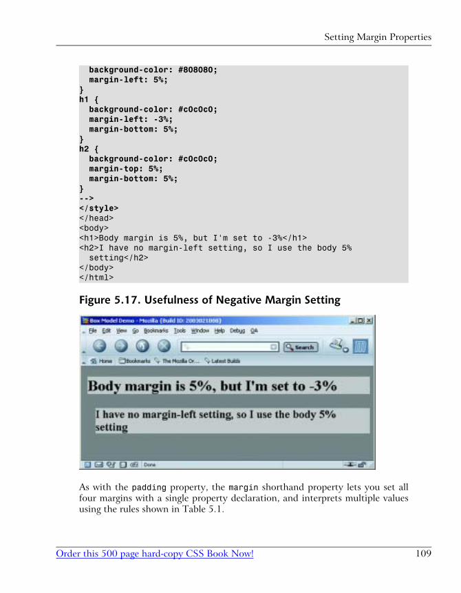
background-color: #808080; margin-left: 5%;}h1 { background-color: #c0c0c0; margin-left: -3%; margin-bottom: 5%;}h2 { background-color: #c0c0c0; margin-top: 5%; margin-bottom: 5%;}--></style></head><body><h1>Body margin is 5%, but I'm set to -3%</h1><h2>I have no margin-left setting, so I use the body 5% setting</h2></body></html>
Figure 5.17. Usefulness of Negative Margin Setting
As with the padding property, the margin shorthand property lets you set all
four margins with a single property declaration, and interprets multiple values
using the rules shown in Table 5.1.
109Order this 500 page hard-copy CSS Book Now!
Setting Margin Properties
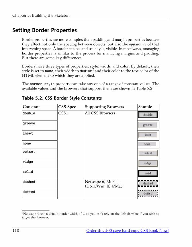
Setting Border Properties
Border properties are more complex than padding and margin properties because
they affect not only the spacing between objects, but also the appearance of that
intervening space. A border can be, and usually is, visible. In most ways, managing
border properties is similar to the process for managing margins and padding.
But there are some key differences.
Borders have three types of properties: style, width, and color. By default, their
style is set to none, their width to medium2 and their color to the text color of the
HTML element to which they are applied.
The border-style property can take any one of a range of constant values. The
available values and the browsers that support them are shown in Table 5.2.
Table 5.2. CSS Border Style Constants
SampleSupporting BrowsersCSS SpecConstant
All CSS BrowsersCSS1double
groove
inset
none
outset
ridge
solid
Netscape 6, Mozilla,
IE 5.5/Win, IE 4/Mac
dashed
dotted
2Netscape 4 sets a default border width of 0, so you can't rely on the default value if you wish to
target that browser.
Chapter 5: Building the Skeleton
Order this 500 page hard-copy CSS Book Now!110
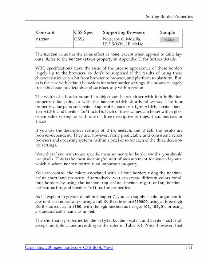
SampleSupporting BrowsersCSS SpecConstant
Netscape 6, Mozilla,
IE 5.5/Win, IE 4/Mac
CSS2hidden
The hidden value has the same effect as none, except when applied to table lay-
outs. Refer to the border-style property in Appendix C, for further details.
W3C specifications leave the issue of the precise appearance of these borders
largely up to the browsers, so don’t be surprised if the results of using these
characteristics vary a bit from browser to browser, and platform to platform. But,
as is the case with default behaviors for other border settings, the browsers largely
treat this issue predictably and satisfactorily within reason.
The width of a border around an object can be set either with four individual
property-value pairs, or with the border-width shorthand syntax. The four
property-value pairs are border-top-width, border-right-width, border-bot-tom-width, and border-left-width. Each of these values can be set with a pixel
or em value setting, or with one of three descriptive settings: thin, medium, or
thick.
If you use the descriptive settings of thin, medium, and thick, the results are
browser-dependent. They are, however, fairly predictable and consistent across
browsers and operating systems, within a pixel or so for each of the three descript-
ive settings.
Note that if you wish to use specific measurements for border widths, you should
use pixels. This is the most meaningful unit of measurement for screen layouts,
which is where border-width is an important property.
You can control the colors associated with all four borders using the border-color shorthand property. Alternatively, you can create different colors for all
four borders by using the border-top-color, border-right-color, border-bottom-color, and border-left-color properties.
As I'll explain in greater detail in Chapter 7, you can supply a color argument in
any of the standard ways: using a full RGB code as in #ff9900, using a three-digit
RGB shortcut as in #f90, with the rgb method as in rgb(102,153,0), or using
a standard color name as in red.
The shorthand properties border-style, border-width, and border-color all
accept multiple values according to the rules in Table 5.1. Note, however, that
111Order this 500 page hard-copy CSS Book Now!
Setting Border Properties
Netscape Navigator 4.x does not recognize multiple arguments to these properties,
nor does it support the side-specific style and color properties.
There is one additional shorthand property that is probably the most widely used
approach to defining border properties. Using the border property, you can
specify the style, width, and color of all four borders of an object in a compact
form. Since a uniform border surrounding an object is most often your desire,
this is an efficient way to set border property values.
This property declaration will produce a uniform 3-pixel, solid, green border
around any element to which it is legally applied:
border: 3px solid green;
The display PropertyBefore we can move on to look at CSS positioning issues, there is one more CSS
property we need to understand. It comes up infrequently, but when it does, it
has a significant impact on page layout.
The display property determines how a browser displays an element—whether
it treats it as a block, an inline text fragment, or something else. Although it can
be assigned any of 17 legal values, browser support realities confine the list to
six, only four of which are really important. For a full reference to display, see
Appendix C.
The six possible values for the display property are:
� block
� inline
� list-item
� none
� table-footer-group
� table-header-group
The default value varies from element to element. Block elements such as p, h1,
and div default to block, while inline elements such as strong, code, and spandefault to inline. List items, quite obviously, default to list-item. Assigning
Chapter 5: Building the Skeleton
Order this 500 page hard-copy CSS Book Now!112
non-default settings to elements (such as setting a div to display: inline) can
produce some interesting effects (imagine a paragraph containing two divs and
a list being displayed in the middle of a line of text).
If you supply a value of none, the element to which it applies is not shown and
the space it would normally occupy is collapsed. This differentiates the display:none property-value pair from the visibility: hidden setting commonly used
to hide the element but preserve the space it would occupy if it were visible.
CSS Positioning and Multi-Column Lay-outs
The box model we’ve been examining so far in this chapter applies within groups
of content. Generally, you use a <div> tag to group together collections of related
content and to assign CSS styles to such a group.
But CSS Positioning (CSS-P) involves more than working with individual groups
of related information. The connections between groups of content on an HTML
page are equally important in determining the layout of the page. The primary
CSS property involved in these connections is the position property.
The position property takes a single constant value. The value determines how
the block is positioned on the page. The two most frequently used values for the
position property are absolute and relative. Another value, static, is the
default value, and is seldom used in CSS rules. A fourth value, fixed, is not
supported by IE on Windows at all, which unfortunately means it’s almost unus-
able in practical sites. Refer to Appendix C, for complete details on these more
esoteric settings.
Absolute, Relative, and Positioning ContextsPositioning can be confusing in CSS because the coordinate system within which
a block is placed depends on the positioning context of the block. There’s no
universal set of coordinates to guide that placement, even when the absolutevalue is assigned to the position property. Each time a block is positioned on
the page (with a position setting other than static), it creates a new positioning
context for its descendants, in which the upper left corner of its content area has
the coordinates (0,0). So, if you use CSS to position an element that is withinthe block, its position will be calculated relative to that new coordinate system—it's
positioning context.
113Order this 500 page hard-copy CSS Book Now!
CSS Positioning and Multi-Column Layouts
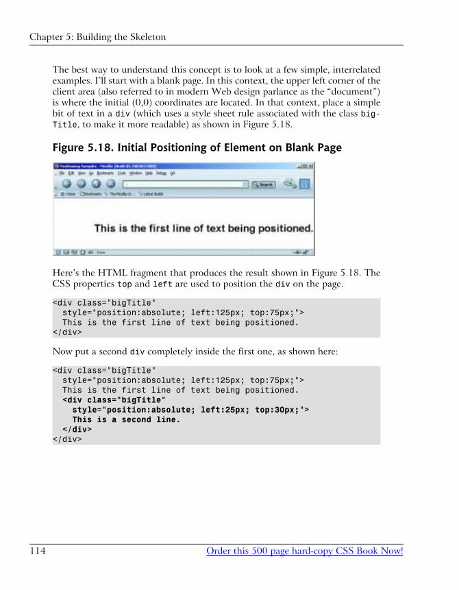
The best way to understand this concept is to look at a few simple, interrelated
examples. I’ll start with a blank page. In this context, the upper left corner of the
client area (also referred to in modern Web design parlance as the “document”)
is where the initial (0,0) coordinates are located. In that context, place a simple
bit of text in a div (which uses a style sheet rule associated with the class big-Title, to make it more readable) as shown in Figure 5.18.
Figure 5.18. Initial Positioning of Element on Blank Page
Here’s the HTML fragment that produces the result shown in Figure 5.18. The
CSS properties top and left are used to position the div on the page.
<div class="bigTitle" style="position:absolute; left:125px; top:75px;"> This is the first line of text being positioned.</div>
Now put a second div completely inside the first one, as shown here:
<div class="bigTitle" style="position:absolute; left:125px; top:75px;"> This is the first line of text being positioned. <div class="bigTitle" style="position:absolute; left:25px; top:30px;"> This is a second line. </div></div>
Chapter 5: Building the Skeleton
Order this 500 page hard-copy CSS Book Now!114
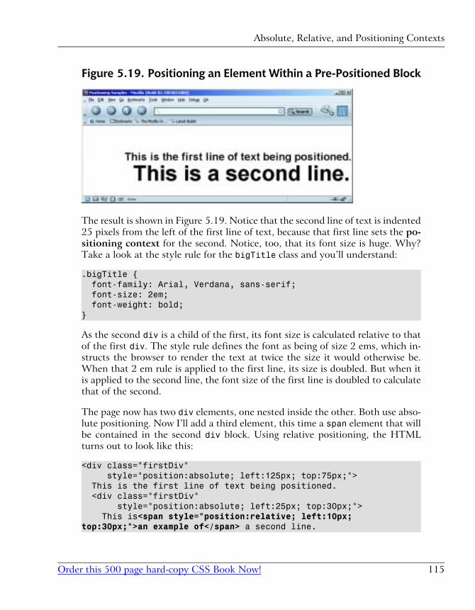
Figure 5.19. Positioning an Element Within a Pre-Positioned Block
The result is shown in Figure 5.19. Notice that the second line of text is indented
25 pixels from the left of the first line of text, because that first line sets the po-
sitioning context for the second. Notice, too, that its font size is huge. Why?
Take a look at the style rule for the bigTitle class and you’ll understand:
.bigTitle { font-family: Arial, Verdana, sans-serif; font-size: 2em; font-weight: bold;}
As the second div is a child of the first, its font size is calculated relative to that
of the first div. The style rule defines the font as being of size 2 ems, which in-
structs the browser to render the text at twice the size it would otherwise be.
When that 2 em rule is applied to the first line, its size is doubled. But when it
is applied to the second line, the font size of the first line is doubled to calculate
that of the second.
The page now has two div elements, one nested inside the other. Both use abso-
lute positioning. Now I’ll add a third element, this time a span element that will
be contained in the second div block. Using relative positioning, the HTML
turns out to look like this:
<div class="firstDiv" style="position:absolute; left:125px; top:75px;"> This is the first line of text being positioned. <div class="firstDiv" style="position:absolute; left:25px; top:30px;"> This is<span style="position:relative; left:10px;top:30px;">an example of</span> a second line.
115Order this 500 page hard-copy CSS Book Now!
Absolute, Relative, and Positioning Contexts
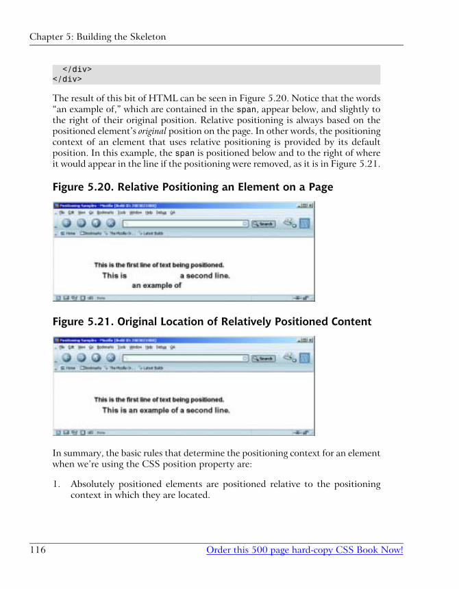
</div></div>
The result of this bit of HTML can be seen in Figure 5.20. Notice that the words
“an example of,” which are contained in the span, appear below, and slightly to
the right of their original position. Relative positioning is always based on the
positioned element’s original position on the page. In other words, the positioning
context of an element that uses relative positioning is provided by its default
position. In this example, the span is positioned below and to the right of where
it would appear in the line if the positioning were removed, as it is in Figure 5.21.
Figure 5.20. Relative Positioning an Element on a Page
Figure 5.21. Original Location of Relatively Positioned Content
In summary, the basic rules that determine the positioning context for an element
when we’re using the CSS position property are:
1. Absolutely positioned elements are positioned relative to the positioning
context in which they are located.
Chapter 5: Building the Skeleton
Order this 500 page hard-copy CSS Book Now!116
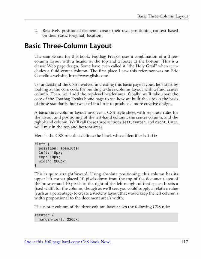
2. Relatively positioned elements create their own positioning context based
on their static (original) location.
Basic Three-Column LayoutThe sample site for this book, Footbag Freaks, uses a combination of a three-
column layout with a header at the top and a footer at the bottom. This is a
classic Web page design. Some have even called it “the Holy Grail” when it in-
cludes a fluid center column. The first place I saw this reference was on Eric
Costello’s website, http://www.glish.com/.
To understand the CSS involved in creating this basic page layout, let’s start by
looking at the core code for building a three-column layout with a fluid center
column. Then, we’ll add the top-level header area. Finally, we’ll take apart the
core of the Footbag Freaks home page to see how we built the site on the basis
of those standards, but tweaked it a little to produce a more creative design.
A basic three-column layout involves a CSS style sheet with separate rules for
the layout and positioning of the left-hand column, the center column, and the
right-hand column. We’ll call these three sections left, center, and right. Later,
we’ll mix in the top and bottom areas.
Here is the CSS rule that defines the block whose identifier is left:
#left { position: absolute; left: 10px; top: 10px; width: 200px;}
This is quite straightforward. Using absolute positioning, this column has its
upper left corner placed 10 pixels down from the top of the document area of
the browser and 10 pixels to the right of the left margin of that space. It sets a
fixed width for the column, though as we’ll see, you could supply a relative value
(such as a percentage) to create a stretchy layout that would keep the left column’s
width proportional to the document area’s width.
The center column of the three-column layout uses the following CSS rule:
#center { margin-left: 220px;
117Order this 500 page hard-copy CSS Book Now!
Basic Three-Column Layout
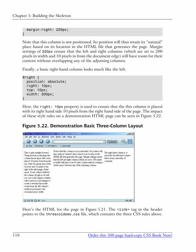
margin-right: 220px;}
Note that this column is not positioned. Its position will thus retain its “natural”
place based on its location in the HTML file that generates the page. Margin
settings of 220px ensure that the left and right columns (which are set to 200
pixels in width and 10 pixels in from the document edge) will have room for their
content without overlapping any of the adjoining columns.
Finally, a basic right-hand column looks much like the left:
#right { position: absolute; right: 10px; top: 10px; width: 200px;}
Here, the right: 10px property is used to ensure that the this column is placed
with its right hand side 10 pixels from the right hand side of the page. The impact
of these style rules on a demonstration HTML page can be seen in Figure 5.22.
Figure 5.22. Demonstration Basic Three-Column Layout
Here’s the HTML for the page in Figure 5.21. The <link> tag in the header
points to the threecoldemo.css file, which contains the three CSS rules above.
Chapter 5: Building the Skeleton
Order this 500 page hard-copy CSS Book Now!118
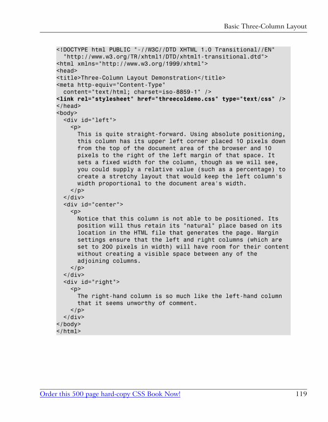
<!DOCTYPE html PUBLIC "-//W3C//DTD XHTML 1.0 Transitional//EN" "http://www.w3.org/TR/xhtml1/DTD/xhtml1-transitional.dtd"><html xmlns="http://www.w3.org/1999/xhtml"><head><title>Three-Column Layout Demonstration</title><meta http-equiv="Content-Type" content="text/html; charset=iso-8859-1" /><link rel="stylesheet" href="threecoldemo.css" type="text/css" /></head><body> <div id="left"> <p> This is quite straight-forward. Using absolute positioning, this column has its upper left corner placed 10 pixels down from the top of the document area of the browser and 10 pixels to the right of the left margin of that space. It sets a fixed width for the column, though as we will see, you could supply a relative value (such as a percentage) to create a stretchy layout that would keep the left column's width proportional to the document area's width. </p> </div> <div id="center"> <p> Notice that this column is not able to be positioned. Its position will thus retain its "natural" place based on its location in the HTML file that generates the page. Margin settings ensure that the left and right columns (which are set to 200 pixels in width) will have room for their content without creating a visible space between any of the adjoining columns. </p> </div> <div id="right"> <p> The right-hand column is so much like the left-hand column that it seems unworthy of comment. </p> </div></body></html>
119Order this 500 page hard-copy CSS Book Now!
Basic Three-Column Layout
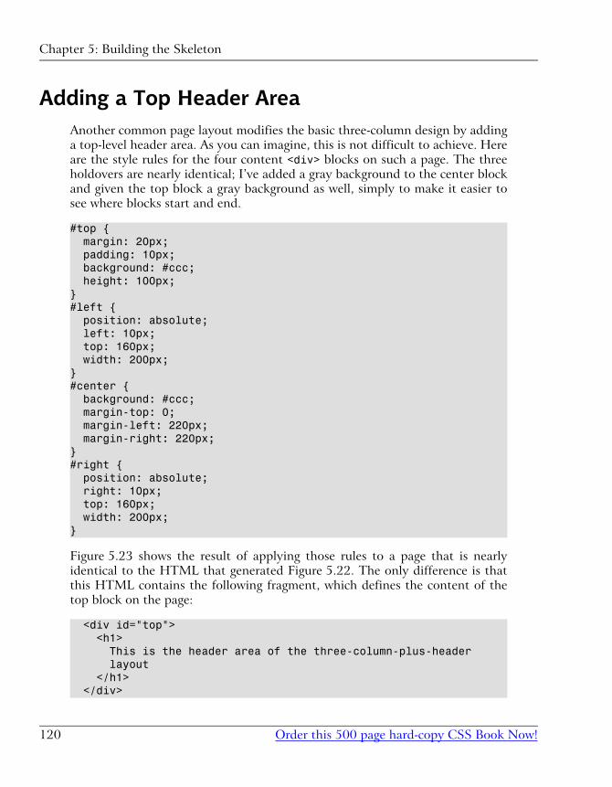
Adding a Top Header AreaAnother common page layout modifies the basic three-column design by adding
a top-level header area. As you can imagine, this is not difficult to achieve. Here
are the style rules for the four content <div> blocks on such a page. The three
holdovers are nearly identical; I’ve added a gray background to the center block
and given the top block a gray background as well, simply to make it easier to
see where blocks start and end.
#top { margin: 20px; padding: 10px; background: #ccc; height: 100px;}#left { position: absolute; left: 10px; top: 160px; width: 200px;}#center { background: #ccc; margin-top: 0; margin-left: 220px; margin-right: 220px;}#right { position: absolute; right: 10px; top: 160px; width: 200px;}
Figure 5.23 shows the result of applying those rules to a page that is nearly
identical to the HTML that generated Figure 5.22. The only difference is that
this HTML contains the following fragment, which defines the content of the
top block on the page:
<div id="top"> <h1> This is the header area of the three-column-plus-header layout </h1> </div>
Chapter 5: Building the Skeleton
Order this 500 page hard-copy CSS Book Now!120
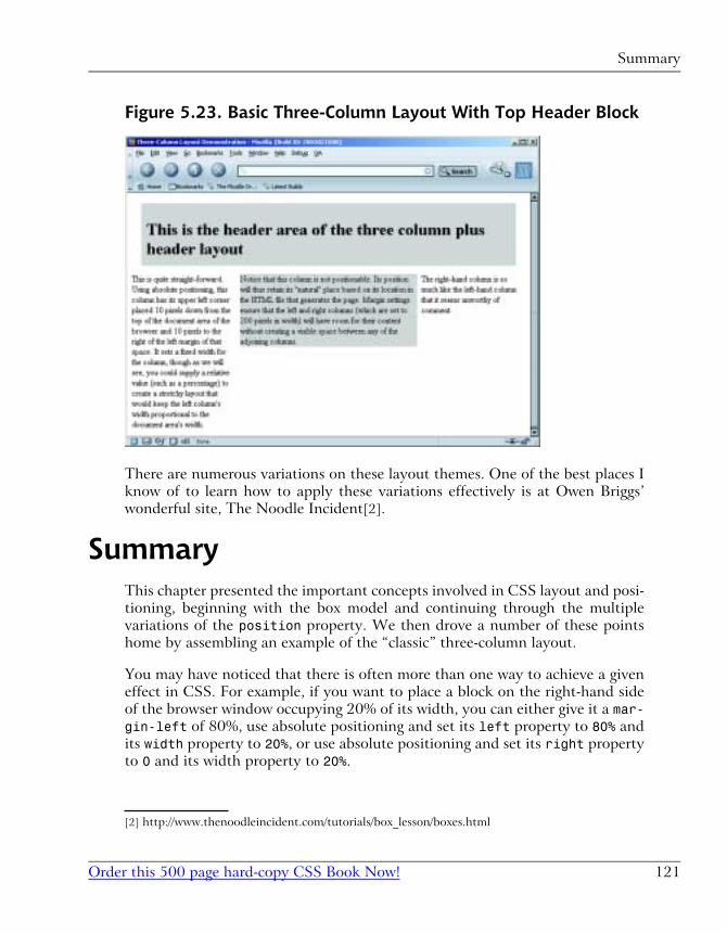
Figure 5.23. Basic Three-Column Layout With Top Header Block
There are numerous variations on these layout themes. One of the best places I
know of to learn how to apply these variations effectively is at Owen Briggs’
wonderful site, The Noodle Incident[2].
SummaryThis chapter presented the important concepts involved in CSS layout and posi-
tioning, beginning with the box model and continuing through the multiple
variations of the position property. We then drove a number of these points
home by assembling an example of the “classic” three-column layout.
You may have noticed that there is often more than one way to achieve a given
effect in CSS. For example, if you want to place a block on the right-hand side
of the browser window occupying 20% of its width, you can either give it a mar-gin-left of 80%, use absolute positioning and set its left property to 80% and
its width property to 20%, or use absolute positioning and set its right property
to 0 and its width property to 20%.
[2] http://www.thenoodleincident.com/tutorials/box_lesson/boxes.html
121Order this 500 page hard-copy CSS Book Now!
Summary
In Chapter 6, we'll see that not all of these options work quite the same in practice.
We'll explore some of the non-ideal behaviors of current browsers that lead us
to choose one option over the another. We'll also look at a few more advanced
CSS properties that affect the layout relationships of elements on the page.
Chapter 5: Building the Skeleton
Order this 500 page hard-copy CSS Book Now!122
Appendix C. CSS PropertyReference
This appendix contains a complete reference to all CSS properties at the time of
this writing. This includes properties defined in the CSS1[1] and CSS2[2] spe-
cifications, as well as browser-specific extensions to the CSS recommendations.
Where a browser-specific extension exposes the same functionality as a planned
feature in CSS3, which is currently a working draft, this is indicated with a refer-
ence to the relevant draft.
azimuthazimuth sets the direction in horizontal space from which the sound comes when
the content is presented aurally (e.g. in a speaking browser for the blind).
For full details on this property, see the CSS2 specification[3].
Inherited: Yes
See also: elevation
Value
An angle (-360deg to 360deg, where 0deg is in front of the listener), or a descript-
ive constant (e.g. far-right behind).
Initial value: center
Compatibility
CSS Version: 2
Not yet supported by any browser.
[1] http://www.w3.org/TR/REC-CSS1
[2] http://www.w3.org/TR/REC-CSS2/
[3] http://www.w3.org/TR/REC-CSS2/aural.html#spatial-props
Examples
This style rule will cause all headings to be heard from the front-left of the sound
field:
h1, h2, h3, h4, h5, h6 { azimuth: -45deg;}
backgroundA shorthand property that allows you to set all the background properties of an
element with a single property declaration.
Inherited: No
See also: background-attachment, background-color, background-image,
background-position, and background-repeat
Value
You can specify any of the values permitted by the five background- properties,
in any order, separated by spaces. The properties you do not specify take on their
initial value.
Initial value: none
Compatibility
CSS Version: 1
Is supported by Internet Explorer 4 or later, Netscape 6 or later, Opera 5 or later,
and all Mozilla browsers. Is partially supported by Netscape 4.x; however, this
support is undocumented and unreliable.
Examples
This rule gives the page a fixed (non-scrolling) background image, which will
display over a solid white background:
Appendix C. CSS Property Reference
Order this 500 page hard-copy CSS Book Now!310
body { background: #fff url(/images/texture.gif) fixed;}
background-attachmentThis property determines whether the background image assigned to an element
scrolls in sync with the element's content or remains fixed in relation to the
browser window. For example, if you wanted the top-left corner of your page
background image to remain in the top-left corner of the browser window, even
as the page was scrolled, you would set background-attachment to fixed.
Inherited: No
See also: background-image
Value
fixed or scroll
Initial value: scroll
Compatibility
CSS Version: 1
Supported by Internet Explorer 4 or later, Netscape 6 or later, Opera 5 or later,
and all Mozilla browsers.
Internet Explorer for Windows (at least up to version 6) and Opera browsers (up
to version 6), do not correctly support background-attachment: fixed on ele-
ments besides body. Opera 7, Internet Explorer 5 for Macintosh, Netscape 6.2.1
or later, and Mozilla browsers all get this right.
Examples
This style rule applies a background image to the page and specifies that the image
should not scroll with the page content:
body { background-image: url(/images/texture.gif);
311Order this 500 page hard-copy CSS Book Now!
background-attachment
background-attachment: fixed;}
background-colorSets the background color for an element.
Note that the default background color is transparent, so even though this
property is not inherited, nested elements will allow the background to show
through by default. The reason for this arrangement is to allow background images
to be displayed behind nested elements.
It is considered good practice always to specify a foreground color (with the
color property) whenever you specify a background color, and vice versa.
Inherited: No
See also: color
Value
Any CSS color value (see Appendix B) or transparent.
Initial value: transparent
Compatibility
CSS Version: 1
Works in all CSS-compatible browsers, including Internet Explorer 4 or later and
Netscape 4 or later.
Netscape 4 does not correctly fill a block element with its assigned background
color, unless it has a border assigned (even a zero-width border will do), and
setting any visible border leaves a transparent gap between the padding area of
the block and its border in that browser. The Netscape 4 specific layer-back-ground-color property lets you fill that transparent gap.
Appendix C. CSS Property Reference
Order this 500 page hard-copy CSS Book Now!312
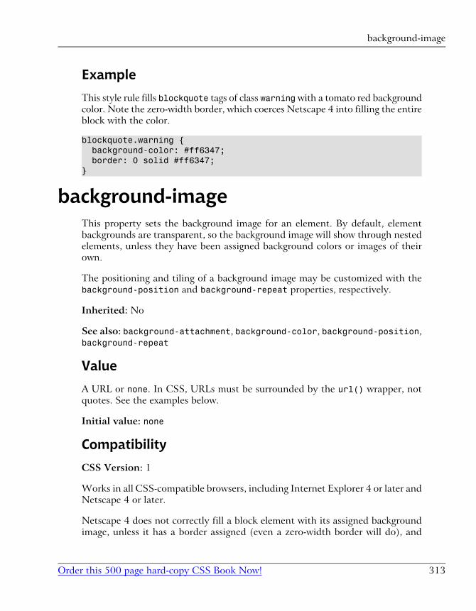
Example
This style rule fills blockquote tags of class warning with a tomato red background
color. Note the zero-width border, which coerces Netscape 4 into filling the entire
block with the color.
blockquote.warning { background-color: #ff6347; border: 0 solid #ff6347;}
background-imageThis property sets the background image for an element. By default, element
backgrounds are transparent, so the background image will show through nested
elements, unless they have been assigned background colors or images of their
own.
The positioning and tiling of a background image may be customized with the
background-position and background-repeat properties, respectively.
Inherited: No
See also: background-attachment, background-color, background-position,
background-repeat
Value
A URL or none. In CSS, URLs must be surrounded by the url() wrapper, not
quotes. See the examples below.
Initial value: none
Compatibility
CSS Version: 1
Works in all CSS-compatible browsers, including Internet Explorer 4 or later and
Netscape 4 or later.
Netscape 4 does not correctly fill a block element with its assigned background
image, unless it has a border assigned (even a zero-width border will do), and
313Order this 500 page hard-copy CSS Book Now!
background-image
setting any visible border leaves a transparent gap between the padding area of
the block and its border in that browser. The Netscape 4 specific layer-back-ground-image property lets you fill that transparent gap.
Example
These style rules demonstrate assigning background images with relative, absolute,
and fully-qualified URLs, respectively:
body { background-image: url(../images/texture.gif);}
body { background-image: url(/images/texture.gif);}
body { background-image: url(http://www.mysite.com/images/texture.gif);}
background-positionBy default, an element's background image (assigned with the background-imageproperty) is aligned so that its top and left edges are flush with the top and left
edges of the element (including any padding), respectively. With the background-position property, you can assign a different position for the image.
Inherited: No
See also: background-image
Value
One position specifier, or two position specifiers separated by a space.
Each of the position specifiers may be a CSS length measurement (pixels, points,
ems, etc.), a percentage, or one of the constants from Table C.1.
Table C.1. background-position constants
HorizontalVertical
Appendix C. CSS Property Reference
Order this 500 page hard-copy CSS Book Now!314
left, center, righttop, center, bottom
If you specify only one measurement or percentage, it applies to the horizontal
position; the vertical position of the image will default to 50%. If you specify two
measurements or percentages, the first specifies the horizontal position, the
second specifies the vertical. Negative measurements/percentages are allowed,
but are rarely useful.
If you specify only one constant, the other dimension defaults to center. The
order of constants is not significant.
You can mix length measurement types and percentages (i.e. specify vertical po-
sition in one format, horizontal in another). You cannot mix lengths/percentages
with constants, however.
Percentages and constants differ from length measurements in the way they pos-
ition the image. In an element 500 pixels wide, a horizontal position of centeror 50% will center the image within the horizontal area of the element. A horizontal
position of 250px, however (or any equivalent length measurement), positions
the left edge of the image exactly 250 pixels from the left edge of the element.
Initial value: 0 0
Compatibility
CSS Version: 2
Works in Internet Explorer 4 or later, Netscape 6 or later, Opera, and Mozilla
browsers.
Setting a non-default value for this property in Internet Explorer 4 for Windows
reveals a bug in that browser's support of background-repeat. See the compat-
ibility section of background-repeat for details.
Examples
In this style rule, the background image is centered in the element area:
body { background-position: center;}
315Order this 500 page hard-copy CSS Book Now!
background-position
In both of these style rules, the background image is placed flush against the
bottom-right corner of the element:
body { background-position: 100% 100%;}
body { background-position: bottom right;}
In this style rule, the background image's left edge will be positioned 20 pixels
from the left of the element, and the image will be centered vertically:
body { background-position: 20px;}
In this style rule, the background image's top edge is 20 pixels from the top of
the element, and the image will be centered horizontally across the element's
width:
body { background-position: 50% 20px;}
The following style rule is illegal, as it mixes a length measurement with a constant:
body { background-position: 20px center; /* This is illegal! */}
background-position-x, background-pos-ition-y
These nonstandard properties are supported only by Internet Explorer browsers,
and let you individually specify the two components of the background-positionproperty. These properties are most useful in Dynamic HTML scripting in an
Internet Explorer only environment.
Inherited: No
See also: background-position
Appendix C. CSS Property Reference
Order this 500 page hard-copy CSS Book Now!316
Value
Both of these properties support values specified in CSS lengths and percentages.
Additionally, background-position-x and background-position-y support
the horizontal and vertical position constants listed in Table C.1. Important
differences between positions specified with CSS length measurements, and pos-
itions specified with percentages or constants, are described under background-position.
Initial value: 0
Compatibility
CSS Version: n/a
Supported by Internet Explorer 4 or later only.
Example
This style rule places the background image 20 pixels from the top and centered
horizontally on the page:
body { background-position-x: center; background-position-y: 20px;}
background-repeatBy default, a background image, specified with the background-image property,
will repeat horizontally and vertically to fill the element (this is often referred to
as tiling). The background-repeat property lets you override that behavior with
your own preferences.
Inherited: No
See also: background-image, background-position
Value
repeat, no-repeat, repeat-x, or repeat-y
317Order this 500 page hard-copy CSS Book Now!
background-repeat
The first two options are self-explanatory. repeat-x causes the image to repeat
only horizontally, effectively forming a horizontal band with the background
image. repeat-y causes the image to repeat only vertically, forming a vertical
band.
Initial value: repeat
Compatibility
CSS Version: 1
Works in all CSS-compatible browsers, including Internet Explorer 4 or later and
Netscape 4 or later.
Internet Explorer 4 for Windows, however, only tiles images down and to the
right (not up or to the left), so if you specify a background-position other than
the default, you may get incomplete tiling in that browser.
Example
This style rule uses background-repeat and background-position to create a
horizontal band 50 pixels down from the top of the page. We keep the left edge
of the background image flush against the left margin to avoid the bug in Internet
Explorer 4 for Windows.
body { background-repeat: repeat-x; background-position: 0 50px;}
behaviorAn Internet Explorer only property, behavior lets you assign packaged Dynamic
HTML code to HTML elements in bulk. For a full description of the Behaviors
feature in Internet Explorer, refer to the MSDN Web site[4].
Inherited: No
[4] http://msdn.microsoft.com/workshop/author/behaviors/overview.asp
Appendix C. CSS Property Reference
Order this 500 page hard-copy CSS Book Now!318
Value
A URL (specified with the CSS url() wrapper) or an object ID.
Initial value: none
Compatibility
CSS Version: n/a
Attached behaviors are supported by Internet Explorer 5 for Windows or later.
Other behavior types are supported by Internet Explorer 5.5 for Windows or
later.
Example
The following style rule applies the behavior defined in the draganddrop.htcfile to any element of class draganddrop:
.draganddrop { behavior: url(draganddrop.htc);}
borderA shorthand property that lets you set the same width, color, and style for all
four borders of an element with a single property declaration. This property sets
up identical borders on all four sides, but can be followed by side-specific border
properties that modify them.
Inherited: No
See also: border-width, border-style, and border-color
Value
You can specify a border-width value, a border-style value, and a border-color value, or any combination of the three, in any order, separated by spaces.
Initial value: none
319Order this 500 page hard-copy CSS Book Now!
border
Compatibility
CSS Version: 1
Works on all CSS-compatible browsers, with the same browser-specific limitations
as the individual border- properties.
Example
This style rule puts a dashed, yellow border 1 pixel wide around div tags of class
advertisement:
div.advertisement { border: dashed yellow 1px;}
border-bottom, border-left, border-right,border-top
These four properties are shorthand properties that let you set the style, width,
and color of the border on a particular side of an element with single property
declaration.
Inherited: No
See also: border-width, border-style, and border-color
Value
You can specify a border-width value, a border-style value, and a border-color value, or any combination of the three, in any order, separated by spaces.
Initial value: none
Compatibility
CSS Version: 1
Works in all CSS-compatible browsers, with exception of Netscape 4.
Appendix C. CSS Property Reference
Order this 500 page hard-copy CSS Book Now!320
Example
Applies a 1 pixel thick, dashed, blue border to the bottom of elements with a
title attribute:
[title] { border-bottom: dashed blue 1px;}
Note that attribute selectors are not yet supported by many browsers.
border-bottom-color, border-left-color,border-right-color, border-top-color
Each of these properties sets the color of the border along one side of an element.
Inherited: No
See also: border-color
Value
Any CSS color value (see Appendix B).
Initial value: none
Compatibility
CSS Version: 2
Works in all CSS-compatible browsers, with exception of Netscape 4.
Examplep.funky { border-style: solid; border-top-color: blue; border-right-color: yellow; border-bottom-color: #ff0000; border-left-color: #0f0;}
321Order this 500 page hard-copy CSS Book Now!
border-bottom-color, border-left-color, border-right-color, border-top-color
border-bottom-style, border-left-style,border-right-style, border-top-style
Each of these properties sets the style of the border along one side of an element.
Inherited: No
See also: border-style
Value
Any of the constants allowed for border-style.
Initial value: none
Compatibility
CSS Version: 2
Works in all CSS-compatible browsers, with exception of Netscape 4.
Example
This style rule puts double lines along the left and right and single lines along
the top and bottom of blockquote elements:
blockquote { border-top-style: solid; border-bottom-style: solid; border-left-style: double; border-right-style: double;}
border-bottom-width, border-left-width,border-right-width, border-top-width
Each of these properties sets the width of the border along one side of an element.
Inherited: No
Appendix C. CSS Property Reference
Order this 500 page hard-copy CSS Book Now!322
See also: border-width
Value
thin, medium, thick, or any CSS length measurement.
Initial value: medium (0 in Netscape 4)
Compatibility
CSS Version: 1
Works in all CSS-compatible browsers, including Internet Explorer 4 or later and
Netscape 4 or later.
Note that Netscape 4's default value is 0, so you need to set the border width as
well as the style for borders to appear in that browser.
Example
This style rule puts 2-pixel borders along the left and right and 1-pixel borders
along the top and bottom of blockquote elements:
blockquote { border-style: solid; border-top-width: 1px; border-bottom-width: 1px; border-left-width: 2px; border-right-width: 2px;}
border-collapseThis property lets you choose which of two systems for defining table borders
you want the browser to use.
The default system, which you can select with the value separate, is the familiar
“separate borders” system, where each table cell has its own borders separated
by the cell spacing of the table. The new system, which you can select with the
collapse value, gets rid of any cell spacing, combines the borders of adjacent
323Order this 500 page hard-copy CSS Book Now!
border-collapse
cells, and lets you assign borders to row and column groups. For full details, refer
to the CSS2 specification[5].
Inherited: Yes
See also: empty-cells
Value
collapse or separate
Initial value: separate1
Compatibility
CSS Version: 2
Works in Internet Explorer 5 for Windows, Netscape 6, and Mozilla browsers.
Example
This style rule sets tables of class data to use the collapsed border model:
table.data { border-collapse: collapse;}
border-colorThe border-color property sets the color of the border surrounding the selected
element(s).
The colors for each side may be set individually using the border-bottom-color,
border-left-color, border-right-color, and border-top-color properties.
Inherited: No
[5] http://www.w3.org/TR/REC-CSS2/tables.html#borders1The initial value prescribed by the CSS2 specification is actually collapse; however, all current
browsers' default table rendering corresponds to separate. The CSS Working Group has therefore
proposed changing the default value of this property to separate in a future version of the CSS
specification. This proposal may be found in the Errata for the CSS2 specification.
Appendix C. CSS Property Reference
Order this 500 page hard-copy CSS Book Now!324
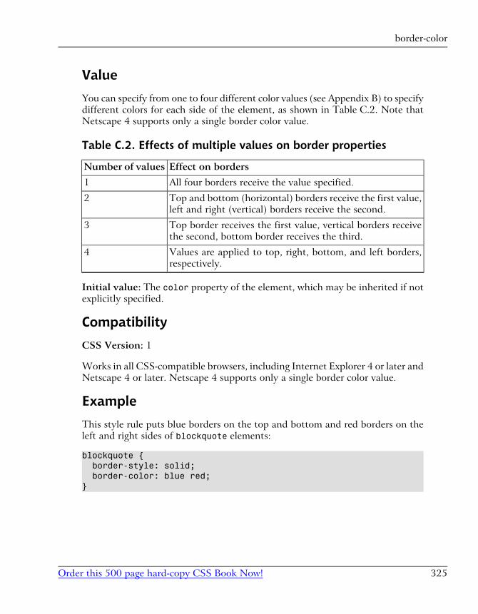
Value
You can specify from one to four different color values (see Appendix B) to specify
different colors for each side of the element, as shown in Table C.2. Note that
Netscape 4 supports only a single border color value.
Table C.2. Effects of multiple values on border properties
Effect on bordersNumber of values
All four borders receive the value specified.1
Top and bottom (horizontal) borders receive the first value,
left and right (vertical) borders receive the second.
2
Top border receives the first value, vertical borders receive
the second, bottom border receives the third.
3
Values are applied to top, right, bottom, and left borders,
respectively.
4
Initial value: The color property of the element, which may be inherited if not
explicitly specified.
Compatibility
CSS Version: 1
Works in all CSS-compatible browsers, including Internet Explorer 4 or later and
Netscape 4 or later. Netscape 4 supports only a single border color value.
Example
This style rule puts blue borders on the top and bottom and red borders on the
left and right sides of blockquote elements:
blockquote { border-style: solid; border-color: blue red;}
325Order this 500 page hard-copy CSS Book Now!
border-color
border-spacingThis property is the CSS equivalent to the cellspacing attribute of the HTML
<table> tag. It lets you specify the spacing that will appear between cells in a
table. This property is ignored if border-collapse is set to collapse for the
table.
Inherited: Yes
See also: border-collapse
Value
A single CSS length measurement, or two lengths separated by a space. A single
value will be applied as both the horizontal and vertical spacing between cells.
Two values will be applied as horizontal and vertical spacing, respectively.
Initial value: 0
Compatibility
CSS Version: 2
Supported by Netscape 6 and Mozilla browsers only at this time.
Example
This style rule allows 5 pixels of spacing between all table cells in tables of class
spacious.
table.spacious { border-spacing: 5px;}
border-styleThe border-style property sets the style of the border surrounding the selected
element(s).
The style for each side may be set individually, using the border-bottom-style,
border-left-style, border-right-style, and border-top-style properties.
Appendix C. CSS Property Reference
Order this 500 page hard-copy CSS Book Now!326
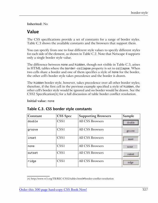
Inherited: No
Value
The CSS specifications provide a set of constants for a range of border styles.
Table C.3 shows the available constants and the browsers that support them.
You can specify from one to four different style values to specify different styles
for each side of the element, as shown in Table C.2. Note that Netscape 4 supports
only a single border style value.
The difference between none and hidden, though not visible in Table C.3, arises
in HTML tables where the border-collapse property is set to collapse. When
two cells share a border and one of them specifies a style of none for the border,
the other cell's border style takes precedence and the border is drawn.
The hidden border style, however, takes precedence over all other border styles;
therefore, if the first cell in the previous example specified a style of hidden, the
other cell's border style would be ignored and no border would be drawn. See the
CSS2 Specification[6] for a full discussion of table border conflict resolution.
Initial value: none
Table C.3. CSS border style constants
SampleSupporting BrowsersCSS SpecConstant
All CSS BrowsersCSS1double
All CSS BrowsersCSS1groove
All CSS BrowsersCSS1inset
All CSS BrowsersCSS1none
All CSS BrowsersCSS1outset
All CSS BrowsersCSS1ridge
[6] http://www.w3.org/TR/REC-CSS2/tables.html#border-conflict-resolution
327Order this 500 page hard-copy CSS Book Now!
border-style
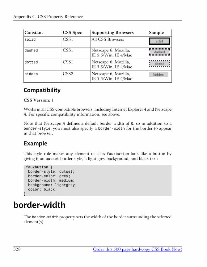
SampleSupporting BrowsersCSS SpecConstant
All CSS BrowsersCSS1solid
Netscape 6, Mozilla,
IE 5.5/Win, IE 4/Mac
CSS1dashed
Netscape 6, Mozilla,
IE 5.5/Win, IE 4/Mac
CSS1dotted
Netscape 6, Mozilla,
IE 5.5/Win, IE 4/Mac
CSS2hidden
Compatibility
CSS Version: 1
Works in all CSS-compatible browsers, including Internet Explorer 4 and Netscape
4. For specific compatibility information, see above.
Note that Netscape 4 defines a default border width of 0, so in addition to a
border-style, you must also specify a border-width for the border to appear
in that browser.
Example
This style rule makes any element of class fauxbutton look like a button by
giving it an outset border style, a light grey background, and black text:
.fauxbutton { border-style: outset; border-color: grey; border-width: medium; background: lightgrey; color: black;}
border-widthThe border-width property sets the width of the border surrounding the selected
element(s).
Appendix C. CSS Property Reference
Order this 500 page hard-copy CSS Book Now!328
The widths for each side may be set individually using the border-bottom-width,
border-left-width, border-right-width, and border-top-width properties.
Inherited: No
Value
thin, medium, thick, or any CSS length measurement.
You can specify from one to four different values to specify different border
widths for each side of the element, as shown in Table C.2.
Initial value: medium (0 in Netscape 4)
Compatibility
CSS Version: 1
Works in all CSS-compatible browsers, including Internet Explorer 4 and Netscape
4.
Note that Netscape 4 defines a default border width of 0, so in addition to a
border-style, you must also specify a border-width for the border to appear
in that browser.
Example
This style rule puts thick borders on the top and bottom and thin borders on the
left and right sides of blockquote elements:
blockquote { border-style: solid; border-width: thick thin;}
bottomThis property lets you set the distance between the bottom edge of an absolutepositioned element (including its padding, border, and margin)2 and the bottom
2The CSS2 specification contains an error that suggests that the padding, border, and margin of the
positioned element should not be considered. This has been acknowledged as a mistake by the CSS
Working Group in the Errata document for CSS2.
329Order this 500 page hard-copy CSS Book Now!
bottom
edge of the positioning context in which it resides. The positioning context is the
content area of the element's nearest ancestor that has a position property value
other than static, or the body element.
In Internet Explorer for Windows, Netscape 6, and Mozilla browsers, when the
positioning context is the document body, the element is positioned relative to
the bottom edge of the browser window (when no scrolling has yet occurred) instead
of the document area, as the CSS Specification requires. Internet Explorer 5 for
Macintosh follows the specification and positions the block relative to the bottom
of the document area.
For relative positioned elements, this property sets a relative offset from the
normal position of its bottom edge. So, a setting of 10px will shift the bottom
edge of the box up by 10 pixels, and a setting of -10px will shift it down by the
same amount.
Inherited: No
See also: position, left, top, and right
Value
A CSS length measurement, a percentage value, or the auto constant. Percentages
are based on the height of the parent element. The auto constant tells the browser
to determine the position of the bottom edge itself, based on whatever other
constraints may exist on the size/position of the element.
Initial value: auto
Compatibility
CSS Version: 2
Works in Internet Explorer 5 or later, Netscape 6 or later, and Mozilla browsers.
Often, the same effect can be achieved by setting the top property of a box. Since
top is supported by more browsers than bottom, this should be done whenever
possible.
Appendix C. CSS Property Reference
Order this 500 page hard-copy CSS Book Now!330
Example
This style rule positions the element with ID menu at the bottom of the window
(or the bottom of the document in Internet Explorer for Macintosh):
#menu { position: absolute; bottom: 0; width: 100px; height: 200px;}
caption-sideThis property lets you specify the side of a table on which its caption (specified
with the <caption> tag) should appear.
Inherited: Yes
Value
Any of the following constants: top, bottom, left, or right.
Initial value: top
Compatibility
CSS Version: 2
Works in Internet Explorer 5 for Macintosh, Netscape 6 or later, and Mozilla
browsers. The values left and right do not yet work in most browsers.
Example
This style rule places captions at the bottom of all tables that occur within other
tables.
table table { caption-side: bottom;}
331Order this 500 page hard-copy CSS Book Now!
caption-side
clearSetting a clear property on an element lets you specify that it should appear
below any floating elements that would normally cut into it. You can specify that
the element should be clear of left-floated elements, right-floated elements, or
both.
Inherited: No
See also: float
Value
left, right, none, or both.
Initial value: none
Compatibility
CSS Version: 1
Works in all CSS-compatible browsers, including Internet Explorer 4 or later,
Netscape 4 or later, and Mozilla browsers.
Example
This style rule ensures that the element with ID footer will be clear of any
floating elements above it in the page:
#footer { clear: both;}
clipThis property clips the visible region of the absolute- or fixed-positioned element(s)
to which it is applied. The element occupies the same amount of space on the
page as usual, but only the area specified by this property is displayed.
Appendix C. CSS Property Reference
Order this 500 page hard-copy CSS Book Now!332
In contrast to the overflow property, this property only affects the visible area
of an element (including its padding, borders, etc.). The size and position of an
element for layout purposes is not affected by this property.
Inherited: No
See also: overflow
Value
The current CSS specification allows only for rectangular clipping regions. You
specify such a region by wrapping four measurement values in the CSS rect()wrapper as follows:
clip: rect(top right bottom left);
For an element x pixels wide and y pixels high, the default clipping region (assum-
ing it has no borders or padding to increase its rendered area) would be rect(0pxxpx ypx 0). To trim off 10 pixels from each side of the image, you'd change this
to rect(10px x-10px y-10px 10px), where you would calculate and substitute
the actual values of x-10 and y-10.
The default value, auto, lets the browser determine the area of the element to
draw, as usual.
Initial value: auto
Compatibility
CSS Version: 2
Works in all CSS-compatible browsers, including Internet Explorer 4 or later,
Netscape 4 or later, and Mozilla browsers. This property is buggy in Internet
Explorer 4 for Macintosh and can cause affected elements to be left out of
scrollbar size calculations in Netscape 4.
Example
This style rule will clip 10 pixels off the left and right sides of the element with
ID logo, which is a 100 x 100 pixel image:
#logo { position: absolute;
333Order this 500 page hard-copy CSS Book Now!
clip
clip: rect(0px 90px 100px 10px);}
colorThis property sets the foreground (text) color of the element. This property also
defines the default border color of the element.
In general, you should always specify a background color when you specify a
foreground color, and vice versa.
Inherited: Yes
See also: background-color
Value
Any CSS color value (see Appendix B).
Initial value: black
Compatibility
CSS Version: 1
Works in all CSS-compatible browsers including Internet Explorer 4 or later,
Netscape 4 or later, and Mozilla browsers.
Example
This style rule sets paragraphs of class warning to have white text on a tomato
red background.
p.warning { color: white; background-color: #ff6347;}
Appendix C. CSS Property Reference
Order this 500 page hard-copy CSS Book Now!334
contentSometimes it makes sense to generate some text at the beginning or end of an
element as part of that element's style. Termed generated content, this text is
not part of the HTML document, but is generated purely by the style sheet. The
CSS content property is intended for this purpose. You must apply it to the
:before or :after pseudo-elements, as shown in the examples below.
Inherited: No
See also: counter-increment, counter-reset, quotes
Value
The CSS2 specification mandates a number of different generated content formats,
but several are not yet supported by current browsers (see the Compatibility
section for details). You can use any combination of the following content formats
by listing them one after the other, separated by spaces.
"arbitrary string"This format lets you place a string of text before or after the actual content
of the element. You cannot format this text by placing HTML code in the
string—the browser will display the tags as text. Instead, use CSS to style the
string, as in the examples below. The special code \A in the string produces
a line break (same effect as an HTML <br> tag).
url(http://url.goes.here)This format lets you place some external resource before or after the actual
content of the element. For example, if you supply a URL to an image, the
browser should place that image before/after the content of the element. If
you supply a URL to an HTML document, the browser should display the
contents of the document before/after the content of the element.
There are obvious complexities that come into play here, but since no browsers
yet support this format, any further discussion would be purely academic.
335Order this 500 page hard-copy CSS Book Now!
content
counter(name)counter(name, style)counters(name, string)counters(name, string, style)
These formats let you generate numbered elements (for example, numbered
section headings) without having to resort to an ordered list (<ol>) in the
HTML document. You must define, increment, and reset your counters when
appropriate using the counter-increment and counter-reset CSS properties,
and then use one of the above formats to display the value of a counter where
desired.
counter(name) will display the value of the named counter in decimal format,
while counter(name, style) lets you specify the style in which to display
the counter value (you can use any style allowed by the list-style-typeCSS property). You can also define hierarchical counters to produce multiple-
level numbering (e.g. “Section 5.2.3”), the values of which you can output
with counters(name, string) or counters(name, string, style). The
string argument specifies the string that is used to separate the numbers,
and is typically a period (".").
attr(attribute)This format lets you output the value of an attribute of the element (e.g. the
title attribute of an <a> tag) before or after the actual content of the ele-
ment.
open-quoteclose-quote
These formats let you display opening or closing quotation marks, the exact
appearance of which are dictated by the CSS quotes property.
no-open-quoteno-close-quote
These formats let you put 'fake' opening or closing quotes that don't actually
display anything, but which still jump in and out of nesting levels defined in
the quotes property.
Initial value: "" (the empty string)
Compatibility
CSS Version: 2
Appendix C. CSS Property Reference
Order this 500 page hard-copy CSS Book Now!336
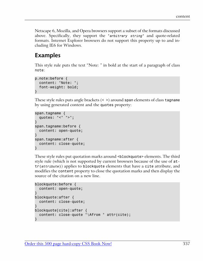
Netscape 6, Mozilla, and Opera browsers support a subset of the formats discussed
above. Specifically, they support the "arbitrary string" and quote-related
formats. Internet Explorer browsers do not support this property up to and in-
cluding IE6 for Windows.
Examples
This style rule puts the text “Note: ” in bold at the start of a paragraph of class
note:
p.note:before { content: "Note: "; font-weight: bold;}
These style rules puts angle brackets (< >) around span elements of class tagnameby using generated content and the quotes property:
span.tagname { quotes: "<" ">";}span.tagname:before { content: open-quote;}span.tagname:after { content: close-quote;}
These style rules put quotation marks around <blockquote> elements. The third
style rule (which is not supported by current browsers because of the use of at-tr(attribute)) applies to blockquote elements that have a cite attribute, and
modifies the content property to close the quotation marks and then display the
source of the citation on a new line.
blockquote:before { content: open-quote;}blockquote:after { content: close-quote;}blockquote[cite]:after { content: close-quote "\Afrom " attr(cite);}
337Order this 500 page hard-copy CSS Book Now!
content
Also unsupported by current browsers, these style rules should place a standard
HTML header and footer on the current page:
body:before { content: url(standardheader.html);}body:after { content: url(standardfooter.html);}
counter-incrementThis property increments or decrements a named counter (for display with the
content property) for each occurrence of the selected element(s).
On nested elements, a hierarchical counter is automatically created, so that you
effectively have a separate counter at each level of the structure.
Inherited: No
See also: content, counter-reset
Value
A counter name, optionally followed by a positive or negative integer to indicate
how much to increment (positive) or decrement (negative) the counter. If you
want to increment/decrement multiple counters for a single element, you can
separate their names (and optional integers) by spaces.
The default value, none is also supported, but is of little practical use.
Initial value: none
Compatibility
CSS Version: 2
Not supported by any currently-available browser.
Appendix C. CSS Property Reference
Order this 500 page hard-copy CSS Book Now!338
Examples
This simple example will keep track of the number of h1 tags in the document
and will output a chapter number at the start of each:
h1 { counter-increment: chapter;}h1:before { content: "Chapter " counter(chapter) " - ";}
This example uses a counter to number div elements in the document, and then
displays the counter value in h1 tags appearing within them. Because the coun-ters() format is used to output the counter value, nested div elements will be
numbered hierarchically (e.g. “Division 2.1.3”).
div { counter-increment: division;}div > h1:before { content: "Division " counters(division,".") ": ";}
counter-resetThis property sets a named counter (for display with the content property), to
a particular value, each time the enclosing style rule is matched.
By default, the counter is reset to zero, but you can specify any value you like.
Inherited: No
See also: counter-increment
Value
A counter name, optionally followed by a positive or negative integer that specifies
the new value for the counter (the default it 0). If you want to set multiple
counters for a single element, you can separate their names (and optional integers)
by spaces.
The default value, none is also supported, but is of little practical use.
339Order this 500 page hard-copy CSS Book Now!
counter-reset
Initial value: none
Compatibility
CSS Version: 2
Not supported by any currently-available browser.
Example
This example lets you use h1 elements to mark chapters, h2 elements to mark
subsections, and have hierarchical numbering on section headings:
h1 { counter-increment: chapter; counter-reset: section;}h1:before { content: "Chapter " counter(chapter) " - ";}h2 { counter-increment: section;}h2:before { content: "Section " counter(chapter) "." counter(section) " - ";}
cueSound cues are used by aural (speaking) browsers for the visually impaired as
“audio icons”. This is a shorthand property that lets you specify the cue-beforeand cue-after properties with a single property declaration.
Inherited: No
See also: cue-before, cue-after
Value
One or two URLs (specified with CSS url() syntax) that point to sound files.
If one URL is provided, it is assigned to cue-before and cue-after—the sound
Appendix C. CSS Property Reference
Order this 500 page hard-copy CSS Book Now!340
is played before and after the element. If two URLs are provided, the first is as-
signed to cue-before and the second to cue-after.
Initial value: none
Compatibility
CSS Version: 2
Not supported by any currently-available browser.
Example
This example plays ding.wav before and after each div element:
div { cue: url(/sounds/ding.wav);}
cue-after, cue-beforeSound cues are used by aural (speaking) browsers for the visually impaired as
“audio icons”. cue-before and cue-after let you set cues to be played before
and after an element, respectively.
Inherited: No
See also: cue
Value
A URL, specified with CSS url() syntax, that points to a sound file.
The default value, none is also supported, but is of little practical use.
Initial value: none
Compatibility
CSS Version: 2
Not supported by any currently-available browser.
341Order this 500 page hard-copy CSS Book Now!
cue-after, cue-before
Example
This example plays ding.wav before each h1 element, with the exception of h1elements of class silent:
h1 { cue-before: url(/sounds/ding.wav);}h1.silent { cue-before: none;}
cursorThis property lets you modify the appearance of the mouse cursor when the
mouse is over a selected element.
Inherited: Yes
Value
Table C.4 lists the different cursor values supported by the CSS2 standard and
the major browsers that support them. The special value auto is the default, and
lets the browser determine what the cursor should look like automatically. The
value default sets the cursor to its default appearance, as dictated by the oper-
ating system.
The value url(url), which is currently supported only in Internet Explorer 6 for
Windows, lets you define your own cursor by pointing to a .cur (Windows
static cursor) or .ani (Windows animated cursor) file on your site. Presumably,
this property will support more standard image formats when it is implemented
in other browsers.
Table C.5 lists additional, nonstandard cursors supported by various versions of
Internet Explorer.
All of the cursors' exact appearances may vary between browsers and operating
systems.
Appendix C. CSS Property Reference
Order this 500 page hard-copy CSS Book Now!342
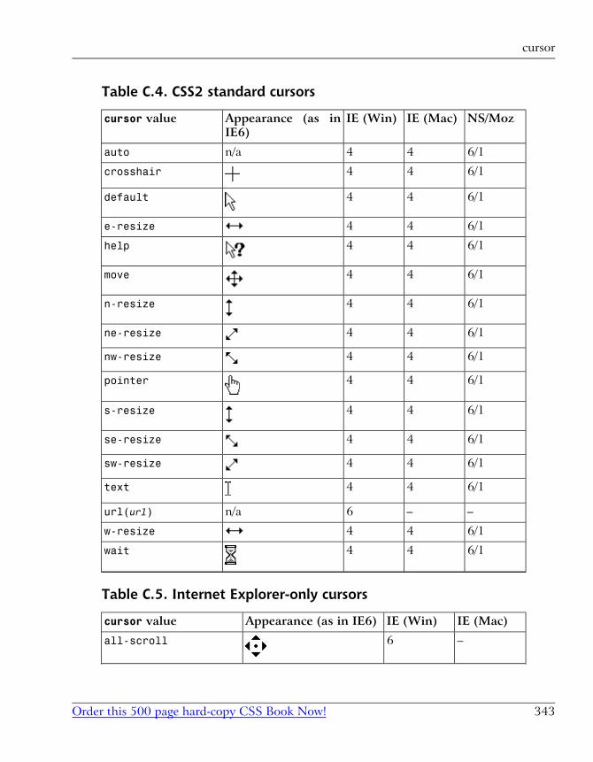
Table C.4. CSS2 standard cursors
NS/MozIE (Mac)IE (Win)Appearance (as in
IE6)
cursor value
6/144n/aauto
6/144crosshair
6/144default
6/144e-resize
6/144help
6/144move
6/144n-resize
6/144ne-resize
6/144nw-resize
6/144pointer
6/144s-resize
6/144se-resize
6/144sw-resize
6/144text
––6n/aurl(url)
6/144w-resize
6/144wait
Table C.5. Internet Explorer-only cursors
IE (Mac)IE (Win)Appearance (as in IE6)cursor value
–6all-scroll
343Order this 500 page hard-copy CSS Book Now!
cursor
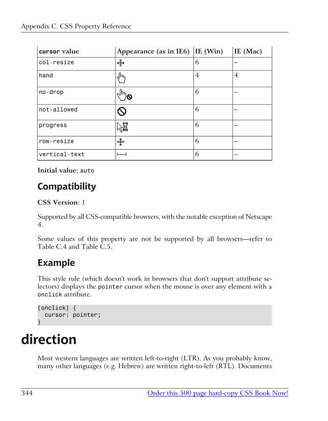
IE (Mac)IE (Win)Appearance (as in IE6)cursor value
–6col-resize
44hand
–6no-drop
–6not-allowed
–6progress
–6row-resize
–6vertical-text
Initial value: auto
Compatibility
CSS Version: 1
Supported by all CSS-compatible browsers, with the notable exception of Netscape
4.
Some values of this property are not be supported by all browsers—refer to
Table C.4 and Table C.5.
Example
This style rule (which doesn't work in browsers that don't support attribute se-
lectors) displays the pointer cursor when the mouse is over any element with a
onclick attribute.
[onclick] { cursor: pointer;}
directionMost western languages are written left-to-right (LTR). As you probably know,
many other languages (e.g. Hebrew) are written right-to-left (RTL). Documents
Appendix C. CSS Property Reference
Order this 500 page hard-copy CSS Book Now!344
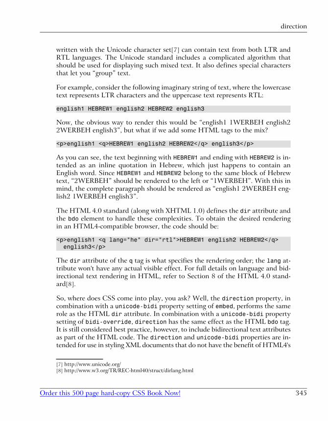
written with the Unicode character set[7] can contain text from both LTR and
RTL languages. The Unicode standard includes a complicated algorithm that
should be used for displaying such mixed text. It also defines special characters
that let you “group” text.
For example, consider the following imaginary string of text, where the lowercase
text represents LTR characters and the uppercase text represents RTL:
english1 HEBREW1 english2 HEBREW2 english3
Now, the obvious way to render this would be “english1 1WERBEH english2
2WERBEH english3”, but what if we add some HTML tags to the mix?
<p>english1 <q>HEBREW1 english2 HEBREW2</q> english3</p>
As you can see, the text beginning with HEBREW1 and ending with HEBREW2 is in-
tended as an inline quotation in Hebrew, which just happens to contain an
English word. Since HEBREW1 and HEBREW2 belong to the same block of Hebrew
text, “2WERBEH” should be rendered to the left or “1WERBEH”. With this in
mind, the complete paragraph should be rendered as “english1 2WERBEH eng-
lish2 1WERBEH english3”.
The HTML 4.0 standard (along with XHTML 1.0) defines the dir attribute and
the bdo element to handle these complexities. To obtain the desired rendering
in an HTML4-compatible browser, the code should be:
<p>english1 <q lang="he" dir="rtl">HEBREW1 english2 HEBREW2</q> english3</p>
The dir attribute of the q tag is what specifies the rendering order; the lang at-
tribute won't have any actual visible effect. For full details on language and bid-
irectional text rendering in HTML, refer to Section 8 of the HTML 4.0 stand-
ard[8].
So, where does CSS come into play, you ask? Well, the direction property, in
combination with a unicode-bidi property setting of embed, performs the same
role as the HTML dir attribute. In combination with a unicode-bidi property
setting of bidi-override, direction has the same effect as the HTML bdo tag.
It is still considered best practice, however, to include bidirectional text attributes
as part of the HTML code. The direction and unicode-bidi properties are in-
tended for use in styling XML documents that do not have the benefit of HTML4's
[7] http://www.unicode.org/
[8] http://www.w3.org/TR/REC-html40/struct/dirlang.html
345Order this 500 page hard-copy CSS Book Now!
direction
bidirectional text features. Since the focus of this book is on Web development,
I'll therefore refer you to the CSS2 standard[9] for full details on these properties.
Inherited: Yes
See also: unicode-bidi
Value
ltr or rtl.
Initial value: ltr
Compatibility
CSS Version: 2
Not supported by any currently-available browser.
Example
This style rule sets the text direction of an imaginary XML element named hebrewto rtl. The unicode-bidi property is there to ensure that this setting will “group”
any elements within it according to this direction, even if hebrew is rendered as
an inline element.
hebrew { direction: rtl; unicode-bidi: embed;}
displayIn HTML, there are different types of elements. div and blockquote, for example,
are both block elements, while strong and em are both inline elements. For each
type of element, a browser supports a “display mode”. All block elements are es-
sentially displayed the same way, just with varying margins, padding, borders,
etc. by default.
[9] http://www.w3.org/TR/REC-CSS2/visuren.html#direction
Appendix C. CSS Property Reference
Order this 500 page hard-copy CSS Book Now!346
The display property lets you set the “display mode” for an element. For example,
you can set a hyperlink (a) to be displayed as a block instead of inline text.
The most common use for the display property is to show and hide portions of
an HTML document. Setting display to none causes the element not only to
be hidden (as with the visibility property), but not to occupy any space on
the page either. Using Dynamic HTML to set this property in JavaScript event
handlers lets you create, for instance, hierarchical menus that expand and collapse
to display submenus on the fly.
Inherited: No
See also: visibility
Value
blockCSS version: 1
Browser support: All CSS-compatible, including Netscape 4.
The default display mode for p, div, ul, blockquote, and many others, blockcauses the element to occupy a rectangular area of the page, stacked vertically
with its sibling elements, so that previous siblings are above it, and subsequent
siblings are below it.
inlineCSS version: 1
Browser support: All CSS-compatible, including Netscape 4.
The default display mode for strong, u, a, code, and many others, this causes
the element to flow “inline” as a string of text within the parent block, possibly
broken by word wrapping.
list-itemCSS version: 1
Browser support: Netscape 4 or later, Internet Explorer 6 for Windows,
Internet Explorer 5 for Mac.
347Order this 500 page hard-copy CSS Book Now!
display
The default display mode for li elements, list-item causes the element to
be rendered as a list item. The list-style family of properties control the
position and appearance of the list item marker (i.e. the bullet or number).
markerCSS version: 2
Browser support: No currently-available browsers.
This display mode can be applied only to :before and :after pseudo-ele-
ments, and tells the browser to treat generated content (created with the
content property) as a “marker” to be displayed in its own box in the margin
of the main content. The formatting is similar to, although somewhat more
flexible than, the formatting applied to the bullets or numbers preceding list
items. The marker-offset property is specifically provided to format gener-
ated content with this display mode.
noneCSS version: 1
Browser support: All CSS-compatible, including Netscape 4.
This display mode causes the element not to be rendered at all. The element
will not occupy any space on the page (unlike visibility: hidden, which
hides the element but reserves space for it on the page).
compactCSS version: 2
Browser support: No currently-available browsers.
This display mode causes the element to appear in the left margin (or right
margin in right-to-left languages) of the block immediately following it if it
can fit all on one line. If the element is too big to fit in the next block's margin
on one line, it is displayed as a normal block instead. The effect is illustrated
in Figure C.1.
Appendix C. CSS Property Reference
Order this 500 page hard-copy CSS Book Now!348
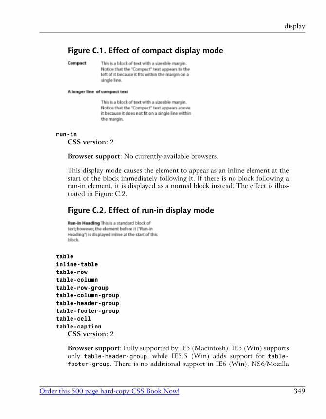
Figure C.1. Effect of compact display mode
run-inCSS version: 2
Browser support: No currently-available browsers.
This display mode causes the element to appear as an inline element at the
start of the block immediately following it. If there is no block following a
run-in element, it is displayed as a normal block instead. The effect is illus-
trated in Figure C.2.
Figure C.2. Effect of run-in display mode
tableinline-tabletable-rowtable-columntable-row-grouptable-column-grouptable-header-grouptable-footer-grouptable-celltable-caption
CSS version: 2
Browser support: Fully supported by IE5 (Macintosh). IE5 (Win) supports
only table-header-group, while IE5.5 (Win) adds support for table-footer-group. There is no additional support in IE6 (Win). NS6/Mozilla
349Order this 500 page hard-copy CSS Book Now!
display
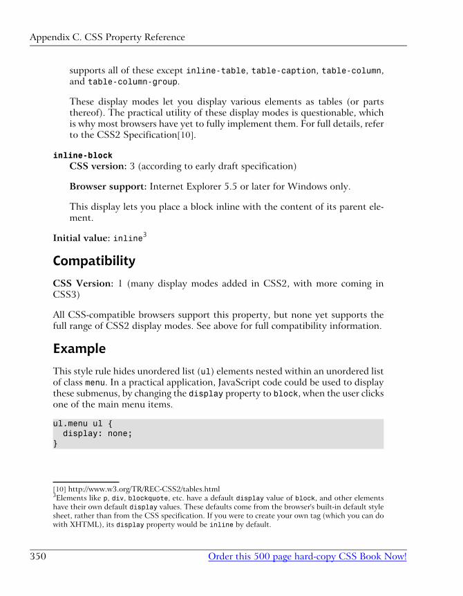
supports all of these except inline-table, table-caption, table-column,
and table-column-group.
These display modes let you display various elements as tables (or parts
thereof). The practical utility of these display modes is questionable, which
is why most browsers have yet to fully implement them. For full details, refer
to the CSS2 Specification[10].
inline-blockCSS version: 3 (according to early draft specification)
Browser support: Internet Explorer 5.5 or later for Windows only.
This display lets you place a block inline with the content of its parent ele-
ment.
Initial value: inline3
Compatibility
CSS Version: 1 (many display modes added in CSS2, with more coming in
CSS3)
All CSS-compatible browsers support this property, but none yet supports the
full range of CSS2 display modes. See above for full compatibility information.
Example
This style rule hides unordered list (ul) elements nested within an unordered list
of class menu. In a practical application, JavaScript code could be used to display
these submenus, by changing the display property to block, when the user clicks
one of the main menu items.
ul.menu ul { display: none;}
[10] http://www.w3.org/TR/REC-CSS2/tables.html3Elements like p, div, blockquote, etc. have a default display value of block, and other elements
have their own default display values. These defaults come from the browser's built-in default style
sheet, rather than from the CSS specification. If you were to create your own tag (which you can do
with XHTML), its display property would be inline by default.
Appendix C. CSS Property Reference
Order this 500 page hard-copy CSS Book Now!350
What’s Next? If you’ve enjoyed these chapters from HTML Utopia: Designing Without Tables Using CSS, why not order yourself a copy?
You’ll learn how to shrink your Web pages 30-60%, support today’s accessibility standards and tomorrow’s browsers, speed up site maintenance, and optimize your content for the search engines… all with CSS. You’ll also gain access to the code archive download, so you can try out all the examples without retyping!
In the remaining chapters, you’ll learn how to
Position page blocks to achieve complex site layouts
Specify and apply colors effectively in CSS
Deploy cross-browser fonts (and downloadable fonts!)
Apply funky text decorations (like shadowed text!)
Modify the mouse cursor
And a whole lot more…
On top of that, you’ll also benefit from the complete CSS Property Reference, with over 150 properties documented, as well as a complete HTML and CSS color reference!
Order Now and Get it Delivered to your Doorstep!
“After reading HTML Utopia: Designing Without Tables Using CSS you will not only understand how to use CSS to emulate old-school, table-driven Web layouts, you will be creating Web sites that would be impossible to design using traditional methods.”
— Jeffrey Zeldman, Co-Founder of the Web Standards Project

IndexSymbols!important (see cascading, factors,
weight)
.css files, 15
/* */ (see comments)
<!-- -->
concealing CSS with, 15
<center> tags, 197
<del> tags, 217
<font> tag, 173, 178
<img> tags, 242
<li> tags, 224
<link> tags, 15, 50, 77, 79, 118, 235
<ol> tags, 224
<span> tags, 194
<style> tags, 14, 50, 235
<ul> tags, 224
@ (see at-rules)
Aaccessibility
and CSS, 36, 79
alignment
as a design tool, 196, 197
of images, 242
alternate style sheets, 38
(see also multiple style sheets)
at-rules, 191, 293
@font-face, 190
@import, 46, 293
@media, 293
@page, 296, 412, 434
attributes
(see also properties)
align, 126, 197, 242
class, 57
clear, 127
id, 58
lang, 60
vs. language, 61
size, 176
style, 14, 50, 238
aural browsers, 80
aural style sheets, 297
Bbackgrounds
images
fixing position of, 271
blinking text, 215
borders, 110, 262
in the CSS box model, 91
box model (see Cascading Style Sheets,
box model)
browsers
(see also DOCTYPE switching)
support for CSS, 42
supporting buggy versions, 46, 285
supporting old versions, 44, 279
Ccascading, 233
factors, 234
origin, 239
sort order, 235
specificity, 237
weight, 239
Cascading Style Sheets
advantages of, 76
box model, 90, 124
Internet Explorer bug, 124
description of, 8
embedded, 14, 50
external, 15, 50
inline, 14, 50
introduction to, 3
limitations of, 34
positioning (see CSS Positioning
(CSS-P))
purpose of, 5
why use, 17
classes (see selectors, types of, class)
clipping content, 250
code archive, xiii
colors, 111, 157
3-digit shorthand, 161
and CSS, 24
background colors, 164
color names, 159
hexadecimal notation, 161
interesting uses of, 166
methods to specify, 159
reference, 301
rgb function, 161
selecting combinations, 162
system colors, 161
table backgrounds, 169
text colors, 164
user preferences, 158
where can be set, 159
columns (see multi-column layouts)
comments, 70
CSS (see Cascading Style Sheets)
CSS Positioning (CSS-P), 113
z-indexes, 140, 245
cursors
modifying with CSS, 269
Ddeprecated elements, 81
DHTML (see Dynamic HTML)
distances (see measurements)
DOCTYPE switching, 288
Internet Explorer XML DOCTYPE
switching bug, 290
drop-caps, 125
Dynamic HTML, 299
Eelements
(see also individual tag entries)
which CSS can target, 13
embedded styles (see Cascading Style
Sheets, embedded)
external styles (see Cascading Style
Sheets, external)
Ffonts, 173
and CSS, 28
cross-platform equivalents, 184
downloadable, 189
families, 174
generic, 175, 186
line height, 182
Microsoft Web Fonts, 185
nonstandard, 188
sizes, 176
browser discrepancies, 177
relative, 178
standard, 184
styles (italic, oblique), 180
system constants, 183
variants (small caps), 180
weight (bold), 181
Footbag Freaks website, 83
browser compatibility, 84
layout deconstructed, 145
layout elements, 89
standards compliance, 84
form layout
with float and clear, 129
Ggraphics
and CSS, 31, 241
clipping (see clipping content)
Index
Order this 500 page hard-copy CSS Book Now!482
HHTML
history in Web design, 4
hyperlinks
changing on mouse hover, 30, 269
displaying as block elements, 263
Internet Explorer margin bug, 264
removing underlines, 219, 223, 262
styling with CSS, 30, 221
Iimages (see graphics)
indents, 203
hanging, 204
inherit
special property value, 53
inheritance, 233
in CSS, 51
inherited properties (see properties, in-
herited)
inline styles (see Cascading Style
Sheets, inline)
JJavaScript, 34
and CSS, 299
Kkerning (see spacing, between letters)
knockout type, 245
Lleading (see line height)
length values, 66
(see also measurements)
lengths (see measurements)
line height, 206
line-through text (see strike-through
text)
links (see hyperlinks)
lists
removing default indent, 260
styling with CSS, 224, 259, 265
using as menus, 257
nested submenus, 266
Mmargins, 102
in the CSS box model, 91
Mozilla top margin bug, 139, 221
negative values, 108
page margins, 134
vertical collapsing, 108
measurements, 65
absolute, 65, 66
centimeters (cm), 66
inches (in), 66
millimeters (mm), 67
picas (pc), 67
pixels (px), 67
points (pt), 67
absolute vs. relative, 131
relative, 65, 68
ems (em), 68
exes (ex), 68
percentages (%), 68
Microsoft Web Embedding Font Tool
(WEFT), 190
multi-column layouts, 113
stretchy layouts, 131
three column layouts, 117
multiple style sheets, 33
(see also alternate style sheets)
Ooutdents (see indents, hanging)
outlines, 159
(see also borders)
overlines, 215
483Order this 500 page hard-copy CSS Book Now!
Ppadding, 93, 265
in the CSS box model, 91
positioning contexts, 113, 221
absolute vs. relative, 116
properties, 10, 13
-moz-border-radius, 397
-moz-border-radius-bottomleft, 398
-moz-border-radius-bottomright, 398
-moz-border-radius-topleft, 398
-moz-border-radius-topright, 398
-moz-opacity, 400
azimuth, 309
background, 273, 310
background-attachment, 311
background-color, 164, 201, 312
transparent value, 165
background-image, 313
background-position, 314
background-position-x, 316
background-position-y, 316
background-repeat, 317
behavior, 318
border, 112, 319
border-bottom, 320
border-bottom-color, 111, 321
border-bottom-style, 322
border-bottom-width, 111, 322
border-collapse, 323
border-color, 111, 324
border-left, 320
border-left-color, 111, 321
border-left-style, 322
border-left-width, 111, 322
border-right, 320
border-right-color, 111, 321
border-right-style, 322
border-right-width, 111, 322
border-spacing, 326
border-style, 110, 326
border-top, 320
border-top-color, 111, 321
border-top-style, 322
border-top-width, 111, 322
border-width, 111, 328
bottom, 329
caption-side, 331
clear, 127, 243, 332
clip, 332
color, 11, 164, 334
content, 335
counter-increment, 338
counter-reset, 339
cue, 340
cue-after, 341
cue-before, 341
cursor, 269, 342
direction, 344
display, 112, 264, 346
elevation, 351
empty-cells, 351
filter, 352
float, 31, 125, 242, 354
font, 51, 181, 265, 355
font-family, 12, 174, 184, 357
font-size, 12, 176, 359
relative measurements, 68
font-size-adjust, 361
font-stretch, 363
font-style, 180, 364
font-variant, 180, 365
font-weight, 181, 366
height, 368
ime-mode, 369
inherited, 53
layer-background-color, 376
layer-background-image, 377
layout-flow, 370
layout-grid, 371
layout-grid-char, 372
layout-grid-line, 373
layout-grid-mode, 374
layout-grid-type, 375
Index
Order this 500 page hard-copy CSS Book Now!484
left, 114, 379
letter-spacing, 209, 380
line-break, 381
line-height, 182, 206, 382
list-style, 224, 260, 383
list-style-image, 231, 385
list-style-position, 229, 386
list-style-type, 224, 388
margin, 390
margin-bottom, 106, 391
margin-left, 103, 391
margin-right, 391
margin-top, 106, 391
marker-offset, 392
marks, 394
max-height, 394
max-width, 396
min-height, 394
min-width, 396
orphans, 401
outline, 159, 402
outline-color, 403
outline-style, 404
outline-width, 405
overflow, 252, 406
overflow-x, 408
overflow-y, 408
padding, 95, 265, 409
padding-bottom, 93, 410
padding-left, 93, 206, 410
padding-right, 93, 410
padding-top, 93, 410
page, 412
page-break-after, 413
page-break-before, 414
page-break-inside, 416
pause, 417
pause-after, 418
pause-before, 418
pitch, 418
pitch-range, 420
play-during, 420
position, 113, 221, 422
quotes, 423
richness, 425
right, 426
ruby-align, 427
ruby-overhang, 428
ruby-position, 430
scrollbar-3dLight-color, 432, 432
scrollbar-arrow-color, 432
scrollbar-base-color, 431
scrollbar-face-color, 432
scrollbar-highlight-color, 432
scrollbar-shadow-color, 433
scrollbar-track-color, 433
shorthand, 51, 91, 95
size, 434
speak, 435
speak-header, 435
speak-numeral, 436
speak-punctuation, 437
speech-rate, 438
stress, 439
table-layout, 440
text-align, 197, 441
text-align-last, 442
text-autospace, 443
text-decoration, 214, 262, 444
text-indent, 203, 445
text-justify, 446
text-kashida-space, 448
text-overflow, 449
text-shadow, 219, 450
text-transform, 451
text-underline-position, 452
top, 114, 453
unicode-bidi, 454
vertical-align, 457
visibility, 113, 459
voice-family, 460
volume, 461
white-space, 462
widows, 464
485Order this 500 page hard-copy CSS Book Now!
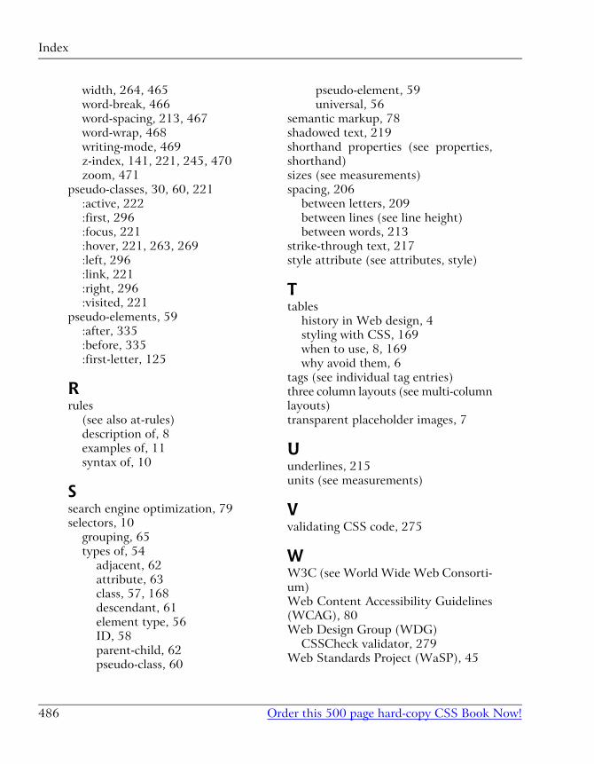
width, 264, 465
word-break, 466
word-spacing, 213, 467
word-wrap, 468
writing-mode, 469
z-index, 141, 221, 245, 470
zoom, 471
pseudo-classes, 30, 60, 221
:active, 222
:first, 296
:focus, 221
:hover, 221, 263, 269
:left, 296
:link, 221
:right, 296
:visited, 221
pseudo-elements, 59
:after, 335
:before, 335
:first-letter, 125
Rrules
(see also at-rules)
description of, 8
examples of, 11
syntax of, 10
Ssearch engine optimization, 79
selectors, 10
grouping, 65
types of, 54
adjacent, 62
attribute, 63
class, 57, 168
descendant, 61
element type, 56
ID, 58
parent-child, 62
pseudo-class, 60
pseudo-element, 59
universal, 56
semantic markup, 78
shadowed text, 219
shorthand properties (see properties,
shorthand)
sizes (see measurements)
spacing, 206
between letters, 209
between lines (see line height)
between words, 213
strike-through text, 217
style attribute (see attributes, style)
Ttables
history in Web design, 4
styling with CSS, 169
when to use, 8, 169
why avoid them, 6
tags (see individual tag entries)
three column layouts (see multi-column
layouts)
transparent placeholder images, 7
Uunderlines, 215
units (see measurements)
Vvalidating CSS code, 275
WW3C (see World Wide Web Consorti-
um)
Web Content Accessibility Guidelines
(WCAG), 80
Web Design Group (WDG)
CSSCheck validator, 279
Web Standards Project (WaSP), 45
Index
Order this 500 page hard-copy CSS Book Now!486
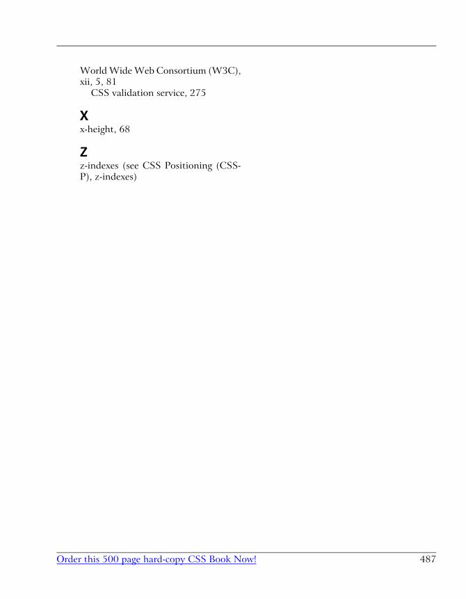
World Wide Web Consortium (W3C),
xii, 5, 81
CSS validation service, 275
Xx-height, 68
Zz-indexes (see CSS Positioning (CSS-
P), z-indexes)
487Order this 500 page hard-copy CSS Book Now!