html and css - pearsoncmg.comptgmedia.pearsoncmg.com/images/9780321928832/samplepages/... · the...
TRANSCRIPT

L A R R Y U L L M A NE L I Z A B E T H C A S T R O
B R U C E H Y S L O P
HTML and CSS
Eighth Edition
LEARN THE QUICK AND EASY WAY!
VISUAL QUICKSTART GUIDE

Peachpit Press
V I S U A L Q U I C K S tA r t G U I D E
HTML and CSS
Eighth Edition
ElizabEth Castro • bruCE hyslop
Visual QuickStart Guide
HTML and CSS, Eighth EditionElizabeth Castro and Bruce Hyslop
Peachpit Presswww.peachpit.com
To report errors, please send a note to [email protected].
Peachpit Press is a division of Pearson Education.
Copyright © 2014 by Elizabeth Castro and Bruce Hyslop
Editor: Clifford ColbyDevelopment editor: Robyn G. ThomasProduction editor: David Van NessCopyeditor: Scout FestaTechnical editor: Aubrey TaylorCompositor: David Van NessIndexer: Valerie Haynes PerryCover design: RHDG / Riezebos Holzbaur Design Group, Peachpit PressInterior design: Peachpit PressLogo design: MINE™ www.minesf.com
Notice of RightsAll rights reserved. No part of this book may be reproduced or transmitted in any form by any means, electronic, mechanical, photocopying, recording, or otherwise, without the prior written permission of the publisher. For information on getting permission for reprints and excerpts, contact [email protected].
css3generator.com screen shot courtesy of Randy Jensen.css3please.com screen shot courtesy of Paul Irish.dribbble.com screen shots courtesy of Dan Cederholm.fontsquirrel.com screen shots courtesy of Ethan Dunham.foodsense.is screen shots courtesy of Julie Lamba.google.com/fonts screen shots courtesy of Google.namecheap.com screen shots courtesy of Namecheap.Silk icon set courtesy of Mark James (http://www.famfamfam.com/lab/icons/silk/).Socialico font courtesy of Fontfabric (www.fontfabric.com).
Notice of LiabilityThe information in this book is distributed on an “As Is” basis, without warranty. While every precaution has been taken in the preparation of the book, neither the authors nor the publisher shall have any liability to any person or entity with respect to any loss or damage caused or alleged to be caused directly or indirectly by the instructions contained in this book or by the computer software and hardware products described in it.
TrademarksVisual QuickStart Guide is a registered trademark of Peachpit Press, a division of Pearson Education.
Many of the designations used by manufacturers and sellers to distinguish their products are claimed as trademarks. Where those designations appear in this book, and Peachpit was aware of a trademark claim, the designations appear as requested by the owner of the trademark. All other product names and services identified throughout this book are used in editorial fashion only and for the benefit of such companies with no intention of infringement of the trademark. No such use, or the use of any trade name, is intended to convey endorsement or other affiliation with this book.
ISBN-13: 978-0-321-92883-2ISBN-10: 0-321-92883-0
9 8 7 6 5 4 3 2 1
Printed and bound in the United States of America
DedicationTo family.
To those I know who endured difficult challenges, demonstrating courage and perseverance all the way.
AcknowledgmentsOne of my favorite parts of working on this book has been the people I’ve been able to work with. All are dedicated, professional, good-natured, and good-humored folks who made it a real pleasure. The book wouldn’t be the same without their contributions.
A grateful, sincere thank you goes out to:
Nancy Aldrich-Ruenzel and Nancy Davis, for their continued trust in me.
Cliff Colby, for his support, for bringing the team together, and for keeping things light.
Robyn Thomas, for making the engine go, improving copy, tracking all the details, being flexible, and providing encouragement.
Scout Festa, for her skill in simplifying lan-guage, for her watchful eye, and for helping to keep things consistent and polished.
Aubrey Taylor, for all the great suggestions and technical feedback. They were very helpful, and readers are better off for them.
David Van Ness, for leading the charge in making it all look great and for all his efforts in refining the layouts.
Valerie Haynes Perry, for compiling the all-important index, which will be the first destination for many readers in search of information.
The marketing, sales, and other folks at Peachpit, for working hard to make the book available to readers.
Natalia Ammon, for the wonderful design of the example webpage that adorns the pages of Chapters 11 and 12, and other spots. You can see more of her work at www.nataliaammon.com.
Zach Szukala, for recommending Natalia.
Scott Boms, Ian Devlin, Seth Lemoine, Erik Vorhes, and Brian Warren, for their contribu-tions to the previous edition.
Victor Gavenda, for providing access to necessary software.
Dan Cederholm, Ethan Dunham, Paul Irish, Mark James, Randy Jensen, Julie Lamba, Fontfabric, Google, and Namecheap, for allowing me to use screen shots or design assets (as the case may be).
C.R. Freer, for working her camera magic.
My family and friends, for providing inspira-tion and breaks, for being patient, and for not disowning me while I was holed up writ-ing for months.
Robert Reinhardt, as always, for getting me started in writing books and for having a swell beard.
The Boston Bruins, for providing a lot of playoffs thrills during my infrequent breaks.
The numerous folks in the web community who have shared their expertise and experi-ences for the betterment of others. (I’ve cited many of you throughout the book.)
To you readers, for inspiring me to recall when I began learning HTML and CSS so that I may explain them in ways I hope you find helpful. Thank you for choosing this book as part of your journey in contributing to the web. Happy reading!
And, lastly, I would like to give a special thank you to Elizabeth Castro, who created this title in the 1990s. She has taught count-less readers how to build webpages over many editions and many years. Because the web has given me so much, I’m genuinely appreciative of the opportunity to teach readers via this title as well.
—Bruce
iv Acknowledgments
Contents at a Glance v
Contents at a Glance
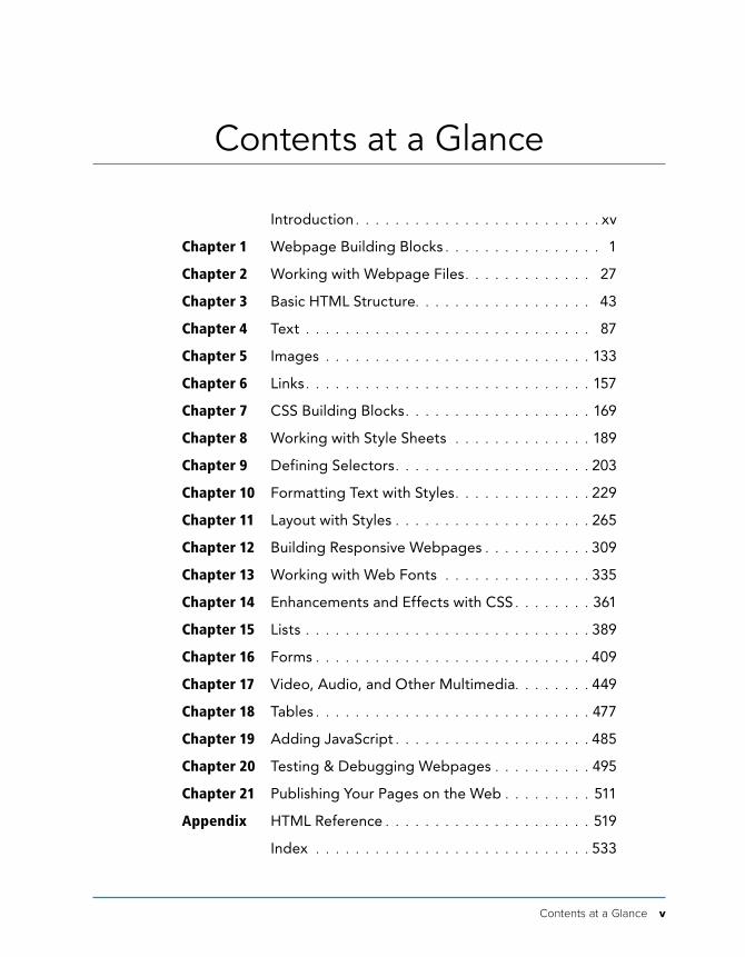
introduction . . . . . . . . . . . . . . . . . . . . . . . . . xv
Chapter 1 Webpage building blocks . . . . . . . . . . . . . . . . 1
Chapter 2 Working with Webpage Files . . . . . . . . . . . . . 27
Chapter 3 basic htMl structure. . . . . . . . . . . . . . . . . . 43
Chapter 4 text . . . . . . . . . . . . . . . . . . . . . . . . . . . . . 87
Chapter 5 images . . . . . . . . . . . . . . . . . . . . . . . . . . . 133
Chapter 6 links . . . . . . . . . . . . . . . . . . . . . . . . . . . . . 157
Chapter 7 Css building blocks . . . . . . . . . . . . . . . . . . . 169
Chapter 8 Working with style sheets . . . . . . . . . . . . . . 189
Chapter 9 Defining selectors . . . . . . . . . . . . . . . . . . . . 203
Chapter 10 Formatting text with styles . . . . . . . . . . . . . . 229
Chapter 11 layout with styles . . . . . . . . . . . . . . . . . . . . 265
Chapter 12 building responsive Webpages . . . . . . . . . . . 309
Chapter 13 Working with Web Fonts . . . . . . . . . . . . . . . 335
Chapter 14 Enhancements and Effects with Css . . . . . . . . 361
Chapter 15 lists . . . . . . . . . . . . . . . . . . . . . . . . . . . . . 389
Chapter 16 Forms . . . . . . . . . . . . . . . . . . . . . . . . . . . . 409
Chapter 17 Video, audio, and other Multimedia. . . . . . . . 449
Chapter 18 tables . . . . . . . . . . . . . . . . . . . . . . . . . . . . 477
Chapter 19 adding Javascript . . . . . . . . . . . . . . . . . . . . 485
Chapter 20 testing & Debugging Webpages . . . . . . . . . . 495
Chapter 21 publishing your pages on the Web . . . . . . . . . 511
Appendix htMl reference . . . . . . . . . . . . . . . . . . . . . 519
index . . . . . . . . . . . . . . . . . . . . . . . . . . . . 533

This page intentionally left blank
Table of Contents vii
Table of Contents
Introduction. . . . . . . . . . . . . . . . . . . . . . . . . xv
HTML and CSS in Brief . . . . . . . . . . . . . . . . . . . xviWeb Browsers . . . . . . . . . . . . . . . . . . . . . . . xviiWeb Standards and Specifications . . . . . . . . . . . xviiiProgressive Enhancement: A Best Practice . . . . . . . xxIs This Book for You? . . . . . . . . . . . . . . . . . . . xxiiHow This Book Works. . . . . . . . . . . . . . . . . . . xxivCompanion Website. . . . . . . . . . . . . . . . . . . . xxvi
Chapter 1 Webpage Building Blocks . . . . . . . . . . . . . . . . . 1
Thinking in HTML . . . . . . . . . . . . . . . . . . . . . . . 3A Basic HTML Page . . . . . . . . . . . . . . . . . . . . . . 4Markup: Elements, Attributes, Values, and More . . . . . 8A Webpage’s Text Content . . . . . . . . . . . . . . . . . 12Links, Images, and Other Non-Text Content . . . . . . . 13File and Folder Names . . . . . . . . . . . . . . . . . . . 14URLs . . . . . . . . . . . . . . . . . . . . . . . . . . . . . 15HTML: Markup with Meaning. . . . . . . . . . . . . . . . 20A Browser’s Default Display of Webpages . . . . . . . . 24Key Takeaways. . . . . . . . . . . . . . . . . . . . . . . . 26
Chapter 2 Working with Webpage Files . . . . . . . . . . . . . 27
Planning Your Site . . . . . . . . . . . . . . . . . . . . . . 28Creating a New Webpage . . . . . . . . . . . . . . . . . 30Saving Your Webpage . . . . . . . . . . . . . . . . . . . 32Specifying a Default Page or Homepage . . . . . . . . . 35Editing Webpages . . . . . . . . . . . . . . . . . . . . . . 36Organizing Files . . . . . . . . . . . . . . . . . . . . . . . 37Viewing Your Page in a Browser . . . . . . . . . . . . . . 38The Inspiration of Others . . . . . . . . . . . . . . . . . . 40
Chapter 3 Basic HTML Structure . . . . . . . . . . . . . . . . . . 43
Starting Your Webpage . . . . . . . . . . . . . . . . . . . 44Creating a Title. . . . . . . . . . . . . . . . . . . . . . . . 48
viii Table of Contents
Creating Headings . . . . . . . . . . . . . . . . . . . . . 50Common Page Constructs . . . . . . . . . . . . . . . . . 53Creating a Header . . . . . . . . . . . . . . . . . . . . . . 54Marking Navigation . . . . . . . . . . . . . . . . . . . . . 56Marking the Main Area of a Webpage. . . . . . . . . . . 59Creating an Article . . . . . . . . . . . . . . . . . . . . . 60Defining a Section. . . . . . . . . . . . . . . . . . . . . . 63Specifying an Aside . . . . . . . . . . . . . . . . . . . . . 65Creating a Footer . . . . . . . . . . . . . . . . . . . . . . 70Creating Generic Containers. . . . . . . . . . . . . . . . 73Improving Accessibility with ARIA . . . . . . . . . . . . . 78Naming Elements with a Class or ID. . . . . . . . . . . . 82Adding the Title Attribute to Elements . . . . . . . . . . 84Adding Comments . . . . . . . . . . . . . . . . . . . . . 85
Chapter 4 Text . . . . . . . . . . . . . . . . . . . . . . . . . . . . . . 87
Adding a Paragraph . . . . . . . . . . . . . . . . . . . . . 88Specifying Fine Print . . . . . . . . . . . . . . . . . . . . 89Marking Important and Emphasized Text . . . . . . . . . 90Creating a Figure . . . . . . . . . . . . . . . . . . . . . . 92Indicating a Citation or Reference . . . . . . . . . . . . . 94Quoting Text . . . . . . . . . . . . . . . . . . . . . . . . . 95Specifying Time . . . . . . . . . . . . . . . . . . . . . . . 98Explaining Abbreviations . . . . . . . . . . . . . . . . . . 101Defining a Term . . . . . . . . . . . . . . . . . . . . . . 103Creating Superscripts and Subscripts. . . . . . . . . . 104Adding Author Contact Information . . . . . . . . . . . 106Noting Edits and Inaccurate Text . . . . . . . . . . . . 108Marking Up Code . . . . . . . . . . . . . . . . . . . . . . 112Using Preformatted Text . . . . . . . . . . . . . . . . . . 114Highlighting Text . . . . . . . . . . . . . . . . . . . . . . 116Creating a Line Break . . . . . . . . . . . . . . . . . . . . 118Creating Spans . . . . . . . . . . . . . . . . . . . . . . 120Other Elements . . . . . . . . . . . . . . . . . . . . . . 122
Chapter 5 Images . . . . . . . . . . . . . . . . . . . . . . . . . . . . 133
Images for the Web . . . . . . . . . . . . . . . . . . . . 134Getting Images . . . . . . . . . . . . . . . . . . . . . . 140Choosing an Image Editor . . . . . . . . . . . . . . . . . 141Saving Your Images . . . . . . . . . . . . . . . . . . . . 142Inserting Images on a Page . . . . . . . . . . . . . . . 145
Table of Contents ix
Offering Alternative Text . . . . . . . . . . . . . . . . . . 147Specifying Image Sizes . . . . . . . . . . . . . . . . . . 149Scaling Images with the Browser . . . . . . . . . . . . 152Scaling Images with an Image Editor . . . . . . . . . . 154Adding Icons for Your Website . . . . . . . . . . . . . . 155
Chapter 6 Links. . . . . . . . . . . . . . . . . . . . . . . . . . . . . . 157
Creating a Link to Another Webpage (and Other Link Basics) . . . . . . . . . . . . . . . . . 158
Creating and Linking to Anchors. . . . . . . . . . . . . 164Creating Other Kinds of Links . . . . . . . . . . . . . . 166
Chapter 7 CSS Building Blocks. . . . . . . . . . . . . . . . . . . . 169
Constructing a Style Rule. . . . . . . . . . . . . . . . . . 171Adding Comments to Style Rules . . . . . . . . . . . . . 172Understanding Inheritance . . . . . . . . . . . . . . . . . 174The Cascade: When Rules Collide. . . . . . . . . . . . . 177A Property’s Value. . . . . . . . . . . . . . . . . . . . . 180
Chapter 8 Working with Style Sheets . . . . . . . . . . . . . . . 189
Creating an External Style Sheet . . . . . . . . . . . . 190Linking to External Style Sheets . . . . . . . . . . . . . 192Creating an Embedded Style Sheet . . . . . . . . . . . 194Applying Inline Styles . . . . . . . . . . . . . . . . . . . 196The Cascade and the Order of Styles . . . . . . . . . . 198Using Media-Specific Style Sheets . . . . . . . . . . . 200The Inspiration of Others: CSS . . . . . . . . . . . . . . 202
Chapter 9 Defining Selectors . . . . . . . . . . . . . . . . . . . 203
Constructing Selectors . . . . . . . . . . . . . . . . . . 204Selecting Elements by Name . . . . . . . . . . . . . . 206Selecting Elements by Class or ID. . . . . . . . . . . . 208Selecting Elements by Context . . . . . . . . . . . . . 212Selecting an Element That Is the First or Last Child . . 216Selecting the First Letter or First Line of an Element . 218Selecting Links Based on Their State . . . . . . . . . . 220Selecting Elements Based on Attributes . . . . . . . . 222Specifying Groups of Elements . . . . . . . . . . . . . 226Combining Selectors . . . . . . . . . . . . . . . . . . . 227
x Table of Contents
Chapter 10 Formatting Text with Styles . . . . . . . . . . . . . . 229
Before and After . . . . . . . . . . . . . . . . . . . . . . 230Choosing a Font Family . . . . . . . . . . . . . . . . . . 232Specifying Alternate Fonts . . . . . . . . . . . . . . . . 233Creating Italics . . . . . . . . . . . . . . . . . . . . . . . 236Applying Bold Formatting . . . . . . . . . . . . . . . . 238Setting the Font Size . . . . . . . . . . . . . . . . . . . 240Setting the Line Height . . . . . . . . . . . . . . . . . . 245Setting All Font Values at Once . . . . . . . . . . . . . 246Setting the Color . . . . . . . . . . . . . . . . . . . . . 248Setting the Background. . . . . . . . . . . . . . . . . . 250Controlling Spacing . . . . . . . . . . . . . . . . . . . . 257Adding Indents . . . . . . . . . . . . . . . . . . . . . . 258Aligning Text . . . . . . . . . . . . . . . . . . . . . . . . 259Changing the Text Case . . . . . . . . . . . . . . . . . 260Using Small Caps . . . . . . . . . . . . . . . . . . . . . 261Decorating Text . . . . . . . . . . . . . . . . . . . . . . 262Setting Whitespace Properties . . . . . . . . . . . . . 264
Chapter 11 Layout with Styles . . . . . . . . . . . . . . . . . . . . 265
Considerations When Beginning a Layout . . . . . . . 266Structuring Your Pages . . . . . . . . . . . . . . . . . . 268Styling HTML5 Elements in Older Browsers . . . . . . 272Resetting or Normalizing Default Styles . . . . . . . . .274The Box Model. . . . . . . . . . . . . . . . . . . . . . . 276Controlling the Display Type and Visibility
of Elements . . . . . . . . . . . . . . . . . . . . . . . 278Setting the Height or Width for an Element . . . . . . 282Adding Padding Around an Element . . . . . . . . . . 286Setting the Border . . . . . . . . . . . . . . . . . . . . . 288Setting the Margins Around an Element . . . . . . . . 292Making Elements Float . . . . . . . . . . . . . . . . . . 295Controlling Where Elements Float. . . . . . . . . . . . 297Positioning Elements Relatively . . . . . . . . . . . . . 301Positioning Elements Absolutely . . . . . . . . . . . . 302Positioning Elements in a Stack . . . . . . . . . . . . . 304Determining How to Treat Overflow. . . . . . . . . . . 305Aligning Elements Vertically . . . . . . . . . . . . . . . 306Changing the Cursor . . . . . . . . . . . . . . . . . . . 308
Table of Contents xi
Chapter 12 Building Responsive Webpages . . . . . . . . . . . . 309
Responsive Web Design: An Overview . . . . . . . . . 310Making Images Flexible. . . . . . . . . . . . . . . . . . 312Creating a Flexible Layout Grid . . . . . . . . . . . . . 315Understanding and Implementing Media Queries. . . 319Putting It All Together . . . . . . . . . . . . . . . . . . . 326Accommodating Older Versions of
Internet Explorer . . . . . . . . . . . . . . . . . . . . 333
Chapter 13 Working with Web Fonts . . . . . . . . . . . . . . . . 335
What Is a Web Font?. . . . . . . . . . . . . . . . . . . . 336Where to Find Web Fonts. . . . . . . . . . . . . . . . . 338Downloading Your First Web Font . . . . . . . . . . . . 342Understanding the @font-face Rule . . . . . . . . . . 345Styling Text with a Web Font . . . . . . . . . . . . . . . 346Applying Italics and Bold with a Web Font . . . . . . . 349Using Web Fonts from Google Fonts . . . . . . . . . . 357
Chapter 14 Enhancements and Effects with CSS . . . . . . . . 361
Browser Compatibility, Progressive Enhancement, and Polyfills . . . . . . . . . . . . . . . . . . . . . . . 362
Understanding Vendor Prefixes . . . . . . . . . . . . . 364Rounding the Corners of Elements . . . . . . . . . . . 365Adding Drop Shadows to Text . . . . . . . . . . . . . . 368Adding Drop Shadows to Elements . . . . . . . . . . . 370Applying Multiple Backgrounds . . . . . . . . . . . . . 373Using Gradient Backgrounds . . . . . . . . . . . . . . 376Setting the Opacity of Elements . . . . . . . . . . . . . 382Effects with Generated Content . . . . . . . . . . . . . 384Combining Images with Sprites . . . . . . . . . . . . . 387
Chapter 15 Lists . . . . . . . . . . . . . . . . . . . . . . . . . . . . . . 389
Creating Ordered and Unordered Lists . . . . . . . . . 390Choosing Your Markers . . . . . . . . . . . . . . . . . . 393Using Custom Markers . . . . . . . . . . . . . . . . . . 394Choosing Where to Start List Numbering. . . . . . . . 397Controlling Where Markers Hang . . . . . . . . . . . . 398Setting All List-Style Properties at Once . . . . . . . . 399Styling Nested Lists . . . . . . . . . . . . . . . . . . . . 400Creating Description Lists . . . . . . . . . . . . . . . . 404
xii Table of Contents
Chapter 16 Forms . . . . . . . . . . . . . . . . . . . . . . . . . . . . 409
Improvements to Forms in HTML5 . . . . . . . . . . . 410Creating Forms . . . . . . . . . . . . . . . . . . . . . . 413Processing Forms . . . . . . . . . . . . . . . . . . . . . 416Organizing the Form Elements. . . . . . . . . . . . . . 418Creating Text Boxes. . . . . . . . . . . . . . . . . . . . 422Labeling Form Parts . . . . . . . . . . . . . . . . . . . . 425Creating Password Boxes . . . . . . . . . . . . . . . . 427Creating Email, Search, Telephone, and
URL Boxes . . . . . . . . . . . . . . . . . . . . . . . . 428Creating Radio Buttons . . . . . . . . . . . . . . . . . . 432Creating Checkboxes . . . . . . . . . . . . . . . . . . . 434Creating Text Areas . . . . . . . . . . . . . . . . . . . . 436Creating Select Boxes . . . . . . . . . . . . . . . . . . 437Allowing Visitors to Upload Files . . . . . . . . . . . . 439Creating Hidden Fields . . . . . . . . . . . . . . . . . . 440Creating a Submit Button . . . . . . . . . . . . . . . . . 441Disabling Form Elements . . . . . . . . . . . . . . . . . 444Styling Forms Based on Their State . . . . . . . . . . . 446
Chapter 17 Video, Audio, and Other Multimedia . . . . . . . . 449
Third-Party Plugins and Going Native. . . . . . . . . . 450Video File Formats . . . . . . . . . . . . . . . . . . . . 451Adding a Video to Your Webpage . . . . . . . . . . . . 452Adding Controls and Autoplay to Your Video . . . . . 454Looping a Video and Specifying a Poster Image . . . 456Preventing a Video from Preloading . . . . . . . . . . 457Using Video with Multiple Sources and
a Text Fallback . . . . . . . . . . . . . . . . . . . . . 459Providing Accessibility . . . . . . . . . . . . . . . . . . 462Audio File Formats . . . . . . . . . . . . . . . . . . . . 463Adding an Audio File with Controls to
Your Webpage . . . . . . . . . . . . . . . . . . . . . 464Autoplaying, Looping, and Preloading Audio . . . . . 466Providing Multiple Audio Sources with a Fallback . . . 468Adding Video and Audio with a Flash Fallback . . . . 470Advanced Multimedia. . . . . . . . . . . . . . . . . . . 475Further Resources. . . . . . . . . . . . . . . . . . . . . 476
Table of Contents xiii
Chapter 18 Tables . . . . . . . . . . . . . . . . . . . . . . . . . . . . . 477
Structuring Tables . . . . . . . . . . . . . . . . . . . . . 478Spanning Columns and Rows . . . . . . . . . . . . . . 482
Chapter 19 Adding JavaScript . . . . . . . . . . . . . . . . . . . . . 485
Loading an External Script . . . . . . . . . . . . . . . . 487Adding an Embedded Script . . . . . . . . . . . . . . . 492JavaScript Events . . . . . . . . . . . . . . . . . . . . . 493
Chapter 20 Testing & Debugging Webpages . . . . . . . . . . . 495
Validating Your Code . . . . . . . . . . . . . . . . . . . 496Testing Your Pages . . . . . . . . . . . . . . . . . . . . 498Trying Some Debugging Techniques . . . . . . . . . . 502Checking the Easy Stuff: General . . . . . . . . . . . . 504Checking the Easy Stuff: HTML . . . . . . . . . . . . . 506Checking the Easy Stuff: CSS . . . . . . . . . . . . . . 508When Images Don’t Display . . . . . . . . . . . . . . . 510
Chapter 21 Publishing Your Pages on the Web . . . . . . . . . . 511
Getting Your Own Domain Name . . . . . . . . . . . . 512Finding a Host for Your Site . . . . . . . . . . . . . . . 513Transferring Files to the Server . . . . . . . . . . . . . 515
Appendix HTML Reference . . . . . . . . . . . . . . . . . . . . . . 519
Index . . . . . . . . . . . . . . . . . . . . . . . . . . . . . 533
This page intentionally left blank
Introduction xv
Introduction
Whether you are just beginning your venture into building websites or have built some before but want to ensure that your knowledge is current, you’ve come along at a very exciting time.
How we code and style webpages, the browsers in which we view the pages, and the devices on which we visit the web have all advanced substantially the past few years. Once limited to browsing the web from our desktop computers or laptops, we can now take the web with us on any number of devices: phones, tablets, and, yes, laptops and desktops.
Which is as it should be, because the web’s promise has always been the dissolution of boundaries—the power to share and access information from any metropolis, rural community, or anywhere
in between and on any web-enabled device. In short, the web’s promise lies in its universality. And its reach continues to expand as technology finds its way to com-munities that were once shut out.
Better still, the web belongs to everyone, and anyone is free to create and launch a site. This book shows you how. It is ideal for the beginner with no knowledge of HTML or CSS who wants to begin to create webpages. You’ll find clear, easy-to-follow instructions that take you through the process of creating pages step by step. And the book is a helpful guide to keep handy. You can look up topics in the table of contents or index and consult just those subjects about which you need more information.
xvi Introduction
HTML and CSS in BriefAt the root of the web’s success is a simple, text-based markup language that is easy to learn and that any device with a basic web browser can read: HTML. Every webpage requires at least some HTML; it wouldn’t be a webpage without it.
As you will learn in greater detail as you read this book, HTML is used to define your content, and CSS is used to control how your content and webpage will look. Both HTML pages and CSS files (style sheets) are text files, making them easy to edit. You can see snippets of HTML and CSS in “How This Book Works,” near the end of this introduction.
You’ll dive into learning a basic HTML page right off the bat in Chapter 1, and you’ll begin to learn how to style your pages with CSS in Chapter 7. See “What this book will teach you” later in this introduction for an overview of the chapters and a summary of the primary topics covered.
The word HTML is all encompassing, rep-resenting the language in general. HTML5 is used when referring to that specific version of HTML, such as when discussing a feature that is new in HTML5 and doesn’t exist in previous versions. The same approach applies to usage of the terms CSS (general) and CSS3 (specific to CSS3).
HTML and HTML5It helps to know some basics about the origins of HTML to understand HTML5.
HTML began in the early 1990s as a short document that detailed a handful of ele-ments used to build webpages. Many of those elements were for content such as headings, paragraphs, lists, and links to other pages. HTML’s version number has increased as the language has evolved
with the introduction of other elements and adjustments to its rules. The most current version is HTML5.
HTML5 is a natural evolution of earlier versions of HTML and strives to reflect the needs of both current and future websites. It inherits the vast majority of features from its predecessors, meaning that if you coded HTML before HTML5 came on the scene, you already know a lot of HTML5. This also means that much of HTML5 works in both old and new browsers; being backward compatible is a key design principle of HTML5 (see www.w3.org/TR/html-design-principles/).
HTML5 also adds a bevy of new features. Many are straightforward, such as addi-tional elements (article, main, figure, and many more) that are used to describe content. Others are complex and aid in creating powerful web applications. You’ll need a firm grasp of creating webpages before you can graduate to the more complicated features that HTML5 provides, which is why this book focuses on the for-mer. HTML5 also introduces native audio and video playback to your webpages, which the book also covers.
CSS and CSS3The first version of CSS didn’t exist until after HTML had been around for a few years, becoming official in 1996. Like HTML5 and its relationship to earlier ver-sions of HTML, CSS3 is a natural extension of the versions of CSS that preceded it.
CSS3 is more powerful than earlier ver-sions of CSS and introduces numerous visual effects, such as drop shadows, rounded corners, gradients, and much more. (See “What this book will teach you” for details of what’s covered.)
Introduction xvii
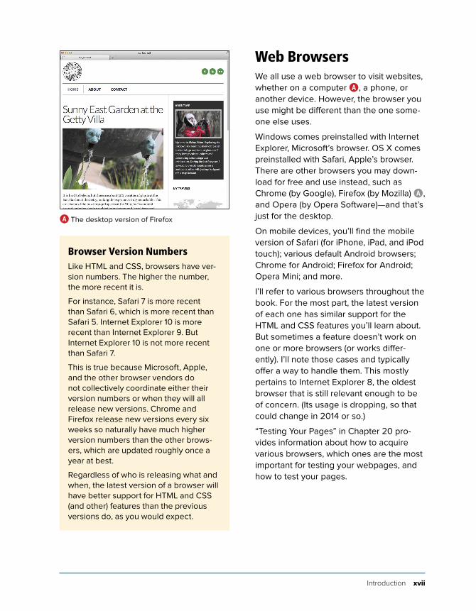
Web BrowsersWe all use a web browser to visit websites, whether on a computer A, a phone, or another device. However, the browser you use might be different than the one some-one else uses.
Windows comes preinstalled with Internet Explorer, Microsoft’s browser. OS X comes preinstalled with Safari, Apple’s browser. There are other browsers you may down-load for free and use instead, such as Chrome (by Google), Firefox (by Mozilla) A, and Opera (by Opera Software)—and that’s just for the desktop.
On mobile devices, you’ll find the mobile version of Safari (for iPhone, iPad, and iPod touch); various default Android browsers; Chrome for Android; Firefox for Android; Opera Mini; and more.
I’ll refer to various browsers throughout the book. For the most part, the latest version of each one has similar support for the HTML and CSS features you’ll learn about. But sometimes a feature doesn’t work on one or more browsers (or works differ-ently). I’ll note those cases and typically offer a way to handle them. This mostly pertains to Internet Explorer 8, the oldest browser that is still relevant enough to be of concern. (Its usage is dropping, so that could change in 2014 or so.)
“Testing Your Pages” in Chapter 20 pro-vides information about how to acquire various browsers, which ones are the most important for testing your webpages, and how to test your pages.
A The desktop version of Firefox
Browser Version NumbersLike HTML and CSS, browsers have ver-sion numbers. The higher the number, the more recent it is.
For instance, Safari 7 is more recent than Safari 6, which is more recent than Safari 5. Internet Explorer 10 is more recent than Internet Explorer 9. But Internet Explorer 10 is not more recent than Safari 7.
This is true because Microsoft, Apple, and the other browser vendors do not collectively coordinate either their version numbers or when they will all release new versions. Chrome and Firefox release new versions every six weeks so naturally have much higher version numbers than the other brows-ers, which are updated roughly once a year at best.
Regardless of who is releasing what and when, the latest version of a browser will have better support for HTML and CSS (and other) features than the previous versions do, as you would expect.
xviii Introduction
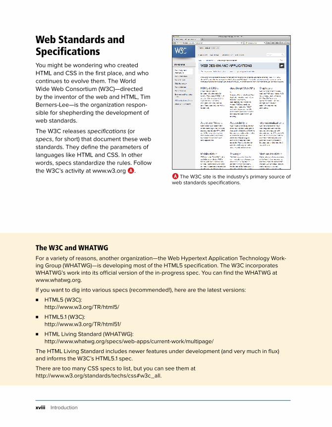
Web Standards and SpecificationsYou might be wondering who created HTML and CSS in the first place, and who continues to evolve them. The World Wide Web Consortium (W3C)—directed by the inventor of the web and HTML, Tim Berners-Lee—is the organization respon-sible for shepherding the development of web standards.
The W3C releases specifications (or specs, for short) that document these web standards. They define the parameters of languages like HTML and CSS. In other words, specs standardize the rules. Follow the W3C’s activity at www.w3.org A.
A The W3C site is the industry’s primary source of web standards specifications.
The W3C and WHATWGFor a variety of reasons, another organization—the Web Hypertext Application Technology Work-ing Group (WHATWG)—is developing most of the HTML5 specification. The W3C incorporates WHATWG’s work into its official version of the in-progress spec. You can find the WHATWG at www.whatwg.org.
If you want to dig into various specs (recommended!), here are the latest versions:
. HTML5 (W3C): http://www.w3.org/TR/html5/
. HTML5.1 (W3C): http://www.w3.org/TR/html51/
. HTML Living Standard (WHATWG): http://www.whatwg.org/specs/web-apps/current-work/multipage/
The HTML Living Standard includes newer features under development (and very much in flux) and informs the W3C’s HTML5.1 spec.
There are too many CSS specs to list, but you can see them at http://www.w3.org/standards/techs/css#w3c_all.
Introduction xix
With standards in place, we can build our pages from the agreed-upon set of rules, and browsers can be built to display our pages with those rules in mind. (On the whole, browsers implement the standards well. Older versions of Internet Explorer, especially Internet Explorer 8, have some issues.)
Specifications go through several stages of development before they are considered final, at which point they are dubbed a Recommendation (www.w3.org/2005/10/Process-20051014/tr).
Parts of the HTML5 and CSS3 specs are still being finalized, but that doesn’t mean you can’t use them. It just takes time (literally years) for the standardiza-tion process to run its course. Browsers begin to implement a spec’s features long before it becomes a Recommendation, because that informs the spec develop-ment process itself. So browsers already include a wide variety of features in HTML5 and CSS3, even though they aren’t Recommendations yet.
On the whole, the features covered in this book are well entrenched in their respec-tive specs, so the risk of their changing prior to becoming a Recommendation is minimal. Developers have been using many HTML5 and CSS3 features for some time. So can you.
Differences Between HTML4 and HTML5If you have prior experience with HTML4 and are wondering what is different in HTML5, the W3C has created just the document for you: http://www.w3.org/TR/html5-diff/.
I call out many of the differences at various points in the book. They aren’t particularly important to know for those of you who are new to HTML, because HTML5 is what virtually everyone uses now. But you might find the W3C’s docu-ment interesting to peruse regardless.
xx Introduction
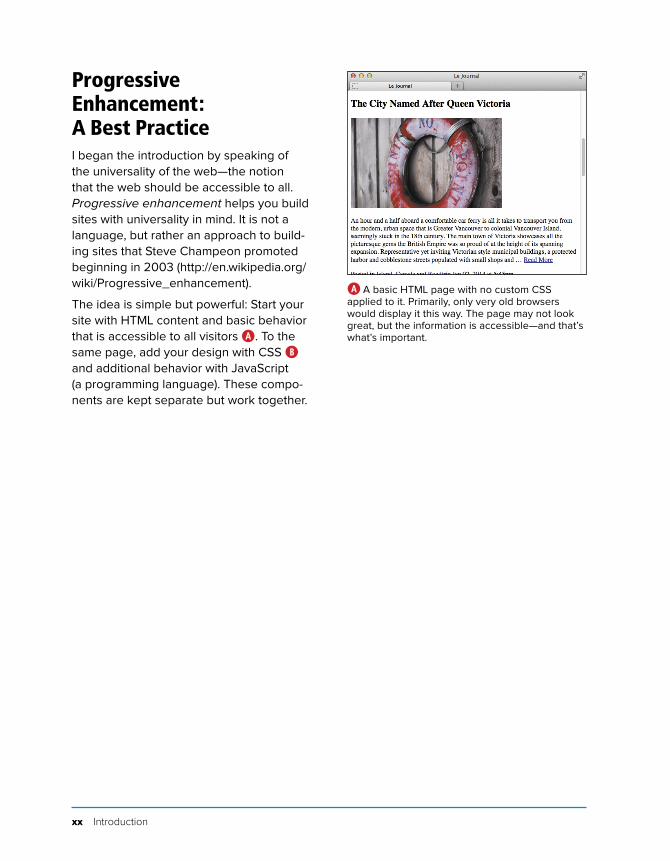
Progressive Enhancement: A Best PracticeI began the introduction by speaking of the universality of the web—the notion that the web should be accessible to all. Progressive enhancement helps you build sites with universality in mind. It is not a language, but rather an approach to build-ing sites that Steve Champeon promoted beginning in 2003 (http://en.wikipedia.org/wiki/Progressive_enhancement).
The idea is simple but powerful: Start your site with HTML content and basic behavior that is accessible to all visitors A. To the same page, add your design with CSS B and additional behavior with JavaScript (a programming language). These compo-nents are kept separate but work together.
A A basic HTML page with no custom CSS applied to it. Primarily, only very old browsers would display it this way. The page may not look great, but the information is accessible—and that’s what’s important.
Introduction xxi
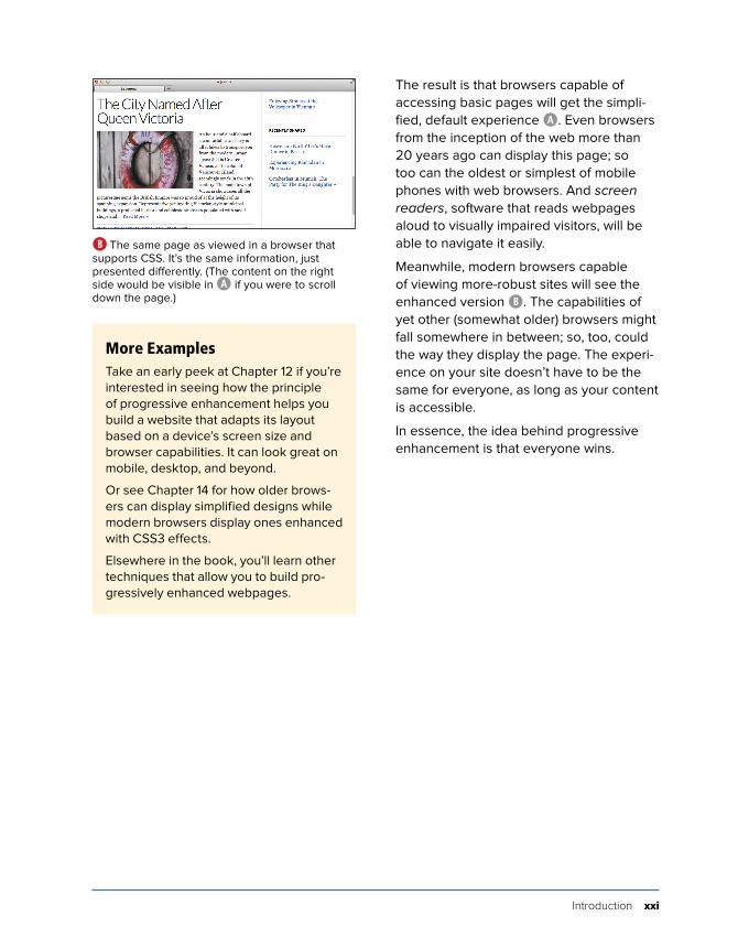
The result is that browsers capable of accessing basic pages will get the simpli-fied, default experience A. Even browsers from the inception of the web more than 20 years ago can display this page; so too can the oldest or simplest of mobile phones with web browsers. And screen readers, software that reads webpages aloud to visually impaired visitors, will be able to navigate it easily.
Meanwhile, modern browsers capable of viewing more-robust sites will see the enhanced version B. The capabilities of yet other (somewhat older) browsers might fall somewhere in between; so, too, could the way they display the page. The experi-ence on your site doesn’t have to be the same for everyone, as long as your content is accessible.
In essence, the idea behind progressive enhancement is that everyone wins.
B The same page as viewed in a browser that supports CSS. It’s the same information, just presented differently. (The content on the right side would be visible in A if you were to scroll down the page.)
More ExamplesTake an early peek at Chapter 12 if you’re interested in seeing how the principle of progressive enhancement helps you build a website that adapts its layout based on a device’s screen size and browser capabilities. It can look great on mobile, desktop, and beyond.
Or see Chapter 14 for how older brows-ers can display simplified designs while modern browsers display ones enhanced with CSS3 effects.
Elsewhere in the book, you’ll learn other techniques that allow you to build pro-gressively enhanced webpages.
xxii Introduction
Is This Book for You?This book assumes no prior knowledge of building websites. So in that sense, it is for the absolute beginner. You will learn both HTML and CSS from the ground up. In the course of doing so, you will also learn about features that are new in HTML5 and CSS3, with an emphasis on many that designers and developers are using today in their daily work.
But even if you are familiar with HTML and CSS, you still stand to learn from this book, especially if you want to get up to speed on the new elements in HTML5, several CSS3 effects, responsive web design, and various best practices.
What this book will teach youThe chapters are organized like so:
n Chapters 1 through 6 and 15 through 18 cover the principles of creating HTML pages and most of the HTML elements at your disposal, with clear examples demonstrating how and when to use each one.
n Chapters 7 through 14 dive into CSS, all the way from creating your first style rule to applying enhanced visual effects with CSS3.
n Chapter 19 shows you how to add pre-written JavaScript to your pages.
n Chapter 20 tells you how to test and debug your pages before putting them on the web.
n Chapter 21 explains how to secure your own domain name and then publish your site on the web for all to see.
Covered topics include the following:
n Creating, saving, and editing HTML and CSS files.
n What it means to write semantic HTML and why it is important.
n How to separate your page’s HTML content, CSS presentation, and JavaScript behavior—a key aspect of progressive enhancement.
n Structuring your content in a meaningful way by using HTML elements that have been around for years as well as ones that are new in HTML5.
n Linking from one webpage to another, or from one part of a page to another part.
n Adding images to your pages and opti-mizing them for the web. This includes creating images targeted for Apple’s Retina display and other high-pixel-density screens.
n Improving your site’s accessibility with ARIA (Accessible Rich Internet Applica-tions) landmark roles and other good coding practices.
n Styling text (size, color, bold, italics, and more) and adding background colors and images.
n Implementing a multi-column webpage layout.
n Building a responsive webpage. That is, a page that shrinks or expands to fit your visitor’s screen and with a layout that adapts in other ways as you wish. The result is a page that’s appropriate for mobile phones, tablets, laptops, desktop computers, and other web-enabled devices.
Introduction xxiii
Some of the topics not covered include the following:
n The HTML5 details, summary, menu, command, output, and keygen elements. The W3C has included some of these on their list of features that might not make the cut when HTML5 is finalized in 2014. The others are used infre-quently at best.
n The HTML5 canvas element, which allows you to draw graphics, create games, and more. Also, Scalable Vector Graphics (SVG). Both are mentioned briefly in Chapter 17, with links to more information.
n The HTML5 APIs and other advanced features that require JavaScript knowl-edge or are otherwise not directly related to the new HTML5 elements.
n CSS3 transforms, animations, and transitions. See www.htmlcssvqs.com/resources/ for links to learn more.
n CSS3’s new layout methods, such as FlexBox, Grid, and more. They are poised to change the way we lay out pages once the specs shake out and browser support is stronger. See Zoe Mickley Gillenwater’s presentation at www.slideshare.net/zomigi/css3-layout, or see Peter Gasston’s article at www.netmagazine.com/features/pros-guide-css-layouts.
n Adding custom web fonts to your pages with @font-face and using fonts from services like Font Squirrel and Google Fonts.
n Using CSS3 effects such as opacity, background alpha transparency, gradi-ents, rounded corners, drop shadows, shadows inside elements, text shadows, and multiple background images.
n Taking advantage of CSS generated content and using sprites to minimize the number of images your page needs, making it load faster for your visitors.
n Building forms to solicit input from your visitors, including using some of the new form input types in HTML5.
n Including media in your pages with the HTML5 audio and video elements for modern browsers, and a Flash fall-back audio or video player for older browsers.
n And more.
These topics are complemented by many dozens of code samples that demonstrate how to implement the features based on best practices in the industry.
What this book won’t teach youAlas, with so many developments in the world of HTML and CSS in recent years, we had to leave out some topics. With a couple of exceptions, we stuck to omit-ting items that you would likely have fewer occasions to use, are still subject to change, lack widespread browser support, require JavaScript knowledge, or are advanced subjects.

xxiv Introduction
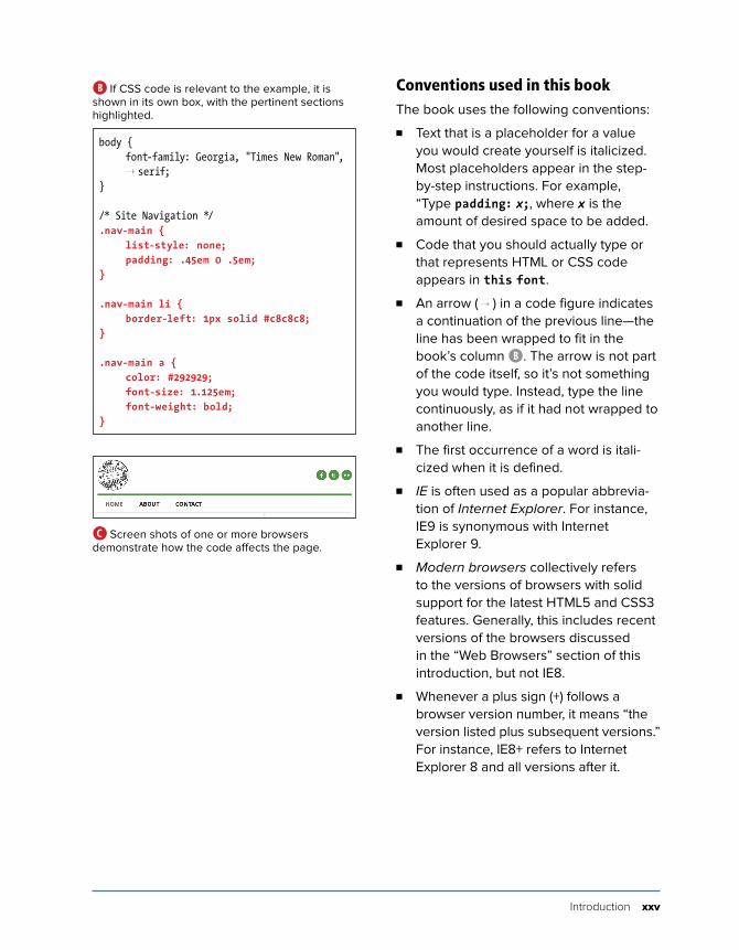
How This Book WorksNearly every section of the book contains practical code examples that demonstrate real-world use (A and B). Typically, they are coupled with screen shots that show the results of the code when you view the webpage in a browser C.
Most of the screen shots are of the latest version of Firefox that was available at the time. However, this doesn’t imply a recommendation of Firefox over any other browser. The code samples will look similar in any of the latest versions of Chrome, Internet Explorer, Opera, or Safari.
...<body><header class="masthead" role="banner"> ... <nav role="navigation"> <ul class="nav-main"> <li><a href="/" class="current-page">Home</a></li> <li><a href="/about/">About</a></li> <li><a href="/contact/">Contact</a></li> </ul> </nav> ...</header>...</body></html>
A You’ll find a snippet of HTML code on many pages, with the pertinent sections highlighted. An ellipsis (...) represents additional code or content that was omitted for brevity. Often, the omitted portion is shown in a different code figure.
The code and screen shots are accompa-nied by descriptions of the HTML elements or CSS properties in question, both to increase your understanding of them and to give the samples context.
In many cases, you may find that the descriptions and code samples are enough for you to start using the HTML and CSS features. But if you need explicit guidance on how to use them, step-by-step instruc-tions are provided as well.
Finally, most sections contain tips that relay additional usage information, best practices, references to related parts of the book, links to relevant resources, and more.
Introduction xxv
Conventions used in this bookThe book uses the following conventions:
n Text that is a placeholder for a value you would create yourself is italicized. Most placeholders appear in the step-by-step instructions. For example, “Type padding: x;, where x is the amount of desired space to be added.
n Code that you should actually type or that represents HTML or CSS code appears in this font.
n An arrow ( ➝ ) in a code figure indicates a continuation of the previous line—the line has been wrapped to fit in the book’s column B. The arrow is not part of the code itself, so it’s not something you would type. Instead, type the line continuously, as if it had not wrapped to another line.
n The first occurrence of a word is itali-cized when it is defined.
n IE is often used as a popular abbrevia-tion of Internet Explorer. For instance, IE9 is synonymous with Internet Explorer 9.
n Modern browsers collectively refers to the versions of browsers with solid support for the latest HTML5 and CSS3 features. Generally, this includes recent versions of the browsers discussed in the “Web Browsers” section of this introduction, but not IE8.
n Whenever a plus sign (+) follows a browser version number, it means “the version listed plus subsequent versions.” For instance, IE8+ refers to Internet Explorer 8 and all versions after it.
body { font-family: Georgia, "Times New Roman",
➝ serif;}
/* Site Navigation */.nav-main { list-style: none; padding: .45em 0 .5em;}
.nav-main li { border-left: 1px solid #c8c8c8;}
.nav-main a { color: #292929; font-size: 1.125em; font-weight: bold;}
B If CSS code is relevant to the example, it is shown in its own box, with the pertinent sections highlighted.
C Screen shots of one or more browsers demonstrate how the code affects the page.
xxvi Introduction
Companion WebsiteThe book’s companion website contains the table of contents, every complete code example featured in the book (plus some additional ones that wouldn’t fit), links to resources cited in the book (as well as additional ones), a list of errata, and more.
The URLs for some of the key pages on the site follow:
n Home page: www.htmlcssvqs.com
n Code examples: www.htmlcssvqs.com/8ed/examples/
You can view the code examples directly from the site or download them to your computer—all the HTML and CSS files are yours for the taking.
In some cases, I’ve included additional comments in the code to explain more about what it does or how to use it. A hand-ful of the code samples in the book are truncated for space considerations, but the complete versions are on the website.
Please feel free to use the code as you please, modifying it as needed for your own projects.
I hope you find the site helpful!
4Text
In This ChapterAdding a Paragraph 88
Specifying Fine Print 89
Marking Important and Emphasized Text 90
Creating a Figure 92
Indicating a Citation or Reference 94
Quoting Text 95
Specifying Time 98
Explaining Abbreviations 101
Defining a Term 103
Creating Superscripts and Subscripts 104
Adding Author Contact Information 106
Noting Edits and Inaccurate Text 108
Marking Up Code 112
Using Preformatted Text 114
Highlighting Text 116
Creating a Line Break 118
Creating Spans 120
Other Elements 122
Unless a site is heavy on videos or photo galleries, most content on webpages is text. This chapter explains which HTML semantics are appropriate for different types of text, especially (but not solely) for text within a sentence or phrase.
For example, the em element is specifically designed for indicating emphasized text, and the cite element’s purpose is to cite works of art, movies, books, and more.
Browsers typically style many text ele-ments differently than normal text. For instance, both the em and cite elements are italicized. Another element, code, which is specifically designed for format-ting lines of code from a script or program, displays in a monospace font by default.
How content will look is irrelevant when deciding how to mark it up. So, you shouldn’t use em or cite just because you want to italicize text. That’s the job of CSS.
Instead, focus on choosing HTML elements that describe the content. If by default a browser styles it as you would yourself with CSS, that’s a bonus. If not, just override the default formatting with your own CSS.
88 Chapter 4
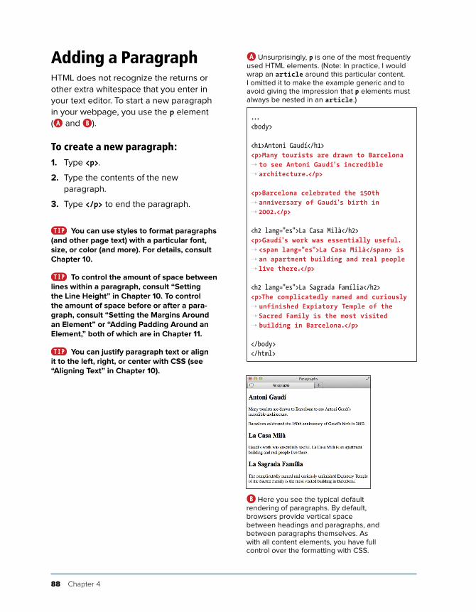
Adding a ParagraphHTML does not recognize the returns or other extra whitespace that you enter in your text editor. To start a new paragraph in your webpage, you use the p element (A and B).
To create a new paragraph:1. Type <p>.
2. Type the contents of the new paragraph.
3. Type </p> to end the paragraph.
You can use styles to format paragraphs (and other page text) with a particular font, size, or color (and more). For details, consult Chapter 10.
To control the amount of space between lines within a paragraph, consult “Setting the Line Height” in Chapter 10. To control the amount of space before or after a para-graph, consult “Setting the Margins Around an Element” or “Adding Padding Around an Element,” both of which are in Chapter 11.
You can justify paragraph text or align it to the left, right, or center with CSS (see “Aligning Text” in Chapter 10).
...<body>
<h1>Antoni Gaudí</h1><p>Many tourists are drawn to Barcelona ➝ to see Antoni Gaudí's incredible ➝ architecture.</p>
<p>Barcelona celebrated the 150th ➝ anniversary of Gaudí's birth in ➝ 2002.</p>
<h2 lang="es">La Casa Milà</h2><p>Gaudí's work was essentially useful. ➝ <span lang="es">La Casa Milà</span> is ➝ an apartment building and real people ➝ live there.</p>
<h2 lang="es">La Sagrada Família</h2><p>The complicatedly named and curiously ➝ unfinished Expiatory Temple of the ➝ Sacred Family is the most visited ➝ building in Barcelona.</p>
</body></html>
A Unsurprisingly, p is one of the most frequently used HTML elements. (Note: In practice, I would wrap an article around this particular content. I omitted it to make the example generic and to avoid giving the impression that p elements must always be nested in an article.)
B Here you see the typical default rendering of paragraphs. By default, browsers provide vertical space between headings and paragraphs, and between paragraphs themselves. As with all content elements, you have full control over the formatting with CSS.

Text 89
Specifying Fine PrintThe small element represents side com-ments such as fine print, which, according to the HTML5 spec, “typically features disclaimers, caveats, legal restrictions, or copyrights. Small print is also sometimes used for attribution or for satisfying licens-ing requirements.”
The small element is intended for brief portions of inline text, not for text spanning multiple paragraphs or other elements (A and B).
To specify fine print:1. Type <small>.
2. Type the text that represents a legal disclaimer, note, attribution, and so on.
3. Type </small>.
Be sure to use small only because it’s appropriate for your content, not because you want to reduce the text size, as happens in some browsers B. You can always adjust the size with CSS (even making it larger if you’d like). See “Setting the Font Size” in Chapter 10 for more information.
The small element is a common choice for marking up your page’s copyright notice (A and B). It’s meant for short phrases like that, so don’t wrap it around long legal notices, such as your Terms of Use or Privacy Policy pages. Those should be marked up with paragraphs and other semantics, as necessary.
...<body>
<p>Order now to receive free shipping. <small>(Some restrictions may apply.) ➝ </small></p>
...
<footer role="contentinfo"> <p><small>© 2013 The Super
➝ Store. All Rights Reserved. ➝ </small></p>
</footer>
</body></html>
A The small element denotes brief legal notices in both instances shown. The second one is a copyright notice contained in a page-level footer, a common convention.
B The small element may render smaller than normal text in some browsers, but the visual size is immaterial to whether you should mark up your content with it.
90 Chapter 4
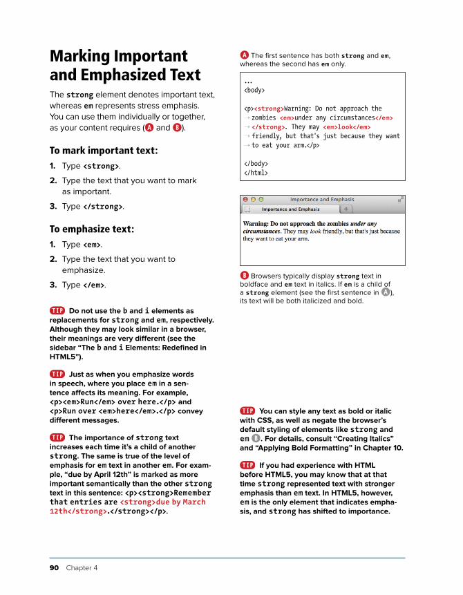
Marking Important and Emphasized TextThe strong element denotes important text, whereas em represents stress emphasis. You can use them individually or together, as your content requires (A and B).
To mark important text:1. Type <strong>.
2. Type the text that you want to mark as important.
3. Type </strong>.
To emphasize text:1. Type <em>.
2. Type the text that you want to emphasize.
3. Type </em>.
Do not use the b and i elements as replacements for strong and em, respectively. Although they may look similar in a browser, their meanings are very different (see the sidebar “The b and i Elements: Redefined in HTML5”).
Just as when you emphasize words in speech, where you place em in a sen-tence affects its meaning. For example, <p><em>Run</em> over here.</p> and <p>Run over <em>here</em>.</p> convey different messages.
The importance of strong text increases each time it’s a child of another strong. The same is true of the level of emphasis for em text in another em. For exam-ple, “due by April 12th” is marked as more important semantically than the other strong text in this sentence: <p><strong>Remember that entries are <strong>due by March 12th</strong>.</strong></p>.
...<body>
<p><strong>Warning: Do not approach the ➝ zombies <em>under any circumstances</em> ➝ </strong>. They may <em>look</em> ➝ friendly, but that's just because they want ➝ to eat your arm.</p>
</body></html>
A The first sentence has both strong and em, whereas the second has em only.
B Browsers typically display strong text in boldface and em text in italics. If em is a child of a strong element (see the first sentence in A), its text will be both italicized and bold.
You can style any text as bold or italic with CSS, as well as negate the browser’s default styling of elements like strong and em B. For details, consult “Creating Italics” and “Applying Bold Formatting” in Chapter 10.
If you had experience with HTML before HTML5, you may know that at that time strong represented text with stronger emphasis than em text. In HTML5, however, em is the only element that indicates empha-sis, and strong has shifted to importance.

Text 91
The b and i Elements: Redefined in HTML5HTML5 focuses on semantics, not on an element’s presentation. The b and i elements are hold-overs from the earliest days of HTML, when they were used to make text bold or italic (CSS didn’t exist yet). They fell out of favor in HTML 4 and XHTML 1 because of their presentational nature. Coders were encouraged to use strong instead of b, and em instead of i. It turns out, though, that em and strong are not always semantically appropriate. HTML5 addresses this by redefining b and i.
Some typographic conventions in traditional publishing fall through the cracks of available HTML semantics. Among them are italicizing certain scientific names (for example, “The Ulmus americana is the Massachusetts state tree.”), named vehicles (for example, “We rode the Orient Express.”), and foreign (to English) language phrases (for example, “The couple exhibited a joie de vivre that was infectious.”). These terms aren’t italicized for emphasis, just stylized per convention.
Rather than create several new semantic elements to address cases like these (and further muddy the waters), HTML5 takes a practical stance by trying to make do with what is available: em for all levels of stress emphasis, strong for importance, and b and i for the through-the-cracks cases. HTML5 emphasizes that you use b and i only as a last resort when another element (such as strong, em, cite, and others) won’t do.
The b Element in Brief
HTML5 redefines the b element this way:
The b element represents a span of text to which attention is being drawn for utilitarian purposes without conveying any extra importance and with no implication of an alternate voice or mood, such as key words in a document abstract, product names in a review, actionable words in interac-tive text-driven software, or an article lede.
For example:
<p>The <b>XR-5</b>, also dubbed the <b>Extreme Robot 5</b>, is the best robot we've ever ➝ tested.</p>
The b element renders as bold by default.
The i Element in Brief
HTML5 redefines the i element this way:
The i element represents a span of text in an alternate voice or mood, or otherwise offset from the normal prose in a manner indicating a different quality of text, such as a taxonomic desig-nation, a technical term, an idiomatic phrase or short span of transliterated prose from another language, a thought, or a ship name in Western texts.
Here are some examples:
<p>The <i lang="la">Ulmus americana</i> is the Massachusetts state tree.</p>
<p>We rode the <i>Orient Express</i>.<p>
<p>The couple exhibited a <i lang="fr">joie de vivre</i> that was infectious.<p>
The i element displays in italics by default.

92 Chapter 4
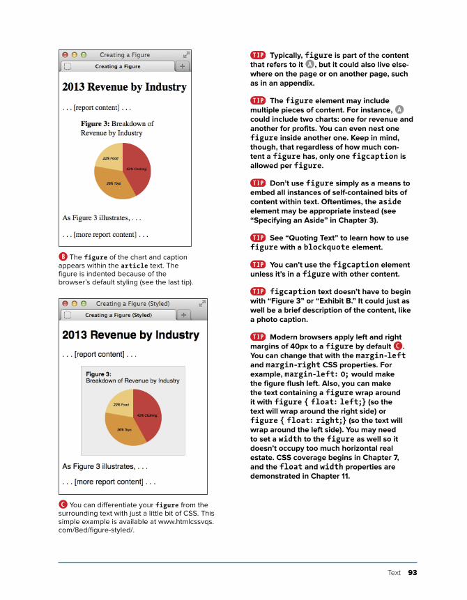
Creating a FigureNo doubt you’ve seen figures in printed newspapers, magazines, reports, and more. Typically, figures are referenced from the main text on a page (like a news story). This very book has them on most pages.
Prior to HTML5, there wasn’t an element designed for this use, so developers cobbled together solutions on their own. This often involved the less-than-ideal, non-semantic div element. HTML5 has changed that with figure and figcaption (A and B). A figure element may contain a chart, a photo, a graph, an illustration, a code segment, or similar self-contained content.
You may refer to a figure from other content on your page (as shown in A and B), but it isn’t required. The optional figcaption is a figure’s caption or leg-end and may appear either at the begin-ning or at the end of a figure’s content.
To create a figure and figure caption:1. Type <figure>.
2. Optionally, type <figcaption> to begin the figure’s caption.
3. Type the caption text.
4. Type </figcaption> if you created a caption in steps 2 and 3.
5. Create your figure by adding code for images, videos, data tables, and so on.
6. If you didn’t include a figcaption before your figure’s content, optionally follow steps 2–4 to add one after the content.
7. Type </figure>.
...<body>...<article> <h1>2013 Revenue by Industry</h1>
<p>... [report content] ...</p>
<figure> <figcaption><b>Figure 3:</b>
➝ Breakdown of Revenue by ➝ Industry</figcaption>
<img src="chart-revenue.png" ➝ width="180" height="143" alt= ➝ "Revenue chart: Clothing 42%, ➝ Toys 36%, Food 22%" />
</figure>
<p>As Figure 3 illustrates, ... </p>
<p>... [more report content] ...</p></article>...</body></html>
A This figure has a chart image, though more than one image or other types of content (such as a data table or video) are allowed as well. The figcaption element isn’t required, but it must be the first or last element in a figure if you do include it. A figure doesn’t have a default styling aside from starting on its own line in modern browsers B. (Note: figures aren’t required to be in an article, but it’s probably suitable in most cases.)
Text 93
Typically, figure is part of the content that refers to it A, but it could also live else-where on the page or on another page, such as in an appendix.
The figure element may include multiple pieces of content. For instance, A could include two charts: one for revenue and another for profits. You can even nest one figure inside another one. Keep in mind, though, that regardless of how much con-tent a figure has, only one figcaption is allowed per figure.
Don’t use figure simply as a means to embed all instances of self-contained bits of content within text. Oftentimes, the aside element may be appropriate instead (see “Specifying an Aside” in Chapter 3).
See “Quoting Text” to learn how to use figure with a blockquote element.
You can’t use the figcaption element unless it’s in a figure with other content.
figcaption text doesn’t have to begin with “Figure 3” or “Exhibit B.” It could just as well be a brief description of the content, like a photo caption.
Modern browsers apply left and right margins of 40px to a figure by default C. You can change that with the margin-left and margin-right CSS properties. For example, margin-left: 0; would make the figure flush left. Also, you can make the text containing a figure wrap around it with figure { float: left;} (so the text will wrap around the right side) or figure { float: right;} (so the text will wrap around the left side). You may need to set a width to the figure as well so it doesn’t occupy too much horizontal real estate. CSS coverage begins in Chapter 7, and the float and width properties are demonstrated in Chapter 11.
B The figure of the chart and caption appears within the article text. The figure is indented because of the browser’s default styling (see the last tip).
C You can differentiate your figure from the surrounding text with just a little bit of CSS. This simple example is available at www.htmlcssvqs.com/8ed/figure-styled/.
94 Chapter 4
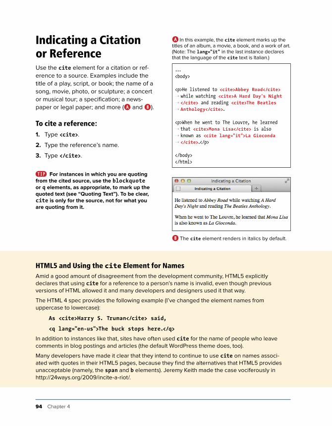
Indicating a Citation or ReferenceUse the cite element for a citation or ref-erence to a source. Examples include the title of a play, script, or book; the name of a song, movie, photo, or sculpture; a concert or musical tour; a specification; a news-paper or legal paper; and more (A and B).
To cite a reference:1. Type <cite>.
2. Type the reference’s name.
3. Type </cite>.
For instances in which you are quoting from the cited source, use the blockquote or q elements, as appropriate, to mark up the quoted text (see “Quoting Text”). To be clear, cite is only for the source, not for what you are quoting from it.
...<body>
<p>He listened to <cite>Abbey Road</cite> ➝ while watching <cite>A Hard Day's Night ➝ </cite> and reading <cite>The Beatles ➝ Anthology</cite>.
<p>When he went to The Louvre, he learned ➝ that <cite>Mona Lisa</cite> is also ➝ known as <cite lang="it">La Gioconda ➝ </cite>.</p>
</body></html>
A In this example, the cite element marks up the titles of an album, a movie, a book, and a work of art. (Note: The lang="it" in the last instance declares that the language of the cite text is Italian.)
B The cite element renders in italics by default.
HTML5 and Using the cite Element for NamesAmid a good amount of disagreement from the development community, HTML5 explicitly declares that using cite for a reference to a person’s name is invalid, even though previous versions of HTML allowed it and many developers and designers used it that way.
The HTML 4 spec provides the following example (I’ve changed the element names from uppercase to lowercase):
As <cite>Harry S. Truman</cite> said,
<q lang="en-us">The buck stops here.</q>
In addition to instances like that, sites have often used cite for the name of people who leave comments in blog postings and articles (the default WordPress theme does, too).
Many developers have made it clear that they intend to continue to use cite on names associ-ated with quotes in their HTML5 pages, because they find the alternatives that HTML5 provides unacceptable (namely, the span and b elements). Jeremy Keith made the case vociferously in http://24ways.org/2009/incite-a-riot/.
Text 95
Quoting TextThere are two special elements for marking text quoted from a source. The blockquote element represents a stand-alone quote (generally a longer one, but not necessarily) (A and B) and displays on its own line by default C. Meanwhile, the q element is for short quotes, like those within a sentence D.
continues on next page
...<body>
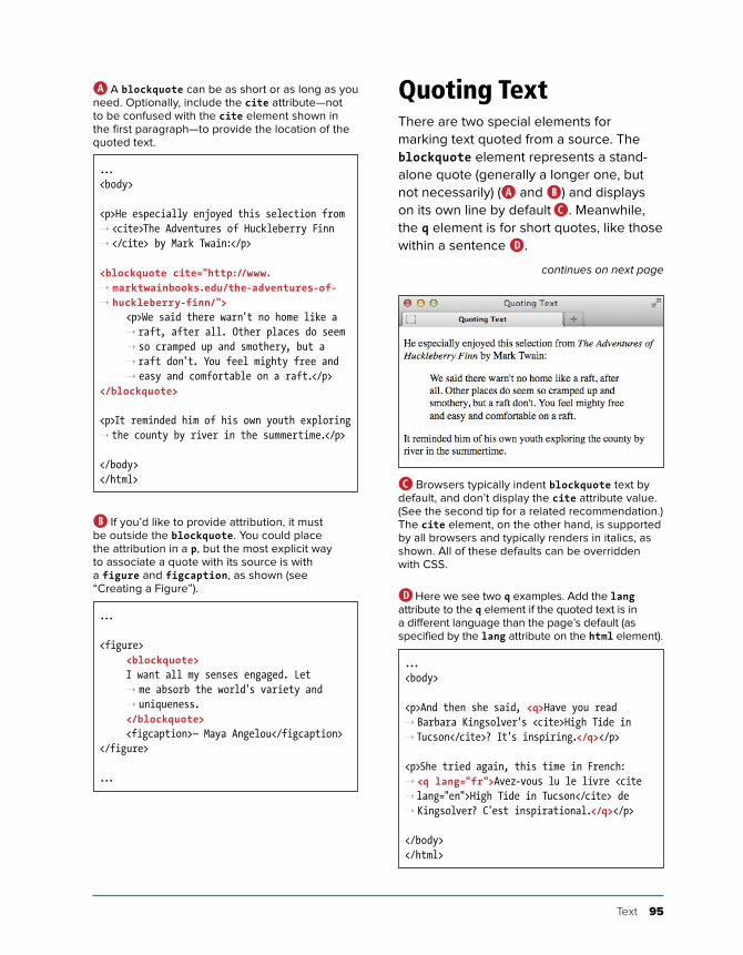
<p>He especially enjoyed this selection from ➝ <cite>The Adventures of Huckleberry Finn ➝ </cite> by Mark Twain:</p>
<blockquote cite="http://www. ➝ marktwainbooks.edu/the-adventures-of- ➝ huckleberry-finn/"> <p>We said there warn't no home like a
➝ raft, after all. Other places do seem ➝ so cramped up and smothery, but a ➝ raft don't. You feel mighty free and ➝ easy and comfortable on a raft.</p>
</blockquote>
<p>It reminded him of his own youth exploring ➝ the county by river in the summertime.</p>
</body></html>
A A blockquote can be as short or as long as you need. Optionally, include the cite attribute—not to be confused with the cite element shown in the first paragraph—to provide the location of the quoted text.
...
<figure> <blockquote> I want all my senses engaged. Let
➝ me absorb the world's variety and ➝ uniqueness.
</blockquote> <figcaption>— Maya Angelou</figcaption></figure>
...
B If you’d like to provide attribution, it must be outside the blockquote. You could place the attribution in a p, but the most explicit way to associate a quote with its source is with a figure and figcaption, as shown (see “Creating a Figure”).
...<body>
<p>And then she said, <q>Have you read ➝ Barbara Kingsolver's <cite>High Tide in ➝ Tucson</cite>? It's inspiring.</q></p>
<p>She tried again, this time in French: ➝ <q lang="fr">Avez-vous lu le livre <cite ➝ lang="en">High Tide in Tucson</cite> de ➝ Kingsolver? C'est inspirational.</q></p>
</body></html>
D Here we see two q examples. Add the lang attribute to the q element if the quoted text is in a different language than the page’s default (as specified by the lang attribute on the html element).
C Browsers typically indent blockquote text by default, and don’t display the cite attribute value. (See the second tip for a related recommendation.) The cite element, on the other hand, is supported by all browsers and typically renders in italics, as shown. All of these defaults can be overridden with CSS.

96 Chapter 4
Browsers are supposed to enclose q ele-ment text in language-specific quotation marks automatically, but the results are mixed E. Be sure to read the tips to learn about alternatives to using the q element.
To quote a block of text:1. Type <blockquote to begin a block
quote.
2. If desired, type cite="url", where url is the address of the source of the quote.
3. Type > to complete the start tag.
4. Type the text you wish to quote, sur-rounding it with paragraphs and other elements as appropriate.
5. Type </blockquote>.
To quote a short phrase:1. Type <q to begin quoting a word or
phrase.
2. If desired, type cite="url", where url is the address of the source of the quote.
3. If the quote’s language is different than the page’s default language (as speci-fied by the lang attribute on the html element), type lang="xx", where xx is the code for the language the quote will be in. This code is supposed to determine the type of quote marks that will be used (“” for English, «» for many European languages, and so on), though browser support for this render-ing can vary.
4. Type > to complete the start tag.
5. Type the text that should be quoted.
6. Type </q>.
E Browsers are supposed to add language-specific quotation marks around q elements automatically. In this example, that means curly double quotes for English and guillemets for French. IE (shown on top) and Chrome do this correctly. Firefox (shown on bottom) is correct for English but not French. Opera and Safari do neither, rendering straight quotes instead, including for French. Inconsistencies like these limit the usefulness of the q element.
Text 97
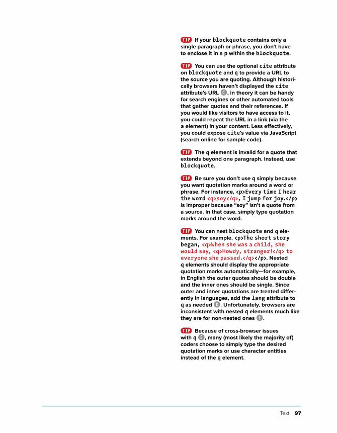
If your blockquote contains only a single paragraph or phrase, you don't have to enclose it in a p within the blockquote.
You can use the optional cite attribute on blockquote and q to provide a URL to the source you are quoting. Although histori-cally browsers haven’t displayed the cite attribute’s URL C, in theory it can be handy for search engines or other automated tools that gather quotes and their references. If you would like visitors to have access to it, you could repeat the URL in a link (via the a element) in your content. Less effectively, you could expose cite’s value via JavaScript (search online for sample code).
The q element is invalid for a quote that extends beyond one paragraph. Instead, use blockquote.
Be sure you don’t use q simply because you want quotation marks around a word or phrase. For instance, <p>Every time I hear the word <q>soy</q>, I jump for joy.</p> is improper because “soy” isn’t a quote from a source. In that case, simply type quotation marks around the word.
You can nest blockquote and q ele-ments. For example, <p>The short story began, <q>When she was a child, she would say, <q>Howdy, stranger!</q> to everyone she passed.</q></p>. Nested q elements should display the appropriate quotation marks automatically—for example, in English the outer quotes should be double and the inner ones should be single. Since outer and inner quotations are treated differ-ently in languages, add the lang attribute to q as needed D. Unfortunately, browsers are inconsistent with nested q elements much like they are for non-nested ones E.
Because of cross-browser issues with q E, many (most likely the majority of) coders choose to simply type the desired quotation marks or use character entities instead of the q element.
98 Chapter 4
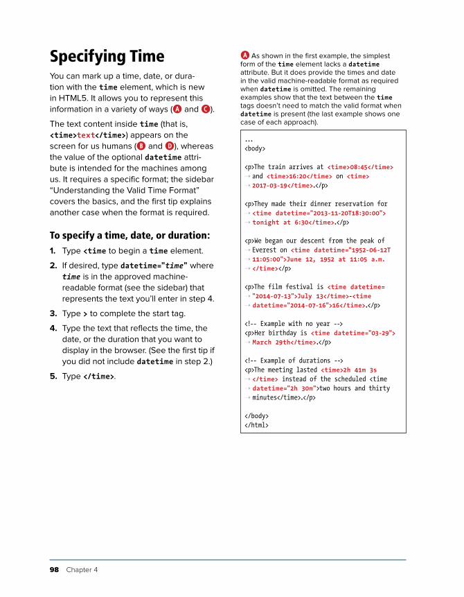
Specifying TimeYou can mark up a time, date, or dura-tion with the time element, which is new in HTML5. It allows you to represent this information in a variety of ways (A and C).
The text content inside time (that is, <time>text</time>) appears on the screen for us humans (B and D), whereas the value of the optional datetime attri-bute is intended for the machines among us. It requires a specific format; the sidebar “Understanding the Valid Time Format” covers the basics, and the first tip explains another case when the format is required.
To specify a time, date, or duration:1. Type <time to begin a time element.
2. If desired, type datetime="time" where time is in the approved machine-readable format (see the sidebar) that represents the text you’ll enter in step 4.
3. Type > to complete the start tag.
4. Type the text that reflects the time, the date, or the duration that you want to display in the browser. (See the first tip if you did not include datetime in step 2.)
5. Type </time>.
...<body>
<p>The train arrives at <time>08:45</time> ➝ and <time>16:20</time> on <time> ➝ 2017-03-19</time>.</p>
<p>They made their dinner reservation for ➝ <time datetime="2013-11-20T18:30:00"> ➝ tonight at 6:30</time>.</p>
<p>We began our descent from the peak of ➝ Everest on <time datetime="1952-06-12T ➝ 11:05:00">June 12, 1952 at 11:05 a.m. ➝ </time></p>
<p>The film festival is <time datetime= ➝ "2014-07-13">July 13</time>-<time ➝ datetime="2014-07-16">16</time>.</p>
<!-- Example with no year --><p>Her birthday is <time datetime="03-29"> ➝ March 29th</time>.</p>
<!-- Example of durations --><p>The meeting lasted <time>2h 41m 3s ➝ </time> instead of the scheduled <time ➝ datetime="2h 30m">two hours and thirty ➝ minutes</time>.</p>
</body></html>
A As shown in the first example, the simplest form of the time element lacks a datetime attribute. But it does provide the times and date in the valid machine-readable format as required when datetime is omitted. The remaining examples show that the text between the time tags doesn’t need to match the valid format when datetime is present (the last example shows one case of each approach).

Text 99
If you omit the datetime attribute, the text content inside time must follow the machine-friendly format rather than being “free-form.” In other words, the first example in A could not be coded as <p>The train arrives at <time>8:45 a.m.</time> and <time>4:20 p.m.</time> on <time>April 20th, 2015</time>.</p> because the time text doesn’t follow the format in any of the three instances. However, when you do include datetime, you’re free to represent the date, time, or duration in the text content as you wish, as seen in the other examples in A.
The datetime attribute doesn’t do any-thing on its own but could be used for syncing dates and times between web applications and the like (for example, think of a calendar application). That’s why it requires a standard, machine-readable format; it allows these pro-grams to share information by speaking the same “language.”
You may not nest a time element inside another one or place any other elements ( just text) in a time element that lacks a datetime attribute.
The time element allowed an optional attribute named pubdate in an earlier itera-tion of HTML5 (remember that the language is still evolving). However, pubdate is no longer part of HTML5. I mention this in case you come across it in an older tutorial or book (such as the seventh edition of this book!) and wonder if you should use it (you shouldn’t).
B Only the time text displays in browsers, not the datetime value.
D As expected, the date is below the heading.
...<body>
<article> <h1>Cheetah and Gazelle Make Fast
➝ Friends</h1> <p><time datetime="2014-10-15">October
➝ 15, 2014</time></p>
... [article content] ...</article>
</body></html>
C This shows how you might include a date for a blog post or news article. As is required for all cases of datetime, its value represents the text content in a machine-readable format.
100 Chapter 4
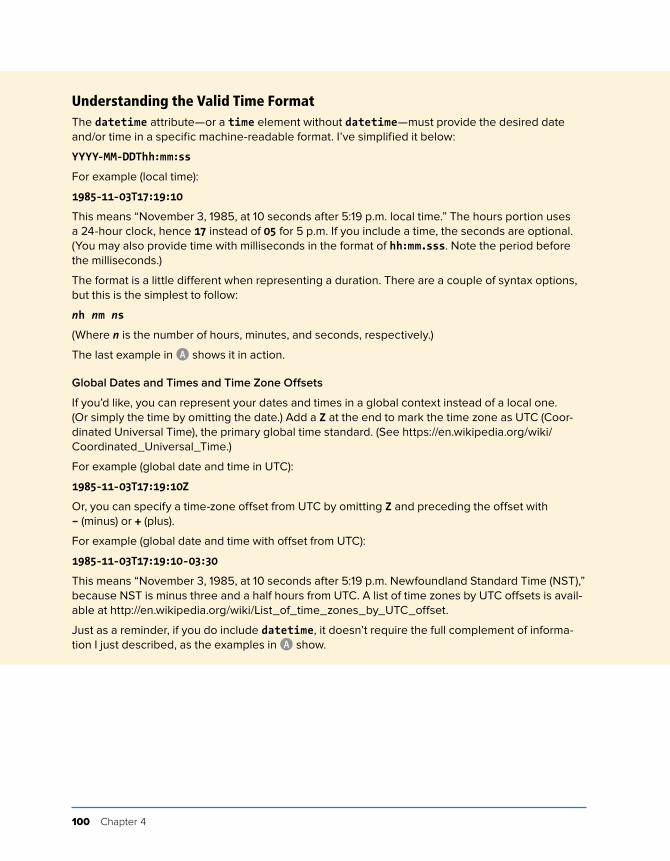
Understanding the Valid Time FormatThe datetime attribute—or a time element without datetime—must provide the desired date and/or time in a specific machine-readable format. I’ve simplified it below:
YYYY-MM-DDThh:mm:ss
For example (local time):
1985-11-03T17:19:10
This means “November 3, 1985, at 10 seconds after 5:19 p.m. local time.” The hours portion uses a 24-hour clock, hence 17 instead of 05 for 5 p.m. If you include a time, the seconds are optional. (You may also provide time with milliseconds in the format of hh:mm.sss. Note the period before the milliseconds.)
The format is a little different when representing a duration. There are a couple of syntax options, but this is the simplest to follow:
nh nm ns
(Where n is the number of hours, minutes, and seconds, respectively.)
The last example in A shows it in action.
Global Dates and Times and Time Zone Offsets
If you’d like, you can represent your dates and times in a global context instead of a local one. (Or simply the time by omitting the date.) Add a Z at the end to mark the time zone as UTC (Coor-dinated Universal Time), the primary global time standard. (See https://en.wikipedia.org/wiki/Coordinated_Universal_Time.)
For example (global date and time in UTC):
1985-11-03T17:19:10Z
Or, you can specify a time-zone offset from UTC by omitting Z and preceding the offset with – (minus) or + (plus).
For example (global date and time with offset from UTC):
1985-11-03T17:19:10-03:30
This means “November 3, 1985, at 10 seconds after 5:19 p.m. Newfoundland Standard Time (NST),” because NST is minus three and a half hours from UTC. A list of time zones by UTC offsets is avail-able at http://en.wikipedia.org/wiki/List_of_time_zones_by_UTC_offset.
Just as a reminder, if you do include datetime, it doesn’t require the full complement of informa-tion I just described, as the examples in A show.
Text 101
Explaining AbbreviationsAbbreviations abound, whether as Jr., M.D., or even good ol’ HTML. You can use the abbr element to mark up abbreviations and explain their meaning (A through C). You don’t have to wrap every abbrevia-tion in abbr, only when you think it would be helpful for visitors to be given the expanded meaning.
To explain abbreviations:1. Type <abbr.
2. Optionally, next type title="expansion", where expansion is the words repre-sented by the abbreviation.
3. Type >.
4. Then type the abbreviation itself.
5. Finally, finish up with </abbr>.
6. Optionally, type a space and (expansion), where expansion is the words represented by the abbreviation.
It’s common practice to include an abbre-viation’s expansion (by way of a title or a parenthetical) only the first time it appears on a page.
A parenthetical abbreviation expansion is the most explicit way to describe an abbre-viation, making it available to the widest set of visitors A. For instance, users on touchscreen devices like smartphones and tablets may not be able to hover on an abbr element to see a title tool tip. So if you provide an expansion, consider putting it in parentheses whenever possible.
If you use an abbreviation in its plural form, make the expansion plural as well.
continues on next page
...<body>
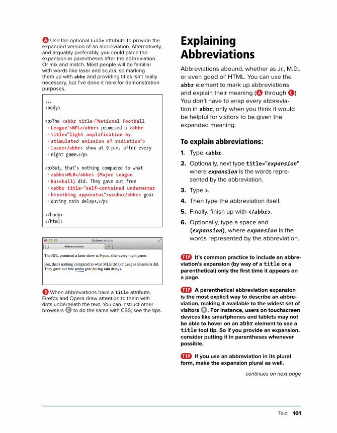
<p>The <abbr title="National Football ➝ League">NFL</abbr> promised a <abbr ➝ title="light amplification by ➝ stimulated emission of radiation"> ➝ laser</abbr> show at 9 p.m. after every ➝ night game.</p>
<p>But, that's nothing compared to what ➝ <abbr>MLB</abbr> (Major League ➝ Baseball) did. They gave out free ➝ <abbr title="self-contained underwater ➝ breathing apparatus">scuba</abbr> gear ➝ during rain delays.</p>
</body></html>
A Use the optional title attribute to provide the expanded version of an abbreviation. Alternatively, and arguably preferably, you could place the expansion in parentheses after the abbreviation. Or mix and match. Most people will be familiar with words like laser and scuba, so marking them up with abbr and providing titles isn’t really necessary, but I’ve done it here for demonstration purposes.
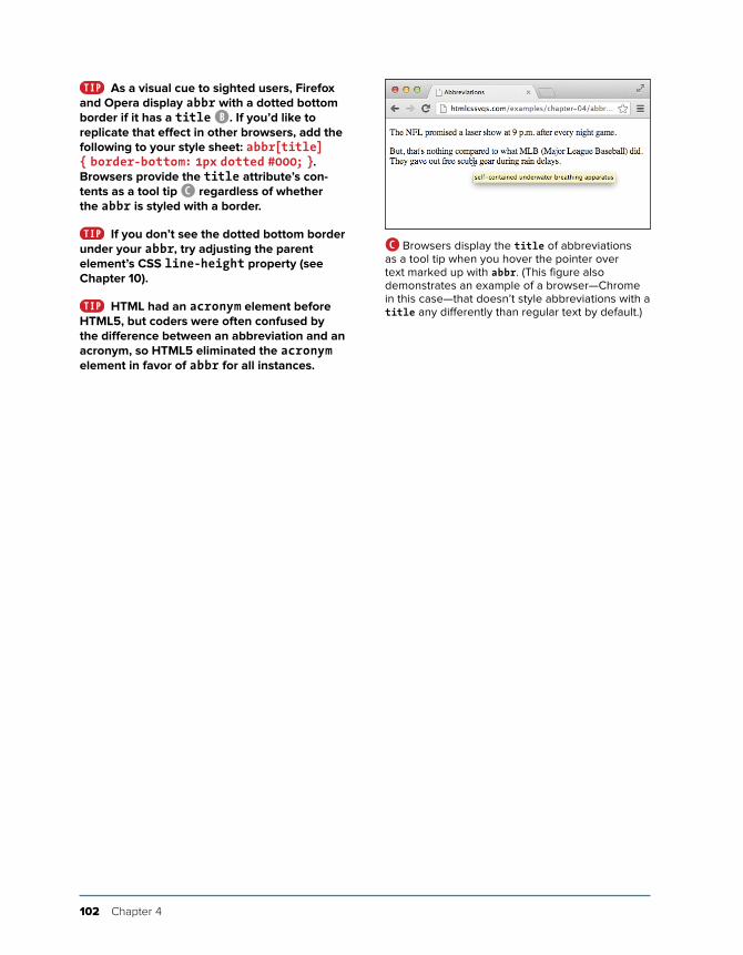
B When abbreviations have a title attribute, Firefox and Opera draw attention to them with dots underneath the text. You can instruct other browsers C to do the same with CSS; see the tips.
102 Chapter 4
As a visual cue to sighted users, Firefox and Opera display abbr with a dotted bottom border if it has a title B. If you’d like to replicate that effect in other browsers, add the following to your style sheet: abbr[title] { border-bottom: 1px dotted #000; }. Browsers provide the title attribute’s con-tents as a tool tip C regardless of whether the abbr is styled with a border.
If you don’t see the dotted bottom border under your abbr, try adjusting the parent element’s CSS line-height property (see Chapter 10).
HTML had an acronym element before HTML5, but coders were often confused by the difference between an abbreviation and an acronym, so HTML5 eliminated the acronym element in favor of abbr for all instances.
C Browsers display the title of abbreviations as a tool tip when you hover the pointer over text marked up with abbr. (This figure also demonstrates an example of a browser—Chrome in this case—that doesn’t style abbreviations with a title any differently than regular text by default.)
Text 103
Defining a TermIn the print world, it’s customary to differ-entiate a term visually when you define it. Typically, this is done with italics; subse-quent uses of the term are not italicized.
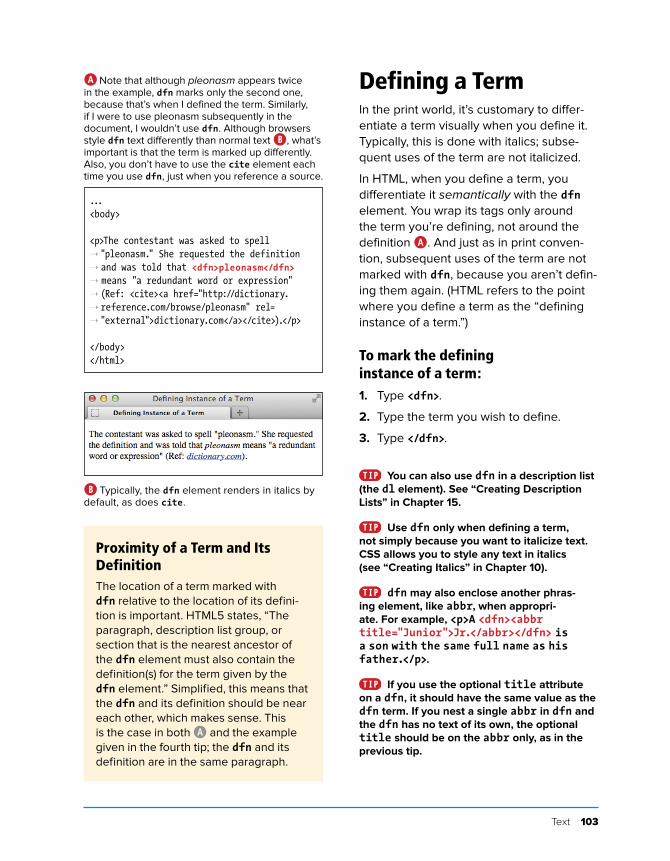
In HTML, when you define a term, you differentiate it semantically with the dfn element. You wrap its tags only around the term you’re defining, not around the definition A. And just as in print conven-tion, subsequent uses of the term are not marked with dfn, because you aren’t defin-ing them again. (HTML refers to the point where you define a term as the “defining instance of a term.”)
To mark the defining instance of a term:1. Type <dfn>.
2. Type the term you wish to define.
3. Type </dfn>.
You can also use dfn in a description list (the dl element). See “Creating Description Lists” in Chapter 15.
Use dfn only when defining a term, not simply because you want to italicize text. CSS allows you to style any text in italics (see “ Creating Italics” in Chapter 10).
dfn may also enclose another phras-ing element, like abbr, when appropri-ate. For example, <p>A <dfn><abbr title="Junior">Jr.</abbr></dfn> is a son with the same full name as his father.</p>.
If you use the optional title attribute on a dfn, it should have the same value as the dfn term. If you nest a single abbr in dfn and the dfn has no text of its own, the optional title should be on the abbr only, as in the previous tip.
...<body>
<p>The contestant was asked to spell ➝ "pleonasm." She requested the definition ➝ and was told that <dfn>pleonasm</dfn> ➝ means "a redundant word or expression" ➝ (Ref: <cite><a href="http://dictionary. ➝ reference.com/browse/pleonasm" rel= ➝ "external">dictionary.com</a></cite>).</p>
</body></html>
A Note that although pleonasm appears twice in the example, dfn marks only the second one, because that’s when I defined the term. Similarly, if I were to use pleonasm subsequently in the document, I wouldn’t use dfn. Although browsers style dfn text differently than normal text B, what’s important is that the term is marked up differently. Also, you don’t have to use the cite element each time you use dfn, just when you reference a source.
B Typically, the dfn element renders in italics by default, as does cite.
Proximity of a Term and Its DefinitionThe location of a term marked with dfn relative to the location of its defini-tion is important. HTML5 states, “The paragraph, description list group, or section that is the nearest ancestor of the dfn element must also contain the definition(s) for the term given by the dfn element.” Simplified, this means that the dfn and its definition should be near each other, which makes sense. This is the case in both A and the example given in the fourth tip; the dfn and its definition are in the same paragraph.
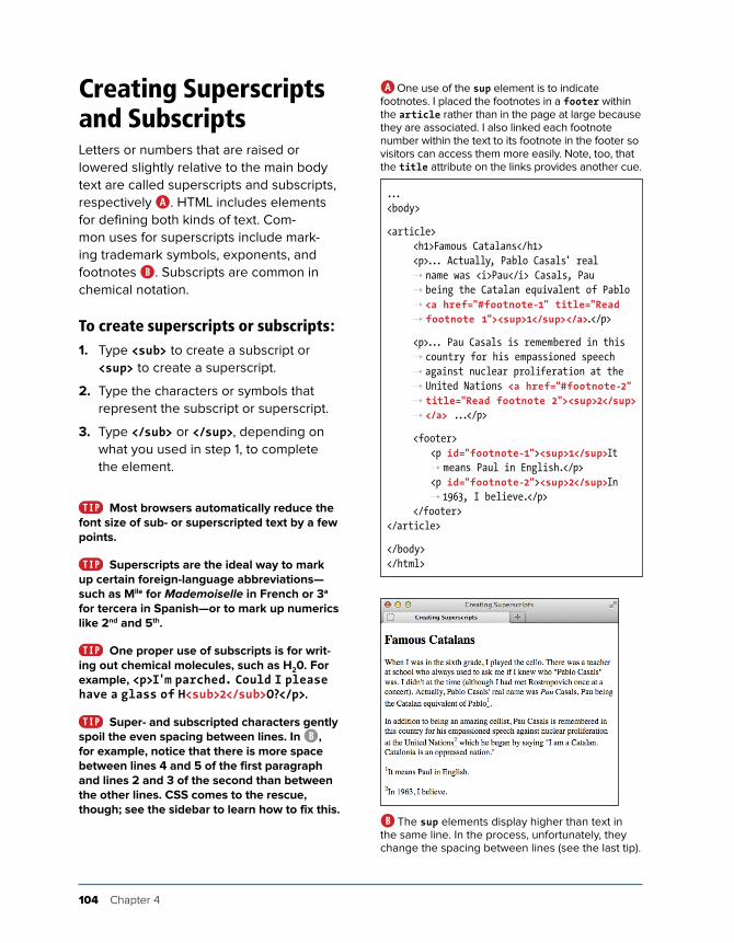
104 Chapter 4
Creating Superscripts and SubscriptsLetters or numbers that are raised or lowered slightly relative to the main body text are called superscripts and subscripts, respectively A. HTML includes elements for defining both kinds of text. Com-mon uses for superscripts include mark-ing trademark symbols, exponents, and footnotes B. Subscripts are common in chemical notation.
To create superscripts or subscripts:1. Type <sub> to create a subscript or
<sup> to create a superscript.
2. Type the characters or symbols that represent the subscript or superscript.
3. Type </sub> or </sup>, depending on what you used in step 1, to complete the element.
Most browsers automatically reduce the font size of sub- or superscripted text by a few points.
Superscripts are the ideal way to mark up certain foreign-language abbreviations—such as Mlle for Mademoiselle in French or 3a for tercera in Spanish—or to mark up numerics like 2nd and 5th.
One proper use of subscripts is for writ-ing out chemical molecules, such as H20. For example, <p>I'm parched. Could I please have a glass of H<sub>2</sub>O?</p>.
Super- and subscripted characters gently spoil the even spacing between lines. In B, for example, notice that there is more space between lines 4 and 5 of the first paragraph and lines 2 and 3 of the second than between the other lines. CSS comes to the rescue, though; see the sidebar to learn how to fix this.
...<body>
<article> <h1>Famous Catalans</h1> <p>... Actually, Pablo Casals' real
➝ name was <i>Pau</i> Casals, Pau ➝ being the Catalan equivalent of Pablo ➝ <a href="#footnote-1" title="Read ➝ footnote 1"><sup>1</sup></a>.</p>
<p>... Pau Casals is remembered in this ➝ country for his empassioned speech ➝ against nuclear proliferation at the ➝ United Nations <a href="#footnote-2" ➝ title="Read footnote 2"><sup>2</sup> ➝ </a> ...</p>
<footer> <p id="footnote-1"><sup>1</sup>It
➝ means Paul in English.</p> <p id="footnote-2"><sup>2</sup>In
➝ 1963, I believe.</p> </footer></article>
</body></html>
A One use of the sup element is to indicate footnotes. I placed the footnotes in a footer within the article rather than in the page at large because they are associated. I also linked each footnote number within the text to its footnote in the footer so visitors can access them more easily. Note, too, that the title attribute on the links provides another cue.
B The sup elements display higher than text in the same line. In the process, unfortunately, they change the spacing between lines (see the last tip).

Text 105
Fixing the Spacing Between Lines When Using sub or supWith a little bit of CSS, you can fix the line height discrepancies caused by the sub and sup elements. The code below comes from Nicolas Gallagher and Jonathan Neal’s excellent normalize.css (http://necolas.github.com/normalize.css/). They didn’t invent the method that follows; they borrowed it from https://gist.github.com/413930, which includes a full explanation of what this CSS does, so I encourage you to give it a look.
I also recommend checking out normalize.css, which you can use on your own projects. It helps you achieve a consistent baseline display of elements across browsers and is documented thor-oughly (see “Resetting or Normalizing Default Styles” in Chapter 11).
/*
* Prevents sub and sup affecting line-height in all browsers
* gist.github.com/413930
*/
sub,
sup {
font-size: 75%;
line-height: 0;
position: relative;
vertical-align: baseline;
}
sup {
top: -0.5em;
}
sub {
bottom: -0.25em;
}
You may need to adjust this CSS a bit to level out the line heights, depending on your content’s font size, but this should give you a very good start at the least. You’ll learn about creating style sheets and how to add this CSS to your site in Chapter 8.
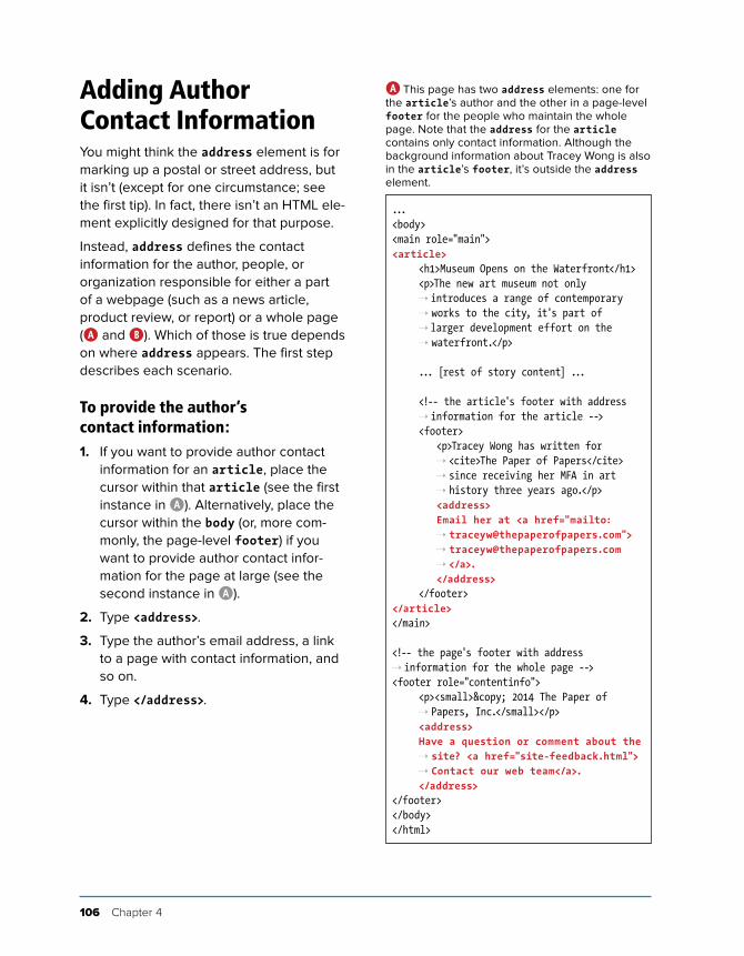
106 Chapter 4
Adding Author Contact InformationYou might think the address element is for marking up a postal or street address, but it isn’t (except for one circumstance; see the first tip). In fact, there isn’t an HTML ele-ment explicitly designed for that purpose.
Instead, address defines the contact information for the author, people, or organization responsible for either a part of a webpage (such as a news article, product review, or report) or a whole page (A and B). Which of those is true depends on where address appears. The first step describes each scenario.
To provide the author’s contact information:1. If you want to provide author contact
information for an article, place the cursor within that article (see the first instance in A). Alternatively, place the cursor within the body (or, more com-monly, the page-level footer) if you want to provide author contact infor-mation for the page at large (see the second instance in A).
2. Type <address>.
3. Type the author’s email address, a link to a page with contact information, and so on.
4. Type </address>.
...<body><main role="main"><article> <h1>Museum Opens on the Waterfront</h1> <p>The new art museum not only
➝ introduces a range of contemporary ➝ works to the city, it's part of ➝ larger development effort on the ➝ waterfront.</p>
... [rest of story content] ...
<!-- the article's footer with address ➝ information for the article -->
<footer> <p>Tracey Wong has written for
➝ <cite>The Paper of Papers</cite> ➝ since receiving her MFA in art ➝ history three years ago.</p>
<address> Email her at <a href="mailto:
➝ [email protected]"> ➝ [email protected] ➝ </a>.
</address> </footer></article></main>
<!-- the page's footer with address ➝ information for the whole page --><footer role="contentinfo"> <p><small>© 2014 The Paper of
➝ Papers, Inc.</small></p> <address> Have a question or comment about the
➝ site? <a href="site-feedback.html"> ➝ Contact our web team</a>.
</address></footer></body></html>
A This page has two address elements: one for the article’s author and the other in a page-level footer for the people who maintain the whole page. Note that the address for the article contains only contact information. Although the background information about Tracey Wong is also in the article’s footer, it’s outside the address element.
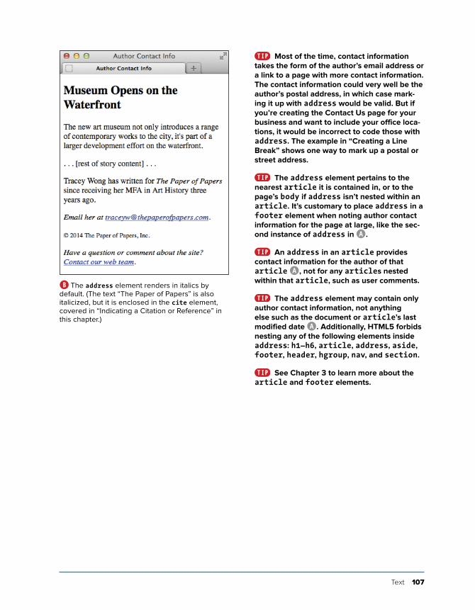
Text 107
Most of the time, contact information takes the form of the author’s email address or a link to a page with more contact information. The contact information could very well be the author’s postal address, in which case mark-ing it up with address would be valid. But if you’re creating the Contact Us page for your business and want to include your office loca-tions, it would be incorrect to code those with address. The example in “Creating a Line Break” shows one way to mark up a postal or street address.
The address element pertains to the nearest article it is contained in, or to the page’s body if address isn’t nested within an article. It’s customary to place address in a footer element when noting author contact information for the page at large, like the sec-ond instance of address in A.
An address in an article provides contact information for the author of that article A, not for any articles nested within that article, such as user comments.
The address element may contain only author contact information, not anything else such as the document or article’s last modified date A. Additionally, HTML5 forbids nesting any of the following elements inside address: h1–h6, article, address, aside, footer, header, hgroup, nav, and section.
See Chapter 3 to learn more about the article and footer elements.
B The address element renders in italics by default. (The text “The Paper of Papers” is also italicized, but it is enclosed in the cite element, covered in “Indicating a Citation or Reference” in this chapter.)
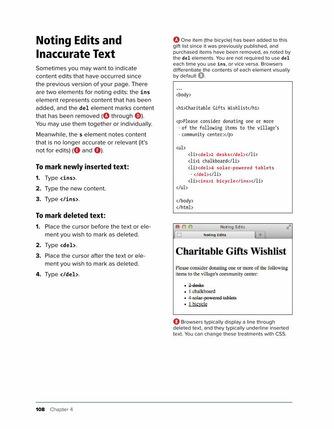
108 Chapter 4
Noting Edits and Inaccurate TextSometimes you may want to indicate content edits that have occurred since the previous version of your page. There are two elements for noting edits: the ins element represents content that has been added, and the del element marks content that has been removed (A through D). You may use them together or individually.
Meanwhile, the s element notes content that is no longer accurate or relevant (it’s not for edits) (E and F).
To mark newly inserted text:1. Type <ins>.
2. Type the new content.
3. Type </ins>.
To mark deleted text:1. Place the cursor before the text or ele-
ment you wish to mark as deleted.
2. Type <del>.
3. Place the cursor after the text or ele-ment you wish to mark as deleted.
4. Type </del>.
...<body>
<h1>Charitable Gifts Wishlist</h1>
<p>Please consider donating one or more ➝ of the following items to the village's ➝ community center:</p>
<ul> <li><del>2 desks</del></li> <li>1 chalkboard</li> <li><del>4 solar-powered tablets
➝ </del></li> <li><ins>1 bicycle</ins></li></ul>
</body></html>
A One item (the bicycle) has been added to this gift list since it was previously published, and purchased items have been removed, as noted by the del elements. You are not required to use del each time you use ins, or vice versa. Browsers differentiate the contents of each element visually by default B.
B Browsers typically display a line through deleted text, and they typically underline inserted text. You can change these treatments with CSS.
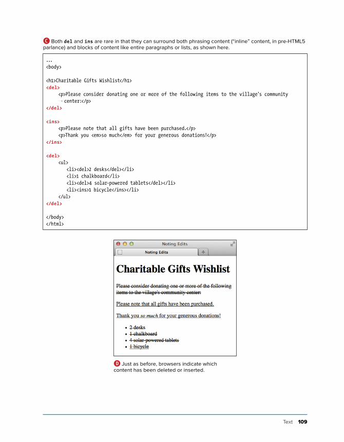
Text 109
...<body>
<h1>Charitable Gifts Wishlist</h1><del> <p>Please consider donating one or more of the following items to the village's community
➝ center:</p></del>
<ins> <p>Please note that all gifts have been purchased.</p> <p>Thank you <em>so much</em> for your generous donations!</p></ins>
<del> <ul> <li><del>2 desks</del></li> <li>1 chalkboard</li> <li><del>4 solar-powered tablets</del></li> <li><ins>1 bicycle</ins></li> </ul></del>
</body></html>
C Both del and ins are rare in that they can surround both phrasing content (“inline” content, in pre-HTML5 parlance) and blocks of content like entire paragraphs or lists, as shown here.
D Just as before, browsers indicate which content has been deleted or inserted.
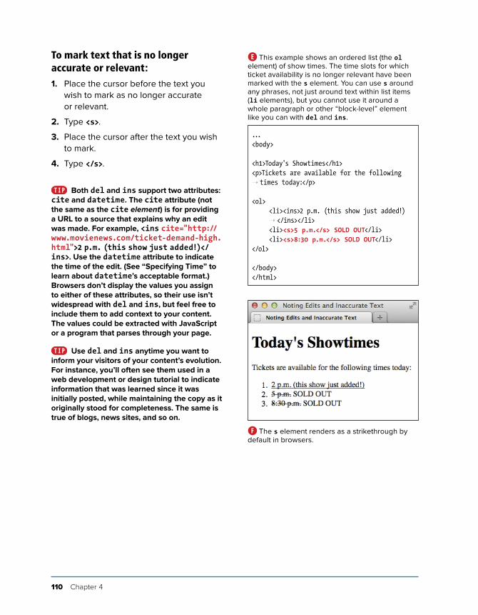
110 Chapter 4
To mark text that is no longer accurate or relevant:1. Place the cursor before the text you
wish to mark as no longer accurate or relevant.
2. Type <s>.
3. Place the cursor after the text you wish to mark.
4. Type </s>.
Both del and ins support two attributes: cite and datetime. The cite attribute (not the same as the cite element) is for providing a URL to a source that explains why an edit was made. For example, <ins cite="http://www.movienews.com/ticket-demand-high.html">2 p.m. (this show just added!)</ins>. Use the datetime attribute to indicate the time of the edit. (See “Specifying Time” to learn about datetime’s acceptable format.) Browsers don’t display the values you assign to either of these attributes, so their use isn’t widespread with del and ins, but feel free to include them to add context to your content. The values could be extracted with JavaScript or a program that parses through your page.
Use del and ins anytime you want to inform your visitors of your content’s evolution. For instance, you’ll often see them used in a web development or design tutorial to indicate information that was learned since it was initially posted, while maintaining the copy as it originally stood for completeness. The same is true of blogs, news sites, and so on.
...<body>
<h1>Today's Showtimes</h1><p>Tickets are available for the following ➝ times today:</p>
<ol> <li><ins>2 p.m. (this show just added!)
➝ </ins></li> <li><s>5 p.m.</s> SOLD OUT</li> <li><s>8:30 p.m.</s> SOLD OUT</li></ol>
</body></html>
E This example shows an ordered list (the ol element) of show times. The time slots for which ticket availability is no longer relevant have been marked with the s element. You can use s around any phrases, not just around text within list items (li elements), but you cannot use it around a whole paragraph or other “block-level” element like you can with del and ins.
F The s element renders as a strikethrough by default in browsers.
Text 111
Text marked with the ins element is generally underlined by default B. Since links are often underlined as well (if not in your site, then in many others), this may be confusing to visitors. You may want to use CSS to change how inserted passages (or links) are displayed (see Chapter 10).
Text marked with the del element is generally struck out B. Why not just erase it and be done with it? It depends on whether you think it’s important to indicate what’s been removed. Striking out content makes it easy for sighted users to know what has changed. (Also, screen readers could announce the con-tent as having been removed, but their sup-port for doing so has historically been lacking.)
Only use del, ins, and s for their semantic value. If you wish to underline or strike out text purely for cosmetic reasons, you can do so with CSS (see “Decorating Text” in Chapter 10).
HTML5 notes that “The s element is not appropriate when indicating document edits; to mark a span of text as having been removed from a document, use the del element.” You may find the distinction a little subtle at times. It’s up to you to decide which is the appropri-ate semantic choice for your content.

112 Chapter 4
Marking Up CodeIf your content contains code samples or file names, the code element is for you (A and B).
The examples show code used in a sen-tence. To show a standalone block of code (outside of a sentence), wrap the code element with a pre element to maintain its formatting (see “Using Preformatted Text” for an example).
To mark up code or a file name:1. Type <code>.
2. Type the code or file name.
3. Type </code>.
You can change the default mono-spaced font applied to code B with CSS (see Chapter 10).
See “A Webpage's Text Content” in Chapter 1 regarding character entities A.
...<body>
<p>The <code>showPhoto()</code> function ➝ displays the full-size photo of the ➝ thumbnail in our <code><ul id= ➝ "thumbnail"></code> carousel list.</p>
<p>This CSS shorthand example applies a ➝ margin to all sides of paragraphs: <code>p ➝ { margin: 1.25em; }</code>. Take a look ➝ at <code>base.css</code> to see more ➝ examples.</p>
</body></html>
A The code element indicates that the text is code or a file name. If your code needs to display < or > signs, use the < and > character entities, respectively (see the last tip). Here, the second instance of code demonstrates this. If you were to use < and >, the browser would treat your code as an HTML element, not as text to display.
B The code element’s text even looks like code because of the monospaced default font.
Text 113
Other Computer and Related Elements: kbd, samp, and varThe kbd, samp, and var elements see infrequent use, but you may have occasion to take advan-tage of them in your content.
The kbd Element
Use kbd to mark up user input instructions.
<p>To log into the demo:</p>
<ol>
<li>Type <kbd>tryDemo</kbd> in the User Name field</li>
<li><kbd>TAB</kbd> to the Password field and type <kbd>demoPass</kbd></li>
<li>Hit <kbd>RETURN</kbd> or <kbd>ENTER</kbd></li>
</ol>
Like code, kbd renders as a monospaced font by default.
The samp Element
The samp element indicates sample output from a program or system.
<p>Once the payment went through, the site returned a message reading, ➝ <samp>Thanks for your order!</samp></p>
samp also renders as a monospaced font by default.
The var Element
The var element represents a variable or placeholder value.
<p>Einstein is best known for <var>E</var>=<var>m</var><var>c</var><sup>2</sup>.</p>
var can also be a placeholder value in content, like a Mad Libs sheet in which you’d put <var>adjective</var>, <var>verb</var>, and so on.
var renders in italics by default.
Note that you can use math and other MathML elements in your HTML5 pages for advanced math-related markup. See http://dev.w3.org/html5/spec-author-view/mathml.html for more information.
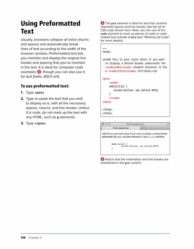
114 Chapter 4
Using Preformatted TextUsually, browsers collapse all extra returns and spaces and automatically break lines of text according to the width of the browser window. Preformatted text lets you maintain and display the original line breaks and spacing that you’ve inserted in the text. It is ideal for computer code examples A, though you can also use it for text (hello, ASCII art!).
To use preformatted text:1. Type <pre>.
2. Type or paste the text that you wish to display as is, with all the necessary spaces, returns, and line breaks. Unless it is code, do not mark up the text with any HTML, such as p elements.
3. Type </pre>.
...<body>
<p>Add this to your style sheet if you want ➝ to display a dotted border underneath the ➝ <code>abbr</code> element whenever it has ➝ a <code>title</code> attribute.</p>
<pre> <code> abbr[title] { border-bottom: 1px dotted #000; } </code></pre>
</body></html>
A The pre element is ideal for text that contains important spaces and line breaks, like the bit of CSS code shown here. Note, too, the use of the code element to mark up pieces of code or code-related text outside of pre (see “Marking Up Code” for more details).
B Notice that the indentation and line breaks are maintained in the pre content.
Text 115
Preformatted text is typically displayed with a monospaced font like Courier or Courier New B. You can use CSS to change the font, if you like (see Chapter 10).
If what you want to display—such as a code sample in a tutorial—contains HTML elements, you’ll have to substitute each < and > around the element name with their appropriate character entities: < and > respectively (see “Marking Up Code” for an example). Otherwise the browser may try to display those elements.
Be sure to validate your pages to see if you’ve nested HTML elements in pre when you shouldn’t have (see “Validating Your Code” in Chapter 20).
The pre element isn’t a shortcut for avoiding marking up your content with proper semantics and then styling the way it looks with CSS. For instance, if you want to post a news article you wrote in a word proces-sor, don’t simply copy and paste it into a pre because you like the spacing the way it is. Instead, wrap your content in p (and other rel-evant text elements) and write CSS to control the layout as desired.
pre, like a paragraph, always displays on a new line by default B.
Presentation Considerations with preBe aware that browsers typically disable automatic word wrapping of content inside a pre, so if the text is too wide, it might affect your layout or force a horizontal scrollbar. The following CSS rule enables wrapping within pre in many browsers, but not in Internet Explorer 7 and below. (In the vast major-ity of cases, those versions are too old to worry about.)
pre {
white-space: pre-wrap;
}
On a related note, in most cases I don’t recommend you use the white-space: pre; CSS declaration on an element such as div as a substitute for pre. Whitespace can be crucial to the seman-tics of content, especially code, and only pre always preserves it. (Also, if the user has disabled CSS in his or her browser, the formatting will be lost.)
Please see CSS coverage beginning in Chapter 7. Text formatting, in particular, is discussed in Chapter 10.
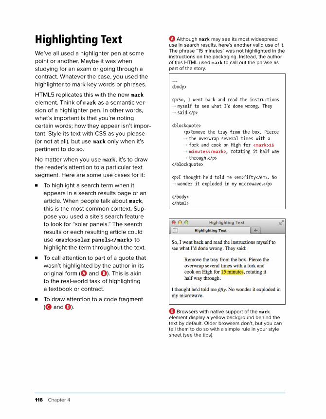
116 Chapter 4
Highlighting TextWe’ve all used a highlighter pen at some point or another. Maybe it was when studying for an exam or going through a contract. Whatever the case, you used the highlighter to mark key words or phrases.
HTML5 replicates this with the new mark element. Think of mark as a semantic ver-sion of a highlighter pen. In other words, what’s important is that you’re noting certain words; how they appear isn’t impor-tant. Style its text with CSS as you please (or not at all), but use mark only when it’s pertinent to do so.
No matter when you use mark, it’s to draw the reader’s attention to a particular text segment. Here are some use cases for it:
n To highlight a search term when it appears in a search results page or an article. When people talk about mark, this is the most common context. Sup-pose you used a site’s search feature to look for “solar panels.” The search results or each resulting article could use <mark>solar panels</mark> to highlight the term throughout the text.
n To call attention to part of a quote that wasn’t highlighted by the author in its original form (A and B). This is akin to the real-world task of highlighting a textbook or contract.
n To draw attention to a code fragment (C and D).
...<body>
<p>So, I went back and read the instructions ➝ myself to see what I'd done wrong. They ➝ said:</p>
<blockquote> <p>Remove the tray from the box. Pierce
➝ the overwrap several times with a ➝ fork and cook on High for <mark>15 ➝ minutes</mark>, rotating it half way ➝ through.</p>
</blockquote>
<p>I thought he'd told me <em>fifty</em>. No ➝ wonder it exploded in my microwave.</p>
</body></html>
A Although mark may see its most widespread use in search results, here’s another valid use of it. The phrase “15 minutes” was not highlighted in the instructions on the packaging. Instead, the author of this HTML used mark to call out the phrase as part of the story.
B Browsers with native support of the mark element display a yellow background behind the text by default. Older browsers don’t, but you can tell them to do so with a simple rule in your style sheet (see the tips).

Text 117
To highlight text:1. Type <mark>.
2. Type the word or words to which you want to call attention.
3. Type </mark>.
The mark element is not the same as either em (which represents stress emphasis) or strong (which represents importance). Both are covered earlier in this chapter.
Since mark is new in HTML5, older browsers don’t render a background color by default. You can instruct them to do so by add-ing mark { background-color: yellow; } to your style sheet.
Be sure not to use mark simply to give text a background color or other visual treat-ment. If all you’re looking for is a means to style text and there’s no proper semantic HTML element to contain it, use the span element (covered later in this chapter), perhaps with a class assigned to it, and style it with CSS.
...<body>
<p>It's usually bad practice to use a class ➝ name that explicitly describes how an ➝ element should look, such as the ➝ highlighted portion of CSS below:</p>
<pre> <code> <mark>.greenText</mark> { color: green; } </code></pre>
</body></html>
C This example uses mark to draw attention to a code segment.
D The code noted with mark is called out.
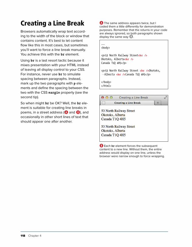
118 Chapter 4
Creating a Line BreakBrowsers automatically wrap text accord-ing to the width of the block or window that contains content. It’s best to let content flow like this in most cases, but sometimes you’ll want to force a line break manually. You achieve this with the br element.
Using br is a last resort tactic because it mixes presentation with your HTML instead of leaving all display control to your CSS. For instance, never use br to simulate spacing between paragraphs. Instead, mark up the two paragraphs with p ele-ments and define the spacing between the two with the CSS margin property (see the second tip).
So when might br be OK? Well, the br ele-ment is suitable for creating line breaks in poems, in a street address (A and B), and occasionally in other short lines of text that should appear one after another.
...<body>
<p>53 North Railway Street<br />Okotoks, Alberta<br />Canada T1Q 4H5</p>
<p>53 North Railway Street <br />Okotoks, ➝ Alberta <br />Canada T1Q 4H5</p>
</body></html>
A The same address appears twice, but I coded them a little differently for demonstration purposes. Remember that the returns in your code are always ignored, so both paragraphs shown display the same way B.
B Each br element forces the subsequent content to a new line. Without them, the entire address would display on one line, unless the browser were narrow enough to force wrapping.
Text 119
To insert a line break:Type <br /> (or <br>) where the line break should occur. There is no separate end br tag because it’s what’s known as an empty (or void) element; it lacks content.
Typing br as either <br /> or <br> is perfectly valid in HTML5.
CSS allows you to control the space between lines in a paragraph (see “Setting the Line Height” in Chapter 10) and between the paragraphs themselves (see “Setting the Margins Around an Element” in Chapter 11).
The hCard microformat (http://microformats.org/wiki/hcard) is for represent-ing people, companies, organizations, and places in a semantic manner that’s human- and machine-readable. You could use it to represent a street address instead of using the provided example A.
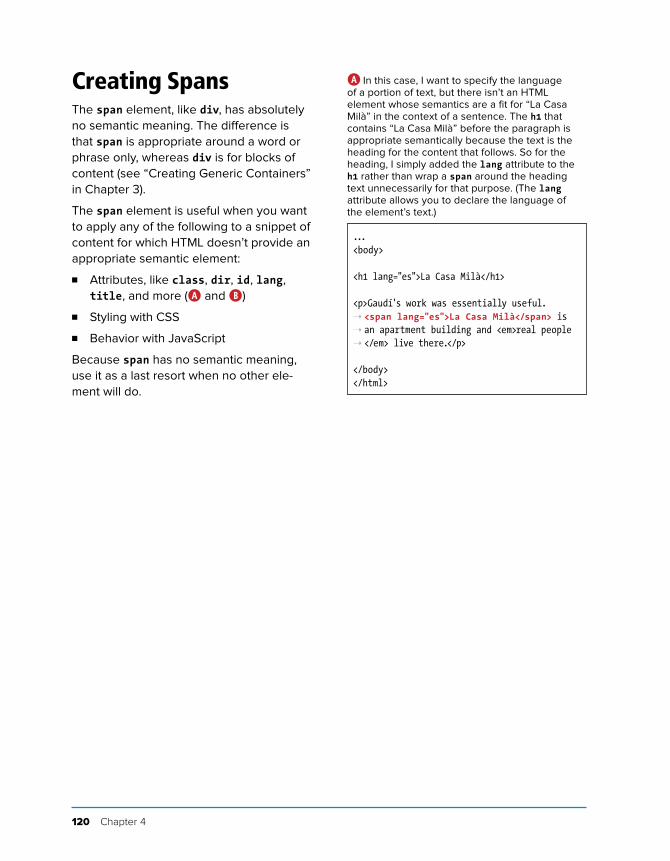
120 Chapter 4
Creating SpansThe span element, like div, has absolutely no semantic meaning. The difference is that span is appropriate around a word or phrase only, whereas div is for blocks of content (see “Creating Generic Containers” in Chapter 3).
The span element is useful when you want to apply any of the following to a snippet of content for which HTML doesn’t provide an appropriate semantic element:
n Attributes, like class, dir, id, lang, title, and more (A and B)
n Styling with CSS
n Behavior with JavaScript
Because span has no semantic meaning, use it as a last resort when no other ele-ment will do.
...<body>
<h1 lang="es">La Casa Milà</h1>
<p>Gaudí's work was essentially useful. ➝ <span lang="es">La Casa Milà</span> is ➝ an apartment building and <em>real people ➝ </em> live there.</p>
</body></html>
A In this case, I want to specify the language of a portion of text, but there isn’t an HTML element whose semantics are a fit for “La Casa Milà” in the context of a sentence. The h1 that contains “La Casa Milà” before the paragraph is appropriate semantically because the text is the heading for the content that follows. So for the heading, I simply added the lang attribute to the h1 rather than wrap a span around the heading text unnecessarily for that purpose. (The lang attribute allows you to declare the language of the element’s text.)
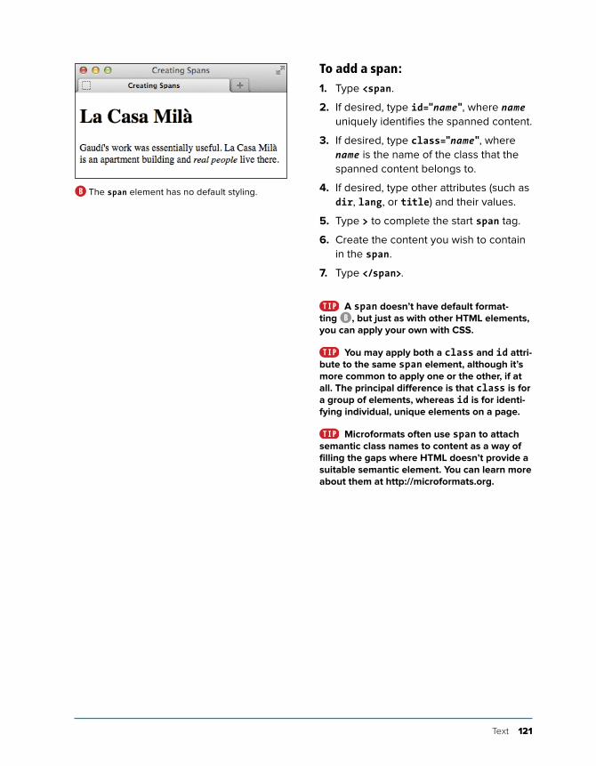
Text 121
To add a span:1. Type <span.
2. If desired, type id="name", where name uniquely identifies the spanned content.
3. If desired, type class="name", where name is the name of the class that the spanned content belongs to.
4. If desired, type other attributes (such as dir, lang, or title) and their values.
5. Type > to complete the start span tag.
6. Create the content you wish to contain in the span.
7. Type </span>.
A span doesn’t have default format-ting B, but just as with other HTML elements, you can apply your own with CSS.
You may apply both a class and id attri-bute to the same span element, although it’s more common to apply one or the other, if at all. The principal difference is that class is for a group of elements, whereas id is for identi-fying individual, unique elements on a page.
Microformats often use span to attach semantic class names to content as a way of filling the gaps where HTML doesn’t provide a suitable semantic element. You can learn more about them at http://microformats.org.
B The span element has no default styling.
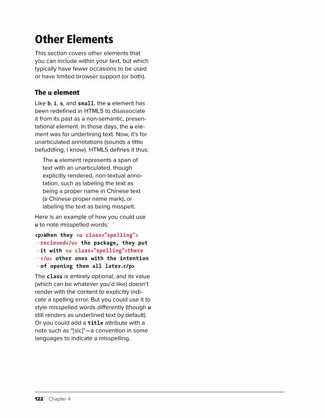
122 Chapter 4
Other ElementsThis section covers other elements that you can include within your text, but which typically have fewer occasions to be used or have limited browser support (or both).
The u elementLike b, i, s, and small, the u element has been redefined in HTML5 to disassociate it from its past as a non-semantic, presen-tational element. In those days, the u ele-ment was for underlining text. Now, it’s for unarticulated annotations (sounds a little befuddling, I know). HTML5 defines it thus:
The u element represents a span of text with an unarticulated, though explicitly rendered, non-textual anno-tation, such as labeling the text as being a proper name in Chinese text (a Chinese proper name mark), or labeling the text as being misspelt.
Here is an example of how you could use u to note misspelled words:
<p>When they <u class="spelling"> ➝ recieved</u> the package, they put ➝ it with <u class="spelling">there ➝ </u> other ones with the intention ➝ of opening them all later.</p>
The class is entirely optional, and its value (which can be whatever you’d like) doesn’t render with the content to explicitly indi-cate a spelling error. But you could use it to style misspelled words differently (though u still renders as underlined text by default). Or you could add a title attribute with a note such as “[sic]”—a convention in some languages to indicate a misspelling.
Text 123
Use u only when an element like cite, em, or mark doesn’t fit your desired semantics. Also, it’s best to change its styling if u text will be confused with linked text, which is also underlined by default A.
The wbr elementHTML5 introduces a cousin of br named wbr. It represents “a line break opportu-nity.” Use it in between words or letters in a long, unbroken phrase (or, say, a URL) to indicate where it could wrap if necessary to fit the text in the available space in a readable fashion. So unlike br, wbr doesn’t force a wrap; it just lets the browser know where it can force a line break if needed.
Here are a couple of examples:
<p>They liked to say, "FriendlyFleas ➝ andFireFlies<wbr /> FriendlyFleasa ➝ ndFireFlies<wbr />FriendlyFleasand ➝ FireFlies<wbr />" as fast as they ➝ could over and over.</p>
<p>His favorite site is this<wbr /> ➝ is<wbr />a<wbr />really<wbr /> ➝ really<wbr />longurl.com.</p>
You can type wbr as either <wbr /> or <wbr>. As you might have guessed, you won’t find many occasions to use wbr. Additionally, browser support is incon-sistent as of this writing. Although wbr works in current versions of Chrome and Firefox, Internet Explorer and Opera simply ignore it.
A Like links, u elements are underlined by default, which can cause confusion unless you change one or both with CSS.
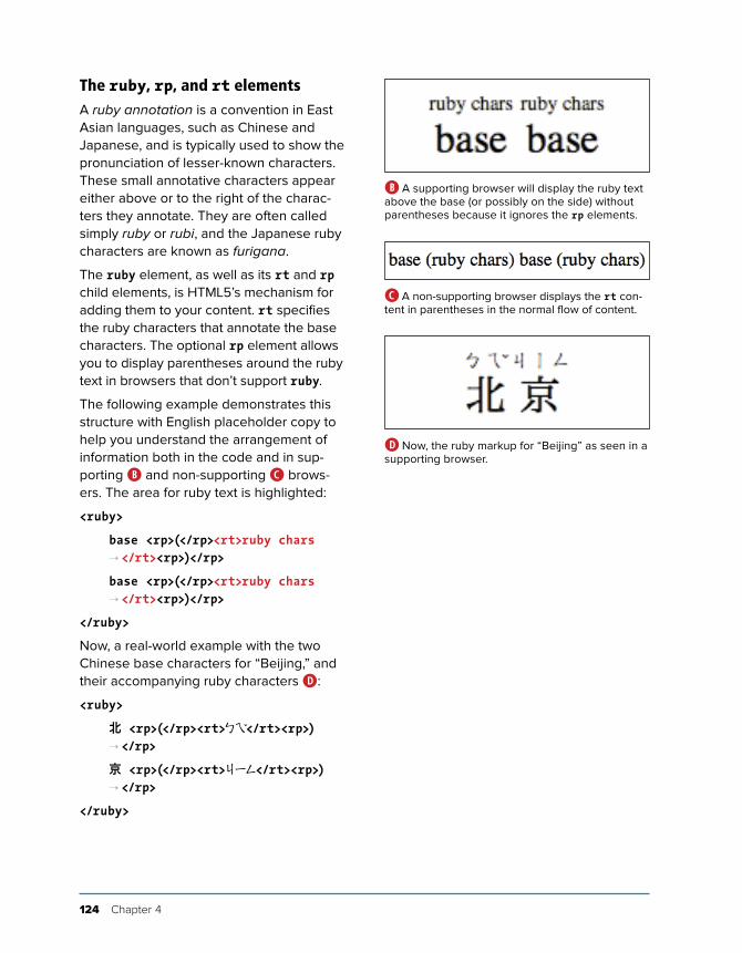
124 Chapter 4
The ruby, rp, and rt elementsA ruby annotation is a convention in East Asian languages, such as Chinese and Japanese, and is typically used to show the pronunciation of lesser-known characters. These small annotative characters appear either above or to the right of the charac-ters they annotate. They are often called simply ruby or rubi, and the Japanese ruby characters are known as furigana.
The ruby element, as well as its rt and rp child elements, is HTML5’s mechanism for adding them to your content. rt specifies the ruby characters that annotate the base characters. The optional rp element allows you to display parentheses around the ruby text in browsers that don’t support ruby.
The following example demonstrates this structure with English placeholder copy to help you understand the arrangement of information both in the code and in sup-porting B and non-supporting C brows-ers. The area for ruby text is highlighted:
<ruby>
base <rp>(</rp><rt>ruby chars ➝ </rt><rp>)</rp>
base <rp>(</rp><rt>ruby chars ➝ </rt><rp>)</rp>
</ruby>
Now, a real-world example with the two Chinese base characters for “Beijing,” and their accompanying ruby characters D:
<ruby>
北 <rp>(</rp><rt>ㄅㄟ̌</rt><rp>) ➝ </rp>
京 <rp>(</rp><rt>ㄐㄧㄥ</rt><rp>) ➝ </rp>
</ruby>
B A supporting browser will display the ruby text above the base (or possibly on the side) without parentheses because it ignores the rp elements.
D Now, the ruby markup for “Beijing” as seen in a supporting browser.
C A non-supporting browser displays the rt con-tent in parentheses in the normal flow of content.
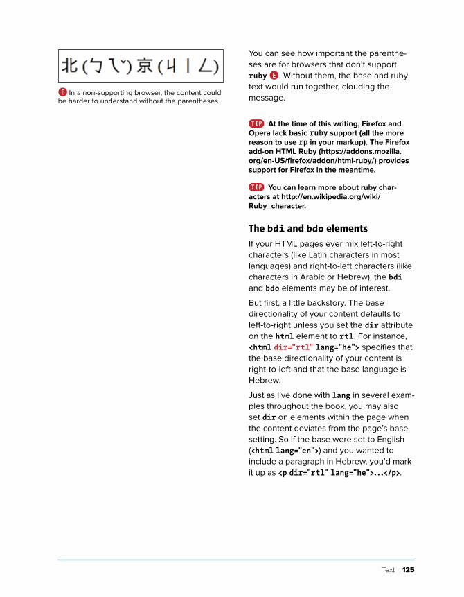
Text 125
You can see how important the parenthe-ses are for browsers that don’t support ruby E. Without them, the base and ruby text would run together, clouding the message.
At the time of this writing, Firefox and Opera lack basic ruby support (all the more reason to use rp in your markup). The Firefox add-on HTML Ruby (https://addons.mozilla.org/en-US/firefox/addon/html-ruby/) provides support for Firefox in the meantime.
You can learn more about ruby char-acters at http://en.wikipedia.org/wiki/Ruby_character.
The bdi and bdo elementsIf your HTML pages ever mix left-to-right characters (like Latin characters in most languages) and right-to-left characters (like characters in Arabic or Hebrew), the bdi and bdo elements may be of interest.
But first, a little backstory. The base directionality of your content defaults to left-to-right unless you set the dir attribute on the html element to rtl. For instance, <html dir="rtl" lang="he"> specifies that the base directionality of your content is right-to-left and that the base language is Hebrew.
Just as I’ve done with lang in several exam-ples throughout the book, you may also set dir on elements within the page when the content deviates from the page’s base setting. So if the base were set to English (<html lang="en">) and you wanted to include a paragraph in Hebrew, you’d mark it up as <p dir="rtl" lang="he">...</p>.
E In a non-supporting browser, the content could be harder to understand without the parentheses.
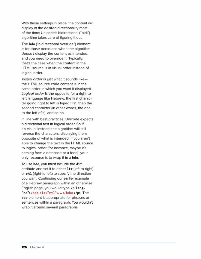
126 Chapter 4
With those settings in place, the content will display in the desired directionality most of the time; Unicode’s bidirectional (“bidi”) algorithm takes care of figuring it out.
The bdo (“bidirectional override”) element is for those occasions when the algorithm doesn’t display the content as intended, and you need to override it. Typically, that’s the case when the content in the HTML source is in visual order instead of logical order.
Visual order is just what it sounds like—the HTML source code content is in the same order in which you want it displayed. Logical order is the opposite for a right-to-left language like Hebrew; the first charac-ter going right to left is typed first, then the second character (in other words, the one to the left of it), and so on.
In line with best practices, Unicode expects bidirectional text in logical order. So if it’s visual instead, the algorithm will still reverse the characters, displaying them opposite of what is intended. If you aren’t able to change the text in the HTML source to logical order (for instance, maybe it’s coming from a database or a feed), your only recourse is to wrap it in a bdo.
To use bdo, you must include the dir attribute and set it to either ltr (left-to-right) or rtl (right-to-left) to specify the direction you want. Continuing our earlier example of a Hebrew paragraph within an otherwise English page, you would type <p lang= "he"><bdo dir="rtl">...</bdo></p>. The bdo element is appropriate for phrases or sentences within a paragraph. You wouldn’t wrap it around several paragraphs.
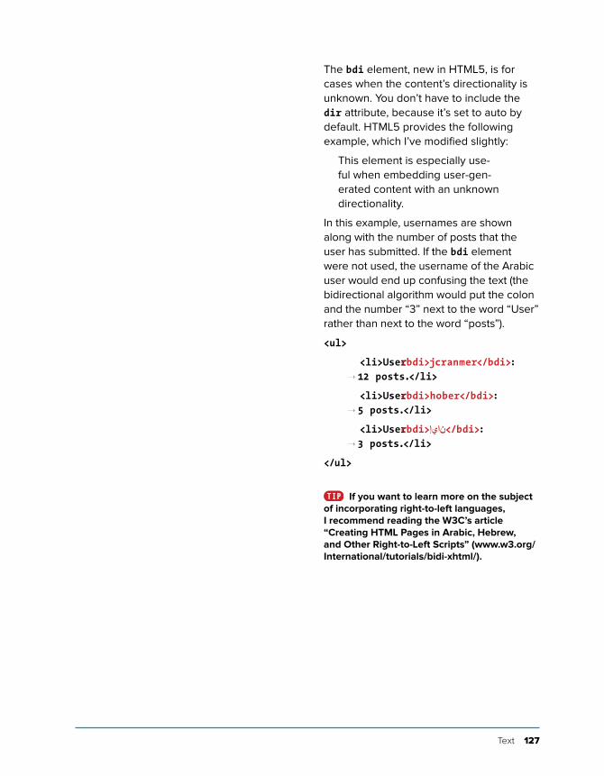
Text 127
The bdi element, new in HTML5, is for cases when the content’s directionality is unknown. You don’t have to include the dir attribute, because it’s set to auto by default. HTML5 provides the following example, which I’ve modified slightly:
This element is especially use-ful when embedding user-gen-erated content with an unknown directionality.
In this example, usernames are shown along with the number of posts that the user has submitted. If the bdi element were not used, the username of the Arabic user would end up confusing the text (the bidirectional algorithm would put the colon and the number “3” next to the word “User” rather than next to the word “posts”).
<ul>
<li>User <bdi>jcranmer</bdi>: ➝ 12 posts.</li>
<li>User <bdi>hober</bdi>: ➝ 5 posts.</li>
<li>User <bdi>نايإ</bdi>: ➝ 3 posts.</li>
</ul>
If you want to learn more on the subject of incorporating right-to-left languages, I recommend reading the W3C’s article “Creating HTML Pages in Arabic, Hebrew, and Other Right-to-Left Scripts” (www.w3.org/International/tutorials/bidi-xhtml/).
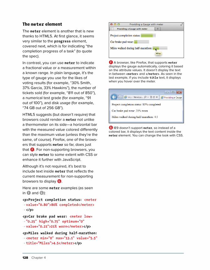
128 Chapter 4
The meter elementThe meter element is another that is new thanks to HTML5. At first glance, it seems very similar to the progress element, covered next, which is for indicating “the completion progress of a task” (to quote the spec).
In contrast, you can use meter to indicate a fractional value or a measurement within a known range. In plain language, it’s the type of gauge you use for the likes of voting results (for example, “30% Smith, 37% Garcia, 33% Hawkins”), the number of tickets sold (for example, “811 out of 850”), a numerical test grade (for example, “91 out of 100”), and disk usage (for example, “74 GB out of 256 GB”).
HTML5 suggests (but doesn’t require) that browsers could render a meter not unlike a thermometer on its side—a horizontal bar with the measured value colored differently than the maximum value (unless they’re the same, of course). Firefox, one of the brows-ers that supports meter so far, does just that F. For non-supporting browsers, you can style meter to some extent with CSS or enhance it further with JavaScript.
Although it’s not required, it’s best to include text inside meter that reflects the current measurement for non-supporting browsers to display G.
Here are some meter examples (as seen in F and G):
<p>Project completion status: <meter ➝ value="0.80">80% completed</meter> ➝ </p>
<p>Car brake pad wear: <meter low= ➝"0.25" high="0.75" optimum="0" ➝ value="0.21">21% worn</meter></p>
<p>Miles walked during half-marathon: ➝ <meter min="0" max="13.1" value="5.5" ➝ title="Miles">4.5</meter></p>
F A browser, like Firefox, that supports meter displays the gauge automatically, coloring it based on the attribute values. It doesn’t display the text in between <meter> and </meter>. As seen in the last example, if you include title text, it displays when you hover over the meter.
G IE9 doesn’t support meter, so instead of a colored bar, it displays the text content inside the meter element. You can change the look with CSS.

Text 129
The meter element doesn’t have defined units of measure, but you can use the title attribute to specify text of your choosing, as in the last example. As is usual with title text, browsers display it as a tooltip F.
meter supports several attributes. The value attribute is the only one that’s required. The min and max attributes default to 0 and 1.0, respectively, if omitted. The low, high, and optimum attributes work together to split the range into low, medium, and high seg-ments. The number assigned to optimum indi-cates the optimum position within the range, such as “0 brake pad wear” in one of the examples. Set optimum in between if neither a low nor a high value is optimal.
At the time of this writing, browser sup-port of meter is still evolving: It’s not sup-ported by Internet Explorer, mobile Safari (iOS devices), or Android’s browser. This partially explains why you don’t yet see it much in the wild. Feel free to use it, but just understand that these browsers will render the meter text rather than the visual gauge by default G. See http://caniuse.com/#feat=progressmeter for the latest browser support.
The style of the gauge that each support-ing browser displays may vary.
Some people have experimented with styling meter CSS for both supporting and non-supporting browsers. Search online for “style HTML5 meter with CSS” to see some of the results (note that some use JavaScript).
The meter element is not for marking up general measurements—such as height, weight, distance, or circumference—that have no known range. For example, you cannot use it for the following because the number of miles walked isn’t gauged against a range: <p>I walked <meter value="4.5">4.5 </meter> miles yesterday.</p>.
Be sure not to mix up your uses of the meter and progress elements.
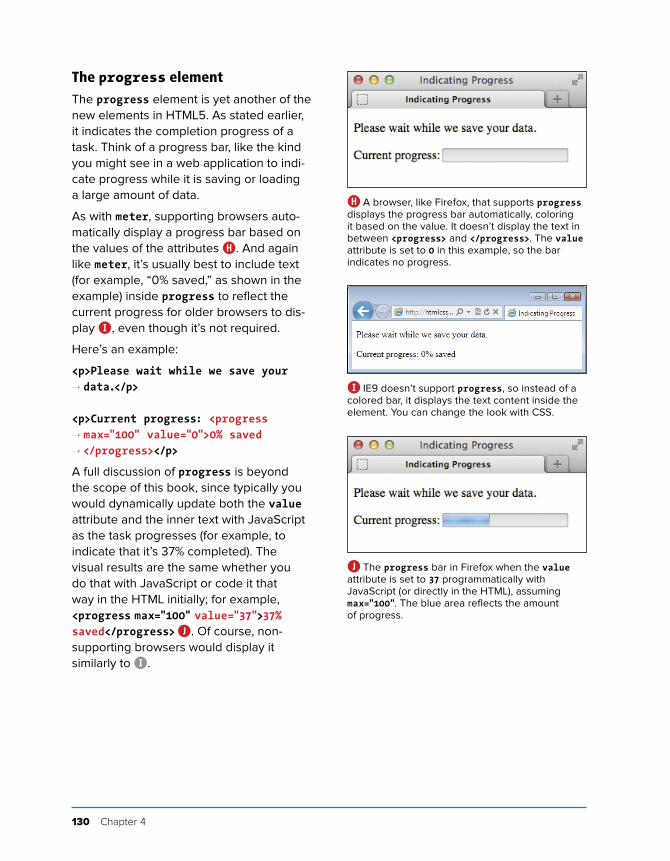
130 Chapter 4
The progress elementThe progress element is yet another of the new elements in HTML5. As stated earlier, it indicates the completion progress of a task. Think of a progress bar, like the kind you might see in a web application to indi-cate progress while it is saving or loading a large amount of data.
As with meter, supporting browsers auto-matically display a progress bar based on the values of the attributes H. And again like meter, it’s usually best to include text (for example, “0% saved,” as shown in the example) inside progress to reflect the current progress for older browsers to dis-play I, even though it’s not required.
Here’s an example:
<p>Please wait while we save your ➝ data.</p>
<p>Current progress: <progress ➝ max="100" value="0">0% saved ➝ </progress></p>
A full discussion of progress is beyond the scope of this book, since typically you would dynamically update both the value attribute and the inner text with JavaScript as the task progresses (for example, to indicate that it’s 37% completed). The visual results are the same whether you do that with JavaScript or code it that way in the HTML initially; for example, <progress max="100" value="37">37% saved</progress> J. Of course, non-supporting browsers would display it similarly to I.
H A browser, like Firefox, that supports progress displays the progress bar automatically, coloring it based on the value. It doesn’t display the text in between <progress> and </progress>. The value attribute is set to 0 in this example, so the bar indicates no progress.
I IE9 doesn’t support progress, so instead of a colored bar, it displays the text content inside the element. You can change the look with CSS.
J The progress bar in Firefox when the value attribute is set to 37 programmatically with JavaScript (or directly in the HTML), assuming max="100". The blue area reflects the amount of progress.
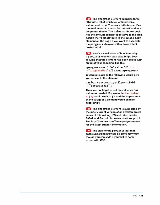
Text 131
The progress element supports three attributes, all of which are optional: max, value, and form. The max attribute specifies the total amount of work for the task and must be greater than 0. The value attribute speci-fies the amount completed relative to the task. Assign the form attribute to the id of a form element on the page if you want to associate the progress element with a form it isn’t nested within.
Here’s a small taste of how to modify a progress element with JavaScript. Let’s assume that the element had been coded with an id of your choosing, like this:
<progress max="100" value="0" id= ➝"progressBar">0% saved</progress>
JavaScript such as the following would give you access to the element:
var bar = document.getElementById ➝ ('progressBar');
Then you could get or set the value via bar.value as needed. For example, bar.value = 37; would set it to 37, and the appearance of the progress element would change accordingly.
The progress element is supported by the most current version of all desktop brows-ers as of this writing. IE9 and prior, mobile Safari, and Android browsers don’t support it. See http://caniuse.com/#feat=progressmeter for the latest support information.
The style of the progress bar that each supporting browser displays may vary, though you can style it yourself to some extent with CSS.

This page intentionally left blank
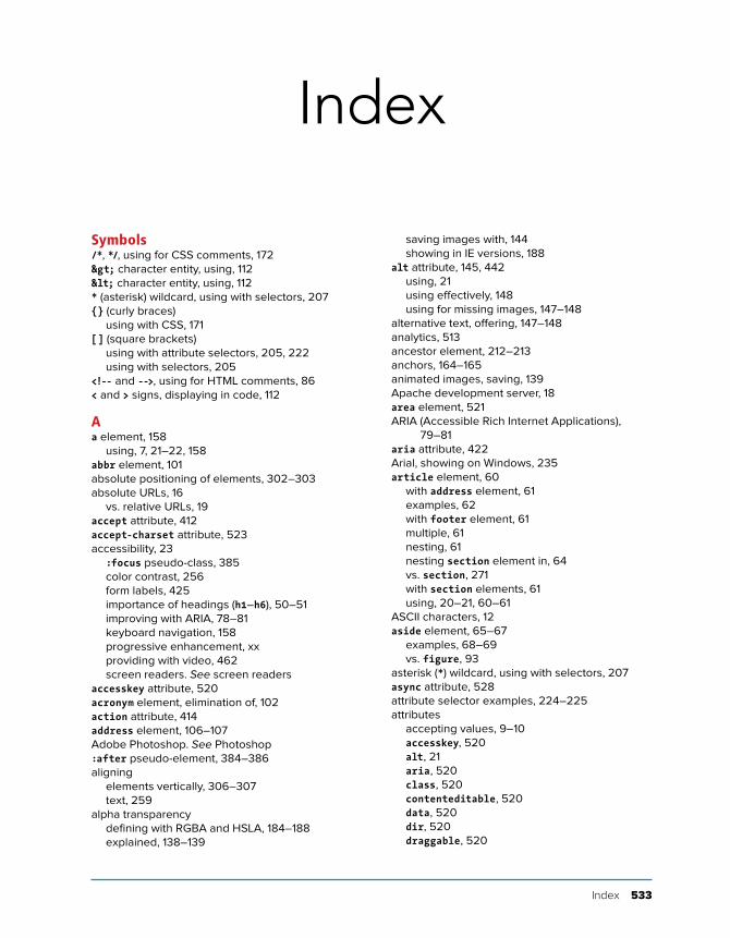
Index 533
Index
saving images with, 144showing in IE versions, 188
alt attribute, 145, 442using, 21using effectively, 148using for missing images, 147–148
alternative text, offering, 147–148analytics, 513ancestor element, 212–213anchors, 164–165animated images, saving, 139Apache development server, 18area element, 521ARIA (Accessible Rich Internet Applications),
79–81aria attribute, 422Arial, showing on Windows, 235article element, 60
with address element, 61examples, 62with footer element, 61multiple, 61nesting, 61nesting section element in, 64vs. section, 271with section elements, 61using, 20–21, 60–61
ASCII characters, 12aside element, 65–67
examples, 68–69vs. figure, 93
asterisk (*) wildcard, using with selectors, 207async attribute, 528attribute selector examples, 224–225attributes
accepting values, 9–10accesskey, 520alt, 21aria, 520class, 520contenteditable, 520data, 520dir, 520draggable, 520
Symbols/*, */, using for CSS comments, 172> character entity, using, 112< character entity, using, 112* (asterisk) wildcard, using with selectors, 207{} (curly braces)
using with CSS, 171[] (square brackets)
using with attribute selectors, 205, 222using with selectors, 205
<!-- and -->, using for HTML comments, 86< and > signs, displaying in code, 112
Aa element, 158
using, 7, 21–22, 158abbr element, 101absolute positioning of elements, 302–303absolute URLs, 16
vs. relative URLs, 19accept attribute, 412accept-charset attribute, 523accessibility, 23
:focus pseudo-class, 385color contrast, 256form labels, 425importance of headings (h1–h6), 50–51improving with ARIA, 78–81keyboard navigation, 158progressive enhancement, xxproviding with video, 462screen readers. See screen readers
accesskey attribute, 520acronym element, elimination of, 102action attribute, 414address element, 106–107Adobe Photoshop. See Photoshop:after pseudo-element, 384–386aligning
elements vertically, 306–307text, 259
alpha transparencydefining with RGBA and HSLA, 184–188explained, 138–139
534 Index
italics, 236–237line height, 245setting background, 250–256setting color, 248–249setting font values, 246–247setting whitespace properties, 264using small caps, 261viewing, 230
base element, 521BBEdit text editor, 31bdi element, 125–127bdo element, 125–127:before pseudo-element, 384–386block-level elements, explained, 24–25block-level links, 161–162blockquote element, 95–97
nesting, 97body element, 44
adding to webpages, 45–46basic usage, 4, 6–7components, 20
bold formattingapplying, 238–239applying with web fonts, 352–353faux bold, 239removing, 238
bold italicapplying with web fonts, 354-355faux bold italic, 355
BOM resource, 34Boolean attribute
explained, 10using with videos, 455
border color, setting, 288border properties, setting multiple, 289border styles, 288, 291border width, setting, 288border-image property, 290border-radius property, 364–367borders, setting, 290–291box model
border, 276components, 276explained, 276height, 277margin, 276padding, 276–277, 286–287width, 277
box-sizing propertyapplying to all elements, 283effect on box model, width, and height, 277usefulness with responsive webpages, 318, 326
box-shadow property, 370–372br element, 118–119
vs. wbr, 123
attributes (continued)dropzone, 520of elements, 9hidden, 520href, 10id, 520lang, 520numbers for values, 10role, 520selecting elements based on, 222–225selector options, 223spellcheck, 520square brackets ([]), 222src, 10tabindex, 520title, 520
audio attributes, 465–469audio element, 464audio file formats, 463–465audio files with controls, adding to pages,
464–465audio sources, providing with fallback, 468–469author contact info, adding, 106–107autocomplete attribute, 424autofocus attribute, 423autoplay attribute, 454, 466
Bb element, 91
redefined in HTML5, 91vs. strong element, 90
background color, changing, 250–251. See also colors
background images, 252–255. See also imagesbackground properties, 255–256background-clip property, 256background-origin property, 256backgrounds, 250–256
applying multiple, 373–375fallback, 378gradient, 376–381
background-size property, 256banner landmark role, 79–80Barcelona’s Architect example
adding indents, 258aligning text, 259alternate fonts, 233–235bold formatting, 238–239changing text case, 260controlling spacing, 257decorating text, 262–263default page rendering, 230font family, 232font size, 240–244HTML classes, 231
Index 535
Chrome’s cache, disabling, 39circles, creating using border-radius, 367citations, indicating, 94cite attribute, 94, 95, 110
using with blockquote, 97cite element, 87, 94–95, 522
using for names, 94class attributes, 82
applying, 82–83implementing microformats, 83naming, 83
class names, assigning to elements, 82class selectors. See also pseudo-classes
vs. ID selectors, 211multiple classes on one element, 177, 210using with inline styles, 197
clearfix method, using with float property, 299clearing floats, 297–300“click here” labels, avoiding, 162Cloud.typography web font service, 339Coda text editor, 31code
displaying < and > signs, 112marking up, 112validating, 496–497
code editor, funny characters in, 47code element, explained, 87, 112codec, explained, 451col element, 522colgroup element, 522colors. See also background color
per image formats, 136CSS color options, 182–188declared with hexadecimal, 183declared with keywords, 182declared with HSL and HSLA, 186–188declared with RGB and RGBA, 183–185setting for text, 248–249specifying for borders, 288
colspan attribute, 482“commenting out” declarations, 173comments
/* and */ for CSS, 172<!-- and --> for HTML, 86adding to HTML, 85–86adding to CSS, 172–173
complementary landmark role, 79–80conditional comments, using with responsive
pages, 333consistency, checking HTML for, 496contact info, adding, 106–107containers, creating, 73–75content, adding to webpages, 6–7content attribute, 527contenteditable attribute, 520
browser developer toolsChrome, 503Firefox, 503Internet Explorer, 503Opera, 503Safari, 503
browser support resources, 499browsers. See also polyfills
default display of webpages, 24–25explained and version numbers, xviiinline, 24–25modern browsers, xxv-moz- prefix, 364-ms- prefix, 364-o- prefix, 364obtaining for testing, 500prefixes, 364support for gradients, 381testing sites in, 500viewing pages in, 38–39VMs (virtual machines), 500-webkit- prefix, 364
bulleted lists, creating, 391, 393button element, 442
using with forms, 442–443
Ccanvas element, 475
using with video, 475capitalize value, limitations of, 260caption element, 478captions, creating for figures, 92–93challenge attribute, 526character encoding, specifying, 12characters
accenting, 12dir attribute, 126left-to-right, 125right-to-left, 125
charset attribute, 45checkboxes, creating for forms, 434–435checked attribute, 433checking for errors. See also debugging
techniquesCSS (Cascading Style Sheets), 508–509general, 504–505HTML (Hypertext Markup Language), 506–507
child elementexplained, 11, 212first and last, 216–217
Chromedeveloper tool, 503refreshing pages in, 39undocking Developer Tools, 39testing sites in, 500
536 Index
HSL and HSLA, 186–188RGBA, 184–185
CSS3 featuresanimations, 363background size, 256browser compatibility, 362, 499clipping backgrounds, 256drop shadows, 368–372gradient backgrounds, 376–381multiple backgrounds, 373–375opacity of elements, 382–383polyfills for non-supporting browsers, 363rounding corners of elements, 365–367text shadows, 368–369transforms, 363transitions, 363
CSS3 Generator, 364CSS3 syntax for pseudo-elements, 219cursors, changing, 308
Ddata attribute, 520data tables. See tablesdatalist element, 411dates
local and global, 100specifying, 98
datetime attribute, using 98–100dd element, 404debugging techniques, overview, 502–503. See
also checking for errorsdefault attribute, 530default homepage, specifying, 35default styles. See also styles
normalizing, 274–275resetting, 274–275
defer attribute, 528defining terms, 103del element, 108–109
cite attribute, 110datetime attribute, 110vs. s element, 111text marked with, 111using with content changes, 110
deleted text, marking, 108descendant element, defined, 212–213details element, 523development server, Apache, 18dfn element, 103dir attribute, 125
using with bdi, 125using with bdo, 126
dirname attribute, 525disabled attribute, 444display type, controlling, 278–281
contentinfo landmark role, 79–80controls attribute, 454, 464coords attribute, 521corners of elements
elliptical, 367rounding, 365–367
Creative Commons licenses, 140CSS (Cascading Style Sheets). See also CSS3
features; inheritance; selectors; style sheetsavoiding @import, 199backgrounds, See backgroundsbenefits, 170browser compatibility, See browser support
resourcesdefault browser styles, 24, 274–275debugging techniques, 508–509generated content, 384–386history and relationship to CSS3, xviimages and sprites, 387–388!important, 199inheritance, 174–176link element, 199media attribute, 200 media queries, 219 order of styles, 198–199polyfills for non-supporting browsers, 363progressive enhancement, xx–xxi, 362–363specificity, law of, 178–179the cascade, 177–179, 198treatment of class names, 177validating to locate errors, 496vendor prefixes, 364viewing others’ code, 202
CSS Arrow Please! 386CSS border shorthand property, 146CSS color keywords, 182–183.css extension, using with external style
sheets, 190CSS gradients, syntax for, 376CSS properties
bare numbers, 181for formatting, 169hexadecimal, 183inherit value, 180for layout, 169lengths, 180–181percentages, 180–181predefined values, 180for printing, 169RGB, 183URLs, 182
CSS validator, using, 497CSS2, explained, 170CSS3 colors
color keywords, 182
Index 537
relative positioning, 301rounding corners of, 365–367selecting based on attributes, 222–225selecting by class, 208–210selecting by context, 212–215selecting by ID, 208–210selecting by name, 206–207selecting when first child, 216–217selecting when last child, 216-217specifying groups of, 226visibility, 278–281void, 8wrapping text around, 295–296
em (stress emphasis) element, 90explained, 87, 523vs. i element, 90and percentage font sizes, 241–243using, 21–22, 90
em values for padding and margin, 294email boxes, creating for forms, 428–431embed element, 523embedded style sheets, 194–195. See external
style sheets; style sheetsempty elements, 8ems, using in media queries, 322emulators, using for testing, 501enctype attribute, 439Espresso text editor, 31event handlers, 494extensions. See file extensionsexternal style sheets. See also embedded style
sheets; style sheetsbenefits, 192creating, 190–191importing, 191linking to, 191–193loading multiple, 193media attribute, 200–201, 319–322naming, 191saving with .css extension, 190URLs in, 193UTF-8 encoding, 190
Ffallback backgrounds, creating, 378favicons, 155–156fieldset element, 418
using with forms, 418–421figcaption element, 92–93figure element, 92–93file extensions, using consistently, 32–34file names
extensions, 14lowercase, 14, 26separating words with dashes, 14
displays, media queries for, 332div element, 73, 125
adding around whole pages, 73containing pages in, 77vs. section element, 63surrounding content, 74using in HTML5, 76
dl (description list) element, 404creating, 404–407explained, 389, 523nesting, 407
DOCTYPE declarationincluding in webpages, 4–5, 44
document flow, explained, 278document head, explained, 5, 46document headings structure, defining, 50domain, connecting with web host, 514domain name, getting, 512double vs. single quotes, 348download attribute, 520draggable attribute, 520DRM (digital rights management), 450drop shadows, adding to text, 368–369dropzone attribute, 520dt element, 389, 404duration, specifying, 98
EEdge Web Fonts service, 339editing webpages, 36edits, noting, 108–111elements. See also alphabetical list of HTML
elements in Appendix; pseudo-elements; selecting elements
aligning vertically, 306–307ancestors, 212assigning classes to, 82attributes of, 9block-level, 24components, 8contents, 8descendants, 212display type, 278–281document flow, 278empty, 8floating, 295–300inline, 24naming with unique IDs, 82nesting, 11number available, 22offsetting in natural flow, 301parents, 11phrasing content, 21positioning absolutely, 302–303positioning in stacks, 304
538 Index
form element, 413form elements
disabling, 444–445example, 413fieldset element, 418–421headings, 421labels, 422–424legend element, 418–421organizing, 418–421placeholder attribute, 422–424, 426screen readers, 421separating, 422styling, 421
form fields, placing inside labels, 426form parts, labeling, 425–426formaction attribute, 522formenctype attribute, 522formmethod attribute, 522formnovalidate attribute, 443, 522formtarget attribute, 525forms
accept attribute, 412attributes, 412autocomplete attribute, 412autofocus attribute, 412checkboxes, 434–435color, 411creating, 413–415creating hidden fields, 440creating text boxes, 422–424data list, 411date input type, 411disabling validation features, 415email boxes, 428–431features-enhancement for older browsers, 412file uploads, 439formnovalidate attribute, 412global date and time, 411HTML5 inputs and elements, 411id naming convention, 426improvements in HTML5, 410–412letting visitors upload files, 439list attribute, 412maxlength attribute, 423, 436method="get", 415method="post", 415month, 411multiple attribute, 412name attributes, 426for naming convention, 426novalidate attribute, 412number input type, 411output element, 411password boxes, 427pattern attribute, 412
file uploads, handling for forms, 439files
naming conventions, 37organizing, 37, 193, 255, 356transferring to server, 515–518
FileZilla FTP clientdownloading, 515using, 516–517
Firefoxdeveloper tool, 503testing sites in, 500
Fireworks alternatives, 141fixed-width page
explained, 266pixels for, 283
Flash fallback, 470–474Flash playback, troubleshooting, 474Flash plugin, use of, 13Flash security settings, changing, 474Flickr website, 140float property, 295–300floats, clearing, 297–300folder names
extensions, 14lowercase, 14, 26
foldersdividing into sub-folders, 37naming conventions, 37
font alternates, specifying, 233–235font family, setting, 232font sizes
basing on parent element, 244basing on root element, 243–244em and percentage, 241–244pixels, 240rem (root em), 243–244setting, 240
Font Squirrel, 338, 342–344font values, setting at once, 246–247Fontdeck web font service, 339@font-face rule, using with web fonts, 336–337,
345, 348fonts. See also font sizes; Google Fonts web font
service; styles for text formatting; text; web fonts
Arial on Windows, 235Geneva stacks, 235Helvetica on OS X, 235shared defaults, 234specifying for alphabets, 235
Food Sense site, viewing, 311footer element, 70–72footers, creating, 71for attribute, 425, 528form attribute, 522
Index 539
organizing webpages with, 51–52proper use of, 52using, 50using all levels of, 51
height, setting for elements, 282–285height vs. min-height, 284Helvetica, showing on OS X, 235hgroup element, removal of, 52hidden attribute, 520hidden fields, creating for forms, 440high, low attributes, 128highlighting text, 116–117homepage, specifying default, 35hr element, 524href attribute
contents, 10explained, 162including for links, 158–159
href values, including on webpages, 6, 158, 192hreflang attribute, 520HSL (hue, saturation, light) and HSLA, 186–188HTML (Hypertext Markup Language), 26
checking for consistency, 496debugging techniques, 506–507history and relationship to HTML5, xviindenting, 7rendering by browsers, 12, 24–25semantics, 20–23thinking in, 3validating, 497viewing others’ code, 40–41writing in lowercase, 26
.html and .htm extensions, 32html element, 44
basic usage, 4–5including in webpages, 44–46
HTML elements. See elementsHTML markup. See markupHTML pages. See also webpages
body element, 4, 20common page constructs, 53components, 44DOCTYPE, 4–5, 44, 46example, basic, 4examples, larger, 60, 230–231, 269–270head element, 4, 45html element, 4, 44indenting code, 7, 44semantics, 20–23structure, 44–46, 50–52
HTML5DOCTYPE, 46–47differences with HTML4, xixdocument outline, 52empty elements, 9
placeholder attribute, 412processing, 416–417pseudo-classes, 446radio buttons, 432–433range input type, 411regular expressions, 431required attribute, 412search boxes, 428–431security, 416–417select boxes, 437–438server-side vs. client-side, 417start and end tags, 413–414styling based on states, 446–448styling with attribute selectors, 448submit button, 441–443telephone boxes, 428–431text areas, 436text boxes, 422–424URL boxes, 428–431validating, 417week input type, 411
fractional values, representing, 128–129FTP client, using, 515–517FTP site, defining properties for, 516
Ggenerated content, 384–386generic containers, creating, 73–75GIF image format, 134–135, 138Gimp image editor, 141Google Fonts web font service, 339, 357–359.
See also fontsGoogle Usage Rights, 140gradient backgrounds, 376–380gradient code, creating for old browsers, 381groups of elements, specifying, 226
Hh1–h6 elements, 50hCard microformat, 119head element, 45
adding to webpages, 4, 45–46indenting code nested in, 47
header attribute, 530header element, 54–55
multiple, 55with nav element, 55page-level with navigation, 54
headers, creating, 55headings
describing groups of form fields with, 418–421for defining document structure, 50importance of, 21, 50–51levels h1–h6, 21, 50navigating with a screen reader, 23
540 Index
resizing, 154retaining aspect ratio, 152saving, 139, 142–144scaling proportionally, 313scaling with browser, 152simulating slow connections, 146sizing for Retina displays and other
high-pixel-density displays, 153storing in folders, 146SVG (scalable vector graphics), 137testing loading time, 146transparency, 138width attribute, 150–153
img element, 145basic usage, 7, 21
indenting HTML, 7, 44indents, adding to text with CSS, 258index transparency, 138–139index.html, saving as default page, 35inheritance, 174–176. See also CSS (Cascading
Style Sheets)inline elements, explained, 24–25inline styles, 196–198input element, 411, 422–424, 427–435, 439–444ins element, 108–111inserted text, marking, 108inset shadow, creating, 371Internet Explorer 8+, testing sites in, 500Internet Explorer developer tool, 503iOS Simulator website, 501iPad, testing pages for, 501iPhone, testing pages for, 501ismap attribute, 524ISP (Internet service provider), using as web
host, 513italics
applying with web fonts, 350–351creating, 236–237real vs. faux, 237removing, 237
JJavaScript
adding embedded scripts, 492inline scripts, 491loading external scripts, 487–491minifying, 489Node.js, 486organizing files, 489overview, 485–486performance best practices, 490–491resources, 486sample, 488–489script element, 490, 492scripting best practices, 490–491
HTML5 (continued)event handlers, 494styling elements in older browsers, 272–273terminology, 2
HTML5 pages, starting, 44–45HTML5 Please resource, 363http-equiv attribute, 527
Ii element, 90–91IcoMoon, creating icon fonts, 340icon fonts, getting, 340. See also fonts; web fontsicons, adding for websites, 155–156id attribute, 82–83, 520ID selectors vs. class selectors, 211IE (Internet Explorer), older versions of and
responsive webpages, 333–334iframe element, 163, 524image editors
choosing, 141scaling images with, 154
image formatsGIF, 134–135, 138JPEG, 134–135PNG-8, 134–135, 138PNG-24, 134–135PNG-32, 134–135WebP, 135
image maps, use of, 162image optimization, 142–144image path, 146image sizes, 136–137, 139
finding, 149–151height attribute, 150–153specifying, 149–151width attribute, 150–153
images. See also background imagesadding to pages, 145–146animation, 139changing alignment, 145changing display size of, 152combining with sprites, 387–388creating for Retina displays and other
high-pixel-density displays, 152Creative Commons licenses, 140debugging problems displaying, 148, 510dimensions, 136–137, 139format colors, 136getting, 140Google Usage Rights, 140height attribute, 150–153making flexible, 312–314offering alternative text, 147–148pixels, 136printing, 137

Index 541
making elements float, 295–300managing overflow, 305margins around elements, 292–293normalizing default styles, 274–275padding around elements, 286–287relative positioning of elements, 301resetting default styles, 274–275visibility of elements, 278–281width for elements, 282–285
legend element, 418–421li element, 390
applying classes to, 396placing list content in, 392
line breaks, creating, 118–119, 123line height, setting, 245linear gradient, 376, 378link element, 192linking
blocks of content, 161–162to external style sheets, 191thumbnail images, 168
linksa element, 158applying style properties, 162avoiding “click here” labels, 162compressing files for download, 168creating different kinds of, 166–168creating to other webpages, 158–160designating as navigation, 56–58destinations, 157to email addresses, 167href attribute, 158–159label lengths, 162labels, 157navigating with keyboard, 158navigation, 162to PDFS, 168rel attribute, 160selecting based on states, 220–221to phone numbers, 167tabindex attribute, 158
list attribute, 411list numbering, starting, 397list type, choosing, 391lists
Boolean reversed attribute, 392choosing markers, 393content direction, 392creating custom markers, 394–396dd (description of term), 389displaying without markers, 393dl (description list), 389, 404–407dt (term to describe), 389for marking up navigation links, 390hanging markers, 398
JavaScript eventsonblur, 493onchange, 493onclick, 493ondblclick, 493onfocus, 493onkeydown, 493onkeypress, 494onkeyup, 494onload, 494onmousedown, 494onmousemove, 494onmouseout, 494onmouseover, 494onmouseup, 494onreset, 494onselect, 494onsubmit, 494
JAWS screen reader, 78Johansson, Roger, 348JPEG image format, 134–135JPEGmini website, 144JW Player Flash fallback solution, 474
Kkbd element, 113kind attribute, 530kerning, specifying, 257keygen element, 526keytype attribute, 526
Llabel attribute, 438label element, 425–426landmark roles, 79–81lang attribute, 44
using q element with, 95–96using with headings, 52
language subtag lookup tool, 47languages, right-to-left, 127layout approaches
fixed-width pages, 266responsive webpages, 266–267
layout grid, making flexible, 315–318layout with styles. See also styles
absolute positioning of elements, 302–303aligning elements vertically, 306–307borders, 288–291box model, 276–277browser considerations, 267changing cursor, 308display type, 278–281elements in stacks, 304height for elements, 282–285HTML5 in older browsers, 272–273

542 Index
media features, 319–320for Retina displays and other high-pixel-density
displays, 332in style sheets, 323for style sheet for responsive webpage,
329–330syntax, 320–322targeting viewport widths, 330using ems in, 322
media-specific style sheets, 200–201, 319–323megapixels, 136menu element, 526meta element, 45, 324–325meter element, 128–130method attribute, 414method="get" vs. method="post", 415microformats, implementing, 83MIME type, setting, 451min-height vs. height, 284Miro Video Converter, 451missing images, fixing, 510misspelled words, noting, 122mobile compatibility, testing for, 501mobile devices resources, 332mobile first approach, following, 327Modernizr website, 363multimedia
native, 450resources, 476
multiple attribute, 431, 437muted attribute, 453, 465
Nname attribute, 413, 436, 437, 522Namecheap website, 512native multimedia
accessibility, 462explained, 450
nav element, 56links in, 56–58with ul and ol, 57
navigationincluding on pages, 162marking, 56–58
navigation landmark role, 79–80nested lists
styling, 400–403using for drop-down navigation, 403
nesting elements, 11nh nm ns duration format, 100Node.js, 486normalize.css, 105noscript element, 527Notepad text editor
displaying files in, 36
lists (continued)indentation, 392, 396li (list item), 389, 392, 396nesting, 392ol (ordered list), 389–392padding-left indentation, 396right-to-left, 392styling nested, 400–403ul (unordered list), 389–392
list-style properties, setting at once, 399list-style-position property, setting, 398loop attribute, 456, 466lowercase
files and folders, 26writing HTML in, 26
lowercase value, using, 260
Mmain element, 59main landmark role, 79–80manifest attribute, 524map element, 526Marcotte, Ethan, 267margins
em values for, 294percentage-based values for, 318setting around elements, 292–293
mark element, 116–117markers
choosing for lists, 393custom vs. default, 396customizing, 394–396
marking upcode, 112file names, 112
markupattributes, 9–10children, 11components, 26elements, 8–9parents, 11values, 9–10
mathematical markup, 113max attribute
for meter element, 128–129for progress element, 130–131
maxlength attribute, 423, 436max, min attributes for input range, 525max-width, relative, 318. See also widthmedia attribute, 200, 319@media at-rule, using in style sheets, 201MediaElement.js, 470–471media queries
base style rules outside of, 323examples, 320–322
Index 543
Paint.NET, 141Paint Shop Pro, 141Pixelmator, 141
phrasing content elements, 21picture element, proposal of, 314Pixelmator website, 141pixels
measurement, 136transparency, 138
placeholder attribute, using with forms, 422–424, 426
placeholder value, representing, 113PNG-* image format variations, 135
comparing to other formats, 134lossless, 135transparency, 138
PNG-24, Transparency setting in Photoshop, 139polyfills, using for non-supporting browsers, 363.
See also browsersposter attribute, 456pre element, 114–115preformatted text, 114–115The Principles of Beautiful Web Design, 29printing images, 137preload attribute, 457, 466progress element, 128–131PSD file layers, 144pseudo-classes. See also class selectors
:active, 220–221:checked, 446:disabled, 446:enabled, 446explained, 219:focus, 220–221, 385, 446for forms, 446:hover, 220–221:invalid, 446, 448:link, 220–221:optional, 446:required, 446:valid, 446:visited, 220–221
pseudo-elements. See also elements:after, 384–386:before, 384–386explained, 219
PT Sans font, using, 343–345publishing pages on web. See also webpages
domain and web host, 514files to server, 515–518finding site host, 513–514getting domain name, 512ISP as web host, 513web analytics, 513
px (CSS pixels), 181
naming files, 33Save as option, 33using, 30
novalidate attribute, 415numbered lists, starting, 397NVDA screen reader, 78
Oobject element, 527oblique text, explained, 237ol (ordered list) element, 390
creating, 390–392explained, 389, 527using with nav, 57
“One Web” presentation, 311opacity property, setting, 382–383open attribute, 523Open Device Lab website, 501Opera developer tool, 503optgroup element, 438optimum attribute, 128option element, 437output element, 411overflow property, 300, 305
Pp (paragraph) element, 21, 88padding
adding around elements, 286–287em values for, 294percentage-based values for, 318
page constructs, 53. See also webpagespages. See webpagesPaint.NET website, 141paragraphs
creating, 21, 88line spacing, 88
param element, 528parent element
basing selection on, 214explained, 11, 212
password boxes, creating for forms, 427pattern attribute, 428percentages, for responsive webpage, 283photographs, saving, 139Photoshop
4-Up tab, 142finding image dimensions, 151RGB vs. CMYK, 144Save for Web command, 142–144scaling images with, 154shrinking image files, 144
Photoshop alternativesAcorn, 141Gimp, 141
544 Index
Retina displays and other high-pixel-density displays
creating images for, 153icon fonts, 153media queries for, 332scaling images for, 152sizing images for, 153SVG (scalable vector graphics), 153
reversed attribute, 392right-to-left languages, incorporating, 127role attribute, 78, root relative URLs, 18rows, cols attributes, 436rowspan attribute, 482rp element, 124–125rt element, 124–125ruby element, explained, 124–125rules. See style rules
Ss element, 108, 110–111Safari
developer tool, 503testing sites in, 500
samp element, 113sandbox attribute, 524saving
animated images, 139external style sheets, 190images, 139, 142–144images with alpha transparency, 144photographs, 139source code, 41webpages, 32–36
scope attribute, 478screen readers, xxi, 23, 49, 50, 78Screen Sizes website, 332script element, 487seamless attribute, 524search boxes, creating for forms, 428–431section element, 63–64
vs. article, 271considering use of, 64vs. div element, 63nesting in article element, 64
section (the word) vs. section element, 46select boxes, creating for forms, 437–438select element, 437selected attribute, 437selecting
first letter of elements, 218–219first line of elements, 218–219links based on states, 220–221
Qq element, 95
cross-browser issues, 97using with lang attribute, 95–96
Quirksmode website, 499quotes, single vs. double, 348quoting text, 95–97
Rradial gradients
defining, 379–380explained, 376
radio buttonscreating for forms, 432–433nesting, 433
readonly attribute 440references, citing, 94regular expressions resource, 431rel attribute, 192
rel values, resource, 160, 162using with external links, 160using when linking to external style
sheets, 192relative positioning of elements, 301relative URLs
vs. absolute URLs, 19referencing files, 17–18root, 18
rem (root em), sizing fonts with, 243rendering webpages, 7, 24–25required attribute, 422resizing background images, 256, 332resizing images, 154Respond.js, downloading, 334responsive webpages. See also webpages
base styling, 326building, 331–332components, 311conditional comments, 333content and HTML, 326evolving layouts, 328–331explained, 266–267flexible images, 312–314flexible layout grid, 315–318images conundrum, 314main navigation, 328media queries, 319–322media query for style sheet, 329mobile first approach, 327picture element, 314scaling in proportion, 318srcset attribute, 314testing, 332width, 328
Index 545
source codesaving, 41viewing CSS, 202viewing HTML, 40
source element, 468, 459spacing
specifying kerning, 257specifying tracking, 257
span attribute, 522span element, 120–121special characters, treatment of, 12specificity, law of, 178–179spellcheck attribute, 520sprites, combining images with, 387–388square brackets ([])
using with attributes, 222using with selectors, 205
src attribute, 145–146, 452, 459, 464, 487including on audio, 464including on img, 145–146including on video, 452
srclang attribute, 531srcdoc attribute, 524srcset attribute, proposal of, 314stacks, positioning elements in, 304start attribute, 397step attribute, 525strong element, 90structure of documents, defining, 44–45, 50, 53style element, 194, 196style rules
adding comments to, 172–173collision of, 177–179constructing, 171ignored by browsers, 448!important, 179law of specificity, 178–179order of, 179
style sheets. See also CSS (Cascading Style Sheets); embedded style sheets; external style sheets
defined, 169inline styles, 196–197location of external, 193media-specific, 200–201saving external, 190sources, 179
styles. See also default styles; layout with stylesapplying to groups of elements, 226order of, 198–199
styles for text formatting. See also fonts; textadding indents, 258aligning text, 259alternate fonts, 233–235backgrounds, 250–252
selecting elements. See also elementsbased on attributes, 222–225by class, 208–210by context, 212–215first child, 216–217by ID, 208–210last child, 216–217by name, 206–207
Selectivizr, 448selectors. See also CSS (Cascading
Style Sheets)ancestors, 212class vs. ID, 211combining, 227–228constructing, 204descendants, 212examples, 204–205keeping simple, 205pseudo-classes for forms, 446resource, 228sibling elements, 215using * (asterisk) wildcard, 207using square brackets ([]) with, 206
semantic HTML, 20–23, 26semantics
accessibility, 23code maintenance, 23CSS styling, 23importance of, 23SEO (search engine optimization), 23
shadows, applying to elements, 372shape attribute, 521sibling elements, basing selections on, 215Silk icon set, 388simulators, using for testing, 501single vs. double quotes, 348sites. See also websites
getting inspiration, 29identifying audiences, 28mapping folder structure, 28–29naming conventions, 28number of pages, 28planning, 28reason for creating, 28resources, 29sketching on paper, 28
size attribute, 423, 437sizes attribute, 526small caps
removing, 261using, 261
small element, 24–25, 89Smashing Magazine website, 29Socialico icon font, 340
546 Index
tbody element, 479td element, 478telephone boxes, creating for forms, 428–431terms, defining, 103testing
browsers, 500with emulators, 501for mobile compatibility, 501obtaining browsers for, 500with simulators, 501webpages, 498–499
text. See also fonts; styles for text formattingadding drop shadows to, 368–369aligning, 259alternative for missing images, 147–148blank alternative, 148character references or entities, 12decorating, 262–263emphasizing, 90encoding, 12highlighting, 116–117marking as important, 90marking deleted, 108–109marking inserted, 108–109noting inaccuracies, 108–111preformatted, 114–115quoting, 95–97styling with web fonts, 346–348wrapping around elements, 295–296
text areas, creating for forms, 436text boxes, creating for forms, 422–424text case
capitalize value, 260changing, 260lowercase value, 260uppercase value, 260
text editorsavailability, 31BBEdit, 31Coda, 31creating webpages in, 31displaying files in, 36Espresso, 31Notepad, 30–31for OS X, 31Sublime Text, 31TextMate, 31TextWrangler, 30–31for Windows, 31
text formatting. See styles for text formatting
textarea element, 436TextMate editor, 31text-shadow property, using, 368–371
styles for text formatting (continued)bold, 238–239controlling spacing, 257decorating text, 262–263font family, 232font sizes, 240–244font values at once, 246–247italics, 236–237line height, 245setting color, 248–249small caps, 261text case, 260whitespace properties, 264
sub element, 103–104fixing line spacing, 105
sub-folders, creating from folders, 37subhead element, 52Sublime Text editor, 31submit button, creating for forms, 441–443subscripts, creating, 103–104subsetting, using with web fonts, 337summary element, 529sup element, 103–105superscripts, creating, 103–104SVG (scalable vector graphics)
coupling video with, 475explained, 137
svg element, 475
Ttabindex attribute, 158table element, 478tables
adding padding, 481advanced examples, 477caption element, 481colspan attribute, 482–483column headers, 479row headers, 479rowspan attribute, 482–483scope attribute for th, 481spanning columns, 482–483spanning rows, 482–483structuring, 478–481tbody (table body) element, 481td (table data) element, 478tfoot (table footer) element 479–480th (table header cell) element, 478, 480thead (table header) element, 479tr (table row) element, 478, 480
target attribute, 163accessibility concerns, 163best practices, 163opening links in iframes, 163usability concerns, 163
Index 547
mailto scheme, 15–16paths, 15relative, 17–18schemes, 15–16separating words with dashes, 14
usemap attribute, 524user input instructions, marking up, 113UTF-8
encoding pages in, 12, 34saving files as, 32–34, 47, 190without BOM, 34
Vvalidating code, 496–497value attribute, 128, 130, 397, 422, 437, 443values, including in attributes, 9–10var element, 113vertical alignment, applying to elements,
306–307video element, 452
accessibility, 462adding to webpages, 452–453adding with Flash fallback, 470–474autoplay, 454–455Boolean attributes, 455controls, 454–455coupling with SVG (Scalable Vector
Graphics), 475with multiple sources, 459–461preventing from preloading, 457–458resources, 476using with canvas element, 475
video element attributesautoplay, 453, 456controls, 453height, 453loop, 453, 456media attribute, 461muted, 453poster, 453–454preload, 453source, 461src, 453type, 461width, 453
video file formatsconverting between, 451.m4v, 451.mp4, 451.ogv (Ogg Theora), 451unsupported, 454.webm, 451
Video.js Flash fallback solution, 474View Source, viewing HTML code with, 40–41
TextWrangler text editornaming files, 33using, 30
tfoot element, 479th element, 478thead element, 479third-party plugins, 450time element, 98–99time formats
datetime attribute, 100nh nm ns, 100YYYY-MM-DDThh:mm:ss, 100
time zone offsets, 100times, global, 100title attribute, 84, 103
adding to elements, 84using with abbreviations, 101
title element, 45–49touch icons, creating, 155–156tr element, 478track element, 84, 462tracking, specifying, 257transferring files to server, 515–518transparency
alpha, 138, 144availability of, 138borders, 276index, 138
triangles, creating with border styles, 386troubleshooting. See debugging techniques;
testing.txt extension, 32type attribute, 393, 411, 422, 461, 523type selector, explained, 206Typekit web font service, 339, 344typemustmatch attribute, 527
Uu element, 122–123ul (unordered list) element, 390
creating, 390–392explained, 389using with nav, 57
Unicode, use of, 12URL boxes, creating for forms, 428–431URLs (uniform resource locators)
absolute, 16absolute vs. relative, 19components, 15creating links to, 166–168ftp scheme, 15–16hosts, 15http and https, 16lowercase convention, 162
548 Index
using in style sheets, 346–348using number of, 344viewing in demo HTML, 344.woff (Web Open Font Format), 336
web hostconnecting domain with, 514finding, 513–514ISP as, 513
web server, creating with JavaScript, 486WebP image format, 135webpages. See also HTML pages; page
constructs; publishing pages on web; responsive webpages
alt attribute, 148ARIA spec, 81components, 26connection-speed simulations, 146content, 6–7content placement, 26creating, 30creating in text editors, 31Creative Commons, 140default missing, 35document head, 5, 45–46editing, 36ending, 45file references, 1fixed-width, 266getting inspiration from, 40–41html element, 5, 44language subtag lookup tool, 47markup, 1meta tag, 4refreshing in Chrome, 39rel value resource, 162rendering, 7responsive, 266saving, 32–36sections, 46structuring pages, 268–271testing, 498–499text content, 1, 12viewing in browsers, 38–39
websites. See also sitesAcorn, 141Adobe Edge Inspect, 501background properties, 256BBEdit text editor, 31BrowserStack, 500Can I Use, 499Coda text editor, 31CSS Arrow Please! 386CSS gradient background maker, 381CSS Sprite Generator, 388CSS3 Generator, 364
viewports, 324–325meta element, 324–325targeting with media queries, 330
visibility of elements, controlling, 278–281visitors, allowing to upload files, 439VMs (virtual machines), using to test
browsers, 500VoiceOver screen reader, 78void elements, 8
WW3C’s validator, accessing, 497WAI-ARIA (Web Accessibility Initiative’s Accessible
Rich Internet Applications), 78–81wbr element, 123web analytics, 513web browsers. See browsersweb font services
Cloud.typography, 339Edge Web Fonts, 339Fontdeck, 339Fonts.com, 339Fontspring.com, 339Google Fonts, 339Typekit, 339WebINK, 339
web fonts. See also fonts; icon fontsapplying bold italic with, 354–356applying bold with, 352–353applying italics with, 350–351browser support, 336choosing, 344downloading, 342–344.eot (Embedded OpenType), 336explained, 336file formats, 336finding, 338–341Font Squirrel, 338@font-face, 336–337, 345from Google Fonts, 357–359The League of Moveable Type website, 338legal issues, 336–337managing file sizes, 337MyFonts, 338.otf (OpenType), 336PT Sans, 343–345quality and rendering, 340self-hosting, 338single vs. double quotes, 348styling text with, 346–348subsetting, 337.svg (Scalable Vector Graphics), 336.ttf (TrueType), 336Typekit web font service, 344using in Photoshop, 344
Index 549
Pixelmator, 141Quirksmode, 499Resources for creating, 29Respond.js, 334responsive website examples, 332Retina images, 152Screen Sizes, 332Selectivizr, 448selectors in CSS3, 228Silk icon set, 388Smashing Magazine, 29specificity weights, 179Sublime Text editor, 31table examples, 477TextMate editor, 31TextWrangler text editor, 30verifying in desktop browsers, 500video resources, 476Video.js solution, 474VoiceOver, 78W3C’s validator, 497Window-Eyes, 78X-Icon Editor, 156
WebVTT file format, 462white-space property, 264width, height attributes, 150, 442, 452width. See also max-width
calculating auto value for, 284–285setting for elements, 282–285
Window-Eyes screen reader, 78word processors, avoiding, 31words, noting misspellings, 122wrap attribute, 530
XXHTML, use of space and forward slash, 9X-Icon Editor, 156
Zz-index property, using, 304
CSS3 Patterns Gallery, 381CSS3 PIE, 363“A Dao of Web Design,” 311DeviceAnywhere, 501domain names, 512Dribbble, 362Electric Plum, 501Espresso text editor, 31favicons, 156Flickr, 140Flowplayer solution, 474Font Squirrel, 342@font-face generator, 337Fontfabric, 340FTP clients, 515, 518Gimp, 141Hover, 512HTML5 Boilerplate, 156HTML5 Please, 363icon fonts, 340ImageOptim, 144IcoMoon, 340iOS Simulator, 501JAWS, 78JPEGmini, 144JW Player solution, 474A List Apart, 29MediaElement.js, 470–471microformats, 119Miro Video Converter, 451Mobile HTML5, 332Modernizr, 363multimedia resources, 476Namecheap, 512normalize.css, 105NVDA, 78“One Web” presentation, 311Open Device Lab, 501Paint.NET, 141Photoshop, 141