html and css 6 th edition tutorial 8 enhancing a web site with advanced css
TRANSCRIPT
HTML and CSS6TH EDITION
Tutorial 8Enhancing a Web Site
with Advanced CSS
XPXPXPXPXPObjectives• Create text and box shadows• Work with IE filters• Rotate an object using CSS3• Create linear gradients• Apply a border image• Set the opacity of a page object
New Perspectives on HTML and CSS, Comprehensive 2
XPXPXPXPXPObjectives• Apply a style to a media device• Create and apply print styles• Define the visual viewport• Create a media query• Create styles for mobile devices in portrait and
landscape mode
New Perspectives on HTML and CSS, Comprehensive 3
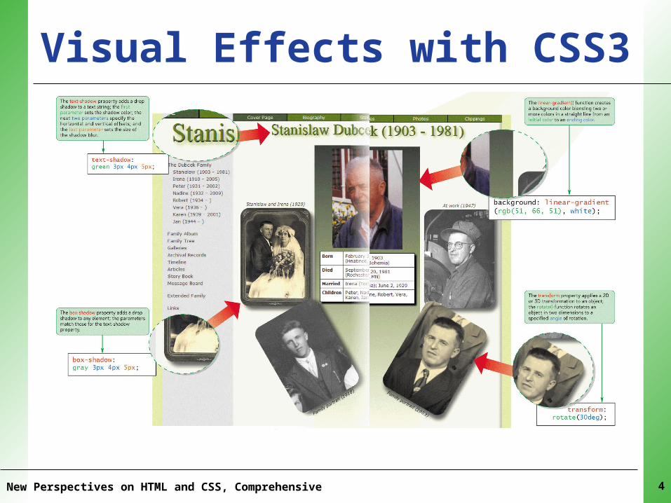
XPXPXPXPXPVisual Effects with CSS3
New Perspectives on HTML and CSS, Comprehensive 4
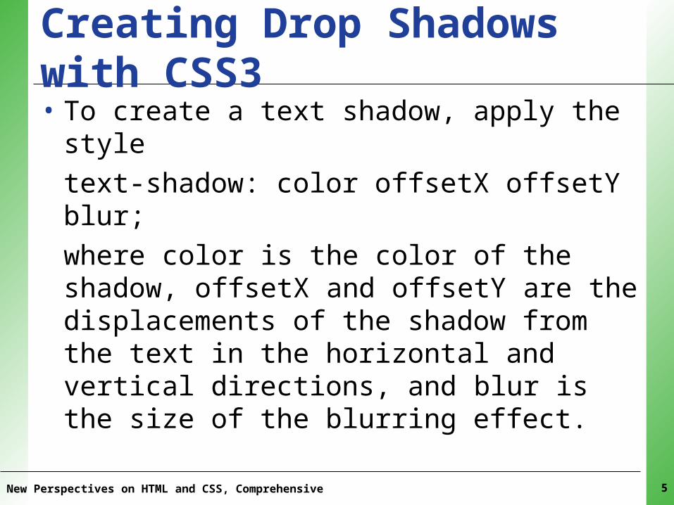
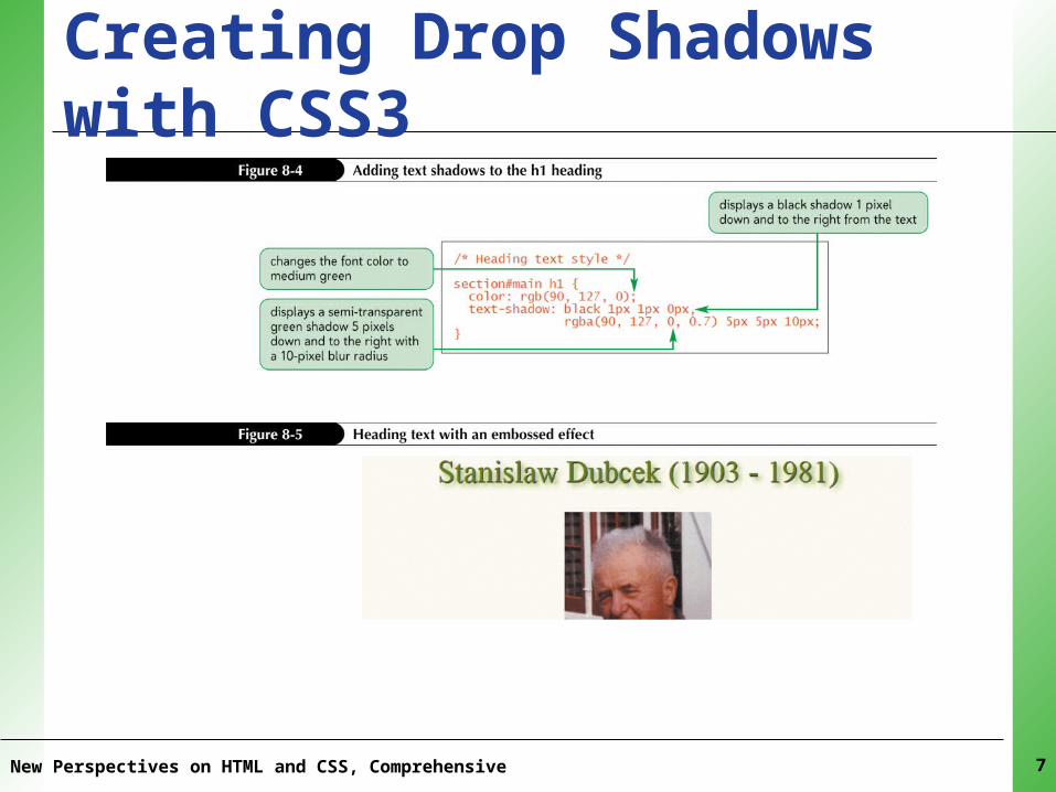
XPXPXPXPXPCreating Drop Shadows with CSS3• To create a text shadow, apply the styletext-shadow: color offsetX offsetY blur;
where color is the color of the shadow, offsetX and offsetY are the displacements of the shadow from the text in the horizontal and vertical directions, and blur is the size of the blurring effect.
New Perspectives on HTML and CSS, Comprehensive 5
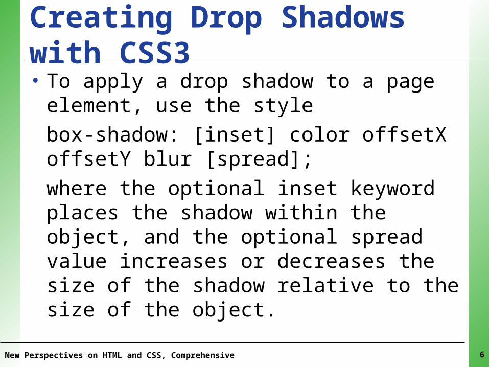
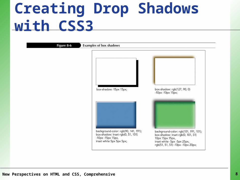
XPXPXPXPXPCreating Drop Shadows with CSS3• To apply a drop shadow to a page element,
use the stylebox-shadow: [inset] color offsetX offsetY blur [spread];
where the optional inset keyword places the shadow within the object, and the optional spread value increases or decreases the size of the shadow relative to the size of the object.
New Perspectives on HTML and CSS, Comprehensive 6
XPXPXPXPXPCreating Drop Shadows with CSS3
New Perspectives on HTML and CSS, Comprehensive 7
XPXPXPXPXPCreating Drop Shadows with CSS3
New Perspectives on HTML and CSS, Comprehensive 8
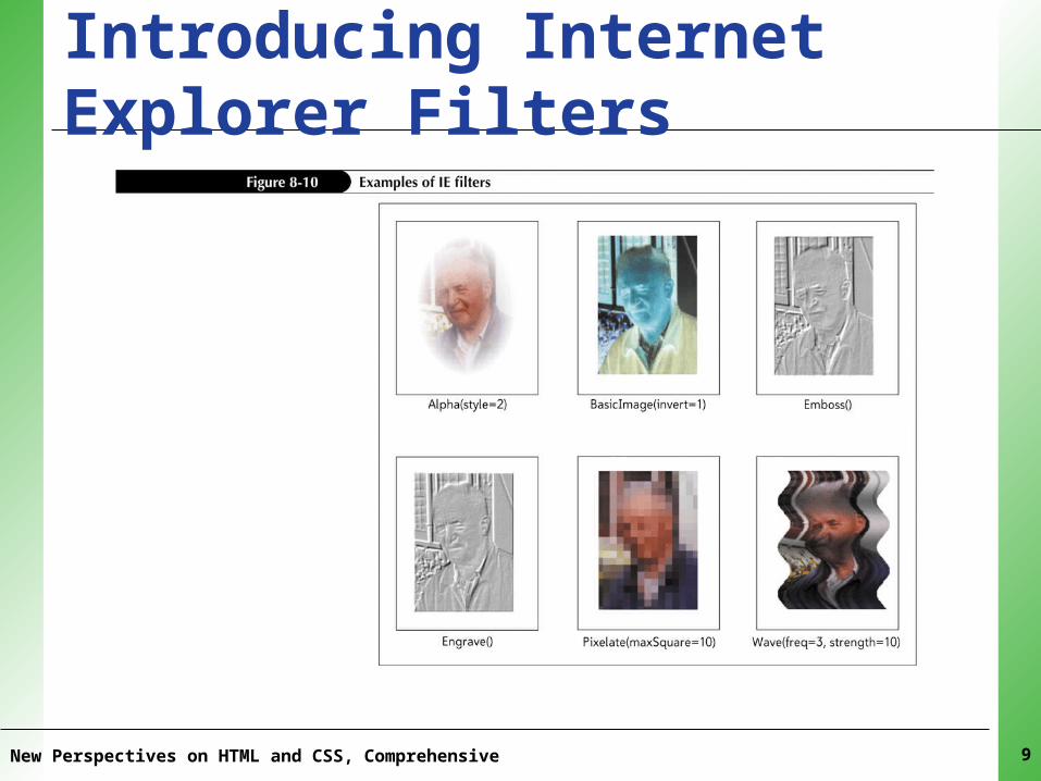
XPXPXPXPXPIntroducing Internet Explorer Filters
New Perspectives on HTML and CSS, Comprehensive 9
XPXPXPXPXPApplying an Internet Explorer Filter• To apply an Internet Explorer filter, add the
style– filter: progid:DXImageTransform.Microsoft.filter(param);
where filter is the name of an Internet Explorer visual effect, and param is the parameters that apply to that effect
New Perspectives on HTML and CSS, Comprehensive 10
XPXPXPXPXPApplying an Internet Explorer Filter• To apply an Internet Explorer filter in
compliance with correct CSS syntax, add the following style:-ms-filter: “progid:DXImageTransform.Microsoft.filter(param)”;
New Perspectives on HTML and CSS, Comprehensive 11
XPXPXPXPXPRotating an Object• Styles that modify the placement or
orientation of a page object are organized under the transform styletransform: effect(params);
where effect is the transformation function that will be applied to the object, and params are any parameters required by the transformation
New Perspectives on HTML and CSS, Comprehensive 12
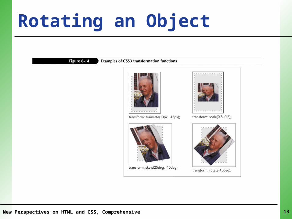
XPXPXPXPXPRotating an Object
New Perspectives on HTML and CSS, Comprehensive 13
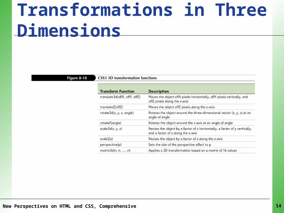
XPXPXPXPXPTransformations in Three Dimensions
New Perspectives on HTML and CSS, Comprehensive 14
XPXPXPXPXPApplying a Color Gradient• To create a linear gradient, apply the functionlinear-gradient(position || angle, color-stop, color-stop, …)
where position is the starting point of the gradient using the keywords left, right, top, and bottom; angle is the angle of the gradient; and color-stop is the position and color of each color (entered as color position).
New Perspectives on HTML and CSS, Comprehensive 15
XPXPXPXPXPApplying a Color Gradient• To create a radial gradient, apply the functionradial-gradient(center, shape size, color-stop, color-stop, …)
where center is the position of the radial gradient’s center, shape is the gradient’s shape, size is the size of the gradient, color is the initial color at the center, and color-stop is a color and its position within the radial gradient.
New Perspectives on HTML and CSS, Comprehensive 16
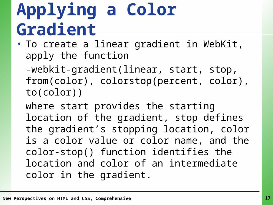
XPXPXPXPXPApplying a Color Gradient• To create a linear gradient in WebKit, apply the
function-webkit-gradient(linear, start, stop, from(color), colorstop(percent, color), to(color))
where start provides the starting location of the gradient, stop defines the gradient’s stopping location, color is a color value or color name, and the color-stop() function identifies the location and color of an intermediate color in the gradient.
New Perspectives on HTML and CSS, Comprehensive 17
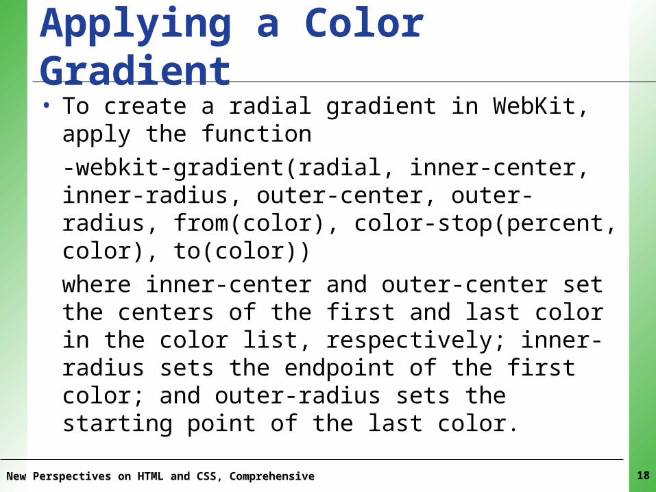
XPXPXPXPXPApplying a Color Gradient• To create a radial gradient in WebKit, apply the
function-webkit-gradient(radial, inner-center, inner-radius, outer-center, outer-radius, from(color), color-stop(percent, color), to(color))
where inner-center and outer-center set the centers of the first and last color in the color list, respectively; inner-radius sets the endpoint of the first color; and outer-radius sets the starting point of the last color.
New Perspectives on HTML and CSS, Comprehensive 18
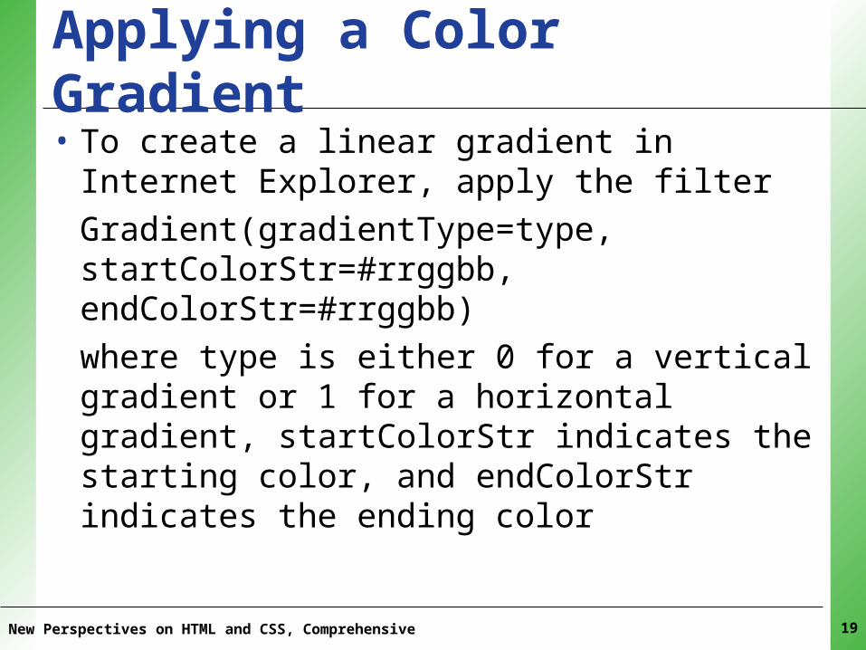
XPXPXPXPXPApplying a Color Gradient• To create a linear gradient in Internet Explorer,
apply the filterGradient(gradientType=type, startColorStr=#rrggbb, endColorStr=#rrggbb)
where type is either 0 for a vertical gradient or 1 for a horizontal gradient, startColorStr indicates the starting color, and endColorStr indicates the ending color
New Perspectives on HTML and CSS, Comprehensive 19
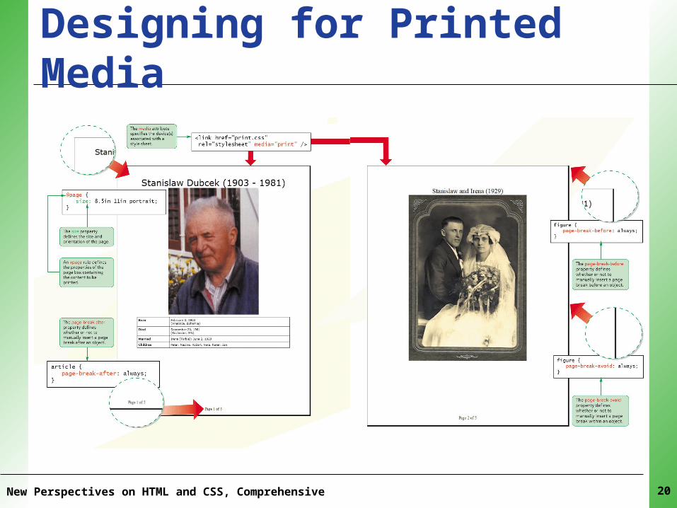
XPXPXPXPXPDesigning for Printed Media
New Perspectives on HTML and CSS, Comprehensive 20
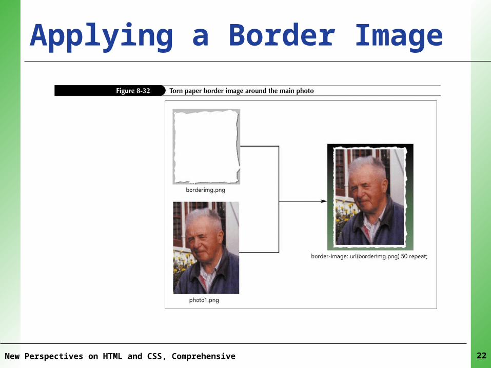
XPXPXPXPXPApplying a Border Image• To use a graphic image as an element border,
apply the styleborder-image: url(url) slice repeat;
where url is the source of the border image file, slice is the size of the slice cut from the border image file, and repeat indicates whether the border slices should be stretched to cover the object’s four sides or tiled
New Perspectives on HTML and CSS, Comprehensive 21
XPXPXPXPXPApplying a Border Image
New Perspectives on HTML and CSS, Comprehensive 22
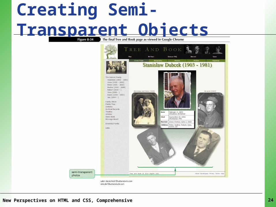
XPXPXPXPXPCreating Semi-Transparent Objects• To create a semi-transparent object, apply the
style opacity: value;where value ranges from 0 (completely transparent) up to 1 (completely opaque).
• To create a semi-transparent object under Internet Explorer version 8 or earlier, apply the filter Alpha(opacity=value)where value ranges from 0 (completely transparent) up to 100 (completely opaque).
New Perspectives on HTML and CSS, Comprehensive 23
XPXPXPXPXPCreating Semi-Transparent Objects
New Perspectives on HTML and CSS, Comprehensive 24
XPXPXPXPXPWorking with Different Media Devices• To create a style sheet for a specific media device,
add the attributemedia = “devices”
to either the link element or the style element, where devices is one or more of braille, embossed, handheld, print, projection, screen, speech, tty, tv, or all. If you don’t specify a media device, the style sheet applies to all devices. Multiple media types should be entered in a comma-separated list
New Perspectives on HTML and CSS, Comprehensive 25
XPXPXPXPXPWorking with Different Media Devices• To create a style for specific media from within
a style sheet, add the rule@media devices {styles}
where styles is the style rules that are applied to the different page elements displayed by those media devices
New Perspectives on HTML and CSS, Comprehensive 26
XPXPXPXPXPUsing Print Styles• To define a page box for a printout that
indicates the page size, margins, and orientation, use the style rule@page {styles}
where styles is the styles that define the page.
New Perspectives on HTML and CSS, Comprehensive 27
XPXPXPXPXPUsing Print Styles• To set the page size and orientation, use the
style propertysize: width height orientation;
where width and height are the width and height of the page, and orientation is the orientation of the page (portrait or landscape).
New Perspectives on HTML and CSS, Comprehensive 28
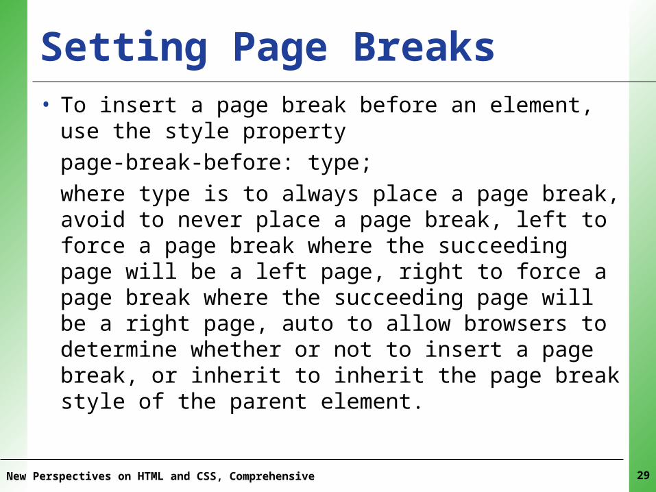
XPXPXPXPXPSetting Page Breaks• To insert a page break before an element, use the
style propertypage-break-before: type;
where type is to always place a page break, avoid to never place a page break, left to force a page break where the succeeding page will be a left page, right to force a page break where the succeeding page will be a right page, auto to allow browsers to determine whether or not to insert a page break, or inherit to inherit the page break style of the parent element.
New Perspectives on HTML and CSS, Comprehensive 29
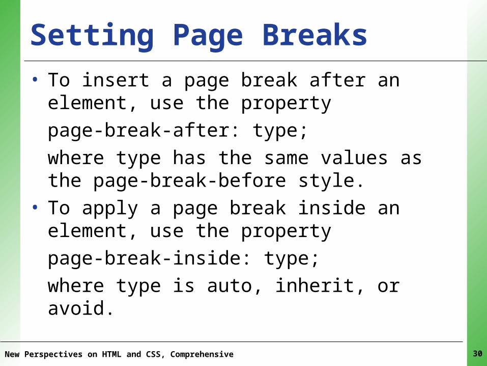
XPXPXPXPXPSetting Page Breaks• To insert a page break after an element, use the
propertypage-break-after: type;
where type has the same values as the page-break-before style.
• To apply a page break inside an element, use the propertypage-break-inside: type;
where type is auto, inherit, or avoid.
New Perspectives on HTML and CSS, Comprehensive 30
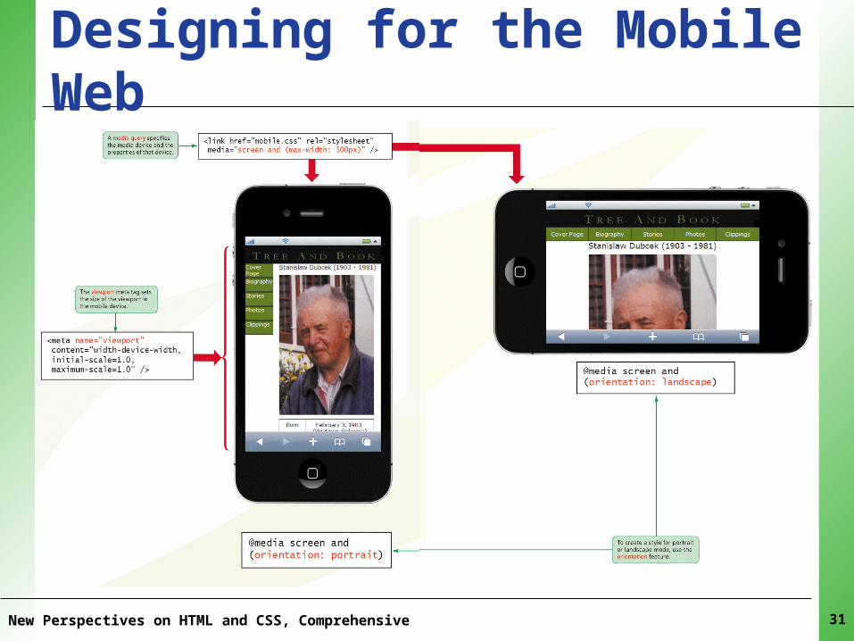
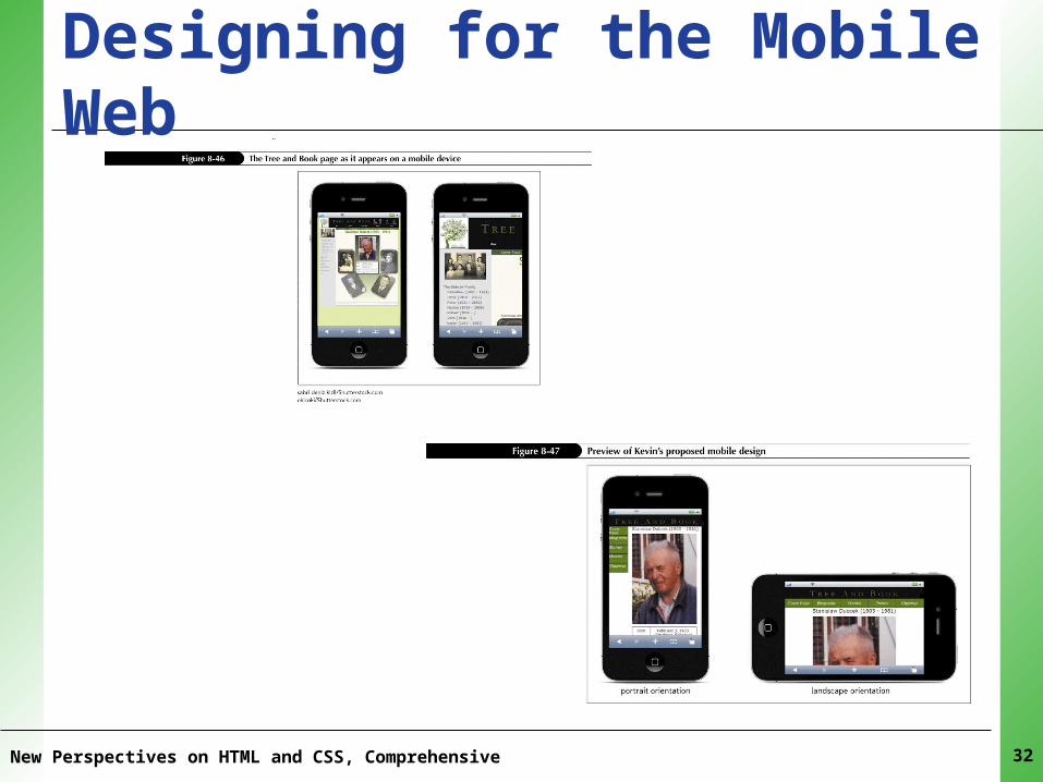
XPXPXPXPXPDesigning for the Mobile Web
New Perspectives on HTML and CSS, Comprehensive 31
XPXPXPXPXPDesigning for the Mobile Web
New Perspectives on HTML and CSS, Comprehensive 32
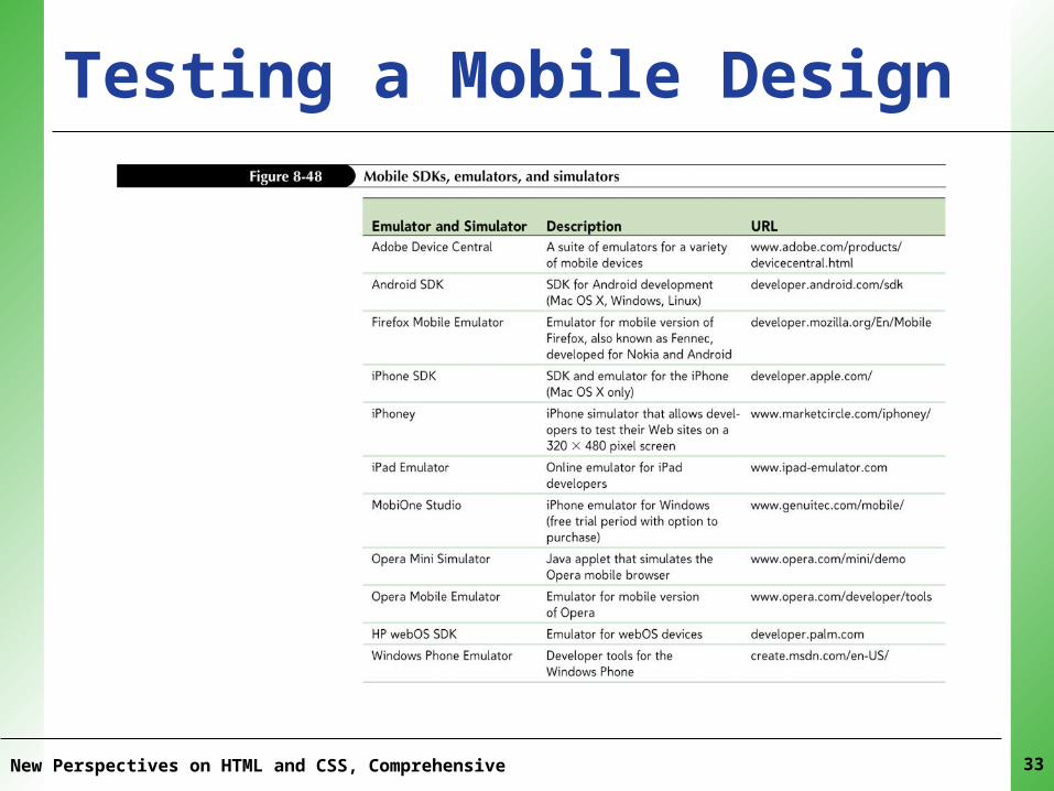
XPXPXPXPXPTesting a Mobile Design
New Perspectives on HTML and CSS, Comprehensive 33
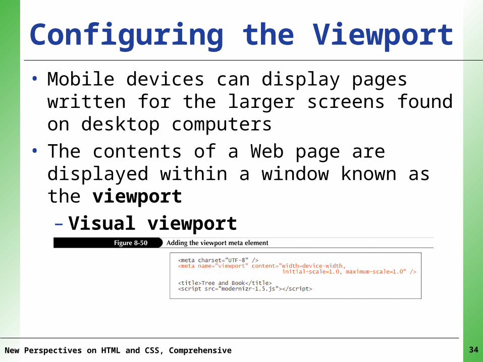
XPXPXPXPXPConfiguring the Viewport• Mobile devices can display pages written for the
larger screens found on desktop computers• The contents of a Web page are displayed within a
window known as the viewport– Visual viewport– Layout viewpot
New Perspectives on HTML and CSS, Comprehensive 34
XPXPXPXPXPIntroducing Media Queries• To create a media query for loading a style
sheet, add the media attributemedia = “devices and|or (features)”
to the link element, where devices is a list of media devices, and features is a list of display features and their values as found on those devices
New Perspectives on HTML and CSS, Comprehensive 35
XPXPXPXPXPIntroducing Media Queries• To apply a media query to a collection of style rules,
apply the @media rule@media devices and|or (features) {
styles
}
in your style sheet, where styles is those styles applied to the specified devices and features.
• To import a style sheet based on a media query, apply the following @import rule:@import url(url) devices and|or (features)
New Perspectives on HTML and CSS, Comprehensive 36
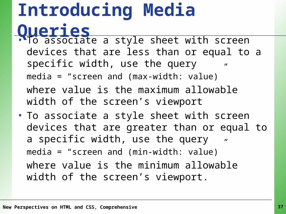
XPXPXPXPXPIntroducing Media Queries• To associate a style sheet with screen devices that are
less than or equal to a specific width, use the querymedia = “screen and (max-width: value)”
where value is the maximum allowable width of the screen’s viewport
• To associate a style sheet with screen devices that are greater than or equal to a specific width, use the querymedia = “screen and (min-width: value)”
where value is the minimum allowable width of the screen’s viewport.
New Perspectives on HTML and CSS, Comprehensive 37
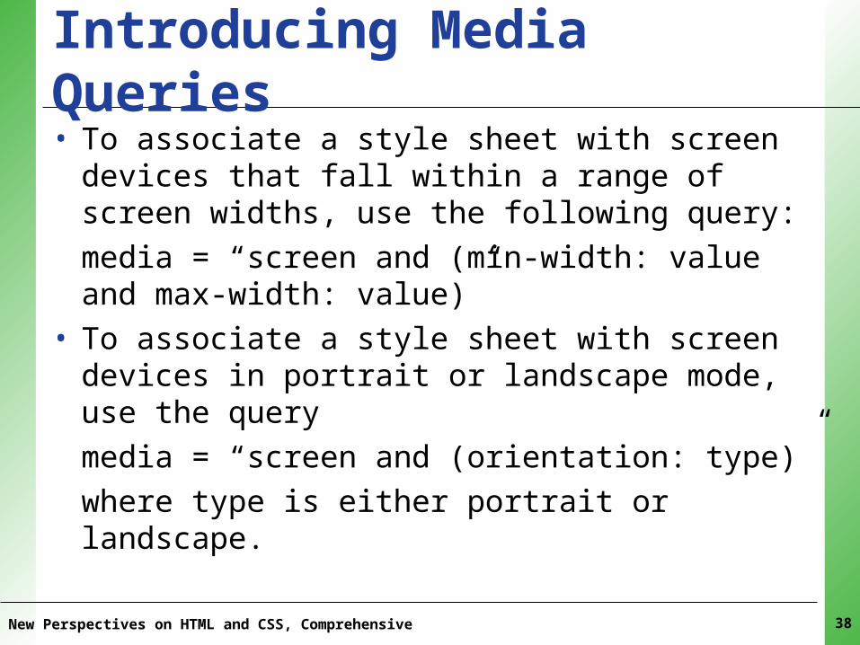
XPXPXPXPXPIntroducing Media Queries• To associate a style sheet with screen devices that fall
within a range of screen widths, use the following query:media = “screen and (min-width: value and max-width: value)”
• To associate a style sheet with screen devices in portrait or landscape mode, use the querymedia = “screen and (orientation: type)”
where type is either portrait or landscape.
New Perspectives on HTML and CSS, Comprehensive 38
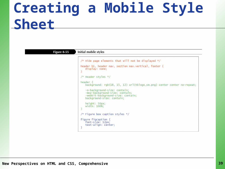
XPXPXPXPXPCreating a Mobile Style Sheet
New Perspectives on HTML and CSS, Comprehensive 39
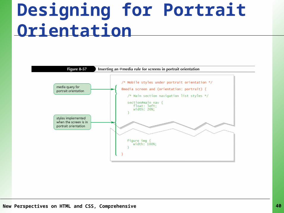
XPXPXPXPXPDesigning for Portrait Orientation
New Perspectives on HTML and CSS, Comprehensive 40
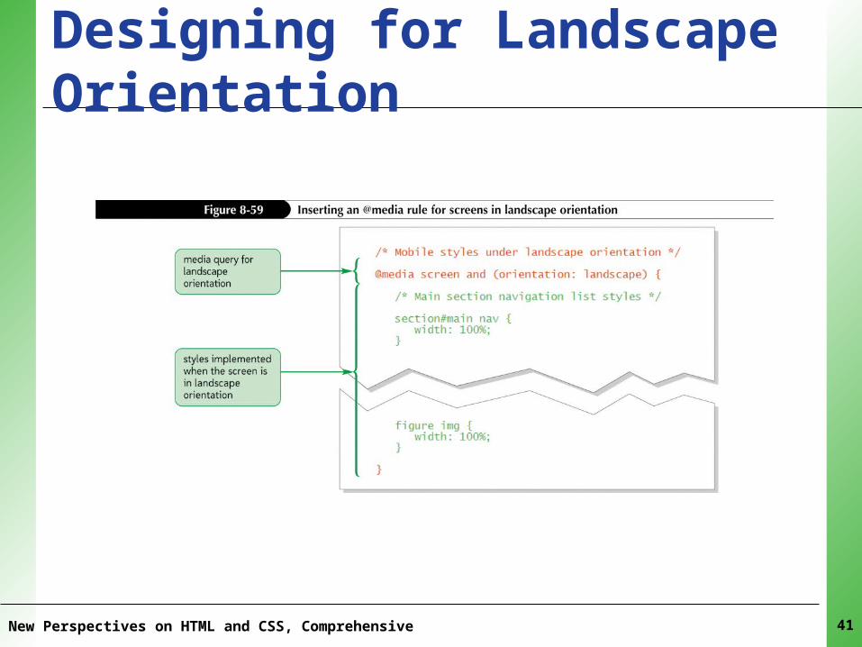
XPXPXPXPXPDesigning for Landscape Orientation
New Perspectives on HTML and CSS, Comprehensive 41