how unequal is europe? evidence from distributional
TRANSCRIPT
How Unequal Is Europe?
Evidence from Distributional National Accounts, 1980-2017
Thomas Blanchet
Lucas Chancel Amory Gethin
April 2019
WID.world WORKING PAPER N° 2019/06
How Unequal Is Europe?
Evidence from Distributional National Accounts, 1980–2017∗
Thomas Blanchet Lucas Chancel Amory Gethin
April 2019
Abstract
This paper estimates the evolution of income inequality in 38 European countries from 1980to 2017 by combining surveys, tax data and national accounts. We develop a harmonizedmethodology, using machine learning, nonlinear survey calibration and extreme value theory,in order to produce homogeneous pre-tax and post-tax income inequality estimates, comparableacross countries and consistent with official national income growth rates. Inequalities have in-creased in a majority of European countries, both at the top and at the bottom of the distribution,especially between 1980 and 2000. The European top 1% grew more than two times faster thanthe bottom 50% and captured 17% of regional income growth. Relative poverty in Europe wentthrough ups and downs, increasing from 20% in 1980 to 22% in 2017. Inequalities yet remainlower and have increased much less in Europe than in the US, despite the persistence of strongincome differences between European countries and the weaker progressivity of European-wideincome redistribution.
∗Thomas Blanchet, Paris School of Economics – EHESS, World Inequality Lab: [email protected]; LucasChancel, World Inequality Lab - Paris School of Economics, IDDRI: [email protected]; Amory Gethin,World Inequality Lab – Paris School of Economics: [email protected]. We thank Facundo Alvaredo, AntoineBozio, Ignacio Flores, Thomas Piketty and Gabriel Zucman for helpful discussions of earlier versions of this paper. Weare also grateful to Alari Paulus for his help in collecting Estonian tax data, as well as Mateo Moisan for useful researchassistance. We acknowledge financial support from the Ford Foundation, the Sloan Foundation, the United NationsDevelopment Programme and the European Research Council (ERC Grant 340831).
1
Contents
1 Introduction 2
2 Data sources and methodology 5
2.1 Income concepts . . . . . . . . . . . . . . . . . . . . . . . . . . . . . . . . . . . . . . . . 5
2.2 Data sources . . . . . . . . . . . . . . . . . . . . . . . . . . . . . . . . . . . . . . . . . . 6
2.3 Methodology . . . . . . . . . . . . . . . . . . . . . . . . . . . . . . . . . . . . . . . . . 13
3 Results 24
3.1 Inequalities between European countries . . . . . . . . . . . . . . . . . . . . . . . . . 24
3.2 Inequalities within European countries . . . . . . . . . . . . . . . . . . . . . . . . . . 29
3.3 Inequalities between European citizens . . . . . . . . . . . . . . . . . . . . . . . . . . 36
3.4 Curbing inequalities? From pre-tax to post-tax income . . . . . . . . . . . . . . . . . 44
3.5 Is Europe more unequal than the United States? . . . . . . . . . . . . . . . . . . . . . 47
4 Conclusion 58

2 How Unequal Is Europe?
1 Introduction
Despite the relevance of Europe (and particularly the European Union) as an economic and politicalentity, it is remarkably hard to know how growth has been shared over the past few decades acrossits population. This difficulty is not the result of a lack of data per se. In fact, there is a fair amountof data available, at least since the 1980s. The problem is that these data are scattered across avariety of sources, taking several forms, using diverse concepts and different methodologies. In theend, we find ourselves with a disparate set of indicators that are not always comparable, are hardto aggregate, provide uneven coverage, and can tell conflicting stories.
As a result, the literature has struggled to answer simple questions such as: which income groupsin which countries have benefited the most from European growth? How is European inequalityaffected by taxes and transfers? Is Europe as a whole more or less equal than the United States? 1
This paper addresses this problem by constructing distributional national accounts for 38 Europeancountries since 1980. While we still face considerable challenges in the construction of goodestimates of the income distribution in some countries, we believe that our new series presentmajor improvements over existing ones.
First, our estimates combine virtually all the existing data on the income distribution of Europeancountries in a consistent way. That includes surveys, national accounts, and tax data. Our method-ology exploits the strengths of each data source to correct for the weaknesses of the others. It avoidsthe kind of systematic errors that would arise from the comparison of different income concepts,different statistical units and different methodologies. As such, our estimates are meant to reflectthe best of our current knowledge on what has been the evolution of inequality in Europe.
Second, in line with the logic of distributional national accounts (DINA), we distribute the entiretyof national income. This includes money that never explicitly shows up on anyone’s bank account,such as imputed rents or the retained earnings of corporations, yet can account for a significantshare of the income recorded in national accounts and official publications of macroeconomicgrowth. Therefore, our results are consistent with macroeconomic totals, and can be directlydiscussed in terms of how much growth accrued to the different parts of the distribution.
1Among many studies, Atkinson (1996) found that inequalities were lower in the EU-15 than in the US in the late1980s, and so did Beblo and Knaus (2001) when looking at the eurozone in the mid-1990s. Brandolini (2006) extendedthe analysis to the EU-25 and found a lower Gini coefficient than in the US when using purchasing power parities.Boix (2004) found the EU-28 to be more unequal than the United States, but not the EU-15 and the EU-25. Similarly,Dauderstadt (2008) and Dauderstadt and Keltek (2011) estimated that income disparities were larger in the EU-27 thanin other world regions such as China, India, Russia or the US.
WID.world Working Paper 2019–6

3 How Unequal Is Europe?
Third, rather than focusing on a handful of indicators, we cover the entire distribution from thebottom to the top 0.001%. Therefore, we can aggregate our distributions at different regional levels,and analyze the structure of inequality in great details. We can, furthermore, use our estimates tocompute any set of synthetic indicators in a consistent way, such as top and bottom income shares,poverty rates or Gini coefficients.
Our approach builds on some of the latest advances in statistics, including machine learning(Chen and Guestrin, 2016), extreme value theory (Ferreira and Haan, 2006), and nonlinear surveycalibration (Lesage, 2009). It obeys a handful of principles. To begin, national accounts are ourbenchmark for measuring inequality between countries. This does not mean that we consider themto be perfect (e.g. Zucman, 2013), but they do represent the most thorough attempt to define aconcept of income harmonized at the international level, and in practice they are already routinelyused to measure the average income of countries.
Then, surveys and tax data provide complementary information on the distribution of incomewithin countries. Surveys cover the entire distribution. They are often — though not always —available as microdata, so they can be used with different income concepts and statistical units. Butthey tend to underrepresent the rich, which limits their ability to measure the income share of topgroups. Tax data does not suffer from that problem. However, in several countries, it only coversthe top of the distribution, and it uses income concepts and statistical units that depend on thelegislation of each country. For that reason, surveys remain a core element of our method, but wecorrect them using the tax data to ensure their representativity in terms of income, in the same waythat statistical institutes already correct them to ensure representativity in terms of age or gender.
We stress that our work should not be viewed as a substitute for what has been done, and isstill being done, in country-specific studies on distributional national accounts (such as Piketty,Saez, and Zucman (2018) on the United States and Garbinti, Goupille-Lebret, and Piketty (2018)on France). In fact, we use such data in the few countries in which they are available. Thesecomprehensive DINA studies typically involve a lot of work and assumptions to match estimates ofthe income distribution with the national accounts for every single component of national income.This results in series that are extremely detailed and extremely precise, but also very complexand time-consuming. It will take a long time until this type of work can be extended to all thecountries covered in this paper. In the meantime, our approach has several advantages. It is simpler,faster, and requires less data. Yet it still represents a significant step forward compared to previousinequality series: unlike pure survey estimates, it does not suffer from the underrepresentation ofthe rich. Unlike raw tax data estimates, it covers the entire population, and it uses concepts andstatistical units that are consistent across countries rather than dependent on the local legislation.
WID.world Working Paper 2019–6
4 How Unequal Is Europe?
And it accounts for the main components of net national income that are traditionally missing fromestimates of inequality. As such, our methodology captures the main improvements that come fromthe production of more comprehensive distributional national accounts, but can be implementedmuch faster and at a larger scale.
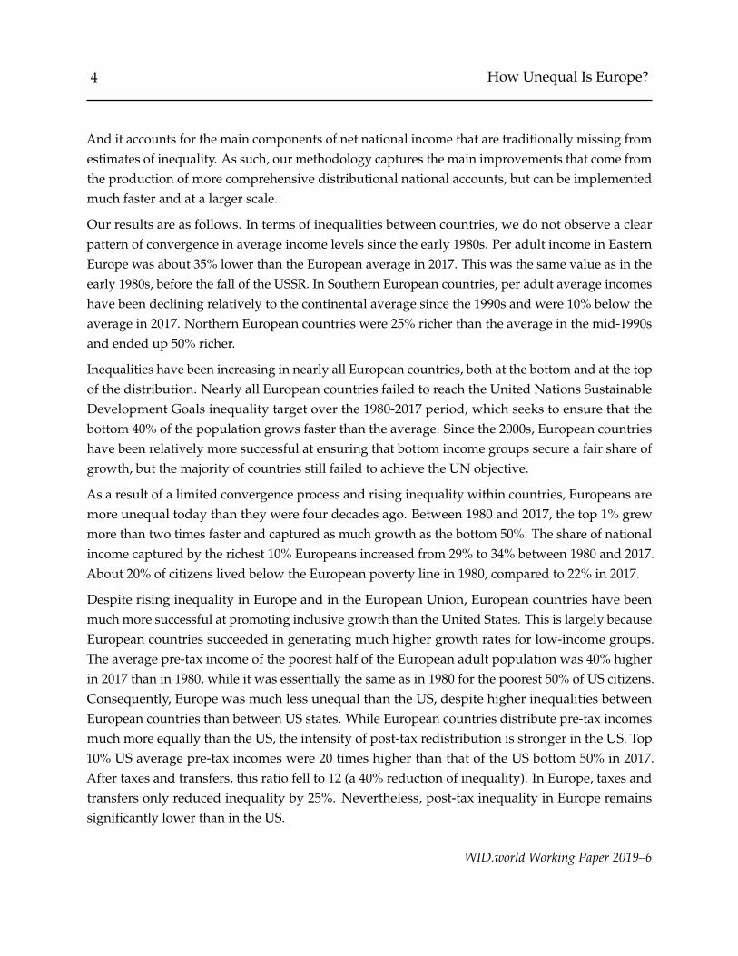
Our results are as follows. In terms of inequalities between countries, we do not observe a clearpattern of convergence in average income levels since the early 1980s. Per adult income in EasternEurope was about 35% lower than the European average in 2017. This was the same value as in theearly 1980s, before the fall of the USSR. In Southern European countries, per adult average incomeshave been declining relatively to the continental average since the 1990s and were 10% below theaverage in 2017. Northern European countries were 25% richer than the average in the mid-1990sand ended up 50% richer.
Inequalities have been increasing in nearly all European countries, both at the bottom and at the topof the distribution. Nearly all European countries failed to reach the United Nations SustainableDevelopment Goals inequality target over the 1980-2017 period, which seeks to ensure that thebottom 40% of the population grows faster than the average. Since the 2000s, European countrieshave been relatively more successful at ensuring that bottom income groups secure a fair share ofgrowth, but the majority of countries still failed to achieve the UN objective.
As a result of a limited convergence process and rising inequality within countries, Europeans aremore unequal today than they were four decades ago. Between 1980 and 2017, the top 1% grewmore than two times faster and captured as much growth as the bottom 50%. The share of nationalincome captured by the richest 10% Europeans increased from 29% to 34% between 1980 and 2017.About 20% of citizens lived below the European poverty line in 1980, compared to 22% in 2017.
Despite rising inequality in Europe and in the European Union, European countries have beenmuch more successful at promoting inclusive growth than the United States. This is largely becauseEuropean countries succeeded in generating much higher growth rates for low-income groups.The average pre-tax income of the poorest half of the European adult population was 40% higherin 2017 than in 1980, while it was essentially the same as in 1980 for the poorest 50% of US citizens.Consequently, Europe was much less unequal than the US, despite higher inequalities betweenEuropean countries than between US states. While European countries distribute pre-tax incomesmuch more equally than the US, the intensity of post-tax redistribution is stronger in the US. Top10% US average pre-tax incomes were 20 times higher than that of the US bottom 50% in 2017.After taxes and transfers, this ratio fell to 12 (a 40% reduction of inequality). In Europe, taxes andtransfers only reduced inequality by 25%. Nevertheless, post-tax inequality in Europe remainssignificantly lower than in the US.
WID.world Working Paper 2019–6
5 How Unequal Is Europe?
In the online appendix, we provide detailed information on data sources, methodological steps andkey results for all the countries and European regions covered in this paper. Detailed inequalityseries covering the distributions of pre-tax and post-tax incomes can be downloaded from thewebsite of the World Inequality Database (https://wid.world), where incomes across Europeancountries can also be compared on an online simulator (https://wid.world/simulator).
Section 2 presents the data sources and methodology used in this paper. Section 3 discusses theevolution of income inequality in Europe between 1980 and 2017. Section 4 concludes.
2 Data sources and methodology
2.1 Income concepts
We produce homogeneous income inequality estimates for thirty-eight European countries, span-ning from Portugal to Cyprus and from Iceland to Malta, over the 1980-2017 period. Our geo-graphical area of interest includes the twenty-eight members of the European Union, five candidatecountries (Bosnia and Herzegovina, Serbia, Montenegro, Macedonia, Albania), and five countrieswhich are not part of the EU but have maintained tight relationships with it (Iceland, Norway,Switzerland, Kosovo and Moldova).
Our benchmark measure to compare income levels between countries and over time is net nationalincome. It is equal to gross domestic product (GDP) net of capital depreciation, plus net foreignincome received from abroad. While GDP figures are most often discussed by both academics andthe general public, we believe national income to be more meaningful, since capital depreciationis not earned by anyone, while foreign incomes are, on the contrary, effectively received (or paid)by residents of a given country. While GDP and national income usually follow each other, thereare countries where they can diverge, such as Ireland and Luxembourg where a growing shareof GDP growth has been captured by foreign corporations in recent years. Furthermore, as anindicator of income rather than production, national income is not sensitive to issues surroundingthe localization of production that have become worrisome in recent years. For example, Irelandofficially estimated its real GDP growth in 2015 to be +26%. This number stirred controversy, as itis believed to be the sole result of a few large multinational corporations relocating their intangibleassets in Ireland for tax purposes.2 National accountants are still debating whether it reflects the
2See https://www.irishtimes.com/business/economy/handful-of-multinationals-behind-26-3-growth-
in-gdp-1.2719047
WID.world Working Paper 2019–6
6 How Unequal Is Europe?
reality of the Irish GDP or a mere statistical artifact. Instead, using the concept of national incomeis much more straightforward: net foreign incomes compensate any change in GDP caused bydifferent assumptions about the localization of production. Throughout this paper, we use nationalincome series compiled by the World Inequality Database based on data from national statisticalinstitutes and macroeconomic tables from the United Nations System of National Accounts (seeBlanchet and Chancel, 2016).
Our work follows the guidelines for distributional national accounts that have been laid down byAlvaredo et al. (2017). It is therefore comparable to other works on distributional national accountsdone in the United States (Piketty, Saez, and Zucman, 2018) and France (Garbinti, Goupille-Lebret,and Piketty, 2018). Our statistical unit is the adult individual (defined as being 20 or older), andwe split income equally between adult household members. We focus on two concepts for thedistribution of income: pre-tax and post-tax national income, both of which sum up to nationalincome.
Pre-tax national income is our main concept. It is the sum of all personal income flows, beforetaking into account the operation of the tax and transfer system, but after taking into account theoperation of the pension system. Contributions to pension and unemployment insurance schemesare therefore deducted, but the corresponding benefits are included. Pre-tax income is similar tothe taxable income of many countries, but its definition is usually broader, and more comparableacross countries. Because we include both pension and unemployment insurance, this correspondsto the “broad” definition of the DINA guidelines (Alvaredo et al., 2017).
Post-tax national income is equal to pre-tax income after subtracting all taxes and adding all formsof government transfers. In line with the DINA methodology, all forms of government spendingare allocated to individuals, so that post-tax income adds up to the national income. Not doingso would make countries with a stronger provision of public goods appear mechanically poorer.Our benchmark post-tax income series allocate all government consumption is a neutral way, bymaking it proportional to income. This is the convention adopted by other DINA studies andmakes the series more comparable to other estimates of post-tax income inequality. We experimentwith alternative assumptions by distributing parts of government consumption as a lump sumrather than proportionally. This changes the levels of post-tax inequality, but not the trends.
2.2 Data sources
Our methodology relies on surveys, tax data and national accounts to produce our final estimatesof the income distribution. We use additional information on social contribution schedules from
WID.world Working Paper 2019–6
7 How Unequal Is Europe?
the OECD tax database when necessary to impute social contributions paid.3 We provide extensivedocumentation of the availability of these sources country by country in the extended appendix ofthe paper.
2.2.1 Survey data
We bring together survey microdata from three sources and survey tabulations from two sources.The Luxembourg Income Study (LIS) provides access to harmonized survey microdata coveringtwenty-six countries over the 1975–2014 period. Most Western European countries are coveredfrom 1985 until today, and several nations from Eastern Europe have been surveyed since the 1990s.Our second most important source of survey data is the European Union Statistics on Income andLiving Conditions (EU-SILC), which have been conducted on a yearly basis since 2004 in thirty-twocountries. We complemented that survey by its predecessor, the European Community HouseholdPanel, which covers the 1994-2001 period for thirteen countries in Western Europe.
We complete our database by compiling survey tabulations available from the World Bank’sPovcalNet portal and from the World Income Inequality Database. PovcalNet provides pre-calculated survey distributions by percentile of post-tax income or consumption per capita. TheWorld Income Inequality Database (WIID) gathers inequality estimates obtained from variousstudies, and gives information on the share of income received by each decile or quintile of thepopulation. We use generalized Pareto interpolation (Blanchet, Fournier, and Piketty, 2017) torecover complete distributions based on the tabulations. These estimates cover very differentnotions, which motivates our method for correcting conceptual discrepancies (see section 2.3.1below). We observe three types of income/consumption definitions and five types of populationunits, amounting to fifteen potential types of inequality series. We may observe either pre-taxincome, post-tax income or consumption. Population units can be households, adults, individuals,the OECD modified equivalence scale or the square root scale.4
Historically, surveys have mostly been used to produce estimates of the distribution of post-tax income. The situation has evolved in the latest decade, with measures of income beforetaxes and transfers being recorded consistently across the continent as part of EU-SILC. TheLuxembourg Income Study also produces some historical data on pre-tax income, in many casesby imputing taxes and contributions as part of their harmonization effort. As a result, we have
3See https://www.oecd.org/tax/tax-policy/tax-database.htm.4When computing inequality estimates with the OECD modified equivalence scale, the first adult in the household
is given a weight of 1, other adults are given a weight of 0.5, and children are given a weight of 0.3 each. The square rootscale divides total income by the square root of the size of the household.
WID.world Working Paper 2019–6

8 How Unequal Is Europe?
data on pre-tax income in almost all countries since 2007, and for over a longer time periodfor some Western European countries (Germany, United Kingdom, Switzerland, and Nordiccountries). Otherwise, we mostly observe the distribution of post-tax income. Cases in whichwe only observe consumption are limited to a handful of Eastern European countries (Moldova,Kosovo, Montenegro).
Our survey estimates for pre-tax income are limited to cases in which we have access to themicrodata, given the need to properly match the DINA definition of pre-tax income.5 That definitioninvolves dividing social contributions between a contributory part and a non-contributory part. Thecontributory part finances pension and unemployment benefits that are included in pre-tax income,while the non-contributory part finances universal and social assistance benefits that should onlybe included in post-tax income. We only remove contributory contributions from pre-tax income.We rely on the national accounts to determine the share of contributory social contributions. Weonly distribute a fraction of social contributions, equal to the ratio of social insurance benefits(items D621 + D622 in the system of national accounts) to social insurance contributions (D63).However, the national accounts of countries do not usually provide enough details to separatesocial insurance benefits (D621 + D622) from social assistance benefits in cash (D623). They onlyrecord their sum as social benefits other than social transfers in kind (D62). To make the distinction,we rely on the OECD social expenditure database, which breaks down social benefits by functionin great detail since 1980. In general, the ratio of social benefits to social contributions is belowone because contributions finance benefits other than pensions and unemployment insurance. Yetthe opposite is true in some countries. Denmark, for example, derives virtually no revenue fromsocial contributions. In such cases we assume that benefits in excess of contributions are financedby income and wealth taxes, so we deduct the corresponding part of taxes from pre-tax income.
Even when we have access to microdata with information on income before taxes and transfers,we have to sometimes perform additional imputations. In EU-SILC, both employer and employeesocial contributions are recorded, but employee contributions are combined with income andwealth taxes. Therefore, we impute employee contributions separately using social contributionschedules published in the OECD Tax Database. Before 2007, employer contributions may alsonot be recorded despite having information on income before taxes and employee contributions.In such cases, we also impute employer contributions based on schedules from the OECD TaxDatabase.
5The only exceptions correspond to a handful of Eastern European countries at the beginning of the period (Bosniaand Herzegovina, Moldova, Montenegro) for which we have no other source available. In these cases we use the surveydistribution of pre-tax income as a proxy for the “true” pre-tax income.
WID.world Working Paper 2019–6
9 How Unequal Is Europe?
We also use additional information from surveys to include imputed rents and the retained earningsof corporations in our measures of income (see section 2.2.3). Imputed rents are recorded in EU-SILC (though not included in the main income definition used by Eurostat). To estimate thedistribution of retained earnings, we use the distribution of stock ownership (both held directlyand indirectly, and for both public and private companies) in the Household Survey of ConsumerFinance (HFCS), a European-wide wealth survey spearheaded by the ECB since 2014.
2.2.2 Tax data
Following contributions by Piketty (2001) for France and Piketty and Saez (2003) for the UnitedStates, several authors have been using tax data to study top income inequality in the long run.Most of these studies have been published in two collective volumes (Atkinson and Piketty,2007; Atkinson and Piketty, 2010), and their results have been compiled in the World InequalityDatabase.6 In general, tax data is only reliable for the top of the distribution, and this is why theseseries do not cover anything below the top 10%. Researchers estimate the share of top incomegroups by dividing their income in the tax data by a corresponding measure of total income inthe national accounts. At the time of writing, data series were available for nineteen Europeancountries, providing information on the share of income received over time by various groupswithin the top 10%.
We complete this database by collecting additional tabulated tax returns for Austria (2008–2015),East Germany (1970–1988), Estonia (2002–2017), Greece (2004–2011), Iceland (1990–2016), Italy(2009–2016), Luxembourg (2010, 2012) and Portugal (2005–2016). We use these tabulations to directlyadd new top income shares to our database. We provide a detailed account of the computationsfor each country in our technical appendix. In most cases, we directly correct the surveys withthe tax data using the method of Blanchet, Flores, and Morgan (2018) rather than using a totalincome estimate from the national accounts. Direct correction of survey data is more a flexible andpractical approach, at least for the recent period, and is now being preferred in the latest work oninequality (e.g. Piketty, Yang, and Zucman, 2017; Morgan, 2017; Bukowski and Novokmet, 2017).When extending existing series using that method, as in Italy or Portugal, our results are consistentwith the work that was done previously, thus confirming the consistency and reliability of bothapproaches.
Top income series based on tax data have advantages and disadvantages. On the one hand, theygenerally provide a more accurate picture of the evolution of top incomes and are often available on
6See http://wid.world.
WID.world Working Paper 2019–6
10 How Unequal Is Europe?
a yearly basis for long periods of time. On the other hand, because estimates of top income sharesare measured from tabulated tax returns, they have to rely on definitions of taxable income and taxunits which depend upon country-specific legislation. In Sweden, for instance, all individuals filetax returns separately and taxable income includes a significant share of social contributions (Roineand Waldenstrom, 2010). In Portugal, by contrast, married couples file jointly and taxable incomeexcludes social contributions (Alvaredo, 2009). Therefore, while estimates based on tabulated taxdata may portray accurately the evolution of top income inequality, they limit considerably thepossibility to compare levels of inequality between countries.
2.2.3 National accounts
We rely on national accounts for several purposes. We use them to allocate the proper fraction ofsocial contributions to individuals, as explained in section 2.2.1. We use net national income as ourmeasure of income inequality between countries. And we use them to for certain types of incomethat are included in macroeconomic growth but excluded from many survey or tax-based estimatesof inequality. For the simplified methodology presented in this paper, we focus on the two mostimportant types of income that are traditionally excluded from estimates of the distribution ofincome: imputed rents and the retained earnings of corporations.7 These components can representa significant share of national income as defined in the national accounts. Both of them are classifiedas capital income, therefore their absence from the traditional estimates of income inequality partlyexplains why both survey and tax data both miss a large fraction of the capital income in theeconomy (Flores, 2018). Our estimates of net national income come from the World InequalityDatabase (see Blanchet and Chancel, 2016). For the rest, we use data from the standard sources:the United Nations Statistics Division, the OECD and Eurostat. We provide a detailed account ofwhich sources are available in any given year for all countries in the extended appendix.8
Imputed rents correspond to the rental value of housing that homeowners pay to themselves whenthey live in their property instead of renting it to a third party. Their inclusion in the definitionof income ensures that national income does not mechanically go up or down when the rate ofhome ownership changes. In advanced economies, they constitute a very significant part of capitalincome (Rognlie, 2015). In the national accounts, imputed rents correspond to the net operating
7Imputed rents are actually included in some survey estimates, and are also part of the tax base in some countries.Our methodology accounts and corrects for these discrepancies.
8When data are missing between two years, we linearly interpolate series expressed as a share of GDP. When data aremissing at the beginning or at the end of the period, we extrapolate the series as a share of GDP using single exponentialsmoothing. Compared to carrying value forward or backward, single exponential smoothing avoid excessive reliance onpotential outliers at the end or the beginning of the series.
WID.world Working Paper 2019–6

11 How Unequal Is Europe?
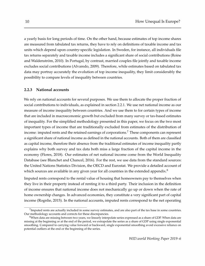
Figure 1: Imputed rents and undistributed profits in six European countries
2.3
3.5
2.4
8.1
2.8 2.8
5.4
4.7
6.3
2.8
8.1
2.4
0
2
4
6
8
% G
DP
Poland Denmark Germany Spain France Italy
Imputed Rents Undistributed Profits
Source: Authors’ elaboration based on tables from the United Nations’ National Accounts Statistics.
surplus of the household sector (B2N).
The retained earnings of corporations correspond to profits that are kept within the company ratherthan distributed to shareholders as dividends. This income ultimately increases the wealth ofshareholders and therefore represents a source of income to them. Several papers have documentedthe impact of including retained earnings in the United States (Piketty, Saez, and Zucman, 2018),Canada (Wolfson, Veall, and Brooks, 2016), and Chile (Fairfield and Jorratt De Luis, 2016; Atriaet al., 2018). In Norway, Alstadsæter et al. (2017) showed that the choice to keep profits within acompany or to distribute them is highly dependent on tax incentives, and therefore that failing toinclude them in estimates of inequality makes top income shares and their composition artificiallyvolatile. Previous work would sometimes include capital gains in their income definition, whichindirectly accounts for this type of income. Yet this constitutes a poor proxy, because capital gainsare recorded upon realization, rather than when they accrue to individuals. And whether capitalgains are realized or not depends on their value and on tax incentives. Therefore, attributingretained earnings to individuals directly is more reliable, more meaningful, more consistent with
WID.world Working Paper 2019–6
12 How Unequal Is Europe?
macroeconomic measures of income, and more comparable across countries.
In the national accounts, retained earnings correspond to the net primary income of corporations(B5N). In line with our focus on net national income, this quantity is net of capital depreciation. Wedo not, however, distribute the entirety of that income to households, because some of it belongs tothe government or to foreigners. To that end, we rely on the financial balance sheets of countries:we divide the equity assets of the government and of the rest of the world by the equity liability ofthe domestic corporate sector. We exclude that fraction of retained earnings from the amount thatis allocated to households.9
Figure 1 presents the share in GDP of both retained earnings and imputed rents for six selectedcountries of the EU. While imputed rents represent 2 to 3% of GDP in Poland and Germany today,they make up more than 6% of GDP in France and Italy. The total value of undistributed profitsalso varies quite significantly from a country to the other, from less than 3% of GDP in France andItaly to more than 8% in Denmark. The importance of imputed rents and undistributed profits inGDP also varies over time. The undistributed profits rose significantly in Italy or Poland since the1980s, whereas they decreased in Spain and the United Kingdom.
2.2.4 Quality of data sources
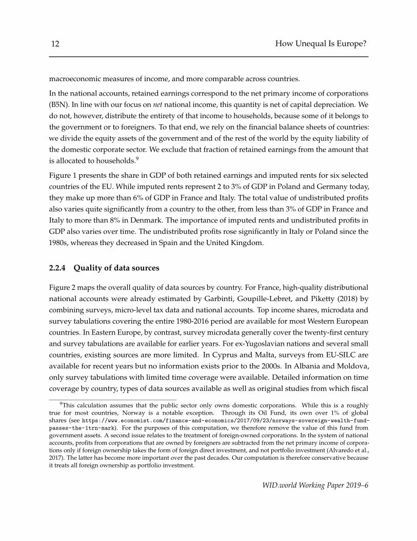
Figure 2 maps the overall quality of data sources by country. For France, high-quality distributionalnational accounts were already estimated by Garbinti, Goupille-Lebret, and Piketty (2018) bycombining surveys, micro-level tax data and national accounts. Top income shares, microdata andsurvey tabulations covering the entire 1980-2016 period are available for most Western Europeancountries. In Eastern Europe, by contrast, survey microdata generally cover the twenty-first centuryand survey tabulations are available for earlier years. For ex-Yugoslavian nations and several smallcountries, existing sources are more limited. In Cyprus and Malta, surveys from EU-SILC areavailable for recent years but no information exists prior to the 2000s. In Albania and Moldova,only survey tabulations with limited time coverage were available. Detailed information on timecoverage by country, types of data sources available as well as original studies from which fiscal
9This calculation assumes that the public sector only owns domestic corporations. While this is a roughlytrue for most countries, Norway is a notable exception. Through its Oil Fund, its own over 1% of globalshares (see https://www.economist.com/finance-and-economics/2017/09/23/norways-sovereign-wealth-fund-
passes-the-1trn-mark). For the purposes of this computation, we therefore remove the value of this fund fromgovernment assets. A second issue relates to the treatment of foreign-owned corporations. In the system of nationalaccounts, profits from corporations that are owned by foreigners are subtracted from the net primary income of corpora-tions only if foreign ownership takes the form of foreign direct investment, and not portfolio investment (Alvaredo et al.,2017). The latter has become more important over the past decades. Our computation is therefore conservative becauseit treats all foreign ownership as portfolio investment.
WID.world Working Paper 2019–6

13 How Unequal Is Europe?
Figure 2: Quality of data sources
Low (survey tabulations, low time coverage)
Medium low (survey tabulations, good time coverage)
Medium (survey tabulations + microdata)
Medium high (survey tabulations + microdata + tax data)
High (distributional national accounts)
data series originate are available in appendix (table A.1).
2.3 Methodology
The issues that affect the validity and the comparability of existing income inequality estimatesmay be divided into three categories: conceptual discrepancies, nonsampling error, and samplingerror.
Conceptual discrepancies are not errors in themselves but refer to differences as to what, precisely,is being measured. Existing estimates of income inequality may be concerned with different typesof income and different populations units. While there may be a case for measuring inequalityusing any of these concepts and units, the existence of such a wide range of definitions makes ithard to compare inequality estimates both over time and between countries. As we have seen,both survey tabulations and fiscal data suffer from important conceptual discrepancies, as they
WID.world Working Paper 2019–6

14 How Unequal Is Europe?
are measured on different groups of individuals and using different income concepts. One of thecontributions of this paper is to provide a new method to harmonize these different distributions.10
Sampling and non-sampling errors apply to surveys. Sampling error refers to problems that arisepurely out of the limited sample size of survey data. Low sample sizes affect the variance ofestimates, which means they may vary a lot around their expected value. But low sample sizesmay also create biases, especially when measuring inequality at the top of the distribution (Taleband Douady, 2015). Estimates based on raw survey data do not account for any of these biases andtherefore tend to underestimate incomes at the top end. Non-sampling error refers to the systematicbiases that affect survey estimates in a way that is not directly affected by the sample size. Thesemostly include people refusing to answer surveys and misreporting their income in ways that arenot observed, and therefore not corrected, by the survey producers.
The general methodology we introduce in this paper aims at correcting all three biases. We correctconceptual discrepancies by training a machine learning algorithm (Chen and Guestrin, 2016)that systematically analyzes how they affect estimates of the income distribution. We correct fornon-sampling error in survey data by combining them with harmonized top income shares using anonlinear survey calibration method (Deville and Sarndal, 1992; Lesage, 2009). And we correctfor sampling error by modeling the top tail of the income distribution based on extreme valuetheory (Ferreira and Haan, 2006). We view this methodology as a consistent and straightforwardframework to exploit all published survey and tax information, while correcting for the weaknessesof these different sources. We feed to our methodology virtually all the data available and obtainestimates of inequality in Europe that reflect latest data and methodological developments.
2.3.1 How we correct conceptual discrepancies between survey data
The first step of our methodology consists in harmonizing surveys for which we are unable torecover directly the distribution of pre-tax and post-tax incomes among equal-split adults. Thisis the case of all survey tabulations, as well as some surveys for which we have microdata butfor which pre-tax income or post-tax income was not measured. For these data sources, wehave to develop a strategy to transform the distribution of the observed ”source concept” (suchas consumption per capita or pre-tax income among households, for instance) into an imputeddistribution measured in a ”target concept” (pre-tax or post-tax income per adult).
The distributions for the different income concepts across country-years are correlated: therefore,
10Previous studies on European or global income distributions typically relied on a combination of non-harmonizedincome and consumption sources, see for instance Lakner and Milanovic (2016).
WID.world Working Paper 2019–6
15 How Unequal Is Europe?
we can use the distribution for one income concept to impute the distribution for another wheneverthe former is observed but not the latter. To do so, we use all the cases where the income distributionis simultaneously observed for two different concepts to learn how one tends to relate to another.In practice, we use survey microdata (EU-SILC, LIS and ECHP) to compute distributions for allequivalence scales and all income concepts available in a given country-year. We then use theseestimates — as well as survey tabulations observed in similar country-years but measured usingdifferent concepts — to model how different income concepts and population units relate to oneanother at different points of the distribution.
To clarify this idea, we can first consider a straightforward, but naive approach. We can observethe p-th quantile of both the source and the target distributions for a variety of countries i and avariety of years t: write them Qtarget
it (p) and Qsourceit (p). Therefore, we can estimate the average
ratio between the two distributions for each percentile as α(p) = E[Qtargetit (p)/Qsource
it (p)]. Say thatfor a country j in year s, we only observe the source concept Qsource
js (p). Then we can approximate
the target concept as Qtargetjs (p) = α(p)Qsource
js (p). While this remains an approximation, it at leastcorrects for some systematic discrepancies that we can observe in the data.
That approach has the merit of simplicity. When we tried it with our data, it gave passable results.But there are several problems with it, both in theory and in practice. The main issue is that itmakes a very restrictive assumption about the way different income concepts may relate to oneanother: it considers that the sole predictor of, say, the 25th percentile of income for equal-splitadults is the 25th percentile of income for households. Furthermore, it assumes that the relationshipis entirely linear. There is no good theoretical reason for any of that to be true: a better, more generalmodel would allow that 25th percentile of the target distribution to depend on any percentile of thesource distribution, including but not limited to the 25th. It would also allow these relationships tobe nonlinear and potentially with interactions. That relationship could also depend on auxiliaryvariables Zit capturing demographic, political and institutional factors. The simple approach alsocannot ensure that the estimated distribution for the target concept will be increasing, which createsproblems that have to be dealt with in an ad hoc way (e.g. by re-ranking percentiles) and implyinefficient use of information. This in particularly true for the bottom of the distribution for whichincomes can be close to zero and the ratios may therefore be very unstable.
Therefore, to construct the best mappings between the different concepts, we consider a much moregeneral model. In that model, each percentile of the target distribution is an arbitrary function ofevery percentile of the source distribution, and of additional covariates. We write:
E[Qtargetit (p)] = ϕ(Qsource
it (p1), . . . , Qsourceit (pm), p, t, Zit)
WID.world Working Paper 2019–6
16 How Unequal Is Europe?
for a grid 0 ≤ p1 < · · · < pm < 1 of fractiles. Estimating such a model raises some challenges.Linear regression will not be flexible enough due to its parametric assumptions and will tend tooverfit the data if m is large due to the number of covariates.
To estimate this model, we therefore rely on more recent advances in high-dimensional, nonpara-metric regression, also known as machine learning methods. The algorithm we use is known asboosted regression trees, a powerful and commonly used method introduced by Friedman (2001). Werely on an implementation known as XGBoost (Chen and Guestrin, 2016), which has enjoyed greatsuccess due to its speed and performance, to the point that is has earned a reputation for “winningevery machine learning competition” (Nielsen, 2016). On top of their performance, boosted regres-sion makes it easy to deal with missing values, or to impose certain constraints, such as the factthat the quantile function Q(p) must be increasing with p.
The algorithm starts from regression trees, a fast and simple nonlinear prediction method thatsuccessively cuts the space of predictors into two subspaces in which the predicted variable haslower variance. This leads to a “tree” of simple decision rules based on the value of the predictors.Following these rules the algorithm places any observation into a subspace where the predictorshould have a relatively low variance, and the predicted value for that observation is the averageof the predictor within that subspace.
Regression trees provide predictions that are simple, but rough. “Boosting” is a method thatcombines many of these simple but low accuracy prediction methods into a high-accuracy one. Itstarts by estimating a regression tree. It then runs a second regression tree to predict the residualfrom the previous regression: this is called a “boosting round.” The process is repeated severaltimes: each round of boosting forces the algorithm to concentrate on the part of the data where theprevious predictions failed. In the end, all the regression trees are combined into a single prediction.
The appropriate number of boosting rounds is determined by cross-validation: the sample isdivided into K subsamples. For each subsample, we train the algorithm on the data excluding thesubsample, and we test the prediction on the excluded subsample: we use the number of boostingrounds for which the cross-validation prediction error is lowest. By excluding the sample on whichwe perform the prediction, we make sure to avoid overfitting to the data on which we estimate themodel.
Since our dataset is made up of countries that we follow over the years, it has a panel dimension,which we take into account as follows. We assume that the country-specific prediction error isindependent conditional on all observed variables (i.e. that it is a random rather than a fixed effect.)Under that assumption, the imputation method remains valid because the error term remains
WID.world Working Paper 2019–6

17 How Unequal Is Europe?
exogenous. However, there is a risk of over-fitting if we do not make sure that the differentsubsamples used in the cross-validation are not independent, because then we would force thealgorithm to try to predict the country random effect. To avoid that problem, we perform the cross-validation by making sure that all the observations for one country are in the same cross-validationsubsample, which is known as leave-one-cluster-out cross validation (Fang, 2011). When possible,we also estimate and include the country random effect into our imputation. The random effect isestimated as a function of the percentile using the mean prediction error by country and percentile.
In the end, for any target concept of interest, we get as many predictions as there are sourcesavailable. Let y = (Qtarget,1
it , . . . , Qtarget,nit )′ the n different predictions. Using the cross-validation
estimation of the prediction error, we can estimate the variance-covariance matrix Σ betweenthe different predictions. Following the logic of generalized least squares, the optimal way ofcombining the n predictions into one is to average them, weighted by the row or column sumsof the symmetric matrix Σ. This yields our harmonized estimate of the distribution, taking intoaccount observed regularities across concepts and percentile groups.
In appendix, we provide detailed information on the performance of the method for imputing thedifferent concepts.11 As table A.10 shows, the mean (cross-validation) prediction error for the valueof the average of a percentile is between 2% and 11% depending on the concept that was used forthe prediction. Adjusting for the statistical unit while keeping the income concept identical createsthe least difficulties. Consumption, on the other hand, is a rather poor predictor of income. Movingfrom post-tax to pre-tax income is a somewhat intermediary situation. The auxiliary variables thatwe use to improve the performance of the prediction are the average national income, the share ofhouseholds with different sizes, the population structure by age and gender, the top tax rates andsocial expenditures. While the inclusion of these variables has only second-order effects on ourharmonized series, they do improve the prediction error by about 15–20%.
2.3.2 How we correct for non-sampling error
We correct survey data for non-sampling error using known top income shares estimated fromadministrative tax data. We do so by adjusting the survey weights using survey calibration methods(Deville and Sarndal, 1992). Statistical institutes already routinely use these methods to ensure
11Before training the model, we transform the data using the transform y 7→ asinh(y) for the value of the quantilesand x 7→ − log(1− x) for the corresponding rank. This stabilizes the mode without changing the nature of the data.The use of asinh rather than the logarithm avoid issues with having zero or near-zero incomes at the bottom of thedistribution. All distributions are normalized by their average since we are only concerned with the distribution ofincome. When we report prediction errors, these are computed for distributions that have been properly transformedback to their original value.
WID.world Working Paper 2019–6

18 How Unequal Is Europe?
these methods to ensure that their surveys are representative, typically in terms of age and gender.Our approach is a natural extension of theirs, in the sense that we enforce representativity in termsof taxable income in addition to age and gender.
Let d1, . . . , dn be the original survey weights, and let w1, . . . , wn be the corrected survey weights.The objective of survey calibration is to minimize the distortion between the original survey weightsand the corrected survey weights:
minw1,...,wn
n
∑i=1
(di − wi)2
di
under the constraint that the top shares in the corrected survey are equal to their value in the taxdata. However, traditional survey calibration methods only work with constraints that can bewritten as a linear function of the data (such as a mean or a frequency), which is not the case withtop shares.
Lesage (2009) suggested two methods to solve such problems. The first one involves linearizingthe top shares using their influence function. Informally, the influence measures the marginalcontribution of the weight of each observation to the overall statistic. For the case of the top(1− α)× 100% share, we show in the technical appendix that it is equal to:
zi = yi H(
αN −Wi−1
wi
)+ (α− 1yi<Qα
)Qα
where yi is the income of observation i, wi is the weight of observation i, Qα is the α-quantileof income in the survey, and H is a function such that H(x) = 0 if x < 0, H(x) = x if 0 ≤x < 1 and H(x) = 1 if x ≥ 1. As Lesage (2009) explains, it then suffices to impose the linearconstraint ∑n
i=1 wizi = 0 in standard calibration methods to approximately enforce, up to a firstorder approximation, the value of the top income share. Intuitively, the survey calibration performsa trade-off between spreading the adjustment of the weights over as many observations as possible(hence minimizing overall distortion) and concentrating the adjustment on the observations withthe largest impact on the top share (hence satisfying the constraint with fewer distortions). Theoptimum is attained when the marginal penalty of adjusting each observation is equal to theirmarginal contribution to the constraint, which is given by the influence function. The first-orderapproximation comes from the fact that the influence of each observation is assumed to be constant.
The second solution of Lesage (2009) involves the introduction of a nuisance parameter. For the top(1− α)× 100% share, the nuisance parameter is the true value of the α-quantile of income. Giventhat value, one can apply standard calibration methods to impose the proper number of peopleand their proper amount of income on both sides of the quantile. The advantage is that this leads
WID.world Working Paper 2019–6

19 How Unequal Is Europe?
to the constraint being exactly satisfied. But for that method to give acceptable results, we need agood guess for the value of the nuisance parameter. Lesage (2009) suggests using its value in theoriginal survey.
We obtained the best results by combining both methods. In the first step, we use the influencefunction method. This performs the majority of the required adjustment, but still leaves a smalldiscrepancy between the survey and the tax data. In the second step, we get rid of the remainingdiscrepancy by applying the second approach, with the nuisance parameter estimated in the surveycorrected through the first step.
Statistically, survey calibration can be interpreted as the estimation of a non-response function, inwhich non-response depends on the variables introduced in the constraints. In that interpretation,we are assuming that nonresponse has the same shape as the influence function for top shares. Thisshape is that of a continuous, piecewise linear function with a kink at the threshold corresponding tothe top share. It is almost flat below that threshold, meaning that the bottom 90% of the distributionis virtually unchanged. Above the threshold, nonresponse increases linearly with income — thoughwe can capture non-linearity of nonresponse at the top by including several top income groupsin the calibration, for example top 10%, 5% and 1%. That shape is what we expect if the richesthouseholds refuse to answer surveys at a higher rate, and also corresponds to the share of thenonresponse that we observe with access to richer data (Blanchet, Flores, and Morgan, 2018).Because the nonresponse function is continuous, our correction method preserves the continuity ofthe density function of income.
Figure 3 shows the average estimated nonresponse profile over all the survey and tax data at ourdisposal. It is mostly flat for most of the distribution, meaning that survey distribution is mostlypreserved. But observations in the top 0.1% are underrepresented by a factor of 3 on average.We may also notice certain regularities: nonresponse is higher at the top when there is moreinequality in the survey. This is the result of having more wealthy households that are less likely toanswer surveys, a fact partially captured by the level of inequality before correction. Given thathigh-inequality countries have experienced more nonresponse, surveys have a tendency not just tounderestimate inequality, but to compress them in cross-country comparisons.
When we do not directly observe tax data in a country, we still perform a correction based on theprofile of nonresponse that we observe in other countries. To capture statistical regularities such asthe one describe above, we estimate the nonresponse profile as a function of the distribution ofincome in the uncorrected survey using the same machine learning algorithm as in section 2.3.1.We stress that this remains a rough approximation and that in our view the proper estimation oftop income inequality requires access to tax data. Fortunately, our tax data covers a large majority
WID.world Working Paper 2019–6

20 How Unequal Is Europe?
Figure 3: Average nonresponse profile in survey data
0
1
2
3
4
5
0-10%
10-20
%
20-30
%
30-40
%
40-50
%
50-60
%
60-70
%
70-80
%
80-90
%
90-95
%
95-99
%
99-99
.5%
99.5-
99.9%
99.9-
100%
0-10%
10-20
%
20-30
%
30-40
%
40-50
%
50-60
%
60-70
%
70-80
%
80-90
%
90-95
%
95-99
%
99-99
.5%
99.5-
99.9%
99.9-
100%
A. “low” inequality (22% - 26%) B. “high” inequality (26% - 33%)
95% CI average implied rate of nonresponse
percentile of survey distribution
by top 10% income share in the survey
of the European population and an even larger majority of European income, so that the impact ofthese corrections on our results remain limited.
2.3.3 How we correct for sampling error
The sample size of surveys varies a lot and can sometimes be quite low: this, in itself, can seriouslyaffect estimates of inequality at the top and, in general, will underestimate it (Taleb and Douady,2015). Correcting sampling error requires some sort of statistical modeling. We chose to use methodscoming from extreme value theory, which is routinely used in actuarial sciences to estimate theprobability of occurrence of very rare events, but can similarly be used to estimate the distributionof income at the very top.
The main tenet of extreme value theory can be understood in analogy to the central limit theorem.According to the central limit theorem, under some regularity assumptions, but regardless of theexact distribution of iid. variables X1, . . . , Xn, the distribution of the sum ∑n
i=1 Xi as n goes to infinitywill belong to a tightly parametrized family of distributions (a Gaussian one). Similarly, under mildregularity assumptions, the distribution of the largest value of the sample max(X1, . . . , Xn) as ngoes to infinity will belong to a certain parametric family. The same holds for the second-largestvalue, the third-largest value, and so on. As a result, the top k largest values will approximately
WID.world Working Paper 2019–6
21 How Unequal Is Europe?
follow a distribution known as the generalized Pareto distribution, which has the cumulativedistribution function:
F(x) = 1−{
1 + ξ
(x− µ
σ
)}−1/ξ
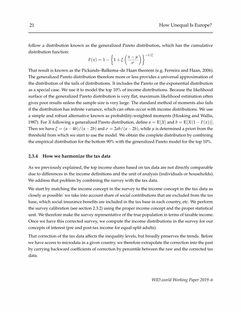
That result is known as the Pickands–Balkema–de Haan theorem (e.g. Ferreira and Haan, 2006).The generalized Pareto distribution therefore more or less provides a universal approximation ofthe distribution of the tails of distributions. It includes the Pareto or the exponential distributionas a special case. We use it to model the top 10% of income distributions. Because the likelihoodsurface of the generalized Pareto distribution is very flat, maximum likelihood estimation oftengives poor results unless the sample size is very large. The standard method of moments also failsif the distribution has infinite variance, which can often occur with income distributions. We usea simple and robust alternative known as probability-weighted moments (Hosking and Wallis,1987). For X following a generalized Pareto distribution, define a = E[X] and b = E[X(1− F(x))].Then we have ξ = (a− 4b)/(a− 2b) and σ = 2ab/(a− 2b), while µ is determined a priori from thethreshold from which we start to use the model. We obtain the complete distribution by combiningthe empirical distribution for the bottom 90% with the generalized Pareto model for the top 10%.
2.3.4 How we harmonize the tax data
As we previously explained, the top income shares based on tax data are not directly comparabledue to differences in the income definitions and the unit of analysis (individuals or households).We address that problem by combining the survey with the tax data.
We start by matching the income concept in the survey to the income concept in the tax data asclosely as possible: we take into account share of social contributions that are excluded from the taxbase, which social insurance benefits are included in the tax base in each country, etc. We performthe survey calibration (see section 2.3.2) using the proper income concept and the proper statisticalunit. We therefore make the survey representative of the true population in terms of taxable income.Once we have this corrected survey, we compute the income distributions in the survey for ourconcepts of interest (pre and post-tax income for equal-split adults).
That correction of the tax data affects the inequality levels, but broadly preserves the trends. Beforewe have access to microdata in a given country, we therefore extrapolate the correction into the pastby carrying backward coefficients of correction by percentile between the raw and the corrected taxdata.
WID.world Working Paper 2019–6
22 How Unequal Is Europe?
2.3.5 How we account for additional sources of income
As explained in section 2.2.3, our estimates account for the two main sources of tax-exempt capitalincome in the economy: imputed rents and the retained earnings of corporations.
The retained earnings of corporations belong to the owners of corporate stock. To distribute them,we therefore assume that the distribution of retained earnings is the same as that of the stock hold-ings of households. This includes both private and public stocks that are held directly or indirectlythrough mutual funds and private pension plans. However, we exclude sole proprietorship, sincein the national accounts they are not an entity separate from the household to which they belong.
The distribution of stock ownership comes from the Household Finance and Consumption Survey(HFCS), the pan-European wealth survey of the European Central Bank. We calibrate that surveyon the top income shares as we do for other surveys to make it representative in terms of incomeand get consistent results. The HFCS only started around 2013, so before that year we keep thedistribution of retained earnings constant and only change the amount of retained earnings tobe distributed: this constitutes a reasonable approximation because stock ownership is alwaysalready highly concentrated, so that the main impact of retained earnings on inequality comesfrom changes in their average amount rather than changes in the inequality of stock ownership.After 2013, we use the wave that is closest to the year under consideration. For imputed rents, weuse their distribution as recorded in EU-SILC surveys, which we also calibrate on the top incomeshares. We take the total amount of imputed rents to be distributed from the national accounts. Forcountries in which the distribution of one of those two components in not observable due to lack ofdata, we use the average European distribution. Again, this assumption is relatively innocuousbecause the first-order effect of the impact of these incomes on the distribution comes from theiraverage amount rather than from changes in their distributions.
Then, we distribute both types of income to individuals. In doing so, we aim to preserve themarginal distribution of retained earnings and imputed rents. We also preserve the marginaldistributions of pre and post-tax income (excluding retained earnings and imputed rents) previouslycalculated by combing survey and tax data. And finally we preserve the copula (i.e. the dependency)between pre-tax income (excluding retained earnings and imputed rents) and the additional sourcesof income. We achieve those goals using the following procedure: we sort all the datasets accordingto their pre-tax income (excluding retained earnings and imputed rents). When using microdata, wematch observations one by one from the lowest to the highest level of pre-tax income. Because themicrodata are weighted, the observations must be matched partially with one another. Therefore,when matching a dataset of size n with a dataset of size m, we end up with a dataset of at most
WID.world Working Paper 2019–6

23 How Unequal Is Europe?
n + m− 1 observations. When matching microdata to a distribution that comes from a tabulation,we attribute to each observation the income that corresponds to the average income of the part ofthe distribution that is represented by the observation in the microdata.
Table A.9 in appendix shows how these incomes are distributed in the different countries. Onthe one hand, the top 10% of the distribution of income (before imputed rents and retainedearnings) owns generally between 15% and 20% of imputed rents. This is generally less than theircorresponding share of income, therefore imputed rents have a somewhat equalizing impact onthe distribution if income. One the other hand, between 40% and 60% of the retained earnings ofcorporations accrues to the same group of people. That is usually more than their correspondingshare of income, therefore accounting for the retained earnings of corporations increases inequality.
WID.world Working Paper 2019–6
24 How Unequal Is Europe?
3 Results
Combining surveys, tax data and national accounts with our harmonized methodology givesrise to a new dataset on pre-tax and post-tax income inequalities in Europe from 1980 to 2017.Distributional national accounts, in particular, allow us to adopt EU-wide or European-wideperspectives, decomposing the relative roles played by between-country and within-countryinequalities. In this section, we present some stylized facts on the evolution of European incomeinequality. Section 3.1 briefly reassesses the question of convergence in per adult national incomesin Europe. We then turn to the description of inequality trends within countries (section 3.2), beforelooking at the evolution of income inequality in Europe as a whole (section 3.3). Section 3.4 studieshow taxes and transfers reduce inequalities in Europe. Section 3.5 compares the evolution of incomeinequality in Europe to that observed in the United States since 1980.
3.1 Inequalities between European countries
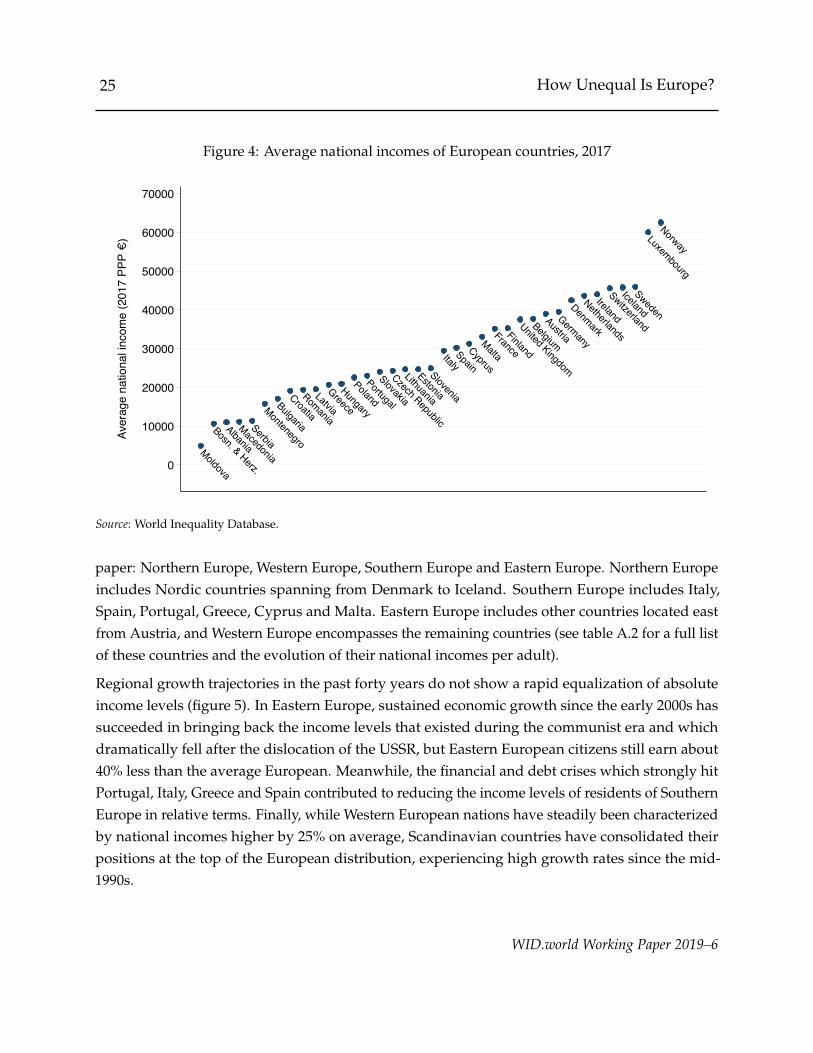
Before looking at inequalities within European countries and within wider regional entities (suchas the European Union), it is worth having in mind how differences in countries’ average nationalincomes have evolved between 1980 and 2017. As new countries joined the EU and further politicalintegration was enhanced by policy makers in the 1990s and 2000s, convergence in standards ofliving gradually became part of the European Union agenda, along with the harmonization ofeconomic policies. One of the explicit objectives of European integration, in particular, was toreduce average income gaps between EU Member States. The Lisbon Treaty, one of the legal basisof the EU, states that ”the EU shall promote economic, social and territorial cohesion, and solidarityamong Member States.”12
In 2017, important differences in standards of living between European countries were visible, butrelatively homogeneous levels among the largest member states of the European Union (figure 4).In most of the Balkan countries, per adult national incomes were below e15,000, while Southernand other Eastern European countries earned between e15,000 and e30,000. In most other EUcountries, incomes ranged between e30,000 and e45,000. Luxembourg and Norway, finally, stoodout with average national incomes higher than e60,000. Based on these differences as well asgeographical proximities, we propose to divide Europe into four broad regions in the rest of this
12Article 3 of the Lisbon Treaty. Inequality reduction between Member States is also made clear in the Treaty on theFunctioning of the European Union. Article 174, for instance, states that ”the Union shall aim at reducing disparitiesbetween the levels of development of the various regions and the backwardness of the least favored regions.”
WID.world Working Paper 2019–6
25 How Unequal Is Europe?
Figure 4: Average national incomes of European countries, 2017
Moldova
Bosn. & Herz.
Albania
Macedonia
Serbia
Montenegro
Bulgaria
Croatia
Romania
Latvia
Greece
Hungary
Poland
Portugal
Slovakia
Czech Republic
Lithuania
Estonia
Slovenia
ItalySpain
Cyprus
Malta
France
Finland
United Kingdom
Belgium
Austria
Germany
Denmark
Netherlands
Ireland
Switzerland
Iceland
Sweden
Luxembourg
Norway
0
10000
20000
30000
40000
50000
60000
70000
Aver
age
natio
nal i
ncom
e (2
017
PPP €
)
Source: World Inequality Database.
paper: Northern Europe, Western Europe, Southern Europe and Eastern Europe. Northern Europeincludes Nordic countries spanning from Denmark to Iceland. Southern Europe includes Italy,Spain, Portugal, Greece, Cyprus and Malta. Eastern Europe includes other countries located eastfrom Austria, and Western Europe encompasses the remaining countries (see table A.2 for a full listof these countries and the evolution of their national incomes per adult).
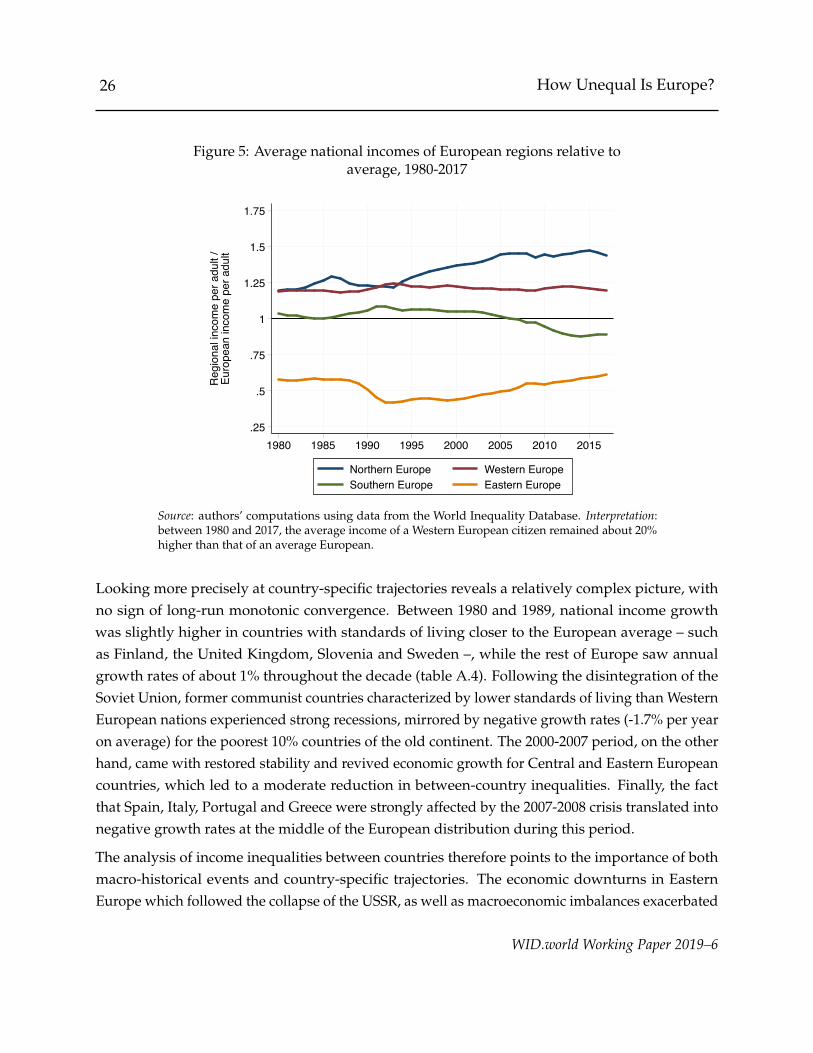
Regional growth trajectories in the past forty years do not show a rapid equalization of absoluteincome levels (figure 5). In Eastern Europe, sustained economic growth since the early 2000s hassucceeded in bringing back the income levels that existed during the communist era and whichdramatically fell after the dislocation of the USSR, but Eastern European citizens still earn about40% less than the average European. Meanwhile, the financial and debt crises which strongly hitPortugal, Italy, Greece and Spain contributed to reducing the income levels of residents of SouthernEurope in relative terms. Finally, while Western European nations have steadily been characterizedby national incomes higher by 25% on average, Scandinavian countries have consolidated theirpositions at the top of the European distribution, experiencing high growth rates since the mid-1990s.
WID.world Working Paper 2019–6
26 How Unequal Is Europe?
Figure 5: Average national incomes of European regions relative toaverage, 1980-2017
.25
.5
.75
1
1.25
1.5
1.75R
egio
nal i
ncom
e pe
r adu
lt /
Euro
pean
inco
me
per a
dult
1980 1985 1990 1995 2000 2005 2010 2015
Northern Europe Western EuropeSouthern Europe Eastern Europe
Source: authors’ computations using data from the World Inequality Database. Interpretation:between 1980 and 2017, the average income of a Western European citizen remained about 20%higher than that of an average European.
Looking more precisely at country-specific trajectories reveals a relatively complex picture, withno sign of long-run monotonic convergence. Between 1980 and 1989, national income growthwas slightly higher in countries with standards of living closer to the European average – suchas Finland, the United Kingdom, Slovenia and Sweden –, while the rest of Europe saw annualgrowth rates of about 1% throughout the decade (table A.4). Following the disintegration of theSoviet Union, former communist countries characterized by lower standards of living than WesternEuropean nations experienced strong recessions, mirrored by negative growth rates (-1.7% per yearon average) for the poorest 10% countries of the old continent. The 2000-2007 period, on the otherhand, came with restored stability and revived economic growth for Central and Eastern Europeancountries, which led to a moderate reduction in between-country inequalities. Finally, the factthat Spain, Italy, Portugal and Greece were strongly affected by the 2007-2008 crisis translated intonegative growth rates at the middle of the European distribution during this period.
The analysis of income inequalities between countries therefore points to the importance of bothmacro-historical events and country-specific trajectories. The economic downturns in EasternEurope which followed the collapse of the USSR, as well as macroeconomic imbalances exacerbated
WID.world Working Paper 2019–6
27 How Unequal Is Europe?
in Western Europe since 2008 have strongly affected national and regional growth trajectories. Yet,because European countries have been affected very differently by these crises, their overall effecton income differences between nations has remained unclear.
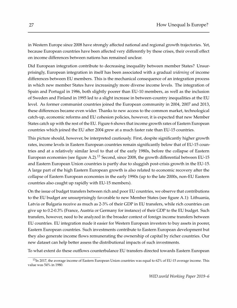
Did European integration contribute to decreasing inequality between member States? Unsur-prisingly, European integration in itself has been associated with a gradual widening of incomedifferences between EU members. This is the mechanical consequence of an integration processin which new member States have increasingly more diverse income levels. The integration ofSpain and Portugal in 1986, both slightly poorer than EU-10 members, as well as the inclusionof Sweden and Finland in 1995 led to a slight increase in between-country inequalities at the EUlevel. As former communist countries joined the European community in 2004, 2007 and 2013,these differences became even wider. Thanks to new access to the common market, technologicalcatch-up, economic reforms and EU cohesion policies, however, it is expected that new MemberStates catch up with the rest of the EU. Figure 6 shows that income growth rates of Eastern Europeancountries which joined the EU after 2004 grew at a much faster rate than EU-15 countries.
This picture should, however, be interpreted cautiously. First, despite significantly higher growthrates, income levels in Eastern European countries remain significantly below that of EU-15 coun-tries and at a relatively similar level to that of the early 1980s, before the collapse of EasternEuropean economies (see figure A.2).13 Second, since 2008, the growth differential between EU-15and Eastern European Union countries is partly due to sluggish post-crisis growth in the EU-15.A large part of the high Eastern European growth is also related to economic recovery after thecollapse of Eastern European economies in the early 1990s (up to the late 2000s, non-EU Easterncountries also caught up rapidly with EU-15 members).
On the issue of budget transfers between rich and poor EU countries, we observe that contributionsto the EU budget are unsurprisingly favorable to new Member States (see figure A.1): Lithuania,Latvia or Bulgaria receive as much as 2-3% of their GDP in EU transfers, while rich countries cangive up to 0.2-0.3% (France, Austria or Germany for instance) of their GDP to the EU budget. Suchtransfers, however, need to be analyzed in the broader context of foreign income transfers betweenEU countries. EU integration made it easier for Western European investors to buy assets in poorer,Eastern European countries. Such investments contribute to Eastern European development butthey also generate income flows remunerating the ownership of capital by richer countries. Ournew dataset can help better assess the distributional impacts of such investments.
To what extent do these outflows counterbalance EU transfers directed towards Eastern European
13In 2017, the average income of Eastern European Union countries was equal to 62% of EU-15 average income. Thisvalue was 54% in 1980.
WID.world Working Paper 2019–6

28 How Unequal Is Europe?
Figure 6: Average annual income growth rate,EU-15 vs. Eastern enlargement, 1980-2017
1.4
0.2
1.6
0.2
0.4
2.9
0.8
2.9
0
.5
1
1.5
2
2.5
3
3.5Pe
r adu
lt re
al in
com
e gr
owth
(%)
1980-90 1990-2000 2000-10 2010-17
West EU-15 East EU-13
Source: authors’ computations using data from the World Inequality Database.
countries? To answer this question, one would ideally rely on bilateral foreign income flows, butsuch information is not available. Net foreign income flows between countries and the rest ofthe world yet show interesting patterns. While most net EU budget beneficiaries have negativenet foreign incomes (on the order of 3 to 6% of their GDP), net contributors to the EU budget arecharacterized by consistently positive NFIs (on the order of 2-3% of their GDP). Over the pastdecade, foreign income positions in most Eastern European have deteriorated, in line with growingforeign capital ownership in these countries. Given the high share of foreign direct investments inEastern European countries coming from other EU members, it is likely that a relatively importantpart of outflows from Eastern European countries accrue to Western European nations. If onlyhalf of these flows accrued to Western European countries, this would be sufficient to match richernations’ net contributions to the EU budget.14 Foreign capital flows, such as capital investmentsfrom Germany to Poland, are, of course, likely to have contributed to raising general productivityin Eastern Europe. On the other hand, different wage levels and wage-setting institutions couldhave significant impacts on the level of profits and foreign income flows in these countries.
14See EU Commission data for 2010 FDIs within Europe: https://tinyurl.com/yanz62hl.
WID.world Working Paper 2019–6

29 How Unequal Is Europe?
Figure 7: Income inequality dynamics in European countries:Top 10% national income shares, 1980 versus 2017
ATBA BE
BG CY
CZFI
FRGB
GR
HRHU
IE
LT
MKNO
PL
RORS
SE
SK
CH
DE
EE ESIT
LULV
ME
DK
IS
NL
PT Decreasinginequality
Increasinginequality
15
20
25
30
35
40To
p 10
% in
com
e sh
are
(201
7)
15 20 25 30 35 40Top 10% income share (1980)
Source: authors’ computations combining surveys, tax data and national accounts.
3.2 Inequalities within European countries
We now turn to the analysis of income inequalities within European countries. How did Europeancountries perform in curbing inequality and promoting inclusive growth over the past decades?Beyond country-specific trajectories and short-run dynamics, it is possible to identify a set ofstylized facts.
3.2.1 Top income inequality
First, in a large majority countries where data is available since 1980, top earners have capturedan increasing share of national income. Figure 7 plots changes in top 10% shares between 1980(x-axis) and 2017 (y-axis). Nearly all points lie to the left of the 45-degree line, implying that inall countries (except Belgium), top 10% shares have increased over the period. The figure yet alsoreveals significant differences in national trajectories. In countries closer to the 45-degree line suchas France, Iceland or Spain, inequalities have only increased moderately. In Bulgaria, Poland orIreland, on the other hand, top 10% income shares have increased much more.
WID.world Working Paper 2019–6
30 How Unequal Is Europe?
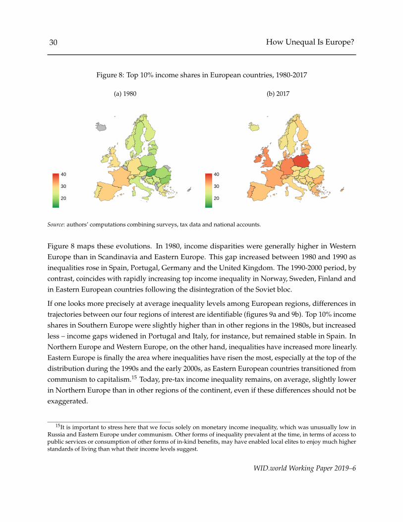
Figure 8: Top 10% income shares in European countries, 1980-2017
(a) 1980
20
30
40
(b) 2017
20
30
40
Source: authors’ computations combining surveys, tax data and national accounts.
Figure 8 maps these evolutions. In 1980, income disparities were generally higher in WesternEurope than in Scandinavia and Eastern Europe. This gap increased between 1980 and 1990 asinequalities rose in Spain, Portugal, Germany and the United Kingdom. The 1990-2000 period, bycontrast, coincides with rapidly increasing top income inequality in Norway, Sweden, Finland andin Eastern European countries following the disintegration of the Soviet bloc.
If one looks more precisely at average inequality levels among European regions, differences intrajectories between our four regions of interest are identifiable (figures 9a and 9b). Top 10% incomeshares in Southern Europe were slightly higher than in other regions in the 1980s, but increasedless – income gaps widened in Portugal and Italy, for instance, but remained stable in Spain. InNorthern Europe and Western Europe, on the other hand, inequalities have increased more linearly.Eastern Europe is finally the area where inequalities have risen the most, especially at the top of thedistribution during the 1990s and the early 2000s, as Eastern European countries transitioned fromcommunism to capitalism.15 Today, pre-tax income inequality remains, on average, slightly lowerin Northern Europe than in other regions of the continent, even if these differences should not beexaggerated.
15It is important to stress here that we focus solely on monetary income inequality, which was unusually low inRussia and Eastern Europe under communism. Other forms of inequality prevalent at the time, in terms of access topublic services or consumption of other forms of in-kind benefits, may have enabled local elites to enjoy much higherstandards of living than what their income levels suggest.
WID.world Working Paper 2019–6
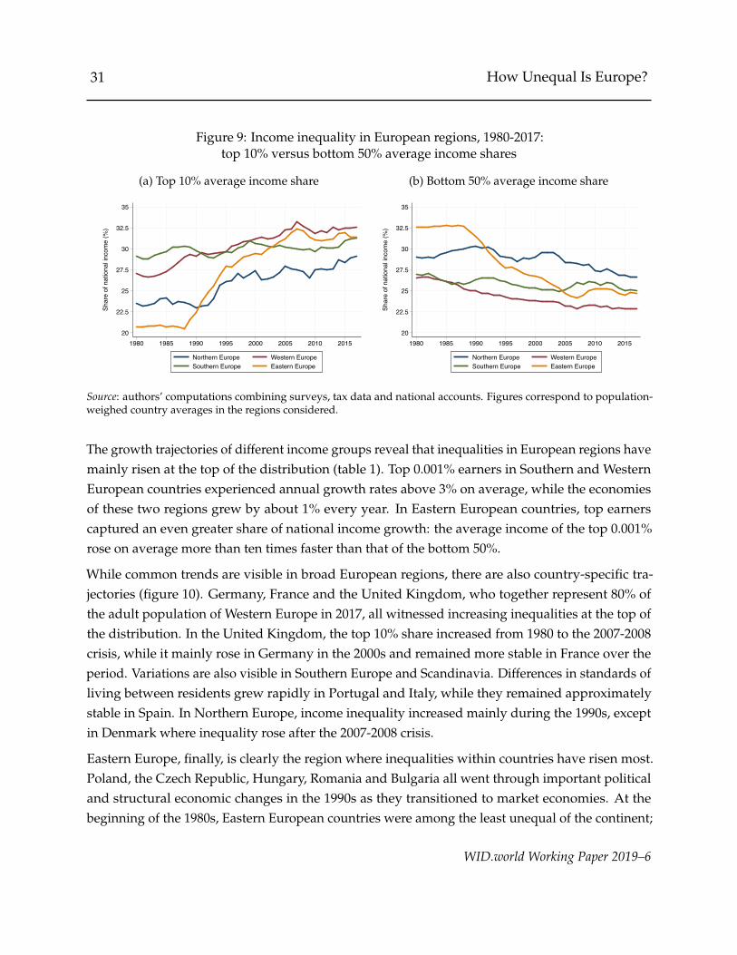
31 How Unequal Is Europe?
Figure 9: Income inequality in European regions, 1980-2017:top 10% versus bottom 50% average income shares
(a) Top 10% average income share
20
22.5
25
27.5
30
32.5
35
Shar
e of
nat
iona
l inc
ome
(%)
1980 1985 1990 1995 2000 2005 2010 2015
Northern Europe Western EuropeSouthern Europe Eastern Europe
(b) Bottom 50% average income share
20
22.5
25
27.5
30
32.5
35
Shar
e of
nat
iona
l inc
ome
(%)
1980 1985 1990 1995 2000 2005 2010 2015
Northern Europe Western EuropeSouthern Europe Eastern Europe
Source: authors’ computations combining surveys, tax data and national accounts. Figures correspond to population-weighed country averages in the regions considered.
The growth trajectories of different income groups reveal that inequalities in European regions havemainly risen at the top of the distribution (table 1). Top 0.001% earners in Southern and WesternEuropean countries experienced annual growth rates above 3% on average, while the economiesof these two regions grew by about 1% every year. In Eastern European countries, top earnerscaptured an even greater share of national income growth: the average income of the top 0.001%rose on average more than ten times faster than that of the bottom 50%.
While common trends are visible in broad European regions, there are also country-specific tra-jectories (figure 10). Germany, France and the United Kingdom, who together represent 80% ofthe adult population of Western Europe in 2017, all witnessed increasing inequalities at the top ofthe distribution. In the United Kingdom, the top 10% share increased from 1980 to the 2007-2008crisis, while it mainly rose in Germany in the 2000s and remained more stable in France over theperiod. Variations are also visible in Southern Europe and Scandinavia. Differences in standards ofliving between residents grew rapidly in Portugal and Italy, while they remained approximatelystable in Spain. In Northern Europe, income inequality increased mainly during the 1990s, exceptin Denmark where inequality rose after the 2007-2008 crisis.
Eastern Europe, finally, is clearly the region where inequalities within countries have risen most.Poland, the Czech Republic, Hungary, Romania and Bulgaria all went through important politicaland structural economic changes in the 1990s as they transitioned to market economies. At thebeginning of the 1980s, Eastern European countries were among the least unequal of the continent;
WID.world Working Paper 2019–6
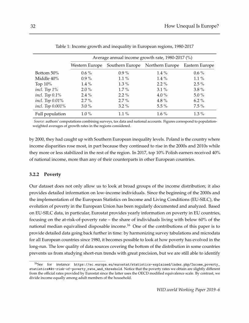
32 How Unequal Is Europe?
Table 1: Income growth and inequality in European regions, 1980-2017
Average annual income growth rate, 1980-2017 (%)
Western Europe Southern Europe Northern Europe Eastern Europe
Bottom 50% 0.6 % 0.9 % 1.4 % 0.6 %Middle 40% 0.9 % 1.1 % 1.4 % 1.1 %Top 10% 1.4 % 1.3 % 2.2 % 2.5 %incl. Top 1% 2.0 % 1.7 % 3.1 % 3.8 %incl. Top 0.1% 2.4 % 2.2 % 4.0 % 5.0 %incl. Top 0.01% 2.7 % 2.7 % 4.8 % 6.2 %incl. Top 0.001% 3.0 % 3.2 % 5.5 % 7.5 %
Full population 1.0 % 1.1 % 1.6 % 1.3 %
Source: authors’ computations combining surveys, tax data and national accounts. Figures correspond to population-weighted averages of growth rates in the regions considered.
by 2000, they had caught up with Southern European inequality levels. Poland is the country whereincome disparities rose most, in part because they continued to rise in the 2000s and 2010s whilethey more or less stabilized in the rest of the region. In 2017, top 10% Polish earners received 40%of national income, more than any of their counterparts in other European countries.
3.2.2 Poverty
Our dataset does not only allow us to look at broad groups of the income distribution; it alsoprovides detailed information on low-income individuals. Since the beginning of the 2000s andthe implementation of the European Statistics on Income and Living Conditions (EU-SILC), theevolution of poverty in the European Union has been regularly documented and analyzed. Basedon EU-SILC data, in particular, Eurostat provides yearly information on poverty in EU countries,focusing on the at-risk-of-poverty rate – the share of individuals living with below 60% of thenational median equivalised disposable income.16 One of the contributions of this paper is toprovide detailed data going back further in time: by harmonizing survey tabulations and microdatafor all European countries since 1980, it becomes possible to look at how poverty has evolved in thelong-run. The low quality of data sources covering the bottom of the distribution in some countriesprevents us from studying short-run trends with great precision, but we are still able to identify
16See for instance https://ec.europa.eu/eurostat/statistics-explained/index.php/Income_poverty_
statistics#At-risk-of-poverty_rate_and_threshold. Notice that the poverty rates we obtain are slightly differentfrom the official rates provided by Eurostat since the latter uses the OECD modified equivalence scale. By contrast, wedivide income equally among adult members of the household.
WID.world Working Paper 2019–6

33 How Unequal Is Europe?
Figure 10: Top 10% income shares in selected European countries, 1980-2017
(a) Western Europe
15
20
25
30
35
40
1980 1985 1990 1995 2000 2005 2010 2015
United KingdomGermanyFrance
(b) Southern Europe
15
20
25
30
35
40
1980 1985 1990 1995 2000 2005 2010 2015
PortugalItalySpainGreece
(c) Northern Europe
15
20
25
30
35
40
1980 1985 1990 1995 2000 2005 2010 2015
FinlandSwedenNorwayDenmark
(d) Eastern Europe
15
20
25
30
35
40
1980 1985 1990 1995 2000 2005 2010 2015
PolandBulgariaHungaryRomaniaCzech Rep.
Source: authors’ computations combining surveys, tax data and national accounts.
key evolutions.
Between 1980 and 2017, poverty has remained stable or risen in a majority of European countries(figure 11). In 1980, more than 10% of citizens in most Western European countries lived with lessthan 60% of the national median income. By contrast, Baltic countries and other Eastern Europeannations were characterized by very low relative poverty. Thirty-seven years later, these differenceshave almost been completely reversed: Romania, Bulgaria and Balkan countries now stand out asthe countries with highest poverty rates. There are exceptions to this pattern: the at-risk-of-povertyrate decreased significantly in France and rose only moderately in the Czech Republic, making thelatter the European nation with the lowest share of poor adults in 2017.
WID.world Working Paper 2019–6

34 How Unequal Is Europe?
Figure 11: At-risk-of-poverty rates in European countries, 1980-2017
(a) 1980
0510152025
(b) 2017
0510152025
Source: authors’ computations combining surveys, tax data and national accounts.
To what extent are poverty and top income inequality linked? Theoretically, there is no mechanicalrelationship between the poverty rate and top income shares: multiplying the average income ofthe top 1% or the top 10% leaves relative poverty unchanged since the shares of national incomeaccruing to median earners and individuals at risk of poverty decrease proportionally. Comparingfigures 8 and 11 suggests a weakly positive relationship between top 10% income shares andrelative poverty. Scandinavian countries have both low poverty and low inequality, while theUnited Kingdom, Germany, Bulgaria or Greece rank high in both indicators. There are howeverinteresting exceptions. Poverty in France is among the lowest across the continent but top incomeinequality remains high. On the contrary, top incomes remain relatively low in Italy but povertywas the highest among Southern and Western European countries in 2017. Understanding thesespecificities is beyond the objective of this paper. They are likely to reflect, among other things,divergent historical trajectories in education systems, taxation regimes and the construction of thewelfare state, which we hope our dataset can contribute to apprehending in future work.
3.2.3 Inclusive growth
We conclude this section by looking at countries’ relative performances in promoting inclusivegrowth since 1980. We use two simple indicators. First, our aim is to shed light on countries’performances in reaching the United Nations’ Sustainable Development Goal 10.1, adopted in2015, which aims to “progressively achieve and sustain income growth of the bottom 40 percent of
WID.world Working Paper 2019–6
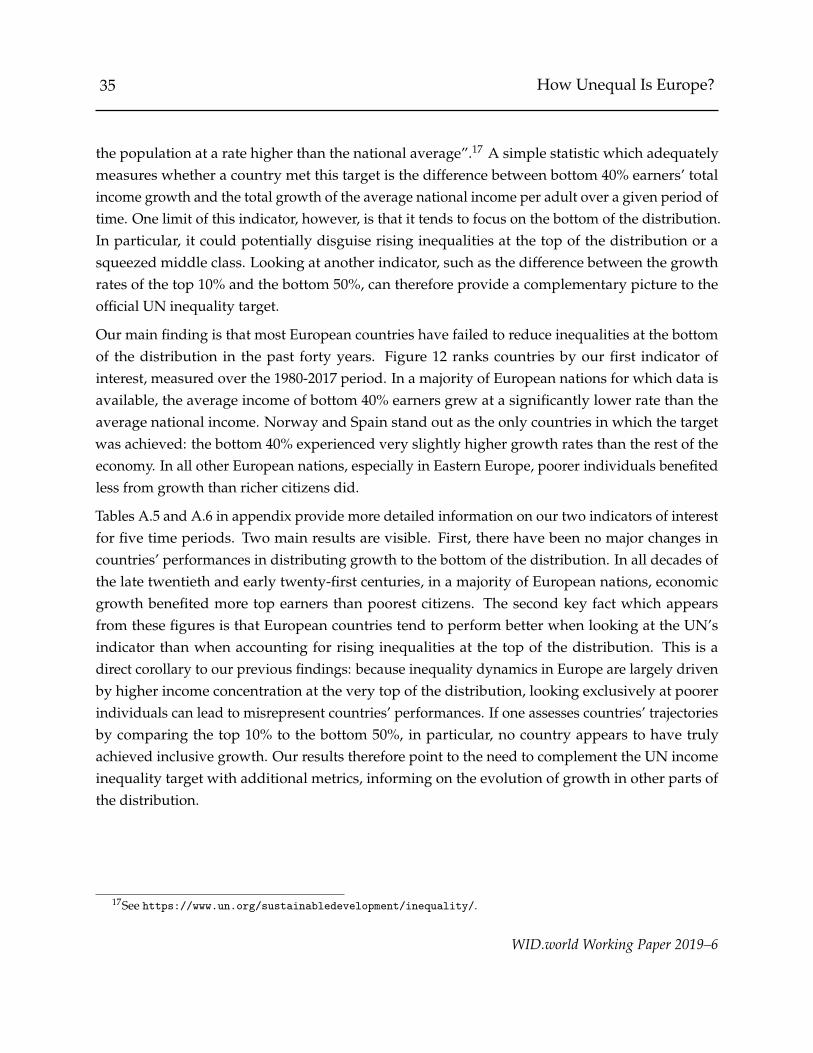
35 How Unequal Is Europe?
the population at a rate higher than the national average”.17 A simple statistic which adequatelymeasures whether a country met this target is the difference between bottom 40% earners’ totalincome growth and the total growth of the average national income per adult over a given period oftime. One limit of this indicator, however, is that it tends to focus on the bottom of the distribution.In particular, it could potentially disguise rising inequalities at the top of the distribution or asqueezed middle class. Looking at another indicator, such as the difference between the growthrates of the top 10% and the bottom 50%, can therefore provide a complementary picture to theofficial UN inequality target.
Our main finding is that most European countries have failed to reduce inequalities at the bottomof the distribution in the past forty years. Figure 12 ranks countries by our first indicator ofinterest, measured over the 1980-2017 period. In a majority of European nations for which data isavailable, the average income of bottom 40% earners grew at a significantly lower rate than theaverage national income. Norway and Spain stand out as the only countries in which the targetwas achieved: the bottom 40% experienced very slightly higher growth rates than the rest of theeconomy. In all other European nations, especially in Eastern Europe, poorer individuals benefitedless from growth than richer citizens did.
Tables A.5 and A.6 in appendix provide more detailed information on our two indicators of interestfor five time periods. Two main results are visible. First, there have been no major changes incountries’ performances in distributing growth to the bottom of the distribution. In all decades ofthe late twentieth and early twenty-first centuries, in a majority of European nations, economicgrowth benefited more top earners than poorest citizens. The second key fact which appearsfrom these figures is that European countries tend to perform better when looking at the UN’sindicator than when accounting for rising inequalities at the top of the distribution. This is adirect corollary to our previous findings: because inequality dynamics in Europe are largely drivenby higher income concentration at the very top of the distribution, looking exclusively at poorerindividuals can lead to misrepresent countries’ performances. If one assesses countries’ trajectoriesby comparing the top 10% to the bottom 50%, in particular, no country appears to have trulyachieved inclusive growth. Our results therefore point to the need to complement the UN incomeinequality target with additional metrics, informing on the evolution of growth in other parts ofthe distribution.
17See https://www.un.org/sustainabledevelopment/inequality/.
WID.world Working Paper 2019–6
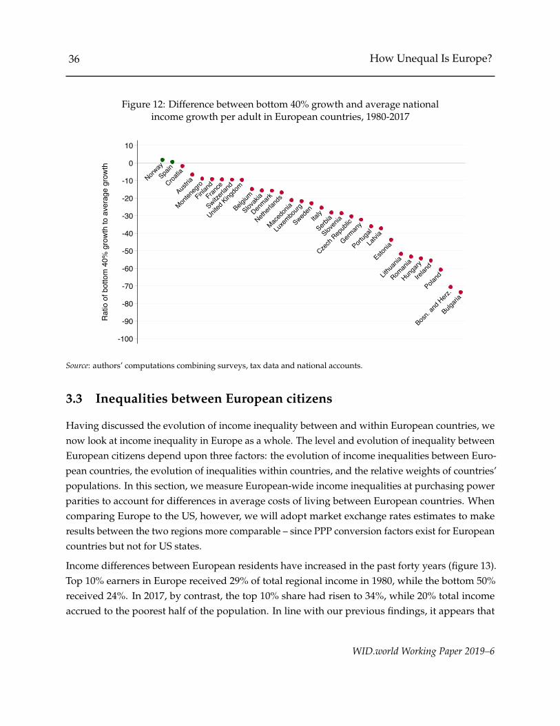
36 How Unequal Is Europe?
Figure 12: Difference between bottom 40% growth and average nationalincome growth per adult in European countries, 1980-2017
NorwaySpa
in
Croatia
Austria
Monten
egro
Finland
France
Switzerla
nd
United
Kingdo
m
Belgium
Slovak
ia
Denmark
Netherl
ands
Maced
onia
Luxe
mbourg
Sweden
Italy
Serbia
Sloven
ia
Czech
Repub
lic
German
y
Portug
al
Latvia
Estonia
Lithu
ania
Roman
ia
Hunga
ry
Irelan
d
Poland
Bosn.
and H
erz.
Bulgari
a
-100
-90
-80
-70
-60
-50
-40
-30
-20
-10
0
10
Rat
io o
f bot
tom
40%
gro
wth
to a
vera
ge g
row
th
Source: authors’ computations combining surveys, tax data and national accounts.
3.3 Inequalities between European citizens
Having discussed the evolution of income inequality between and within European countries, wenow look at income inequality in Europe as a whole. The level and evolution of inequality betweenEuropean citizens depend upon three factors: the evolution of income inequalities between Euro-pean countries, the evolution of inequalities within countries, and the relative weights of countries’populations. In this section, we measure European-wide income inequalities at purchasing powerparities to account for differences in average costs of living between European countries. Whencomparing Europe to the US, however, we will adopt market exchange rates estimates to makeresults between the two regions more comparable – since PPP conversion factors exist for Europeancountries but not for US states.
Income differences between European residents have increased in the past forty years (figure 13).Top 10% earners in Europe received 29% of total regional income in 1980, while the bottom 50%received 24%. In 2017, by contrast, the top 10% share had risen to 34%, while 20% total incomeaccrued to the poorest half of the population. In line with our previous findings, it appears that
WID.world Working Paper 2019–6

37 How Unequal Is Europe?
Figure 13: Income inequality in Europe, 1980-2017:Top 10% vs. bottom 50% income shares
15
20
25
30
35
40Sh
are
of n
atio
nal i
ncom
e (%
)
1980 1985 1990 1995 2000 2005 2010 2015
Top 10%Bottom 50%
Figure 14: Income inequality in Europe, 1980-2017:Growth incidence curve
Bottom 50% captured15% of growth
Top 1% captured17% of growth
020406080
100120140160180200220240260
Tota
l inc
ome
grow
th (%
)
10 20 30 40 50 60 70 80 90 99 99.9 99.99 99.999Income group (percentile)
Source: authors’ computations combining surveys, tax data and national accounts.
WID.world Working Paper 2019–6

38 How Unequal Is Europe?
Table 2: Income growth and inequality in Europe, 1980-2017
Average annual income growth rate (%)
1980-2017 1980-1990 1990-2000 2000-2007 2007-2017
Bottom 50% 0.8 % 0.5 % 0.3 % 1.8 % 0.6 %Middle 40% 1.0 % 1.2 % 1.3 % 1.2 % 0.4 %Top 10% 1.6 % 2.0 % 2.1 % 2.2 % 0.3 %incl. Top 1% 2.2 % 2.8 % 2.9 % 3.2 % 0.1 %incl. Top 0.1% 2.6 % 3.7 % 3.4 % 4.0 % -0.2 %incl. Top 0.01% 2.9 % 4.9 % 3.2 % 4.6 % -0.5 %incl. Top 0.001% 3.0 % 5.6 % 2.8 % 5.5 % -0.9 %
Full population 1.1 % 1.3 % 1.4 % 1.6 % 0.4 %
Source: authors’ computations combining surveys, tax data and national accounts.
changes in the income distribution mostly occurred during the last two decades of the twentiethcentury. As top income inequality increased in most countries of Western Europe and Scandinaviabetween 1980 and 2000, the richest decile captured an increasing share of the continent’s growth,before more of less stagnating since then. By contrast, the bottom 50% share decreased moresuddenly in the early 1990s due to the combination of strong recessions and rising inequalitiesat the top in Eastern Europe. These two movements have driven most of variations in incomeinequality in Europe. Perhaps surprisingly, the 2008 crisis has not led to major changes in thedistribution of pre-tax incomes: even if the top 10% share decreased very slightly between 2007and 2010, it remained remarkably stable in all following years.
Long-run trends in Europe reveal that inequalities have mainly increased at the very top of theincome distribution. Figure 14 plots the total growth rates of different income groups over the1980-2017 period. In the past thirty-seven years, the poorest half of European residents saw theirincomes increase by 30 to 40%. The “European middle class” only benefited slightly more fromgrowth than these poorer groups: income earners between percentiles 50 and 90 saw their incomesincrease by 40 to 50%. As soon as one looks at groups within the top 10%, however, total growthrates are markedly higher. All income groups among top 0.1% earners saw their earnings growby more than 100% during our period of interest, and top 0.001% European earners now enjoystandards of living which are about three times higher than what they used to be.
A more careful examination of short-run evolutions reveal important differences between periods.Table 2 provides information on the average annual growth rates of different income groupsbetween 1980 and 2017. Between 1980 and 1990, the average income of bottom 50% earners grew
WID.world Working Paper 2019–6
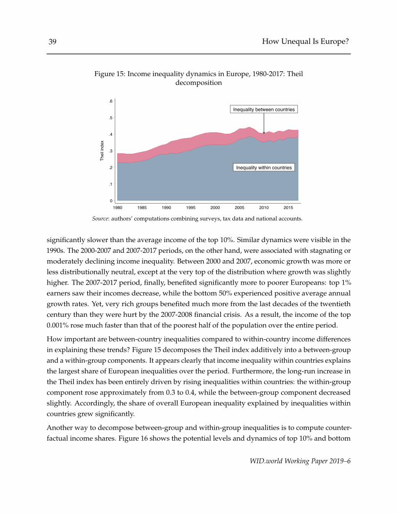
39 How Unequal Is Europe?
Figure 15: Income inequality dynamics in Europe, 1980-2017: Theildecomposition
Inequality within countries
Inequality between countries
0
.1
.2
.3
.4
.5
.6Th
eil i
ndex
1980 1985 1990 1995 2000 2005 2010 2015
Source: authors’ computations combining surveys, tax data and national accounts.
significantly slower than the average income of the top 10%. Similar dynamics were visible in the1990s. The 2000-2007 and 2007-2017 periods, on the other hand, were associated with stagnating ormoderately declining income inequality. Between 2000 and 2007, economic growth was more orless distributionally neutral, except at the very top of the distribution where growth was slightlyhigher. The 2007-2017 period, finally, benefited significantly more to poorer Europeans: top 1%earners saw their incomes decrease, while the bottom 50% experienced positive average annualgrowth rates. Yet, very rich groups benefited much more from the last decades of the twentiethcentury than they were hurt by the 2007-2008 financial crisis. As a result, the income of the top0.001% rose much faster than that of the poorest half of the population over the entire period.
How important are between-country inequalities compared to within-country income differencesin explaining these trends? Figure 15 decomposes the Theil index additively into a between-groupand a within-group components. It appears clearly that income inequality within countries explainsthe largest share of European inequalities over the period. Furthermore, the long-run increase inthe Theil index has been entirely driven by rising inequalities within countries: the within-groupcomponent rose approximately from 0.3 to 0.4, while the between-group component decreasedslightly. Accordingly, the share of overall European inequality explained by inequalities withincountries grew significantly.
Another way to decompose between-group and within-group inequalities is to compute counter-factual income shares. Figure 16 shows the potential levels and dynamics of top 10% and bottom
WID.world Working Paper 2019–6
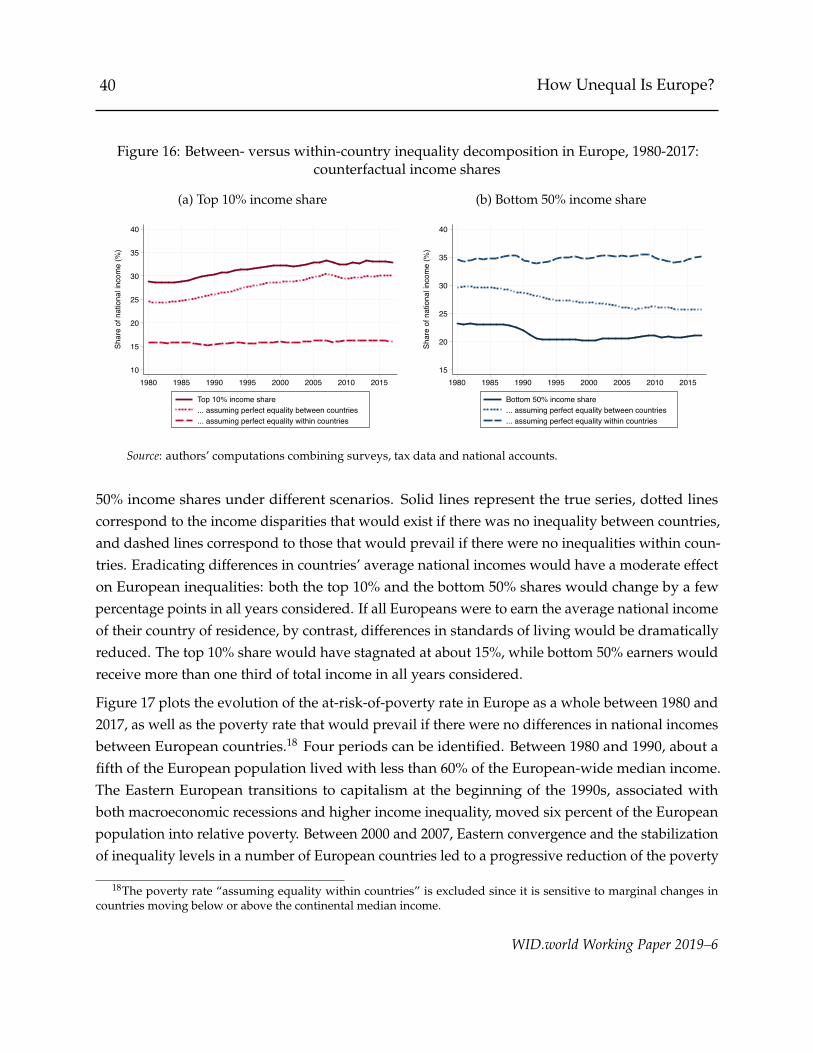
40 How Unequal Is Europe?
Figure 16: Between- versus within-country inequality decomposition in Europe, 1980-2017:counterfactual income shares
(a) Top 10% income share
10
15
20
25
30
35
40
Shar
e of
nat
iona
l inc
ome
(%)
1980 1985 1990 1995 2000 2005 2010 2015
Top 10% income share... assuming perfect equality between countries... assuming perfect equality within countries
(b) Bottom 50% income share
15
20
25
30
35
40
Shar
e of
nat
iona
l inc
ome
(%)
1980 1985 1990 1995 2000 2005 2010 2015
Bottom 50% income share... assuming perfect equality between countries... assuming perfect equality within countries
Source: authors’ computations combining surveys, tax data and national accounts.
50% income shares under different scenarios. Solid lines represent the true series, dotted linescorrespond to the income disparities that would exist if there was no inequality between countries,and dashed lines correspond to those that would prevail if there were no inequalities within coun-tries. Eradicating differences in countries’ average national incomes would have a moderate effecton European inequalities: both the top 10% and the bottom 50% shares would change by a fewpercentage points in all years considered. If all Europeans were to earn the average national incomeof their country of residence, by contrast, differences in standards of living would be dramaticallyreduced. The top 10% share would have stagnated at about 15%, while bottom 50% earners wouldreceive more than one third of total income in all years considered.
Figure 17 plots the evolution of the at-risk-of-poverty rate in Europe as a whole between 1980 and2017, as well as the poverty rate that would prevail if there were no differences in national incomesbetween European countries.18 Four periods can be identified. Between 1980 and 1990, about afifth of the European population lived with less than 60% of the European-wide median income.The Eastern European transitions to capitalism at the beginning of the 1990s, associated withboth macroeconomic recessions and higher income inequality, moved six percent of the Europeanpopulation into relative poverty. Between 2000 and 2007, Eastern convergence and the stabilizationof inequality levels in a number of European countries led to a progressive reduction of the poverty
18The poverty rate “assuming equality within countries” is excluded since it is sensitive to marginal changes incountries moving below or above the continental median income.
WID.world Working Paper 2019–6
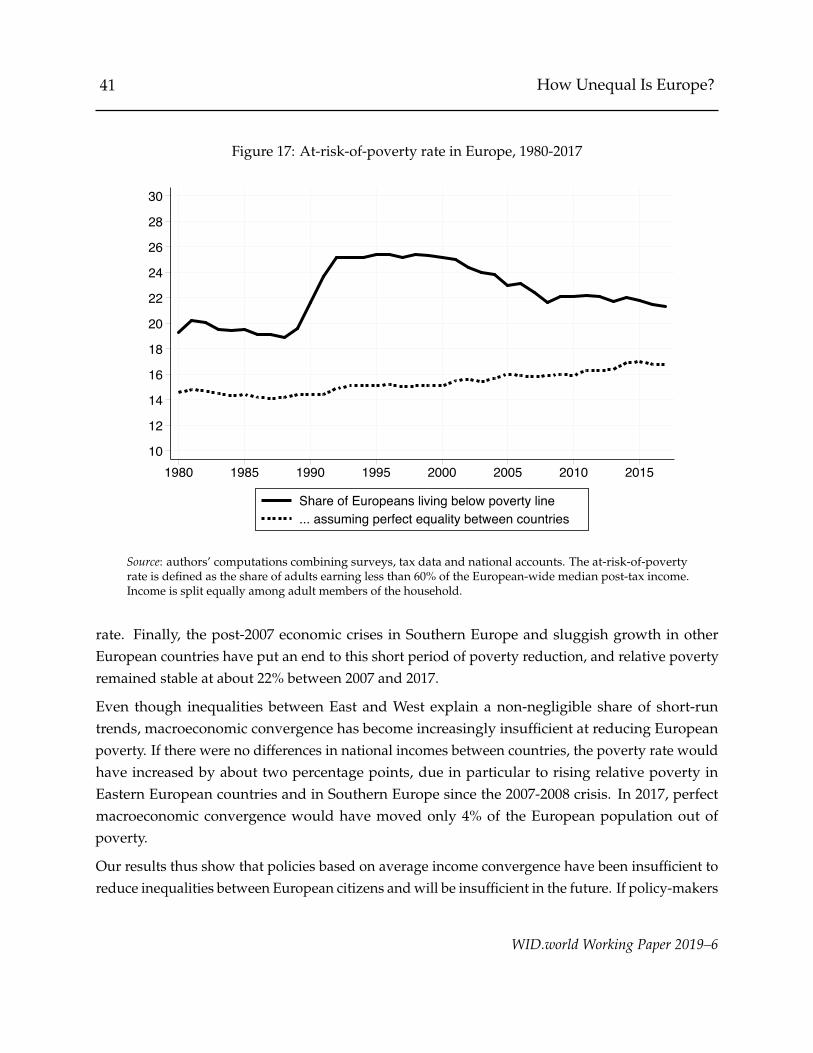
41 How Unequal Is Europe?
Figure 17: At-risk-of-poverty rate in Europe, 1980-2017
10
12
14
16
18
20
22
24
26
28
30
1980 1985 1990 1995 2000 2005 2010 2015
Share of Europeans living below poverty line... assuming perfect equality between countries
Source: authors’ computations combining surveys, tax data and national accounts. The at-risk-of-povertyrate is defined as the share of adults earning less than 60% of the European-wide median post-tax income.Income is split equally among adult members of the household.
rate. Finally, the post-2007 economic crises in Southern Europe and sluggish growth in otherEuropean countries have put an end to this short period of poverty reduction, and relative povertyremained stable at about 22% between 2007 and 2017.
Even though inequalities between East and West explain a non-negligible share of short-runtrends, macroeconomic convergence has become increasingly insufficient at reducing Europeanpoverty. If there were no differences in national incomes between countries, the poverty rate wouldhave increased by about two percentage points, due in particular to rising relative poverty inEastern European countries and in Southern Europe since the 2007-2008 crisis. In 2017, perfectmacroeconomic convergence would have moved only 4% of the European population out ofpoverty.
Our results thus show that policies based on average income convergence have been insufficient toreduce inequalities between European citizens and will be insufficient in the future. If policy-makers
WID.world Working Paper 2019–6
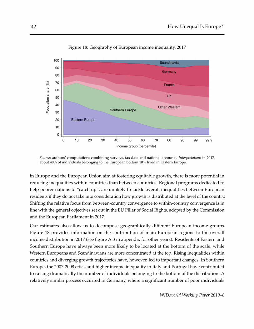
42 How Unequal Is Europe?
Figure 18: Geography of European income inequality, 2017
Eastern Europe
Southern EuropeOther Western
UK
France
Germany
Scandinavia
0
10
20
30
40
50
60
70
80
90
100
Popu
latio
n sh
are
(%)
0 10 20 30 40 50 60 70 80 90 99 99.9Income group (percentile)
Source: authors’ computations combining surveys, tax data and national accounts. Interpretation: in 2017,about 40% of individuals belonging to the European bottom 10% lived in Eastern Europe.
in Europe and the European Union aim at fostering equitable growth, there is more potential inreducing inequalities within countries than between countries. Regional programs dedicated tohelp poorer nations to “catch up”, are unlikely to tackle overall inequalities between Europeanresidents if they do not take into consideration how growth is distributed at the level of the country.Shifting the relative focus from between-country convergence to within-country convergence is inline with the general objectives set out in the EU Pillar of Social Rights, adopted by the Commissionand the European Parliament in 2017.
Our estimates also allow us to decompose geographically different European income groups.Figure 18 provides information on the contribution of main European regions to the overallincome distribution in 2017 (see figure A.3 in appendix for other years). Residents of Eastern andSouthern Europe have always been more likely to be located at the bottom of the scale, whileWestern Europeans and Scandinavians are more concentrated at the top. Rising inequalities withincountries and diverging growth trajectories have, however, led to important changes. In SouthernEurope, the 2007-2008 crisis and higher income inequality in Italy and Portugal have contributedto raising dramatically the number of individuals belonging to the bottom of the distribution. Arelatively similar process occurred in Germany, where a significant number of poor individuals
WID.world Working Paper 2019–6

43 How Unequal Is Europe?
Figure 19: Redistribution in European regions, 2017:ratio of post-tax to pre-tax income by percentile
.8
.9
1
1.1
1.2
1.3
1.4R
atio
of p
ost-t
ax to
pre
-tax
inco
me
10 20 30 40 50 60 70 80 90 100Income group (percentile)
Northern Europe Western EuropeSouthern Europe Eastern Europe
Source: authors’ computations combining surveys, tax data and national accounts.Figures correspond to population-weighted averages over the countries belongingto the corresponding regions.
experienced lower growth rates than the rest of the country. As a result, the share of poorest 10%Europeans living in Germany increased substantially. Rising inequalities in Eastern Europe, on thecontrary, have been associated with the emergence of an economic elite which can now competewith its Western European counterparts. Between 1980 and 2017, the share of top 10% Europeansearners living in Eastern Europe was multiplied by four and reached almost 10% in 2017.
The fact that European income disparities are partly geographically concentrated should not makeus forget that inequalities within countries remain much more significant. While figure 18 showsthat there are more poor Eastern Europeans than poor Western Europeans, it also reveals that noregion can escape from being at least partly “spread out” through the entire European distribution.National incomes per adult are 25% to 75% lower than the continental average in most EasternEuropean countries; yet, a substantial share of inhabitants of this area belong to the Europeanmiddle or even upper-middle classes. Accordingly, a non-negligible proportion of Europe’s poorestfamilies still live in some of Western Europe’s wealthiest nations.
WID.world Working Paper 2019–6
44 How Unequal Is Europe?
3.4 Curbing inequalities? From pre-tax to post-tax income
Until now, we have focused exclusively on the distribution of pre-tax income, that is the sum of allpre-tax personal income flows accruing to the owners of the production factors, before taking intoaccount the operation of the tax and transfer system, but after taking into account the operationof the pension system. We will now look more precisely at the evolution of post-tax disposableincome inequality in Europe and the extent of redistribution across European regions. Post-taxdisposable income corresponds to the sum of primary incomes over all sectors, after taxes andtransfers. It includes all in-kind transfers and public spending, which are attributed proportionallyto all individuals, so that aggregate post-tax income is equal to aggregate national income.
Since the tax data used to correct inequality at the top of the distribution are only available forpre-tax income, we assume that the underestimation profile of post-tax income inequality is similarto that observed for pre-tax income. Furthermore, given that pre-tax income and post-tax incomeare only available jointly in a limited number of surveys (essentially EU-SILC and a few surveysfrom the Luxembourg Income Study), we are not able to precisely document evolutions in theredistributive effects of taxes and transfers. Analyses of larger geographical areas and broadcomparisons between countries can still reveal interesting information on redistribution in Europe.As more detailed studies become available, more precise comparisons between countries and acrosstime will become possible.
We start by looking at the incidence of taxes and transfers in European regions. Figure 19 plots thepopulation-weighted average ratio of post-tax to pre-tax income by percentile across Europeanregions in 2017. Taxes and transfers appear to reduce income inequality in all regions: they increasethe average income of bottom 50% earners by up to 40%, and reduce the earnings of top earnersby up to 25%. Redistribution is lowest at the top end of the distribution in Eastern Europe, whileWestern Europe tends to redistribute more towards poorer individuals.
In order to synthesize this information with a simple indicator, we propose to follow Bozio et al.(2018) and look at the percent reduction in the ratio of the top 10% to bottom 50% average incomes.This ratio is a simple and straightforward measure of inequality, as it summarizes in a singlenumber the gap between the earnings of the two sides of the income distribution. Looking at theextent to which fiscal systems reduce this gap can therefore inform directly on their redistributiveeffect.19 Figure 20 compares average redistribution across European regions with this indicator. Onaverage, taxes and transfers reduce the income gap between rich and poor about two times less in
19The results of this section are robust to the use of different groups for the top and the bottom of the distribution (e.g.top 1%/bottom 50%). See table A.8 in appendix.
WID.world Working Paper 2019–6
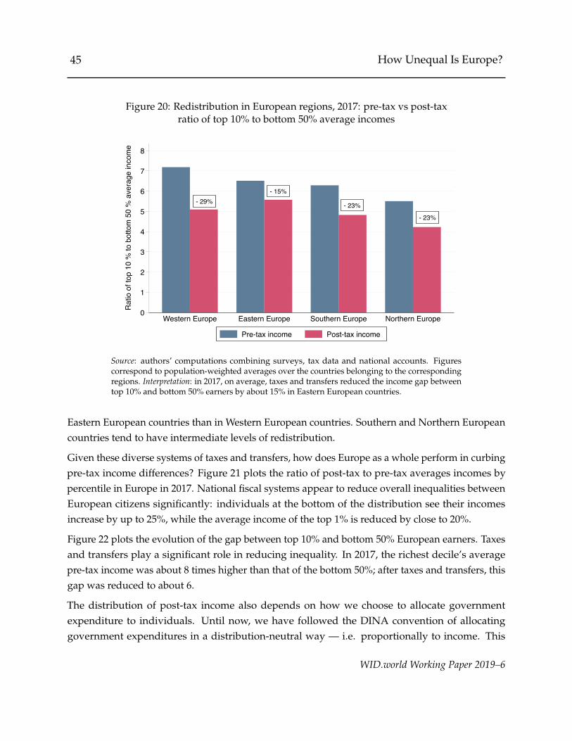
45 How Unequal Is Europe?
Figure 20: Redistribution in European regions, 2017: pre-tax vs post-taxratio of top 10% to bottom 50% average incomes
- 29%- 15%
- 23%
- 23%
0
1
2
3
4
5
6
7
8
Rat
io o
f top
10
% to
bot
tom
50
% a
vera
ge in
com
e
Western Europe Eastern Europe Southern Europe Northern Europe
Pre-tax income Post-tax income
Source: authors’ computations combining surveys, tax data and national accounts. Figurescorrespond to population-weighted averages over the countries belonging to the correspondingregions. Interpretation: in 2017, on average, taxes and transfers reduced the income gap betweentop 10% and bottom 50% earners by about 15% in Eastern European countries.
Eastern European countries than in Western European countries. Southern and Northern Europeancountries tend to have intermediate levels of redistribution.
Given these diverse systems of taxes and transfers, how does Europe as a whole perform in curbingpre-tax income differences? Figure 21 plots the ratio of post-tax to pre-tax averages incomes bypercentile in Europe in 2017. National fiscal systems appear to reduce overall inequalities betweenEuropean citizens significantly: individuals at the bottom of the distribution see their incomesincrease by up to 25%, while the average income of the top 1% is reduced by close to 20%.
Figure 22 plots the evolution of the gap between top 10% and bottom 50% European earners. Taxesand transfers play a significant role in reducing inequality. In 2017, the richest decile’s averagepre-tax income was about 8 times higher than that of the bottom 50%; after taxes and transfers, thisgap was reduced to about 6.
The distribution of post-tax income also depends on how we choose to allocate governmentexpenditure to individuals. Until now, we have followed the DINA convention of allocatinggovernment expenditures in a distribution-neutral way — i.e. proportionally to income. This
WID.world Working Paper 2019–6
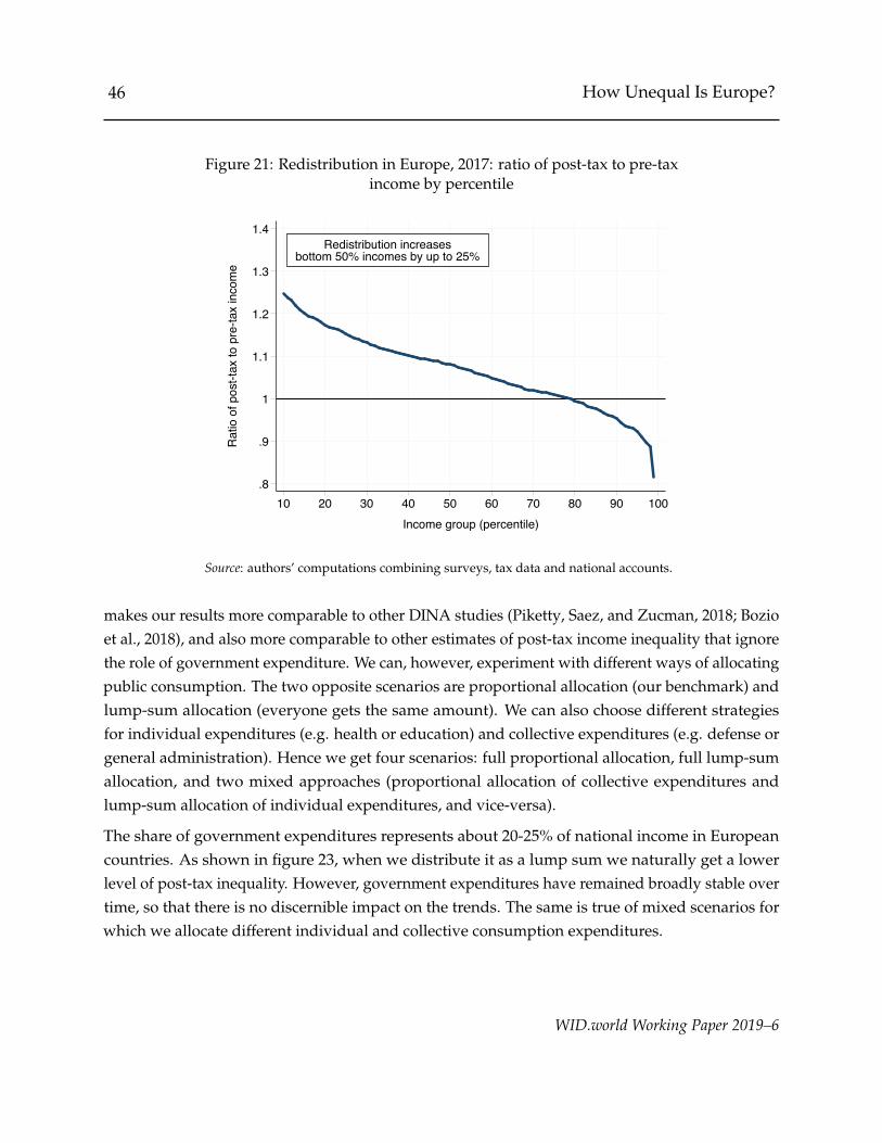
46 How Unequal Is Europe?
Figure 21: Redistribution in Europe, 2017: ratio of post-tax to pre-taxincome by percentile
Redistribution increasesbottom 50% incomes by up to 25%
.8
.9
1
1.1
1.2
1.3
1.4R
atio
of p
ost-t
ax to
pre
-tax
inco
me
10 20 30 40 50 60 70 80 90 100Income group (percentile)
Source: authors’ computations combining surveys, tax data and national accounts.
makes our results more comparable to other DINA studies (Piketty, Saez, and Zucman, 2018; Bozioet al., 2018), and also more comparable to other estimates of post-tax income inequality that ignorethe role of government expenditure. We can, however, experiment with different ways of allocatingpublic consumption. The two opposite scenarios are proportional allocation (our benchmark) andlump-sum allocation (everyone gets the same amount). We can also choose different strategiesfor individual expenditures (e.g. health or education) and collective expenditures (e.g. defense orgeneral administration). Hence we get four scenarios: full proportional allocation, full lump-sumallocation, and two mixed approaches (proportional allocation of collective expenditures andlump-sum allocation of individual expenditures, and vice-versa).
The share of government expenditures represents about 20-25% of national income in Europeancountries. As shown in figure 23, when we distribute it as a lump sum we naturally get a lowerlevel of post-tax inequality. However, government expenditures have remained broadly stable overtime, so that there is no discernible impact on the trends. The same is true of mixed scenarios forwhich we allocate different individual and collective consumption expenditures.
WID.world Working Paper 2019–6

47 How Unequal Is Europe?
Figure 22: Redistribution in Europe, 1980-2017:ratio of top 10% to bottom 50% average incomes
2017 (before taxes)Top 10% make 8x more
than bottom 50%
2017 (after taxes)Top 10% make 6x more
than bottom 50%
3
4
5
6
7
8
9
10R
atio
of t
op 1
0% to
bot
tom
50%
ave
rage
inco
me
1980 1985 1990 1995 2000 2005 2010 2015
Pre-tax inequalityPost-tax inequality
Source: authors’ computations combining surveys, tax data and national accounts.
3.5 Is Europe more unequal than the United States?
Income inequality in the US has increased dramatically in the past forty years, especially at thetop of the distribution (Piketty, Saez, and Zucman, 2018). In this section, we seek to compare thesedynamics to those observed in Europe. Europe and the United States are two large, integratedworld regions, which share relatively high degrees of similarities in terms of levels of development,exposure to global markets or penetration of new technologies. Comparing the evolution of incomeinequality in these regions can thus provide insights into their different policy and economictrajectories since the 1980s. In particular, we will refine and expand on the recent work donein the World Inequality Report 2018 (Alvaredo et al., 2018) by focusing on two questions. Areincome disparities in Europe larger than in the US? And what are the roles of between-country(between-states) and within-country (within-states) inequalities in explaining these differences?Our estimates for Europe are based on the work done in this paper. For the US, we collect dataon total state domestic products from the Bureau of Economic Analysis, along with state adultpopulations series from the United States Census Bureau. In order to obtain comparable series onincome inequalities within US states, we correct survey distributions obtained from the CurrentPopulation Surveys with top income shares estimated by Frank et al. (2015), using the same
WID.world Working Paper 2019–6
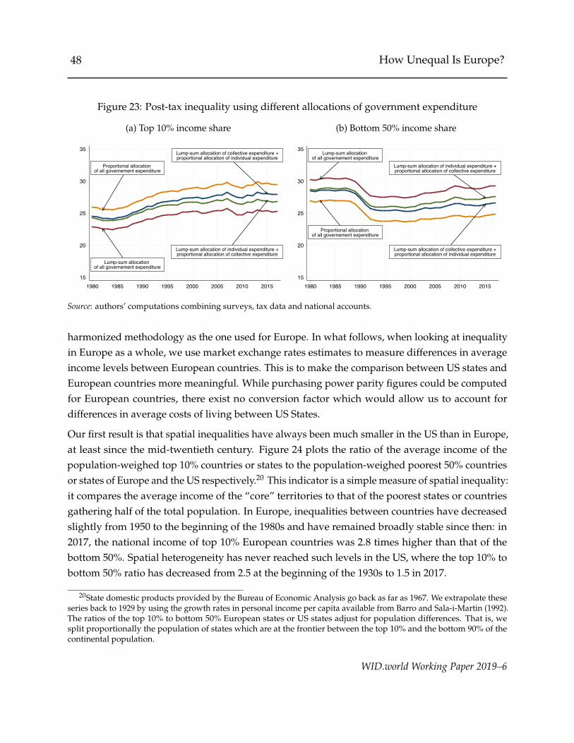
48 How Unequal Is Europe?
Figure 23: Post-tax inequality using different allocations of government expenditure
(a) Top 10% income share
Proportional allocation of all governement expenditure
Lump-sum allocation of all governement expenditure
Lump-sum allocation of collective expenditure +proportional allocation of individual expenditure
Lump-sum allocation of individual expenditure +proportional allocation of collective expenditure
15
20
25
30
35
1980 1985 1990 1995 2000 2005 2010 2015
(b) Bottom 50% income share
Proportional allocation of all governement expenditure
Lump-sum allocation of all governement expenditure
Lump-sum allocation of collective expenditure +proportional allocation of individual expenditure
Lump-sum allocation of individual expenditure +proportional allocation of collective expenditure
15
20
25
30
35
1980 1985 1990 1995 2000 2005 2010 2015
Source: authors’ computations combining surveys, tax data and national accounts.
harmonized methodology as the one used for Europe. In what follows, when looking at inequalityin Europe as a whole, we use market exchange rates estimates to measure differences in averageincome levels between European countries. This is to make the comparison between US states andEuropean countries more meaningful. While purchasing power parity figures could be computedfor European countries, there exist no conversion factor which would allow us to account fordifferences in average costs of living between US States.
Our first result is that spatial inequalities have always been much smaller in the US than in Europe,at least since the mid-twentieth century. Figure 24 plots the ratio of the average income of thepopulation-weighed top 10% countries or states to the population-weighed poorest 50% countriesor states of Europe and the US respectively.20 This indicator is a simple measure of spatial inequality:it compares the average income of the “core” territories to that of the poorest states or countriesgathering half of the total population. In Europe, inequalities between countries have decreasedslightly from 1950 to the beginning of the 1980s and have remained broadly stable since then: in2017, the national income of top 10% European countries was 2.8 times higher than that of thebottom 50%. Spatial heterogeneity has never reached such levels in the US, where the top 10% tobottom 50% ratio has decreased from 2.5 at the beginning of the 1930s to 1.5 in 2017.
20State domestic products provided by the Bureau of Economic Analysis go back as far as 1967. We extrapolate theseseries back to 1929 by using the growth rates in personal income per capita available from Barro and Sala-i-Martin (1992).The ratios of the top 10% to bottom 50% European states or US states adjust for population differences. That is, wesplit proportionally the population of states which are at the frontier between the top 10% and the bottom 90% of thecontinental population.
WID.world Working Paper 2019–6
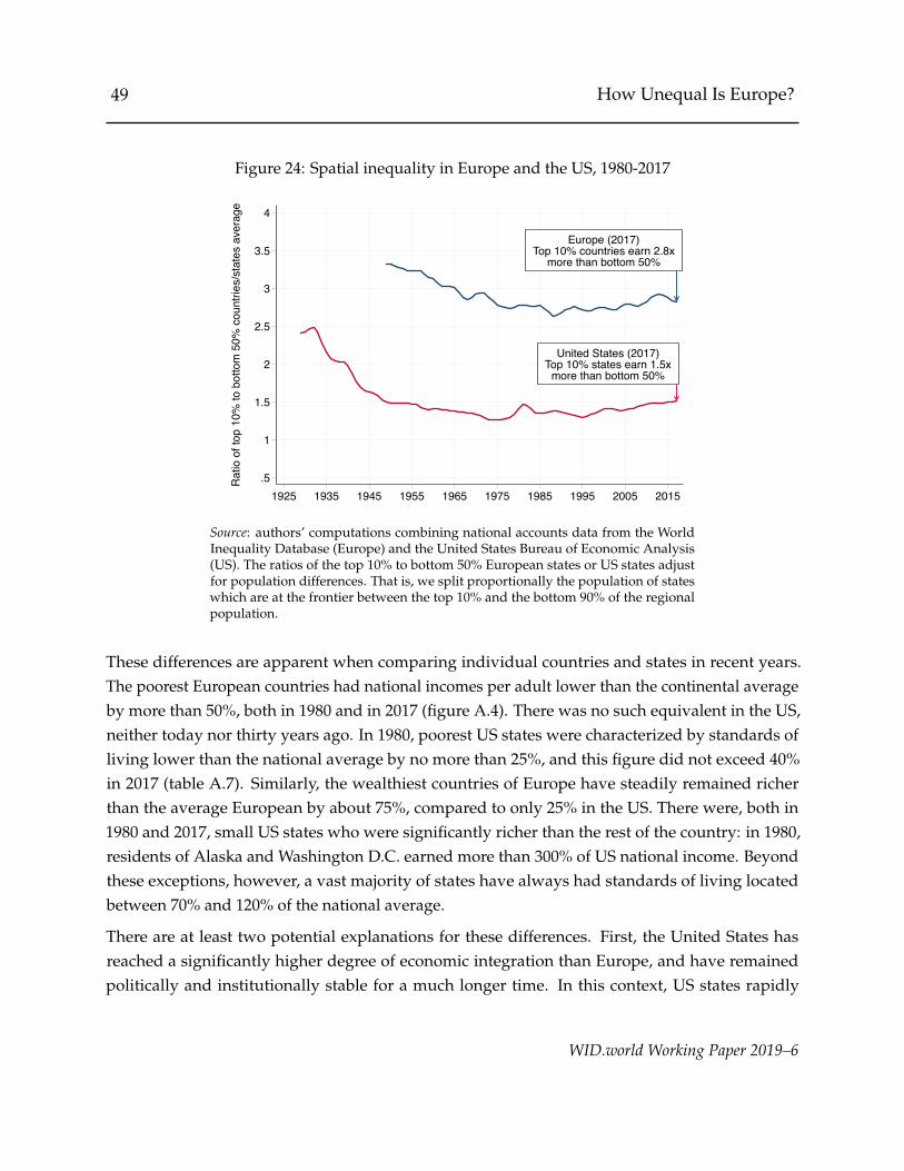
49 How Unequal Is Europe?
Figure 24: Spatial inequality in Europe and the US, 1980-2017
Europe (2017)Top 10% countries earn 2.8x
more than bottom 50%
United States (2017)Top 10% states earn 1.5x
more than bottom 50%
.5
1
1.5
2
2.5
3
3.5
4
Rat
io o
f top
10%
to b
otto
m 5
0% c
ount
ries/
stat
es a
vera
ge
1925 1935 1945 1955 1965 1975 1985 1995 2005 2015
Source: authors’ computations combining national accounts data from the WorldInequality Database (Europe) and the United States Bureau of Economic Analysis(US). The ratios of the top 10% to bottom 50% European states or US states adjustfor population differences. That is, we split proportionally the population of stateswhich are at the frontier between the top 10% and the bottom 90% of the regionalpopulation.
These differences are apparent when comparing individual countries and states in recent years.The poorest European countries had national incomes per adult lower than the continental averageby more than 50%, both in 1980 and in 2017 (figure A.4). There was no such equivalent in the US,neither today nor thirty years ago. In 1980, poorest US states were characterized by standards ofliving lower than the national average by no more than 25%, and this figure did not exceed 40%in 2017 (table A.7). Similarly, the wealthiest countries of Europe have steadily remained richerthan the average European by about 75%, compared to only 25% in the US. There were, both in1980 and 2017, small US states who were significantly richer than the rest of the country: in 1980,residents of Alaska and Washington D.C. earned more than 300% of US national income. Beyondthese exceptions, however, a vast majority of states have always had standards of living locatedbetween 70% and 120% of the national average.
There are at least two potential explanations for these differences. First, the United States hasreached a significantly higher degree of economic integration than Europe, and have remainedpolitically and institutionally stable for a much longer time. In this context, US states rapidly
WID.world Working Paper 2019–6

50 How Unequal Is Europe?
Figure 25: Top 10% income shares in European countries and US states, 1980-2017
(a) Europe, 1980
10
20
30
40
50
(b) Europe, 2017
10
20
30
40
50
(c) United States, 1980
10
20
30
40
50
(d) United States, 2017
10
20
30
40
50
Source: authors’ computations combining surveys, tax data and national accounts.
WID.world Working Paper 2019–6

51 How Unequal Is Europe?
converged in their levels of development, especially at the beginning of the twentieth century(Barro and Sala-i-Martin, 1991; Barro and Sala-i-Martin, 1992). Accordingly, the persistence ofhigh between-country inequalities in Europe can partially be explained by the multiplication ofstrong asymmetric shocks since the 1980s which have delayed potential convergence processes.The 1990s crises in Eastern Europe badly affected the poorest economies of the continent, just as the2008 crisis hit only moderately richer European nations but led to stronger recessions in Southernand Baltic countries. That heterogeneity also has to do with a lack of political integration andcoordinated policy responses among European countries and within the European Union. Whilethe EU has decided to encourage the adhesion of future members with financial aid funds, it hasonly dedicated moderate sums to these programs. Between 1991 and 2003, for instance, averagetransfers from West Germany to East Germany had amounted to some 4.5% of western GDP and30% of eastern GDP, leading to rapid and significant regional convergence after reunification.21
By contrast, the 2019 financial programming of the European Regional Development Fund, themain program for correcting imbalances between EU regions, is expected to amount to 31 billioneuros, or less than 0.2% of total EU GDP.22 And when looking at net contributions to the EU budget,countries benefiting most from EU transfers (such as Bulgaria, Hungary of Lithuania) do not receivenet income flows higher than 3% of their GDP, while the most important contributors (such asGermany or Sweden) give up less than 0.4% of their total annual production (see figure A.1).
Our second key result is that while geographical disparities are higher in Europe than in the US,inequalities within territories are higher and have grown much faster in the US. Figure 25 mapsthe long-run evolution of top income inequality in European and US regions. In 1980, US stateswere, on average, only slightly more unequal than Western European countries. Between 1980 and2017, however, this gap grew significantly: while inequalities within European countries increasedonly moderately, they skyrocketed in most US states, reaching up to 60% in New York and Florida.The fact that inequalities increased only moderately in Europe, and mainly in Eastern Europeancountries who “caught up” with their Western neighbors, announced a clear disconnection betweenthe US and Europe. In 2017, top 10% shares in the most equal states of the US were close to thoseobserved in the most unequal countries of Europe.
Another interesting fact is that top 10% income shares were generally more similar across US statesthan they were across European countries in 1980, where communist countries were characterizedby significantly lower income disparities than Western European nations. Just as in the case ofbetween-region inequalities, this can be partly explained by differences in degrees of political
21See for example http://ec.europa.eu/economy_finance/publications/pages/publication1437_en.pdf.22See https://ec.europa.eu/budget/library/biblio/documents/2019/Programmes_performance_overview.
pdf.
WID.world Working Paper 2019–6

52 How Unequal Is Europe?
Figure 26: Income inequality trends in Europe and the US, 1980-2017
(a) Bottom 50% vs. Top 1% income shares
5
7.5
10
12.5
15
17.5
20
22.5
25
Shar
e of
nat
iona
l inc
ome
(%)
1980 1985 1990 1995 2000 2005 2010 2015
United States
5
7.5
10
12.5
15
17.5
20
22.5
25
1980 1985 1990 1995 2000 2005 2010 2015
Europe
Bottom 50% Top 1%
(b) Growth Incidence Curves
0
100
200
300
400
500
600
700
Tota
l inc
ome
grow
th (%
)
10 20 30 40 50 60 70 80 90 99 99.9 99.99 99.999Income group (percentile)
United States Europe
Source: authors’ computations combining surveys, tax data and national accounts for Europe;Piketty, Saez, and Zucman (2018) for the United States.
WID.world Working Paper 2019–6
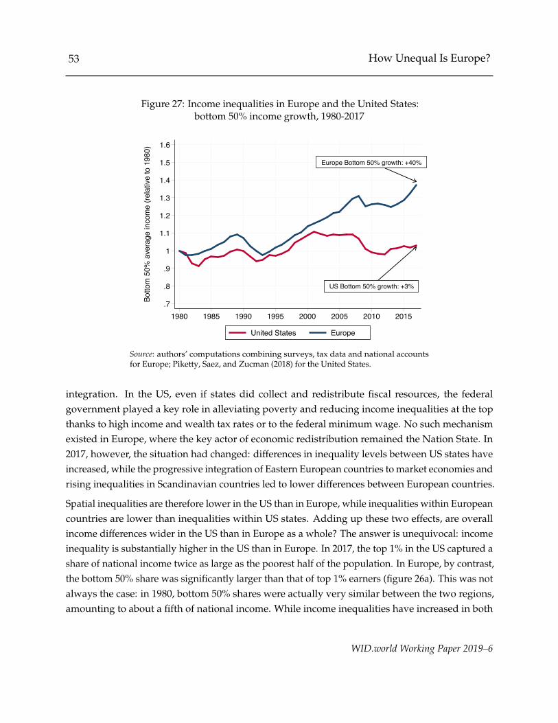
53 How Unequal Is Europe?
Figure 27: Income inequalities in Europe and the United States:bottom 50% income growth, 1980-2017
US Bottom 50% growth: +3%
Europe Bottom 50% growth: +40%
.7
.8
.9
1
1.1
1.2
1.3
1.4
1.5
1.6Bo
ttom
50%
ave
rage
inco
me
(rela
tive
to 1
980)
1980 1985 1990 1995 2000 2005 2010 2015
United States Europe
Source: authors’ computations combining surveys, tax data and national accountsfor Europe; Piketty, Saez, and Zucman (2018) for the United States.
integration. In the US, even if states did collect and redistribute fiscal resources, the federalgovernment played a key role in alleviating poverty and reducing income inequalities at the topthanks to high income and wealth tax rates or to the federal minimum wage. No such mechanismexisted in Europe, where the key actor of economic redistribution remained the Nation State. In2017, however, the situation had changed: differences in inequality levels between US states haveincreased, while the progressive integration of Eastern European countries to market economies andrising inequalities in Scandinavian countries led to lower differences between European countries.
Spatial inequalities are therefore lower in the US than in Europe, while inequalities within Europeancountries are lower than inequalities within US states. Adding up these two effects, are overallincome differences wider in the US than in Europe as a whole? The answer is unequivocal: incomeinequality is substantially higher in the US than in Europe. In 2017, the top 1% in the US captured ashare of national income twice as large as the poorest half of the population. In Europe, by contrast,the bottom 50% share was significantly larger than that of top 1% earners (figure 26a). This was notalways the case: in 1980, bottom 50% shares were actually very similar between the two regions,amounting to about a fifth of national income. While income inequalities have increased in both
WID.world Working Paper 2019–6

54 How Unequal Is Europe?
Figure 28: National income growth in the United States and Europe:Income-weighed vs population-weighed estimates
(a) United States
90
100
110
120
130
140
150
160
170
Aver
age
inco
me
(bas
e 19
80)
1980 1985 1990 1995 2000 2005 2010 2015
Income-weighed (traditional)Population-weighed
(b) Europe
90
100
110
120
130
140
150
160
170
Aver
age
inco
me
(bas
e 19
80)
1980 1985 1990 1995 2000 2005 2010 2015
Income-weighed (traditional)Population-weighed
Source: authors’ computations combining surveys, tax data and national accounts for Europe; Piketty, Saez, and Zucman(2018) for the United States.
Europe and the US, the trend has therefore been much steeper in the latter. In Europe, economiccrises and rising income disparities in Eastern Europe contributed to moderately compressing thebottom 50% share at the beginning of the 1990s, while top income inequality increased slightlyfrom the 1980s to the 2000s. Inequality dynamics in the US have been much more linear: in thepast forty years, the top 1% share steadily surged from 11% to 20% and the bottom 50% share wasnearly divided by two.
These differences appear even more striking if one compares the growth trajectories of differentincome groups in the two regions (figure 26b). Between 1980 and 2017, top earners in Europeexperienced growth rates lower than 200%; during the same period, the richest 0.001% US citizenssaw their standards of living multiplied by seven. And while poorer Europeans’ earnings grew by40%, bottom 50% earners in the US did not experience any improvements in their income levels(figure 27). Our estimates reveal that despite the fact that the average national income grew fasterin the US than in Europe by 40% during this period, the poorest 70% European residents saw theirincomes grow faster than the poorest 70% US citizens (the two growth incidence curves cross at theseventieth percentile).
Figure 28 formalizes the gap between average national income growth and the growth felt by“typical” individuals. Solid lines represent the evolution of the average income per adult in Europeand the US, measured directly from national accounts, relative to its value in 1980. This standard
WID.world Working Paper 2019–6
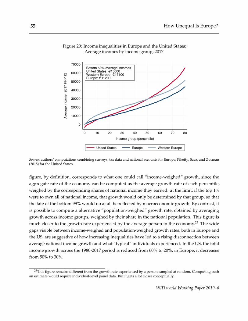
55 How Unequal Is Europe?
Figure 29: Income inequalities in Europe and the United States:Average incomes by income group, 2017
Bottom 50% average incomesUnited States: €13000Western Europe: €17100Europe: €11200
0
10000
20000
30000
40000
50000
60000
70000Av
erag
e in
com
e (2
017
PPP €
)
0 10 20 30 40 50 60 70 80Income group (percentile)
United States Europe Western Europe
Source: authors’ computations combining surveys, tax data and national accounts for Europe; Piketty, Saez, and Zucman(2018) for the United States.
figure, by definition, corresponds to what one could call “income-weighed” growth, since theaggregate rate of the economy can be computed as the average growth rate of each percentile,weighed by the corresponding shares of national income they earned: at the limit, if the top 1%were to own all of national income, that growth would only be determined by that group, so thatthe fate of the bottom 99% would no at all be reflected by macroeconomic growth. By contrast, itis possible to compute a alternative “population-weighed” growth rate, obtained by averaginggrowth across income groups, weighed by their share in the national population. This figure ismuch closer to the growth rate experienced by the average person in the economy.23 The widegaps visible between income-weighed and population-weighed growth rates, both in Europe andthe US, are suggestive of how increasing inequalities have led to a rising disconnection betweenaverage national income growth and what “typical” individuals experienced. In the US, the totalincome growth across the 1980-2017 period is reduced from 60% to 20%; in Europe, it decreasesfrom 50% to 30%.
23This figure remains different from the growth rate experienced by a person sampled at random. Computing suchan estimate would require individual-level panel data. But it gets a lot closer conceptually.
WID.world Working Paper 2019–6

56 How Unequal Is Europe?
Table 3: Theil index decomposition of between-region andwithin-region inequalities in Europe and the US
Theil index Within-group Between-group
Value % of total Value % of total
Europe1980 0.37 0.24 65.0 % 0.13 35.0 %1990 0.43 0.29 67.4 % 0.14 32.6 %2000 0.49 0.34 69.6 % 0.15 30.4 %2007 0.52 0.39 74.8 % 0.13 25.2 %2017 0.50 0.38 76.6 % 0.12 23.4 %
United States1980 0.45 0.44 96.7 % 0.01 3.3 %1990 0.63 0.61 98.0 % 0.01 2.0 %2000 0.85 0.84 98.5 % 0.01 1.5 %2007 0.94 0.93 98.5 % 0.01 1.5 %2017 1.00 0.98 98.3 % 0.02 1.7 %
Source: authors’ computations combining surveys tax data and national accounts.
Differences in income inequality in Europe and the US are also a powerful illustration of howstandard macroeconomic aggregates can fail to measure true standards of living. Figure 29 plots theaverage income of poorer income groups in the US, Europe and Western Europe. In 2017, accordingto national accounts, US citizens were on average significantly wealthier than Europeans: theirnational income per adult reached about e54,000, compared to only e37,000 in Western Europe ande31,000 in Europe as a whole (in 2017 PPP euros). Median income in Western Europe, however, wasapproximately equal to US median income, and all groups below median were richer in WesternEurope than corresponding individuals in the US. In Europe as a whole, a significantly largerfraction of individuals were poorer than their counterparts in the US. Yet, the poorest fifth of theadult population was characterized by comparable standards of living in both regions (between e0and e10,000). Traditional indicators therefore disguise how important income differences betweenresidents can be: while the United States’ production is among the highest in the world, a majorityof US inhabitants still earn very little in comparison to what figures from national accounts suggest.
Table 3 provides Theil decomposition of income inequality in Europe and the US between 1980 and2017. In 1980, inequalities were slightly higher in the US than in Europe, if one considers the Theilindex to be a broad measure of income concentration. This gap had widened considerably in 2017:the Theil index reached 1 in the US, compared to only 0.5 in Europe. Furthermore, decomposition
WID.world Working Paper 2019–6
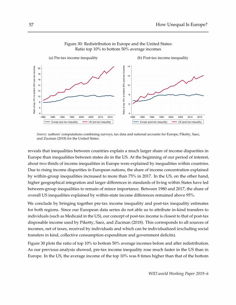
57 How Unequal Is Europe?
Figure 30: Redistribution in Europe and the United States:Ratio top 10% to bottom 50% average incomes
(a) Pre-tax income inequality
4
6
8
10
12
14
16
18
20
Rat
io o
f top
10%
to b
otto
m 5
0% p
re-ta
x in
com
es
1980 1985 1990 1995 2000 2005 2010 2015
Europe (pre-tax inequality) US (pre-tax inequality)
(b) Post-tax income inequality
4
6
8
10
12
14
Rat
io o
f top
10%
to b
otto
m 5
0% p
ost-t
ax in
com
es
1980 1985 1990 1995 2000 2005 2010 2015
Europe (post-tax inequality) US (post-tax inequality)
Source: authors’ computations combining surveys, tax data and national accounts for Europe; Piketty, Saez,and Zucman (2018) for the United States.
reveals that inequalities between countries explain a much larger share of income disparities inEurope than inequalities between states do in the US. At the beginning of our period of interest,about two thirds of income inequalities in Europe were explained by inequalities within countries.Due to rising income disparities in European nations, the share of income concentration explainedby within-group inequalities increased to more than 75% in 2017. In the US, on the other hand,higher geographical integration and larger differences in standards of living within States have ledbetween-group inequalities to remain of minor importance. Between 1980 and 2017, the share ofoverall US inequalities explained by within-state income differences remained above 95%.
We conclude by bringing together pre-tax income inequality and post-tax inequality estimatesfor both regions. Since our European data series do not able us to attribute in-kind transfers toindividuals (such as Medicaid in the US), our concept of post-tax income is closest to that of post-taxdisposable income used by Piketty, Saez, and Zucman (2018). This corresponds to all sources ofincomes, net of taxes, received by individuals and which can be individualized (excluding socialtransfers in kind, collective consumption expenditure and government deficits).
Figure 30 plots the ratio of top 10% to bottom 50% average incomes before and after redistribution.As our previous analysis showed, pre-tax income inequality rose much faster in the US than inEurope. In the US, the average income of the top 10% was 8 times higher than that of the bottom
WID.world Working Paper 2019–6
58 How Unequal Is Europe?
50% in 1980 and 20 times higher in 2017. In Europe, this figure rose much more moderately, fromabout 8 to 10. However, redistribution in the US appears to be substantially higher than in the oldcontinent: after accounting for taxes and transfers, the top 10% to bottom 50% ratio grew from 6to 12 in the US, while it rose from 7 to 8 in Europe.24 The pre-tax income gap between rich andpoor was therefore twice as large in the US than in Europe in 2017, while the post-tax income gapwas about 50% wider. Taxes and transfers are therefore much more progressive in the US than inEurope, but they have still been insufficient to curb rising pre-tax inequalities in either region.
4 Conclusion
We have developed a novel methodology combining surveys, tax data and national accounts in aconsistent manner to produce pre-tax and post-tax income inequality statistics for all Europeancountries covering the 1980-2017 period. Based on this methodology, we have documented thefollowing results.
First, we do not observe a clear pattern of convergence in average income levels between countriessince the early 1980s. Per adult income in Eastern Europe is about 35% lower than Europeanaverage today. This is the same value as in the early 1980s, before the fall of the USSR. In SouthernEuropean countries, per adult average incomes have been declining relatively to the continentalaverage since the 1990s and are now 10% below the average. Northern European countries were25% richer than the average in the mid-1990s and are now 50% richer.
Personal income inequalities have been increasing in nearly all countries. Nearly all Europeancountries failed to reach the United Nations Sustainable Development Goals inequality target overthe 1980-2017 period, which seeks to ensure that the bottom 40% of the population grows fasterthan the average. Since the 2000s, European countries have been relatively more successful atensuring that bottom income groups secure a fair share of growth, but the majority of countriesstill failed to achieve the UN objective.
As a result of a limited convergence process and rising inequality within countries, Europeans aremore unequal today than four decades ago. Between 1980 and 2017, per adult average annualpre-tax income growth was below 1% for bottom 50% earners, while the top 0.1% grew at a ratehigher than 2% per year. The top 1% captured about as much growth as the bottom 50% of thepopulation. The share of national income captured by the top 1% Europeans increased from less
24We get more similar levels of redistribution when looking at the ratio between the middle and the bottom of thedistribution, except in Eastern Europe. See table A.8 in appendix for details.
WID.world Working Paper 2019–6

59 How Unequal Is Europe?
than 8% of national income to nearly 11% between 1980 and 2017.
Despite a rise of inequality in Europe and within the EU, European countries have been muchmore successful at containing rising inequalities than the US. This is largely because Europeancountries succeeded in generating higher income growth rates for bottom earners than did the US.Average income of the poorest half of Europeans was 40% higher in 2017 than in 1980, while itwas essentially the same as in 1980 (+3%) for the poorest 50% Americans. Consequently, Europeis much less unequal than the US, despite higher spatial inequalities in Europe than between USstates.
While European countries distribute pre-tax incomes much more equally than the US, the intensityof post-tax redistribution is stronger in the US. Top 10% average pre-tax incomes in 2017 were 20times higher than bottom 50% average income in the US. After taxes and transfers, this ratio fellto 12 (a 40% reduction of inequality). In Europe, taxes and transfers reduce inequality by 20%.Nevertheless, Europe is significantly more equal after taxes and transfers than the US given theextreme level of pre-tax inequality in the US.
To what extent did observed and perceived inequality dynamics in Europe contribute to currentlevels of resentment against national and European institutions? Which structural changes and setof policies enabled European countries to contain the surge of inequalities observed in the USAsince 1980? This paper opens up many questions to which our inequality series will hopefullycontribute to answering in future comparative research.
WID.world Working Paper 2019–6
60 How Unequal Is Europe?
References
Aaberge, R. and A. B. Atkinson (2010). “Top incomes in Norway”. In: Top incomes: a global perspective.Ed. by A. B. Atkinson and Thomas Piketty. Oxford University Press. Chap. 9, pp. 448–481.
Alstadsæter, Annette, Martin Jacob, Wojciech Kopczuk, and Kjetil Telle (2017). “Accounting for Busi-ness Income in Measuring Top Income Shares: Integrated Accrual Approach Using Individualand Firm Data from Norway”. URL: http://www.nber.org/papers/w22888.
Alvaredo, Facundo (2009). “Top incomes and earnings in Portugal 1936-2005”. In: Explorations inEconomic History 46.1, pp. 404–417.
Alvaredo, Facundo and Elena Pisano (2010). “Top incomes in Italy, 1974-2004”. In: Top incomes: aglobal perspective. Ed. by A. B. Atkinson and Thomas Piketty. Oxford University Press. Chap. 12,pp. 625–663.
Alvaredo, Facundo and Emmanuel Saez (2010). “Income and wealth concentration in Spain in ahistorical and fiscal perspective”. In: Top incomes: a global perspective. Ed. by A. B. Atkinson andThomas Piketty. Oxford University Press. Chap. 10, pp. 482–559.
Alvaredo, Facundo, A. B. Atkinson, Lucas Chancel, Thomas Piketty, Emmanuel Saez, and GabrielZucman (2017). “Distributional National Accounts (DINA) Guidelines: Concepts and Methodsused in WID.world”.
Alvaredo, Facundo, Lucas Chancel, Thomas Piketty, Emmanuel Saez, and Gabriel Zucman (2018).World Inequality Report. Tech. rep. World Inequality Lab. URL: http://wir2018.wid.world/files/download/wir2018-full-report-english.pdf.
Atkinson, A. B. and Thomas Piketty (2007). Top incomes over the twentieth century: a contrast be-tween continental European and English-speaking countries. Oxford University Press, p. 585. ISBN:9780199286881. URL: https://global.oup.com/academic/product/top-incomes-over-the-twentieth-century-9780199286881?lang=en&cc=fr.
— (2010). Top incomes: a global perspective. Oxford University Press, p. 776. ISBN: 9780199286898.URL: https://global.oup.com/academic/product/top-incomes-9780199286898?cc=fr&lang=en&#.
Atkinson, A.B. and J.E. Søgaard (2013). “The long-run history of income inequality in Denmark:Top incomes from 1870 to 2010”. In: EPRU Working Paper Series 2013-01.
Atkinson, Anthony B. (1996). “Income distribution in Europe and the United States”. In: OxfordReview of Economic Policy 12.1.
WID.world Working Paper 2019–6

61 How Unequal Is Europe?
Atria, Jorge, Ignacio Flores, Ricardo Mayer, and Claudia Sanhueza (2018). “Top incomes in Chile: AHistorical Perspective of Income Inequality (1964-2015)”. URL: http://ignacioflores.com/pdf/top-incomes-chile.pdf.
Barro, Robert and Xavier Sala-i-Martin (1991). “Convergence across States and Regions”. In: CenterDiscussion Paper No. 629.
— (1992). “Convergence”. In: Journal of Political Economy 100.2, pp. 223–251.Bartels, Charlotte (2017). “Top incomes in Germany, 1871-2013”. In: WID.world Working Paper Series
2017/18.Beblo, Miriam and Thomas Knaus (2001). “Measuring income inequality in Euroland”. In: Review of
Income and Wealth 47.3.Blanchet, Thomas and Lucas Chancel (2016). “National Accounts Series Methodology”. URL: http:
//wid.world/document/1676/.Blanchet, Thomas, Ignacio Flores, and Marc Morgan (2018). “The Weight of the Rich: Improving
Surveys Using Tax Data”.Blanchet, Thomas, Juliette Fournier, and Thomas Piketty (2017). “Generalized Pareto Curves:
Theory and Applications”.Boix, Carles (2004). “The institutional accomodation of an enlarged Europe”. In: Friedrich Ebert
Stiftung, Europaische Politik 6.1, pp. 1–9.Bozio, Antoine, Bertrand Garbinti, Jonathan Goupille-Lebret, Malka Guillot, and Thomas Piketty
(2018). “Inequality and Redistribution in France, 1990-2018: Evidence from Post-Tax Distribu-tional National Accounts (DINA)”. In: WID.world Working Paper 2018/10.
Brandolini, Andrea (2006). “Measurement of income distribution in supranational entities: The caseof the European Union”. In: LIS Working Paper Series, No. 452.
Bukowski, Pawel and Filip Novokmet (2017). “Top incomes during wars, communism and capital-ism: Poland 1892-2015”. In: WID.world Working Paper Series 2017/22.
Chen, Tianqi and Carlos Guestrin (2016). “XGBoost: A Scalable Tree Boosting System”. URL: http://dx.doi.org/10.1145/2939672.2939785.
Chrissis, Kostas and Franciscos Koutentakis (2017). “From dictatorship to crisis: the evolution oftop income shares in Greece (1967-2013)”. In: Working Paper.
Dauderstadt, Michael (2008). “Ungleichheit und sozialer Ausgleich in der erweiterten EuropaischenUnion”. In: Wirtschaftsdienst 88.4, pp. 261–269.
Dauderstadt, Michael and Cem Keltek (2011). “Immeasurable Inequality in the European Union”.In: Intereconomics 46.1, pp. 44–51.
WID.world Working Paper 2019–6
62 How Unequal Is Europe?
Decoster, Andre, Koen Dobbeleer, and Sebastiaan Maes (2017). “Using fiscal data to estimate theevolution of top income shares in Belgium from 1990 to 2013”. In: Ku Leuven Discussion PaperSeries DPS17.18.
Deville, Jean-Claude and Carl-Erik Sarndal (1992). “Calibration Estimators in Survey Sampling”.In: Journal of the American Statistical Association 87.418, pp. 376–382. DOI: 10.1080/01621459.1992.10475217.
Fairfield, Tasha and Michel Jorratt De Luis (2016). “Top Income Shares, Business Profits, andEffective Tax Rates in Contemporary Chile”. In: Review of Income and Wealth 62.August, S120–S144. ISSN: 14754991. DOI: 10.1111/roiw.12196.
Fang, Yixin (2011). “Asymptotic Equivalence between Cross-Validations and Akaike InformationCriteria in Mixed-Effects Models”. In: Journal of Data Science 9, pp. 15–21.
Ferreira, Ana and Laurens de Haan (2006). Extreme Value Theory: An Introduction. Springer Series inOperations Research. Springer.
Flores, Ignacio (2018). “Income Under the Carpet: What Gets Lost Between the Measure of CapitalShares and Inequality”. URL: http://ignacioflores.com/pdf/Income_under_the_Carpet.pdf.
Foellmi, Reto and Isabel Z. Martınez (2017). “Volatile top income shares in Switzerland? Reassessingthe evolution between 1981 and 2010”. In: Review of Economics and Statistics 99.5, pp. 793–809.
Frank, Mark, Estelle Sommeiller, Mark Price, and Emmanuel Saez (2015). “Frank-Sommeiller-PriceSeries for Top Income Shares by US States since 1917”. In: WID.world Technical Note Series 2015/7.
Friedman, Jerome H. (2001). “Greedy Function Approximation: A Gradient Boosting Machine”. In:The Annals of Statistics 29.5, pp. 1189–1232. URL: http://www.jstor.org/stable/2699986.
Garbinti, B, J Goupille-Lebret, and T Piketty (2018). “Income inequality in France, 1900–2014:Evidence from Distributional National Accounts (DINA)”. In: Journal of Public Economics 162.1,pp. 63–77.
Hosking, J R M and J R Wallis (1987). “Parameter and Quantile Estimation for the Generalized ParetoDistribution”. In: Technometrics 29.3, pp. 339–349. ISSN: 0040-1706. DOI: 10.1080/00401706.1987.10488243. URL: https://www.tandfonline.com/doi/abs/10.1080/00401706.1987.10488243.
Jantti, M., M. Riihela, R. Sullstrom, and M. Tuomala (2007). “Long-term trends in top income sharesin Ireland”. In: Top incomes over the 20th century. Ed. by A. B. Atkinson and Thomas Piketty.Oxford University Press. Chap. 12, pp. 501–530.
— (2010). “Trends in top income shares in Finland”. In: Top incomes: a global perspective. Ed. byA.B. Atkinson and Thomas Piketty. Oxford University Press. Chap. 8, pp. 371–447.
WID.world Working Paper 2019–6
63 How Unequal Is Europe?
Kump, Natasa and Filip Novokmet (2018). “Top incomes in Croatia and Slovenia, from 1960s untiltoday”. In: WID.world Working Paper Series 2018/8.
Lakner, Christoph and Branko Milanovic (2016). “Global Income Distribution: From the Fall of theBerlin Wall to the Great Recession”. In: The World Bank Economic Review 30.2, pp. 203–232. ISSN:0258-6770. DOI: 10.1093/wber/lhv039. URL: https://academic.oup.com/wber/article-lookup/doi/10.1093/wber/lhv039.
Lesage, Eric (2009). “Calage non lineaire”.Mavridis, Dimitris and Palma Mosberger (2017). “Income inequality and incentives: the quasi-
natural experiment of Hungary, 1914-2008”. In: WID.world Working Paper Series 2017/17.Morgan, Marc (2017). “Extreme and Persistent Inequality: New Evidence for Brazil Combining
National Accounts , Surveys and Fiscal Data, 2001-2015”. URL: http : / / wid . world / wp -content/uploads/2017/09/Morgan2017BrazilDINA.pdf.
Nielsen, Didrik (2016). Tree Boosting With XGBoost Why Does XGBoost Win ”Every” Machine LearningCompetition? Tech. rep. December, p. 2016. URL: https://brage.bibsys.no/xmlui/bitstream/handle/11250/2433761/16128_FULLTEXT.pdf?sequence=1&isAllowed=y.
Novokmet, Filip (2018). “The long-run evolution of inequality in the Czech lands, 1898-2015”. In:WID.world Working Paper Series 2018/6.
Piketty, Thomas (2001). Les hauts revenus en France au XXe siecle. Seuil.Piketty, Thomas and Emmanuel Saez (2003). “Income Inequality in the United States, 1913–1998”.
In: Quarterly Journal of Economics CXVIII.1.Piketty, Thomas, Emmanuel Saez, and Gabriel Zucman (2018). “Distributional National Accounts:
Methods and Estimates for the United States”. In: Quarterly Journal of Economics 133.2, pp. 553–609.
Piketty, Thomas, Li Yang, and Gabriel Zucman (2017). “Capital Accumulation, Private Propertyand Rising Inequality in China, 1978-2015”. URL: http://www.nber.org/papers/w23368.pdf.
Rognlie, Matthew (2015). “Deciphering the Fall and Rise in the Net Capital Share”. In: BrookingsPapers on Economic Activity 46.1, pp. 1–69. URL: https://ideas.repec.org/a/bin/bpeajo/v46y2015i2015-01p1-69.html.
Roine, Jesper and Daniel Waldenstrom (2010). “Top incomes in Sweden over the twentieth century”.In: Top incomes: a global perspective. Ed. by A. B. Atkinson and Thomas Piketty. Oxford UniversityPress. Chap. 7, pp. 299–370.
Salverda, W. and A. B. Atkinson (2007). “Top incomes in the Netherlands over the twentiethcentury”. In: Top incomes over the 20th century. Ed. by A. B. Atkinson and Thomas Piketty. OxfordUniversity Press. Chap. 10, pp. 426–471.
WID.world Working Paper 2019–6

64 How Unequal Is Europe?
Taleb, Nassim Nicholas and Raphael Douady (2015). “On the super-additivity and estimation biasesof quantile contributions”. In: Physica A: Statistical Mechanics and its Applications 429, pp. 252–260.ISSN: 03784371. DOI: 10.1016/j.physa.2015.02.038. URL: http://dx.doi.org/10.1016/j.physa.2015.02.038.
Wolfson, Michael, Mike Veall, and Neil Brooks (2016). “Piercing the Veil – Private Corporations andthe Income of the Affluent”. In: Canadian Tax Journal 64.1, pp. 1–25.
Zucman, Gabriel (2013). “The Missing Wealth of Nations, Are Europe and the U.S. net Debtorsor net Creditors?” In: Quarterly Journal of Economics 128.3, pp. 1321–1364. DOI: 10.1093/qje/qjt012.Advance.
WID.world Working Paper 2019–6
65 How Unequal Is Europe?
Appendix
Table A.1: Coverage of data sources
Country Surveys Tax data Undistrib. prof. Imp. rents Tax data source Quality score
Western EuropeAustria 1987-2016 1995-2017 1995-2017 MediumBelgium 1985-2016 1990-2016 1994-2017 1985-2017 Decoster, Dobbeleer, and Maes (2017) HighFrance 1989-2015 1980-2014 1995-2017 1980-2017 Garbinti, Goupille-Lebret, and Piketty (2018) Very highGermany 1981-2016 1980-2013 1991-2017 1991-2017 Bartels (2017) HighIreland 1980-2016 1980-2015 2001-2017 1995-2017 Jantti et al. (2007) HighLuxembourg 1985-2016 2011 1999-2016 1995-2017 Authors HighNetherlands 1983-2016 1981-2012 1990-2017 Salverda and Atkinson (2007) HighSwitzerland 1982-2016 1981-2014 Foellmi and Martınez (2017) HighUnited Kingdom 1986-2016 1981-2014 1990-2017 1990-2017 Atkinson and Piketty (2007) High
Northern EuropeDenmark 1981-2016 1980-2010 1994-2017 1990-2017 Atkinson and Søgaard (2013) HighFinland 1981-2016 1980-2009 1995-2017 1980-2017 Jantti et al. (2010) HighIceland 2004-2015 1990-2016 2005-2014 Authors HighNorway 1986-2016 1981-2011 1995-2017 1980-2017 Aaberge and Atkinson (2010) HighSweden 1981-2016 1980-2013 1995-2017 1980-2017 Roine and Waldenstrom (2010) High
Southern EuropeCyprus 1990-2016 1995-2017 Medium LowGreece 1995-2016 2004-2011 1995-2016 1995-2016 Chrissis and Koutentakis (2017) HighItaly 1981-2016 1980-2009 1995-2017 1980-2017 Alvaredo and Pisano (2010) HighMalta 2007-2016 2000-2017 Medium LowPortugal 1980-2016 1980-2005 1995-2017 1995-2017 Alvaredo (2009) HighSpain 1980-2016 1981-2012 1995-2017 1995-2017 Alvaredo and Saez (2010) High
Eastern EuropeAlbania 1996-2012 LowBosn. & Herz. 1983-2011 Medium LowBulgaria 1980-2016 MediumCroatia 1983-2016 1983-2013 2002-2012 Kump and Novokmet (2018) HighCzech Republic 1980-2016 1980-2015 1993-2017 1993-2017 Novokmet (2018) HighEast Germany 1980-1988 Authors Medium HighEstonia 1988-2016 1994-2017 HighHungary 1982-2016 1980-2008 1995-2017 1995-2017 Mavridis and Mosberger (2017) HighKosovo 2003-2013 Medium LowLatvia 1988-2016 1994-2017 1995-2017 MediumLithuania 1988-2016 1995-2017 1995-2017 MediumMacedonia 1983-2014 Medium LowMoldova 1993-2015 LowMontenegro 1983-2014 Medium LowPoland 1983-2016 1983-2015 1995-2016 1995-2016 Bukowski and Novokmet (2017) HighRomania 1989-2016 2004-2013 MediumSerbia 1983-2016 1997-2011 MediumSlovakia 1980-2016 1995-2017 1995-2017 MediumSlovenia 1987-2016 1991-2012 1995-2017 1995-2017 Kump and Novokmet (2018) High
WID.world Working Paper 2019–6
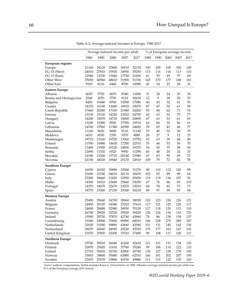
66 How Unequal Is Europe?
Table A.2: Average national incomes in Europe, 1980-2017
Average national income per adult % of European average income
1980 1990 2000 2007 2017 1980 1990 2000 2007 2017
European regionsEurope 21160 24120 27600 30910 32130 100 100 100 100 100EU-15 (West) 24010 27810 31930 34950 35250 113 116 116 113 110EU-13 (East) 12940 13230 13440 17720 21690 61 55 49 57 68Other West 35050 40960 48610 51900 51700 165 170 177 168 161Other East 9100 8110 6460 8700 10080 43 34 23 28 31
Eastern EuropeAlbania 6630 5720 6670 9340 11000 31 24 24 30 34Bosnia and Herzegovina 2540 2070 7750 9110 10630 12 9 28 30 33Bulgaria 8450 10440 8760 12500 17080 40 43 32 41 53Croatia 18370 16190 13680 18910 19070 87 67 50 61 59Czech Republic 17660 20280 17100 21980 24260 83 84 62 71 76Estonia 13130 15120 14320 23010 24700 62 63 52 75 77Hungary 14200 15070 14710 18690 20890 67 63 53 61 65Latvia 13180 15280 8920 17350 19510 62 64 32 56 61Lithuania 14760 15560 11380 20390 24620 70 65 41 66 77Macedonia 11160 9630 8680 9110 11140 53 40 32 30 35Moldova 6010 6530 2350 3570 4880 28 27 9 12 15Montenegro 19710 15160 10720 13560 15750 93 63 39 44 49Poland 11550 10480 14630 17200 22510 55 44 53 56 70Romania 11400 11920 10120 14830 19370 54 50 37 48 60Serbia 12690 11520 6520 9950 11290 60 48 24 32 35Slovakia 14180 15260 13710 20140 23980 67 63 50 65 75Slovenia 22150 18020 19840 25170 24910 105 75 72 82 78
Southern EuropeCyprus 16950 26320 30890 37000 31270 80 110 112 120 98Greece 21690 22180 24610 30110 20670 102 92 89 98 64Italy 25280 28660 31820 32950 29450 119 119 116 107 92Malta 14300 18310 23680 25660 33050 67 76 86 83 103Portugal 14370 18670 22670 23070 23010 68 78 82 75 72Spain 18770 23300 27230 29340 30230 89 97 99 95 94
Western EuropeAustria 25400 29640 34700 38960 38930 120 123 126 126 121Belgium 24850 29130 34380 37010 37610 117 121 125 120 117France 24690 28480 32980 34930 35130 117 118 120 113 110Germany 26740 29820 32520 35920 39420 126 124 118 116 123Ireland 15590 20730 37870 42740 43960 74 86 138 139 137Luxembourg 31040 54900 75660 89090 60010 146 228 275 289 187Netherlands 32030 31590 39890 43840 43580 151 131 145 142 136Switzerland 36070 42640 44940 45220 45530 170 177 163 147 142United Kingdom 21070 25850 32300 37010 37490 99 108 117 120 117
Northern EuropeDenmark 25740 29010 36040 41430 42410 121 121 131 134 132Finland 20970 25420 31410 37760 35240 99 106 114 122 110Iceland 27510 30430 35330 42800 45740 130 127 128 139 143Norway 33810 38800 55480 63880 62510 160 161 202 207 195Sweden 23470 27670 33860 41530 45880 111 115 123 135 143
Source: authors’ computations. Serbia includes Kosovo. Interpretation: in 1980, Albania’s average national income per adult was31% of the European average (69% lower).
WID.world Working Paper 2019–6

67 How Unequal Is Europe?
Table A.3: Shares of total European income received by richversus poor countries in Europe, 1980-2017
Country groups National income share (%)
(deciles) 1980 1989 2000 2007 2017
1 4.6 % 4.4 % 3.0 % 3.9 % 4.8 %2 5.9 % 5.6 % 5.2 % 5.8 % 6.8 %3 7.8 % 8.0 % 7.7 % 8.2 % 7.9 %4 9.4 % 9.6 % 10.5 % 10.0 % 9.2 %5 10.0 % 10.8 % 11.6 % 10.8 % 9.9 %6 11.2 % 11.4 % 11.7 % 11.3 % 11.0 %7 11.7 % 11.7 % 11.8 % 11.6 % 11.7 %8 11.9 % 11.9 % 11.9 % 11.8 % 12.1 %9 13.0 % 12.7 % 12.1 % 12.0 % 12.3 %
10 14.5 % 13.9 % 14.5 % 14.5 % 14.3 %
Source: authors’ computations. Interpretation: the poorest 10% countries inEurope (mainly Bosnia and Herzegovina, Albania, Moldova, Macedonia andBulgaria) received 2.2% of European national income in 1980.
Table A.4: Annual income growth rates of rich versus poor countriesin Europe, 1980-2017
Country groups Average annual income growth (%)
(deciles) 1980-1989 1989-2000 2000-2007 2007-2017
1 1.0 % -2.2 % 5.6 % 2.4 %2 1.0 % 0.4 % 3.2 % 2.1 %3 1.7 % 0.8 % 2.5 % 0.1 %4 1.7 % 2.0 % 0.9 % -0.4 %5 2.2 % 1.9 % 0.6 % -0.5 %6 1.7 % 1.5 % 1.1 % 0.1 %7 1.4 % 1.3 % 1.4 % 0.4 %8 1.4 % 1.2 % 1.5 % 0.6 %9 1.2 % 0.8 % 1.6 % 0.6 %10 0.9 % 1.7 % 1.6 % 0.2 %
Source: authors’ computations based on data from the World Inequality Database.Interpretation: the average incomes of the poorest 10% countries in Europe (weighedby their adult population) grew by 1% per year on average between 1980 and 1989.
WID.world Working Paper 2019–6

68 How Unequal Is Europe?
Table A.5: Performances of European countries in reducing inequalities, 1980-2017: bottom40% versus average growth rates
Difference between bottom 40% growth and average growth
1980-2017 1980-1990 1990-2000 2000-2007 2007-2017
Eastern EuropeAlbania 0.6 6.3Bosnia and Herzegovina -70.7 -0.4 -47.8 -3.0 -2.0Bulgaria -73.6 -0.5 -20.2 -13.4 -9.7Croatia -1.8 -7.6 3.9 -2.8 4.9Czech Republic -30.4 -4.4 -10.4 -6.0 -3.5Estonia -43.7 -17.0 -16.0 1.7 7.8Hungary -54.3 -7.5 -13.1 -24.0 -3.7Kosovo -1.5 15.2Latvia -37.2 -2.6 -11.6 -13.4 2.8Lithuania -51.7 -7.1 -11.3 -7.9 -10.2Macedonia -21.2 -0.8 -26.8 1.6 14.0Moldova -6.5 10.8 33.7Montenegro -8.9 -0.3 -5.7 -6.9 3.2Poland -60.7 -3.0 -28.8 -12.0 -0.1Romania -53.3 -0.3 -15.4 -38.2 18.1Serbia -28.3 -2.8 -10.6 -14.6 -4.6Slovakia -15.7 2.5 -12.2 -2.1 4.7Slovenia -28.7 0.0 -20.1 -3.0 -6.6
Southern EuropeCyprus 4.8 1.2 -10.1Greece 34.8 -12.0Italy -25.5 -7.9 -11.9 0.9 -6.1Malta 2.6 -16.8Portugal -36.1 -13.9 -16.0 0.0 -0.1Spain 0.6 -2.9 7.7 -2.1 -1.8
Western EuropeAustria -6.7 0.2 2.4 -0.0 -6.3Belgium -14.9 -1.7 -6.1 -1.1 -2.5East Germany 4.1France -9.4 -11.8 -1.0 3.1 1.9Germany -32.3 -5.9 -4.5 -13.7 -3.2Ireland -55.5 -0.9 -17.7 -5.3 -6.3Luxembourg -21.7 -1.0 -5.8 -6.5 -0.9Netherlands -16.8 -3.9 10.3 -13.1 -4.1Switzerland -9.5 -3.4 -1.0 -0.9 -3.0United Kingdom -9.7 -15.0 -1.0 -1.0 9.6
Northern EuropeDenmark -15.8 -3.0 -1.1 4.3 -9.9Finland -9.2 7.9 -2.4 -1.1 -8.1Iceland -6.5 11.3Norway 1.7 20.2 -17.6 -2.9 0.4Sweden -23.0 5.6 -0.3 -10.9 -8.1
Source: authors’ computations.
WID.world Working Paper 2019–6

69 How Unequal Is Europe?
Table A.6: Performances of European countries in reducing inequalities, 1980-2017: top 10%versus bottom 50% growth rates
Difference between bottom 50% growth and top 10% growth
1980-2017 1980-1990 1990-2000 2000-2007 2007-2017
Eastern EuropeAlbania 2.8 12.0Bosnia and Herzegovina -162.3 1.1 -127.5 -6.2 -1.3Bulgaria -220.6 -24.9 -45.2 -12.2 -23.1Croatia -17.0 -16.3 -2.6 -3.3 8.4Czech Republic -110.1 -20.4 -37.1 -8.0 -6.6Estonia -100.2 -49.2 -39.8 10.8 23.3Hungary -176.7 -33.7 -40.3 -52.5 7.0Kosovo -6.0 24.0Latvia -100.8 -10.0 -33.6 2.5 -3.8Lithuania -125.5 -22.9 -23.9 -15.4 -11.5Macedonia -35.0 0.9 -36.1 -4.4 11.3Moldova -13.9 16.9 46.3Montenegro -24.2 1.3 -15.9 -11.6 0.1Poland -206.1 -12.1 -88.8 -23.3 -0.7Romania -111.3 -2.2 -40.5 -66.7 38.2Serbia -47.8 -3.6 -17.9 -20.5 -5.9Slovakia -37.7 3.1 -31.3 -4.1 13.5Slovenia -68.7 0.0 -49.1 -4.4 -11.8
Southern EuropeCyprus 13.9 4.5 -23.8Greece 45.3 -18.1Italy -53.2 -20.2 -24.0 0.4 -5.5Malta 11.5 -53.2Portugal -60.6 -26.6 -26.2 -2.1 5.5Spain -4.0 -4.5 11.4 -2.7 -6.3
Western EuropeAustria -22.2 -3.7 1.4 -4.2 -8.4Belgium -13.0 -4.5 -2.2 1.5 -4.6East Germany -6.6France -15.1 -15.7 -2.8 -0.6 6.3Germany -62.3 -17.2 -5.5 -28.1 1.0Ireland -154.7 0.7 -49.4 -10.2 -18.3Luxembourg -37.7 -3.7 -11.2 -16.7 3.0Netherlands -32.4 -2.2 7.5 -26.1 -3.6Switzerland -28.5 -3.0 -9.0 -4.3 -6.8United Kingdom -47.3 -22.3 -12.9 -11.5 13.4
Northern EuropeDenmark -68.4 -7.6 -14.0 7.9 -29.2Finland -52.6 12.9 -34.3 2.2 -15.4Iceland -31.6 29.7Norway -27.1 32.3 -65.1 1.0 -1.1Sweden -71.9 3.0 -22.6 -16.0 -7.3
Source: authors’ computations.
WID.world Working Paper 2019–6

70 How Unequal Is Europe?
Figure A.1: Contributions to EU budget vs. net foreign incomes in the EU, 2017
(a) Contributions to EU budget (% GDP), 2017
−0.5
0.0
0.5
1.0
1.5
(b) Net Foreign incomes in the EU (% GDP), 2017
−5.0
−2.5
0.0
2.5
5.0
Figure A.2: Average incomes in Europe, 1980-2017: East vs. West
25
50
75
100
125
150
175
Aver
age
inco
me
per a
dult
(in %
of E
U-15
avg
. inc
ome
per a
dult)
1980 1985 1990 1995 2000 2005 2010 2015
East EU-13 Other EasternOther Rich
WID.world Working Paper 2019–6
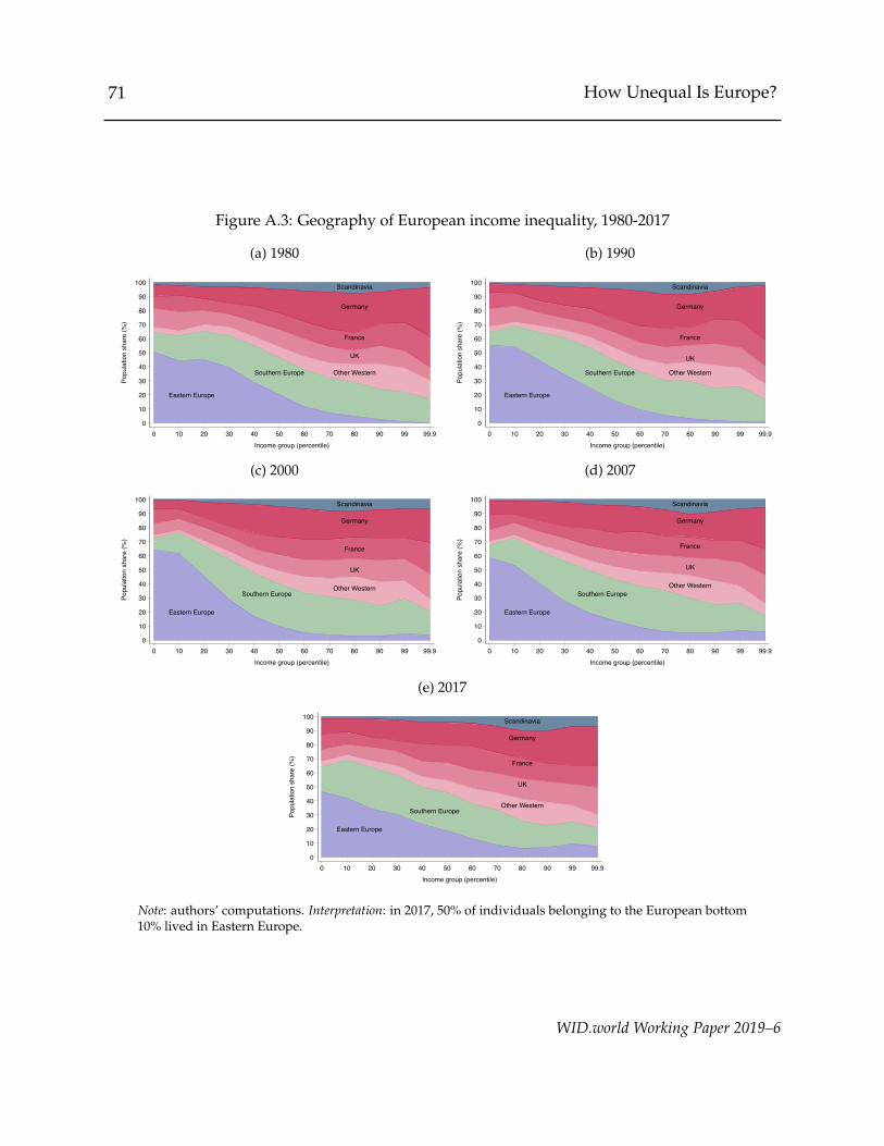
71 How Unequal Is Europe?
Figure A.3: Geography of European income inequality, 1980-2017
(a) 1980
Eastern Europe
Southern Europe Other Western
UK
France
Germany
Scandinavia
0
10
20
30
40
50
60
70
80
90
100
Popu
latio
n sh
are
(%)
0 10 20 30 40 50 60 70 80 90 99 99.9Income group (percentile)
(b) 1990
Eastern Europe
Southern Europe Other Western
UK
France
Germany
Scandinavia
0
10
20
30
40
50
60
70
80
90
100
Popu
latio
n sh
are
(%)
0 10 20 30 40 50 60 70 80 90 99 99.9Income group (percentile)
(c) 2000
Eastern Europe
Southern EuropeOther Western
UK
France
Germany
Scandinavia
0
10
20
30
40
50
60
70
80
90
100
Popu
latio
n sh
are
(%)
0 10 20 30 40 50 60 70 80 90 99 99.9Income group (percentile)
(d) 2007
Eastern Europe
Southern EuropeOther Western
UK
France
Germany
Scandinavia
0
10
20
30
40
50
60
70
80
90
100
Popu
latio
n sh
are
(%)
0 10 20 30 40 50 60 70 80 90 99 99.9Income group (percentile)
(e) 2017
Eastern Europe
Southern EuropeOther Western
UK
France
Germany
Scandinavia
0
10
20
30
40
50
60
70
80
90
100
Popu
latio
n sh
are
(%)
0 10 20 30 40 50 60 70 80 90 99 99.9Income group (percentile)
Note: authors’ computations. Interpretation: in 2017, 50% of individuals belonging to the European bottom10% lived in Eastern Europe.
WID.world Working Paper 2019–6

72H
owU
nequalIsEurope?
Table A.7: Average state incomes in the US, 1980-2017
Average state income per adult % of US average income
1980 1990 2000 2007 2017 1980 1990 2000 2007 2017
Alabama 25360 29540 34630 38170 38080 80 79 74 76 74Alaska 106640 82770 60140 79880 78540 336 221 128 159 152Arizona 30210 32330 42220 45480 40300 95 86 90 90 78Arkansas 24130 27640 33540 36240 38540 76 74 71 72 74California 35850 43060 53090 57590 58390 113 115 113 115 113Colorado 35050 38240 54440 53960 54560 110 102 116 107 105Connecticut 33710 48070 62880 69310 63620 106 128 134 138 123Delaware 35300 48520 73120 67740 66300 111 130 155 135 128District of Columbia 76470 99010 127110 157240 157160 241 264 270 313 303Florida 24780 31070 38410 42310 38300 78 83 82 84 74Georgia 28300 36610 49210 48320 46480 89 98 105 96 90Hawaii 37000 47530 43280 50520 50510 117 127 92 101 98Idaho 30030 32120 40420 40070 38920 95 86 86 80 75Illinois 33800 40210 51610 53780 55690 107 107 110 107 108Indiana 29130 33230 44130 45110 47870 92 89 94 90 92Iowa 31830 33620 42110 48380 53390 100 90 90 96 103Kansas 31760 35290 42920 47390 50530 100 94 91 94 98Kentucky 27660 30890 36470 38230 40310 87 82 78 76 78Louisiana 42720 39080 39890 50950 50580 135 104 85 101 98Maine 24330 30920 36560 37610 37850 77 83 78 75 73Maryland 29570 38050 46700 52900 55550 93 102 99 105 107Massachusetts 31150 41830 57180 60100 62940 98 112 122 120 122Michigan 30600 34660 46120 42310 42470 96 93 98 84 82
WID
.world
Working
Paper2019–6

73H
owU
nequalIsEurope?
Table A.7: Average state incomes in the US, 1980-2017
Average state income per adult % of US average income
1980 1990 2000 2007 2017 1980 1990 2000 2007 2017Minnesota 33080 39250 50820 52470 55920 104 105 108 104 108Mississippi 24310 26340 31230 33900 34290 77 70 66 67 66Missouri 28220 33450 43790 42990 44500 89 89 93 86 86Montana 31170 28580 31980 38940 41930 98 76 68 77 81Nebraska 31410 36320 44350 49390 58960 99 97 94 98 114Nevada 37430 41800 49140 53480 44630 118 112 104 106 86New Hampshire 26590 34930 47160 48090 49260 84 93 100 96 95New Jersey 31030 43910 54670 57450 57200 98 117 116 114 110New Mexico 34180 30770 40940 43550 44000 108 82 87 87 85New York 34690 43880 55880 59870 65620 109 117 119 119 127North Carolina 26670 34250 43750 45690 45590 84 91 93 91 88North Dakota 32270 30840 37000 46480 78220 102 82 79 92 151Ohio 29970 34540 44950 44840 48690 94 92 96 89 94Oklahoma 33190 31030 34800 42630 50080 105 83 74 85 97Oregon 29760 32670 43900 47280 47460 94 87 93 94 92Pennsylvania 27600 32970 41950 45620 49770 87 88 89 91 96Rhode Island 26010 34170 41760 46520 47040 82 91 89 93 91South Carolina 24320 31270 37260 37700 37430 77 83 79 75 72South Dakota 27370 32260 41090 48210 53380 86 86 87 96 103Tennessee 26120 31610 40710 41090 43360 82 84 87 82 84Texas 39010 38520 47860 54370 59850 123 103 102 108 116Utah 32030 35380 45550 52260 51140 101 94 97 104 99Vermont 25530 34320 38670 40760 43230 80 92 82 81 83
WID
.world
Working
Paper2019–6

74H
owU
nequalIsEurope?
Table A.7: Average state incomes in the US, 1980-2017
Average state income per adult % of US average income
1980 1990 2000 2007 2017 1980 1990 2000 2007 2017Virginia 28980 38120 48400 52800 52360 91 102 103 105 101Washington 33320 40260 52050 55690 57120 105 107 111 111 110West Virginia 25310 25360 29460 32440 36960 80 68 63 65 71Wisconsin 30230 34190 44100 45410 48000 95 91 94 90 93Wyoming 61790 49820 46660 71810 69150 195 133 99 143 133
Source: authors’ computations. Average state incomes per adult are expressed in 2017 dollars. Interpretation: in 2017, the averagenational income per adult in the state of Wyoming was about 88,000 dollars, corresponding to 111% of the United States’ averagenational income per adult.
WID
.world
Working
Paper2019–6

75 How Unequal Is Europe?
Figure A.4: Distributions of national/states incomes in Europe andthe US, 1980-2017
0 %
25 %
50 %
75 %
100 %
125 %
150 %
175 %
200 %
Aver
age
stat
e or
nat
iona
l inc
ome
(% o
f ave
rage
regi
onal
inco
me)
1 2 3 4 5 6 7 8 9 10Country/State group (decile)
Europe (1980) Europe (1990) Europe (2007) Europe (2017)US (1980) US (1990) US (2007) US (2017)
Source: authors’ computations. Interpretation: between 1980 and 2017, the poorest 10% countriesin Europe have always earned less than 40% of the average European income. Meanwhile, in theUS, the poorest 10% states have always earned more than 75% of the average federal income.
Table A.8: Redistribution in different parts of the distribution, 2010–2017
Relative decrease through taxes and social assistance
top 10%/bottom 50% top 1%/bottom 50% top 10%/middle 40% top 1%/middle 40% middle 40%/bottom 50%
Western Europe 29.9% 34.1% 13.8% 18.9% 18.7%Eastern Europe 13.5% 13.8% 5.2% 5.5% 8.9%Southern Europe 21.5% 31.5% 14.9% 25.7% 7.8%Northern Europe 21.6% 24.9% 11.4% 15% 11.6%United States 38.2% 39.1% 13.1% 14.4% 28.9%
Source: authors’ computations. Interpretation: In Western Europe, taxes and social assistance benefits decrease the ratio of the mean income of the top 10% to the mean incomeof the bottom 50% by 29.9% on average.
WID.world Working Paper 2019–6

76 How Unequal Is Europe?
Table A.9: Share of imputed rents and retained earningsthat belong to the top 10% of income earners
country imputed rents retained earnings
Austria 16% 56%Belgium 15% 25%Cyprus 16% 39%Estonia 19% 37%Finland 19% 75%France 19% 69%Germany 18% 47%Greece 16% 62%Hungary 14% 62%Ireland 15% 56%Italy 15% 62%Latvia 17% 68%Luxembourg 17% 53%Malta 11% 73%Netherlands 22% 24%Poland 19% 52%Portugal 20% 57%Slovak Republic 14% 49%Slovenia 14% 34%Spain 15% 48%
Source: authors’ computations using calibrated HFCS and EU-SILCdata. Interpretation: In Austria, the top 10% of pre-tax income earn-ers excluding imputed rents and retained earnings earned 16% ofthe economy’s imputed rents, and 56% of the economy’s retainedearnings of corporations.
WID.world Working Paper 2019–6

77 How Unequal Is Europe?
Table A.10: Mean relative error on the average by percentile when imputing pre-tax and post-taxincome by adults from a different concept using the machine learning algorithm
mean relative prediction error
income/consumption concept statistical unit pre-tax income post-tax income
consumption equal-split per adults 10.1% 10.6%consumption equal-split per capita 10.6% 10.7%consumption households 11.0% 9.4%consumption OECD equivalence scale 9.8% 10.4%consumption square root equivalence scale 9.8% 9.8%
pre-tax income equal-split per adults n/a 5.7%pre-tax income equal-split per capita 4.2% 6.1%pre-tax income households 3.9% 6.8%pre-tax income OECD equivalence scale 2.6% 6.1%pre-tax income square root equivalence scale 2.8% 6.2%
post-tax equal-split per adults 5.8% n/apost-tax equal-split per capita 7.0% 3.8%post-tax households 7.1% 4.1%post-tax OECD equivalence scale 6.1% 2.2%post-tax square root equivalence scale 6.0% 2.7%
Source: authors’ computations. Note: Error calculated only for the top 90% of the distributions to avoid problems ofdenominator equal to zero. Interpretation: When trying to impute pre-tax income per equal-split adult from consumption perhousehold, the mean relative error for the average income of a given percentile is 11%.
WID.world Working Paper 2019–6