how to get the most out of monitor
TRANSCRIPT

PERSON CENTRED SOFTWARE | HOW TO GET THE MOST OUT OF MONITOR | PAGE 1
Mobile Care Monitoring How to get the most out of Monitor
August 2018
PERSON CENTRED SOFTWARE | HOW TO GET THE MOST OUT OF MONITOR | PAGE 2
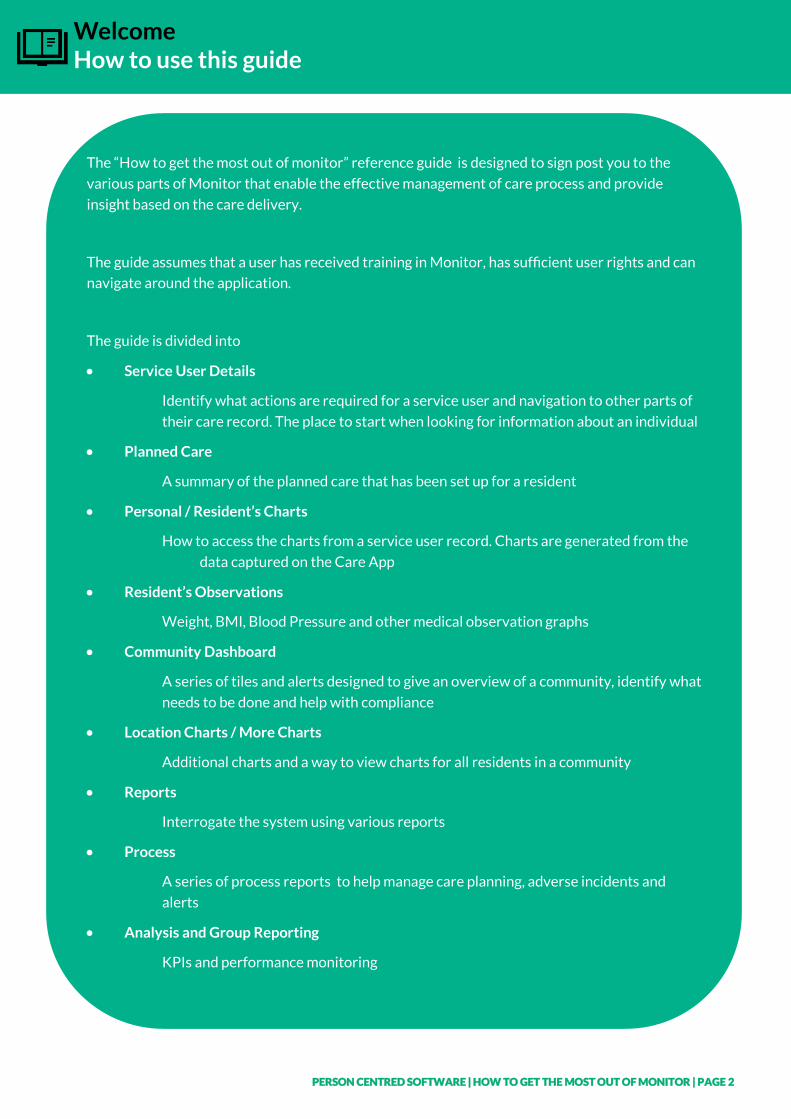
Welcome How to use this guide
The “How to get the most out of monitor” reference guide is designed to sign post you to the
various parts of Monitor that enable the effective management of care process and provide
insight based on the care delivery.
The guide assumes that a user has received training in Monitor, has sufficient user rights and can
navigate around the application.
The guide is divided into
• Service User Details
Identify what actions are required for a service user and navigation to other parts of
their care record. The place to start when looking for information about an individual
• Planned Care
A summary of the planned care that has been set up for a resident
• Personal / Resident’s Charts
How to access the charts from a service user record. Charts are generated from the
data captured on the Care App
• Resident’s Observations
Weight, BMI, Blood Pressure and other medical observation graphs
• Community Dashboard
A series of tiles and alerts designed to give an overview of a community, identify what
needs to be done and help with compliance
• Location Charts / More Charts
Additional charts and a way to view charts for all residents in a community
• Reports
Interrogate the system using various reports
• Process
A series of process reports to help manage care planning, adverse incidents and
alerts
• Analysis and Group Reporting
KPIs and performance monitoring
PERSON CENTRED SOFTWARE | HOW TO GET THE MOST OUT OF MONITOR | PAGE 3
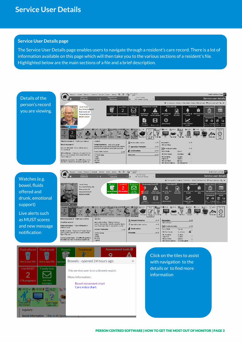
Service User Details
Service User Details page
The Service User Details page enables users to navigate through a resident’s care record. There is a lot of
information available on this page which will then take you to the various sections of a resident’s file.
Highlighted below are the main sections of a file and a brief description.
Details of the
person’s record
you are viewing.
Watches (e.g.
bowel, fluids
offered and
drunk, emotional
support)
Live alerts such
as MUST scores
and new message
notification
Click on the tiles to assist
with navigation to the
details or to find more
information
PERSON CENTRED SOFTWARE | HOW TO GET THE MOST OUT OF MONITOR | PAGE 4
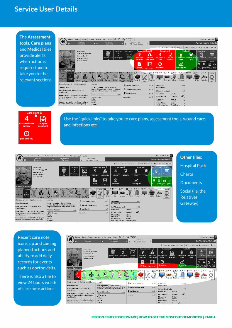
Service User Details
The Assessment
tools, Care plans
and Medical tiles
provide alerts
when action is
required and to
take you to the
relevant sections
Use the “quick links” to take you to care plans, assessment tools, wound care
and infections etc.
Other tiles:
Hospital Pack
Charts
Documents
Social (i.e. the
Relatives
Gateway)
Recent care note
icons, up and coming
planned actions and
ability to add daily
records for events
such as doctor visits.
There is also a tile to
view 24 hours worth
of care note actions
PERSON CENTRED SOFTWARE | HOW TO GET THE MOST OUT OF MONITOR | PAGE 5
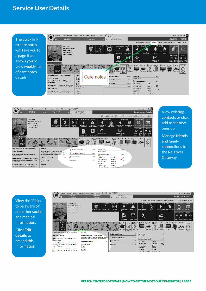
Service User Details
The quick link
to care notes
will take you to
a page that
allows you to
view weekly list
of care notes
details
View existing
contacts or click
add to set new
ones up.
Manage friends
and family
connections to
the Relatives
Gateway
View the “Risks
to be aware of”
and other social
and medical
information.
Click Edit
details to
amend this
information
PERSON CENTRED SOFTWARE | HOW TO GET THE MOST OUT OF MONITOR | PAGE 6
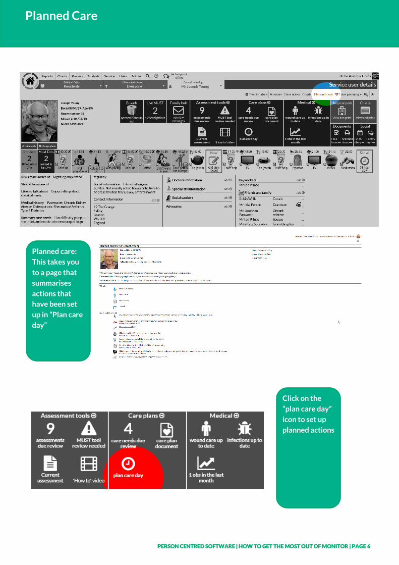
Planned Care
Planned care:
This takes you
to a page that
summarises
actions that
have been set
up in “Plan care
day”
Click on the
“plan care day”
icon to set up
planned actions
PERSON CENTRED SOFTWARE | HOW TO GET THE MOST OUT OF MONITOR | PAGE 7
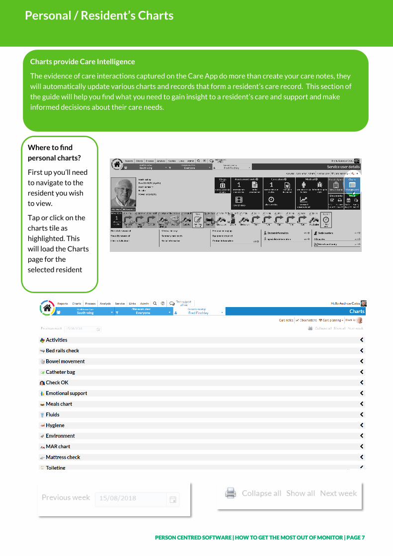
Personal / Resident’s Charts
Charts provide Care Intelligence
The evidence of care interactions captured on the Care App do more than create your care notes, they
will automatically update various charts and records that form a resident’s care record. This section of
the guide will help you find what you need to gain insight to a resident’s care and support and make
informed decisions about their care needs.
Where to find
personal charts?
First up you’ll need
to navigate to the
resident you wish
to view.
Tap or click on the
charts tile as
highlighted. This
will load the Charts
page for the
selected resident
PERSON CENTRED SOFTWARE | HOW TO GET THE MOST OUT OF MONITOR | PAGE 8
Personal / Resident’s Charts
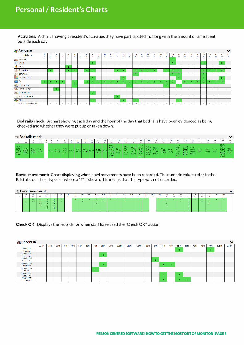
Activities: A chart showing a resident’s activities they have participated in, along with the amount of time spent outside each day
Bed rails check: A chart showing each day and the hour of the day that bed rails have been evidenced as being checked and whether they were put up or taken down.
Bowel movement: Chart displaying when bowl movements have been recorded. The numeric values refer to the Bristol stool chart types or where a “?” is shown, this means that the type was not recorded.
Check OK: Displays the records for when staff have used the “Check OK” action
PERSON CENTRED SOFTWARE | HOW TO GET THE MOST OUT OF MONITOR | PAGE 9
Personal / Resident’s Charts
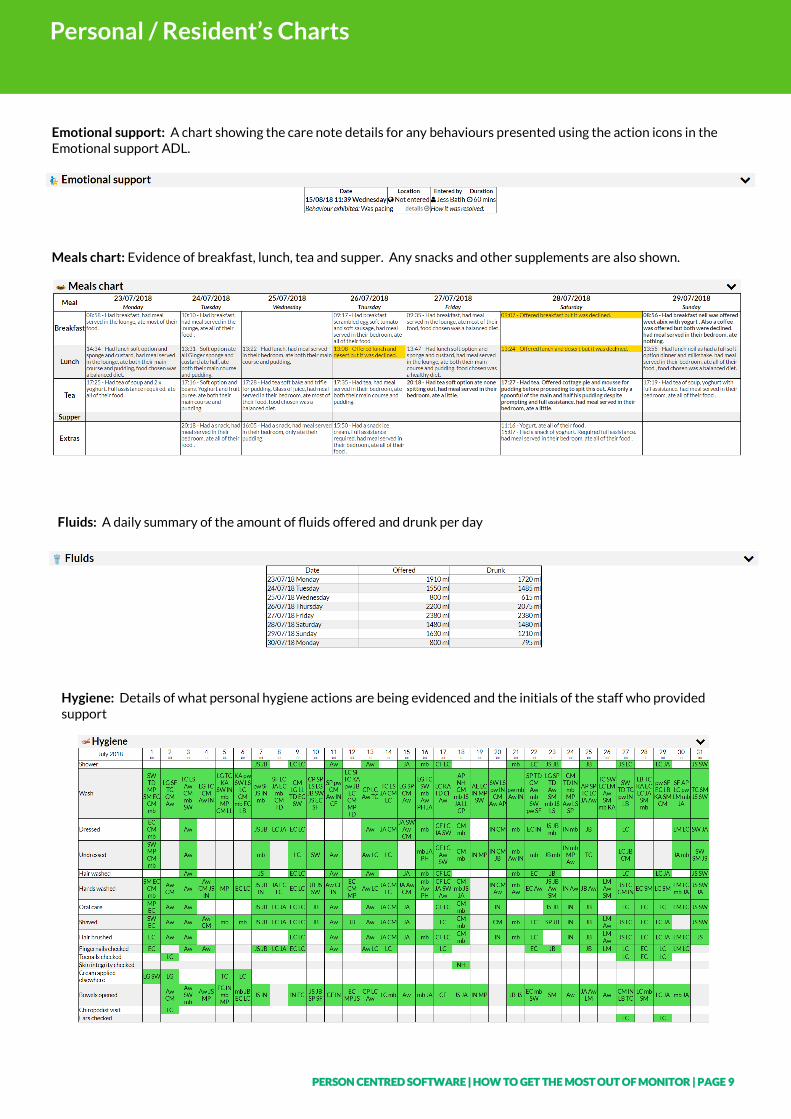
Emotional support: A chart showing the care note details for any behaviours presented using the action icons in the Emotional support ADL.
Meals chart: Evidence of breakfast, lunch, tea and supper. Any snacks and other supplements are also shown.
Fluids: A daily summary of the amount of fluids offered and drunk per day
Hygiene: Details of what personal hygiene actions are being evidenced and the initials of the staff who provided support
PERSON CENTRED SOFTWARE | HOW TO GET THE MOST OUT OF MONITOR | PAGE 10 www.personcentredsoftware.com
Personal / Resident’s Charts
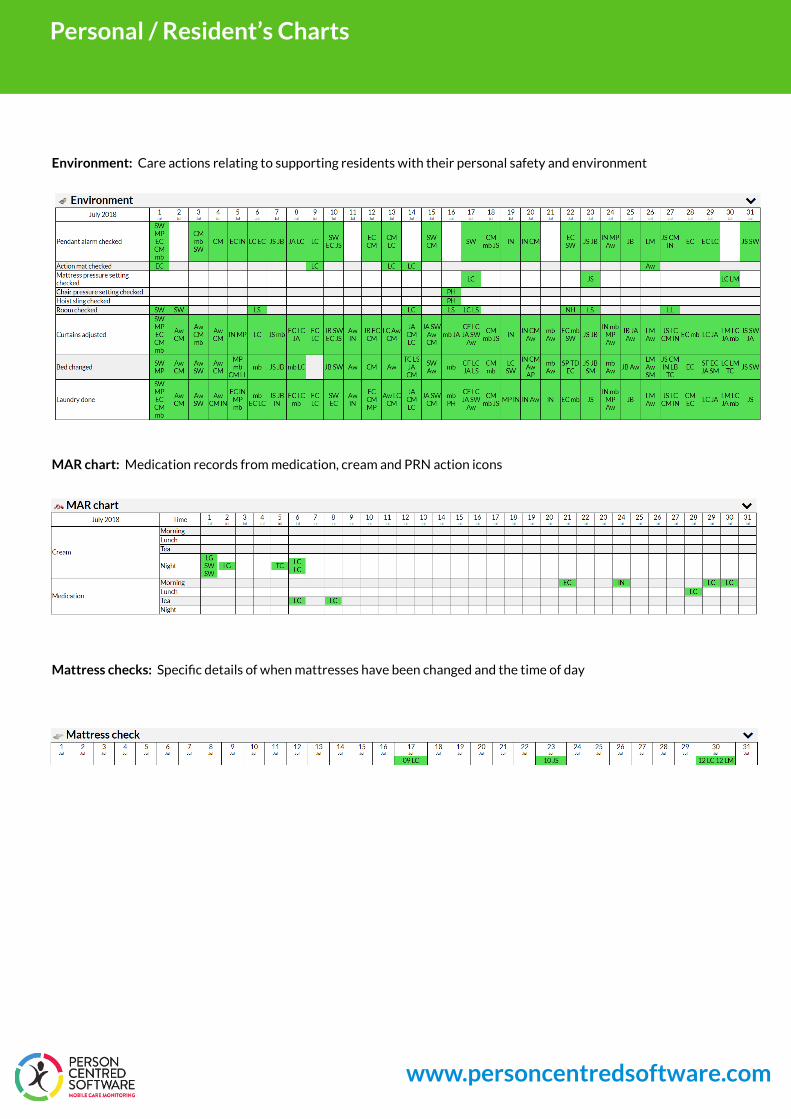
Environment: Care actions relating to supporting residents with their personal safety and environment
MAR chart: Medication records from medication, cream and PRN action icons
Mattress checks: Specific details of when mattresses have been changed and the time of day
PERSON CENTRED SOFTWARE | HOW TO GET THE MOST OUT OF MONITOR | PAGE 11
Personal / Resident’s Charts
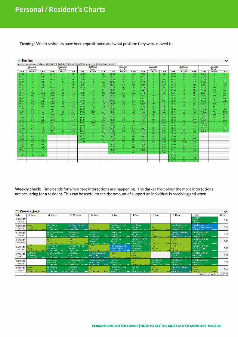
Turning: When residents have been repositioned and what position they were moved to
Weekly check: Time bands for when care interactions are happening. The darker the colour the more interactions are occurring for a resident. This can be useful to see the amount of support an individual is receiving and when.
PERSON CENTRED SOFTWARE | HOW TO GET THE MOST OUT OF MONITOR | PAGE 12
Resident’s Observations
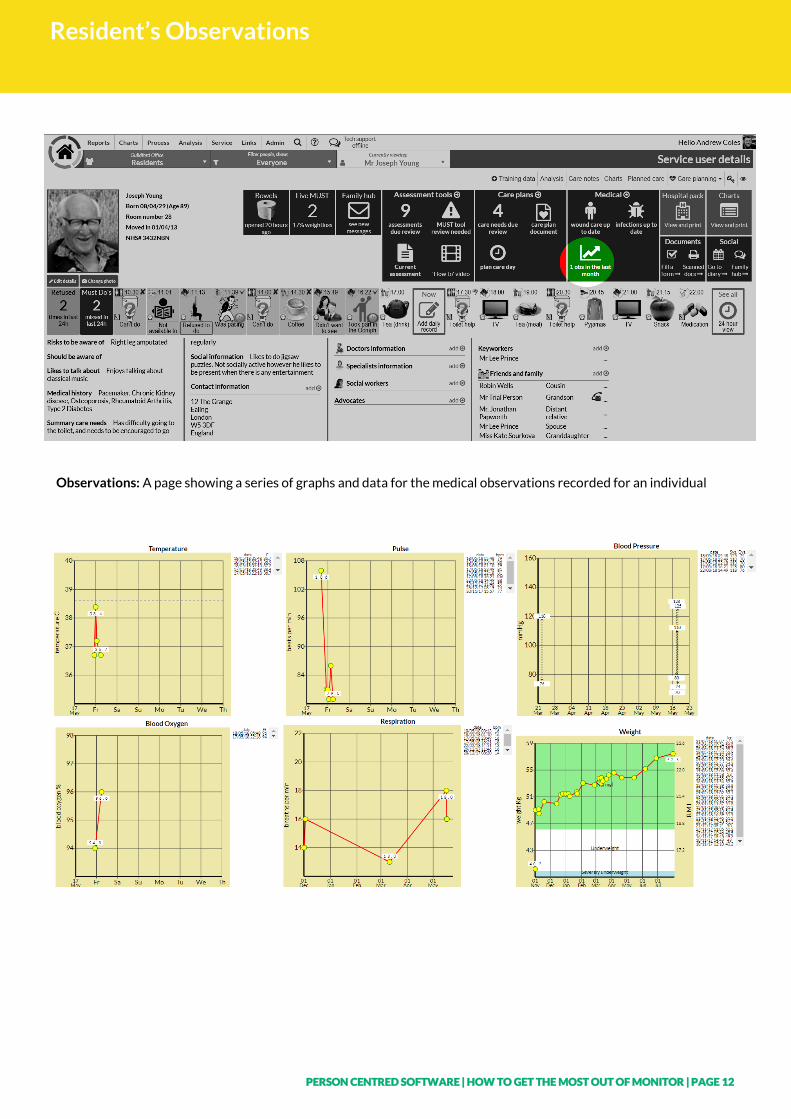
Observations: A page showing a series of graphs and data for the medical observations recorded for an individual
PERSON CENTRED SOFTWARE | HOW TO GET THE MOST OUT OF MONITOR | PAGE 13
Community Dashboard
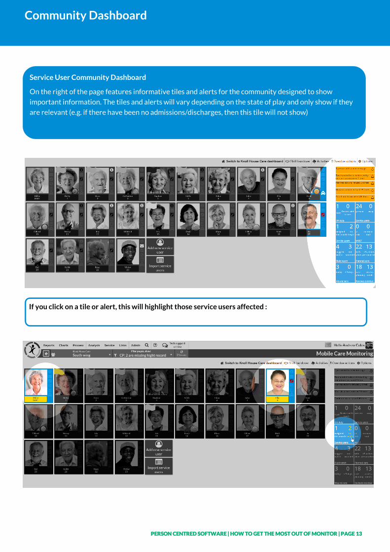
Service User Community Dashboard
On the right of the page features informative tiles and alerts for the community designed to show
important information. The tiles and alerts will vary depending on the state of play and only show if they
are relevant (e.g. if there have been no admissions/discharges, then this tile will not show)
If you click on a tile or alert, this will highlight those service users affected :
PERSON CENTRED SOFTWARE | HOW TO GET THE MOST OUT OF MONITOR | PAGE 14
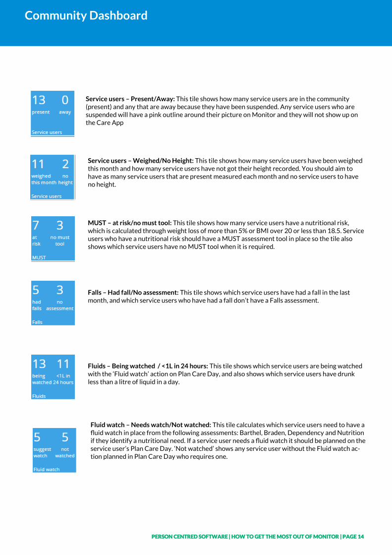
Community Dashboard
Service users – Present/Away: This tile shows how many service users are in the community (present) and any that are away because they have been suspended. Any service users who are suspended will have a pink outline around their picture on Monitor and they will not show up on the Care App
Service users – Weighed/No Height: This tile shows how many service users have been weighed this month and how many service users have not got their height recorded. You should aim to have as many service users that are present measured each month and no service users to have no height.
MUST – at risk/no must tool: This tile shows how many service users have a nutritional risk, which is calculated through weight loss of more than 5% or BMI over 20 or less than 18.5. Service users who have a nutritional risk should have a MUST assessment tool in place so the tile also shows which service users have no MUST tool when it is required.
Falls – Had fall/No assessment: This tile shows which service users have had a fall in the last month, and which service users who have had a fall don’t have a Falls assessment.
Fluids – Being watched / <1L in 24 hours: This tile shows which service users are being watched with the ‘Fluid watch’ action on Plan Care Day, and also shows which service users have drunk less than a litre of liquid in a day.
Fluid watch – Needs watch/Not watched: This tile calculates which service users need to have a fluid watch in place from the following assessments: Barthel, Braden, Dependency and Nutrition if they identify a nutritional need. If a service user needs a fluid watch it should be planned on the service user’s Plan Care Day. ‘Not watched’ shows any service user without the Fluid watch ac-tion planned in Plan Care Day who requires one.
PERSON CENTRED SOFTWARE | HOW TO GET THE MOST OUT OF MONITOR | PAGE 15
Community Dashboard
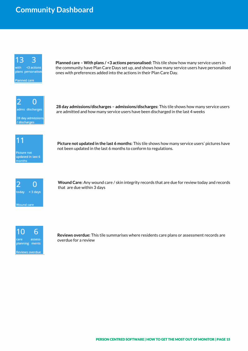
Planned care – With plans / <3 actions personalised: This tile show how many service users in the community have Plan Care Days set up, and shows how many service users have personalised ones with preferences added into the actions in their Plan Care Day.
28 day admissions/discharges – admissions/discharges: This tile shows how many service users are admitted and how many service users have been discharged in the last 4 weeks
Picture not updated in the last 6 months: This tile shows how many service users’ pictures have not been updated in the last 6 months to conform to regulations.
Wound Care: Any wound care / skin integrity records that are due for review today and records that are due within 3 days
Reviews overdue: This tile summarises where residents care plans or assessment records are overdue for a review
PERSON CENTRED SOFTWARE | HOW TO GET THE MOST OUT OF MONITOR | PAGE 16
Location Charts / More Charts
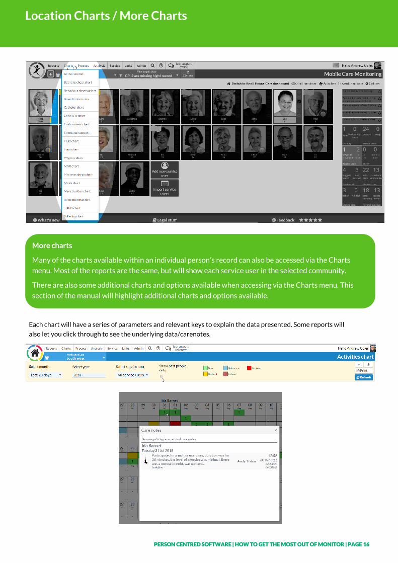
More charts
Many of the charts available within an individual person’s record can also be accessed via the Charts
menu. Most of the reports are the same, but will show each service user in the selected community.
There are also some additional charts and options available when accessing via the Charts menu. This
section of the manual will highlight additional charts and options available.
Each chart will have a series of parameters and relevant keys to explain the data presented. Some reports will
also let you click through to see the underlying data/carenotes.
PERSON CENTRED SOFTWARE | HOW TO GET THE MOST OUT OF MONITOR | PAGE 17
Location Charts / More Charts
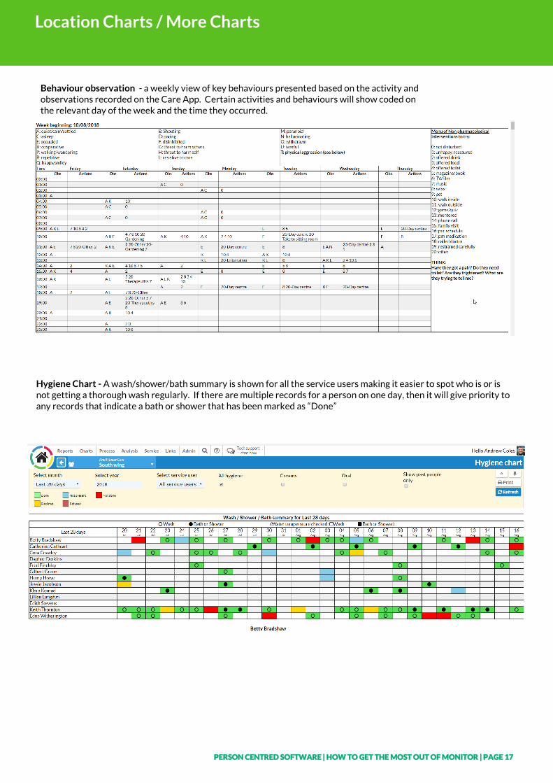
Behaviour observation - a weekly view of key behaviours presented based on the activity and observations recorded on the Care App. Certain activities and behaviours will show coded on the relevant day of the week and the time they occurred.
Hygiene Chart - A wash/shower/bath summary is shown for all the service users making it easier to spot who is or is not getting a thorough wash regularly. If there are multiple records for a person on one day, then it will give priority to any records that indicate a bath or shower that has been marked as “Done”
PERSON CENTRED SOFTWARE | HOW TO GET THE MOST OUT OF MONITOR | PAGE 18
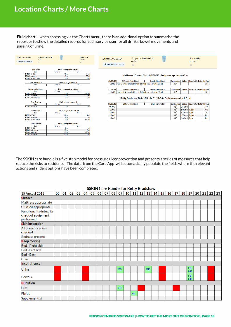
Location Charts / More Charts
Fluid chart— when accessing via the Charts menu, there is an additional option to summarise the report or to show the detailed records for each service user for all drinks, bowel movements and passing of urine.
The SSKIN care bundle is a five step model for pressure ulcer prevention and presents a series of measures that help reduce the risks to residents. The data from the Care App will automatically populate the fields where the relevant actions and sliders options have been completed.
PERSON CENTRED SOFTWARE | HOW TO GET THE MOST OUT OF MONITOR | PAGE 19
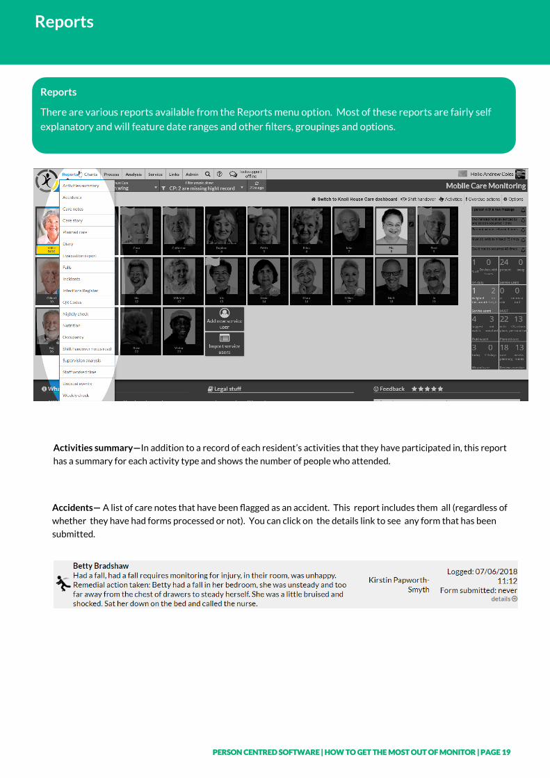
Reports
Reports
There are various reports available from the Reports menu option. Most of these reports are fairly self
explanatory and will feature date ranges and other filters, groupings and options.
Activities summary—In addition to a record of each resident’s activities that they have participated in, this report
has a summary for each activity type and shows the number of people who attended.
Accidents— A list of care notes that have been flagged as an accident. This report includes them all (regardless of
whether they have had forms processed or not). You can click on the details link to see any form that has been
submitted.
PERSON CENTRED SOFTWARE | HOW TO GET THE MOST OUT OF MONITOR | PAGE 20
Reports
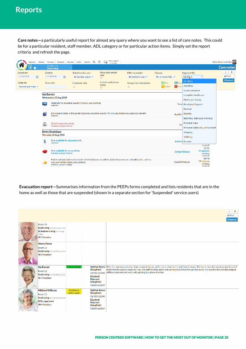
Care notes—a particularly useful report for almost any query where you want to see a list of care notes. This could
be for a particular resident, staff member, ADL category or for particular action items. Simply set the report
criteria and refresh the page.
Evacuation report—Summarises information from the PEEPs forms completed and lists residents that are in the
home as well as those that are suspended (shown in a separate section for ‘Suspended’ service users)
PERSON CENTRED SOFTWARE | HOW TO GET THE MOST OUT OF MONITOR | PAGE 21
Reports
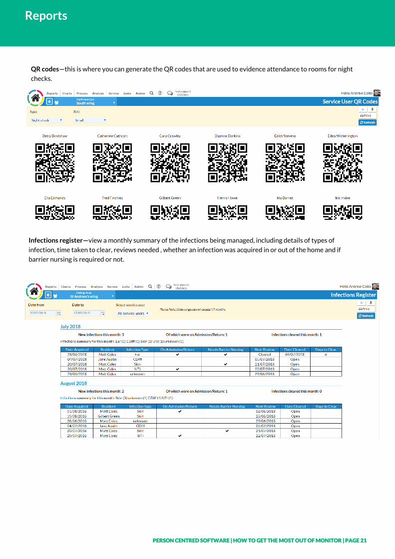
Infections register—view a monthly summary of the infections being managed, including details of types of
infection, time taken to clear, reviews needed , whether an infection was acquired in or out of the home and if
barrier nursing is required or not.
QR codes—this is where you can generate the QR codes that are used to evidence attendance to rooms for night
checks.
PERSON CENTRED SOFTWARE | HOW TO GET THE MOST OUT OF MONITOR | PAGE 22
Reports
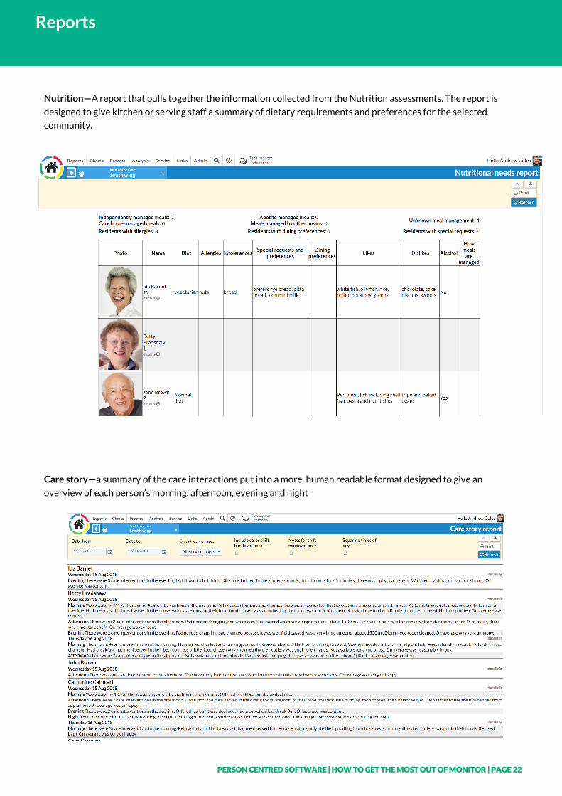
Nutrition—A report that pulls together the information collected from the Nutrition assessments. The report is
designed to give kitchen or serving staff a summary of dietary requirements and preferences for the selected
community.
Care story—a summary of the care interactions put into a more human readable format designed to give an
overview of each person’s morning, afternoon, evening and night
PERSON CENTRED SOFTWARE | HOW TO GET THE MOST OUT OF MONITOR | PAGE 23
Reports
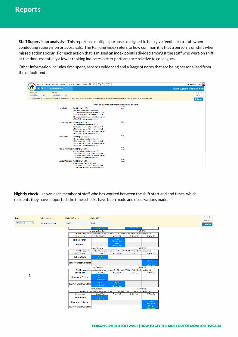
Staff Supervision analysis—This report has multiple purposes designed to help give feedback to staff when
conducting supervision or appraisals. The Ranking index refers to how common it is that a person is on shift when
missed actions occur. For each action that is missed an index point is divided amongst the staff who were on shift
at the time, essentially a lower ranking indicates better performance relative to colleagues.
Other information includes time spent, records evidenced and a %age of notes that are being personalised from
the default text.
Nightly check—shows each member of staff who has worked between the shift start and end times, which
residents they have supported, the times checks have been made and observations made.
PERSON CENTRED SOFTWARE | HOW TO GET THE MOST OUT OF MONITOR | PAGE 24
Process
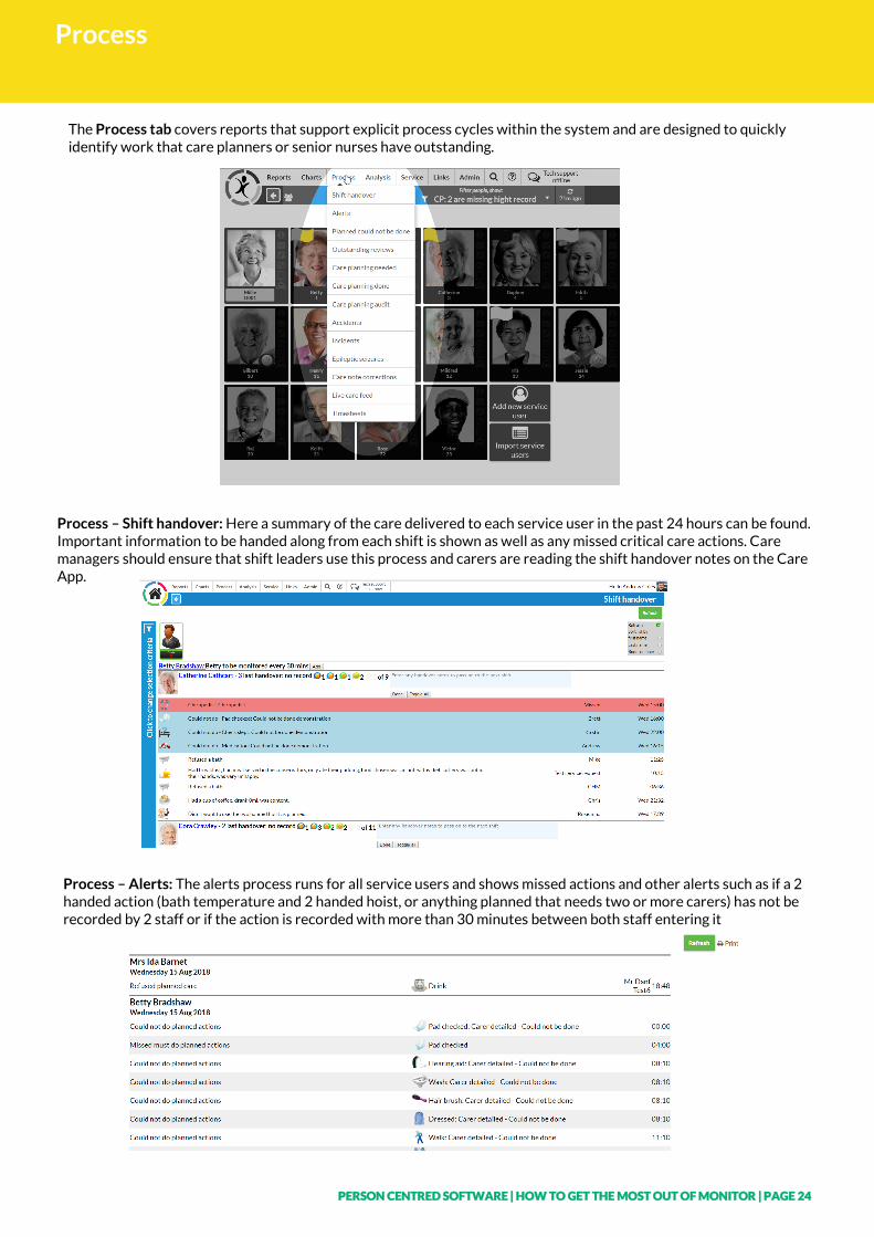
The Process tab covers reports that support explicit process cycles within the system and are designed to quickly identify work that care planners or senior nurses have outstanding.
Process – Shift handover: Here a summary of the care delivered to each service user in the past 24 hours can be found. Important information to be handed along from each shift is shown as well as any missed critical care actions. Care managers should ensure that shift leaders use this process and carers are reading the shift handover notes on the Care App.
Process – Alerts: The alerts process runs for all service users and shows missed actions and other alerts such as if a 2 handed action (bath temperature and 2 handed hoist, or anything planned that needs two or more carers) has not be recorded by 2 staff or if the action is recorded with more than 30 minutes between both staff entering it
PERSON CENTRED SOFTWARE | HOW TO GET THE MOST OUT OF MONITOR | PAGE 25
Process
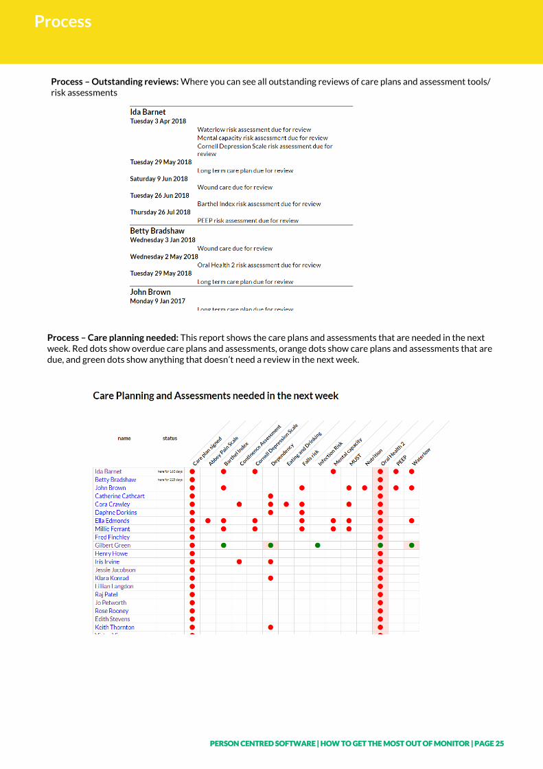
Process – Outstanding reviews: Where you can see all outstanding reviews of care plans and assessment tools/risk assessments
Process – Care planning needed: This report shows the care plans and assessments that are needed in the next week. Red dots show overdue care plans and assessments, orange dots show care plans and assessments that are due, and green dots show anything that doesn’t need a review in the next week.
PERSON CENTRED SOFTWARE | HOW TO GET THE MOST OUT OF MONITOR | PAGE 26
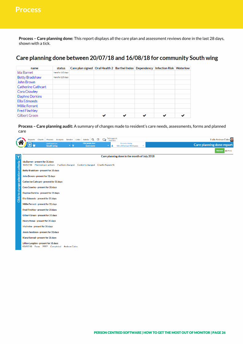
Process
Process – Care planning done: This report displays all the care plan and assessment reviews done in the last 28 days, shown with a tick.
Process – Care planning audit: A summary of changes made to resident’s care needs, assessments, forms and planned care
PERSON CENTRED SOFTWARE | HOW TO GET THE MOST OUT OF MONITOR | PAGE 27
Analysis and Group Reporting
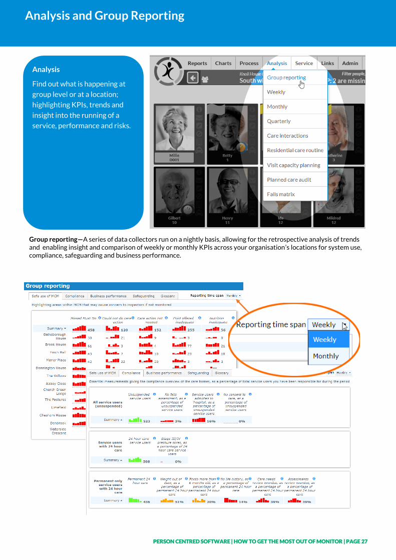
Analysis
Find out what is happening at
group level or at a location;
highlighting KPIs, trends and
insight into the running of a
service, performance and risks.
Group reporting—A series of data collectors run on a nightly basis, allowing for the retrospective analysis of trends and enabling insight and comparison of weekly or monthly KPIs across your organisation’s locations for system use, compliance, safeguarding and business performance.
PERSON CENTRED SOFTWARE | HOW TO GET THE MOST OUT OF MONITOR | PAGE 28
Analysis and Group Reporting
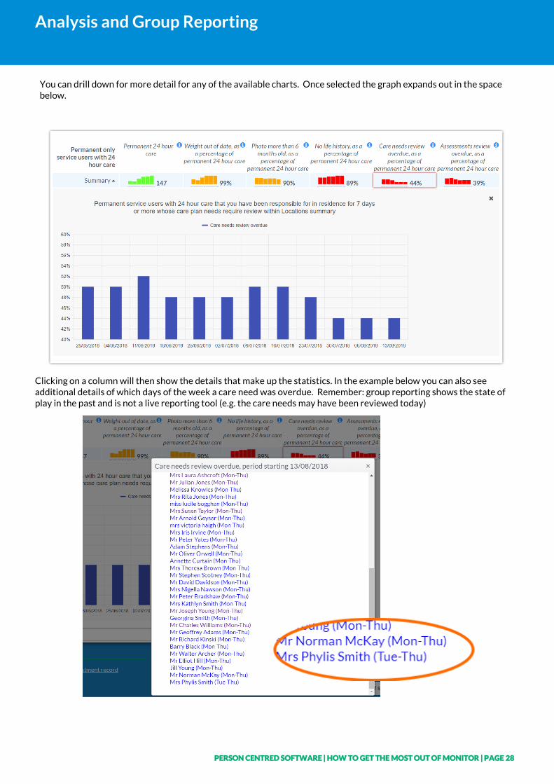
You can drill down for more detail for any of the available charts. Once selected the graph expands out in the space below.
Clicking on a column will then show the details that make up the statistics. In the example below you can also see additional details of which days of the week a care need was overdue. Remember: group reporting shows the state of play in the past and is not a live reporting tool (e.g. the care needs may have been reviewed today)
PERSON CENTRED SOFTWARE | HOW TO GET THE MOST OUT OF MONITOR | PAGE 29
Analysis and Group Reporting
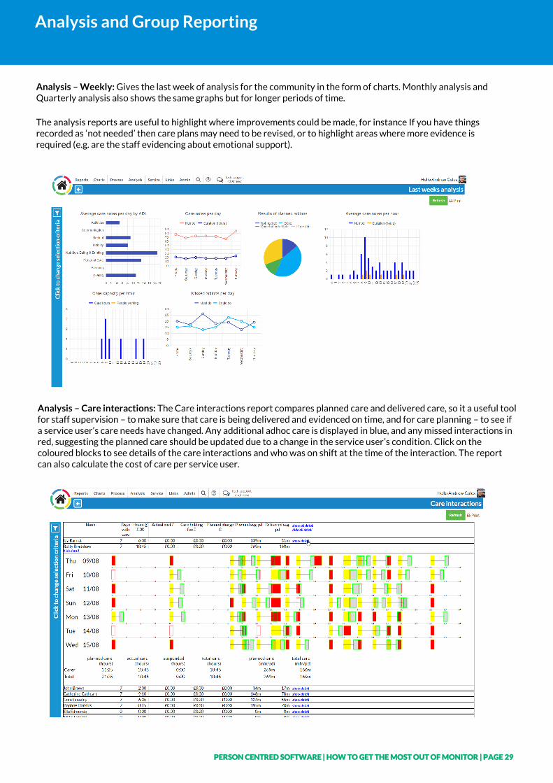
Analysis – Weekly: Gives the last week of analysis for the community in the form of charts. Monthly analysis and Quarterly analysis also shows the same graphs but for longer periods of time.
The analysis reports are useful to highlight where improvements could be made, for instance If you have things recorded as ‘not needed’ then care plans may need to be revised, or to highlight areas where more evidence is required (e.g. are the staff evidencing about emotional support).
Analysis – Care interactions: The Care interactions report compares planned care and delivered care, so it a useful tool for staff supervision – to make sure that care is being delivered and evidenced on time, and for care planning – to see if a service user’s care needs have changed. Any additional adhoc care is displayed in blue, and any missed interactions in red, suggesting the planned care should be updated due to a change in the service user’s condition. Click on the coloured blocks to see details of the care interactions and who was on shift at the time of the interaction. The report can also calculate the cost of care per service user.
PERSON CENTRED SOFTWARE | HOW TO GET THE MOST OUT OF MONITOR | PAGE 30
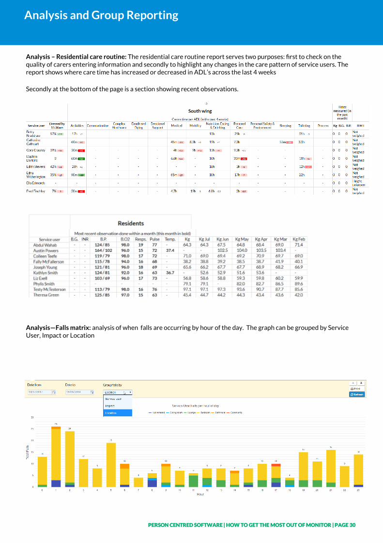
Analysis and Group Reporting
Analysis – Residential care routine: The residential care routine report serves two purposes: first to check on the quality of carers entering information and secondly to highlight any changes in the care pattern of service users. The report shows where care time has increased or decreased in ADL’s across the last 4 weeks
Secondly at the bottom of the page is a section showing recent observations.
Analysis—Falls matrix: analysis of when falls are occurring by hour of the day. The graph can be grouped by Service User, Impact or Location
PERSON CENTRED SOFTWARE | HOW TO GET THE MOST OUT OF MONITOR | PAGE 31
Notes A blank space for you to make any notes