how to draw - snagfilms · pdf filehow to draw course guidebook ... composition: shape and...
TRANSCRIPT
Better Living
Topic
Arts & Leisure
Subtopic
How to Draw
Course Guidebook
Professor David BrodyUniversity of Washington
PUBLISHED BY:
THE GREAT COURSESCorporate Headquarters
4840 Westfields Boulevard, Suite 500Chantilly, Virginia 20151-2299
Phone: 1-800-832-2412Fax: 703-378-3819
www.thegreatcourses.com
Copyright © The Teaching Company, 2015
Printed in the United States of America
This book is in copyright. All rights reserved.
Without limiting the rights under copyright reserved above,no part of this publication may be reproduced, stored in
or introduced into a retrieval system, or transmitted, in any form, or by any means
(electronic, mechanical, photocopying, recording, or otherwise), without the prior written permission of
The Teaching Company.
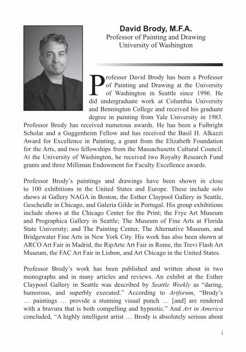
David Brody, M.F.A.Professor of Painting and Drawing
University of Washington
Professor David Brody has been a Professor of Painting and Drawing at the University of Washington in Seattle since 1996. He
did undergraduate work at Columbia University and Bennington College and received his graduate degree in painting from Yale University in 1983.
Professor Brody has received numerous awards. He has been a Fulbright Scholar and a Guggenheim Fellow and has received the Basil H. Alkazzi Award for Excellence in Painting, a grant from the Elizabeth Foundation for the Arts, and two fellowships from the Massachusetts Cultural Council. At the University of Washington, he received two Royalty Research Fund grants and three Milliman Endowment for Faculty Excellence awards.
Professor Brody’s paintings and drawings have been shown in close to 100 exhibitions in the United States and Europe. These include solo shows at Gallery NAGA in Boston, the Esther Claypool Gallery in Seattle, Gescheidle in Chicago, and Galeria Gilde in Portugal. His group exhibitions include shows at the Chicago Center for the Print; the Frye Art Museum and Prographica Gallery in Seattle; The Museum of Fine Arts at Florida State University; and The Painting Center, The Alternative Museum, and Bridgewater Fine Arts in New York City. His work has also been shown at ARCO Art Fair in Madrid, the RipArte Art Fair in Rome, the Trevi Flash Art Museum, the FAC Art Fair in Lisbon, and Art Chicago in the United States.
Professor Brody’s work has been published and written about in two monographs and in many articles and reviews. An exhibit at the Esther Claypool Gallery in Seattle was described by Seattle Weekly as “daring, humorous, and superbly executed.” According to Artforum, “Brody’s … paintings … provide a stunning visual punch … [and] are rendered with a bravura that is both compelling and hypnotic.” And Art in America concluded, “A highly intelligent artist … Brody is absolutely serious about
i
ii
considerations of color and light informs all his pictures.” In addition, Brody has been written about in many other publications, including The Boston Globe, the New Art Examiner, the Spanish journal Lapiz, and the Lisbon daily O Público.
Professor Brody has lectured or been a visiting critic at Carnegie Mellon University, the Massachusetts Institute of Technology, The University of Chicago, Harvard University, Capital Normal University in Beijing, and the China Art Academy in Hangzhou.
Professor Brody has had a parallel career in music. He has published The Fiddler’s
Fakebook: The Ultimate Sourcebook for the Traditional Fiddler. He has performed at festivals in the United States, Europe, and Canada; at Avery Fisher Hall and Symphony Space in New York City; and on Garrison Keillor’s radio show A Prairie Home Companion. He has recorded with the Klezmer Conservatory Band and other artists on the Rounder, Vanguard, and
iii
Table of Contents
LECTURE GUIDES
INTRODUCTION
Professor Biography ............................................................................ iCourse Scope .....................................................................................1
LECTURE 1An Introduction to Drawing .................................................................4
LECTURE 2Drawing Materials for Line ..................................................................9
LECTURE 3Drawing Fundamentals and First Exercises .....................................14
LECTURE 4Line and Shape: Line and Aggregate Shape ....................................18
LECTURE 5Line and Shape: Volume and Figure-Ground ...................................20
LECTURE 6Line and Shape: Positive and Negative Shape ................................25
LECTURE 7Composition: The Format and Its Armature ......................................29
LECTURE 8Composition: How Artists Compose .................................................33
LECTURE 9Line and Shape: Line Attributes and Gesture ...................................38
Table of Contents
iv
LECTURE 10Composition: Shape and Advanced Strategies ................................43
LECTURE 11Proportion: Alberti’s Velo ..................................................................47
LECTURE 12Proportion: Accurate Proportion and Measure .................................50
LECTURE 13Creating Volume and Illusionistic Space ..........................................56
LECTURE 14Six Complex Drawing Projects .........................................................63
LECTURE 15Linear Perspective: Introduction .......................................................68
LECTURE 16Linear Perspective: The Quad ..........................................................74
LECTURE 17Linear Perspective: The Gridded Room ...........................................77
LECTURE 18Linear Perspective: Ellipses and Pattern ..........................................81
LECTURE 19Linear Perspective: Advanced Topics ..............................................87
LECTURE 20Value: How Artists Use Value ...........................................................91
LECTURE 21Value: Drawing Materials for Value ...................................................98
Table of Contents
v
LECTURE 22Value: Black and White and a Value Scale .....................................104
LECTURE 23Value: Eight Complex Drawing Projects .........................................108
LECTURE 24Value: Side Light and Cast Shadow ...............................................114
LECTURE 25Value: Oblique Light and Cast Shadow ..........................................117
LECTURE 26Texture: Mark Making and Optical Value ........................................122
LECTURE 27Texture: How Artists Use Texture ....................................................126
LECTURE 28Color: Color Theory and Color and Light ........................................131
LECTURE 29Color: How Artists Use Color ..........................................................137
LECTURE 30Color: Color Drawing Projects ........................................................141
LECTURE 31The Figure: A Canon of Proportions ...............................................147
LECTURE 32The Figure: The Head, Hands, and Feet .......................................153
LECTURE 33The Figure: Artistic Anatomy...........................................................159
Table of Contents
vi
LECTURE 34The Figure: Drawing Projects .........................................................167
LECTURE 35Advanced Concepts: Pictorial Space .............................................173
LECTURE 36Advanced Drawing Projects ...........................................................179
Additional Activities .........................................................................186
Bibliography ....................................................................................197
SUPPLEMENTAL MATERIAL
1
How to Draw
Scope:
The 36 lectures in this course are distilled from four decades of study, studio work, and teaching and communicate the most important and useful things to know about drawing—information that will greatly
The course presents drawing as a language and, as in many language courses, introduces ideas one at a time to allow you to fully examine each piece of the
each new idea building on the previous ones. We’ll start from simple units
Each lecture or set of lectures deals with a key idea, concept, material, or technique that has been historically important to artists over the long history of drawing. As we’ll see, although there have certainly been changes with time and place, there has also been a great degree of continuity in the language of drawing across continents and over the millennia that human beings have been making drawings.
The approach in this course is simple. Each lecture begins by describing and explaining a new concept or technique, which is then situated it in its historical context and illustrated with visual examples. The examples include both masterworks from a range of periods and traditions in art history and student drawings meant to demonstrate that learning to draw is eminently attainable. The lectures themselves run about 18 hours, but working through all the exercises and projects could well keep you occupied for many months.
3, introduces the long history of drawing, starting with some lines scratched into a piece of ochre found in a cave in South Africa dating back some 80,000 years or more and bringing us up to the present day. The introductory section presents the course in broad strokes and quickly gets you experimenting with the materials you’ll be using throughout.
Scop
e
2
The second section, Lectures 4 through 14, focuses on the underlying grammar of drawing, referred to as formal language. Here, you’ll learn
construction line, and gestural line. You’ll learn how line creates shapes, both positive and negative, and how you can use simple shapes to draw
As we begin to draw more complex groupings of objects, we’ll delve into composition. We’ll learn how famous artists—spanning the Song dynasty in China, the Italian Renaissance, the French Impressionist period, and beyond—structured their drawings in this regard.
In Lectures 12 through 14, we’ll learn how such artists as Leonardo, Dürer, Eakins, and Van Gogh used practical systems to arrive at accurate proportions
apply these same methods and techniques to your own drawing projects.
In the third section, Lectures 15 through 19, we’ll learn about linear perspective. This powerful drawing system, developed during the Renaissance, radically changed the way future generations around the world would draw. It’s not only at the heart of what Raphael and his Renaissance contemporaries were able to accomplish but has become ubiquitous in everything from the contemporary works of such artists as Anselm Kiefer, to video games and manga, to animated cartoons, such as The Simpsons.
In the fourth section, Lectures 20 through 30, we’ll return to complete our examination of formal language, learning to incorporate value, texture, and color into drawings. You’ll learn how artists think about palettes of value and how palettes suggest light and mood. You’ll also learn to use value as a compositional tool and how you can create the illusion of volume, space, and light through modulations of light and dark. You’ll see how you can further
And you’ll learn about textural approaches to creating value, including
3
We’ll conclude the fourth section with an exploration of color. We’ll learn about color properties and study the basics of color theory. As with value, we’ll see how artists use these ideas and conceive of color in terms of
of light and mood. As we did with value, we’ll learn how we can use color compositionally to create a visual hierarchy with focal areas and focal points. And you’ll apply all these ideas in your own drawings to create different qualities of mood, light, and form.
imagination. We’ll start with an examination of canons of proportion. Here,
this with a study of artistic anatomy, including both the skeletal and muscular systems. You’ll also learn techniques for approaching the foreshortened
in our study of linear perspective, giving you the tools you need to draw
Leonardo and Dürer did during the Renaissance, and it is the same method many contemporary animators and game designers use to develop their characters and environments.
changes that occurred between the late 19th century and the present. We’ll see how Renaissance spatial constructs evolved to include a broader understanding of pictorial space and how this related to many movements in art, including Impressionism, Cubism, and abstraction. We’ll close with a discussion and a set or projects designed to help you identify the kind of art you want to make
4
Lect
ure
1—A
n In
trod
uctio
n to
Dra
win
g
An Introduction to DrawingLecture 1
The ability to draw naturalistically did not come easily to human beings.
believably seated in a chair, the chair on the carpet, and the carpet on
Many people, when they think about “learning to draw,” want to develop just these skills—getting the proportions right, getting the things to sit on
degree, be learned, and with practice, you can make the ideas and methods your own. Those are our goals for this course.
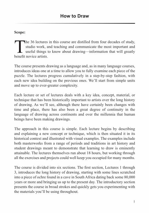
The RenaissanceAlthough just about every people and culture has produced beautiful and expressive artworks, discoveries in 15th
anything as remotely naturalistic as this watercolor (John Biglin in a Single Scull) by Thomas Eakins:
© Y
ale
Uni
vers
ity A
rt G
alle
ry.
5
Bits and pieces had been learned and practiced for a period, but local advances were often swallowed up by time and forgotten. For example, from about the late 1st century B.C.E. to perhaps the 3rd century C.E., some Egyptians had their portraits painted on wooden panels, which were then attached to their mummies when the subjects died. These paintings, known as Fayum Portraits, are amazingly naturalistic for their time. But after about the 3rd century, this kind of naturalism would not appear again for hundreds of years.
out how to create a believable and proportionate illusion of three dimensions
techniques developed during the Renaissance and used by Leonardo da Vinci, Raphael, and others are commonly used today by cartoonists, video game designers, and animators.
But we mustn’t think that people were visually challenged for tens of thousands of years and then, suddenly, from the Renaissance to the present, became so exceedingly talented that they were able to render things with verisimilitude. Instead, it’s that the knowledge base improved radically. After the Renaissance, artists who had access to good information and worked hard to master their craft were able to learn things and draw in ways that their predecessors had never been able to. Rather than just absorbing a set of local symbols, these artists had methods for analyzing and drawing anything they came upon. And, as we’ll learn, they also developed methods
Challenges in Learning to DrawOf course, talent plays a role in making art, but it’s a much less important one
someone has before he or she has put in a considerable amount of work,
Acquiring knowledge and putting it into practice are the two essential keys to
elements is the willingness to put in a substantial amount of work. Students
6
Lect
ure
1—A
n In
trod
uctio
n to
Dra
win
g
As you practice drawing, don’t avoid working on what you’re not naturally good at. You may feel comfortable with line and pencil but not with value and charcoal, or you may like gesture drawing but not linear perspective. You will do better if you apply yourself fully to everything and, in fact, apply yourself with extra energy to the things that you have less of a knack for.
Learning to draw is endless, like learning to cook, to play music, or to write well. You can be a student of these things for a lifetime, continually learning more. As you struggle to learn new things, the feelings of uncertainty will fade away; after a time, you’ll realize that the struggle itself is enjoyable and that your efforts are dependably rewarded. How quickly and nimbly you
your own pace, and for your own sense of mastery.
Learning to See
have to learn to see it as a depth of space. We want to look at the four edges of the page and see them as the four sides of a window frame. The white surface becomes a depth, like a room or a landscape, that we transform through the use of line, shape, mark, and value to suggest volume and space.
Many artists and professors say that learning to draw is all about learning to see, not seeing things to identify them but seeing them as they actually appear—the proportions, angles, values, and the real play of light and color. That’s a much harder kind of seeing. It requires looking analytically and abstractly. In his book Successful Drawing, Andrew Loomis wrote,
for.” There’s a peculiar paradox here. In order for us to draw things in a naturalistic or realistic way—in proportion—we must learn to see them abstractly.
Simple lines can have multiple and complex meanings. Line creates shape, and shape creates pattern. Shapes can also be arranged to create the illusion
like things in the world around us.
7
Drawing across the CenturiesAs mentioned at the beginning of the lecture, drawing took a great leap forward during the Renaissance, but that’s not to say that human beings weren’t making interesting and beautiful drawings long before the 1400s. Anthropologists tell us that modern Homo sapiens showed up somewhere between 100,000 and 200,000 years ago. And long before we have any
of our ancestors making drawings. The oldest known examples, found in the Blombos Cave in South Africa, go back about 80,000 years or more. They consist of incised lines on pieces of ochre. These ancient incised lines form a pattern, and line and pattern are still very much with us today.
Most drawing we know of—at least as measured in years—is prehistoric and took place in caves. You’ve likely seen examples that feature mammoths, bison, and horses. The oldest cave drawings date to about 40,000 years ago, and the practice of cave drawing continued in Europe for about 30,000 years. In contrast, people have been drawing on paper for only a little more than 2,000 years. Paper was invented in the 2nd century B.C.E. in Han dynasty China, and its method of manufacture was kept secret from the West until the 8th century C.E.
During the early historical period, just about every culture or civilization on every continent practiced drawing in one form or another; there are stunning examples from every corner of the globe. In fact, many of our earliest written languages have origins in drawing. Chinese, spoken by more than 1 billion
back more than 3,000 years, and the modern written language retains many
Stylization Many people imagine artists standing in front of a still life, a landscape, or a model to make a drawing. But looking directly at something and drawing it is a relatively recent phenomenon, as is the idea of artists making their own kind of art, for that matter.
For most of time, from Blombos until fairly recently, people weren’t looking at what they were drawing while they were drawing it. In most cultures, at
8
Lect
ure
1—A
n In
trod
uctio
n to
Dra
win
g
an animal. We refer to this as stylization. From the historical record, it would appear that much of this stylization was determined by local convention, which also determined what to draw, where to draw, and what materials to use. Thus, the early cave artists in Europe followed a set of conventions regarding subject, materials, and technique. Later artists—Egyptian, Greek, Chinese, and others—followed their own conventions.
Yet despite the fact that art has changed over time and place, there has
have been using many of the same principles of good drawing and design for thousands of years. Their command of craft and their use of line, shape, value, and color—to name a few of the factors we will explore—begin to explain why these works have stood out and been cherished by people of diverse backgrounds and beliefs over the centuries.
from the work of great artists from a range of cultures covering a broad swath of time, from the ancient to the contemporary.
Suggested Reading
Mendelowitz, Drawing.
Stokstad, Art History.
9
Drawing Materials for LineLecture 2
This lecture lists the materials we’ll use for the projects in Lectures 4 through 19. We’ll go into detail about graphite pencils, charcoal, erasers, brushes and ink, and drafting and measuring tools. In
close the lecture by discussing how you should set up your drawing area.
Graphite PencilsGraphite pencils come in varying degrees of hardness, which is controlled by the amount of clay that is mixed with the graphite. With less clay, the graphite is softer; with more clay, it’s harder.
letter scale. There are 22 steps in this scale:
10B 9B 8B 7B 6B 5B 4B 3B 2B B HB F H 2H 3H 4H 5H 6H 7H 8H 9H 10H
The softest pencil is the 10B, and the hardest is the 10H. Historically, most people doing general drawing have used pencils in the 4B to 2H range. The very hard pencils are generally used for more technical drawing and highly detailed work. That said, it’s well worth having a set of all 22 pencils.
to an F, the 3 to an H, and the 4 to a 2H. Neither the European nor the U.S. scale is standardized; thus, two pencils of the same number from different manufacturers may vary in their degrees of hardness. Not all brands and all qualities are alike either. For this reason, choose a set of pencils from one
10
Lect
ure
2—D
raw
ing
Mat
eria
ls fo
r Lin
e
In addition to using a pencil sharpener, many artists sharpen their pencils using a utility knife and a sanding block, which allows the pencil to be formed into a number of different shapes.
Test your pencils by making a single straight line on a page with each one, noting the pencil you’re using. Then, make a series of small lines or scribbles to get an idea of how each pencil is different. Note, too, that the way a pencil behaves is affected by the kind of paper you use.
Mechanical pencils are also great tools. The graphite for these comes in four thicknesses: 0.3 millimeter, 0.5 millimeter, 0.7 millimeter, and 0.9 millimeter. The graphite used for mechanical pencils ranges from about 4B to 4H.
CharcoalAlong with graphite, charcoal is among the most common drawing materials. It comes in four basic forms: vine or willow, compressed, charcoal pencils, and charcoal powder. For our line drawings, we’ll use vine or willow, which tends to be the most forgiving, that is, the easiest to erase.
This charcoal is called vine or willow because it’s commonly made by charring pieces of vines or willow in kilns. Because no binder is used—it’s just cooked wood—it turns to powder easily. That makes it easy to erase, but then, it’s also easy to rub away a morning’s work with a careless swipe of your hand.
Vine and willow generally come in four grades: extra soft, soft, medium, and hard. They also come in a variety of shapes and sizes, from thin to thick, from cylindrical to rectangular, and even in chunks. For line, the medium and hard cylindrical sticks work well.
ErasersSome artists avoid erasing; they want a pristine surface, and heavy erasing can modify the surface texture of the paper. Many other artists embrace erasure. Matisse, for example, made erasing very much a part of his drawing. In this course, erasing will be necessary for many of our projects.
Different erasers modify or erase what you draw in different ways. The factors involved here include erasing power, precision, ability to handle
11
large areas, amount of smearing, and residual marks made by the eraser itself. It’s probably best to start with three erasers: a kneaded, a Pink Pearl,
Using the kneaded eraser doesn’t result in any crumbs, and in fact, the adhesive quality of this eraser can be used to lift crumbs off the page. It’s also possible to modify the shape of a kneaded eraser. This eraser works well with vine charcoal and graphite and can be used to modify the darkness of a given line or area of value by gently pulling it across that section of the drawing.
The Pink Pearl eraser has a distinctive wedge shape and a sharp, knifelike edge. If you draw a line that’s too thick, you can use a Pink Pearl fairly precisely to make the line thinner. To maintain that sharp edge, trim the
precise erasures. Again, try your erasers with different types of pencils, charcoal, and paper.
Brush and Ink Two brushes will work well for drawing line: a small one, about 1/16 to 1/8 inch at the top of the ferrule (the metal piece that holds the hairs together), and another about 3/8 to 5/8 inches long. These types of brushes are made from animal hair or synthetic materials. The most expensive are labeled sable, though they’re generally made using mink or weasel hair. For our
When you buy your brush, it may feel a bit stiff. Many manufacturers dip the hairs in light glue to help maintain the brush’s shape. Before you use a new brush, run it under warm water. Gently massage the hairs to remove the glue, then dry the brush.
Your brush should come with a small plastic cap. After you use the brush, rinse it, dry it, and replace the cap to keep the brush from getting damaged.
over the bottle of ink when you’re drawing, pour some of it into a small cup. Experiment with the brush and ink by making a thin line. It can be helpful
12
Lect
ure
2—D
raw
ing
Mat
eria
ls fo
r Lin
e
to brace your hand against the page so that you’re not putting all the weight of your hand onto the brush. Then, try to make a thicker line. Make sure the brush is adequately charged and apply a little more pressure. Next, try creating a discontinuous line, allowing the brush to kind of skip along. Also, experiment with drying out the brush to get lines of varying darkness.
Drafting and Measuring Tools
You’ll use this to help frame and compose your drawings.
generate and download custom graph paper. Enter the desired dimensions
straightedge, cut out the center rectangle and put it aside. Turn the frame horizontally. From the upper left corner, measure 12 inches toward the right and make a vertical line. From the bottom right corner, measure 12 inches to the left and make a similar vertical line. Cut along both lines with your utility knife; you should have right angles that are 12 inches in either direction. With your 2H pencil and ruler, calibrate both right angles along
Setting Up to DrawIf you’re making small drawings—about 12 to 15 inches—you can easily draw on a table or with your drawing board supported on your knees and
table, the page will be in a foreshortened position; it will look like a trapezoid instead of a rectangle. As you can imagine, this makes controlling shapes
13
should be supported more or less vertically, using an easel.
Set up the easel so that the center of the page is about at the height of your collar bone. Both the page and easel should be at about 90 degrees to your line of sight. You should be at a distance of about 18 to 24 inches from the page to allow you to see as much of it as possible without moving your eyes
can step back periodically and look at your drawing from a greater distance.
When you’re working on still lifes, you’ll need a second table positioned
with a plain top is best. For many of our projects, white will be ideal for both the table and the wall behind. If your table and wall are not white, you can cover them with a large sheet of white paper or foam core.
When drawing from observation, it’s good practice to put the easel or drawing board parallel to and just to the left or right of what you’re drawing. Ideally, you want to be able to view your drawing and the subject at the same time without swiveling your head. When you back up, you want to be able to see both at once in the same planar orientation.
As we’ll see, when drawing from observation, it’s useful to be able to draw from different heights. Having a chair or easel that can be lowered or raised is helpful for this purpose.
and marks on the page. But make sure that the light doesn’t throw glare or cast shadow on the page, both of which can be distracting.
Suggested Reading
Cennini, The Craftsman’s Handbook.
Guptill, Rendering in Pencil, chapters 1–3.
Mendelowitz, Faber, and Wakeman, A Guide to Drawing, “Beginner’s Media,” pp. 17–35, and “Dry Media,” pp. 184–207.
14
Lect
ure
3—D
raw
ing
Fund
amen
tals
and
Firs
t Exe
rcis
es
Drawing Fundamentals and First ExercisesLecture 3
Many people have the idea that artists stand in front of a subject and draw what they see, but in fact, most of the drawing you have likely seen is the result of some mix of observation, construction,
and abstraction. Drawing from observation means drawing what we see before us. Construction refers to methods for drawing that rely on building what we draw using shapes, geometric solids, and linear perspective. Abstraction refers to the way we bring abstract visual thinking to bear on the drawing decisions we make. An example would be thinking about how
rectangles to signify a tabletop and a wall in a still life or the land and sky in a landscape. We’ll learn more about these aspects of drawing as we move through the six sections of this course: (1) introductory materials; (2) line and formal language; (3) linear perspective; (4) value, texture, and color;
an overview of the course.
Drawing as a LanguageDrawing is a language. Thus, studying drawing can be similar to studying a new language. We start by learning about different kinds of line—comparable to learning a new alphabet. Next, we use line to draw shape, just as we use letters to form words. Then, we use shape to construct drawings of individual objects—like forming words into sentences. And we draw multiple objects together in coherent compositions—similar to organizing sentences into paragraphs.
In drawing, our grammatical parts are line, shape, volume, mark, value, and color, among other elements. If we want to make sophisticated drawings, we must understand how these pieces function in the visual realm.
Examples Used in the CourseOne art historical cliché describes the history of art as a series of advances through tumultuous breaks from the ignorance or overbearing restrictions
15
of past conventions. There’s also much ink dedicated to showing how one culture’s art is markedly different from that of another. No doubt, art has certainly changed across time and place, but at the same time, there has also been a great degree of continuity in the language of art across the continents and over the millennia of drawing practice.
The reason that many diverse people have used similar visual strategies is that our eyes and brains—our hardware and software—have remained pretty much the same for a long period. Thus, a large portion of the underlying visual mechanics of making drawings has remained fairly consistent. This is one of the reasons that we can look at art made by people who lived very
and beautiful. At a certain level, we “get it” because these works were crafted to speak to beings wired like ourselves.
Looking at examples of artworks from a range of periods, cultures, and geographic locations, we’ll see that artists in different times and places have used similar visual strategies and techniques. Because their work has stood the test of time and local bias, it’s reasonable to suspect that the visual ideas they’ve employed are good ones.
Analyzing DrawingsLooking at drawings is as important to an aspiring draftsperson as listening to music, tasting food, or watching a game is to an aspiring musician, chef, or athlete. But it’s also crucial to make the shift to active analysis. Many of us drive cars, but our relationship with them ends there. Someone who loves cars and wants to understand them deeply takes cars apart and puts them back together again. To be a real student of drawing means that your relationship with drawing must become analytical. You must take drawings apart, reverse engineer them, and reconstruct them.
How to Use These LecturesEach lecture in this course is about 30 minutes long, but it will generally take you much longer than that to complete the drawing projects in the lectures. For this reason, you may want to stop and start the lectures as you draw. Of course, you can also watch each lecture all the way through once, then
16
Lect
ure
3—D
raw
ing
Fund
amen
tals
and
Firs
t Exe
rcis
es
helpful in learning to draw, you may also want to watch the lectures with a family member or a small group of friends who are also interested in learning to draw. This activity will allow you to offer one another feedback and constructive criticism on your drawings.
Topics to Be DiscussedYou can think of these 36 lectures as divided into six conceptual sections.
introduces formal language or drawing’s grammar. The third section provides an overview of linear perspective. The fourth bring us back to our discussion
In general, the progression of topics in these sections will be as follows:
Aggregate shape
Positive and negative shape
Composition
Gestural line
Proportion
Linear perspective
Value
Mark and texture
17
Color theory, properties, and palettes
Advanced concepts and projects.
There is a natural progression in this sequence of study, from concentrating more on acquiring knowledge, skill, and technique to thinking about how to
goal at the beginning is mastery of the breadth of accumulated knowledge. As you advance, you’ll be able to apply this knowledge and skill to your own individual creative vision.
new piece building on what you’ve learned in prior lessons, and you’ll be on your way to developing a depth of knowledge regarding many of the ways in which drawings are conceived and made. Whether you choose to fully work through all the problems or not, simply developing a conceptual understanding of the ways in which artists think and pursue their work will fundamentally change the way you see both art and the world around you.
Suggested Reading
J. Paul Getty Museum, Formal Analysis.
Kennedy Center, Formal Visual Analysis.
Pumphrey, The Elements of Art, pp. 55–61.
18
Lect
ure
4—Li
ne a
nd S
hape
: Lin
e an
d A
ggre
gate
Sha
pe
Line and Shape: Line and Aggregate ShapeLecture 4
Aand shapes for a very long time—at least 80,000 years. This is also the way most of us started drawing as children. Because it seems
to come so naturally, drawing lines and shapes is a logical place to begin. In this lecture, we’ll start by learning about two kinds of line: contour line and construction line. Then, we’ll see how we can use these to draw simple shapes. By combining contour line, construction line, and shape, we can draw all kinds of things, including the kinds of objects commonly found in still lifes. We’ll conclude the lecture by discussing a special kind of shape: aggregate shape. We’ll see how we can use this to organize the various shapes associated with objects in a drawing.
Contour and Construction LinesContour lines are often used to describe the outer edges of objects or to outline shapes. An example might be drawing a circle by putting your pencil on the page, following the circle’s edge, and returning to the point of origin.
Construction lines (also called diagrammatic lines) are like scaffolding at a construction site. The scaffolding helps the workers build the building, but as the project moves toward completion, it’s removed. In drawing, a construction line might be a centerline that helps you ensure the object you’re drawing doesn’t lean in one direction or the other. Artists may also use
such lines are usually erased from completed drawings. Both construction lines and construction shapes help build more complex objects.
Simple ShapesAs you begin to develop a vocabulary of shapes, you can put them to use to draw objects. For example, you can draw a wine bottle—an object commonly found in still lifes—using a centerline and four simple shapes: a large rectangle for the body of the bottle; a triangle for the “shoulders”; a smaller, thinner, vertical rectangle for the neck; and a much smaller
19
horizontal rectangle for the collar. You would then erase the centerline and
Practicing with Still-Life ObjectsMany things in our homes can be constructed using simple shapes, such as circles, ovals, rectangles, and triangles, especially when they’re in an upright
candlestick, a coffee mug, and a wine glass. Put one object at a time on your
with? Draw a centerline and construct each object using shapes. Check at each step for symmetricality and proportion. Also try drawing some other objects, such as a house, car, bicycle, or furniture. Once you understand the basic principle of using construction lines, contour lines, and shape building blocks, try drawing from your imagination, too.
Aggregate ShapeSo far, we’ve seen how contour can be used to make shape, and we’ve seen how we can use contour and shape, with the aid of construction lines and shapes, to draw a wide range of things, both from observation and from the imagination. Often though, we’re not just drawing a single thing but groups of things, such as objects and fruit in a still life or groups of trees and other elements in a landscape. In these cases, another kind of construction shape, aggregate shape, is useful. Aggregate shape is essentially the container for the objects in a drawing.
Suggested Reading
Guptill, Rendering in Pencil, chapter 7, “Object Drawing in Outline.”
Pumphrey, The Elements of Art, chapter 6, “Line and Dot,” and “Shape,” pp. 90–131.
Sale and Betti, Drawing, “Shape,” pp. 99–106.
Smagula, Creative Drawing, chapter 4, “Line” pp. 84–87.
20
Lect
ure
5—Li
ne a
nd S
hape
: Vol
ume
and
Figu
re-G
roun
d
Line and Shape: Volume and Figure-GroundLecture 5
Iwe’ll see how it’s related to an oblique shape. We’ll also learn how oblique shapes are related to geometric solids. We can use this new
which will help us structure our drawings in a more sophisticated way.
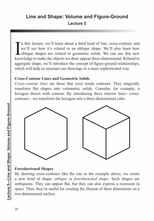
Cross-Contour Lines and Geometric SolidsCross-contour lines are those that exist inside contours. They magically
Foreshortened Shapes
a new kind of shape: oblique or foreshortened shape. Such shapes are
space. Thus, they’re useful for creating the illusion of three dimensions on a
21
Integrating Contour and Cross-Contour
presented as separate. And, at times, they may well be used that way. But it’s
or people; we’re just drawing lines, and we have to decide where each line begins and ends. We move from the edge of the form, the contour, to the
clear overlaps to show what’s in front and what’s behind. This is one of the
of the “art” here involves making subtle choices about how this is done.
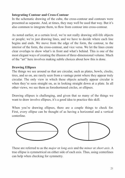
Drawing EllipsesThe things we see around us that are circular, such as plates, bowls, clocks, tires, and so on, are rarely seen from a vantage point where they appear truly circular. The only view in which these objects actually appear circular is when they’re seen straight on, as in looking straight down at a plate. In all other views, we see them as foreshortened circles, or ellipses.
Drawing ellipses is challenging, and given that so many of the things we want to draw involve ellipses, it’s a good idea to practice this skill.
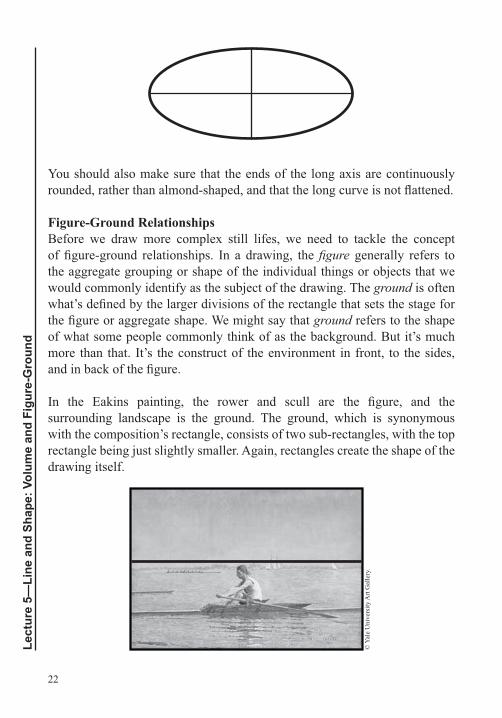
When you’re drawing ellipses, there are a couple things to check for. First, every ellipse can be thought of as having a horizontal and a vertical centerline.
These are referred to as the major or long axis and the minor or short axis. A true ellipse is symmetrical on either side of each axis. Thus, using centerlines can help when checking for symmetry.
22
Lect
ure
5—Li
ne a
nd S
hape
: Vol
ume
and
Figu
re-G
roun
d
You should also make sure that the ends of the long axis are continuously
Figure-Ground RelationshipsBefore we draw more complex still lifes, we need to tackle the concept
generally refers to the aggregate grouping or shape of the individual things or objects that we would commonly identify as the subject of the drawing. The ground is often
ground refers to the shape of what some people commonly think of as the background. But it’s much more than that. It’s the construct of the environment in front, to the sides,
surrounding landscape is the ground. The ground, which is synonymous
rectangle being just slightly smaller. Again, rectangles create the shape of the drawing itself.
© Y
ale
Uni
vers
ity A
rt G
alle
ry.
23
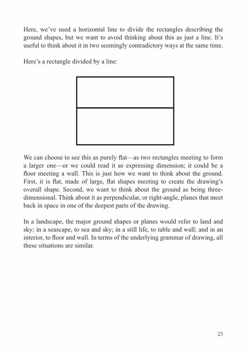
Here, we’ve used a horizontal line to divide the rectangles describing the ground shapes, but we want to avoid thinking about this as just a line. It’s useful to think about it in two seemingly contradictory ways at the same time.
Here’s a rectangle divided by a line:
a larger one—or we could read it as expressing dimension; it could be a
back in space in one of the deepest parts of the drawing.
In a landscape, the major ground shapes or planes would refer to land and sky; in a seascape, to sea and sky; in a still life, to table and wall; and in an
these situations are similar.
24
Lect
ure
5—Li
ne a
nd S
hape
: Vol
ume
and
Figu
re-G
roun
d
Suggested Reading
Chaet, The Art of Drawing
Curtis, Drawing from Observation,
Norling, Perspective Made Easy, chapter 14, “Practical Uses of Cylinders in Drawing,” pp. 131–142.
Rockman, Drawing Essentials, “Different Kinds and Functions of Line,” pp. 59–65.
Smagula, Creative Drawing, chapter 4, “Line,” pp. 88–90.
25
Line and Shape: Positive and Negative ShapeLecture 6
This lecture concerns another important kind of shape: negative shape,
composition itself much more powerful. In addition, it’s a useful tool for helping to establish accurate proportions. In this lecture, we’ll also learn to
analyze shape, select what we draw, and determine the shape of a drawing using this device.
Negative Shape and Format ShapeWhen artists draw, they’re not just drawing shapes to represent things. They also consider and draw shapes that represent the spaces between things—shapes to represent where things are not. Artists are preoccupied with the relationships between the “stuff”—the objects they want to represent—and
negative shapes.
Format ShapeWhen you draw a shape—a positive—on the page, you actually get at least two shapes—the positive and its accompanying negative. Often, depending
negatives.
create the overall structure and shape of the drawing, painting, print, or
the format shape.
26
Lect
ure
6—Li
ne a
nd S
hape
: Pos
itive
and
Neg
ativ
e Sh
ape
or forward or from side to side, even slightly, you’ll see a different framing, which translates to a different image.
easiest way to do this is to make sure that your arm is always fully extended.
not be a true rectangle but a trapezoid.
Finally, close one eye—always the same eye.
When doing the negative shape exercise, keep these tips in mind:
Use one sheet of paper, such as basic printer paper, for each drawing. Center your format shape in the page and outline it with a 2H or 4H pencil. This allows you to modify the format on any side
Turn your page in sympathy with the drawing’s shape. If the framing is horizontal, turn your page horizontally. If vertical, turn the page vertically.
Think of drawing from observation as choosing and framing. Try to choose and frame visual situations that will yield a drawing with strong and interesting negative shapes.
Think about what you choose to draw. Spend some time walking
around your home. Look for compelling negatives.
27
Plants often have interesting shapes between their stems, leaves,
In a single tree, notice the spaces between the limbs.
Try to set up still lifes purposefully to bring out the negatives.
yourself: Do your lines convincingly create negative shape? When you cover the positives, do the negatives come out forcefully? Are
composition and assert the rectangular format itself? Are the large negative shapes active?
Skill BuildingThe concepts we’ve learned so far are all connected:
We can make shapes out of contour line.
shapes, and geometric solids.
shapes, and geometric solids, often with the use of construction lines.
We can organize the objects in our drawing using aggregate shapes. Aggregate shapes help us create visual groupings. They contain and place what it is we want to draw within the drawing’s shape.
We can conceive of the space around the main objects or subject as
the drawing itself.
We can conceive of yet another kind of shape that expresses the distances and spaces between things: negative shape. Our drawings
as the objects themselves. Negative shapes are also useful for checking the proportions of the positives, or the objects.
28
Lect
ure
6—Li
ne a
nd S
hape
: Pos
itive
and
Neg
ativ
e Sh
ape
the shape of the drawing—the format shape.
Suggested Reading
Curtis, Drawing from Observation, chapter 6, “Positive/Negative Shape.”
Pumphrey, The Elements of Art, “Ground,” pp. 40–43.
Sale and Betti, Drawing, “Positive and Negative Space,” pp. 107–115.
29
Composition: The Format and Its ArmatureLecture 7
We’ve been working our way up in degrees of complexity. We started at the microcosmic level with line. We then moved on to shape, then a single object, then several objects. Next, we
turned shape into volume and drew multiple volumetric objects, considering
positive and negative shape. These last ideas took us well beyond drawing isolated objects and gave us a more sophisticated idea about how the parts of a drawing relate. Though we didn’t name it, we were starting to talk about composition, which is really nothing more than organization—organizing parts of a drawing into a coherent whole. In this lecture, we’ll talk about the underlying structure of rectangles because that’s the shape of most of the drawings we make. Artists refer to this structure as the armature.
Drawing the ArmatureMost drawings have a rectangular shape made of constituent shapes that
relationship with the shape of the drawing itself.
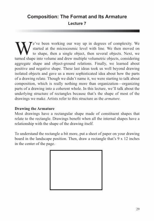
To understand the rectangle a bit more, put a sheet of paper on your drawing board in the landscape position. Then, draw a rectangle that’s 9 x 12 inches in the center of the page.
30
Lect
ure
7—C
ompo
sitio
n: T
he F
orm
at a
nd It
s A
rmat
ure
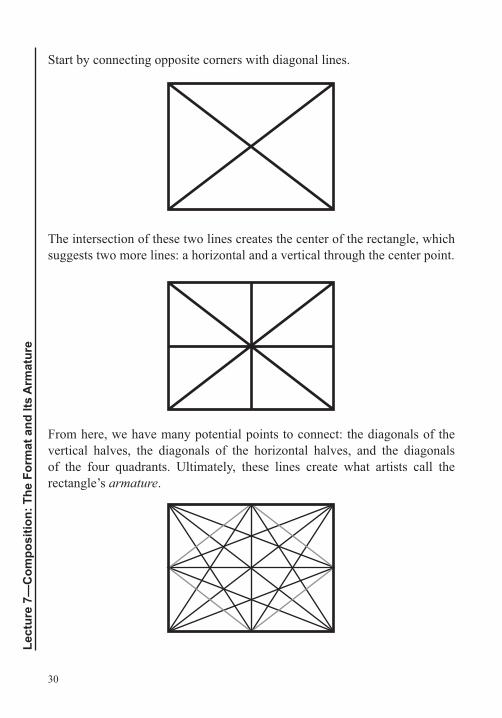
Start by connecting opposite corners with diagonal lines.
The intersection of these two lines creates the center of the rectangle, which suggests two more lines: a horizontal and a vertical through the center point.
From here, we have many potential points to connect: the diagonals of the vertical halves, the diagonals of the horizontal halves, and the diagonals of the four quadrants. Ultimately, these lines create what artists call the rectangle’s armature.
31
a more complex version. And of course, not all artists draw armatures in their rectangles, but doing so in a range of different rectangles is useful, especially if you pay attention to the shapes and relationships that emerge as you add each new line. Drawing armatures is a great way to develop sensitivity to the underlying structure of the format’s shape.
Ratios in Rectangles
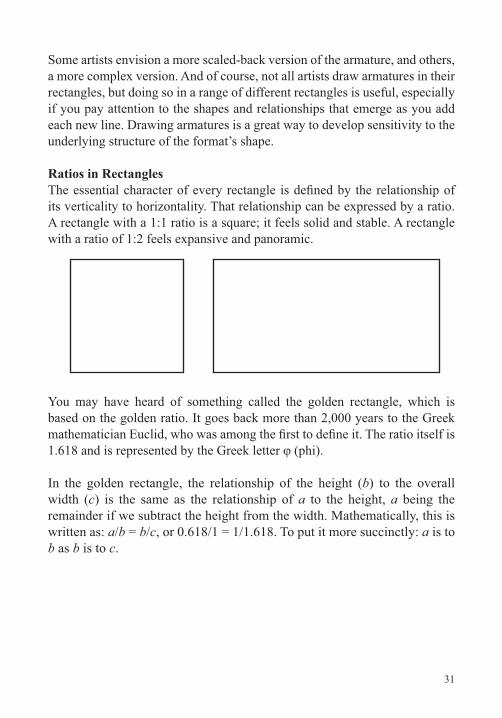
its verticality to horizontality. That relationship can be expressed by a ratio. A rectangle with a 1:1 ratio is a square; it feels solid and stable. A rectangle with a ratio of 1:2 feels expansive and panoramic.
You may have heard of something called the golden rectangle, which is based on the golden ratio. It goes back more than 2,000 years to the Greek
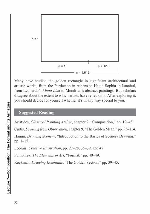
In the golden rectangle, the relationship of the height (b) to the overall width (c) is the same as the relationship of a to the height, a being the remainder if we subtract the height from the width. Mathematically, this is written as: a/b = b/c, or 0.618/1 = 1/1.618. To put it more succinctly: a is to b as b is to c.
32
Lect
ure
7—C
ompo
sitio
n: T
he F
orm
at a
nd It
s A
rmat
ure
artistic works, from the Parthenon in Athens to Hagia Sophia in Istanbul, from Leonardo’s Mona Lisa to Mondrian’s abstract paintings. But scholars disagree about the extent to which artists have relied on it. After exploring it, you should decide for yourself whether it’s in any way special to you.
Suggested Reading
Aristides, Classical Painting Atelier, chapter 2, “Composition,” pp. 19–43.
Curtis, Drawing from Observation, chapter 9, “The Golden Mean,” pp. 93–114.
Hamm, Drawing Scenery, “Introduction to the Basics of Scenery Drawing,” pp. 1–15.
Loomis, Creative Illustration, pp. 27–28, 35–39, and 47.
Pumphrey, The Elements of Art, “Format,” pp. 40–49.
Rockman, Drawing Essentials, “The Golden Section,” pp. 39–45.
b = 1
c = 1.618
b = 1 a = .618
33
Composition: How Artists ComposeLecture 8
Choosing the right kind of rectangle for a given drawing is crucial. The
choose to orient the format in sympathy with the subject. Although
the subject’s lying down. Most people make the same choice instinctively when they take snapshots. Generally, artists want the various parts of a
ground and the aggregate shapes, relate to the drawing’s armature. In this lecture, we’ll look at some of the ways in which artists apply an understanding of the underlying structure of the rectangle to their drawings.
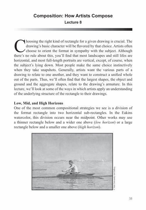
Low, Mid, and High HorizonsOne of the most common compositional strategies we see is a division of
watercolor, this division occurs near the midpoint. Other works may use a thinner rectangle below and a wider one above (low horizon) or a large rectangle below and a smaller one above (high horizon).
© Y
ale
Uni
vers
ity A
rt G
alle
ry.
34
Lect
ure
8—C
ompo
sitio
n: H
ow A
rtis
ts C
ompo
se
Other DivisionsOf course, the primary divisions in a drawing don’t need to be horizontal. Artists also make use of vertical divisions. And in some cases, you might want to think in terms of dividing the rectangle into thirds, diagonals, and quarters. Yet another compositional strategy is to slightly skew the main division in the ground. In other words, the division sits along a diagonal that divides the rectangle into two wedge shapes, something like the blade of a guillotine.
Focal Point, Focal Area, and Compositional ShapesThis discussion of large compositional shapes leads naturally to the subject of focal area and focal point.
There’s a reason that most people aren’t aware of the ground when they look at a drawing: Artists purposely construct their drawings so that we focus on the objects. But the artist must pay a great deal of attention to both the focal point and the ground so that the viewer experiences the hierarchy of visual
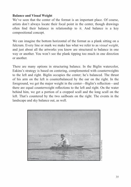
In Eakins’s watercolor, the focal point is clearly Biglin’s head and upper torso. The focal area is Biglin in his scull. Why? First, Biglin and his scull
Direction also plays a role here. Not all directions attract the same attention. All else being equal, horizontals are sleepiest; verticals, a bit more energetic; and diagonals, the most dynamic. If we eliminate Biglin and his boat, what remains is very horizontal, with a couple of minor verticals and tiny diagonals. The result is sleepy. Biglin supplies the
in the composition’s center.
Many drawings and paintings—even stylistically different ones—use these and similar abstract strategies to create focal points and focal areas in a composition.
35
Balance and Visual WeightWe’ve seen that the center of the format is an important place. Of course, artists don’t always locate their focal point in the center, though drawings
compositional concept.
We can imagine the bottom horizontal of the format as a plank sitting on a fulcrum. Every line or mark we make has what we refer to as visual weight, and just about all the artworks you know are structured to balance in one way or another. You won’t see the plank tipping too much in one direction or another.
There are many options in structuring balance. In the Biglin watercolor, Eakins’s strategy is based on centering, complemented with counterweights to the left and right. Biglin occupies the center; he’s balanced. The thrust of his arm on the left is counterbalanced by the oar on the right. In the
behind him, we get a portion of a cropped scull and the long scull on the left. That’s countered by the two sailboats on the right. The events in the landscape and sky balance out, as well.
© Y
ale
Uni
vers
ity A
rt G
alle
ry.
36
Lect
ure
8—C
ompo
sitio
n: H
ow A
rtis
ts C
ompo
se
Arranging FurnitureEverything we’ve discussed so far has to do with ordering and balancing things in relation to a given rectangle. In that sense, composing a drawing is similar to arranging furniture, which we do in relation to the proportions of a given room. How we arrange the furniture depends on the room itself. What kind of rectangle it is? How long? How wide? We also create aggregate groupings and relationships when we arrange furniture. In your living room, for instance, you position the area rug, sofa, coffee table, and armchair so that the individual objects form a grouping.
Most drawings, prints, and paintings are rectangles, and most artists structure
in most cases, as with the works we’ve seen, they don’t end up looking
to the underlying structure of the given rectangle. The structure generally remains hidden—unless you look for it.
Self-Critique Questions There are several key points to consider when working on compositional problems like the ones we’ve covered in this lecture:
Choose what you draw carefully.
Take time to select a point of view and framing.
Think about the large planes and planar divisions, such as the
and sky in a landscape.
Relate observed reality to large geometric shapes and draw through the format in sympathy with this.
Here are some questions you can ask yourself as a guide in critiquing your own work:
Is the whole format activated?
37
Are there dead areas?
Does the composition balance?
Does the drawing feel alive and fresh?
Is there a unique perception or point of view?
Does this perception come to life on the page?
Does the drawing have a focal point and a focal area?
Is there a strong sense of design in the composition that directs the viewer to move through the drawing in a particular order?
Have you looked at what you’re drawing closely and with an intelligent and analytic eye?
Do your objects sit convincingly in relation to the large planes?
Are you creating space and volume convincingly?
Have you been attentive to clarifying overlap situations?
Suggested Reading
Loomis, Creative Illustration, pp. 29–34 and 47–53.
Mendelowitz, Faber, and Wakeman, A Guide to Drawing, chapter 8, “Composition,” pp.138–160.
Pumphrey, The Elements of Art, chapter 5, “The Organizational Components of Art,” pp. 62– 89.
Rockman, Drawing Essentials, “The Principles of Composition,” pp. 22–38.
38
Lect
ure
9—Li
ne a
nd S
hape
: Lin
e A
ttrib
utes
and
Ges
ture
Line and Shape: Line Attributes and GestureLecture 9
Ato look more closely, it reveals a surprising degree of complexity. There are quite a number of choices to make when using line and a
great deal of “art” involved in making those choices. So far, we’ve discussed
lecture, we’ll dig deeper. We’ll learn about the attributes of line that directly bear on its function and expressive potential, and we’ll learn about a new kind of line, gestural line.
Types of Line and Their AttributesThe visual attributes of various lines account for the way a drawing “feels”—its expressive quality. Major attributes of line include the following:
Value: light versus dark
Width: thick versus thin
Continuity: continuous versus discontinuous
Length: long versus short
Direction: horizontal, vertical, or diagonal
Shape: straight, angular, or curvilinear
Degree of closure: a range running from straight with no closure to curving and fully closing in on itself, making a shape
Speed: drawn quickly, slowly, or at any speed in between
Texture: smooth versus rough.
39
Value and WidthLine value can be controlled by pencil choice—a soft pencil produces a darker line than a hard one—and pressure applied when drawing.
Line width is controlled by pressure (increased pressure results in increased width), the way in which the pencil comes into contact with the page (point versus side), and the way in which the pencil is sharpened (sharp edge
and referred to as line weight. The greater the line weight, the greater the contrast to the page. And, all else being equal, the part of the drawing with the greatest line weight will function as a focal point and draw the viewer’s eye to that section. This is a primary means for creating a hierarchy in a line drawing.
ContinuitySome lines are discontinuous or fragmented (sometimes referred to as implied lines), while others are continuous. Highly continuous lines present things in sharp focus, while discontinuous lines may create the appearance of broken edges and things seen peripherally. Greater line weight and continuous line create focal zones and, all else being equal, tend to pull forward in space. Lighter, thinner, and discontinuous lines receive less of the eye’s attention and, all else being equal, recede in space.
LengthRelated to continuity and discontinuity is line length. Varying line lengths can be used to create rhythm in a drawing, just as in music, where varied durations or lengths of notes create audible rhythm.
DirectionAnother factor affecting line is direction and stability. As we’ve noted, horizontals are stable, at rest; verticals are less so; and diagonals are the most dramatic lines.
40
Lect
ure
9—Li
ne a
nd S
hape
: Lin
e A
ttrib
utes
and
Ges
ture
Shape, Degree of Closure, and Speed
to a line’s shape is its degree of closure. Some lines in a drawing may be very open; they make no move toward closure. Others, however, close to make clearly delineated shapes. In some cases, lines may exhibit degrees of closure. They begin to suggest shape but don’t fully close in on themselves. Lines are also imbued with character by how quickly or slowly they seem to be drawn.
TextureLine texture is often the product of the way the line interacts with the paper’s surface. Not surprisingly, a smooth surface yields smooth lines—lines that are consistent in value, both internally and along the edges. But a textured paper—one with a noticeable tooth, such as many charcoal or watercolor papers—results in rougher lines. Such lines have irregularities both internally and along their edges.
Combining AttributesOverall, you can think about each of these attributes as existing on a sliding scale. You can increase or decrease any of the factors and make a fairly unlimited number of line types by combining diverse attributes. For instance, you could make a thick, light, short, straight line, drawn slowly, with a lot of texture. Or you could make a dark, thin, long, curved line, drawn quickly and smoothly. In the end, these types of choices contribute to the way we experience a drawing emotionally.
Line attributes are also affected by the artist’s choice of materials. Different tools and papers or surfaces have different intrinsic qualities and personalities that will create different opportunities and limitations. In addition, line attributes are affected by how you physically draw. To test this out, try
shoulder. You’ll see that each of these choices can affect the lines you draw.
Gestural Line
planes, gestural lines describe the approximate location and character of things. Gestural line generally has the attribute of speed and some quality of
41
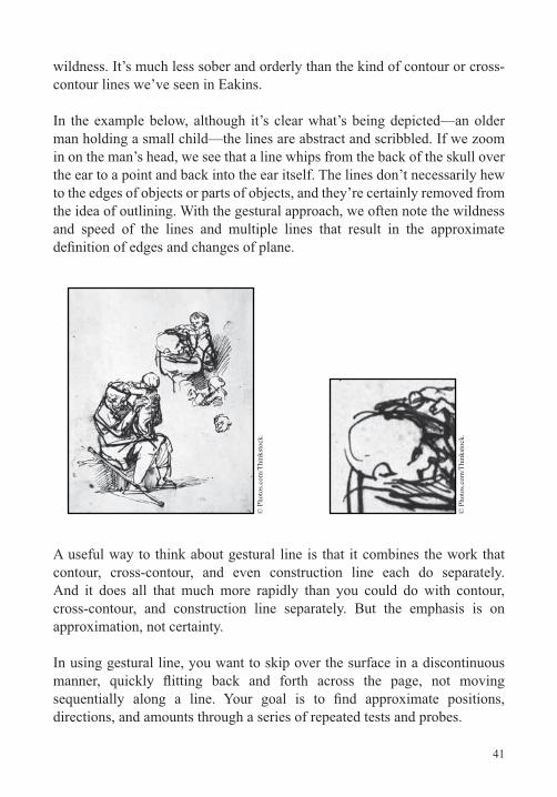
contour lines we’ve seen in Eakins.
In the example below, although it’s clear what’s being depicted—an older man holding a small child—the lines are abstract and scribbled. If we zoom in on the man’s head, we see that a line whips from the back of the skull over the ear to a point and back into the ear itself. The lines don’t necessarily hew to the edges of objects or parts of objects, and they’re certainly removed from the idea of outlining. With the gestural approach, we often note the wildness and speed of the lines and multiple lines that result in the approximate
A useful way to think about gestural line is that it combines the work that
And it does all that much more rapidly than you could do with contour,
approximation, not certainty.
In using gestural line, you want to skip over the surface in a discontinuous
directions, and amounts through a series of repeated tests and probes.
© P
hoto
s.com
/Thi
nkst
ock.
© P
hoto
s.com
/Thi
nkst
ock.
42
Lect
ure
9—Li
ne a
nd S
hape
: Lin
e A
ttrib
utes
and
Ges
ture
As you probe for visual data, ask yourself these questions:
Where will the drawing begin and end?
What will be the format shape?
Where are the large divisions?
What are the farthest points to the right and left of the aggregate shape?
What are the farthest points up and down?
How would you describe the negative shapes between the objects?
How far does your eye travel from one side of the arrangement to the other?
What are the widths and heights of the objects?
Suggested Reading
Brown and McLean, Drawing from Life, chapter 4, “Line.”
Curtis, Drawing from Observation, chapter 4, “Intuitive Gesture.”
Sale and Betti, Drawing, chapter 2, “Learning to See,” pp. 33–71.
Smagula, Creative Drawing, chapter 4, “Line.”
43
Composition: Shape and Advanced StrategiesLecture 10
In this lecture, we’ll conclude our investigation of composition. We’ll start by looking at some of the major attributes of shape. Then, we’ll dig deeper into the compositional strategies that artists use in their work.
Now that we’ve studied gestural line, we can also apply it to test out these new compositional structures.
Types and Attributes of ShapeDifferent kinds of shapes, like different kinds of line, have different attributes or qualities. And most of us associate different feelings or sensations with shapes because of these differences. Attributes of shape include the following:
Geometric (including rectilinear and curvilinear) versus organic.
Degree of symmetry.
Degree of complexity. All else being equal, we generally reward complexity—a source of visual excitement—with our attention.
Personality. Rectilinear and symmetrical shapes generally appear serious and sober; curvilinear shapes can appear elegant and
Degree of closure. Open shape equals gentle overlap and continuity; closed shape indicates emphatic overlap and discontinuity.
Degree of stability.
All these are important compositional factors and, ultimately, affect the expressive quality of a drawing.
44
Lect
ure
10—
Com
posi
tion:
Sha
pe a
nd A
dvan
ced
Stra
tegi
es
Compositional Strategy: The Target or Bull’s EyeWith all this in mind, let’s return to some examples of compositional strategies used by artists. A balanced strategy related to the use of symmetrical shape is what we might call the target or bull’s eye. It uses centered rings or successive units of framing to bring the viewer into the center of the drawing.
Several compositional factors can be used to bring the viewer into the target’s center, including contrasts of shape, contrasts in degree of density and complexity of line or mark, and contrast of direction. All these factors
rings later. We prompt the viewer to attend to the parts of the drawing in a certain order, which is one of the goals of composition.
Compositional Strategy: Repetition, Variation, Pattern, and Visual RhymesRepetition and variation are key compositional concepts in their own right. Musical composition can revolve around this structural idea, as well. A Bach
Choruses repeat, and verses vary, generally, with the same melody but new lyrics. This would indicate that we like a certain amount of repetition, but too much is monotonous.
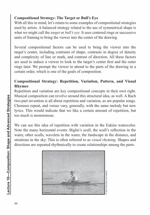
We can see this idea of repetition with variation in the Eakins watercolor.
water, other sculls, wavelets in the water, the landscape in the distance, and striations in the sky. This is often referred to as visual rhyming. Shapes and directions are repeated rhythmically to create relationships among the parts.
© Y
ale
Uni
vers
ity A
rt G
alle
ry.
45
Spatial Considerations: Bas-Relief and Three Depths of SpaceSo far, we’ve looked at relationships that occur on the surface of the
they’ve chosen. We’ve also seen that there’s a relationship between the main things being depicted—the ostensible subject—and the environment in which they sit.
In addition, we’ve noted that we must think in two ways simultaneously.
edges and armature. Second, we have to think about how they relate to any illusion of depth. Inextricably related to both of these considerations is the
Shallow spatial depth is referred to as bas-relief (“low relief”). Think here
Deeper spatial organization may be achieved through the use of three depths.
a depth of space with a number of supporting events occurring in and around the horizon. This approach to composition is often accompanied by placing the main subject in the topographical center of the page.
Composition and NarrativeThe way we pose things and organize them on the page in a drawing can
the father might be elevated over the other family members to highlight his position as head of the family. In a modern advertisement, a political leader might be posed in the center of his advisors.
Uncomposed Drawings Not all drawings are composed in the ways we’ve discussed in this lecture, primarily because not all drawings are intended as complete or
with problem solving; others function as exercises to explore perspective, pattern, or color relationships; and others are done as studies in preparation
46
Lect
ure
10—
Com
posi
tion:
Sha
pe a
nd A
dvan
ced
Stra
tegi
es
for more involved works. The choices we make regarding how we draw are often based on the goal we have for the drawing in question.
Suggested Reading
Curtis, Drawing from Observation, chapter 9, “Composition,” p. 279.
Guptill, Rendering in Pencil, chapter 10, “Composing Your Drawings,” p. 110.
Smagula, Creative Drawing, chapter 7, “Composition and Space,” pp. 150–167.
47
Proportion: Alberti’s VeloLecture 11
We’re now ready to turn our attention to proportion and measurement. In this lecture, we’ll learn about the discoveries and methods that led to some radical changes in 15th
European art. These discoveries would spread over the globe and are still
have been drawing for more than 80,000 years, but until the European
span of time, a little more than 100 years, artists were able to create this illusion. In this lecture, we’ll work with some of the tools that enabled this leap forward in naturalistic representation.
Early Explorations in Proportion
popularly known as Alhazen. In Europe, he was followed by Leon Battista Alberti, Luca Pacioli, Piero della Francesca, Filippo Brunelleschi, Leonardo da Vinci, and Albrecht Dürer. The latter were all interested in the intersection of optics, mathematics, and art, and they enlarged on Alhazen’s and one another’s discoveries. A number of them published their own seminal works describing newfound systems, tools, and methods.
Around 1490, Leonardo described a method for drawing accurately. It involved placing a pane of glass perpendicular to the artist’s line of vision and drawing what was seen directly on the glass. The availability
naturalistic representation.
In his later book Instruction in Measurement, Albrecht Dürer wrote, “There is yet another method of copying an object … and it is more practical than
48
Lect
ure
11—
Prop
ortio
n: A
lber
ti’s Velo
using a glass pane.” Dürer was talking about a device called the velo, or “veil.” The device had also been discussed about a century earlier by the Renaissance polymath Leon Battista Alberti. Essentially, the velo was a grid of threads stretched on a frame that allowed anything seen through it to be transcribed on paper by noting the xy coordinates.
Drawing Proportionate Foreshortened FiguresFor most of history, people drew things in their iconic positions. In this position, the silhouette of the object would tell us what it is. This also happens to be the position where the long axis of the subject is perpendicular or parallel to the ground. Think of an upright person or a bottle; that position is perpendicular to the ground. A person lying down horizontally would be parallel to the ground. In Egyptian art, the avoidance of other positions accounts for some of the distorted anatomical depictions, with the head in
large, people avoided other views of objects for about 80,000 years.
All the millennia of avoidance indicate the challenges of drawing objects in certain positions, such as a limb projecting outward from the picture
measuring. Find grid coordinates. Note where and in which grid unit on the vertical picture plane all the important points are located. Then, mark these same points on the second picture plane, the page. Measure carefully
fundamentally changed drawing.
The essential idea behind using the velo is the same as tracing on glass or
velo, we have the added aid of xy coordinates. We don’t even have to worry about drawing a complicated object. We just have to place the coordinates.
49
Suggested Reading
Alberti, On Painting.
Brown and McLean, Drawing from Life, “Learning to See,” pp. 44–45.
da Vinci, A Treatise on Painting.
Dürer, Underweysung der Messung (1525).
———, Underweysung der Messung (1538).
———, The Painter’s Manual.
Eakins, A Drawing Manual, “Linear Perspective,” pp. 47–54.
Hockney, Secret Knowledge.
50
Lect
ure
12—
Prop
ortio
n: A
ccur
ate
Prop
ortio
n an
d M
easu
re
Proportion: Accurate Proportion and MeasureLecture 12
In this lecture, we’ll concentrate on the tools we use to arrive at correct proportions. We’ll start by reviewing the tools we’ve already discussed:
shape, eyeballing, negative shape, and Alberti’s velo. Then, we’ll add some
measure, level lines and plumb lines, and the method of sighting the half.
yourself combining them seamlessly in your own way. They’ll become part of the way you naturally draw.
Tools for Accurate Proportion and MeasurementThe tools for accurate proportion that we’ve already discussed include the following:
Centerline, a type of construction line that helps establish an object’s placement within the drawing and helps maintain the subject’s direction. The centerline also serves as an aid in drawing shapes proportionately in relation to the object’s center.
part of an object.
Large ground shapes, which set up proportions for the whole drawing.
Aggregate shape, or the simple shape that contains the subject
proportions in a drawing.
51
Eyeballing, that is, looking at the shape you’ve drawn and asking yourself if it corresponds to what you’re seeing.
Negative shape, which we tend to see more accurately than positive shapes because we have no preconceptions about what they look like. This allows us to see them in a purely visual and analytic manner. Taken together, a group of negative shapes will reveal the silhouette of an object in accurate proportion.
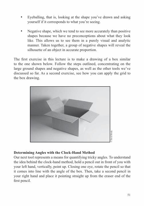
to the one shown below. Follow the steps outlined, concentrating on the large ground shapes and negative shapes, as well as the other tools we’ve discussed so far. As a second exercise, see how you can apply the grid to the box drawing.
© D
avid
Bro
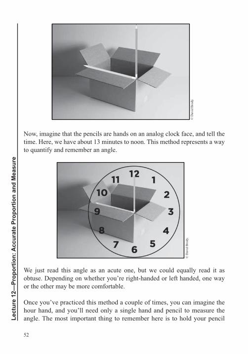
dy.
Determining Angles with the Clock-Hand MethodOur next tool represents a means for quantifying tricky angles. To understand
your left hand, vertically, point up. Closing one eye, rotate the pencil so that it comes into line with the angle of the box. Then, take a second pencil in your right hand and place it pointing straight up from the eraser end of the
52
Lect
ure
12—
Prop
ortio
n: A
ccur
ate
Prop
ortio
n an
d M
easu
re
© D
avid
Bro
dy.
Now, imagine that the pencils are hands on an analog clock face, and tell the time. Here, we have about 13 minutes to noon. This method represents a way to quantify and remember an angle.
© D
avid
Bro
dy.
We just read this angle as an acute one, but we could equally read it as
or the other may be more comfortable.
Once you’ve practiced this method a couple of times, you can imagine the hour hand, and you’ll need only a single hand and pencil to measure the angle. The most important thing to remember here is to hold your pencil
53
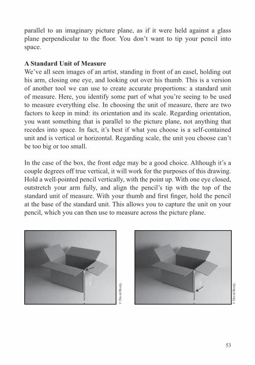
parallel to an imaginary picture plane, as if it were held against a glass
space.
A Standard Unit of MeasureWe’ve all seen images of an artist, standing in front of an easel, holding out his arm, closing one eye, and looking out over his thumb. This is a version of another tool we can use to create accurate proportions: a standard unit of measure. Here, you identify some part of what you’re seeing to be used to measure everything else. In choosing the unit of measure, there are two factors to keep in mind: its orientation and its scale. Regarding orientation, you want something that is parallel to the picture plane, not anything that
unit and is vertical or horizontal. Regarding scale, the unit you choose can’t be too big or too small.
In the case of the box, the front edge may be a good choice. Although it’s a couple degrees off true vertical, it will work for the purposes of this drawing.
outstretch your arm fully, and align the pencil’s tip with the top of the
at the base of the standard unit. This allows you to capture the unit on your pencil, which you can then use to measure across the picture plane.
© D
avid
Bro
dy.
© D
avid
Bro
dy.
54
Lect
ure
12—
Prop
ortio
n: A
ccur
ate
Prop
ortio
n an
d M
easu
re
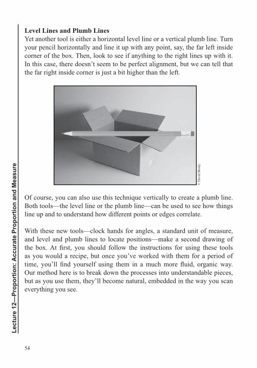
Level Lines and Plumb LinesYet another tool is either a horizontal level line or a vertical plumb line. Turn your pencil horizontally and line it up with any point, say, the far left inside corner of the box. Then, look to see if anything to the right lines up with it. In this case, there doesn’t seem to be perfect alignment, but we can tell that the far right inside corner is just a bit higher than the left.
© D
avid
Bro
dy.
Of course, you can also use this technique vertically to create a plumb line. Both tools—the level line or the plumb line—can be used to see how things line up and to understand how different points or edges correlate.
With these new tools—clock hands for angles, a standard unit of measure, and level and plumb lines to locate positions—make a second drawing of
as you would a recipe, but once you’ve worked with them for a period of
Our method here is to break down the processes into understandable pieces, but as you use them, they’ll become natural, embedded in the way you scan everything you see.
55
Sighting the HalfRelated to some of the tools we’ve studied is an approach called sighting the half. This is another method to help you imagine an even grid over your
that help you draw proportionately.
Drawing as an Interrogative ProcessAs you’re beginning to realize, drawing can be an interrogative process. We ask one question after another: How does the picture plane divide? What’s the largest shape? What’s the angle of that diagonal? How long is it? A drawing can represent the sum of an artist’s responses to these questions.
Suggested Reading
Curtis, Drawing from Observation, chapter 7, “The Perceptual Grid,” pp. 61–74, and chapter 8, “Proportion,” pp. 75–92.
Loomis, Figure Drawing for All It’s Worth, “The Visual Survey Process,” pp. 88–89.
Mendelowitz, Faber, and Wakeman, A Guide to Drawing, chapter 3, “Learning to See Deeply,” pp. 38–56.
Rockman, Drawing Essentials, pp. 4–22.
56
Lect
ure
13—
Cre
atin
g Vo
lum
e an
d Ill
usio
nist
ic S
pace
Creating Volume and Illusionistic SpaceLecture 13
A central theme in our discussions about proportion revolved around the challenges of translating three dimensions into two. In this
In addition to controlling proportions, we often want to create the illusion
differentiate between two types of dimensionality: the volume of an object itself and the dimensionality of the environment that the object occupies—the space. Putting these two pieces together, we get volumetric form in space; we’ll explore that process in this lecture.
Creating Illusionistic Space: 12 PrinciplesAs we’ve noted, learning to draw is related to learning to understand what we see. A number of factors govern the way we perceive depth of space in the world around us, and these same factors correlate with ways we depict space on the page. The 12 primary factors are as follows:
Overlap
Diminishing size
Position along the page’s vertical axis
Position relative to the format’s edges
Diagonals creating spatial depth
Foreshortened shapes
Value, light, and shadow
57
Value and atmospheric perspective
Level of detail
Color and atmospheric perspective
Subject matter of recognizable size.
Overlap
person partially conceals the second from view. Not surprisingly, overlap
Diminishing Size A second factor here is relative scale. We look out into the world and see two things that we know are the same size. If one looks smaller than the other, we know that the smaller one is farther away. Similarly, if we see two things in a drawing that we know to be similar in size but one is drawn smaller than the other, we will, all else being equal, feel that they’re in different spatial locations. This creates a volume of space between the two.
Position along the Page’s Vertical AxisAnother factor affecting the sensation of depth of space is position along the vertical axis of the format.
In looking at a naturalistic drawing or a painting, as your eyes move up the vertical axis of the page, you are most often moving back in space. This imitates our experience in life. Look down at your feet; then, keeping your eyes focused downward, lift your head and allow your gaze to travel away from your feet into increasingly greater depth, until you hit the back wall of the room you’re in.
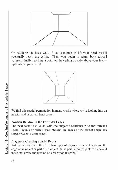
58
Lect
ure
13—
Cre
atin
g Vo
lum
e an
d Ill
usio
nist
ic S
pace
On reaching the back wall, if you continue to lift your head, you’ll eventually reach the ceiling. Then, you begin to return back toward
right where you started.
interior and in certain landscapes.
Position Relative to the Format’s EdgesThe next factor has to do with the subject’s relationship to the format’s edges. Figures or objects that intersect the edges of the format shape can appear closer to us in space.
Diagonals Creating Spatial Depth
edge of an object or part of an object that is parallel to the picture plane and those that create the illusion of a recession in space.
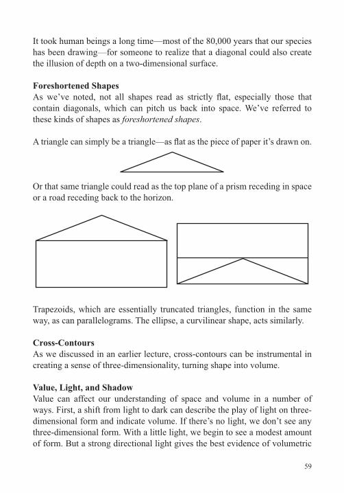
59
It took human beings a long time—most of the 80,000 years that our species has been drawing—for someone to realize that a diagonal could also create
Foreshortened Shapes
contain diagonals, which can pitch us back into space. We’ve referred to these kinds of shapes as foreshortened shapes.
Or that same triangle could read as the top plane of a prism receding in space or a road receding back to the horizon.
Trapezoids, which are essentially truncated triangles, function in the same way, as can parallelograms. The ellipse, a curvilinear shape, acts similarly.
Cross-Contours
Value, Light, and ShadowValue can affect our understanding of space and volume in a number of
dimensional form and indicate volume. If there’s no light, we don’t see any
of form. But a strong directional light gives the best evidence of volumetric
60
Lect
ure
13—
Cre
atin
g Vo
lum
e an
d Ill
usio
nist
ic S
pace
structure. The planes of an object turned toward the light will appear lighter, and those turned away will appear darker. The shift from light to dark is evidence of the underlying planar shift, which translates to volume. The use of varying degrees of light and dark to simulate the passage of light over form and create volume is referred to as chiaroscuro.
In drawing, we speak about two kinds of shadow: object shadow and cast shadow. Object shadow, as the name implies, refers to the shadow on the part of an object that is turned away from the light and, as we’ve said, reveals form. Cast shadows describe the planar surface on which they fall and, thus, can reveal form, too.
Value and Atmospheric PerspectiveAnother way that value affects our perception of depth is through atmospheric or aerial perspective. This is what we experience when we see a distant mountain or building. The distant object looks less clear than when we’re close to it. The darks get lighter, and many of the bright lights get dimmer. The object appears to fade somewhat into the atmosphere. Another way of saying this is that value contrasts can appear to diminish with depth. This is accompanied by changes in the way edges appear. Up close, they’re clear and precise, but from a distance, they appear fuzzier. The use of atmospheric perspective not only gives us space but can also create the illusion of airiness or atmosphere on the page.
Level of DetailThe next principle is related to atmospheric perspective. It concerns the amount of detail we’re able to see at any given depth. Clearly, we see more detail up close and less as something recedes from sight.
Color and Atmospheric PerspectiveThe next factor is color. We’ll discuss this in much greater depth later in the
the way it affects value.
We think of color as having three attributes: (1) hue (the color’s blueness, yellowness, or redness), (2) saturation or intensity (the color’s level of purity versus neutrality), and (3) value (lightness or darkness). Look at the water
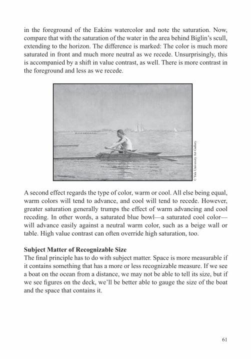
61
in the foreground of the Eakins watercolor and note the saturation. Now, compare that with the saturation of the water in the area behind Biglin’s scull, extending to the horizon. The difference is marked: The color is much more saturated in front and much more neutral as we recede. Unsurprisingly, this is accompanied by a shift in value contrast, as well. There is more contrast in the foreground and less as we recede.
© Y
ale
Uni
vers
ity A
rt G
alle
ry.
A second effect regards the type of color, warm or cool. All else being equal, warm colors will tend to advance, and cool will tend to recede. However, greater saturation generally trumps the effect of warm advancing and cool receding. In other words, a saturated blue bowl—a saturated cool color—will advance easily against a neutral warm color, such as a beige wall or table. High value contrast can often override high saturation, too.
Subject Matter of Recognizable Size
it contains something that has a more or less recognizable measure. If we see a boat on the ocean from a distance, we may not be able to tell its size, but if
and the space that contains it.
62
Lect
ure
13—
Cre
atin
g Vo
lum
e an
d Ill
usio
nist
ic S
pace
Suggested Reading
Pumphrey, The Elements of Art, chapter 7, “Space.”
Rockman, Drawing Essentials, Dimensional Surface,” pp. 46–51.
Sale and Betti, Drawing, Part II, “Spatial Relationships of the Art Elements.”
63
Six Complex Drawing ProjectsLecture 14
Thus far in the course, we’ve seen how line can make shape; how basic shapes, along with construction lines, can be used to construct objects;
seen how we can create strong structures for drawings by relating the negatives to the positives and by relating large aggregate shapes to the even larger ground shapes that create the shape of the drawing itself. In addition, we’ve seen how artists relate what they draw to the armature of the format shape. We’ve learned how to use gestural line to do the work of contour,
arriving at accurate proportions and learned another 12 principles that can
surface. In this lecture, we’ll take on some challenging drawing projects to begin to synthesize this knowledge.
Drawing ProjectsTo make the concepts and techniques we’ve discussed so far your own, in this lecture, you’ll apply what you’ve learned to a number of intriguing and increasingly complex drawing projects: a still life of boxes, a still life of
Is there a large aggregate shape that makes sense in the format?
64
Lect
ure
14—
Six
Com
plex
Dra
win
g Pr
ojec
ts
Are you composing well? Are you relating what you’re drawing to the format’s armature?
Do all the planes read convincingly in space?
Are you using line weight spatially? Are you able to use line weight to make some things appear nearer and others farther away?
Are you using line weight compositionally? Are you able to use line weight to create zones of greater and lesser focus?
ground?
Are the proportions accurate?
Is the whole drawing activated? Are there dead areas?
ProportionsIn each of these projects, you’ll be working to arrive at accurate proportions. If something is eluding you, apply the tools we’ve learned to see if you can
Centerline
Large ground shapes
Aggregate shape
Eyeballing
Negative shape
The gridded picture plane
65
A standard unit of measure
Level lines and plumb lines
The technique of sighting the half.
Common Spatial ProblemsBeyond proportion, much of the challenge in these drawing projects is
recall the 12 principles we’ve discussed related to spatial illusion:
Overlap
Diminishing size
Position along the page’s vertical axis
Position relative to the format’s edges
Diagonals creating spatial depth
Value (light)
Value (aerial perspective)
Amount of detail
Color (aerial perspective)
Subject matter of recognizable size.
66
Lect
ure
14—
Six
Com
plex
Dra
win
g Pr
ojec
ts
Pitfalls in Drawing Naturalistic SpaceThere are a number of pitfalls to avoid when trying to draw naturalistic
format’s shape. Many beginning students position the subject or some part of it so that it lines up with an edge of the format. The result is generally a
shapes to position your subject at the outset and work from the general to
components relative to the drawing’s shape.
Another common problem is drawing what we know, not what we see. Our preconceived shape ideas of most things are limited and differ from how the
common error to draw the top planes of objects, such as tables and beds, too large; we know that these are relatively expansive surfaces, but from many common points of view, they can shrink to an oblique sliver. The way to avoid this is to use a standard unit of measure to gauge the vertical distance
of these kinds of planes.
Another common problem involves inaccurate diagonals and even
you to check the diagonal in reference to the horizontals and verticals of the grid. If something still eludes you, remember Leonardo’s advice about tracing on a piece of glass, or do a phantom trace in the air. You could even
the screen.
top of a bowl to stripes on a shirt curving around an abdomen. It also applies to facial features, such as lips, that naturally follow the curving plane of the head. When drawing your own features, close one eye, look in the mirror,
get a good feel for the form.
67
Line weights are also crucial. Many beginners don’t pay attention to the actual lines they’re drawing—how light or dark or how thick or thin the lines are. And they don’t pay attention to how lines relate to one another on the page. Take a look at your drawing and ask yourself which line or lines grab your attention. Which ones advance in space and which ones recede? Just look at the lines themselves, abstractly. Then, ask yourself which lines should be creating focal points and focal areas and which ones should be advancing and receding. Edit your drawing accordingly.
In addition to line weights, also pay attention to line overlaps. A line attached to something in the background that overlaps something in the foreground will confuse the spatial reading.
A last and common problem is something we might consider as the opposite of overlap. This occurs when something in one spatial location—something in the foreground, for instance—lines up with something in another spatial
Suggested Reading
Review as needed Suggested Readings for Lectures 5 through 14.
68
Lect
ure
15—
Line
ar P
ersp
ectiv
e: In
trod
uctio
n
Linear Perspective: IntroductionLecture 15
Tlearn to apply many of the most important concepts and techniques related to perspective that artists have used over the centuries. Linear
perspective calls on us to use our analytic abilities, and many people enjoy learning about it. But others believe that art should be all about emotion. For those people, it’s important to bear in mind that even a seemingly spontaneous watercolor, such as Eakins’s John Biglin in a Single Scull, is the result of deep thought about perspectival spatial construction. Even Vincent van Gogh, often mistakenly portrayed as running on manic genius, took great pains to learn perspective. He understood that it would free his expressive ability. In this section of the course, we’ll cover many technical aspects of drawing, but the underlying ideas are all applicable to freehand sketching; they will help you understand what you’re seeing much more rapidly and with greater clarity.
PerspectiveThe methods we’ve studied—using plumb lines, units of measure, and other visual tools to create a convincing sensation of proportion and depth of space—are referred to as empirical perspective and nonlinear perspective.
Empirical perspective relies on observation, rather than a set of rules. And it
refers to overlap and to manipulations of clarity of edge, value, or color to create the illusion of spatial depth.
Our area of study, , is a method of drawing that relies on geometric principles. It uses a set of rules regarding the way lines recede to vanishing points. Linear perspective enables us to create form in space and control proportions.
Linear perspective isn’t new to you. You experience it every day, whether you’re walking down a city street or staying at a resort hotel.
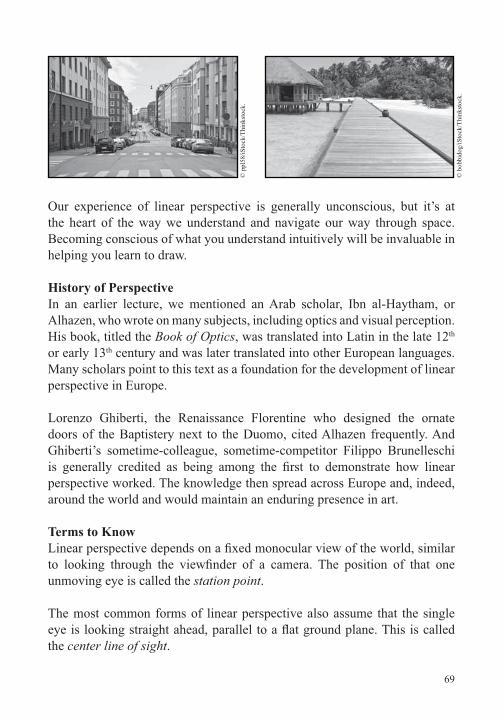
69
© p
pl58
/iSto
ck/T
hink
stoc
k.
© b
obbi
dog/
iSto
ck/T
hink
stoc
k.
Our experience of linear perspective is generally unconscious, but it’s at the heart of the way we understand and navigate our way through space. Becoming conscious of what you understand intuitively will be invaluable in helping you learn to draw.
History of Perspective
Alhazen, who wrote on many subjects, including optics and visual perception. His book, titled the Book of Optics, was translated into Latin in the late 12th or early 13th century and was later translated into other European languages. Many scholars point to this text as a foundation for the development of linear perspective in Europe.
Lorenzo Ghiberti, the Renaissance Florentine who designed the ornate doors of the Baptistery next to the Duomo, cited Alhazen frequently. And
perspective worked. The knowledge then spread across Europe and, indeed, around the world and would maintain an enduring presence in art.
Terms to Know
unmoving eye is called the station point.
The most common forms of linear perspective also assume that the single
the center line of sight.
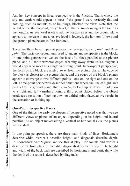
70
Lect
ure
15—
Line
ar P
ersp
ectiv
e: In
trod
uctio
n
Another key concept in linear perspective is the horizon. That’s where the
nothing, such as mountains or buildings, blocked the view. Note that the height of the station point, or eye level, of the person drawing is the same as the horizon. As eye level is elevated, the horizon rises and the ground plane appears to increase in area. As eye level is lowered, the horizon follows and the ground plane becomes foreshortened.
There are three basic types of perspective: one point, two point, and three point. The basic conceptual unit used to understand perspective is the block.
plane, and all the horizontal edges receding away from us as diagonals
the faces of the block are angled away from the picture plane. The edge of the block is closest to the picture plane, and the edges of the block’s planes appear to converge to two different points—one on the right and one on the
parallel to the ground plane, that is, we’re looking up or down. In addition to a right and left vanishing point, a third point placed below the object produces a sensation of looking down or a third point placed above results in the sensation of looking up.
One-Point Perspective BasicsOne of the things the early developers of perspective noted was that we see different views or planes of an object depending on its height and lateral position. As an object moves along a vertical or horizontal axis, the planes we see shift.
describe width; verticals describe height; and diagonals describe depth. In Leonardo’s Last Supper, we see this at play. Horizontals and verticals describe the front plane of the table; diagonals describe its depth. The height and width of the back wall are described by horizontals and verticals, while the depth of the room is described by diagonals.
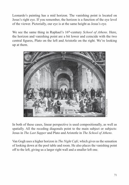
71
Leonardo’s painting has a mid horizon. The vanishing point is located on Jesus’s right eye. If you remember, the horizon is a function of the eye level of the viewer. Pictorially, our eye is at the same height as Jesus’s eye.
We see the same thing in Raphael’s 16th School of Athens. Here, the horizon and vanishing point are a bit lower and coincide with the two
up at them.
© P
hoto
s.com
/Thi
nkst
ock.
In both of these cases, linear perspective is used compositionally, as well as spatially. All the receding diagonals point to the main subject or subjects: Jesus in The Last Supper and Plato and Aristotle in The School of Athens.
Van Gogh uses a higher horizon in The Night Café, which gives us the sensation of looking down at the pool table and room. He also places the vanishing point off to the left, giving us a larger right wall and a smaller left one.
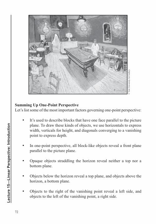
72
Lect
ure
15—
Line
ar P
ersp
ectiv
e: In
trod
uctio
n
© Y
ale
Uni
vers
ity A
rt G
alle
ry.
Summing Up One-Point Perspective
It’s used to describe blocks that have one face parallel to the picture plane. To draw these kinds of objects, we use horizontals to express width, verticals for height, and diagonals converging to a vanishing point to express depth.
parallel to the picture plane.
Opaque objects straddling the horizon reveal neither a top nor a bottom plane.
Objects below the horizon reveal a top plane, and objects above the horizon, a bottom plane.
Objects to the right of the vanishing point reveal a left side, and objects to the left of the vanishing point, a right side.
73
Objects on a vertical axis straddling the vanishing point reveal no side planes.
As planes get closer to the vanishing point, they appear more foreshortened; as they move away, they appear lengthened.
is relatively close to the vanishing point. When objects are placed too far away from the vanishing point, they begin to distort.
Suggested Reading
Norling, Perspective Made Easy, pp. 1–30.
Rockman, Drawing Essentials, pp. 140–151.
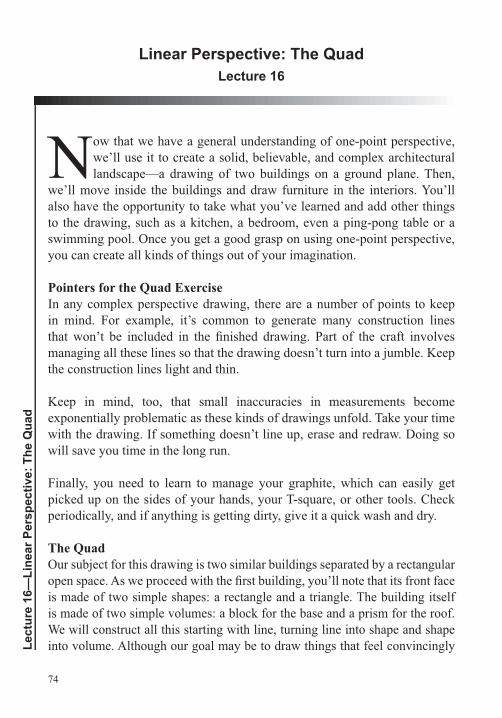
74
Lect
ure
16—
Line
ar P
ersp
ectiv
e: T
he Q
uad
Linear Perspective: The QuadLecture 16
Nwe’ll use it to create a solid, believable, and complex architectural landscape—a drawing of two buildings on a ground plane. Then,
we’ll move inside the buildings and draw furniture in the interiors. You’ll also have the opportunity to take what you’ve learned and add other things
you can create all kinds of things out of your imagination.
Pointers for the Quad ExerciseIn any complex perspective drawing, there are a number of points to keep in mind. For example, it’s common to generate many construction lines
managing all these lines so that the drawing doesn’t turn into a jumble. Keep the construction lines light and thin.
Keep in mind, too, that small inaccuracies in measurements become exponentially problematic as these kinds of drawings unfold. Take your time with the drawing. If something doesn’t line up, erase and redraw. Doing so will save you time in the long run.
Finally, you need to learn to manage your graphite, which can easily get
periodically, and if anything is getting dirty, give it a quick wash and dry.
The QuadOur subject for this drawing is two similar buildings separated by a rectangular
is made of two simple shapes: a rectangle and a triangle. The building itself is made of two simple volumes: a block for the base and a prism for the roof. We will construct all this starting with line, turning line into shape and shape into volume. Although our goal may be to draw things that feel convincingly
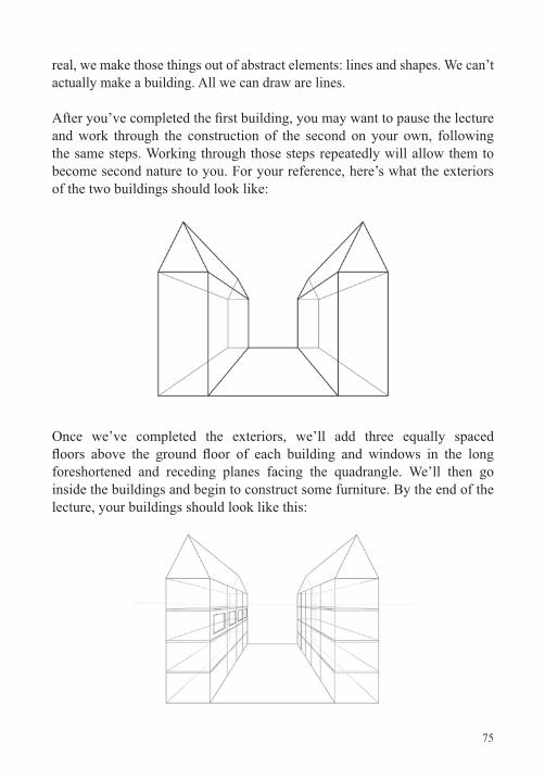
75
real, we make those things out of abstract elements: lines and shapes. We can’t actually make a building. All we can draw are lines.
and work through the construction of the second on your own, following the same steps. Working through those steps repeatedly will allow them to become second nature to you. For your reference, here’s what the exteriors of the two buildings should look like:
Once we’ve completed the exteriors, we’ll add three equally spaced
foreshortened and receding planes facing the quadrangle. We’ll then go inside the buildings and begin to construct some furniture. By the end of the lecture, your buildings should look like this:

76
Lect
ure
16—
Line
ar P
ersp
ectiv
e: T
he Q
uad
Suggested Reading
Auvil, Perspective Drawing.
Montague, Basic Perspective Drawing.
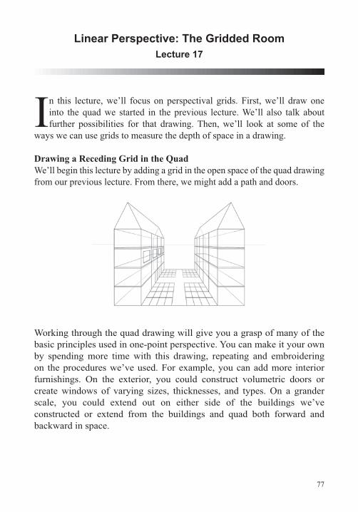
77
Linear Perspective: The Gridded RoomLecture 17
In this lecture, we’ll focus on perspectival grids. First, we’ll draw one into the quad we started in the previous lecture. We’ll also talk about further possibilities for that drawing. Then, we’ll look at some of the
ways we can use grids to measure the depth of space in a drawing.
Drawing a Receding Grid in the QuadWe’ll begin this lecture by adding a grid in the open space of the quad drawing from our previous lecture. From there, we might add a path and doors.
Working through the quad drawing will give you a grasp of many of the
by spending more time with this drawing, repeating and embroidering on the procedures we’ve used. For example, you can add more interior furnishings. On the exterior, you could construct volumetric doors or create windows of varying sizes, thicknesses, and types. On a grander scale, you could extend out on either side of the buildings we’ve constructed or extend from the buildings and quad both forward and backward in space.
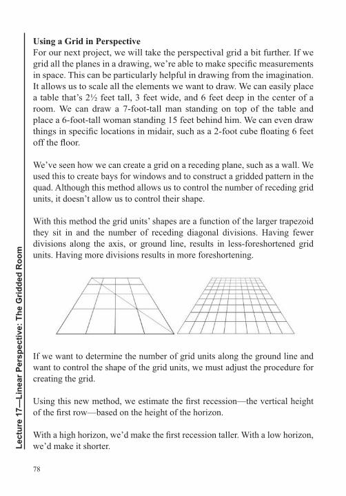
78
Lect
ure
17—
Line
ar P
ersp
ectiv
e: T
he G
ridde
d R
oom
Using a Grid in PerspectiveFor our next project, we will take the perspectival grid a bit further. If we
in space. This can be particularly helpful in drawing from the imagination. It allows us to scale all the elements we want to draw. We can easily place
We’ve seen how we can create a grid on a receding plane, such as a wall. We used this to create bays for windows and to construct a gridded pattern in the quad. Although this method allows us to control the number of receding grid units, it doesn’t allow us to control their shape.
With this method the grid units’ shapes are a function of the larger trapezoid they sit in and the number of receding diagonal divisions. Having fewer
units. Having more divisions results in more foreshortening.
If we want to determine the number of grid units along the ground line and want to control the shape of the grid units, we must adjust the procedure for creating the grid.
we’d make it shorter.
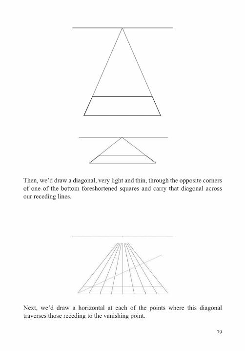
79
Then, we’d draw a diagonal, very light and thin, through the opposite corners of one of the bottom foreshortened squares and carry that diagonal across our receding lines.
Next, we’d draw a horizontal at each of the points where this diagonal traverses those receding to the vanishing point.
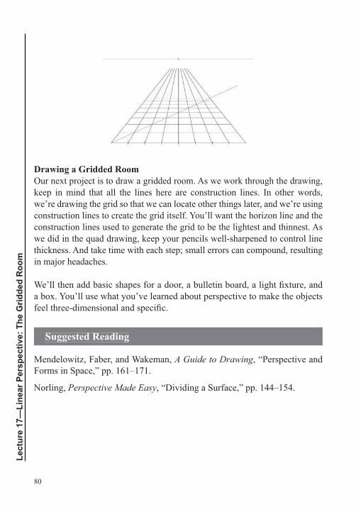
80
Lect
ure
17—
Line
ar P
ersp
ectiv
e: T
he G
ridde
d R
oom
Drawing a Gridded RoomOur next project is to draw a gridded room. As we work through the drawing, keep in mind that all the lines here are construction lines. In other words, we’re drawing the grid so that we can locate other things later, and we’re using construction lines to create the grid itself. You’ll want the horizon line and the construction lines used to generate the grid to be the lightest and thinnest. As
thickness. And take time with each step; small errors can compound, resulting in major headaches.
a box. You’ll use what you’ve learned about perspective to make the objects
Suggested Reading
Mendelowitz, Faber, and Wakeman, A Guide to Drawing, “Perspective and Forms in Space,” pp. 161–171.
Norling, Perspective Made Easy, “Dividing a Surface,” pp. 144–154.
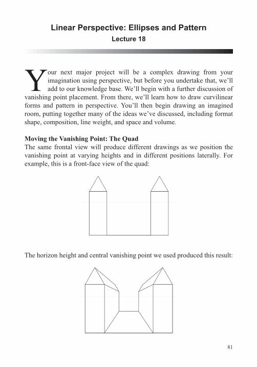
81
Linear Perspective: Ellipses and PatternLecture 18
Your next major project will be a complex drawing from your imagination using perspective, but before you undertake that, we’ll add to our knowledge base. We’ll begin with a further discussion of
vanishing point placement. From there, we’ll learn how to draw curvilinear forms and pattern in perspective. You’ll then begin drawing an imagined room, putting together many of the ideas we’ve discussed, including format shape, composition, line weight, and space and volume.
Moving the Vanishing Point: The QuadThe same frontal view will produce different drawings as we position the vanishing point at varying heights and in different positions laterally. For
The horizon height and central vanishing point we used produced this result:
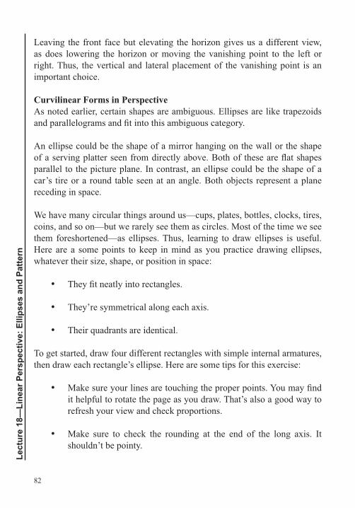
82
Lect
ure
18—
Line
ar P
ersp
ectiv
e: E
llips
es a
nd P
atte
rn
Leaving the front face but elevating the horizon gives us a different view, as does lowering the horizon or moving the vanishing point to the left or right. Thus, the vertical and lateral placement of the vanishing point is an important choice.
Curvilinear Forms in PerspectiveAs noted earlier, certain shapes are ambiguous. Ellipses are like trapezoids
An ellipse could be the shape of a mirror hanging on the wall or the shape
parallel to the picture plane. In contrast, an ellipse could be the shape of a car’s tire or a round table seen at an angle. Both objects represent a plane receding in space.
We have many circular things around us—cups, plates, bottles, clocks, tires, coins, and so on—but we rarely see them as circles. Most of the time we see them foreshortened—as ellipses. Thus, learning to draw ellipses is useful. Here are a some points to keep in mind as you practice drawing ellipses, whatever their size, shape, or position in space:
They’re symmetrical along each axis.
Their quadrants are identical.
To get started, draw four different rectangles with simple internal armatures, then draw each rectangle’s ellipse. Here are some tips for this exercise:
it helpful to rotate the page as you draw. That’s also a good way to refresh your view and check proportions.
Make sure to check the rounding at the end of the long axis. It shouldn’t be pointy.
83
Symmetricality is vital. Use the negative shapes in the rectangle as aids; they should be identical.
If you get stuck, make a tracing of the ellipse and rotate the tracing above the original drawing. That will give you a read on symmetry.
The Foreshortened Ellipse
But an ellipse that’s representing a foreshortened circle can also be thought
In other words, if we draw ellipses into trapezoids that represent squares in perspective, we’ll produce perspectival circles. We can use the same kinds of construction lines that we used to draw a circle in a square to help us construct an ellipse in a foreshortened square.
Note that in the foreshortened view, the major axis divides the ellipse into perspectival halves—larger below and smaller above. The reason for this is that equal halves do not appear equal in a foreshortened view. The half that’s closer looks larger, and the half that’s farther away looks smaller.
Cylinders, Cones, and SpheresPaul Cézanne once wrote: “Treat nature by the cylinder, the sphere, [and] the cone, everything in proper perspective so that each side of an object or a plane is directed towards a central point.” Although Cézanne was a revolutionary artist, the sentiment he expressed here is traditional. He’s saying that we should draw using basic geometric volumes and that we
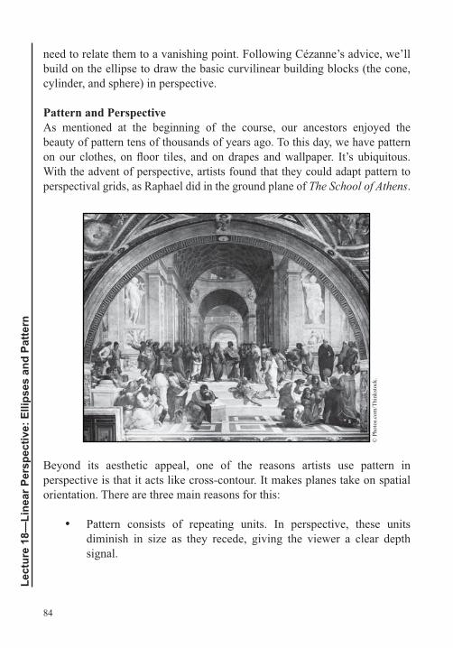
84
Lect
ure
18—
Line
ar P
ersp
ectiv
e: E
llips
es a
nd P
atte
rn
need to relate them to a vanishing point. Following Cézanne’s advice, we’ll build on the ellipse to draw the basic curvilinear building blocks (the cone, cylinder, and sphere) in perspective.
Pattern and PerspectiveAs mentioned at the beginning of the course, our ancestors enjoyed the beauty of pattern tens of thousands of years ago. To this day, we have pattern
With the advent of perspective, artists found that they could adapt pattern to perspectival grids, as Raphael did in the ground plane of The School of Athens.
© P
hoto
s.com
/Thi
nkst
ock.
Beyond its aesthetic appeal, one of the reasons artists use pattern in
orientation. There are three main reasons for this:
Pattern consists of repeating units. In perspective, these units diminish in size as they recede, giving the viewer a clear depth signal.
85
Pattern placed in perspective either has or implies diagonals, which create spatial depth.
A pattern wedded to a perspectival grid exhibits foreshortened shapes.
Patterns can range from highly repetitive and regular to extremely varied. Generating patterns becomes complex very quickly, but looking at some of the basic methods can stimulate your imagination. After generating patterns, you can also tessellate them, that is, put one patterned tile next to another. In addition, assigning value or color to a grid or pattern will bring out different
some pattern studies by drawing on graph paper.
Transferring a pattern to a perspectival grid is a matter of remembering the steps you took to generate the pattern and repeating them in the foreshortened grid. Once you’ve created some patterns, return to your drawing of the gridded room. Look through the pattern studies you just did, and apply the best ones to the different planes of the room.
Drawing Project: A Constructed Space in One-Point Perspective
drawing here will be a fully gridded room, with grid units that are foreshortened squares. The lines that structure the drawing will be of three primary types: horizontals to express width, verticals to express height, and diagonals to express depth. Of course, you could use curvilinear structures, too.
As you work on this drawing, keep in mind the topics we have discussed previously, including the importance of the format shape, of thinking compositionally, and of paying attention to line weights. Begin with some quick gestural drawings of an imagined room. Think about the major planes
rectangle they form; this will be the format shape. Then, consider your grid unit and scale, but again, work quickly and gesturally. You can work out the
86
Lect
ure
18—
Line
ar P
ersp
ectiv
e: E
llips
es a
nd P
atte
rn
Suggested Reading
Rockman, Drawing Essentials, Dimensional Surface,” pp. 51–187.
Stevens, A Handbook of Regular Patterns.
87
Linear Perspective: Advanced Topics Lecture 19
In this lecture, we’ll conclude our discussion of gesture drawing applied to compositional studies using perspective. You’ll also learn how you can relate your knowledge of linear perspective to drawing freehand,
from observation. In this course, we separate topics, such as perspective, in order to be able to study them closely. But each artist synthesizes all the pieces we’ve been learning in his or her own way. Also in this lecture, we’ll
Applying Gesture Drawing to Compositional StudiesThe goal in using gesture drawing in compositional studies for the constructed space drawing project is to run through a number of different ideas with the
much detail, but you should be able to answer several key questions:
Where is the horizon? Is it high, mid, or low?
Where’s the vanishing point? Is it right, left, or centered?
What is the drawing’s format shape—horizontal, vertical, or square?
What’s the approximate scale of the grid measure at the baseline?
Once you’ve answered these questions, measure your compositional sketch and scale up the important measures, including the format shape, the position of the horizon, and the vanishing point. Follow the procedures outlined earlier to grid the drawing, and you’re ready to make the drawing itself.
objects in your drawing, search in books or online for images and data. Then,
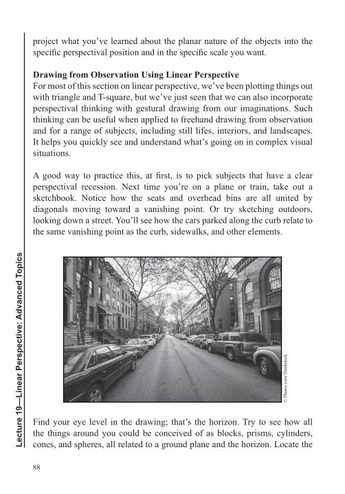
88
Lect
ure
19—
Line
ar P
ersp
ectiv
e: A
dvan
ced
Topi
cs
project what you’ve learned about the planar nature of the objects into the
Drawing from Observation Using Linear PerspectiveFor most of this section on linear perspective, we’ve been plotting things out
perspectival thinking with gestural drawing from our imaginations. Such thinking can be useful when applied to freehand drawing from observation and for a range of subjects, including still lifes, interiors, and landscapes. It helps you quickly see and understand what’s going on in complex visual situations.
perspectival recession. Next time you’re on a plane or train, take out a sketchbook. Notice how the seats and overhead bins are all united by diagonals moving toward a vanishing point. Or try sketching outdoors, looking down a street. You’ll see how the cars parked along the curb relate to the same vanishing point as the curb, sidewalks, and other elements.
© P
hoto
s.com
/Thi
nkst
ock.
Find your eye level in the drawing; that’s the horizon. Try to see how all the things around you could be conceived of as blocks, prisms, cylinders, cones, and spheres, all related to a ground plane and the horizon. Locate the
89
vanishing point or points. Draw with horizontals, verticals, and diagonals related to those points. Start with large structures and move from the general
Two-Point Perspective
great for describing a receding hallway or a room where the back wall is parallel and the side walls are perpendicular to the picture plane. It’s equally useful for describing such objects as blocks in a similar spatial orientation, with a face that is parallel to the picture plane and other surfaces that are perpendicular. Vertical lines describe height; horizontals describe width; and diagonals, receding to a common vanishing point on the horizon, describe depth.
But if the object is positioned so that it no longer has a face that is parallel
express the height of the room or block, but the horizontals are gone. We are left with diagonals shooting back in two different directions: one to a
drawing nine blocks.
Sloping Planes
with planes that are parallel, perpendicular, or angled to the picture plane. We can also describe an object that is parallel or perpendicular to the ground plane. But if we tip the object at an angle, we need a new set of procedures. The tipped plane of an object is called a sloping or incline plane.
We’ve actually already drawn an object with multiple sloping planes, though we didn’t speak about it in those terms. This was the open box we drew in an earlier lecture. We’ll draw a similar box now, but this time, instead of relying on observation, we’ll use what we know about linear perspective and sloping planes to construct the drawing.
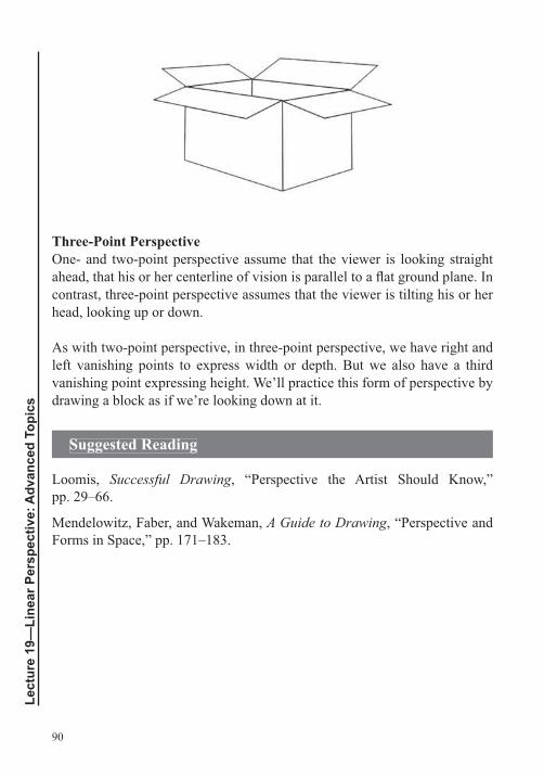
90
Lect
ure
19—
Line
ar P
ersp
ectiv
e: A
dvan
ced
Topi
cs
Three-Point Perspective
head, looking up or down.
left vanishing points to express width or depth. But we also have a third vanishing point expressing height. We’ll practice this form of perspective by drawing a block as if we’re looking down at it.
Suggested Reading
Loomis, Successful Drawing, “Perspective the Artist Should Know,” pp. 29–66.
Mendelowitz, Faber, and Wakeman, A Guide to Drawing, “Perspective and Forms in Space,” pp. 171–183.
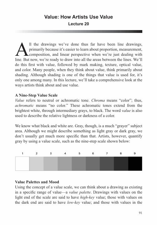
91
Value: How Artists Use ValueLecture 20
All the drawings we’ve done thus far have been line drawings, primarily because it’s easier to learn about proportion, measurement, composition, and linear perspective when we’re just dealing with
line. But now, we’re ready to draw into all the areas between the lines. We’ll
and color. Many people, when they think about value, think primarily about shading. Although shading is one of the things that value is used for, it’s only one among many. In this lecture, we’ll take a comprehensive look at the ways artists think about and use value.
A Nine-Step Value ScaleValue refers to neutral or achromatic tone. Chroma means “color”; thus, achromatic means “no color.” These achromatic tones extend from the brightest white, through intermediary grays, to black. The word value is also used to describe the relative lightness or darkness of a color.
We know what black and white are. Gray, though, is a much “grayer” subject area. Although we might describe something as light gray or dark gray, we
Value Palettes and MoodUsing the concept of a value scale, we can think about a drawing as existing
value palette. Drawings with values on the light end of the scale are said to have high-key value; those with values on the dark end are said to have low-key value; and those with values in the
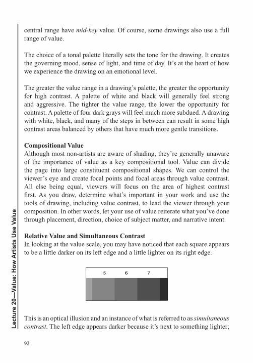
92
Lect
ure
20—
Valu
e: H
ow A
rtis
ts U
se V
alue
central range have mid-key value. Of course, some drawings also use a full range of value.
The choice of a tonal palette literally sets the tone for the drawing. It creates the governing mood, sense of light, and time of day. It’s at the heart of how we experience the drawing on an emotional level.
The greater the value range in a drawing’s palette, the greater the opportunity for high contrast. A palette of white and black will generally feel strong and aggressive. The tighter the value range, the lower the opportunity for contrast. A palette of four dark grays will feel much more subdued. A drawing with white, black, and many of the steps in between can result in some high contrast areas balanced by others that have much more gentle transitions.
Compositional Value
of the importance of value as a key compositional tool. Value can divide the page into large constituent compositional shapes. We can control the viewer’s eye and create focal points and focal areas through value contrast. All else being equal, viewers will focus on the area of highest contrast
tools of drawing, including value contrast, to lead the viewer through your composition. In other words, let your use of value reiterate what you’ve done through placement, direction, choice of subject matter, and narrative intent.
Relative Value and Simultaneous ContrastIn looking at the value scale, you may have noticed that each square appears to be a little darker on its left edge and a little lighter on its right edge.
This is an optical illusion and an instance of what is referred to as simultaneous contrast. The left edge appears darker because it’s next to something lighter;
93
the right edge appears lighter because it’s next to something darker. White will also appear brighter as its ground becomes darker and brightest when set against black. Black will appear darker as its ground gets lighter and darkest when set against white.
We experience value relatively, which means that we won’t know how any value really appears until we see it in context—next to all abutting values. Imagine that you’re drawing a still life of two bottles on a table in front of a
much more sense to look at the central area, where we see the interior sides of the bottles and where those two sides meet the intersection of the wall and table. If you can give an indication of what happens at this set of intersections, you’ll be able to understand how the different values affect one another.
Developing such a key area can give you a clear idea of the overall value range or value palette in a drawing. Based on this, you can lay in general values for the back wall, table, and bottles. In this way, you see all the value relatively
Another good practice is to work from the back to the front in a drawing because whatever is behind the main subject or objects—such as a wall—must be overlapped to truly feel as if it is behind. The same thing is true for whatever is underneath the main subject or objects, such as a table; it must be overlapped to feel underneath the objects. This means that the actual graphite or charcoal marks and smudges that the bottles are drawn with should overlap the graphite or charcoal of the wall, not vice versa. Beginners who don’t do this often wind up with a halo of light around their objects.
because they’re afraid to mar the edges of what they’ve drawn, they stop the value of the wall or table short of the object’s edge. This makes the wall and the spatial environment feel unbelievable and discontinuous.
In most cases, if you develop the habit of working from back to front, the overlaps of edge will work to your advantage. Once you’ve found the general value palette by putting value into a juncture where key edges meet, go to the largest plane in deep space, such as the wall, then address the tabletop, and
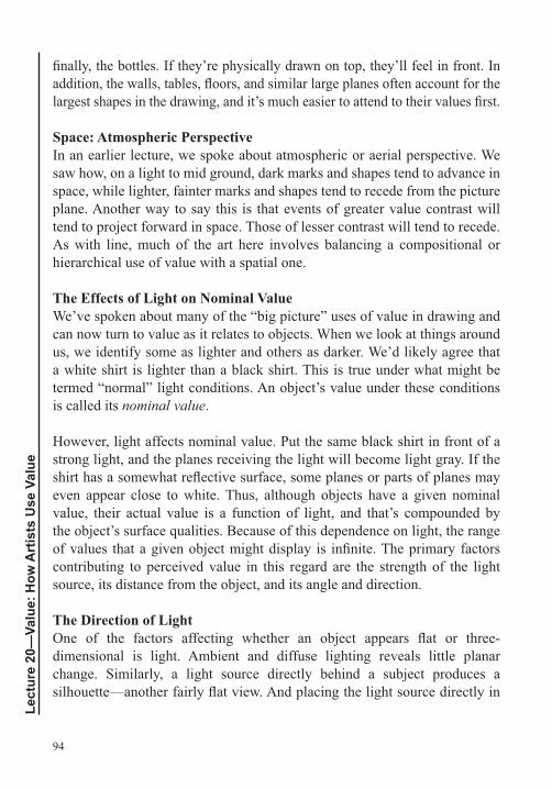
94
Lect
ure
20—
Valu
e: H
ow A
rtis
ts U
se V
alue
Space: Atmospheric PerspectiveIn an earlier lecture, we spoke about atmospheric or aerial perspective. We saw how, on a light to mid ground, dark marks and shapes tend to advance in space, while lighter, fainter marks and shapes tend to recede from the picture plane. Another way to say this is that events of greater value contrast will tend to project forward in space. Those of lesser contrast will tend to recede. As with line, much of the art here involves balancing a compositional or hierarchical use of value with a spatial one.
The Effects of Light on Nominal ValueWe’ve spoken about many of the “big picture” uses of value in drawing and can now turn to value as it relates to objects. When we look at things around us, we identify some as lighter and others as darker. We’d likely agree that a white shirt is lighter than a black shirt. This is true under what might be termed “normal” light conditions. An object’s value under these conditions is called its nominal value.
However, light affects nominal value. Put the same black shirt in front of a strong light, and the planes receiving the light will become light gray. If the
even appear close to white. Thus, although objects have a given nominal value, their actual value is a function of light, and that’s compounded by the object’s surface qualities. Because of this dependence on light, the range
contributing to perceived value in this regard are the strength of the light source, its distance from the object, and its angle and direction.
The Direction of Light
dimensional is light. Ambient and diffuse lighting reveals little planar change. Similarly, a light source directly behind a subject produces a
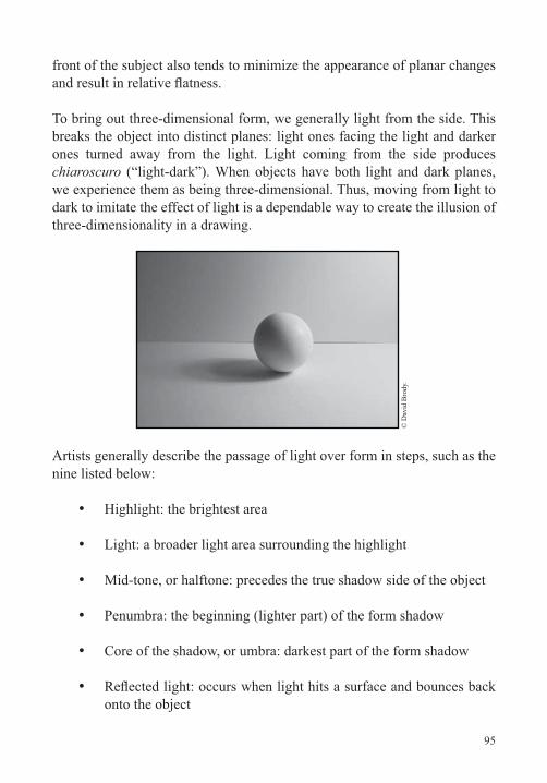
95
front of the subject also tends to minimize the appearance of planar changes
breaks the object into distinct planes: light ones facing the light and darker ones turned away from the light. Light coming from the side produces chiaroscuro
dark to imitate the effect of light is a dependable way to create the illusion of
© D
avid
Bro
dy.
Artists generally describe the passage of light over form in steps, such as the nine listed below:
Highlight: the brightest area
Light: a broader light area surrounding the highlight
Penumbra: the beginning (lighter part) of the form shadow
Core of the shadow, or umbra: darkest part of the form shadow
onto the object
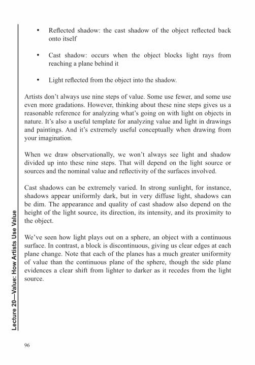
96
Lect
ure
20—
Valu
e: H
ow A
rtis
ts U
se V
alue
onto itself
Cast shadow: occurs when the object blocks light rays from reaching a plane behind it
Artists don’t always use nine steps of value. Some use fewer, and some use even more gradations. However, thinking about these nine steps gives us a reasonable reference for analyzing what’s going on with light on objects in nature. It’s also a useful template for analyzing value and light in drawings and paintings. And it’s extremely useful conceptually when drawing from your imagination.
When we draw observationally, we won’t always see light and shadow divided up into these nine steps. That will depend on the light source or
Cast shadows can be extremely varied. In strong sunlight, for instance, shadows appear uniformly dark, but in very diffuse light, shadows can be dim. The appearance and quality of cast shadow also depend on the height of the light source, its direction, its intensity, and its proximity to the object.
We’ve seen how light plays out on a sphere, an object with a continuous surface. In contrast, a block is discontinuous, giving us clear edges at each plane change. Note that each of the planes has a much greater uniformity of value than the continuous plane of the sphere, though the side plane evidences a clear shift from lighter to darker as it recedes from the light source.
97
© D
avid
Bro
dy.
Steps of Light in Drawings and PaintingsIf we understand the way light moves over a continuously curving surface and the way it moves over a faceted surface, we have the basics to apply to most of the things we see around us. Spheres and spheroid objects, such as eggs, bowls, and breasts, take light in a graduated way. When we draw these kinds of forms, we modulate the value with greater continuity. In contrast,
with chiseled features, retain a much greater consistency of value within each plane. Many artists actively use these kinds of geometric forms as a means of conceiving of the way light affects the things they want to draw.
Suggested Reading
Pumphrey, The Elements of Art, “Value and Color,” pp. 147–161.
98
Lect
ure
21—
Valu
e: D
raw
ing
Mat
eria
ls fo
r Val
ue
Value: Drawing Materials for ValueLecture 21
To draw with value, we’ll need to expand on our use of materials. This lecture reviews some of the materials we’ve been using, including graphite, charcoal, and erasers, and covers additional materials
paper in detail and learn how to make test sheets to understand how different papers, materials, and techniques interact.
Graphite
the next to a point, and so on. This will give you a good range of tools for both line and value.
As mentioned earlier, graphite also comes in solid sticks. Most are soft, in the range of 2B to 6B. Such sticks can be sharpened into wedge or square shapes to to make different kinds of lines or areas of value.
When using your sanding block, save the graphite powder. You can apply it with a brush or other tool to create smooth areas of value in your drawings.
CharcoalVine charcoal will not create a deep black; for this, you need compressed charcoal, which is made by mixing charcoal powder with varying amounts of binder and clay. Some manufacturers add black or dark pigments to enhance the color. The proportion of binder and clay to powder determines the charcoal’s hardness—more clay for harder charcoal and less clay for softer. Compressed charcoal is commonly labeled soft, medium, and hard or with a system similar to that used for pencils. As with pencils, the grading of charcoal varies from one manufacturer to the next.
99
Charcoal pencils are useful for more detailed work. These pencils are made of compressed charcoal encased in wood. Some manufacturers label them extra soft, soft, medium, and hard. Others label them similar to graphite pencils, with grades ranging from 6B to 2H. You can sharpen charcoal pencils with a sharpener or a knife and sandpaper, but be gentle. These pencils are more brittle than graphite. A near relative of the charcoal pencil is the carbon pencil. It, too, gives deeper blacks than vine or willow charcoal, but like compressed charcoal, it is harder to erase.
Again, save the powder you produce when sharpening your charcoal.
Blending, Spreading, and Applying ValueA number of tools can be used to blend, spread, and apply material, including a chamois cloth for large areas and tortillons and blending stumps for small
of rolled paper. Tortillons are small and pointed at one end; stumps vary in size, are denser, and are pointed at both ends. Brushes—from stiff bristle brushes to softer ones—are also useful for blending. Many artists also use
your skin can mix with graphite or charcoal and discolor it. These oils may
ErasersIt’s a good idea to experiment with different erasers to see how they work with your various drawing tools. For example, kneaded erasers tend to smear the darkest materials, such as charcoal and charcoal pencil when they’ve been applied heavily.
tool to draw light lines, marks, or shapes into areas of value. To make a thin,
Some artists use a tool called an erasing shield. This is about the size of a
of different shapes and sizes. You can place the shield over a part of your drawing and erase through the opening to control the erasure.
100
Lect
ure
21—
Valu
e: D
raw
ing
Mat
eria
ls fo
r Val
ue
FixativeFixative is a spray varnish that artists use to protect their drawings. It
you’ve done any blending or erasing you might want before spraying. When you spray, aim for a light, even coat. A single spray is often enough for light to medium graphite. For heavy pencil and charcoal, you may need two to three coats. For successive coats, alternate the direction of application and make sure to wait until each coat is fully dry before spraying again.
Fixative can darken tonal values if oversprayed, and it can change value, chroma, and saturation, especially with delicate pastels. It’s always a good
instructions on the can and the material safety data sheet (MSDS) before using.
Pen and InkDip, or nib, pens are excellent drawing tools. Dip pens consist of a nib and holder. Nibs vary in size and shape, from very small crow quills to larger,
and shapes. Also, get one holder for each nib.
Some manufacturers use a protective coating on nibs to prevent rust, but the
toothbrush, warm water, and dish soap. Make sure to rinse and dry your nibs after each use, as well.
manufacturers make ink erasers, although these work best for small areas. You can also try scraping away ink with a utility knife. Again, this won’t work on large areas or with lightweight papers.
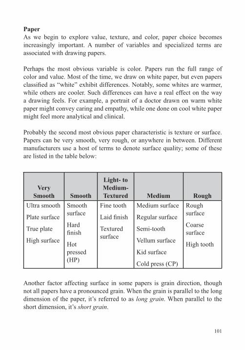
101
PaperAs we begin to explore value, texture, and color, paper choice becomes increasingly important. A number of variables and specialized terms are associated with drawing papers.
Perhaps the most obvious variable is color. Papers run the full range of color and value. Most of the time, we draw on white paper, but even papers
while others are cooler. Such differences can have a real effect on the way a drawing feels. For example, a portrait of a doctor drawn on warm white paper might convey caring and empathy, while one done on cool white paper might feel more analytical and clinical.
Probably the second most obvious paper characteristic is texture or surface. Papers can be very smooth, very rough, or anywhere in between. Different manufacturers use a host of terms to denote surface quality; some of these are listed in the table below:
Very Smooth Smooth
Light- to Medium-Textured Medium Rough
Ultra smooth
Plate surface
True plate
High surface
Smooth surface
Hard
Hot pressed (HP)
Fine tooth
Textured surface
Medium surface
Regular surface
Vellum surface
Kid surface
Cold press (CP)
Rough surface
Coarse surface
High tooth
Another factor affecting surface in some papers is grain direction, though not all papers have a pronounced grain. When the grain is parallel to the long dimension of the paper, it’s referred to as long grain. When parallel to the short dimension, it’s short grain.
102
Lect
ure
21—
Valu
e: D
raw
ing
Mat
eria
ls fo
r Val
ue
Some papers also have a starch, glue, or similar synthetic material applied to the surface, referred to as size or sizing. This coating creates a barrier between
using wet media. It can also make a paper more easily erasable.
Another important paper factor is thickness. The thickness of a piece of paper is referred to as its caliper. This is generally measured in thousandths of an inch or in millimeters. Another measure of thickness is ply. One
glued together to create a thicker sheet. The word bristol is also used to refer
is known as the basis weight. That’s the weight of a ream of a given paper at its basis size. Note that the basis size is not always the same as the sheet size.
industry basis size for this kind of paper is 17 x 22 inches. This means that a ream of this paper, with sheets measuring 17 x 20 inches, would weigh in at 20 pounds. The basis size for most watercolor papers is 22 x 30 inches, and for drawing papers, 24 x 36 inches.
also commonly used to make papers.
Another important consideration with paper is permanence, and the enemy of permanence is acidity. For this reason, many papermakers add alkaline substances, such as calcium carbonate, as a buffer. Acidity and alkalinity are measured on the pH scale, which runs from 0 to 14. Low pH is acidic; high pH is alkaline; and 7 is neutral. Archival papers generally score in the 7.5 to 9.5 range.
As you attempt more ambitious drawing projects, you should experiment
each into 6 pieces, and label each piece on the back with the paper’s name. With 5 of each of the 6 pieces, make yourself a small sketchbook. With the remaining 10 pieces, make some test sheets using a variety of different
103
materials, including soft and hard pencils, graphite sticks, different types of charcoal, pens, and brushes and ink. Try blending and erasing on these test sheets. You’ll learn a tremendous amount through this activity. As you touch each of your materials to each sheet of paper, you’ll immediately feel the
Although papers are labeled for different uses and materials, such as drawing, charcoal, pastel, watercolor, etching, and so on, any paper can be used for any purpose, though, the labeling is not meaningless. For clear, articulated line drawings, a smoother, harder paper is generally desirable. Charcoal and pastel papers tend to have more tooth, or texture. Watercolor papers tend to be stiffer and more textured, while printmaking papers tend to be smoother.
Portfolios
end versions with zippers and other enhancements. For storage at home,
around, something more protective and durable may serve you better over time. Make sure to bring a portfolio when you go out to buy paper and leave the paper in the portfolio for storage.
LightsFinally, for a number of the projects done from observation using value, you
Suggested Reading
Chaet, The Art of Drawing, chapter 4, “Media and Materials.”
Guptill, Rendering in Pen and Ink, chapters 1–3.
Mendelowitz, Faber, and Wakeman, A Guide to Drawing, “Wet Media,” pp. 208–227.
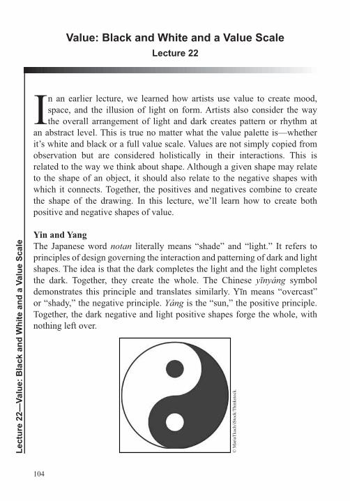
104
Lect
ure
22—
Valu
e: B
lack
and
Whi
te a
nd a
Val
ue S
cale
Value: Black and White and a Value ScaleLecture 22
In an earlier lecture, we learned how artists use value to create mood, space, and the illusion of light on form. Artists also consider the way the overall arrangement of light and dark creates pattern or rhythm at
an abstract level. This is true no matter what the value palette is—whether it’s white and black or a full value scale. Values are not simply copied from observation but are considered holistically in their interactions. This is related to the way we think about shape. Although a given shape may relate to the shape of an object, it should also relate to the negative shapes with which it connects. Together, the positives and negatives combine to create the shape of the drawing. In this lecture, we’ll learn how to create both positive and negative shapes of value.
Yin and YangThe Japanese word notan literally means “shade” and “light.” It refers to principles of design governing the interaction and patterning of dark and light shapes. The idea is that the dark completes the light and the light completes the dark. Together, they create the whole. The Chinese symbol
or “shady,” the negative principle. is the “sun,” the positive principle. Together, the dark negative and light positive shapes forge the whole, with nothing left over.
© M
aria
Tkac
h/iS
tock
/Thi
nkst
ock.
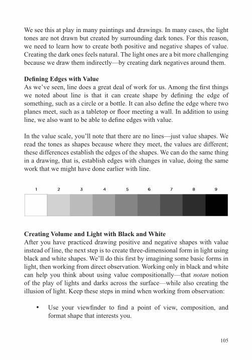
105
We see this at play in many paintings and drawings. In many cases, the light tones are not drawn but created by surrounding dark tones. For this reason, we need to learn how to create both positive and negative shapes of value. Creating the dark ones feels natural. The light ones are a bit more challenging because we draw them indirectly—by creating dark negatives around them.
In the value scale, you’ll note that there are no lines—just value shapes. We read the tones as shapes because where they meet, the values are different; these differences establish the edges of the shapes. We can do the same thing in a drawing, that is, establish edges with changes in value, doing the same work that we might have done earlier with line.
Creating Volume and Light with Black and WhiteAfter you have practiced drawing positive and negative shapes with value
light, then working from direct observation. Working only in black and white can help you think about using value compositionally—that notan notion of the play of lights and darks across the surface—while also creating the illusion of light. Keep these steps in mind when working from observation:
format shape that interests you.
106
Lect
ure
22—
Valu
e: B
lack
and
Whi
te a
nd a
Val
ue S
cale
Pay particular attention to the large positive and negative shapes
Also pay attention to the large groupings of light and dark caused by planar changes and cast shadows.
As you did with single objects drawn from your imagination, rule out the format on your paper with a light pencil. Then, translate all the values you see into either white or black shapes. You want to make this translation or reduction based on choices that will maximize the illusion of depth and volume.
Returning to the Value ScaleWe’ve now seen that we don’t have to copy every value to get a convincing sensation of light, space, and volume. In fact, we can translate those values into just two: black and white. But now, we’re ready to use a fuller range. One exercise to help you begin thinking about the range of values is to create
copy the values from the scale shown above. Start on the outside and work toward the center, imagining and adjusting the values as you go.
After you complete the exercise, ask yourself:
Is 5 accurately gauged as the midpoint between 1 and 9?
Are 3 and 7 accurate as midpoints between 1 and 5 and 5 and 9, respectively?
Are 2, 4, 6, and 8 gauged accurately as midpoints between their neighboring values?
they group more with some than others?
Gestural Value SketchesBefore we move onto more complex value drawings, it’s a good idea to incorporate value into your quick gestural compositional studies. As we saw
107
earlier with line, it can be helpful to try out several different compositional strategies before committing to a drawing. And as we get into value, completing a drawing can demand an even greater investment of time. You can save time and frustration by doing some preliminary value sketches.
Using any materials you like, make some quick drawings that use different value palettes compositionally, allowing them to structure the hierarchy in your drawings. Start with some simple forms from your imagination and
with the light source, too, varying its direction, height, and distance from the objects. Then, try making gestural value sketches using an interior or a landscape as your observational source.
Suggested Reading
Notan.
Mendelowitz, Faber, and Wakeman, A Guide to Drawing, chapter 6, “Value and Color,” pp. 96–114 .
108
Lect
ure
23—
Valu
e: E
ight
Com
plex
Dra
win
g Pr
ojec
ts
Value: Eight Complex Drawing ProjectsLecture 23
We’ve now looked into the ways in which artists think about value.
the illusion of light and volume with black and white, and steps of value. In this lecture, we’ll outline eight drawing projects that are designed
recap some of the major topics we’ve covered in order to relate them to the new projects using value.
Review
First, we can use gestural line, quickly and incisively, to do the
add value to gestural line drawings. Such drawings are helpful for
We can construct many things we want to draw using contour and basic shapes as building blocks, often using construction lines as an aid.
another.
It’s important to think compositionally and organize disparate objects into large aggregate shapes related to the ground shapes. These aggregate shapes generally create the shape of the drawing itself.
The shape of the drawing has an underlying abstract structure. Earlier, we saw how we could create strong compositions by
109
relating negative shapes to positives. We’ve now seen that those negatives and positives can be created out of value shapes, and these can be organized to form visual pattern within the format.
We studied 12 methods for arriving at accurate proportions and another 12 principles that can be applied to create the illusion of
We also learned about linear perspective. We’re aware that which planes and how much of any given plane we see depend on eye height and point of view.
In recent lectures, we learned that we can think about value as occurring in steps from white to black. And we’ve seen how we can create mood by being selective in our choice of value palette.
By controlling contrasts, we can create a visual hierarchy with cascading zones of focus. And we can create volume and space within the palette and within the hierarchy by showing the effects
modulating value to create atmospheric perspective.
Tips for Value DrawingsHere are some suggestions that apply globally to the projects in this lecture:
First, analyze the value situation you see. Squint at the scene in front of you to cut down on the amount of detail you’re able to discern. An effect of this is to diminish many of the smaller value changes so that you see the larger changes that have the greatest impact.
Make small, quick compositional studies with broad generalizations
If you want to analyze a particular instance of value, try this trick:
110
Lect
ure
23—
Valu
e: E
ight
Com
plex
Dra
win
g Pr
ojec
ts
you’ve made, and read the value against the viewer.
When you’re looking at the effects of light, try to understand what’s
light? It’s much easier to draw something if you understand why it looks the way it does.
A common pitfall is to try to copy every detail of light and shade without understanding what’s producing those details. The result can be an incoherent pattern that doesn’t succeed in representing what you’re trying to draw.
Analyzing what you’re seeing is important, but remember, nothing
you copy the value of everything you see while you focus on it,
the most important place, the focal point. Note how you see all the other visual events while focusing on this point. They’ll have less
Think hierarchically. Don’t copy value; organize it. In a still life, you generally want less contrast between the wall and tabletop and more associated with the objects in relation to one another and to their environment.
means putting in large areas that approximate the overall values in the drawing. This approach allows you to see the drawing whole at an early stage. Then, lighten and darken within the approximation as needed.
A practical way to begin a drawing that will have a fairly full range
that the light shouldn’t be white and the dark shouldn’t be black.
111
darkest dark against the lightest light for the intended focal point, you’ll be well on your way to having it assert itself as such.
and block in general value. Once this has gelled, use compressed charcoal and charcoal pencils to deepen the darks and work in greater detail.
You may want to try one or more of these projects as a reductive drawing. This type of drawing involves lightly outlining the format shape on the page with vine charcoal, then creating an even
create lights and darken it to create darks.
Choose one of the suggested projects for this experiment: Try interpreting the same subject, lit in the same way, as an overall light drawing (high key) and an overall dark drawing (low key). Then
you a sense of how much freedom you have to modulate a subject in different tonal keys and how these keys pay off in terms of mood and emotion.
Take time and care setting up and lighting your subjects. Use your
If you think compositionally when setting up and in locating the best point of view and format shape, the drawing will make sense much more readily.
Finally, give yourself different light situations. Try different intensities of bulbs or set up a still life by the light of a window on a bright day, a cloudy day, and at night. If you draw outside on a day
112
Lect
ure
23—
Valu
e: E
ight
Com
plex
Dra
win
g Pr
ojec
ts
when the sun is strong, you’ll note strongly delineated shadows. Return to the same scene on an overcast day, and you’ll see that the shadows are much more minimal.
Working with Colored ObjectsAlthough we are not yet drawing with color, below are some tips for drawing objects that have color:
Color has three attributes: hue (the attribute that gives the color its name), saturation (the color’s level of purity), and value (the lightness or darkness of the color).
For the projects in this lecture, focus on the color’s value. The idea here is to learn to see the value as distinct from the color’s hue and saturation. You want to be able to see the world as if you were a
As we’ve already noted, you want to establish a mood, a hierarchy, and the sensation of light and space. Essentially, you have to translate color into value, keeping all this in mind.
When setting up a still life, if you want the objects to dominate, make sure the two ground colors have less contrast, one to the other, than the objects have to the ground and to one another.
Start with three or four objects at the most. In choosing them, think about how they’ll affect one another hierarchically. Two darkish objects placed against a dark ground will group together with the ground. Imagine, for example, two bottles of red wine against a violet drape of similar value. There’s not much contrast in that
colored vase will be the focal point.
You might also try starting off with colors that are closely related. For example, you could choose objects and grounds that are all in the
113
ground; then, use a couple of objects that are somewhat darker and more saturated but still light. They will read as more important than the ground. Light the scene from the side to produce chiaroscuro, and all the objects will gain in contrast. Finally, add a red object as the focal point. This object will be the darkest thing in an otherwise light environment and will have the greatest light/dark contrast.
Suggested Reading
Aristides, Classical Drawing Atelier, chapter 4, “Value,” pp. 52–65, and “Sphere Drawing,” pp. 124–125.
Loomis, Successful Drawing, “Complex Forms in Light,” pp. 89–95.
Smagula, Creative Drawing, chapter 5, “Value,” pp. 108–131.
114
Lect
ure
24—
Valu
e: S
ide
Ligh
t and
Cas
t Sha
dow
Value: Side Light and Cast ShadowLecture 24
In the past few lectures, we’ve concentrated on the use of value in drawings done from observation, but we also want to use value in drawing from the imagination. Learning something about projecting
done with many problems, we’ll build from simple geometric forms. The goal is to wed your knowledge of geometric solids and perspective to ideas about value to create believable objects in light and shade drawn from your imagination. Because this topic is really part of linear perspective, it’s often termed the perspective of shadowsprocedures, but like the rest of linear perspective, once you understand the underlying principles, you can apply it freely, basically eyeballing how you want to construct light and shade in your drawings.
Cast Shadow VariablesAs we’ve already seen, a number of variables affect the way we see the form of an object and the cast shadow it produces. The strength of the light source
Sunlight is different from moonlight, which is different from an incandescent
light—say, bright sun on a cloudless day—are different from those created by diffuse light on a gray and overcast day.
The position of the light source relative to the object—both its distance and its angle—is another important variable. Imagine that you’re looking directly at an object. Light could come from any direction in relationship to that object. If it came from directly in front, the result would be a partially or fully obscured shadow because the shadow will be overlapped by the object itself. Light coming from directly behind the object leaves it in silhouette; here, the cast shadow projects out toward the viewer. Light could also come from the right or left side and from any of the oblique angles in between
115
either the right or left side or from a right or left oblique angle, we’ll get the
naturalistic works are lit in this way. This lighting brings out the form of the
or other large planes.
Further, the shape and spatial orientation of the object producing the shadow have a measurable effect on the cast shadow. Similarly, the planar orientation
All these factors combine to increase the complexity of drawing cast shadows. However, as we’ve done in the past, we’ll start with a simple situation and
build from this base and learn how to project cast shadows of blocks and
compound surfaces receiving shadows and inclined planes throwing them. In the next lecture, we’ll look into light coming from oblique angles, both in
Important Principles of Side LightAs we move through the drawing exercises in this lecture, keep these principles in mind:
In linear perspective, we consider all light rays coming from the sun as being parallel.
To draw the shadow of a vertical that’s perpendicular to the ground plane, extend a horizontal from the base of the vertical to meet the ray of light.
With side light, the shadow of a horizontal edge recedes to the same vanishing point as the edge itself.
As you’re working through variations on the drawing exercises in this lecture, try changing the variables. For example, try a given situation with a low horizon, then a high horizon. Keep in mind that the lower the horizon, the
116
Lect
ure
24—
Valu
e: S
ide
Ligh
t and
Cas
t Sha
dow
more oblique the shadow, and the higher the horizon, the wider the shadow. You might also try different locations and angles for the light source, which will translate to different shadow lengths. If you go through the exercises methodically several times, you’ll begin to develop an instinctive feel for how the shadows should relate to one another, to the point of view, and to the time of day.
Suggested Reading
Auvil, Perspective Drawing, chapter 8, “Cast Shadow,” pp. 59–74.
Norling, Perspective Made Easy, chapter 16, “Shade and Shadow,” pp. 155–166.
117
Value: Oblique Light and Cast ShadowLecture 25
In this lecture, we’ll complete our discussion of cast shadows. We’ll cover
light, multiple light sources, and a method for determining shadows of irregular forms. We’ll then discuss a number of drawing projects that will allow you to apply the knowledge you’ve gained about value and about constructing cast shadow.
Oblique LightWith oblique light coming from the front, cast shadows will recede into space. With oblique light coming from the rear, cast shadows will project forward into space. In this lecture, we’ll walk through several exercises that explore how we project cast shadows in oblique light. Key points to remember include the following:
A cast shadow has two major components: angle, or direction, and length. The light ray’s intersection with the angle, or direction, of the shadow determines length.
To project the shadow of an object in oblique light, we need a new kind of vanishing point: a shadow vanishing point.
We also need a shadow trace point. This is a point where light rays
point.
All shadow directions from a given light source converge toward the same point, the shadow vanishing point.
the shadow trace point, where they intersect shadow directional lines.
118
Lect
ure
25—
Valu
e: O
bliq
ue L
ight
and
Cas
t Sha
dow
With light coming from the front, as we move laterally away from the shadow vanishing and trace points, the cast shadows get longer and the angle of the shadow to the vertical edge becomes more obtuse. As we move closer, the shadows get shorter and the angle becomes more acute.
With light coming from the back, as we move laterally away from the shadow vanishing and trace points, the cast shadows get longer, but the angle of the shadow to the vertical edge becomes more acute with distance. As we move closer, the shadows get shorter, and the angle becomes more obtuse.
When drawing from the imagination, the angle of the shadow and shadow length can be important compositional choices.
a single light source on the ceiling. We’ll locate the shadow vanishing point directly below the light source, on the ground plane. In this situation, the shadows of objects in front of the shadow vanishing point will project forward in space. Objects behind the shadow vanishing point will project back, behind the objects. And objects straddling the shadow vanishing point will project horizontally away from it. In this exercise, we’ll project the cast shadows of a block, a cone, a cylinder, and a sphere.
Light and Irregular Forms
are irregular. For many of these objects, using a bounding rectangle helps
Summing Up Cast Shadows
projection. In each case, we built the shadows using vertical heights associated with an object. To construct the shadows, we determined the direction or angle of the shadow and its length. The shadow’s direction or angle originated from the base of the vertical. The length of the shadow
119
was determined by a light ray glancing the top of the vertical. The point
the vertical’s shadow.
shadow was horizontal to the right. In right sidelight, the direction of the light and shadow was horizontal to the left. In both cases, the shadow’s length was
The third case was oblique light from in front of an object. Here, shadows of verticals receded behind the object to a shadow vanishing point on the horizon. The lengths of the shadows were determined by the intersection of a light ray with the shadow directional line. All the rays converged to a shadow trace point located on a vertical trace directly below the shadow vanishing point.
The fourth case was oblique light from behind an object. Here, shadows projected forward in space from a shadow vanishing point on the horizon. The lengths of the shadows were determined by the intersection of a light ray with the shadow directional line. All the rays converged to a shadow trace point located on a vertical trace directly above the shadow vanishing point. In this case, the point can be conceived of as being the light source itself.
outward from the light source. They glanced the tops of verticals and continued to the ground plane to intersect the shadows’ angle or direction. These angles originated in a shadow vanishing point located on the ground plane directly below the light source. The resultant shadows splay out from the center.
shadows of vertical elements must recede to the same shadow vanishing
intersecting the shadows’ directional lines. All light rays from a given light source converge at a shadow trace point located directly above or below the shadow vanishing point.
120
Lect
ure
25—
Valu
e: O
bliq
ue L
ight
and
Cas
t Sha
dow
Multiple Light Sources
form from the imagination using value to imitate the effects of light. Using a
But you could certainly experiment with using multiple light sources. For
we’ve discussed.
With light coming from every side, the planes become evenly lit. One
many artists are interested in exploring such forms. Multiple light sources might also be of interest when the focus of the drawing is not really the object but the choreography of patterns of light and shadow. You might also be interested in looking at contrasting light sources, such as outdoor light from a window combined with interior light from an incandescent bulb. This situation can be especially interesting if you’re working in color.
Continuing ProjectsYou now know quite a bit about value, light, and shade and about constructing shadow. With this knowledge, consider trying these drawing projects:
previous lecture. Add value to all the planes and to the objects. As you think about using light and shade to create volume, also think about overall mood and value palette. And remember to consider hierarchies of contrast—how you use value compositionally.
Play with projecting shadows onto different kinds of surfaces.
on which it falls.
Draw geometric solids from your imagination, starting with a sphere. Practice working with the nine steps of light we discussed in an earlier lecture. Then try a block, a cone, and a cylinder. Finally, put a group of solids together in a still life.
121
Invent a room, imagine a window as your light source, and construct a still life consisting of geometric solids in the room. Include a
Suggested Reading
Loomis, Successful Drawing, “Light on the Basic Forms,” pp. 79–88.
Montague, Basic Perspective Drawing, chapter 8, “Shadows and
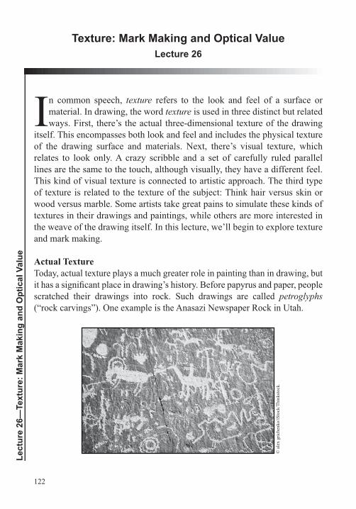
122
Lect
ure
26—
Text
ure:
Mar
k M
akin
g an
d O
ptic
al V
alue
Texture: Mark Making and Optical ValueLecture 26
In common speech, texture refers to the look and feel of a surface or material. In drawing, the word texture is used in three distinct but related
itself. This encompasses both look and feel and includes the physical texture of the drawing surface and materials. Next, there’s visual texture, which relates to look only. A crazy scribble and a set of carefully ruled parallel lines are the same to the touch, although visually, they have a different feel. This kind of visual texture is connected to artistic approach. The third type of texture is related to the texture of the subject: Think hair versus skin or wood versus marble. Some artists take great pains to simulate these kinds of textures in their drawings and paintings, while others are more interested in the weave of the drawing itself. In this lecture, we’ll begin to explore texture and mark making.
Actual TextureToday, actual texture plays a much greater role in painting than in drawing, but
scratched their drawings into rock. Such drawings are called petroglyphs (“rock carvings”). One example is the Anasazi Newspaper Rock in Utah.
© a
lex
gric
henk
o/iS
tock
/Thi
nkst
ock.
123
Drawing with incised lines has also been commonplace in ceramics. And many types of printmaking, such as woodcuts and engravings, depend on incised mark and line; these can be felt on the blocks used to make the prints, though not on the prints themselves.
A number of 20th
but the most common way we experience actual texture in drawing is in the paper. As noted in an earlier lecture, paper can be very smooth, very rough, and any texture in between, and the choice of surface in a drawing
In contrast, to achieve the kind of optical mixing of value he wanted in his drawings, Georges Seurat chose a paper with tooth. If you’d like to see how this works, drag charcoal lightly over a rough paper; you’ll note that the dark material catches on the high ground, while the recessed part of the paper’s texture remains white. Nevertheless, at a distance, our eyes mix the black and white, and we see gray. The lighter the pressure you use, the lighter the gray that will result, but if you push the charcoal into the paper’s crevices, you’ll get robust darks.
Visual Texture: HatchingThe second type of texture we encounter is purely visual. So far, in the drawing projects we’ve undertaken we’ve generally applied value in a smooth and continuous way, but we can also use a wide variety of lines and marks to create optical value with a range of textures.
For example, one type of mark used to generate tonal value is hatching. This is made of nothing more than lines. If the lines are drawn close together, the result is a dark gray. If they’re spaced out, the result is a lighter gray. Discontinuous line, the number of hatch directions, staggered hatching, line thickness, and even the speed of execution (deliberate versus gestural) also affect the kind of value created with hatching.
Another important factor in hatching is the hatch’s direction. One common
contour. Value changes that capture the play of light on planes already create the illusion of three dimensions. Applying the value following the axis or

124
Lect
ure
26—
Text
ure:
Mar
k M
akin
g an
d O
ptic
al V
alue
axes of the form compounds this illusion. Hatching may also imitate the direction of the light source.
Use a nib pen, brush and ink, and graphite to try some hatching. Make some
continuity. Then draw some geometric solids using hatching.
Here’s a review of ways in which hatching can be controlled:
Through spacing: Closer spacing equals darker values.
Through continuity or discontinuity of line: More continuous lines equal darker values.
By varying the lengths of the lines moving into the light: Staggering line lengths can create the sensation of a graduated value.
By varying the thickness of the line: Thicker lines result in darker values.
By changing the tonal value of the material: With ink, for lighter values, dry the brush or add water to the ink; with pencil or charcoal, use a range from hard to soft and vary the pressure as you draw.
By increasing the number of hatch directions: More directions result in an increase in darkness and density of the hatch.
think compositionally. Organize the value with the drawing’s focal hierarchy in mind.
Other Forms of Mark Making
ancestors used were their own hands, as can be seen in the Cueva de las Manos in Argentina.
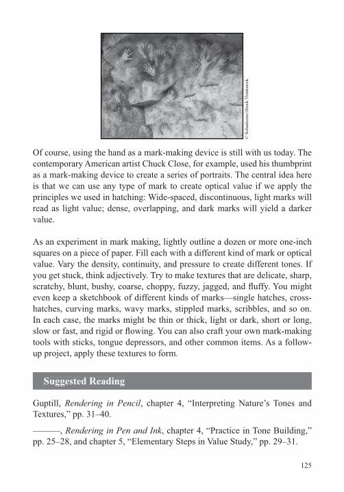
125
© S
ohad
iszn
o/iS
tock
/Thi
nkst
ock.
contemporary American artist Chuck Close, for example, used his thumbprint
is that we can use any type of mark to create optical value if we apply the
read as light value; dense, overlapping, and dark marks will yield a darker value.
squares on a piece of paper. Fill each with a different kind of mark or optical value. Vary the density, continuity, and pressure to create different tones. If you get stuck, think adjectively. Try to make textures that are delicate, sharp,
hatches, curving marks, wavy marks, stippled marks, scribbles, and so on. In each case, the marks might be thin or thick, light or dark, short or long,
up project, apply these textures to form.
Suggested Reading
Guptill, Rendering in Pencil, chapter 4, “Interpreting Nature’s Tones and Textures,” pp. 31–40.
———, Rendering in Pen and Ink, chapter 4, “Practice in Tone Building,” pp. 25–28, and chapter 5, “Elementary Steps in Value Study,” pp. 29–31.
126
Lect
ure
27—
Text
ure:
How
Art
ists
Use
Tex
ture
Texture: How Artists Use TextureLecture 27
In this lecture, we’ll learn more about how artists use texture, mark, and
see, each drawing has a pronounced textural personality and mood that are related to formal and material choices. We’ll then go into detail about the primary factors that affect texture in a drawing, including paper
tool, and more. We’ll close with a look at creating simulated or trompe l’oeil textures.
Texture and MaterialsSeven primary factors affect texture:
Paper or drawing surface
Choice of drawing tool
Application method (e.g., drawing directly on the surface versus transferring material via a brush)
Physical technique (e.g., hand motion, pressure applied)
smudging, and erasing).
In combining these seven factors, the number of textural possibilities is
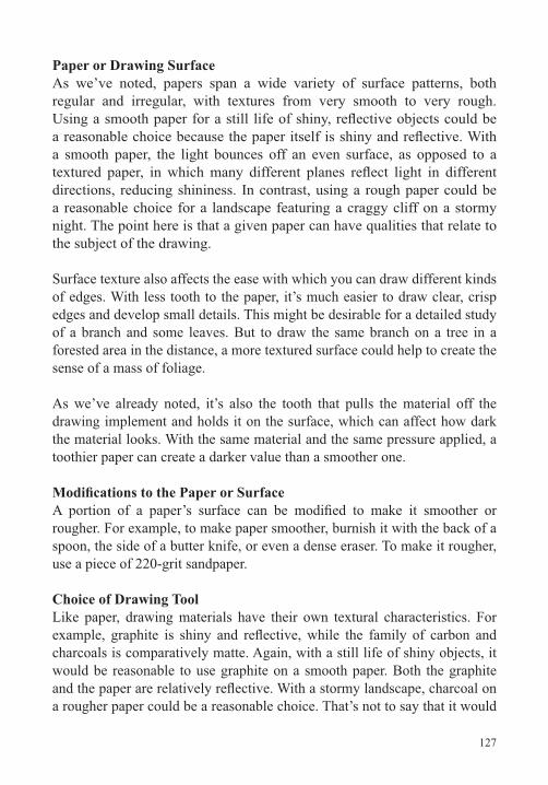
127
Paper or Drawing SurfaceAs we’ve noted, papers span a wide variety of surface patterns, both regular and irregular, with textures from very smooth to very rough.
a smooth paper, the light bounces off an even surface, as opposed to a
directions, reducing shininess. In contrast, using a rough paper could be a reasonable choice for a landscape featuring a craggy cliff on a stormy night. The point here is that a given paper can have qualities that relate to the subject of the drawing.
Surface texture also affects the ease with which you can draw different kinds of edges. With less tooth to the paper, it’s much easier to draw clear, crisp edges and develop small details. This might be desirable for a detailed study of a branch and some leaves. But to draw the same branch on a tree in a forested area in the distance, a more textured surface could help to create the sense of a mass of foliage.
As we’ve already noted, it’s also the tooth that pulls the material off the drawing implement and holds it on the surface, which can affect how dark the material looks. With the same material and the same pressure applied, a toothier paper can create a darker value than a smoother one.
rougher. For example, to make paper smoother, burnish it with the back of a spoon, the side of a butter knife, or even a dense eraser. To make it rougher,
Choice of Drawing ToolLike paper, drawing materials have their own textural characteristics. For
charcoals is comparatively matte. Again, with a still life of shiny objects, it would be reasonable to use graphite on a smooth paper. Both the graphite
a rougher paper could be a reasonable choice. That’s not to say that it would
128
Lect
ure
27—
Text
ure:
How
Art
ists
Use
Tex
ture
be wrong to draw each of these subjects with different materials. It’s just
jagged, crisper or more atmospheric—depending on the tools used. Such characteristics are at the heart of how a drawing feels.
drawing tools. For example, earlier, we learned a number of ways to shape a
creates different textures.
In using wet media, you can dilute the ink or partially dry the brush before applying it to the surface. And you can use different brush shapes and types of bristle.
Application MethodAs we’ve seen, the method of application also affects texture. Materials can be applied directly or indirectly to a surface. For example, graphite or charcoal can be rubbed with a tortillon, a blending stub, a brush, or a chamois, then transferred to the surface. Powdered graphite or charcoal could be applied similarly. Artists also use many other tools as applicators,
sponges.
With wet media, the range of application tools is extremely varied, including brushes of all sizes and shapes, countless types of nibs, and sponges. Blotter paper or other absorbent materials can be used to modify wet media on the drawing surface.
Physical Technique
of factors, including the position of the surface in relation to the body (on an easel versus on a desk), the joint of motion (shoulder, elbow, wrist, or
129
Once you have some mark on the surface, you can modify it in many ways. Indeed, the number of textural possibilities skyrockets as you begin to layer, combine, blend, smudge, smear, and erase. Exploring the possibilities of
When you combine materials, you need to be aware of their native characteristics. Pay attention to how the order of application affects the way materials appear on a given surface. For example, graphite is slick, and many materials won’t adhere to it well. It’s easier to put graphite on top of charcoal or ink than vice versa—but there’s no harm in trying unlikely combinations.
Simulated or Trompe l’Oeil TextureStudents often ask how to draw the texture of metal, rock, or water, but there is no single drawing “recipe” that will work. Metal, for example, can be shiny stainless steel, rusted iron, or bent aluminum. Rock can be a jagged cliff or polished marble. And water might be in a pitcher at lunch or in the ocean at night. Further, the way each material looks is affected by a host of factors, such as spatial location and light. A distant tree reveals much less of its bark’s surface texture than one up close. And we’ll see more or less texture depending on the position, distance, and strength of the light
these elements is of limited use.
the distinguishing visual characteristics of a subject at a given distance
materials and procedures.
In drawing simulated textures, start simply. Do a study of just one interesting
interesting grain pattern.
130
Lect
ure
27—
Text
ure:
How
Art
ists
Use
Tex
ture
First, analyze the material to determine its underlying visual characteristics.
see the underlying characteristics more clearly. Or try making a rubbing or a photocopy. A photo, rubbing, or photocopy will each have much less visual data than the objects themselves, which can work to your advantage in trying
white photo reveals that you could lay down a fairly consistent ground of value, then use a darker, nearly vertical mark to draw the echoing grain shapes.
© si
rup/
iSto
ck/T
hink
stoc
k.
paint can from the hardware store. Before you start drawing, think about what material and paper you want to use. On a test sheet, experiment with blending tools and erasers to approximate the quality of the edges you see in
copying a random pattern of lights and darks.
You can apply these same methods of analysis to rock, fur, water in a glass, or anything else that piques your interest.
Suggested Reading
Sale and Betti, Drawing, chapter 6, pp. 193–222.
Smagula, Creative Drawing, chapter 6, “Texture,” pp. 132–149.
131
Color: Color Theory and Color and LightLecture 28
The next three lectures focus on color. First, we’ll look at some
how color functions in nature. Finally, we’ll analyze a number of artists’ paintings and drawings to see how they actually use color. And you’ll have the opportunity to apply what you learn in a range of exercises and drawing projects.
PastelsFor the drawing projects in our lectures on color, use chalk pastels. These are
based binder. They’re relatively easy to use, especially if you’ve worked with charcoal.
Pastels run from soft and powdery to hard and brittle. The soft pastels spread and blend more easily, while the hard pastels can be sharpened to a point with a knife or razor blade for more precise work. Some manufacturers make pastel pencils that can also be used for more detailed work.
Pastels can be purchased both individually and in sets. If you purchase them
violet, red, orange, yellow, yellow ochre, raw sienna, burnt sienna, Van Dyke brown, white, black, and gray. If you purchase a set, look for a similar range of colors.
number these. The darkest version usually gets the lowest number; the purest grade gets a middle number; and the lightest gets the highest number. A good way to expand on a basic set is to get three of each color. For example, choose a green and get the darkest, purest, and lightest versions. Another way to build on a set is to get three versions of the same color with different qualities. For example, purchase an iconic blue, another blue toward green,
132
Lect
ure
28—
Col
or: C
olor
The
ory
and
Col
or a
nd L
ight
and another toward violet. You might also expand your collection by buying both soft and hard pastels in similar colors.
As with most of the materials we’ve discussed, there is no standardization among manufacturers. Two “ultramarine blues” made by two manufacturers may well be different. And there are a wide variety of color names, some particular to a single manufacturer.
Pastels, like graphite and charcoal, can be hatched, blended, layered, and manipulated in myriad ways. Pastel papers tend to have a fair amount of tooth, which serves to abrade the chalk and hold it to the surface.
Color and Light As you may remember from high school physics, Isaac Newton passed white light through a prism and observed that it split apart into bands of color. He described the spectrum he saw as consisting of seven colors: red, orange, yellow, green, blue, indigo, and violet. The number of colors derived from Newton’s belief that the color spectrum had an underlying connection with
Physics tells us that color is determined by the distance between waves (wavelength) of a given wave of light. This is referred to as wave quality. Red has the widest wavelength; as we progress around Newton’s circle, wavelengths get narrower.
of that length and absorbs all others. All else being equal, the lightness or darkness of an object or substance is determined by the quantity of light waves
light waves. Black substances, such as ink, absorb most light waves.
The Color Wheel Newton also showed that he could pass his bands of colored light back through a prism and get white light, but pigments behave differently. If you mix seven pastels to match Newton’s seven colors, you won’t get white but a darkish mud.
133
For artists, the most basic group of colors consists of a triad: red, yellow, and blue. These are referred to as primary colors because they can’t be produced by mixing other pigments. The next three colors are known as secondary colors and are made by mixing the primaries. As most of us know, yellow and blue produce green, blue and red produce violet, and red and yellow produce orange. If we mix intermediary steps between any of the six primaries and secondaries, we get six new colors, referred to as tertiaries.
to create another 12 hues. As more transitional colors are added, the visual path around the color wheel becomes smoother.
On the wheel of primaries and secondaries, the colors that are next to one another are called adjacent or analogous colors. Here, each color shares something with its neighbor. Orange and yellow both share yellow; orange and red both share red. These represent smoother transitions than yellow to red. A general principle in applying color in a given drawing is to use colors that share common elements where you want smoother transitions.
Colors are also thought of as having temperature. Yellow, orange, and red are the warm colors, while green, blue, and violet are cool. Like the warm and cool groups, there are other, more subtle, groups. For example, the three colors that share yellow—yellow, orange, and green—form a group. Note, however, that not all adjacent colors are equally similar. The temperature
to a pure green. Although yellow and green share yellow, green contains blue, a contrasting cool color. Yellow and orange share yellow, and neither contains anything cool; thus, they share warmth, as well.
their secondary, or two parents and their offspring, such as yellow, blue, and green; blue, red, and violet; and red, yellow, and orange.
The opposite of analogous colors are complementary colors. These pairs of colors sit opposite each other on the color wheel, putting each one as far away as possible from its opposite. The three complementary pairs are yellow and violet, orange and blue, and red and green. While analogous
134
Lect
ure
28—
Col
or: C
olor
The
ory
and
Col
or a
nd L
ight
colors share a component color, complements have nothing in common. For example, there’s no yellow in violet and no violet (or red or blue) in yellow.
We could say that analogous colors are like two grays. They have contrast—we can tell them apart—but they share some elements. Each has some amount of black and some amount of white. But complementary colors are extreme. They’re like black and white, with none of one in the other.
violet pair has the greatest value contrast of the three, followed by orange and blue. Red and green are the most similar in value.
Properties of Color: Hue, Value, and SaturationIn an earlier lecture, we noted that each color has three attributes: hue, value, and saturation. Hue coincides with the color’s name; it’s the yellow, green, or blue character of the color. Value refers to the color’s lightness or darkness. (Any color can be made lighter by adding white, known as a tint, or darker by adding black, known as a shade.) Saturation refers to the color’s level of purity. We can create versions of any color, stretching from very gray at the achromatic end of the scale to the most intensely saturated at the other. When you change the value of a color by adding white, black, or some other neutralizing color, you also lower the saturation.
Color and ContrastIf drawing with value is like playing checkers, drawing with color is like
or darker. Thus, tonal value in and of itself offers one kind of contrast. With color, we can have contrasts happening along three scales simultaneously: hue, value, and saturation. If all three are the same, the color will be identical, and we won’t see any distinction between two shapes. But if we vary one factor even a bit—say, keep the hue and saturation about the same but lighten the value—we get contrast and differentiation. Varying all three attributes results in high contrast.
As we’ve seen, warm to cool represents one type of contrast. Another is contrast of amount. All else being equal, the greater the amount of a given color, the more dominant that color will feel.
135
Simultaneous Contrast of Hue, Value, Saturation, and Temperature
surrounded by black will appear brighter, and black surrounded by white will appear darker. We experience color similarly. Red appears brighter if surrounded by black and dimmer if surrounded by white. Colors also appear more saturated as the ground’s hue moves from similar to complementary.
could look all wrong when an abutting color is added.
Color and ContentIt’s important to note that color has symbolic meaning. Some such
more widespread. Not surprisingly, the warm colors—red, orange, and
is particularly associated with heart, passion, and love, but it can also signify blood, violence, and danger. Green has associations with growth, life, and freshness, and blue is often construed as calm or sad. In the West, white is associated with day, reason, calm, and purity. Black has associations with night, terror, and death but also with elegance and romance. Of course, many of these associations are matters of local culture. Among the Chinese, white is associated with death, and red is the color of prosperity.
Light and Color in NatureMost of what we’ve discussed so far would come under the heading of color theory. But in order to use color in drawing, it helps to understand how we actually see color. We talk about the nominal color of an object as its local color. But when we look at most things, we actually see many more colors
factors, including the color of the light source, the direction of light, and the
These same factors hold true indoors and outdoors, but outdoors, other factors come into play, as well. For example, the atmosphere lends its color to what we see. As hills and trees recede into space, they take on more and
136
Lect
ure
28—
Col
or: C
olor
The
ory
and
Col
or a
nd L
ight
more of the color of the atmosphere itself. That’s because, with distance,
sky can tinge everything with golden tones. Other skies might suffuse a landscape with blue, brown, or gray.
Steps of Light in ColorIn the lectures on value, we saw that we could create the illusion of light and volume using anywhere from two to nine values. With color, the number of possibilities for modulating form increases exponentially. For example, volume can be created by modulating a single color from light to dark, from warm to cool, or from light to dark and warm to cool simultaneously. In the next lecture, we’ll learn more about how we can use and create form in just about any kind of color palette.
Suggested Reading
Albers, Interaction of Color.
Mendelowitz, Faber, and Wakeman, A Guide to Drawing, “Color,” pp. 114–121.
Pumphrey, The Elements of Art, “Value and Color,” pp. 147–187.
137
Color: How Artists Use ColorLecture 29
In the last lecture, we looked at both landscape photos and artworks and saw how color creates a quality of light and mood. And mood is an important consideration in making a drawing; it leads us to select a
hierarchy, using color and value to structure focal areas and focal points. We also saw that we can attend to the illusion of space, volume, and light with color. In this lecture, we’ll look at the work of a number of artists to learn
Working with ColorAs you begin to work with color, try to pay attention to your everyday feelings about it. Many people viscerally feel the difference between a blue
afternoon sun and a dingy bus station at night. Why do some places feel uplifting, romantic, scary, or depressing? Analyze what’s going on around you in terms of color and use what you learn in your drawings.
You actually know a lot more about certain aspects of color than you might think. For example, you coordinate the colors of the clothes you wear every day, and you know that business attire projects a serious mood through its fairly neutral palette. With casual clothes or sports clothes, the palette is more saturated, and the mood is lighter. Similarly, you’ve likely thought about
study or a yellow bedroom. Each of these palettes projects a different mood.
We’re also constantly barraged with the work of professional designers and illustrators who put color to work to create mood and evoke an emotional response in order to sell us things. Examples of this can be found everywhere—even the cereal aisle of your local supermarket. The sweet children’s cereals are packaged with bright, saturated colors, while
138
Lect
ure
29—
Col
or: H
ow A
rtis
ts U
se C
olor
to become more aware of how color is used around you by professional designers and note your reactions.
Palette and MoodIn the last lecture, we saw how a sense of light, mood, and emotion can be
through limitation. Artists have used certain common color limitations, or palettes, for centuries. These palettes include the following:
Monochromatic. Working with a monochromatic palette is really a form of working with value, though hue plays a part. A blue painting will feel different—cooler and icier—than a warm gray or an orange painting.
Expanded monochrome. This type of palette admits a bit of color outside the monochrome.
Dominant hue. Related to both the monochrome and expanded monochrome palettes is the dominant hue palette. Here, the artist
other hue to each one to ensure that the one hue will be dominant.
Analogous. A next step in palette complexity is the analogous palette. This type of palette uses colors that are next to one another
Complementary. Another common palette is one based on
green.
Split complementary. Related to the complementary palette is the
139
Double complementary. This palette is based on two sets of
The Eakins watercolor we’ve looked at throughout the course uses this palette.
of palette was used quite a bit by Picasso, Georges Braque, Juan Gris, and others during the heyday of Cubism.
Color Application: Flat Color, Open Color, and GradationsAnother set of factors to be aware of in working with color has to do with the relationship of color to shape. Here, refers to broad areas of unmodulated color enclosed in a shape. This is the way many of us colored in pictures as children: Draw the shape of the apple and color it in red. One of the hallmarks of this use of color is that the colors of individual things
object to another. Color remains in its bounded shape.
With open color, we see marks and multiple small areas of color within
This approach is common when areas or surfaces are built out of mark and the sensation of color depends on optical mixing.
Another way in which shapes are treated with color is through gradation,
in naturalistic work, where the goal is to create a convincing illusion of
Summing Up Color PrinciplesHere are some important principles we’ve learned about color:
work.
Once you’ve made that decision, the next step is to think hierarchically and compositionally. Think about relative
140
Lect
ure
29—
Col
or: H
ow A
rtis
ts U
se C
olor
contrasts; in other words, consider relative hue, value, and saturation contextually to move the viewer through your drawing. Remember, areas of higher saturation and value contrast will become focal zones.
Pay attention to the effects of atmospheric perspective. With distance, objects take on the color of the atmosphere. When things are closer to us, their colors appear to have greater value contrast and greater saturation. As they recede, they have less value contrast and saturation.
All else being equal, warm colors will tend to advance and cools to recede, but saturation will generally trump this principle. In other words, a saturated blue bowl—a cool—will easily advance against a backdrop that is a neutral, warm tan.
Suggested Reading
Guptill, Watercolor Painting Step-by-Step, chapters 7–10, pp. 65–98.
Loomis, Creative Illustration, “Color,” pp. 145–179.
141
Color: Color Drawing ProjectsLecture 30
We concluded the last lecture with a discussion of atmospheric perspective and saw that we can create the illusion of spatial depth using color. We’ll continue in this lecture with a discussion
number of drawing projects that use color.
Color and Volume
But if we make a differentiation in color, we can get dimension.
We can create volume in any palette and in any range of values. We can also increase the contrast, lighten or darken the value range, or shift into another hue. And we can accompany a change in value with a change in saturation, making the color more saturated in the light and less so away from the light. We can also modulate the hue in this progression across the planes of an object. We could start with a warm, say an orange, on the plane closest to the light, and move to a cool, say a blue, on the plane farthest from the light.
use relative contrasts of hue, value, and saturation to create a visual hierarchy of focal points. Within the given palette and hierarchy, artists create the illusion of space, volume, and light. Thus, it’s reasonable to start a drawing
If you’re working from observation, use the same principles. That means carefully considering the color and value of all the elements in a still life as you set it up, including the wall, table, and lighting. When working from a landscape, it means organizing the color you see and interpreting it in a way that serves the mood of the drawing.
142
Lect
ure
30—
Col
or: C
olor
Dra
win
g Pr
ojec
ts
Pastels and PalettesIn these lectures on color, we’ve outlined different palettes, including analogous, complementary, and so on. Working with a palette means making a selection of pastels to use for a given drawing. The goal here is to limit the number of colors while maintaining a range from light to dark and saturated to neutral. This yields both cohesion and the opportunity for contrast. For
cool blue; a warm blue; a saturated orange; an earth orange; a dark, neutral brown; a gray; and a white. Note that this selection includes a warm and a cool version of your cool color, a saturated and an earth version of your warm color, a dark, and two neutrals, giving you the opportunity to mix a great range of colors. For analogous palettes, follow the same model. For instance, for a
cool green; a warm green; a dark, neutral brown; a gray; and a white.
It’s a good idea to create test sheets to play with the relationships of the pastels you plan to use in a given palette before making a drawing. This will give you options when you approach the drawing.
Palette Exploration: Drawing Geometric SolidsAs an exercise for this lecture, we’ll do a series of drawings to explore color palettes; control hierarchy; and create space, volume, and light. Keep the compositions here simple. First, divide a rectangle along a horizontal to yield a tabletop and wall. Then, imagine a block, sphere, cylinder, cone, or other solid lit by a single light source. Next, think about mood and palette. Use value and color hierarchically so that the object is the focal point, and use color within the given palette to create the illusion of volume, space, and light. Think in four to nine steps of light as you move across the large planes of the table and wall and the object itself.
For this exercise, use colored paper, which immediately asserts mood and provides an underlying unifying hue for the drawing. This shared hue allows you to create smooth transitions where you want them. Where you don’t want smooth transitions, work opaquely so that the paper is less visible. Try a number of variations of palettes and papers.
143
Monet loved these kinds of experiments. He often repeated the same painting or drawing over and over again but varied the light, mood, and palette. Look
Haystacks, Waterloo Bridge, The Houses of Parliament, and Rouen Cathedralexplore color and light.
Color ProjectsOnce you’ve made some color studies of geometric objects, try creating a still life from your imagination. The utility of working from your imagination is that you can’t copy details. You have to think abstractly about the large color relationships. Start by making small, monochromatic, gestural sketches in pen
to get ideas about possible palettes to apply to the still life and do a small color study. This can consist of just smudges of color that relate to the shapes in the composition. Line up your color studies and take a couple steps back to judge
used to draw the geometric solids. The goals of this exercise are to:
Select a range or palette of color and value to create a mood.
Use that palette to create a hierarchical structure that features focal areas and focal points.
Create the illusion of volume, space, and light within the hierarchical structure.
As you work, keep in mind these key points from earlier lectures:
First, make sure you’re thinking compositionally. Be attentive to the format shape and its large divisions and to positive and negative shapes. Build your objects using shapes and geometric solids.
Be aware of the eye height or horizon, which will indicate how much of any plane you will see.
Work from the large decisions to the small, adding detail last.
144
Lect
ure
30—
Col
or: C
olor
Dra
win
g Pr
ojec
ts
Also make sure that your paper’s color relates to the color system with which you’re working. You might start with fairly neutral colors, which will allow
resolved, add analogous or complementary colors, working up from lower to higher saturations.
Follow this exercise with a still life drawn from observation, but take the same care with the palette. Be prepared to drape a wall or table and be choosy with your objects and the type and direction of light. Think about how everything relates in terms of mood, hierarchy, space, and volume.
Unnamable Color A common problem people have when starting out with color is that they conceive of it in terms of namable color—primaries, secondaries, and the like. These are all useful, but a command of all the grays—and the ability to see the grays as color—is all but essential.
Similarly, many beginners see a white bowl or a black hat and immediately
white bowl is rarely white, and the black hat is rarely black. When we look at something that’s nominally white or black, we’re actually seeing a whole range of color.
Just as with value, light is the reason we see any color at all. The color that anything appears to be is directly related to the color and strength of the light source. It’s also tied up with the way in which surfaces share color
accumulation of multiple factors creating the instance of color. In many cases, the differences are small. For example, a gray may be just slightly warmer, cooler, darker, or lighter or more to the yellow and away from the red. The more you look analytically, the more you’ll learn to see these small differences in color.
A good exercise that can help you analyze unnamable color is to draw a still life of white objects on a white table in front of a white wall. As you work,
145
Often, students believe that they’re not getting as wide a range of color as they’d like in a drawing. In response, they may wind up using every pigment in their kit, resulting in a depletion of mood and hierarchy. In many cases, a
Remember, color is relative. By changing an abutting color, you can make an existing color feel lighter or darker, more neutral or saturated, or warmer or cooler.
Many times, you don’t need a new namable color. For example, if you’re
not projecting enough, you can modify the ground rather than adding a new color to accentuate the central red object. There’s no rule here, but because most people err on the side of too many random colors, it’s useful to look for some less obvious solutions.
Additional Projects
setting up your still life. Keep in mind that the environment, lighting, point of view, costume, and palette all combine to create mood and meaning. And
Next, take a cue from Monet and go outside. Draw at different times of day under different weather conditions. A sunny day or a gloomy, overcast day
thrust. After drawing several landscapes from observation, bring your drawings inside. Use these drawings, as well as your knowledge about composition, space, and color, to construct a second landscape from your imagination.
two different color and light environments in the same drawing can be an interesting project. One classic way to approach this problem is to use an interior with a view out a window. Less common, though no less interesting, is to look from the outside into an indoor space.
146
Lect
ure
30—
Col
or: C
olor
Dra
win
g Pr
ojec
ts
Suggested Reading
Eagle, Pastel Painting Atelier.
Enstice and Peters, Drawing, chapter 10, “Using Color in Drawing,” pp. 216–229.
147
The Figure: A Canon of ProportionsLecture 31
Tusing a set of principles. A great deal of drawing involves proportion
termed a canon of proportions. Then, we’ll apply volumetric solids to make
major muscles in the body to see how we can use anatomical landmarks
believable spatial environment by relating what we’ve studied about the
Human ProportionsStudents routinely ask what the correct proportions are for drawing a
no right answer to this question. Indeed, in his book Master Class in Figure Drawing, the teacher and artist Robert Beverly Hale wrote, “The forms of the body have no exact shape and never have had except in the mind of the individual artist. They have always varied according to the knowledge, the style, and the time of the artist. They have always been created by the artist to conform to his ultimate purpose. … Drawing is not a mere act of copying, but a highly creative act controlled by the artist’s expressive intent.”
If we think of almost any artist, we can see that each interprets or reinvents
As Leonardo put it, “We, by our arts, may be called the grandsons of God.”
To some extent, the human proportions we see in art are related to the wide range of proportions we see in nature. Think, for a moment, about runway
148
Lect
ure
31—
The
Figu
re: A
Can
on o
f Pro
port
ions
models, sumo wrestlers, ballerinas, NBA players, and jockeys; these categories evince widely different sets of proportions. Although you may notice fewer extremes, the same is true of any random group of people you see at the supermarket or on the subway.
In the early 1500s, Dürer became very interested in human proportions. He wrote, “I know of no one who has written about a system of human proportion, except a man, Jacobus [Jacopo de Barbari], a native of Venice. He showed me how to construct a man and a woman based on measurements. I was greatly fascinated by his skill and decided to master it.” And master it he did. Dürer made hundreds of drawings of variations on human proportion
work culminated in a lengthy study of the subject, published in 1528 and titled Four Books on Human Proportion. Like his other book on drawing, this work is all about measure.
Returning to the question about correct proportions, there is no one answer—not in art and not in the world in which we live. There are endless combinations. But following in Dürer’s footsteps, we can start with one set of proportions, then play with variations.
Constructing Human Figures
into simple constituent shapes—rectangles, trapezoids, hemispheres, and
For this project, we’ll adopt the method Dürer used in his 1528 book, drawing
view; and a rear, or posterior, view. After completing this drawing, you’ll
with the kinds of proportions you want to draw.
149
The general steps for this exercise are as follows:
Because humans are basically bilaterally symmetrical, draw a vertical centerline.
Establish height proportions. Divide the centerline into segments with horizontal lines to mark locations for anatomical events, such as the top of the shoulders, bottom of the chest, and so on.
Establish width measurements, that is, distances to the right and left
at the top of the pelvis, and so on.
of measure.
Variations in Male and Female ProportionsThere are clear differences between the male and female body. Of course, the obvious ones are breasts and sexual organs, but there are also differences of measure that affect overall shape. Chief among these is the shape of the
ratio is greater width to height. In addition, the opening in the male pelvis is more constricted, and the male pubic arch is more angular and acute. The female’s is more curved and obtuse.
From the Renaissance to contemporary superhero comics, artists and illustrators have also adopted certain conventions for male and female
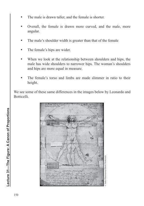
150
Lect
ure
31—
The
Figu
re: A
Can
on o
f Pro
port
ions
The male is drawn taller, and the female is shorter.
Overall, the female is drawn more curved, and the male, more angular.
The male’s shoulder width is greater than that of the female
The female’s hips are wider.
When we look at the relationship between shoulders and hips, the male has wide shoulders to narrower hips. The woman’s shoulders and hips are more equal in measure.
The female’s torso and limbs are made slimmer in ratio to their height.
We see some of these same differences in the images below by Leonardo and Botticelli.
© Ja
nka
Dha
rmas
ena/
iSto
ck/T
hink
stoc
k.
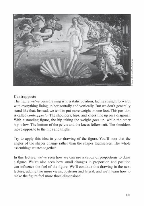
151
© D
over
Ele
ctro
nic
Clip
Art
Serie
s.
Contrapposto
with everything lining up horizontally and vertically. But we don’t generally stand like that. Instead, we tend to put more weight on one foot. This position is called contrapposto. The shoulders, hips, and knees line up on a diagonal.
hip is low. The bottom of the pelvis and the knees follow suit. The shoulders move opposite to the hips and thighs.
angles of the shapes change rather than the shapes themselves. The whole assemblage rotates together.
In this lecture, we’ve seen how we can use a canon of proportions to draw
lecture, adding two more views, posterior and lateral, and we’ll learn how to
152
Lect
ure
31—
The
Figu
re: A
Can
on o
f Pro
port
ions
Suggested Reading
Dürer, Four Books on Human Proportions.
Dürer and Strauss, The Human Figure by Albrecht Dürer.
Loomis, Figure Drawing for All It’s Worth, “Ideal Proportion,” pp. 26–29.
Reed, The Figure, pp. 9–19.
Winslow, Classic Human Anatomy, “The Proportions of the Whole Figure,” pp. 249–261.
153
The Figure: The Head, Hands, and Feet Lecture 32
Iprevious lecture. We’ll start by blocking in the side (lateral) and back (posterior) views. In general, the procedure will be to carry over the
contrapposto, then erase and adjust lines for a more natural stance. After
hands, and feet.
The HeadAfter walking through a drawing of the anterior, lateral, and posterior
like individual bodies, vary in their proportions and their degrees of symmetricality. But there are a couple formulas, or canons, that are widely used as starting points.
In the anterior view, we used the proportion of 3 to 4 for the head’s width
followed by vertical and horizontal centerlines and an egg shape or ovoid.
The eyes ride the horizontal half, so place the irises on top of the
Draw the upper and lower lids of each eye to extend across each eye measure.
center of the lips at the third. Carry a vertical down from each eye’s center. Let the length of the lips extend from one of these verticals to the other.

154
Lect
ure
32—
The
Figu
re: T
he H
ead,
Han
ds, a
nd F
eet
For the eyebrow, measure one eye’s width straight up from the lower lid and make a mark. Draw the eyebrow.
Place the top of the ears above the top of the eyelid but below the eyebrow. The bottom of the ears should be in line with the tip of the nose. The ears can extend beyond the rectangle.
Make the nose one eye wide, wings included. Locate the top of the nasal bone—where the plane of the nose begins to project forward from the face—at about the top of the eyelid.
To describe the planar structure of the head, add verticals at the temples. You might also indicate that the jaw overlaps the ears, and the ears overlap the side plane of the head.
Then, draw the neck, indicating that it is overlapped by the jaw.
Place a couple lines for the cheekbones and, perhaps, a mark or two to create a front plane of the chin.
Of course, many people have narrower heads, wider noses, or longer ears, but these general steps give you a template from which you can create endless variations.
of the nose is closest to the viewer; the eyes, farther away; and the ears, at a distance behind. The front plane of the head can exhibit curvature, as well.
Hands and Feet
Hands are quite complex, with more than 25 bones and more than 30
compared to other parts of the body, such as the head. And unlike the head, ribcage, arms, or legs, the hand is much less symmetrical. Add to that all the different points of view from which the hand is seen—from above, from below, and foreshortened—and the result is a great deal of visual complexity.
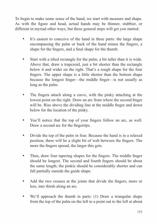
155
To begin to make some sense of the hand, we start with measure and shape.
different in myriad other ways, but these general steps will get you started:
It’s easiest to conceive of the hand in three parts: the large shape
Start with a tilted rectangle for the palm, a bit taller than it is wide. Above that, draw a trapezoid, just a bit shorter than the rectangle below it and wider on the right. That’s a rough shape for the four
long as the palm.
below for the location of the pinky.
Divide the top of the palm in four. Because the hand is in a relaxed
the same length; the pinkie should be considerably shorter and can fall partially outside the guide shape.
less, into thirds along an arc.
We’ll approach the thumb in parts: (1) Draw a triangular shape from the top of the palm on the left to a point out to the left at about
156
Lect
ure
32—
The
Figu
re: T
he H
ead,
Han
ds, a
nd F
eet
a quarter to a third of the palm’s height. This will approximate the
shape for the thumb. It should register close to the top of the palm, although this measure changes as the thumb moves. (3) Draw a curving line from the base of the thumb to the palm.
Now, we’ll round and edit the construction shape.
Make this adjustment on both the thumb and pinky sides.
The interior of the palm has three groups of pads and several
wrist.
As a last step, look at your own hand and modify your drawing with the goal of making it closer to what you observe.
Other points to note about drawing hands include the following:
If you hold your hand laterally, you’ll see that the creases where the
back of the hand can appear shorter than the palm side.
trapezoid, rectangle, or ovoid can often be used for the body of the hand.
When it makes sense, use an aggregate shape or shapes for the
157
solids, either blocks or cylinders. Then, naturalize what you’ve drawn.
bend in toward the center of the palm.
For additional practice, draw your hands in all the typical positions
Feet are generally easier to deal with than hands because they’re more
for drawing feet; using that, you can practice drawing your own feet in many different positions.
Volume
In his Master Class in Figure Drawing, Robert Beverly Hale wrote,
geometric forms … like the cube, sphere, cylinder, or ovoid form.” Elsewhere in the same work, Hale wrote, “When drawing the ribcage the experienced artist doesn’t start his drawing with a detail, such as the nipple or the navel,
simplest form he can—a box. … He has learned to visualize all complex forms in terms of very simple masses.”
158
Lect
ure
32—
The
Figu
re: T
he H
ead,
Han
ds, a
nd F
eet
and alter your original image. It’s best to make light copies. Once you’ve
drawn feel more naturalistic.
Suggested Reading
Loomis, Figure Drawing for All It’s Worth, “The Heads, Hands and Feet,” pp. 171–188, and “Planes,” pp. 76–77.
Reed, The Figure, “Heads and Hands,” pp. 75–115, and “Construction,” pp. 20–45.
Winslow, Classic Human Anatomy, “The Proportions of the Whole Figure,” pp. 249–261.
159
The Figure: Artistic AnatomyLecture 33
Such artists as Leonardo, Michelangelo, Raphael, Rubens, and many others studied human anatomy, and many artists do so to this day. The reason for this is that knowledge of what’s going on below the surface
can be a great aid in drawing what’s visible on the surface. In this lecture, we’ll discuss the skeletal system and major muscles and draw these systems
Naturalizing the FigureAt the beginning of the course, we discussed the interplay of contour and
volume. Using the copies you made of your drawing from the last lecture, try
and compare the results.
slight rounding of a line does a great deal in this regard. After doing several
drawing, using line alone, without adding any hatching or value.
The Skeletal SystemThere are more than 200 bones in the human body, but many repeat left and right, and about half are in our hands and feet. Let’s take a tour of the major bones from top to bottom.
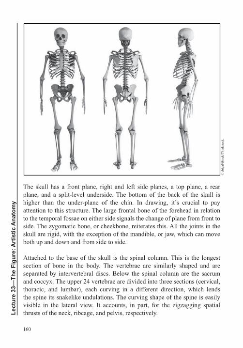
160
Lect
ure
33—
The
Figu
re: A
rtis
tic A
nato
my
The skull has a front plane, right and left side planes, a top plane, a rear
attention to this structure. The large frontal bone of the forehead in relation to the temporal fossae on either side signals the change of plane from front to side. The zygomatic bone, or cheekbone, reiterates this. All the joints in the skull are rigid, with the exception of the mandible, or jaw, which can move both up and down and from side to side.
Attached to the base of the skull is the spinal column. This is the longest section of bone in the body. The vertebrae are similarly shaped and are separated by intervertebral discs. Below the spinal column are the sacrum and coccyx. The upper 24 vertebrae are divided into three sections (cervical, thoracic, and lumbar), each curving in a different direction, which lends the spine its snakelike undulations. The curving shape of the spine is easily visible in the lateral view. It accounts, in part, for the zigzagging spatial thrusts of the neck, ribcage, and pelvis, respectively.
© a
bida
l/iSt
ock/
Thin
ksto
ck.
161
These three vertebral sections are followed by the sacrum, attaching to the pelvis, and the smaller coccyx, projecting to a point. Once again, the assembly of the sacrum and coccyx curves away from the preceding section, the lumbar vertebrae. Depending on an individual’s build and body fat, we
also be a visible landmark through the soft tissue.
The next bone mass is referred to as the shoulder girdle, which includes the clavicles; scapulae; and the sternum, or breast bone. Skeletal elements of the front and rear connect in this assembly, and it provides the housing where the head of the humerus (the bone of the upper arm) connects. Studying the scapula and its connection to the clavicle and humerus from multiple points of view will help you understand how the arms connect to the torso.
As we know, there are 24 ribs, 12 on each side. All attach to the sternum via cartilage and directly to the spinal column in the rear. The ribcage curves around the body from back to front, with the ribs sloping diagonally
of the upper torso.
pelvis is called the iliac crest
portion of the femur.
In both the arms and legs, the section of the limb closest to the trunk has one bone; the next section, two; and the feet and hands come in at more than 25 each. In the arm, the large upper bone is the humerus. The two smaller bones of the lower arm are the ulna and radius.
The large upper bone of the leg is the femur. On the front of the femur at the
162
Lect
ure
33—
The
Figu
re: A
rtis
tic A
nato
my
As already noted, both the hands and feet have numerous bones, but these
foot: seven tarsals, followed by metatarsals and phalanges, or toes. At the heel end, the bone of the heel is the calcaneus.
Having a mental picture of the comparative lengths of the major bones and bone groups helps when thinking about proportions. Using the skull’s height
somewhat smaller. The ulna, radius, pelvis, and foot are a bit longer. Next in
heights. The femur is about two skull heights, and the spine is about three.
Not all the bones are equally visible on the surface. The major landmarks include the following:
Frontal bone of the forehead
Temporal fossae
Zygomatic bone
7th cervical vertebra
Jugular notch and sternum
Front and top of both clavicles
Scapulae
Bottom of the 10th rib
In the arm, the elbow—the meeting of the humerus, radius, and ulna; at the wrist, the ulna on the pinky side and the radius on the thumb side
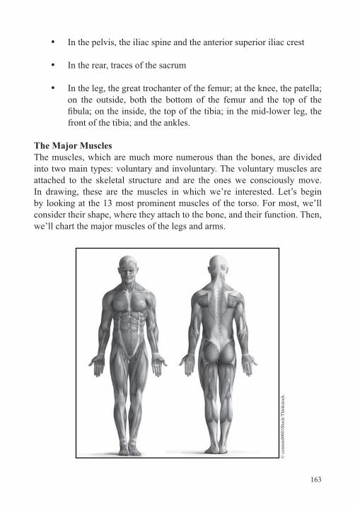
163
In the pelvis, the iliac spine and the anterior superior iliac crest
In the rear, traces of the sacrum
In the leg, the great trochanter of the femur; at the knee, the patella; on the outside, both the bottom of the femur and the top of the
front of the tibia; and the ankles.
The Major MusclesThe muscles, which are much more numerous than the bones, are divided into two main types: voluntary and involuntary. The voluntary muscles are attached to the skeletal structure and are the ones we consciously move. In drawing, these are the muscles in which we’re interested. Let’s begin by looking at the 13 most prominent muscles of the torso. For most, we’ll consider their shape, where they attach to the bone, and their function. Then, we’ll chart the major muscles of the legs and arms.
© c
osm
in40
00/iS
tock
/Thi
nkst
ock.
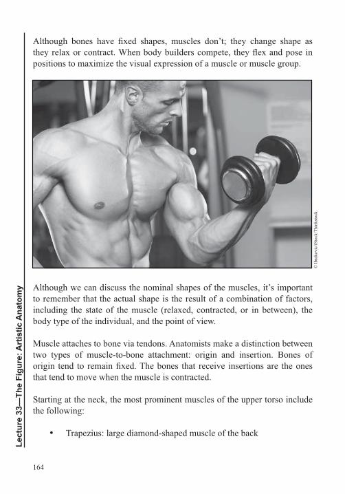
164
Lect
ure
33—
The
Figu
re: A
rtis
tic A
nato
my
positions to maximize the visual expression of a muscle or muscle group.
© Ib
rako
vic/
iSto
ck/T
hink
stoc
k.
Although we can discuss the nominal shapes of the muscles, it’s important to remember that the actual shape is the result of a combination of factors, including the state of the muscle (relaxed, contracted, or in between), the body type of the individual, and the point of view.
Muscle attaches to bone via tendons. Anatomists make a distinction between
that tend to move when the muscle is contracted.
Starting at the neck, the most prominent muscles of the upper torso include the following:
165
Sternomastoid, or sternocleidomastoid: located on either side of the neck
Deltoid: originates along the outer half of the clavicle and along the top spine of the scapula
Pectoralis major: central muscle of the chest
Serratus: any of three muscles that originate along the sides of the
each side
Rectus abdominis: abdominal muscle
External obliques: curve around to the side of the abdomen
Latissimus dorsi: large triangular muscle of the back
Rhomboid: group of muscles sandwiched between the trapezius and deltoids above and the latissimus dorsi below
Infraspinatus, teres minor, and teres major: three muscles that cover the back of the scapula
Erector spinae (sacrospinalis): deep muscle of the back.
The major muscles of the legs include the following:
Sartorius: crosses from the outside of the hip to the inside of the knee
Quadriceps: set of four muscles in the front of the thighs
pelvis
Glutes (gluteus): set of three muscles in the buttocks.
166
Lect
ure
33—
The
Figu
re: A
rtis
tic A
nato
my
Suggested Reading
Brown and McLean, Drawing from Life.
Visiblebody.com, SkeletonPremium and MusclePremium.
Winslow, Classic Human Anatomy.
167
The Figure: Drawing ProjectsLecture 34
Iconstruction and highlight a few tips that will help you avoid common
Continuing with the Major Muscles In the last lecture, we left off with the glutes. Continuing our inventory, additional major muscles in the legs include the following:
Hamstrings: group of muscles in the upper leg, below the glutes
Extensors: group of muscles in the front lower leg; involved in the motion of the foot and toes
Gastrocnemius: calf muscle; attaches to the Achilles tendon and heel bone
Soleus: partially overlapped by the calf
Peroneus longus and peroneus brevis: involved in the motion of the feet.
Major muscles in the arms include the following:
Biceps: main muscles in the front of the upper arm
Triceps: main muscles along the back of the upper arm
Anconeus: muscle directly below the triceps, at the elbow
168
Lect
ure
34—
The
Figu
re: D
raw
ing
Proj
ects
Flexors: group of muscles in the front of the lower arm; involved
Extensors: group of muscles in the back of the lower arm; involved
The best way to begin to absorb all the bones and muscles we’ve covered is, of course, to draw them. Look online for illustrations to follow and take your time as you continue this study. You could easily spend 15 to 25 hours on the
and adding the muscles—but it will be time well spent.
Once you’ve completed this investigation, you’ll have a much fuller
fat and skin obscure the view. Overall, fat collects most around the center of the body, in the chest, abdomen, buttocks, and hips, followed by the thighs and upper arms. We see less fat on the lower legs and arms and the least on the hands and feet.
Review of Figure Construction Steps
steps we took in this last drawing:
Start with linear measure—two horizontal and three vertical lines
anatomical events to this scale. Using the same scale, establish widths.
Using this scaffolding, draw 10 simple shapes to represent the ribcage and upper torso, pelvis and lower torso, thighs, lower legs, feet, upper arms, lower arms, hands, neck, and head.
Introduce contrapposto.
169
axes to create planes or facets, then draw ellipses or ovoids to further the illusion.
of naturalism.
drawing:
Start with the whole, meaning some kind of linear measure or aggregate shape placed on the page. This lets you control composition and helps you avoid the beginner’s problem of running out of room.
proportions and composition together if you start with details.
x, y, and z coordinates.
Regarding anatomical knowledge, use it as an aid in drawing your
showing more bone and muscle isn’t always better.
Practice drawing all these muscles into half of the anterior and posterior
pencils for this project, get a set of eight: yellow, orange, red, blue, brown, gray, black, and white. Imagine the light coming from a single direction. Where the muscles swell toward the light, make them lighter. Where the muscles taper, where they’re overlapped, and where they’re away from the light, go darker.
Project: Self-Portrait in Three Views
terms of measure and to note actual, as opposed to canonical, proportions. To complete this project, follow these steps:
170
Lect
ure
34—
The
Figu
re: D
raw
ing
Proj
ects
In order to see your proportions clearly, wear a bathing suit, a leotard, or shorts and a tank top.
Choose an expressive posture and decide on the positions of your arms and legs.
Start with the anterior view. Take the measure of your head with your pencil. Then, measure your body height in heads and calibrate the central vertical axis according to this number. Number the head heights.
Note what landmarks occur at each head height. For example, the nipples might be located at the second head, the naval at the third head, and so on. When important landmarks don’t coincide with a head height, make a line where the landmark occurs and an accompanying notation.
Once you have the heights established, plot the widths.
With the anterior view plotted, carry the measures to the posterior and lateral views. Then, turning your head, add any other measures you need for these views. If there’s something you can’t see, have someone take a picture and use the photo to clarify.
Draw the basic shapes in relation to your measure marks. Check the proportions and adjust.
on this project with a number of different body types will help you develop a sense of the range of human proportions. It also makes you aware of the
and rear relate.
171
Another good project is to invent your own set of proportions. Such a drawing might consist of a subtle variation on the proportions you used in
extreme. You might try drawing a child, a weight lifter, or a runway model. Given the body type you’re imagining, consider what you might see of the underlying anatomy on the surface.
Project: Stick Figures
or ovoid for the ribcage and another for the pelvis. Then, follow with the other eight body shapes. If you add tapering cylinders for the body parts, you’ll have volume.
In an earlier lecture, we saw how we can apply gestural drawing to linear
gestural approach, you have a ready method for quickly drawing complex
Project: Figures in Perspectival Space and Foreshortened Figures
of value and color.
this project. Remember, it’s all about measure and a conscientious use of
not volumetric.
172
Lect
ure
34—
The
Figu
re: D
raw
ing
Proj
ects
Suggested Reading
Brown and McLean, Drawing from Life, “Foreshortened Figures,” pp. 48–60.
Hamm, Drawing the Head and Figure.
Loomis, Successful Drawing, “Projection of Figures (in Perspective),” pp. 67–77.
173
Advanced Concepts: Pictorial SpaceLecture 35
After working diligently through the many projects in this course, you have some real knowledge and ability at your disposal. You’ll likely want to put it to use to make drawings that speak to your own
concerns and ambitions. In developing your work, it’s useful to be aware of the range of traditions and subjects that have been important in the history of drawing, as well as trends in contemporary art. In this lecture, we’ll trace a
in the Blombos Cave and moving into the present.
Pictorial Space from Earliest ArtWe can chart the whole history of art from the perspective of pictorial space.
50,000 years to the drawings in Chauvet Cave, and we get line, value, and overlap. Move forward another 27,000 years to Egypt, and we get line, shape, value, pattern, color, and a clear embrace of spatial illusion, although
About 2,000 years later, in Song dynasty China, we have line, shape, value, pattern, color, overlap, and shapes that tilt back into space. By this time, human beings had clearly discovered a great deal about the compositional
much more muted value and color contrasts in the ground.
Move ahead another 200 years to northern Italy, and the list of artistic techniques and discoveries becomes longer. We have line, shape, value,
ceilings. And we see the effects of light, with more light on the top planes and less on the side planes.
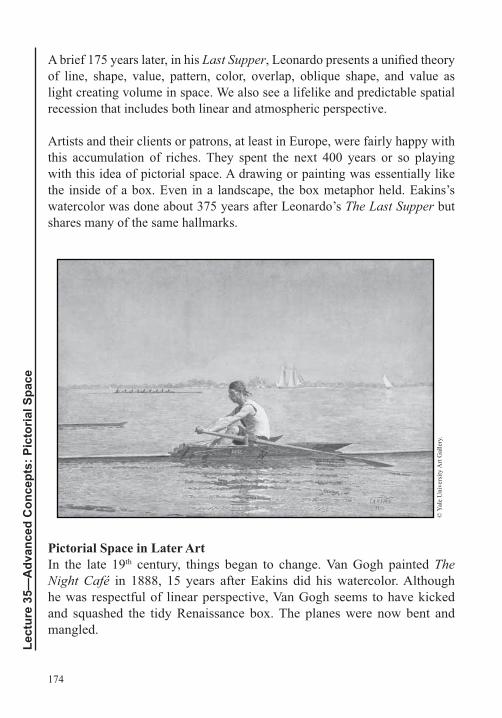
174
Lect
ure
35—
Adv
ance
d C
once
pts:
Pic
toria
l Spa
ce
A brief 175 years later, in his Last Supperof line, shape, value, pattern, color, overlap, oblique shape, and value as light creating volume in space. We also see a lifelike and predictable spatial recession that includes both linear and atmospheric perspective.
Artists and their clients or patrons, at least in Europe, were fairly happy with this accumulation of riches. They spent the next 400 years or so playing with this idea of pictorial space. A drawing or painting was essentially like the inside of a box. Even in a landscape, the box metaphor held. Eakins’s watercolor was done about 375 years after Leonardo’s The Last Supper but shares many of the same hallmarks.
© Y
ale
Uni
vers
ity A
rt G
alle
ry.
Pictorial Space in Later ArtIn the late 19th century, things began to change. Van Gogh painted The Night Café in 1888, 15 years after Eakins did his watercolor. Although he was respectful of linear perspective, Van Gogh seems to have kicked and squashed the tidy Renaissance box. The planes were now bent and mangled.
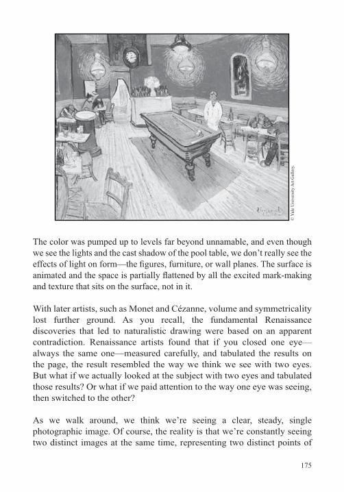
175
© Y
ale
Uni
vers
ity A
rt G
alle
ry.
The color was pumped up to levels far beyond unnamable, and even though we see the lights and the cast shadow of the pool table, we don’t really see the
and texture that sits on the surface, not in it.
With later artists, such as Monet and Cézanne, volume and symmetricality lost further ground. As you recall, the fundamental Renaissance discoveries that led to naturalistic drawing were based on an apparent contradiction. Renaissance artists found that if you closed one eye—always the same one—measured carefully, and tabulated the results on the page, the result resembled the way we think we see with two eyes. But what if we actually looked at the subject with two eyes and tabulated those results? Or what if we paid attention to the way one eye was seeing, then switched to the other?
As we walk around, we think we’re seeing a clear, steady, single photographic image. Of course, the reality is that we’re constantly seeing two distinct images at the same time, representing two distinct points of
176
Lect
ure
35—
Adv
ance
d C
once
pts:
Pic
toria
l Spa
ce
view that are actually several inches apart. You’d think this view would
for us. Our reality is that we’re seeing one image, though the reality is different.
Artists in the late 19th century, Cézanne prominently among them, began to draw and paint while embracing a binocular view of the world. In the early 20th century, Picasso went even further; he wasn’t just looking with two eyes but moving his head as he looked, taking in views from straight
of points of view, which have their similarity with both Egyptian and
the Renaissance tradition of depicting a receding space along a ground
Indeed, one way of understanding drawing and painting of the late 19th century and throughout the 20th is as an exploration of the many possibilities that exist in pictorial space. A complex world exists between
Piet Mondrian’s trajectory and body of work are compelling in this regard. He was born in 1872, a year before Eakins did the Biglin watercolor. He studied at the Academy of Fine Arts in Amsterdam and, by age 28, was an accomplished artist. Many of his early works were landscapes, and he clearly absorbed many of the same things we’ve studied in this course, particularly those relating to composition and spatial illusion.
Mondrian died in 1944 at age 71, and his later work might seem completely removed from the early landscapes. But there’s a clear evolution to be discovered. If we compare some of Mondrian’s landscapes, such as Row
, to his later work, we begin to see that the underlying structure of the landscape is based primarily on horizontals intersecting verticals—essentially, a grid.
As we’ve said, in painting and drawing, what’s most important is not what you’re looking at but what you’re looking for. What Mondrian was looking
177
into water. What he eventually found was that he could do away with the
he could get rid of the structure of the Renaissance box itself.
Van Gogh kicked the box in. Monet pushed it up against the picture plane. Cézanne mangled it. And Picasso and Braque shattered it like glass. But Mondrian eliminated it altogether. The drawn or painted world was pushed up against the picture plane.
Ambiguous SpaceIf you spend some time studying Mondrian’s later works, such as Broadway Boogie Woogiewe’ve learned regarding the manipulation of illusionistic space. But rather than using them to reinforce one message, as he did in his earlier paintings, he uses them to contradict one another, producing what we refer to as ambiguous space.
Starting in the late 19th century, many artists were, in one way or another,
in between. These ways of thinking—the questioning of the kind of space
artists thought about representation and in many forays into abstraction.
about learning to see, and you’re probably seeing much more now than when we began. Two questions to ask yourself as you move forward are: What do you want to draw? How do you want to draw it?
build on what you’ve learned and help you experiment with a range of
areas that are of particular interest to you.
178
Lect
ure
35—
Adv
ance
d C
once
pts:
Pic
toria
l Spa
ce
Suggested Reading
Enstice and Peters, Drawinga Drawing,” pp. 20–46, and Drawing,” pp. 47–58.
Hockney, David. I Am a Space Freak.
Rockman, Drawing Essentials, “Different Kinds of Space,” pp. 50.
Sale and Betti, Drawing, “Categories of Space,” pp. 80–98, and “Organizing the Picture Plane,” pp. 273–297.
Shan, Ben, The Shape of Content.
179
Advanced Drawing ProjectsLecture 36
Thus far, this course has covered the bulk of what students might
Although the lecture itself is about 30 minutes, the projects could take six months or more to realize. Some are directly related to topics discussed in the last lecture. They’ll help you expand on what you’ve learned and try
areas of artistic interest.
Artistic ApproachIn the last lecture, we posed two questions: What do you want to draw? How do you want to draw it? In developing your own drawing, these two questions are pivotal.
Many art classes are organized around such subjects as still lifes, interiors,
critical to note the importance of approach. Although one artist might approach a still life with purely formal concerns, another might approach it to explore a particular theme, such as mortality, fertility, or consumerism. For example, most Cézanne still lifes are formal, but many other European
known as memento mori and vanitas was to remind European Christians that life here on earth is temporary.
Approach can be partially designated by a term, such as Impressionism, Cubism, Baroque, or Pop Art. Such terms have their uses, but they tend to be imprecise. Degas and Monet are often lumped together as Impressionists, yet their methods and approaches were quite different. Similarly, Van Gogh
paintings have distinct concerns.
180
Lect
ure
36—
Adv
ance
d D
raw
ing
Proj
ects
Overall, it’s often more useful to ask what kind of problem an artist was interested in or what the goal of a particular project was. These kinds of
work and understand the methodology: What were the materials? What was the procedure?
Often, the reason a drawing looks the way it does is that the artist was
of procedures. When you consider these questions, you develop a more profound understanding of what’s behind a given work. And understanding things in this way puts you in a better position to understand how you might work on similar problems or on problems that intrigue you.
Intermediate ProjectsThe following intermediate projects are designed to help you relate technical and formal considerations—line, shape, space, composition, proportion, value, texture, and color—to your own subject matter and content. They are also meant to prompt you to explore different means for creating drawings, including observation, construction, and abstraction.
Abstract Drawing Based on a Figurative Painting
painting. The idea here is to develop a drawing with a spatial structure that has depth but doesn’t function like a Renaissance window or box. It’s space without gravity.
one with a compelling structure. The goal is to abstract the structure or
should consist of lines and shapes that you will then use to create your drawing. This is where your own invention comes into play.
Begin to use line weight to suggest a hierarchy. Turn the lines and shapes into planes and volumes but without reference to gravity. To aid in this, you might want to rotate the paper every 15 minutes as you draw. Each time, respond as if the bottom edge had gravity. In the end, many of the assertions will contradict one another, but you’ll have succeeded in creating a very
181
point of view.
A related project entails drawing the rectangle’s armature and using this as a
intimately connected; they exist along a continuum.
Multiple Points of View and Scale ChangesFor another project that will extend your understanding of composition and
view, draw from multiple viewpoints. Instead of drawing any of the things you see just once, repeat them as many times as needed. And instead of keeping all the proportions related naturalistically, allow them to vary to serve the composition.
One variant of this project is to minimize the shift of location and retain all proportions accurately. Draw in one location for 15 or 20 minutes, then move a couple of feet to the right. Draw what you see from this view on top
As you draw, see how you can weave the three views together.
Earlier Drawing as Source MaterialUsing one drawing you’ve made as source material for another allows you to have a dialogue with yourself surrounding visual themes. And as we’ve said, this is the way many artists build a body of work: They let one piece suggest a second, a third, a fourth, and so on.
Start with the drawing you did from multiple viewpoints as a source for a new drawing. You’re no longer drawing directly from observation but from a drawing you just made. At this point, you might add some value, say, 10 to 20 percent hatching while the rest of the drawing remains line. Assign the hatching to what should be the focal area and focal point.
182
Lect
ure
36—
Adv
ance
d D
raw
ing
Proj
ects
External Source MaterialFor the next project, continue working with multiple viewpoints and multiple scales, but ask yourself what you’d like the drawing to be about.
look to a wide range of source material, from other artworks, to literature, to something from popular culture.
Figure Study Combined with Source MaterialNext, you could tackle a related project with a more traditional spatial
made as a study for a more complex drawing. The central idea is to imagine
need, such as perspective studies, photographs, and so on, to be able to depict the environment convincingly. As you work, consider the following questions:
What is the subject?
What is happening in the drawing?
What kind of place is this?
It’s a good idea to do some preliminary gestural sketches to work out your composition, then get the source material you’ll need to complete the drawing.
Model in a Narrative Pose
with narrative intent. In forming the pose, consider what the person is doing and why. Think about the mood of the scene and the subject being addressed. Also consider the room where you’re drawing and how a section of it could be transformed. Will you put the model in the center of the room, in a corner, by a window? What kind of light will you use—strong directional light, candlelight, light from a television or laptop?
183
You can work through your ideas before meeting with the model by making small sketches to help you visualize what you might want to set up. Once you’ve set up the scene you intend to draw, take some time to look at it carefully and ask yourself how it could be improved.
Imaginary Self-PortraitFor this project, draw yourself from direct observation, but complete the rest of the drawing using linear perspective and other constructive methods.
Advanced ProjectsOur last set of projects is more advanced. Although you’ll still be dealing with a range of technical issues, your main goal is to locate areas of personal interest and relate these to drawing. Remember that an area of personal interest can be anything, from nature, to the grotesque, to politics, to geometrical pattern, and much more. An area of interest can also be formal, as in Monet’s interest in color and light or Mondrian’s interest in the relation
Locating Subject and Content
Find source material that’s meaningful to you, such as a traditional artwork, an element from popular culture, a passage from literature, a piece of music, or even a chart or diagram. Then, ask yourself the following questions about the materials you’ve gathered:
What is the subject?
How is it being presented formally?
Why do you feel the presentation is successful?
How do you intend to use the source material you’ve chosen?
Next, determine what drawing materials you’ll use and at what scale. As you continue to think about your drawing, again, ask yourself a few questions:
184
Lect
ure
36—
Adv
ance
d D
raw
ing
Proj
ects
Do you intend to make a line drawing, a drawing that’s partially line with some or full value, or a drawing that depends on color?
How will your drawing be composed?
How will you address space and proportion?
Will you use mark or texture?
When you’ve completed your drawing, give yourself a critique. Ask yourself what’s working well and what’s not. Also consider whether the subject or content is something you might want to pursue. If it is, you might use this drawing as the basis for others. If it isn’t, identify a new theme or subject and try the project again.
Charcoal on Primed CanvasAs you’ve discovered, working through all these projects takes time and effort. One way to surprise yourself and get varied results is to use materials in unexpected ways. For example, try a value drawing using charcoal on a
very forgiving; it takes a great deal of erasure with little wear and tear.
Triptych: Line Drawing Using Black and White AcrylicAnother structure you might use to further develop your subject matter is the triptych, a work made of three separate panels. As a further challenge, you could try this project using black and white acrylic on three sheets of a heavier artist’s grade paper. Work with the paint as a drawing medium, using the black to create line and the white to eliminate it.
Drawing Using Non–Art Store Materials
in Lecture 1. People have been making art for a long while but have had paper for only a fairly short period—and have had the convenience of art stores for even less time. The challenge is to make a drawing without any art store materials. One of the opportunities here is to capitalize on the way materiality relates to a given subject or might even suggest a subject.
185
Your Future in DrawingDrawing, like many other pursuits, returns dividends in proportion to investment. The more you put into it, the more you’re likely to get out.
advance well beyond what you assumed were your own limitations. Evaluate
to your own creative discoveries.
Suggested Reading
Cembalest, “How Edward Hopper Storyboarded Nighthawks.”
Enstice and Peters, Drawing, chapter 8, “Subject Matter,” and chapter 11, “Visualizations.”
Rockman, Drawing Essentials, chapter 4, “Developing Ideas, Resolving Problems and Evaluating Results.”
Sale and Betti, Drawing, chapter 10, “Thematic Development,” pp. 299–326, and chapter 11, “A Look at Art Today.”
Sewell, ed., Thomas Eakins, “The Camera Artist,” pp. 239–255, and “Photographs and the Making of Paintings,” p. 225–238.
Smagula, Creative Drawing, chapter 11, “Exploring Themes,” and chapter 12, “Image and Idea.”
Add
ition
al A
ctiv
ities
186
Additional Activities
Lectures 1–3For those looking for a broad history of art as a companion to help situate what they’re learning about drawing, Janson’s History of Art is one the standards for the Western canon. Another is The Story of Art by E. H. Gombrich. For a more inclusive worldview, Stokstad and Cothren’s Art History, weighing in at a hefty 1,240 pages, is highly regarded. It starts with prehistory and, in addition to the Western canon, covers Asia, Islam, Africa, and the Americas. Though out of print, Daniel Mendelowitz’s 1966 book Drawing is a good introduction to the history of (mostly) Western drawing from prehistory to the early 20th century.
Quite a few books have good introductory sections on getting to know your materials. The chapter “Media and Materials” in Bernard Chaet’s The Art of Drawing contains much useful information. Arthur Guptill’s books Rendering in Pencil and Rendering in Pen and Ink have excellent sections, as well. In the
Exercises.” In the book on pen and ink, see chapters 2 through 5.
Lectures 4–11In the lectures, we covered only a fraction of the many artists who use line, shape, volume, and composition in compelling ways. Below are listed a few names, with search terms when applicable, that will bring up many more excellent examples.
its listing includes the name of a book from the bibliography for this course in which it appears.
Contour and Cross-Contour Line
Alexander Calder drawingsJuan Gris Line drawingsGeorge Grosz drawingsAl Hirschfeld drawings
187
Gustav Klimt drawingsGaston Lachaise drawingsSol LeWitt drawingsHenri Matisse line drawings, including Nude in the Studio (pen and ink, 1935)Pablo Picasso line drawings
Line and Volume
Luca Cambiaso, especially his preparatory drawings
Gestural Line
Honoré Daumier drawingsWillem de Kooning drawingsFrank Gehry drawingsRembrandt van Rijn drawings
Shape
Arshile GorkyFernand Léger drawings
Joan Miró drawingsDonald Sultan drawings
Positive and Negative Shape
Richard Diebenkorn drawingsM. C. EscherPhilip Pearlstein drawings
Euan Uglow
Composition
Balthus (Balthazar Klossowski de Rola)
188
Add
ition
al A
ctiv
ities
Max BeckmanEdgar DegasPiero della FrancescaLucian FreudEdward HopperRembrandt van Rijn drawings
Lectures 12–14In his 2001 book Secret Knowledge, the artist David Hockney advanced the theory that the great changes evidenced in the Renaissance were traceable to the use of such optical devices as the camera lucida and camera obscura to project images onto a surface and trace them. As part of this project, he put together what he termed The Great Wall of art. It’s a compilation of reproductions of art historical works arranged chronologically that shows a distinct change in the 15th century, when artists’ ability to portray subjects naturalistically took off. A Google search will turn up a number of images of the wall, as well as articles about his project.
For those interested in the subject of mechanical devices used by Western artists, Martin Kemp’s book The Science of Art has an excellent chapter on the subject.
Although the thought of drawing or painting a still life of books might not
with this idea. For example, the contemporary artist Vincent Desiderio Cockaigne that you can view at
by 17th
vanitas. The idea
the point.
Still life can be much more than just a bunch of random objects posed on a table. For additional inspiration, look for Agnus Dei by the 17th
189
Spanish artist Francisco de Zurbarán. Next, fast forward a couple hundred years to Frida Kahlo’s still lifes of fruit. They’re clearly set up and composed to bring out visual references to sexual organs and fertility. Finally, the contemporary artists Audrey Flack, Wayne Thiebaud, and Janet Fish each have a fresh take on the form.
Lectures 15–19Perspective
Robert Bechtle drawingsJacopo Bellini drawingsLeonardo da Vinci, Study for the Adoration of the Magi (c. 1481)Rackstraw Downes drawingsThomas Eakins, Perspective Study for the Biglin Brothers Turning the Stake, The Pair Oared Shell, Perspective Study for Baseball Players PracticingM. C. EscherAnselm Kiefer Giovanni Battista Piranesi drawings
Three-Point Perspective
Charles Sheeler, Delmonico Building (lithograph, 1926,
Lectures 20–30As in the earlier section on formal language (Lectures 5–11), there are many excellent examples that could be added to what we looked at in this section of the course. Below are listed a few more individuals who are well worth looking up.
Value, General
Kent BellowsEdgar Degas monotypesSidney GoodmanFrancisco Goya drawings
190
Add
ition
al A
ctiv
ities
Value, Compositional Use of Value
Akira Arita drawingsJohn Luke, Self-Portrait (pencil on paper, Mendelowitz, Faber, and Wakeman, A Guide to Drawing, p. 27)John Singer Sargent, Study of a Nude Man (c. 1874–1880, Rockman, Drawing Essentials, p. 93)
Value, Chiaroscuro
CaravaggioAlfred Leslie drawingsGeorges Seurat drawingsGiovanni Battista Tiepolo drawings
Value, Black and White
Aubrey Beardsley drawingsHonoré Daumier, Don Quixote and Sancho Panza (c. 1850,
Value, Positive and Negative Shape
Richard Diebenkorn drawingsEmil Nolde, Harbor (brush and ink, c. 1900, http://www.artic.edu/aic/collections/artwork/23101)NotanA. R. Penck drawings, black and white
Value, Gesture and Compositional Sketching
Edward Hopper, Study for East Side Interior (chalk and charcoal on paper,
id=845), Study for Evening Wind (1921, Mendelowitz, Faber, and Wakeman, A Guide to Drawing, p. 149) drawing for Morning Sun (1952, Brown and McLean, Drawing from Life. p. 29).
191
Planar Head
Planar heads are available from http://www.planesofthehead.com.
Texture and Mark
Texture and mark are used expressively in a range of drawing types. If you pull up the Charles Schulz characters Charlie Brown and Pigpen, you get a very clear illustration of how potently mark affects the character of the subject portrayed.
Texture and Mark, General
Pieter Bruegel, The Beekeepers (pen and brown ink, 1568)Honoré Daumier drawingsJean Dubuffet drawingsAlberto Giacometti drawingsPhilip Guston drawingsWilliam Kentridge drawings and animationsRoy Lichtenstein drawingsHenry Moore drawingsSaul Steinberg drawings
Texture and Mark, Cross-Hatching
Hiëronymus Bosch drawingsPieter Breughel the Elder drawingsPaul Cadmus drawingsR. Crumb drawingsDavid Levine drawingsRaphael (Raffaello Sanzio) drawingsPeter Paul Rubens drawings
Texture and Mark, Simulated Textures
Kent BellowsVija Celmins
192
Add
ition
al A
ctiv
ities
Audrey FlackRené Magritte, The Thought Which Sees (graphite, 1965,
Catherine Murphy, Paint Jacket Pockets (pencil on paper, 2002,
Sylvia Plimack Mangold drawingsMark Tansey
Color
Pierre BonnardYvonne JacquetteWayne ThiebaudÉdouard Vuillard
In addition, below are listed a number of color websites that may prove interesting:
ColorCube, http://www.colorcube.com/illusions/illusion.htm. This site provides visual illustration of some optical effects.
Color Matters, http://colormatters.com. This site focuses on color in relation to symbolism, marketing, and a number of other related subjects.
Color Palette GeneratorThis site allows you to upload an image and create a set of swatches related to the image.
A Breakdown of Color in Film Stills, http://imgur.com/a/PyRly. Analyzes movie stills in terms of the color palettes used in the shots.
Movies in Color, http://moviesincolor.com/. Like the preceding site, this one also analyzes movie stills in terms of the color palettes used in the shots.
193
Lectures 31–34The Figure, General
Jacopo da Pontormo drawingsRaphael (Raffaello Sanzio) drawings
The Figure, Anatomy
Bernhard Siegfried Albinus Andreas Vesalius
The Figure in Perspectival Space
The Laundress (1888, Mendelowitz, Faber, and Wakeman, A Guide to Drawing, p. 41)
The Figure, Foreshortened
Giovanni Paolo Lomazzo, Foreshortened Nude Man (Mendelowitz, Faber, and Wakeman, A Guide to Drawing, p. 43)Andrea Mantegna, Lamentation of Christ (http://en.wikipedia.org/wiki/
Additionally, here is a list of some prominent artists who have done
a broad range of approaches.
Steven AssaelPaul CadmusGeorge CondoR. CrumbJohn CurrinRichard DiebenkornMarlene DumasEric Fischl
194
Add
ition
al A
ctiv
ities
Lucian FreudGregory GillespieDavid HockneyJohn KochAlfred LeslieLoretta LuxElizabeth PeytonAlice NeelPhilip PearlsteinJenny SavilleLuc TuymansJames Valerio
Lectures 35–36
of work and see where you feel some kinship. The following three lists for further research include either contemporary artists who are currently active or artists who were active during the last 100 years. Most are artists who weren’t mentioned in the lectures or in these accompanying notes. Needless to say, these lists are far from inclusive, and as you search each individual, you’ll come up with 5 or 10 others artists who are or were in some way associated with your initial target.
you’ve learned about drawing in this course should offer inroads to other
at arm’s length, here are some artists you might look up:
Willem de KooningArthur DoveMarsden HartleyHoward HodgkinFranz KlineEmma KunzKazimir MalevichKurt Schwitters
195
Sean ScullyTerry Winters
Louise BourgeoisCecily BrownRichard DiebenkornPhilip GustonPhilip PearlsteinGerhard RichterMatthias Weischer
we’ve seen over recent decades:
William BeckmanPaul CadmusJames CastleVija CelminsSue CoeJohn CurrinTacita DeanJan De Vliegher Rackstraw DownesMarlene DumasEric FischlAnn GaleGregory GillespieIgnacio IturiaYvonne JacquetteWilliam KentridgeJohn KochCatherine MurphyAlice NeelDavid Park
196
Add
ition
al A
ctiv
ities
Ed PaschkeJenny SavilleJames Valerio
A last note: Don’t be afraid to change or try new things. Although some artists have been consistent over the decades of their lives, many others have embraced change. A look at the careers of such artists as Edvard Munch, Picasso, Matisse, Mondrian, or Philip Guston can be instructive in this regard.
197
Bibliography
Drawing: Contemporary Sources
Aristides, Juliette. Classical Drawing Atelier.
th
———. Classical Painting Atelier. Aristides’s drawing book. For the purposes of this course, this volume has useful chapters on composition and value.
———. Lessons in Classical Drawing. volume from Aristides that includes a DVD tutorial.
Notan: The Dark-Light Principle of Design. Dover, 1991. A good introduction to notan, discussed in Lecture 22.
It provides an overview of value and light and shade.
Chaet, Bernard. The Art of Drawing. 3rd ed. Harcourt Brace Jovanovich, 1983. A good, straightforward text. Provides clear explanations and examples
chapter on materials.
Character Design. http://pinterest.com/characterdesigh/. This site is popular among my students who have an interest in concept art, comics, manga, and video games.
Curtis, Brian. Drawing from Observation. contains a great deal of good material, with a focus on observational drawing.
reader understand the topics under discussion.
198
Bib
liogr
aphy
Eagle, Ellen. Pastel Painting Ateliernumber of books in this bibliography have a section or chapter devoted to pastel, this book represents a comprehensive introduction to the subject with
Enstice, Wayne, and Melody Peters. Drawing: Space, Form and Expression. 2nd ed. Prentice Hall, 1995. This book contains all the materials commonly
of reproductions of artists’ works, including many contemporary examples.
Faber, David L., and Daniel M. Mendelowitz. A Concise Guide to Drawing, 8th
drawing book. Covers all the important formal elements with sections on still
including contemporary ones.
Goldstein, Nathan. The Art of Responsive Drawing. 3rd ed. Prentice Hall, 1984. A thorough book with much useful information.
Guptill, Arthur L., and Susan E. Meyer, Rendering in Pencil. Guptill, 1977. This is one of my favorite books on drawing. It is thorough and provides clear explanations. Note: Arthur Guptill, Jack Hamm, and
th century. They each wrote multiple texts on drawing, many of which are listed in this bibliography. Their books are decidedly different in character from books published from the 1970s onward and geared to the college classroom (e.g., those by Enstice, Faber, Goldstein, Mendelowitz, Rockman, Sale, Smagula, and others.). Guptill, Hamm, and Loomis tend to be more prescriptive, with a greater reliance on recipes. Also, some of
drawings of different “ethnic types” would make most contemporary readers cringe. That said, these men were extremely knowledgeable and wrote in clear and concise terms. There is a wealth of good information in their respective volumes.
———. Rendering in Pen and Ink. pencil, an excellent work.
199
Hamm, Jack. Drawing Scenery: Landscapes and Seascapes. Perigee Trade, 1988. Hamm starts out with many basics about composition. He then goes on, in his encyclopedic way, to catalog 38 kinds of trees, many other kinds of rocks, and cloud types charted by altitude.
———. First Lessons in Drawing and Painting. Perigee Trade, 1988. Although this book is not comprehensive, it includes plenty of excellent information.
———. How to Draw Animals. Perigee Trade, 1983. If you want to draw animals, this is a good place to start. Hamm starts with some anatomical basics. Then, he runs through scores of different animals, pointing out differences among species. For example, he doesn’t just give you one bear but contrasts the Kodiak with the polar, grizzly, black, Himalayan, sloth, and Malayan varieties.
The J. Paul Getty Museum. Formal Analysis. http://www.getty.edu/
provides an introduction to formal analysis.
The Kennedy Center. Formal Visual Analysis.
Loomis, Andrew. Fun with a Pencil. Titan Books, 2013. There’s a fair degree of overlap in Loomis’s books, but they all have excellent information, including this one. This volume concerns itself a bit more with cartooning than the others.
———. Successful Drawing. Titan Books, 2012. An excellent book with good sections on basic forms, form in light, linear perspective, and relating
Mendelowitz, Daniel M. Drawing. Holt, Rinehart and Winston, 1967. This is
Western drawing from prehistory to the early 20th century.
200
Bib
liogr
aphy
Mendelowitz, Daniel, David L. Faber, and Duane Wakeman. A Guide to Drawing. 7th ed. Cengage Learning, 2006. From the same publisher and by some of the same authors as A Concise Guide to Drawing, above, this source has many of the same materials.
Pumphrey, Richard. The Elements of Art. Prentice Hall College Division, 1996. Though introduced as a book on design, not drawing, this volume provides an excellent introduction to formal language and many important
Rockman, Deborah. Drawing Essentials. Oxford University Press, 2009.
Sale, Teel, and Claudia Betti. Drawing: A Contemporary Approach. 5th ed. Thomson Wadsworth, 2004. A fairly comprehensive book, with many good explanations and illustrations.
Smagula, Howard J. Creative Drawing. 2nd
generally discussed in a university drawing course.
Stevens, Peter, S. A Handbook of Regular Patterns. MIT Press, 1981. An excellent and comprehensive book on pattern. The text is clear, analytical, and accompanied by a wealth of illustrations.
Drawing: Historical Sources
Ackerman, Gerald, and Graydon Parrish. Charles Bargue and Jean-Leon Gérôme Drawing Course. ACR, 2011. This is a reprinting of the 19th
Cours de DessinGérôme, the academician known for his orientalist paintings. The method involves copying drawings of plaster casts, starting with line to block out shape, then volume attached to planar structure. This is used as a guide to then apply value. The young Pablo Picasso made copies of a number of these drawings.
201
Alberti, Leon Battista, and Martin Kemp. On Painting. Penguin, 1991. A seminal 15th
Cennini, Cennino d’Andrea. The Craftsman’s Handbook. Dover, 1933.
Written in 15th
materials and their application.
da Vinci, Leonardo. A Treatise on Painting. Dover, 2005. http://www.treatiseonpainting.org. This is a translation of a text based, at least in part, on Leonardo’s manuscripts. A number of versions were published in Europe during the 16th and 17th centuries. It is somewhat fragmented but interesting nonetheless. Multiple early editions can be viewed at the link listed above.
———. http://www.universalleonardo.org/. This site, curated by Martin Kemp, has an excellent selection of Leonardo’s drawings and manuscript pages.
de Honnecourt, Villard. The Sketchbook of Villard de Honnecourt. Edited by Theodore Bowie. Indiana University Press, 1959. A 13th
source is noteworthy for our course because it constitutes an early example of a draftsman using simple geometric shapes to draw more complex objects (plates 35 through 38). Plate 35 has the inscription “Here begins the method of representation.”
Dürer, Albrecht. Four Books on Human Proportions
Dürer’s exploration of human proportions is available as a pdf at this site.
———. Underweysung der Messung.Record/3529943. The original German text printed in 1525.
———. Underweysung der Messung. Record/3529943. An additional eight pages published in 1538.
Dürer, Albrecht, and Walter Strauss. The Human Figure by Albrecht Dürer: The Complete Dresden Sketchbooks. Dover, 1972. https://archive.org/stream/
202
Bib
liogr
aphy
Four Books on Human Proportion.
———. The Painter’s Manual. Abaris Books, 1977. An English translation of Dürer’s Underweysung der Messung.
Eakins, Thomas. A Drawing Manual. Philadelphia Museum of Art, 2005.
Pennsylvania Academy of Fine Arts. Though fragmentary, it shows the kind of analytical and quantitative thinking that engaged him.
Koller, E. L. Light, Shade, and Shadow. Dover, 2008. This book was originally published in 1914. Though a slim volume, it covers the perspective of shadows in some detail.
Ruskin, John. The Elements of Drawing. Dover, 1971. Ruskin was better known as an art critic than an artist, but he was an accomplished draftsman nonetheless. His book, originally published in 1857, is heavier on text and has fewer illustrations than most contemporary books on drawing. That said, much of the information here is relevant.
Speed, Harold. The Practice and Science of Drawing. Dover, 1972.
it dealing with both line and mass.
Vasari, Giorgio. Vasari on Technique. Dover, 2011. This 1550 text on methods in architecture, sculpture, painting, and design was written by the
Lives of the Artists. It gives us a contemporary view of the materials, methods, and techniques used by Renaissance artists.
Linear Perspective
Auvil, Kenneth W. Perspective Drawing. 2nd ed. concise and thorough book with clear illustrations.
203
D’Amelio, Joseph. Perspective Drawing Handbook. Dover, 2004. This book
Montague, John. Basic Perspective Drawing. 6th ed. Wiley, 2013. Among the clearest and most thorough books on linear perspective. The newest edition includes a key code that gives you access to a website with instructional videos.
Norling, Ernest R. Perspective Made Easy. Dover Publications, 1999. This
communicate the essential points in a vivid way.
Robertson, Scott, and Thomas Berling. How to Draw. Design Studio Press, 2013. A good recent book on perspective. It covers all the basics and has detailed sections on drawing cars and planes.
Veltman, Kim H. Linear Perspective and the Visual Dimensions of Science and Art. it’s a historical study of Leonardo’s writings on, and use of, perspective and related subjects. Contains a great deal of fascinating material.
Figure Drawing and Anatomy
Bridgman, George B. Bridgman’s Complete Guide to Drawing from Life.
Students League in New York City for many years. This book includes his own drawings, accompanied by explanations of the major body parts. There is also a chapter on drapery.
Brown, Clint, and Cheryl McLean. Drawing from Life. 2nd ed. Harcourt
This is followed by a section on anatomy and another on composition and expression.
204
Bib
liogr
aphy
Goldstein, Nathan. Figure Drawing. 4th ed. Prentice Hall, 1993. A good
anatomical, and expressive approaches
Hale, Robert Beverly. Master Class in Figure Drawing. 1991. This text is distilled from Hale’s anatomy classes at The Art Students League in New York. Hale moves through the major structures of muscle and bone in the human body, relating them to choices made in drawings by important artists from Leonardo to Rubens.
———. Lectures on Artistic Anatomy and Figure Drawing
League in New York provide excellent material. There are 10 talks in all, each covering a section of the body, as follows: Lecture 1, Rib Cage (78 minutes); Lecture 2, Pelvis (81 minutes); Lecture 3, Leg (74 minutes); Lecture 4, Foot (72 minutes); Lecture 5, Shoulder Girdle 1 (77 minutes); Lecture 6, Shoulder Girdle 2 (68 minutes); Lecture 7, Arm (76 minutes); Lecture 8, Hand (80 minutes); Lecture 9, Head and Skull (80 minutes); Lecture 10, Head and Features (97 minutes).
Hale, Robert Beverly, and Jacob Collins. Drawing Lessons from the Great Mastersrelation to the use of line, light, plane, and anatomy.
Hamm, Jack. Cartooning the Head and Figure. Perigee Trade, 1986. As the title suggests, this book is all about cartooning. The examples are decidedly
th century, but there’s a great deal of excellent information here. Hamm had an encyclopedic personality. There are pages devoted to charting scores of cartoon noses, ears, and lips. A wonderful book to leaf through.
———. Drawing the Head and Figure. Perigee Trade, 1988. A great
not about observation but about using systems of measure and shape to draw
205
Loomis, Andrew. Drawing the Head and Hands. Titan Books, 2011. An excellent introduction to the subject.
———. Figure Drawing for All It’s Worth. Titan Books, 2011. Contains a great deal of good information about measure, anatomy, constructing the
Reed, Walt. The Figure. 30th ed. North Light Books, 1984. An excellent book
Thomson, Arthur. A Handbook of Anatomy for Art Students. 5th ed. Dover, 2011. This book is primarily text with some illustrations. It contains thorough descriptions of the major anatomical structures of the body.
Vanderpoel, John H. The Human Figure. Dover, 1958. Considered one of the th
in 1935. Like many books of the period, it has more text than illustration,
wealth of good information to be found here.
Visiblebody.com. SkeletonPremium and MusclePremium. These apps let you move through all the important bones and muscles, which are rendered in three dimensions. You can rotate them and see them in motion, as well. This is one of the best ways to get a clear idea of how the various anatomical structures relate. The apps are compatible with many phones, tablets, and various operating systems.
Winslow, Valerie L. Classic Human Anatomy.the most recent and comprehensive books on anatomy for the artist. It does a good job of outlining and illustrating the important bones and muscles.
Color
Albers, Josef. Interaction of Color. Yale University Press, 2006. Albers was a student, and later, a colleague, of Itten’s (see below) at the Bauhaus. His book has become one of the standards used in art schools and universities in the United States. The strengths of his approach center on bringing out
206
Bib
liogr
aphy
optical relationships, namely, how color is relative. A single color can be made to appear darker or lighter, warmer or cooler based on the surrounding colors—hence, the Interaction in the title.
A Breakdown of Color in Film Stills. http://imgur.com/a/PyRly. A good site
Guptill, Arthur L. Oil Painting Step-By-Step. 9th
Though primarily a book on oil painting, this source includes several useful chapters on color.
Guptill, Arthur L., and Susan E. Meyer, Watercolor Painting Step-By-Step. 2nd
book has several excellent chapters on color.
Itten, Johannes, and Faber Birren. The Elements of Color. Van Nostrand Reinhold Company, 1970. Along with Albers’s book, Itten’s is one of those most used in U.S. academia today. The two approaches are similar.
Loomis, Andrew. Creative Illustration. Titan Books, 2012. As with all Loomis’s books, there’s excellent information here on many aspects of drawing, including line, tone, composition, and perspective. Also includes a useful chapter on color.
Robertson, Jean, and Craig McDaniel. Painting as a Language. Cengage Learning, 1999. Although primarily a book on painting, this source includes a good chapter on color, as well chapters on space, the picture plane, and abstraction.
Drawing and Painting Materials
Many of the contemporary drawing books listed above have excellent chapters on materials. In addition, several books that deal solely with this subject are listed below.
207
Chaet, Bernard. An Artist’s Notebook: Techniques and Materials. Holt, Rinehart and Winston, 1979. This book has a lengthy chapter on drawing materials. Also includes a chapter on color.
Doerner, Max. The Materials of the Artist. Mariner Books, 1949. First published in 1921. Before Mayer published The Artist’s Handbook, this
Like Mayer’s work, it deals primarily with painting materials.
Eastlake, Sir Charles Lock. Methods and Materials of Painting of the Great Schools and Masters. Dover, 2001. This book, by a former president of the British Royal Academy, was originally published in 1847 as Materials for a History of Oil Painting. It is a lengthy volume—more than 1,000 pages—covering historical painting methods and techniques in the West.
Gettins, Rutherford J., and George L. Stout. Painting Materials. Dover Art Instruction, 2011. Originally published in 1942 and written by two
Fogg Art Museum. This is a technical work with extensive information on pigments, mediums, and supports.
Gottsegen. Mark David. The Painter’s Handbook. Among the most recent, useful, and readable of the books listed here. The recipes are clear and concise. There is also a good introductory chapter on common drawing materials and papers.
Mayer, Ralph. The Artist’s Handbook. 5th ed. Viking, 1991. First published
mostly concerned with painting materials but includes chapters on pastel and watercolor.
Speed, Harold. Oil Painting Techniques and Materials. Dover, 1987. First published in 1924, this book is regarded by many as a classic, covering traditional oil painting materials and techniques.
Turner, Jacques. Brushes: A Handbook for Artists. Design Press, 1992. A fairly comprehensive look at brushes used with a wide range of materials.
208
Bib
liogr
aphy
Van de Wettering, Ernst. Rembrandt: The Painter at Work. University of California Press, 2009. An interesting book that examines Rembrandt’s materials and painting methods.
Health and Safety
McCann, Michael. Artist Beware. Lyons Press, 2005. This book has become
Rossol, Monona. The Artist’s Complete Health and Safety Guide. Allworth
regarded text on the subject.
Artists’ Writings, Interviews with Artists, and Artist Video Clips
of artists actually think about. Below is a modest selection spanning artists’ writings, interviews with artists, and clips of artists at work.
Ashton, Dore. Picasso on Art, De Capo Press, 1988.
Bacon, Francis. Fragments of a Portrait, Francis Bacon’s Last
Interview Francis Bacon Rare Interview, 1971, https://www.youtube.com/watch?v=aFDiemYxuvA.
Baselitz, Georg. Georg Baselitz Talks about Farewell Bill, https://www.youtube.com/watch?v=A6ipu0KzUds.
Cembalest, Robin. “How Edward Hopper Storyboarded Nighthawks.”
nighthawks/.
da Vinci, Leonardo. The Notebooks of Leonardo da Vinci. 2 vols. Edited by Jean Paul Richeter. Dover, 1970.
209
Desiderio, Vincent. LCAD Vincent Desiderio Painting Demo,
De Vliegher, Jan.
Fischl, Eric. Dive Deep: Eric Fischl and the Process of Painting. https://www.youtube.com/watch?v=MWpYD4LWpVc.
Freud, Lucian. An Exclusive Tour of Freud’s Studio, https://www.youtube.com/watch?v=4YMV4EyaPMM. Lucian Freud’s Rarest Interview, https://www.youtube.com/watch?v=i5KcT4PBh2M.
Gaugain, Paul. The Writings of a Savage. Viking, 1978.
Henri, Robert. The Art Spirit. Basic Books, 2007.
Hockney, David. David Hockney by David Hockney. Abrams, 1977. I Am a Space Freak,
Photoshop Is Boring, Who Gets to Call It
Art, https://www.youtube.com/watch?v=CjfIKymXMa4.
Kahlo, Frida, with an introduction by Carlos Fuentes. Diary of Frida Kahlo. Bloomsbury, 1995.
Katz, Alex. https://www.youtube.com/watch?v=p1bA6Sbk24Y.
Klee, Paul. Diaries of Paul Klee. University of California Press, 1968.
Kuspit, Donald. Fischl: An Interview with Eric Fischl. Vintage, 1987.
210
Bib
liogr
aphy
Lundin, Norman, and David Brody. Norman Lundin: Selections from Three Decades of Drawing and Painting. University of Washington Press, 2006.
Matisse, Henri. Matisse on Art. Phaidon, 1973.
Redon, Odilon. To Myself: Notes on Life, Art, and Artists. George Braziller, 1996.
Richter, Gerhard. Gerhard Richter Painting, http://www.youtube.com/watch?v=yF6EluMNR14. Gerhard Richter in the Studio, https://www.youtube.com/watch?v=ExfNJDh4K1g.
The Daily Practice of Painting. The MIT Press, 1995.
Shan, Ben. The Shape of Content. Harvard University Press, 1992. This volume contains six essays by Shahn delivered in 1956–1957 at Harvard University as part of The Charles Eliot Norton Lecture series. Shahn writes
essay, “The Education of an Artist,” of particular interest.
Sylvester, David. The Brutality of Fact: Interviews with Francis Bacon. Thames and Hudson, 1990.
Van Gogh, Vincent. Letters of Vincent Van Gogh. Penguin, 1998.
Wellington, Hubert. The Journal of Eugene Delacroix. Phaidon, 1995.
Compilations of Artists’ Writings
Chipp, Herschel B. Theories of Modern Art. University of California Press, 1984. This volume includes writings by many 19th th
from Paul Cézanne to Henry Moore.
Goldwater, Robert, and Marco Treves. Artists on Art, Pantheon, 1974. This volume includes artists’ writings from the 14th to the 20th centuries.
211
Harrison, Charles, and Paul Wood. Art in Theory, 1900–1990. Blackwell, 1995. As the title indicates, this book covers the period 1900–1990 with writings by many artists and writers, from Gaugain and Freud to Barbara Kruger and Richard Serra.
Art History and Criticism
This short list contains texts referenced in the course and a few others that are either comprehensive or will serve as introductions to aspects of art history or criticism.
Davies, Penelope. Janson’s History of Art. 8th ed. Pearson, 2010. One of the standards used in university art history survey courses covering the Western canon at length.
Fineberg, Jonathan. Art since 1940. 3rd ed. Pearson, 2010. As the title indicates, this book covers art since 1940. Though not comprehensive, it’s a readable overview that will give the reader a sense of the important individuals and ideas during this period.
Gombrich, Ernst. The Story of Art. 16th ed. Phaidon Press, 1995. One of the bestselling introductions to the history of (mostly) Western art. Well written and accessible.
Grove Dictionary of Art, work is as comprehensive as anything available. Not something you’re likely to buy for your home library, but major libraries will have a copy. It’s extremely useful for getting information and references for any topic you might become interested in.
Hickey, Dave. Air Guitar: Essays on Art and Democracy. Art Issues Press, 1997. A collection of essays by one of the more witty contemporary critics. It can serve as an introduction to some contemporary thought on art.
Hockney, David. Secret Knowledge. Studio, 2006. Artist David Hockney advances the theory that the great changes evidenced in the Renaissance were traceable to the use of such optical devices as the camera lucida and camera
212
Bib
liogr
aphy
obscura. He argues that artists from Van Eyck to Caravaggio to Ingres used them to project images onto a surface and trace them. There is also a BBC documentary on the same subject that makes for interesting viewing (http://youtu.be/ynrnfBnhWSo).
Hughes, Robert. Nothing If Not Critical. Penguin Books, 1992. Hughes was the art critic for TIME magazine for many years and one of the most prominent art critics of the late 20th century. This is a collection of his essays on both historical and more contemporary artists. The prose is unusually lucid.
———. The Shock of the New. Knopf, 1991. An excellent introduction for anyone interested in beginning to understand what might be termed “modern art.”
Kemp, Martin. The Science of Art. Yale University Press, 1992. This is a fascinating book for those interested in many of the more quantitative aspects of art. It covers the relationship of science to art in the West from the Renaissance through the 19th century. It includes an interesting chapter on mechanical devices used in drawing and painting. The appendix boasts one of the most lucid and concise descriptions of the principles underlying linear perspective.
Kleiner, Fred S. Gardner’s Art through the Ages: A Global History. 2 vols. 14th ed. Wadsworth, 2012. Another standard comprehensive text used in university art history courses.
Sewell, Darrel, ed. Thomas Eakins. Philadelphia Museum of Art, 2001. Include several excellent articles on Eakins’s working methods.
Stokstad, Marilyn, and Michael Cothren. Art History. 4th ed. Pearson, 2010. An inclusive world history of art. Starting with prehistory, it covers Asia, Islam, Africa, and the Americas, in addition to the Western canon.