how effective is the combination of your main product and ancillary texts?
DESCRIPTION
evaluationTRANSCRIPT
How effective is the combination of your main
product and ancillary texts?Katie Wootton
I believe that the combination of my main product and ancillary products are extremely effective and appropriate for the task which I have been set. My main product (my trailer) and ancillary products (my promotional poster and magazine cover) work well together and look effective as individual products too. Throughout this presentation I will be annotating my final products to show why they work and are effective as individual products and then why they’re appropriate/effective as combined products.
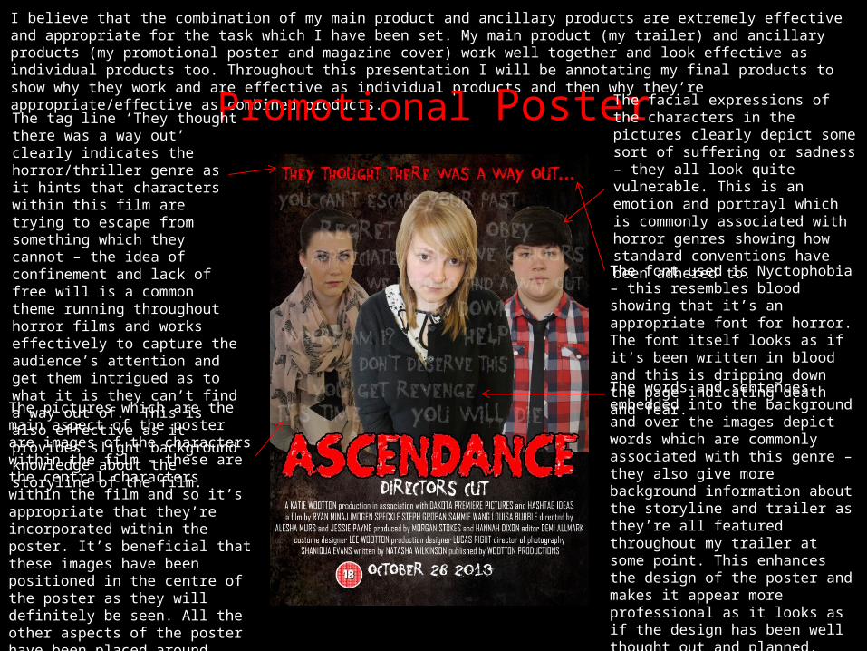
Promotional PosterThe tag line ‘They thought there was a way out’ clearly indicates the horror/thriller genre as it hints that characters within this film are trying to escape from something which they cannot – the idea of confinement and lack of free will is a common theme running throughout horror films and works effectively to capture the audience’s attention and get them intrigued as to what it is they can’t find a way out of. This is also effective as it provides slight background knowledge about the storyline of the film.
The pictures which are the main aspect of the poster are images of the characters within the film – these are the central characters within the film and so it’s appropriate that they’re incorporated within the poster. It’s beneficial that these images have been positioned in the centre of the poster as they will definitely be seen. All the other aspects of the poster have been placed around these images as they’re slightly less important.
The facial expressions of the characters in the pictures clearly depict some sort of suffering or sadness – they all look quite vulnerable. This is an emotion and portrayl which is commonly associated with horror genres showing how standard conventions have been adhered to.The font used is Nyctophobia – this resembles blood showing that it’s an appropriate font for horror. The font itself looks as if it’s been written in blood and this is dripping down the page indicating death and fear.The words and sentences embedded into the background and over the images depict words which are commonly associated with this genre – they also give more background information about the storyline and trailer as they’re all featured throughout my trailer at some point. This enhances the design of the poster and makes it appear more professional as it looks as if the design has been well thought out and planned. They’ve also been placed appropriately so that no aspects of the poster have been blocked or made unclear.
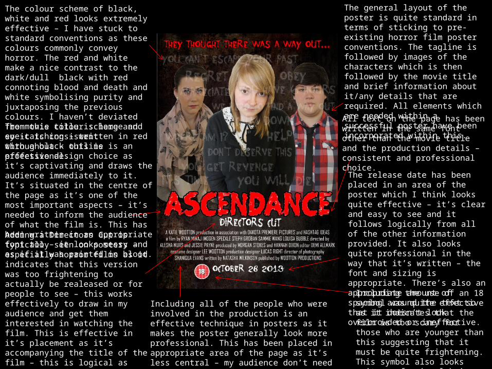
The colour scheme of black, white and red looks extremely effective – I have stuck to standard conventions as these colours commonly convey horror. The red and white make a nice contrast to the dark/dull black with red connoting blood and death and white symbolising purity and juxtaposing the previous colours. I haven’t deviated from this colour scheme and so it is consistent throughout – this is professional.The movie title is large and eye-catching – written in red with a black outline is an effective design choice as it’s captivating and draws the audience immediately to it. It’s situated in the centre of the page as it’s one of the most important aspects – it’s needed to inform the audience of what the film is. This has been written in an appropriate font too – it looks messy and as if it was painted in blood. Adding a Directors Cut is typically seen on posters – especially horror films as it indicates that this version was too frightening to actually be realeased or for people to see – this works effectively to draw in my audience and get them interested in watching the film. This is effective in it’s placement as it’s accompanying the title of the film – this is logical as this piece of information follows on from the title.
Including all of the people who were involved in the production is an effective technique in posters as it makes the poster generally look more professional. This has been placed in appropriate area of the page as it’s less central – my audience don’t need to draw their attention to this aspect but it still can be clearly seen and is in obvious view if they wish to.
Including the use of an 18 symbol was quite effective as it indicates that the film is too scary for those who are younger than this suggesting that it must be quite frightening. This symbol also looks quite professional being placed on the poster.
The release date has been placed in an area of the poster which I think looks quite effective – it’s clear and easy to see and it follows logically from all of the other information provided. It also looks quite professional in the way that it’s written – the font and sizing is appropriate. There’s also an appropriate amount of spacing around the text so that it doesn’t look overcrowded or ineffective.
The general layout of the poster is quite standard in terms of sticking to pre-existing horror film poster conventions. The tagline is followed by images of the characters which is then followed by the movie title and brief information about it/any details that are required. All elements which are needed within a successful poster have been incorporated within this. All text on the page has been written in the same font other than the movie title and the production details – consistent and professional choice.

Pre-Existing PostersThe layout of these posters are both very similar –the top of the poster consists of a gripping tagline/piece of information. This is then followed by an image of the character(s) within the film, then followed by the movie title, then followed by the production details which is then followed by the release date. This is a very standard layout and design but it works effectively as it’s used in the majority of horror posters – all the information that needs to be conveyed is and the design looks professional and sophisticated. The actual production details have also been written in exactly the same way.
The colour scheme used within both products are virtually the same – black, white and red. This helps convey the idea of horror as these are the most prominent and prevalent colour schemes used to express this genre. The ‘Mirrors’ poster has used a darker shade of red however, this is the only difference between colouring. My poster consists of more red whereas the ‘Mirrors’ poster has used white as the most prominent colour. As my poster is very similar to a pre-existing and successful poster, mine can also be deemed as effective.
Similar concepts have been used within both posters i.e. the 18 symbol in my poster and the rated R symbol in the ‘Mirrors’ poster. Both posters are quite simplistic too – they’re dark and have used dull colouring but both look appealing and attractive – they work to draw in the audience effectively. My poster is slightly brighter as the colours used are more vibrant as well as the font styles looking slightly more friendly – however, the similarities between the two are indisputable even though it appears that the ‘Mirrors’ poster is much more professional, understandably.
The facial expression on each of the characters in these products help to convey the role these characters play within the films – the characters within these posters appear to be victims.

Pre-Existing PostersThe background pattern/image between these two posters is very similar. The ‘Drag Me To Hell’ background is actually in the form of a photograph though whereas my background is completely a separate image. However, the pattern and atmosphere of the background is extremely similar in both – they’re both dark andw ith a ghostly/unnatural vibe.
The general layout of both products is very similar – the image of the character is followed by the movie title and production details. There are more elements contained on my poster, however. The tagline’s are also situated in different positions but these are virtually the only differences – these posters are highly similar.
The colours which have been used within each poster are quite similar. The background in each poster is in a black/grey pattern or design with the majority of the writing on the page written in white. The most important elements on my poster have been written in red, however – this isn’t done on the ‘Drag Me To Hell’ poster as the only element which sort of resembles this colour is the use of the fire effect towards the bottom of the poster which essentially does connote the same meanings as the colour red. The ‘Drag Me To Hell’ poster is extremely effective in it’s design.
The ‘Drag Me To Hell’ poster appears to have a more simplistic design than my own – the design of it simply consists of an image with the necessary text situated on top of it whereas I have incorporated more detailing within my design i.e. the low opacity words/sentences used in the background.
The image’s of the characters in these posters are both very different – the ‘Drag Me To Hell’ poster consists of a more shocking and graphical image which makes my images look quite reserved in comparison. This suggests that there is more intense action within the ‘Drag Me To Hell’ trailer whereas mine is more calm and the silent suffering type – this assumption is actually correct.
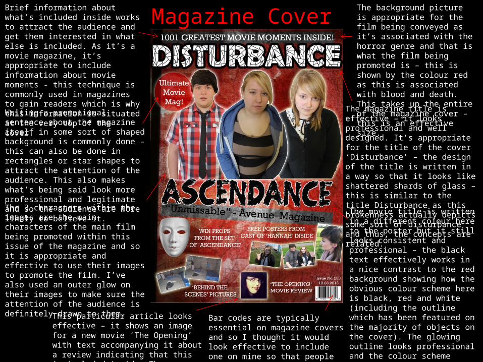
Brief information about what’s included inside works to attract the audience and get them interested in what else is included. As it’s a movie magazine, it’s appropriate to include information about movie moments - this technique is commonly used in magazines to gain readers which is why this information is situated at the very top of the cover.
Magazine CoverThe background picture is appropriate for the film being conveyed as it’s associated with the horror genre and that is what the film being promoted is – this is shown by the colour red as this is associated with blood and death. This takes up the entire of the magazine cover – this is an effective size.
The magazine title is effective – it looks professional and well designed. It’s appropriate for the title of the cover ‘Disturbance’ – the design of the title is written in a way so that it looks like shattered shards of glass – this is similar to the title Disturbance as this brokenness actually depicts some sort of disturbance and thus, the concepts are related.
Writing a promotional sentence about the magazine itself in some sort of shaped background is commonly done – this can also be done in rectangles or star shapes to attract the attention of the audience. This also makes what’s being said look more professional and legitimate and so the audience are more likely to believe it. The 3 characters within the images are the main characters of the main film being promoted within this issue of the magazine and so it is appropriate and effective to use their images to promote the film. I’ve also used an outer glow on their images to make sure the attention of the audience is definitely drawn to them.
The movie title is written in a different colour here to the poster but it still looks consistent and professional – the black text effectively works in a nice contrast to the red background showing how the obvious colour scheme here is black, red and white (including the outline which has been featured on the majority of objects on the cover). The glowing outline looks professional and the colour scheme clearly indicates that the film is of the horror genre and that’s what this particular issue is based around.
Bar codes are typically essential on magazine covers and so I thought it would look effective to include one on mine so that people could actually purchase the magazine.
This particular article looks effective – it shows an image for a new movie ‘The Opening’ with text accompanying it about a review indicating that this is included inside. The placement looks effective.

This particular article has been accompanied with a different coloured background as it’s the article relating to the central photos and thus, is the main article on the cover – this means that it’s effective to draw the most attention to this particular article. The use of grey/white background is still consistent with the colour scheme.This article is related to the film being promoted within this cover – the article is effective as it contains an image with accompanying appropriate text relating to the image. Giving the readers a chance to win something is a common feature of magazine covers that works to draw the attention of readers and convince them into reading the article/buying the magazine. This article is also related to the film being promoted within the cover – it’s appropriate in the same way as the previous article in that an image is accompanied by the appropriate text. Magazine covers including a ‘behind the scenes’ element is typically done as it’s an interesting piece of information and will draw people into reading the magazine.
All of the article’s are written in the same font – this looks consistent and professional. All of the less central articles are written in white as opposed to black – this helps identify the articles which are of importance. They’re written in an appropriately sized font too.
The issue number and date are typically included on magazine covers – I decided to incorporate one onto mine as I thought this would increase the level of professionalism. It’s placed in an appropriate area of the magazine cover as it is preceeding the barcode – this is typically done.
This particular article is concerning a different film being promoted – ‘Hannah’. The concept of including free posters within the magazine cover is extremely effective as it works as a persuasive tool for the audience as they’ll want these free posters and so will purchase the magazine. The images accompanying this text are also effective as they give the audience a taste of what they can expect inside.
The images which have been included in the articles are all appropriately sized – they’re big enough so that they can be clearly seen but not too big so that it would be overbearing. There is clear spacing between articles so they don’t become disorganised or unclear.
The general layout and creation of the magazine cover looks effective – the design is professional and it looks like a legitimate cover that is mainly promoting the film Ascendance.

Pre-Existing Magazine CoversSomewhat similar layout used throughout both magazine covers – the title of the magazine is situated at the top centre of the page with a gripping sentence above it – this is to attract the readers attention. This is then followed by images of the main article/film/characters and then the title of this particular film, plus some brief information about that film. Following this is the less central aspects of the magazine i.e. unrelated articles or less important information.
Similar features have been used on both products i.e. the eye-catching circle shape with attractive text inside it – this has even been placed in the same area of the magazine. This is similar to the barcode which has also been placed in the exact same section – this shows consistency between the placement and layout of objects.
The colours used within each poster are very similar – there is a lot of red, black and white used in each with those colours being the house style/colour scheme within my poster. However, the ‘Film’ cover has incorporated a lot of blue too – this appears to be the colour scheme used within that magazine as that magazine isn’t specifically for the ‘horror’ genre and so can incorporate colours which connote other things showing where these covers differ.
This ‘Film’ cover has also decided to randomly disperse their articles rather than placing them within sections such as having boxes around each article – this is also what I did in my magazine cover. This allows the background to look more collaborated and together.
The ‘Film’ title has done a similar thing to ‘Disturbance’ in terms of design as both of the titles look quite broken and shattered due to the effects which have been incorporated on them i.e. they both look as if they’ve been placed together like sections of a jigsaw – this looks effective.
The general design of the ‘Film’ magazine looks more professional and of a high quality, understandably. However, the images used within my cover may be more effective in conveying the emotions of the characters as the image on the ‘Film’ cover looks quite ambiguous and unclear.
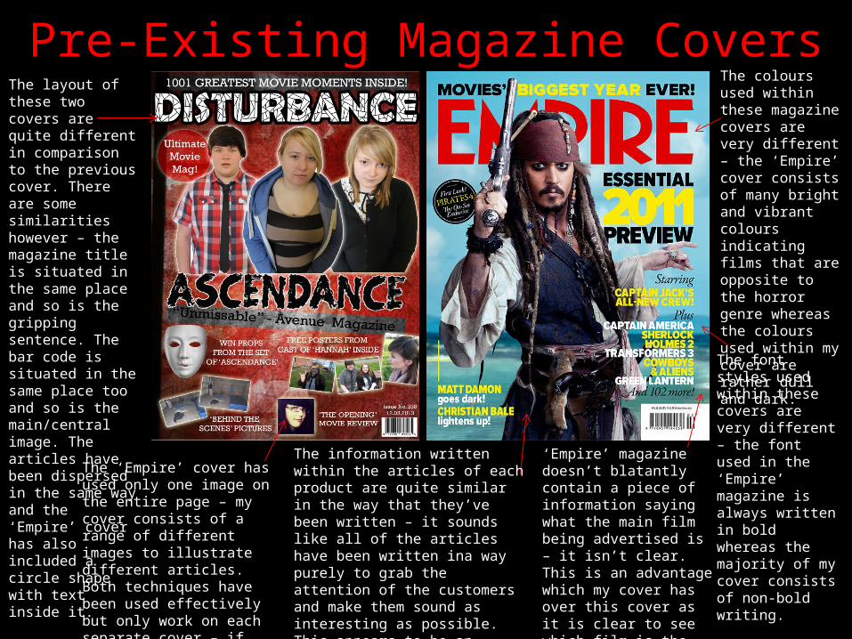
Pre-Existing Magazine CoversThe layout of these two covers are quite different in comparison to the previous cover. There are some similarities however – the magazine title is situated in the same place and so is the gripping sentence. The bar code is situated in the same place too and so is the main/central image. The articles have been dispersed in the same way and the ‘Empire’ cover has also included a circle shape with text inside it.
The colours used within these magazine covers are very different – the ‘Empire’ cover consists of many bright and vibrant colours indicating films that are opposite to the horror genre whereas the colours used within my cover are rather dull and dark.The font styles used within these covers are very different – the font used in the ‘Empire’ magazine is always written in bold whereas the majority of my cover consists of non-bold writing.
‘Empire’ magazine doesn’t blatantly contain a piece of information saying what the main film being advertised is – it isn’t clear. This is an advantage which my cover has over this cover as it is clear to see which film is the central aspect within the ‘Ascendance’ cover.
The information written within the articles of each product are quite similar in the way that they’ve been written – it sounds like all of the articles have been written ina way purely to grab the attention of the customers and make them sound as interesting as possible. This appears to be an effective technique to use when creating magazine articles for covers.
The ‘Empire’ cover has used only one image on the entire page – my cover consists of a range of different images to illustrate different articles. Both techniques have been used effectively but only work on each separate cover – if these were reversed, they would not look as effective or professional.

Combination of poster and coverThe layout of each product is quite similar – an eye-catching sentence is situated at the top of the page which is then followed by images of the characters from the film. This is then followed by the movie title and a piece of information relating to the movie title. This is then followed by less central and less important information i.e. either the production details or magazine articles. The way in which the objects have been placed is very consistent showing how the design aspects are quite professional.
The images used are only slightly different. I actually used the same image of my main character (the blonde character) clearly displaying how the images show consistency and it will be recognisable that these two products work together. Each product consists of 3 images of characters which have been placed in a similar way – the design aspects clearly show how these two products combine effectively.
The background image takes up the entire background on each product – they both contain some sort of subtle pattern which indicates ghostly or unnatural atmospheres, reiterating the idea of the horror genre. Both of the backgrounds are separate images to the images of my characters showing a running theme throughout both products.
The less central information on each product has been written in white with the more important aspects written in either red or black. There is a consistent colour scheme throughout.
The images used within both products consist of the same characters showing how these characters have clearly been used for both products suggesting that the products go together.
The use of black, red and white looks really effective across both products – this indicates the horror genre and emphasizes the level of consistency.
The movie title is written in the same font and size on both products – they’re both the central features of each product showing how it’s clear what each product is advertising. The only difference is the colour in which the title is written. There are numerous similarities between each product, clearly showing how the products are meant to combine together.

Combination of cover/poster & trailer
When all 3 products are looked at in combination, it is clear to see that there are major similarities between them and that all the products work effectively together – it’s obvious that they were designed in a way so that they could be presented together. The characters used within each product are all featured – I’ve made sure that the images of the characters in the poster and cover are extremely clear so that it’s obvious to see that these same characters are the ones featured within the trailer – the characters are clearly shown within the trailer due to their heavy screen time in the film footage. I’ve ensured that the characters appearances haven’t changed much throughout the 3 products i.e. none of the characters have dyed their hair – I did this to avoid any confusion or ambiguity. The scripting within the trailer has also been represented in the poster – the words and sentences featured faintly throughout the poster are the words which are spoken by the characters in the trailer, clearly showing how these two products connect and interlink – this isn’t too blatant however. The props which have been included within the trailer have also been included as aspects of the magazine cover i.e. the white mask, showing how the magazine cover is advertising elements of the trailer. A major similarity between these products is the use of text techniques within the trailer – these are written/displayed in either red, black or white showing how a consistent colour scheme and house style has been used throughout all 3 products – this is professional and shows that the combination of the products is quite effective and appropriate. This is also shown in the use of font styles and font sizes – they’re all extremely similar as they’re written in a messy and disorganised way, clearly indicating the concept of horror and fear in each product.

Combination of cover/poster & trailer
The images of the characters within my cover and poster also lead logically into their position portrayed within the trailer showing consistency between concepts and ideas. The images of the characters in the poster all look quite vulnerable and scared, thus, indicating these particular characters are victims –this is represented within the trailer as they’re the ones who need help and are being controlled by a pursuer. The pursuer is shown in the centre of the magazine cover looking quite angry or hostile – this is also represented within the trailer as this is the pursuer who is controlling the rest of the characters and is the evil character, thus, showing consistency and effectiveness between products. The movie title which appears at the end of the trailer is extremely similar to the way in which the movie title is displayed on the poster – the same font and colouring has been used as well as the same release date, written also in the same font. This particular movie title also consists of the same background which has been used in the poster so that the font (movie title) looks appropriate and effective on top of it and thus, the design is virtually the same in both products. It’s clear to see that the poster and magazine cover are appropriate for the trailer – all the elements and characteristics included in both are the same. The information contained at the end of the trailer with all of the production details has also been shown on the poster with the exact same information. It is clear from just looking at these 3 products together from a distance that they were designed and created for the purposes of being presented together in a sort of pack. The poster and cover provide my audience with extra information about the details which are indicated within the trailer.