housing supply affordability report - treasury
TRANSCRIPT
NATIONAL HOUSING SUPPLY COUNCIL
HOUSING SUPPLY AND AFFORDABILITY – KEY INDICATORS, 2012


NATIONAL HOUSING SUPPLY COUNCIL
HOUSING SUPPLY AND AFFORDABILITY – KEY INDICATORS, 2012
Page ii National Housing Supply Council Housing Supply and Affordability – Key Indicators, 2012
© Commonwealth of Australia 2012
ISBN 978-0-642-74817-1
This publication is available for your use under a Creative Commons Attribution 3.0 Australia licence, with the exception of the Commonwealth Coat of Arms, the Treasury logo, photographs, images, signatures, Figure 5.1 House price and earnings growth (annual change), banks’ standard variable mortgage interest rate – all Australia, Figure 5.2 Capital city house prices, 2005 to 2011, Figure 5.3 Rest of state house prices, 2005 to 2011, Figure 5.4 Average rents, earning and house prices indexed to third quarter of 1994 and where otherwise stated. The full licence terms are available from http://creativecommons.org/licenses/by/3.0/au/legalcode.
Use of Treasury material under a Creative Commons Attribution 3.0 Australia licence requires you to attribute the work (but not in any way that suggests that the Treasury endorses you or your use of the work).
Treasury material used ‘as supplied’
Provided you have not modified or transformed Treasury material in any way including, for example, by changing the Treasury text; calculating percentage changes; graphing or charting data; or deriving new statistics from published Treasury statistics – then Treasury prefers the following attribution:
Source: The National Housing Supply Council
Derivative material
If you have modified or transformed Treasury material, or derived new material from those of the Treasury in any way, then Treasury prefers the following attribution:
Based on The National Housing Supply Council data
Use of the Coat of Arms
The terms under which the Coat of Arms can be used are set out on the It’s an Honour website (see www.itsanhonour.gov.au)
Other Uses
Inquiries regarding this licence and any other use of this document are welcome at:
National Housing Supply Council Unit
The Treasury
Langton Crescent Parkes ACT 2600
Email: [email protected]
Disclaimer: The National Housing Supply Council has prepared this report. It draws on information, opinions and advice provided by a variety of individuals and organisations, including the Commonwealth of Australia. The Commonwealth accepts no responsibility for the accuracy or completeness of any material contained within this report. Additionally, the Commonwealth disclaims all liability to any person in respect of anything, and of the consequences of anything, done or omitted to be done by any such person in reliance, whether wholly or partially, upon any information presented in this report.
Caution: Data in this report is made available on the understanding that neither the Commonwealth nor the National Housing Supply Council is providing professional advice. Before relying on any of the information contained within this report, users should obtain appropriate professional advice. Views and recommendations which may also be included in the report are those of the Council only, and do not necessarily reflect the views of the Commonwealth, the Minister for Housing, or the Treasury or indicate a commitment to a particular course of action.

Page iii
Contents
Executive summary vi
Chapter 1 Introduction 2
Chapter 2 Demand 8
Chapter 3 Supply 16
Chapter 4 Demand-supply balance 22
Chapter 5 Affordability 32
Chapter 6 Conclusion 54
Appendix National Housing Supply Council membership 58
Glossary 60

Page iv National Housing Supply Council Housing Supply and Affordability – Key Indicators, 2012
TablesTable 2.1 Underlying demand projections based on low, medium and high household
growth: annual increase in underlying demand and total underlying demand projections (households), 2011—2031 10
Table 2.2 Cumulative additional households projected under low, medium and high household growth scenarios, from June 2011 10
Table 2.3 Proportional projected additional households by region for low, medium and high household growth scenarios, (per cent increase 2011–2031) 12
Table 3.1 Existing supply, June 2011 18
Table 3.2 Projected net increase in supply of residential dwellings, Australia, low, medium and high supply scenarios, 2011–2031 19
Table 3.3 Projected net supply growth by state/territory, cumulative 2011-2031 19
Table 4.1 Estimates of the net dwelling supply gap, Australia, 2001-2011 23
Table 4.2 Estimated additional underlying demand and adjusted net supply, states and territories, July 2010 to June 2011 24
Table 4.3 Estimated dwelling gap since June 2001 (‘000 dwellings), states and territories 25
Table 4.4 Estimated dwelling gap at June 2011 as a proportion of the estimated level of underlying demand (per cent) 26
Table 4.5 Change in the gap between underlying demand and dwelling supply, five years (June 2011 to June 2016), using different projection assumptions 27
Table 4.6 Cumulative gap since 2001 between underlying demand and dwelling supply at June 2016, using different projection assumptions 28
Table 4.7 Change in gap between underlying demand and dwelling supply, 20 years (June 2011 to June 2031), using different projection assumptions 29
Table 4.8 Cumulative gap since 2001 between underlying demand and dwelling supply at June 2031, using different projection assumptions 29
Table 5.1 Number and proportion of mortgagors with equivalised disposable incomes below the 40th or 50th percentiles, or wholly depending on government income support payments, paying more than 30 per cent or more than 50 per cent of their gross income in repayments. 40
Table 5.2 Mortgagors in the lowest 40 per cent of the income distribution facing direct housing costs of 30 and 50 per cent or more of income 42
Table 5.3 Number and proportion of private renters with equivalised disposable income below the 40th or 50th percentiles, or wholly depending on government income support payments, paying more than 30 per cent or more than 50 per cent of their gross income in rent 43
Table 5.4 Proportion of renters in lower 40 per cent of income distribution with housing costs of more than 30 per cent and 50 per cent of income 45
Table 5.5 Proportion of lower and middle income mortgagors in housing stress by household type, 2009-10 46
Table 5.6 Proportion of lower and middle income renters in housing stress by household type, 2009-10 46
Table 5.7 Shortage (surplus) of rental dwellings affordable to renters with gross incomes below the 40th or 50th percentiles 48
Table 5.8 Shortage of affordable and available rental dwellings for renters with gross incomes at or below the 40th or 50th percentiles 48

Page v
FiguresFigure 3.1 Dwelling approvals and completions, four quarter moving average 16
Figure 3.2 Number of dwelling completions, private and public sectors (per annum) 17
Figure 5.1 House price and earnings growth (annual change), banks’ standard variable mortgage interest rate – all Australia 33
Figure 5.2 Capital city house prices, 2005 to 2011 ($ thousands) 34
Figure 5.3 Rest of state house prices, 2005 to 2011 ($ thousands) 35
Figure 5.4 Average rents, earnings and house prices indexed to third quarter of 1994 37
Figure 5.5 Housing cost outcomes for home buyers, 2009-10 41
Figure 5.6 Housing cost outcomes for renters, 2009-10 44
Figure 5.7 Affordable and available housing by income deciles, 2009-10 49
Page vi National Housing Supply Council Housing Supply and Affordability – Key Indicators, 2012
Executive summary
This publication updates the National Housing Supply Council’s analysis of underlying
housing demand, supply, the balance between the two, and housing affordability
using data not available for inclusion in the 2011 State of Supply Report released in
December 2011. Key findings are that:
�� The Council estimates that the total dwelling stock in Australia increased by 142,000
(1.6 per cent) to almost 9.3 million dwellings over the year to end-June 2011.
�� The housing shortfall (gap) increased by 28,000 dwellings over the year to
end-June 2011, taking the cumulative shortage since 2001 to 228,000 dwellings.
�� The shortfall of 200,000 at end-June 2010 has been revised from the 187,000
published in the 2011 State of Supply Report. The revision is explained in Chapter 4.
�� The most acute shortage remains in NSW, with an estimated gap of 89,000
dwellings, followed by 83,000 in Queensland. Relative to the number of households,
the largest estimated shortfall is in the Northern Territory at almost 15 per cent.
�� The housing shortfall in Victoria narrowed over the year to June 2011.
New South Wales and Queensland experienced further widening of the gap
over the same period.
�� The Council projects that the national shortfall will increase to 370,000 dwellings by
2016, 492,000 by 2021 and 663,000 by 2031, assuming historic demographic and
supply trends continue (the Council’s “medium” growth scenarios for underlying
demand and supply).
The impact of the continuing shortfall is evident in a range of affordability measures
calculated by the Council from the 2009-10 Survey of Income and Housing:
�� In 2009-10, 316,000 (48 per cent) of lower income home owners (those in the
bottom 40 per cent of the income distribution) faced direct (mortgage) housing
costs of more than 30 per cent of their gross income. This proportion was
unchanged from 2007-08.
�� Lower income households with a mortgage in capital cities faced greater
affordability pressures than those living elsewhere. Higher proportions of lower
income households in New South Wales and Western Australia faced affordability
pressures than in other states.
Executive summary Page vii
�� In 2009-10, 60 per cent of lower income private renters faced direct housing costs
of more than 30 per cent of their income, an increase from 57 per cent in 2007-08.
�� A larger proportion of lower income renters in capital cities faced housing costs
of more than 30 (and 50) per cent of income than did low income renters outside
those cities.
�� New South Wales, followed by Queensland, had the highest proportion of lower
income renters paying more than 30 (and 50) per cent of income.
�� There is a shortage of properties that are affordable and available for lower income
renters. The Council estimates that there is a shortage of 539,000 rental properties
that are both affordable and available for this group. Available rental properties
include some which are affordable for less affluent households but are already
occupied by higher income earners.

Chapter 1
Page viii National Housing Supply Council Housing Supply and Affordability – Key Indicators, 2012

Chapter 1 Introduction

Page 2 National Housing Supply Council Housing Supply and Affordability – Key Indicators, 2012
Chapter 1 Introduction
The National Housing Supply Council published its most recent assessment of the
balance between underlying housing demand and supply in December 2011 in the
2011 State of Supply Report. This update provides a more timely assessment of the
underlying trends in housing, using data that were not available in time for inclusion in
the 2011 State of Supply Report. It does not draw any policy conclusions beyond those
presented in the 2011 Report.
In particular, this report:
�� Updates the figures for housing supply, underlying demand, and the gap between
the two through to June 2011.
�� Extends the housing supply, underlying demand and shortfall (gap) projections
through to 2031.
�� Provides an update on affordability trends, drawing on the findings of the
2009-10 Survey of Income and Housing.
�� Provides a revised national estimate of the housing shortfall to June 2010.
Revisions to previous estimates of the housing shortfallHistoric estimates of net new housing supply from 2001 to 2010, and as a result the
balance between supply and demand, have been revised from those published in the
2011 State of Supply Report. These take account of an adjustment to the calculations
for underlying net housing supply growth (see Chapter 4 for details). The revised
national estimate of the housing shortfall at end-June 2010 is 200,000 dwellings,
13,000 greater than previously published.
This revision does not change any of the key conclusions of the Report, although
the housing shortfall is larger than previously estimated. The Council’s estimates
of underlying demand growth since 2001, and the path of the supply and demand
projections, are unaffected. In the Council’s view, the key challenges facing the housing
system have not changed since the 2011 Report was published.
Chapter 1: Introduction Page 3
Underlying demand growth continues despite soft housing marketThe updated assessment of the balance between underlying supply and demand
shows that the housing shortfall continued to increase over the year to June 2011,
at a slightly slower pace than in the two preceding years. This further deterioration
in Australia’s undersupply occurred despite the weakness in the housing market
over the period. As was explained in the 2011 Report, the Council do not believe
this is inconsistent.
The Council’s estimates are based on the concept of underlying demand, which is
driven predominantly by demographic factors, including migration. By contrast,
market weakness has come about through a slowing in effective demand (largely the
level of purchaser activity in the market), which is driven by a range of factors including
consumer and investor sentiment, interest rates, affordability constraints and job
prospects. Put another way, effective demand is underlying demand moderated by
market factors. The tight rental market offers supporting evidence that there is an
underlying housing shortage.
In the short-term, it is possible for underlying demand and effective demand to diverge
quite significantly. The structural shortfall (i.e. that housing supply fails to keep up with
underlying demand), means that housing costs are higher than they would be in a less
constrained market. However, it does not preclude periods of weakness. In the longer-
term, there will inevitably be some connection between the two measures. Lower levels
of effective demand could be influenced by the housing shortage and affordability
constraints. This could lead to changes in household formation decisions and therefore
reduce underlying demand.
The housing shortfall is likely to have the greatest impact at the lower end of the income
distribution. These households have less choice than more affluent groups because
they face binding affordability constraints, have less ability to absorb increased
housing costs, and are often displaced from affordable existing housing by established
households and those higher up the income spectrum.
Current estimates and projections of the housing shortfallNet overseas migration has slowed from recent peaks and housing supply growth held
up reasonably well in 2010-11. This limited the pace at which the housing gap widened.
However, recent declines in building approvals suggest that the immediate outlook is
for the situation to get worse on the supply side.
The public sector accounted for a larger than usual (8 per cent) share of housing
completions in 2011-12, compared to a more typical 2-3 per cent over the last decade.
Page 4 National Housing Supply Council Housing Supply and Affordability – Key Indicators, 2012
The high levels of public sector housing completions are attributable to the stimulus
spending in response to the Global Financial Crisis (GFC) working through the system.
Activity in the public sector is likely to decline sharply, with the majority of the homes
built under the Social Housing Initiative scheduled to be completed by end-June 2012.
With relative weakness in the leading indicators (specifically building approvals in the
private sector), production of new homes is also likely to fall in the immediate future.
2011 census will provide an opportunity to reassessResults from the 2011 Census of Population and Housing, which are scheduled for
release mid-year, will provide an opportunity to assess how households have adapted
to the shortage. The data will show whether household size has increased since 2006
for comparable household types. The changing structure of the household population
(for example due to ageing) affects household size in its own right, so it is important to
consider changes in household characteristics relative to that population structure.
The Council will present analysis of 2011 census data in future publications, and will
examine whether constraints in housing availability have impacted on household
formation rates. For example, the analysis will examine whether supply and affordability
pressures have contributed to delayed household formation, and what other factors
are leading to different household formation patterns than in the past. Changes can
also occur due to underlying social changes in preferences for different types of living
arrangements. The results may lead to a change in the Council’s underlying demand
projections if they reveal a change in household formation patterns from the past.
However, while the census is critical to the Council’s analysis of the housing system,
it may not provide all the answers. Some of the more extreme coping mechanisms
to the housing shortage, for example overcrowding amongst international students
or illegal boarding houses, may not be reported and can fall outside private housing
definitions. In essence, the more extreme responses to a housing shortage are the
least likely to be picked-up in standard data gathering. The undercount has increased
in recent times. Some of the groups most likely to be undercounted are those most
likely to be in unconventional housing situations.
Housing affordability This report also includes an update of key indicators of housing affordability from the
2010 State of Supply Report, based on data in the 2009-10 Survey of Income and
Housing released in late 2011. Despite the softening in house prices over the last
18 months, housing affordability remains a key concern for home buyers. Meanwhile,
private rental tenants have seen rents increase by more than earnings.
Chapter 1: Introduction Page 5
The situation faced by lower income renters deteriorated between 2007-08 and
2009-10, most notably in the capital cities. This highlights a key point of the Council’s
analysis of the housing gap. It is those at the lower end of the income distribution,
many of who will be in the private rental market, who are likely to be most affected
by constrained housing availability. Given that rents have continued to rise, and
outstripped house price growth in 2011, rental affordability may have continued to
deteriorate, at least in comparison to the situation faced by home owners.
Page 6 National Housing Supply Council Housing Supply and Affordability – Key Indicators, 2012
Chapter 2

DemandChapter 2
Page 8 National Housing Supply Council Housing Supply and Affordability – Key Indicators, 2012
Chapter 2 Demand
There have not been any changes to the demand-side data underlying the Council’s
calculations in the 2011 State of Supply Report. The Council uses estimated growth
in the number of households to measure underlying housing demand. As noted in
Chapter 1, this differs considerably from the concept of effective demand – the latter is
demand as it is expressed in the market and is driven by a range of cyclical, as well as
structural economic and demographic factors. As explained in the 2011 Report, these
two measures of demand are conceptually very different and will not necessarily move
together, at least in the short-term.
However, over the longer-term, there are clearly linkages between the two measures.
If effective demand is squeezed due to a housing shortage and affordability constraints,
this may eventually influence household formation patterns and decisions leading to a
lower level of underlying demand.
It is important to understand the concepts and data underlying the Council’s estimates
of the number of households. Definitive figures for the number of households are
sourced from the Census of Population and Housing, with the most recent census
data available being for 2006. Household estimates for years since 2006 are derived
by applying household transition probabilities (the likelihood of a person moving from
one type of household and/or location to another) to the most recent final estimate of
the total Australian population (the Estimated Resident Population, ERP, the number
of people in Australia) available at the time the modelling was undertaken. So the
estimates for 2007 to 2011 apply the patterns of household transition observed
between the 2001 and 2006 censuses to more recent population (number of people
rather than households) estimates.1
This means the data may not necessarily reflect the most recent patterns of household
transition (changes in living arrangements) and may overestimate the number
of households. Deteriorating housing affordability is likely to have affected living
arrangements and formation rates of new households in ways not captured in current
projections. However, it is important to note that changes can also occur due to
underlying social changes in preferences for different types of living arrangements.
An updated count of the number of households for 2011 will only be available after
census results are published this year.
1 See page 22 of NHSC 2011 State of Supply Report.
Chapter 2: Demand Page 9
In addition to the uncertainty around household transition patterns, the estimated
household numbers for 2009-10 and 2010-11, published in the 2011 Report and this
update, are based on the projected population in 2009-10 and 2010-11, rather than an
updated ERP for those years. This includes population growth estimates for 2009-10
and 2010-11, based on two components. Firstly, natural population growth (births less
deaths), which is unlikely to vary significantly from the projected levels. Secondly, an
assumed net overseas migration (NOM) level of 180,000 people per annum, which is
rather more volatile. The last ERP input into the model was for June 2009, meaning
the higher levels of migration in 2007-08 and 2008-09, which contributed to a short-
term increase in population growth at that time, are included, but actual NOM levels for
2009-10 and 2010-11 are not.
However, the net overseas migration assumption of 180,000 people per annum
is, on average, close to the actual outcomes2 of 196,000 in 2009-10 and 170,000
(preliminary estimate) in 2010-11. If migrants have the same characteristics as the
existing population, as the Council’s modelling assumes, the cumulative difference
of 6,000 people over the two years would equate to a little under 3,000 additional
households at end-June 2011. The figures in this update have not been adjusted to take
account of this small discrepancy.
The underlying demand projections estimate that there were 8,909,000 households
in Australia as at end-June 2011. This is 163,000 more than a year earlier. Under the
medium migration growth scenario (with NOM remaining at 180,000 every year) the rate
of growth in the number of households is projected to increase gradually to 165,000
per annum in 2018 before slowly declining thereafter as the population ages, to just
under 160,000 at the end of the forecast horizon in 2031. The total number of households
(the underlying demand for housing) is projected to increase to 10,553,000 in 2021 and
12,168,000 in 2031 (Table 2.1).
2 ABS 2011 - 3101.0 - Australian Demographic Statistics, September 2011.

Page 10 National Housing Supply Council Housing Supply and Affordability – Key Indicators, 2012
Table 2.1 Underlying demand projections based on low, medium and high household growth: annual increase in underlying demand and total underlying demand projections (households), 2011—2031
Average annual increase in underlying demand in
intervening periodTotal underlying demand
YearLow
household growth
Medium household
growth
High household
growth
Lowhousehold
growth
Medium household
growth
High household
growth
2011 139,000 163,000 190,000 8,862,000 8,909,000 8,964,000
2016 140,000 165,000 193,000 9,564,000 9,733,000 9,931,000
2021 138,000 164,000 194,000 10,255,000 10,553,000 10,902,000
2026 136,000 163,000 194,000 10,933,000 11,366,000 11,872,000
2031 132,000 160,000 193,000 11,593,000 12,168,000 12,838,000
Source: National Housing Supply Council projections based on McDonald and Temple low, medium and high house-hold growth scenarios. Figures are rounded to the nearest thousand.
Notes: The shaded area depicts the main projection series used in this report. These figures are projected from estimated resident population as at 30 June 2009. The increase for 2011 is solely for that year. Subsequent increases are averages for five-year periods (2012–2016, 2017–2021, 2022–2026, 2027–2031).
There is a projected increase of a little over 1.6 million additional households over
the decade to June 2021 and just under 3.3 million for the 20 years to June 2031
(Table 2.2). The low growth scenario (which is based on NOM of 120,000 per year
through to 2031) projects there will be just less than 1.4 million additional households
over the next decade and just over 2.7 million over the next two decades. The high
growth scenario (NOM at 250,000 per year) projects there will be just over 1.9 million
additional households by 2021 and almost 3.9 million by 2031.
Table 2.2 Cumulative additional households projected under low, medium and high household growth scenarios, from June 2011
To end JuneScenario
Low growth Medium growth High growth
2016 701,000 824,000 967,000
2021 1,392,000 1,644,000 1,938,000
2026 2,070,000 2,457,000 2,908,000
2031 2,731,000 3,259,000 3,874,000
Source: National Housing Supply Council projections based on McDonald and Temple low, medium and high household growth scenarios from June 2009. Figures are rounded to the nearest thousand.
Chapter 2: Demand Page 11
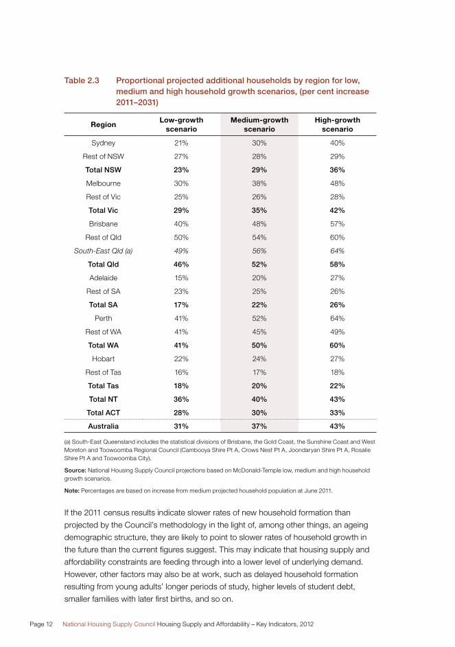
The projected increase in underlying demand is not equally distributed among the
states and territories. As Table 2.3 shows, Queensland and Western Australia are
projected to experience the fastest rates of growth in the number of households
over the next 20 years under the medium migration scenario. These projections
are based on the period when Queensland had been the fastest growing state for
several decades (up to the 2006 census). Since 2006, Western Australia‘s growth has
comfortably overtaken Queensland’s, so projections based on updated information
once the 2011 census data is available will likely point to this continuing.
The country’s most populous state, New South Wales, is projected to experience
significantly slower growth than the national average. Table 2.3 also shows that the
capital cities will experience larger increases than the rest of state areas. Adelaide and
Brisbane are the only exceptions to this. However, when South-East Queensland is
considered as a whole, growth in the number of households there is also projected to
outstrip the growth in households in the rest of the state. In Adelaide’s case, much of
the recent growth has been in the Outer Adelaide Statistical Division area, outside the
Adelaide Statistical Division. This is due more to overflow than a separate housing market.
The distribution of projected housing growth is based on past interstate migration
patterns. These may not fully reflect more recent developments, particularly the impact
of the mining boom, where fly-in, fly-out workers could increase demand in their place
of work in addition to their “home”.
A full explanation of the calculations underlying the demand projections is provided in
the 2011 Report3. Updates to a range of tables relating to demand are available on the
Council’s website4.
The impending census results will provide an opportunity for the Council to analyse
how household formation rates have changed in response to the constraints in
housing availability, and will also provide an opportunity to reassess household
projections. The Council will update its projection assumptions after analysis of the
2011 census data.
3 See pages 18-36, 152-159 of 2011 State of Supply Report.
4 www.nhsc.org.au.
Page 12 National Housing Supply Council Housing Supply and Affordability – Key Indicators, 2012
Table 2.3 Proportional projected additional households by region for low, medium and high household growth scenarios, (per cent increase 2011–2031)
RegionLow-growth
scenarioMedium-growth
scenarioHigh-growth
scenario
Sydney 21% 30% 40%
Rest of NSW 27% 28% 29%
Total NSW 23% 29% 36%
Melbourne 30% 38% 48%
Rest of Vic 25% 26% 28%
Total Vic 29% 35% 42%
Brisbane 40% 48% 57%
Rest of Qld 50% 54% 60%
South-East Qld (a) 49% 56% 64%
Total Qld 46% 52% 58%
Adelaide 15% 20% 27%
Rest of SA 23% 25% 26%
Total SA 17% 22% 26%
Perth 41% 52% 64%
Rest of WA 41% 45% 49%
Total WA 41% 50% 60%
Hobart 22% 24% 27%
Rest of Tas 16% 17% 18%
Total Tas 18% 20% 22%
Total NT 36% 40% 43%
Total ACT 28% 30% 33%
Australia 31% 37% 43%
(a) South-East Queensland includes the statistical divisions of Brisbane, the Gold Coast, the Sunshine Coast and West Moreton and Toowoomba Regional Council (Cambooya Shire Pt A, Crows Nest Pt A, Joondaryan Shire Pt A, Rosalie Shire Pt A and Toowoomba City).
Source: National Housing Supply Council projections based on McDonald-Temple low, medium and high household growth scenarios.
Note: Percentages are based on increase from medium projected household population at June 2011.
If the 2011 census results indicate slower rates of new household formation than
projected by the Council’s methodology in the light of, among other things, an ageing
demographic structure, they are likely to point to slower rates of household growth in
the future than the current figures suggest. This may indicate that housing supply and
affordability constraints are feeding through into a lower level of underlying demand.
However, other factors may also be at work, such as delayed household formation
resulting from young adults’ longer periods of study, higher levels of student debt,
smaller families with later first births, and so on.

Chapter 2: Demand Page 13
The Council will attempt to assess the reasons for differences between the
2011 census results and the Council’s projections of household formation based on
past trends and migration scenarios. This analysis will aim to distinguish sources of
difference arising from underlying demographic and distributional trends from those
apparently caused by constrained housing supply and affordability. For example,
has there been any change in living arrangements such as an increase in multi-
generational households concentrated among lower income people, and has this
occurred because of reduced access to housing or for other reasons?
However, census data are unlikely to identify fully the extent of responses to the
housing shortage, particularly the more extreme reactions. For instance, it is unlikely
that accommodation arrangements like over-crowding amongst students, people living
in cars or illegal boarding houses would be reported correctly and fully. It is not possible
to assess the magnitude of such arrangements or the extent of change. The Council
believes that there is a strong case for an assessment of census coverage to identify
which housing groups are most likely to be overrepresented in an undercount.

Page 14 National Housing Supply Council Housing Supply and Affordability – Key Indicators, 2012
Chapter 3

Chapter 3 Supply
Page 16 National Housing Supply Council Housing Supply and Affordability – Key Indicators, 2012
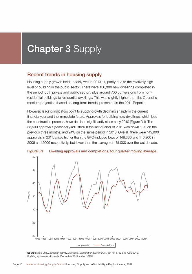
Recent trends in housing supplyHousing supply growth held up fairly well in 2010-11, partly due to the relatively high
level of building in the public sector. There were 156,300 new dwellings completed in
the period (both private and public sector), plus around 700 conversions from non-
residential buildings to residential dwellings. This was slightly higher than the Council’s
medium projection (based on long-term trends) presented in the 2011 Report.
However, leading indicators point to supply growth declining sharply in the current
financial year and the immediate future. Approvals for building new dwellings, which lead
the construction process, have declined significantly since early 2010 (Figure 3.1). The
33,500 approvals (seasonally adjusted) in the last quarter of 2011 was down 13% on the
previous three months, and 24% on the same period in 2010. Overall, there were 149,800
approvals in 2011, a little higher than the GFC-induced lows of 148,300 and 146,200 in
2008 and 2009 respectively, but lower than the average of 161,000 over the last decade.
Figure 3.1 Dwelling approvals and completions, four quarter moving average
Source: ABS 2012, Building Activity, Australia, September quarter 2011, cat no. 8752 and ABS 2012, Building Approvals, Australia, December 2011, cat no. 8731.
Chapter 3 Supply
Chapter 3: Supply Page 17
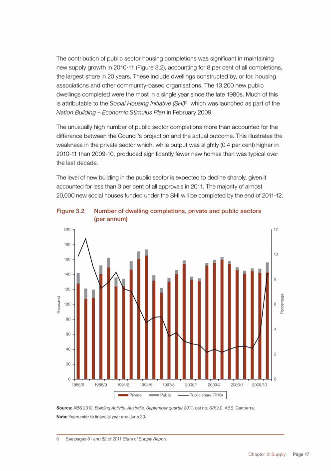
The contribution of public sector housing completions was significant in maintaining
new supply growth in 2010-11 (Figure 3.2), accounting for 8 per cent of all completions,
the largest share in 20 years. These include dwellings constructed by, or for, housing
associations and other community-based organisations. The 13,200 new public
dwellings completed were the most in a single year since the late 1980s. Much of this
is attributable to the Social Housing Initiative (SHI)5, which was launched as part of the
Nation Building – Economic Stimulus Plan in February 2009.
The unusually high number of public sector completions more than accounted for the
difference between the Council’s projection and the actual outcome. This illustrates the
weakness in the private sector which, while output was slightly (0.4 per cent) higher in
2010-11 than 2009-10, produced significantly fewer new homes than was typical over
the last decade.
The level of new building in the public sector is expected to decline sharply, given it
accounted for less than 3 per cent of all approvals in 2011. The majority of almost
20,000 new social houses funded under the SHI will be completed by the end of 2011-12.
Figure 3.2 Number of dwelling completions, private and public sectors (per annum)
Source: ABS 2012, Building Activity, Australia, September quarter 2011, cat no. 8752.0, ABS, Canberra.
Note: Years refer to financial year end June 30.
5 See pages 81 and 82 of 2011 State of Supply Report.
Page 18 National Housing Supply Council Housing Supply and Affordability – Key Indicators, 2012
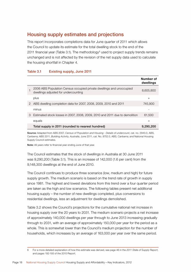
Housing supply estimates and projectionsThis report incorporates completions data for June quarter of 2011 which allows
the Council to update its estimate for the total dwelling stock to the end of the
2011 financial year (Table 3.1). The methodology6 used to project supply trends remains
unchanged and is not affected by the revision of the net supply data used to calculate
the housing shortfall in Chapter 4.
Table 3.1 Existing supply, June 2011
Number of dwellings
12006 ABS Population Census occupied private dwellings and unoccupied dwellings adjusted for undercounting
8,605,800
plus +
2 ABS dwelling completion data for 2007, 2008, 2009, 2010 and 2011 745,900
minus -
3 Estimated stock losses in 2007, 2008, 2009, 2010 and 2011 due to demolition 61,500
equals =
Total supply in 2011 (rounded to nearest hundred) 9,290,200
Source: Adapted from ABS 2007, Census of Population and Housing - Details of undercount, cat. no. 2940.0, ABS, Canberra; ABS 2011, Building Activity, Australia, June 2011, cat. No. 8752.0, ABS, Canberra; and National Housing Supply Council estimates.
Note: All years refer to financial year ending June of that year.
The Council estimates that the stock of dwellings in Australia at 30 June 2011
was 9,290,200 (Table 3.1). This is an increase of 142,000 (1.6 per cent) from the
9,148,300 dwellings at the end of June 2010.
The Council continues to produce three scenarios (low, medium and high) for future
supply growth. The medium scenario is based on the trend rate of growth in supply
since 1981. The highest and lowest deviations from this trend over a four quarter period
are taken as the high and low scenarios. The following tables present net additional
housing supply – the number of new dwellings completed, plus conversions to
residential dwellings, less an adjustment for dwellings demolished.
Table 3.2 shows the Council’s projections for the cumulative national net increase in
housing supply over the 20 years to 2031. The medium scenario projects a net increase
of approximately 140,000 dwellings per year through to June 2013 increasing gradually
through to 2031, with an average of approximately 150,000 per year for the period as a
whole. This is somewhat lower than the Council’s medium projection for the number of
households, which increases by an average of 163,000 per year over the same period.
6 For a more detailed explanation of how this estimate was derived, see page 46 in the 2011 State of Supply Report, and pages 192-193 of the 2010 Report.

Chapter 3: Supply Page 19
The short-term outlook for supply is that net supply growth is expected to be lower
than that projected in the medium scenario.
Table 3.2 Projected net increase in supply of residential dwellings, Australia, low, medium and high supply scenarios, 2011–2031
Time periodLow-supply
scenarioMedium-supply
scenarioHigh-supply
scenario
2011–12 to 2012–13 236,000 288,000 350,000
2011–12 to 2015–16 595,000 725,000 880,000
2011–12 to 2020–21 1,203,000 1,467,000 1,780,000
2011–12 to 2030–31 2,460,000 3,000,000 3,641,000
Source: Based on dwelling completion trend, 1 July 1980 to 31 June 2011, from ABS 2011, Building activity, Australia, December 2010, cat. no. 8752.0, ABS, Canberra; and National Housing Supply Council estimates for completions and conversions, net of demolitions.
The Council has also projected net supply growth for each state and territory for each
scenario (Table 3.3). Victoria and Queensland are projected to experience a greater
increase in housing supply than New South Wales, reflecting building activity over the
last thirty years, despite all experiencing strong population growth in recent years7.
Western Australia is also projected to experience a relatively large proportionate
increase in housing supply, consistent with strong population growth in the state.
If long-term trends continue, New South Wales, Tasmania and the Northern Territory
will see lower proportionate growth in housing supply than the rest of the country.
Table 3.3 Projected net supply growth by state/territory, cumulative 2011-2031
Low-supply scenario
Medium-supply scenario
High-supply scenario
NSW 528,000 615,000 731,000
Vic 751,000 926,000 1,066,000
Qld 615,000 766,000 964,000
SA 113,000 166,000 203,000
WA 389,000 428,000 544,000
Tas 21,000 35,000 43,000
NT 7,000 12,000 17,000
ACT 35,000 52,000 73,000
Australia 3,000,000
Sources: Australian Bureau of Statistics, Building Activity, Australia, December 2011, cat. no. 8752.0, ABS, Canberra, 2011; and National Housing Supply Council estimates for completions plus conversions, net of demolitions.
Note: Projections by state and territory are based on the lowest, average and highest trend data (from 1 July 1980 to 31 June 2011) for each individual state and territory.
7 ABS 2011, Regional Population Growth, Australia, cat.no.3218.0, ABS, Canberra.
Page 20 National Housing Supply Council Housing Supply and Affordability – Key Indicators, 2012
Chapter 4
All the estimates and projections of net housing supply in this chapter are sensitive to
the assumptions that underlie them. This kind of “projection risk” applies especially to
the adjustment made for demolitions, which is based on a mixture of data sources,
and to the split between occupied and unoccupied dwellings (used when assessing
the balance between underlying demand and supply), which relies on dated information
from previous censuses. Projected future supply is based on the trend increase in
completions since 1981. A different time period would lead to a different projected
path – for instance, the trend over the last decade has been a small fall in dwelling
completions. So projections based on trend since 2001 suggest that output will
continue to fall gradually over coming years.
More detailed tables showing annual gross and net housing supply growth projections
by state and territory are available on the Council’s website.

Demand-supply balanceChapter 4

Page 22 National Housing Supply Council Housing Supply and Affordability – Key Indicators, 2012
Chapter 4 Demand-supply balance
Assessment of the current situationThe net housing supply estimates in this report have been revised for the period 2001
to 2010 from those published in the 2011 State of Supply Report. The revised data take
into account an adjustment to the calculations of net housing supply. Estimates through
to the year ending June 2011 are also presented.
The adjusted net housing supply estimates in this updated report take net new
dwellings (completions, plus conversions of other buildings to residential dwellings,
less demolitions) and make an adjustment for some of these properties being
unoccupied8, an unchanged method from the previous report.
In the calculations underlying the 2011 Report, 34,700 conversions between June 2001
and June 2010 were included as new dwellings. In fact, there were 18,300 conversions
over the period, meaning that 16,400 fewer new dwellings were actually created over
the period than had been accounted for.
So the revision is specifically that gross (completions plus conversions) dwelling supply
growth was 16,400 lower between June 2001 and June 2010. This, in turn, means net
supply at June 2010 was 13,500 lower, and the housing shortfall (gap) was 200,000 at
that point, rather than the previous estimate of 187,000 published in the 2011 Report9.
8 A full explanation of the methodology can be found on pages 167-169 of the 2011 State of Supply Report, with vacancy rates specified in Table 4.1 on page 104.
9 These figures do not necessarily sum exactly due to rounding.

Chapter 4: Demand-supply balance Page 23
Table 4.1 Estimates of the net dwelling supply gap, Australia, 2001-2011
Year ending June
Change in underlying demand
Supply growth, net of demolitions, with allowance for
unoccupied dwellings excluding
‘resident absent’
Cumulative net dwelling supply gap 2001–2011 based on the
difference between change in underlying demand and supply adjusted for demolitions and
unoccupied dwellings
(‘000 households) (‘000 dwellings) (‘000 dwellings)
2002 138 117 21
2003 140 135 26
2004 138 138 26
2005 137 142 21
2206 137 137 22
2007 162 130 54
2008 157 125 86
2009 211 128 169
2010 159 127 200
2011 163 135 228
Source: National Housing Supply Council estimates of underlying demand; National Housing Supply Council estimates of dwelling completions net of demolitions and adjusted for unoccupied dwellings.
Note: Figures may not sum exactly due to rounding. The net gap is assumed to be zero as at June 2001. All estimates and projections of the shortfall have been rounded to the nearest thousand.
The housing shortfall continued to widen in 2010-11 (Table 4.1). The Council estimates
that underlying demand growth outstripped adjusted net supply by 28,000 over the
year, taking the cumulative gap to 228,000 dwellings. Other than the larger increase in
2008-09 (largely owing to the peak in net overseas migration in that year), the rate at
which the housing shortfall is increasing has held fairly steady since 2006-07.
Looking at the change in the housing shortfall in 2010-11 across the states and
territories (Table 4.2), Queensland and New South Wales, and to a lesser extent
Western Australia, experienced a growth in housing supply that continued to lag some
way behind the Council’s estimate of growth in underlying demand.

Page 24 National Housing Supply Council Housing Supply and Affordability – Key Indicators, 2012
Table 4.2 Estimated additional underlying demand and adjusted net supply, states and territories, July 2010 to June 2011
NSW Vic Qld SA WA Tas NT ACT Australia
(’000 households)
Underlying demand
42 39 44 8 23 2 2 2 163
(’000 dwellings)
Adjusted net supply growth
27 44 27 9 20 3 1 4 135
Increase in gap in year to June 2011
15 -6 17 -1 4 0 1 -1 28
Source: National Housing Supply Council estimates of underlying demand; National Housing Supply Council estimates of dwelling completions net of demolitions and adjusted for unoccupied dwellings.
Note: Figures may not sum exactly due to rounding.
In Victoria, the increase in net supply was greater than the growth in underlying
demand. This resulted in a reduction in the housing shortfall in the state over
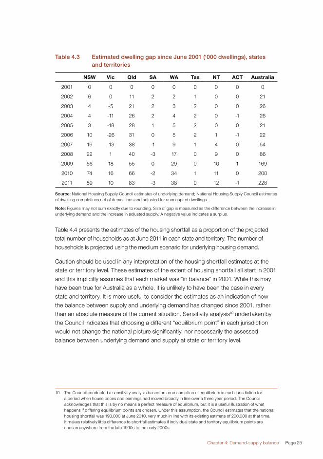
2010-11. Table 4.3 shows the estimated balance in each state and territory from
June 2001 through to June 2011.
The historic estimates of the housing shortfall across the states and territories have
also been revised from those published in the 2011 State of Supply Report. As a
result, the estimated housing shortfall in Victoria in June 2010 is now slightly lower
than previously published, while the shortfalls in Queensland, the Northern Territory
and Western Australian are now slightly higher. The small housing surplus in South
Australia is now even smaller, while the previous surplus in the ACT is now estimated
as essentially in balance. There is almost no change in New South Wales’ estimated
substantial undersupply.
Chapter 4: Demand-supply balance Page 25
Table 4.3 Estimated dwelling gap since June 2001 (‘000 dwellings), states and territories
NSW Vic Qld SA WA Tas NT ACT Australia
2001 0 0 0 0 0 0 0 0 0
2002 6 0 11 2 2 1 0 0 21
2003 4 -5 21 2 3 2 0 0 26
2004 4 -11 26 2 4 2 0 -1 26
2005 3 -18 28 1 5 2 0 0 21
2006 10 -26 31 0 5 2 1 -1 22
2007 16 -13 38 -1 9 1 4 0 54
2008 22 1 40 -3 17 0 9 0 86
2009 56 18 55 0 29 0 10 1 169
2010 74 16 66 -2 34 1 11 0 200
2011 89 10 83 -3 38 0 12 -1 228
Source: National Housing Supply Council estimates of underlying demand; National Housing Supply Council estimates of dwelling completions net of demolitions and adjusted for unoccupied dwellings.
Note: Figures may not sum exactly due to rounding. Size of gap is measured as the difference between the increase in underlying demand and the increase in adjusted supply. A negative value indicates a surplus.
Table 4.4 presents the estimates of the housing shortfall as a proportion of the projected
total number of households as at June 2011 in each state and territory. The number of
households is projected using the medium scenario for underlying housing demand.
Caution should be used in any interpretation of the housing shortfall estimates at the
state or territory level. These estimates of the extent of housing shortfall all start in 2001
and this implicitly assumes that each market was “in balance” in 2001. While this may
have been true for Australia as a whole, it is unlikely to have been the case in every
state and territory. It is more useful to consider the estimates as an indication of how
the balance between supply and underlying demand has changed since 2001, rather
than an absolute measure of the current situation. Sensitivity analysis10 undertaken by
the Council indicates that choosing a different “equilibrium point” in each jurisdiction
would not change the national picture significantly, nor necessarily the assessed
balance between underlying demand and supply at state or territory level.
10 The Council conducted a sensitivity analysis based on an assumption of equilibrium in each jurisdiction for a period when house prices and earnings had moved broadly in line over a three year period. The Council acknowledges that this is by no means a perfect measure of equilibrium, but it is a useful illustration of what happens if differing equilibrium points are chosen. Under this assumption, the Council estimates that the national housing shortfall was 193,000 at June 2010, very much in line with its existing estimate of 200,000 at that time. It makes relatively little difference to shortfall estimates if individual state and territory equilibrium points are chosen anywhere from the late 1990s to the early 2000s.

Page 26 National Housing Supply Council Housing Supply and Affordability – Key Indicators, 2012
A further qualification is that the “gap” represented here is between estimated
underlying demand and supply, not market demand and supply. Market demand
is moderated much more directly by the availability and price of supply, so the gap
between market demand and supply will almost always be less.
The estimates in Table 4.4 indicate that the Northern Territory has by far the largest
housing shortfall relative to the total number of households. However, some care should
be taken in interpreting this. The relatively small population and number of dwellings,
the remote nature of many areas and a highly mobile population all complicate the
collection of accurate data, meaning that there are likely to be larger margins of error
than in other states and territories.
Queensland, Western Australia and New South Wales also face relatively large
shortfalls. The small relative shortfalls in Victoria and Tasmania, and virtual balance
in South Australia and the ACT, suggest that the relativity between underlying supply
and demand is now much the same as it was in 2001. This should not be assumed to
apply to all localities, tenures and population subgroups: as the Council’s estimates
of “affordable and available housing” indicate (see Chapter 5), there are likely to be
undersupplied submarkets within states and regions that seem to be in balance at an
aggregated level.
Table 4.4 Estimated dwelling gap at June 2011 as a proportion of the estimated level of underlying demand (per cent)
NSW Vic Qld SA WA Tas NT ACT Australia
2011 3.1% 0.5% 4.6% -0.4% 4.0% 0.2% 14.6% -0.9% 2.6%
Source: National Housing Supply Council estimates of gap as a proportion of underlying demand estimate in June 2011.
Note: Size of gap is measured as the difference between the increase in underlying demand and the increase in adjusted supply. A negative value indicates a surplus.
Projections for the balance between housing demand and supply The national housing shortfall is expected to increase further in future years under most
of the Council’s scenarios for underlying demand and supply growth (Table 4.5).
Under the medium demand and supply growth scenarios, the housing shortfall is set
to rise by around 141,000 in the five years to June 2016.
If the Council’s medium projections of underlying demand turn out to be correct,
preventing the national shortfall from increasing over the next five years would require
supply growth to match its highest rate (relative to trend over a four quarter period)
in the last thirty years, and this would need to be sustained over the entire five year
period. Household formation rates under the medium scenario are assumed to be in
accordance with age-specific trends over the period 2001-2006, with net overseas
migration of 180,000 persons per annum.

Chapter 4: Demand-supply balance Page 27
As outlined in Chapter 3, there seems little prospect of new housing production
increasing significantly in the short-term. In fact, a slowdown to below the medium
projection scenario appears more likely, at least over 2011-12 and 2012-13.
Table 4.5 Change in the gap between underlying demand and dwelling supply, five years (June 2011 to June 2016), using different projection assumptions
Supply projection: Production of dwellings
Demand projection: Underlying demand
Low adjusted net production
Medium adjusted net production
High adjusted net production
Increase over five years (2011 to 2016)
Low household growth
Increase in underlying demand 701,000 701,000 701,000
Increase in net supply 560,000 683,000 828,000
Change to gap (a) 142,000 19,000 -127,000
Medium household growth
Increase in underlying demand 824,000 824,000 824,000
Increase in net supply 560,000 683,000 828,000
Change to gap (a) 264,000 141,000 -5,000
High household growth
Increase in underlying demand 967,000 967,000 967,000
Increase in net supply 560,000 683,000 828,000
Change to gap (a) 407,000 284,000 138,000
Source: National Housing Supply Council projections based on McDonald and Temple low, medium and high house-hold growth scenarios; National Housing Supply Council projections based on trends in dwelling completions.
Note: (a) Size of gap is measured as the difference between the increase in underlying demand and the increase in adjusted supply. A negative value indicates a surplus. Figures are rounded to the nearest thousand. Totals may not sum exactly due to rounding.
The Council’s projections suggest that increases in housing supply will continue to
be lower than growth in underlying demand, and so the housing shortfall is likely
to continue to widen over the next five years. Under the Council’s medium growth
scenarios for underlying demand and supply, the shortfall is projected to rise from
228,000 at June 2011 to 369,000 by June 2016 (Table 4.6).

Page 28 National Housing Supply Council Housing Supply and Affordability – Key Indicators, 2012
Table 4.6 Cumulative gap since 2001 between underlying demand and dwelling supply at June 2016, using different projection assumptions
Supply projection: production of dwellings
Demand projection: Underlying demand
Low adjusted net production
Medium adjusted net production
High adjusted net production
Low household growth 370,000 247,000 101,000
Medium household growth 492,000 369,000 223,000
High household growth 635,000 512,000 366,000
Source: National Housing Supply Council projections based on McDonald and Temple low, medium and high household growth scenarios; National Housing Supply Council projections based on trends in dwelling completions; National Housing Supply Council estimate of initial gap between underlying demand and supply.
The projections also suggest that the housing shortfall is likely to widen further over the
longer term. Table 4.7 shows the increase in the projected shortfall between 2011 and
2031 under the various underlying demand and supply scenarios. Under the medium
scenario for underlying demand and supply, the housing shortfall is projected to
increase by a further 435,000 households over the next 20 years to 2031. In contrast,
if supply growth were to meet the high scenario (such a step-change in production
would be likely to require significant structural change in the industry) while underlying
demand followed the medium scenario, the present shortfall would be reduced by
168,000 over the period to 2031 (Table 4.7). The longer-term projections differ from the
five year projections as, under the medium scenario, the ageing population is projected
to reduce the rate of household formation over time. Therefore, demand growth is
expected to gradually slow in the later years of the period to 2031, whereas net supply
growth would continue to rise at the historic trend rate of increase.

Chapter 4: Demand-supply balance Page 29
Table 4.7 Change in gap between underlying demand and dwelling supply, 20 years (June 2011 to June 2031), using different projection assumptions
Supply projection: Production of dwellings
Demand projection: Underlying demand
Low adjusted net production
Medium adjusted net production
High adjusted net production
Increase over 20 years (2011 to 2031)
Low household growth
Increase in underlying demand 2,731,000 2,731,000 2,731,000
Increase in net supply 2,316,000 2,824,000 3,427,000
Change to gap (a) 415,000 -93,000 -696,000
Medium household growth
Increase in underlying demand 3,259,000 3,259,000 3,259,000
Increase in net supply 2,316,000 2,824,000 3,427,000
Change to gap (a) 943,000 435,000 -168,000
High household growth
Increase in underlying demand 3,874,000 3,874,000 3,874,000
Increase in net supply 2,316,000 2,824,000 3,427,000
Change to gap (a) 1,559,000 1,051,000 447,000
Source: National Housing Supply Council projections based on McDonald and Temple low, medium and high house-hold growth scenarios; National Housing Supply Council projections based on trends in dwelling completions.
Note: (a) Size of gap is measured as the difference between the increase in underlying demand and the increase in adjusted supply. A negative value indicates a surplus. Figures are rounded to the nearest thousand. Totals may not sum exactly due to rounding.
The cumulative shortfall is projected to increase significantly under the medium scenario.
As Table 4.8 illustrates, it would increase from 228,000 in 2011 to 663,000 by 2031.
Table 4.8 Cumulative gap since 2001 between underlying demand and dwelling supply at June 2031, using different projection assumptions
Supply projection: production of dwellings
Demand projection: Underlying demand
Low adjusted net production
Medium adjusted net production
High adjusted net production
Increase over 20 years (2011 to 2031)
Low household growth 643,000 135,000 -468,000
Medium household growth 1,171,000 663,000 60,000
High household growth 1,787,000 1,279,000 675,000
Source: National Housing Supply Council projections based on McDonald and Temple low, medium and high household growth scenarios; National Housing Supply Council projections based on trends in dwelling completions; National Housing Supply Council estimate of initial gap between underlying demand and supply.
The measures of the balance between housing supply and underlying demand point
to a significant shortfall in several states. If recent trends continue, the gap will widen
further in the coming years.

Page 30 National Housing Supply Council Housing Supply and Affordability – Key Indicators, 2012
The Council’s estimates since 2001 suggest that housing supply is poorer than it was
a decade ago after taking account of the size and age structure of the population.
While some of this shortage may be revealed by increased numbers of homeless
people or increased use of non-private dwellings, the majority of the adjustment is likely
to occur in the way people use the existing stock of dwellings – adult children staying
in the parental home, more people per dwelling, more households with three or more
adults, and so on. This type of response to housing supply shortfall is likely to vary
among different population groups, affecting lower income households more because
they are less able to compete successfully for scarcer and more expensive housing.
There is also likely to be greater demand for social housing and affordable private rental
housing, both of which may experience a greater incidence of overcrowding. In short,
the housing shortfall causes lower market demand and its impact on household size
ultimately lowers underlying demand.
It is also likely that lower levels of housing production are a response to reductions
in effective (market) demand that flow from social changes like later partnering and
later childbirth, with consequently later household formation. If the Council’s method
of projecting household formation understates the extent of such changes in social
preference, it will overestimate the extent of the housing gap.
In all likelihood, both factors are at work: demand is reduced (among marginal buyers
and lower income renters) by the scarcity of housing and rising house prices relative to
income as well as by other social changes, and the slowing of additional supply then
feeds back into further reductions in effective and underlying demand. As noted in
previous Council reports, inadequate additional supply also flows from a host of other
factors that are likely to be potent when applied simultaneously. These include high
land prices and a range of development charges that flow to consumers; tightened
access to development finance; adverse land release and development assessment
policies and practices; and a variety of policy settings that ostensibly encourage
investment in housing, but ironically increase its price and reduce access to housing
among lower income people.
Finally, it is important to note that the Council’s projections are not predictions,
they are simply indications of what would happen if certain trends continue.
They are highly sensitive to the assumptions used, and are unlikely to be realised
in the longer-term because an enduring and substantial gap would be likely to
stimulate responses in demand (lower net migration, slower household formation),
supply (higher production in manifestly undersupplied markets) or government policy
(such as supply stimulating programs).

AffordabilityChapter 5
Page 32 National Housing Supply Council Housing Supply and Affordability – Key Indicators, 2012
Chapter 5 Affordability
This chapter updates some of the headline measures of housing costs from the
2011 State of Supply Report. It also includes an updated analysis of the cost of housing
faced by lower income households. The 2010 Report set out the original analysis of
this information, and this chapter updates this for data that was not available in time for
inclusion in the 2011 Report.
Recent trends in housing affordabilityAt an aggregate level, there have been some signs of affordability pressures easing
slightly since late 2010 in the owner-occupied sector. House prices declined, generally
modestly, in many areas over 2011 and the reduction in interest rates in late 2011 will
have reduced many households’ mortgage costs. For example, the HIA-Commonwealth
Bank Affordability Index showed11 a steady improvement in housing affordability for home
buyers throughout 2011. However, house prices remain at, or above, pre-GFC levels.
11 Available at hia.com.au, this index measures the accessibility of home ownership for first-home buyers (see pages 124-5 from 2011 State of Supply Report for more details).

Chapter 5: Affordability Page 33
Figure 5.1 House price and earnings growth (annual change), banks’ standard variable mortgage interest rate – all Australia
Source: ABS 2012, Average weekly earnings, cat. No. 6302, ABS Canberra; RBA February 2012, Indicator lending rates; RP Data-Rismark house price data, December quarter 2011.
Note: The mortgage rate is the average standard variable rate for banks quoted by the RBA. Earnings are for full-time workers.
On historic comparison, most measures of affordability for home owners or purchasers
are stretched, and the rental market remains tight. Rents have continued to grow more
rapidly than household incomes, and vacancy rates remain low in most capital cities.
The recent weakness in house prices is clearly illustrated in Figure 5.1, at a time
when earnings growth has held up reasonably well and mortgage interest rates have
reduced slightly.

Page 34 National Housing Supply Council Housing Supply and Affordability – Key Indicators, 2012
Figure 5.2 Capital city house prices, 2005 to 2011 ($ thousands)
Source: RP Data-Rismark house price indices, 2012.
Note: Hedonic prices – average prices after adjusting for elements of quality that affect price (such as location within the city, number of bedrooms and land size).
The weakness in house prices was more acute in Brisbane and Melbourne over
calendar year 2011, with declines of more than 6 per cent in both these cities.
In contrast, Sydney, which did not experience as steep an increase in prices over the
last decade as the other capital cities, was the only city to experience a decline of less
than 1 per cent over the year12. Price falls over 2011 were typically a little larger in the
capital cities than elsewhere, although this should be considered against a much larger
increase in the capital cities in recent years – 82 per cent against 29 per cent from
2005 to 2011 (Figures 5.2 and 5.3).
12 RP Data-Rismark house price data, December quarter 2011.

Chapter 5: Affordability Page 35
Figure 5.3 Rest of state house prices, 2005 to 2011 ($ thousands)
Source: RP Data-Rismark house price indices, 2012.
Note: Hedonic prices – average prices after adjusting for elements of quality that affect price (such as location within the city, number of bedrooms and land size). No data is available for non-capital city areas in Tasmania or the Northern Territory.
The rental market is where a housing shortage is likely to be felt most acutely,
particularly at the lower end. This is partly because the private rental market is more
fluid than the owner-occupier market. It is much easier, and less costly, to move across
rented accommodation than it is to sell and purchase in the owner-occupier market.
The higher turnover rate amongst tenants means that a shortage of properties has a
more immediate impact on a higher proportion of households in the sector. The lower
end of the rental market also caters for around 50 per cent of households dependent
on government income support, most of whom are in the bottom decile of household
incomes who are most likely to find themselves squeezed as costs increase.
Rents continued to increase across the country in 2011, with the Real Estate Institute
of Australia (REIA) reporting an increase in median rents of just over 4 per cent
nationally13. Perth (with an 11 per cent increase) and Sydney (5 per cent) experienced
the largest increases, with increases between 0 and 3 per cent in the other major cities.
Darwin was the exception, where rents declined by 4 per cent.
13 Data for 3 bedroom house, change from last quarter of 2010 to last quarter of 2011.

Page 36 National Housing Supply Council Housing Supply and Affordability – Key Indicators, 2012
States’ rental bond boards record rents on new leases. These also show a 5 per cent
increase in Sydney14 over 2011, and a 70 per cent rise over the decade, and a
3 per cent annual increase in Melbourne15 where rents are 69 per cent higher than a
decade ago.
When looking over the decade to the end of 2011, rents (up 81 per cent according
to the REIA16) have increased only a little less than house prices (up 87 per cent17).
However, both have increased by considerably more than the 58 per cent rise in
average earnings18.
Figure 5.4 clearly illustrates these trends. What the chart does not show is that the cost
of purchasing a home with a mortgage has not risen as sharply as the increases in
prices. This is because interest rates are now significantly lower than in the mid-1990s.
The increase in rental costs comes despite the possibility that rents may have been
held down by landlords’ expectations of capital growth (reducing the need to run
strongly positive cashflows) and the interaction with negative gearing rules. If, following
recent weakness in house prices, expectation of future capital growth diminishes,
this may lead to future upward pressure on rents.
While the national and state and territory trends in prices, mortgage costs, rents
and rental vacancy rates provide some indication of what is happening to housing
affordability at an aggregate level, they provide limited insight into where the greatest
strains are. They also give no indication of the situation faced by those in the lower end
of the rental market.
14 Available from Housing NSW, www.housing.nsw.gov.au/
15 Available from Victorian Department of Human Services, www.dhs.vic.gov.au/home.
16 REIA March 2012, Quarterly median rents on three-bedroom houses.
17 RP Data-Rismark house price indices.
18 Full-time adult ordinary time earnings from Australia, November 2011, Average Weekly Earnings cat. no. 8752.0, ABS, Canberra, 2012.

Chapter 5: Affordability Page 37
Figure 5.4 Average rents, earnings and house prices indexed to third quarter of 1994
Source: ABS 2012, Average weekly earnings, cat. No. 6302, ABS Canberra; RP Data-Rismark house price indices, 2012; REIA March 2012, Quarterly median rents on three-bedroom houses.
Note: Each series indexed to third quarter of 1994. Earnings are for full-time workers.
Analysis of Survey of Income and HousingThe following analysis uses data from the 2009-10 Survey of Income and Housing
(SIH)19 to assess housing affordability in the mortgage and rental sectors for
households in the lower portion of the income distribution. These figures are also
compared to equivalent analysis undertaken on the 2007-08 SIH.
When looking at the mortgage sector, it is worth noting that the 2009-10 survey took place
at a time when interest rates, while rising, were somewhat below current levels. In contrast,
the 2007-08 survey took place before the sharp cuts in interest rates in response to the
GFC. The Reserve Bank of Australia (RBA) reports that banks’ standard variable rates on
home loans20 over 2007-08 averaged 8.8 per cent, compared to 6.5 per cent in
2009-10 (some $300 a month lower on a loan of $200,000)21. These changes clearly have
a significant impact on households’ mortgage repayments. The analysis of the rental sector
is less likely to be impacted by short-term movements in interest rates.
19 6523.0 - Household Expenditure Survey and Survey of Income and Housing, User Guide, Australia, 2009-10, ABS Canberra
20 RBA March 2012, Indicator lending rates.
21 The equivalent rate was 7.4 per cent in February 2012.
Page 38 National Housing Supply Council Housing Supply and Affordability – Key Indicators, 2012
It should also be noted that the impact of rising or falling house prices on most home-
owning households is unlikely to be particularly significant in the short-term. The vast
majority are not recent movers, so will not face a change in housing costs as a result of
a change in transacted house prices. In general, mortgage holders’ monthly outgoings
are much more sensitive to changes in interest rates, with price movements only having
a significant impact when they enter the market or move. However, in the longer-term,
higher house prices clearly lead to larger mortgages and higher housing costs for those
able to get into the market.
The opposite is true for the rental market. Interest rates have no direct impact on rents
unless landlords decide to pass increased or declining costs on to tenants – although
rising business costs for landlords would be expected to feed through at some point.
However, rising “average” rents feed directly into higher housing costs quite quickly
for a relatively large share of tenants. Many tenants’ leases prescribe fixed rents for a
certain period (often 12 months) but a review relative to the market at the end of that
time. A rise in average rents will, therefore, feed through into higher costs within a year
for a larger proportion of tenants than would a rise in average house prices for owner
occupiers’ housing costs. In addition, tenants tend to move more often than do owner-
occupiers, so they face the prospect of paying the current “market value” for a property
more often. Many owner-occupiers will have bought their homes some years ago
probably at lower prices than the current market rate.
The following indicators are calculated based on the proportion of lower income
households22 facing direct housing costs of greater than a set proportion of their
gross income.
Results presented in this report from the 2007-08 SIH below are modestly different
from those published in the 2010 State of Supply Report. This is due to a change
in the methodology used by the ABS to calculate household income. The data
presented in this report (for both the 2007-08 and 2009-10 surveys) are all based on
the new methodology.23
22 When the term “lower income households” is used in this section, it refers those whose income is at or below the 40th percentile of an equivalised disposable income scale. Equivalised income accounts for the differences in a household’s size and composition. The Council has also analysed the situation for those in the bottom half of the income distribution as sorted by equivalised income. The actual analysis of housing affordability for these households is based on their gross household income.
23 The updated methodology for calculating gross household income varies from previous methods in a number of ways including: all payments received from the current or former employer are accounted for (which includes some non-cash benefits, bonuses, and payments for irregular overtime not previously included); income earned as a silent partnership and some private trust income reclassified as investment, rather than unincorporated business, income; the inclusion of lump sum workers’ compensation receipts; and a wider range of financial support from family outside the household. For a more detailed description of the changes to income estimates, see Household Expenditure Survey and Survey of Income and Housing, User Guide, cat no 6503.0, ABS, Canberra, pages 73-75.

Chapter 5: Affordability Page 39
Mortgage holdersKey findings from the SIH for households with a mortgage (Table 5.1, Figure 5.5) include:
�� Across Australia, 48 per cent of lower income households with a mortgage
faced direct housing costs of more than 30 per cent of gross income in 2009-10,
the same proportion as in 2007-08.
�� 27 per cent faced costs of more than 50 per cent of income, up from 25 per cent
in 2007-08.
�� 42 per cent of mortgage-holding households in the bottom half of the income
distribution (at or below the 50th percentile) faced costs of more than 30 per cent
of their income, up from 41 per cent in 2007-08.
�� 19 per cent of mortgage-holding households in the bottom half of the income
distribution faced costs of more than 50 per cent of their income, an unchanged
proportion from 2007-08.
Overall, there was little change in the proportion of households paying more than
30 per cent of their income in housing costs between 2007-08 and 2009-10.
However, there was a 17 per cent rise in the number of households with income
at or below the 40th percentile facing mortgage costs of more than 50 per cent
of income. Generally, the situation improved a little outside capital cities,
but deteriorated within them24.
24 The split of lower income households in the capital cities and rest of states was based on the lowest 40 per cent of earners nationally – i.e. this is for the lowest 40 per cent across the country, not the lowest 40 per cent in the capital cities and the lowest 40 per cent in the rest of state.
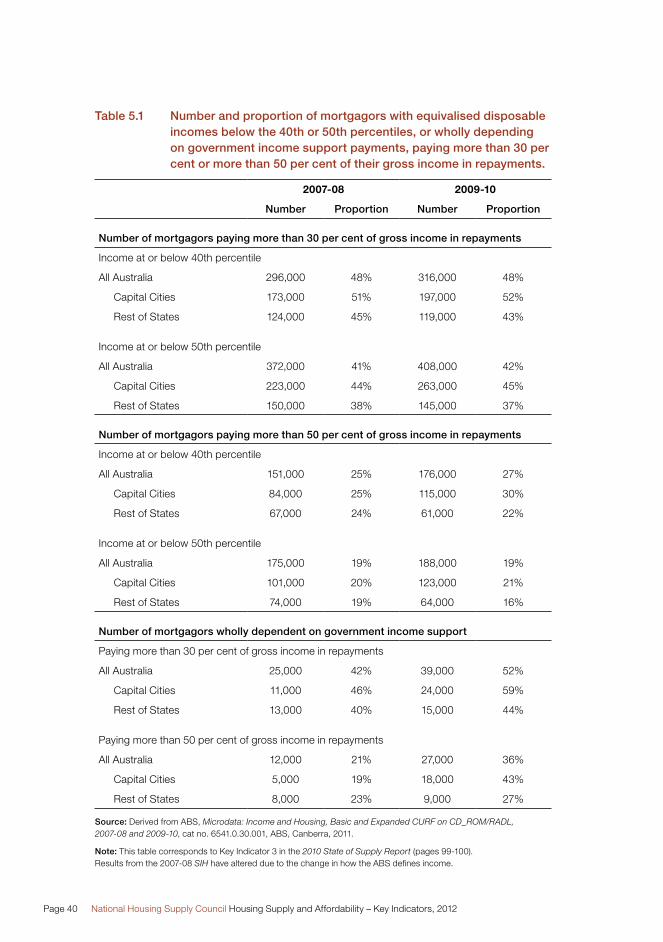
Page 40 National Housing Supply Council Housing Supply and Affordability – Key Indicators, 2012
Table 5.1 Number and proportion of mortgagors with equivalised disposable incomes below the 40th or 50th percentiles, or wholly depending on government income support payments, paying more than 30 per cent or more than 50 per cent of their gross income in repayments.
2007-08 2009-10
Number Proportion Number Proportion
Number of mortgagors paying more than 30 per cent of gross income in repayments
Income at or below 40th percentile
All Australia 296,000 48% 316,000 48%
Capital Cities 173,000 51% 197,000 52%
Rest of States 124,000 45% 119,000 43%
Income at or below 50th percentile
All Australia 372,000 41% 408,000 42%
Capital Cities 223,000 44% 263,000 45%
Rest of States 150,000 38% 145,000 37%
Number of mortgagors paying more than 50 per cent of gross income in repayments
Income at or below 40th percentile
All Australia 151,000 25% 176,000 27%
Capital Cities 84,000 25% 115,000 30%
Rest of States 67,000 24% 61,000 22%
Income at or below 50th percentile
All Australia 175,000 19% 188,000 19%
Capital Cities 101,000 20% 123,000 21%
Rest of States 74,000 19% 64,000 16%
Number of mortgagors wholly dependent on government income support
Paying more than 30 per cent of gross income in repayments
All Australia 25,000 42% 39,000 52%
Capital Cities 11,000 46% 24,000 59%
Rest of States 13,000 40% 15,000 44%
Paying more than 50 per cent of gross income in repayments
All Australia 12,000 21% 27,000 36%
Capital Cities 5,000 19% 18,000 43%
Rest of States 8,000 23% 9,000 27%
Source: Derived from ABS, Microdata: Income and Housing, Basic and Expanded CURF on CD_ROM/RADL, 2007-08 and 2009-10, cat no. 6541.0.30.001, ABS, Canberra, 2011.
Note: This table corresponds to Key Indicator 3 in the 2010 State of Supply Report (pages 99-100). Results from the 2007-08 SIH have altered due to the change in how the ABS defines income.
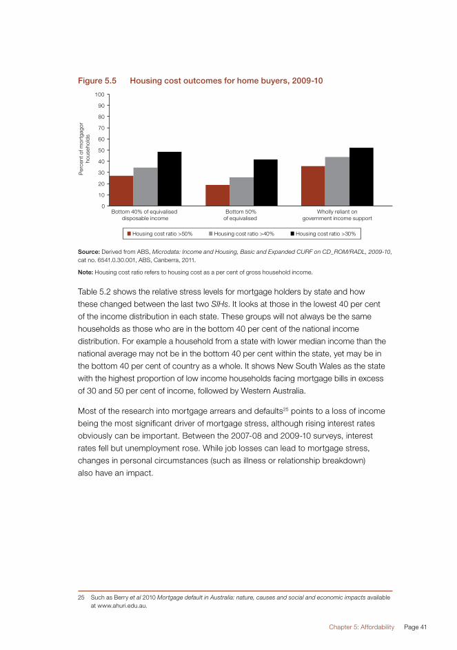
Chapter 5: Affordability Page 41
Figure 5.5 Housing cost outcomes for home buyers, 2009-10
Source: Derived from ABS, Microdata: Income and Housing, Basic and Expanded CURF on CD_ROM/RADL, 2009-10, cat no. 6541.0.30.001, ABS, Canberra, 2011.
Note: Housing cost ratio refers to housing cost as a per cent of gross household income.
Table 5.2 shows the relative stress levels for mortgage holders by state and how
these changed between the last two SIHs. It looks at those in the lowest 40 per cent
of the income distribution in each state. These groups will not always be the same
households as those who are in the bottom 40 per cent of the national income
distribution. For example a household from a state with lower median income than the
national average may not be in the bottom 40 per cent within the state, yet may be in
the bottom 40 per cent of country as a whole. It shows New South Wales as the state
with the highest proportion of low income households facing mortgage bills in excess
of 30 and 50 per cent of income, followed by Western Australia.
Most of the research into mortgage arrears and defaults25 points to a loss of income
being the most significant driver of mortgage stress, although rising interest rates
obviously can be important. Between the 2007-08 and 2009-10 surveys, interest
rates fell but unemployment rose. While job losses can lead to mortgage stress,
changes in personal circumstances (such as illness or relationship breakdown)
also have an impact.
25 Such as Berry et al 2010 Mortgage default in Australia: nature, causes and social and economic impacts available at www.ahuri.edu.au.

Page 42 National Housing Supply Council Housing Supply and Affordability – Key Indicators, 2012
Table 5.2 Proportion of mortgagors in the lowest 40 per cent of the income distribution facing direct housing costs of 30 and 50 per cent or more of income
30% or more of income 50% or more of income
2007-08 2009-10 2007-08 2009-10
NSW 48% 54% 31% 32%
Vic 47% 43% 17% 24%
Qld 55% 49% 28% 25%
SA 47% 46% 23% 27%
WA 45% 50% 31% 29%
Tas 31% 41% 12% 16%
ACT* n.a. n.a. n.a. n.a.
NT* n.a. n.a. n.a. n.a.
Australia 48% 48% 25% 27%
Source: Derived from ABS, Microdata: Income and Housing, Basic and Expanded CURF on CD_ROM/RADL, 2007-08 and 2009-10, cat no. 6541.0.30.001, ABS, Canberra, 2011.
Notes: *Small sample sizes mean that splits for the ACT and Northern Territory are not reliable enough for publication. Some discretion should be exercised in drawing firm conclusions from these data as small sample sizes can lead to relatively large margins of error. The lowest 40 per cent of earners are identified for each jurisdiction in this analysis. These are not exactly the same households as those identified as the bottom 40 per cent nationally in the analysis in Tables 5.1 and 5.5.
RentersBetween 2007-08 and 2009-10, there was an increase in the number of lower income
households facing high housing costs in the private rental market. Rental affordability
deteriorated across both the capital cities and the rest of the states (Table 5.3 and
Figure 5.6). Commonwealth Rent Assistance payments are included in households’
income. The key findings of this analysis for renters include:
�� 60 per cent of lower income private tenants paid rents in excess of 30 per cent
of their income in 2009-10, and 25 per cent paid in excess of 50 per cent.
This compares to 57 per cent and 15 per cent, respectively, in 2007-08.
�� 68 per cent of private renters wholly reliant on government income support,
paid rent in excess of 30 per cent of total household income, including
Commonwealth Rent Assistance, and 28 per cent paid in excess of 50 per cent.
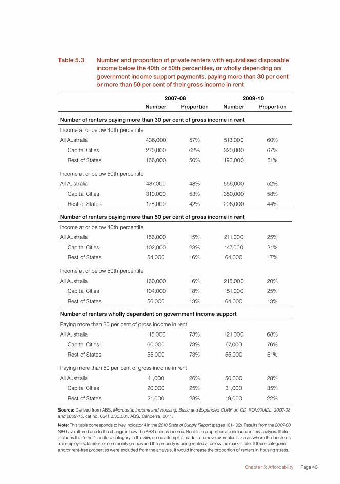
Chapter 5: Affordability Page 43
Table 5.3 Number and proportion of private renters with equivalised disposable income below the 40th or 50th percentiles, or wholly depending on government income support payments, paying more than 30 per cent or more than 50 per cent of their gross income in rent
2007-08 2009-10
Number Proportion Number Proportion
Number of renters paying more than 30 per cent of gross income in rent
Income at or below 40th percentile
All Australia 436,000 57% 513,000 60%
Capital Cities 270,000 62% 320,000 67%
Rest of States 166,000 50% 193,000 51%
Income at or below 50th percentile
All Australia 487,000 48% 556,000 52%
Capital Cities 310,000 53% 350,000 58%
Rest of States 178,000 42% 206,000 44%
Number of renters paying more than 50 per cent of gross income in rent
Income at or below 40th percentile
All Australia 156,000 15% 211,000 25%
Capital Cities 102,000 23% 147,000 31%
Rest of States 54,000 16% 64,000 17%
Income at or below 50th percentile
All Australia 160,000 16% 215,000 20%
Capital Cities 104,000 18% 151,000 25%
Rest of States 56,000 13% 64,000 13%
Number of renters wholly dependent on government income support
Paying more than 30 per cent of gross income in rent
All Australia 115,000 73% 121,000 68%
Capital Cities 60,000 73% 67,000 76%
Rest of States 55,000 73% 55,000 61%
Paying more than 50 per cent of gross income in rent
All Australia 41,000 26% 50,000 28%
Capital Cities 20,000 25% 31,000 35%
Rest of States 21,000 28% 19,000 22%
Source: Derived from ABS, Microdata: Income and Housing, Basic and Expanded CURF on CD_ROM/RADL, 2007-08 and 2009-10, cat no. 6541.0.30.001, ABS, Canberra, 2011.
Note: This table corresponds to Key Indicator 4 in the 2010 State of Supply Report (pages 101-102). Results from the 2007-08 SIH have altered due to the change in how the ABS defines income. Rent-free properties are included in this analysis. It also includes the “other” landlord category in the SIH, so no attempt is made to remove examples such as where the landlords are employers, families or community groups and the property is being rented at below the market rate. If these categories and/or rent-free properties were excluded from the analysis, it would increase the proportion of renters in housing stress.

Page 44 National Housing Supply Council Housing Supply and Affordability – Key Indicators, 2012
Generally, a larger proportion of lower income rental tenants faced direct housing costs
of more than 30 per cent of income than did lower income purchasers.
Figure 5.6 Housing cost outcomes for renters, 2009-10
Source: Derived from ABS, Microdata: Income and Housing, Basic and Expanded CURF on CD_ROM/RADL, 2009-10, cat no. 6541.0.30.001, ABS, Canberra, 2011.
Note: Housing cost ratio refers to housing cost as a per cent of gross household income. Rent-free properties are included in this analysis. It also includes the “other” landlord category in the SIH, so no attempt is made to remove examples such as where the landlords are employers, families or community groups and the property is being rented at below the market rate. If these categories and/or rent-free properties were excluded from the analysis, it would increase the proportion of renters in housing stress.
The interstate analysis (Table 5.4) shows that New South Wales saw the largest
proportion of lower income rental households facing housing costs of 30 per cent or
more of income, although this had fallen slightly since 2007-08. It also had the largest
proportion under greater stress levels – facing rental costs of 50 per cent or more of
income - which increased between 2007-08 and 2009-10. Queensland had the second
highest readings, with both measures increasing noticeable over the two surveys.

Chapter 5: Affordability Page 45
Table 5.4 Proportion of renters in lower 40 per cent of income distribution with housing costs of more than 30 per cent and 50 per cent of income
30% or more of income 50% or more of income
2007-08 2009-10 2007-08 2009-10
NSW 65% 62% 22% 28%
Vic 51% 57% 25% 20%
Qld 52% 61% 19% 26%
SA 62% 58% 11% 20%
WA 47% 57% 16% 25%
Tas 55% 55% 8% 15%
ACT* n.a. n.a. n.a. n.a.
NT* n.a. n.a. n.a. n.a.
Australia 57% 60% 20% 25%
Source: Derived from ABS, Microdata: Income and Housing, Basic and Expanded CURF on CD_ROM/RADL, 2007-08 and 2009-10, cat no. 6541.0.30.001, ABS, Canberra, 2011.
Notes: *Small sample sizes mean that splits for the ACT and Northern Territory are not reliable enough for publication. Some discretion should be exercised in drawing firm conclusions from these data as small sample sizes can lead to relatively large margins of error. These results include the “other” landlord category in the SIH, so no attempt is made to remove examples such as where the landlords are employers, families or community groups and the property is being rented at below the market rate. If these categories were excluded from the analysis, it is likely that the proportion of renters in housing stress would increase. The lowest 40 per cent of earners are identified for each jurisdiction in this analysis. These are not exactly the same households as those identified as the bottom 40 per cent nationally in the analysis in Tables 5.3 and 5.6.
Housing affordability by household typeThe SIH also allows an analysis of housing costs by household type. Table 5.5 shows
the proportion of middle and lower income mortgagors facing housing costs at more
than 30 and more than 50 per cent of income. It shows that low income, lone person
households were more likely to face relatively high costs than were other household
types – at least where there was a large enough sample to draw reasonably robust
conclusions. There are a number of household categories where there were not
enough respondents to draw reliable conclusions, although these groups are relatively
small in relation to all lower income groups.
However, these results are based on a simple ratio measure of affordability which
highlights the weakness in this approach. More sophisticated measures, such as those
based on residual incomes, may not lead to the same conclusions. Different household
types are likely to face differing living costs outside direct housing costs.
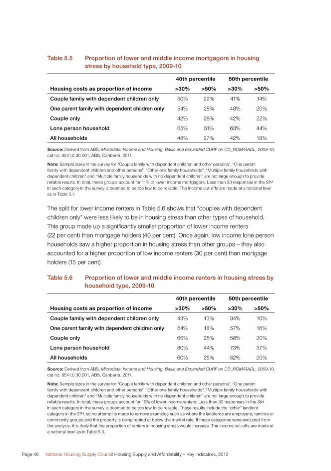
Page 46 National Housing Supply Council Housing Supply and Affordability – Key Indicators, 2012
Table 5.5 Proportion of lower and middle income mortgagors in housing stress by household type, 2009-10
40th percentile 50th percentile
Housing costs as proportion of income >30% >50% >30% >50%
Couple family with dependent children only 50% 22% 41% 14%
One parent family with dependent children only 54% 28% 48% 20%
Couple only 42% 28% 42% 22%
Lone person household 65% 51% 63% 44%
All households 48% 27% 42% 19%
Source: Derived from ABS, Microdata: Income and Housing, Basic and Expanded CURF on CD_ROM/RADL, 2009-10, cat no. 6541.0.30.001, ABS, Canberra, 2011.
Note: Sample sizes in the survey for “Couple family with dependent children and other persons”, “One parent family with dependent children and other persons”, “Other one family households”, “Multiple family households with dependent children” and “Multiple family households with no dependent children” are not large enough to provide reliable results. In total, these groups account for 11% of lower income mortgagors. Less than 30 responses in the SIH in each category in the survey is deemed to be too few to be reliable. The income cut-offs are made at a national level as in Table 5.1.
The split for lower income renters in Table 5.6 shows that “couples with dependent
children only” were less likely to be in housing stress than other types of household.
This group made up a significantly smaller proportion of lower income renters
(22 per cent) than mortgage holders (40 per cent). Once again, low income lone person
households saw a higher proportion in housing stress than other groups – they also
accounted for a higher proportion of low income renters (30 per cent) than mortgage
holders (15 per cent).
Table 5.6 Proportion of lower and middle income renters in housing stress by household type, 2009-10
40th percentile 50th percentile
Housing costs as proportion of income >30% >50% >30% >50%
Couple family with dependent children only 43% 13% 34% 10%
One parent family with dependent children only 64% 18% 57% 16%
Couple only 66% 25% 58% 20%
Lone person household 80% 44% 73% 37%
All households 60% 25% 52% 20%
Source: Derived from ABS, Microdata: Income and Housing, Basic and Expanded CURF on CD_ROM/RADL, 2009-10, cat no. 6541.0.30.001, ABS, Canberra, 2011.
Note: Sample sizes in the survey for “Couple family with dependent children and other persons”, “One parent family with dependent children and other persons”, “Other one family households”, “Multiple family households with dependent children” and “Multiple family households with no dependent children” are not large enough to provide reliable results. In total, these groups account for 19% of lower income renters. Less than 30 responses in the SIH in each category in the survey is deemed to be too few to be reliable. These results include the “other” landlord category in the SIH, so no attempt is made to remove examples such as where the landlords are employers, families or community groups and the property is being rented at below the market rate. If these categories were excluded from the analysis, it is likely that the proportion of renters in housing stress would increase. The income cut-offs are made at a national level as in Table 5.3.
Chapter 5: Affordability Page 47
Affordable and available rental propertiesAs part of a stocktake of the broader rental market, the Council assessed how
many properties were affordable and available for lower income groups, using a
methodology analogous to that employed by the US Department of Housing and Urban
Development26 that was pioneered in Australia by Wulff and Yates27. The key findings of
this analysis are:
�� In 2009-10, there were 1,256,000 private rental dwellings that were affordable for the
857,000 private renter households with incomes at, or below, the 40th percentile.
�� Of these, 937,000 were occupied by households in higher income groups. As a
result, the apparent surplus of affordable rental dwellings for the lowest two income
quintiles was actually a major shortfall of 539,000 dwellings (over 60 per cent of
underlying demand), up from a shortage of 473,000 dwellings in 2007-08.
�� For the 1,149,000 private renters with household income at, or below, the 50th
percentile, there were 1,709,000 affordable rental properties.
�� This apparent surplus for those with income at, or below, the 50th percentile was
in fact a shortfall of 599,000 (compared with 504,000 in 2007-08) after deducting
those properties occupied by higher income groups.
The following paragraphs and tables provide more detail.
Table 5.728 shows the shortage of private rental properties that were affordable (rents
less than 30 per cent of income) for lower income households, and compares the
situation from 2007-08 and 2009-10. The negative figures indicate that the number of
affordable dwellings was significantly greater than the number of lower income rental
tenant households although the lower value in 2009-10 indicates that the surplus
has declined. Figure 5.7 shows that there is an absolute shortage for low income
households with incomes in the first quintile of the equivalised disposable income
distribution. Even if all of the “affordable” dwellings were allocated to these low income
households (without any regard to whether dwellings were appropriate in terms of
size or location), there would not be enough dwellings to ensure that lower income
households could be protected from rental stress. For all lower income households,
the shortage of affordable dwellings is exacerbated by the fact that many are not
available because they are rented by higher income households as discussed below.
26 Nelson, K. (1994), Whose shortage of affordable housing, Housing Policy Debate, 5(4):401-442. US Department of Housing and Urban Development.
27 Yates, J., Wulff, M. and Reynolds, M. (2004) Changes in the supply of and need for low rent dwellings in the private rental market, Australian Housing and Urban Research Institute, Final Report. www.ahuri.edu.au – an update of Wulff, M. and Yates, J (with T. Burke) (2001) Low Rent Housing in Australia, 1986-1996, Australian Housing Research Fund Project Number 213, Canberra: Commonwealth of Australia.
28 The income segmentation for the analysis in Tables 5.7 and 5.8 and Figure 5.6 is based on gross household income rather than on the equivalised income used in the rest of the SIH analysis. As with the rest of the analysis, the actual affordability calculations are performed on gross household income.
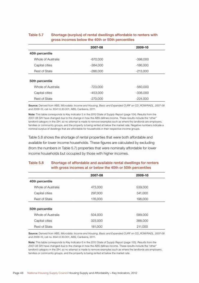
Page 48 National Housing Supply Council Housing Supply and Affordability – Key Indicators, 2012
Table 5.7 Shortage (surplus) of rental dwellings affordable to renters with gross incomes below the 40th or 50th percentiles
2007-08 2009-10
40th percentile
Whole of Australia -670,000 -398,000
Capital cities -384,000 -186,000
Rest of State -286,000 -213,000
50th percentile
Whole of Australia -723,000 -560,000
Capital cities -453,000 -336,000
Rest of State -270,000 -224,000
Source: Derived from ABS, Microdata: Income and Housing, Basic and Expanded CURF on CD_ROM/RADL, 2007-08 and 2009-10, cat no. 6541.0.30.001, ABS, Canberra, 2011.
Note: This table corresponds to Key Indicator 5 in the 2010 State of Supply Report (page 104). Results from the 2007-08 SIH have changed due to the change in how the ABS defines income. These results include the “other” landlord category in the SIH, so no attempt is made to remove examples such as where the landlords are employers, families or community groups, and the property is being rented at below the market rate. Negative numbers indicate a nominal surplus of dwellings that are affordable for households in their respective income groups.
Table 5.8 shows the shortage of rental properties that were both affordable and
available for lower income households. These figures are calculated by excluding
(from the numbers in Table 5.7) properties that were nominally affordable for lower
income households but occupied by those with higher incomes.
Table 5.8 Shortage of affordable and available rental dwellings for renters with gross incomes at or below the 40th or 50th percentiles
2007-08 2009-10
40th percentile
Whole of Australia 473,000 539,000
Capital cities 297,000 341,000
Rest of State 176,000 198,000
50th percentile
Whole of Australia 504,000 599,000
Capital cities 323,000 388,000
Rest of State 181,000 211,000
Source: Derived from ABS, Microdata: Income and Housing, Basic and Expanded CURF on CD_ROM/RADL, 2007-08 and 2009-10, cat no. 6541.0.30.001, ABS, Canberra, 2011.
Note: This table corresponds to Key Indicator 6 in the 2010 State of Supply Report (page 105). Results from the 2007-08 SIH have changed due to the change in how the ABS defines income. These results include the “other” landlord category in the SIH, so no attempt is made to remove examples such as where the landlords are employers, families or community groups, and the property is being rented at below the market rate.

Chapter 5: Affordability Page 49
Figure 5.7 illustrates how many rental properties are affordable (on the 30 per cent of
income definition), as reported in Table 5.7 but repeated for each income decile.
There is a shortfall for the lowest income groups, but a theoretical surplus for the
cumulative total thereafter.
The “affordable” (red) line in Figure 5.7 represents a net position for all households up
to that decile point. The survey is based on households (rather than dwellings), so the
total number of renting households is equal to the number rental properties. At the top
end of the scale effectively all the housing stock is affordable to the highest earners.
As a result, there is no shortage or surplus for those households at that very top end.
Figure 5.7 Affordable and available rental dwellings by income deciles, 2009-10
Source: Derived from ABS, Microdata: Income and Housing, Basic and Expanded CURF on CD_ROM/RADL, 2007-08 and 2009-10, cat no. 6541.0.30.001, ABS, Canberra, 2011.
Note: Affordable means rent is less than 30 per cent of gross income; available means the dwelling is not occupied by a higher income household. These results include the “other” landlord category in the SIH, so no attempt is made to remove examples such as where the landlords are employers, families or community groups, and the property is being rented at below the market rate.
The chart also illustrates the cumulative shortfall of available and affordable rental
dwellings (the black line). The affordable and available stock is calculated for
households in each income decile (as in Table 5.8) and the line represents the
cumulative shortfall for households up to that point – those in higher income deciles
generally do not face a shortfall. The vast majority of dwellings available for rent are
affordable for households in the top half of the income distribution.
Page 50 National Housing Supply Council Housing Supply and Affordability – Key Indicators, 2012
Broader-based measures of housing affordabilityAs was noted in the 2011 Report, there are other costs associated with housing,
such as utility bills and travel costs, which the Council’s analysis of the SIH does not
take into account. The ABS itself noted that if direct associated costs were added to
estimates in the SIH, then average housing costs would be more than doubled for
owners without a mortgage, and would increase by about 13 per cent for owners with
a mortgage29.
There has been debate on how to incorporate often significant, non-discretionary,
costs when analysing housing affordability, for example, how to incorporate
increased travel time to work and fuel bills when a household lives further from an
employment hub.
One example of how this might be handled is provided in an exploratory analysis by
Burke, Stone and Ralston (2011)30 which employed a “residual” measure of housing
affordability. Essentially, this methodology estimated the funds a household would have
left for direct housing costs after “relevant expenditure as measured by some budget
standard is taken into account”. One advantage of this measure over the simple ratio
measure employed in this report is that it recognises this relevant expenditure varies for
different types of household – for example, a household with a child faces higher
non-housing costs than one without.
While their aggregate results were not dissimilar from those obtained from the Council’s
use of the “30/40 rule” – those amongst the bottom 40 per cent of the income
distribution paying more than 30 per cent of their income in housing costs – they do
show a higher incidence of difficulties amongst lower income households. Burke et al
suggested two main reasons for this. Firstly, social housing tenants are defined as not
facing affordability problems under the 30/40 rule as their rents are set at a certain
proportion of their income. Under the residual method these households may still face
difficulties. Second, there are some outright owners who the residual methodology
report as facing problems, which the 30/40 rule would not as it would not record them
as facing any direct housing costs.
29 ABS 2011 cat. no. 4130.0 – Housing and Occupancy Costs These costs include repairs, maintenance and dwelling insurance. The disproportionate increase between owners with and without a mortgage arises from the much lower direct housing costs faced by owners without a mortgage.
30 Burke, T, Stone, M, Ralston, L, (2011) The residual income method: a new lens on housing affordability and market behaviour, Australian Housing and Urban Research Institute www.ahuri.edu.au/publications/download/50597_fr.

Chapter 5: Affordability Page 51
Future work on affordabilityThe Council will look into broader housing costs in future, including analysing the
impact on journey-to-work time and fuel costs of new dwellings at the city fringe.
The previously cited analysis by Burke et al employed average fuel costs for travel,
and energy costs for heating and cooling, based on a budget standard rather than
identifying actual costs. As a result, variations in costs across locations were not taken
into account. Tailoring this form of analysis to actual expenditure (using, for instance,
unit record data from ABS’ Household Expenditure Survey) could reveal more about
the “affordability trade-off” between expensive housing close to jobs and services,
and less costly housing more distant from such opportunities. Difficulties, however,
will arise in distinguishing non-discretionary from discretionary expenditure.
These are important considerations in the broader concept of housing (or living)
costs. Locational variations could usefully be included in measures of affordability,
and this could have a bearing on assessment of the economic and social impact of
infrastructure investment.
Even without taking these broader costs into account, the various measures of
affordability analysed by the Council all suggest that a significant and growing proportion
of lower income households face continuing high housing costs. This is particularly true
of those in the private rental sector, in which a housing shortfall is most likely to be felt.
It experiences greater turnover (is “higher velocity”) than the owner-occupied sector,
in which prices (rents) adjust relatively quickly to increased demand, and less wealthy
households are more likely to struggle to afford suitable accommodation.

Page 52 National Housing Supply Council Housing Supply and Affordability – Key Indicators, 2012
Chapter 6

ConclusionChapter 6

Page 54 National Housing Supply Council Housing Supply and Affordability – Key Indicators, 2012
Chapter 6 Conclusion
The aim of this report is simply to update some the data underlying the Council’s
quantitative analysis of the underlying state of housing supply in Australia.
The updated estimates and projections suggest that, although production improved
over 2010-11 and house prices eased in most market segments over the past
18 months or so, growth in underlying demand continues to exceed that of production,
and the underlying housing shortage has therefore worsened rather than diminished.
It remains important to address the sources of this shortage, including building and
home finance approvals pointing to the likelihood of comparatively few additions to
housing stock over the next couple of years.
It is also important to recognise how the apparent shortfall manifests itself in
households’ formation and living standards.
Having fewer dwellings, at least relative to the number that would be required if the
household population had evolved in line with previous trends, may be represented
fairly as a deterioration in living standards – or, at least, a slowing in the rate of
improvement enjoyed by previous generations. Most of the adjustment to limited
housing supply is likely to take place within the existing stock, which will need to carry
a higher population than past and anticipated demographic trends would otherwise
lead us to expect. A variety of changes in living patterns could occur, including adult
children living at home longer; increasing use of non-private dwellings such as boarding
houses; people forming households later in life; more multi-generational households;
and increased incidence of overcrowding, particularly in the social housing sector and
lower end of the private rental market. Some of these changes will have a greater social
and/or economic impact than others.
The immediate prospects are for supply growth to slow over the next year or two.
This suggests that, assuming population growth continues at or near projected levels,
the undersupply will worsen. The residential development and construction industry
faces a number of challenges that work against its ability to increase the production of
new stock. These challenges are likely to be exacerbated in the short-term by the soft
market and fragile global financial markets potentially affecting the flow of credit to the
broader economy.
Chapter 6: Conclusion Page 55
While a slowing of house prices has taken some of the steam out of measures of
average affordability, the Council’s analysis of the latest Survey of Income and Housing
suggests that many households continue to face strains in meeting direct housing
costs. It is unsurprising that these pressures look to be most acute in the nation’s
capital cities, where the greatest shortfalls of affordable housing are likely to be,
and at the lower end of the private rental market.
The aim of this update does not extend to making comments on policy or practice
beyond those expressed in the 2011 full Report. The updated data support the
Council’s conclusions at that time. In brief, the Council continues to believe that the
focus of policy and program practice should be on increasing housing supply,
bearing in mind the need to produce the types and mix of housing that help to support
inclusive and sustainable communities. The focus needs to be more specific than
simply increasing the number of homes being built, although that is certainly important
and would help over time to address the supply of affordable housing for particularly
vulnerable groups. But more selective increases in supply directed to particular types of
households, types and styles of housing, and specific locations are likely to work more
quickly and effectively.
Page 56 National Housing Supply Council Housing Supply and Affordability – Key Indicators, 2012

Appendix

Page 58 National Housing Supply Council Housing Supply and Affordability – Key Indicators, 2012
Appendix National Housing Supply Council membership
Members of the National Housing Supply CouncilThe Council comprises a Chair plus eleven Members. Appointments to the Council
are made by the Minister for Housing in consultation with the Treasurer. The Chair
is appointed for up to three years and Members for two years. The Minister, in
consultation with the Chair, will elect a deputy Chair. The Chair and Members will be
appointed as individuals and not as a representative of organisations or businesses.
The Chair is responsible for convening and chairing the Council meetings and
presenting the annual State of Supply Report to the Minister for Housing.
Members will be appointed for their individual capacity and expertise in an area relevant
to the housing industry as set out below. Members are responsible for attending
meetings and contributing to the work of the Council by offering insight and guidance
based on their expertise.
Sector representation sought in the membership of the council encompasses the
housing, property and building and construction industry, planning and development,
social welfare and community housing, banking and finance, and housing research.
Current Members of the Council are:
Dr Owen Donald, Chair Former Director, Housing Victoria; Former CEO, Australian Housing and Urban Research Institute
Mr Saul Eslake, Deputy Chair
Chief Economist, Bank of America-Merrill Lynch Australia
Ms Janet Buhagiar Director, Social Policy, NT Government
Ms Dyan Currie National President, Planning Institute of Australia
Professor Sue Holliday Managing Director, Strategies for Change Pty Ltd; Professor of Planning Practice, UNSW
Professor Graeme Hugo Australian Research Council Professorial Fellow, University of Adelaide
Mr Mark Hunter CEO Residential, Stockland
Mr Simon Norris General Manager, Clarendon Homes Queensland

Appendix – National Housing Supply Council Membership Page 59
Ms Mary Patetsos Chair, SA Local Government Grants Commission; Board Member, South Australian Housing Trust
Mr Nigel Satterley AM Managing Director, Satterley Property Group
Ms Ruth Spielman Executive Officer, National Growth Areas Alliance
Dr Judy Yates Honorary Associate Professor, University of Sydney
In addition, the following senior Australian Government officers attend Council
meetings:
Paul Tilley General Manager, Markets Group, Treasury, ex-officio participant observer
Brenton Thomas Principal Advisor, Treasury, ex-officio participant observer
Sean Innis Group Manager, FaHCSIA, ex-officio participant observer
Support to the Council in developing this report was provided by Paul Samter,
Grey Robertson, Mark Harry, Julia Graczyk, Anthony Krieg and Leanne McGrath in the
Council’s Secretariat, now based in the Treasury. The Council gratefully acknowledges
their invaluable assistance, including with analysis and drafting the report. The findings
and views expressed is this report are, however, those of the Council and do not
necessarily reflect those of the Government or its agencies, including the Treasury.
Further information on the Council’s terms of reference can be found in previous State
of Supply reports.

Page 60 National Housing Supply Council Housing Supply and Affordability – Key Indicators, 2012
Glossary
Australian Bureau of Statistics (ABS)
The ABS provides statistics on a wide range of economic, industry, environment
and energy, people and regional matters, covering government, business and the
community in general.
affordable housing
Housing that is affordable for households on low to moderate incomes, when housing
costs are low enough to enable the household to meet other basic long-term living
costs. For example, housing costs should be less than 30 per cent of household
income for occupants in the bottom 40 per cent of household incomes.
average household size
The average number of people per household in a given area.
Census
The Census of Population and Housing, carried out every five years by the Australian
Bureau of Statistics. It aims to accurately measure the number of people in Australia on
Census night, and to gather information on their key characteristics and the dwellings
in which they live. Census 2006 is the most recent Australian Census for which data is
available (a Census was conducted in 2011 but the results are yet to be published).
Commonwealth Rent Assistance (CRA)
A non-taxable Commonwealth Government supplementary payment added on to
the benefit or family payment of people who rent in the private rental market above
applicable rent thresholds.
conversion
Conversions are additional dwellings created by alterations or additions to residential
buildings; conversions of non-residential buildings to residential buildings; or
construction of non-residential buildings. Throughout this report conversions are taken
to be from non-residential buildings to residential buildings – specifically those that add
to housing supply but are not counted as a housing ‘completion’.
dwelling approval
Permission to commence construction of a building, such as a building permit issued
by local government authorities and other principal certifying authorities, contract let or
Glossary Page 61
day labour work authorised by Commonwealth, state/territory, semi-government and
local government authorities, or major building approval in areas not subject to normal
administrative approval, e.g. building on remote mine sites.
dwelling completion
A building is completed when building activity has progressed to the stage where the
building can fulfil its intended function.
effective demand
The quantity of housing that owner-occupiers, investors and renters are able and willing
to buy or rent in the housing market.
equivalised disposal income
Equivalence scales devised to make adjustments to the actual incomes of households
in a way that enables analysis of the relative wellbeing of households of different size
and composition. For example, it would be expected that a household comprising two
people would normally need more income than a one-person household if the two
households are to enjoy the same standard of living.
homelessness
A person is homeless if he or she does not have access to adequate housing that is
safe and secure. People who are homeless fall into three broad groups; that is, those
who are:
�� sleeping rough (living on the streets)
�� living in temporary accommodation, such as crisis accommodation or with friends
or relatives
�� staying in boarding houses or caravan parks with no secure lease and no
private facilities.
household
The household is the basic unit of analysis in this publication. A household consists of
one or more persons, at least one of whom is at least 15 years of age, usually resident
in the same private dwelling. The people in a household may or may not be related.
They must live wholly within one dwelling.
household growth scenario
A projection scenario of household growth based on (among other factors) the
projected rate of net overseas migration.
housing stress
The condition of households (in the bottom 40 per cent of income distribution) paying
more than 30 per cent of their gross income on mortgage or rental repayments.

Page 62 National Housing Supply Council Housing Supply and Affordability – Key Indicators, 2012
lower-income household
A household with income in the bottom 40 per cent of all household income distribution.
National Housing Supply Council (NHSC)
The National Housing Supply Council was appointed by the Treasurer and the Minister
for Housing and announced by the Prime Minister in May 2008. The Council provides
projections, advice and analysis of trends in demand and land availability to measure
and assess the supply of land and housing and its relationship with demand to assist
the government in assessing adequacy of supply and future needs for up to 20 years.
negative gearing
A taxation arrangement applicable when costs exceed investment income,
under which the loss may be deducted from other taxable income.
net overseas migration (NOM)
A figure calculated from incoming and outgoing passenger movements at Australian
ports maintained by the Department of Immigration and Citizenship. A person must
have been in Australia for 12 of the previous 16 months to be counted.
net transition probability approach
A statistical approach that projects probable change in household types at the national
and sub-national level. This is the approach used by Macdonald and Temple to
produce the Council’s estimates of underlying housing demand.
non-private dwelling (NPD)
A non-private dwelling is a residential dwelling with accommodation that is not included
in the Census of Population and Housing list of private dwelling categories. NPDs
are classified according to their function. They include hotels, motels, guest houses,
jails, religious and charitable institutions, military establishments, hospitals and other
communal dwellings. Where this type of accommodation includes self-contained units
(as provided by hotels, motels, homes for the elderly and guest houses), the units are
enumerated as part of the NPD. Complexes such as retirement villages, which have a
combination of self-contained units, hostel and/or nursing home accommodation, are
enumerated as NPDs.
private dwelling
Defined in the Census as a house, flat, part of a house, or even a room, but can also be
a house attached to, or rooms above, a shop or office, an occupied caravan in a caravan
park, a boat in a marina, a houseboat or a tent if it is standing on its own block of land.
A caravan situated on a residential allotment is also classed as a private dwelling.
Reserve Bank of Australia (RBA)
The Reserve Bank of Australia is Australia’s central bank. It conducts monetary policy,
works to maintain a strong financial system and issues the nation’s currency.

Glossary Page 63
second home
Often referred to as a holiday home, a second home is a dwelling that is owned by,
but not the principal residence of, an individual.
semi-detached, row or terrace house, townhouse
A dwelling having its own private grounds with no other dwellings above or below but
attached to an adjacent dwelling.
social housing
Rental housing that is provided and/or managed by government or non-government
organisations, including public and community housing.
tenure type
The nature of a person’s or social group’s legal right to occupy a dwelling. Tenure types
include owner (fully owned or being purchased/ with mortgage), renter (private housing
or public housing/community housing), rent free, life tenure scheme, shared equity or
rent/buy scheme. The category ‘other’ includes being occupied rent free and being
occupied under a life-tenure scheme.
underlying demand
The need for housing based on the number of households in the population,
rather than the demand actually expressed in the market (effective demand).

Page 64 National Housing Supply Council Housing Supply and Affordability – Key Indicators, 2012