gui bloopers - university of alaska systemafkjm/cs470/handouts/gui_bloopers5.pdf · gui bloopers...
TRANSCRIPT

1/31/2008
1
GUI Bloopers
Graphic Design, Layout, and Web
Page/Style Design
Graphic Design and Layout Bloopers
• Once you have GUI controls appropriate for your software you have to decide on:– Layout
– Colors
– Fonts
• The following bloopers diminish software’s perceived quality – it only takes a few to look amateurish and untrustworthy
• Poor graphic design and layout can also decrease user’s ability and motivation to absorb the software’s content
1/31/2008
2
Blooper 32 : Easily missed information
• Software developers often assume that if information is displayed users will see it. Not so!
• Common flaw: not focusing user’s attention– People scan for information, left to right, top to
bottom
– Should design for how human perception works
– Examples users can miss:• Status or mode indicators
• Prompts for input
• Results
• Error or status messages
• Controls
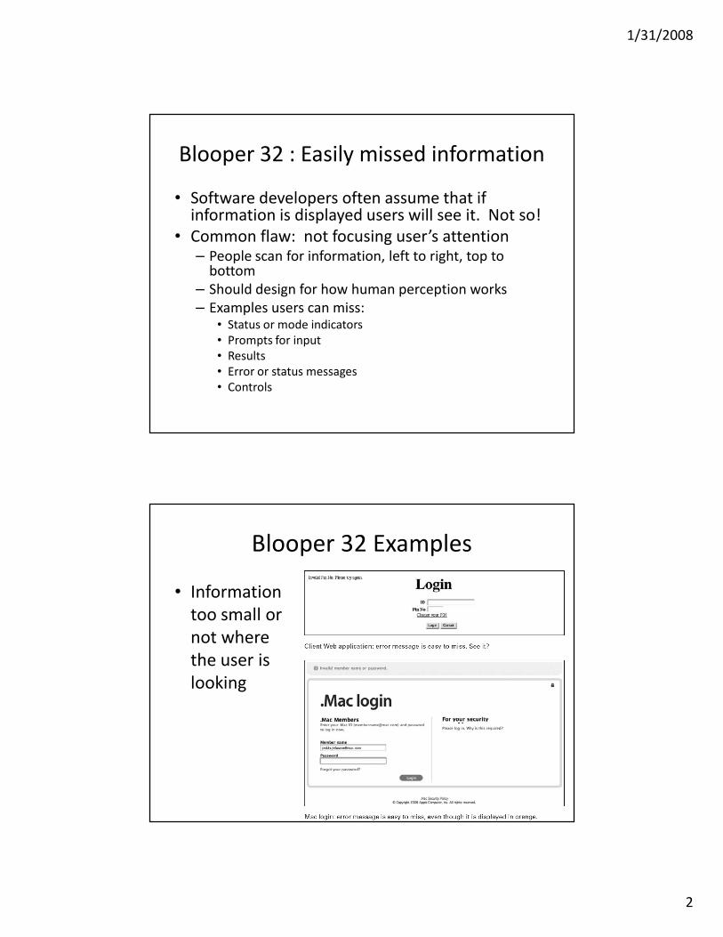
Blooper 32 Examples
• Information
too small or
not where
the user is
looking

1/31/2008
3
Blooper 32 Example
• Information buried in noise
• Consider these prompts:– Enter filename and press ENTER
– Enter username and press ENTER
• Only difference is the second word which has the only real information:– Filename:
– Username:
• Status displays another common trouble spot:– Containing tank: normal Pressure valves: normal
– Fuel rods: abnormal Discharge pump: normal
Blooper 32 Example
• Messages that don’t die
– New message displayed over a similar old
message. Did it change or is it still searching?

1/31/2008
4
Avoiding Blooper 32
• Construct a visual hierarchy
– Organize information displays in hierarchical chunks; users ignore irrelevant chunks and find what they want much faster
• Make important information bigger
• Put important information where the user is looking
– Center of field, not periphery
• Use color to highlight
Avoiding Blooper 32
• If necessary, use heavy artillery
– Dialog boxes and pop-ups
• Impossible to ignore, but it better be important
– Sound
• Simple beeps usually sufficient
– Vibration and animation
• Peripheral vision for stationary objects is poor, but is very good at noticing movement or changes
• Distracting if too much; have been abused by web advertisers
• Make sure animation stops quickly and can be stopped

1/31/2008
5
Avoiding Blooper 32
• Don’t bury the wheat in chaff
• Display information graphically instead of
textually
Side Topic: Color
• Technical characteristics of color
– Hue : Frequency / Wavelength
– Value : Intensity of the hue
– Saturation : Purity of the color from gray/vivid
• Use the color wheel
Choose:
Opposite, nearly opposite
Varying degree of value for hue
Equidistant hues
1/31/2008
6
Uses of Color
• Call attention to specific data or information
• Identify elements of structure and processes
• Portray natural objects realistically
• Depict the logical structure of ideas and processes
• Portray time and progress
• Increase appeal, memorability, and
comprehensibility
• Reduce errors of legibility or interpretation
• Increase the number of dimensions for coding data
Pitfalls of Color
• May cause problems for color deficient vision (8% of Caucasian males)
• May cause visual fatigue with strong colors
• May contribute to visual confusion if too complex
• May have negative cultural or historical associations– E.g., using black in master/slave controller diagram
• May exhibit confusing cross-disciplinary or cultural connotations– E.g., Red in Chinese = Warm/Happy, America =
Hot/Flashy

1/31/2008
7
The 10 Commandments of Color
1. Use five +/- two colors
2. Use foveal and peripheral colors appropriately
• Blue for background, not for center
• Black, white, yellow for periphery, no red or green
• No blue for text or diagrams
The 10 Commandments of Color
3. Minimum shift in color/size• Light text on dark background for dark environment
• Dark text on light background for light environment
4. High-chroma, spectrally extreme colors may create illusions of shadows/after-images
• Bright blue/green
5. Use familiar, consistent color coding• Red – stop, danger, hot, fire. Yellow – Caution, slow
• Green – go, okay, safe. Blue – Cold, water, death
• Warm colors – Action, response
• Cool colors – stats, background, distance
• Gray, white – neutral
• Context-dependent

1/31/2008
8
The 10 Commandments of Color
6. Use the same color for grouping related elements.
7. Color to your audience
– Men prefer blue to red, women red to blue
– Men prefer orange to yellow, women yellow to orange
– Young prefer bright, old prefer sober/restrained colors
8. Use high-value, high-chroma colors to attract attention.
• Bright red better / faster than yellow, orange
• Older viewers have easier time with bright
The 10 Commandments of Color
9. Use redundant coding of shape, as well as
color, if possible. The more cues to
remember an object, the better.
10.Use color to enhance black-and-white
information.
– People remember better with color
– Different emotional reaction

1/31/2008
9
Examples of Bad Color Usage
• Poor background pattern
– http://www.kencole.org/frctltes.htm
– Also make background images large enough to avoid
repeat pattern

1/31/2008
10
Color Contrast
• Hard to read colors:
– http://www2.cajun.net/~hugh/tradewar.html
• Watch out for default colors!
– Some browsers default to a white background and
others to gray. Specify a background color in your
body tag to ensure all browsers use the same
color.

1/31/2008
11
Blooper 33 : Mixing dialog box control
buttons with content control buttons
• This happens when you add new buttons to
the standard “OK”, “Apply”, “Close”, “Cancel”
buttons
• Everything OK here?
Align Buttons To Controls
• It can be hard to see the connection between the new buttons and data
• Make functions clear by separating content control buttons from window control buttons

1/31/2008
12
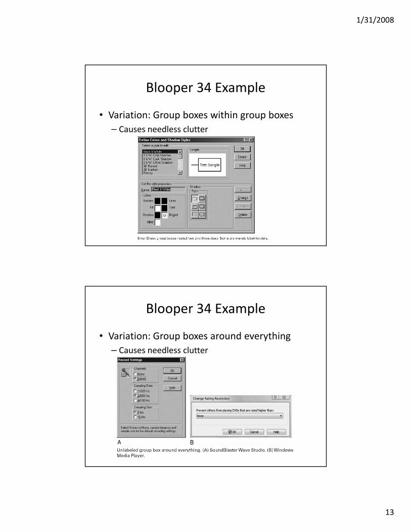
Blooper 34 : Misusing Group Boxes
• Group boxes put a visible border around
related controls and have a slot for a label
• Serve no purpose around one setting; in this
case a simple label is better.
Blooper 34 Examples
1/31/2008
13
Blooper 34 Example
• Variation: Group boxes within group boxes
– Causes needless clutter
Blooper 34 Example
• Variation: Group boxes around everything
– Causes needless clutter

1/31/2008
14
Avoiding Blooper 34
• Use group boxes for what the name suggests –
boxing related groups of settings
• Container controls like tables, lists, etc. have
their own borders and don’t need a second
one
• Label a single setting without putting a group
box around it
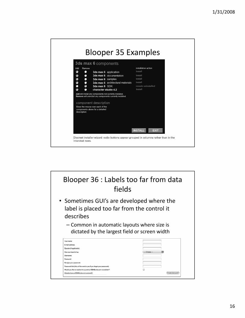
Blooper 35: Radio Buttons too far apart
• Related radio buttons should be grouped
closely together

1/31/2008
15
Improved Spacing
Blooper 35 Examples
1/31/2008
16
Blooper 35 Examples
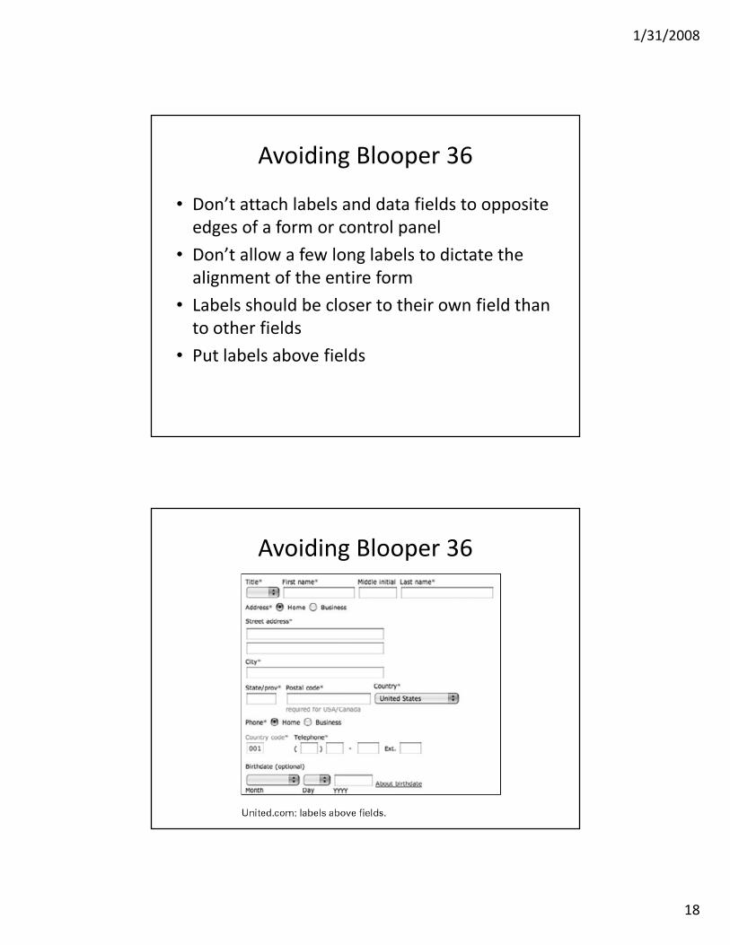
Blooper 36 : Labels too far from data
fields
• Sometimes GUI’s are developed where the
label is placed too far from the control it
describes
– Common in automatic layouts where size is
dictated by the largest field or screen width

1/31/2008
17
Blooper 36 Example
Blooper 36 Example
• Variation: labels closer to other settings than
their own
1/31/2008
18
Avoiding Blooper 36
• Don’t attach labels and data fields to opposite
edges of a form or control panel
• Don’t allow a few long labels to dictate the
alignment of the entire form
• Labels should be closer to their own field than
to other fields
• Put labels above fields
Avoiding Blooper 36

1/31/2008
19
Blooper 37 : Inconsistent Label
Alignment
• Labels should be consistent in where they are
placed throughout the application
• Extreme case:
Blooper 37 Example

1/31/2008
20
Blooper 38: Poor Window Location
• Where should an application’s windows first
appear?
• Heuristics:
– On-screen
– Staggered
– No occlusion
Blooper 38 Examples
• Display all windows at the same coordinates

1/31/2008
21
Blooper 38 Examples
• Displaying subordinate windows in middle of
parent
Avoiding Blooper 38
• Decide where each window appears
– Don’t just let the OS decide or use [0,0]
• Optimal position depends on the type of window
– Primary or informational?
• Stagger windows
• Make sure child windows don’t cover important information
• Don’t place windows directly on top of each other

1/31/2008
22
Blooper 39: Tiny fonts
• Lots of people with impaired vision can’t read
small fonts
– Includes old folks over 45
Blooper 39 Example

1/31/2008
23
Blooper Bonus: Un-Natural Order
• Avoid the “random” layout
Add proper tab stops, but also reorganize layout
Excuses for Tiny Fonts
• I can read it. What’s the problem?
• Hey, we gotta fit all this info in somehow.
• I just used the default font.
• It’s not my fault, the text is in the image.
• It’s big enough in low resolution.
• Minimum font size is 10, but 12 better
• Design for high resolution displays
• Let users adjust the font size
• Test it on users
1/31/2008
24
Web Page Design
Yale Design Guidebook
User Interface Design
• We’ll focus on website design, but most of the
same concepts apply to standalone
applications too
• What makes a good web site?
– Similar to, but differences from printed medium
– Hyperlinks!
– Attempt to make web page “Free Standing”
• Someone may link to it, or print it

1/31/2008
25
Same Questions as Print
• Who is talking? Is it an individual or an institution?
• What is the content about?
– Titles, Headers
– Consider bookmarks
• When?
– Our CS page is an offender
• Where on your site are you currently located?
– Navigational aids or pointers to the main page may be appropriate.
– Button Bars
Every page should have
• Informative title
• Creator’s identity / contact link
• Creation or revision date
• At least one link back to home
• These basic elements will get you 90% of the way to an understandable interface
• Example of missing information:– http://www.1amp.com

1/31/2008
26
Fundamentals of Page Design
• What should be on an individual page or screen?
• Don’t dumb-down the readers -- just design to their needs
– short, fast, easy access
• Guide the user
– Left to right, top to bottom
– design appropriately to guide user to the next element
– Headlines at the top
– Don’t forget whitespace

1/31/2008
27
Page Design
• Avoid too-fancy graphics (unless experienced)
• Label icons
• Combine navigation bar with logo/graphics, use consistently!
• Remember that the screen is small
• Graphics or Forms too large: Layout more than 600 pixels wide may not properly render on a single page. (1024x768 probably safe assumption today, unless for an ultraportable… or cell phone…)
Image Guidelines

1/31/2008
28
Page Design Guidelines
Grid
Layout
Page Template
1/31/2008
29
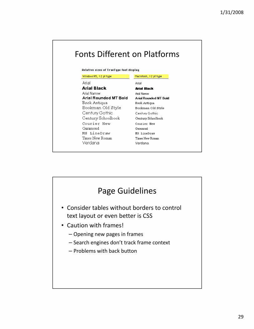
Fonts Different on Platforms
Page Guidelines
• Consider tables without borders to control
text layout or even better is CSS
• Caution with frames!
– Opening new pages in frames
– Search engines don’t track frame context
– Problems with back button

1/31/2008
30
Technical Considerations
• Plug-Ins– PDF, Flash, RealAudio, etc.
– Don’t use unless necessary or if you know that almost all of your targeted users will have the plug-in application already installed
• Java, Javascript, Flash?In Lynx:
Technology
• Compare to Yahoo!

1/31/2008
31
Animation
• Animation
– Appropriate for a very limited number of web sites
– Can be distracting and generally not appropriate on information or e-commerce web sites
– Appropriate for children, entertainment, perhaps ads
– Example: http://www.webpagesthatsuck.com/topic59.htm
– Example: http://www.aurigamusic.com/
– Example: http://www.qualitycollisionservices.com/
– Example: http://www.ridertown.com/
User Behavior on the Web
• Reduce clicking
– Users prefer menus with at least 5-7 links
– Prefer dense screen with many choices over deep
path with few choices
– Chunking of data vs. hundreds of individual menu
choices
1/31/2008
32
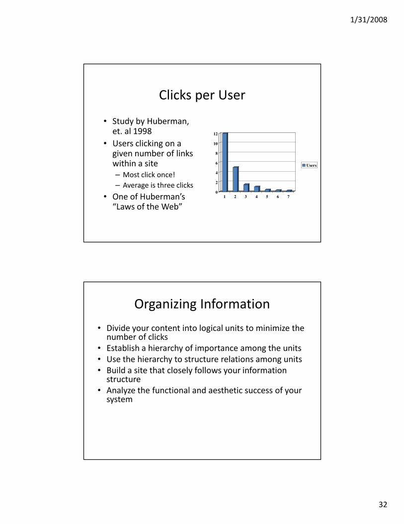
Clicks per User
• Study by Huberman, et. al 1998
• Users clicking on a given number of links within a site
– Most click once!
– Average is three clicks
• One of Huberman’s “Laws of the Web”
0
2
4
6
8
10
12
1 2 3 4 5 6 7
Users
Organizing Information
• Divide your content into logical units to minimize the number of clicks
• Establish a hierarchy of importance among the units
• Use the hierarchy to structure relations among units
• Build a site that closely follows your information structure
• Analyze the functional and aesthetic success of your system

1/31/2008
33
Chunk your Info
• Chunking
– Short chunks of information that fit on a screen
– Few users read long passages of text on screen
– Discrete chunks lend themselves to a link
– Supports a uniform format
• Text Length
– Yale Style Guide suggests a max of four screens of information in most cases
Site Design
• “Chunk” your information

1/31/2008
34
Site Organization
Site Organization

1/31/2008
35
Balanced Site Organization
Range of Choices

1/31/2008
36
Case Study
• Time is Money -- redesign at Sun
• Average employee views 12 intranet pages per
day
• Could save 5 minutes per week per employee
by redesigning the site
• $10 million/year in “lost” time
Example of Menus
• Too flat and shallow
– Get There Fast
– UAA Weather Observation Database
• Good example of chunking
– Yahoo’s Site

1/31/2008
37
Navigation Techniques
• Topical Sections
– Most common technique
– Problem if user picks wrong topic
– Some pages in multiple topics
• Path Analysis
– Provide user the path that was used to reach the current page, shows where they are now
– Requires hierarchical organization
Screen Size and Good Navigation
• Caution with right-hand menus
– Example: UAA site
– One study showed that it does provide easier access to
scrollbars for longer pages with more to navigate
– What about menus on the bottom of the page?
• Can address browser width issue programmatically:
– http://www.google.com

1/31/2008
38
Preferred Navigation
• Left seems to be best
– http://www.usability.gov/pubs/040106news.html
Preferred Navigation

1/31/2008
39
Preferred Navigation
• Kingsbury and Andre's Study
– Results showed that the left-left-left (LLL) and left-top-
top (LTT) navigational structures were the top
performing and most preferred.
• The three navigation structures eliciting slower
performance and lower preference ratings were:
– Top – Top – Left (TTL)
– Top – Left – Top (TLT)
– Right – Top – Right (RTR)
Summary of Interface Design Tips• Build Navigational aids.
– Navigation bars, frames
– Critical for giving user a sense of where they are
– Must provide context, e.g. bar with page headers
– User shouldn’t have to go “back” to figure this out
• Avoid dead-end pages
• Keep download time short– Frustration after 10 seconds
• Consistency!– E.g., keep “home” button in the same place, don’t change link colors
– Simplicity often appreciated
• Offer feedback
• Design for the disabled– ALT tags
• E.g., modem user might disable graphics
– Use elements as designed• E.g. don’t use blank GIF as a spacer

1/31/2008
40
Some Design Considerations
• Animations (e.g. Flash), older browsers, web TV won't view them
• Need for “What’s new?” RSS? Only if lots of new content
• FAQ page
• Site Cover - splashy graphics or animation to draw users in. For others, an annoying click that needs to be bypassed.
Top Ten Mistakes
• Jakob Nielsen’s top design mistakes
1. Using Frames
2. Gratuitous use of bleeding-edge technology
3. Scrolling text, marquees, and constantly running animations
4. Complex URLs
5. Orphan pages
6. Long, scrolling pages
7. Lack of navigation support
8. Non-standard link colors
9. Outdated information
10. Overly long download times

1/31/2008
41
Evaluating Your UI
• Don’t forget User Centered Design
• User Testing– Focus Group
– Ask users to perform a task, watch sequence of steps taken
– Time users on specific tasks• E.g., shopping for a specific item
• Build from your users and work your way up!– Readjustment to meet user needs