graphing a progression of time series plotsanalytics.ncsu.edu/sesug/2011/rv04.derby.pdfbetween each...
TRANSCRIPT

Paper RV-04
Graphing a Progression of Time Series PlotsNate Derby, Stakana Analytics, Seattle, WALaura Vo, Stakana Analytics, Seattle, WA
Perry Watts, Stakana Analytics, Elkins Park, PA
ABSTRACT
Graphing is an essential step for exploratory data analysis and statistical modeling. However, when graphing an orderedprogression of time series plots, it can be difficult to effectively display the progression without looking disorganized andchaotic. This paper shows a couple of approaches to this problem using the GPLOT procedure from SAS®/GRAPH® softwareand the LAYOUT OVERLAY, LAYOUT DATAPANEL and SERIESPLOT statements from the Graphic Template Language (GTL)in ODS statistical graphics.
KEYWORDS: SAS, graph, GTL, time series.
All data sets and SAS code used in this paper are downloadable from http://nderby.org/docs/RUG11-TSPlots.zip.
INTRODUCTION: PROBLEMS WITH TIME SERIES PROGRESSION PLOTS
An essential part of statistical modeling is the exploratory data analysis (EDA) required to first look at the data and decidewhich models may be an appropriate fit for the data. This was initially argued by Tukey (1977) and has since become standardpractice in statistical modeling. The goal is to look at the data in ways that are conducive to effectively see how the data aretruly progressing through time, including large and/or irregularly spaced times.
Time series analysis is the branch of statistics that deals with data indexed by time, where the order of the observations matters.As an example of time series analysis, we look at bookings versus the number of days out for a daily flight from Greater Seattle(SEA) to San Diego (SAN). In this example the variable daysleft (days left before departure) acts as a time parameter,ddate (departure date) as an independent variable and bookings as the response variable. A graph of this quantity is acumulative booking curve, and it is often used in revenue management as a basis for additive and multiplicative pickup modelsused in statistical forecasting, as explained by Talluri and Van Ryzin (2004, pp. 469-471). However, following the principles ofEDA, it can be used to suggest a variety of statistical models.
For our theoretical example, suppose we want to look at the cumulative booking curve for one flight: The one departing onWednesday, November 3, 2010. We can make a basic plot of this with PROC GPLOT within an ODS PDF statement:
SYMBOL1 INTERPOL=join MODE=include; Ê
AXIS1 LABEL=( height=1.6 'Days before Departure' ) ORDER=( 0 to 60 by 10 ) ...; ËAXIS2 LABEL=( angle=90 height=1.6 'Bookings' ) ORDER=( 0 to 190 by 10 ) ...;
PROC GPLOT DATA=airdata2;PLOT bookings*daysleft = ddate / HAXIS=axis1 VAXIS=axis2 VREF=180 LVREF=33 CVREF=black; Ì
RUN;
Note the following:
Ê The SYMBOL1 statement tells SAS to connect the points via a line and to include lines drawn toward outliers.
Ë The AXIS statements explicitly label and order the horizontal and vertical axes.
Ì This is our plot, using the AXIS and SYMBOL statements above. We add a dotted horizontal line at the capacity of 180seats.
The result is shown in Figure 1(a). This graph is confusing because the horizontal axis represents time running backwards: Aswe increase the days before departure, we move farther away from the departure date. We will correct for this and align thegraph to the right later on in this paper.
A booking curve for one specific flight is not very useful; rather, it is most effective when a series of time series plots are plottedon the same axes, which can be called a time series progression plot because it shows the progression of the time series plots.
1

(a) Boo
king
s
0
10
20
30
40
50
60
70
80
90
100
110
120
130
140
150
160
170
180
190
Days before Departure
0 10 20 30 40 50 60
Cumulative Bookings, 11/3/10
Departure Date 11/03/10
(b)
Boo
king
s
0
10 20
30
40
50 60
70
80
90100
110
120130
140
150
160170
180
190
Days before Departure
0 10 20 30 40 50 60
Cumulative Bookings, Wednesdays, 12/10/08 - 11/3/10
Departure Date 12/10/08 12/17/08 12/24/08 12/31/08 01/07/09 01/14/09 01/21/09 01/28/09 02/04/09 02/11/0902/18/09 02/25/09 03/04/09 03/11/09 03/18/09 03/25/09 04/01/09 04/08/09 04/15/09 04/22/0904/29/09 05/06/09 05/13/09 05/20/09 05/27/09 06/03/09 06/10/09 06/17/09 06/24/09 07/01/0907/08/09 07/15/09 07/22/09 07/29/09 08/05/09 08/12/09 08/19/09 08/26/09 09/02/09 09/09/0909/16/09 09/23/09 09/30/09 10/07/09 10/14/09 10/21/09 10/28/09 11/04/09 11/11/09 11/18/0911/25/09 12/02/09 12/09/09 12/16/09 12/23/09 12/30/09 01/06/10 01/13/10 01/20/10 01/27/1002/03/10 02/10/10 02/17/10 02/24/10 03/03/10 03/10/10 03/17/10 03/24/10 03/31/10 04/07/1004/14/10 04/21/10 04/28/10 05/05/10 05/12/10 05/19/10 05/26/10 06/02/10 06/09/10 06/16/1006/23/10 06/30/10 07/07/10 07/14/10 07/21/10 07/28/10 08/04/10 08/11/10 08/18/10 08/25/1009/01/10 09/08/10 09/15/10 09/22/10 09/29/10 10/06/10 10/13/10 10/20/10 10/27/10 11/03/10
Figure 1: Cumulative bookings curve for the 11/3/10 flight (a) and all Wednesday flights over the past 100 weeks (b), using thedefault SAS color scheme.
2

We can produce booking curves for all Wednesday flights (100 of them) by applying the above code to the multi-date data setairdata rather than to the single-data data set airdata2 from before, except that we replace the SYMBOL statements withthe following:.
%MACRO graphData;
...%DO j=1 %TO &nseries;SYMBOL&j INTERPOL=join MODE=include;%END;
...
%MEND graphData;
This uses the macro language1 to set the remainder of the SYMBOL statements to have the same options as SYMBOL1, usingthe default colors that SAS assigns to each time series. &nseries is the number of time series that we have (100). Notethat the SYMBOL statements are indexed by the order of the departure date (ddate) in the PLOT statement in step Ì. TheSYMBOLi statement iterates to the next value i+1 every time the value of ddate changes; the actual value of ddate isirrelevant. Therefore, the data must be pre-sorted accordingly.
This code produces Figure 1(b). The major problem with this plot, however, is that it fails the central goal of exploratorydata analysis: To effectively see what the data are telling us. Indeed, since there is no natural order of the colorings, itis very difficult to visualize the order of the progression. SAS intentionally sets these default colors to maximize contrastsbetween each progression, since it is designed to make it easy to differentiate the different progressions. However, we arenow attempting to minimize the contrast between individual time series plots so that we can visualize general tendencies of theoverall progression. Furthermore, with so many time series plots at once, with repeating or very similar colors, the legend is adistraction which serves no useful purpose.
With this distorted view of the data, a statistician might choose to fit a random intercept model, similar to that illustrated inDiggle et al. (2002, p. 136),2 since it looks like the intercepts are random. But this kind of model would be inappropriate, sincethe intercepts actually follow an ordered progression, as we’ll see in the next section.
A BETTER TIME SERIES PROGRESSION PLOT
For exploratory data analysis, the key to making a better time series progression plot is to put a visual order to the colorings.We can do this by picking a color and making the shade lighter for older time series and darker for more recent ones. Then theplot would look similar to a contour plot, except that their contours could cross. For this example, blue is used, since that colorcan easily be seen from both black-and-white and color printers. However, the ideas in this paper can be applied to any color.
We can use the exact same code we used before, but with different shades of blue chosen for the COLOR option in the SYMBOLstatements. For coding up those shades of blue, we need to learn a little about how SAS codes colors. Watts (2001, 2002,2003, 2004) has written a series of detailed papers about working with colors within SAS ODS. As best explained in her 2004paper and briefly summarized here, a color is uniquely identified by the percentage of the primary additive colors red, greenand blue. Each color is given a number between 0 and 255, which is the full range of an 8-bit byte (since 28 = 256 differentvalues). Many computing applications and formats such as JPG and TIFF code colors as a triplet of these values. Thus,3
Blue is (0,0,255), White is (255,255,255), Black is (0,0,0).
SAS codes these colors as hexadecimal values, so that each character represents an integer from 1 to 16 (integers 10 to16 are represented by the letters A through F, respectively). Each hexadecimal digit is multiplied by a power of 16, with therightmost digit being multiplied by 160, the second rightmost digit being multiplied by 161, and so on. For example, a value of213 would be coded as D5, since D represents the integer 13 and
(13 × 161) + (5 × 160) = 208 + 5 = 213.
Fortunately, SAS has a hexadecimal format for us, hex2. To convert decimal 213 into hexadecimal, for example, just enterPUT( 213, hex2. ), which gives us D5. A color code in the RGB system combines three hexadecimal numbers intoCXRRGGBB, where RR, GG and BB represent the two-digit values for red, green and blue components. Thus,
Black is CX000000, Royal Blue is CX0000FF, Light Blue is CXB2B2FF, White is CXFFFFFF.
1This macro language won’t work in open code; it must be within a macro.2The model illustrated on that page is a logistic regression model, which would be inappropriate here. However, the random intercept component is comparable.3For a color map, see http://en.wikipedia.org/wiki/Rgb#The_24-bit_RGB_representation.
3

HLS RGB
Figure 2: A pictorial definition for the HLS and RGB color spaces shows how the blue lightness scale in HLS maps from blackto white in RGB. Fully saturated colors appear at the surface of all color spaces. Interior grayish shades are unsaturated.
However, the HLS coding systems is better suited for working with lighter and darker shades of the same color. The formatfor HLS is HHHHLLSS where HHH is a three-digit hexadecimal value for hue (0-360 Decimal, 0-168 Hex), LL is a two-digithexadecimal value for lightness (0-FF), and SS is again a two-digit hexadecimal value for saturation (0-FF). Thus,
Black is H00000FF, Royal Blue is H00080FF, Light Blue is H000D9FF, White is H000FFFF.
To get a lighter or darker shade of the same hue in HLS, only the lightness component has to be changed. A visualization ofthe difference between the HLS and RGB systems is shown in Figure 2. HLS translates to a double-ended cone whereas theRGB space is a cube.
For our time series progression plot, we can plot the first time series in white (H000FFFF), the last one in black (H00000FF),and the intermediate ones in the equidistantly calculated shades of blue. Assuming we have n time series progressions, inpseudocode we have
FOR j = 1, 2, . . . , n,
LET k =⌊
100 ·(
n – jn – 1
)⌋Ê
SYMBOLj COLOR = HLS( hue=0%, lightness=k%, saturation=100% ) in RGB ËEND
A couple notes:
Ê The mathematical symbol b·cmeans the floor of a number, which is the greatest integer less than or equal to that number.For instance, b5.5c = 5 and b6c = 6. We use this to ensure that we have an integer between 0 and 100. The n – j
n – 1 termtells us what percentage to use; as j increases from 1 to n, this expression goes from 100 (giving us H00000FF (white)in step Ë) to 0 (giving us H00000FF (black) in step Ë).
Ë Here we code the color first into HLS, then into RGB (since ODS only accepts RGB values).
To code an HLS value in SAS, we can use the macro %HLS, part of the %COLORMAC set of macro utilities introduced in version9 SAS. These macros simplify the translation of color codes from decimal to hexadecimal and from one coding system toanother. Anticipating that ODS won’t accept HLS values, we convert them now to their RGB counterparts using the SASmacro %HLS2RGB (also part of %COLORMAC). Below is the SAS code that implements the pseudocode above:
4
Boo
king
s
0
10
20
30
40
50
60
70
80
90
100
110
120
130
140
150
160
170
180
190
Days before Departure
0 10 20 30 40 50 60
Cumulative Bookings, Wednesdays, 12/10/08 - 11/3/10
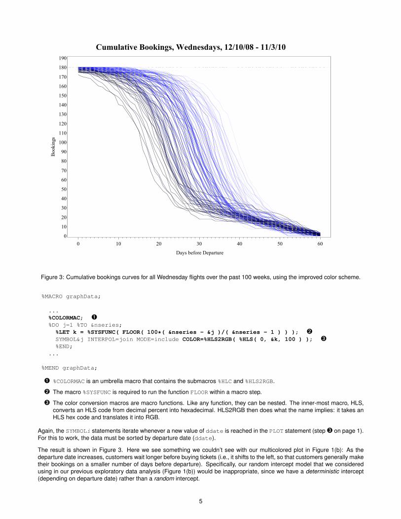
Figure 3: Cumulative bookings curves for all Wednesday flights over the past 100 weeks, using the improved color scheme.
%MACRO graphData;
...%COLORMAC; Ê%DO j=1 %TO &nseries;%LET k = %SYSFUNC( FLOOR( 100*( &nseries - &j )/( &nseries - 1 ) ) ); ËSYMBOL&j INTERPOL=join MODE=include COLOR=%HLS2RGB( %HLS( 0, &k, 100 ) ); Ì%END;
...
%MEND graphData;
Ê %COLORMAC is an umbrella macro that contains the submacros %HLC and %HLS2RGB.
Ë The macro %SYSFUNC is required to run the function FLOOR within a macro step.
Ì The color conversion macros are macro functions. Like any function, they can be nested. The inner-most macro, HLS,converts an HLS code from decimal percent into hexadecimal. HLS2RGB then does what the name implies: it takes anHLS hex code and translates it into RGB.
Again, the SYMBOLi statements iterate whenever a new value of ddate is reached in the PLOT statement (step Ì on page 1).For this to work, the data must be sorted by departure date (ddate).
The result is shown in Figure 3. Here we see something we couldn’t see with our multicolored plot in Figure 1(b): As thedeparture date increases, customers wait longer before buying tickets (i.e., it shifts to the left, so that customers generally maketheir bookings on a smaller number of days before departure). Specifically, our random intercept model that we consideredusing in our previous exploratory data analysis (Figure 1(b)) would be inappropriate, since we have a deterministic intercept(depending on departure date) rather than a random intercept.
5

While Figure 3 is good for finding an appropriate statistical mode, it still falls short on usability for deeper visual analysis. We’reshowing two years worth of data here, but we don’t have a clear sense of what booking curves correspond to what dates.Naturally we can’t label every series as in Figure 1(b), but our solution in Figure 3 doesn’t show any dates. A better solution isto put the data into different groups ordered by time of departure and to order the colorings of them.
For the color, as shown in Figure 3, we don’t want to start with complete white that is impossible to see or end with black thathas no detectable hue. So for the lightness, instead of going from 100% (white) to 0% (black), we can go from 85% to 15% inincrements of 15% (with the first increment being 10% for the math to fit):
%MACRO AssignBlues;
%COLORMAC;%LET lite=85;%DO i = 1 %TO 6;
%LET color&i = %HLS2RGB( %HLS( 0, &lite, 100 ) );%IF &i eq 1 %THEN %LET lite = %EVAL( &lite - 10 );
%ELSE %LET lite = %EVAL( &lite - 15 );%END;
%MEND AssignBlues;
Once again, we need %COLORMAC to make use of the macro functions %HLS2RGB and %HLS. This gives us six shades of blue.
For our graph, we will instead use the Graphics Template Language (GTL) to get a slightly different view. This is discussedextensively in Kuhfeld (2010). We will list the code below with minimal details, with most of the style attributes removed. Macrovariable assignments have also been resolved.
PROC TEMPLATE;
DEFINE STATGRAPH seriesplt;DYNAMIC title title2;
BEGINGRAPH / DESIGNWIDTH=600 DESIGNHEIGHT=350 ...;ENTRYTITLE title;ENTRYTITLE title2;
LAYOUT OVERLAY / YAXISOPTS=( GRIDDISPLAY=on ÊLABEL="Bookings"LINEAROPTS=( TICKVALUELIST=(0 30 60 90 120 150 180)VIEWMIN=0 VIEWMAX=180 ) )
XAXISOPTS=( LABEL="Days Before Departure"LINEAROPTS=( TICKVALUESEQUENCE=( START=0 END=60 INCREMENT=10 ) ) );
SERIESPLOT Y=y1 X=x1 / GROUP=ddate ËLINEATTRS=( COLOR=CX00004B PATTERN=1 THICKNESS=1 )YAXIS=y; Ê
...SERIESPLOT Y=y6 X=x6 / GROUP=ddate
LINEATTRS=( COLOR=CXB2B2FF PATTERN=1 THICKNESS=1 )YAXIS=y;
LAYOUT GRIDDED / COLUMNS=1 AUTOALIGN=( topleft topright ) ÌOPAQUE=true BACKGROUNDCOLOR=CXF5F5F5 BORDER=true;
ENTRY HALIGN=left "Departure Date Range";ENTRY HALIGN=left TEXTATTRS=( WEIGHT=bold COLOR=CX00004B ) "12/10/08-04/05/09";...ENTRY HALIGN=left TEXTATTRS=( WEIGHT=bold COLOR=CXB2B2FF ) "07/13/10-11/06/10";
ENDLAYOUT; /*GRIDDED*/
ENDLAYOUT; /*OVERLAY*/
ENDGRAPH; /*END GRAPH BLOCK*/
END;
RUN;
6

Figure 4: Cumulative booking curves for 100 consecutive Wednesday flights using the improved color scheme.
As outlined above, ODS is hierarchical with nested functionality. At the outermost level, a STATGRAPH template namedseriesplt is defined. Dynamic variables that bear a similarity to macro variables are declared at this point. Next, graphsize and titles are entered with BEGINGRAPH, followed by LAYOUT OVERLAY that associates axes properties with a singleplotting area. In this particular example, six series plots are inserted sequentially into the defined plotting area. Each newseries plot overlays the one previously created. Thus, the light early plots are partially hidden by the darker plots that follow.Finally LAYOUT GRIDDED (contained within LAYOUT OVERLAY) holds the graph’s legend. Some further details:
Ê Axes options are defined first in the LAYOUT OVERLAY statement. It is possible to replace the Y axis with the Y2axis in this graph. Therefore either YAXISOPTS or Y2AXISOPTS are specified here and with links defined in subsequentSERIESPLOT statements with YAXIS=y or YAXIS=y2. When y2 is specified, then the X axis is reversed withREVERSE=true (shown in a later example).
Ë 100 Wednesday series plots are created, because GROUP=ddate (departure date). However, color is assigned bysix date ranges of 116 days each. Color assignment occurs by subdividing data at the date range level. daysleft(Days before Departure) is used to for creating variables X1-X6 whereas the corresponding Y1-Y6 variables come frombookings.
Ì LAYOUT GRIDDED rather than a DISCRETELEGEND statement is better suited for color labeling. Legend line colors washout because line widths fixed at 1 pixel are too narrow. Bold font used for specifying date ranges in the GRIDDED layoutis much wider. AUTOALIGN=( TOPLEFT TOPRIGHT ) also comes in very handy. When the Y axis is being used, thelegend needs to be TOPRIGHT, whereas TOPLEFT is automatically assigned for the Y2 axis. ODS graphics is set up toavoid data/legend collisions.
The end result is shown in Figure 4.
7

Figure 5: Cumulative booking curves with missing data are displayed. By comparing the legend to the plot with missing values,color discontinuities can easily be identified.
PROGRESSION PLOTS WITH IRREGULARLY SPACED DATES
The seriesplt template created above can easily handle irregularly spaced progressions. Only the input data set needsto be changed. Let’s suppose, for example, that a year’s worth of bookings data turns up missing. Instead of deleting anentire observation that includes departure date and the number of days before departure, just retain these variables and setbookings to missing:
IF ddate >= MDY( 6, 1, 2009 ) AND ddate <= MDY( 6, 1, 2010 ) THEN bookings = .
Missing values from bookings will automatically transfer to Y2-Y5. By comparing departure date ranges to the year cut-offdates, it can be determined that the contents of Y1 and Y6 will remain untouched whereas all the values in Y3 and Y4 will beset to missing. Y2 and Y5 fall somewhere in the middle with some but not all values being set to missing. The log reflects thisoutcome by issuing the following warning messages:
WARNING: Y=Y3 is invalid. The option expects at least one non-missing value in the column.WARNING: Y=Y4 is invalid. The option expects at least one non-missing value in the column.
Setting the Y-coordinate to missing takes advantage of the fact that nothing is plotted when a single coordinate is missing fromthe output data set. Thus Figure 5 displays cumulative booking curves with data removed from the year in the middle while thelegend acts as if it were dealing with a complete data set.
8

Figure 6: Cumulative bookings for 100 consecutive Wednesday flights aligned to the right.
PROGRESSION PLOTS ALIGNED TO THE RIGHT
As mentioned in the introduction, our horizontal axis is going in the wrong direction. Again, the way it is now, time runsbackwards as the horizontal axis increases. It’s much more intuitive to have the graph the other way around, such that thedays before departure decreases to zero. Since the curves increase to the upper right, it’s more natural to label the verticalaxis on the right rather than on the left. This is the standard way of formatting the graph in the revenue management industry,as shown e.g., in Talluri and Van Ryzin (2004, p. 471).
Doing this with PROC GPLOT is actually quite involved, as shown in Derby and Vo (2010) (an earlier version of this paper).However, it’s actually quite easy with GTL, as we need only change a few parameters of the seriesplt template as notedbelow:
PROC TEMPLATE;DEFINE STATGRAPH seriesplt;...;BEGINGRAPH / ...;
...;LAYOUT OVERLAY / Y2AXISOPTS=( ... ) Ê
XAXISOPTS=( ... REVERSE=true ); ËSERIESPLOT Y=y1 X=x1 / GROUP=ddate ... YAXIS=y2; Ê...SERIESPLOTY=y6 X=x6 / GROUP=ddate ... YAXIS=y2; Ê/* LAYOUT GRIDDED is the same */
ENDLAYOUT;ENDGRAPH;
END;RUN;
Ê The Y2 axis is the right vertical axis. Therefore, we use Y2 rather than Y in the indicated places.
Ë REVERSE=true reverses the order of the horizontal axis.
USING A DATAPANEL LAYOUT TO DISPLAY CUMULATIVE AIRLINE BOOKINGS
According to SAS Institute (2009, p. 59), the LAYOUT DATAPANEL statement in GTL is used to create “a grid of graphs basedon one or more classification variables and a graphical prototype”. With LAYOUT DATAPANEL, all cells have a uniform definitionthat is specified in a single subordinate LAYOUT PROTOTYPE statement. The restriction imposed on the output by LAYOUTPROTOTYPE means that panels must be colored the same. Color isn’t really a necessity in this instance, however, since eachgroup is assigned to a different panel. Again, the REVERSE option is supported in LAYOUT DATAPANEL as it was in LAYOUTOVERLAY. The code for the DATAPANEL graph in Figure 7 is shown on the next page.
9

Figure 7: Cumulative bookings for 100 consecutive Wednesday flights are represented in a DATAPANEL graph. Outliers aremore easily identified, since data overlay is greatly reduced in a multi-cell display. The relationship between booking lead timesand departure dates is also well established in this plot. On average, it appears that flyers in the beginning of 2009 bookedtheir reservations 15 days earlier than they did in the latter part of 2010.
PROC TEMPLATE;DEFINE STATGRAPH seriesplt;
DYNAMIC TITLE;BEGINGRAPH / DESIGNWIDTH=450 DESIGNHEIGHT=450 BORDERATTRS=( THICKNESS=1px );
ENTRYTITLE TITLE / TEXTATTRS=( SIZE=8pt );LAYOUT DATAPANEL CLASSVARS=( byddatelbl ) / COLUMNDATARANGE=union
HEADERLABELATTRS=( WEIGHT=bold SIZE=6px ) HEADERBACKGROUNDCOLOR=CXAAAAFFROWAXISOPTS=( GRIDDISPLAY=on DISPLAY=all ALTDISPLAY=none DISPLAYSECONDARY=noneALTDISPLAYSECONDARY=( ticks tickvalues )LINEAROPTS=( TICKVALUESEQUENCE=( START=0 END=180 INCREMENT=90 ) ) )COLUMNAXISOPTS=( LABEL="Days Before Departure" REVERSE=trueLINEAROPTS=( TICKVALUESEQUENCE=(START=0 END=60 INCREMENT=10 ) ) );
LAYOUT PROTOTYPE;SERIESPLOT Y=bookings X=daysleft / GROUP=ddate LINEATTRS=( PATTERN=1 COLOR=black );
ENDLAYOUT; /*PROTOTYPE*/ENDLAYOUT; /*DATAPANEL */
ENDGRAPH; /*END GRAPH BLOCK*/END;
RUN;
10

CONCLUSIONS
Underlying patterns in a progression of time series plots can be revealed graphically when a palette of related, ordered colorsis applied to the data that are being displayed. The palette is easily defined using SAS software color conversion macros. Theadvantages of ODS statistical graphics have also been illustrated in this paper. Both legend placement and axes reversal canbe implemented with ease, and the new DATAPANEL plot greatly reduces data overlay in the output. Whether the graphs areproduced with traditional SAS/GRAPH software or ODS statistical graphics, special care must be taken to insure that irregularlyspaced data are displayed correctly.
REFERENCESDerby, N. and Vo, L. (2010), Graphing a progression of time series plots, Proceedings of the 2010 Western Users of SAS
Software Conference.http://www.wuss.org/proceedings10/analy/2954_6_ANL-Derby.pdf
Diggle, P. J., Heagerty, P., Liang, K.-Y. and Zeger, S. L. (2002), Analysis of Longitudinal Data, second edn, Oxford UniversityPress, Oxford, UK.
Kuhfeld, W. F. (2010), Statistical Graphics in SAS: An Introduction to the Graph Template Language and the Statistical GraphicsProcedures, SAS Institute, Inc., Cary, NC.
SAS Institute (2009), SAS/GRAPH 9.2 Graph Template Language Reference, SAS Institute, Inc., Cary, NC.
Talluri, K. T. and Van Ryzin, G. J. (2004), The Theory and Practice of Revenue Management, Kluwer Academic Publishers,Boston.
Tukey, J. (1977), Exploratory Data Analysis, Addison-Wesley, Boston.
Watts, P. (2001), Defining colors with precision in your SAS/GRAPH application, Proceedings of the Fourteenth Northeast SASUsers Group Conference.http://www.nesug.org/proceedings/nesug01/cc/cc4023.pdf
Watts, P. (2002), Using ODS and the macro facility to construct color charts and scales for SAS software applications,Proceedings of the Twenty-Seventh SAS Users Group International Conference, paper 125-27.http://www2.sas.com/proceedings/sugi27/p125-27.pdf
Watts, P. (2003), Working with RGB and HLS color coding systems in SAS software, Proceedings of the Twenty-Eighth SASUsers Group International Conference, paper 136-28.http://www2.sas.com/proceedings/sugi28/136-28.pdf
Watts, P. (2004), Advanced programming techniques for working with color in SAS software, Proceedings of the Twenty-NinthSAS Users Group International Conference, paper 091-29.http://www2.sas.com/proceedings/sugi29/091-29.pdf
ACKNOWLEDGMENTS
We thank our clients for working with us on this topic. We also thank our partners/spouses Charles, Hoa and Sam for theirpatience and support.
CONTACT INFORMATION
Comments and questions are valued and encouraged. Contact one of the authors:
Nate Derby Laura Vo Perry WattsStakana Analytics Stakana Analytics Stakana Analytics815 First Ave., Suite 287 815 First Ave., Suite 287Seattle, WA 98104-1404 Seattle, WA 98104-1404 Elkins Park, [email protected] [email protected] [email protected]://stakana.com http://stakana.com http://stakana.comhttp://nderby.org http://PerryWatts.org
SAS and all other SAS Institute Inc. product or service names are registered trademarks or trademarks of SAS Institute Inc. inthe USA and other countries. ® indicates USA registration. Other brand and product names are trademarks of their respectivecompanies.
11