graphical screen design part 2: analyzing designs and other visual design concepts lecture /slide...
TRANSCRIPT

Graphical Screen DesignPart 2: Analyzing designs and other visual design concepts
Lecture /slide deck produced by Saul Greenberg, University of Calgary, Canada
Notice: some material in this deck is used from other sources without permission. Credit to the original source is given if it is known,
Overview
CRAP recap
Grids
Other visual design concepts • consistency relationships• organization legibility and readability• navigational cues appropriate imagery• familiar idioms
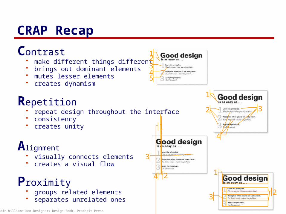
CRAP Recap
Contrast • make different things different• brings out dominant elements• mutes lesser elements• creates dynamism
Repetition • repeat design throughout the interface• consistency• creates unity
Alignment • visually connects elements• creates a visual flow
Proximity • groups related elements• separates unrelated ones
Robin Williams Non-Designers Design Book, Peachpit Press
1
2 3
4
12345
1
2
3
4 1
23

Repetition & Consistency
internal consistency• elements follow same conventions and rules• set of application-specific grids enforce this
external consistency• follow platform and interface style conventions• use platform and widget-specific grids
deviate only when it provides a clear benefit to user
Warning
mmmm mmmmmm
Okay
!
Help
mmmm mmmmmm mmm
Okay
?
Tip of the day: Monday, Mar 12
mmmm mmmmmm
Dismiss
ü û

Proximity vs. External Structure
• alignment • white (negative) space to separate• minimize explicit structure
Mmmm:
Mmmm:
Mmmm:
Mmmm:
Mmmm:
ü
Mmmm:
Mmmm:
Mmmm:
Mmmm:
Mmmm:
û
Mmmm:
Mmmm:
Mmmm:
Mmmm:
Mmmm:
û
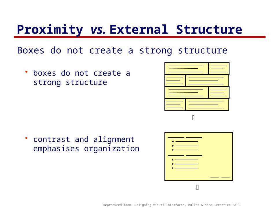
Proximity vs. External Structure
Boxes do not create a strong structure
• boxes do not create a strong structure
• contrast and alignment emphasises organization
Reproduced from: Designing Visual Interfaces, Mullet & Sano, Prentice Hall
ü
û

Navigational Cues
provide initial focus
direct attention as appropriate to important 2ndary, or peripheral items as appropriate
order should follow a user’s conceptual model of sequences
Reproduced from: Designing Visual Interfaces, Mullet & Sano, Prentice Hall
ü
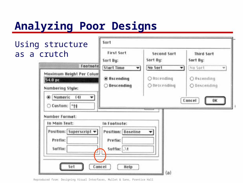
Analyzing Poor Designs
Reproduced from: Designing Visual Interfaces, Mullet & Sano, Prentice Hall
Using structure as a crutch

Analyzing Poor Designs
Overuse of 3-d effects • unnecessarily structure• unnecessary visual clutter
WebForms
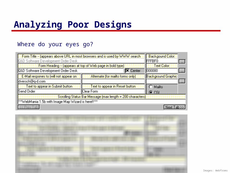
Analyzing Poor Designs
Images: Webfroms
Where do your eyes go?

Analyzing Poor Designs
contrast • cannot distinguish colored labels from editable fields
repetition• buttons do not look like buttons
alignment • no flow
explicit structure replaces proximity• lines and blocks compete with alignment
Image: Webfroms

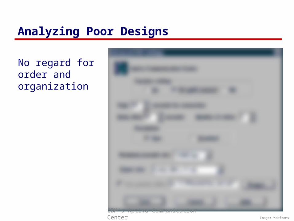
Analyzing Poor Designs
No regard for order andorganization
Image: WebfromsIBM's Aptiva Communication Center
Analyzing Poor Designs
No regard for order andorganization
Image: WebfromsIBM's Aptiva Communication Center

Analyzing Poor Designs
Spatial tension
Image: Designing Visual Interfaces, Mullet & Sano, Prentice Hall

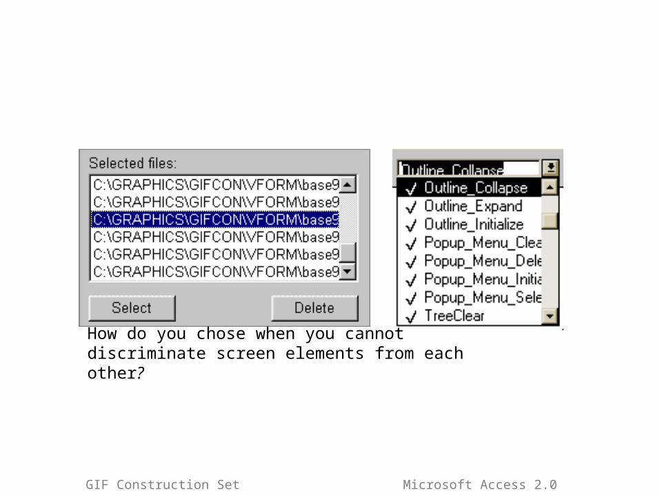
Analyzing Poor Designs
How do you chose when you cannot discriminate screen elements from each other?
GIF Construction Set Microsoft Access 2.0
How do you chose when you cannot discriminate screen elements from each other?
GIF Construction Set Microsoft Access 2.0

Repairing Designs
Minimal contrast, weak proximity• ambiguous structure• interleaved items
û Image : Designing Visual Interfaces, Mullet & Sano, Prentice Hall
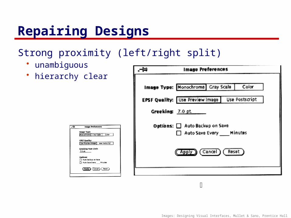
Repairing Designs
Strong proximity (left/right split)• unambiguous• hierarchy clear
ü
Images: Designing Visual Interfaces, Mullet & Sano, Prentice Hall
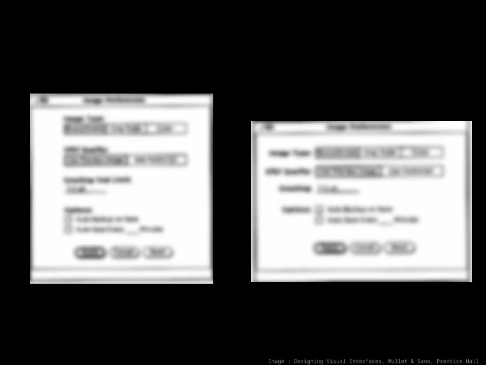
Image : Designing Visual Interfaces, Mullet & Sano, Prentice Hall

Image : Designing Visual Interfaces, Mullet & Sano, Prentice Hall
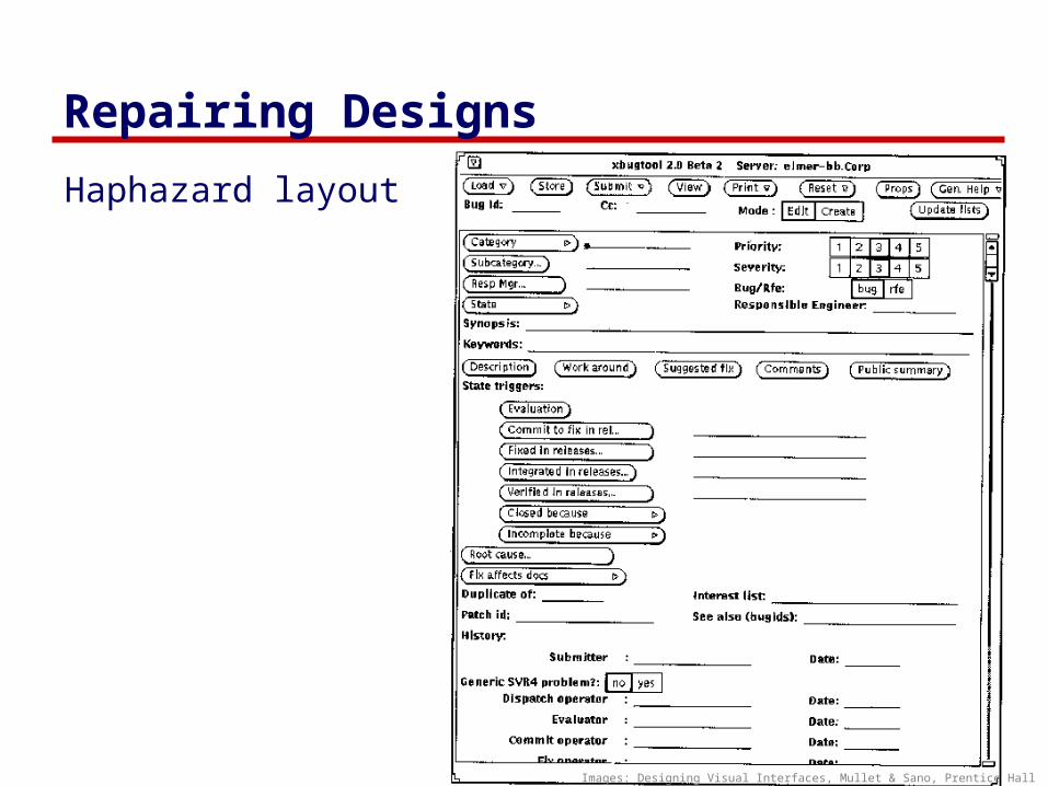
Repairing Designs
Haphazard layout
Images: Designing Visual Interfaces, Mullet & Sano, Prentice Hall

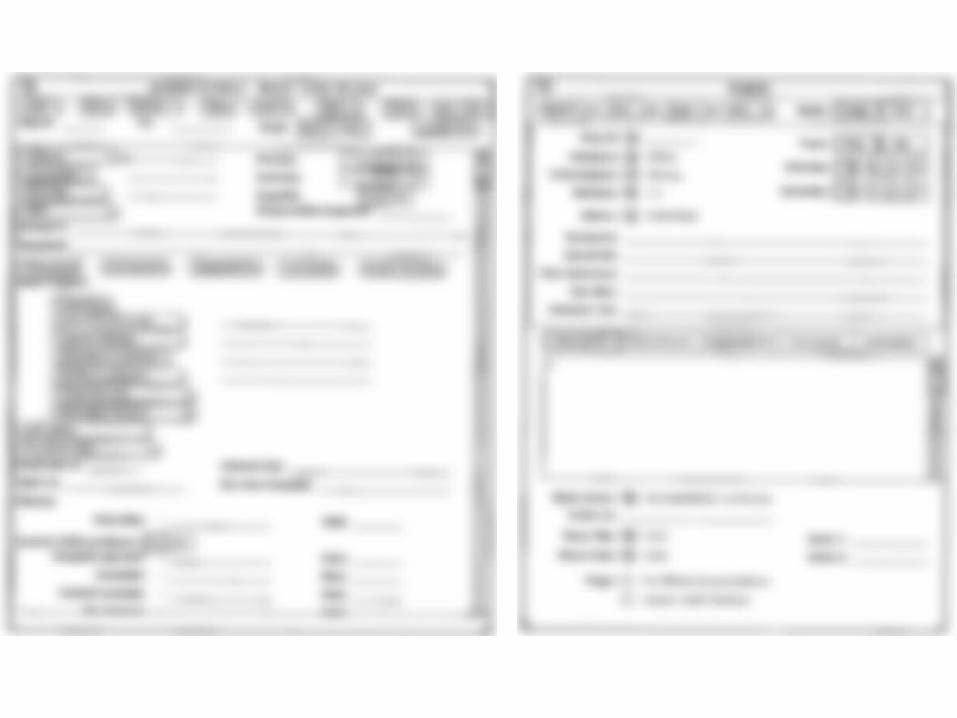
Repairing Designs
Repaired…
Images: Designing Visual Interfaces, Mullet & Sano, Prentice Hall
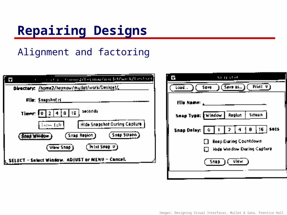
Repairing Designs
Alignment and factoring
Images: Designing Visual Interfaces, Mullet & Sano, Prentice Hall

Repairing Design
Economy of visual elements
• leverage factoring• minimize number of controls
• include only those that are necessaryo eliminate, or relegate
others to secondary windows
• minimize clutter o so information is not
hidden
NNNN
MMMM
xxx: ____
xxx: ____
xxx: ____
xxx: ____
xxx: ____
xxx: ____
xxx: ____
xxx: ____
xxx: ____
xxx: ____
xxx: ____
xxx: ____
xxx: ____
xxx: ____
xxx: ____
MMMM
NNNN
ü
û
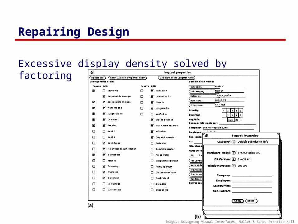
Repairing Design
Excessive display density solved by factoring
Images: Designing Visual Interfaces, Mullet & Sano, Prentice Hall
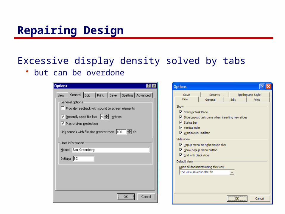
Repairing Design
Excessive display density solved by tabs• but can be overdone
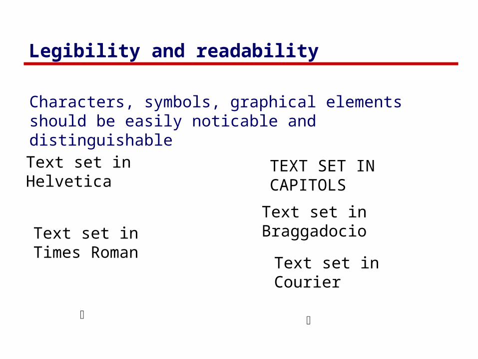
Legibility and readability
Characters, symbols, graphical elements should be easily noticable and distinguishable
Text set in Braggadocio
Text set in Helvetica
Text set in Courier
TEXT SET INCAPITOLS
ü û
Text set in Times Roman

Legibility and readability
Proper use of typography • 1-2 typefaces (3 max)• normal, italics, bold• 1-3 sizes max
LargeMediumSmall
LargeMediumSmall
ü û
Readable
Design components to be inviting and attractive
Design components to be inviting and attractive
Unreadable
Design components to be inviting and attractive
Design components to be inviting and attractive
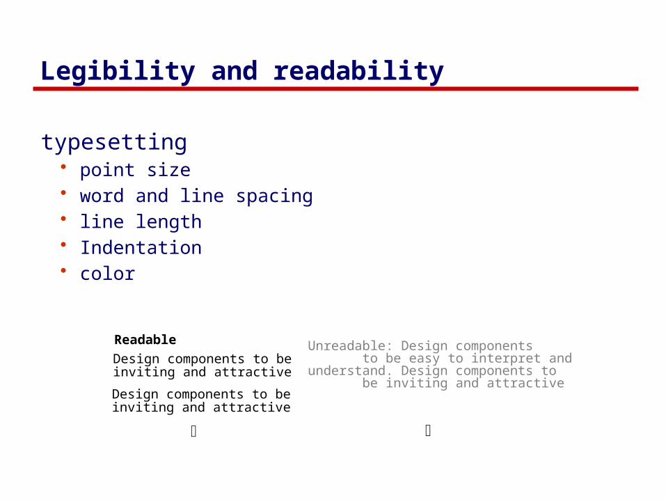
Legibility and readability
typesetting• point size• word and line spacing• line length • Indentation• color
Readable
Design components to be inviting and attractive
Design components to be inviting and attractive
ü û
Unreadable: Design components to be easy to interpret andunderstand. Design components to be inviting and attractive

Popkin Software’s System Architect
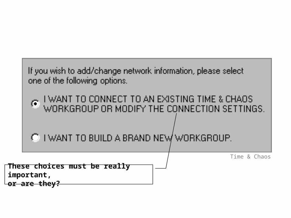
These choices must be really important, or are they?
Time & Chaos

Greyed-out example text hard to read.Why not make it black?
Regional preferences in Windows 95

Text orientation difficult to read
Microsoft Word

Imagery
Signs, icons, symbols• right choice within spectrum from concrete to abstract
Icon design very hard• except for most familiar, always label them
Image position and type should be related• image “family”
Consistent and relevant image use• identifies situations, offerings...
Partial icon family

Choosing levels of abstraction
ü û û ü û
Images: Designing Visual Interfaces, Mullet & Sano, Prentice Hall
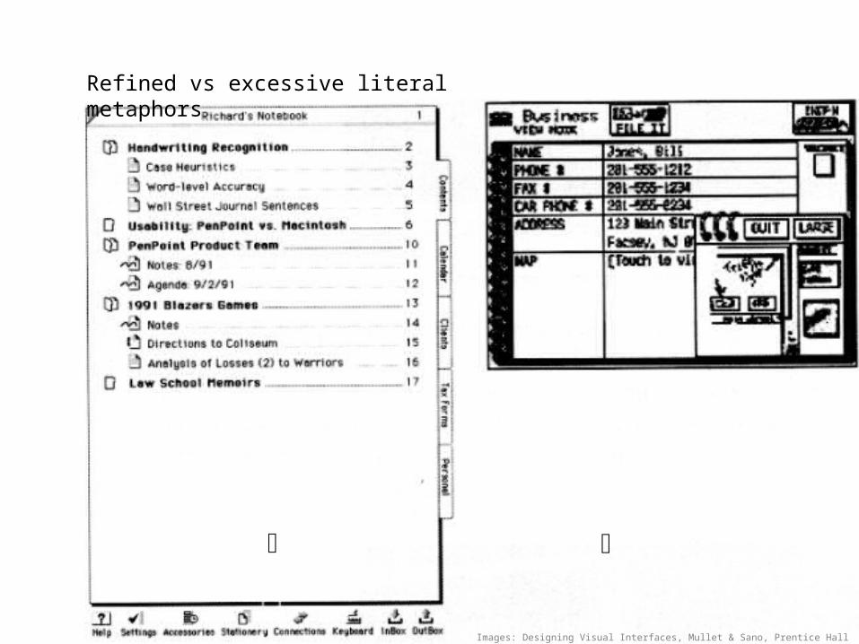
Refined vs excessive literal metaphors
ü û
Images: Designing Visual Interfaces, Mullet & Sano, Prentice Hall
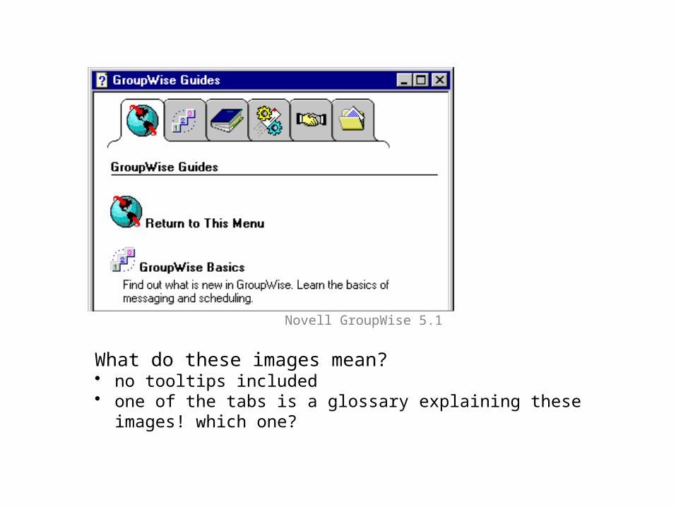
What do these images mean? • no tooltips included• one of the tabs is a glossary explaining these images!
which one?
Novell GroupWise 5.1
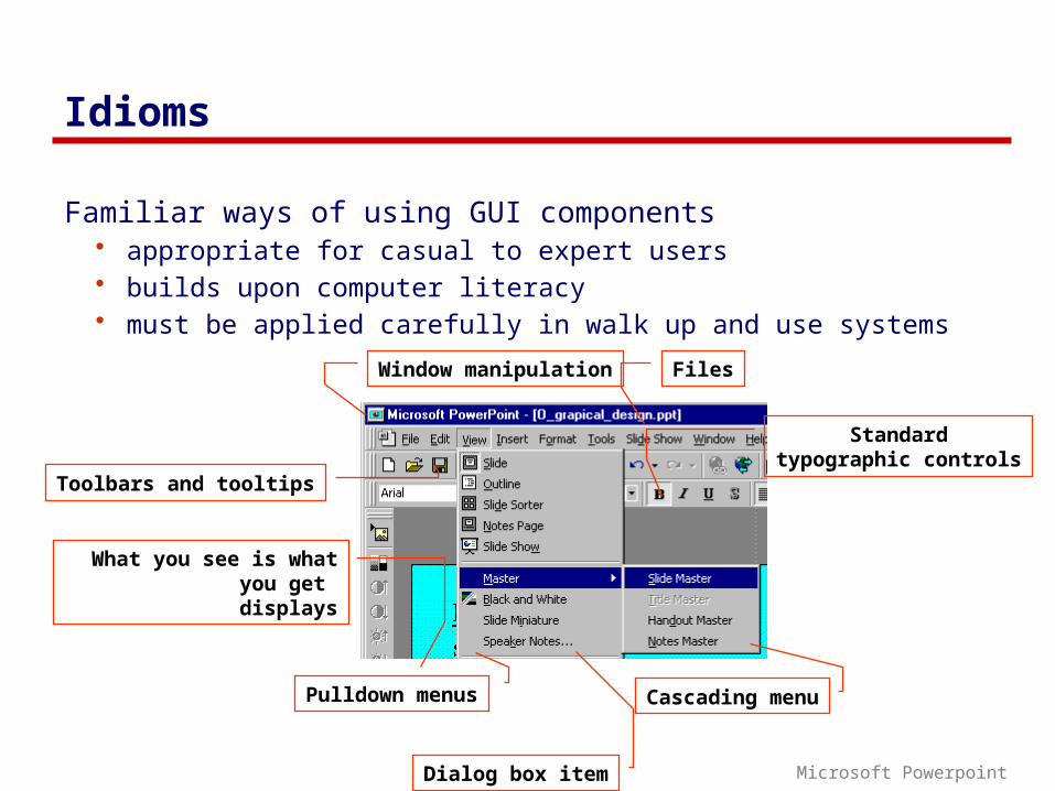
Idioms
Familiar ways of using GUI components• appropriate for casual to expert users• builds upon computer literacy • must be applied carefully in walk up and use systems
Pulldown menus Cascading menu
Dialog box item
Toolbars and tooltips
Window manipulation
Standardtypographic controls
Files
What you see is what you get
displays
Microsoft Powerpoint
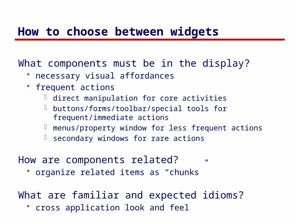
How to choose between widgets
What components must be in the display?• necessary visual affordances• frequent actions
o direct manipulation for core activitieso buttons/forms/toolbar/special tools for frequent/immediate
actionso menus/property window for less frequent actionso secondary windows for rare actions
How are components related?• organize related items as “chunks”
What are familiar and expected idioms?• cross application look and feel
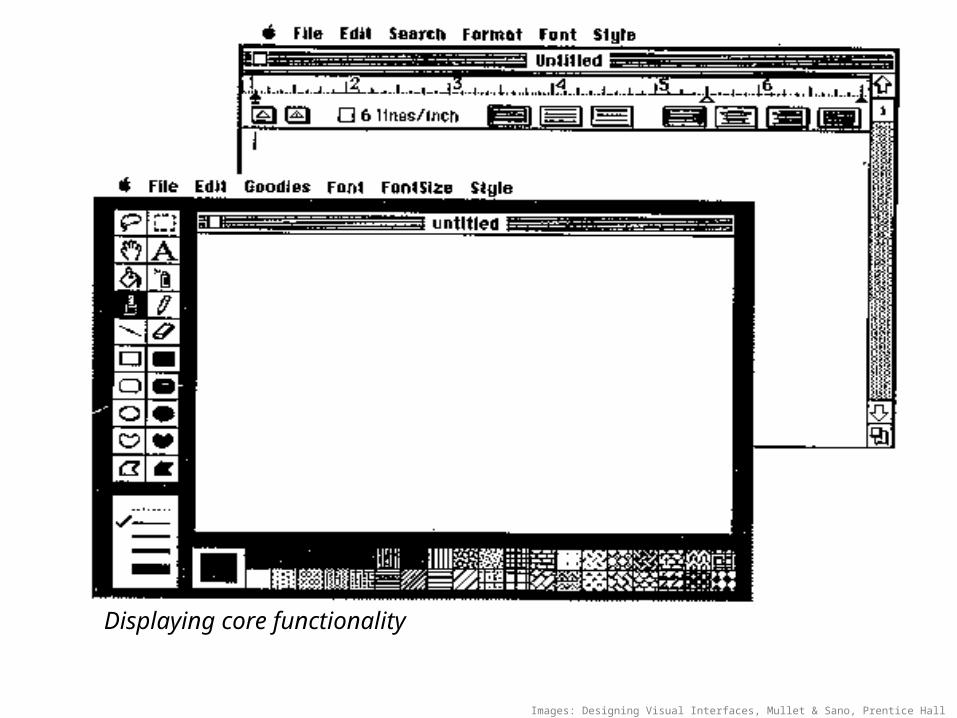
Displaying core functionality
Images: Designing Visual Interfaces, Mullet & Sano, Prentice Hall

Widgets and complexity
how can window navigation be reduced?• avoid long paths• avoid deep hierarchies
ü û
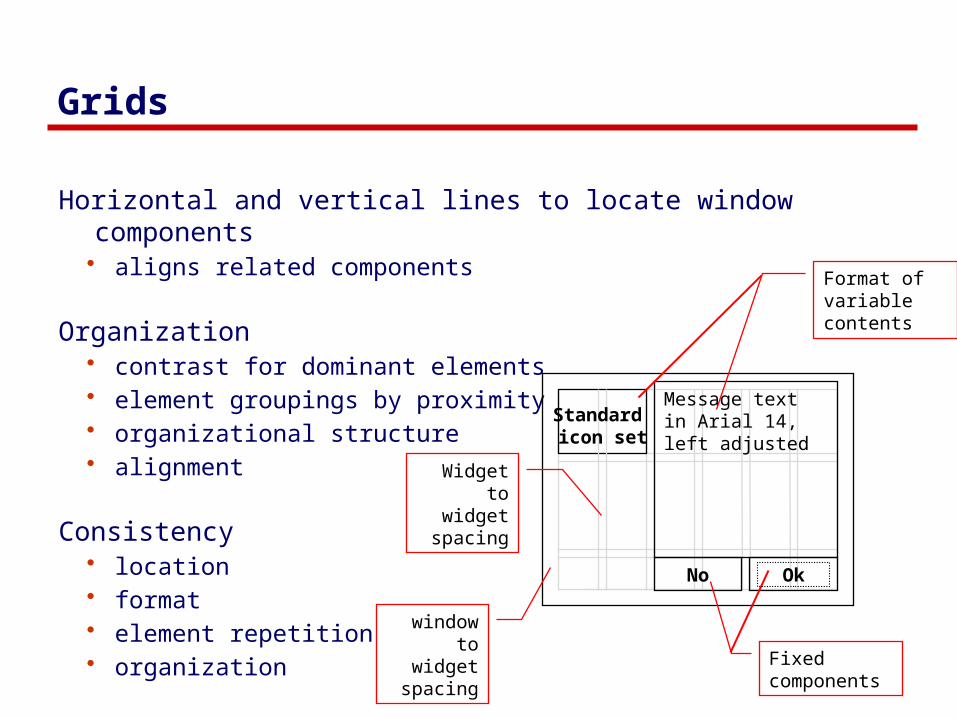
Grids
Horizontal and vertical lines to locate window components• aligns related components
Organization• contrast for dominant elements• element groupings by proximity• organizational structure• alignment
Consistency• location• format• element repetition• organization window to
widget spacing
Widget to widget
spacing
No Ok
Message text in Arial 14, left adjusted
Standard icon set
Fixed components
Format of variable contents

No Ok
Message text in Arial 14, left adjusted
Standard icon set
No Ok
Do you really want to delete the file “myfile.doc” from the folder “junk”?
?
ü
Ok
Cannot move the file “myfile.doc” to the folder “junk” because the disc is full.
!
û
Apply
Cancel
The file was destroyed
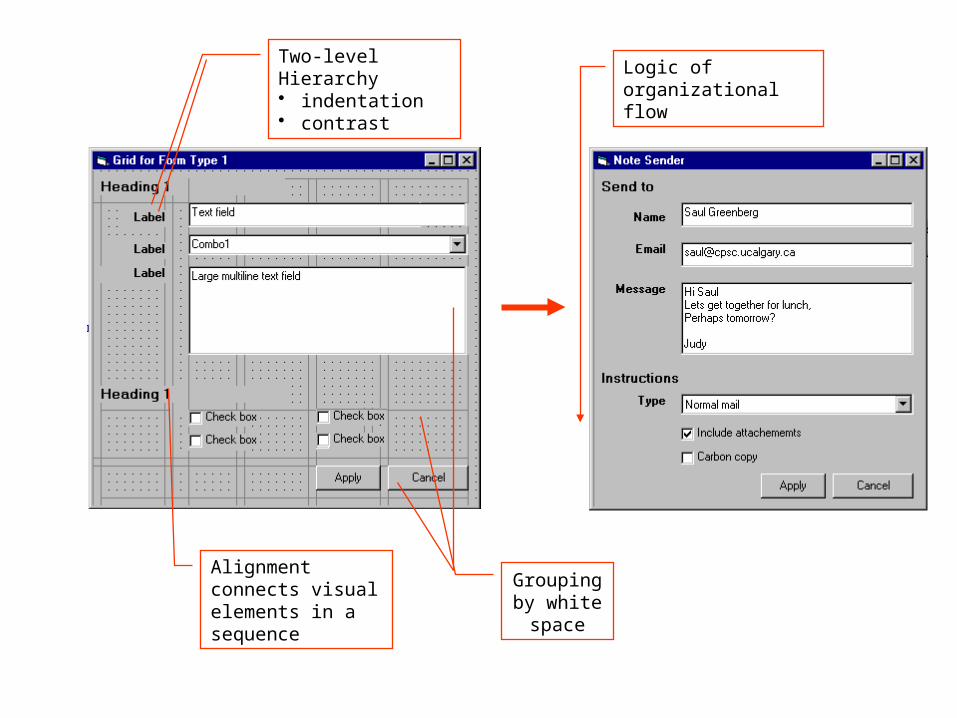
Two-level Hierarchy• indentation• contrast
Grouping by white space
Alignment connects visual elements in a sequence
Logic of organizationalflow

Exercise
Graphical redesign
Create a grid emphasizing:• visual consistency • relationships between
screen elements • navigational cues • economy • legibility and readability • imagery

Constructing a grid1. Maintain consistency with GUI style
o locate standard components - title bar, window controls, …
2. Decide navigational layout + white space + legibility + typographyo annotated grid shows location of generic components o these generic components may have their own grids.

Using the grid3. Determine relationships, navigational structure
o map navigational structure onto the grid
4. Economizeo collapse two windows into one o trim sound dialog

Using the grid5. Evaluate by displaying actual examples
6. Economize further• decide which we prefer
vs
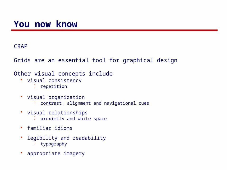
You now know
CRAP
Grids are an essential tool for graphical design
Other visual concepts include • visual consistency
o repetition
• visual organization o contrast, alignment and navigational cues
• visual relationships o proximity and white space
• familiar idioms
• legibility and readabilityo typography
• appropriate imagery
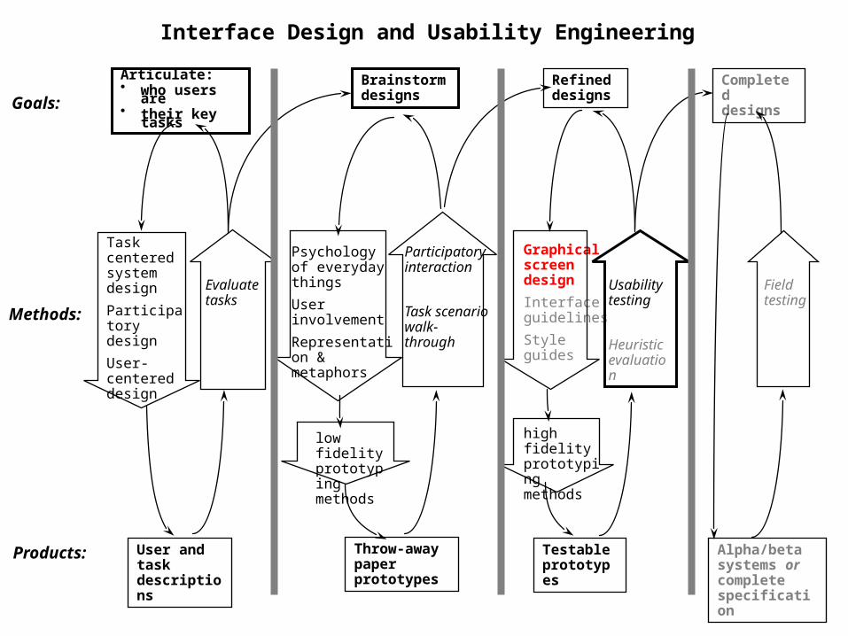
Articulate:• who users are• their key tasks
User and task descriptions
Goals:
Methods:
Products:
Brainstorm designs
Task centered system design
Participatory design
User-centered design
Evaluatetasks
Psychology of everyday things
User involvement
Representation & metaphors
low fidelity prototyping methods
Throw-away paper prototypes
Participatory interaction
Task scenario walk-through
Refined designs
Graphical screen design
Interface guidelines
Style guides
high fidelity prototyping methods
Testable prototypes
Usability testing
Heuristic evaluation
Completed designs
Alpha/beta systems or complete specification
Field testing
Interface Design and Usability Engineering
Primary Sources
This slide deck is partly based on concepts as taught by:
• Designing Visual Interfaces, Mullet & Sano, Prentice Hall • Robin Williams Non-Designers Design Book, Peachpit Press
Permissions
You are free:• to Share — to copy, distribute and transmit the work• to Remix — to adapt the work
Under the following conditions:Attribution — You must attribute the work in the manner specified by the author (but not in any way that suggests that they endorse you or your use of the work) by citing:
“Lecture materials by Saul Greenberg, University of Calgary, AB, Canada. http://saul.cpsc.ucalgary.ca/saul/pmwiki.php/HCIResources/HCILectures”
Noncommercial — You may not use this work for commercial purposes, except to assist one’s own teaching and training within commercial organizations.Share Alike — If you alter, transform, or build upon this work, you may distribute the resulting work only under the same or similar license to this one.
With the understanding that:Not all material have transferable rights — materials from other sources which are included here are cited Waiver — Any of the above conditions can be waived if you get permission from the copyright holder.Public Domain — Where the work or any of its elements is in the public domain under applicable law, that status is in no way affected by the license.Other Rights — In no way are any of the following rights affected by the license:
• Your fair dealing or fair use rights, or other applicable copyright exceptions and limitations;• The author's moral rights;• Rights other persons may have either in the work itself or in how the work is used, such as publicity or privacy rights.
Notice — For any reuse or distribution, you must make clear to others the license terms of this work. The best way to do this is with a link to this web page.