graphical representation of climate-based daylight ... · pdf filegraphical representation of...
TRANSCRIPT
1
Graphical Representation of Climate-Based Daylight Performance to Support Architectural Design
Siân Kleindienst1, MSc, Magali Bodart2, PhD, Marilyne Andersen1,*, PhD
1Building Technology Program, Department of Architecture, Massachusetts Institute of Technology, Cambridge, USA
2Postdoctoral Researcher, Fonds de la Recherche Scientifique, FNRS, Unité d’Architecture, Université Catholique de Louvain, Louvain-La-Neuve, Belgium
* Corresponding author. Prof. M. Andersen, MIT Room 5-418, 77 Massachusetts Avenue, Cambridge MA 02139, USA. Phone: +1 617 253 7714. Fax: +1 617 253 6152. Email: [email protected]
ABSTRACT
Many conventional daylighting design tools are limited in that each simulation represents only one time of year and time of day (or a single, theoretical overcast sky condition). Since daylight is so variable – due to the movement of the sun, changing seasons, and diverse weather conditions – one moment is hardly representative of the overall quality of the daylighting design, which is why climate-based, dynamic performance metrics like Daylight Autonomy (DA) and Useful Daylight Illuminance (UDI) are so needed. Going one step further, the annual variation in performance (condensed to a percentage by DA and UDI) is also valuable information, as is the ability to link this data to spatial visualizations and renderings. Trying to realize this combination of analytical needs using existing tools would become an overly time-consuming and tedious process. The challenge is to provide all information necessary to early design stage decision-making in a manageable form, while retaining the continuity of annual data. This paper introduces a climate data simplification method based on a splitting of the year into 56 periods, over which weather conditions are “averaged” and simulated using Perez’s ASRC-CIE sky model, while information on sun penetration is provided at a greater resolution. The graphical output of the produced data in the form of “Temporal Maps” will be shown to be visually, and even numerically, comparable to reference case maps created using short time step calculations and based on illuminance data generated by Daysim.
KEYWORDS
Daylighting, Annual Simulation, Climate-based metrics, Temporal Maps, Schematic Design

2
1 INTRODUCTION
The quality of daylighting design depends heavily on solar altitude, weather, and other time-dependent environmental factors. Yet very few existing tools provide the user with some understanding of the annual performance of a daylighting design, and similarly few lighting metrics focus on this temporal aspect of light measurement. The two existing time-based metrics are Daylight Autonomy (DA) (Reinhart and Herkel 2000; Reinhart and Walkenhorst 2001), which provides the percentage of annual work hours where daylight is sufficient to exceed a benchmark illuminance, and Useful Daylight Illuminance (UDI), which is similar to DA except that the benchmark is replaced by the illuminance range 100 to 2000 lux (Mardaljevic and Nabil 2005, 2006). Both metrics can be calculated for different points in a spatial grid, as is often done with Daylight Factor or illuminance measurements. S.P.O.T. (Architectural Energy Corporation 2006), Daysim (Reinhart and Walkenhorst 2001), and Daysim’s recent on-line and interactive version, Daylight1-2-3 (Reinhart et al 2007), are three programs which provide calculations of DA, and the calculation engines of all three are based on the highly reliable Radiance engine for daylighting simulations (Mardaljevic 1995; Ward and Shakespeare 1998). Daysim, which can calculate annual illuminances in intervals as short as 5 minutes, produces a highly detailed DA solution, and has been validated successfully against measured data (Reinhart and Walkenhorst 2001); it provides an output that is largely tabular and un-graphical. To be intuitive to non-experts, the DA metric condenses all time-based results to a single percentage, thus losing any sense of the annual variation in performance. S.P.O.T. and Daylight 1-2-3 provide some spatial graphical output (simple renderings, work plane DA grid), but are more limited in the allowed geometric and situational input. A recent paper by the creators of both DA and UDI outlines the benefits and limitations analyses performed using dynamic daylighting metrics (Reinhart et al 2006).
For the sake of readability, it is impossible to show all available data in a single graph. DA and UDI choose to sacrifice an understanding of the time-based variability of performance in favor of retaining the spatial variability of performance. In other words, DA can show that for 70% of annual working hours, a particular point has adequate daylight, but it cannot show whether this point is underperforming in the morning hours, or in the winter. On the other hand, the “Temporal Map” graphical format suggested by Mardaljevic (Mardaljevic 2004) displays data on a surface map whose axes represent the hours of the day and the days of the year; this retains the temporal variability of performance in a very dense format. The combination of these two approaches would produce a highly detailed analysis of the performance of a space, showing how performance varies both over space and over time (Glaser et al 2004). Beyond the practical implications of this approach in terms of computation, the greatest challenge involved in producing such an immense data set is to make sure it can be easily absorbed and interpreted by a designer.
While the number of times per day and per year for which full simulations must be done has an obvious effect on the program’s simulation time, it also has a less obvious, but important, effect on the readability of the graphical output. In other words, whereas a too low resolution might shortchange the variability of sky

3
conditions, a very high resolution data might require too much mental processing and analysis from the user to be quickly synthesized and efficiently translated into design changes. This also holds true for spatial renderings. Because of this, information pre-processing becomes a precious advantage – one which goes beyond interactivity and calculation time concerns. In preparing data for quicker analysis, however, care must be taken to ensure that any information critical to inform design in its early stages is not lost through this process.
This paper describes how a simplified annual data set, created by splitting the year into a relatively small number of periods of “similar moments” and using the ASRC-CIE sky model (Perez et al 1992), can produce temporal maps which are visually, and even numerically, comparable to reference case maps created using the highly detailed Daysim. If then coupled with appropriate metrics to represent spatial variation of performance in a more condensed format (see section 6.3), such temporal maps can become an integral and informative part of design analysis. Their combination with a series of spatial renderings, a concept investigated further in (Andersen et al 2008) and made possible by the use of a discrete set of 4 sky types in the ASRC-CIE model, ultimately adds an extra dimension to our understanding of building performance by providing immediate yet comprehensive information about the spatial and temporal variability of performance.
To demonstrate their capability to faithfully represent annual performance variation, four validations cases were chosen for visual and pixel-based comparison to Daysim-based results. The first focuses on climate and weather by using an unobstructed view of the sky dome for ten diverse cities across the globe. The second case introduces simple geometry to two cities but maintains a large unbroken view of the southern sky. The third introduces a more complex geometry which obscures all but small patches of the sky dome. This last case introduces a discussion on the necessity for higher-frequency sun penetration data and proposes a way to include this information in the temporal maps. An example of how this approach can inform the design process is then presented through a classroom design case study, to demonstrate the value of keeping time-varied performance accessible to a designer in this form.
2 METHODOLOGY
2.1 DIVISION OF THE YEAR INTO 56 SIMILAR PERIODS
In dividing the year into periods of “similar” moments that will ultimately be represented by a single point on a temporal map, the most important consideration is to ensure that these periods include a range of conditions as limited as possible. The sun should be at approximately the same position in the sky, as only one sun position will represent the whole period, and weather conditions should be reasonably consistent – satisfying both of these requirements typically means that a group of moments should be similar in both time of day and time of year. This concept resembles in some aspects the method presented by Herkel at the 1997 IBPSA conference (Herkel 1997), which uses the similarity of 3 factors – direct irradiance, diffuse irradiance, and solar altitude – to
4
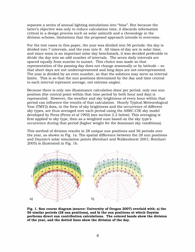
separate a series of annual lighting simulations into “bins”. But because the latter’s objective was only to reduce calculation time, it discards information critical in a design process such as solar azimuth and a chronology in the division scheme, limitations that the proposed approach intends to overcome.
For the test cases in this paper, the year was divided into 56 periods: the day is divided into 7 intervals, and the year into 8. All times of day are in solar time, and since noon is an important solar day benchmark, it was decided preferable to divide the day into an odd number of intervals. The seven daily intervals are spaced equally from sunrise to sunset. This choice was made so that representation of the passing day does not change seasonally or by latitude – so that short days are not underrepresented and long days are not overrepresented. The year is divided by an even number, so that the solstices may serve as interval limits. This is so that the sun positions determined by the day and time central to each interval represent average, not extreme angles.
Because there is only one illuminance calculation done per period, only one sun position (the central point within that time period by both hour and day) is represented. However, the weather and sky brightness of every hour within that period can influence the results of that calculation. Hourly Typical Meteorological Year (TMY2) data, in the form of sky brightness and the occurrence of different sky types, are thus averaged over each period using the ASRC-CIE sky model developed by Perez (Perez et al 1992) (see section 2.2 below). This averaging is first applied to sky type, then as a weighted sum based on the sky type’s occurrence during that period (higher weight for the dominant sky conditions).
This method of division results in 28 unique sun positions and 56 periods over the year, as shown in Fig. 1a. The spatial difference between the 28 sun positions and Daysim’s solar simulation points (Reinhart and Walkenhorst 2001; Reinhart 2005) is illustrated in Fig. 1b.
Fig. 1. Sun course diagram (source: University of Oregon 2007) overlaid with: a) the 56 similar periods (28 sun positions), and b) the sun positions at which Daysim performs direct sun contribution calculations. The colored bands show the division of the year, and the dotted lines show the division of the day.

5
While this averaging method into 56 annual periods proved adequate for data like general illuminance level (see sections 4, 5 and 6), the treatment of direct sun penetration needed a higher resolution to ensure that information critical to a designer was maintained, and thus required a separate processing. Section 6.2 discusses how this issue is solved and how both approaches can still be displayed to the user as a unique temporal map.
2.2 AVERAGING OF WEATHER CONDITIONS USING SKY MODELS
The ASRC-CIE sky model, developed by Perez, is the one used in this paper. It integrates the four standard CIE sky models into one angular distribution of sky luminance – the standard CIE overcast sky (Hopkins), the CIE averaged intermediate sky (Nakamura), the standard CIE clear sky, and a high turbidity formulation of the latter (CIE clear sky for polluted atmosphere)(CIE 1994).
This sky model has been validated for diverse climate and sky zones (sun proximity) (Perez et al 1992; Littlefair 1994; Chaiwiwatworakul and Chirarattananon 2004) and compared with several other models. Comparison results vary from one study to another, but the ASRC model always gives good results, sometimes even better results than the more complex “all-weather sky model”, also developed by Perez (Perez et al 1993) and validated with several other models (Perez et al 1993; Littlefair 1994; Chaiwiwatworakul and Chirarattananon 2004; Igawa and Nakamura 2001; Igawa et al 2004). According to Perez (Perez et al 1992), the good performance of the ASRC model is due to the two-fold parameterization of insolation conditions which help differentiate between sky clearness and sky brightness. The ASRC-CIE model was validated by Littlefair against the extensive BRE sky-luminance distribution dataset (Littlefair 1994). It exceeded most other sky models in accuracy, including the Perez All-Weather model, and was declared most likely to be adaptable to a wide range of climate zones.
It was deemed the most appropriate sky model for temporal data reduction because it is not only accurate, but conducive to averaging many skies in a realistic way. Given typical meteorological data for all time within a certain range of days and hours, one can find an average horizontal illuminance separately for each of the major sky types (clear, clear-turbid, intermediate, and overcast) and the percent chance of that sky type occurring within that period. Using these averaged values and weights, one can create four realistic, instantaneous sky maps which still represent the entire period in question. One could not get the same effect using the All-Weather Perez model, for example, because averaging data from different types of skies might result in one sky map which is both impossible and unrepresentative of any sky that might occur within that time frame.
The governing equation of the ASRC-CIE model is the following (Perez et al 1992):
ocievcoicievcictcievcctccievccvc EbEbEbEbE ........ +++= (1)

6
where Evc is the illuminance at a sensor point and Evc.cie.c, Evc.cie.ct, Evc.cie.i and Evc.cie.o
are, respectively, the illuminances at that sensor point under a standard CIE clear sky, a standard CIE clear turbid sky, a CIE intermediate sky and a CIE overcast sky.
The weighting factors bc, bct, bi, bo, which were adopted by Perez in 1992, depend on the sky clearness ε and brightness ∆ (Perez et al 1992). The ε and ∆ are calculated using the horizontal diffuse irradiance, the normal incident irradiance, and the solar zenith angle. For any given ε and ∆, two of the four skies are selected depending on the prevailing value of sky clearness ε and are then assigned bj coefficients, or the probability of each sky occurring.
In short, we divide the year into 56 periods. For each period, the average bj coefficients are calculated, together with the average diffuse horizontal illuminances. Point illuminance values are then calculated using the central sun position for the considered period, each of the four CIE sky types, and the weighted sum is calculated using the average bc, bct, bi and bo coefficients. The one instance in which this method failed was for intermediate skies with sun altitudes greater than 80°. Since the failure was caused by the inaccuracy of the CIE intermediate sky model at high sun altitudes (CIE 1994), these few simulations were replaced by All-Weather model simulations with ε set equal to 1.35, as a representative clearness number for intermediate skies. In this way, although only four simulations are done per temporal period, the sky models incorporate data from every day and hour of that period. The only aspect which cannot be averaged is the sun position, a limitation that is addressed in section 6.2.
Note that there are systematic differences between the ASRC-CIE model used in this temporal data-reduction method and the All-Weather model chosen for the reference program Daysim; these will be discussed in the validation section 4.2.
2.3 CREATION OF TEMPORAL MAPS
The previous paragraphs describe the process used for dividing the year into 56 time periods, and how one may arrive at a single representative illuminance value for the whole period in question. What remains is to put this averaged data into an intuitive graphical form in order to understand how the illuminance level responds to hourly and yearly changes in weather and sun position.
In 2003, Mardaljevic introduced the concept of Spatio-Temporal Irradiation Maps (STIMAPs) – surface graphs following the year on the x-axis and the day on the y-axis – at the 8th international IBPSA conference (Mardaljevic 2003). Other applications of the basic concept behind STIMAPs can be found in ECOTECT for the display of ventilation- and solar-thermal gains (Marsh 2008), or in the SPOT! program for direct shadows (Bund and Do 2005).
Especially when coupled with spatial renderings, temporal maps are an intuitive and powerful way in which to view an entire year's worth of daylighting analysis in one glance. Figure 2 shows the authors’ adaptation of the “Temporal Map”
7
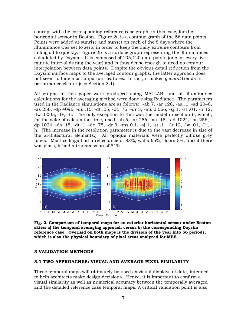
concept with the corresponding reference case graph, in this case, for the horizontal sensor in Boston. Figure 2a is a contour graph of the 56 data points. Points were added at sunrise and sunset on each of the 8 days where the illuminance was set to zero, in order to keep the daily extreme contours from falling off to quickly. Figure 2b is a surface graph representing the illuminances calculated by Daysim. It is composed of 105,120 data points (one for every five minute interval during the year) and is thus dense enough to need no contour interpolation between data points. Despite the obvious detail reduction from the Daysim surface maps to the averaged contour graphs, the latter approach does not seem to hide most important features. In fact, it makes general trends in performance clearer (see Section 3.1).
All graphs in this paper were produced using MATLAB, and all illuminance calculations for the averaging method were done using Radiance. The parameters used in the Radiance simulations are as follows: -ab 7, -ar 128, -aa .1, -ad 2048, -as 256, -dp 4096, -ds .15, -dt .05, -dc .75, -dr 3, -ms 0.066, -sj 1, -st .01, -lr 12, -lw .0005, -I+, -h. The only exception to this was the model in section 6, which, for the sake of calculation time, used -ab 5, -ar 256, -aa .15, -ad 1024, -as 256, -dp 1024, -ds .15, -dt .1, -dc .75, -dr 3, -ms 0.1, -sj 1, -st .1, -lr 12, -lw .01, -I+, -h. (The increase in the resolution parameter is due to the vast decrease in size of the architectural elements.) All opaque materials were perfectly diffuse grey tones. Most ceilings had a reflectance of 83%, walls 65%, floors 5%, and if there was glass, it had a transmission of 81%.
Fig. 2. Comparison of temporal maps for an exterior horizontal sensor under Boston skies: a) the temporal averaging approach versus b) the corresponding Daysim reference case. Overlaid on both maps is the division of the year into 56 periods, which is also the physical boundary of pixel areas analyzed for MBE.
3 VALIDATION METHODS
3.1 TWO APPROACHES: VISUAL AND AVERAGE PIXEL SIMILARITY
These temporal maps will ultimately be used as visual displays of data, intended to help architects make design decisions. Hence, it is important to confirm a visual similarity as well as numerical accuracy between the temporally averaged and the detailed reference case temporal maps. A critical validation point is also

8
to ensure that the “main visual features” of a very detailed Temporal Map would also be observed in a contour map based on 56 representative moments. These main visual features refer to those aspects of the map which, if lost, would cause the architect to misjudge the performance of the design and may typically refer to the general level of illuminance, the way that illuminance levels change with time of day or season, indications of sun penetration, or indications of weather patterns.
Three levels of validation will be subsequently discussed: the validation of weather and climate variation (performed using unobstructed sensor points under a sky only), the validation of illuminance within a simple geometry, and the validation of illuminance within a complex geometry, in which one may begin to tie the results shown in a Temporal Map to an actual design process. The first level of validation was performed for an extensive range of climates and locations, described in the next section, so as to demonstrate whether a reduction of the year in 56 adjacent periods could provide reliable results under arbitrary conditions. The second analysis was performed for two dissimilar climates, to assess whether conclusions drawn for outdoor conditions could be applied to indoor calculations too. The third study was based on a complex building model in Boston annual conditions, to evaluate the adequacy of this data reduction strategy in more complex environments.
In addition to the visual comparison of these temporal maps, pixel-by-pixel analyses were also undertaken on greyscale versions of the unobstructed sky maps and the simple geometry maps: after dividing both the temporally averaged and detailed Daysim maps into portions corresponding with the 56 annual divisions (such as in Fig. 2), an average illuminance, corresponding with the average greyscale pixel brightness, was found for each of the 56 areas. The Mean Bias Error (MBE, between the LightSolve and Daysim maps), given in Eqn. (2), was then analyzed for each of the 56 periods for ten locations over the globe (see section 3.2), meant to represent with reasonable breadth the range of climate zones and latitudes that one would find. The Mean Bias Error is given as:
∑=
−=
N
i iD
iDiL
PPP
NMBE
1
)(1 (2)
where PiL is the greyscale brightness of a pixel in the LightSolve Temporal Map and PiD is the same pixel in the Daysim map. They are summed and averaged over all pixels in a single period. These graphs, which are presented in section 4.2, allow one to analyze the similarity between the 56 period technique and the detailed data on a per temporal area basis. The Root Mean Square Error (RMSE) was not analyzed, because in this situation, a high standard deviation would not indicate a correlation failure. The method being presented is not intended to match the level of detail of the reference data, but to produce a good visual similarity, in which case the effect of averaging peaks and troughs pixel by pixel in the Daysim data would skew the RMSE artificially high and would not inform the appropriateness of the simplification methodology.
The one important exception to this reasoning is the inclusion of direct sun penetration. Direct sun can change the illuminance level at a point by orders of magnitude, and when architectural obstructions are present, it can appear or
9
disappear rapidly. Without higher frequency direct solar calculations (discussed in section 6.2), the lack of these short solar peaks might cause an underestimation in the illuminances found using the above averaging method. Another possible source of uncertainty is that inherent in the illuminances provided by the TMY2 data, which ranges from 1.2%-2.4% bias error according to the TMY2 user manual (Marion and Urban 1995). Additionally, the test and reference data sets are produced using different sky models: the ASRC-CIE sky model, and the All-Weather sky model, respectively. Both are validated and respected sky models, but a systematic difference between them has been observed, as detailed in section 4.2.
3.2 VALIDATION ACROSS THE GLOBE: TEN CITIES TO COVER A RANGE OF CLIMATES AND LATITUDES
To validate any proposal that heavily depends on weather and solar position, one needs to perform this validation for a group of locations representative of different climate types and latitudes. Ideally, a group of test locations would encompass a wide range of latitudes and a similarly wide spread of climate types. It would be heavy on those latitudes and climates most relevant to the majority of the world’s population, which is distributed unevenly over the globe. The cities chosen should also be ones for which annual data is readily available.
Assisting in the choice of latitude distribution was the chart in Fig. 3, which shows the world’s population distribution as a function of latitude. By far, the largest density of world population falls between 20° N and 45° N. Latitude ranges between 5° N and 20° N and between 45° N and 60° N have about half the population density as the previous range, and the latitudes between 25° S and 5° N have about one sixth. In other latitudes, the population density falls off very quickly. This distribution resulted in a greater number of cities representing the northern hemisphere than southern: three cities were chosen from the most populous zone “A”, two each from the northern and southern halves of zone “B”, two again from the much larger zone “C”, and one from the southern part of zone “D”, which represents everything else. In this way, the large range of latitudes was preserved and concentrated slightly in the higher population latitudes while still including a few cities at extreme latitudes and two from the southern hemisphere. Each location was also chosen with regard to its climate and average number of sun hours available (BBC World Weather 2007, Houghton Mifflin 2007).
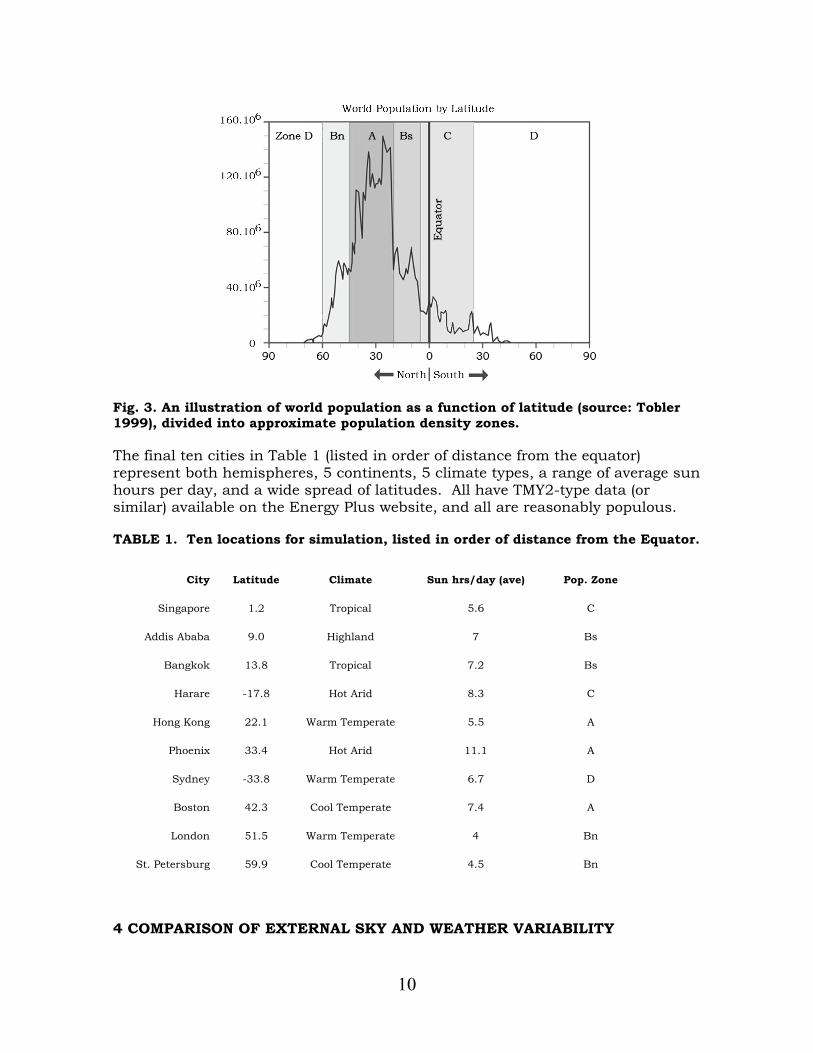
10
Fig. 3. An illustration of world population as a function of latitude (source: Tobler 1999), divided into approximate population density zones.
The final ten cities in Table 1 (listed in order of distance from the equator) represent both hemispheres, 5 continents, 5 climate types, a range of average sun hours per day, and a wide spread of latitudes. All have TMY2-type data (or similar) available on the Energy Plus website, and all are reasonably populous.
TABLE 1. Ten locations for simulation, listed in order of distance from the Equator.
City Latitude Climate Sun hrs/day (ave) Pop. Zone
Singapore 1.2 Tropical 5.6 C
Addis Ababa 9.0 Highland 7 Bs
Bangkok 13.8 Tropical 7.2 Bs
Harare -17.8 Hot Arid 8.3 C
Hong Kong 22.1 Warm Temperate 5.5 A
Phoenix 33.4 Hot Arid 11.1 A
Sydney -33.8 Warm Temperate 6.7 D
Boston 42.3 Cool Temperate 7.4 A
London 51.5 Warm Temperate 4 Bn
St. Petersburg 59.9 Cool Temperate 4.5 Bn
4 COMPARISON OF EXTERNAL SKY AND WEATHER VARIABILITY

11
4.1 VISUAL COMPARISON FOR EXTERIOR DATA
The first level of validation was performed with five unobstructed sensors under an open sky – one vertical sensor facing each cardinal direction and one horizontal sensor facing upwards. The purpose of comparing illuminance values taken with an unobstructed sky view is to validate the temporal data reduction and averaging method against the far more detailed Daysim data set from a weather representation standpoint, without adding an architectural variable. This validation model was given the nickname “cube” because the sensors were placed as if on the five exposed faces of a cube.
As shown in Figs. 2 and 4, the biggest visual difference between the reduced data temporal maps and Daysim temporal maps is the effect of averaging. The Daysim maps, which have a resolution of 5 minutes, can show minute changes in weather and the “scan-line” striations of back-to-back clear and cloudy days, the result of which is a busy, almost fuzzy, Temporal Map. The Daysim map can show the exact illuminance at each sensor point at any time of the day or year, but on the smoother averaged map, general trends through time are also revealed clearly - and without what could be perceived as noise.
However, the averaged maps also show high illuminance values that are less extreme than those in the Daysim maps, which is the logical effect of averaging illuminances over a certain period of time. Because this might become a critical oversimplification in some cases, especially in terms of pointing out high illuminance risks, it was concluded that an overlay with direct-sun data, described in section 6.2, was necessary.
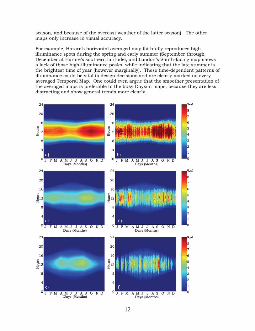
Unsurprisingly, the visual effects of averaging are more pronounced in maps of cities in which the weather is highly changeable – in other words, those cities which have a balanced number of clear and cloudy periods in quick succession with each other. Boston (Fig. 2, 4c, and 4d) is one such city, as are Hong Kong and Addis Ababa to an even greater degree. Harare (Fig. 4a and 4b) and Phoenix, two hot arid climates, tend towards more consistently sunny days, resulting for the most part in a higher visual correlation between the two maps. Likewise, although Sydney and Bangkok have average sun hours that are closer to Boston’s, the weather in those cities seems to change more slowly, causing less discrepancy between the two maps.
On the other extreme are cities such as London (Fig. 4e and 4f), St. Petersburg, and Singapore, which are largely overcast climates. The visual correlation between the temporally averaged and detailed Daysim maps for these cities is good, because the sunny “peaks” in the Daysim maps are so few and far between that their “smoothing out” becomes acceptable. The temporal maps shown in Fig. 2 and 4 are not the best visual correlations produced, but are typical of the cities with similar characteristics, as described above. In fact, the south-facing Boston map is one of the worst visual correlations produced by this method. Yet even in this map, it can be seen that the general illuminance level on the south face increases around midday during fall and spring, and decreases in the middle of summer and winter (presumably because of the steeper sun angles of the former
12
season, and because of the overcast weather of the latter season). The other maps only increase in visual accuracy.
For example, Harare’s horizontal averaged map faithfully reproduces high-illuminance spots during the spring and early summer (September through December at Harare’s southern latitude), and London’s South-facing map shows a lack of those high-illuminance peaks, while indicating that the late summer is the brightest time of year (however marginally). These time-dependent patterns of illuminance could be vital to design decisions and are clearly marked on every averaged Temporal Map. One could even argue that the smoother presentation of the averaged maps is preferable to the busy Daysim maps, because they are less distracting and show general trends more clearly.

13
Fig. 4. Temporal maps comparison for exterior conditions: averaged maps on the left, Daysim-produced maps on the right. (a, b) Harare horizontal sensor, (c, d) Boston vertical south-facing sensor (e, f) London vertical south-facing sensor. The saturation illuminance is 90,000 lux for all maps.
One analogy which can be drawn here is the practice of leaving nonessential and peripheral details out of a rendering or architectural model. For instance, a rendering in grey tones prevents clients from complaining about the color of the wallpaper when they’re supposed to be judging the building form. In the case of a Temporal Map, it is much more important for an architect to understand that there’s too much light at midday during the summer than to focus on the fact that it’s cloudy on March 17th in the afternoon during the theoretical “Typical Meteorological Year”.
The most prominent piece of information not captured in the temporally averaged maps is that of changeable weather and the greater averaging of those illuminance extremes, a discrepancy addressed by the direct sun penetration overlay described in section 6.2. For less changeable climates (like London and Harare), a few peaks or troughs may still be lost, but since they are not the norm, they probably should not have a great weight in design decisions, and may even serve to confuse matters.
4.2 PIXEL COMPARISON FOR EXTERNAL DATA
It was found that, in general, the averaged maps estimate illuminances that are lower than those produced by Daysim. For every orientation, the Mean Bias error for each of the 56 periods usually ranges from 0 to -25%, although the early morning and evening periods often produce much larger errors (both negative and positive). Daily extremes are indeed prone to higher relative errors because of the low illuminance values associated (even if absolute errors are small). In addition, although every attempt was made to ensure that the correct data was used regarding each range of solar time hours, there may still be some diurnal shifting of illuminances in both the averaged moments and the Daysim temporal maps. The reason for this is that TMY2 (as well as other weather data formats) tend to be in civil time rather than solar time, which means that each TMY2 data point will be off by a certain number of minutes depending on the time of year. As part of the averaging process, any solar data “hour” falling within each of the seven times of day contributes to the sky model parameters. This includes solar data “hours” which may only partially fall within the given daily period; in this case, they are given partial “credit” in the averaging (smaller weighing coefficient).
Differences between the ASRC-CIE and All Weather sky models may also be a source of some negative error. In a comparison study involving carefully recorded measurements and seven different sky models, Littlefair found that both the ASRC-CIE model (used in the data reduction scheme) and the Perez All-Weather sky model (used in Daysim) overestimated sky luminance in comparison with actual measurements, and that the All-Weather model overestimation was significantly greater in certain circumstances (Littlefair 1994). Specifically, the

14
All-Weather Mean Bias Error (MBE) was significantly higher than the ASRC-CIE MBE for low solar altitudes, as was the Root Mean Square Error (RMSE). Particular trouble spots for the All-Weather model were sky areas near the sun (at low sun altitudes) for cloudy and intermediate skies and sky areas opposite the sun (at any altitude) for intermediate and clear skies. For example, Littlefair’s paper found that compared to measured data from Garston, England (which is very close to London), the average MBE for all sky luminance near the sun at low solar altitudes was 24%, and for cloudy skies (which are prevalent in London winters) this error increased to 39% (Littlefair 1994). The corresponding MBE for ASRC-CIE model sky luminances was only 7% for cloudy skies and 8% for all skies. This makes the potential low sun angle error – attributed only to sky model difference – anywhere from 16% to 32%.
This may also explain why a south-facing façade in Boston produced a relatively bad comparison to Daysim. Boston being located at a relatively high latitude, it has lower sun angles in comparison with other cities, especially in the wintertime, which is were the temporal regions of poorest performance. This is also borne out by the MBE of St. Petersburg, the city located at the highest latitude, and – although not as obviously - by that of London, which has the second highest latitude.
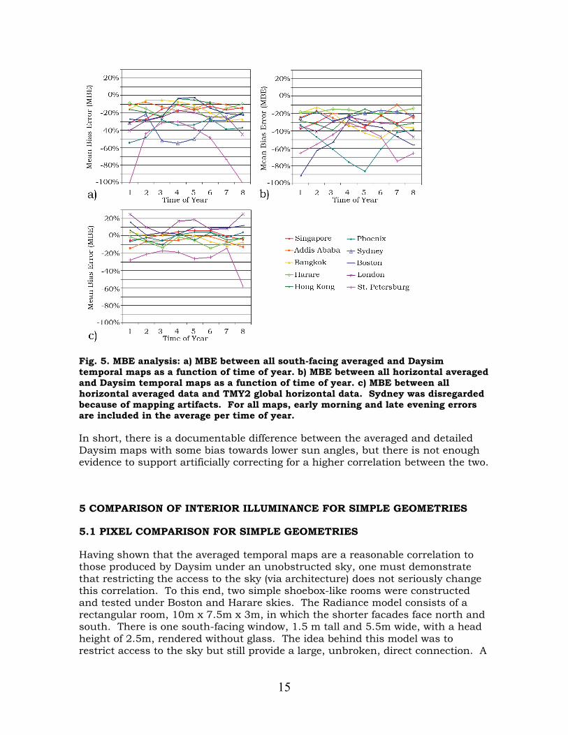
To assess the potential limitations of our averaging method to represent actual weather data, an error comparison was made between the horizontal unobstructed sensor data and the global horizontal illuminance data extracted directly from the TMY2 files. Qualitatively, the graphs created using the measured TMY2 data were typically good visual matches with the corresponding averaged maps and the Daysim-based temporal maps. A few of the graphs produced artefacts when contour mapped in MATLAB, the worst of these by far being Sydney; that city was therefore removed from the ensuing quantitative analysis. Figure 5 shows three different Mean Bias Error comparisons. The error for the seven daily periods was averaged for each of the 8 times of year (including early morning and late evening outliers) and graphed for all ten cities. This chart color codes each city by distance to the equator. While the majority of temporal periods had an MBE between 0% and negative 25% when compared with the Daysim graphs, the MBE for the TMY2 data comparisons turned out to be both positive and negative, and generally stayed within ±25%. This finding is significant, because a couple sources of potential negative error, such as the act of using discrete points to average a generally convex daily brightness curve, had been suggested. Although the TMY2 MBE is biased slightly negative, the existence of positive error, or averaging overestimation, in this situation suggests that this type of error either does not exist or that it is insignificant.
15
Fig. 5. MBE analysis: a) MBE between all south-facing averaged and Daysim temporal maps as a function of time of year. b) MBE between all horizontal averaged and Daysim temporal maps as a function of time of year. c) MBE between all horizontal averaged data and TMY2 global horizontal data. Sydney was disregarded because of mapping artifacts. For all maps, early morning and late evening errors are included in the average per time of year.
In short, there is a documentable difference between the averaged and detailed Daysim maps with some bias towards lower sun angles, but there is not enough evidence to support artificially correcting for a higher correlation between the two.
5 COMPARISON OF INTERIOR ILLUMINANCE FOR SIMPLE GEOMETRIES
5.1 PIXEL COMPARISON FOR SIMPLE GEOMETRIES
Having shown that the averaged temporal maps are a reasonable correlation to those produced by Daysim under an unobstructed sky, one must demonstrate that restricting the access to the sky (via architecture) does not seriously change this correlation. To this end, two simple shoebox-like rooms were constructed and tested under Boston and Harare skies. The Radiance model consists of a rectangular room, 10m x 7.5m x 3m, in which the shorter facades face north and south. There is one south-facing window, 1.5 m tall and 5.5m wide, with a head height of 2.5m, rendered without glass. The idea behind this model was to restrict access to the sky but still provide a large, unbroken, direct connection. A

16
modified version of the shoebox model was also tested in the Boston environment: a diffuse light shelf was added to the south window of the Boston shoebox model as well as strip window on the north wall a third the area of it’s opposite (flush with the ceiling with a height of 0.5m). All shoebox models were rendered with a 3x4 grid of 12 horizontal sensor points at the height of one meter to simulate a work plane. Points numbered 1, 2, and 3 are closest to the south window, and points 10, 11, and 12 are furthest north. temporal maps and pixel analyses, similar to those done for the outdoor “cube” model, were applied to the shoebox model.
Figure 6 shows that the nature of the period-based MBE in the Boston shoebox model is similar to the error for an unobstructed view of the sky. In other words, the large vertical south window in the shoebox room gives a similar view of the sky as would be seen by the south-facing vertical sensor in the cube model, and so the error patterns are also the same – there is a larger difference between averaged and detailed Daysim maps for the lower sun angles in Boston’s winter and less error in summer, and this is somewhat true of Harare also, although the sun is on the north side of the building in that case, and the error curve is flatter throughout the year. There is one anomalous curve for the normal shoebox model in Boston, which falls between -50% and -70%, the peak of which is barely visible on the graph in Fig. 6b.
One interesting observation to make is that the error between averaged and detailed maps is generally a good 10% less for the shoebox model than for the unobstructed sensors, and some points tend slightly positive rather than negative. It is encouraging that this simplification method moves even closer to the Daysim Temporal Map’s performance when one adds architecture into the model, especially since much of the validation done for Daysim was done using interior sensor points (Reinhart and Walkenhorst 2001). The systematic underestimation as a function of solar altitude, which was discussed in section 4.2, can clearly be seen still, but most of the MBE curves have shifted closer to zero.

17
Fig. 6. Shoebox model MBE between averaged and Daysim maps as a function of time of year for (a) Boston, and (b) Harare. The thick lines represent the MBE for the south-facing vertical cube model sensors, included for the sake of comparison.
5.2 VISUAL COMPARISON FOR SIMPLE GEOMETRIES
Just as the pixel analysis correlates to the “cube” model sensor which sees the same swath of sky, many of the visual correlations and discrepancies are also carried over from the open sky to the large-windowed box. The south-facing cube sensor for Boston (Fig. 4c and 4d), being vertical, facing the sun, and at higher latitude, was susceptible to a high MBE between the ASRC-CIE and All-Weather sky models, and this was very visually perceptible in the winter moments. Likewise, the lower winter illuminance occurs also in the Boston shoebox model,
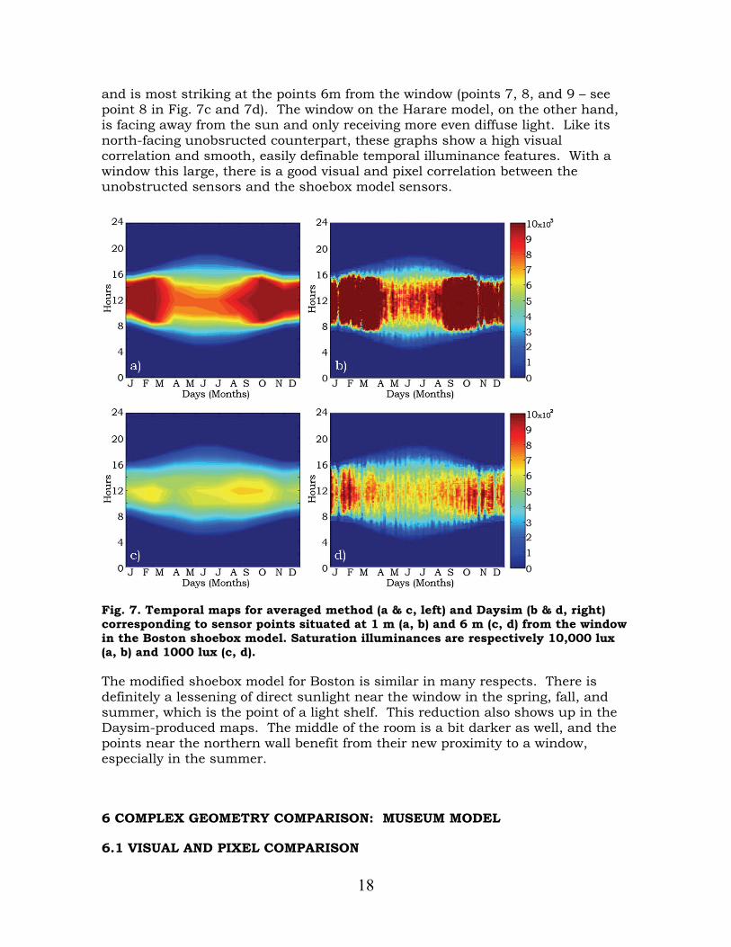
18
and is most striking at the points 6m from the window (points 7, 8, and 9 – see point 8 in Fig. 7c and 7d). The window on the Harare model, on the other hand, is facing away from the sun and only receiving more even diffuse light. Like its north-facing unobsructed counterpart, these graphs show a high visual correlation and smooth, easily definable temporal illuminance features. With a window this large, there is a good visual and pixel correlation between the unobstructed sensors and the shoebox model sensors.
Fig. 7. Temporal maps for averaged method (a & c, left) and Daysim (b & d, right) corresponding to sensor points situated at 1 m (a, b) and 6 m (c, d) from the window in the Boston shoebox model. Saturation illuminances are respectively 10,000 lux (a, b) and 1000 lux (c, d).
The modified shoebox model for Boston is similar in many respects. There is definitely a lessening of direct sunlight near the window in the spring, fall, and summer, which is the point of a light shelf. This reduction also shows up in the Daysim-produced maps. The middle of the room is a bit darker as well, and the points near the northern wall benefit from their new proximity to a window, especially in the summer.
6 COMPLEX GEOMETRY COMPARISON: MUSEUM MODEL
6.1 VISUAL AND PIXEL COMPARISON

19
The third validation case was based on a four-room museum (Figure 8a). Designed by an architecture student at MIT, it is a building of much higher complexity than the shoe box model and includes features such as louvers, small windows, divided skylights, and lattices. The walls are around 70-75% reflective (diffuse), and the ceiling and skylight wells are about 80% reflective. The object of this case study was to see if the complex geometry changed the level of visual correlation between the temporally averaged and detailed Daysim maps. Figure 8 shows an exterior (8a) and two interior shots (8b and c) of the museum model.
Fig. 8. Museum design in Boston. a) Exterior rendering with cardinal directions indicated. b) Interior rendering of the Northeast room in which the dotted outline on the wall indicates a vertical area of interest. c) Interior rendering of the Southwest room in which a horizontal area of interest is represented as a floating panel with a dotted outline.
Two areas of interest were chosen in the museum: a horizontal area in the center of the southwest room at table height (1m), outlined in Fig. 8c and represented by 9 sensor points spaced 1.5m apart, and a vertical area along the north and east walls in the northeast room, outlined in Fig. 8b and represented by ten sensor points (four on one wall and six on the other, at heights 0.65m and 2.5 m). Temporally averaged maps and Daysim-based maps were then produced for each sensor point in each area under Boston skies, resulting in 19 x 2 maps to compare.
The first important observation one could make was that for general illuminance levels, the same high level of visual correlation could be observed between the temporally averaged and detailed Daysim maps, which was a satisfying result considering the complexity of the building model. One big difference, however, was that there were also small stripes or patches of direct sunlight moving around the rooms which were only intermittently captured using the 56 moments method. This was due to the fact that most of the sensor points never see the sky directly, or if they do, it is as tiny patches scattered over the hemisphere. To make matters more complex, the reference maps were produced by Daysim, another program which limits the number of sun angles it simulates (see Fig. 1b). According to the Daysim tutorial, the program only simulates 60-65 independent sun angles (over 100 per year), and extrapolates the sun’s contribution at all other moments from the nearest 3 or 4 sun positions rendered (Reinhart 2005). Quick shadow casting techniques keep track of those points which catch direct sunlight when the surrounding measured sun contributions do not, but the result of this occurrence is a zero illuminance error from Daysim. Basically,
a) b) c)

20
Daysim simulates just over twice the number of sun angles that the averaging method simulates and does a shadow casting check on the rest of the points. This results in Daysim catching far more direct sun spots, but neither approach is completely immune to error in complex geometric situations.
6.2 HIGHER FREQUENCY DIRECT SUN OVERLAY
In a recent paper by Bourgeois, Reinhart, and Ward (Bourgeois et al 2008), a new format for dynamic daylighting simulation (DDS) was proposed that calculates 2305 direct daylight coefficients per sensor point, which is the number of non-zenithal Tregenza sky patches (Tregenza 1987) multiplied by a factor of 16. While DDS accounts for the full sky dome rather than just the annual sun path lines, their research indicates the need for much higher frequency direct sun contribution than is accounted for by dividing the year into 56 moments.
Based on these findings, it was deemed necessary to include an additional zero-bounce sun penetration data set to the proposed 56 moments method, calculated at 15 times per day and 80 times per year, or 1200 moments and 600 separate sun angles. This dataset is calculated by doing illuminance calculations in Radiance similar to those done for the 56 annual periods, using the ASRC-CIE sky model and the TMY2 weather data, but at a much greater number of sun angles and discarding interior reflections. The result is that with this fast calculation, the sensor will only record the direct sky component of the illuminance. Whenever it still exceeds the illuminance level of the original map, i.e. whenever the direct sky component is by far the dominant one, the new illuminance value should be considered in lieu of the original one because it better reflects the risk of direct sun penetration. These additional datasets are thus overlaid onto the general illuminance temporal maps for all the moments where they exceed the original illuminance values.
The number 1200 was considered sufficient in comparison with the DDS scheme, since these sun angle test points are all concentrated within the actual angles of a location’s specific sun path, rather than over the full sky dome as in DDS. The decision to limit the daily divisions to 15 stems from the fact that for most climates there are not many days which exceed 15 hours, and the TMY2 climate data available has a resolution of only one hour per day.
Figure 9 shows two examples of general illuminance temporal maps overlaid with direct-sun data. The “shoebox” model graph in Fig. 9a is an example of an overlay which does not greatly change the general illuminance temporal map. This is because the large connection to the sky afforded by the shoebox window causes large, consistent, and long-lasting sun spots. On the other hand, the “museum” model graph in Fig. 9b illustrates a situation in which there are many small sun patches flitting around the room. In this extreme case, the general illuminance temporal map did not catch any of these points of direct sunlight, whereas the higher-frequency direct-sun checks did. Weather was taken into account in both cases of finding direct sun spots by weighing and averaging bi coefficients as discussed in section 2.2. Although ignoring internal reflections

21
will result in a slight underestimation of illuminance values, this process is only meant to pinpoint moments in which direct sun may be an issue; the general illuminance is still calculated by the 56 periods averaging method.
The combination of the simplified annual performance analysis with this detailed direct sun penetration check still allows a designer to grasp, at a glance, how lighting conditions will vary over time for that particular location’s climate. But it also allows him to point out when there will probably be comfort and performance issues due to direct sunlight. With 1200 yearly direct solar point calculated (600 unique sun positions), the overlay effectively corrects for the largest weakness in the 56 periods averaging method alone. The added solar penetration calculation has a resolution of ten times the public distribution of Daysim (Reinhart 2005) and is similar to the more recent DDS format (Bourgeois et al 2008).
Fig. 9. Direct sun overlay examples for a horizontal sensor point in a) the "shoebox" model and b) the museum model. Saturation illuminance for a) is 10,000 lux (sensor is next to the window), and for b) is 5,000 lux.
6.3 SINGLE GRAPH ILLUMINANCE DATA: PROPOSAL FOR AN AREA-BASED ILLUMINANCE METRIC
In analyzing both the shoebox and museum models, it became obvious that with so many sensor points, the number of temporal maps produced was becoming unwieldy. A method of compiling and displaying all data for a single area of interest was thus developed, resulting in graphs displaying not illuminance, but an area-based illuminance metric which corresponds to the percent of area within a targeted illuminance range. Reversing Daysim’s approach (using Daylight Autonomy to display the percent of time which each point of an area has reached the desired illuminance), the current illuminance metric displays the percent of the area which is within the desired illuminance range, and how it changes over time.
Similarly to DA calculations, a grid of sensor points over the area is considered, and illuminance values calculated over the year at their respective locations. Full credit (100%) is then given to any point within the illuminance range desired (that may have both an upper and a lower limits or only one of the two); in addition, a

22
buffer zone adjacent to these limits can be defined, inside which partial credit will be given. Partial credit decreases linearly from 100% at the limit value to 0% at the buffer zone boundaries. This method of condensing all data to one temporal map will be utilized in section 7.
7 TEMPORAL MAPS IN THE DESIGN PROCESS: CLASSROOM CASE STUDY
This section will follow three iterations of a classroom design. It will show how temporal maps analysis can illustrate the weaknesses in a particular daylighting design and ensure that the final version meets the user’s design goals.
For this simple example, located in Sydney, Australia, we assumed no major obstructions to the sky dome. The original classroom design was given the same dimensions as the shoebox model in section 5, and the same spread of work plane illuminance sensors were defined: 12 horizontal sensors, 1m from the floor, arranged in 4 rows of 3 where sensors 1, 2, and 3 are closest to the south wall. The wall reflectance value was 65%, the ceiling’s 83%, the floor’s 20%, and all surfaces were assumed perfectly diffuse. A large chalkboard was added on the east wall with a reflectance of 5%. The general window region was the same size, except that it was divided into two smaller punch windows, glazed with double-pane clear glass (80% visible transmission) and facing north, the sunny side in Australia.
The performance goal for this classroom was to create conditions that were generally bright enough during the school day (7 am through 4 pm solar time) and academic year (February through November) to illuminate the work plane using daylight alone but to avoid really bright patches as well. A desired illuminance of 400 to 1500 lux was chosen accordingly, with a buffer zone extending down to 200 lux and up to 2000 lux. At every design iteration, three temporal maps were created: one displayed the percent of the work plane within the desired illuminance range, one map displayed the percent of the work plane that was too bright, and the third indicated how much of the work plane was too dark. Note that when integrated into these condensed illuminance graphs, the high-frequency direct sun calculations discussed in section 6.2 will contribute weight to the “percent too high” graphs and detract from the other two.
Figure 10a shows an interior rendering (produced with Radiance) of the North and South façades at 8:18am solar time (the second of seven daily moments) on February 27th (the second of eight yearly moments) for the first design iteration (it also includes a small exterior rendering of the North façade, superimposed in the bottom left corner). This initial design consisted of a north-facing unilateral punch window room with a flat roof. Figure 10b shows its performance over the year. One can immediately observe that, during the later winter, upwards of 60%-75% of the work plane is in the correct illuminance range, while in the spring, fall and summer, only about 40% of the work plane is meeting the illuminance criteria. A glance at the “too high” and “too low” temporal maps (not included here) also revealed that about 20%-30% of the work plane is always too bright,

23
and the dark portion expands up to 50% of the area on spring, fall, and summer around 7-8am or 3-4pm (solar time).
This distribution of illuminance is not unusual for a unilateral side-lighting situation. The bright part would represent the area next to the windows, while the dark part depends on the time of year because solar altitude changes with the seasons. The low sun angles of midwinter achieved the furthest light penetration and thus the largest area of work plane in range.
Fig. 10. Area -based “percent in range” temporal maps over the entire year and composite renderings corresponding to 8:18am solar time on February 27 (indicated by a cross on the maps) for the three design iterations of the classroom model. Design iteration 1 is shown in a) and b), design 2 in c) and d), and design 3 in e) and f). The desired illuminance range was 400 to 1500 lux (with a buffer zone down to 200 and up to 2000 lux).
Even if none of the above analysis was obvious to the designer, the temporal maps do easily show that the performance is better in the winter (more orange and yellow, less blue), but that the daylight is always insufficient to switch off the electric lights. In addition, the high and low maps (not shown here) and the associated renderings indicated that there are problems with both brightness and darkness at once throughout nearly the full year. Therefore, two windows, similar to those on the north wall, were added to the south wall, and the resulting model was the second design iteration, shown in Fig. 10c for the same date and time as the previous iteration.
Figure 10d shows that while 7-8am and 3-4pm are very highly in range all year long, only about 50% of the work plane is in range between those times. The additional high and low temporal maps indicated that practically all work plane space that is not in range was too bright rather than too dark. Therefore, design iteration 2 eliminates the dark space problem, but creates additional problems with too much light. It especially decreases the performance in the wintertime.
The next iteration of design addresses this by reducing the amount of light without creating dark patches in the room. To this end, both south and north windows are reduced in size, while an overhang and an exterior light shelf are

24
added to the north window (Fig. 10e). This strategy effectively eliminates all direct sun penetration during warmer months while allowing low-angled winter light to reflect off the light shelf and into the space. The north wall is also made 4m tall and the north facing windows are moved higher on the wall.
As illustrated decisively in Fig. 10f, this last design iteration keeps the work plane 80% – 100% in range during occupancy hours during the course of the full year with only a slight seasonal bias. The temporal maps analyses made this conclusion possible in a relatively small number of design iterations by pinpointing the problem areas as a function of time. This mock design process thus convincingly illustrates how this graphical representation can be effectively condensed to convey a large amount of data and allow quick progress in design iterations, and how it can be both design goals specific and easily accessible to non-experts. A preliminary interview exercise amongst architecture students led to similar conclusions and to very enthusiastic reactions about the potential of this type of visualization to help addressing design issues in a more comprehensive way (Yi 2008). Based on these promising results, the authors intend to expand this preliminary survey to a more thorough user study in the near future.
8 DISCUSSION AND FUTURE WORK
The comparison models presented in sections 4, 5, and 6 indicate a strong visual and numerical correlation between temporal maps produced using the 56 annual periods method and those produced using detailed illuminance data extracted from the program Daysim. The result of averaging the illuminance over each area on the Temporal Map is that small details and the sense of immediate weather changeability are lost, while the changeability of performance on an annual scale is retained, and even made clearer. Furthermore, the overlay of high-frequency direct solar data compensates for the inability of a small number of annual periods (and thus a small sampling of possible sun angles) to capture the highly dynamic nature of direct solar irradiance.
Beyond illuminance, the authors hope to apply glare probability metrics and solar heat gain indicators to the temporal maps format. Similar methods of representing the annual performance of these metrics will be researched and will hopefully add to the future capabilities of a daylighting design tool.
9 CONCLUSION
Climate-based, time-variable data are very valuable to the design process because they are able to reveal the nature of the environmental conditions in which a design performs well or poorly, to make visual comfort predictions, and because they encourage the designer to address the most important issues in daylighting with an annual perspective, such as building orientation, position and size of openings, and shading strategies. It is critical for an architect to have such data
25
in hand early in the design process, before the overarching design strategies have been solidified. Ultimately, it will also be critical for an architect to connect such numerical data to visualizations of a space so as to reconcile performance criteria with aesthetic considerations (Andersen et al 2008).
While some of the components of this data processing and display methodology have been in existence for years, it is their unique combination that holds great promise in the capacity of helping architects to make design decisions. The application of the ASRC-CIE sky model allows one to calculate illuminances under a few discrete, realistic skies which nonetheless represent many unique annual conditions. This makes it invaluable to the calculation and reduction of massive amounts of annual data, which can then be displayed in an intuitive form on temporal maps. The ability to see – in one glance – the variation in annual performance of a building design via temporal maps adds an extra and important dimension to the design process. With this information, one could modify a design according to seasonal or daily trends without drowning in data noise, and without having to rely on single renderings representing only a few somewhat arbitrary moments during the year. Reducing the annual data points to 56 and using the ASRC-CIE sky model enables interactive design support for the architect and opens up the possibility attaching spatial data through a series of renderings linked to various points on the Temporal Map. This pre-processing of annual data and its linking to both temporal maps and spatial renderings, an approach designed for a program named Lightsolve, is what the authors see as the next development phase of a research effort meant to help architects make the correct daylighting design decisions early in the process. Lightsolve, a work in progress, will also incorporate interactive rendering optimization capabilities (Cutler et al 2008) and is described in further detail in another paper (Andersen et al 2008).
ACKNOWLEDGEMENTS
Siân Kleindienst and Dr. Marilyne Andersen were supported by the Massachusetts Institute of Technology, and were provided additional support from the Boston Society of Architects (BSA) over the summer of 2007. Dr. Magali Bodart was supported by the Belgian National Scientific Research Foundation for her contribution. The authors wish to thank Lu Yi for sharing her museum design and Dr Barbara Cutler for her continued involvement in the Lightsolve project.
REFERENCES
Andersen M, Kleindienst S, Yi L, Lee J, Bodart M, Cutler B. 2008. An intuitive daylighting performance analysis and optimization approach. Build Res and Inf. In press.

26
[AEC] Architectural Energy Corporation. 2006. Daylighting metric development using daylight autonomy calculations in the Sensor Placement Optimization Tool: developmental report and case studies. Prepared for CHPS daylighting committee, March 17.
BBC World Weather city guides. 2007. <http://www.bbc.co.uk/weather/world/city_guides/> Accessed 2007 Dec.
Bourgeois D, Reinhart CF, Ward G. 2008. A standard daylight coefficient model for dynamic daylighting simulations. Build Res Inf. 36(1): 68-82.
Bund S, Do EYL. 2005. SPOT! Fetch Light Interactive navigable 3D visualization of direct sunlight. Autom Construct. 14(2): 181-188.
Chaiwiwatworakul P, Chirarattananon S. 2004.Evaluation of sky luminance and radiance models using data of north Bangkok. Leukos. 1(2): 107-126.
[CIE] Commission Internationale de l’Éclairage. 1994. Spatial distribution of daylight – luminance distributions of various reference skies. Vienna (Austria). CIE. Publication No 110-1994. 30p.
Cutler B, Sheng Y, Martin S, Glaser D, Andersen M. 2008. Interactive selection of optimal fenestration materials for schematic architectural daylighting design. Autom Construct. 17(7): 809-823.
Glaser D, Feng O, Voung J, Xiao L. 2004. Towards an algebra for lighting simulation. Build Env. 39(8): 895-903.
Herkel, S. 1997. Dynamic link of light and thermal simulation: on the way to integrated planning tools. Proceedings of 5th IBPSA conf. Prague (Czech Rep), Sept 8–10. 307–312.
Houghton Mifflin Company. World Climate. An outline map of world climates. <http://www.eduplace.com/ss/maps/pdf/world_clim.pdf > Accessed 2007 Dec.
Igawa N, Nakamura H. 2001. All sky model as a standard sky for the simulation of daylit environment. Build Env. 36(6): 763–770.
Igawa N, Koga Y, Matsuzawa T, Nakamura H. 2004. Models of sky radiance distribution and sky luminance distribution. Solar Energy. 77(2): 137-157.
Littlefair PJ. 1992. Daylight coefficients for practical computation of internal illuminance. Lighting Res Tech. 24(3): 127-135.
Littlefair, PJ. 1994. A comparison of sky luminance models with measured data from Garston, United Kingdom. Solar Energy. 53(4): 315-322.
Mardaljevic J. 1995. Validation of a lighting simulation program under real sky conditions. Lighting Res Tech. 27: 181-188.
Mardaljevic J. 2003. Precision modeling of parametrically defined solar shading systems: pseudo-changi. Proceedings of 8th IBPSA conf. Eindhoven (Netherlands), Aug 11-14. 823-830.

27
Mardaljevic J. 2004. Spatio-temporal dynamics of solar shading for a parametrically defined roof system. Energy Build. 36(8): 815-823.
Mardaljevic J, Nabil A. 2006. The Useful Daylight Illuminance paradigm: A replacement for daylight factors. Energy Build. 38(7): 905-913.
Marion W, Urban K. 1995. User’s manual for TMY2s: typical meteorological years. Published by NREL for the US DOE. June 1995: 1-49.
Marsh A. 2008. Ecotect: thermal analysis. Web help maintained by Square One research Ltd; <http://squ1.com/ecotect/features/thermal> Accessed 2007 Dec.
Nabil A, Mardaljevic J. 2005. Useful daylight illuminace: a new paradigm for assessing daylight in buildings. Lighting Res Tech. 37(1): 41-57.
Perez R, Ineichen P, Seals R, Michalsky J, Stewart R. 1990. Modelling daylight availability and irradiance components from direct and global irradiance. Solar Energy. 44(5): 271-289.
Perez R, Michalsky J, Seals R. 1992. Modelling Sky Luminance Angular distribution for real sky conditions; experimental evaluation of existing algorithms. J Illum Eng Soc. 21(2): 84-92.
Perez R, Seals R, Michalsky J. 1993. All weather model for sky luminance distribution – preliminary configuration and validation. Solar Energy. 50 (3): 235-245.
Reinhart CF, Herkel S. 2000. The simulation of annual daylight illuminance distributions – a state-of-the-art comparison of six Radiance-based methods. Energy Build. 32(2): 167-187.
Reinhart CF, Walkenhorst O. 2001. Validation of dynamic Radiance-based daylight simulations for a test office with external blinds. Energy Build. 33(7): 683-697.
Reinhart CF. 2005. Tutorial on the use of Daysim/Radiance simulations for sustainable design. Ottawa (Canada): NRC. 111p.
Reinhart CF, Mardaljevic J, Rogers Z. 2006. Dynamic daylight performance metrics for sustainable building design. Leukos. 3(1): 7-31.
Reinhart CF, Bourgeois D, Dubrous F, Laouadi A, Lopez P, Stelesku O. 2007. Daylight1-2-3 – a state-of-the-art daylighting/energy analysis software for initial design investigations. Proceedings of 10th IBPSA conf. Beijing (China), Sept 3-6.
Tobler W. 1999. World population by latitude. Slide in Unusual Map Projections slideshow. UC Santa Barbara. Used with permission, stylistically reformatted. <http://www.ncgia.ucsb.edu/projects/tobler/Projections/sld075.htm> Accessed 2007 Dec.
Tregenza PR, Waters IM. 1983. Daylight coefficients. Lighting Res Tech.15(2): 65-71.
Tregenza PR. 1987. Subdivision of the sky hemisphere for luminance measurements. Lighting Res Tech. 19: 13-14.

28
University of Oregon. 2007. Solar Radiation Monitoring Laboratory. Sun path chart program: <http://solardat.uoregon.edu/SunChartProgram.html> Accessed 2007 Dec.
Ward G, Shakespeare R. 2004. Rendering with Radiance. Revised ed. Davis, CA: Space & Light. 690p.
Yi L. 2008. A New Approach in Data Visualization to Integrate Time and Space Variability of Daylighting in the Design Process. SMArchS thesis, Department of Architecture, Massachusetts Institute of Technology.