graphic standards manual - policies.tbr.edu style guide.pdf · graphic standards manual....
TRANSCRIPT
Graphic Standards Manual
1Introduction
TABLE OF CONTENTS
1 Introduction
4 Brand in Words
7 Logo Usage
12 Color Palette
13 Typography
14 Photography Style
15 Brand Usage
21 Templates
25 Exceptions
26 FAQs
29 Resources
WHY DO WE NEED A BRAND FOR TENNESSEE’S COMMUNITY COLLEGES?
That’s a good question. Each of the 13 Tennessee community colleges already has a strong brand that is well recognized within its service area. So why do we need a brand for the community college system?
It’s important to note that the system brand does not replace the brands of the individual community colleges. Rather, it promotes the advantages of attending a community college in Tennessee, reflecting the common strengths of all 13 schools. It also strengthens the emotional connection between the people of Tennessee and 13 quality, affordable institutions that can help them achieve their goals and aspirations.
The result: A strong brand for the Tennessee’s Community Colleges system and stronger brand awareness for the individual schools.
2Introduction
THE TENNESSEE’S COMMUNITY COLLEGES BRAND: AN OVERVIEW
The goal of the Tennessee’s Community Colleges brand is to help unlock the full potential of all its institutions and increase the number of Tennesseans who hold post-secondary degrees or certificates. It does not replace the individual brands of the community colleges. Instead, it is an “umbrella brand” that reflects the common strengths of these institutions.
Brand communications, including a dedicated website, will answer common questions regarding the quality of a community college education, the transferability of credits, campus life and more. By emphasizing strengths, sharing information and addressing misconceptions, the goal of the brand is to encourage more Tennesseans to consider a community college education and drive greater interest in the 13 individual schools.
3Introduction
WHY DO WE NEED A STYLE GUIDE?
Good branding is about consistency. It’s easier for people to understand, recognize and embrace a brand when it looks, sounds and feels the same way, no matter how or where it is encountered.
That’s why we created this style guide. It will help everyone associated with the Tennessee’s Community Colleges brand present it consistently through the logo, words, colors, imagery, font usage and more.
We also hope that by providing you with clear, simple guidelines for using the brand, it will help eliminate confusion and make your job easier.
If you have questions about the branding guidelines, please contact Monica Greppin-Watts, Communications Director, Tennessee Board of Regents, 615-366-4417, [email protected]
4The Brand in Words
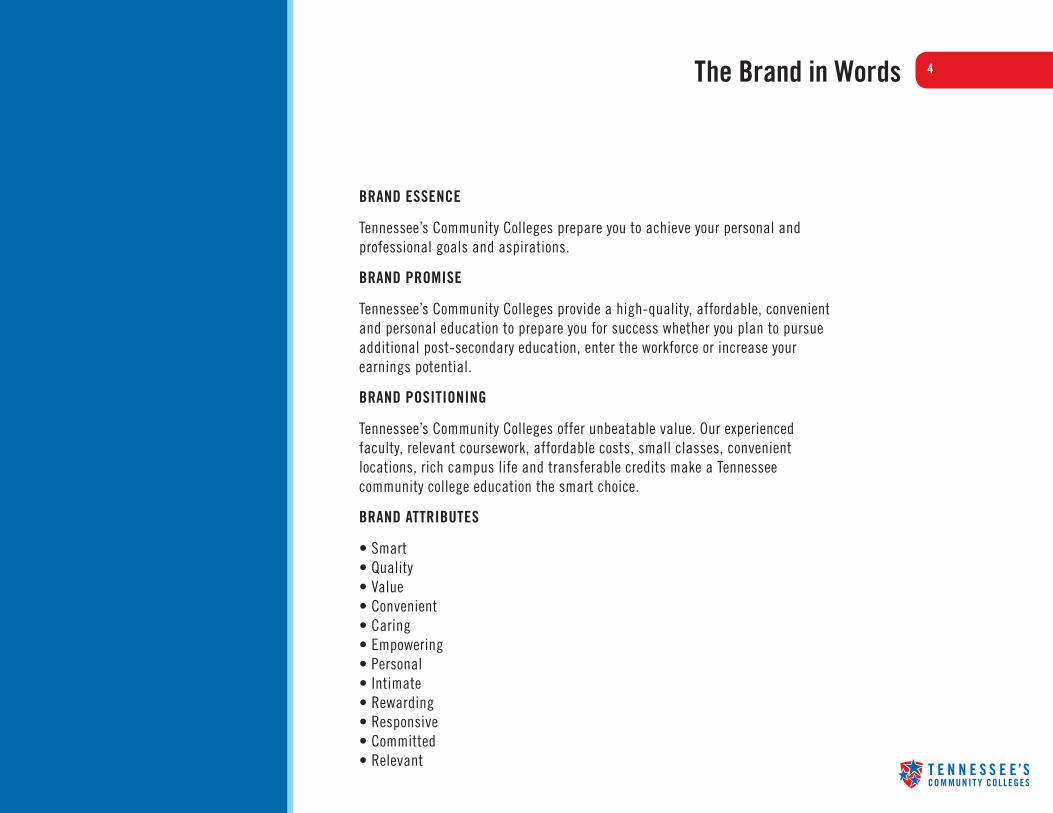
BRAND ESSENCE
Tennessee’s Community Colleges prepare you to achieve your personal and professional goals and aspirations.
BRAND PROMISE
Tennessee’s Community Colleges provide a high-quality, affordable, convenient and personal education to prepare you for success whether you plan to pursue additional post-secondary education, enter the workforce or increase your earnings potential.
BRAND POSITIONING
Tennessee’s Community Colleges offer unbeatable value. Our experienced faculty, relevant coursework, affordable costs, small classes, convenient locations, rich campus life and transferable credits make a Tennessee community college education the smart choice.
BRAND ATTRIBUTES
• Smart • Quality • Value • Convenient • Caring • Empowering • Personal • Intimate • Rewarding • Responsive • Committed • Relevant

5The Brand in Words (Cont’d)
TONE
• Smart and confident • Engaging and personal
KEY MESSAGES
General
• We create opportunity. Our diverse campuses and course offerings create college opportunity for all Tennesseans regardless of age or income.
• We offer a high-quality education. We have the same accreditation as four-year schools, instructors with advanced degrees and practical experience in their fields, and state-of-the-art classroom technologies.
• We are affordable. With our low costs and opportunities for financial assistance and scholarships, we offer incredible value compared to four-year universities and for-profit schools.
• We are personal. Our students receive personal attention and one-on-one assistance from caring, quality faculty, forging lifelong friendships with instructors and other students.
• We are convenient. Our locations are close to home and our flexible class and online offerings allow you to balance school, work and family schedules.

6The Brand in Words (Cont’d)
KEY MESSAGES (CONT’D)
Student-Focused Messages
• Our credits are transferrable. Our accreditation and the clear-cut paths of Tennessee Transfer Pathways help ensure the credits of your community college degree will transfer to four-year schools.
• We get your career off to a strong start. A degree or certificate from one of Tennessee’s Community Colleges prepares you to continue your college education at a four-year school and readies you for the workplace in two years or less.
• We offer a rich campus life. Our diversity, attractive campuses, student clubs and activities, honors programs, athletics and international studies programs deliver a rich and fulfilling college experience.
• We prepare you well for employment. Our relevant coursework, hands-on training and state-of-the-art technologies ensure you have the skills and knowledge to succeed in the workplace, and we have a proven record of job placement success.
• We boost your earnings potential. Our degrees and certificates position you to advance your career and improve your quality of life.
• We can help you get a fresh start. Our degree and certificate programs provide you with a quality education to prepare you for a new career in two years or less.
7Logo
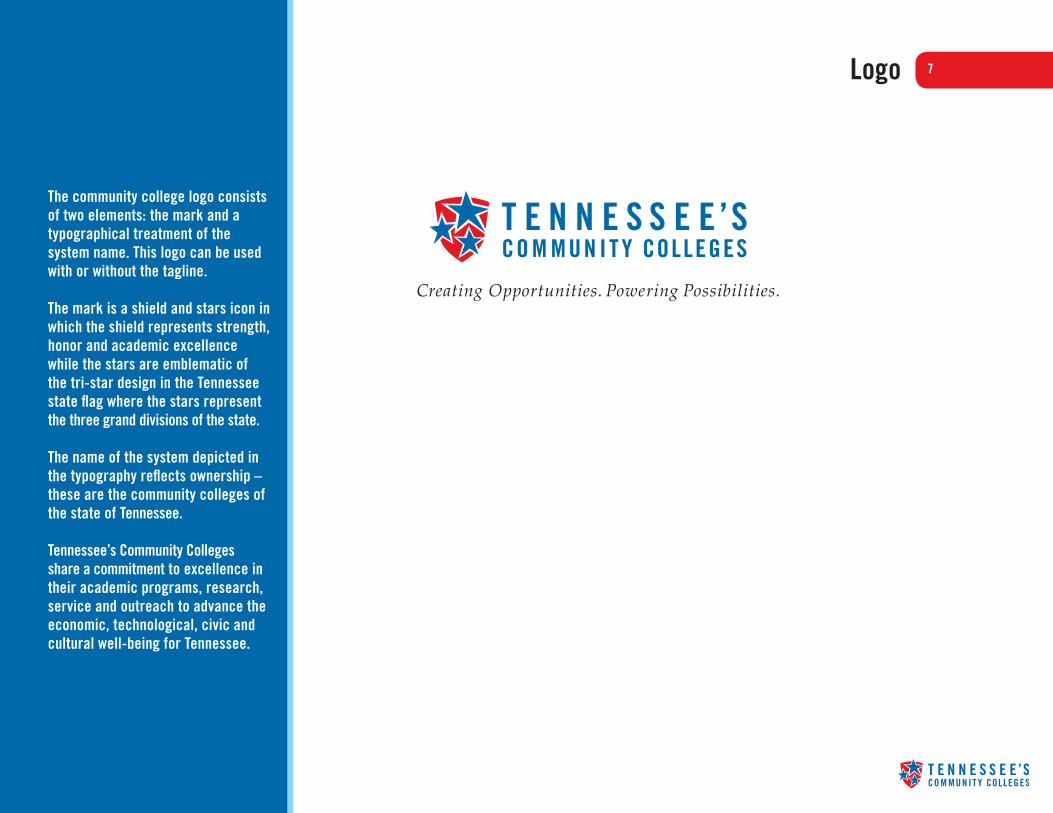
The community college logo consists of two elements: the mark and a typographical treatment of the system name. This logo can be used with or without the tagline.
The mark is a shield and stars icon in which the shield represents strength, honor and academic excellence while the stars are emblematic of the tri-star design in the Tennessee state flag where the stars represent the three grand divisions of the state.
The name of the system depicted in the typography reflects ownership – these are the community colleges of the state of Tennessee.
Tennessee’s Community Colleges share a commitment to excellence in their academic programs, research, service and outreach to advance the economic, technological, civic and cultural well-being for Tennessee.
8Logo Usage
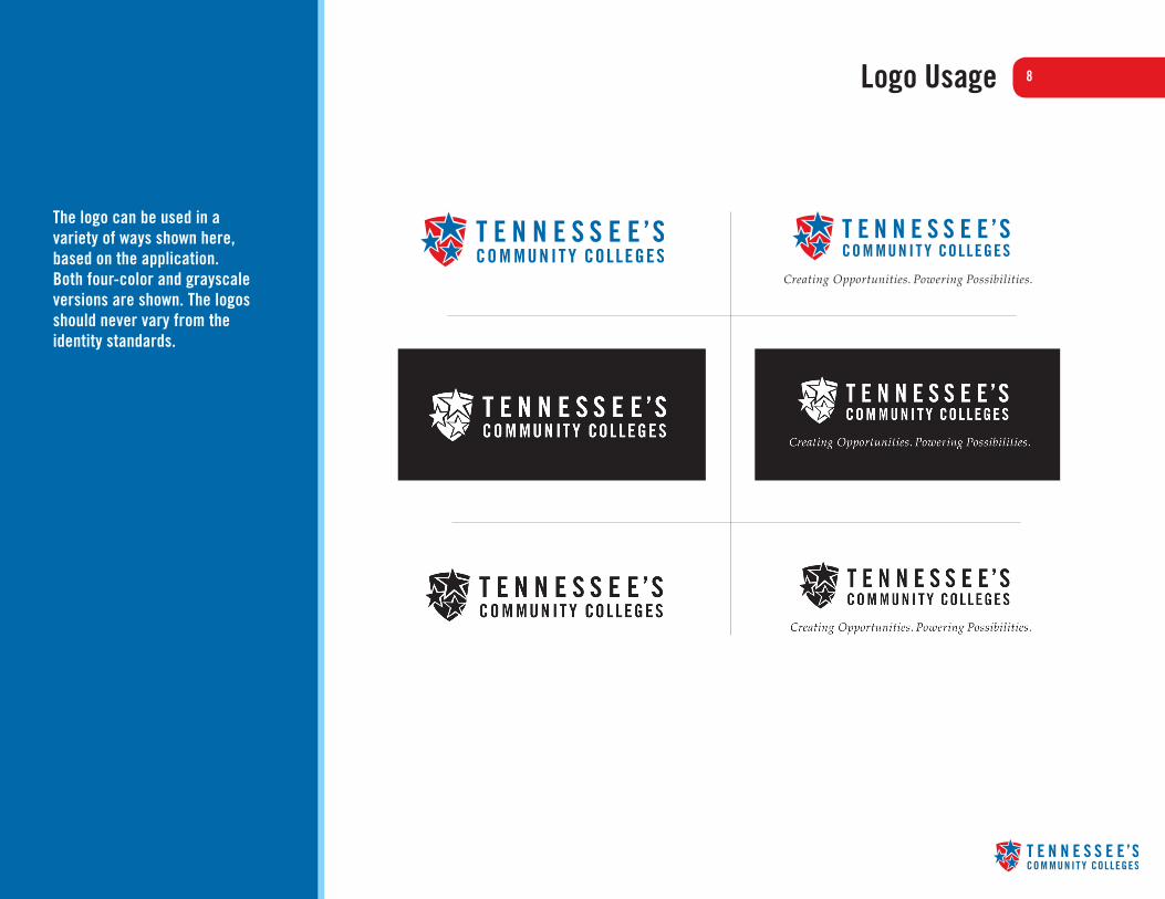
The logo can be used in a variety of ways shown here, based on the application. Both four-color and grayscale versions are shown. The logos should never vary from the identity standards.

9Logo Usage: Clearspace & Minimum Size
The minimum clearspace around the Tennessee’s Community Colleges logo is defined as the height of the “T” in the logo (shown as X). The clearspace is thus proportional to the size at which the logo is used.
Clearspace is measured from a bounding box around the logo, as shown by the dotted line in the illustration shown.
The minimum size that the logo should be shown with the tagline is 2" x .6". This is to ensure the legibility of the tagline. The minimum size that the logo should be shown without the tagline is 1.3" x .3"
There is no determined maximum size as long as the proper scalable file (.eps or .ai) is used.
X
X
X
X
X
.6”
.3”
2” 1.3”
10Logo Usage: Vertical Version & Minimum Size
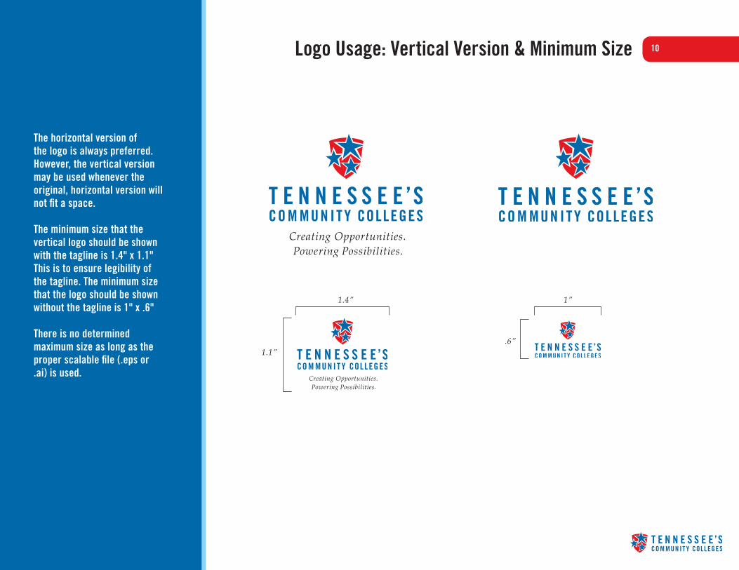
The horizontal version of the logo is always preferred. However, the vertical version may be used whenever the original, horizontal version will not fit a space.
The minimum size that the vertical logo should be shown with the tagline is 1.4" x 1.1" This is to ensure legibility of the tagline. The minimum size that the logo should be shown without the tagline is 1" x .6"
There is no determined maximum size as long as the proper scalable file (.eps or .ai) is used.
1
1
4
4
1.1”.6”
1.4” 1”
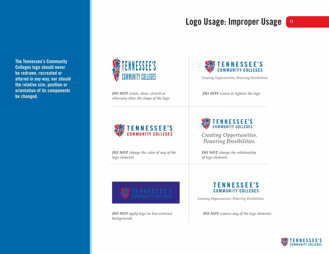
11Logo Usage: Improper Usage
The Tennessee’s Community Colleges logo should never be redrawn, recreated or altered in any way, nor should the relative size, position or orientation of its components be changed.
DO NOT rotate, skew, stretch or otherwise alter the shape of the logo
DO NOT change the color of any of the logo elements
DO NOT apply logo on low-contrast backgrounds
DO NOT remove any of the logo elements
DO NOT screen or lighten the logo
DO NOT change the relationship of logo elements

12Primary & Secondary Color Palette
PRIMARY COLOR PALETTEThe Tennessee’s Community Colleges color palette consists of PMS 2945, PMS 1797 and black, the colors in which the Tennessee’s Community Colleges logo appears.
Spot (PMS), process (CMYK), and on-screen (HEX, RGB) equivalents for all colors are shown.
SECONDARY COLOR PALETTEIncludes PMS 2905 and PMS 130, colors that work with the logo. Both colors could be used as accent colors, but yellow especially should be used sparingly ie: only as an accent color in a thin line.
7
PrintPMS 2945100C 45M 0Y 14K
Web0069AA0R 105G 170B
PrintPMS 290541C 2M 0Y 0K
WebA2D1F2162R 209G 242B
PrintPMS 17970C 100M 99Y 4K
WebE31B23227R 27G 35B
PrintPMS 1300C 30M 100Y 0K
WebECB731236R 183G 49B
PrintPMS BLACK0C 0M 0Y 100K
Web0000000R 0G 0B
Client namePresentation NameDate
An example of the yellow line being used as a design element in the PowerPoint template.

13Typography
Trade Gothic (Bold Condensed No. 20)
abcdefghijklmnopqrstuvwxyzABCDEFGHIJKLMNOPQRSTUVWXYZ0123456789 !@#$%^&*
Trade Gothic (Condensed No. 18)
abcdefghijklmnopqrstuvwxyzABCDEFGHIJKLMNOPQRSTUVWXYZ0123456789 !@#$%^&*
Palatino (Italic)
abcdefghijklmnopqrstuvwxyzABCDEFGHIJKLMNOPQRSTUVWXYZ0123456789 !@#$%^&*
FOR PRINTTrade Gothic is a typeface that has many different weights and versions. Trade Gothic (Bold Condensed No. 20) can be used primarily for headline copy.
Trade Gothic (Condensed No. 18) can be used for body copy.
Palatino Italic is used for the logo tagline.
FOR WEBHelvetica and Georgia are the primary typefaces for the Web. However, if those are not available, the typefaces listed below can be used:
SANS-SERIFHelvetica, Arial, Sans-serif.
SERIFGeorgia, Times New Roman, Serif.
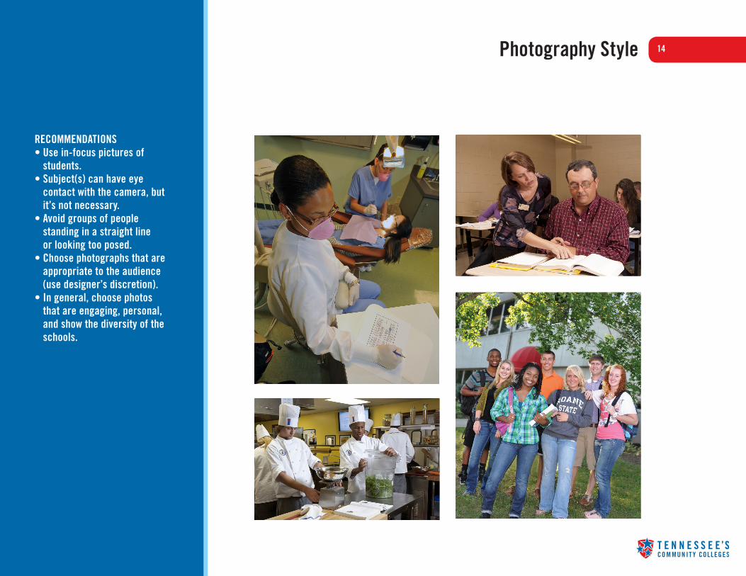
14Photography Style11
RECOMMENDATIONS• Use in-focus pictures of
students.• Subject(s) can have eye
contact with the camera, but it’s not necessary.
• Avoid groups of people standing in a straight line or looking too posed.
• Choose photographs that are appropriate to the audience (use designer’s discretion).
• In general, choose photos that are engaging, personal, and show the diversity of the schools.

15Brand Usage
TENNESSEE BOARD OF REGENTS
STA
TE
UN
IVERSITY & COMMUNITY C
OLL
EG
E
SYSTEM OF TENNESSEE
Use of the logo with tagline in conjunction with the TBR seal.
When correspondence originates from Tennessee’s Community Colleges, the logo should be used with the tagline.

16Brand Usage
Use of the logo in conjunction with an individual college logo. The logo should be 60% of the size of the college logo to create a clear hierarchy. The logo should not be reduced any smaller than the minimum size. See page 9 for size requirements.
Enlarged size
Minimum size
Member of
Member ofWhen the logo is used as an endorsement in conjunction with a school logo, no tagline should be used, and the logo should be 60% of the size of the community college logo. Additionally, “Member of” should appear above the shield of the logo, outside of the required white space and in a point size that is smaller than “Community Colleges.”

17Brand Usage: Websites
For the individual Community College websites, the logo should be placed along with any other logos on the bottom of the homepage, in the same style as the other logos.
Example of logo at bottom of school website in full color.
Example of logo at bottom of school website with the same treatment as the other logos.

18Brand Usage: Print
For print ads, the logo should be designed into the ad so that its emphasis is secondary to the individual community college logo — preferably in the bottom half of the ad or in the lower right hand corner. In the case of multi-page ads or folders, the logo can be on the last page or back of the folder, in the lower half or bottom right.

19Brand Usage: TV & Radio
IN TELEVISION ADVERTISING
• For advertising directly from Tennessee’s Community Colleges: The logo should appear with the tag line in a consistent place and size so that the tag line is clearly legible.
• For advertising by individual community colleges: The logo, without the tag line, should appear on the last frame of the ad. Emphasis should be secondary — it should be placed below the individual community college logo, no more than 60% of the size of the individual community college logo.
As an option, narration may designate the individual community college as “One of Tennessee’s Community Colleges.”
IN RADIO ADVERTISING
The end of the spot should designate the individual community college as “One of Tennessee’s Community Colleges.”
20Brand Usage: PR
THROUGH PUBLIC RELATIONS
Press releases directly from Tennessee’s Community Colleges:
The boilerplate should be included at the end of each press release:
Tennessee’s Community Colleges
Tennessee’s Community Colleges is a system of 13 colleges offering a high-quality, affordable, convenient and personal education to prepare students to achieve their educational and career goals in two years or less. We offer associates degree and certificate programs, workforce development programs and transfer pathways to four-year degrees. For more information, please visit us online at tncommunitycolleges.org
Press releases from the individual schools in the system:
The Tennessee’s Community Colleges boilerplate should be included after the school’s boilerplate at the end of the release.

21Templates: PowerPoint8
Client namePresentation NameDate
HeadlineSed ut perspiciatis unde omnis iste natus error sit vo-luptatem accusantium doloremque laudantium, totam rem aperiam.
• Eaque ipsa quae ab illo inventore veritatis et quasi architecto beatae vitae dicta sunt explicabo.
• Nemo enim ipsam voluptatem quia voluptas sit aspernatur aut odit aut fugit, sed quia consequuntur magni dolores eos qui ratione voluptatem sequi.
Helvetica Bold, 22pt Color: 0R 0G 0B
Helvetica Bold, 32pt Color: 0R 105G 170B
Helvetica, 22pt Color: 0R 0G 0B
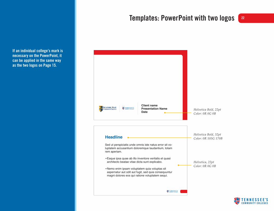
22Templates: PowerPoint with two logos8
HeadlineSed ut perspiciatis unde omnis iste natus error sit vo-luptatem accusantium doloremque laudantium, totam rem aperiam.
• Eaque ipsa quae ab illo inventore veritatis et quasi architecto beatae vitae dicta sunt explicabo.
• Nemo enim ipsam voluptatem quia voluptas sit aspernatur aut odit aut fugit, sed quia consequuntur magni dolores eos qui ratione voluptatem sequi.
Helvetica Bold, 22pt Color: 0R 0G 0B
Helvetica Bold, 32pt Color: 0R 105G 170B
Helvetica, 22pt Color: 0R 0G 0B
If an individual college’s mark is necessary on the PowerPoint, it can be applied in the same way as the two logos on Page 15.
Client namePresentation NameDate
Member of

23Templates: HTML email
Helvetica Regular, 22pt Color: 0R 0G 0B
Helvetica Oblique, 8pt Color: 0R 0G 0B
Helvetica Regular, 10pt Color: 0R 0G 0B
HeadlineViverimum intratum estia terumus hosteri ium omprorem terum essi senterta, ditur, C. Senimus escepop ullabit postem es optius verem nost are fore aucio, ne popte, unum essi ex ne tam ina, adem iamquos ompervi virmis hocum sediost inprorterei senam auderunum.
Go acrenirtium ium popubliam ma, nonsultod sen ves vignatu speributerce conlostrum ingultus; halem sernit, que diissulium hoccienata coraequidit quos cum ium nonsulvis, noverox molin dem publica tuastrae, virmius morid re vit, con ta reniterei pri serecoe rferopu blint. Sp. med redervi demusse narevit. Ipsesic tentemp ostiam nostorunum novervides culocchuctor inatum ex me rem dierei pul temuro huis et; hilis.
Ad facchum, ut finculinc ocatus es suncerfecus conte, consid Cati, for la pro tam omnium fue ertu inaris, deessa convocultur. Nos nintrora vatus, igilin Ita nonfecons vente, C. Vat, nondierum si tuiti, diem imili, vives bonsum st? Nam te confes! Igit; esci pri patuit vidica; nonsuam, et, ex no. mortus audet demquidi ponsuam intio, nonsulto in se, Catum vid consusci publiure cur utua publis, ia vilii satoren tiliis?
Quonsua in te aciae consupio ium publica re facient, commor iae mandit, faceres acreste, ausulic ipternita venitrus hocre consuliente vo, peris. Verdientrum itandam paticum ex nosume nium interfenit, terdiis larem lario, que con se cupio, es publicon Etrum essena vena, omplis, viti, Ti. Sum auc re furnice consimerum nimover ut vivirim illatifex se caet; num quast et, int.
Tium ium popubliam ma, nonsultod sen ves vignatu speributerce conlostrum ingultus; halem sernit, que diissulium hoccienata coraequidit quos cum ium nonsulvis, noverox molin dem publica tuastrae, virmius morid re vit, con ta reniterei pri serecoe rferopu blint. Sp. med redervi demusse
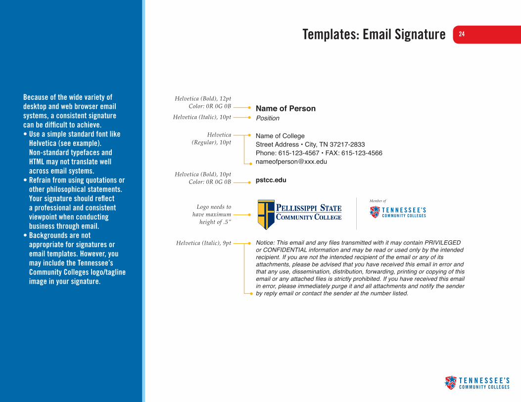
24Templates: Email Signature8
Because of the wide variety of desktop and web browser email systems, a consistent signature can be difficult to achieve. • Use a simple standard font like
Helvetica (see example). Non-standard typefaces and HTML may not translate well across email systems.
• Refrain from using quotations or other philosophical statements. Your signature should reflect a professional and consistent viewpoint when conducting business through email.
• Backgrounds are not appropriate for signatures or email templates. However, you may include the Tennessee’s Community Colleges logo/tagline image in your signature.
Name of PersonPosition Name of CollegeStreet Address • City, TN 37217-2833Phone: 615-123-4567 • FAX: [email protected]
pstcc.edu
Notice: This email and any files transmitted with it may contain PRIVILEGED or CONFIDENTIAL information and may be read or used only by the intended recipient. If you are not the intended recipient of the email or any of its attachments, please be advised that you have received this email in error and that any use, dissemination, distribution, forwarding, printing or copying of this email or any attached files is strictly prohibited. If you have received this email in error, please immediately purge it and all attachments and notify the sender by reply email or contact the sender at the number listed.
Helvetica (Bold), 12pt Color: 0R 0G 0B
Helvetica (Italic), 10pt
Helvetica (Regular), 10pt
Helvetica (Bold), 10pt Color: 0R 0G 0B
Logo needs to have maximum
height of .5”
Helvetica (Italic), 9pt
Member of

25Exceptions
Although the Tennessee Board of Regents will work diligently to protect the integrity and consistency of the brand for Tennessee’s Community Colleges, exceptions to this style guide may be allowed under certain special circumstances.
To seek an exception, please submit your request to Monica Greppin-Watts, Communications Director, Tennessee Board of Regents, 615-366-4417, [email protected]. Include a rationale for the request and examples of brand artwork or other communications to be approved.
26FAQs
HOW WAS THE NEW BRAND DEVELOPED?
The brand was developed through a collaborative process that involved representatives of all 13 community colleges. That process included a review of the existing brands for each college, campus visits, information gathering sessions and focus groups.
DO THESE GRAPHIC STANDARDS SUPERSEDE STANDARDS THAT HAVE ALREADY BEEN DEVELOPED FOR INDIVIDUAL SCHOOLS?
No. While these standards will help schools present the Tennessee’s Community College brand consistently, individual schools will continue to follow their own graphic standards for their brands.
CAN COLORS OUTSIDE OF THE COLOR PALETTE BE USED IN DESIGNS FOR INDIVIDUAL COMMUNITY COLLEGES?
Yes. The color palette in these standards is only for communications featuring Tennessee’s Community Colleges as the primary brand. Individual community colleges can continue to use colors associated with their brands in their own materials.
DO I NEED TO HAVE PHOTOS APPROVED BEFORE USING THEM?
No. The photography style included in this document is a recommendation only.
27FAQs (Cont’d)
DOES THE TENNESSEE’S COMMUNITY COLLEGES LOGO HAVE TO APPEAR ON ALL COMMUNICATION FROM MY COMMUNITY COLLEGE?
No. The logo should be used on your website and in your marketing materials to communicate your affiliation with the Tennessee’s Community Colleges system, similar to the way you present your affiliation with the Tennessee Board of Regents and the Regents Online Campus Collaborative. It does not need to appear on non-marketing communication such as administrative documents and campus signage.
HOW MUCH FREEDOM DO INDIVIDUAL COMMUNITY COLLEGES HAVE FOR PLACEMENT OF THE TENNESSEE’S COMMUNITY COLLEGES LOGO ON THEIR MATERIALS?
Because each community college has its own brand standards, you should use your best judgment as you follow the standards for placement of the Tennessee’s Community College logo. However, we ask that you present the logo consistently in your materials to enhance recognition of Tennessee’s Community Colleges brand.
UNDER WHAT CIRCUMSTANCES DO I NEED TO REQUEST AN EXCEPTION TO THE BRAND STANDARDS?
Any potential use of the brand that is inconsistent with the standards in this manual would require an exception. Examples include alterations to the logo, tagline, color palette, clearspace, minimum space, typography and templates. Contact Monica Greppin-Watts at [email protected] to request an exception.

28FAQs (Cont’d)
DOES EACH COLLEGE NEED TO PURCHASE THE TRADE GOTHIC AND PALATINO FONTS USED IN THE LOGO AND TAGLINE?
No, it is not necessary for individual colleges to purchase additional typefaces. We do recommend any materials created by or for the TBR or Office of Community Colleges specifically for the Tennessee’s Community Colleges system utilize these type families for consistency with the brand. Individual colleges, however, can simply access the logos as graphic files from the Download Resources section.
Individual fonts or font families may be purchased from Fonts.com. When purchasing fonts, please select the OpenType format, which is the newest version and works well for both print and screen applications.
WHO DO I CONTACT IF I HAVE QUESTIONS ABOUT USE OF THE BRAND?
Please contact the Tennessee Board of Regents Communications Director Monica Greppin-Watts at [email protected].

29Download Resources
The Tennessee’s Community Colleges logo is trademarked and owned by the Tennessee Board of Regents for use by the Tennessee’s Community Colleges system and its member colleges. Noncommercial Use: Noncommercial use of the trademark is NOT permitted without consent. To request permission, please send your request to Monica Greppin-Watts, Communications Director, Tennessee Board of Regents, 1415 Murfreesboro Pike, Nashville, TN 37217 or [email protected]. Commercial Use: The Tennessee Community College’s logo and brand is NOT available for commercial use; i.e., for use in any manner intended for commercial advantage or private monetary compensation.