gastroenterology associates of fairfield county, pc …...joseph engel, mps gastroenterology...
TRANSCRIPT

Joseph Engel, MPSGastroenterology Associates of Fairfield County, PC
Becker's 26th Annual Meeting: The Business and Operations of ASCsOctober 25, 2019

• What is Visual Data Analysis?
• Visual Analysis Techniques and Skills
• A Useful Example For an ASC
• Dos and Don’ts

What is Visual Data Analysis?

“Data visualization is the presentation of data in a pictorial or graphical format.”
https://www.sas.com/en_us/insights/big-data/data-visualization.html

• Visual analysis is used to: • Make sense of large amounts of data• Tell a story with the data

• Table presentation
• Visual analysis presentation


SpreadsheetYou can’t easily see a pattern
• Spot the Maximum
• Spot the Minimum
• Any Duplicates?
• Any Trends?
• Etc.

“Spreadsheet Only”
The Sum, Average & Standard Deviation are the same

Visual Analysis
The actual data is very different in each case


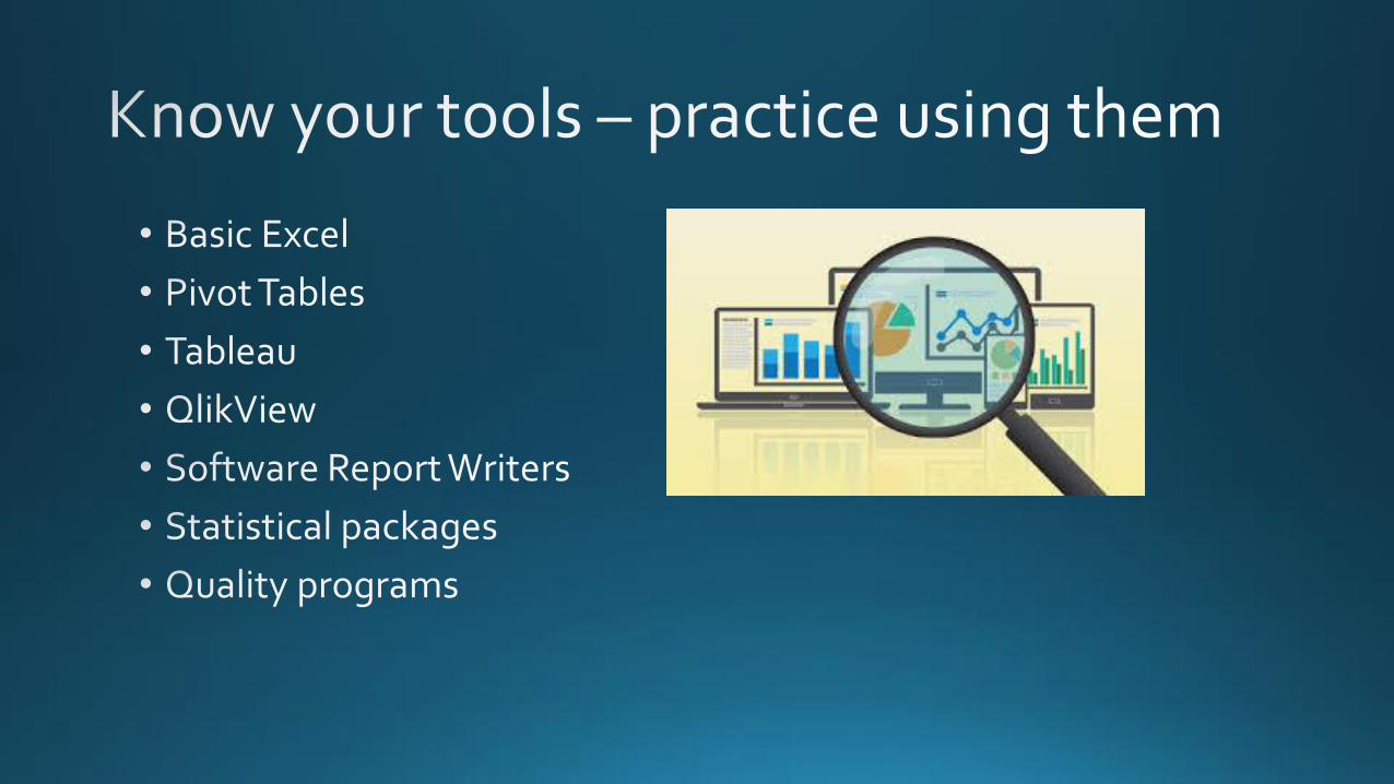
Visual Analysis Techniques and Skills
Presenting your data visually
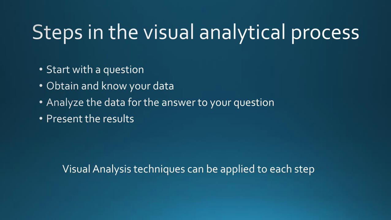
Visual Analysis techniques can be applied to each step


http://flowingdata.com/2018/09/07/visualization-in-the-1980s-just-before-the-rise-of-computers/

https://public.tableau.com/en-us/s/gallery

http://www.dashboardinsight.com/news/news-posts/difference-between-dashboards-infographics.aspx

https://www.pinterest.com/pin/466474473878220072/

0
1
2
3
4
5
6
Category 1 Category 2 Category 3 Category 4
Chart Title
Series 1 Series 2 Series 3


personal computer
projected
analyst only?


“Tidy Data”

http://garrettgman.github.io/tidying/


https://exceljet.net/things-to-know-about-excel-pivot-tables


https://www.howtogeek.com/howto/microsoft-office/using-conditional-cell-formatting-in-excel-2007/


Software may suggest best chart type for the
data
Tableau

https://www.optimizesmart.com/how-to-select-best-excel-charts-for-your-data-analysis-reporting/


https://www.ncbi.nlm.nih.gov/pmc/articles/PMC3952904/ Accessed Aug 9 2018

http://www.healthdataviz.com/2014/04/25/a-histogram-and-frequency-polygon-walk-into-a-bar/
Histograms

https://www.google.com/search?biw=1280&bih=559&tbm=isch&sa=1&ei=mJObW6LTNezB_Qb69YWIBA&q=line+charts+healthcare&oq=line+charts+healthcare&gs_l=img.3...132097.138169..139412...0.0..0.163.3135.1j23......0....1..gws-wiz-img.......0j0i8i30j0i24j0i30j0i5i30.6z4A0-5GC7w#imgrc=k2JueTEK0PMd4M:&spf=1536922661101

https://qi.elft.nhs.uk/wp-content/uploads/2014/08/scatter-plot2.png

https://www.google.com/search?biw=1280&bih=559&tbm=isch&sa=1&ei=JZSbW672D-K0ggedkZq4Cg&q=scatterplot+charts+healthcare&oq=scatterplot+charts+healthcare&gs_l=img.3...249636.252238..254210...0.0..0.170.1563.0j11......0....1..gws-wiz-img.pNmwxHkgAoI#imgrc=eEQ1ytIL4ox8CM:&spf=1536922916074

https://www.google.com/search?q=correlation+is+not+causation+examples&source=lnms&tbm=isch&sa=X&ved=0ahUKEwiTwbz03uPdAhXjc98KHWUxB4YQ_AUIDigB&biw=1280&bih=559#imgdii=rooKS8LstsbR6M:&imgrc=CwFrJloFGh8hPM:&spf=1538345327311

https://www.google.com/search?biw=1280&bih=559&tbm=isch&sa=1&ei=JJWbW5XwDfK9ggfh5LXAAw&q=BOXPLOTS+healthcare&oq=BOXPLOTS+healthcare&gs_l=img.3...4316311.4320761..4323100...0.0..0.217.1331.0j7j1......0....1..gws-wiz-img.......0i7i30j0i24.1_4MY2ZuSTI#imgrc=8bqP8yqVNbBgbM:&spf=1536927240115

https://www.google.com/search?biw=1280&bih=559&tbm=isch&sa=1&ei=JJWbW5XwDfK9ggfh5LXAAw&q=BOXPLOTS+healthcare&oq=BOXPLOTS+healthcare&gs_l=img.3...4316311.4320761..4323100...0.0..0.217.1331.0j7j1......0....1..gws-wiz-img.......0i7i30j0i24.1_4MY2ZuSTI#imgrc=8bqP8yqVNbBgbM:&spf=1536927240115


Can be done in Excel but a Visual Analytical tool like Tableau is easier to use
Doughnut Tornado Waterfall


If you can’t gain an insight from a visualization in 10 seconds you may as
well use a spreadsheet
https://www.datacamp.com/community/blog/data-products-dashboards-rapid-prototyping
From Data Framed Podcast Accessed 9/12/2018

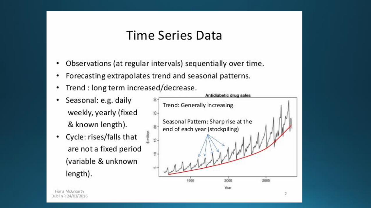
A Useful Example For an ASC
Time Series

time
patterns


https://www.myexcelonline.com/blog/add-trendlines-excel-charts/


https://www.capacitas.co.uk/blog/forecasting-basic-time-series-decomposition-in-excel
https://exceltable.com/en/analyses-reports/time-series-analysis
https://magoosh.com/excel/understanding-time-series-forecasting-in-excel/

Dos and Don’tsTop 10
From a Duke University Library Guide
https://guides.library.duke.edu/datavis/topten

https://duke.app.box.com/v/TopTenSlidesS14

Do use the full (numerical) axis

Do simplify less important information
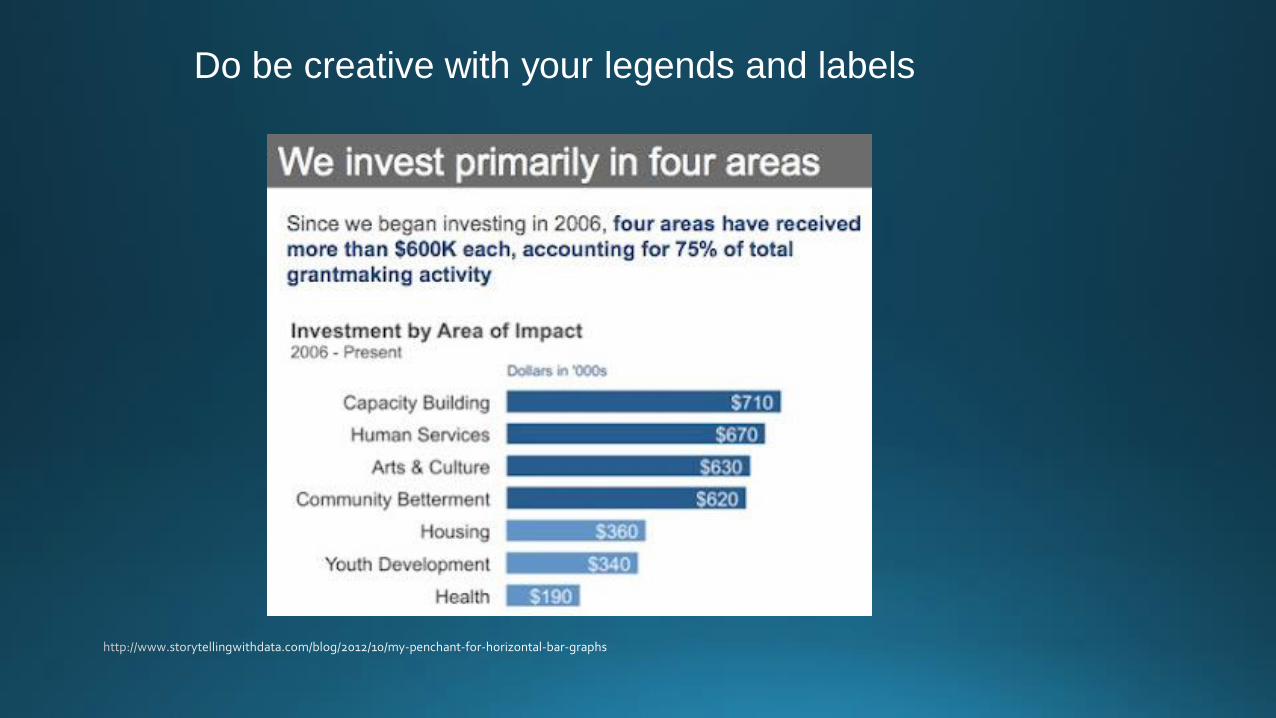
Do be creative with your legends and labels

Do pass the squint test

Don’t use 3D or blow apart effects
https://flowingdata.com/2012/04/25/world-happiness-report-makes-statisticians-unhappy/

Don’t use more than six colors

Don’t change “style” boats midstream

Don’t make users do “visual math”

Don’t overload the chart
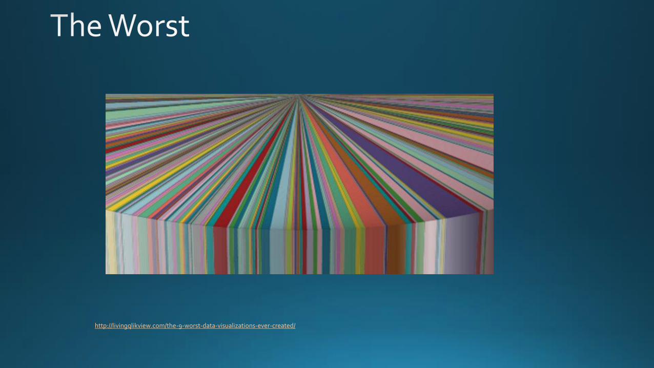
http://livingqlikview.com/the-9-worst-data-visualizations-ever-created/

https://blog.udacity.com/2015/01/15-data-visualizations-will-blow-mind.html
Charles Minard’s visualization of Napoleon’s 1812 March
