fx design seminar colour june 2015
TRANSCRIPT

052 053
Daniel Hopwood (left) and Jenny Wasson (right)
DESIGN SEMINAR
COLOURFUL LANGUAGE
WORDS BY TOBY MAXWELL
PHOTGRAPHY BY GARETH GARDNER
FX recently brought together interiors experts from all corners of the industry to talk all things colour, styles, trends… and
encouraging clients to be braveSPONSORED BY

look incredibly colourful by night even though by day it may be fairly neutral and discreet.
Kramer added: ‘In our � eld, we probably use less coloured lighting now. I guess it was a fashion thing when RGB lighting � rst came out and everyone felt it had to be applied everywhere, but now people have probably become a little desensitised to it. Because it was overused, it somehow lost impact. When it’s use subtly and simply, it can be e� ective.’
But is lighting such a specialist skill that it calls for outside expertise? Kramer said he wouldn’t personally use a lighting designer: ‘I think lighting is an integral part of having a vision. � ere is a technical element of course, but in terms of the mood or overall palette you’re trying to create, I think it’s a core part of the design.
‘We’ve gone through an era of saturated colour and have used lighting to help achieve that. I wonder if now it is more about contextualising it and using it in more constrained and interesting ways. A lot of interiors you see in the commercial sector are saturated with colour on the walls and furniture, the whole lot. It can look a bit Toytown. � e contract interiors sector has been at that end for a long time and I’m wondering if less is more.’
So when it comes to colour trends, are there any discernible patterns out there right now? Jenny Weiss, also a director at Hill House Interiors, said: ‘It’s hard to really get to the bottom of. You could ask 20 designers what they felt were the hot colour trends and they would all come up with something di� erent.’
She added: ‘It’s interesting looking around the table at what we’re wearing. Some of us are in bright and bold colours, others are a little more muted, but no-one has gone ‘non-colour’,” to which Littlefair responded: “But what is ‘non-colour’? I see colour in lots of neutrals, in terms of shades and texture.’
Brand messagePersonal colour preference is one thing but, said Kramer, colour for brands can be a really tricky area: ‘Companies have become quite “physical” about pushing the brand recognition in their spaces. � ey can sometimes try to do this in too literal a way, where what we try to do is get to understand the meaning behind the brand and convey that “tone of voice”. Some brands are adamant that their corporate colours have to be everywhere, and that can create a danger of turning it into a pastiche of the brand.’
When it comes to commercial interiors, there is also the issue of building in longevity to what can often represent a huge investment, especially in the case of a retail
WE’VE ALL SEEN THEM – and most probably worked in them. O� ces with interior layouts and decor that are so lifeless and dull that they sap the energy out of anyone who enters. � e scourge of workers and designers alike, these spaces could become a thing of the past if only the companies responsible for these spaces could be persuaded to stretch the boundaries a little.
David Kramer, director at commercial interiors studio Squaredot, said: ‘It’s our job to challenge some of the preconceived ideas that clients might have about what their interiors should be and how their brand is re� ected. What we like to do is push it a bit further though and take them out of their comfort zone, whether that is through colour, materials, or lighting. Often this means going with something quite bold. I don’t do vanilla. If someone wants vanilla then why employ someone to do their interiors?’
One of a number of wide-ranging topics being discussed by a panel of interiors experts at the recent FX Design Seminar on Colour, held at the showroom of Designworks Tiles in London, the issue of winning the client’s con� dence was agreed by most as a key challenge. Kramer said: ‘You have to win [it]through demonstration and education. You can show them by mock-ups and explaining the impact that a certain design could have.’
Rather than battling to convince a client that their preferences are wrong and that they should adopt something completely di� erent, there was a suggestion among designers around the table that, instead, clients tend to come to interior designers whose portfolio of work resonates with them, hence, they are generally ‘on the same page’ since they identify with that designer’s signature style.
Jo Littlefair, director at Goddard Littlefair said: ‘We have clients come to us for our diversity. We’ve undertaken hotels as well as developer work and private residential and it can be the case that each industry is feeding the other in terms of ideas. For example, you have developers wanting a “hotel feel”, homeowners wanting the hotel bathroom kind of look, and yet you have hotels that want to create the sense that you’re going into a home environment.’
Illuminated thinkingFor many, achieving the right colour balance has much to do with e� ective lighting. Helen Bygraves, director at residential specialist Hill House Interiors, said: ‘We will often use a neutral base but look to highlight certain areas with lighting, and we let that provide a lot of the drama. It means you can make a space
DESIGN SEMINAR 055
Simon Fisher (left) and Jenny Weiss (right)
THOSE TAKING PART WERE
Theresa Dowling(chair), editorial director, FX Magazine
Helen Bygraves director, Hill House Interiors
Simon Fisherfounder, F Mark
Daniel Hopwoodpresident, BIID
David Kramerdirector, Squaredot
Jo Littlefairdirector, Goddard Littlefair
Cherrill Scheer director, CSA
Jenny Wassondesign director, Designworks Tiles
Jenny Weiss director, Hill House Interiors
054 DESIGN SEMINAR
SPONSORED BY
056 DESIGN SEMINAR
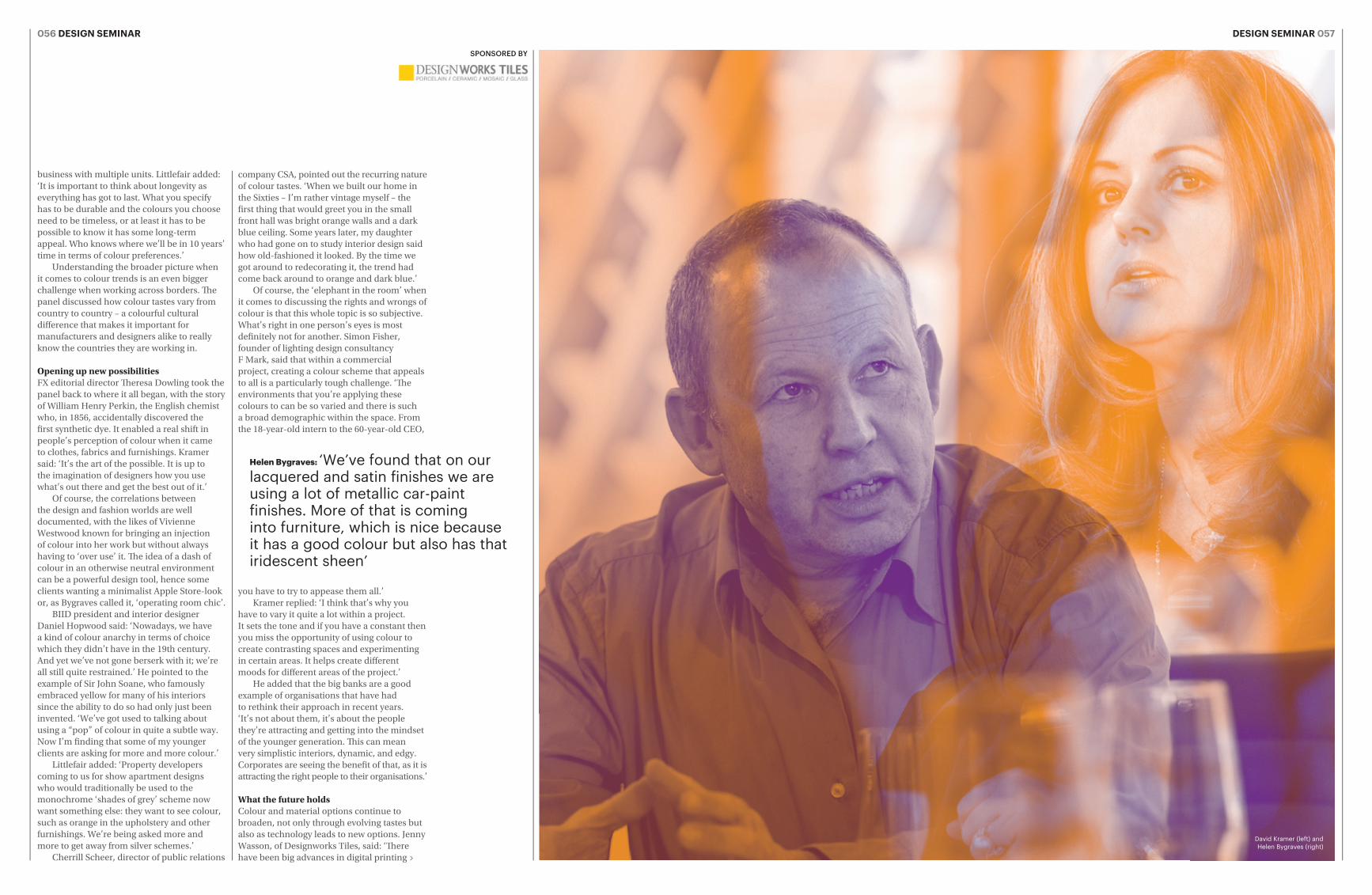
David Kramer (left) and Helen Bygraves (right)
DESIGN SEMINAR 057
company CSA, pointed out the recurring nature of colour tastes. ‘When we built our home in the Sixties – I’m rather vintage myself – the � rst thing that would greet you in the small front hall was bright orange walls and a dark blue ceiling. Some years later, my daughter who had gone on to study interior design said how old-fashioned it looked. By the time we got around to redecorating it, the trend had come back around to orange and dark blue.’
Of course, the ‘elephant in the room’ when it comes to discussing the rights and wrongs of colour is that this whole topic is so subjective. What’s right in one person’s eyes is most de� nitely not for another. Simon Fisher, founder of lighting design consultancy F Mark, said that within a commercial project, creating a colour scheme that appeals to all is a particularly tough challenge. ‘� e environments that you’re applying these colours to can be so varied and there is such a broad demographic within the space. From the 18-year-old intern to the 60-year-old CEO,
you have to try to appease them all.’Kramer replied: ‘I think that’s why you
have to vary it quite a lot within a project. It sets the tone and if you have a constant then you miss the opportunity of using colour to create contrasting spaces and experimenting in certain areas. It helps create di� erent moods for di� erent areas of the project.’
He added that the big banks are a good example of organisations that have had to rethink their approach in recent years. ‘It’s not about them, it’s about the people they’re attracting and getting into the mindset of the younger generation. � is can mean very simplistic interiors, dynamic, and edgy. Corporates are seeing the bene� t of that, as it is attracting the right people to their organisations.’
What the future holdsColour and material options continue to broaden, not only through evolving tastes but also as technology leads to new options. Jenny Wasson, of Designworks Tiles, said: ‘� ere have been big advances in digital printing
business with multiple units. Littlefair added: ‘It is important to think about longevity as everything has got to last. What you specify has to be durable and the colours you choose need to be timeless, or at least it has to be possible to know it has some long-term appeal. Who knows where we’ll be in 10 years’ time in terms of colour preferences.’
Understanding the broader picture when it comes to colour trends is an even bigger challenge when working across borders. � e panel discussed how colour tastes vary from country to country – a colourful cultural di� erence that makes it important for manufacturers and designers alike to really know the countries they are working in.
Opening up new possibilitiesFX editorial director � eresa Dowling took the panel back to where it all began, with the story of William Henry Perkin, the English chemist who, in 1856, accidentally discovered the � rst synthetic dye. It enabled a real shift in people’s perception of colour when it came to clothes, fabrics and furnishings. Kramer said: ‘It’s the art of the possible. It is up to the imagination of designers how you use what’s out there and get the best out of it.’
Of course, the correlations between the design and fashion worlds are well documented, with the likes of Vivienne Westwood known for bringing an injection of colour into her work but without always having to ‘over use’ it. � e idea of a dash of colour in an otherwise neutral environment can be a powerful design tool, hence some clients wanting a minimalist Apple Store-look or, as Bygraves called it, ‘operating room chic’.
BIID president and interior designer Daniel Hopwood said: ‘Nowadays, we have a kind of colour anarchy in terms of choice which they didn’t have in the 19th century. And yet we’ve not gone berserk with it; we’re all still quite restrained.’ He pointed to the example of Sir John Soane, who famously embraced yellow for many of his interiors since the ability to do so had only just been invented. ‘We’ve got used to talking about using a “pop” of colour in quite a subtle way. Now I’m � nding that some of my younger clients are asking for more and more colour.’
Littlefair added: ‘Property developers coming to us for show apartment designs who would traditionally be used to the monochrome ‘shades of grey’ scheme now want something else: they want to see colour, such as orange in the upholstery and other furnishings. We’re being asked more and more to get away from silver schemes.’
Cherrill Scheer, director of public relations
Helen Bygraves: ‘We’ve found that on our lacquered and satin finishes we are using a lot of metallic car-paint finishes. More of that is coming into furniture, which is nice because it has a good colour but also has that iridescent sheen’
SPONSORED BY

DESIGN SEMINAR 059058 DESIGN SEMINAR
underestimated as a way of introducing strong colour to a space.’
‘� at’s been a good way of getting colour into people’s houses actually,’ said Hopwood. ‘We talk a lot about the Wall of Fear – otherwise known as the feature wall. It can be a good way for people to experiment with colour when they’re not too con� dent about it, but at least it’s meant we’ve got colour back. When you think back to the Sixties, when everyone was so exciting with colour, what happened? We got there but then somehow ran away from it.
‘What I’m seeing creeping in now though is a moving on from the eclectic “Shoreditch look” towards something more related to the Memphis movement of the Eighties, and all its bold use of colour. I saw the beginnings of this returning at Salone in Milan last year and again this year – the shapes and colours, if not the “Lego block” form exactly, but it will be quite exciting to see what happens with that.’ Kramer added: ‘Application is important too. We talk about feature walls and where to put the colour that we want to inject into
a scheme, but too often people overlook the ceiling. How many times do you go into an o� ce building and it’s just boring white throughout all the ceilings? Why don’t people think about di� erent applications for colour in this way?’
Dare to be boldWhich brings us back to one of the fundamental talking points of the day – encouraging corporate clients to embrace an approach to colour that they are unlikely to be familiar with. It is all part and parcel of the designer’s job believes Kramer: ‘You have to win their con� dence and take them on a journey. You can’t go leaping in and expect them to just “get it”, because it’s frightening to the uninitiated. You have to sell the idea and use a lot of reference to your past experience of working with all di� erent kinds of spaces.’
Wasson added: ‘If the scheme is at least supported by a neutral then they can often feel more comfortable about it. � at way colour can punctuate the rest of the look.’
Hopwood said: ‘I agree it is very much a journey, and one that can take a lot of time and e� ort. � at can be very rewarding, but the frustrating part is that you then move
and that has opened up almost endless possibilities. � at applies across not just tiles but also textiles. It also all depends on good lighting to get the very best end result.
‘When we develop some of the glaze � nishes, we put the product into light booths in which we can replicate every single type of lighting to see how it looks. You might put a daylight bulb in and think the tiles look great, but then under certain other lighting the tone can be completely di� erent.’
It’s also worth factoring in the false economy of using cheaper components in a scheme, with warnings over LEDs that start to burn out and provide a ‘greenish’ colour after a certain period of time – ‘if you buy cheap you buy twice’, warned Weiss.
Technology has touched many aspects of interior spaces, not least in terms of the ease at which the mood, colour, light and temperature can be changed at the touch of a button. One on the panel explained that they often get asked by clients for an all-singing, all-dancing, internet-controlled lighting system, something which is often way too over-specced for their needs. ‘I sometimes think, “You’re not old enough to have all the controls!” In the vast majority of cases, what they need is a switch for on and o� , and once they’ve mastered that they could think about moving on! But it’s clear that the demand is there and some people are prepared to pay for it.’
Kramer said: ‘We are in an era of in� nite control of space. � e technology is there to turn up in a space with your laptop or tablet and control the lighting and temperature at a keystroke. Why you need to do this is another thing, but it’s possible.’
Hopwood added: ‘� at is nice to have in the commercial world but in a residential context it’s not so helpful. I was recently stripping out a house in Bayswater that had literally hundreds of thousands of pounds-worth of electronics embedded into it. My client, who has just bought the property, told me: ‘I tried to turn the television on with the online controls and ended up opening the curtains.’ And what happens if you mislay the iPad that you need to control it all with? Most of the time people just want simplicity, and there is a reaction against over-complicating what should be a very simple activity.’
Bygraves of Hill House Interiors added that another solution for introducing colour to a space could be right underneath our feet: ‘A vibrant colour on the � oor can make you feel very di� erently about a space too. We sometimes use dark colour for carpets or darker colours for ceilings, but I think it’s often
on to the next client and you have to start all the way back at the beginning.’
� ere are nevertheless plenty of reasons to be cheerful for designers working in interiors now, as the scope for being creative is broadening in both commercial and residential schemes, with clients and consumers increasingly prepared to go bold with colour. ‘� e public is wanting it. � ey just need direction,’ said Hopwood, who appears on BBC2’s � e Great Interior Design Challenge. He says that people come up to him showing great interest in doing something more ambitious in their own homes. ‘But they ask me, “How do you dare to be so bold to use those colours?” � e simple answer is that it is just a case of trying it out. A lot of the people on the programme have clearly soaked everything up from magazines so they’re copying what they’ve seen, but at the same time those magazines are a really good vehicle for broadening the mind and boosting con� dence in experimenting with colour.’
Tough times for the economy had also
focused people’s minds less on residential property purely as an asset and more on how it should be a home. Hopwood said: ‘Pre-recession it was all about how to make money out of your property and sell it for a big pro� t. Now, the thinking is less about moving and instead focusing on how to make it a great place to live.’
Against this backdrop, ‘upcycling’ has become something of a buzzword, but it’s not just restricted to the residential sector. Kramer says that references have been cropping up in the commercial sector too, with junk-shop and second-hand items being repurposed for a new life in an o� ce, retail or other business environment. ‘It can really change the dynamic in those spaces quite a lot,’ he added.
Just like encouraging a client to step out of their comfort zone with colour, it is perhaps another area in which the designer has to help them along the way by putting things into a context that they are more comfortable with. ‘I recently had a Russian client who told me that they didn’t want anything in their home that was old. She was quite adamant about that point. I said “OK, do you like vintage?” and she replied: “Oh, I love vintage”. I guess that has been a great bit of marketing.’
Jo Littlefair: ‘There are so many tools that can be used in residential projects – from the cushions to the textures to the rugs – and yet it staggers me how relatively few there can be in a lot of commercial settings’
SPONSORED BY
Jo Littlefair (left) and Theresa Dowling (right)