front cover analysis
TRANSCRIPT

Front Cover Analysis of other music magazines.

1
Pull Quotes:
Pull quotes are used so that the readers are made clear of the main stories in the magazine and quotes from those stories are used to provide an enticing extract in the hope that people will be encouraged to buy the magazine.
Masthead:The masthead for this magazine is not in the usual place you would expect to find a mast head. This is because the masthead is not the main focus of the front cover but instead the woman who is the main subject.
Cover lines are effective at highlighting some of the main stories within the magazine. There are multiple cover lines on this magazine front cover which help to fill the space and highlight the fact that the magazine is full of content.
The main colour scheme is red, white and blue. All these colours are effective at highlighting the main image which is the close up shot of the woman.
The barcode is a key feature on all magazines, not just music ones. Also, underneath the barcode is the price of the magazine itself. It is in a clear space so readers will be able to see it immediately. Especially because it is white which makes it stand out in front of the red background.
Button:A button is effective at highlighting one of the most important pieces of content in the magazine. For example, this one states that there is a new column in the magazine.

1. How does the choice of band featured in the article suggest who the target audience will be?The artist on the front cover is the lead singer Florence Welch from the band ‘Florence and The Machines’. The type of music they create is very folk/rock influenced which suggests that their target audience will be consumers who like to listen to that genre of music. However, because Florence is the main focus of the band and appears in most of the magazines it would suggest that perhaps more of their target audience would be women.
2. What type of language is used in the article?The language used in this article is the polar opposite of simplistic. Unlike, ‘Vibe’ and ‘Billboard’ magazine, ‘Q’ magazine is actually writing in full sentences on its front cover page. This implies that it targets a slightly more intellectual audience because the content inside is portrayed as being more complex from the outset.
3. How is colour used?Like all the other magazines, this magazine also chose three main colours to project on its front cover. The main colours are white, blue and red/copper (the copper being Florence’s hair which takes up a significant amount of the photograph.A significant amount of the writing is white which looks extremely clear against the background of Florence’s vibrant, ginger hair.
4. What style of text is used? Is it similar to any other pages? What does it say about the image of the magazine and the audience?
The style of text used is not soft or cursive but instead quite simple. The closest representative of the font used would be ‘Arial’ or ‘Calibiri’ on a Word document. This implies that the magazine is quite a smart, formal magazine and is also supported by the fact that a lot of the cover lines are written in full sentences.
5. How is the artist/band presented to the audience through the choice of images?The photo used on the front cover is a close up of the artist’s face. This means that like most of the other magazines she is personable and friendly looking. This can be supported by the fact that if she didn’t have a welcoming face than maybe they would not have done such an extreme close up of it.

The cover lines on this magazine are both yellow and white. The effect of the bright cover lines attracts potential readers to the magazine. Also, the more enticing the cover lines look, the higher the likelihood of the magazine being bought is because the main reason cover lines are placed on front covers is to entice the reader into buying the magazine and reading the content
Cover lines:
Masthead: The font used is different to all the others and is bright red. This helps the name of the magazine to stand out in comparison to all the other text on the front cover.
2
Issue number and date of release are made clear in the top right hand side of the issue.This signifies the number of issues the magazine has released.
The name of the band that are featured on the front cover of this magazine are called “Mumford & Sons”.This is made clear by the huge cover line on the bottom, right-hand side of the magazine. This is effective because if the reader were to have Mumford & Sons as one of their favorite band s they are more likely to buy the magazine
This magazine does not have a barcode on their front cover.If the barcode is not on the front cover than that means it is probably on the back. The lack of a barcode on the front cover probably implies that the magazine is expensive and also makes it look neater. It doesn’t distract from the main content of the magazine.
All the subjects in the photograph are dressed smart. This implies one of two things. Firstly, that it is simply the look the band is trying to portrayORSecondly, the magazine is trying to aim fro a formal style.
1. How does the choice of band featured in the article suggest who the target audience will be?The band featured on the front cover implies that the target market will be people who enjoy some form of rock music as they are featured on the magazine ‘Rolling Stones’ who are renowned for writing articles about famous rock bands. Hence the name ‘Rolling Stones’ as a magazine title.
2. What type of language is used in the front cover?The language used in this front cover is a lot less simplistic than the ‘Vibe’ and ‘Billboard’ front covers. However, it a front cover so the language used is not going to be over the top but instead highlight enough of the content of the magazine that the audience are going to want to buy it. 3. How is colour used?The main colours used in this front cover are white, yellow and hints of red. All these bright colours are projected on a relatively dark background which helps make them stand out.
4. What style of text is used? Is it similar to any other pages? What does it say about the image of the magazine and the audience?The style of the text is very unique. The font is cursive but harsh at the same time implying that both men and women read this magazine and the font is representative of its target audience.
5. How is the artist/band presented to the audience through the choice of images?The band (Mumford&Sons) are presented as personable and happy in this front cover. The main reason for this is because they are all smiling and looking directly towards the camera. Unlike, in ‘Vibe’ magazine where the artist looks slightly less approachable.
3
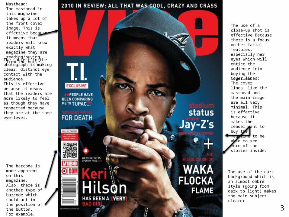
Masthead: The masthead in this magazine takes up a lot of the front cover image. This is effective because it means that readers will know exactly what magazine they are reading/buying from the outset.
Cover lines:The cover lines, like the masthead and the main image are all very minimal. This is effective because it makes the reader want to buy the magazine to be able to see more of the stories inside.
The barcode is made apparent on this magazine. Also, there is another type of barcode which could act in the position of the button. For example, this barcode is used to get a chance to win a gift.
The subject in the photograph is making clear, distinct eye contact with the audience. This is effective because it means that the readers are more likely to feel as though they have connected because they are at the same eye-level.
The use of a close-up shot is effective Because there is a focus on her facial features, especially her eyes Which will entice the audience into buying the magazine.
The use of the dark background which is an almost ombré style (going from dark to light) makes the main subject clearer.
1. How does the choice of band featured in the article suggest who the target audience will be?The artist on the front cover of the magazine is portrayed in quite a dark light. He does not seem too approachable because his pose suggests that he is scowling. I imagine his audience are people with a slightly hard exterior, who wear similar clothing and listen to some of the artists featured in the article. For example, one of the cover lines are ‘Jay Z’ and ‘Tupac’
2. What type of language is used in the article?The language used in this front cover is simplistic. A lot of the cover lines are just the names of other artists. Also, there are not many full sentences on the front cover which implies that the language inside will also be extremely simplistic.
3. How is colour used?This magazine has a main colour scheme of dark blue, red and white along with some black writing. The masthead is in bright red which helps the magazine to stand out.
4. What style of text is used? Is it similar to any other pages? What does it say about the image of the magazine and the audience?The style of text is harsh and hard. This implies the audience are mainly going to be men or people who enjoy listening to heavy rap/R&B music.
5. How is the artist/band presented to the audience through the choice of images?The artist is presented as intimidating and serious. However, he is featured on a popular music magazine which implies that he is a popular artist and people want to read about him.

4
Neutral background is effective because it means that the main focus of the image (model) shows up easily.
The use of a close-up shot is effective Because there is a focus on her facial features, especially her eyes Which will entice the audience into buying the magazine.
Masthead:The masthead of this magazine is called ‘Billboard’. It is made extremely clear as it is in the typical place you would find the masthead; at the top of the magazine and in the center.
Cover lines:The cover lines in this magazine are pink and white. This is effective at making them stand out against the grey background colour.
The issue number is made clear in the bottom left hand corner of the magazine. This shows how many issues have been produced and the date at which the current magazine was produced too.
There is no barcode made clear on the front cover of this magazine. However, the price is made clear at the bottom left hand side which indicates to potential buyers how much they will be paying for the magazine anyway.
1. How does the choice of band featured in the article suggest who the target audience will be?The artist on this front cover is Lily Allen. Her front cover can be found on the slide titled number 4. In this photo, Lily Allen looks feminine. Her audience would probably be mostly woman around her age, if not both older and younger.The front cover image is extremely minimalistic and does not give a lot away. However, some of the surrounding cofer lines suggest that the main target audience might still be women. This is because the other artist featured on the magazines’ cover lines are Taylor Swift and Lady Gaga.
2. What type of language is used in the article?The language used in this article is simple. A lot of the cover lines are just the names of other artists. Also, there are not many full sentences on the front cover which implies that the language inside will also be extremely simplistic.3. How is colour used?This magazine uses three main colours for its front image. The main colour scheme is pink, white, and a light grey. However, there are other hints of yellow. For example, in the letter ‘d’ of the ‘Billboard’. Also, Lily Allen herself has very simplistic make-up, and her dark brown, long hair is flowing down below her shoulders. The white cover lines surrounding the front cover are in the colour white. The white is projected clearly against the dark brown of her hair.
4. What style of text is used? Is it similar to any other pages? What does it say about the image of the magazine and the audience?The style of text is rounded and soft, which implies the audience they are targeting is a young audience. Also, one of the main colours being pink implies that the target audience is mostly women.
5. How is the artist/band presented to the audience through the choice of images?Lily Allen is presented as personable from this picture. Firstly, because she is making direct eye-contact. Also, she is smiling softly and her eyes appear wide which are all the characteristics of someone who has a soft, welcoming face.