from usability to user experience
TRANSCRIPT
www.UsabilityOne.com
Background
From Usability to User Experience2011
Copyright & Confidentiality
The concepts, ideas, strategies, information, materials, plans and copy contained in this document are presented in absolute confidence and are the property of UsabilityOne and must not be reproduced, adapted or communicated to third parties in anyway without express permission of UsabilityOne.
www.UsabilityOne.com
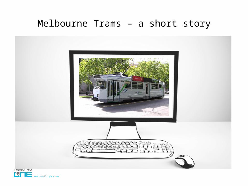
Melbourne Trams – a short story

www.UsabilityOne.com
Melbourne Trams – a short story

www.UsabilityOne.com
INTRODUCTIONS
• Organisation
• Role
• Current Project

www.UsabilityOne.com
SCOPE
Introductions
Definitions
Historical Context
Heuristics
Background Key Principles
Information Architecture
Forms/transactions
Search
Multimedia
Social Media
Mobile and other Platforms
Writing for the web Techniques and Tools
Why writing for the web is so important
Top 12 writing tips with examples
Website style guides
Contextual analysisConcept TestingCard SortingUsability Testing (Moderated/Online)Website Analytics
www.UsabilityOne.com
Background

www.UsabilityOne.com
WHAT IS USABILITY?
• ...A term used to denote the ease with which people can employ a particular tool or other human-made object in order to achieve a particular goal [Wikipedia.org]
• ...How well users can learn and use a product to achieve their goals and how satisfied they are with that process [Usability.gov]
• The effectiveness, efficiency and satisfaction with which specified users achieve specified goals in particular environments. [ISO]

www.UsabilityOne.com
WHAT IS USER EXPERIENCE?
User experience (UX) is about how a person feels about using a product, system or service. User experience highlights the experiential, affective, meaningful and valuable aspects of human-computer interaction and product ownership, but it also includes a person’s perceptions of the practical aspects such as utility, ease of use and efficiency of the system. User experience is subjective in nature, because it is about an individual’s feelings and thoughts about the system. User experience is dynamic, because it changes over time as the circumstances change. [Wikipedia.org]

www.UsabilityOne.com
MATCHING THE SYSTEM WITH THE USER’S NEEDS
• Developers usually build a system to meet a certain workflow
Viewproducts
Selectproduct
Checkout Credit cardPurchasecomplete
• Users often take a different workflow to reach their goal
Viewproducts
Make comparisons
Selectproduct
Check shipping costs
Checkout
Look for discounts coupons
Credit cardPurchase complete
• Users needs are often different to business and designer’s needs
www.UsabilityOne.com
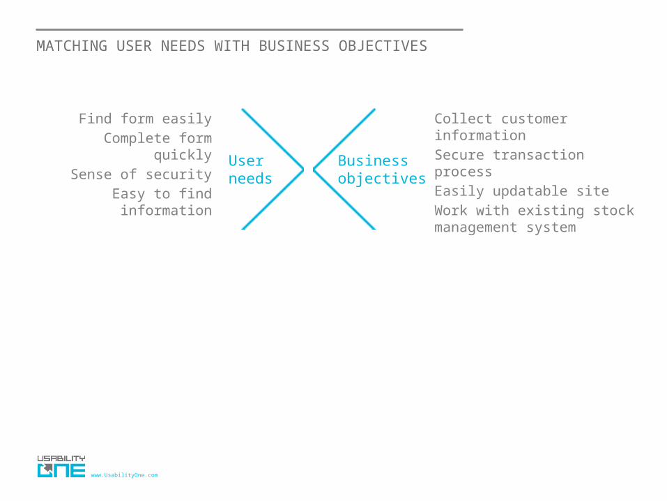
MATCHING USER NEEDS WITH BUSINESS OBJECTIVES
Find form easilyComplete form quickly
Sense of securityEasy to find information
User needs
Business objectives
Collect customer informationSecure transaction processEasily updatable siteWork with existing stock management system

www.UsabilityOne.com
www.UsabilityOne.com
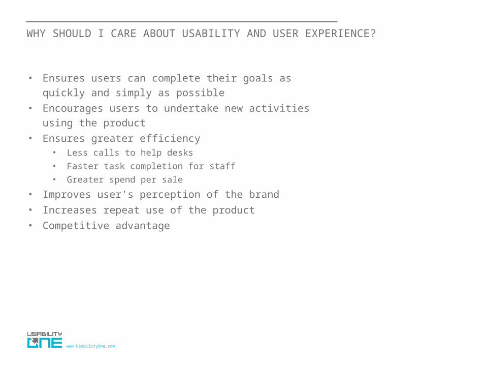
WHY SHOULD I CARE ABOUT USABILITY AND USER EXPERIENCE?
• Ensures users can complete their goals as quickly and simply as possible
• Encourages users to undertake new activities using the product
• Ensures greater efficiency• Less calls to help desks
• Faster task completion for staff
• Greater spend per sale
• Improves user’s perception of the brand
• Increases repeat use of the product
• Competitive advantage

www.UsabilityOne.com
CASE STUDY
Metlink wanted to increase awareness and usage of their late night bus service

www.UsabilityOne.com
CASE STUDY
Users did not associate the Nightrider links with late night bus services

www.UsabilityOne.com
CASE STUDY
• We suggested a more descriptive label
• This small change increased visitation to this area of the site by 128%

www.UsabilityOne.com

www.UsabilityOne.com
http://whichtestwon.com/

www.UsabilityOne.com
How far we’ve come
www.UsabilityOne.com
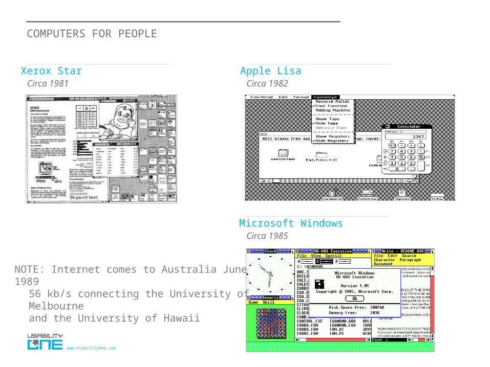
COMPUTERS FOR PEOPLE
Xerox Star Apple LisaCirca 1981 Circa 1982
Microsoft WindowsCirca 1985
NOTE: Internet comes to Australia June 198956 kb/s connecting the University of Melbourne and the University of Hawaii

www.UsabilityOne.com
ACCESSING THE INTERNET
1990s
• Desktop software• Growth of the internet• Email for communication• World Wide Web for
information• Online shopping

www.UsabilityOne.com
ON THE MOVE
2000s
• Online software• Mobile computing• Social networking• Touchscreen interfaces• Online collaboration

www.UsabilityOne.com
TODAY
2010s
• Ubiquitous and Pervasive technologies• Mobile computing
• Location based Technologies• Voice Recognition software
• Tablets, eReaders• Social Networks platforms for Mass
Movements

www.UsabilityOne.com
MORE OPPORTUNITIES
• As technology advances, so too do the opportunities• However, with each new opportunity comes potential
difficulties for users
“How do I move or delete my apps?”
“What does the RSS button do?”
“What is my securitycode?”

www.UsabilityOne.com
The basis of usability

www.UsabilityOne.com
NIELSEN’S 10 HEURISTICS
• Visibility of system status
• Match between system and the real world
• User control and freedom
• Consistency and standards
• Error prevention
• Recognition rather than recall
• Flexibility and efficiency of use
• Aesthetic and minimalist design
• Help users recognise, diagnose, and recover from errors
• Help and documentation
www.UsabilityOne.com
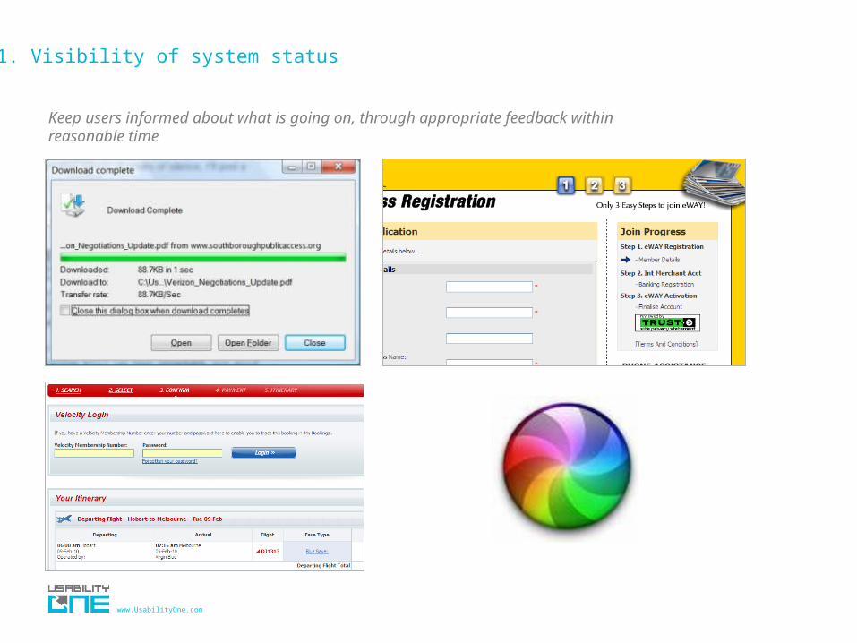
1. Visibility of system status
Keep users informed about what is going on, through appropriate feedback within reasonable time

www.UsabilityOne.com

www.UsabilityOne.com
2. Match between system and the real world
Speaking the users' language, with words, phrases and concepts familiar to the user, rather than system-oriented terms. Follow real-world conventions, making information appear in a natural and logical order.
Useful techniques to help you match the system with the real world
• Metaphors
• Natural Mappings
• Affordances
• Direct Manipulation

www.UsabilityOne.com
2. Metaphors
Desktop Folders Files
Online book Vcr

www.UsabilityOne.com
2. Providing natural mappings

www.UsabilityOne.com
2. Affordances
Chairs – For sitting
Knobs – For turningTables – For putting things on
Slots – For insertingHandles – For spinning Buttons – For pressing Switch – For
toggling

www.UsabilityOne.com
2. Affordances
Using standard affordances, users know what they can do
Drop down list Type here Button to be pressed
Clicking here does nothing
Must click here
What to do with this?

www.UsabilityOne.com
2. Direct Manipulation
Drop
Drag
Sorting by column headers
www.UsabilityOne.com
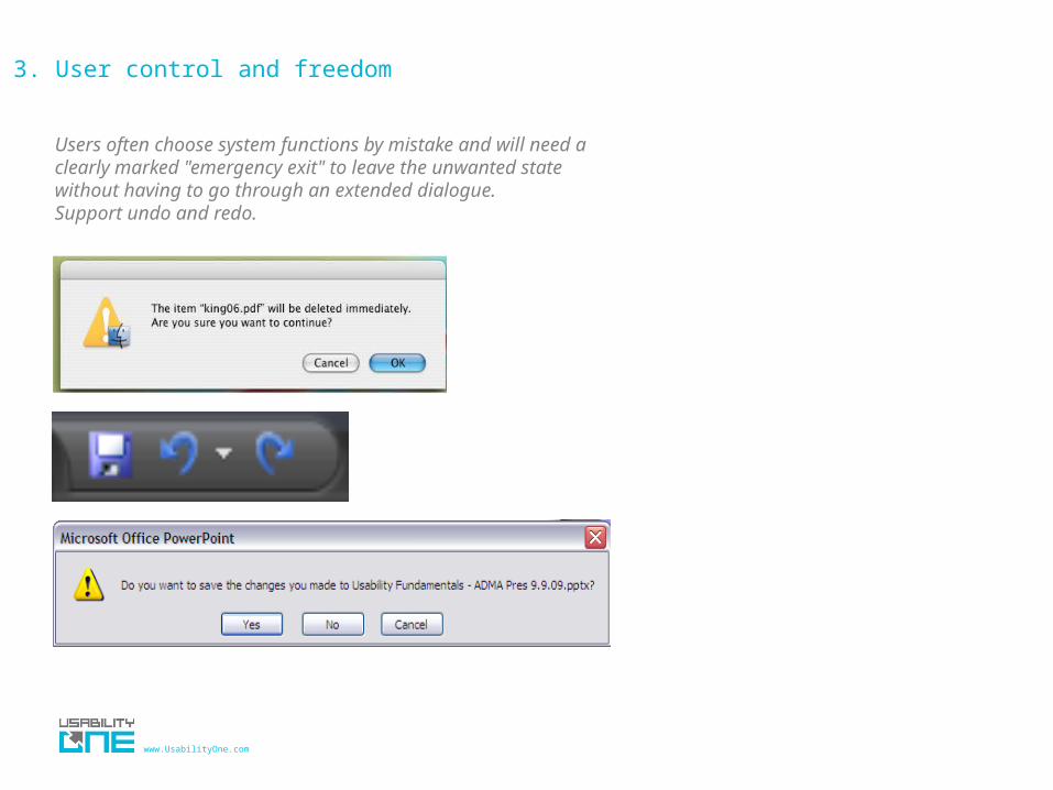
3. User control and freedom
Users often choose system functions by mistake and will need a clearly marked "emergency exit" to leave the unwanted state without having to go through an extended dialogue. Support undo and redo.

www.UsabilityOne.com
4. Consistency and standards
Users should not have to wonder whether different words, situations, or actions mean the same thing. Follow platform conventions.
Web conventions
• About Us• Contact Us• Home
Desktop conventions
• File• Edit• Menu
Yahoo! Design Patterns

www.UsabilityOne.com
5. Error prevention
Even better than good error messages is a careful design which prevents a problem from occurring in the first place. Either eliminate error-prone conditions or check for them and present users with a confirmation option before they commit to the action.
• Prevention is always better than the cure
www.UsabilityOne.com
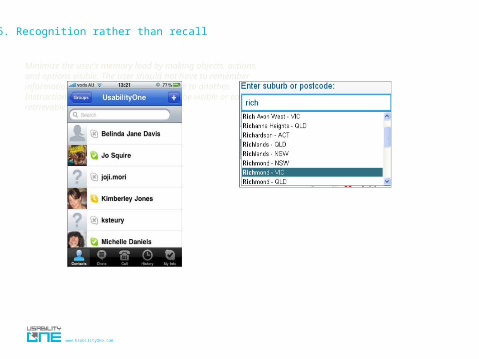
6. Recognition rather than recall
Minimize the user's memory load by making objects, actions, and options visible. The user should not have to remember information from one part of the dialogue to another. Instructions for use of the system should be visible or easily retrievable whenever appropriate.

www.UsabilityOne.com
7. Flexibility and efficiency of use
Accelerators -- unseen by the novice user -- may often speed up the interaction for the expert user such that the system can cater to both inexperienced and experienced users. Allow users to tailor frequent actions.
Quick links for frequent tasks
Shortcut keys

www.UsabilityOne.com
8. Aesthetic and minimalist design
Dialogues should not contain information which is irrelevant or rarely needed. Every extra unit of information in a dialogue competes with the relevant units of information and diminishes their relative visibility.
www.UsabilityOne.com
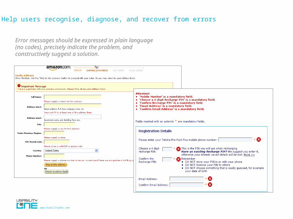
9. Help users recognise, diagnose, and recover from errors
Error messages should be expressed in plain language(no codes), precisely indicate the problem, and constructively suggest a solution.

www.UsabilityOne.com
10. Help and documentation
Even though it is better if the system can be used without documentation, it may be necessary to provide help and documentation. Any such information should be easy to search, focused on the user's task, list concrete steps to be carried out, and not be too large.

www.UsabilityOne.com
Don’t use documentation unless needed
Poorly written documentation can make a simple task harder

www.UsabilityOne.com
REFERENCES
• Heuristics (Jakob Nielsen) http://www.useit.com/papers/heuristic/heuristic_list.html
• Book - Usability Engineering (Jakob Nielsen)
• Affordances - Design of Everyday Things (Donald Norman) http://www.jnd.org/books.html#DOET
• Direct Manipulation (Ben Shneiderman)• http://www.interaction-design.org/references/authors/ben_sh
neiderman.html